Archive

Archive for September, 2015

DeviceMock.js Produces Device Mockups via JavaScript

September 30th, 2015 No comments
00-featured-devicemock-js

Previewing a new design can help to frame your concept in perspective. It can show what you’re doing that works, what might not be working, and how the final product should look.

This process often requires a graphic design program like Photoshop or Sketch. But if you’re someone who likes to pass designs via code or build in the browser then DeviceMock.js is perfect.

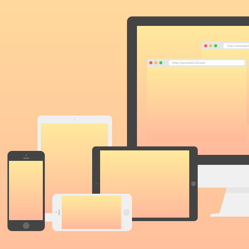
You simply call the script via JavaScript and pass options into the DeviceMock method. This will display any image or container within your device mockup as needed.

While this can have significant value during live website testing, it’s also a great resource for building previews for your own site. If you run a small app or program you can show live previews right on the landing page. DeviceMock simply offers a JS-powered method as opposed to only images.

The whole platform is completely open source under the MIT license and free to download straight from GitHub.

Note that it does require the jQuery library along with its own DeviceMock CSS dependency. All JS options are located on the plugin homepage with information about each option and how to pass these parameters into the main function.

Read More at DeviceMock.js Produces Device Mockups via JavaScript

Categories: Designing, Others Tags:

Channel 4 reveals a bizarre rebrand

September 30th, 2015 No comments

Channel 4 is today launching a major brand redesign. Masterminded by 4Creative, Channel 4’s in-house creative agency, the new identity is brave, bizarre, and striking.

The broadcast media landscape is a much more complicated place than it was ten years ago, so there’s a need to stand out more than ever before. — John Allison, 4Creative

Designed over the past three years, there are three major areas of the British broadcaster’s identity that have been redesigned: the logo, the typefaces, and the idents.

From the very start, we wanted whatever we did to be real and to be tactile, because if you look at a lot of other branding out there, it’s very shiny and CGI-led. — John Allison, 4Creative

The logo has been revised, but retains the blocks of the original logo designed by Martin Lambie-Nairn familiar to viewers. Intended to be used off-air, mostly in print, the ‘4‘ numeral has had additional space inserted to emphasize the block elements, rather than the overall form.

Two new typefaces have been designed by Neville Brody. The first is Chadwick, a rounded, warm, corporate typeface. Its forms are heavily geometric and designed for readability.

The second typeface is Horseferry, an unusual, disruptive display text. Horseferry uses the basic forms of Chadwick, but blends in the blocks from the ‘4‘ logo. The blocks can be found as additional slab serifs, and angular cuts into the shapes. There are even abrupt angular strokes across bowls, which in isolation are ugly, but in context form a typeface packed with personality.

It’s got loads of character — it’s occasionally spiky, sometimes smooth, sometimes goes against the grain, doesn’t always follow type rules. — Alice Tonge, 4Creative

Fittingly for a broadcaster, the most striking element of the rebrand are the idents — the short films sandwiched between programs and adverts — which are beautiful and in some places edgy. They are reminiscent of the opening scenes of J.J. Abrams’ “Star Trek Into Darkness”.

Shot by Jonathan Glazer, the idents tell the story of the channel’s blocks being discovered in caves, mined from the ground, and refined in labs. They’re natural, elemental curiosities.

Channel 4’s new branding is a brave approach. Some elements are more successful than others, but as a whole it’s an identity that is impactful, original, and ambitious.

700+ Hand-Drawn Graphic Elements – only $24!

Source

Categories: Designing, Others Tags:

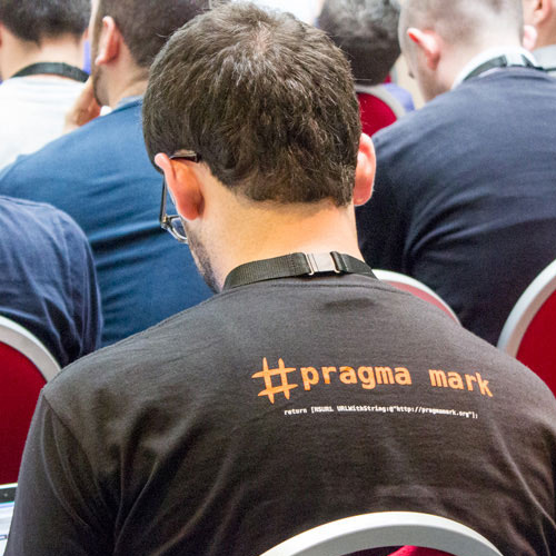
Italy hosts #Pragma Conference for iOS & OS X Developers

September 29th, 2015 No comments
00-pragma-mark-conference-cocoa

While many events around the world focus on programming for Apple devices, #Pragma Conference is the only major event found in Italy. While it is hosted in Europe, the event is open to anyone around the world who’d be willing to obtain a ticket.

The #Pragma Conference is a two day event spanning October 9-10. Most of the talks and track workshops open on the 10th running from 9AM to 7PM. A few workshops occur on the 9th with a full list of workshops available on the website.

Topics including various Cocoa API platforms like iCloud connection, Core Data fundamentals, and multi-threading.

The list of speakers is equally as fascinating with people appearing from all over the world. Some names include Christoper Downer of Bohemian Coding & Hannes Verlinde who does iOS programming for Facebook.

Check out the #Pragma Conf website to learn more and to grab some tickets. If you don’t have time to make it then be sure to look around for similar iOS events. You can also plan for next year’s #Pragma event by following their latest updates on Twitter @pragmamarkorg.

Read More at Italy hosts #Pragma Conference for iOS & OS X Developers

Categories: Designing, Others Tags:

Quench.js: An Online Gulp Code Generator

September 29th, 2015 No comments
00-featured-gulp-quench

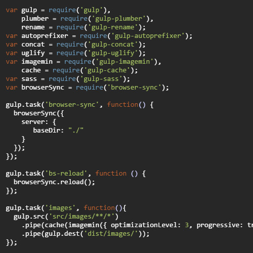
Frontend devs should already know a little about Gulp. It’s a JavaScript-based automation library for handling tasks that you’d rather not perform manually.

These tasks can include file compression, automatic CSS prefixing, and code linting(to name just a few). Most of these tasks require Gulp settings to be created or downloaded from pre-built code snippets.

But thanks to Quench you can download a full package of Gulp features all at once! This allows you to simply code away and have far less concern over the automation process.

The website itself is where you download the custom gulpfile.js which you can read about from Gulp’s Getting Started guide.

All code from the file is visible but you affect changes from a GUI menu. This makes customizing gulp as simple as pointing and clicking. It likely requires more work to find a video on YouTube than to create your Gulp file via Quench.

Once finished you simply download the .zip file and install it via npm(requires Node.js).

If you’re still new to Gulp then I’d recommend following an intro tutorial first. It’s better to learn how to crawl before you walk — or in this case sprint.

But once you’ve got the hang of Gulp and how it operates, Quench can save a lot of time during the new project cycle.

Read More at Quench.js: An Online Gulp Code Generator

Categories: Designing, Others Tags:

Simple Lightbox is a Touch-Friendly Lightbox for jQuery Users

September 29th, 2015 No comments
00-featured-modal-window

There’s no shortage of custom plugins for building almost any type of interface for the web. JavaScript is the underlying factor among all web interfaces, but jQuery is perhaps the largest open source library to simplify the process.

Free lightbox plugins are voluminous and each offers a variety of unique features. These can range from dynamic button motions to custom mouse events or animation effects.

Simple Lightbox created by Andre Rinas is the perfect solution for mobile responsive websites.

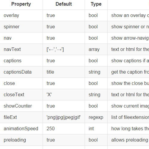
The plugin offers touch-based support for swiping and closing new panels. It also offers keyboard progressions with arrow keys moving between different slides. The goal was to make a plugin that truly works effortlessly on mobile. Simple Lightbox is definitely one of the best choices for any mobile or responsive website.

You can find the plugin’s documentation on the demo page along with a few example code snippets. Simple Lightbox really is simple and it shouldn’t take much work to get it up & running smoothly.

Feel free to download a copy from the GitHub repo and see what you can build with this highly-extensible jQuery plugin.

Read More at Simple Lightbox is a Touch-Friendly Lightbox for jQuery Users

Categories: Designing, Others Tags:

Sketch Repo lists Free HQ Sketch App Resources

September 29th, 2015 No comments
00-featured-sketch-freebie-dark

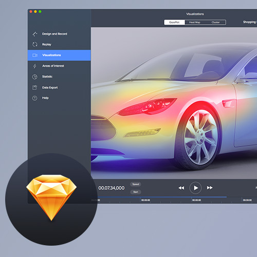
With the dozens of Photoshop and Illustrator freebie websites online, it should come as no surprise that Sketch users have felt a little behind the times. If you search websites like Behance or Dribbble you’re sure to find Sketch freebies. But why not assemble these resources into one neat collection?

Sketch Repo comes with the perfect solution. This online directory lists free Sketch resources for designers of all types. You’ll find interfaces for mobile apps, website layouts, and even desktop software GUIs.

The site includes everything from simple wireframes to detailed mockups. You’ll find plenty of iconsets along with other various freebies.

If you’re looking for practical Sketch freebies then Sketch Repo is the place to be.

The entire website is curated by user submissions which means it’s really a collection of resources pooled from sources all around the web. If you release a freebie or find a new one yourself, try adding it to Sketch Repo through their submission form.

Given more time to grow I think Sketch Repo could be one of the largest resources for Sketch users. And with a growing collection of new freebies released every month, there’s an almost endless supply of quality resources just waiting for your next design project!

To keep up with site changes and new releases you can visit the Sketch Repo Facebook page or follow them on Twitter @sketchrepo.

Read More at Sketch Repo lists Free HQ Sketch App Resources

Categories: Designing, Others Tags:

Collection of Design Patterns for Web & Mobile UI

September 29th, 2015 No comments
00-breadcrumbs-design-patterns

While design trends will always be popular, they’re not necessarily the best methods for constructing a new website. Trends do not always fit into every project and sometimes you’ll need to try new techniques to fulfill a client’s wishes.

This is where you should try relying more on design patterns which are commonly-used methods of crafting interface features.

The UI-Design website has a design patterns gallery full of examples for anything you could imagine. Form fields, tours & in-page wizards, breadcrumbs, anything that you’d typically find in a modern interface has a category on this page.

This doesn’t mean you should solely rely on design patterns for all of your work – far from it.

But studying common patterns can help you put together ideas that may work for projects in need of a working solution. Plus visitors are going to be familiar with popular patterns, thus making a site much easier to browse on the user’s end.

Each page caters to a particular pattern with details and helpful hints. Live examples are only part of the equation.

For example the breadcrumbs page covers the incipient problem and how breadcrumbs can solve that particular problem(hierarchical navigation).

Use this resource as a guide to stay focused on what matters most: the user experience. If you can solve problems from an experiential level then your aesthetic design work should become the least of your concerns.

Read More at Collection of Design Patterns for Web & Mobile UI

Categories: Designing, Others Tags:

Learn Design online with Method of Action

September 29th, 2015 No comments
00-featured-method-editor-preview

If you’ve ever wanted to learn specific design techniques free of charge, then Method of Action is the site for you.

It’s a collection of resources for learning specific skills related to digital design. Since everything is online you can practice these little games & tools from any computer with Internet access – no Adobe software required.

At the moment you’ll find 4 unique “games” that are more like practice puzzles to improve your design skills. My favorite is The Bézier Game which teaches how to use bézier handles like you’d find with any pen tool. Many designers struggle to understand the pen tool but it’s undoubtedly one of the best tools worth mastering.

Shape Type is a similar game that relies on bezier handles to reshape typography. This may be more useful for typographers but it teaches many similar principles. Kerntype is another typography game focused on kerning, which is the distance between letters in a word.

There’s also a color matching game that asks you to perfectly match colors as they display on the screen. I didn’t find this particularly helpful but it may be useful to some color enthusiasts.

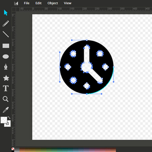
Lastly Method Draw is a completely free open source vector editor for the web. MoA created this as a way for designers to practice vector work foregoing the usual high-priced software.

You can find the full source code on GitHub if you’d want to check it out and try hosting it yourself.

Method of Action is outstanding because it’s completely free and most games are fully functional on touchscreen devices! If you’re feeling with any of these design techniques, consider checking out Method of Action to see if you can get a jump forward.

Also check back every-so-often or follow on Twitter @methodofaction to see if any new games have been released.

Read More at Learn Design online with Method of Action

Categories: Designing, Others Tags:

Tools & Webapps for Creating your own Infographics

September 29th, 2015 No comments
00-infographic-editing-tools

Infographics have become all the rage with Internet lovers. They provide quick & easy factual information related to a certain topic. I have always loved the idea but never thought it would catch on so quickly. Looking over Google you can find so many examples of refined infographics on nearly any subject.

But there are also many designers who want to get into the craft. Making your own infographic is very hard work, since you’ll need to do research on topics to gather statistics & data. But if you are fairly well-versed in a subject then it is obviously worthwhile trying your hand at some different graphics. Check out these online resources and see if you can learn anything new about the art of infographic design.

Piktochart

First up we have Piktochart which is an online webapp for creating infographics. The website is seriously fantastic and it provides a lot of staple features you would expect such as templates and graphic icons. There are some other premium account plans which offer better templates and no watermark branding.

However when just getting started I think Piktochart is a fun application to play with. You can study how other designers are making charts in the user showcase. By practicing with some of your own ideas it can be really easy to generate quality infographics with a bit of practice.

easel.ly
easelly infographics online webapp network screenshot

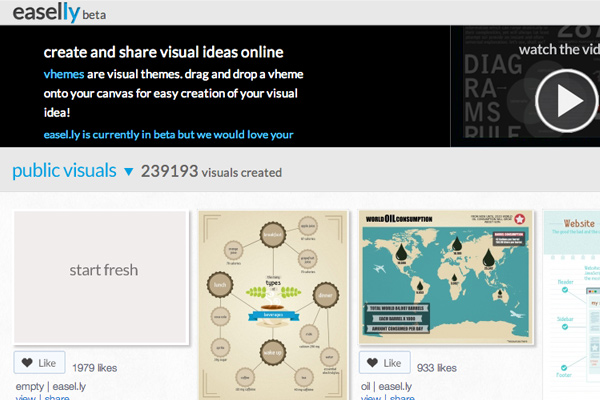
To compare another online infographics builder, the website Easelly is beautiful with its own full showcase gallery. Designers may publish their full infographics or templates onto the website and share them with the world. But you can also edit these infographic templates to setup any data formats you like! It is really easy and certainly the best tool for newbies.

My favorite part about Easel.ly is the large user-contributed showcase. This contains many template files which you can revamp to look like your own custom infographic. But there are also many fully-completed GUI sets which are submitted for inspiration. Their online visual editor tools are not difficult and they grow on you quickly, with a bit of practice. Plus you can get started without even signing up for an account.

Infogram
screenshot infogram website webapp building infographics

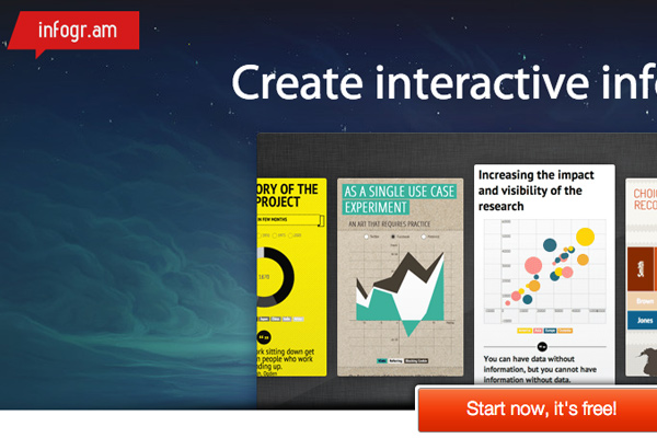
The new startup Infogram provides another beautiful interface to mockup your own infographics online. The website is currently in beta, yet does allow for open signups from anyone. There are a number of pre-formatted templates which you can build upon.

Also you can organize creations into various libraries for sharing. With a pro plan you can even download infographics as full PNG/PDF files. Infogram comes across like a more advanced web application for designers who want a premier infographics editing suite. The pro plan runs at $18/month or $180/year which may not be feasible for everyone. But even their free online editor is worth playing around to see what kind of tools are at your disposal.

Visually
visually webapp website resource infographics screenshot

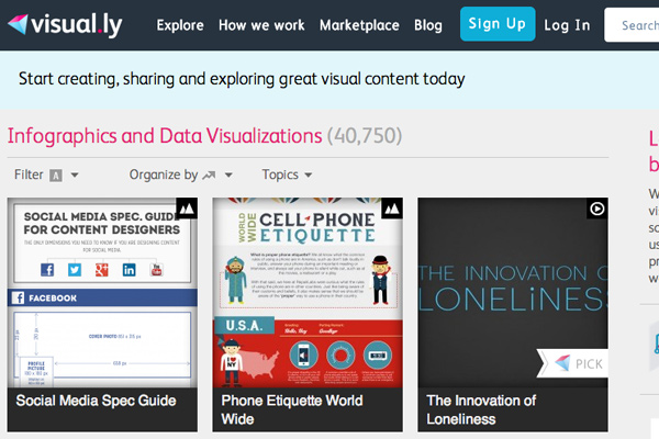
What infographics resource article could be complete without mentioning Visually? This site has grown very quickly to include a number of dedicated members who design, gather data, and publish content online. Visually isn’t just a sharing network for data visualisations. It is a meeting ground where you can work with others to create your own infographics.

The website has a marvelous online gallery which includes hundreds if not thousands of different examples. These infographics are often shared elsewhere on the web, but get republished into Visually as an archive. It can be fun going through all the categories to see what designers have created.

But as I mentioned earlier, Visually really offers some quality services for creating infographics. You do not need to be a designer or a researcher to put together all the sources. Check out the Visually marketplace for some detailed price guidelines. Even smaller projects may end up costing over $1,000 so it’s not exactly cheap, but glossing over their past examples it is safe to assume you will get what you pay for.

Vizualize.me
vizualize beta webapp online website layout

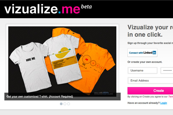
Here we have another web application in beta called Vizualize.me. The site is dedicated more towards online resumes than infographics. But the design styles are formatted just like you would expect to see in an infographic – stats, organized data, charts, and other such graphical elements.

I think Vizualize is opening into a new market which hasn’t really been needed until recently. Resume’s have usually been created in a word processor with static text. It is only recently with the popularity of the Internet have we seen a rise in graphically-enhanced resumes. The site is still very small but it’s growing fast, and certainly worth paying attention to see what else the team has planned for the future.

Freebie Resources

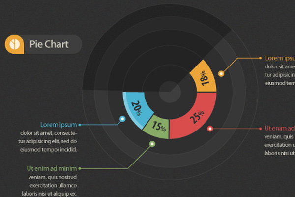
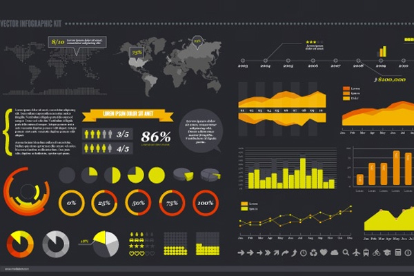
Along with these online web applications it is worthwhile to mention some freebies you can download. All of these resources are PSD or AI files which contain infographic templates & common interface items. The GUI kits are fantastic because you can play with shapes and graphs to learn how you might design your own.
Infographic Vector Elements

pixeden freebie vector elements infographics charts

MediaLoot Vector Infographic Kit

medialoot infographics ui kit download psd

Oil Theme Business Infographic Vector

freebie oil gui kit infographics psd

Elements of Food Infographics Vector

freebie infographic gui vector food ai illustrator cooking

Closing

There are likely many other freebies to be found elsewhere online. This collection is a great way to get started practicing your own ideas with other designer’s GUI kits. I would highly recommend skimming the other resources listed here since most are devoted to online infographic design. Also if you know of similar resources I may have missed, please feel free to share with us in the post discussion area below.

Read More at Tools & Webapps for Creating your own Infographics
Categories: Designing, Others Tags:
28 Powerful WordPress Plugins to Extend your Website’s Functionality

September 29th, 2015 No comments
wp-plugins-extension-dashboard

I simply love WordPress as a blogging platform, and as a quickly-advancing content management system. The use of plugins within your WP installation can provide an inordinate amount of support to your website. It could be things like pricing tables, shortcodes, photo slideshows, even additional tools in the backend.

Within this showcase I have put together 28 exceptionally beneficial WordPress plugins you may want to check out. Each of these examples is a premium plugin released on CodeCanyon. But don’t let that dissuade you – most of these plugins range from $5-$15 and you get a lot of bang for your buck. Plus they can be fantastic learning tools for developing your own custom plugins.

User Profiles Made Easy

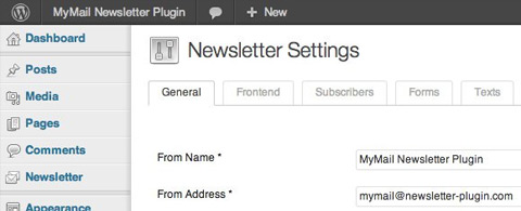
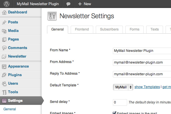
MyMail

mymail newsletter plugin premium wordpress

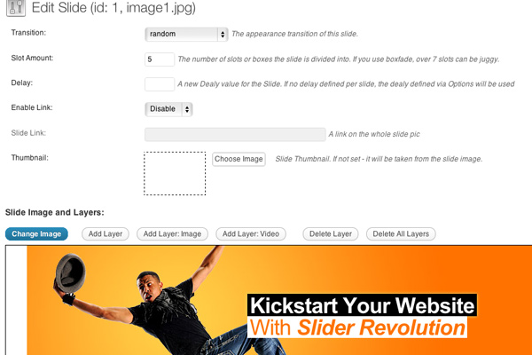
Slider Revolution

slider revolution responsive plugin design wordpress

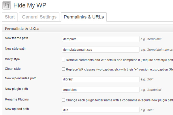
Hide My WP

hide my wp wordpress plugin premium

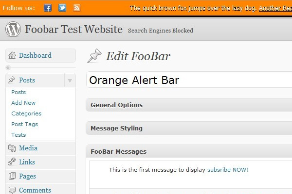
Foobar

foobar wordpress notifications system premium item

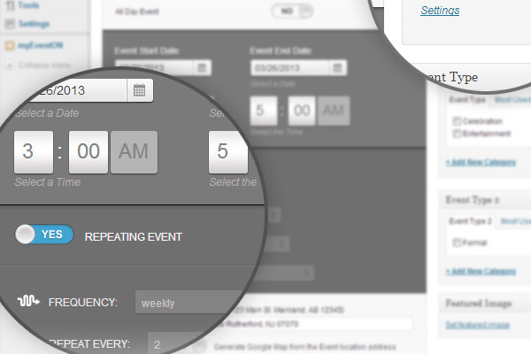
EventOn

events management plugin wordpress premium codecanyon

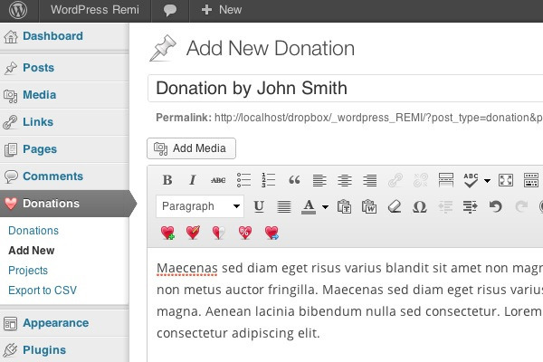
Easy WordPress Donations

easy wp wordpress donations website paypal plugin

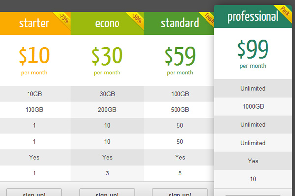
CSS3 Responsive Pricing Tables

css3 responsive pricing tables plugin wordpres

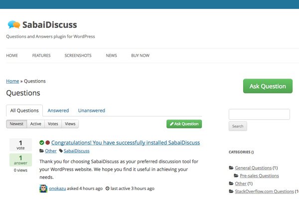
SabaiDiscuss

faq questions answers management plugin wordpress sabai discuss

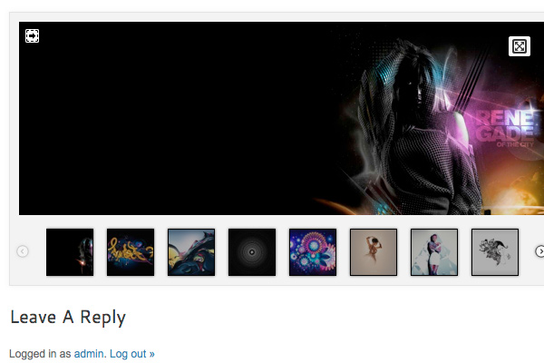
Thumbnail Gallery

wordpress thumbnail gallery images plugin premium

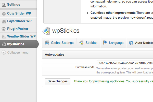
wpStickies

wordpress stickies premium plugin image tagging

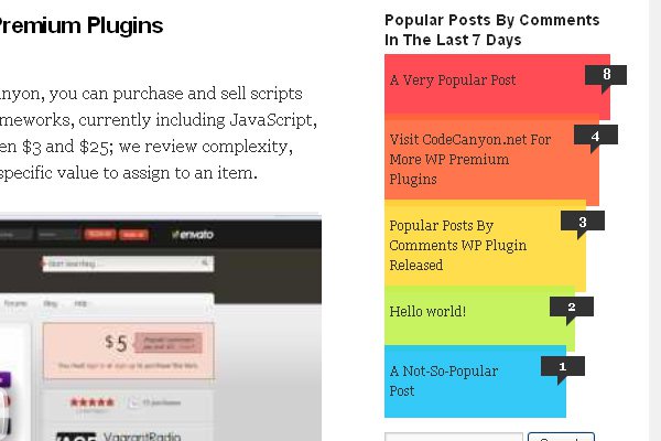
Popular Posts Bar

wordpress widget plugin popular posts plugin engadget-style

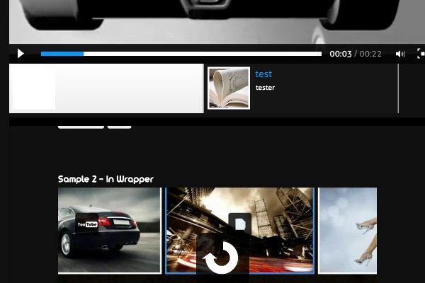
Video Gallery

wordpress plugin full video gallery setup

Lightbox Evolution

minimal wordpress plugin lightbox evolution

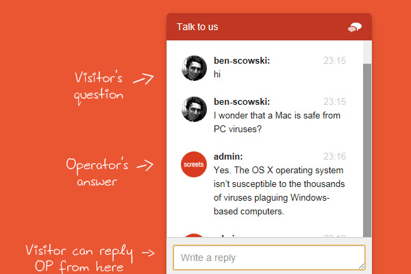
Live Chat

wordpress live chat plugin sales support premium

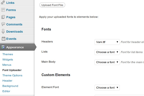
Font Uploader

wordpress premium plugin font uploader design

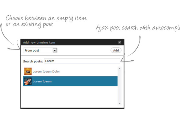
Content Timeline

content timeline responsive wordpress plugin

Premium Gallery Manager

premium gallery manager wordpress plugin

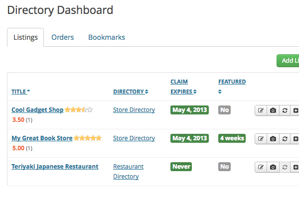
SabaiDirectory

wordpress directory listing sabai directory premium

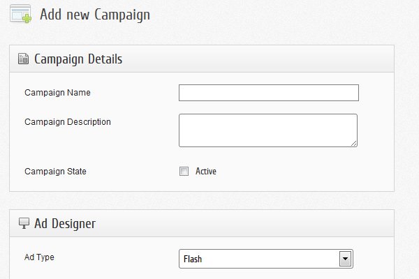
AdPress

advertisements management plugin wordpress adpress premium

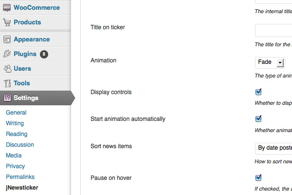
jNewsticker

jnewsticker wordpress premium news ticker plugin

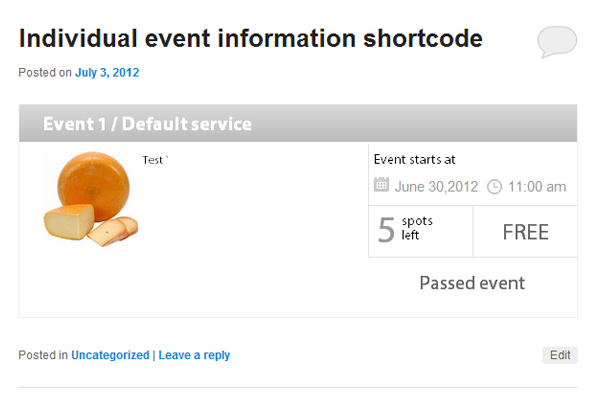
BookingWizz

booking events system plugin wordpress

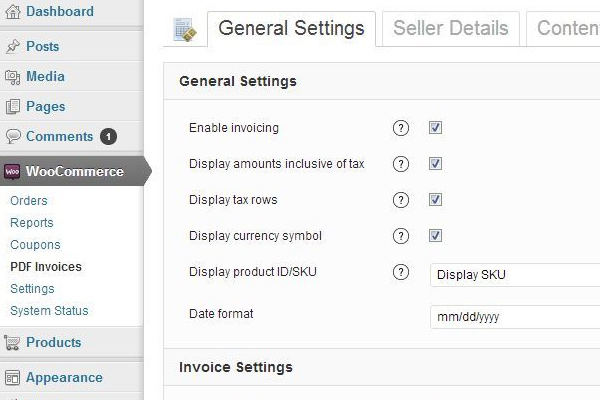
WooCommerce PDF Invoice

woocommerce pdf invoice plugin premium codecanyon

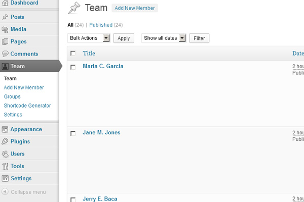
Team Showcase

wordpress team showcase plugin premium

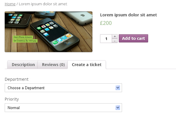
Press Ticket System

press ticket system wordpress helpdesk premium

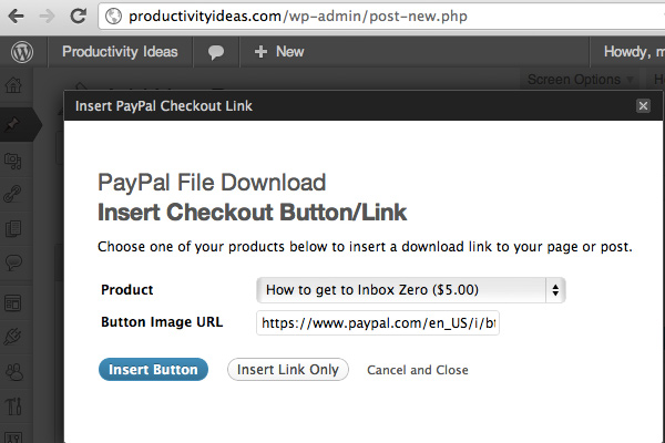
PayPal File Download

wordpress premium plugin paypal file download digital

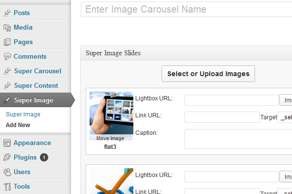
Super Carousel

super carousel image rotator plugin wordpress premium

Vision Shortcodes

wordpress vision shortcodes premium plugin wpadmin

Read More at 28 Powerful WordPress Plugins to Extend your Website’s Functionality

Categories: Designing, Others Tags: