Archive

Archive for November, 2015

How to Design Forms That Increase Your Conversion Rate

November 30th, 2015 No comments

A visually attractive form doesn’t help much when only a few visitors fill it in. In reality, a neat design is limited in its effectiveness as it only works in combination with other factors that need to be considered as well. In this article, I will give you advice on how to shape forms regarding content to increase the conversion rate which, in this case, means the number of successfully completed forms.

How to Design Forms: Keep Them Short and Simple

Nobody wants to hand out a lot of personal information. Especially when one doesn’t know the website owner well or even at all. Thus, it can make a lot of sense to ask your visitors for as less information as possible. According to a study by HubSpot, in which more than 40,000 landing pages had been examined, the completion rate of forms was the highest, when there were only three input fields in total. The conversion rate dropped by one third when a fourth field was added.

On the other hand, you should also attempt to create a balance between the quality of leads and the number of fields. I can tell you from my personal experience that it’s not always helpful to reduce the number of fields too radically. It is not always possible to distinguish high-grade from lower quality leads when the amount of fields is reduced to two or less.

Is the Phone Number Really Important?

How to Design Forms That Increase Your Conversion Rate

Especially asking for the phone number is a delicate subject. Most people don’t want to be called. That’s why you should ask yourself if it makes sense to request this information at a later time at least, or better, not at all. If you need to, once you receive the email address, you can still ask for the phone number in a follow-up message.

Multistage Forms

A new trend to make forms look short is multistage forms. Instead of filling all fields on the landing page of the form, there are only one or two questions asked in the first step. A magnificent example can be found on OnPage.org. Here, just one field is displayed on the landing page. It requests a URL of the web user. After having entered that the complete form with more fields appears.

Naming the Buttons

Most websites show the obvious “send” on the buttons. However, variations of that can also lead to higher conversions. Alternatives that have great success are “continue”, “send order” and “send now”. In FormStack’s report, some of these variants achieved 50 percent better results than “send”.

Count on A/B tests in this regard. Different websites can achieve different results here. We will return to A/B tests for forms later on.

Inspire Trust

Most people have a hard time sending a stranger or a website personal data. That’s why you should avoid friction areas as good as possible and take measures to inspire trust. What could that look like?

Here are some options:

  • Do you really need to ask for sensitive data (phone number, full name, etc.) in the first step? These can be requested later in the process.
  • Do you really need a multiline comment field? Most of the time, a single line field in which the visitor can type one sentence is sufficient.
  • Assure the user that the data will be treated confidentially.
  • Display at least one customer reference below or alongside the form.

Choosing the Right Form Type

Does it always have to be a contact form? According to the aforementioned FormStack study, there are different conversion rates depending on the type of the form. For example, raffles do best. Here, an average of 35 out of 100 visitors complete the form. With contact forms, just one out of 100 visitors complete the form. Surveys, with 14 out of 100 visitors, as well as sign-up forms for events, with 11 out of 100 visitors, do a better job of calling people to action.

That’s why you should consider implementing appropriate types of forms on your website instead of only using contact forms.

Optimising Your Forms for Mobile View

How to Design Forms That Increase Your Conversion Rate

The growth rate of mobile internet usage is enormous. A majority of internet users accesses websites from their smartphones or tablets. This creates new challenges as well.

The screens are smaller which makes it harder to fill in long forms. That’s another reason it makes sense to reduce the number of fields. Concerning mobile websites, there are many further options to support the user. For example, GPS could be used to determine the location of the visitor to automatically fill some of the fields in advance.

How to Design Forms: A/B Testing

How to Design Forms That Increase Your Conversion Rate

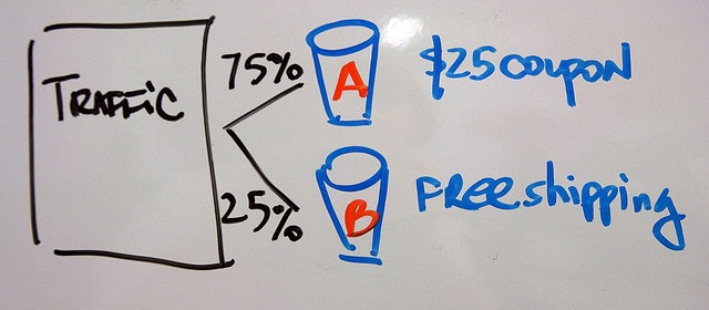
What is A/B Testing? Nowadays, different variations of the same website can be shown at various web users easily. Doing so mainly allows you to see which variant does better. Here are some tips on how to A/B test forms.

Placement: Above the Fold versus Below the Fold

“Above the Fold” means the website area that is visible without any scrolling in the browser. “Below the Fold” is the area that only becomes visible after scrolling.

In some cases, it makes sense to place the form above the fold. This should be done for easily understandable products and services.

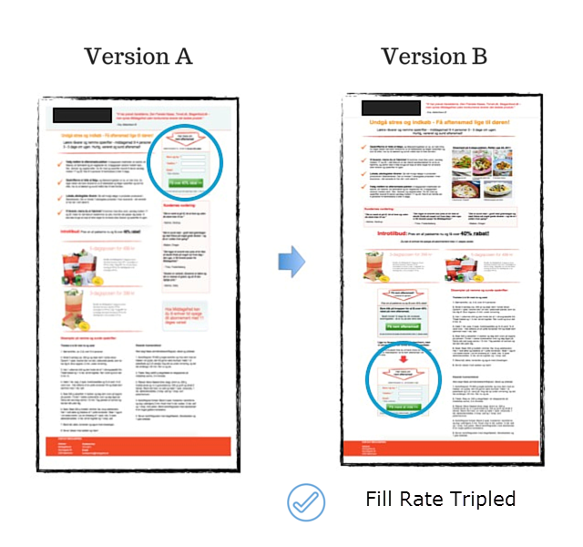
It’s not necessarily more effective to place forms above the fold. When a form concerning complex services is put in the lower areas of the website, it can lead to a higher conversion rate as well.

Michal Aagaard of ContentVerve, for example, experienced a tripled conversion rate when he placed the form in the lower parts of his website in one of his A/B tests:

How to Design Forms That Increase Your Conversion Rate

Promise Data Protection Effectively

Who doesn’t know these sentences below a form? “We don’t spam”, “We don’t like spam”, “Your data is treated confidentially” and many more.

ContentVerve has also set up studies on this topic. The words “We guarantee 100% security. Your data will not be shared with third parties” lead to an increase in the sign-up rate of almost 20 percent. Take away from that that a more detailed information will help here and prefer that over short mentions such as “100% no spam” and similar.

Test, Test, Test

The same tests can lead to different results for different websites. That’s why you should always check the mentioned best practices instead of just assuming that they will lead to higher conversion rates.

More form areas that you can test:

  • The orientation of the labeling of the input fields: In this report by Luke Wroblewski, it is shown that labels above the form fields are more effective than right- or left-adjusted texts.
  • Lettering and colour of the buttons: Here, small changes can lead to positive results as well. For example, buttons that have a high contrast to the website’s colour are clicked more often than those that use the same colours.

Conclusion

Potential customers want to quickly receive information online and avoid dialogues with sellers. Forms can be both a hazard and a relief here. That’s why it makes sense to thoroughly optimise them to achieve better results.

Image Sources: Flickr.com/ Marc Levin/ Johan Larsson

(dpe)

Categories: Others Tags:

Desktop Wallpaper Calendars: December 2015

November 30th, 2015 No comments

Since seven years, our monthly desktop wallpapers post is a Smashing favorite that wouldn’t be possible without the tireless efforts of designers and artists from across the globe. Each month, we challenge you, the design community, to get your creative juices flowing and produce some interesting and inspiring desktop wallpapers. And well, we are very thankful to everyone who tickles their creativity and contributes to this challenge every month.

Desktop Wallpaper Calendars: December 2015

This post features artwork for December 2015. The wallpapers all come in versions with and without a calendar and can be downloaded for free. Now it’s up to you to decide: which one will deck your desktop this month?

The post Desktop Wallpaper Calendars: December 2015 appeared first on Smashing Magazine.

Categories: Others Tags:

The 2016 HTPC Build

November 30th, 2015 No comments

I’ve loved many computers in my life, but my HTPC has always had a special place in my heart. It’s the only always-on workhorse computer in our house, it is utterly silent, totally reliable, sips power, and it’s at the center of our home entertainment, networking, storage, and gaming. This handy box does it all, 24/7.

I love this little machine to death; it’s always been there for me and my family. The march of improvements in my HTPC build over the years lets me look back and see how far the old beige box PC has come in the last decade since I’ve been blogging:

2005 ~$1000 512 MB RAM, single core CPU 80 watts idle
2008 ~$520 2 GB RAM, dual core CPU 45 watts idle
2011 ~$420 4 GB RAM, dual core CPU + GPU 22 watts idle
2013 ~$300 8 GB RAM, dual core CPU + GPU×2 15 watts idle
2016 ~$320 8 GB RAM, dual core CPU + GPU×4 10 watts idle

As expected, the per-thread performance increase from 2013’s Haswell CPU to 2016’s Skylake CPU is modest – 20 percent at best, and that might be rounding up. About all you can do is slap more cores in there, to very limited benefit in most applications. The 6100T I chose is dual-core plus hyperthreading, which I consider the sweet spot, but there are some other Skylake 6000 series variants at the same 35w power envelope which offer true quad-core, or quad-core plus hyperthreading – and, inevitably, a slightly lower base clock rate. So it goes.

The real story is how power consumption was reduced another 33 percent. Here’s what I measured with my trusty kill-a-watt:

  • 10w idle with display off
  • 11w idle with display on
  • 13w active standard netflix (720p?) movie playback
  • 14w multiple torrents, display off
  • 15w 1080p video playback in MPC-HC x64
  • 40w Lego Batman 3 high detail 720p gameplay
  • 56w Prime95 full CPU load + Rthdribl full GPU load

These are impressive numbers, much better than I expected. Maybe part of it is the latest Windows 10 update which supports the new Speed Shift technology in Skylake. Speed Shift hands over CPU clockspeed control to the CPU itself, so it can ramp its internal clock up and down dramatically faster than the OS could. A Skylake CPU, with the right OS support, gets up to speed and back to idle faster, resulting in better performance and less overall power draw.

Skylake’s on-board HD 530 graphics is about twice as fast as the HD 4400 that it replaces. Haswell offered the first reasonable big screen gaming GPU on an Intel CPU, but only just. 720p was mostly attainable in older games with the HD 4400, but I sometimes had to drop to medium detail settings, or lower. Two generations on, with the HD 530, even recent games like GRID Autosport, Lego Jurassic Park and so on can now be played at 720p with high detail settings at consistently high framerates. It depends on the game, but a few can even be played at 1080p now with medium settings. I did have at least one saved benchmark result on the disk to compare with:

GRID 2, 1280×720, high detail defaults
Max Min Avg
i3-4130T, Intel HD 4400 GPU 32 21 27
i3-6100T, Intel HD 530 GPU 50 32 39

Skylake is a legitimate gaming system on a chip, provided you are OK with 720p. It’s tremendous fun to play Lego Batman 3 with my son.

At 720p using high detail settings, where there used to be many instances of notable slowdown, particularly in co-op, it now feels very smooth throughout. And since games are much cheaper on PC than consoles, particularly through Steam, we have access to a complete range of gaming options from new to old, from indie to mainstream – and an enormous, inexpensive back catalog.

Of course, this is still far from the performance you’d get out of a $300 video card or a $300 console. You’ll never be able to play a cutting edge, high end game like GTA V or Witcher 3 on this HTPC box. But you may not need to. Steam in-home streaming has truly come into its own in the last year. I tried streaming Batman: Arkham Knight from my beefy home office computer to the HTPC at 1080p, and I was surprised to discover just how effortless it was – nor could I detect any visual artifacts or input latency.

It’s super easy to set up – just have the Steam client running on both machines at a logged in Windows desktop (can’t be on the lock screen), and press the Stream button on any game that you don’t have installed locally. Be careful with WiFi when streaming high resolutions, obviously, but if you’re on a wired network, I found the experience is nearly identical to playing the game locally. As long as the game has native console / controller support, like Arkham Knight and Fallout 4, streaming to the big screen works great. Try it! That’s how Henry and I are going to play through Just Cause 3 this Tuesday and I can’t wait.

As before in 2013, I only upgraded the guts of the system, so the incremental cost is low.

That’s a total of $321 for this upgrade cycle, about the cost of a new Xbox One or PS4. The i3-6100T should be a bit cheaper; according to Intel it has the same list price as the i3-6100, but suffers from weak availability. The motherboard I chose is a little more expensive, too, perhaps because it includes extras like built in WiFi and M.2 support, although I’m not using either quite yet. You might be able to source a cheaper H170 motherboard than mine.

The rest of the system has not changed much since 2013:

Populate these items to taste, pick whatever drives and mini-ITX case you prefer, but definitely stick with the PicoPSU, because removing the large, traditional case power supply makes the setup both a) much more power efficient at low wattage, and b) much roomier inside the case and easier to install, upgrade, and maintain.

I also switched to Xbox One controllers, for no really good reason other than the Xbox 360 is getting more obsolete every month, and now that my beloved Rock Band 4 is available on next-gen systems, I’m trying to slowly evict the 360s from my house.

The Windows 10 wireless Xbox One adapter does have some perks. In addition to working with the newer and slightly nicer gamepads from the Xbox One, it supports an audio stream over each controller via the controller’s headset connector. But really, for the purposes of Steam gaming, any USB controller will do.

While I’ve been over the moon in love with my HTPC for years, and I liked the Xbox 360, I have been thoroughly unimpressed with my newly purchased Xbox One. Both the new and old UIs are hard to use, it’s quite slow relative to my very snappy HTPC, and it has a ton of useless features that I don’t care about, like broadcast TV support. About all the Xbox One lets you do is sometimes play next gen games at 1080p without paying $200 or $300 for a fancy video card, and let’s face it – the PS4 does that slightly better. If those same games are available on PC, you’ll have a better experience streaming them from a gaming PC to either a cheap Steam streaming box, or a generalist HTPC like this one.

The Xbox One and PS4 are effectively plain old PCs, built on:

  • Intel Atom class (aka slow) AMD 8-core x86 CPU
  • 8 GB RAM
  • AMD Radeon 77xx / 78xx GPUs
  • cheap commodity 512GB or 1TB hard drives (not SSDs)

The golden age of x86 gaming is well upon us. That’s why the future of PC gaming is looking brighter every day. We can see it coming true in the solid GPU and idle power improvements in Skylake, riding the inevitable wave of x86 becoming the dominant kind of (non mobile, anyway) gaming for the forseeable future.

[advertisement] At Stack Overflow, we help developers learn, share, and grow. Whether you’re looking for your next dream job or looking to build out your team, we’ve got your back.
Categories: Others, Programming Tags:

Building for HTTP/2

November 29th, 2015 No comments

Rebecca Murphey:

This is everything-you-thought-you-knew-is-wrong kind of stuff. In an HTTP/2 world, there are few benefits to concatenating a bunch of JS files together, and in many cases the practice will be actively harmful. Domain sharding becomes an anti-pattern. Throwing a bunch of tags in your HTML is suddenly not a laughably terrible idea. Inlining of resources is a thing of the past. Browser caching — and cache busting — can occur on a per-module basis.

I can’t help but think that web development might actually make sense some day.

Direct Link to ArticlePermalink


Building for HTTP/2 is a post from CSS-Tricks

Categories: Designing, Others Tags:

Metadata Markup

November 29th, 2015 No comments

Jeremy Keith looks at the competing standards for the metadata that goes in the head which ultimately helps services such as Slack, Twitter and Facebook to create a preview of the content of a website. Unfortunately the lack of consensus is an annoying problem for developers:

We’ve seen this kind of waste before. I remember when Netscape and Microsoft were battling it out in the browser wars: Internet Explorer added a proprietary acronym element, while Netscape added the abbr element. They both basically did the same thing. For years, Internet Explorer refused to implement the abbr element out of sheer spite.

Direct Link to ArticlePermalink


Metadata Markup is a post from CSS-Tricks

Categories: Designing, Others Tags:

Cartoon: Nothing too Sophisticated

November 29th, 2015 No comments

This is a true story – unfortunately. A good friend of mine hired a web designer to help him get online. As he has a very specialized target group he does not need an imposing internet presence, more a kind of a virtual business card to help his customers find him online. That’s what he told the designer. The designer then nodded an “Okay” but still silently rattled off his seemingly hard-wired plan of how a website has to be built, ending in an absolute overkill. My friend didn’t see the first draft within four weeks when he expected the whole project would be ready within a few days. One day he decided to ask for a status update. The designer got pretty angry and told him how complicated all these technological background tasks are to implement and how happy he should be to have found such a qualified designer.

By the way, we have more cartoons for you here.

Categories: Others Tags:

Popular design news of the week: November 23, 2015 – November 29, 2015

November 29th, 2015 No comments

Every week users submit a lot of interesting stuff on our sister site Webdesigner News, highlighting great content from around the web that can be of interest to web designers.

The best way to keep track of all the great stories and news being posted is simply to check out the Webdesigner News site, however, in case you missed some here’s a quick and useful compilation of the most popular designer news that we curated from the past week.

Note that this is only a very small selection of the links that were posted, so don’t miss out and subscribe to our newsletter and follow the site daily for all the news.

4 Layout Trends on Dribbble

Must-Know Techniques for HTML5 Responsive Design

7 Common Mistakes Made with Responsive Mockups

The Cost of Frameworks

Why is it so Hard to Find a Front End Developer?

The Future of Responsive Design Standards

Web Design Trends 2015 & 2016: Fearless Colors

10 Things I Learned About UX by Being Drunk

The Story Behind the New WordPress.com

Photos of Darth Vader’s Rather Ordinary Daily Life

Google’s Star Wars – Rebrand Google with the Light, or Dark Side

Responsive Times Two: Essential New Books from Ethan Marcotte & Karen McGrane

I Am Done with Bad Meetings

Instantsearch.js: JavaScript Library for Building Great Search Experiences

6 Designers’ Bad Habits – And How to Avoid Them

Digital Style Guide: Tool for Lean Design Process

The Origins of Flat Design

Don’t do That, do This.

3 Ingredients for a Successful UX Strategy

Raspberry Pi Zero – The $5 Computer

The Unsplash Book – Crowdsourced Book Featuring Photos, Essays, and Art

Fallout 4’s UI is Truly Terrible

If the Internet is Addictive, Why We Don’t Regulate It?

These Gorgeous Sunrises and Sunsets are Made from Slices of Time

The Museum of the World

Want more? No problem! Keep track of top design news from around the web with Webdesigner News.

LAST DAY: 14,000 Smashicons Vector Icons + Drag and Drop Mac App – only $27!

Source

Categories: Designing, Others Tags:

Comics of the week #315

November 28th, 2015 No comments

Every week we feature a set of comics created exclusively for WDD.

The content revolves around web design, blogging and funny situations that we encounter in our daily lives as designers.

These great cartoons are created by Jerry King, an award-winning cartoonist who’s one of the most published, prolific and versatile cartoonists in the world today.

So for a few moments, take a break from your daily routine, have a laugh and enjoy these funny cartoons.

Feel free to leave your comments and suggestions below as well as any related stories of your own…

Build your world power

Always thinking about the job

That’s a relief

Can you relate to these situations? Please share your funny stories and comments below…

Piccadilly Font Family of 20 Modern Typefaces – only $12!

Source

Categories: Designing, Others Tags:

WordPress Hacked? Keep Calm – This is What You Need to Do Now!

November 28th, 2015 No comments
Maintannance Mode aktivieren

Shock! Your WordPress website was hacked. A new landing page saying “WordPress Hacked by XYZ” or nastier things shows up. You break a sweat and feel close to fainting. Your heart plays drums in your chest. You can’t think clearly and you don’t know what to do. Got it? Now calm down. It is not that difficult to clean up a hacked WordPress website and return to business as usual. We’ll show you how to do it in this article.

First: Take a deep breath and don’t panic. It’s not the end of the world and you are not the only one with a hacked site. It happened to a lot of people, including me. That’s why I know how to deal with it 😉 And I will now share my knowledge and show you how to solve this problem.

Certainly, the easiest way is to recover the website from an earlier backup. You did take care of a backup solution, right? If so, it’s not a problem at all. Just restore an older backup from a time where your website was not hacked. Change all passwords, use 2-factor authentification and your problem is history. If you don’t have a backup, read on. We will deal with the problem step by step.

WordPress Hacked? Not as Bad as it Seems. Stick to the Following Guide

1 – Check Your Computer for Trojans

The first step might sound profane but it is very important nonetheless. A trojan on your computer could be the reason why the intruder was able to find the password for your website. Scan your computer with an antivirus program loaded with the newest virus definitions. When nothing was found, you’re good. Still check the computer once more with the Kaspersky Rescue Disc. You can continue with the next step should it also not find anything.

2 – Make Sure That Your Website is not Publicly Accessible Anymore

This step is very important as your website might have started spreading malware after being hacked and thus might be right in the process of being removed from the Google index (or other search engines, hehe). The fastest way to shut down your website from the public is the installation of a so-called “Maintenance Mode” plugin. If you can still log into your WordPress, install the plugin »WP Quick Maintenance” and activate it. Now open the plugin settings and activate the maintenance mode there. From then on, every visitor will only see the maintenance page.

If you don’t have access to the admin login anymore, reset your password. Here is a good guide to resetting your password..

3 – Change all Passwords

Immediately change all passwords. You should start with the passwords on your computer. If you don’t yet have any for that, get them. Nobody else should have access to your computer. If you can still log into WordPress, change the passwords of all accounts. A pretty solid and straigh-forward generator for save passwordscan be found here. Additionally, you should change the passwords of the (S)FTP access and the WordPress database as well as the master password and the password of your web host.

4 – Get a Backup of all WordPress Files and the Database

Log into your server or webhosting package via (S)FTP and download all WordPress files to your desktop. Pay close attention to the folder “uploads“. This one definitely needs to be saved as it contains all uploaded files and images. You can find it under »wp-content => uploads“. Download this folder onto your desktop separately because you will need it later.

Now create a backup of your database. To do so, log into the administration interface of your web host and choose “phpMyAmin” or whatever tool your host provides you with. Following that, choose your database and click “export”. Export the database as “SQL” and if possible, as a .ZIP file. Don’t forget to also save the important file ».htaccess“. This file will also be needed later as WordPress doesn’t work properly without it.

If you are using a Mac instead of a PC, you will need to activate the display of hidden data as all files with a dot before the file name are hidden system files for Max OS X and thus, as the name suggests, are hidden from view.

5 – Re-Download all Plugins and Themes

WordPress-Plugins

Download all used plugins fresh off WordPress.org or from the company that you bought them from. Also get the most recent version of the WordPress theme you are using. Plugins and themes are very popular for placing malware and backdoors. To entirely clean up the website, you will need to newly download all themes and plugins as the copies from the repository are guaranteed to be absolutely clean.

6 – Check Important Data and Folders

wp-config.php

Search for the files »wp-config.php” and ».htaccess” in the backup and check them. The »wp-content.php” shouldn’t contain much more than the access data to your WordPress database and the things that every fresh version of a file contains like the “Authentication Unique Keys and Salts”; meaning the security keys. If you’re not sure how the original version of the file looks, you can find it here.

Afterwards, check the ».htaccess” data to see if there are things that don’t belong there. If you are not sure, just delete the content of the file. In the WordPress codex, you can find the content of a standard .htaccess file. Copy the code into the file you cleaned and save it. Both files are needed for the recovery of your website.

7 – Check the Folder »uploads”

The folder »uploads” is crucial for the success of the recovery as it contains all uploaded data, oremost all of your images. Open the folder and search it and its sub folders for .PHPfiles. If you find any, delete them all. In most cases, they don’t belong there. If a plugin in the folder does need a PHP file, it will automatically recreate it later.

8 – Delete all Data from the Server

Log into your webserver or your webhosting package via (S)FTP access and delete all data of your WordPress installation. Delete ALL the data. Don’t leave anything. Really. Go ahead. Do it!

9 – Upload a Fresh Package of WordPress and Important Files

Neues WordPress hochladen

Get a new WordPress version from WordPress.org and upload it onto your server or webhosting package via (S)FTP access. You should also newly distribute the security key in the »wp-content.php” file, the generator “https://api.wordpress.org/secret-key/1.1/salt/” helps you with that.

After that, load the »wp-content.php” and the ».htaccess” data back into the root of your WordPress installation. Now open the folder »wp-content” on the server and load your »uploads” folder into that. Afterwards you should have gained access to your WordPress again. Login to the admin interface.

10 – Install New Themes and Plugins

Newly install all plugins. Subsequently, install a fresh version of your theme. Please, do yourself a favour and don’t use any old versions from the backup. Chances are that they contain malware. Only use new and fresh versions.

11 – Update the Database to the New WordPress Version

This step is unnecessary if you always upgraded to the newest WordPress version. However, when you didn’t always do that, your database might have to be updated for the new version. Enter the following URL in the address bar of your browser:

http://www.yourdomain.com/wp-admin/upgrade.php

Afterwards, follow the steps and refresh your database.

12 – Check the Correct Read/Write Rights on the Server

Now, you have to make sure that the files and data can’t be altered from outside. Too many rights open the door to your WordPress installation for hackers. Adjust your rights the following way:

File or Folder Relative to the Root Rights Inherit*
Root 705 yes
/.htaccess 404 no
/wp-config.php 404 no
/index.php 404 no
/wp-blog-header.php 404 no
/wp-admin/ 705 yes
/wp-includes/ 705 yes
/wp-content/ 705 yes

13 – Scan your Website Using the Exploit Scanner

Exploit Scanner WordPress Plugin

Install the WordPress plugin »Exploit Scanner” and let it scan your website. When there is still malware inside your database, the plugin should find it. Consider one thing: Malware can now only be within the database as all other files have been freshly installed or, in case of the »uploads” folder, cleaned from harmful data. If malware is found in the database (which is rather unlikely), you should leave the job to a professional as the database is the heart of WordPress. One mistake and your website is history.

14 – Test – Test – Test

Open your website in the incognito mode of your browser and check if the hack is gone. Also test if all articles and pages can be accessed without any issues. Check the features and if all errors are gone while being logged in as well as while being logged out as some hacks can only be seen while not being logged in.

If you don’t find anything and everything works without issues: Be happy, you got your website back!

15 – Deactivate the Maintenance Mode

As everything works flawlessly now, you can deactivate the maintenance mode and with that have your website go back live.

Conclusion

Recovering a hacked WordPress website is not entirely easy, but also no rocket science with our guide. It’s important to keep calm and approach the problem systematically. Then, almost nothing can go wrong.

Related Links

(dpe)

Categories: Others Tags:

Kids’ Card Game Inspires Creative Problem Solving

November 27th, 2015 No comments
Kondu

Khandu is a card game that aims to challenge kids to get them thinking and solve problems creatively. The card game was created by Seven Thinkers, a digital service agency based in Madrid, Spain. It is designed to help kids develop the same creative skills as adult designers by simulating the pitching process that designers are involved in every day.

Kids card game

The game also promotes development by igniting creativity, promoting out-of-the-box thinking and creative problem solving. The card game is made of a variation of 15 kid-friendly challenges and different levels of difficulty.

Creative card game

As of November, the Kickstarter project is fully backed by 308 participants raising over €24K.

Read More at Kids’ Card Game Inspires Creative Problem Solving

Categories: Designing, Others Tags: