Archive

Archive for March, 2016

New Launch: Divi 2.7 Levels Up Conversion Rate Optimization in WordPress Themes

March 30th, 2016 No comments
1

Divi 2.7‘s new features that have been incorporated into this release are not simply improvements. They are trend setters. Whereas the vast majority of WordPress themes focus on creating unique and satisfying user experiences, which obviously makes for happy clients. Divi 2.7 takes things a step further.

With this release, Divi is more than a website-creating theme, it is a marketing tool as well. Web designers, as a rule, do not fully integrate sales and marketing solutions into their creations, because they lack the tools that enable them to do so. Divi 2.7 changes all of that. It enables the designer to create websites that have brains as well as good looks.

Why is CRO the Next Big Thing in WordPress Themes?

WordPress themes have long been built with UI and UX in mind, but the vast majority do not go beyond creating websites that can attract and engage users.

They do not measure user activity for purposes of enhancing and optimizing conversion rates. With its 2016 2.7 release, Divi has accomplished precisely that.

Everything changes with the new conversion rate optimizing (CRO) features that have been included in this latest release. Web design and marketing can how proceed hand in hand; for the benefit of the client.

What is Conversion Rate Optimization All About?

  • The objective of CRO is to improve your websites performance; in terms of sales, leads, and so forth.
  • Analysis and subsequent action is based on real information; not on guesses or hunches.
  • Optimization is based on key performance indicators (KPIs) that are often unique to a given website.
  • CRO is designed to make the most of your existing traffic.

Divi 2.7: Introducing Divi Leads

2

Divi Builder has always been a premium drag and drop landing page builder, but its focus has been more on user experience than on that of the client’s. Divi Leads, a natural extension of the Divi Builder, changes all of this.

Divi Leads is a split testing (A/B testing) system. A/B testing allows two versions of a web page to be compared against one another with respect to their respective marketing performances.

A/B testing is used to:

  • Validate design changes
  • Validate hypotheses behind messages on a page (e.g. a call to action)
  • Validate image placement on a page to see which is most successful in getting the desired user response.

A web page variant may be as simple as a headline or the location of a button, or as complex as a complete redesign of the page. The objective is the same however; to see which way works best with respect to CRO.

Divi 2.7: Introducing Powerful Stats and Insights

3

It’s worth repeating that conversion rate optimization is based on genuine insights, real data, and statistics rather than on subjective thoughts, hunches, or opinions.

What do powerful stats and insights mean, with respect to Divi 2.7?

After A/B testing has started, pertinent information needed to judge which of the variants is the winning variant is gathered. As noted, KPIs can be somewhat website unique, but generally consist of measurements of clicks, sales, and bounce rates.

The winning variant will be the one that provides the greater advancement toward a given set of goals.

These goals often include determining why website visitors aren’t converting, and fixing the problem once it is discovered what it is or might be.

At times this will be an iterative process that works toward achieving a specific goal, and in most cases a number of design variables will be investigated and tested. Divi 2.7 does this.

More Divi 2.7 Features

This latest release includes improvements in Divi and the Divi Builder in other ways as well. Divi users will love the new portability options, which make it easy to create, share, and transfer both Divi configurations and Divi Builder layouts.

This benefits collaboration among design colleagues and with clients and with clients, since specific configuration settings can be ported.

The new Divi Builder page settings feature makes it possible for the designer to adjust or modify design options for an entire page, as opposed to doing so in an element by element, or module by module, piecemeal process.

All in all, Divi users and newcomers alike will find these 2.7 enhancements will not only be cool, but represent an important new trend in WordPress themes by enabling the designer to test and measure CRO in a working environment.

A Word About Elegant Themes

Elegant Themes currently features a collection of 87 extraordinary WordPress themes that have been put to use by more than 300,000 customers.

Elegant Themes focuses on stellar themes, characterized by pixel-perfect detail and aesthetic superiority. The host of shortcodes, theme options, and templates give the designer total control over the website design/build process.

No matter which theme or themes you select, you can be assured of whatever support you may need to get your website or blog up and running in no time, whether you are a beginner or a seasoned pro. The support is top-notch.

Read More at New Launch: Divi 2.7 Levels Up Conversion Rate Optimization in WordPress Themes

Categories: Designing, Others Tags:

Divi 2.7 introduces A/B testing for WordPress

March 30th, 2016 No comments

If you’re a fan of WordPress, and you build sites professionally, you’ve almost certainly encountered Divi; Elegant Themes’ flagship theme and builder. We’ve covered the release of several versions, and so we were eager to try out the latest version to be announced: Divi 2.7.

In a nutshell, Divi 2.7 comes with an advanced theme builder for WordPress, that not only enables you to customize content, but uses the same user-friendly dashboard to customize the look of your site without having to switch themes.

It allows for unlimited layout possibilities, and boasts fluid content areas so that Divi produces fully responsive sites, meaning your designs will look great on any device.

Divi Leads

Divi 2.7 introduces A/B testing in the form of Divi Leads, which is a logical extension of the popular Divi Builder. Thanks to this feature you will be able to test and measure any design modification that you do on a website.

A/B testing, also known as split testing—occasionally erroneously presented as AI design—has been a hot-topic for some time. The premise is that by alternating design alternatives and measuring which version solicits the greater response, you can optimize your design for conversions.

The value of A/B testing is often debated, and certainly the technique is heavily dependent on achieving what is known as ‘statistical significance’, but if you’re designing for large volumes of traffic, or update your design infrequently, then built-in A/B testing should give you greater insight into your users.

Enhanced portability

Several versions ago, Elegant Themes introduced Divi Library to the feature set. Divi Library made it possible to save, and export Divi designs, even to other sites.

New in version 2.7 is an enhanced export and import process, allowing you to transfer very specific configurations from one site to another.

This is a godsend for professional WordPress designers who can now develop prototype themes to be used as the basis for new client projects, fast-tracking new site development.

Anyone migrating servers will also find the enhancements invaluable.

Supercharged Divi Builder

At the heart of Divi is Divi Builder, a plugin that allows you to insert, remove, and edit content blocks; meaning that even non-coders can create unique designs without touching a line of code.

Until now, Divi Builder allowed you to edit settings for different modules. New in Divi 2.7 are page-wide settings, enabling you to customize whole pages in a few clicks, supercharging your workflow.

Divi Builder still operates with a familiar drag and drop process, but that doesn’t mean it’s basic. Anything that can be set in CSS can be set in the advanced features of every Divi Builder module. They can be accessed via panels, but many options can also be accessed with a right-click, a huge time-saver for power-users.

Designing in Divi

In addition to the new features, Divi 2.7 retains the features that made earlier versions popular.

Numerous pre-made layouts are included that serve as a jumping off point for your own designs.

The dashboard has unlimited undos and redos via its history feature, allowing you to try out ideas, without the risk of losing your current design.

A couple of versions ago, Elegant Themes introduced global settings to Divi, enabling you to link elements and then update them site-wide from a single location.

And for those building themes for clients, the Divi Role Editor is invaluable; just like user roles in WordPress, it allows you to grant clients access to content editing, without letting them loose on your carefully crafted design.

Conclusion

We see many resources for WordPress released, some good, some bad. What distinguishes the two is usually how committed the developers are to supporting the product long-term. It’s been several years since Divi first burst onto the scene, and in that time, the number of new features released demonstrates Elegant Themes’ commitment to the product.

Is Divi 2.7 perfect? No, it’s hard to see how a single product could be perfect for every designer. However, Divi 2.7 is a fully rounded, mature product, with a diverse set of features. What’s more, based on its track record, there’s more to come…

If you’re a designer working in WordPress, Divi 2.7 could be the theme builder you always wanted.

To try out Divi 2.7 for yourself, just sign up for Elegant Themes membership; not only will you get full access to Divi 2.7, but the whole of Elegant Themes’ theme collection!

[– This is a sponsored post on behalf of Elegant Themes –]

4 Minimal Font Families, 150 Unique Fonts from Typesketchbook – only $17!

Source

Categories: Designing, Others Tags:

Stop the Fight! The Ad-Block Debate is Over.

March 30th, 2016 No comments
adblockers
adblockers
The numbers are clear: there are 45 million active ad-blockers in the United States, a number which grew by 48% in 2015. This cost publishers about $22 billion in 2015 alone, according to PageFair and Adobe.
It’s easy to see why this software is growing faster than any other software segment. After all, online advertising is (in most cases) irrelevant, repetitive, rude, intrusive, irritating, tacky, inefficient, and insulting. Yet, a benjamin survey indicates that a whopping 78% of people believe that journalists and bloggers deserve to be compensated for their work.
… and there’s the rub.
This disconnect has launched a gnarly cold war. NPR, the BBC, Fortune, AdWeek – they’ve all chimed in on the ethics and business realities of this practice. CNET even questioned the legality of ad-blocking.
The debate is a bit like American politics: we all agree that we want a strong economy, a good national defense, and a healthy and educated population but we have wildly different ideas of how to get there. If journalists deserve compensation and alternate revenue-generators like pay-walls are deemed annoying, what do we do?
We make a better ad.
It needs to be relevant. A quick observation from my personal experience: Google is the worst at this. A few months ago, I read 3 or 4 posts about a football player who had injured his foot and would be missing a few weeks worth of games. Google took this to mean that I must be looking for a podiatrist. D’oh.
It needs to deliver value. Think about the last time that you clicked on an ad. Why did you do it? The benjamin survey I’ve been referencing didn’t offer a strong quantitative signal here but a quick gut feel says that there needs to be a clear incentive to do so. Financial incentive and exclusive access feel most obvious.
It shouldn’t be intrusive. A word to those who implement and buy pop-over or “take-over” ads: enough! It’s hard enough to get someone to come to your website or blog, so why would you impede access to the information that they came for? Imagine if a retail store advertised heavily in your local paper in an effort to generate more foot traffic only to have each person wait at the door for 5 minutes before coming in. No good publisher should welcome this kind of reader experience.

Given an ad format that follows those rules, there is less reason to install an ad-blocker. At benjamin, we’re trying our hardest to come up with something that works. Here’s our first attempt:

It’s an interactive widget rather than a flat text or image that links to a landing page. If you click the orange X you see the next item. If you see the blue $, you move on to a checkout flow.

Benjamin has been deploying these units on sports blogs over the last six months to some success. The bulk of our user feedback includes words like relevant and value to describe the experience which is validation that we’re making progress. For more information on this, the first true merchandise ad network, check out the benja network or the benjamin company blog.

Andrew Chapin is the Founder & CEO of benjamin: deals that don’t waste your time. Benjamin is constructing the first true merchandise ad network with a series of rich media online display advertisements and a series of mobile applications on iOS and Android. He is an avid skier and Boston Red Sox fan.

Read More at Stop the Fight! The Ad-Block Debate is Over.

Categories: Designing, Others Tags:

Annotating Your (Critical) CSS

March 30th, 2016 No comments

The following is a guest post by Wladston Ferreira Filho. We’ve covered critical CSS before, but the technique covered was specific to SCSS. Here Wladston covers the basics and introduces another way to do it, through PostCSS, and shows an example (with data) of the result.

Critical CSS is an effective, but all-too-rarely used approach for improving page rendering performance. Critical CSS is two things together:

  1. Deferred loading of the main stylesheet
  2. Inlining the most vital (“above the fold”) styles

Implementing Critical CSS requires some work. For one, it means splitting the CSS in two (the critical parts and the rest) which can be a maintenance problem.

Later in this article we’ll look at a tool to counter this drawback by splitting CSS automatically based on annotations (i.e. /* comments */) in the main CSS file.

The Facts

Research by Mozilla, Akamai and many other sources confirm: small changes in page render time can significantly alter performance metrics. Under a bad network connection, page performance becomes even more important, as download times can be multiple times higher.

Google even provides a service to give pages a “speed score”, a not-so-subtle hint that performance can be related to SEO. Properly using Critical CSS is advised by Google to up your score. The technique is certain to cause a positive effect on render speed. The reduction in render time depends on how small you can make your Critical CSS, and how big your main stylesheet.

How Critical CSS Works

The “normal” approach to CSS is to include your main stylesheet as a in the . The downloading and parsing of that blocks rendering. Critical CSS makes your page render faster by bypassing that blocking.

The first step is to “inline” (a streamlined tag in the ) the essential CSS required to render the page’s above-the-fold content. That enables the second step: non-critical CSS can be loaded asynchronously (non-blocking), while the web page is rendering. Once the big CSS file arrives, it’s appended to the page by JavaScript.

A common way to make this work in practice is by using a CSS preprocessor. The preprocessor can detect specially authored comments on the CSS, so it can distinguish the critical CSS, and separate it automatically. This has been covered on CSS-Tricks before, using SCSS. Let’s explore doing it in the native CSS syntax.

Heads up: to make this work you’ll need a server-side tool to inline the critical CSS into all pages you serve as well as add a few lines of inline JavaScript to load the main (non-critical) stylesheet.

Existing techniques for Critical CSS

Critical CSS ultimately requires having two separate pieces of CSS: critical and non-critical. How do we get them?

Full Manual: Maintain Two CSS files

With this strategy you directly edit two CSS files instead of one. While this strategy is simple and requires no tooling, it is way harder to work with. It is harder to understand, read, and change styles. It’s recommended only for static CSS that is unlikely to ever change.

Full Automation

Server side tools (such as Google Page Speed Extension) will automatically detect which of your CSS is required to render the above-the-fold content, and they will separate what they elect as critical CSS and inline it for you, without your interference.

This technique has some drawbacks: your automatically generated non-critical CSS is likely to change for each page evaluated, reducing the efficiency of CSS caching. It also doesn’t detect the Critical CSS flawlessly, particularly for small screens.

Moreover, you have no way to customize or fine tune the process.

SCSS with jacket plugin

If you use SCSS, you can install the Jacket plugin (details here). Jacket separates CSS marked with a special critical class into another file, generating critical and non-critical css after processing the LCSS. The problem with this technique is that it ties you to SCSS. If you decide to stop using it, or if you want to change your preprocessing flavour, you’ll have additional work to adapt your critical CSS solution.

My Technique: PostCSS and PostCSS-Split

My technique relies on marking all your Critical CSS declarations with simple, plain CSS comment. Let’s consider this super simple HTML to illustrate:

<!DOCTYPE html>
<html lang="en">
<body>
  <header>
    <h1>I'm a big header</h1>
  </header>
  <p>I'm below the fold</p></body>
</body>
</html>
header > h1 { 
  /* !Critical */ margin: 300px;
}
p { 
  border: 1px dotted black;
}

The first step is marking the CSS rules that are required to render the above-the-fold content, by placing /* !Critical */ inside them.

To figure out on which declarations from your main stylesheet should be in your critical CSS, you can get suggestions from free services like this one.

Once you have your base CSS file with “critical” comments in place, install PostCSS-Split with npm. You’ll have to install Node.js if you haven’t already. In a terminal, issue this command to install PostCSS-Split:

sudo npm install -g post-css-split

Then you can issue this command, passing your commented base CSS file to PostCSS-Split:

post-css-split base.css

Brand new base-critical.css and base-non-critical.css files will be created, based on your input file. The contents of `base-critical.css` are to be inserted in the in a tag.

As for loading `base-non-critical.css`, you can use an asynchronous CSS loader. For instance, add this before the tag (and change accordingly):

<script>
function lCss(u, m) {
  var l = document.createElement('link');
  l.rel = 'stylesheet';
  l.type = 'text/css';
  l.href = u;
  l.media = m;
  document.getElementsByTagName('head')[0].appendChild(l)
}
function dCss() {
  lCss('<your_css_url>', 'all')
}
if (window.addEventListener) {
  window.addEventListener('DOMContentLoaded', dCss, false)
} else { 
  window.onload=dCss
}
</script>

Potential Pitfalls of any Critical CSS Technique

When using any Critical CSS technique, you are likely to hit some problems. Let’s see how to face them:

Precedence

If you have multiple CSS rules with the same specificity, rules declared later will prevail over rules declared earlier.

Keep in mind that the CSS you designate as critical will change its location: it will be inline in your , meaning that it loads first and will be overridden by any CSS that loads later with selectors of the same specificity.

If you are having problem getting your correct CSS styles using Critical CSS this way, make sure your CSS isn’t order-dependant. If you get strange results, use a CSS inspector to help you fix your specificity problems.

FOUC

If your Critical CSS does not include every rule required to render all of the above-the-fold content, or if your user starts browsing the under-the-folder content before it the bulk of your CSS is loaded, you’ll experience the FOUC (Flash of Unstyled Content) effect.

When your non-critical CSS loads, the browser is going to change the styling of your page to apply the rules from the non-critical CSS. This “flash” of style change can be undesirable.

One possibility for alieviating this awkwardness is using CSS transition to smoothly change from non-styled to styled. During development, you can manually add a delay to the JavaScript code that injects your bulk CSS.

Including the Critical CSS in the HTML pages

You’ll need a tool to inject the Critical CSS to the of your HTML pages. If you are using a back end language like PHP, you can do that easily with an include() statement (or the like).

<!DOCTYPE html>
<html lang="en">

<head>

  ...

  <style>
    <?php include_once("/path/to/base-critical.css"); ?>
  </style>

  ...

If you are not dealing with the code directly (e.g. you are using a content management system such as WordPress), you can search for a configuration setting or plugin that will do this for you. In WordPress, you can add a “hook” to inline the contents of your CSS file into your final HTML.

Jeremy Keith has outlined a way with Grunt/Twig.

Is this really worth it?

To summarize…

These are the steps required to implement this technique:

  • Identify and mark your Critical CSS in your main stylesheet.
  • Include a task in your deploy routine to split the base CSS into two files.
  • Include the extra JavaScript code to load your main stylesheet asynchronously.
  • Implement a server side include feature to add your Critical CSS contents to each pages .

Case Study: Real World Website with Critical CSS

I’ve programmed the website https://code.energy such that it can serve pages with or without Critical CSS. It will use Critical CSS by default, unless a nocritical query string is included (example, https://code.energy?nocritical). Another way to disable Critical CSS is to pass a user-agent header that contains the string nocritical.

With this in place, we can easily measure how Critical CSS affects the speed performance of this website using online tools such as webpagetest.org. Webpagetest easily allows running tests will a custom user-agent string. These are the results from the average of 5 experiments for each scenario:

Critical Load Time Start Render Full Load Speed Idx
x 0.949s 0.988s 1.003s 1036
? 0.838s 0.695s 0.893s 755

The most impressive difference is the “Start Render” time. By loading the CSS asynchronously, we can see that the browser is able to make more requests is parallel, as it starts parsing the HTML way earlier, as you can see here:

Conclusion

If you want the best possible performance for your website, you need a Critical CSS strategy. And by using PostCSS-Split you can get it with a small maintenance cost.


Annotating Your (Critical) CSS is a post from CSS-Tricks

Categories: Designing, Others Tags:

Never Stop Learning With Conference Live Streams And Videos

March 30th, 2016 No comments

What makes a great conference? It fuels your ideas and polishes up your skills. It fosters your professional growth and takes your work to the next level. Luckily, a lot of conferences provide videos of their talks after the event has ended, some do even stream live to pass on their knowledge even if you couldn’t attend.

Build 2016

The videos collected in this round-up revive the spirit of the conferences they were recorded at and cater for a lot of fresh insights and light-bulb moments to make the learning never stop. As a very special goodie, we’re very pleased to also feature the live stream of this year’s Build 2016 Conference, taking place at the Moscone Center in San Francisco, CA, right here on Smashing.

The post Never Stop Learning With Conference Live Streams And Videos appeared first on Smashing Magazine.

Categories: Others Tags:

Web Content Personalization: Intersection of IT and Marketing

March 30th, 2016 No comments
Web Content Personalization

Effective Strategies for Improving Web Content Personalization

Web Content Personalization

Personalization of web content is becoming increasingly important for businesses to gain – and maintain – their competitive advantage. Web personalization is key to increasing conversion rates and return rates, as well as boosting retention, time-on-site, and page views, according to a December 2015 VentureBeat study, which noted that 87 percent of companies have seen a lift of at least 5 percent in their most important metrics as a result of personalization.

But personalization efforts are no longer solely the bailiwick of marketing. To be successful, IT, design and marketing must work together. Research firm Gartner noted that teamwork is needed in order to evaluate solutions, source data, manage and consolidate the application portfolio, and integrate solutions.

This collaborative effort is predicted to be fruitful. Gartner estimates that by 2018, CIOs who build strong relationships with CMOs will be able to drive a 25 percent improvement in return on marketing technology investment. Furthermore, those firms that that incorporate personalization into digital commerce will realize revenue increases up to 15 percent.

“Personalization enables sellers to remain competitive and drive customer satisfaction, loyalty and advocacy, as well as increase profitability,” Gartner noted. “Consumers who have personalized experiences spend more. Companies that incorporate personalization into B2B digital commerce strategies will make their business customers more efficient, provide a better customer experience and increase the likelihood of greater purchase value as well as upselling and cross-selling — all leading to greater revenue.”

Creative Bottleneck Drives Companies to a Screeching Halt

While the benefits and projected ROI described by Gartner and others are enticing, web personalization programs are very resource intensive. Developers must build code for alternate experiences, then marketers must generate the appropriate content. But as they work together, it quickly becomes apparent that there’s a creative bottleneck.

There are many content optimization/personalization tools – such as Maxymiser, Optimizely, Adobe Target, Ensighten – available today that offer WYSIWYG (What You See Is What You Get) editors to help speed coding and development. But the creative bottleneck stubbornly remains. It all boils down to manpower. With current tools, companies can create great personalization or A/B test ideas. But they are unable to execute on them because the creative team does not have the vast number of people, the time or the resources to develop what’s needed. Effective web personalization needs more than even infinite manpower can be expected to achieve.

For many companies, it’s a Catch 22. The more successful they are in their optimization program, the harder and more resource-intensive it will be to scale and maintain. This is especially true as personalization becomes increasingly granular, requiring even more content catered to the individual user.

The Green Light for Improved Web Content Personalization
So, how can your company scale up its web content personalization initiatives without hiring an army of creative folks? Here are some strategies that can help you achieve optimal web personalization:

  • Start with A/B Testing – Most A/B testing tools enable you to add segments to your experiments to get insight into how different audiences are behaving in response to each experience. Tools like Maxymiser will automatically find the relevant segments and present them to you. But with some others you have to add the segments ahead of time, which can be guesswork. A/B testing your way into personalization is a great way to back into a personalized site, while also gathering data ahead of time about which personalization strategies are most effective for future use. Of course this leaves out many possibilities as some personalization strategies can’t be backed into. But A/B testing is a great way to increase your ROI with limited resources.
  • Increase the Number of Experiences per Test – Many tests are only run with the default experience and a single alternate. This is fine for UX changes where only a single alternate makes sense. But if your goal is personalization, you should add more experiences since you never know what may garner responses from different segments of traffic. Instead of two experiences, try four or more. This approach will give you more chances to find something relevant to your core segments.
  • Know Who Your Visitors Are – The more you know about your visitors, the more opportunities you will have for personalization. This may sound obvious, but from my experience, it’s often overlooked. In addition to the typical temporal, behavioral and browser-level attributes you are looking at, see what other data is available about your visitors, including information that other internal teams may control. For instance, your CRM probably contains a wealth of information about your visitors’ gender, purchase history, campaign engagement and more. Several data management platforms (DMPs), such as Oracle Bluekai and Adobe Audience Manager, and even some tag management tools, like Ensighten and Tealium, can help you onboard and make use of this data in your A/B testing tool for segmentation and targeting.
  • Leverage Dynamic Content Creation Tools – You need to remove the limitations associated with manually creating and managing content, and instead take a programmatic approach to those tasks. Tools, such as Cloudinary, automate the process of creating and delivering images dynamically. Simply changing the URL of the image and applying custom parameters right in the image URL will enable you to build a new, customized image on the fly, without creative team involvement. You can reuse existing creative content and transform it to fit your current requirements by re-sizing, cropping, overlaying text and other images, adding borders and more. Taking this step will enable you to scale and execute your personalization strategy by eliminating that creative bottleneck. If you cannot automate content creation, you’ll remain limited not only in the tests you can execute, but in those that you can fully scale going forward after winners are determined.

For web personalization and content optimization to be successful, you must take a broader approach – looking across your organization to encourage closer collaboration between IT, design and marketing. By working in tandem, and leveraging a number of tools available on the market for testing, dynamic content creation and automation, your company can deliver content that is tailored to a wide variety of users, which will in turn translate into more sales, greater return on investment and a stronger, long-term relationship with your customers.

About the Author
Robert Moseley is a senior solutions engineer at Cloudinary.

Read More at Web Content Personalization: Intersection of IT and Marketing

Categories: Designing, Others Tags:

Master’s Helpful Level

March 30th, 2016 No comments

Master’s Helpful Level

Master’s course carries cutting edge dilemmas as well as , the possiblility to students who wish to seek this situation aspiration. The situation any becomes smaller the individuals you have to have to cope with, furnishes significantly more distinctiveness and so ladies into the are effective it’s important to achieve, could make the however , distinct from persons stolen due to your next-doors.

In many examples, your text has to fulfill the necessities in a great deal fields:

  • Style. Select one match the tutorial standard this author coupled with keep to the legislation together with the technique of health-related writing.
  • Formatting. You should use those style preferences suited to each of our technique that you need to compose relating to. Study the operated manually quite, and in addition view this kind of amid work, so as by and large teaches all or a wide range of cases. Most vital boundaries include featured rolling around in its Formatting styles internet sites.
  • Content and consequently organization. As well as being partitioned properly, your prized pieces of paper should be spelled out in conventional you are arena not to mention niche. Essentially the minds your business assist has to be or worry, yet they should really be featured deep in a wonderful means.

anydissertation.co.uk

By then, you may supposed to enjoy the best information about promotions, prominent over the complex open public, in regards to preferences and moreover format. They are certainly not considered major loading time . tell them to, they will can result the typical symbolize you ultimately getting.

The first considerations toward the style normally correspond to the kind needed the drafted nearly as design writing:

  • Abstracts involving many times speak and as well , intuition are to be interposed by using defined advice: reports, submits always on scientific studies, stock chart plus the.
  • Extensive used to remedy connectives to make legitimate coalition between paragraphs together with other enjoyable machines during the message.
  • Sentences more often than not incorporate In vitro fertilization with regard to 35 saying; the article author endeavors to make the way clear as you’re able.
  • Frequent utilisation of inactive speech analysis in order to ensure the sleek steady stream amongst speech.

You get more info . in any test fashion hands-on. As you see, employment in conjunction with the Master’s intensity changes more and more baffling and moreover more and more tightly related to any filter concern per assumption, that is maybe intended to burn tremendous amount of the performing on the game.

Don’t put aside which will what is above mentioned is only a selection of almost customari customer feedback, plus much more large tips for being received from the employees of their very high guided facility your entire family put up with, about they can change in a big way base on when you need to the two a school and as a result industry.

The post Master’s Helpful Level appeared first on Visual Swirl Design Resources.

Categories: Designing, Others Tags:

the concise explaination imperative essay

March 30th, 2016 No comments

the concise explaination imperative essay

Many each student member also been practiced so very important composition with this disadvantage viewpoint the author. However ,, within this instance it is just not just exactly authentic, mainly because critical here is more apt to be used this is “evaluative” within positive or negative possibility based on reasoning behind mcdougal all around the coherence, informativity in addition to hard drive suggested inside a publication or else the short post.

Taking under a person’s peculiarities in this particular model of creation, the exact key items to do remember the time penning a major essay are perhaps due to the fact follows:

  • Critical article feel the need to call for research into the booklet at issue.
  • The research study will utilize short-lived story with their author’s considerable philosophy, mindset, facts the article author employs to compliment his/her theory as well as the strategy or maybe a suggestions belonging to the paperback, or no.essay-writer-usa.com
  • The next step to your comparison rrs always to look into the important info will make use of making integrity, plausibility explications.
  • Critical article will need revealing, to enable you to store attention and not on those summary emotions, but through the information and facts, framework, as well as how some sort of actual content is employed.
  • Criticism if you want means of research project, rather than the best way to criticize as a result of stating that things in a very buy is detrimental.
  • Any assumed in addition to get ought to identified sufficient reason for data, and therefore strongest but also simplest way to deliver itrrrs violation from your literal career.
  • When ideal round at a avoid report, don’t try to generate something like things, or you will merely take at a loss for what amount information you’ll have to compliment the boundaries of an essay. Now, you need to to pick one part among the buy subject to test while keeping your focus when you strike it.
  • Remember on the way to go through all of your paper to reduce every bit typos or difficulties, keep to the file and a functional well-structured december resources.
  • The post the concise explaination imperative essay appeared first on Visual Swirl Design Resources.

Categories: Designing, Others Tags:

Twitter finally opens up platform to the visually impaired

March 30th, 2016 No comments

Not all developers and tech services consider the visually impaired when rolling out their latest designs and updates, so it’s refreshing when one finally does. Twitter, which recently celebrated its 10th anniversary, just made its interface friendlier to the blind and those with vision impairment.

Yesterday, Twitter announced on its blog that it’s making its images accessible for everyone. The motivation for the decision seems to be the company’s philosophy that pictures are at the core of its micro-blogging experience. So if those with sight can partake in this experience, why shouldn’t an effort be made to include the visually impaired?

All users now have the option of adding descriptions to the images that they share. Users who enable this new feature have the chance to write a short caption with every image. Interestingly, the character limit for these new captions is 420 characters, which is significantly longer than Twitter’s current limit for its tweet text.

This redesign of the images interface is only available for iOS and Android platforms, however; no word yet on whether this feature will eventually roll out to Twitter desktop versions.

People interested in using alt text only have to go to the app’s accessibility settings. Once there, they can enable this new feature by selecting the compose image descriptions options from within the menu. After users have enabled it, they will start seeing an “add description” button next to every thumbnail in the composer when they want to tweet an image. They can tap the button to add the short caption.

Users who are visually impaired can “see” the description thanks to their assistive technology such as screen readers or braille devices.

For thorough and more detailed instructions on how users can enable this “add descriptions” feature on their iOS or Android devices, see this walkthrough.

As a bonus, Twitter has extended its platform products to both the REST API as well as Twitter Cards. This is part of an effort to make sure that publishers and third-party clients have the chance to add descriptions to their images.

This is very relevant to specific Twitter clients that already cater to the visually impaired. Examples include:

  • TheQube – A social networking client written mainly for the blind and other visually impaired users
  • Chicken Nugget – A Windows Twitter client that makes all parts of Twitter accessible to blind people due to its efficient screen-readers feature
  • EasyChirp – A web-accessible alternative to the Twitter site for the visually impaired.

While Twitter’s design update is commendable for its altruistic vision of making the platform accessible to everyone, it’s only ever going to be successful if those posting images make use of it.

Learn to Build iOS9 and Apple WatchOS Apps – only $37!

Source

Categories: Designing, Others Tags:

Natural Evolution: Surreal CMS Dynamizes Static Websites

March 30th, 2016 No comments

Content managements systems are an essential part of modern web development. Depending on the system, the installation and configuration can be more or less extensive and time-consuming. Especially with smaller projects, effort is often in no relation to utility, which is why these often end up as a static website instead. Surreal CMS allows you to add almost all features of a content management system to any finished static website, without much effort and while being easy to use.

Find CMS Bliss Via FTP

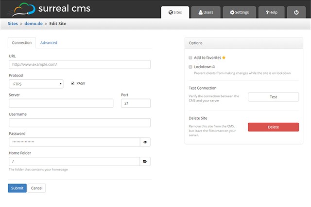
The principle of Surreal CMS is as simple as it gets: After registration, add an existing, static website by entering its FTP credentials, and choosing the folder in which the website’s files are stored.

surreal-cms_connection
Entering the FTP Access Information

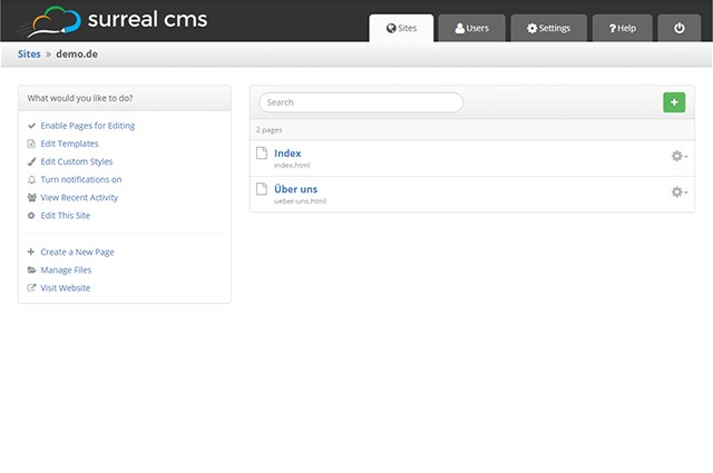
Apart from regular FTP protocol, SFTP and FTPS are supported as well. Access to Amazon S3 is also possible. This is useful for everyone that hosts on Amazon’s cloud storage. Afterwards, Surreal CMS gives you access to all files. On a list, you can choose which of the HTML documents you want to make editable.

Defining Editable Areas

To prevent that all content of an HTML document can be altered, you need to define editable areas. To do so, the class “editable” will be added to all elements that you want the user to be able to edit. In Surreal CMS’ rich text editor, you will then be able to alter these areas. For example, when making a container element like “

” editable, you can add headlines, lists, and text, as well as images.

surreal-cms_site
Managing your Website in Surreal CMS

However, you can also make block elements like “

” or “

” editable. In this case, you can only alter the elements’ contents, but you can’t add any further block elements.

In any case, the formatting of the content is adapted from your website. Thus, headlines and other content is displayed in the editor in the same way it is displayed on the website.

The class “uneditable” allows you to choose certain areas within an editable area that are not supposed to be editable. The class “editable-text” also gives you the option to restrict the editing of content to pure text. Instead of the rich text editor, a simple input field is then displayed.

Editing Content, Adding Media

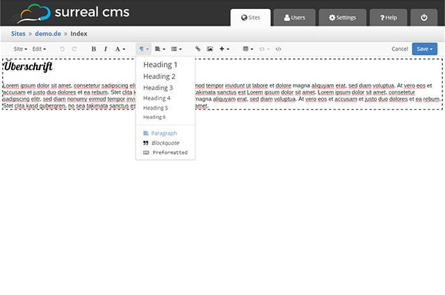
As mentioned before, an extensive rich text editor that can be used to edit text in a similar fashion to other content management systems, is available. Headlines, lists, charts, as well as bold and italic formattings are supported.

surreal-cms_rte
Rich Text Editor

Of course, you can also add links and images. Surreal CMS provides file management, which you can use to upload images, documents, and other media, like videos, and implement them into the website. While doing that, you can set a default folder, in which e.g. all images will be stored automatically.

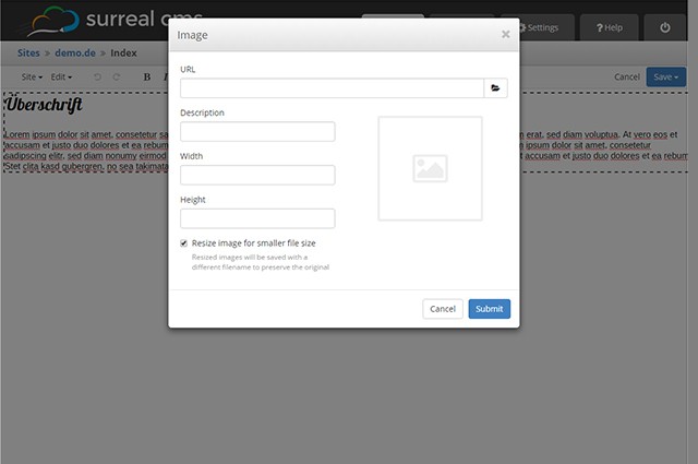
On integrating images into a website, you can scale them freely. Surreal CMS will create accordingly scaled files. The class “editable gallery” enables you to define an area for an image gallery. Here, you add as many images as you want to, which will open a full-size image when clicked. The size of the thumbnails is defined by additional data attributes.

surreal-cms_image
Simple Upload and Integration of Images

The whole thing also works in combination with popular JavaScript galleries such as Lightbox or Fancybox.

HTML5 videos are also supported. Here, choose up to two different formats and a preview image. Surreal CMS takes care of the markup of the respective source code.

Creating Templates

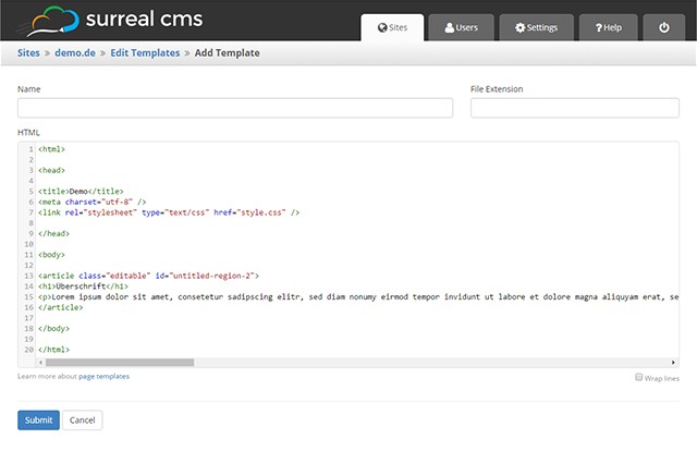
Like every proper content management system, Surreal CMS doesn’t only offer the editing of existing sites, but also the creation of new ones. To transfer existing layouts to new sites, you create templates.

surreal-cms_templates
Template Creation

These are not just simple HTML documents in which the website’s layout is defined plus editable areas. You can save multiple templates and choose one of them for each new site.

When templates are changed afterwards, this doesn’t affect the websites on which these templates have already been applied to. That’s because Surreal CMS generates static HTML documents on the base of the template, which will exist independently from the template after its creation.

Including Files

In contrast to other content management systems, Surreal CMS doesn’t create a menu automatically. However, when your server, or provider supports PHP, you can integrate fixed content such as navigation, header, and footer via PHP or SSI.

Having your HTML files run through the PHP parser – can be set via “.htaccess” -, you can easily integrate PHP files via “include()”. This eases the handling of templates, as you only need to define the PHP inclusions, and the design is identical on all sites, even when altering the included files later on.

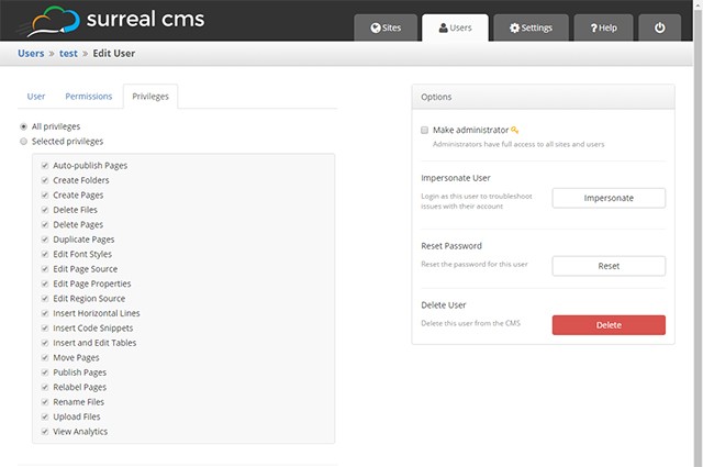
User and Right Management

Creating users and distributing rights is just as easy as the editing of content. To create a user, assign a name and an email address. After that, choose a website and determine the pages the user will gain access to.

surreal-cms_user
User and Right Management

You can also choose which rights a user will receive, for each user separately. There’s a list on which you decide whether a user may create pages, edit or delete them, and whether pages made by him will be published or not.

You can also allow or ban the uploading of files as well as the integration of source code. When you created users and distributed all rights, Surreal CMS automatically sends them a welcome mail with the access information.

You can choose the content of the welcome mail yourself, using a template. This allows you to send a tailored mail with the access information to your customers, for example.

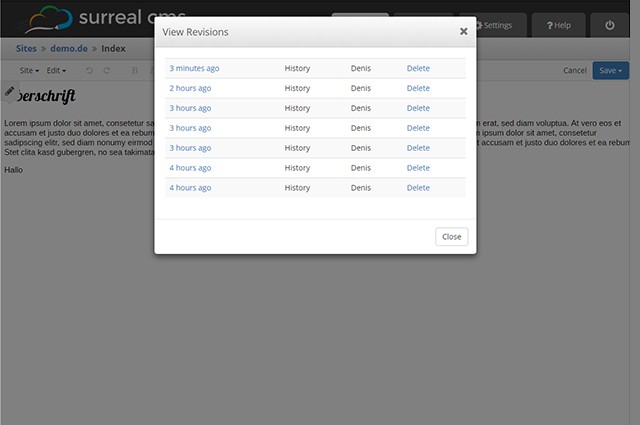
surreal-cms_revisions
Simple Recovery Thanks to Revisions

Surreal CMS sets up server-side revisions of altered content. This way, you can quickly recover original content.

Custom Branding and Costs

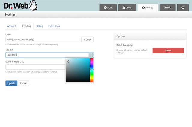
Surreal CMS is mainly targeted to web designers and developers that want to offer a simple CMS to their customers. Thus, you can customize the appearance of the backend. Replace the logo with your own, or change the backend’s color. You could even place your own support area.

surreal-cms_branding
Custom Branding is Possible

As Surreal CMS runs via the domain “edit-content.com”, it will not be evident that a third-party system is being used. This allows you to adjust everything to fit you and your company, improving customer retention.

A two-weeks trial access is provided, allowing you to test Surreal CMS. After that, you’ll need to pay 10 dollars a month for up to five websites to manage. In total, there are seven plans. For 100 dollars a month, an unlimited amount of web projects is available.

Conclusion

Surreal CMS connects the advantages of classic content management systems with the advantages of static websites. You are entirely free when it comes to design and technology. You are not limited by any restrictions that come with other CM systems, and you also don’t need to deal with template creation in WordPress, or TYPO3’s Typoscript configuration.

But the two biggest advantages of Surreal CMS are, for one, that you can easily add a content management system to a static website. This is done quickly and in a totally uncomplicated way. Especially for existing websites that you are supposed to make editable on customer request, Surreal CMS is something you should definitely give a go.

The second advantage is, that the website also runs without Surreal CMS. If you ever decide to forgo Surreal CMS, your website will keep running as usual. This doesn’t work with other content management systems or homepage building kits.

Talking about homepage building kits: Surreal CMS is not directed to ambitioned amateurs that don’t have a budget for the outsourcing of their website designs. Surreal CMS is clearly directed towards designers that want or need to dynamize their customer’s websites.

(dpe)

Categories: Others Tags: