Archive

Archive for May, 2016

Essential design trends, May 2016

May 30th, 2016 No comments

Nothing catches your attention like a high-drama design. Big images, unusual use of common elements or whitespace and adventure-based gameplay are different ways to introduce users to a project. Each of these techniques has an over-the-top feel that makes a strong first impression and encourages user interaction.

Here’s what’s trending in design this month:

1) One big photo

While collage style websites with plenty of photos or video headers are popular options, one big photo is making a comeback in homepage design. Characterized by one striking image without a lot of other effects, one large photo can carry a lot of weight and introduce users to the site content.

But the photo has to be of the highest quality and very interesting to entice users to keep clicking.

This can be a tough formula to solve.

Here are a few solutions:

  • Start with a defining photo. It needs to be interesting and somewhat different. (Avoid the hand holding a phone images for app launches or a person on a solid color background shots.)
  • Crop it tight.
  • Edit and play with color settings. Go for something a little more extreme, such as black and white.
  • Showcase your product or brand.
  • Keep other elements to a minimum. Consider only using a brand identifier, such as a logo, and short headline.
  • Move navigation out of the way.
  • Provide a clue for users so they know what action to take next, such as the arrow encouraging a scroll.
  • Make a dramatic photograph with the help of lighting, interesting backgrounds or stellar environments. (A professional photographer is likely required for this one.)
  • Play up the drama with typography is that oversized, undersized or uses a novelty typeface. But only use one of these techniques.

2) Sidebar navigation

While the most common placement for navigational elements is along the top of a website, that’s not a requirement. As long as it is clear to users as to how to use a site, navigation can live in a number of different places.

Sidebar-style navigation, often on the left side of the screen, is one such popular option.

This is a trend that’s come on quite quickly and is on a number of sites. From thin, almost not there styles to wider, almost oversized navigational elements in a sidebar arrangement, this placement makes a lot of sense because users read from left to right. So, left-hand navigation elements could be the first thing users actually read on the screen after they glance at the main headline or other large copy.

The trend stems from mobile navigation styles and is a logical step for desktop websites as well. For a while, we’ve experienced pop-out navigation from the side on small-screen devices. Seeking out navigation from the side has become a pretty commonly accepted user pattern for this reason.

As part of a broader picture, we are likely to see even more techniques that were mobile-based solutions make their way to screens of all sizes. Extending a small screen solution to all devices can save time and provide greater consistency in the look of a project. It’s also part of the mobile-first design strategy.

When it comes to sidebar navigation on larger screens, there are a few specific elements to consider.

  • Navigation needs to be somewhat obvious to users, which is why many sites still use the hamburger icon as a notation.
  • Navigation can pop-out from the left or right, but it can also be a distinct design element with a static placement.
  • Sidebar navigation can be part of the overall design rather than an aside to it. Note how the Quecha website integrates sidebar style navigation elements into the overall design.
  • Provide plenty of space so that navigational elements are clear and easy to read. Users should know what these words or icons are and that they are a path to getting around the website.
  • Be cautious of changing navigational styles between pages, unless you go back to a more standard top of the screen option on interior pages.

3) Interactive adventure

Designers are taking video, animation and storytelling to the next level with fun websites that take users on an interactive adventure. These story-based websites are for brands and businesses of all kinds, as well as for sites that are simply informative.

Each interactive adventure site tends to look quite different and can use any number of techniques to engage users. The common thread is a storyline where the user controls the action on the screen. This works with clicks, typing in commands and scrolling to engage the user in the story and help determine outcomes.

This interactive story type of website design is good for users and good for you. A good story can keep users on your site longer and clicking through links, engaging with content. This will help you establish a better connection with your audience.

Users like interactive stories because they can be fun and interesting. The trick is keeping the story short enough that a user can play and complete the game in a sitting. If they have to turn away, you might lose them.

Also consider the outcome of the interactive experience. What happens at the end of the interaction? Is it only related to the game? Or are you highlighting a product or service that users will want to come back to? If the answer is the latter, make sure to include a bypass option for users who have already played (or don’t want to play) the game but still want access to the content.

Conclusion

The theme in trending design this month is big drama. It takes great art, a good story and plenty of planning to pull off one of these techniques because they are so singularly focused on grabbing users with a quick impression. Is it a style that you would consider?

What trends are you loving (or hating) right now? I’d love to see some of the websites that you are fascinated with. Drop me a link on Twitter; I’d love to hear from you.

UX Flowchart Cards for Website Structure Planning – Only $24!

Source

Categories: Designing, Others Tags:

Smart Responsive Design Patterns, Or When Off-Canvas Isn’t Good Enough

May 30th, 2016 No comments

Design patterns often have a bad reputation. They are often considered to be quick, lazy, off-the-shelf solutions that are applied blindly without consideration of the context of a problem. Solutions such as the almighty off-canvas navigation, the floating label pattern or carousels for featured products are some of the prominent ones.

Smart Responsive Design Patterns, Or When Off-Canvas Isn't Good Enough

This article isn’t about these patterns, though. This article features some of the slightly more obscure design patterns, such as responsive car-builder interfaces, mega dropdown navigation, content grids, maps and charts, as well as responsive art direction. Please note that this article isn’t technical; it explores interesting UX patterns out in the wild, rather than code samples. Beware: You will not be able to unsee what you are about to see, and that’s probably a good thing.

The post Smart Responsive Design Patterns, Or When Off-Canvas Isn’t Good Enough appeared first on Smashing Magazine.

Categories: Others Tags:

How to Avoid These Ten Creativity Killers

May 29th, 2016 No comments
How to Avoid These Ten Creativity Killers

Sometimes, we all feel paralyzed. It can happen out of the blue. A few moments ago you were flooded with ideas, and the day wasn’t long enough to realize them all. But then, without a warning, nothing worked anymore. However, sometimes, it’s a silent process, enclosing you slowly but surely. Then, it becomes incredibly difficult to think of something useful and to be creative and productive. Don’t worry; there are ways to keep creativity killers under control. Read on; I’ll show you some today.

1 – The Monotony

We are the sum of our experiences. In many situations, the way we think about things determines what kind of life we live. But exactly this way of thinking causes problems easily, as many people live in a total work monotony. They always sit in the same place, and always execute the same tasks. This can easily wear you down.

Bring Variety to Your Life

Fueling creativity and positive thoughts are pretty simple when the following things are possible: Just do things that you usually never do. Search for a different room to work in. Check the chances of working in an entirely different place. Brian Gardner, the creator of the Genesis framework, for example, visits the closest Starbucks to work in.

You could also go and work in a library. Or visit a café during your breaks and let your mind relax. Lay down on a meadow and spread your limbs. Anything works, as long as it’s different from the routine.

2 – Self-Doubt

You have a very good idea but think you can’t realize it? Because your idea is out of your league? Maybe you’d want to let someone else try their luck then? This is exactly what you shouldn’t do, as it’s not beneficial for your life.

Our life is what our thoughts make it
Marc Aurel

Always believe that you can do it

How to Avoid These Ten Creativity Killers

Give your idea a chance, and try your best to realize it. You’ll grow with your tasks. At first, everything might seem overwhelming, but the longer you deal with your idea, the more possible it will appear. Don’t let it bring you down, and, above all: don’t make yourself smaller than you are, as then, you’ll only limit yourself.

Make your ideas come to life. The more challenges you have to deal with, the more you will grow as a person, the more creativity you’ll receive. In addition to that, you’ll gain new abilities and learn new techniques. So, never doubt yourself and give your ideas a chance. Of course, you’ll run into hazards, but overcoming them will only make you more creative.

3 – The Fear of Failure

What happens when you can develop a lot of ideas, but still carry the fears of failing and not making enough profit? When the fear of making mistakes paralyzes you and prevents you from thinking clearly? The fear of failing and making mistakes is one of the biggest creativity killers. Relax, this monster can be defeated.

Face this monster and you will be gifted with short- and long-term creativity. Of course, it can be tough to have your work exposed to the controls of other people. However, failing in front of an audience is tougher.

How to Avoid These Ten Creativity Killers

Face Your Fear and Get to Work

The more you tell yourself that you can’t do it, the faster you’ll actually become unable to do it. It’s the self-fulfilling prophecy. Not trying something means that you’ll never learn, and never be better at what you’re doing. This significantly harms the creativity. So, even when you think you can’t do it, you should still do it. What’s the worst thing that can happen? It would be the experience that you can’t realize your idea yet. But at least you tried. And that’s exactly what will give you a good feeling.

Don’t be scared of mistakes. Failure and mistakes are a part of life. We grow through our mistakes and learn from them. The more mistakes we make, the more we learn. People that don’t make mistakes don’t work, and don’t learn. The more mistakes you make in your life, and in your job, the more you’ll learn and grow. However, you shouldn’t make the same mistakes multiple times but learn from them instead. Then, every mistake is a success.

4 – Don’t Make Excuses

Does this seem familiar? You want to do, achieve, or realize something. But you lack the necessary background knowledge, the right technology for the successful execution? Or are you not positive to be able to master a large project? Stop!

How to Avoid These Ten Creativity Killers

Always Search for Solutions

Never find excuses for why you can’t do something. These excuses slow you down, take your creativity, and make you smaller than you are. A lot smaller than you’d have to be.

Never look for reasons why you can’t do something. Always think about how you can do it anyway.

Think this way: I can do it because I have a free hour every morning. I can do it because I can read tutorials that teach me the missing abilities. I can do it because I know someone to realize the project with. Always ask the right questions and you’ll receive the right answers.

5 – Don’t Keep Your Ideas Secret

Hiding ideas and not sharing them with anybody might be a way of protecting your valuable thoughts. However, it also hurts your ideas and creativity, as it is locked away as well.

Share Your Ideas

How to Avoid These Ten Creativity Killers

Share your ideas with others. Share them with creative people and sometimes, share them with “normal” people. This can have the advantage that you can add something to your idea that got overlooked so far. Sharing creativity and ideas with others often results in the improvement of the idea, and a constant stream of new ideas and creativity.

Even when the people you share your idea with don’t have anything to add, you’ll rethink your idea over and over again, and maybe, you’ll be able to perfect it. In any case, this way of thinking will help you develop new creativity in the long run.

6 – The Apathy

Many people work in jobs and branches that they don’t care about. Then, the job is only the tool for the purpose of earning money to pay the bills. This makes it twice as hard to be creative. It is much easier to find a gift for a loved person than for someone you don’t care about.

Love What You Do

How to Avoid These Ten Creativity Killers

When you’re interested in something, you’ll always put in all of your passion. You’ll always try to be the best you can be. You’ll feel happy, and spend more time searching for the solutions to the challenges that you’re faced with. However, this also works in the opposite direction. If you don’t care for something and don’t feel like doing it, you won’t feel motivated, and you won’t really be creative either.

Thus: love your job! Love what you do. If you don’t, think about what you can change to make you love it. There are always more solutions than you think. For example, you could start a competition with yourself. Get your work done faster and faster. Just act like you love it. This alone can often work wonders, and helps me a lot in some situations. Do it, and you’ll feel your creativity flowing.

7 – Your Ego

The ego is a nice thing. Everyone should have a strong one. Too much of it isn’t really helpful either, tough. Of course, it’s good for you when you are an amazing person. But be careful not to become cocky. Being cocky also means that you’ll stop thinking about how to do things differently, and how to improve them.

Don’t become cocky

High spirits are a mental limitation as well. If you consider all your ideas to be perfect, you don’t leave yourself any room for improvement. On top of that, you lose the opportunity to gain new abilities and develop new ideas. This will make your creativity stagnate, without you feeling it, and without you being able to change it. Better stay modest, and tell yourself that you’re never as good as you could be. This way of thinking will give your creativity a significant boost. Always try to improve.

This way of thinking and working will quickly be noticed by people that are actually better than you are at the moment. Maybe they’ll become your mentor, from who you can learn a lot. Never be 100 percent satisfied with yourself, always seek to improve. Then, you’ll reach areas that you didn’t think you could reach before.

8 – The Lack of Focus

Losing the focus on what you want to achieve makes being creative very difficult. If you don’t know where you want to go, you won’t get there. Having no limits, no rules, and no goals might sound like total freedom. But your mind can’t work properly without explicit restrictions.

Stay on Track and Don’t Lose Focus

How to Avoid These Ten Creativity Killers

Set clear goals for your project. Setting deadlines is a warranty for the work you need to get done. A well-calculated pressure is the basis for well-done work. Break your project into smaller parts, set daily goals and deadlines. Make sure that they’re realistic, however, as wanting to do too much in too little time would be harmful.

Every project should be well planned from the start. A final goal should be set, possible goals for each day are very helpful. Realistic scheduling is optimal not to lose focus. If you do it this way, there’s close to no way you’ll lose your focus.

Have you ever thought about long-term goal setting? Where do you see yourself in a year, where do you want to be in ten years? The majority of people doesn’t set goals at all. That’s why it’s not surprising that they don’t reach what they’re dreaming of. By the way: most people overestimate what they can do in a year, and underestimate what they can achieve in ten years. My advice: set goals for yourself.

9 – The Lack of Experience

If you let too much time go by without being creative, it will be difficult for your mind to come up with creativity all of a sudden. You won’t get going as easily. If you can’t become creative during your job or in your private life, make it possible.

Train Your Creative Muscle

How to Avoid These Ten Creativity Killers

Creativity can be compared to a muscle. If you stop working out, your body will go limp, and your muscles recede. The same thing applies to your creativity. Thus, make room for half an hour every day, and try to get new ideas. Train your creative muscle, exercise daily. The more often you do that, the more ideas you’ll get, and the faster they’ll come to you.

Go through the world with open eyes. Look around you. Every time you or someone else has a problem, you could try and solve it. You could take an analytic or humorous approach. Either way, it’s creative thinking that trains your “creative muscle”. Creativity can not be used up. The more you use, the more you’ll receive.

10 – Negative People

Some people don’t really help your creativity. That does not mean they are bad people. But if they aren’t creative, they don’t think the way you do. Maybe they will only see the negative sides of an idea and make no bones about it. They don’t understand your ideas, and perhaps, they are jealous of your creativity.

Surround Yourself With Positivity

How to Avoid These Ten Creativity Killers

Don’t spend too much time with people that talk down on your ideas. Most likely, they don’t do it on purpose; maybe they even want to bring you “back on track”. Nonetheless, these people harm you if you spend too much time with them, as, without noticing, you’ll adapt their point of view, and your creativity will die at the same time.

Avoid negativity, and only surround yourself with positive people. You can share ideas with them, and, in return, receive valuable input. This pushes your creative side. They’ll help you reach your goals. You should always accept constructive criticism, as it helps your creativity, and shows you what you haven’t considered yet, and what you might’ve looked at from the wrong perspective until then.

Conclusion

There are various ways to fight creative paralysis and to get more output out of yourself. However, you should always keep the ten factors mentioned above in mind. Don’t lose your focus, don’t think small, and be brave. Remember: In the end, all will be good. If it’s not good yet, it’s not the end 😉

(dpe)

Categories: Others Tags:

Popular design news of the week: May 23, 2016 – May 29, 2016

May 29th, 2016 No comments

Every week users submit a lot of interesting stuff on our sister site Webdesigner News, highlighting great content from around the web that can be of interest to web designers.

The best way to keep track of all the great stories and news being posted is simply to check out the Webdesigner News site, however, in case you missed some here’s a quick and useful compilation of the most popular designer news that we curated from the past week.

Note that this is only a very small selection of the links that were posted, so don’t miss out and subscribe to our newsletter and follow the site daily for all the news.

24 Clever 404 Error Page Designs

Walt Disney’s 16 Unconventional Rules for Winning Clients

Simple CSS Agree Button

3 Secrets Behind the Best Websites in the World

It’s Time to Bring Some Creativity Back to Web Design

Picking a Color for your Brand

Site Design: Pleasure to Burn

What to A/B Test When Building your Website

Google Aims to Kill Passwords by the End of this Year

The Start-to-Finish Designer

Let’s Reverse Engineer the Instagram Design Brief

The 100 Best Free Fonts for Designers

Tachyon: Design New UI Components Without Writing CSS

Bideo.js – Easy Background Videos in HTML5

How UX Designers Think and Work

Never Use Papyrus (AKA the New Comic Sans), Plus Alternatives

Infographic: Star Wars, a New Hope

New French Law Makes it Illegal to Email Employees After Work Hours

Why We Need the Humanities in Tech

OnTheGrid — Designer Curated City Guides

Stop Trying to Be Somebody

The Principles of UX Choreography

Building a Visual Language

Facebook Begins Tracking Non-users Around the Internet

Solving a Century-Old Typographical Mystery

Want more? No problem! Keep track of top design news from around the web with Webdesigner News.

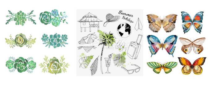
LAST DAY: Watercolor Flowers Bundle of 400+ Elements – only $24!

Source

Categories: Designing, Others Tags:

Comics of the week #341

May 28th, 2016 No comments

Every week we feature a set of comics created exclusively for WDD.

The content revolves around web design, blogging and funny situations that we encounter in our daily lives as designers.

These great cartoons are created by Jerry King, an award-winning cartoonist who’s one of the most published, prolific and versatile cartoonists in the world today.

So for a few moments, take a break from your daily routine, have a laugh and enjoy these funny cartoons.

Feel free to leave your comments and suggestions below as well as any related stories of your own…

Back end

Website redesign

Not strong enough

Can you relate to these situations? Please share your funny stories and comments below…

5 Beautiful Hand-Drawn Fonts From Decavantona – only $12!

Source

Categories: Designing, Others Tags:

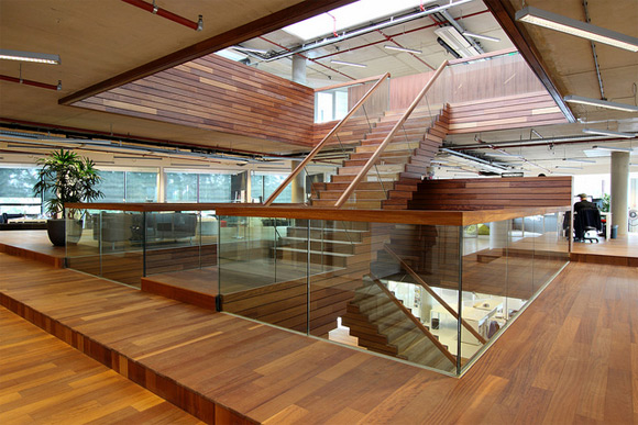
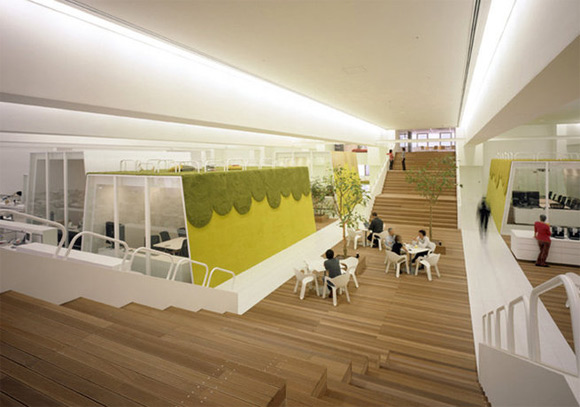
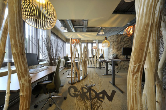
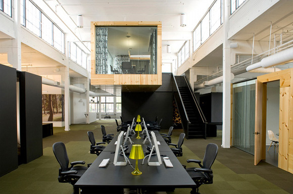
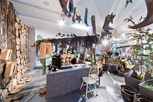
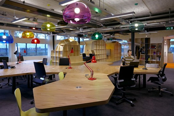
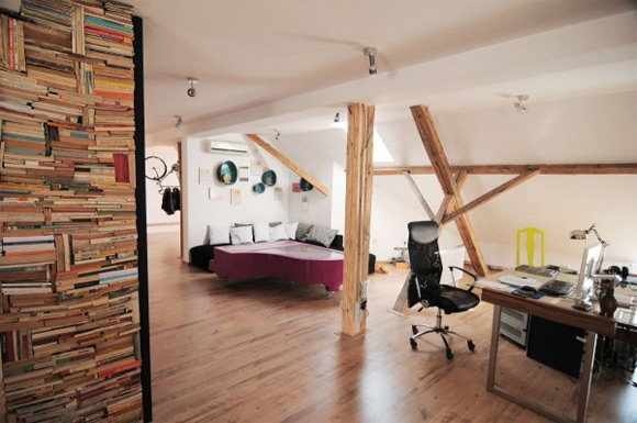
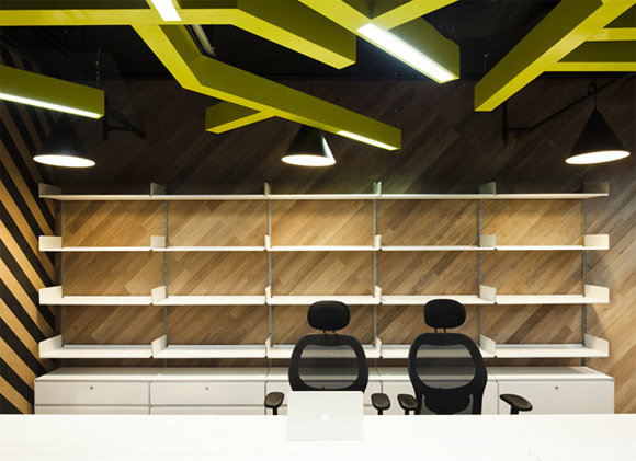
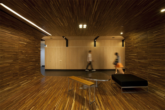
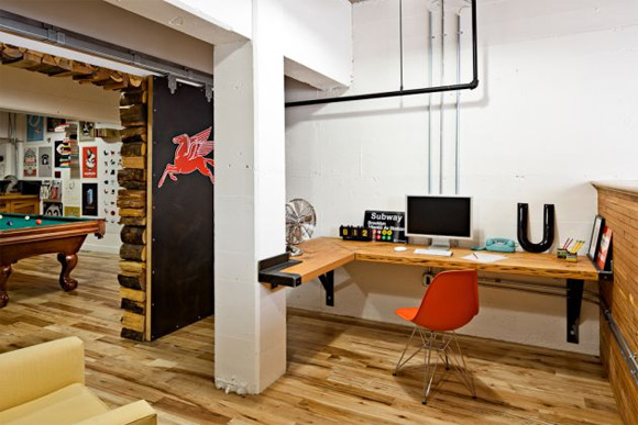
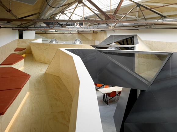
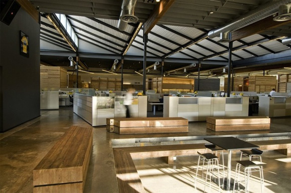
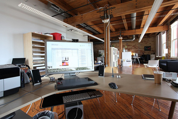
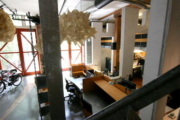
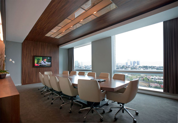
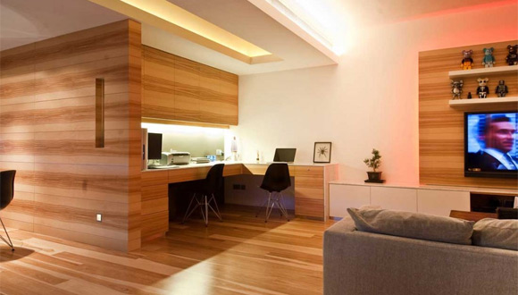
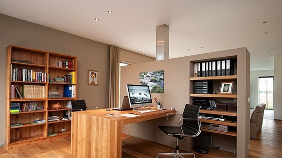
30 Creative Wooden Workspace Interior Designs

May 27th, 2016 No comments
03_wooden_office_interior_design
An organized and clean workspace is one of the vital factors in any sort of work. While working as creative professionals, we spend most of the time in offices – doesn’t matter if it’s a home office or corporate one, we should take into consideration and make them as useful and nice as possible. In my opinion, an office should be a nice and cozy place to work, if otherwise we could not manage to do our best. The most important factor in making an office a cool place to work is interior design.

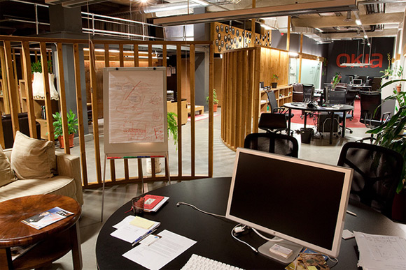
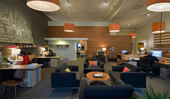
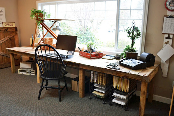
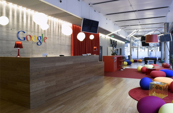
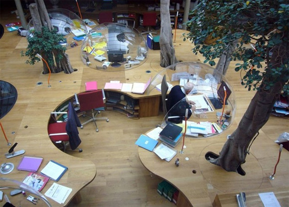
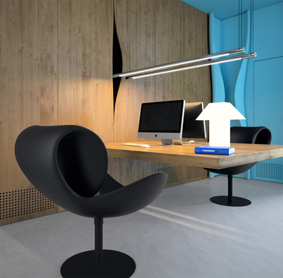
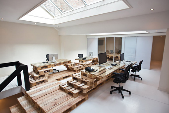
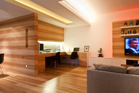
In this post, I would like to show you some nicely designed offices with wooden accents that add a nature look and feel to the workplace. Look through these and find something for your home or company’s office.

Horizon Media

Big-Giant

Big-Giant

OKIA

OKIA

Downstairs office

Downstairs office

Google Office In Zurich

Google Office In Zurich

The stairwell at TBWA Amsterdam office

The stairwell at TBWA Amsterdam office

22squared Inc.

22squared Inc.

Hakuhodo Office

Hakuhodo Office

Unilever Switzerland Office

Unilever Switzerland Office

North Advertising

North Advertising

Grand Gift

Grand Gift

Sprikk Office

Sprikk Office

X3 Office

X3 Office

Saatchi & Saatchi

Saatchi & Saatchi

Pons and Huot

Pons and Huot

Azure Office

Azure Office

BrandBase

BrandBase

Wood home office

Wood home office

Dtac Headquarters

Dtac Headquarters

Headvertising

Headvertising

Seamen’s Church Institute

Seamen's Church Institute

Parliament’s Office

Parliament's Office

Red Bull’s Headquarters

Red Bull's Headquarters

CouponCabin’s Office

CouponCabin's Office

Lance Armstrong Foundation Office

Lance Armstrong Foundation Office

NoPattern Studio

NoPattern Studio

David Baker Architecture Headquarters

David Baker Architecture Headquarters

ACBC Office

ACBC Office

Minimalist Wood Home Office Design

Minimalist Wood Home Office Design

Earth Tones and Built-Ins: An Open and Integrated Home Office

Earth Tones and Built-Ins: An Open and Integrated Home Office

Read More at 30 Creative Wooden Workspace Interior Designs

Categories: Designing, Others Tags:

Tips for Incorporating Vectors Into Your Work

May 27th, 2016 No comments
stock-illustration-90936057-young-hipster-woman-with-surprised-expression

When it seems like photography just isn’t the right medium for what you’re working on, don’t forget about the creative power of illustrations. There’s an army of digital artists out there, creating new, completely original graphics every single day, and it’s about time you considered incorporating them into your work. In the hands of a talented and capable artist, the right combination of lines, curves, and color can evoke any feeling or emotion you wish. Take a look at what makes vector drawings such an effective element in visual content creation:

Powerful Simplicity

Never underestimate the power of a single, black line. Masterfully rendered contour drawings can say as much or more as the most detailed, colorful composition. What area of your brand or business might benefit from fewer words and an extra image or two? If visuals seem superfluous (hint: they’re not), don’t be afraid to start small and simple.

Attractive Accents

Accents make for another nice introduction to vectors and illustration. The right image can work wonders in helping a brand stand out, whether it’s applied to a logo, favicon, menu bar, or perhaps as an indicator of serialized content. With so many different options to choose from, there’s bound to be the perfect fit for any field or audience.

Screen Shot 2016-05-18 at 10.29.10 AM

Abstract Concepts

Vectors also offer a great way to express abstract ideas that might escape traditional photography. Certain concepts in modern technology – like cloud computing, for instance – are especially limiting in image choice. Photos of cirrus formations or fluffy white puffs against blue skies might make the connection for most, but a skillful illustration is bound to convey much more.

Screen Shot 2016-05-18 at 10.24.18 AM

Creative Alternatives

Finally, vectors and illustrations simply provide a fresh, different approach to visuals – one that is inherently attention-grabbing. Take aerial view still-lives. They’ve been everywhere lately, accompanying blog posts, appearing on landing pages, and littering social media feeds. It’s a great look, but when we start to see it everywhere, things tend to blend together – or worse, get ignored completely. A vector counterpart makes way for something new, yet familiar. Give it a try.

Man planning vacation trip with map. Top view. Outfit of modern traveler. Objects on wooden background.

Man, planning vacation trip with a map. Top view. Outfit of the modern traveler. Objects on wooden background.

CTA: Explore our collection of creative vector illustrations at

These tips we brought to you by iStock.com, the web’s original resource for crowdsourced royalty-free stock images, media, and design elements, offering millions of hand-picked photos, illustrations, videos and audio tracks. View their collection at istockphoto.com

Read More at Tips for Incorporating Vectors Into Your Work

Categories: Designing, Others Tags:

Using the Pen Tool in Adobe XD

May 27th, 2016 No comments
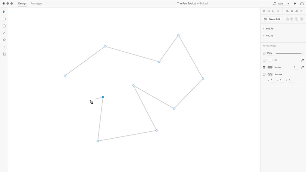
pen-tool-adobe-xd-1

In this tutorial, we’re going to learn how to use the Pen Tool in Adobe Experience Design CC (Adobe XD).

Drawing Straight Lines in Adobe XD

1. Create a new document.

2. Select the Pen Tool.

3. Left-click to create an anchor point on your artboard.

4. Left-click anywhere else on the artboard to create a second anchor point, and a straight line will be drawn between these two points.

5. You can add as many anchor points as you like, and can complete your shape by left-clicking on the first anchor point that you created back in Step 3.

6. With your shape selected and in the Property Inspector on the right, you can adjust the colour of your fill and border, as well as the border width.

7. Borders and fills can be toggled on/off by using the tick boxes alongside each option respectively.

8. You can double-click a straight anchor point using the Select Tool, to convert the lines either side into curves.

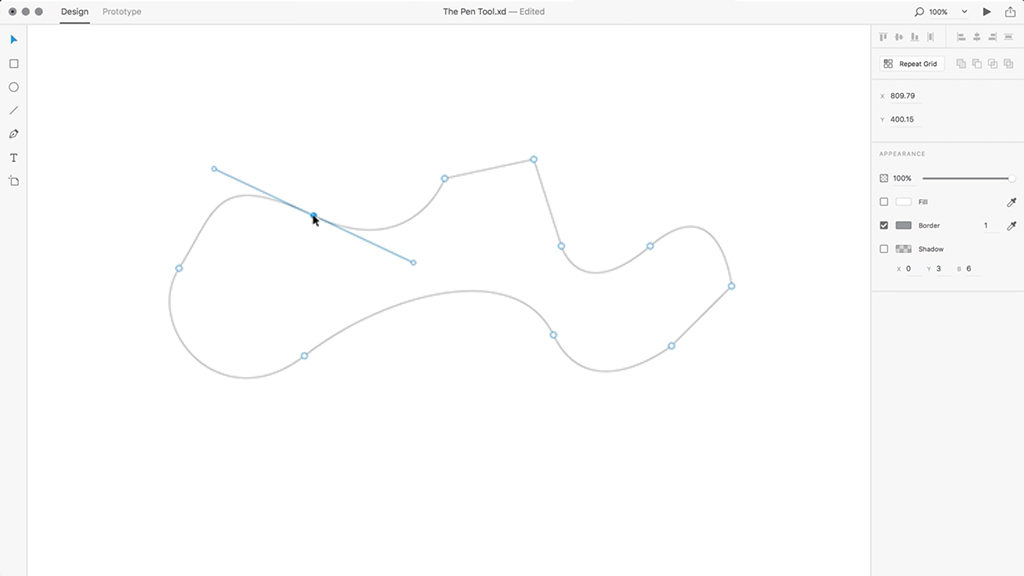
Drawing Curved Lines in Adobe XD

pen-tool-adobe-xd-2

1. Create a new document.

2. Select the Pen Tool.

3. Left-click to create an anchor point on your artboard.

4. Left-click and hold anywhere else on the artboard to create a second anchor point. However, before releasing your mouse button, drag in any direction to adjust the curve between these two anchor points.

5. When placing your next anchor point, Adobe XD will automatically assist when adjusting the curvature, to help your lines flow smoothly into one another.

6. You can use a combination of straight and curved lines together, depending on whether you click and drag in a direction, whilst holding the Left Mouse Button in Step 4.

7. Using the Select Tool, you can double-click your shape, and then select an anchor point. With the anchor point selected, adjustment handles will appear on either side, that allow you to adjust the lines’ curvature. Holding down the Alt key whilst making this adjustment, allows you adjust each line individually.

8. You can double-click a curved anchor point using the Select Tool to convert the lines either side into straight lines.

Download Adobe Experience Design CC (Adobe XD).

Read More at Using the Pen Tool in Adobe XD

Categories: Designing, Others Tags:

Everything OK: Is Your Website Valid, Accessible, and Fast?

May 27th, 2016 No comments
everything-okay-teaser_EN

Web development is becoming more and more sophisticated. Aside from the correct markup of HTML and CSS, there are plenty of factors that don’t necessarily affect the look of a website, yet they can still influence a website’s success. This includes a barrier-free display of the content, as well as other components. Having all of this covered is difficult. That’s why there are many tools that help you get to the rating “everything OK”.

Classic Validators for HTML and CSS

First, you should make sure that your HTML and CSS source code is flawless. Here, the W3C offers a validator, which searches your HTML source code for errors, and displays alerts as well as suggestions for improvement. Aside from sticking to the syntax, there are other factors that you need to keep in mind when it comes to HTML or HTML5, respectively.

validator_w3c_html
W3C Validator for HTML

Semantics play a big role especially when it comes to HTML5. Therefore, you should make sure that your website sticks to HTML5’s semantic rules. This includes proper placement of captions. Every “

” element should contain a caption. Multiple “

” captions should be avoided. The W3C validator makes you aware of these things.

For CSS, there’s the respective validator, which makes you aware of markup errors in your stylesheets as well. Unfortunately, this one interprets vendor prefixes as errors, which is why an actually valid CSS source text practically is not sensible.

Check Accessibility

The aspect of accessibility is becoming increasingly more important. This poses a significant challenge to web designers and developers. For visually impaired people, a website has to meet specific conditions for it to be readable by screenreaders. This includes that content that can easily be detected is marked so that screenreaders can easily interpret navigation elements or border areas of a website.

validator_codesniffer

The HTML_CodeSniffers tells you the state of your website’s accessibility

The HTML_CodeSniffer helps you find critical elements in your source code and checks in how far they are not barrier-free. While doing so, the tool keeps several standards in mind, which require different degrees of accessibility.

Safe Websites Preferred

The safety aspect is also increasingly important in web development. For instance, Google has already started to rate websites with SSL encryption better in the search results. Especially when personal information is transferred, which is mainly the case in social networks, and online shops, you should make sure that it is encrypted.

validator_ssl-report
The SSL Report Informs You About How Safe Your Website is

The SSL report by Qualys SSL Labs gives you a quick overview on if your website is encrypted via SSL, and which other factors can pose a potential safety risk.

The website securityheaders.io tells you how so-called security headers are placed. Especially in combination with HTTPS, additional security gates can be erected, like making sure that a safe connection to a domain is kept stable, and is not accidentally switched to an unsafe connection. We’ve already presented Securityheaders.io in a more detailed review.

Speed is Important as Well

Despite the broadband expansion, you should always make sure that your website is loaded quickly even under less than optimal conditions. Especially when it comes to the mobile web, it is important to keep the transferred data as slim as possible, due to lower broadbands, and capped data volumes.

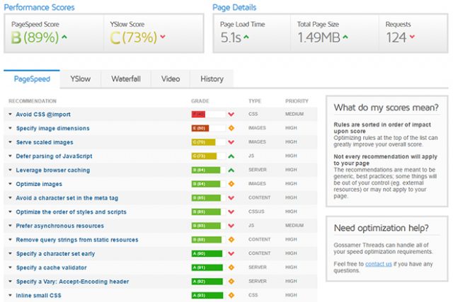
The Google PageSpeed Insights help you find out where optimizations of your website’s loading speed can be made. For example, the service tells you if the image’s file size can be reduced via improved compression, and if your JavaScript and CSS files block the page’s rendering.

validator_gtmetrix
GTmetrix Gives You Extensive Information on Your Website’s Speed

GTmetrix is an alternative to Google’s service. It works in a very similar fashion and shows you a percentage value of how fast your website is, and how much potential for optimization is given. To find out, over 25 parameters, which are relevant for speed, and can be optimized if necessary, are checked.

Testing Mobile Suitability

Last but not least, as we’re already talking about the mobile web, the question how well your website works on mobile devices is a factor as well. Google also has a special tool for this, which informs you about whether your site is “mobile-friendly” or not. The test for optimization for mobile devices gives you a short and brief information on if there’s need for optimization.

Is the web layout responsive? Are links and buttons big enough and have a sufficiently big gap between each other? Is the font readable? All of these factors are considered for the test.

validator_mobiready
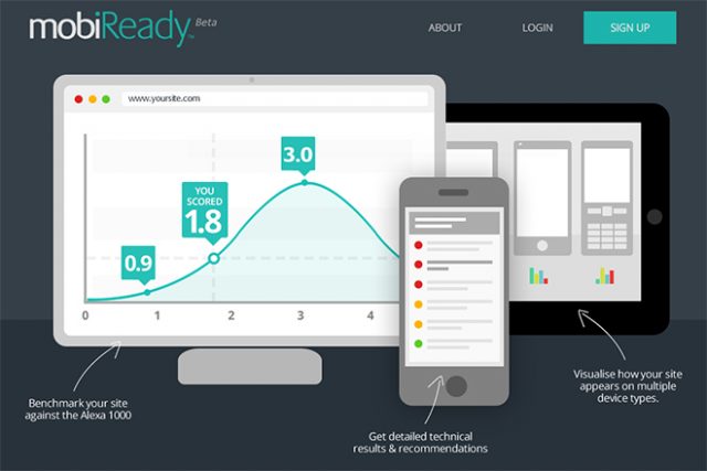
mobiReady Shows How “Mobile-friendly” Your Website is

The website mobiReady also examines your website for mobile-friendliness. Here, it is simulated in desktop view as well as on three smartphone displays. As a result, you receive a score that compares your website to the biggest 1,000 websites in the world. On top of that, you also receive a bunch of hints on where your website is lacking, and where you can improve something.

Conclusion: Everything OK!

If you want to do everything correctly, you have a lot of work to do when it comes to design and realization. Passing all tests will be difficult, if not impossible, especially for websites with a complex design or content. Nonetheless, the services presented in this article are a good starting point to find weaknesses, and to patch up, or avoid significant errors.

(dpe)

Categories: Others Tags:

inStyle (Modifying the Current Selector `&` in Sass)

May 27th, 2016 No comments

The following is a guest post by Filip Naumovic. Filip has built a Sass tool to help with an issue I know I’ve experienced many times. You’re happily nesting in Sass. You’re maybe a level or two deep, and you need to style a variation based on some parent selector. You need to either break out of the nesting and start a new nesting context, or go nuclear with @at-root. I’ll let Filip tell the story of his new tool that changes that.

Sass has helped a lot of us tremendously with cleaning up our CSS code bases. When it arrived on the scene, some extremely useful patterns emerged and got quickly adopted.

For example, the usage of & and nesting allowed for the cleaning up of otherwise rather gross code blocks.

This:

.my-app { display: block; }
.my-app .widget { border-radius: 5px; }
.my-app .widget.blue { color: blue; }
.isIE6 .my-app .widget { background-image: url('fake-borders.png'); }
@media (max-width: 768px) { .my-app .widget { float: left; } }

Turned into this:

.my-app {
  display: block;
  .widget {
    border-radius: 5px;
    &.blue {
      color: blue;
    }
    .isIE6 & {
      background-image: url("fake-borders.png");
    }
    @media (max-width: 768px) {
      float: left;
    }
  }
}

What a positive change for our sanity!

All style variations of the .widget element are clearly nested below itself, using indentation as both a visual cue for relevancy and a query generator.

The current selector (&), in this case, provides a shortcut for the most common patterns. Styling the variation of an element that is invoked either by a property of the element itself or a prepending parent state.

Nested media queries are a younger addition, but they hint that evolution towards indented syntax for styles comes almost naturally. It’s easy to read and navigate, because it somehow mirrors the familiar DOM structure and keeps all styles for an element in one place, while still producing our precious, yet sometimes complicated, selectors.

Today, nesting and current selector features are present in Less, Sass, and Stylus. With a bit of wine, one could almost call it a standard.

A classic case of “You can’t do that.”

Using the above code block as an example, let’s add styles for .my-app.expanded .widget.

Despite our mighty tools, we quickly find ourselves with limited choices:

Option 1

Using the modern @at-root directive (or / in Stylus), we leave the current scope entirely and repeat the full root query to keep the relevant new styles nested below .widget, because the current selector can’t help us express this relationship.

.my-app {
  display: block;
  .widget {
    border-radius: 5px;
    &.blue {
      color: blue;
    }
    .isIE6 & {
      background-image: url("fake-borders.png");
    }
    // repeating the root selector here
    @at-root .my-app.expanded .widget {
      color: red'
    }
    @media (max-width: 768px) {
      float: left;
    }
  }
}

This creates harder to read code with a lot of duplicity, especially when real world usage extends way over our small example piece. But, it keeps our glorious nesting paradigm intact.

Option 2

We create a new code block below .my-app and use it to change all child elements relevant to the .expanded state. This means that our .widget is now styled in different places, and this separation grows for every added state in each element in the nest.

.my-app {
  display: block;
  .widget {
    border-radius: 5px;
    &.blue {
      color: blue;
    }
    .isIE6 & {
      background-image: url("fake-borders.png");
    }
    @media (max-width: 768px) {
      float: left;
    }
  }
  &.expanded .widget
     color: red;
  }
}

While it is in direct violation of our “nesting all relevant styles” dream, it’s the imperfection we learned to live with. Many of you would probably even defend this pattern, because it has been the way things are done for quite a while.

However, for the sake of choice, wouldn’t it be great to have an Option 3? One that would allow us to express the simple change in .my-app.expanded that influences our .widget without having to escape the context?

This idea has been secretly bothering me for quite a while, if only out of some form of OCD about my own stylesheets. Alas, thanks to my fabulous open-source-encouraging employer, I’ve made it my sidequest to try and find this missing tool in the style shed.

Finding Option 3

While digging around the topic, I’ve found spider webs, eternal discussions, and wildly varying propositions, many of which suggested adding some special syntax to the current selector character &. Doing that would mean months of learning complicated core libraries and fighting the long war, which instantly felt like an unacceptable burden.

Secondly, I think & works well because it’s a clear representation of the whole context, and for that reason it might be problematic adding more features to it. It does one thing and does it well, so creating a good partner to it seemed like a better idea at this time.

For sake of easy integration, I’ve decided to implement the idea on the level of preprocessor language, so you could just @import and use it right away. Preprocessors are powerful frameworks nowadays, so why not?

My first choice was Stylus, because it’s just so awesome. Unfortunately, due to issue 1703, the current selector placeholder cannot be modified inside a mixin function as of right now. Like a good zealot I’ll wait until the end of time for Stylus to fix it, but I had to keep searching for something I could implement now.

You shall not parse the current selector, as I’ve learned, in Less, so that was out.

SassScript on the other hand proved to be a powerhouse. While it is missing many useful abstractions for manipulation with strings and arrays, it is very possible to craft such functions manually. Many of them are already provided by Sass Prince Hugo Giraudel.

After months of controlled string terror…

inStyle for Sass 3.4+ is born!

Cheesy name, I know. But it’s suggestive of the functionality, because you want this thing readable in the actual code. Mixin syntax is already familiar with preprocessor users, so having a suggestive name for describing changes in element parents sounded right to me as an added bumper against unfamiliarity.

Either way, all of it has to stay readable while handling complex cases, otherwise it loses purpose in favor of @at-root selector approaches or just nesting the code elsewhere. I decided to go with two basic mechanisms that I believe address even the most despicable needs, while keeping a logically simple parsing algorithm:

Use 1) Modification

Additions to a compound element present in the current selector proved to handle ~80% of real world code, just like our first example tries to achieve.

.my-app {
  display: block;
  .widget {
    border-radius: 5px;
    &.blue {
      color: blue;
    }
    .isIE6 & {
      background-image: url("fake-borders.png");
    }
    @include in(".my-app.expanded") {
      color: red; // .my-app.expanded .widget { };
    }
    @media (max-width: 768px) {
      float: left;
    }
  }
}

Try to read that like this:

styling .widget in the .my-app.expanded state.

The function searches the nest bottom to top for the first occurrence of .my-app element (skipping current element) and appends the class .expanded to it, returning a new selector.

What about longer queries and combo modifications?

table {
  table-layout: fixed;
  thead {
    font-weight: normal;
    tr {
      height: 30px;
      td {
        background-color: #fafafa;
        &.user {
          font-weight: bold'
        }
        @include in('table.one tr.two:hover') {
          background-image: url(rainbow.png) // table.one thead tr.two:hover td { };
        }
      }
    }
  }
}

The tr parent is found and modified with .two:hover. Going upwards, table is also found and modified with .one, other elements are skipped.

Irrelevant multi-selectors are removed from the new selector:

ul, ol {
  list-style: none;
  li {
    display: inline-block;
    a {
      text-decoration: underline;
      @include in("ol.links") {
        color: orange; // ol.links li a { };
      }
    }
  }
}

Impossible cases and invalid CSS queries produce a blocking Sass error on compilation:

table {
  table-layout: fixed;
  td {
    height: 30px;
    @include in("table^s&()#") {
      what: the; // ERROR, invalid CSS
    }
    @include in ("tr.green:hover") {
      border-color: green; // ERROR, no tr or tr.green to modify in &
    }
  }
}

While crash testing this in production (hah!), I found another very practical need that I couldn’t satisfy with modifications of the parent tree only. In fact, it solves the example above, because you have to be able to do just that with tr.green:hover. You just have to be able to say where.

Use 2) Insertion

Let’s assume the following. It’s an example of a little shorter query for some practice:

table {
  table-layout: fixed;
  thead {
    font-weight: normal;
  }
  tr {
    height: 30px;
  }
  td {
    background-color: #fafafa;
  }
}

Where would you ideally nest a table thead tr selector? By the dogma, you seemingly have to add it as follows:

table {
  table-layout: fixed;
  thead {
    font-weight: normal;
    tr {
      height: 50px;
    }
  tr {
    height: 30px;
  }
  td {
    background-color: #fafafa;
  }
}

However, the styled element in question is tr and you already have that as a generic style, so theoretically, nesting it below itself as a variant might be closer to how you think about the relationship, filling the gaps that current selector & cannot describe.

In this case, it means there has to be a simple way to insert some selector at a certain position above the current element while also allowing combinations with compound modifications. I couldn’t imagine this without adding a special character, so I went with the visually suggestive ^ caret.

table {
  table-layout: fixed;
  thead {
    font-weight: normal;
  }
  tr {
    height: 30px;
    @include in("^thead") {
      height: 50px; // table thead tr { };
    }
  }
  td {
    background-color: #fafafa;
    @include in("table.blue-skin ^tbody") {
      background-color: blue; // table.blue-skin tbody td { };
    }
  }
}

In this case, the caret is inserting thead one level above current or last modified element. More carets mean higher jumps in the current selector:

main {
  display: flex;
  > div {
    flex-grow: 1;
    span {
      display: inline-block;
      &.highlight {
        outline-style: dashed;
        @include in("^^.section.active") {
          outline-style: solid; // main .section.active > div span.highlight { };
        }
        @include in("^^^.section") {
          some: thing; // ERROR, inserting too high, it would equal to ".section &"
        }
      }
    }
  }
}

Note: &.highlight is the same element as span, so the insertion treats it as one step in the nest

I think inStyle shines in the simplest cases, which are also by far the most common. But things can get more complex if needed.

Use 3) Advanced combinations

The matching algorithm allows you to go even wilder with inserting in or modifying more compounds at once:

.my-app {
  display: flex;
  section {
    flex: 1;    
    header {
      width: 100%;
      @include in("^^.wrapper ^.dialog)") {
        height: 50px; // .my-app .wrapper section .dialog header { };
      }
      @include in("^.overlay ^.sidebar") {
        position: fixed; // .my-app section .overlay .sidebar header { };
      }
      @include in("^.modifier section.next ^.parent") {
        opacity: 0; // .my-app .modifier section.next .parent header { };
      }
    }
  }
}
  1. .dialog is inserted one level above header and .wrapper is inserted two levels.
  2. .sidebar is inserted above header and .overlay directly above it.
  3. Pushes .parent above header, modifies section with .next and then pushes .modifier above it.

This reminds me, perhaps you have some feedback! I’ve been thinking about enabling some simpler syntax when you want to insert more compound elements directly after each other as in the second case, perhaps something like @include in("^(.overlay .sidebar)") or improve the parser and enable more natural @include in("^.overlay .sidebar"). Let me know your opinion!

After using it for a while, I’ve found that most of my inconvenient code patterns are solved rather easily by just changing one element here and there or pushing a new selector at a certain position and keep things in place. Still, I need to be honest, it is potentially quite invasive to your usual code organization by nature of the idea.

I can see how using inStyle might bring on heated arguments. My colleagues seem to be either open minded or don’t care, which is both great.

If you use it, I would hope that the correct handling would be like with any other tool: when it’s fit for the job. Spamming complex nested mixins will unlikely score high on readability than flat out writing the full query, but on the other hand it can simplify most real world problems while keeping a slim footprint.

In the near future, I’d like to get the Stylus port working and perhaps create an Atom editor plugin to display the resulting query as a hint in the code.

It was fun taking a shot at solving the first-world problems of CSS and it is my hope that you consider the subject at least worthy of a discussion. The project is open source, so feel free to get onboard with either code or feedback!

Love it or hate it, here it is on GitHub, here’s a little microsite and here’s a live debugger for good measure.

See the Pen inStyle Crash Test Dummy by Salsita Software (@salsita) on CodePen.

Thanks for reading!


inStyle (Modifying the Current Selector `&` in Sass) is a post from CSS-Tricks

Categories: Designing, Others Tags: