Archive

Archive for June, 2016

Recreating the Twitter Heart Animation (with One Element, No Images, and No JavaScript)

June 29th, 2016 No comments

I recently saw a recreation of the Twitter heart animation among the picks on CodePen. If I happen to have a bit of time, I always look through the code of demos that catch my attention to see if there’s something in there that I could use or improve. In this case, I was surprised to see the demo was using an image sprite. I later learned that this is how Twitter does it. Surely it could be done without images, right?

I decided I’d give that a try. I also decided I’d do it without JavaScript because this is a perfect candidate for the checkbox hack, which allows you to make simple on/off toggles through form elements and clever CSS.

The result:

Recording of the resulting animation

Now let’s see how I did it!

Looking at the original sprite


Original twitter heart sprite. View in new tab.

It has 29 frames, a number I have no problem with, until it comes to computations. That’s when it starts looking ugly to me because it’s a big prime number, I can’t divide it by small pretty numbers like 2, 4, or 5 and get an integer. Oh, well… that’s what approximations are good for. 29 is pretty close to both 28, which is a multiple of 4 as 4 * 7 = 28, and 30, which is a multiple of 5 (5 * 6 = 30). So we could take this 29 to be either 28 or 30, whichever suits us best.

The next thing to notice about the sprite is that it has three components:

  • the heart
  • the bubble behind the heart
  • the particles around the heart

This means that it can be done with just one element and its two pseudos. The heart is the element itself, the bubble is the ::before pseudo-element and the particles are the ::after pseudo-element.

Using the checkbox hack

The whole heart and it’s other parts will be the of the checkbox. Clicking the label will toggle the checkbox and allow us to handle the two states. In this situation, our HTML looks like this, a checkbox and a label containing a unicode heart:

<input id="toggle-heart" type="checkbox" />
<label for="toggle-heart">❤</label>

Let’s get the checkbox out of sight:

[id='toggle-heart'] {
  position: absolute;
  left: -100vw;
}

We then set a color value for the heart depending on whether our checkbox is checked or not. We use a color picker to take the actual values out of the sprite.

[for='toggle-heart'] { color: #aab8c2; }
[id='toggle-heart']:checked + label { color: #e2264d; }

Center and enlarge

We also set cursor: pointer on the label and increase the font-size because it looks too small otherwise.

[for='toggle-heart'] {
  font-size: 2em;
  cursor: pointer;
}

Then we position it in the middle of the screen so we can see it better. Thank you, flexbox!

body {
  display: flex;
  justify-content: center; /* horizontal alignment */
  margin: 0;
  height: 100vh; /* the viewport height */
}

/* vertical alignment, needs the height of 
   the body to be equal to that of the 
   viewport if we want it in the middle */
[for='toggle-heart'] { 
  align-self: center; 
}

We now have a heart that’s grey when the checkbox isn’t checked and crimson when it is:

Animating the size growth of the heart

Looking at the sprite, we see that the heart is scaled to 0 from frame 2 through frame 6. After frame 6, it starts to grow and then from a certain point it decreases a bit. This kind of grow is the perfect use case for the easeOutBack timing function. We take the start of grow to be 17.5% because that’s a nice number that seems like a pretty good approximation given our total number of frames. Now we need to decide how to do this scaling. We cannot use a scale() transform because that would also affect any descendants or pseudos of our element and we don’t want those scaled to 0 when our heart is. So we use font-size.

@keyframes heart { 0%, 17.5% { font-size: 0; } }

[id='toggle-heart']:checked + label {
  will-change: font-size;
  animation: heart 1s cubic-bezier(.17, .89, .32, 1.49);
}

The result of the above code can be seen in the following Pen:

If we don’t include the 0% or 100% keyframes, they get automatically generated using the values we have set for that element (in our case font-size: 2em), or, if we haven’t done that, from the default values (which would be 1em in the case of the font-size).

The bubble

Now let’s move on to the pseudo elements that create the bubble (and also the particles, we’ll cover next). We set position: relative on our heart label so we can position them absolutely. We want them underneath the heart, so we use z-index: -1 to do this. We want them in the middle, so at 50% from the top and left it is. Both the bubble and the particles are round, so we give them border-radius: 50%. We’re going to start using the SCSS syntax here, since we’re going to end us using it to do some math anyway.

[for='toggle-heart'] {
  position: relative;

  &:before, &:after {
    position: absolute;
    z-index: -1;
    top: 50%; left: 50%;
    border-radius: 50%;
    content: '';
  }
}

Looking at the sprite we see that, at its biggest, the bubble is a little more than twice the heart, so we take its diameter to be 4.5rem. We use rem units, not em because the font-size of the element is being animated to change the size of the heart. We size and position our ::before pseudo in the middle. We also give it a test background just to see it’s there and it looks right (we remove this later):

$bubble-d: 4.5rem; // bubble diameter
$bubble-r: .5 * $bubble-d; // bubble-radius

[for='toggle-heart']::before {
  margin: -$bubble-r;
  width: $bubble-d; height: $bubble-d;
  background: gold;
}

So far so good:

From frame 2 through frame 5, the bubble grows from nothing to its full size and goes from a crimson to a violet. Then, through frame 9, it grows a hole in the middle until this hole is as big as the bubble itself. The growing part looks like a job that animating a scale() transform can do. The growing hole we can get by animating the border-width from $bubble-r (the bubble radius) to 0. Note that we also need to set box-sizing: border-box on the bubble (the ::before pseudo) for this to work.

[for='toggle-heart']:before {
  box-sizing: border-box;
  border: solid $bubble-r #e2264d;
  transform: scale(0);
}

@keyframes bubble {
  15% {
    border-color: #cc8ef5;
    border-width: $bubble-r;
    transform: scale(1);
  }
  30%, 100% {
    border-color: #cc8ef5;
    border-width: 0;
    transform: scale(1);
  }
}

We can compact the keyframes with a mixin:

@mixin bubble($ext) {
  border-color: #cc8ef5;
  border-width: $ext;
  transform: scale(1);
}

@keyframes bubble {
  15% { @include bubble($bubble-r); }
  30%, 100% { @include bubble(0); }
}

We also make the pseudos inherit the heart animation, switch them both to an easeOutCubic kind of timing function and change the animation-name for each individually:

[id='toggle-heart']:checked + label {
  &::before, &::after {
    animation: inherit;
    animation-timing-function: cubic-bezier(.21, .61, .35, 1);
  }

  &::before {
    will-change: transform, border-color, border-width;
    animation-name: bubble;
  }

  &::after { animation-name: particles; }
}

We can check out what the above code produces in the following Pen:

The particles

Looking at the sprite, we can see that we have seven groups of two round particles each and that these groups are distributed on a circle.


Closeup of three consecutive frames in the sprite, showing the particles in groups around the heart.

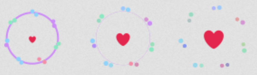
What changes about them is their opacity and their size. We create the particles with multiple box shadows (one for each particle) and then we animate the opacity of the pseudo and the spread of these box shadows.

The first thing we do is to decide on a particle’s dimensions, then size and position our ::after pseudo-element.

$particle-d: 0.375rem;
$particle-r: 0.5 * $particle-d;

[for='toggle-heart']:after {
  margin: -$particle-r;
  width: $particle-d; height: $particle-d;
}

We distribute the seven groups of particles on a circle. We have 360° on a circle, as illustrated by the following demo:

We split these 360° into as many parts as many groups we have. Each vertex of a polygon in the demo below would mark the position of a group.

We go clockwise and we start from the + of the x axis (3 o’clock). If we want to start from the - of the y axis (12 o’clock), then we need to subtract 90° from the angle corresponding to the position of each group.

Now let’s see how we code a distribution of groups on a circle whose radius we initially take as big as the radius of the bubble ($bubble-r), starting from the top (12 o’clock). If we consider were to have just one particle in the middle of each such group, then we have:

$shadow-list: (); // init shadow list
$n-groups: 7; // number of groups
$group-base-angle: 360deg/$n-groups;
$group-distr-r: $bubble-r; // circular distribution radius for groups

@for $i from 0 to $n-groups {
  // current group angle, starting fron 12 o'clock
  $group-curr-angle: $i*$group-base-angle - 90deg;
  // coords of the central point of current group of particles
  $xg: $group-distr-r*cos($group-curr-angle);
  $yg: $group-distr-r*sin($group-curr-angle);

  // add to shadow list
  $shadow-list: $shadow-list, $xg $yg;
}

Setting box-shadow: $shadow-list on our ::after pseudo gives us the following result:

Now let’s take the case where we have two particles in each group.

We position the particles in a group on a circle (with radius of, let’s say, equal to the diameter of our ::after pseudo – $particle-d) around the central point of that group.

The next thing we need to think of is the start angle. In the case of the groups themselves, the start angle was -90° because we want to start from the top. For the individual particles, the start angle is the angle corresponding to the group (the one we use to compute its coordinates) plus an offset angle that’s the same for all the particles around the heart. We’ll make this angle to be 60° because that seems to look nice.

The code for computing the positions of all the particles and adding a box-shadow at each of those positions is below:

$shadow-list: ();
$n-groups: 7;
$group-base-angle: 360deg/$n-groups;
$group-distr-r: $bubble-r;
$n-particles: 2;
$particle-base-angle: 360deg/$n-particles;
$particle-off-angle: 60deg; // offset angle from radius

@for $i from 0 to $n-groups {
  $group-curr-angle: $i*$group-base-angle - 90deg;
  $xg: $group-distr-r*cos($group-curr-angle);
  $yg: $group-distr-r*sin($group-curr-angle);

  @for $j from 0 to $n-particles {
    $particle-curr-angle: $group-curr-angle + 
      $particle-off-angle + $j*$particle-base-angle;
    // coordinates of curent particle
    $xs: $xg + $particle-d*cos($particle-curr-angle);
    $ys: $yg + $particle-d*sin($particle-curr-angle);

    // add to shadow list
    $shadow-list: $shadow-list, $xs $ys;
  }
}

Now this results in what can be seen in the following Pen:

Rainbow particles

The positions look pretty good, but all these shadows use the color value we have set for the heart. We can make them rainbowy by giving each particle a hsl() value depending on the index of the group it is in ($i) and on its index within that group ($j). So we change the adding to the shadow list part:

$shadow-list: $shadow-list, $xs $ys hsl(($i + $j) * $group-base-angle, 100%, 75%);

This simple change gives us rainbow particles:

We could even introduce some degree of randomness in picking the hue, but I felt pretty satisfied with this result.

When animating the particles, we want them to go from the position we have them in now, which means groups on the circle of radius $bubble-r, a bit outwards, let’s say, until groups are on a circle of radius 1.25 * $bubble-r. This means that we need to change the $group-distr-r variable.

At the same time, we want them to shrink from their current full size to zero. Shrinking box shadows without a blur to zero means giving them a negative spread radius whose absolute value is equal to at least half the smallest dimension of the element or pseudo they’re set on. Both dimensions of our :after pseudo are equal to $particle-d (the particle diameter), so our spread radius should be -$particle-r (the particle radius).

To recap, in state 0, we have a group distribution circle of radius $bubble-r and a spread radius of 0, while in state 1, we have a group distribution circle of radius 1.25 * $bubble-r and a spread radius of -$particle-r.

If we use a variable $k for the state, then we have:

$group-distr-r: (1 + $k * 0.25) * $bubble-r;
$spread-r: -$k * $particle-r;

This leads us to creating a mixin, so we don’t write those @for loops twice:

@mixin particles($k) {
  $shadow-list: ();
  $n-groups: 7;
  $group-base-angle: 360deg / $n-groups;
  $group-distr-r: (1 + $k * 0.25)*$bubble-r;
  $n-particles: 2;
  $particle-base-angle: 360deg / $n-particles;
  $particle-off-angle: 60deg; // offset angle from radius
  $spread-r: -$k * $particle-r;

  @for $i from 0 to $n-groups {
    $group-curr-angle: $i * $group-base-angle - 90deg;
    $xg: $group-distr-r * cos($group-curr-angle);
    $yg: $group-distr-r * sin($group-curr-angle);

    @for $j from 0 to $n-particles {
      $particle-curr-angle: $group-curr-angle + 
        $particle-off-angle + $j * $particle-base-angle;
      $xs: $xg + $particle-d * cos($particle-curr-angle);
      $ys: $yg + $particle-d * sin($particle-curr-angle);

      $shadow-list: $shadow-list, $xs $ys 0 $spread-r 
        hsl(($i + $j) * $group-base-angle, 100%, 75%);
    }
  }

  box-shadow: $shadow-list;
}

Now let’s look at the sprite a bit again for a moment. The particles don’t appear until frame 7. 7 is a fourth (or 25%) of 28, which is pretty close to our actual number of frames (29). This means our basic animation of the particles would look something like this:

@keyframes particles {
  0%, 20% { opacity: 0; }
  25% {
    opacity: 1;
    @include particles(0);
  }
}

[for='toggle-heart']:after { @include particles(1); }

This can be seen in action in the following Pen:

Tweaks

It looks fine in all browsers except Edge/IE, where the particles don’t really shrink to nothing, they stay there, really tiny, barely visible, but still visible. A quick solution for this would be to increase the absolute value of the spread radius a tiny bit:

$spread-r: -$k * 1.1 * $particle-r;

A couple more tweaks like setting a nice background and a font on the body and preventing heart selection and we get:

Accessibility

There’s still a problem with this, an accessibility problem in this case: when using the keyboard for navigation, there’s no visual clue on whether the heart toggle is focused or not (because we have moved the checkbox out of sight). The first solution that comes to mind is adding a text-shadow on the heart when the checkbox is focused. A white one seems like the best bet:

[id='toggle-heart']:focus + label {
  text-shadow: 
    0 0 3px #fff, 
    0 1px 1px #fff, 0 -1px 1px #fff, 
    1px 0 1px #fff, -1px 0 1px #fff;
}

It didn’t look like it had enough contrast to the initial grey state of the heart so I ended up changing the grey from the sprite to a darker one.

The final result


Recreating the Twitter Heart Animation (with One Element, No Images, and No JavaScript) is a post from CSS-Tricks

Categories: Designing, Others Tags:

Autofill: What web devs should know, but don’t

June 29th, 2016 No comments

I didn’t/didn’t:

Many people know that you can scan your credit credit in Mobile Safari. But how many web developers know how to create a form that supports that feature?

Jason Grigsby gets into the nitty gritty details including a list of label names iOS expects in order to trigger the autofill and a practical working demo.

Direct Link to ArticlePermalink


Autofill: What web devs should know, but don’t is a post from CSS-Tricks

Categories: Designing, Others Tags:

Fontastic: How to Find Free High-Quality Fonts

June 29th, 2016 No comments
How to Find Free High-Quality Fonts

Finding the right font for a design or a project is not easy, although there are tons of free fonts on the internet. Oftentimes, the quality of the fonts is rather lacking in terms of aesthetics, character set, and OpenType features. However, there are a couple of high-quality, well elaborated, aesthetically appealing, and, on top of that, free fonts on the internet, and all of that even outside of Google Fonts.

Unusual Fonts at Behance

The creative network Behance is not only a good spot to get inspired. Many font designers don’t just use Behance to present their fonts. A lot of them offer the fonts for free download as well.

Just go there to look for fonts, and you’ll quickly notice how rich Behance’s variety is. However, as there are lots of drafts that don’t exist as a “real” font, you might need to put more time into searching.

„Mosk“

In return, you will find many unspent fonts like the “Mosk“, for example, which is a neat sans serif font in nine cuts that, among other things, contains international characters. If you’d rather look for something with serifs, you might like the “Butler” that resembles classicistic fonts.

“Butler”

As Behance is not a font portal, the search is not really comfortable. The amount of cuts, and the extent of the character set vary drastically. That means, that you’ll need patience. But it’s worth it.

Pay as Much as You Want to at Lost Type

Lost Type is one of the smaller font foundries. Thus, the fonts that are distributed there mostly aren’t the popular kind. Therefore, when unspent typography is important to you, you’ll find something there. Aside from many fonts suitable for running texts, like “Mission Gothic“, there are interesting fonts for bold headings, like the majuscule font “Liberator“.

Mission Gothic

„Mission Gothic“

Unique about Lost Type is, that everyone pays as much as they want to, for personal use, at least. You will only actually need to pay when you want to use the font for commercial purposes. All others pay any price they want to – and that can well be nothing at all.

Liberator

“Liberator”

Not even a regsitration is required. If you just enter a zero in the payment box, the font is downloaded without any detours.

Free Fonts at MyFonts

MyFonts is one of the largest font providers and has plenty of foundries in store. Among them are many small, and rather unknown foundries, but also large ones like FontFont.

Miso

„Miso“

Usually, you’ll have to pay to purchase fonts at MyFonts. However, there are a couple of font families that you can get for free. For instance, four of the six versions of the round grotesque font “Miso” are available for free.

There are some free cuts in the popular “Museo” family as well. Two of the ten versions of”Museo Sans” can be downloaded for free. Additionally, not just the desktop fonts are free, but also the web fonts.

Museo Sans

„Museo Sans“

All you need to have is a MyFonts account, and go through the regular purchase procedure: This means placing fonts in the shopping cart and “paying”. As long as you only have free fonts in the cart, you don’t need to pay. Nonetheless, the fonts are listed in your order history like all other purchases.

Everything for Free at Font Squirrel

Last but not least, there’s Font Squirrel. There, you’ll find plenty of fonts for lots of different purposes – and all of them are free. Many fonts offered there can also be found at Google Fonts. The difference is, that Font Squirrel allows you to host the fonts yourself.

Open Sans und Losbter

„Open Sans“ and „Losbter“

Using their custom web font generator, you can also create the web fonts yourself, using the fonts offered on there as the base.

Well-known fonts like the “Open Sans“, for example, or the popular “Lobster“, are part of Font Squirrel’s portfolio.

(dpe)

Categories: Others Tags:

Cloudinary: Responsive Images Solved

June 29th, 2016 No comments

As a designer or developer of responsive websites, your ultimate goal, no doubt, is to maximize an image for each unique device, while not making the files so big they slow down the load time or use excessive amounts of bandwidth. You must find that delicate balance between serving an image that is as large as the device can handle and providing the best possible quality without impacting site performance. This balance is particularly important with increased usage of mobile devices, which commonly have high pixel density, but can suffer from unreliable connectivity, monthly bandwidth limitations and orientations changes quickly.

For responsive designs to work as intended, you require multiple versions of every image so it can be adapted to look perfect on any device in any resolution, pixel density or orientation. Generating, managing, marking-up and delivering these numerous versions can be a daunting task – requiring time-consuming manual intervention.

You also have to be careful not to make mistakes – such as upscaling or downscaling an image when a window is resized. And, often, you may not take into account the impact of using different image formats. For example, serving a WebP image to Chrome or Opera browsers can reduce the image size by 25 percent compared to the equivalent PNG or JPG.

Solving the image adaptation problems

Cloudinary has long been a pioneer in simplifying image management, enabling developers to just mention the cropping parameters, encoding settings and various resolutions for responsive images so they could be dynamically adapted. Today, the process became even simpler. Cloudinary announced its “Images Solved” solution, which completely automates image management using content- and context-aware image adaptation.

You can upload one high-resolution copy of any image to Cloudinary, which then automatically adapts the image, in real-time, to focus on the most important region of the image, select the optimal quality and encoding settings, and responsively deliver the image to any device in any resolution or pixel density.

Cloudinary eliminates manual intervention, guesswork and tradeoffs by further simplifying image transformation by automating the following features:

Content-aware cropping

Scaling an image isn’t always enough. With experience in responsive design, you likely know that variations in viewport sizes and device orientations mean that images need to be cropped differently. Cloudinary leverages a single dynamic URL to deliver the right image, in the right proportions, on every device. Cloudinary’s content?aware image cropping algorithm automatically detects the most important parts of each image and crops it on-the-fly, while making sure that important information is never cut off.

Content-aware quality adjustment and encoder fine-tuning

Oftentimes, designers and developers will err on the side of caution when optimizing an image. Despite little discernible difference in quality, you might opt for a JPG at 90 percent over a JPG at 80 percent. This decision packs in extra Kb that offers nothing but wasted bandwidth to the user. At the same time, you may save images as the best all?round encoding option (commonly JPG), even when alternatives like WebP offer a much faster experience for some browsers. Cloudinary optimizes performance by detecting the capabilities of the viewing browser and delivering not only the optimum level of compression, but also the best-performing format for any browser or device. This, too, is accomplished using the single dynamic URL.

Responsive images

With so many devices on the market, it’s almost impossible to export the right image size, ratio and pixel?density for every device. Every image could potentially have thousands of variations. Cloudinary simplifies dynamic image delivery for responsive websites by automating the image width and DPR value decision based on the viewing device, display size and layout. Using Google Client Hints, it determines the required width of an image based on the browser viewport or the layout width and then calculates the optimal resolution for displaying the image on that device. Or Cloudinary dynamically selects image-specific breakpoints by determining the required number of versions of every image in order to balance the optimal dimensions vs. bandwidth reduction trade-off.

Dynamic format selection

Developers are expected to select optimal image formats for different scenarios based on the image content and viewing device/browser.

For example, JPEG should be used for a captured photograph or for faster loading while PNG should be used for illustrations or drawings or when using a transparent background. Additional logic should also be considered for modern formats such as WebP and JPEG-XR, if the viewing browser is Chrome or Internet-Explorer/Edge.

Image formats can have significant impact on the page load time and bandwidth – for example using WebP over JPEG can result in 30% file size reduction, which can lead to faster page loads and improved conversion rates.

The browser/format compatibility requirements seem simple, but manually adopting the format logic for many images can be complex and inefficient.

The Cloudinary Images Solved enhancements can make your job infinitely easier. Now instead of managing multiple versions of the same image, you can upload one high-resolution copy of the image and then automatically adapt it, in real-time, to focus on the most important region of the image, select optimal quality and encoding settings and responsively deliver the image on any device in any resolution or pixel density. Read this blog to view some examples.

[– This is a advertorial post on behalf of Cloudinary –]

65 Hi-Res Book Mockups from Zippy Pixels – only $14!

Source

Categories: Designing, Others Tags:

The Right Tool For The Job: Picking The Best Prototyping Software For Your Project

June 29th, 2016 No comments

Prototyping tools have become an important resource for us designers — allowing us to document multiple states of a single screen, including animations, transitions and microinteractions that are hard to represent in static documentation.

The Right Tool For The Job: Picking The Best Prototyping Software For Your Project

Companies that pay attention to this trend have started to build prototyping tools to address this need; and today we’re seeing a plethora of tools emerge on a regular basis. But which should you pick? More importantly, what questions should you ask yourself and your team to make sure you choose the right one?

The post The Right Tool For The Job: Picking The Best Prototyping Software For Your Project appeared first on Smashing Magazine.

Categories: Others Tags:

Suicide Squad Character Morphing in Adobe Muse

June 28th, 2016 No comments
Muse For You - Suicide Squad Character Morphing - Adobe Muse CC

Morph SVG elements in Adobe Muse. No Coding Skills Required.

Adobe Muse CC Logo Greensock Logo

Most have us have seen the colorful trailer of the new Suicide Squad movie. We’ve seen Will Smith as Deadshot, Margot Robbie as Harley Quinn, and lets not forget the joker played by Jared Leto who looks deviously insane. You might be asking…why am I reading about this in a web design article? Great question.

I was recently invited to be a guest speaker at the Adobe Max – Creativity Conference on November 2nd to November 4th. I will be talking about Adobe Muse and my session is titled “Adobe Muse Power User Tips and Tricks.” One of the keynote speakers there is going to be Jared Leto who plays the Joker in the new Suicide Squad movie that comes out Friday, August 5th. This gave me the idea to use the new Muse Morph Widget to morph the characters from the Suicide Squad movie.

Muse For You - Suicide Squad Character Morphing - Adobe Muse CC

In the video above I go through the whole process from start to finish on how to morph the characters. I am using the new Muse Morph Widget Powered by Greensock’s MorphSVGPlugin Technology. The widget can be found at http://museforyoushop.com. This widget allows you to easily Morph SVG elements in Adobe Muse. No coding skills required. I also use Adobe Illustrator to set up the SVG elements (characters). Watch the video above to see how to use the widget and where to access it.

Happy Musing :).

Read More at Suicide Squad Character Morphing in Adobe Muse

Categories: Designing, Others Tags:

10 Important Measures for More Internet Safety

June 28th, 2016 No comments
10 Important Measures for More Internet Safety

Internet safety is a sensitive topic that is discussed now and then, but most of the time, it is neglected. Nothing will happen to me; I won’t get hacked, that only happens to others. However, it is very simple to use the internet more safely. That’s why I’ve composed a list to allow you to surf through the depths of the web a bit safer on any device. Of course, a lot of the things I mention on this list aren’t new, but that doesn’t mean they have been etched into the user’s memory already. Maybe, I can still surprise you somehow.

1 – Protect Your Devices From Unauthorized Access

Your files are invaluable! Aside from you, nobody should have access to them unless you authorized it. Additionally, you should always keep the possibility of theft in mind. This mainly affects your smartphone, tablet, or notebook. Thus, these devices should always be protected with a password or a PIN. Don’t use patterns or something similar, as they are too easy to figure out.

If your device is stolen and not protected properly, the thief has access to all of your information. He can look at your photos, post them on Facebook, check your WhatsApp conversations, send messages from your phone, and so forth. That’s why you need to use a safe password.

Further Information:

2 – Always Keep an Eye on Your Notebook

Your laptop is a precious item. By that, I don’t mean the price, but the amount of data that you stored on it. Just imagine your most private photos in the hands of someone unauthorized. Or your confidential business information. What a catastrophe! When you use your notebook on the go, it could happen that you leave your notebook unprotected for a short moment in time.

I strongly advise you not to do so, as thieves only need a few seconds to steal your device. If you don’t use a very safe password, or if you didn’t encrypt your harddrive, the thief could empty your bank account, use your social media accounts, and so on. Thus, always keep an eye on your notebook, or even better, always keep it on you. This way, it is safe.

3 – Email Links and Email Attachments

How many thousands of people have claimed not to fall for a fake email? And yet, it happens all the time. The thieves’ fake emails are improving. Well-done fakes can’t be distinguished from originals at first sight. So, always be careful when it comes to clicking a link in an email.

Here is Where the Danger Lies:

A trojan could be hidden behind every email attachment. When clicking the link, nothing happens. But in the background, a trojan is loaded onto the computer or the mobile device. Common antivirus programs don’t protect you from this phenomenon, as you requested the download via clicking. This gives the sender of the fake mail full control over your device, allowing him to control it from a distance.

Safety on the Internet: Dealing With Email Attachments

Email attachments can be extremely dangerous. I suggest to only open attachments that you definitely requested yourself. No matter how curious you are, you should keep your hands off of all other links. Most of the dangerous attachments disguise as bills and warnings. The fear of financial damage and curiosity are the two biggest success factors for cyber criminals.

Here is Where the Danger Lies:

The criminals are becoming increasingly better and smarter. The better ones among them know that attachments with file endings like .bat, .exe, .ade, .adp, .cpl, and .wsc are not worth it anymore. A couple of good antivirus programs already block files with these endings. However, the cyber gangsters also know that Windows doesn’t display the known file endings in its default settings. That’s why seemingly safe text files (.txt) are sent as well, as the users know that they are harmless.

However, as Windows hides known file endings, it is not visible at first sight, that the seemingly harmless text file is actually called “clickme.txt.vbs.” That means it is not a harmless text file, but executable malware. However, when displaying the file endings in the Explorer, you will recognize it instantly.

4 – Protection Via Antivirus Programs?

This is a very controversial topic. Yes, antivirus programs protect you. No, they don’t always protect you. Generally, these programs provide excellent protection from known pests. However, most of the viruses and trojans in circulation are not known. Programs with good heuristics provide a certain, but far from complete, protection. Yet, a good heuristic still doesn’t find all malware.

However, all malware has to abuse security gaps to release itself into the system. That’s why it’s imperative to install all OS and program updates as fast as possible. These updates often close known security gaps. Then, malware doesn’t get the chance to establish itself.

5 – Encrypt Your Data Traffic

Important emails and file transfers should always be encrypted. Then, it is impossible to read an email’s content or to catch it. Here, particular email service providers like ProtonMail can be used, or owners of email addresses, and an email client (like Thunderbird or Apple Mail, for example) have the option to use the GNUPG process. Both methods encrypt the email from end to end.

The many fans of WhatsApp will be relieved, as since recently, the messages sent from the service are encrypted as well. However, the phone numbers from your personal contact list are still uploaded to the service’s server.

The transfer service Whisply is used to send scrambled email attachments, as long as it doesn’t exceed the file size of 12 megabytes. Whisply is still in an early stage of development, however, and needs access to Dropbox, Google Drive, or OneDrive.

Further Information:

6 – Encrypt Your Cloud

Services to store significant amounts of data in the cloud are very popular. More and more users utilize these convenient services. The market leader Dropbox alone has over 400 million customers already. Using it is as easy as it gets, and the hazard of creating an account is minuscule, as most providers allow you to store a significant amount of data for free. The cloud’s great advantage is the physical safety of the data. That’s why the cloud is a perfect backup option.

Here is Where the Danger Lies:

Data protection is not given, as the provider can look at your files at any time. Most services run their servers in the United States, which forces them to give the governmental authorities access to the data upon demand. As you can see, a lot of people have the ability to see your files under certain circumstances.

The Solution:

Of course, it is possible to protect yourself from that. The German service Boxcryptor allows you to easily encrypt your files in the cloud to a high degree, without any professional knowledge being required. Now, only you are authorized to read your data.

Costs and Platforms:

  • Costs: In the basic version for one cloud, it is free on two devices
  • Available for the following platforms: Windows, Mac OS X, Chrome, iOS, Android, Win Phone, Win RT, and Blackberry

Further Information:

7 – Create Backups Regularly

Make sure to create backups on a regular basis. Only then, you are able to avoid potential data loss. Backup your operating system, and ebem more importantly, your files. Also keep your mobile devices, the WhatsApp history, and everything that seems important to you in sync. Create regular backups. For example, external file storage like USB sticks, external harddrives, or a cloud are usable for backups. Of course, the cloud comes with a genuine advantage, as it guarantees absolute physical protection of your information. Harddrives can break, even if they happen to be rather new. I had to make that experience once already.

Since last year, the so-called ransomware attacks on computers and notebooks are becoming popular. If your device is infected, the software either encrypts a part of your files or all of them. The only way to gain access to them is by transferring money or bitcoins to the perpetrators. The conventional antivirus programs don’t protect you from such an attack, as there are too many variations of the malware.

The solution to this problem are backups you created of your files. Simply delete the infected files, and replace them with a backup.

Important:

Backups should always be stored on disks that are not always connected to the PC, or not always turned on, respectively. If you happen not to want to save your backups in the cloud, make sure that your files don’t automatically synchronize with the cloud. Otherwise, the infected files will be synced as well, rendering the backup useless.

8 – Open WiFi Can be Dangerous

Using open WiFi has the potential to be rather dangerous.

When using open WiFi without taking the necessary precautions, you might as well ask your café friends if they would like to receive your confidential business information.
PC World

A public WiFi is not encrypted and accessible to anyone. Cyber criminals know that and abuse the situation. Thus, you should take some precautions before using public internet. Before doing so, deactivate the email synchronization, and don’t access or read them. Otherwise, your neighbor could read your emails right in front of you. If you want to use websites that require you to log in, always pay attention to a connection encrypted via HTTPS. HTTP transfers your data without encrypting it.

9 – Use Secure Passwords

The most commonly heard, yet most ignored tip in the world. Nobody wants to hear it, nobody follows it. The most popular password is still “password”. Sometimes, passwords with numbers like “1234” are used. Then, you shouldn’t be surprised when you get hacked. Most people make it very easy for the criminals. On top of that, most of them use the same password for all services and logins. This becomes a huge problem when also using this password for your emails.

Once they got access to your emails, the criminals can use the “forgot password” function to get new passwords for all of your accounts, giving them total control over your cyber identity. Then, you’ll have a real problem.

The Solution:

Go and change your passwords to really safe ones today! To not forget them, note all of them down and store the file in a cloud encrypted with e.g. Boxcryptor. Now, the only password you have to remember is the one for Boxcryptor.

Further Information:

10 – Always be All Ears and Think Before Each Click

The biggest security risk is sitting in front of the computer. Sadly, this is not a silly prejudice but the truth. I recommend you to always pay attention and to think about every click within an email or on a website. Today, it is too easy to get an infection on your computer or mobile device. Of course, internet safety requires additional effort, but that is irrelevant considering the amount of added security. Always be aware of the dangers, then the bit of added effort won’t seem like much.

(dpe)

Categories: Others Tags:

Design like you’re Hollywood

June 28th, 2016 No comments

Hollywood is the holy grail for the whole movie industry, and it’s where all blockbusters (or most of them at least) come from. These movies cost a lot of money, but they (usually) also make a lot more money.

And you know how Hollywood movies make so much money? Because they research. A lot. And they design for success.

It’s not about art

It’s easy to create an analogy between design (of a website, an app, a poster) and a movie. In one way or another both mediums try to convey a feeling, and tell a story. Both have something to “sell”, a conversion objective.

If you’re designing a poster, your objective is usually to either promote an event, a brand, or a product. An app has a more focussed objective, accomplishing an action such as “reading email”, “buying tickets”, “taking photos”, whatever it might be. But we can all agree that when designing any of these, there is an artistic influence and a specific design style that you try to use and convey to your users. And while you may want to only focus on the art and the style of your work, you need to keep in mind your end goal.Unless you’re an artist that just creates art for the sake of it, you will need to achieve an end goal.

Unless you’re an artist that just creates art for the sake of it, you will need to achieve an end goal

So, how is Hollywood a good inspiration for designers? Hollywood runs a business, and a movie is nothing other than an investment made by people who backed the movie financially, with the end goal of making profit and taking revenue from it. Their product is the movie, the merchandise, the licensing rights for toys and games, and all of these generate revenue out of the movie.

There’s a lot more to be said about the movie industry and how money is made, but I’ll leave that to the movie experts. My point is, in the end, the movie is not made with the sole purpose of existing as art, or telling a story; it’s a business: Money goes in, money comes out. Unless it’s a flop in the box office, and that’s just bad business.

Testing, learning, and changing

I was absolutely amazed when I found out about test audiences for movies. I was naive enough to think that a movie was simply produced in a team, edited and released, and it would do well or not, depending only on the hunches and talents of the team that made it. But oh, no.

A movie is well-tested, changed and improved, and re-tested again until it tests as well as possible. Movies are shown to a test audience, and people are asked several questions about the movie: How does it make them feel? Do they like the whole movie, or specific parts of it? Would they pay for it?

These tests have a big impact on the final movie, as a lot might change to get the best test results with the audience. Because again, they want to sell tickets and make sure people are happy with it. And unfortunately, I feel like a lot of designers don’t think the same way.

Your preference doesn’t count

For the sake of simplicity, let’s focus on a website. There are a lot of companies and designers out there that do a great job on design and development, but the only people involved in the process are the design team, the development team and the client. They forget about gathering feedback from the most important people of all, their target market.

I’ve seen this over and over again. People have opinions and ideas on layout, copy, features, and obviously the client has the final say (well.. it shouldn’t have, but that’s a topic for a whole another article). And then the website is the aggregated result of the designer’s and developers work and the feedback and opinions and all the rounds of amends requested from the client. And once you publish it and release it into the wild…well, if it does well or not is all dependent on these people.

So why don’t we do it a bit more like Hollywood and use a test audience? Just grab some people that you believe to be your target market, get them in front of the website and ask them what do they think, and more importantly, what do they want? It’s as easy as just paying a beer to a friend after work to take a look at your work, or a lunch, or heck, if budget allows, even allocate an amount to pay for their time!

And by the way, have you done your homework as well? Any market research on your target market? Competition research and checking what others are doing well and what they’re doing wrong?

Show your work to the most relevant people: the ones who’ll be using your work

This is obviously not a general problem. Startups already do this. More and more you see great companies and their user experience teams doing amazing work, having a lot of user interviews way ahead of time, creating personas and use cases. They test it all throughout the design and development process. However, it’s mostly done in product development teams.

But designers still lack the input from users. Instead, they work mostly to please the client. “A little bit more to the right, a little bit more to the left.” “Oh my daughter loves purple, let’s use purple.”

Designers often work in a silo, and that kind of behavior leads to work being created blindly without any input from others. Feedback and input is crucial for good work, so if you’re a loner (like I am), use that for when you need to focus on your work and get stuff done, but remember to, from time to time, get up and show what you’re doing to others. A brand new set of eyes will bring a new view, new ideas and great feedback on what you’re doing.

So take a hint from Hollywood. When you can, show your work to the most relevant people: the ones who’ll be using your work. They are the ones who really matter.

Featured image via Sean Pavone / Shutterstock.com

Focus Your Creative Direction with the Beautiful Book of Ideas – only $19!

Source

Categories: Designing, Others Tags:

Top Tips for Bloggers Who Need Post Ideas

June 28th, 2016 No comments

A blank canvas. A blinking cursor on a white screen. You start to ask yourself, “What will I write about?” “Do I have something to say that will be important to my audience?” “Is there anyone who even cares?” At this point, you may think that nothing is working, and that you should try again

Categories: Designing, Others Tags:

How To Build a Word Counter App

June 28th, 2016 No comments

The following is a guest post by Vikas Lalwani, who walks us through building something very practical. Along the way, we’ll learn about structure, RegEx, Ajax, APIs, and more, that get us to the desired feature set. All with good ol’ vanilla HTML, CSS, and JavaScript.

We have all written essays during our school days. There was always a minimum word count – 250, 500 words – that we needed to meet before submitting. Before I had a computer at home I used to count words manually. Once my parents got me one, discovering Microsoft Word was like magic. I didn’t know programming then, so I was amazed at everything that MS Word did.

One of the features that I really liked was called “Word Count”. You could select any piece of text and click on Tools > Word Count to see some interesting statistics such as number of characters, words, and paragraphs about your selected piece of text. I loved it then and I’m even using it right now as I am drafting this article inside Google Sheets. I figured I’d take a crack at writing one myself.

The app that we are making today will calculate:

  1. Number of characters, words, and sentences in a piece of text
  2. Top keywords used
  3. Readability score – how difficult is it to comprehend the passage.

Before we begin, you can see what we are making here:

See the Pen Word Counter by Vikas Lalwani (@lalwanivikas) on CodePen.

Now, let’s get started!

All the counting in the app relies heavily on regular expressions (referred to as “regex” in rest of the article). If you are not familiar with regex, then check out this beginner article on regular expressions in JavaScript.

Page Setup

First and foremost we need something to take user input. What better way to handle this than textarea HTML element?

<textarea placeholder="Enter your text here..."></textarea>

We can select the above textarea using this piece of JavaScript:

var input = document.querySelectorAll('textarea')[0];

We can access the input string through input.value. Since we want to display the stats as the user types, we need to perform our logic on keyup. This is what the skeleton of our core logic looks like:

input.addEventListener('keyup', function() {

  // word counter logic

  // sentence count logic

  // reading time calculation

  // keyword finding logic

});

The output will be stored in simple HTML div elements, so nothing fancy here:

<div class="output row">
  <div>Characters: <span id="characterCount">0</span></div>
  <div>Words: <span id="wordCount">0</span></div>
</div>
<!-- more similar divs for other stats -->

Part 1: Counting Characters and Words

With the basic setup out of the way, let’s explore how to count words and sentences. One of the best ways to do it is to use regex.

I am going to walk you through regex patterns for word and sentence counting only. Once you are able to understand that, you can figure out rest of them on your own by looking at source code.

We need to look for two things to find words in our input string:

  1. word boundaries
  2. valid word characters

If we are able to locate these, then we will have our list of words. One more thing we can do to increase accuracy is to look for hyphens(-). That way words with hyphens (eg, CSS-Tricks) will be counted as one word instead of 2 or more.

var words = input.value.match(/b[-?(w+)?]+b/gi);

In the above pattern:

  • b matches word boundaries i.e. starting or ending of a word
  • w+ will match word characters. + makes it match one or more characters
  • -? will match hyphens, ? at the end makes it optional. This is a special case for counting words with hyphens as one word. For example, ‘long-term’ and ‘front-end’ will be counted as one word instead of two
  • + at the end of the pattern matches one or more occurrences of the whole pattern
  • Finally, i makes it case insensitive, and gmakes it do a global search instead of stopping at first match

Next, let’s explore how to count sentences.

Sentences are relatively easy to handle because we just need to detect sentence separators and split at those. This is what the code for doing it looks like:

var sentences = input.value.split(/[.|!|?]/g);

In the above pattern, we are looking for three characters – ., !, and ? – in the input text since these three are used as sentence separators.

After above operation, sentences will contain an array of all the sentences. But there is one interesting case that we need to take care of before we count: what if someone enters “come back soon…”?

Based on above logic, sentences will contain four entries – one correct sentence and three empty strings. But this is not what we want. One way to solve it to change the above regex pattern to this:

var sentences = input.value.split(/[.|!|?]+/g);

Notice the + at the end of the pattern. It is there to take care of any instance where a user inputs consecutive sentence separators. With this modification, “come back soon…” will be counted as one sentence and not four.

If you followed the explanation above for counting words and sentences, you can understand rest of the logic yourself by looking at the source code. The important thing to keep in mind is not forgetting edge cases, like words with hyphens and empty sentences.

Part 2: Finding Top Keywords

Once you start typing, you will notice that a new container will appear at the bottom of the page that displays top keywords from the text. This tells you what keywords you used most often which can help you prevent overusing certain words in your writing. That’s cool, but how do we calculate it?

To make it easier to digest, I have divided the process of calculating top keywords into following 4 steps:

  1. Remove all the stop words
  2. Form an object with keywords and their count
  3. Sort the object by first converting it to a 2D array
  4. Display top 4 keywords and their count

Step 1) Remove All the Stop Words

Stop words refer to the most common words in a language and we need to filter them out before doing any kind of analysis on our piece of text. Unfortunately there is no universal list of stop words, but a simple search will give you many options. Just pick one and move on.

This is the code for filtering out stop words (explanation below):

// Step 1) removing all the stop words
var nonStopWords = [];
var stopWords = ["a", "able", "about", "above", ...];
for (var i = 0; i < words.length; i++) {
  // filtering out stop words and numbers
  if (stopWords.indexOf(words[i].toLowerCase()) === -1 && isNaN(words[i])) {
    nonStopWords.push(words[i].toLowerCase());
  }
}

stopWords array contains all the the words that we need to check against. We are going over our words array and checking if each item exists in the stopWords array. If it does we are ignoring it. If not are are adding it to the nonStopWords array. We are also ignoring all the numbers (hence the isNaN condition).

Step 2) Form an Object with Keywords and Their Count

In this step, we will form an object where key will be words and value will their count in the array. The logic for this is pretty straightforward. We form an empty object keywords and check if the word already exists in it. If it does, we increment the value by one, if not then we create a new key-value pair. Here is how it looks:

// Step 2) forming an object with keywords and their count
var keywords = {};
for (var i = 0; i < nonStopWords.length; i++) {
  // checking if the word(property) already exists
  // if it does increment the count otherwise set it to one
  if (nonStopWords[i] in keywords) {
    keywords[nonStopWords[i]] += 1;
  } else {
    keywords[nonStopWords[i]] = 1;
  }
}

Step 3) Sort the Object by Converting It to a 2D Array

In this step first we will convert the above object to a 2D array so that we can use JavaScript’s native sort method to sort it:

// Step 3) sorting the object by first converting it to a 2D array
var sortedKeywords = [];
for (var keyword in keywords) {
  sortedKeywords.push([keyword, keywords[keyword]])
}
sortedKeywords.sort(function(a, b) {
  return b[1] - a[1]
});

Step 4) Display Top 4 Keywords and Their Count

Output of the above step was a 2D array named sortedKeywords. In this step we will display the first four (or few if total words are fewer than 4) elements of that array. For each item, word will be at position 0 and its count will be at position 1.

We create a new list item for each entry and append it to ul represented by topKeywords:

// Step 4) displaying top 4 keywords and their count
for (var i = 0; i < sortedKeywords.length && i < 4; i++) {
  var li = document.createElement('li');
  li.innerHTML = "" + sortedKeywords[i][0] + ": " + sortedKeywords[i][1];
  topKeywords.appendChild(li);
}

Now let’s move to finding readability score.

Part 3: Fetching Readability Score

To get your message across in a piece of writing, you want to use words which your audience can comprehend. Otherwise there is no point of writing. But how can you measure how difficult it is to understand a piece of text?

Enter readability score.

Folks, more intelligent than us, have developed many scales to measure difficulty level of a reading passage. For our app, we are going to use Flesch reading-ease test, which is one of the most commonly used tests for this purpose. This is the one that Microsoft Word relies on!

In the Flesch reading-ease test, scores range from zero to one hundred. Higher scores indicate material that is easier to read; lower numbers mark passages that are more difficult to read. It is based on a little complex mathematical formula which we don’t need to worry about, because on the web there is an API for (almost) everything.

While there are many paid options for calculating readability scores, we are going to use Readability Metrics API from Mashape which is absolutely free to use. It gives some other readability scores as well if you are interested.

To use the API, we need to make a POST request to a designated URL with the text that we want to evaluate. The good thing about Mashape is that it allows you to consume its APIs directly from the browser.

I am going to use plain JavaScript to make this Ajax call. If you are planning to use jQuery, you will find this documentation page useful or if you want to use a server side language, please refer to API home page for code samples.

Here is what the code for making the request looks like:

// readability level using readability-metrics API from Mashape
readability.addEventListener('click', function() {

  // placeholder until the API returns the score  
  readability.innerHTML = "Fetching score...";

  var requestUrl = "https://ipeirotis-readability-metrics.p.mashape.com/getReadabilityMetrics?text=";
  var data = input.value;

  var request = new XMLHttpRequest();
  request.open('POST', encodeURI(requestUrl + data), true);
  request.setRequestHeader('Content-Type', 'application/x-www-form-urlencoded; charset=UTF-8');
  request.setRequestHeader("X-Mashape-Authorization", "Your API key | Don't use mine!");
  request.send();

  request.onload = function() {
    if (this.status >= 200 && this.status < 400) {
      // Success!
      readability.innerHTML = readingEase(JSON.parse(this.response).FLESCH_READING);
    } else {
      // We reached our target server, but it returned an error
      readability.innerHTML = "Not available.";
    }
  };

  request.onerror = function() {
    // There was a connection error of some sort
    readability.innerHTML = "Not available.";
  };
});

Most of the above code consists of a standard Ajax call, but here are three important things to note:

  • For using this API you need a free Mashape account. Once you have that, you will get a key which you can insert in authorization header.
  • API returns many different scores and the one we need lies in FLESCH_READING property of response.
  • The response will contain a number between 0 and 100 which by itself does not convey anything to a user. So we need to convert it into a format that makes sense, and this is what the readingEase function does. It takes that number as input and outputs a string based on this Wikipedia table.
function readingEase(num) {
  switch (true) {
    case (num <= 30):
      return "Readability: College graduate.";
      break;
    case (num > 30 && num <= 50):
      return "Readability: College level.";
      break;

      // more cases

    default:
      return "Not available.";
      break;
  }
}

That’s it! That was all the logic involved in making a word counter app. I did not explain every small detail because you can figure that on your own by looking at the code. If you get stuck anywhere, feel free to check out the full source code on GitHub.

Further Development

Although the app looks nice and works great, there are few ways in which you can improve it, like:

  • Handling full stops: right now if you enter an email like hello@css-tricks.com, our app will count it as two different sentences. Same is the case if you enter a domain name or words like ‘vs.’, ‘eg.’ etc. One way to deal with it is to use a manual list and filter these out using regex. But since there is no such list readily available, we will have to curate it manually. Please let me know in comments if you know a better way.
  • Handling more languages: Currently our app only handles all the cases of English language very well. But what if you want to use it for German? Well, you will have include stop words of German. That’s it. Rest of the stuff will remain same. Best would be to have an option to choose a language from dropdown and the app should work accordingly.

I hope you had fun following along this tutorial. Feel free to leave a comment below if you have any questions. Or to just say hi! Always happy to help.


How To Build a Word Counter App is a post from CSS-Tricks

Categories: Designing, Others Tags: