Archive

Archive for August, 2016

What Website Makers Have Been Missing Until Now

August 30th, 2016 No comments
Screenshot_1

Written by Kira Goldring

When the first cell phone was created in 1973, no one would have guessed that just forty years later the majority of the population would unfailingly rely on them for a plethora of things that have nothing to do with calling another person. In the last decade or so, a device that began as a means of communicating with others on the go has morphed into a mini-computer that can be carried around in your pocket, answer most of your questions, and entertain you ’till the sun goes down. And carried they are; these ubiquitous smartphones have generated a forty percent increase in mobile phone users over the last fifteen years, for the underlying reason that they serve our needs. Yes, that 1973 cell phone was a wonderful first step for mankind, but it was apparent that that’s all it was: a first step. The smartphone, on the other hand, was the real prize.

In the realm of DIY website making, we are still stuck on that first step; we’ve only succeeded insofar as to create basic websites to self-market our brands, a nice feat in itself but not even close to enough. What we are still lacking is the autonomy to push the boundaries of website making; if we want to add things like an online database or web applications to our websites, we’re right back at square one—needing to appeal to external, expensive resources, hire third-party developers or acquire widgets to do the job for us. It’s time to revolutionize the way we think about website makers and the capabilities they afford us, to realize that what they allow us to do barely scratches the surface of what we need to be able to accomplish independently. Until now, website building has just been the pretty face on a much bigger canvas that has never been painted before: a complete online business environment.

Easy to navigate database list
Registered user panel
Role system interface
Database table panel

For the first time in website-making history, Simbla has bravely jumped into the revolutionary bath and came out unscathed, by integrating a UI/UX environment with a brand new online database that can also produce web-based applications. This unprecedented combination is what will drive the future of website making, i.e. the ability for SMBs to create an entire online business environment by themselves, without having to turn to outside sources for help.

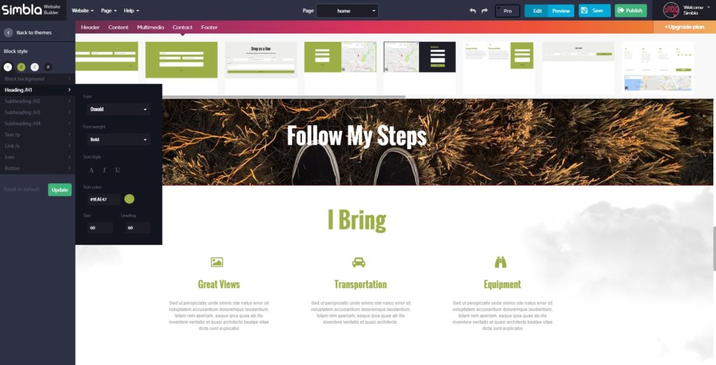
Before we broach the subject of this unparalleled database, let’s explore some of Simbla’s more well-known features as a website maker. Their UI/UX platform encompasses a number of useful tools to assist anyone from beginner to expert in making their website:

  • Responsive—The websites are compatible with both computer and mobile devices, such as smartphones or tablets, so you only have to make your website once.
  • Drag and Drop—So easy a baby could do it. Simply click on the design blocks you like, drag them wherever you want them positioned onto your page, and voila—your layout is complete. Unlike with some of the other website makers available, Simbla’s platform doesn’t lock the users in to using rigid or strict templates when choosing the design of their sites.
  • SEO friendly—Because Simbla’s sites are HTML5 based, all the content you insert is read as text which is picked up by search engines like Google. On top of this, Simbla provides a number of features that further enhances your site’s SEO.
  • Design tools—Graphic designers, you’ll enjoy this one! To ensure that your websites appear sleek, Simbla offers a theme maker, which will instantly change the overall look of your website while preserving the content, background images that include video backgrounds, and an easy-to-use parallax effect.
Designers heaven

Designer heaven

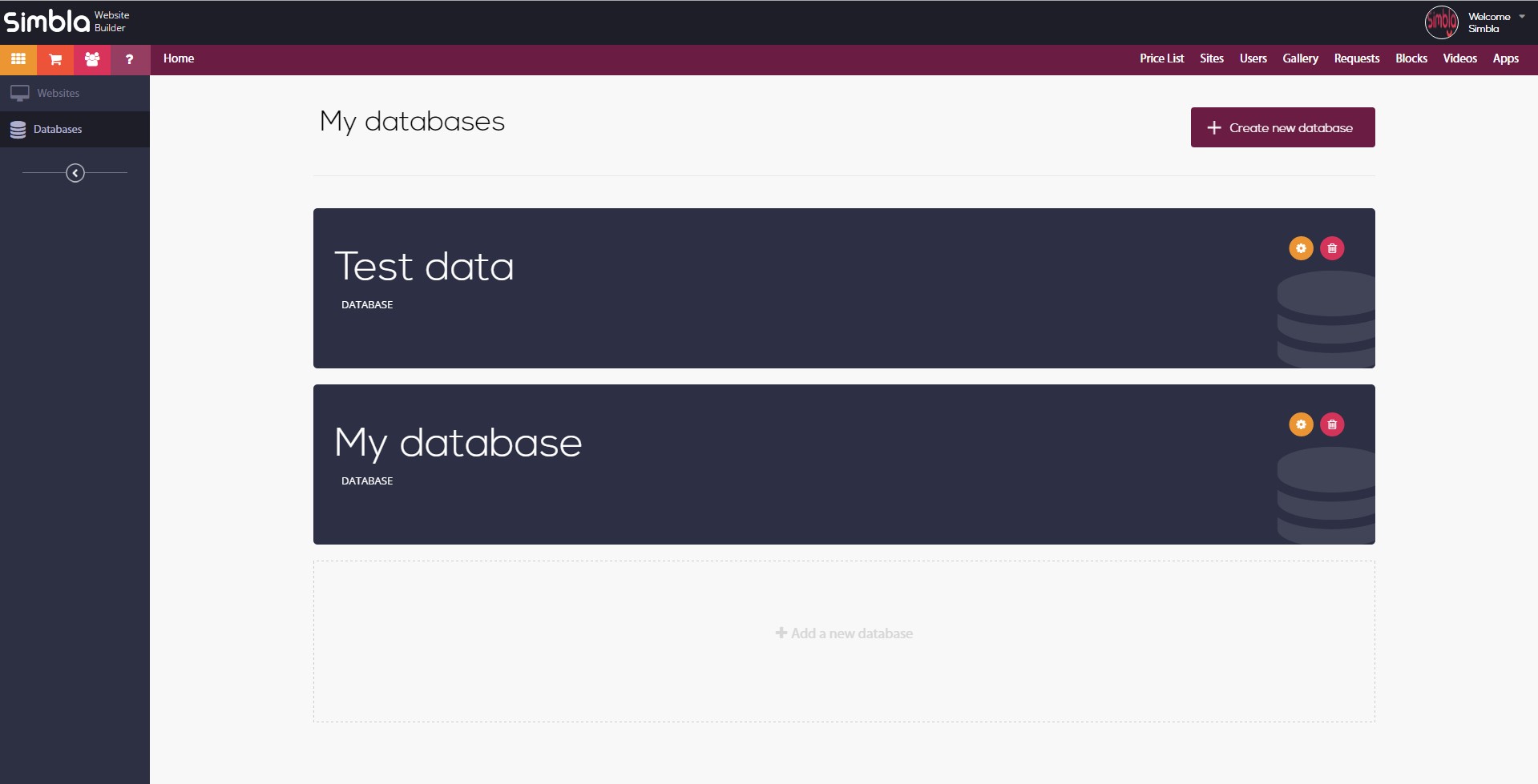
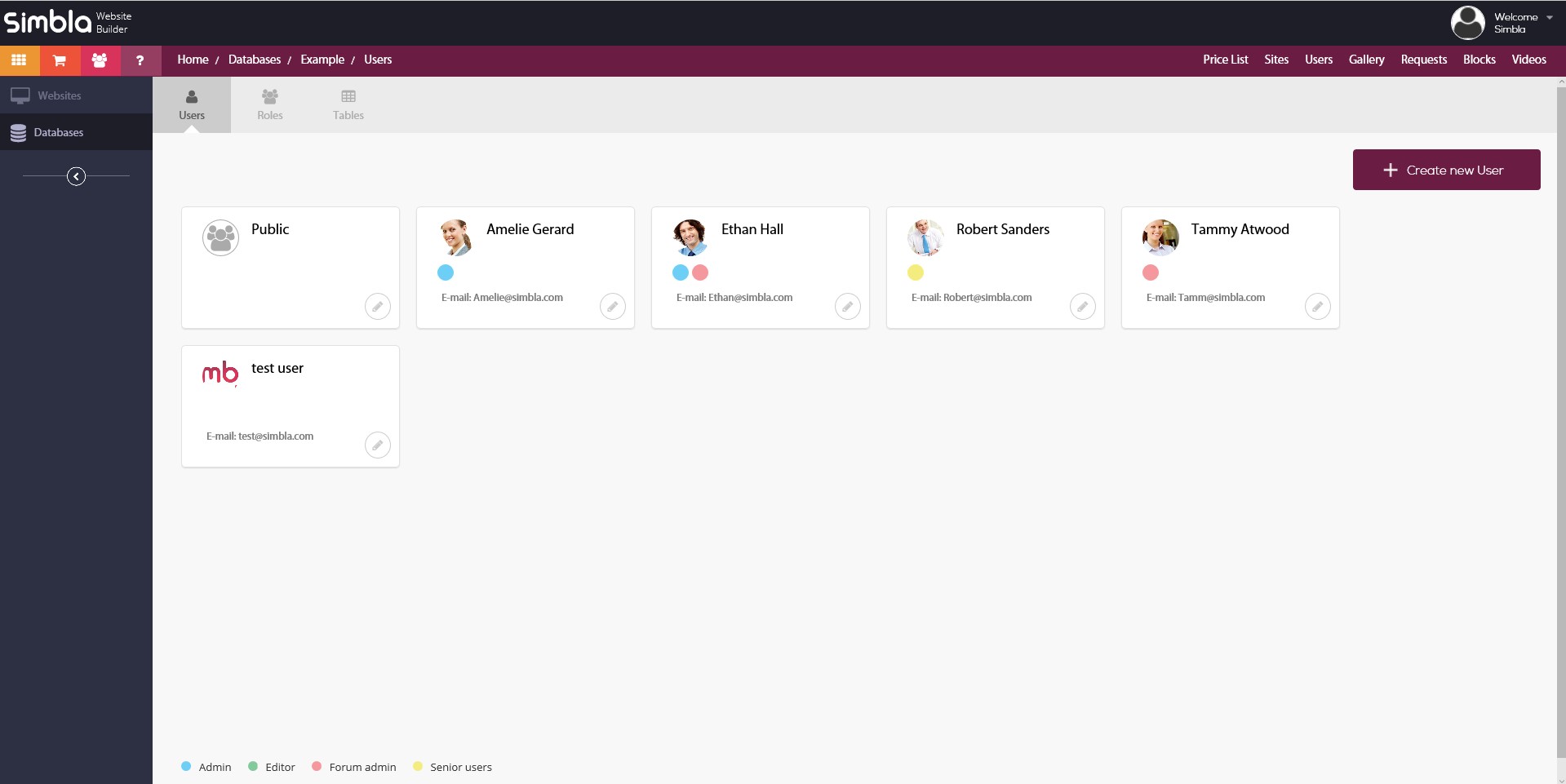
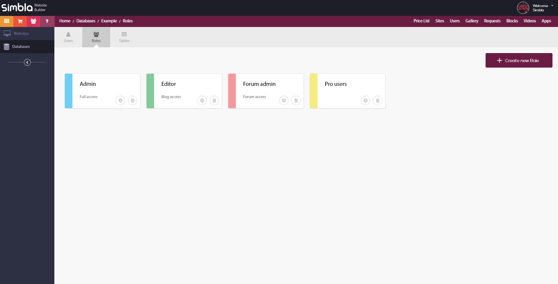
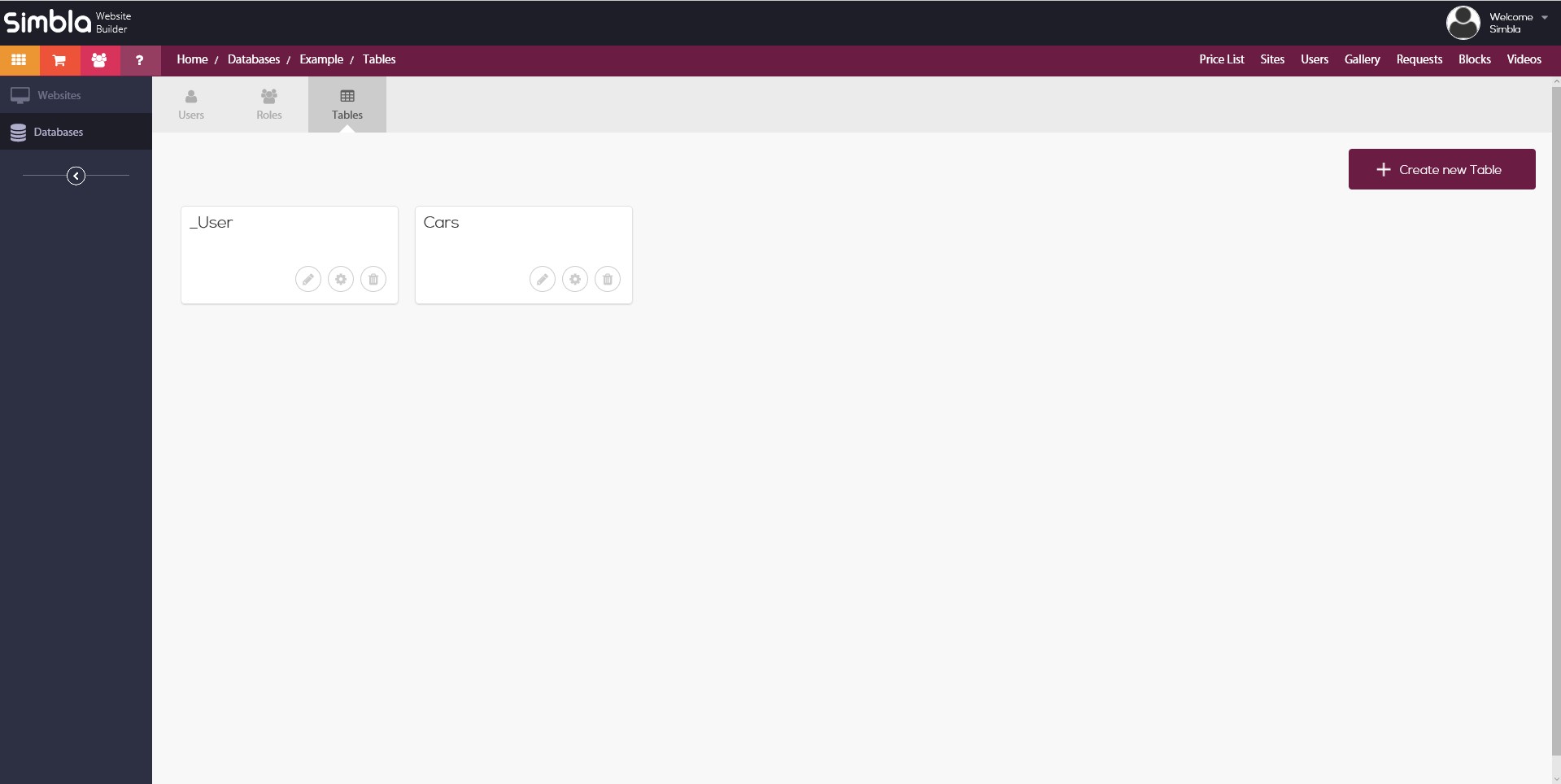
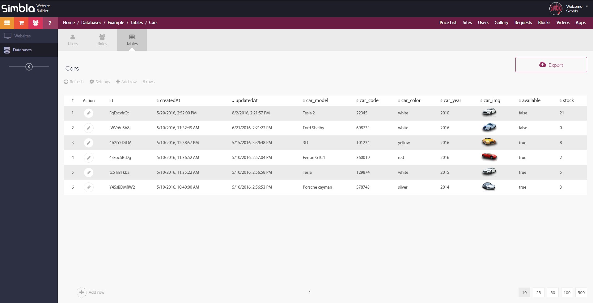
But the newest and most key feature on top of all of this is the addition of an online database builder to Simbla’s website-making package. This means you can now create your own database tables, define columns, add records, organize the data in an efficient and intuitive manner, and control who has permission to access it and how, by managing who can modify, create, obtain and remove data sets. You’ll have the ability to decide who the users are and establish their roles, and you won’t be limited to choosing one setting for everyone; you can individually customize who can perform which actions by assigning rights to different users, such as “read,” “delete,” “create,” “get,” and “update.” Setting up the database and its permissions is simple, and it can be easily incorporated into your website.

Easy to edit table interface
Add record form
Database driven gallery final result

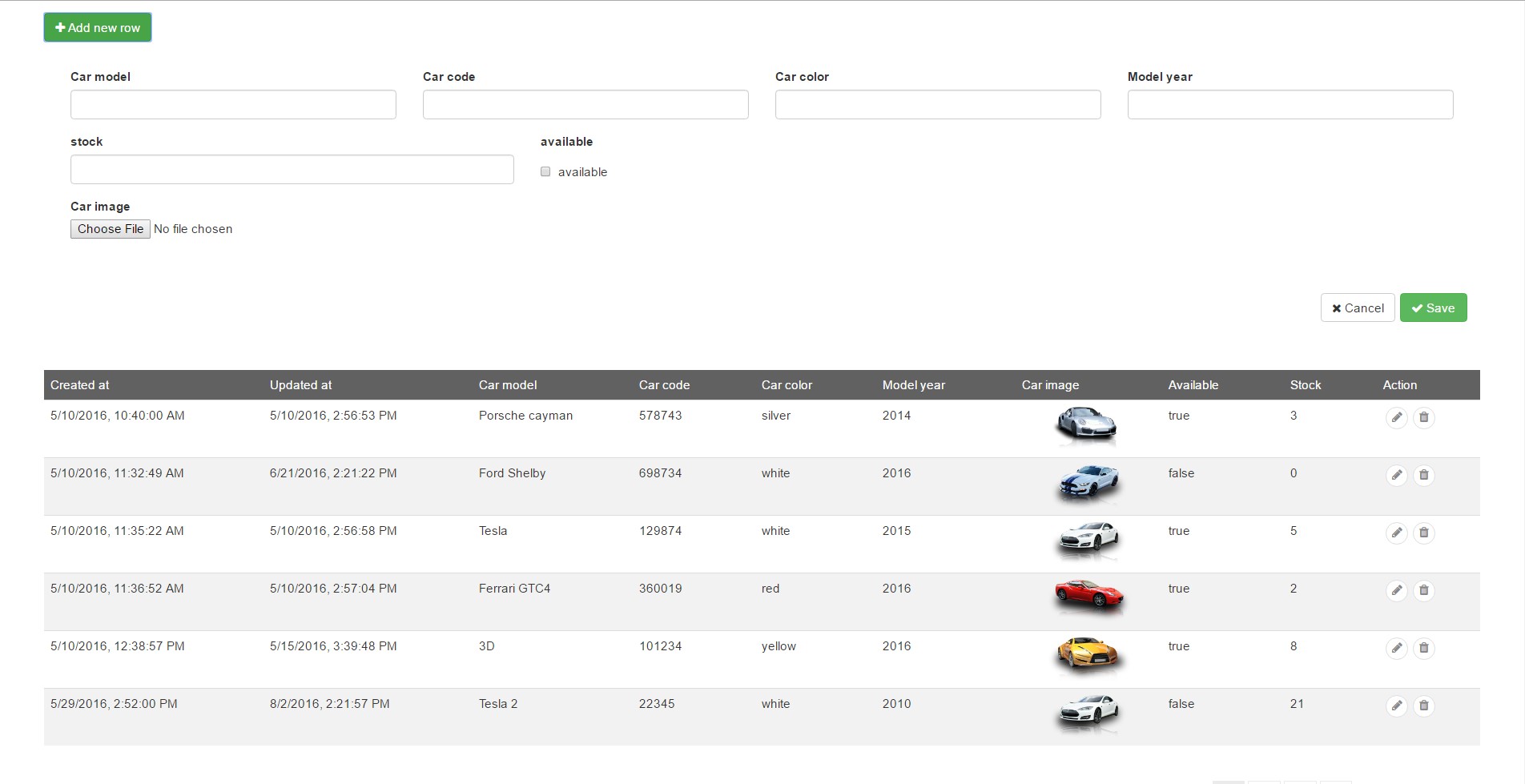
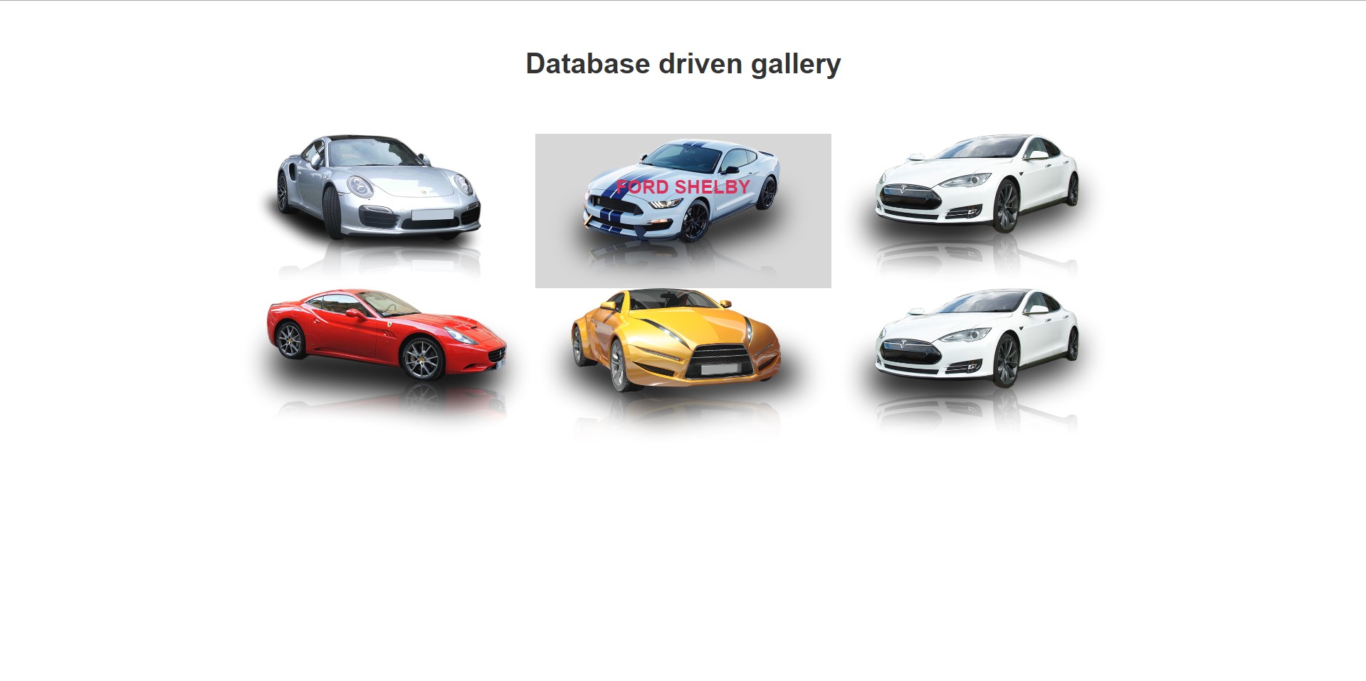
The future of third-party web widgets is at stake here, because the database you create with Simbla will give you the option to use “database widgets” that will connect to your online database and allow you to do things like create a login page for registered users, create a search form filtering the returned results and allow users to view, edit and add records. The newly registered users will then be shown in the database area. Owing to the sizable amount of options the widgets offer, users can choose to combine these app widgets and create their own basic data-driven applications, or produce more complex ones by utilizing a custom JavaScript API to suit their individual needs for database requests. In addition to the tailored applications users can construct, Simbla is in the midst of creating ready-made web applications that users will be able to choose from to perform complex processes, such as managing leads and clients, controlling sale processes, utilizing a straightforward blog system and more.

New features on the way

New features on the way

This integration of web-based applications with a database builder and UI/UX environment is a mind-blowing leap for SMBs: Finally, the smartphone of website makers has arrived. The possibilities it can afford you as a business are vast, cementing the point that Simbla has journeyed where no other website maker has before. You can now have your cake and eat it too: It’s time to upgrade from simply making websites to establishing a complete online business environment—you owe it to yourself. Thanks to Simbla, your need has finally been met.


Read More at What Website Makers Have Been Missing Until Now

Categories: Designing, Others Tags:

Fixing JPG’s “Photocopier Effect” problem

August 30th, 2016 No comments

If you make a copy of a copy of a copy, the quality will deteriorate with each subsequent version in a phenomenon called “generation loss.” It’s easy to understand why this happens with actual copier machines. Scanning and printing are based on noisy sensors and physical paper and ink, and the resulting noise will tend to accumulate.

Digital images should not suffer generation loss. In theory, a file can be copied over and over again, and it should be bit-for-bit identical to the original. However, lossy image formats, such as JPG, can behave like photocopiers. If you simply copy a JPG file, nothing changes. But if you open a JPG file in an image editor and then save it, you will get a different JPG file. Some information can be lost in the process, and compression artifacts will start to accumulate. Do this often enough, and the image will eventually degrade beyond use.

The problems with resaving JPGs

In this video, you can see what happens to image quality when you re-encode a JPG image many times.

JPG offers quality settings that result in a trade-off between compression and visual quality.

But if you just save the JPG at a high enough quality setting, there won’t be a problem, right? Not exactly. Information that is lost when JPGs are re-saved cannot be magically recovered. So if you take a JPG image that was saved with a quality of 70, then re-saving it with a quality of 90 will, of course, not make the image look any better. In fact, it will even be worse. Every additional JPG encoding will introduce additional loss, even if it is done at a higher quality setting than the original JPG.

To understand this problem, we have to appreciate how this format uses several mechanisms to reduce the file size of an image, some of which don’t accumulate while others do.

The first is a color space transformation. Digital images are typically represented as pixels containing three separate 8-bit RGB (red, green, blue) values, which are statistically correlated in most images. For example, in a grayscale image, the three channels are completely identical. So if image compression is the goal, RGB is not the best representation. Instead, JPG uses the YCbCr color space. The Y channel is called luma (the intensity of the light, i.e. the grayscale image), the two other channels, Cb and Cr, are called chroma (the color components). Besides decorrelating the pixel information, this color transformation has another advantage: The human eye is more sensitive to luma than it is to chroma, so in lossy compression, you can get away with more loss in the chroma channels than in the luma channel.

The color space transformation itself already introduces some loss, due to rounding errors and limited precision. If you transform an image containing all 16.7 million different colors from RGB to YCbCr and back, and then count the number of different colors, you’ll end up with only about 4 million different colors; most of the loss is in the red and blue channels.

The YCbCr color transformation by itself does not result in generation loss. It’s a relatively small, one-time loss in color precision, but it does not accumulate. JPG also does “chroma subsampling”—sometimes called “4:2:0”—that results in only the Y channel being encoded at full resolution; while the Cb and Cr channel resolutions are cut in half both horizontally and vertically. As a result, chroma channels are reduced to one third of the total.

Chroma subsampling contributes to generation loss and can lead to color bleeding or color drifting. The chroma channels become increasingly blurry with each iteration of subsampling/upsampling. For example, this is what happens if you take an image and save it with a JPG quality of 100 with 4:2:0 chroma subsampling:

While color space transformation and chroma subsampling can lead to generation loss, it isn’t the cause of real loss in JPGs, though.

The core of JPG compression is quantization, which is a very simple yet effective mechanism. If you want to compress some sequence of numbers—it doesn’t actually matter whether these numbers represent pixel values, DCT coefficients or something else—the amount of space you need to encode them depends on how large the numbers are. For smaller numbers, less bits are needed.

To make those numbers smaller, you divide them by some number—called a quantization constant—in the encoder, and then multiply it again by that same number in the decoder. The larger this quantization constant, the smaller the encoded values will become. But the image becomes more lossy because we’re rounding everything to integers here (otherwise the numbers wouldn’t really become smaller).

This also explains why re-saving a JPG file at a higher quality setting than the original is always a bad idea: you’ll get a larger file with more loss than if you would re-save it at the exact same quality setting.

Issues with other image formats

You might expect that JPG suffers from generation loss because it is a 25-year-old file format, and newer formats are better. But that’s not so. Modern image formats, such as WebP (released in 2010) or BPG (released in 2014) suffer even more from generation loss than JPG. WebP and BPG use variable-sized, larger macroblocks, which is good for compression, but can result in an error in one part of the image more easily propagating to other parts of the image. This does not mean that WebP and BPG are bad image formats, you just have to be careful in how you use them.

FLIF is a lossless image format that outperforms other lossless image formats. FLIF also has a lossy encoder that modifies the image so that the lossless compression works better on it. It is much less sensitive to generation loss because the format itself is lossless. Generation loss commonly occurs when you significantly modify the image between generations, for example by performing a rotation or resizing.

The color space of FLIF is YCoCg, which does not introduce loss, and there is no chroma subsampling, nor transformation to DCT that introduces rounding errors. Instead of using quantization, FLIF rounds small values to zero and discards a number of bits. This works because the values it encodes are differences (between predicted pixel values and actual pixel values), not absolute values (of DCT coefficients).

Avoiding generation loss

There are only two ways to avoid generation loss:

  1. Keep the number of generations as close as possible to 1—the generation count has a larger impact on the image quality than the actual quality settings you use. (For example, if you save an image first with a JPG quality of 85 and then re-save it with a quality of 90, the result will actually be more lossy than if you saved it only once with a quality of 80.)
  2. Don’t use a lossy format—when editing images, it is best to store the original and intermediate images using lossless image formats like PNG, TIFF, FLIF, or native image editor formats like PSD or XCF. Only when you’re done should the final image be saved using a lossy format like JPG to reduce the file size. If you later change your mind and want to do some further editing, you can go back to the lossless originals and start from there. When this is not an option—say, you find an image on the internet that you want to edit and reuse, chances are the image is a JPG file, and the original cannot be found. In this case, one thing you can do is track down the image using Google Image Search, and try to find the earliest generation, i.e. the oldest and highest resolution version of the image.

Cloudinary can help with minimizing the photocopier effect. You can upload the highest resolution, highest quality original image you have available (lossless if possible), especially if you’re using automatic format selection. Cloudinary always keeps your original image as is (adding zero generation loss) and each derived image is encoded directly from the original (adding one generation, which is inevitable). With that approach, you can ensure that your image assets are futureproof. When in the future, higher image qualities and/or resolutions are required or desired, or new image formats become available, it will be an effortless change.

[— This is a sponsored post on behalf of Cloudinary –]

Mighty Deals Exclusive! 500+ Linear Vector Elements & Icons – only $14!

Source

Categories: Designing, Others Tags:

Fun Times With CSS Pixel Art

August 30th, 2016 No comments

Pixel art is one of those lost art forms that have been overshadowed by super crisp, high resolutions images. I stumbled on some pixel art while surfing around CodePen and it reminded me how awesome it is.

See the Pen Pikachu pixel css by Devi Krisdiansyah (@agilBAKA) on CodePen.

How cool is that?! There’s something about pixelated graphics that adds a layer of simplicity and friendliness that can get lost in high definition images and illustrations.

It’s also a great example of how we can create pixel art using HTML and CSS. Let’s break this concept down and create a pattern we can use in other instances.

Create a Grid

First things first. We need a canvas to paint our pixelated masterpiece. This is really a grid that we can create a couple of different ways.

One way would be a standard HTML

that contains a bunch of fixed-width cells in each row. For example, let’s say we draw a perfectly square table that is eight columns wide and eight rows deep. If we make each cell 10 pixels square, then we have a table that is 80px wide and tall:

See the Pen CSS Pixels – Table Grid Example by Geoff Graham (@geoffgraham) on CodePen.

Want a larger canvas? Give the cells a larger dimension. Want to go from 8-bit to 16-bit resolution? Double the number of cells in each table row.

The other way to set up a grid is to ditch the table and replace it with two divs: one that acts as the container for our canvas and another that will can be repeated as many times as we want to represent each pixel in the canvas.

<div class="canvas">
  <div class="pixel"></div>
  <!-- Repeat as many times as needed -->
</div><!-- end .canvas -->

The trick here is knowing exactly how many pixels to create. For that, we can multiple the number of pixels wide by the number of pixels tall. For example, if we create the same 80px square grid as the table method and want a grid that is 8 pixels wide by 8 pixels tall, then we can multiply those for a grand total of 64 pixels.

.canvas {
  /* Perfectly square */
  width: 80px;
  height: 80px;
}

.pixel {
  /* We'll need 64 total pixels in our HTML */
  width: 10px;
  height: 10px;
  float: left;
}

See the Pen CSS Pixels – Div Example by Geoff Graham (@geoffgraham) on CodePen.

What I like about this method is that it is truer to the canvas dimensions we define. I also find it easier to not have to work with the extra HTML markup that comes with table.

If we want more pixels to create a more detailed pattern, then we can quadruple the number of pixels in our HTML markup and cut the size of our pixels in half. This is kind of like making an image in Photoshop that is twice the size of the dimensions you plan to use on the page to create a higher resolution.

.canvas {
  /* Perfectly square */
  width: 80px;
  height: 80px;
}

.pixel {
  /* We'll need 256 total pixels in our HTML */
  width: 5px;
  height: 5px;
  float: left;
}

Start Painting

This is where the rubber meets the road in the sense that we add color to our pixels. We can use the nth-child attribute to select specific pixels in the grid.

/* The third cell in our grid */
.pixel:nth-child(3) {
  background: orange;
}

As you can imagine, this list will get very long very quickly depending on the number of cells in the grid and the how much detail the design requires. The opening example in this post uses 1,920 total pixels in the grid and more than 300 different child selectors. Phew!

A Simple Example

I decided to make a pixelated self portrait. It’s pretty simple since I went with very few pixels and only four total colors.

See the Pen CSS Pixels – Self Portrait by Geoff Graham (@geoffgraham) on CodePen.

CSS Pixel Art as an Icon

Now that we have something to work with, we can use the transform property to scale our artwork down and use it like an icon:

See the Pen CSS Pixels – Self Portrait – Icon by Geoff Graham (@geoffgraham) on CodePen.

Other Pixel Drawing Techniques

box-shadow

You can draw pixel art within a single element by using a big complicated box-shadow! If you declare a vertical and horizontal offset for the box-shadow, but not a blur or spread radius, you’ll get a clean colorized copy of the shape of the element to move around.

Here’s the concept. The black “pixel” is the original, and I’ve created an orange pixel to the bottom left and a red pixel to the bottom right.

See the Pen Basics of Pixel Art by Chris Coyier (@chriscoyier) on CodePen.

You could go hog-wild with that and do entire drawings.

See the Pen Pixel Hellboy by servin (@servinlp) on CodePen.

Preprocessing

Variables could help make it easier to adjust colors and sizing and such. Here’s an example in Less:

See the Pen Pixel-art hipster pacwoman by Mario Sanz (@msanz) on CodePen.

Here’s an example by Una Kravets that takes it a step further in creating the box shadow with a Sass map, which is pretty darn clever:

// Setting the colors we're syncing up with
$pixel-color-map: (
  'r' : #f00,
  'w': #fff,
  'k': #000,
  'o': transparent,
  't': #83401f,
  'p': #ffbc77,
  'b': #06f,
  'y': #ff0,
  'n': #ff8000,
  'g': #5ac528
);

// Mario pixel art matrices!
$pixel-art:(
  mushroom: (
    (o o o o o k k k k k k o o o o o)
    (o o o k k r r r r w w k k o o o)
    (o o k w w r r r r w w w w k o o)
    (o k w w r r r r r r w w w w k o)
    (o k w r r w w w w r r w w w k o)
    (k r r r w w w w w w r r r r r k)
    (k r r r w w w w w w r r w w r k)
    (k w r r w w w w w w r w w w w k)
    (k w w r r w w w w r r w w w w k)
    (k w w r r r r r r r r r w w r k)
    (k w r r k k k k k k k k r r r k)
    (o k k k w w k w w k w w k k k o)
    (o o k w w w k w w k w w w k o o)
    (o o k w w w w w w w w w w k o o)
    (o o o k w w w w w w w w k o o o)
    (o o o o k k k k k k k k o o o o)
  )
);

There are a few more functions in there to convert that into the box-shadow and apply it. Here’s the final result:

See the Pen Sass-Generated Box Shadow Pixel Art! by Una Kravets (@una) on CodePen.

Remember box-shadow can be animated too!

See the Pen Ash and Pikachu box-shadow Pixel Art by Andrew (@AstroDroid) on CodePen.

Canvas

The APIs can certainly draw rectangles!

var canvas = document.getElementById("canvas");
var ctx = canvas.getContext("2d");
  
ctx.fillStyle = "rgb(53, 41, 15)";
ctx.fillRect(48, 0, 8, 8);
ctx.fillStyle = "rgb(238, 187, 68)";
ctx.fillRect(56, 0, 8, 8);

See the Pen Canvas Ark from Terranigma by Max (@MyXoToD) on CodePen.

SVG

An of course has . But you could even cheat a little and make s that combine multiple pixels.

See the Pen Pixel me by Aloïs De Schepper (@Alo62) on CodePen.

3D!

Ok I think we’ve done enough here.

See the Pen 3D Pixel Art by cx20 (@cx20) on CodePen.

It’s Your Turn!

We’re always a fan of you doing things your own way, but know there are some tools already out there for drawing with pixels:

Have you created CSS pixel art that you’d be willing to share? I created a collection in CodePen, but please post your examples in the comments below so we can bask in the awesomeness.


Fun Times With CSS Pixel Art is a post from CSS-Tricks

Categories: Designing, Others Tags:

Pixel-Perfect Specifications Without The Headaches

August 30th, 2016 No comments

Designers, developers and managers often work with compressed timeframes and multiple projects simultaneously. A team must be able to respond quickly to feedback on their product from clients, project managers and developers. Each minor revision in the UI or UX needs to be reflected in the documentation, so that designers and developers always have the latest information.

A style guide ensures that your project doesn’t encounter serious problems when you implement the initial design. Making sure that all specifications are accurate to their designs is critical, because an inaccurate specification means that developers will have to either rely on guesswork when building the app or go to the design source to get answers to their questions.

The post Pixel-Perfect Specifications Without The Headaches appeared first on Smashing Magazine.

Categories: Others Tags:

Developing Extensible HTML and CSS Components

August 29th, 2016 No comments

The following is a guest post by Jon Yablonski. Jon is going to show us an example of how we might approach markup such that one component is particularly versatile. It works as-is, and has a standardized way of making variations (adding a single class) that allow the design to be altered to fit the situation.

Media patterns

The days of building fixed-width web pages from pixel-perfect Photoshop files are gone. In order to produce flexible layouts that smartly adapt to any screen size, our workflows have undergone changes to be more iterative and agile. We’ve come to understand the importance of modularity and how it facilitates the flexibility we need to stay nimble in the browser. As a designer and front-end developer, this flexibility is integral to how I approach web projects. I find myself making design decisions in the browser more often than design files, and to support this workflow I need the ability to build user interface modules that can be easily extended.

Extendable Modules

What I’ve come to value highly is extensibility, a systems design principle where the implementation takes future growth into consideration. The central theme of extensibility is to provide for change while minimizing impact to the existing system. For front-end development, this means building module variations that can easily be extended to fit the needs of the user interface while preserving the underlying foundation of the module. The end result is less code bloat, less fragmentation of the code base due to one-off solutions, and code that is easier to maintain.

Building for Extensibility

To ensure consistency in the structure of our components and patterns, it’s necessary to build them in a fashion that is repeatable and predictable. The following are the basic steps I take:

Step 1: Identify the Module Type

The first step is to identify the type of module we are working with, which can be classified into one of two categories: component or pattern. A component is an independent, modular object that has no children elements, but can have modifier states that change their appearance (example: buttons, messages, thumbnails). A pattern on the other hand is an object that has children (which can be stand-alone components as well), all of which is affected by the parent object (example: header, header logo, header nav). Both components and patterns can have modifier states that change their appearance or structure.

Step 2: Define the Module Foundation

The next step is to find the component or pattern’s foundational rules that all variations of the component will inherit. These rules should be relatively minimal and reserved for properties that will rarely change. More often than not, I find these rules are properties like margin, padding, position, and display.

All code examples in this article are using BEM (block, element, modifier) naming methodology. BEM offers a number of advantages, but perhaps my favorite is that I can simply look at a piece of markup is doing from its name alone. If you want to know more about this naming methodology, I’d recommend checking out this article for a good introduction.

HTML Foundation
<div class="block"></div>
CSS Foundation
.block {
  position: relative;
  margin: 0 0 1em;
}

Step 3: Define Common Elements

If you’re building a component, then you can skip this step and go straight to the next step; but if you’re building a pattern that will contain child elements, then the next step is to define common elements. These elements are thematically-related to the parent block (but can exists outside of the pattern as stand-alone components).

HTML Common Elements
<div class="block">
  <div class="block__element">…</div>
  <div class="block__another-element">…</div>
</div>
CSS
.block__element {
  padding: 1em;
  background: white;
  border: 1px solid black;
}

.block__another-element {
  position: absolute;
  top: 0;
  right: 0;
}

Step 4: Extend with Modifiers

The final step is to extend your component/pattern with modifiers. Modifiers are essentially variations that extend the foundational block and children, and can be created as you need them.

Example of HTML modifier class

<div class="block block—modifier">
  <div class="block__element">…</div>
  <div class="block__another-element">…</div>
</div>

Example of CSS Modification

.block—modifier {
  border-top: 3px solid red;
}

.block—modifier .block__element {
  background: grey;
}

Examples

Now that we’ve taken a look at the basic steps involved with building extendable components and patterns, it’s time to explore some examples. We’ll begin with a relatively simple component and how it can be extended to cover a variety of scenarios, and then we’ll look a slightly more complex pattern.

About Components

The following is a demo of several common components along with variations. Each component consists of a parent block and modifiers that extend the style of the block. This allows for variations to be rapidly created, giving you the flexibility to quickly iterate and adapt components to any circumstance in your user interface.

Common Components Example

See the Pen Common Extendable Components by Jon Yablonski (@jonyablonski) on CodePen.

Components by their nature should be relatively simple, as they do not contain child elements. Now, let’s take a look at a something that is slightly more complex.

About Patterns

A media pattern is an object that consists of a media element (this can be an image or video), and related content (usually in the form of text). You might be familiar with a variation of the media pattern known as a ‘media object‘ or ‘flag object‘, which we’ll touch on in a bit. This pattern is a great example of how building with extensibility in mind provides endless flexibility.

Media Default Pattern

We’ll start with our default pattern, or how it will be displayed with no modifiers. I’ve made some assumptions here by leveraging an

tag to provide more semantic information, but this can be changed to be can tag you want. The core styles of our media pattern are:

  1. A flex container in which its children do not wrap
  2. A bit of margin

These are styles that all media pattern’s will inherit. In addition, each media pattern will contain the media item (in this case an image), and the media body which consists of a title and a definition list.

See the Pen Default Media Pattern by Jon Yablonski (@jonyablonski) on CodePen.

Media Card Pattern

While this default variation of our media pattern might be sufficient in some circumstances, there will be plenty others in which you’ll want to drastically alter its appearance. The next step is to begin identifying variations which will allow our pattern to adapt to a variety of situations. Let’s begin with a variation that is not a huge departure from the default appearance — a card variation. The premise is that very little will need to change to our markup, and we can change the appearance of our pattern by simply adding a modifier class to the parent block:

See the Pen Media Card Pattern by Jon Yablonski (@jonyablonski) on CodePen.

Media Object Pattern

Let’s say, later on, I’ve discovered I need a pattern which the image and text are displayed side-by-side when there is enough space available. This is a pattern commonly known as a ‘media object’. To create it, we can simply extend the media pattern we already have in order keep redundant code minimal.

See the Pen Media Object Pattern by Jon Yablonski (@jonyablonski) on CodePen.

Media Slat Pattern

Let’s push things a bit further with a variation that will really put it to the test. The variations we defined thus far are accommodating pretty much all my design needs, but I need one more with a little more of an impact. Let’s create a variation that is spans the full-width of the window with the body filling half, and the image filling the other. In addition to this, I want to make sure the body content aligns with the other content on the page. We’ll call this variation a ‘media slat’:

See the Pen Media Slat Pattern by Jon Yablonski (@jonyablonski) on CodePen.

Now we have several variations of our media pattern: we have the default variation, the card variation, the object variation, and finally the slat variation. These variations of our pattern are all useful in different circumstances, and they all make sure of the same underlying foundation of code! What’s great about this is that any change that happens to our pattern will affect all patterns, so each instance of this pattern will remain in sync and consistent.

Conclusion

We have covered why extendable components and patterns are better when building interfaces, which center around flexibility and maintainability. And to illustrate this, we covered the steps involved in creating some extendable components. The advantages of building interfaces in this way will become apparent right away because you will spend less time refactoring due to an unexpected design change or addition, and your styling that makes up these components will be easier to maintain.


Developing Extensible HTML and CSS Components is a post from CSS-Tricks

Categories: Designing, Others Tags:

Babel Plugin to Add Function Names

August 29th, 2016 No comments

Have you ever been working with those sweet new ES6 arrow functions, run into a problem, and noticed that now your stack trace is all anonymous functions? Yeah, that’s not so great. That’s why this Babel plugin is so useful. You can add names to your ES6 arrow functions, and it makes debugging a lot more simple.

Direct Link to ArticlePermalink


Babel Plugin to Add Function Names is a post from CSS-Tricks

Categories: Designing, Others Tags:

Essential design trends, August 2016

August 29th, 2016 No comments

Color and layers. This pair of design elements has been the driving force behind many of the year’s trends. While we haven’t seen anything take over, like flat design a few years ago or more recently Material Design, elements of both styles are pushing designers to explore new things.

Both color choices and layering seem to have roots in those bigger trends and are being used in design schemes even without totally flat or material aesthetics. Here’s what’s trending in design this month:

1. Lots of layered elements

Layered elements and three-dimensional effects are the must-have technique in the 2D web space. Thanks to the fun techniques, and even better how-tos, introduced primarily by Material Design, layered elements are popping up in projects of all types.

What’s particularly nice is it gives a website a more realistic feel. The user can almost reach out and grab the elements on the screen. (And that’s a good thing!) The trick is that every layer should look real and light, and layers look natural.

Here are a couple of ways to start experimenting with layers in your design projects:

  • “Lift” elements off the background with a simple shadow or animation. Olle does this with multiple elements on different planes, but they all pull together and look natural.
  • Allow elements to intersect. Text can crossover into the space occupied by an image.
  • Parallax scrolling features are an interesting way to create layered elements (a foreground moving over a background) without being too overwhelming.
  • Use geometric shapes, animation and color variation to mimic depth in the design. Users should feel like they can almost fall into the visuals, such as the experience established by Delete Agency.
  • Create layers by going outside of the canvas, with elements that go beyond the background or edge of the screen.
  • Allow elements to rest on top of a textured background to create separation between the top layer (which users can imagine actually touching) and background layer.

2. Dark color schemes

For a while it seemed like every website was a minimalist ideal, including a stark white background. That trend has shifted as more dark color schemes are emerging as the design favorite.

And for good reason. A nice dark color scheme can be attention-grabbing and isn’t as harsh on the eyes of some users as bright white. On the flip side, dark aesthetics can be a little more troublesome if text is small or on smaller screens (so make sure to pay particular care to how elements render on mobile devices).

Elements that really stand out on dark color schemes include the use of cool video and animation, even if it is hardly recognizable; bold white typography, pops of bright color to accent calls-to-action or important information and the appropriate overall mood.

Remember as well, that dark doesn’t always mean black. Dark color schemes can be rooted in a variety of hues from reds to blues to greens. While black options are the most common, it is important to choose a rich black that is made from various color combinations. A flat black (or “K black” as print designers call it) will leave something to be desired in website design.

When working with dark color schemes take special care to make sure there is proper contrast between elements and that colors and images don’t get lost inside the dark nature of the design. White can be a good option as well as other primary colors with a lot of brightness or saturation. Remember to think of size contrast as well. Consider bumping up the size of all text elements by 10 to 20 percent when working with a dark framework to ensure readability.

3. Gradients make a comeback

The gradient—one of the techniques shunned by flat design—is making a comeback. (And it’s even being used in mostly flat design patterns.)

Gradients work because they do something that many people thought flat design lacked, which is to help create and establish depth. What’s new about gradients this time around is that they are not used to mimic textures or without purpose. Today’s trend focuses on bright-colored gradients that emphasize the content. From full-screen gradient overlays to backgrounds, almost anything goes when it comes to the technique… as long as it is bold.

Designers are making the most of the gradient comeback in a few distinct ways:

  • Gradient-“flat color” pairs mix both design ideas for a bold look, such as the website for WPcrew.
  • Two-tone gradients are a fun color overlay to add interest to a photo that might be somewhat lacking or to add depth to a background.
  • While many of these gradients seem to be on a more grand scale, they are being used for smaller elements as well, such as buttons or to bring attention to specific content.

There are still a few gradient don’ts to consider as well. (Since you don’t want that design to looking like it jumped right out of 2012!)

  • Be wary of small gradients. Use in icons is still not recommended.
  • Don’t overwhelm the content. A gradient overlay on a photo can be nice (just think of some of the cool effects that Spotify features regularly), but the photo still needs to be discernable.
  • Bold color gradients tend to have a light, cheery feel. Make sure this meshes with your content.
  • Pay attention to color combinations and contrast when it comes to readability. Some gradients can get light and white text can present a problem. Make sure to test readability against color, different responsive breakpoint and on multiple size devices. (With gradients, readability issues can sometimes pop up in places you wouldn’t expect.)

Conclusion

There’s nothing more fun than color when it comes to design. Trends in color are nice because they are elements that you can add to almost any style of design without a full-scale overhaul. The same is true of layered elements. This is a technique that can be added to an existing design to give it a more modern feel.

What trends are you loving (or hating) right now? I’d love to see some of the websites that you are fascinated with. Drop me a link on Twitter; I’d love to hear from you.

Mockup Scene Generator Bundle: I Am Creator Perspective Edition – only $14!

Source

Categories: Designing, Others Tags:

Ways To Reduce Content Shifting On Page Load

August 29th, 2016 No comments

Have you ever opened a website, started reading and, after some time had passed and all assets had finished loading, you found that you’ve lost your scroll position? I undergo this every day, especially when surfing on my mobile device on a slow connection — a frustrating and distracting experience.

Every time the browser has to recalculate the positions and geometries of elements in the document, a reflow happens. This happens when new DOM elements are added to the page, images load or dimensions of elements change. In this article, we will share techniques to minimize this content shifting.

The post Ways To Reduce Content Shifting On Page Load appeared first on Smashing Magazine.

Categories: Others Tags:

August 2016: Ten Latest Free WordPress Plugins

August 29th, 2016 No comments
hiweb-theme-switcher

In August, just like every month, I took on the challenge to find the ten most interesting new WordPress plugins for you in the official plugin index. So you keep ahead of the curve and always add the newest features and many awesome functions that will surprise your visitors. Free WordPress plugins are that extra something for your blog.

1 – User Dashboard Notifications

The plugin is a perfect choice for blogs with multiple authors. It lets the admin create small messages for the other authors or – more general – registered users. This can either be done for all users, or a certain group. Of course, User Dashboard Notifications also works well with websites that have a member area.

  • Developer: franmc
  • Work in progress: yes
  • Latest version from: 08.14.2016
  • Costs: free via WordPress.org
  • License: GNU GENERAL PUBLIC LICENSE
  • Known compatibility issues: unknown
  • Developer homepage: unknown
  • Download on WordPress.org

2 – hiWeb Theme Switcher

The plugin provides the option to use a different theme than the one you’re currently using on pages or posts. You’re able to define very precise rules of when exactly a different design is to be shown.

  • Developer: den media
  • Work in progress: yes
  • Latest version from: 08.15.2016
  • Costs: free via WordPress.org
  • License: GNU GENERAL PUBLIC LICENSE
  • Known compatibility issues: unknown
  • Developer homepage: unknown
  • Download on WordPress.org

3 – Scroll Popup Ads

scroll-popup-ads

Scroll Popup Ads is a manager for ad blocks or notifications that are displayed when scrolling down a website. The pop up windows come with extensive customization options in terms of colors, fonts, and content. Additionally, you also get to pick the position of the popups yourself.

  • Developer: themepoints
  • Work in progress: yes
  • Latest version from: 08.15.2016
  • Costs: free via WordPress.org
  • License: GNU GENERAL PUBLIC LICENSE
  • Known compatibility issues: unknown
  • Developer homepage: themepoints.com
  • Download on WordPress.org

4 – Enhanced Publishing

Enhanced-Publishing

Enhanced Publishing promises to make publishing posts and pages significantly easier than before. It was made for developers that are able to ease the lives of inexperienced clients by using this plugin. However, the interesting approach to have all functions available in the admin bar should also be appealing for people that write a lot.

enhanced-publishing-screenshot

  • Developer: echoplugins
  • Work in progress: yes
  • Latest version from: 08.13.2016
  • Costs: free via WordPress.org
  • License: GNU GENERAL PUBLIC LICENSE
  • Known compatibility issues: unknown
  • Developer homepage: unknown
  • Download on WordPress.org

5 – Hide All Notices

Hide-All-Notices

Who doesn’t know the annoying notifications in the WordPress admin area? While many of them can be removed with a click, they’ll pop back up on each page. Others remain visible and only distract you from the writing process. This plugin simply deactivates these annoying messages.

  • Developer: Duncan Platt
  • Work in progress: yes
  • Latest version from: 08.13.2016
  • Costs: free via WordPress.org
  • License: GNU GENERAL PUBLIC LICENSE
  • Known compatibility issues: unknown
  • Developer homepage: unknown
  • Download on WordPress.org

6 – Preload Fullpage Cache

Preload Fullpage Cache in conjunction with a cache plugin or an activated varnish cache allows for the instant caching of a new post, so that visitors will immediately get to see the cache version of each new publication. Three versions of an article are loaded into the cache, being the desktop, mobile, and the AMP version. This way, the plugin accelerates the display of new posts.

  • Developer: Pothi Kalimuthu
  • Work in progress: yes
  • Latest version from: 08.12.2016
  • Costs: free via WordPress.org
  • License: GNU GENERAL PUBLIC LICENSE
  • Known compatibility issues: unknown
  • Developer homepage: unknown
  • Download on WordPress.org

7 – CWIS-Scanner for WordPress

The CWIS-scanner scans your website for already existing malware infections. It is supposed to detect malware, trojans, viruses, backdoors, and security gaps, as well as phishing codes. To do so, it searches the theme, plugin, and core files of WordPress, as well as the database. Potentially found malware has to be removed manually.

  • Developer: CobWeb Security
  • Work in progress: yes
  • Latest version from: 08.15.2016
  • Costs: free via WordPress.org
  • License: GNU GENERAL PUBLIC LICENSE
  • Known compatibility issues: unknown
  • Developer homepage: unknown
  • Download on WordPress.org

8 – Google Analytics WD

Google-Analytics-WD

Google Analytics WD displays all relevant information in one place. Every single information can be clicked for more details. I will conduct a more in-depth test on this plugin soon.

Die Hauptübersicht im Backend mit allen wichtigen Dingen

The Main Overview in the Backend With All Important Things in One Spot.

9 – Stomp

stomp

Stomp solves a well-known issue in web development. With short content areas, the website’s footer likes to slide up, ruining the layout. Stomp solves this by fixing the footer where it belongs: at the bottom border of the theme. This way, the design is always displayed the same way, and it doesn’t matter whether there’s a lot or only little content on the page.

  • Developer: cubecolour
  • Work in progress: yes
  • Latest version from: 08.11.2016
  • Costs: free via WordPress.org
  • License: GNU GENERAL PUBLIC LICENSE
  • Known compatibility issues: unknown
  • Developer homepage: not available
  • Download on WordPress.org

10 – Auto Updates

auto-updates

Auto Updates drives background updates of WordPress, the themes, the plugins, and the translation files. Now, you won’t have to take care of updates anymore, as everything will be done in the background. This results in additional safety and convenience.

  • Developer: minor
  • Work in progress: yes
  • Latest version from: 08.09.2016
  • Costs: free via WordPress.org
  • License: GNU GENERAL PUBLIC LICENSE
  • Known compatibility issues: unknown
  • Developer homepage: not available
  • Download on WordPress.org

(dpe)

Categories: Others Tags:

Popular design news of the week: August 22, 2016 – August 28, 2016

August 28th, 2016 No comments

Every week users submit a lot of interesting stuff on our sister site Webdesigner News, highlighting great content from around the web that can be of interest to web designers.

The best way to keep track of all the great stories and news being posted is simply to check out the Webdesigner News site, however, in case you missed some here’s a quick and useful compilation of the most popular designer news that we curated from the past week.

Note that this is only a very small selection of the links that were posted, so don’t miss out and subscribe to our newsletter and follow the site daily for all the news.

20 Amazing CSS Text Effects

Designing a Website Ten Years Ago

How Spotify’s UX Changed Over a Decade

Better Web Images

Designers Should Learn Marketing

Site Design: Android.com

Why is Health Care Design so Terrible?

CodeDammit: Learn Coding by Looking at Real Examples

All your UX are Belong to us

Landing: Free UI Kit for Sketch and Photoshop

What I Learned Working with Jony Ive’s Team on the Apple Watch

Apply Pixels: Industry Standard Design Tools

The Internet of Poorly Working Things

Canvas for iOS: In Realtime, Using Markdown, Instantly Shareable

Site Design: Wtfshouldidowithmylife.com

Design.blog

LinkedIn ProFinder Expands Nationwide to Help You Hire Freelancers

Stranger Things Type Generator

Linux Took Over the Web. Now, It’s Taking Over the World

Clever App Brings the Food Label into the Modern Age

AI to Help You Write Emails People will Actually Read

TeamMood: Track the Well-being of your Team, Easily

Lydia 6.0: The Payment App, Redesigned

Why AI Consolidation will Create the Worst Monopoly in US history

Apple Zero-days Mark a New Era of Mobile hacking

Want more? No problem! Keep track of top design news from around the web with Webdesigner News.

LAST DAY: Exclusive Mighty Deals Summer Font Bundle – 30 Fonts with Extended Licenses – only $29!

Source

Categories: Designing, Others Tags: