Four years ago, Jason Grigsby asked a surprisingly difficult question: How do you pick responsive image breakpoints? A year later, he had an answer: Ideally, we’d set responsive image performance budgets to achieve “sensible jumps in file size.”
Cloudinary built a tool that implements this idea, and the response from the community was universal: “Great! Now, what else can it do?” Today, we have an answer: art direction!
The most exciting article of the month brings you the ten newest and most interesting free WordPress plugins. If you feel the same way I do, you’re always on the hunt for the coolest functions to pimp your blog and to provide the best possible service to your readers. So, let me surprise you with what I found for you this month.
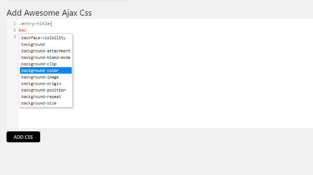
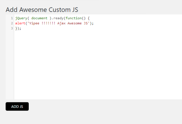
Ajax Awesome CSS allows you to create custom CSS for your website or your blog, without having to refresh the page every time you want to see the changes. With this plugin, you won’t have to deal with theme files anymore, and you get to make small variations in a simple and comfortable way.
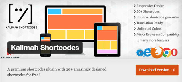
Kalimah Shortcodes offers a function range that is usually only found in premium plugins. It lets you use more than 30 shortcodes in your blog posts and pages, and also allows you to create sections full of functions. All shortcodes can be tested on the demo page.
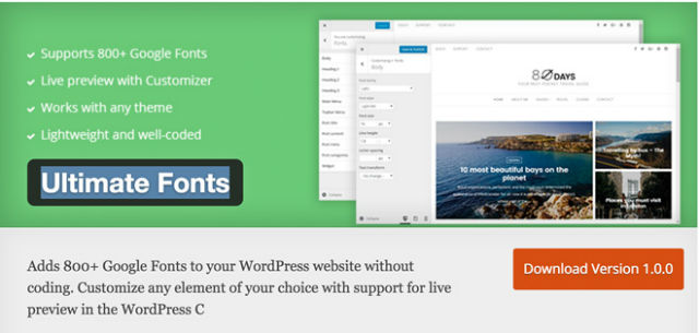
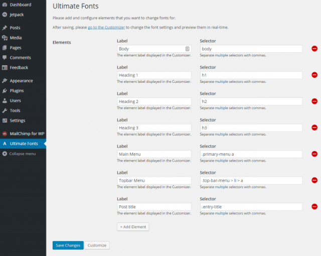
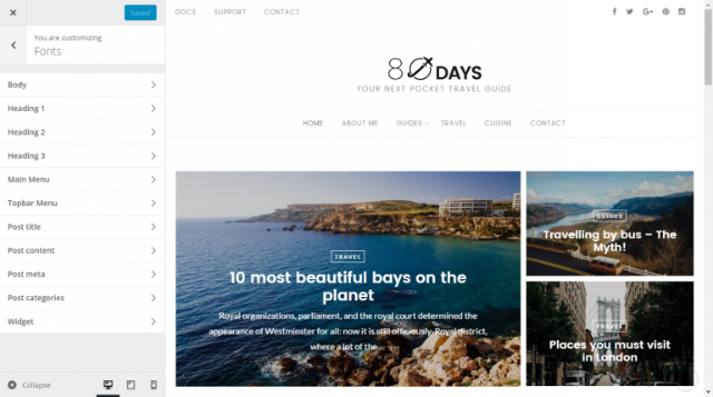
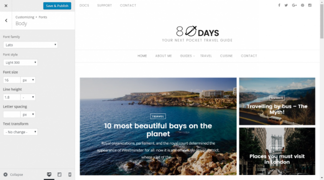
Are you looking for a comfortable way to equip your website with many neat Google Fonts? But you don’t want to fiddle with the code? Then, this plugin is the perfect choice for you. It allows you to use more than 800 typefaces. You can assign a custom font to each of your blog’s elements. In the WordPress Customizer, you’ll see the changes in real-time.
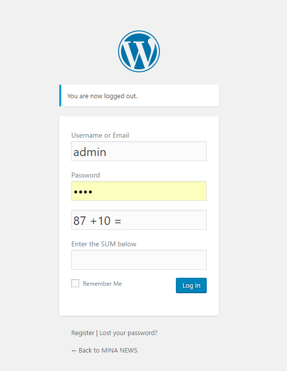
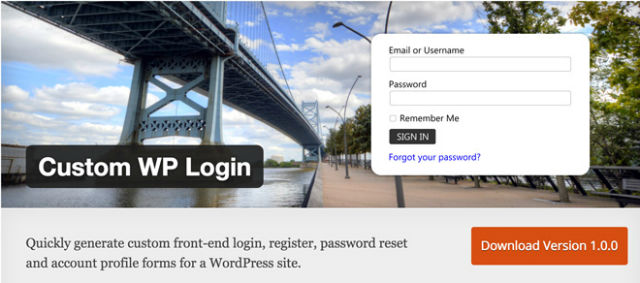
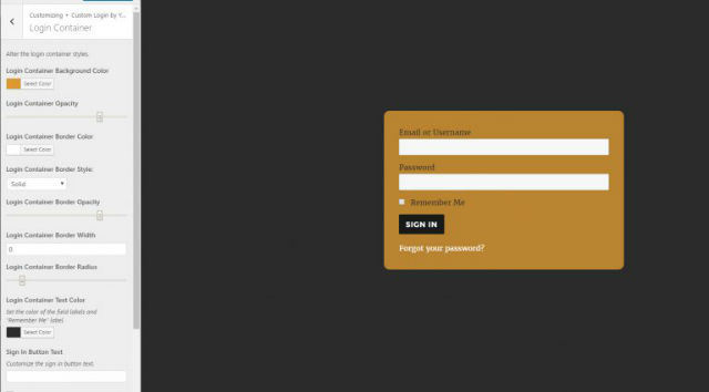
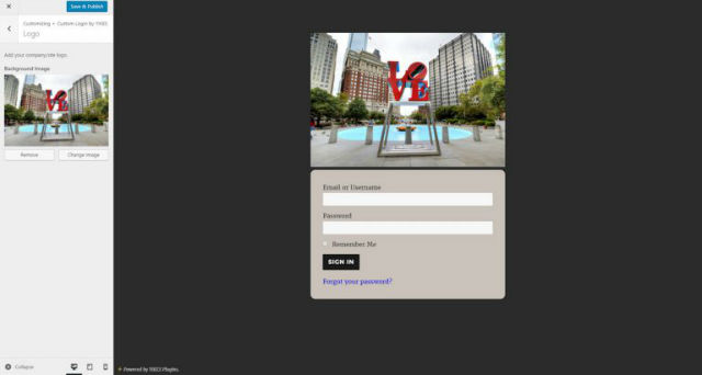
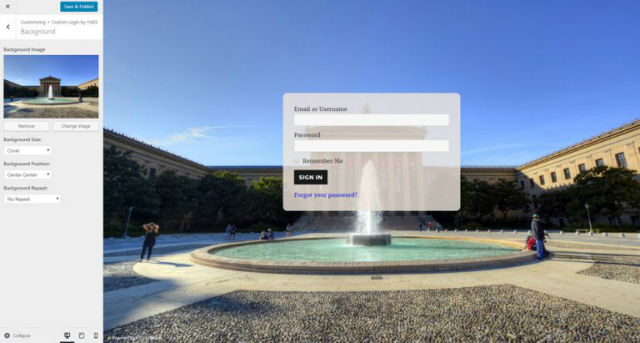
Custom WP Login is the plugin for you when you wish to create login forms for your users. You get the option to create fully customizable login pages. Many different layouts and background images make for a safe and appealing way to create a login for your membership, or shop website.
All settings can be viewed in real-time via the WordPress customizer.
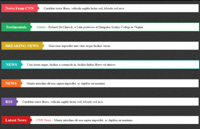
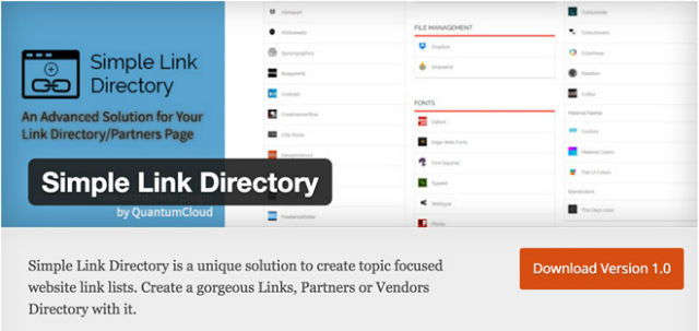
Simple Link Directory helps you create appealing lists with icons. This plugin could be useful for a list of your partner websites, or to highlight certain categories. With a bit of creativity, the right application area can always be found.
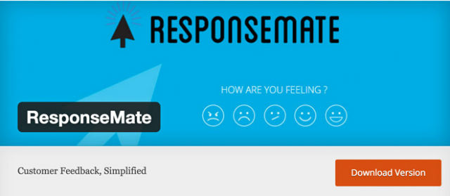
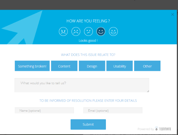
ResponseMate allows you to receive fast and straightforward feedback from your users or customers. The service behind the plugin is still in the beta stage so that it may lag at times. However, the description already sounds interesting. A free account on the ResponseMate website is required to use the plugin.
I’ve always loved 3D geometry. I began playing with CSS 3D transforms as soon as I noticed support in CSS was getting decent. But while it felt natural to use transforms to create 2D shapes and move/rotate them in 3D to create polyhedra, there were some things that tripped me up at first. I thought I might write about the things that surprised me and the challenges I encountered so that you might avoid the same.
3D Rendering Context
I clearly remember I first ran into this one evening when curiosity hit me and I thought I’d write a quick test to see how browsers handle plane intersection. The test contained two plane elements:
The scene was the entire body element, made to cover the entire viewport and given a perspective so that everything further away would appear smaller and everything closer would appear larger:
body {
  margin: 0;
  height: 100vh;
  perspective: 40em;
}
To actually test plane intersection, the second plane element got a rotateY() transform and a different background:
But I was wrong. This is exactly what the code I had written should result in. What I should have done was put my two planes within the same 3D rendering context. If you’re not familiar with 3D rendering contexts, they’re not that different from stacking contexts. Just we can’t order elements via z-index if they are not within the same stacking context, 3D transformed elements can’t be arranged in 3D order or be made to intersect if they are not within the same 3D rendering context.
The easiest way to make sure they’re within the same 3D rendering context is to put them inside another element:
If you’re using Firefox to view the above demo, you still can’t see the planes intersecting as they should because Firefox still doesn’t get this right. But you should see them intersecting in WebKit browsers and in Edge.
Now you may be wondering why even bother with adding that containing element, shouldn’t simply adding transform-style: preserve-3d on the scene (the body element in our case) work? Well, in this particular case, if we add this one rule and nothing else to the initial demo, it does work (unless you’re viewing it in Firefox, because, as I’ve said before, Firefox still has problems with 3D order and 3D intersections):
If we want to use 3D on an actual web page, our scene probably won’t be the body element and we’ll probably want to add other properties on the scene. Properties that could interfere with that.
Things That Break 3D (Or Cause Flattening
Let’s say our scene should be another div in the page and that we have other stuff around:
I’ve also added a few more transforms on the second plane to make it more obvious that it’s coming out of the scene. Which is something we don’t want. We want to be able to read the text, interact with controls we might have there, and so on.
1) overflow
The first idea that springs to mind is to just set overflow: hidden on the scene. However, when we do that, we lose our beautiful 3D intersection:
This is because giving overflow any value other than visible effectively forces the value of transform-style to flat, even when we have explicitly set it to preserve-3d. So using a container does mean writing a bit more code, but can spare us a lot of headaches.
This is why I now place everything in a scene in a containing element, even if that element isn’t being transformed in 3D. For example, consider the following demo:
All the rotating columns of hexagons are placed within a .helix element:
<div class='helix'>
    <div class='col'>
        <!-- all the hexagons inside a column -->
    </div>
    <!-- the other columns -->
</div>
This .helix element doesn’t have any other styles (directly set or inherited) except those that ensure the whole assembly is absolutely positioned in the middle of the viewport and that all the columns are within the same 3D rendering context:
This is because I’m setting overflow: hidden on the scene (the body element in this case) as the size of the hexagons doesn’t depend on the viewport so I don’t know if they’re going to stretch outside (and cause scrollbars, which I don’t want) or not.
I confess to having hit this problem more than once before I learned my lesson. In my defence, there are situations where the effect of overflow: hidden may not seem as obvious.
transform-style: preserve-3dtells the browser that the 3D transformed children of the element it’s set on shouldn’t be flattened into the plane of their parent (the element we set transform-style: preserve-3d on). So even intuitively, it kind of makes sense that also setting overflow: hidden on the same element would undo this and prevent children from breaking out of the plane of their parent.
But sometimes a 3D transformed child can still be in the plane of its parent. Consider the following case: we have a card with two faces:
We position them all absolutely in the middle of the scene (the body element in this case), give both the card and its faces the same dimensions, set transform-style: preserve-3d on the card, set backface-visibility: hidden on the faces and rotate the second one by half a turn around its vertical axis:
Both faces are still in the plane of their parent, it’s just that the back one is rotated by half a turn around its vertical axis. It’s facing the opposite way, but it’s still in the same plane. Everything seems great so far.
Now let’s say we don’t want the faces to be rectangular. The simplest way to change that is to give the card border-radius: 50%. But that doesn’t seem to do anything at all.
In this case, the method solving the issue is even simpler than the one causing problems. But what if we wanted another shape, like a regular octagon, for example? A regular octagon is pretty easy to achieve with two elements (or an element and a pseudo):
We give them both the same dimensions, rotate the .inner element by 45deg, give it a background so that we can see it and then set overflow: hidden on the .octagon element:
The problem is that it’s clipped out in one of the corners, so we make it larger, align it horizontally with text-align: center and bring it to the middle vertically by giving it a line height equal to the dimension of our .octagon (or .inner) element:
Now let’s see how we could apply this if we want a card with octagonal faces. We cannot set overflow: hidden on the card itself (making it play the role of the .octagon element while the faces would be like .inner elements) as that would break things and we wouldn’t have a nice 3D card with two distinct faces anymore:
Another property that can cause similar problems is clip-path. Going back to our card example, we cannot make it triangular by applying a clip-path on the .card element itself, because we need it to have a 3D transformed child, the second face. We should apply it on the card faces instead:
Note that the clip-path property still needs the -webkit- prefix for WebKit browsers, setting the layout.css.clip-path-shapes.enabled flag to true in about:config for Firefox (47+) and is not yet supported in Edge (but you can vote for implementation).
The result of adding the line of code above would look like this:
No 3D issues, but it looks really awkward. If the card is a triangle pointing right when viewed from the front, then it should point left when viewed from the back. But it doesn’t, it also points right. One solution to this problem would be to use different clip-path values for each of the faces. Clip the front one using the same triangle pointing right and clip the back one using another triangle pointing left:
Note that I have also changed the text-align value: the default left for the front face and set to right for the back face.
Alternatively, we could also add a scaleX(-1) to the transform chain on the back face (if you need a reminder of how scaling works, check out this interactive demo):
The shape looks fine in this case, but the text is backwards. This means we actually place the text and the background on a pseudo element on which we reverse the scale on the .face element. Reversing a scale of factor f means setting another scale of factor 1/f. In our case, the f factor is -1, so the value we’re looking for the scale on the pseudo-element is 1/-1 = -1.
Masking properties set to any value other than none can also force the used value of transform-style to flat, just like overflow or clip-path when set to values different from visible and none respectively.
3) opacity
This is an unexpected one.
It’s also a relatively new change to the spec so that the effect opacity of less than 1 has on 3D rendering contexts matches that on stacking contexts. This is why sub-unitary opacity doesn’t actually force flattening in Edge, Safari or Brave… yet! It does however have this effect in Chrome, Opera and Firefox.
Consider the following demo, a group of cubes rotating together in 3D:
Structurally, this means an .assembly element containing a bunch of .cube elements, each of them with 6 faces:
<div class='assembly'>
  <div class='cube'>
    <div class='cube__face'></div>
    <!-- five more cube faces -->
  </div>
  <!-- more cubes, each with 6 faces -->
</div>
Now say we want the cubes to be semitransparent. We cannot do this:
.cube { opacity: .5; }
This leads to the transform-style value on the .cube elements to be forced to flat even though we’ve set it to preserve-3d, which makes the cube faces get flattened into the planes of their .cube parents. For now just in Chrome, Opera and Firefox, but the rest of the browsers will implement this in the future as well.
Result when opacity doesn’t force flattening (Brave, Edge, Safari) Result when opacity forces flattening (Chrome, Firefox, Opera, per new spec changes)
We cannot set opacity: .5 on the .assembly element either, as we have set transform-style to preserve-3d on it as well. So, again, the result is going to be inconsistent across browsers as the new spec forces flattening and some still follow the old one (which didn’t).
What we can do without running into any trouble is set opacity: .5 on the cube face elements:
We could also set it on the scene element, but note that is going to also affect any scene background or pseudo-elements we might have. It’s also not going to make the individual cubes or faces semitransparent, just the whole assembly. And it doesn’t allow us to have different opacity values for different cubes.
Result when setting opacity: .5 on the individual cube faces Result when setting opacity: .5 on the scene
4) filter
This is another one that surprised me though, unlike opacity, it isn’t new and the results are consistent across browsers. Let’s look at the cubes example again. Say we wanted a random different hue for each cube via hue-rotate(). Setting a filter value other than none on the cubes or the assembly results in flattened representations.
$n: 20; // number of cubes

@for $i from 0 to $n {
    $angle: random(360)*1deg;

    .cube:nth-child(#{$i + 1}) {
        filter: hue-rotate($angle);
    }
}
That filter still needs the -webkit- prefix for WebKit browsers.
This does work for giving each cube a random hue, but it also flattens them:
The solution in this case is to set the filter on the cube faces within the loop:
$n: 20; // number of cubes

@for $i from 0 to $n {
    $angle: random(360)*1deg;

    .cube:nth-child(#{$i + 1}) .cube__face {
        filter: hue-rotate($angle);
    }
}
This gives us what we were after, cubes in random hues and still 3D, not flattened:
We also cannot set a filter on the whole assembly. Consider the situation when we’d want it all blurred. Let’s say we do it like this:
.assembly { filter: blur(4px); }
The result is that the whole thing gets flattened into the plane of the assembly in addition to being blurred. Edge is the exception, everything disappears.
What we could do here is try to apply the blur() filter on the face elements, though the result wouldn’t be exactly as intended as if we’d have the individual faces blurred, not the cubes themselves. It also looks buggy, with Blink browsers experiencing some flickering, missing faces and being noticeably slowed down by the blur() filter, while Edge messes things up completely. Firefox seems to do best here, save for the 3D order issues previously mentioned.
We could also try applying it on the scene, though that seems buggy (sometimes there’s flickering, faces disappear in Chrome and in Firefox, where the whole assembly then disappears completely, while Edge doesn’t display anything at all).
I was surprised because this next simpler demo of a rotating cube also has a blur() filter applied on the scene and it seems to work fine for the most part in Blink browsers and in Edge. Nothing shows up in Firefox however.
Overall, filters in combination with 3D seem to be often problematic, so I’d say use with caution.
5) mix-blend-mode
Let’s say we have a .container element with a sort of a rainbow background. Inside this element, we have a .mover element with an image background, let’s say a blackberry pie. The class name probably gave this away already, but we animate the position of the .mover element and we set mix-blend-mode: overlay on it. This makes our mover have a different look depending on what part of its parent’s background happens to be over.
Blend modes are not yet supported in Edge, so none of the demos in this section work there. You can however vote for mix-blend-mode implementation. Also note that, for now, you probably shouldn’t take the .container to be the body or the html element due to a Blink bug. This bug causes the blend mode on the .mover to be ignored when it’s animated and the .container is the body or the html. Firefox and Safari don’t have this problem.
Alright, but this is just 2D. How about our mover being a cube with image faces, a cube that’s rotating around in 3D?
So far, so good, but we don’t have any blending going on yet. We set mix-blend-mode: overlay on our cube and… we now have blending, but it broke our 3D, the faces are flattened into the plane of the cube!
Again, this is because we apply 3D transforms on the cube as we animate it and it has 3D transformed children, so we want our cube to have a value of preserve-3d for transform-style. But setting mix-blend-mode: overlay on our cube forces the used value of transform-style to flat, so the cube faces get flattened into the plane of their parent.
We could try setting mix-blend-mode: overlay on the cube faces, but this doesn’t appear to be working. The cube is flattened and there’s no blending.
Another solution would be to add a .scene element between the container and the moving cube and set perspective and mix-blend-mode on this element:
Designers often rely on wireframes, mockups, and prototypes. They use them to show how they see the final product unfolding at various stages in the design process. These presentations can vary from rough sketches to a model that emulates the look and feel of the final product nearly to perfection.
Thus, these three design aids serve somewhat similar purposes, and their often confused. They are not one and the same. It’s important to know the difference.
A wireframe is a low-fidelity model of a proposed design. A wireframe, as the name implies, offers only an outline of what the final product might look like. It is a static representation, with little internal substance (functionality).
A mockup is a step up. A mid-to high-fidelity mockup can in fact provide a visual demonstration of the proposed design in great detail. But it is also a static model.
A prototype provides a dynamic representation. A high-fidelity prototype can simulate the look and feel of the end product to the point where you can hardly tell the difference.
All three model types are vehicles for obtaining comment and feedback. Prototypes can vary from simple to exceedingly complex, and are by far the best usability testing aids. Prototypes can range from data and user-flow sketches, to low-fidelity models. And to high-fidelity models that can prove and verify a product’s UX.
With InVision, designers and their teams have few problems, if any, prototyping, reviewing, refining, and testing their web and mobile product designs. Best of all, they can accomplish these things without writing a single line of code, and it takes just minutes to build a working, high-fidelity prototype.
In InVision, users enjoy a premier product designed and developed by a world-class company. InVision is recommended by Forbes, and Forbes also lists InVision as one of the top cloud companies in the world, ranked up there with the likes of Slack, MailChimp, and Dropbox.
InVision’s always-on prototyping, collaboration, and workflow platform can play a decisive role in speeding up your team’s entire product creation process. View feedback in one central location for every project, and drill down to a specific project, task, or team member. Version controls are present too, so there’s no need to worry about losing your place during a flurry of feedback, suggestions, changes, and fixes.
Sign up for a free 15-day trial today. You’ll be glad you did.
If you’ve been dreading looking for a new prototyping tool because you don’t want to have to deal with a steep learning curve – again, you’ll love getting acquainted with Pidoco. Prototyping made easy is the watchword, and this product lives up to the slogan.
Since you can start being productive from the get-go, Pidoco makes a great choice for teams that need a smart web and/or mobile prototyping tool, but have been reluctant to the take extra time to become familiar with something new.
Pidoco is well-known for its ability to turn out high-fidelity, fully-interactive UX prototypes, but you can use if for wireframing and low-fidelity applications as well. Small and large companies in more than 50 countries have put their trust in Pidoco. You can sign up for free, and several pricing plans are available.
One user calls Proto.io the best in-browser prototyping platform around. Another claims to have built their startup around it. Yet another appreciates the fact that having this prototyping platform in hand mitigates the problem of moving from design to development prematurely.
These are just a few of the many reasons for trying out this prototyping platform, taking advantage of the free 15-day full feature trial.
Proto.io is very easy to use, and no coding is necessary to turn out pixel-perfect, interactive prototypes of your mobile app designs. Actually, you can prototype for any device and screen size. The latest version contains a number of exciting new features that make prototyping faster and easier than ever.
The Proto.io Dashboard helps you with your version control and collaboration tasks, the Editor does the heavy lifting when building your prototype, and the Player lets you view the results on your browser, share it with others, and conduct testing.
Last but not least, the Proto.io app lets you experience how your prototype looks, feels and works on a mobile device.
With Webflow, nothing you create is wasted. Everything you build, including your high-fidelity, interactive prototypes, is powered by production-ready HTML, CSS, and JavaScript. This means you can make the transition from prototype to production rather seamlessly. At a minimum, you can give your developers responsive code to work with, and not just static mockups.
However you choose to use Webflow, you’ll soon discover how easily it can speed up the design process. You can design with real content, and collaborating with fellow designers and other team members is also easy. Sign up, and try out this powerful tool today. It may change your approach to a lot of things.
Until recently, PowerPoint users had to be content with static slide representation in place of mockups and interactive prototypes. While using PowerPoint is an effective way to present almost anything, including web and app design information, PowerMockup has changed things for the better, and dramatically so.
PowerMockup is a PowerPoint add-on consisting of a large library of design elements and shapes. No coding is necessary to present a slideshow of animated, interactive screens that give team members and project stakeholders a storyboard-type of prototype to work with or respond to.
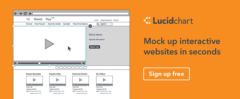
Even if you have a prototyping tool you’re happy with, adding Lucidchart to your design toolbox will still make sense. Its extensive library of design elements allows you to create high-quality wireframes and mockups; or you can simply use this tool for your chart making and flow diagramming tasks.
While rough sketches have their place, a professional design shop should never be without a tool that produces professional-grade dataflow or workflow diagrams, or charts. Lucidchart makes flowcharts quickly, and it makes them right.
HotGloo is easy to learn, runs in your browser and provides you with the right amount of features needed to create your wireframes and prototypes for web, mobile and wearables.
You’ll have access to a 2000+ user interface element library, a multiple-licensed account, so you can easily and quickly collaborate with team members, and you can test your work and add comments or make changes on the fly.
HotGloo is supported with a full documentation, video tutorials and webinars to get you going in almost no time. Try it for free today!
Conclusion
These 7 prototyping tools are not one and the same, and differ only in their packaging and branding. You should not have a problem finding one or two that will work for you better than the others. Most have the features you need to build pixel-perfect, interactive prototypes, although several are better suited for wireframing, or assisting your design efforts in other areas.
One is dedicated to PowerPoint users, one allows you to hand off your design to developers in coded form, and one is a great tool to have if your flowcharting and diagramming efforts aren’t quite at a level of quality you’d like them to be. Whichever you choose, you’ll have made a smart decision, since all seven of these tools are great at what they do.
The Muz.li team joins forces with the great people behind InVision Labs. As both have the same understanding of quality, this move is no bad news for designers and developers. So no worries, it’s only me. I am having a hard time understanding what the deal could be about.
A Short Introduction to InVision and Muz.li
Noupe readers know Mus.li, which we introduced here, as well as InVision, which we covered extensively here. InVision has created waves in the developer pond ever since its inception and is today one of the most active contributors of free design assets out there.
The core of the business is prototyping, however. Read the linked article above to learn more. In short words, InVision makes it easy for you to create an operational prototype of your design project and share with stakeholders. Collaboration is possible; communication is tied right to the item that needs discussion. I would confirm that there are not many solutions covering the same problem, and there is not one that does it better. So, InVision is the place to go to when you are in need of a prototyping and collaboration platform for your design projects.
Muz.li, on the other hand, has nothing to do with this core business. They are just the provider of a Chrome extension that overtakes the New Tab in your browser to populate it with inspirational content drawn from third-party websites. For more information turn to the above-mentioned article. Since 2014 Muz.li has evolved and started to come up with their own line of content that they publish over at Medium.
Still, the core of the extension is curating content from around the web and presenting it in each new Chrome tab you open. Besides relying on their curation powers, you can also add RSS feeds you want to see on the same page. The mixture they present looks visually appealing and is certainly diverse.
For a short while the Muz.li Chrome extension stayed installed in my browser. Rather sooner than later I found that inspiration curation is a thing I need to do on my own. No premade service can deliver me exactly the sparks I am looking for and – to be honest – Muz.li picks on the lowest hanging fruit in the designer space anyway. There was nothing that I would have missed had I not installed Muz.li.
Even worse was the constant distraction each new tab opening exposed me to. Work is still about getting things done in the first place. Inspiration needs to be searched for when it is not coming voluntarily. Having inspiration sources pop up all around me did more harm than good to my work output. It must have been at least a year ago that I decided to delete the extension again.
Is Muz.li InVision’s Content Marketing Strategy?
Now Muz.li and InVision announce that Muz.li will be run as part of InVision Labs. Muz.li will continue to do what they did up until now, and it will also keep running independently from InVision. That’s about all information we get. Besides the mutual praise of the teams and the philosophy and what not. What isn’t explained is the question why InVision would want Muz.li on board. By the way, what does “Today we join the amazing InVision Labs family” even mean?
There are two interpretations to make sense of it. One might be that the Muz.li team might be highly skilled in making apps work in the browser. That would certainly mean the end of the extension sooner or later. The second might be that InVision, already highly active regarding content output, is looking to strengthen their content marketing efforts. It would certainly be a question of price, but this approach makes the most sense to me. We will see whether or not promotional aspects will come up in the operation of Muz.li.
Either way, from a business point of view I cannot find a solid explanation for that move. Can you?
For those of us familiar with brutalism on the web, we don’t necessarily look at it as a favorable design choice. That’s because it violates a lot of the best practices of today’s web-design standards, including making beautiful websites that provide good information architecture on each page.
In fact, brutalism’s stark, ultra-bare bones approach to design has left many of us borderline repulsed, especially with popular design trends like flat, flat 2.0, minimalism, and parallax espousing characteristics like vibrant colors and great aesthetics. To be sure, brutalism’s raw and industrial-inspired approach doesn’t leave many in the design community feeling all warm and fuzzy.
However, what if the extreme, stripped-down approach of brutalism actually helps your site get more conversions and sell more of its product or service? Then, you’d have to give it a second look, wouldn’t you?
Believe it or not, while brutalism certainly won’t win any aesthetic accolades any time soon, its ultra-minimalist design choices actually can prove beneficial to raising conversion rates. Here’s how:
A faster website
One of the reasons that brutalism is seen as ugly is because there are no frills and gimmicks in the design. The appearance of a brutalist site goes way beyond minimalism and into something raw and almost unfinished-looking. While it’s not easy on the eyes of users, the thing is that a site with so few elements won’t take long to load its pages.
As a result, a brutalist site becomes faster than an ordinary site with more elements to load. Think about it: Without high-resolution images or lengthy videos, a site isn’t bogged down and can therefore load quicker than usual.
How does this impact conversions?
Research show that faster sites increase conversions.
Kissmetrics’ infographic establishes the following:
• The longer it takes a page to load, the higher the abandonment rate will be
• 79% of shoppers who are unhappy with site performance are less likely to purchase from the same site again
• A one-second delay in page speed can cause a 7% drop in a site’s conversions
Brutalist sites provide your users and visitors with better, speedier performance because designers don’t have to work with a sophisticated and taxing content management software, nor do they have to bother with complex Javascript or CSS. From the back-end perspective, brutalist sites can be built with just a fundamental understanding of HTML and a text editor.
A popular example of a brutalist site is Y Combinator’s Hacker News. When we check Alexa analytics to determine its site speed, we see that it loads “very fast” at just 0.79 seconds.
While this ultra-simplicity may be minimalism to the extreme, it sure results in faster sites that provide a better UX, particularly for shopping sites, and therefore raise conversions.
Extremely easy navigation
The ease of use of any site’s navigation isn’t just a benchmark for the success of the site, but also determines whether the site has many conversions or very few. Depending on the navigability of a site—in other words, how easy it is for users and visitors to find the information they’re looking for on your site’s interface—usability will be affected one way or another.
Say what you will about brutalist sites’ ugliness, but at least they are incredibly easy to use!
According to the Nielsen/Norman Group, if site usability is low, thereby making the site hard to use, users leave, dropping conversion rates like crazy. One of the primary offenders of bad navigation and, consequently, bad usability is complexity, excess and clutter in the form of too many elements on any given webpage.
Say what you will about brutalist sites’ ugliness, but at least they are incredibly easy to use! That’s directly owing to how relatively few elements appear on their pages, competing for the user’s attention, in comparison to today’s apparently UX-friendly, trendy and aesthetic sites that adhere to all the web-design best practices.
When your users easily find what they want on your site — say, a product they’re searching for, along with prices, shipping info, and a bold and big call to action button — they’re likelier to stick around and complete an action.
We see this on Apple’s site for this past summer’s WWDC16. The navigation is so easy to find in the header since there are only very few competing elements on the page. Budding designers who wanted to attend the conference and get advice straight from Apple experts could also efficiently request a consultation since the “Consultations” tab in the navigation menu was easy to find and led to a noticeable CTA.
Fewer distractions and choices
We know that visitors and users are an easily distracted bunch. We’ve all heard of the notorious and frequently referenced jam experiment, where one tasting session with fewer choices led to more purchases or conversions, as opposed to another session dominated by more choices and fewer purchases.
This old-school experiment — not involving sites, digital products, or anything design-related — shows us that human beings are easily affected by too many choices, which leads to choice paralysis. This applies to your site visitors and users, too.
That’s why it’s unsurprising that studies show that landing pages, for example, with fewer choices lead to more conversions. Crazy Egg recommends removing the following distractions for better conversions:
The navigation bar
Excessive form fields
Multiple CTAs
Thanks to their rawness and stark absence of frills and gimmicks, brutalist sites are extremely distraction-free. Many brutalist sites have only one point of focus or page goal on their homepages, and that usually centers around the purpose of the site in the first place. As we’ve just seen, when a page has very few distractions, conversions will increase because there are fewer elements competing for your users’ attention and action.
Take UX and web designer Serge Khineika’s site. It is literally the epitome of a brutalist site with barely any distractions because there are only a few links visitors can click on until they scroll down to the bottom of the page—where Serge displays his contact info. Therefore, the page goal—getting leads to get in touch with him—is optimized and will have a positive effect on conversions.
Brutalism and conversions: a match made in heaven?
Before you write off brutalism as being unfriendly to conversions, think twice. Criticism of brutalism has been primarily based on its unorthodoxy and unattractiveness, which violates our current standards of what constitutes excellent design.
However, when it comes to conversions, less is more and simpler is better—and the research backs this up. You don’t necessarily need a gorgeous site with all the bells and whistles that sports the latest design trend to optimize conversions on your site. Ironically, a beautiful site can include a lot of excess baggage, both in design and development, which can hamper conversions.
So the next time you see a brutalist site, don’t be so quick to misjudge it! The site owner may just be enjoying his fair share of conversions, in spite of its unattractive appearance.
There are many reasons why one may want to embed JavaScript capabilities into an app. One example may be to take a dependency on a JavaScript library that has not yet been ported to the language you’re developing in. Another may be that you want to allow users to “eval” small routines or functions in JavaScript, e.g., in data processing applications.
The key reason for our investigation of ChakraCore was to support the React Native framework on the Universal Windows Platform, which is a framework for declaring applications using JavaScript and the React programming model.
Someone wrote in asking about some icons in my Dock. I figured that might be a fun thing to share, and y’all can follow suit and share yours as well. I know “Docks” are a little Mac-centric, but feel free to share your most used apps on other platforms as well. I bet this changes quite a bit over the years, so it will be interesting to re-do this in years to come and see how it changes.
The Whole Dock
I keep it as big as it can be. I also just a few days into having a really wide 34″ LG monitor, so my Dock is large-and-in-charge right now:
Activity Monitor – Sometimes my laptop fans start going crazy and everything gets slow. I often pop open Activity Monitor and sort by CPU usage and figure out what it is. Sometimes it’s some Ruby task freaking out or a Chrome tab doing something super intensive. It’s good to figure out so I can kills the task and calm things back down.
1Password – Essential app for managing passwords. I also keep a lot of notes in there of things I want to keep secure. I use pretty much every feature of 1Password. Multiple vaults. Shared vaults. Drivers License. Software Licences. Passports. Most useful: Credit Cards. So nice to have all this data in one app that also syncs to my other devices.
FontExplorerX – I’m not even sure how necessary this is anymore since the native Font Book looks like it can do most of what I use this for. Mostly grouping fonts into my own categories so I can browse for what I need quickly and shutting off stuff I don’t use very much. I like the interface though so I keep upgrading it.
The browsers!
Safari – On iOS I use Safari because it’s the only browser that supports that ad blocking stuff. On Desktop I use it the least, but it’s here for testing.
Chrome – I do most of my day-to-day browsing and development in Chrome.
Firefox Developer Edition – Mostly for testing. I’m not sure why I use the Developer Edition and I don’t think I use any particular features of it, but hey, why not.
Simulator – I use this iOS simulator (comes with XCode) quite a bit. I find it the easiest way to get a faithful mobile look and experience of a site without having to use the real thing.
Git Tower – I like a GUI for git! I use this for 98% of all Git stuff I do. I find it nice for jumping around projects, cutting and merging branches, picking out files for commits… it suites my style. I do find it very crashy though. I’d say it quits on me a few times a day. Fortunately it starts fast. My favorite feature is the auto-stashing when switching branches.
iTerm – I use the command line a ton, but only for basic things and things real DevOps people have set up for our team. I’ve heard iTerm is far nicer than the native Terminal, so I use it. I doubt I use any of it’s many features though. I do like how when it quits and restarts it keeps all the tabs and the directory location of each.
Sequel Pro – For poking around in databases. I tend to just do little stuff like change settings, figure out user ID’s, ensure the proper tables exist and that connections work, and things like that.
Transmit – When I need straight FTP, I use Transmit. But even than FTP I use it for connecting to the various Amazon S3 buckets where I need to store stuff.
Coda – I don’t use it much anymore, but when I need to FTP into a site and hotfix some actual code in there, you can’t beat Coda. I don’t use most of it’s features, like version control and previewing and whatnot. Mostly I end up using it for editing files that are .gitignored for whatever reason, like an `.htaccess` file or something.
CodeKit – Any of my projects that are in between “super simple thing with zero build step necessary” and “super complicated project with custom build steps” I use CodeKit for. Like CSS-Tricks itself. Point CodeKit at a project folder and do all the preprocessing you need.
MAMP – I use the Pro version for firing up local WordPress sites. Someday I’d like to upgrade my setup and have everything be more virtualized or Dockerized or whatever, I just haven’t gotten there. And it bites me sometimes, needing all my other projects to work around MAMP stuff so everything can co-exist.
Noun Project – the native app means you can search for icons and then drag and drop them right into apps like Sketch, Illustrator, or Keynote.
Sketch – The design tool of choice for layout and component design work.
Photoshop – I mostly use it for cropping and resizing, as my attempt at a workflow didn’t go great. A little photo manipulation. Very little layout work anymore.
Illustrator – Any time I’m working with an individual SVG file I go for Illustrator. Haven’t quite moved that to Sketch yet. Not sure why.
Keynote – I feel weirdly guilty that I don’t build my slide decks with front end technologies. I think that’s usually a cool way to go. Makes them more shareable and searchable and all that. I just like working in Keynote. I also really like Slides.com though, so I plan to use that more and more.
GIPHY CAPTURE – I like the UI and options available in this GIF capturing tool.
licecap – I still go for licecap when I need to make a GIF bigger than GIPHY CAPTURE allows or I need to very carefully control the framerate.
Photos – I quite like Photos lately. It seems a little slow to sync new stuff from my other devices, but it does do it. I’ve managed to port over pretty much every photo I’ve ever taken into it. So now I have this massive collection of photos, but only a fraction of which are stored in high res directly on my machine. The shared albums works great. The smart grouping works well. I can blast things up to Flickr as needed. Not much more I want!
iTunes – I don’t hate on iTunes as much as a lot of people, and I think it’s finally starting to get better. I probably shouldn’t, but I feel pretty locked into the whole iTunes ecosystem. I’ve boughten a ton of stuff from it. I have a ton of playlists and ratings and whatnot. I don’t use it a whole lot on my laptop anyway as I’m one of those weirdos who can’t work well with music playing. I use iTunes stuff way more on the phone and AppleTV.
Quicktime Player – I actually use the crap out of this since I use it for recording local audio bits for all the various podcasting I do. I also use it for quick screen recordings, which is useful for stuff like Buffer > Instagram.
ScreenFlow – For longer screencast stuff, I use ScreenFlow. Mostly because it has this really cool robust feature set that you could use to make screencasts much more compelling and watchable… that I only think about using but never do. I do use the timeline feature for stitching together multiple video and audio tracks.
Sublime Text – I switched to Atom for a good month there but ultimately couldn’t get it to stick. I find Sublime fast, comfortable, and productive.
Fantastical – This is the calendar app that stuck for me. I tried and essentially liked BusyCal, Sunrise, Google Calendar and the native iCal and they were all pretty good, but I just like this a bit better. Behind the scenes, it’s really all still Google Calendar though so it syncs nicely. If anything weird went down with integration, I’d probably just use the Google apps.
Messages – I only use this for SMS and whatever the Apple version of that is. iMessage or whatever. I don’t use AIM anymore and Google Hangouts works best through the Chrome add-on.
WhatsApp – I mostly think of this as a phone app, but recently found the desktop app and it’s pretty good! I don’t use it a lot, but I have a bunch of family and friends groups on it. So it you’re at the desktop anyway, might as well use the desktop app instead of having to change contexts over to the phone.
Slack – All communication lives here. I still find it so weird how Slack came out of nowhere and absolutely dominated team communication.
Zoom – The UI ain’t great, but it’s hands down the best video and audio conferencing software. Skype UI is infuriating. Google Hangouts feels slow and buggy. ScreenHero feels abandoned and buggy and the bits that made it into Slack doesn’t seem to work great either.
Front – A team-based tool for managing incoming email and Twitter and stuff. We love it at CodePen.
iA Writer – The best Markdown editor.
Notes – I use the crap out of Notes for personal organization. These are my to-do lists, thought dumps, publishing schedules, general notes. I haven’t even used all the fancy new features like drawing in them and whatnot. I love that they automatically sync through iCloud though.
ImageOptim – I upload a ton of images to the web intended to be seen on websites. Like all the images in this blog post. I drag and drop all of them onto this first to make sure they are as small as they can be. Ideally I”d have a WordPress plugin automatically optimize everything I upload, but I haven’t found anything that has worked great and stuck yet.
Recent Documents – Anything that I’m super actively working on I drag over here so they are one-click away.
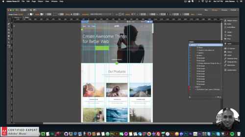
Complete Tutorial on How to Build a Bootstrap Template in Adobe Muse. No Coding Skills Required.
Bootstrap is one of the more popular methods of creating a website with code. In the above video tutorial I go over how to create a Bootstrap template in Adobe Muse. No coding skills required. The steps are as follows:
1. Find a Bootstrap template to re-create.
2. Take a picture of the website across different breakpoints with the Fireshot Webpage Screenshot Chrome extension.
3. Create breakpoints in Adobe Muse.
4. Decide if website is going to be fixed width, fluid-width, or adaptive.
5. Create guides in Adobe Muse.
6. Add elements and assets. Sample fonts with the WhatFont Chrome extension.
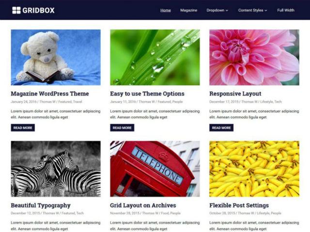
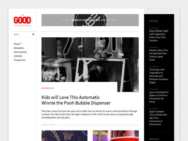
Same procedure as every month. I look through the official WordPress theme index to bring you the best free WordPress themes that give your website a fresh new look. Surprise your readers with a new design that you didn’t need to pay a single cent for. This month, there are real treasures among the various themes.
Halcyon is a very clean theme for blogs or photographers. It provides a modern display of your photos and a slider on the landing page. Custom logos, social media links, as well as four theme-exclusive widgets are available.
Created by: Rara Theme
License: Free for personal and commercial use | GNU General Public License
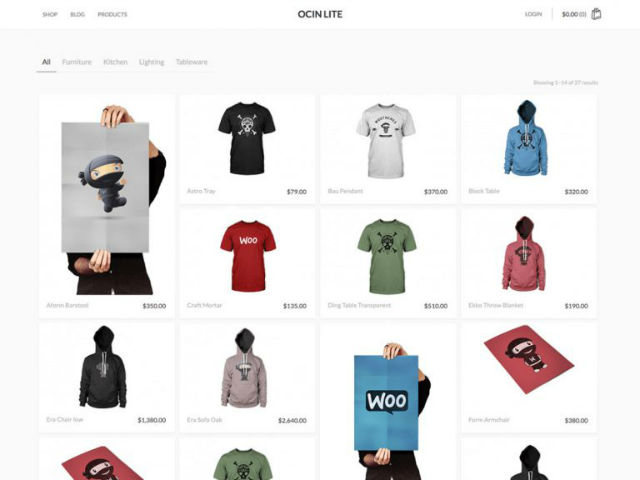
Ocin Lite is a theme for online shops, based on the popular WooCommerce plugin. You get to customize both header and background colors. The theme has a minimalistic design and focuses on the presentation of products.
Created by: Quema Labs
License: Free for personal and commercial use | GNU General Public License
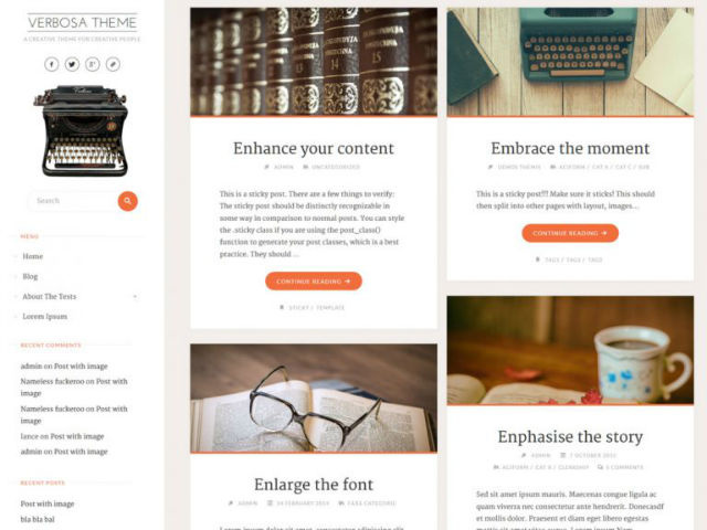
Verbosa is an appealingly designed theme for bloggers, authors, and photographers. The background, the colors, as well as the header can be customized to your personal needs. Such a lovingly designed theme is a rare sight nowadays.
Created by: CryoutCreations
License: Free for personal and commercial use | GNU General Public License
Travelers is a theme for travelers and globetrotters. However, it can also be used for many different areas, such as blogs or magazines. The logo, the colors, and the layout are adjustable. To allow for better customization, the theme comes with a couple of widgets.
Created by: Daisy Themes
License: Free for personal and commercial use | GNU General Public License
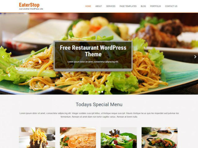
The EaterStop Lite theme aims to be a special theme for restaurants, cafés, and bistros. However, it is definitely possible to use it in other industries as well, due to its business-theme structure. Business and corporate websites seem like valid options.
Created by: gracethemes
License: Free for personal and commercial use | GNU General Public License
Interior Lite is a theme for multiple purposes. A website for furniture stores is just as possible as any other business website. The theme is prepared for the shop plugin WooCommerce. Colors, background, and logo can be adjusted.
Created by: SKTThemes
License: Free for personal and commercial use | GNU General Public License
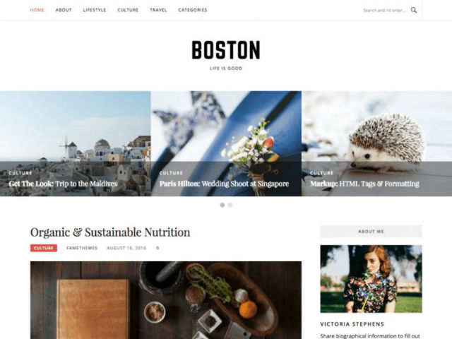
Boston is a blog theme that was specifically designed for female bloggers, which is why it has a light feminine touch to it. Nonetheless, emancipated men are allowed to use the theme as well. You get to customize the colors, the logo, as well as the background, and a landing page slider is also included.
Created by:FameThemes
License: Free for personal and commercial use | GNU General Public License


