Archive

Archive for December, 2016

The simple way to get better at design

December 29th, 2016 No comments

Design, by its very nature, is there to be judged. We do it every day—whether it’s our own creation, or that of someone else. When we see something, we’re looking at it and forming an opinion (positive or negative).

So, those of us who do this type of work for a living do understand that it’s all part of the gig. Clients will of course give their opinions about what we have created for them. Our job is generally two-fold:

  • Communicate with the client as to why we made specific design choices and back up our methods with supporting evidence. For example, perhaps a client doesn’t like the placement of a search field. You might point out that you placed it in that particular spot as research shows more users will utilize the feature.
  • Make sure you’ve done your best to ensure the client’s happiness with your work. Whether they come around to your way of thinking or not, you still need to put forth your best effort to help them achieve their goal.

There’s a certain amount of give-and-take in the design process when working with a client. But that’s to be expected when you’ve been hired by someone to represent their brand.

However, in recent times, designers have also become subject to another kind of criticism: one they voluntarily sign up for.

Putting your work on display for the design community

Beyond the usual client feedback, there are “community critique” websites. Many designers are choosing to submit their work to sites like Behance or Awwwards – places where the community at large (and a jury in the case of Awwwards) can offer both critique and some creative inspiration.

Both communities, although a bit different in methodology, are quite popular. Behance is run by Adobe and is completely free to use. Besides websites, they also feature varied types of media such as photography, architecture and fashion. You can upload your work via their site or directly from Photoshop CC. Community members can vote up and comment on submitted works, while Behance curators create featured galleries showing the best of the best.

Awwwards differs in that they focus solely on websites and they also charge for submissions. After submission, your site will be evaluated by a panel of eight judges and can also be voted on by members of the community. But only community member voters with a specific amount of “status” points to their credit actually count towards the final verdict. If you do well enough, you may even get featured as a “Site of the Day”, and included in their yearly book.

Sharing is caring

… having your work critiqued by other design professionals can also make you a better designer.

There is some truly outstanding work being shared. It’s hard not to find inspiration when browsing through the submissions. If you decide to join in the fun, you may find that you’ve made a positive impact on someone else. Even if you don’t win any formal honors, inspiring others is a reward in its own right.

It’s also entirely possible that, if your work becomes popular, your career may get a real boost. Behance, for example, has an area of their site for job postings. Granted, the competition is fierce. But if the right person sees your creations, it could lead to some big opportunities.

Going through the whole process of having your work critiqued by other design professionals can also make you a better designer. Helpful tips from others can point out some different techniques or help you to clean up some inconsistencies in your work. Little things like this can make a big difference in the finished product.

Potential pitfalls?

While there are lots of positive attributes, these communities are not completely risk-free. For one, the joys of putting yourself out there to be judged may not be for everyone. We sensitive types might not be ready or willing to handle low ratings—or worse—unflattering comments.

Thankfully, scanning the comments section of various Behance listings showed mostly positive and uplifting messages from other members. Initially, one of my biggest fears when peering into these communities was that anyone could come in and say derogatory things about another person’s project (this is the internet, after all). But that didn’t seem to be the case. It could be the result of a friendly community combined with top-notch comment moderation.

In fact, the only minor annoyance in the comments section is the self-promotion from other designers (“Great work! Please click here to see my profile.”). Oh well, you can’t blame people for trying.

As for low ratings, well, that could be tough to take. To some, it could feel devastating to see their hard work panned. On the bright side, it may be a good motivator to continue learning and improving your skills.

Go ahead, put yourself out there

Until recently, I hadn’t taken the time to look into sites like Behance or Awwwards. I have to say that my initial reaction to the thought of these community critique sites was one of concern. I thought that perhaps they’d be equivalent to the trolling we so often see on social media. Pleasantly enough, I was wrong!

For many, submitting your work for review can be a very positive experience. At the bare minimum, you’ll have the opportunity to see how you stack up against some of the best designers out there. That can lead to a growth in your skills and perhaps even a boost for your career as a whole.

Still, this may not be the best fit for every personality. Criticism, even if it’s well-meaning, can be difficult to hear. But even if you’re not interested in submitting your own projects, I encourage you to take a look around at the quality of work on display in these communities. You’ll undoubtedly find yourself inspired by what you see. Plus, you may even get a shot of confidence from discovering that you’re capable of doing similarly well in your own projects.

Both Awwwards and Behance appear to be well-run communities. You can feel confident that your participation in them (whether you submit something or not) will be very worthwhile.

LAST DAY: Mega Bundle of 48 Vintage, Grunge Fonts – only $19!

Source

Categories: Designing, Others Tags:

Develop Locally, Use Images from Production

December 29th, 2016 No comments

Working on your website locally means having the files that make your website tick right there on your computer. It’s common those files live in a version control repository. You work on them, and push them up to the repo when you are ready. Other people work too, and you pull their changes back down.

What might not be in that repo, are images files from the CMS. WordPress is a classic example of this. When you upload an image in WordPress, it does a whole song and dance. It gets uploaded to the `uploads` folder, multiple versions are created, even the database is updated and attachment meta data happens. What doesn’t happen is that a version control commit happens with all those files.

There are ways to make sure you have those files. You could write a script to pull them down. You could manually FTP it once in a while. In WordPress land, there are plugins that help, like WP DB Migrate Pro, which not only does the database but can move images as well.

But you might not even want to deal with images. Perhaps:

  • You don’t want the images in your repo. Maybe the repo is just a theme folder and it makes sense to leave it that way.
  • You have like 10 GB worth of images and it’s impractical and unnecessary to move them around.

I think that’s totally legit. A publication-style site probably doesn’t need every single image they’ve ever uploaded as part of their main repo.

OK, enough explanation. You get it.

Sean Lange talked about this exact thing in his 2013 article Using Remote Image Files When You Develop Locally. His solution was to rewrite local URL’s at the web server level to point to the production files:

I found my answer in Apache URL rewrite rules. When the Apache program handles incoming web page requests, rewrite rules allow it to change URLs matching certain patterns — for example, they can turn requests for the ‘files’ directory on your local machine into requests for remote URLs on the production server.

Here’s his Apache rewrite rules:

RewriteEngine on
# Force image styles that have local files that exist to be generated.
RewriteCond %{REQUEST_URI} ^/sites/([^/]*)/files/styles/[^/]*/public/((.*))$
RewriteCond %{DOCUMENT_ROOT}/sites/%1/files/%2 -f
RewriteRule ^(.*)$ $1 [QSA,L]
# Otherwise, send anything else that's in the files directory to the production server.
RewriteCond %{REQUEST_URI} ^/sites/[^/]*/files/.*$
RewriteCond %{REQUEST_URI} !^/sites/[^/]*/files/css/.*$
RewriteCond %{REQUEST_URI} !^/sites/[^/]*/files/js/.*$
RewriteCond %{REQUEST_FILENAME} !-f
RewriteCond %{REQUEST_FILENAME} !-d
RewriteRule ^(.*)$ http://www.example.com/$1 [QSA,L]

He’s working with Drupal through MAMP, but so long as you’re using Apache locally it’s all just a variation on the same idea. Match URL’s that point to the assets you want to target, rewrite them to the live site.

He was able to paste those rules into a little box in MAMP that handles it. I’m running WordPress locally through a little Docker setup, so I went for just editing my `.htaccess` file directly, and kinda simplified it for my needs:

RewriteCond %{REQUEST_URI} ^/wp-content/uploads/[^/]*/.*$
RewriteRule ^(.*)$ https://css-tricks.com/$1 [QSA,L]

Works great for me! Here’s a visual explanation:


Develop Locally, Use Images from Production is a post from CSS-Tricks

Categories: Designing, Others Tags:

WordPress Plugin Rename Media Files Renames Media Files

December 29th, 2016 No comments

It’s surprising but true. You can’t edit the file names of uploaded media from within WordPress. The only way to do so is to delete file by file and reupload them again after names were changed locally. Today, we’ll change that.

When the Name Doesn’t Fit: Rename Media Files

Let’s not fool ourselves. This happens very quickly in our hectic daily routine. The image that you just downloaded from Pixabay is now being uploaded into your WordPress with its original name. Or you made a mistake with a screenshot you just took, and now it’s not called screenshot.jpg but screenshit.jpg instead. This is almost a bit embarrassing.

Aside from the embarrassment, the image-related SEO is not to be neglected either. After all, you should include the chosen keyword in your file names to increase your chances of a better ranking. The right file name for your image is no accessory, but an essential part of the work on your website.

WordPress is not very flexible in this regard. It does not allow you to access your file names once the element has been uploaded. All there’s left to do is to delete the file, alter it locally, and reupload the modified version. At first, this seems doable.

But what if you’re responsible for the publishing in a multi-author blog, and you don’t even have access to the original files? Sure, with a bit of effort, this can be changed, but wouldn’t it be better if you could just modify the file name from within the Media Library?

Rename Media Files Takes Care of Links and Intermediate Sizes

Alright, I can already hear your outcry. “What about the links to the images? All of them will be wrong!” Yes, this is a problem. But the Serbian developer Milan Dinic has already taken care of it during the creation of his free plugin “Rename Media Files.”

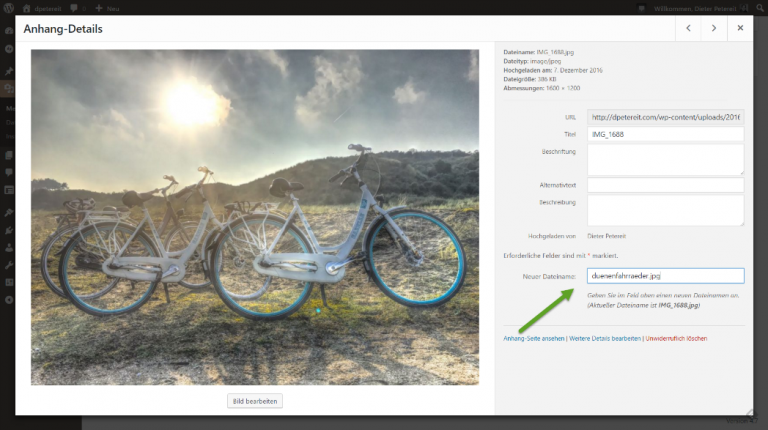
The mechanics of the plugin are as easy as it gets because Milan has decided to simply add another field to the file detail view, which he labeled “New Filename.” Here, he also informs you about the current file name of the chosen image, to prevent you from renaming images that you’ve renamed already.

Rename Media Files Only Adds a Small Unremarkable Field. (Screenshot: Noupe Magazine

If the element you want to rename is an image, it won’t just receive a new name. All required intermediate sizes are also newly generated reflecting the changed name. The plugin also alters the link to the file in all posts that have the element integrated.

This removes the risk of forgetting or overlooking anything. Your files remain completely intact, even in older posts. While it’s not typical to rename images that were already used in older posts, it is still possible with “Rename Media Files.”

It is more common that you need to rename something during the completion of a post. Everything is basically done, but then you notice the typo in the file name. Or you notice that the chosen keyword is not the optimal one after all. Fortunately, you won’t have to newly upload and integrate all images. Instead, you only change the names.

Conclusion and Download

“Rename Media Files” is a very focused WordPress plugin with one single job. But it does that job perfectly. For me, this small tool is indispensable.

WP-Appbox: Rename Media Files (Free, WordPress) ?

Categories: Others Tags:

How to Build a Landing Page That Converts

December 28th, 2016 No comments
featured image

Are you looking for the best and proven solution to build a professional web presence for your business or personal project? Ask any marketing specialist and he will tell you that a well-built landing page is exactly what you need to make people talk about you. But how to build a landing page that will convert accidental visitors into loyal customers? How to generate new leads for your business? How to design a powerful landing page? Let’s cover all of these aspects in one blog post.

A landing page is a place where the online story of your business begins. A landing page is the first spot that the users come across when looking for some general information about your business. This is the simplest and the most effective way of engaging the audience and inviting them for a productive dialogue.

What are landing pages all about?

  • A landing page represents one message that you want to deliver to your audience. It promotes a specific product/service/action and demonstrates all benefits of using it.
  • The design of the landing page should be clear and simple. It should stick to one point and provide for a simple comprehension of the content. The main objective is to captivate the users’ attention and arouse their desire to learn better about you and try your offers.
  • A landing page is intended to make viewers click.
  • A landing page is a single page made up of several clearly defined blocks that target to represent one message in a captivating, effective way.

Web Developer Landing Page Template
Depending on the way a landing page is designed, we can judge the potential success that a business standing behind it will attain. The more user-friendly a landing page is designed, the higher chances of triggering the users’ curiosity you have. It’s not a rocket science to build a professional landing page. Let’s consider the most effective tips on how to get started right and appeal to a wider audience.

Tip #1 Keep the Page Clean, Well Structured

The primary goal of a landing page is to make a clear presentation of a business it represents. In order to make it easier for your visitors to convert, it should have a simple and intuitive design. So that even first-time visitors will find it easy to come across the necessary piece of content effortlessly.

What makes the design of a landing page effective? These are the clever use of colors and bold, quality images that will look razor sharp on any screen. Call-to-action buttons and subscription forms (it depends on what specific goal your landing page pursues) should be put front and central. The key converting elements should look contrasting within the interface. CTAs should be painted in bright hues. Headlines and subheadings should look outstanding as a user scans your content.

A cool example of a landing page design built in clean style is Web Developer Landing Page Template. Suited for launching landing pages representing web design studios and freelancers, it features a well-structured, quick-to-scan design. CTAs and icons look contrasting to the background. The theme also makes clever use of whitespace, which adds a balanced touch to the layout.

Tip #2 Make a Powerful Headline

A landing page should clearly communicate its objective. A headline is probably the first thing that your visitors will come across when reaching the page. That’s why a headline that makes a clear statement will help them better understand your objective. In addition to pushing the main value proposition in the headline, you can explain different aspects of certain software or offer in subheadings. When thinking about the main texts of the landing page, keep in mind that you are limited to 8 seconds only to convince the audience that your offer is truly worthy of their attention.

Let’s take a look at the following example. Car Repair Responsive Landing Page Template represents services provided by an auto repair company. It makes use of a bold headline and a set of subheadings that represent different aspects of the business. In the header of the page, there is an integrated appointment manager. It welcomes the users to make a request in a simple and intuitive manner.

Car Repair Responsive Landing Page Template
Tip #3 Make It Trustworthy

A landing page needs to have a set of trust signals, which will make your business look reliable in the eyes of your visitors. What elements are we talking about? These are blocks with user testimonials that are easy-to-locate on the landing page. The word of mouth is known as one of the most effective marketing “assistants”. People tend to trust fellow-shoppers far better than a well-written marketing text by the top specialists of your company. Other trust signals that you can opt for are star ratings, “likes” and “shares” that people leave on your site or share with their social media followers, respectively.

Consulting Landing Page Template features a clearly visually defined block with user testimonials, which accompanies a block with team members and a list of company benefits. The testimonials are organized into a carousel slider, letting your clients look through the feedback left by several users at a time.

Consulting Landing Page Template
Tip #4 Keep Forms Short & Clear

As a person reaches your landing page, he/she can be asked to fill in a certain form, which will be of use to you for certain marketing purposes. It’s clear that you need to collect as much data about your clients as possible. Still, it is of tremendous importance to keep those forms as short as possible. The more fields you ask them to fill in, the less likely they will get to the last question and complete the necessary conversion.

The following landing page includes a simple inquiry form made of three lines only, which increases the chances of attaining the desired action from your visitors.
Real Estate Responsive Landing Page Template

Tip #5 Make It Mobile-friendly

These days any web page should adjust to a variety of screen resolutions on the fly. People have shifted from desktops to handheld devices, so the way your landing page looks and feels on a touchscreen plays a predefining role. A mobile-friendly landing page will double your conversions and keep the users more engaged.
Thanks to the availability of a huge variety of pre-designed landing pages, there is no need to create a separate version of your site for mobile phones and tablets. Travel Agency Landing Page Template is one of such pre-designed responsive solutions. The theme runs on Bootstrap framework, which will scale all data provided on the page up and down to any screen size possible.

Travel Agency Landing Page Template
Tip #6 Know Your Audience

What kind of users do you target? Is that male or female audience? Are those adults or youngsters? The design of your landing page is heavily dependent on the way you answer these questions. Different people react to the same design elements differently. One of the aspects that we want to highlight is the color scheme of your landing page. Women are known to enjoy designs built in warm colors far better than the ones built in cool hues. Men, in their turn, enjoy more neutral, clear and concise web design style. That is why a landing page built in cool hues will be a perfect match for them.

As the name implies, Maria’s Bakery MotoCMS 3 Landing Builder targets the users who have a sweet tooth, i.e. women and kids. More often than not ladies make sweets and bake something tasty at home. So, building such a landing page in warm hues is a clever move.
Maria's Bakery MotoCMS 3 Landing Builder

Ready-made Landing Page Designs for a Quick Start

How lucky we are to have an abundance of pre-designed landing page templates to choose from! Intended to be used by people of different backgrounds and of all skill levels, they allow you to get started with a landing page of your business or personal project in the shortest period of time. As a rule, landing page templates are designed to suit a particular purpose. These are fully editable and can be adjusted to match your personal requirements to the fullest.

For this blog post, we have hand-picked 5 landing page templates, which are developed as per the latest web requirements and can go live out-of-the-box.

Webinar MotoCMS 3 Landing Builder

The theme is best suited for presenting online education projects to the web community. Featuring a sleek and stylish design, it looks very trendy. The header includes a large hero image with bold CTAs atop of it. Neat fonts enhance the content readability. Texts make a perfect balance with images, making the data easier to browse. The theme is integrated with a drag-and-drop content editor, making it possible even for non-tech savvy users build versatile pages effortlessly.

Webinar MotoCMS 3 Landing Builder
Traffic School Landing Page Template

Here is one more pre-designed landing page template best suited for educational purposes. It features a clean and minimalist design. The layout makes clever use of whitespace, bringing the content to the foreground. The theme’s header is pre-loaded with a simple booking form, which welcomes the users to get the first lesson for free. Counters provide for clearer content presentation.

Traffic School Landing Page Template
Business Responsive Landing Page Template

This business landing page will appeal to the male audience the most. The dark-colored design looks professional and reliable. Clear and concise style brings emphasis to the highlighted data/benefits of a business that the page represents. With the purpose to bring the users’ eye to several featured messages, the header is pre-loaded with a responsive carousel slider.

Business Responsive Landing Page Template
Home Repairs Responsive Landing Page Template

The theme is designed in flat style. Bold hues make the design an eye-catcher. Designed with attention to details, the theme provides online visitors with a seamless and intuitive browsing experience. A simple booking form is easy to reach in the header. A list of services is organized into a grid-based list and enhanced with neat, recognizable icons. A separate block with user testimonials is intended to grow the users’ trust. Contact details are accompanied by a built-in Google map widget, letting the online audience reach you with ease.

Home Repairs Responsive Landing Page Template
Job Seeker Landing Page Template

The theme is intended to become a rock-solid starting point of online CVs. Job portals can also make use of it for an impressive and user-friendly presentation of their services to the web community. A couple of CTAs are put front and central in the theme’s header. Success stories are intended to grow people’s confidence in your business. A simple contact form and contact details make it possible to reach a person/company standing behind the landing page straight away.
Job Seeker Landing Page Template
*** If you need a wider selection of professionally built, responsive landing page templates, please follow this link.
If you want to customize one of those templates, it’s really easy to do, but if you don’t have enough time, you’re free to apply to TemplateMonster’s Service Center.

Here we go. We hope that the aforementioned tips will come in handy to you when building or redesigning a landing page. The conversion-oriented theme that we have showcased today will grow your business popularity in the eyes of the web community and grow people’s trust in what you are doing. Go check this out by yourself.

Read More at How to Build a Landing Page That Converts

Categories: Designing, Others Tags:

12 UX rules every designer should know

December 28th, 2016 No comments

“User experience” is a broad term that gets bandied around at meetings and swapped with “user interface” as if the two are the same—they’re not. This confusion has probably affected your career as UX and web design roles have slowly started to overlap. Even your clients may be confused as to what exactly your job is.

Like it or not, UX has a huge impact on what web designers do. You can create the best design in the world, but it won’t succeed if it’s not usable. And it won’t be usable unless you know a little UX strategy. These UX lessons will teach you how to improve projects’ usability and make you indispensable to your clients.

1) UX is not UI

Even if you don’t interchange the terms “UX” and “UI”, you’ll likely hear your clients say it at some point. You’ll have to be able to explain the difference between UX and UI so they can understand what is, and isn’t, your job.

User interface refers to the actual system… User experience is about the emotions…

User interface refers to the actual system the client interacts with. The layout of an iPhone’s settings menu is a user interface. User experience is about the emotions the interface evokes during that interaction; the user’s satisfaction with an easy-to-use settings menu is user experience.

Essentially, UX is the totality of the emotions resulting from the UI. Good UX designers understand human emotion and user behavior patterns, because those things affect how users respond to an interface.

2) UX is not just a “web thing”

Web design is only a small portion of UX. Every print design you see, product you use, and even place you go, also has UX. Eating at a terrible restaurant is a bad experience; easily opening a package is a good one.

Offline UX design may seem like a different ball game—after all, creating a navigable website isn’t the same as designing a sports car for people to drive on real roads—but in reality, the two types of UX affect each other.

Nav bars are a great example of how the web and physical worlds overlap. Website navigation used to be on the left side of the page, but somebody realized we prioritize information from left to right—meaning content should be on the left. By the early 2000s, nav bars moved to the right side of the viewport.

If you’re a web designer, it never hurts to brush up on print, packaging, or other types of physical UX design. This cross-training expands your knowledge and helps you see projects from a fresh perspective.

3) UX is art and science combined

Art and science make an odd couple, but that’s essentially what UX is. Understanding how UX combines art and science lets you refine your design process to reach solutions more easily.

UX is scientific in that it poses a problem-solution scenario in which the designer poses a theory about how to fix the problem. So let’s say the problem is an outdated site hurting sales. The designer suggests a way to update the site; through testing and adaptation, that suggestion evolves into a solution.

The solution is where the art comes in. Colors, typefaces, layout, and so forth all combine to create an aesthetically pleasing whole. As with viewing art in a gallery, the design evokes an emotional response, which in turn produces an outward behavior.

4) UX creates goal-driven design

Every designer has dealt with clients who insisted on having things their own way. This creates a conundrum, because the client’s way may not be the only or best way to solve that specific problem. Similarly, some designers think their way is the only way and won’t listen to any other ideas—even if those ideas might work better.

Rather than taking this single-minded approach, UX stems from using goal-driven design to look for the most effective solution.

Let’s say your client wants to move their customer testimonials link to the top of the page so it gets more traffic. But the problem isn’t necessarily the link’s location; it’s that the link needs more traffic. You could also fix the issue by making the link more visible where it’s at. Either solution will solve the problem; being open to those options is goal-driven design.

5) UX showcases your brand

Good UX design reflects brand identity, so it requires you to stay true to the client’s goals.

Once in a while, you may find yourself in a design trance. Colors come easily, type fits together, images are imaginative—and none of it matches your client’s brand identity.

It’s imperative that you don’t get caught up in creating a look that doesn’t meet the client’s needs. And while that sounds almost laughable, it happens much more easily (and often) than you might expect.

Good UX design reflects brand identity, so it requires you to stay true to the client’s goals. Make sure you ask questions about the brand upfront and schedule regular input from stakeholders, who will be able to tell you if you’re sticking with the brand or straying away.

6) UX designs for the user

It sounds silly to say “design for the user,” because that’s what UX is. Yet many web designers are often the victims of their own creativity. Their designs have all the bells and whistles — and even meet the client’s expectations — but they may still not meet the user’s needs.

Designing for the user requires you to do something that’s often difficult for creatives: let go of your opinion. While you may view something as best, it may not be best for that situation.

To make sure you’re on the right track, you’ll want to learn some guidelines to user-driven design. A good rule of thumb is to start by researching different types of users and mapping out how they use the site you’re working on. Before you release the finished design, use A/B testing to verify that you’ve reached the best solution.

7) Identify behavioral triggers

Good UX design relies heavily on psychology. The cool part is, UX designers not only learn users’ tendencies – they can trigger new behaviors that lead to conversions. But there’s a right and wrong way to do it.

Take notifications, for instance. They’re meant to spark a behavior, but it’s easy to forget actually doing the behavior takes time and effort for the user. Some designers bombard users with notifications at the worst times, then wonder why there’s no response.

The trick is to research how users’ motivation changes throughout the day, so you can time notifications accordingly. For instance, receiving a notification on the way to work won’t do any good, because the user has a competing, and more urgent, goal of getting to work. But the same notification received on the way home gets more attention, because now the user actually has time to engage in the behavior.

Your goal is to empower users with a beneficial solution; to help their day go smoother in some way. The more you play to their desires and habits, the more successful your design will be.

8) Encourage scrolling

Scrolling sends users deeper into the site and asks them to invest more time – making them more likely to convert. That’s why some designers place their calls to action at the bottom of the page, where users have to scroll to get to them.

Even above-the-fold sites — which place the call to action at the top of the page to optimize the “love at first sight” principle — can promote scrolling. You can encourage users to spend more time on the site with “scroll cues,” such as an arrow that points down to the next section or partially visible text that requires users to scroll to keep reading.

9) Ask yourself, “What has the user done?”

Before you can start solving a problem, you have to understand what exactly the problem is. You’ll want to analyze the user’s experience on your current site. Ask the right questions to find out how they’re interacting with the site now, what’s working, and what’s going wrong.

If possible, get a little help from the customer service department. Collect their notes on issues clients have complained about, or listen to recordings of frustrated customers. Often, you’ll learn about design issues while customers are ranting about what went wrong the last time they tried to use the site.

10) Let content define the interaction

UX isn’t just about the icons users click or the colors on the page. Almost everything visitors see is content – whether that’s writing, images, or videos. Yet many designers completely skip talking to the content team or developing any sort of content strategy.

A great-looking site is essentially useless unless you back it up with strong content. So on your next design, start asking questions. Are you redesigning a site that already has a voice – and if so, how should you incorporate it? Or are helping set the tone for a completely new site?

The goal is to create content that’s easy to absorb and process. You ultimately want your users to feel as if a friend is guiding them through the site, because a friend would know exactly what they want and show them where it is.

11) Don’t create inconsistency

Users who feel confused are more likely to get frustrated — even if they don’t have the vocabulary to say why…

Inconsistency is one of the biggest problems users deal with. Yet many designers actually try to make their designs appear more creative or memorable with intentional inconsistencies in color or style.

Let’s say you used a nav burger on your homepage, while another landing page features a dropdown arrow. Both icons technically do the same job, and the homepage has its own unique look. However, users developed an impression of your site while they were on the homepage. Seeing another type of navigation on other pages conflicts with their initial impression, creating confusion.

Users who feel confused are more likely to get frustrated—even if they don’t have the vocabulary to say why—and they won’t come back. A consistent site, on the other hand, lets them take care of their business without pondering your stylistic choices.

12) Eliminate pointless page elements

UX design has evolved a lot over the last decade, as the internet shed its gawky teenage phase and morphed into a sophisticated adult. Gone are the days of too-bright colors and nav links scattered across the page. Today’s site is streamlined for good UX.

So why mention eliminating pointless page elements? Because “pointless” has gotten a lot more subtle. People aren’t making the same gaudy mistakes – well, in most cases. Today, a pointless page element might be a call to action with two commands instead of one, or an image that draws the eye away from where it should go.

To get rid of these things, you’ll have to learn how to gauge an element’s value. A good way to check for useless elements is to get into the user’s mindset – ask yourself how each element makes you feel and whether it helped you reach your goal.

Conclusion

You may not be a UX designer. But when you start applying the principles of good UX design to your web designs, you’ll find yourself creating better, more effective websites. That’s the goal of a good design, after all — to guide the user to the information they need and show them what to do with it. With the help of these tips, you can implement UX design and spark a positive reaction in your website’s users.

Creative 3D Lettering Mega Bundle – only $10!

Source

Categories: Designing, Others Tags:

Review of My New Computer Equipment

December 28th, 2016 No comments

I recently changed out just about all of my computer equipment. Nothing dramatic like #davegoeswindows, but all new gear within my relative comfort-zone. It was the first time since late 2013, and now it’s going on 2017, so I figured it was time.

No surprise: I’m an Apple guy. I have been for a couple of decades now. I was pretty excited about the new MacBook Pro’s and ordered one within a few days of them coming out. Coinciding with all that, I’ve also changed out my mouse, keyboard, and monitor. None of those accessories are Apple. Partly because they’ve stopped making them (monitors), or the ones they do make kind of suck (mice, keyboards).

I figured I’d review my new setup since it’s on my mind.

15-inch MacBook Pro

Like I said, I hadn’t upgraded in three years. I’d like to get another three years or more out of this one, so I went kinda all-out on the specs.

  • Upgraded to 2.9GHz quad-core Intel Core i7 processor
  • Upgraded to 2TB PCIe-based SSD
  • Upgraded to Radeon Pro 460 with 4GB memory

I wanted to feel something, dammit.

I don’t have a whole lot to say about it. It’s fine. It doesn’t feel all that different from my 2013 MacBook Pro.

It doesn’t feel all that much faster. It doesn’t start up any quicker and has a weird quirk where the screen gets all distorted and then goes all black except for the start up progress bar. It doesn’t seem to last on a charge any longer. Transferring data to it from a Time Capsule was rough, as it did about 90% of it over 12 hours before failing and being unable to continue. It’s worst characteristic is that it freezes with more frequency than my last laptop.

I think the Touch Bar is fun, but it doesn’t affect my productivity or do anything mind-blowingly useful. I do enjoy Touch ID instead of having to type a password sometimes. I’ve had the Touch Bar freeze on me a few times, though, which hurt productivity, because as expected, it’s a little annoying not having that escape key. Seems to me the Touch Bar could still be there even if there was a hardware escape key on the upper left. Or at least allows some way to restart the Touch Bar. Ascii shrug.

LG Electronics WQHD IPS Curved 34-Inch LED-Lit Monitor

My monitor was actually the first thing I replaced. My Cinema Display was exhibiting bad behavior. It would just go black randomly, and require lots of fidgeting with the connector to get it to come back, which became untenable.

I went with one of those super wide 21:9 34″ LG monitors. Specifically: LG Electronics WQHD IPS Curved 34-Inch LED-Lit Monitor (34UC97-S). At the time I bought it, I just found one for sale and bought it, not realizing LG sold 19 different versions of it. ?. It works of course, but I still don’t know if I bought the best one for me.

Thoughts:

  • I got a curved one, which feels like a cheezy gimmick. I’d prefer a non-curved one, especially considering they are less expensive.
  • It’s far less vibrant and bright than the Cinema Display was, or the laptop screen. It feels a bit dingy.
  • I don’t like having hardware controls for adjusting the look of the screen. I can change a single setting, like the “Color Temp”, and have it be drastically different. It makes me think there is no possible way I have all these settings exactly correct, especially in conjunction with the color profiles settable through System Preferences.
  • It’s a 1x display. I think I’m ready to leave those days behind.
  • It has built-in speakers (not very good), which at least don’t require any additional cables since it connects via HDMI.
  • The new laptop, of course, doesn’t have HDMI, so it actually connects via dongle. It’s an obnoxious dongle too, the “Multiport Adapter”, which is the only one Apple sells that has HDMI on it. I figured that was the one to trust, but in a not-so-shocking twist, I gave a presentation through a projector the other day that was also HDMI, and the Apple dongle didn’t work with it. They happened to have a cheap-looking third-party USB-C to HDMI dongle, and it worked great.
  • It does not have a camera or microphone. So, because I need that for video conferencing, I had to get a Logitech HD Pro Webcam C920. That’s USB, so it has to go into my USB 3.0 hub. I was looking forward to this, thinking a highly-rated third-party add-on camera would be an upgrade. Sadly I don’t think it’s as nice of quality as the old built-in iSight.
  • I get that “banding” effect fairly often. Apparently, these super wide monitors are essentially two monitors seamlessly aligned next to each other. Although seamlessly is the wrong word, as you can see the seam if you, for example, put a web browser right in the middle and scroll down. You’ll see one side scrolling faster than the other. It doesn’t happen all the time, and unplugging-and-plugging-back-in seems to solve it most of the time.
  • The 21:9 size is pretty nice. I could see using one even a bit bigger. At first, I was leaving my laptop open as well, but I’ve stopped doing that. I think I prefer just looking straight at one monitor rather than kinda sideways at two. Plus, it might just be in my head, but I feel like I get better performance generally with the laptop closed. I do wish I could just plugin in the monitor into a closed laptop and have it wake up, but I find I have to open the laptop to wake up, then close it again once the monitor has kicked on.
  • The huge weird size of it does make screen sharing with other folks a little awkward. Fortunately, most screen sharing software allows you to just share one window.

Microsoft Surface Ergonomic Keyboard

I was almost more excited about the Microsoft Surface Ergonomic Keyboard (Amazon.com, Microsoft.com) than I was about the laptop. It’s an evolution of the Microsoft Sculpt Ergonomic Keyboard (which only had a detached number pad and was wireless-only), which was an evolution of the Microsoft Natural Ergonomic Keyboard 4000 (bulky, wired-only).

I mean just look at this beauty:

The handrest looks like it fabric in the photos. It’s not really fabric. It’s kind of a foamy rubber. It’s still very nice, and probably good that it’s not actually fabric.

It even had an Apple-like hype video:

It’s straight up beautiful. The nicest looking keyboard I’ve ever owned. It’s just as nice in real life. It’s comfortable. They keys are low-profile but not too-low-profile, and nice springy. The shape and feel is really nice.

Thoughts:

  • I don’t love that it is Bluetooth only. I have a theory that my body gives off Bluetooth obstructing rays. Bluetooth never works flawlessly for me, and this keyboard is no exception. Several times I’ve had to go through the whole pairing process again since the connection seemed entirely forgotten.
  • When there is Bluetooth trouble, I also wonder about battery strength. It uses AAA batteries. It comes with “alkaline” batteries and claims up to 12 months of battery life. I had to replace them once, or at least I thought I had to because of connection trouble. I’m not entirely clear on what the best possible battery is for a device like this, so I bought the expensive lithium ones. They seem to be working, but maybe they are the cause of connection pains? There also seems to be no way to check the battery level.
  • The most pronounced problem with they keyboard is that it falls asleep. If you leave it alone for even a few minutes, it loses active connection. You can’t just start typing, as you’ll lose whatever you type. You need to press a key, wait a few seconds, then start typing. It doesn’t try to catch up with whatever you’ve started typing.
  • I’m so damn torn. I’m trying to get over my dislike of Bluetooth because it sure is nice not having so many wires around. On the other hand, if they just sold a wired version of it, it would solve all these problems and be just about a perfect keyboard.
  • Many reviews complain there is no backlighting. I don’t care about that.

I miiiight end up going back to the Microsoft Natural Ergonomic Keyboard 4000 just because it’s wired and I get tired to smurfing around with wireless.

Key mapping

There aren’t many third-party keyboards that are Mac-specific. They don’t need to be because for the most part they work fine on Macs. But if want your keyboard to feel similar to the keyboard on the laptop itself, in regards to modifier key position, you’ll need to remap them. Specifically, putting the command key next to the spacebar.

Normally, you can do this right in System Settings:

You can change the settings here normally, but that doesn’t work on this keyboard.

Like the caption says, this doesn’t work with this keyboard. I hear this is just a “Bluetooth keyboard” thing, not specific to this keyboard. Still a bummer.

Fortunately, Karabiner-Elements handles the remapping just fine.

I’ve heard serious warnings from friends about Karabiner (like: YOU WILL HAVE PROBLEMS WITH THIS), but so far so good for me.

Logitech MX Master Wireless Mouse

For a long time, I was a ball-mouse guy. I was totally in love with the Kensington Expert Trackball Mouse. I forced myself to stop using it a few years ago. I was so attached to using it that anything else felt very awkward. It wasn’t very practical to travel with, so if I opted not to bring it, I was in awkwardville until I got home. That was no good. For practicality, I switched to “normal” mice when at my desk, and went full-trackpad when traveling. The transition is complete, and now I’m all good with that.

I’ve long chosen wired mice, because as I mentioned, I think my body gives off anti-Bluetooth rays. Some mice have little USB dongle things, which are better but are extremely easy to lose.

My wired mouse, for years, was the Logitech Corded Mouse (M500), which is a perfectly decent inexpensive mouse.

I decided to go for the Logitech MX Master Wireless Mouse though, because:

  • My current wired mouse was acting up. It didn’t seem to track or scroll very nicely anymore.
  • The new keyboard is wireless, so I thought I’d take a crack at going full wireless.
  • I figured I could go for a kind of “premium”, well-reviewed mouse since I really wanted a mouse that would track and scroll smoothly.

The verdict:

  • It works either with Bluetooth or a dongle. I use the dongle because I trust it more, and it seems to be more reliable. I don’t have the near the connectivity issues I do with the keyboard.
  • I just leave the dongle in a USB 3.0 hub I’m still using. I wonder if I should get a better hub. This Arc Hub looks nice.
  • Sometimes it’s super smooth, sometimes it all goes to crap. Tracking is choppy. Scrolling is choppy. It doesn’t seem to be logical when it happens. I worry about the USB dongle: it’s in a USB 3.0 Hub, which is connected via yet another dongle to the USB-C port. I wonder if that bottlenecks somehow.
The software for configuring the mouse on macOS is pretty nice. I have mine customized to make good use of Spaces.

It’s tempting to go back to a corded mouse, but none are as well-reviewed as this one is and I already know the corded mouse I have isn’t any better.

More Thoughts

  • I’m a little bummed that there isn’t a single piece of computer equipment I’m currently using that I actually really love. Every single thing has problems. Fortunately, none of those problems are bad enough to hurt productivity too badly. Although as I say that, as I woke up this morning to publish this blog post, the laptop froze while plugging in the monitor. After restarting, the keyboard wouldn’t connect until I jiggled the batteries, and mouse was choppy until I unplugged/replugged the hub. ??. Update: froze everything again fiddling with some monitor settings.
  • It’s tempting to go back to a fully wired setup. I didn’t mention this above, but I went for Bluetooth headphones as well, but I find myself using my wired ones more often because I’m afraid I’ll be in the middle of a podcast or something and have them drop off because of my anti-Bluetooth rays (it happens). For the love of god, I just want smooth, fast accessories. I want them to work the instant I start using them and never fail. It’s actually a little tempting to get rid of all the accessories and just use only the laptop.
  • I wish Apple would make a monitor again. I really liked the Cinema Displays.
  • It seems like Apple is really pushing the LG UltraFine 5K Display. It’s about the same price as a Cinema Display was, at $974. It’s USB-C, so not needing a dongle would be nice, plus it charges the laptop, so that frees up an additional port. Plus, it’s a USB-C hub. Plus, it’s got a built-in camera and mic. Most importantly, it looks like a huge and beautiful pixel-dense display. Crap I think I just talked myself into it. Buy my book, lol.

Review of My New Computer Equipment is a post from CSS-Tricks

Categories: Designing, Others Tags:

My Journey Of Learning Programming Through Flatiron School #4

December 28th, 2016 No comments
flatiron school

My name is Mason Ellwood and I’m currently working on Flatiron School’s Online Full Stack Web Development Program. Each week, I’ll be writing about my experience, what I’m learning, and tips on learning to code.

In the last post, I covered the definitions of a failing test and what data types Ruby, super fun stuff! Now that everything had a definition applied to it we are ready to get into arrays and interpolation! Heck yeah!

Arrays are used to store data as a collection. They do this by declaring literals or variable names separated by commas and wrapped in square brackets

Ex: this_is_an_array = [ “slot-one”, “slot-two”, “slot-three”, “slot-four”, “slot-five”, “slot-six”]

Remember!

*A class is a kind of like a template for creating objects in Ruby.

*A bundle is simply a bundle of information and behaviors.

*And a string is an object

Within your array, each element within your array is associated with a number that represents their order, this is called an index and they begin their index at 0.

Ex: this_is_an_array = [ “slot-one”, “slot-two”, “slot-three”, “slot-four”, “slot-five”, “slot-six”]

In order to call an element in the array you just created you must call the name of the array the number in which you want to call.

Ex: this_is_an_array[0] => “slot-one”

To assign a new value to a current index of that array, you can call the array index of the number you want to re-assign and define it to a new variable.

Or you can place, put, or take away whatever you want anywhere within this array. You can do this with a variety of different methods. I will not be covering every instance that was covered in the lesson, but for an example you can use the shovel method which employs the shovel operator ( << ) which allows you to add items at the end of the array. Similar to the shovel method you can also use #push method to do the same thing.

Moving forward I am finally ready to cover methods. Basically with arrays and methods you can do just about anything in Ruby and are the staple of the language. So what is a method…. It defines something new your program can do. They teach your Ruby program about a new routine or behavior it can use. This is an incredible tool because to my understanding they are the meat of your program and allow the practice of DRY or don’t repeat yourself logic. By defining your method once you can then call the method as many times as you would like.

The code above may seem dumb…. But if i encapsulate the repetitive strings within a method I do not need to repeat myself over and over again, remember to work towards DRY haha. So the above method I wrote def a_bunch_of_strings is the method signature, which defines the basic properties of the method including the name of the method which is a_bunch_of_strings. Everything inside of this is considered the body, and remember this must in end. Once a method is defined you can call is as many times as you would like by using the method name. Then through string interpolation we can then make it dynamic (to check out more on string interpolation please check out this link: https://docs.ruby-lang.org/en/2.0.0/syntax/literals_rdoc.html).

Up until this point, I have not had any real issues with the Flatiron Schools, in fact it has been really enjoyable. This next post I may jump ahead quite a bit, so bear with me. But everyone I have met within the school has been great. What I really like is that once I finally do reach out to customer support with questions about the current course work, they don’t just belatedly tell you what the solution is, which is great. They allow me to work through it myself while they nudge me in the right direction. This can get kind of confusing though because you are communication over instant messenger. Which can be difficult when trying to work through which piece of your code does not work.

Read More at My Journey Of Learning Programming Through Flatiron School #4

Categories: Designing, Others Tags:

CSS Writing Modes

December 28th, 2016 No comments

We shared a little trick not long ago about using the writing-mode property to set a title vertically. While a useful trick, it’s the tip of the iceberg on this property. Jen Simmons digs in and explains what’s really going on.

There is a certain way elements flow on websites. Without doing anything special, block elements push downward from top to bottom. Inline elements go from left to right. In writing-mode, that would be expressed by (the default) horizontal-tb (horizontal inline flow, “top to bottom” block flow). Different languages and cultures handle layout in other ways, so this property allows for control over that in a more comprehensive way than the dir attribute is capable of. For example, vertical-rl (vertical inline flow, “right to left” block flow).

Direct Link to ArticlePermalink


CSS Writing Modes is a post from CSS-Tricks

Categories: Designing, Others Tags:

The Ultimate Digital Clean-Up Checklist: Are You Prepared For The New Year?

December 28th, 2016 No comments

With a couple of days left until New Year’s Eve, it’s just about time to set aside 60 minutes to clean up, sort out and back up your digital footprint, to ensure a good smooth start to 2017. So many little details tend to get forgotten or overlooked every single time, only to get fixed hastily later — but doesn’t it just feel right when everything is in the right place, neatly organized, even if you aren’t a compulsory cleaner or an obsessed perfectionist?

This is not a generic article about unspectacular things like getting to inbox zero or changing the copyright year in your footer (although that’s a good idea!) — we published a detailed checklist of all of those details a couple of years ago. Instead, you’ll find below an overview of all of those obscure little things that I forget about every year; so, I decided to gather them all in one place once and for all.

The post The Ultimate Digital Clean-Up Checklist: Are You Prepared For The New Year? appeared first on Smashing Magazine.

Categories: Others Tags:

Mockuuups Studio: Desktop App for Appealing Project Presentations

December 28th, 2016 No comments

We eat with our eyes first. So it’s only logical that a digital product needs a presentation that shows it in action. The desktop app Mockuuups Studio does just that.

Create Mockups in a Few Clicks

So, your customer wants to see how his web app will look on an iPhone. But you have only finished the static landing page mockup. No problem. Grab the free Mockuuups Studio and build a presentation with one/two clicks.

Mockuuups Studio is software available for macOS and Windows. You can download and use it for free. The same applies for the commercial usage, as well as using it in client projects. Mockuuups Studio only covers one purpose, which is the import of screenshots or other image files into the software’s mockup portfolio, as well as the following display of the final result.

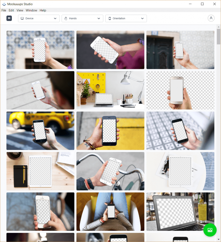
This is what Mockuuups Studio looks like when you don’t have an image imported:

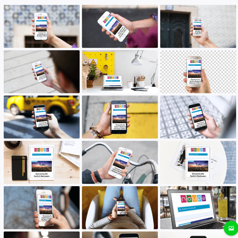
And this is what it looks like after you used the green circle icon from the bottom right of the app window to import a picture file:

Due to the direct integration into all available templates, you’ll quickly see which mockup is best for the particular presentation. Here, you can choose whether you want to equip the image grid with small, medium, or large-sized thumbnails. The image above displays the view with large thumbnails.

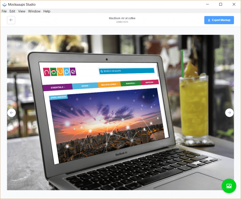
When clicking on one of the thumbnails, the respective mockup opens in a detailed view, allowing you to judge it better. Here, you’ll also find the button “Export Mockup” on the right. The resolution in pixels can be seen in the middle above the mockup. It varies, but it is always high-resolution.

If you don’t like the implemented image in the mockup, after all, you can just upload a new one using the circle icon from the bottom right. Unfortunately, there is no option to reposition, zoom, or edit image files once they are integrated.

Mockuuups Studio is Free With About 50 Mockup Templates

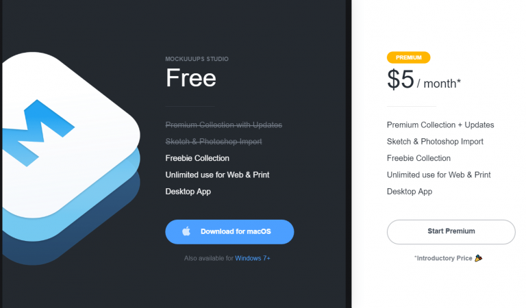
Mockuuups Studio comes with about 250 mockups, and new ones being added regularly. The free version “only” comes with about 50 free-to-use mockups. If you want more, you need to complete a subscription which will cost five dollars a month or 48 dollars with annual payment.

In return, you’ll gain access to all mockups that were previously labeled with a lock icon in the overview. You also get to directly import Photoshop and Sketch files. Naturally, Sketch files can only be imported by the Mac version of Mockuuups Studio.

The Windows version is labeled as in beta stage. I have tested it on a Windows 10 and was unable to find any problems. It ran smoothly, and on normal processing speed. The Windows download takes up about 56 MB, while the download of the Mac version weighs around 44 MB, and comes as a DMG.

Even if you end up not picking the paid subscription, the free variant of Mockuuups Studio is still a must-have asset for your designer toolbox.

Categories: Others Tags: