Do People Still Love Helvetica?
Do people still use Helvetica? Today, we will see what designers say about the notorious font. Are you curious to find out how many hate it and how many love it? So am I. Let’s find out!
Approximately 1000 years ago, the Chineseman Bi Sheng invented the mobile letter. An organic and geometric work that has revolutionized the writing in the western world. Five hundred years later, Johannes Gutenberd invented the typographic press using Bi Sheng’s idea of mobile letters.

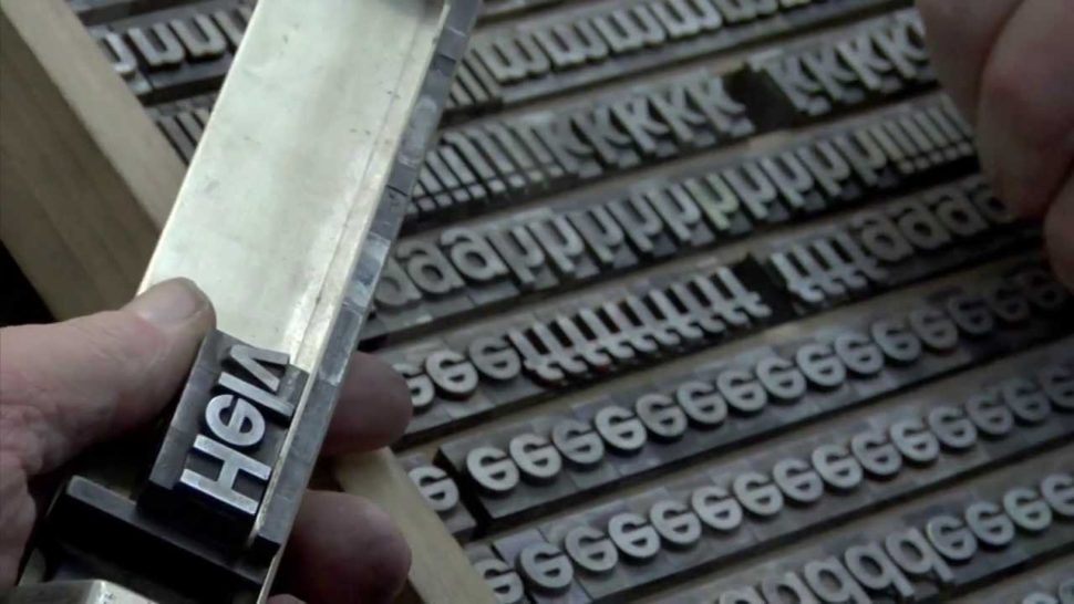
Back then, the letters were poured into matrixes and assembled in shapes, and after they were used, they were given separate boxes so that they can be reused any time. From that moment, the families of fonts started making their way into the world and they have been evolving ever since. So did the typographic techniques which, in 1880, have evolved into the automatic printing.
From the beginning of the 15th century to the present, thousands and thousands of fonts families have been designed. Some are called classic fonts, and their shape looks very much like the calligraphic hand writing. Other fonts are modern, with more abstract shapes and less organic, such as the one presented below.
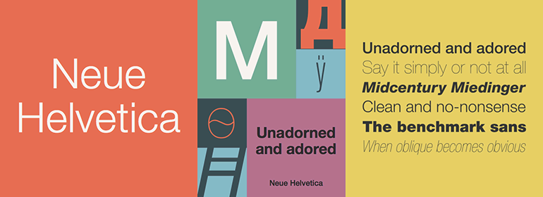
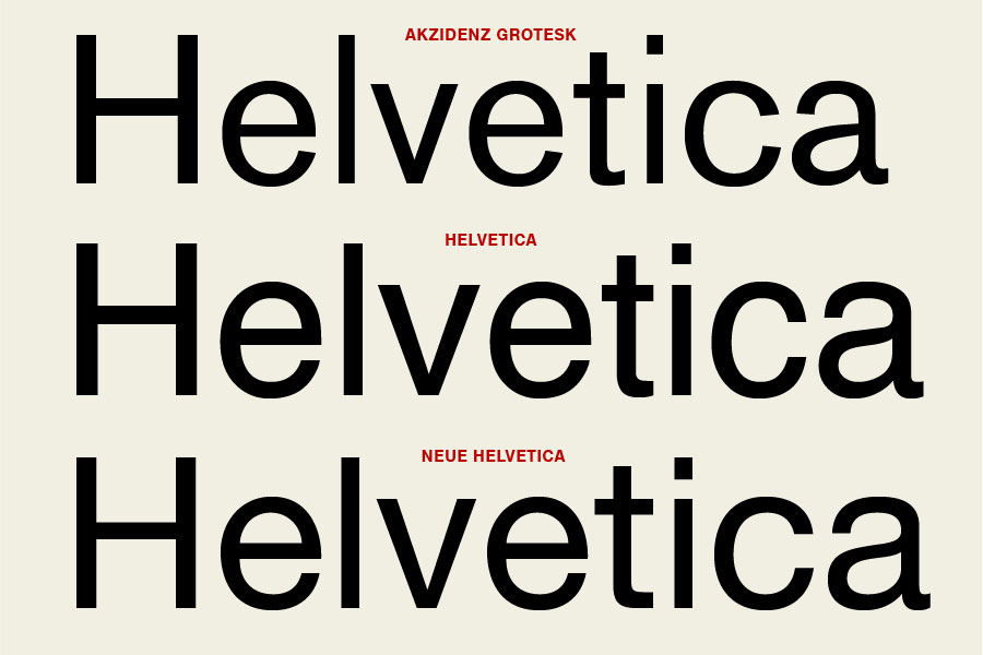
Helvetica was created as a completion of an older one called Akzidenz Grotesk, which was created in 1896. It was initially named Neue Haas Grotesk, and it received the name Helvetica in 1960. Its name comes from the Latin name of Switzerland, Helvetia, and it is also known by the name of Swiss 721 BT. Its first rivals in the world are Times New Roman, Baskerville, Gill Sans, and Verdana. Arial is also a variation of Helvetica. Linotype, the company that owns Helvetica has released an improved version of the font in 1983, Neue Helvetica. The font is very legible and it can be purchased on many websites for about $40.

The psychologists say that the first messages transmitted using Helvetica are: you won’t lose your plane; you’ll make it in time at the destination; your money is safe if you use our services; we won’t open the package; everything will be ok. That’s why, notorious companies such as Orange, American Airlines, Royal Bank of Scotland, Panasonic, Zanussi, Lufthansa, or Toyota, use this font when displaying their names. It never gets old.
Helvetica turned 50 years in 2017 since its creation in 1957 by Max Miedinger and Eduard Hoffman, from the Haas Type Foundry Institute in Muenchenstein, Switzerland. It is the most used font in the world in all areas of work, being called the font of the twentieth century.

“It’s durable. Helvetica comes from natural design forms. The font doesn’t have an expression of fashion. It has very clear lines and characters, it looks like a very serious typeface,” says Frank Wildenberg, managing director of Linotype, the German firm that owns the font.
There are versions of the font for different alphabets: Latin, Cyrillic, Jewish or Greek. It is part of the “sans-serifs” fonts. Its lines are clean, equall, and has a faded geometrical shape that doesn’t “scream” for attention.
Mixed Feelings about Helvetica
Helvetica is so appreciated that some people decided to dedicate it books. Lars Muller is one of the most dedicated to the font. He published a book called “Helvetica: Homage to a Typeface.” Moreover, he donated a set of the first inscriptions of the font to the Modern Art Museum in New York. Muller believes that the font has a “modern attitude” that comes as a response to the aesthetical premises from the 50’s-60’s. Helvetica is a font used by both the big corporations, and the small make-up shops or fast food chains. “It’s like the butter on bread,” believes Muller.

Adrian Frutiger believes “Helvetica is the jeans, and Univers the dinner jacket. The font is here to stay.”
Wim Crouwel: “Helvetica was a real step from the 19th-century typeface… We were impressed by that because it was more neutral, and neutralism was a word that we loved. It should be neutral. It shouldn’t have a meaning in itself. The meaning is in the content of the text and not in the typeface.”
Massimo Vignelli: “You can say, “I love you,” in Helvetica. And you can say it with Helvetica Extra Light if you want to be really fancy. Or you can say it with the Extra Bold if it’s really intensive and passionate, you know, and it might work.”

Not everybody loves this font, though. There are people who condemn the domination of Helvetica, and they see it as an old-fashioned font that encourages normality and routine.
Erik Spiekermann: “Most people who use Helvetica, use it because it’s ubiquitous. It’s like going to McDonald’s instead of thinking about food. Because it’s there, it’s on every street corner, so let’s eat crap because it’s on the corner.”
Menar Irvin: “Pshhh, Helvetica was so 2006. ITC Avant Garde Gothic Pro with the new ligatures & unicase glyphs are what’s hot.”
Jack Earl: “Helvetica: typography’s equivalent to internet explorer.”
Read More at Do People Still Love Helvetica?