The History Of The Android Logo
Are you team Apple or team Android? Regardless of which OS you prefer, you’ve undoubtedly seen Google’s popular Android logo floating around once or twice. We’ve gone over the history of the Apple logo, now it’s time to take a look at the origins of the cute little green dude behind Android.
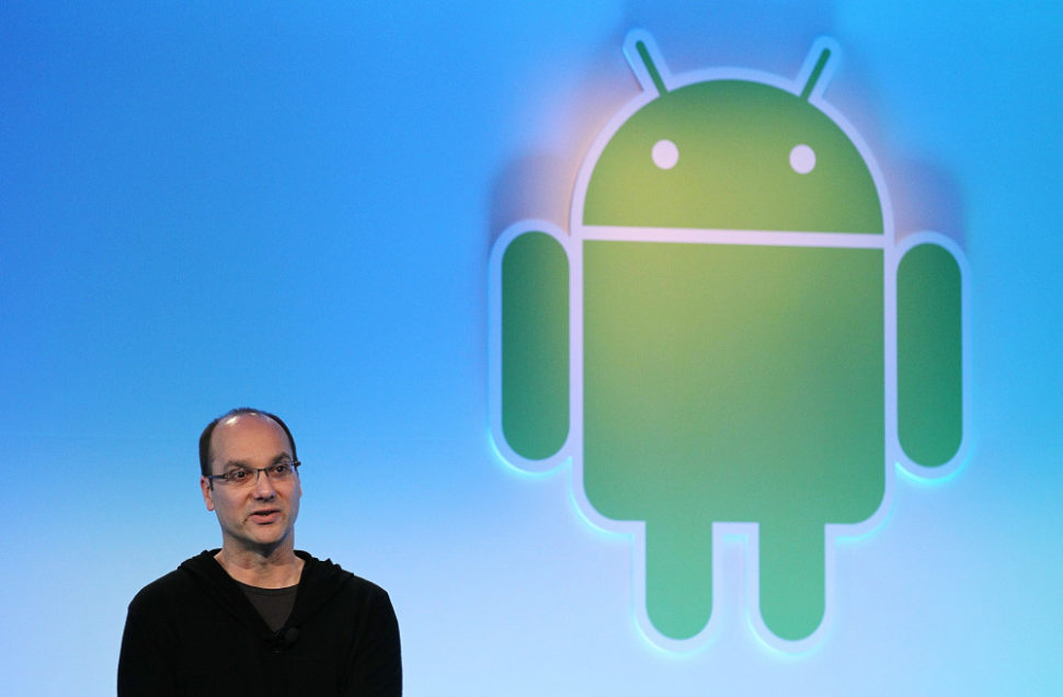
Irina Blok
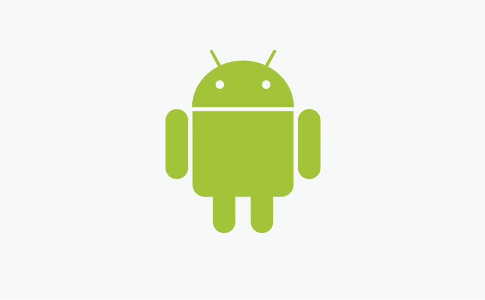
The logo that Android launched with and still uses today was created by Irina Blok, who was a big part of the original launch campaign. At the beginning, the logo was intended specifically for developers. After the reveal, individual customers fell in love with the little green robot so much that Google decided to use it as the logo.
“The idea was to create the open source logo (very much like open source Android platform), that was released to the developer community without regular brand guidelines.” – Irina Blok
The inspiration behind the Android logo
There are many critics out there that claim that the design of the android robot was stolen from an old Atari video game called “Gauntlet: The Third Encounter.”
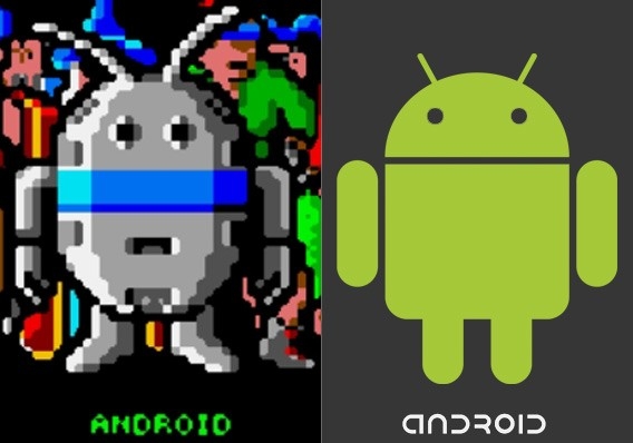
If you take a look at the image above, the is no doubt that they look very similar. Ironically enough, the character in the game is also called ANDROID.
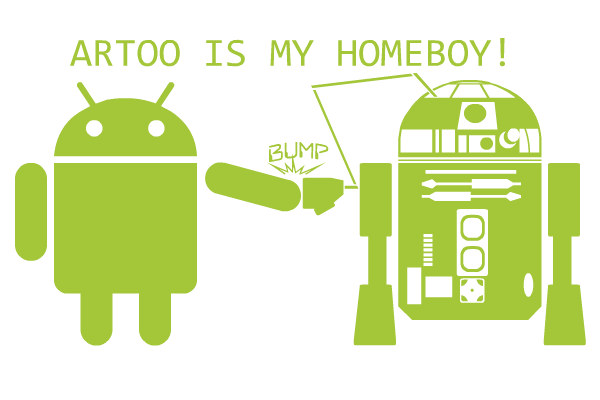
It would be hard to pin the inspiration of the Android logo on any one source. Some even believe that the logo was inspired by the original R2-D2 robot from Star Wars.
Much to everyone’s surprise, Irina has come out and disclosed that there are actually many early design drafts for the Android logo, and this just so happened to be the one they chose.
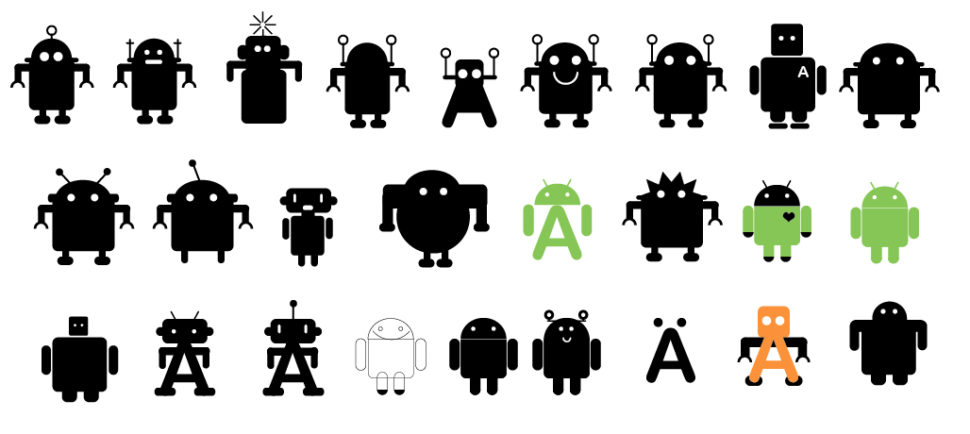
Given the fact that the design theme of the logo is apparent in multiple different popular games and movies, I highly doubt that it was stolen.
Other than the design, the color was also thought about deeply. The green color, fittingly being called “Android Green” is meant to depict growth, freshness, and prosperity.
Android has quickly taken over
Although Android hasn’t been around as long as some of the other tech giants, it’s safe to say that they definitely have earned their place among the rest. Since its creation in 2003, Android has risen in the ranks and only really has one competitor, Apple. Although there are many Apple fans out there, there are equally as many, if not more Android fans that will never be caught using anything else.
What do you think about the popular logo? Is it a good look for the company, or should google find something new? Personally, I believe that the logo is a big selling point for the devices sold using the Android OS. If Google continues to use this marketing formula, whatever it is, then I’m certain that we will soon be seeing Apple products becoming obsolete.
Read More at The History Of The Android Logo
