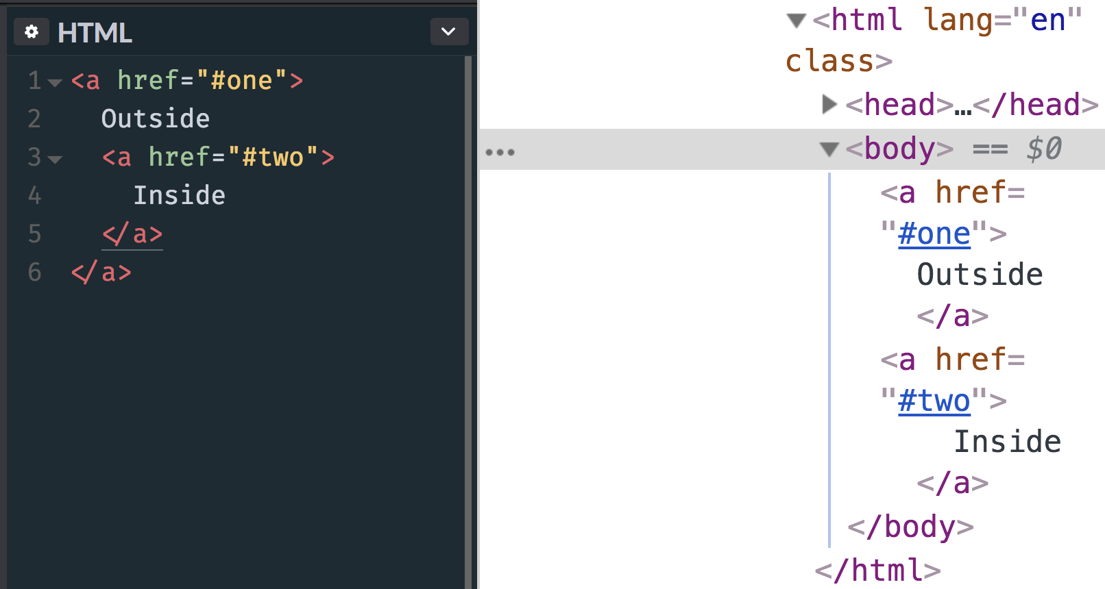
The other day I posted an image, quite literally as a thought exercise, about how you might accomplish “nested” links. That is, a big container that is linked to one URL that contains a smaller container or text link inside of it that goes to another URL. That’s harder than it might seem at first glance. The main reason being that…
<!-- this is invalid and won't render as expected -->
<a href="#one">
  Outside
  <a href="#two">
    Inside
  </a>
</a>
Eric Meyer once called for more flexible linking, but even that doesn’t quite handle a situation where one link is nested inside another.
Here’s what happens with that HTML, by the way:
The nested link gets kicked out.
My first inclination would be to simply not nest the links in the markup, but make them appear nested visually. Some folks replied to the tweet, including Nathan Smith, who shared that same thought: have a relatively positioned parent element and absolutely position both links. The larger one could fill up the whole area and the smaller one could sit on top of it.
I have literally no idea how kosher that is from an accessibility perspective. It looks gross to me so I’m just going to assume it’s bad news.
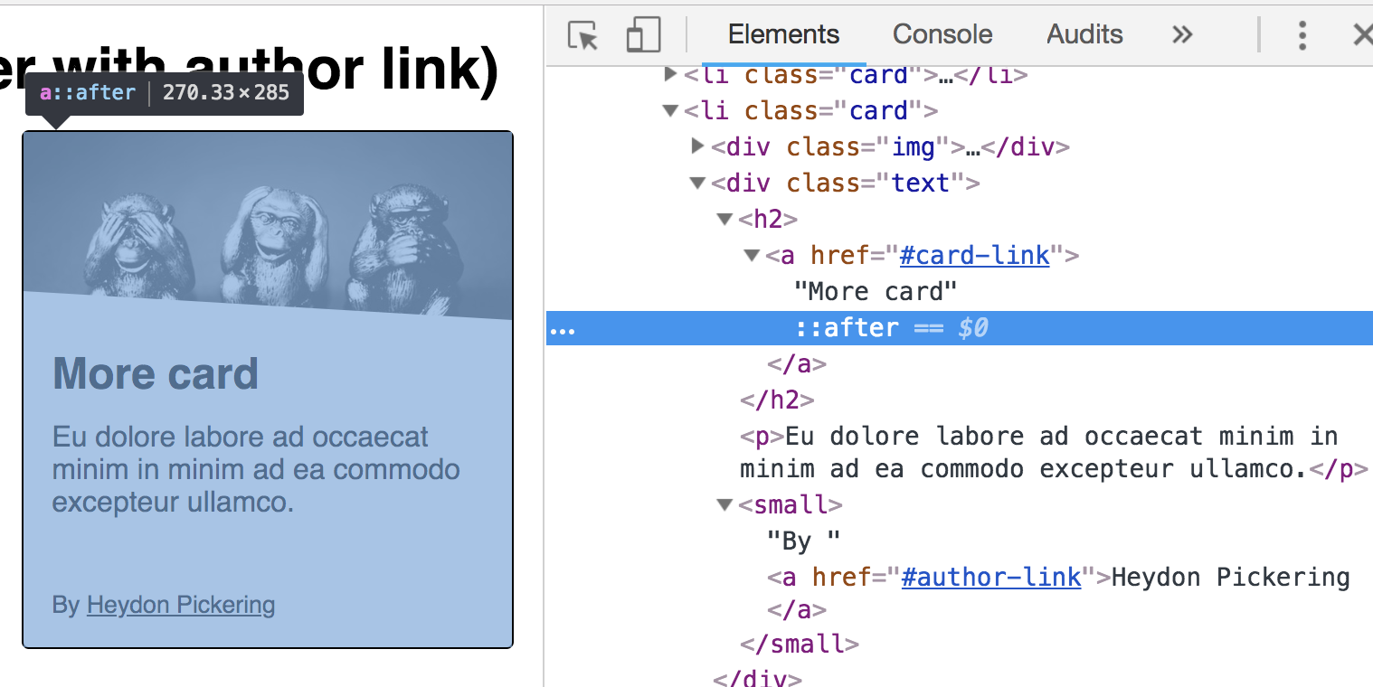
Speaking of accessibility, Heydon Pickering has a whole article about card components which is a popular design pattern where this situation often comes up. His solution is to have a relatively positioned parent element, then a normally-placed and functional main link. That first link has an absolutely positioned pseudo-element on it covering the entire card. Any sub-links are relatively positioned and come after the initial link, so they’d sit on top of the first link by way of z-index.
I had the same requirement a couple of years ago when I was building the front-end foundation for Smashing Magazine. So I thought I’d write my response to Chris’s thread out in the form of a blog post.
Sara has written about this with much more detail and care than I have here, so definitely check that out. It looks like both she and Heydon have landed on nearly the same solution, with the pseudo-element cover that contains sub-links poking above it as needed.
DigitalOcean invites you to experience a better, faster and simpler cloud platform designed to scale based on your needs. Get started for free with a $100 credit toward your first project and discover why the most innovative companies are already hosting on DigitalOcean.
Time is the most valuable thing in every person’s life – regardless of career, lifestyle, or income.
In these days of quick tech advancements, it is highly inefficient for anyone to spend time printing out a document, sending it off to recipients, asking them to sign, then having them returning it to be filed.
Thanks to free online PDF signing tools, no one has to go through those steps anymore. Now, you can quickly sign PDF documents with electronic signatures, also known as, e-signatures.
Using an e-signature to sign documents is a commonly accepted practice. It is quick, easy, secure, and professional – all things you want your brand to be associated with.
To save you time, we’ve created a list of our top five free PDF signing tools for 2018. In this list, you’ll not only learn about the best free online PDF signing tools, but also how you can use them to sign documents in less than five minutes.
The five signing tools listed below are web-based and free. They are compatible with Windows 10, Mac Os, Linux and Tablet, Mobile and smartphones, iPad, iPhones, and Chromebooks.
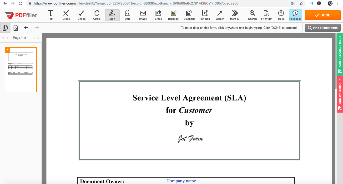
PDF Filler is one of the easiest ways to sign PDFs online. This website supports Word documents, PowerPoint, PDF and Text formats.
Something unique about it is that you can enter the URL to the document you want to sign, meaning that you don’t need to have the document stored on your computer before you even sign it! You can also retrieve it from your email inbox or third-party apps like Google Drive, Dropbox, Office or Box.
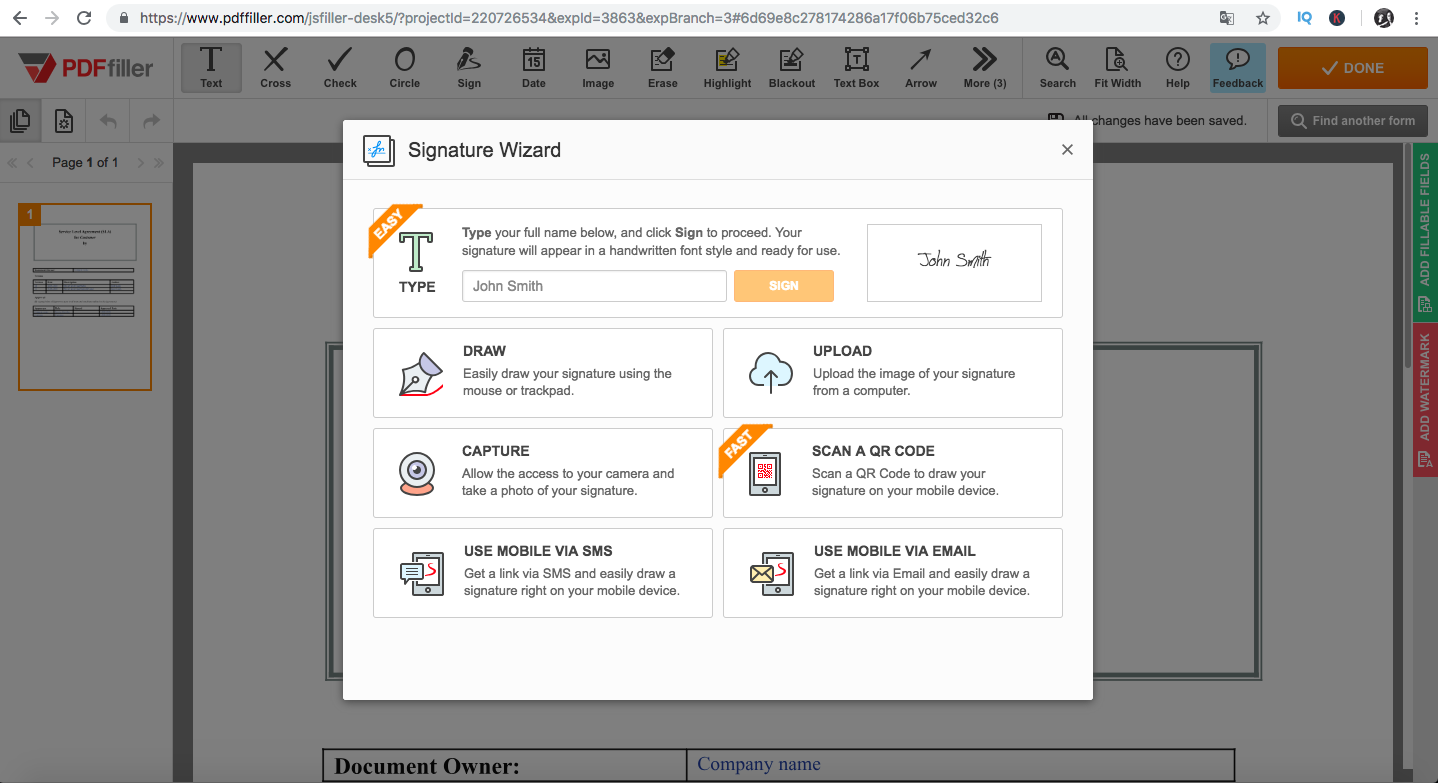
Below is a step-by-step guide to signing a document with PDF Filler:
To get started, type in the URL and upload or drag and drop your document using any of the options listed above.
After uploading your document, click the Sign button.
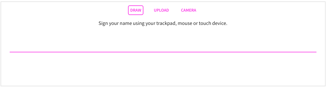
Now, you are shown different ways you can add your signature. You can type, draw, capture with a camera, scan a QR code or upload an existing image of your signature.
Below, we’ll show you two ways you can add your signature using this tool.
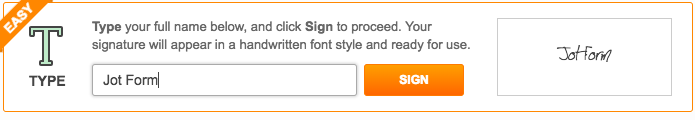
Option 1
Typing:
To do this, you simply type your name in the text box and click the “Sign” button to create a handwritten version of your signature.
You then place this signature in the space or field in your document. That’s it!
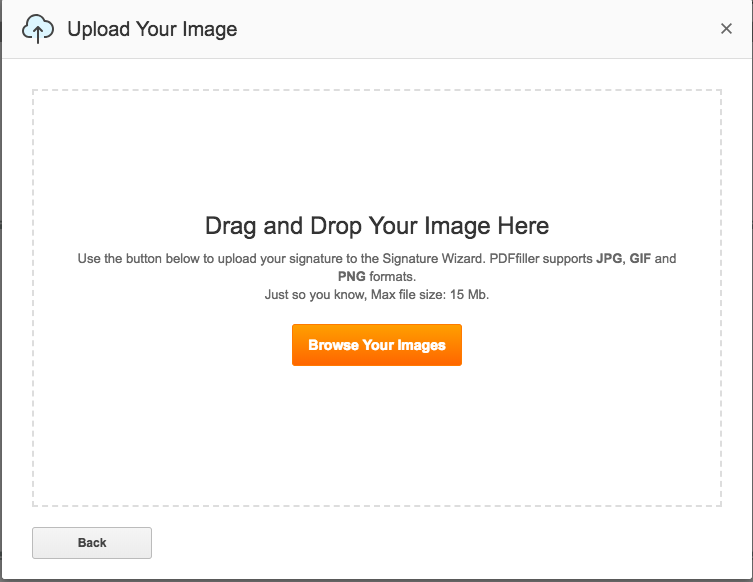
Option 2
Upload image:
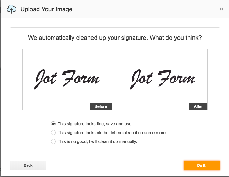
If you already have a saved photo of your signature, you can simply upload that by clicking the “Upload” button. The image can be a PNG, JPG, or GIF. We recommend using either PNG or JPG formats because they render predictably on all operating systems and browsers.
PDF Filler cleans up the image and gives you the option to make it cleaner.
Once you’re satisfied with how it looks, you can place it in the space or field in your document and you’re done.
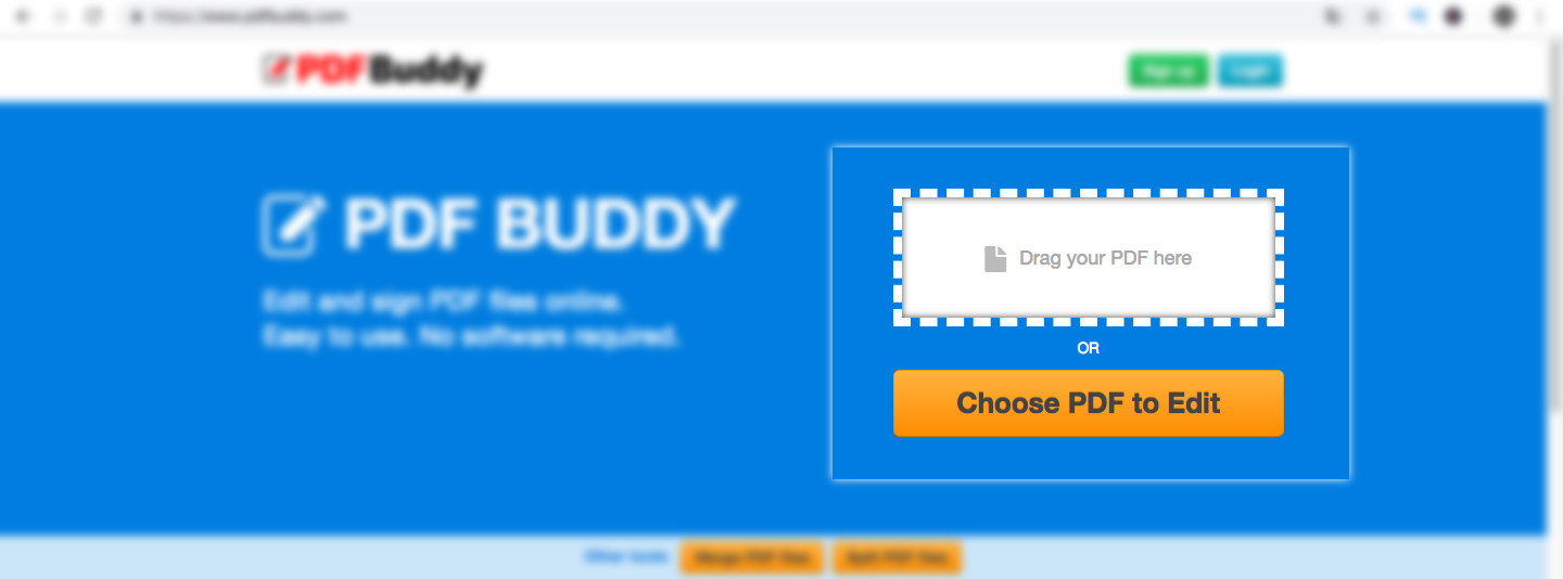
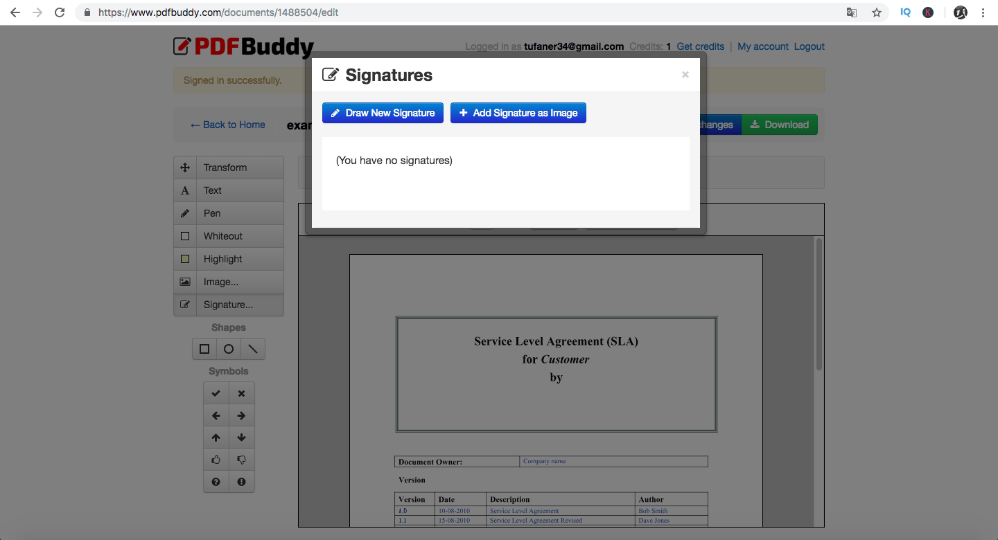
PDF Buddy is another great free tool which helps you sign and edit documents. PDF Buddy has Secure Sockets Layer (SSL) and AES-256 bit encryption to keep your documents and e-signatures safe.
Below are steps to use PDF Buddy.
Step 1
To get started, type in the URL into your web browser. You will be taken to the homepage where you’re asked to drag and drop your file or “Choose PDF to Edit” from your computer.
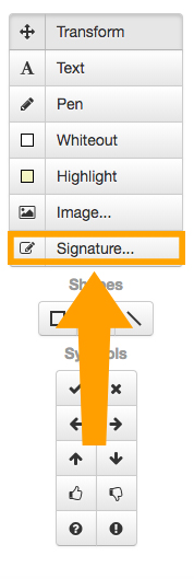
After uploading your file, select the Signature button on the left navigation bar.
You will then be asked to log in or sign up if it’s your first time visiting the site.
After signing up, a pop-up opens from the “Signatures” option. You can either draw your signature or add it as an image.
In this example, we will choose the option to add our signature as an image. We recommend that you have a photo of your hand-drawn signature on your computer or smartphone so it’s easily accessible.
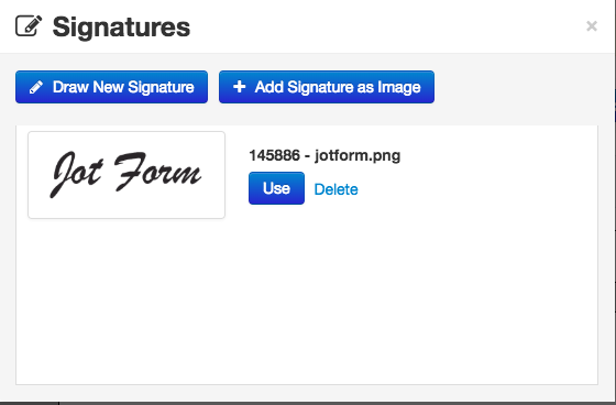
After you upload your signature, click the “Use” button.
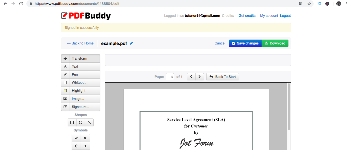
Similar to PDF Filler, place the signature in the space or field of the document.
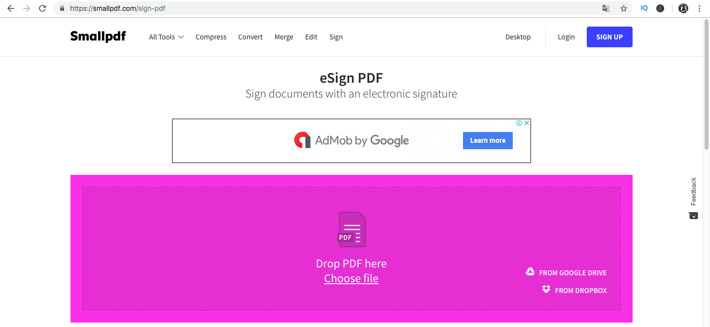
SmallPDF is another easy and free online tool to sign and edit your documents. Benefits of using it include its cloud-based saving option and other converting media files from one type to the other (I.e., PDF to JPG, PDF to Word Doc). You can see all these options on the SmallPDF homepage.
The process to use SmallPDF’s eSign is similar to the both PDF Filler and PDF Buddy. You can enter the URL and drop your file into the box or upload a file from Google Drive or Dropbox.
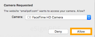
Once you have uploaded your file, you will be asked to choose how you want to upload your signature. You can draw it with your fingers, upload directly from your device, or capture an image with your camera.
If you are using a smartphone, you can use your phone’s camera and if you are using your computer, you can use your webcam.
After choosing the “Camera” option, make sure to allow “Camera Request.” This grants SmallPDF permission to use your webcam.
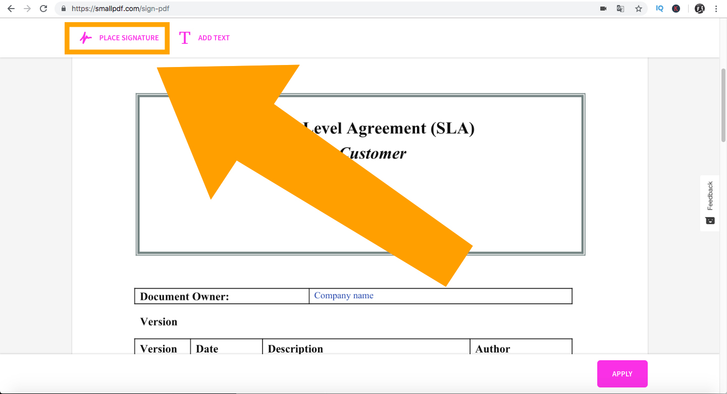
Take a steady and clear picture of your signature on a piece of paper.
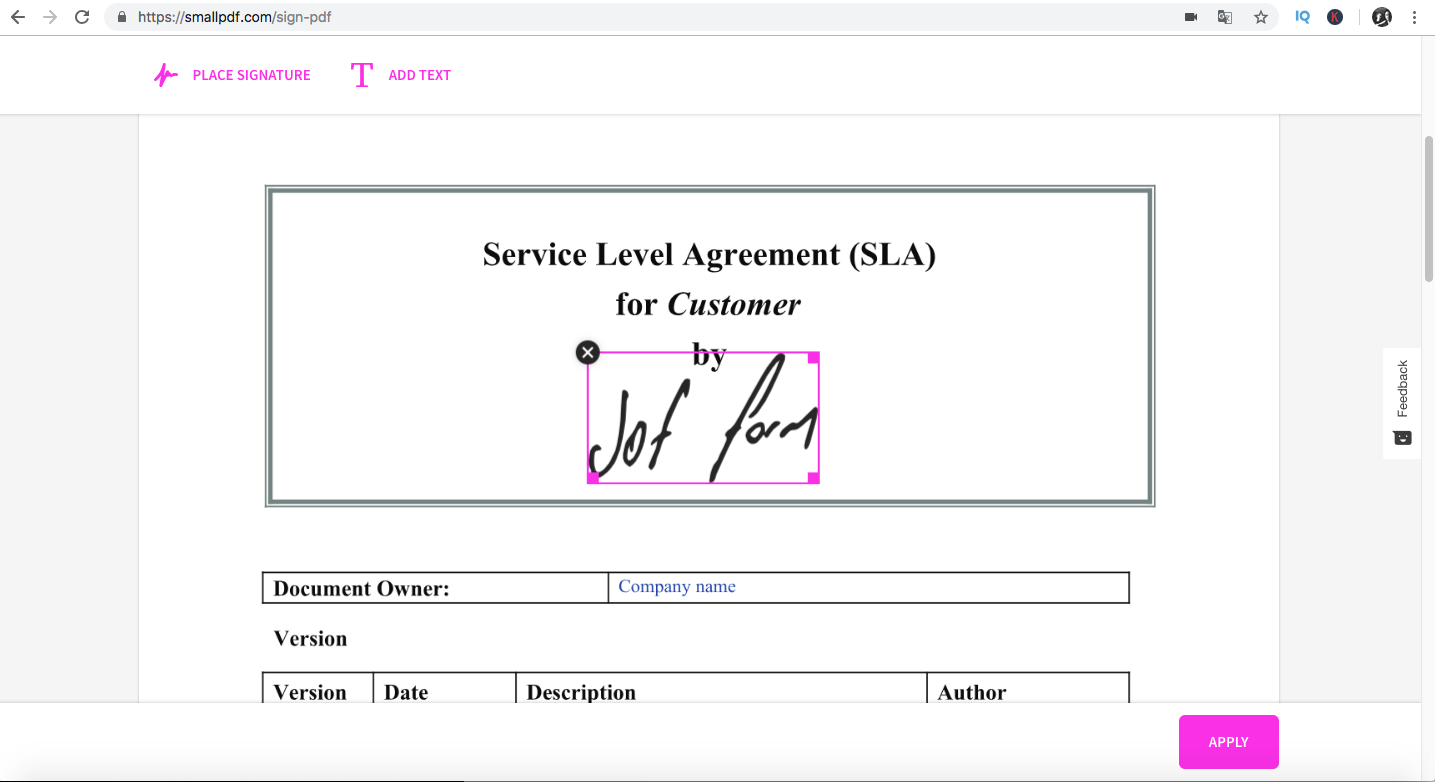
Then, you simply click, “Place Signature” and insert it into the document wherever appropriate.
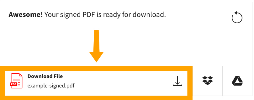
You will then be asked to download your signed document.
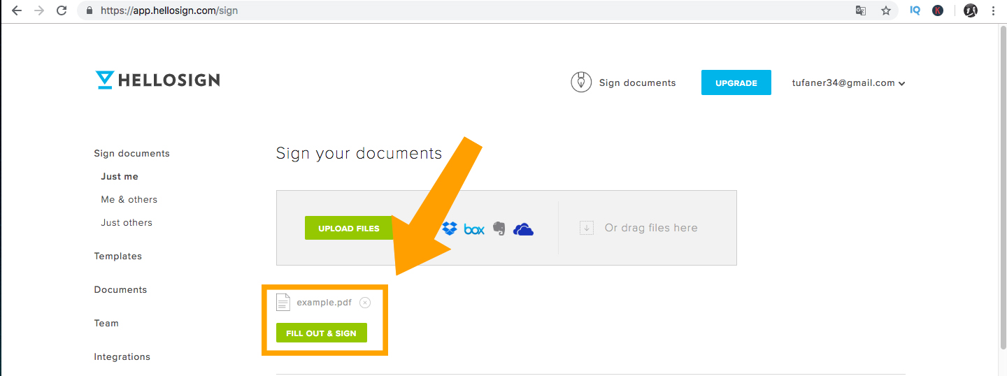
HelloSign is more than a simple PDF signing tool. It integrates with your business and helps you create customized agreements with clients, employees, and partners really easily. HelloSign has catchy slogans like ‘eSignatures Simplified,’ and works with some of the biggest companies in the world, such as Lyft, Samsung, and Twitter.
They provide high-level security for the documents and signatures, and also keep the process simple.
Here are the steps to use HelloSign to sign PDF documents.
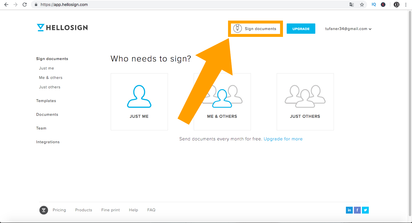
To get started, type in the URL. Once you’re on the site, make sure to create an account. After your account is created, click on the “Sign Documents” option on the top right menu bar.
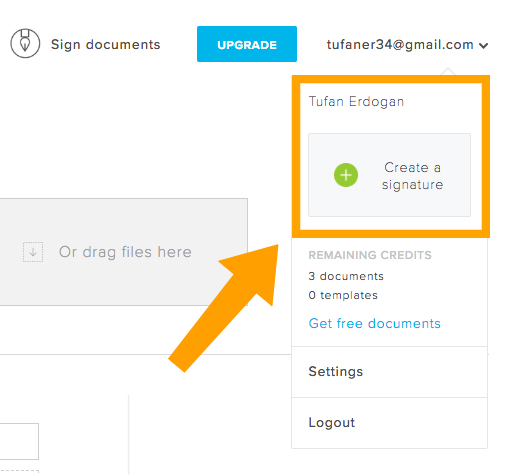
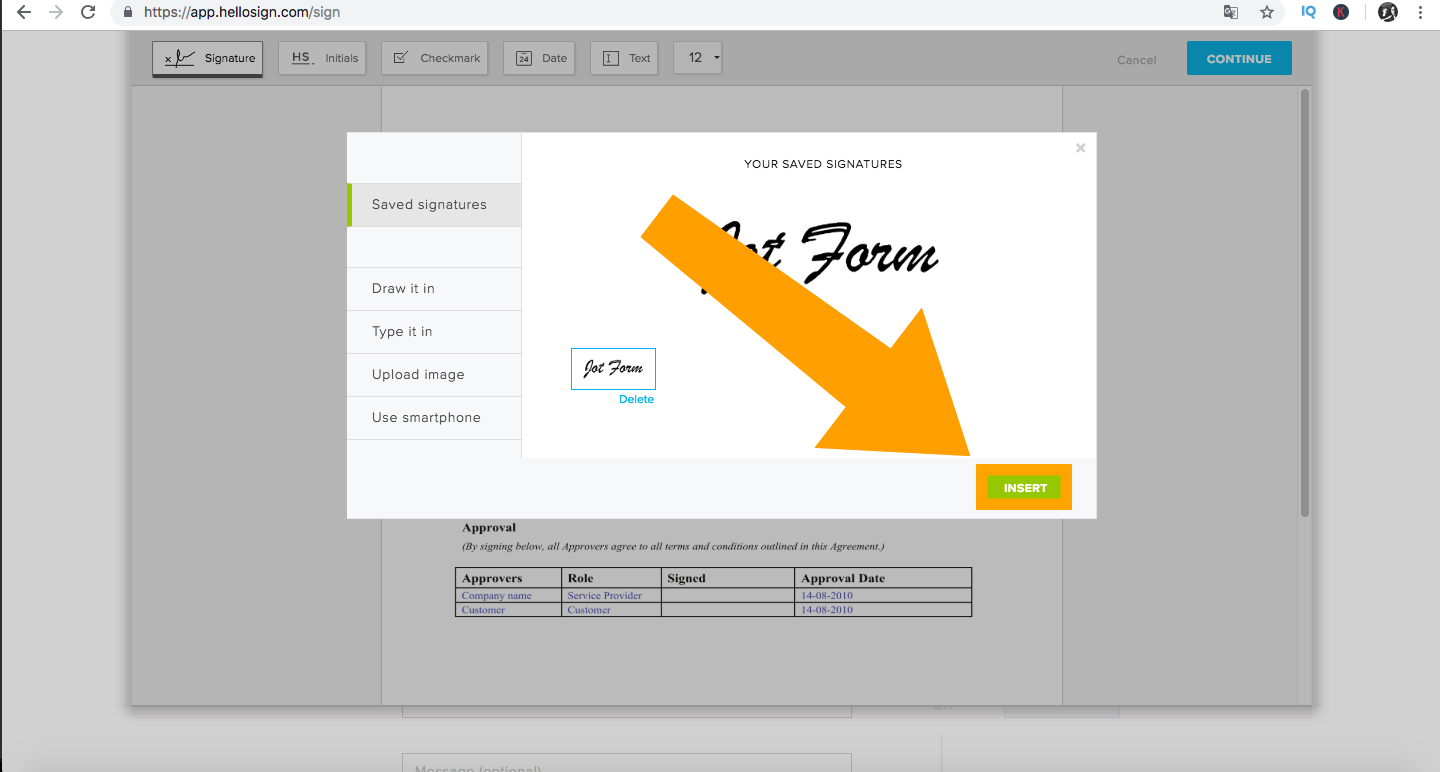
Next, you’ll be asked to “Create a Signature” and given the option to draw, type, or upload an image through your computer or smartphone.
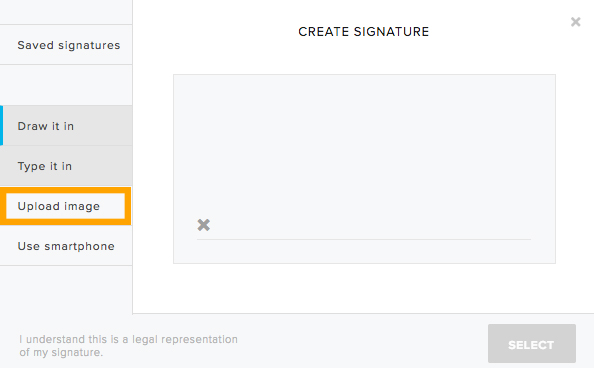
For this example, we will choose to upload an image with our signature.
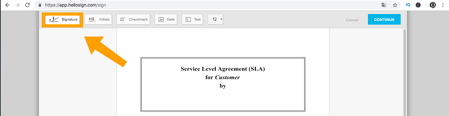
After you upload your signature from your computer, smartphone, Google Drive, Dropbox, Evernote, etc., HelloSign will ask you to upload your document, then click “Fill Out and Sign.”
After your document opens, click on the “Signature” button and insert your uploaded signature.
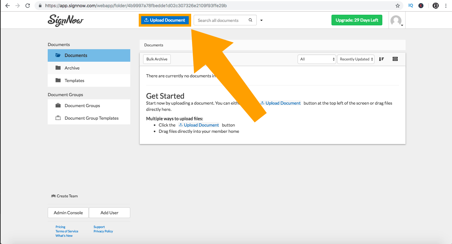
Last but not least, we have SignNow. Similar to the four editors above, SignNow is straightforward and provides legally binding e-signatures on all devices. They also have an iOS app.
SignNow is the only tool on this list that’s not free. They offer a 30-day free trial, however, and their mobile app makes it easy for users to sign, save, and send documents on-the-go.
To get started, simply enter the URL and sign up to use the free trial.
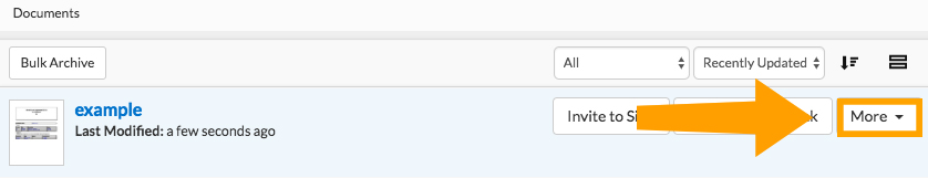
Once you’re registered, upload your document by clicking the Upload Document button shown below.
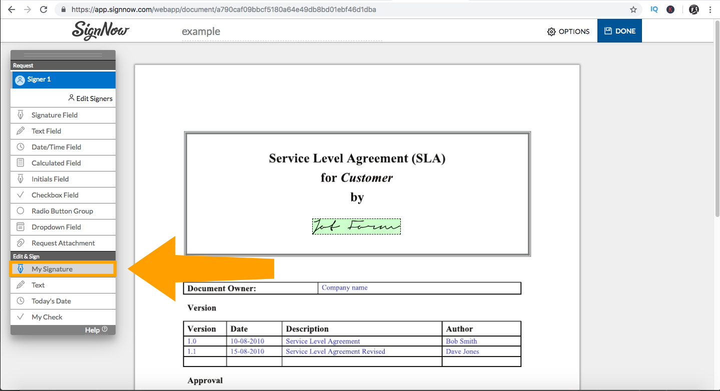
After your file is uploaded, click on “More” and open your document.
When the document is open, click on “My Signature” as shown below.
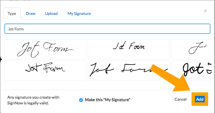
You’ll then be asked to add your signature by typing, drawing, uploading, or using a pre-saved signature. Don’t forget to click the “Save” button after creating or uploading your signature.
Once saved, simply click the “Add” button and insert your signature into your PDF file. Both your document and signature will be saved, so you can use it again when you need to.
And there you have it – the top five free online tools for signing documents in 2018! Learning how to edit PDFs can be challenging, but these tools can save you a ton of time, which will make you more efficient and keep you at the top of your game.
Know of any other PDF signing tools? Please share in the comments below.
One of the many things that I do is to be a part of the CSS Working Group as an Invited Expert. Invited Experts are people who the group wants to be part of the group, but who do not work for a member organization which would confer upon their membership. In this post, I explain a little bit about what I feel my role is in the Working Group, as a way to announce a possible change to my involvement with the support of the Dutch organization, Fronteers.
I’ve always seen my involvement in the CSS Working Group as a two-way thing. I ferry information from the Working Group to authors (folks who are web developers, designers, and people who use CSS for print or EPUB) and from authors to the Working Group. Once I understand a discussion that is happening around a specification which would benefit from author input, I can explain it to authors in a way that doesn’t require detailed knowledge of CSS specifications or browser internals.
This was the motivation behind all of the work I did to explain Grid Layout before it landed in browsers. It is work I continue, for example, my recent article here on Smashing Magazine on Grid Level 2 and subgrid. While I think that far more web developers are capable of understanding the specifications than they often give themselves credit for, I get that people have other priorities! If I can distill and share the most important points, then perhaps we can get more feedback into the group at a point when it can make a difference.
There is something I have discovered while constantly unpacking these subjects in articles and on stage. While I can directly ask people for their opinion — and sometimes I do — the answers to those direct questions are most often the obvious ones. People are put on the spot; they feel they should have an opinion and so give the first answer they think of. Even with they’re in an A or B choice about a subject (when asked to vote), they may not be in a place to fully consider all of the implications.
If I write or talk about a subject, however, I don’t get requests for CSS features. I get questions. Some of those I can answer and I make a note to perhaps better explain that point in future. Some of those questions I cannot answer because CSS doesn’t yet have an answer. I am constantly searching for those unanswered questions, for that is where the future of CSS is. By being a web developer who also happens to work on CSS, I’m in a perfect place to have those conversations and to try to take them back with me to the Working Group when relevant things are being discussed, and so we need to know what authors think.
To do this sort of work, you need to be able to explain things well and to have a nerdy interest in specifications. I’m not the only person on the planet who has these attributes. However, to do this sort of work as an Invited Expert to the CSS Working Group requires something else; it requires you to give up a lot of your time and be able to spend a lot of your own money. There is no funding for Invited Experts. A W3C Invited Expert is a volunteer, attending weekly meetings, traveling for in-person meetings, spending time responding to issues on GitHub, chatting to authors, or even editing specifications and writing tests. This is all volunteer work. As an independent — sat at a CSS Working Group meeting — I know that while practically every other person sat around that table is being paid to be there — as they work for a browser vendor or another company with an interest — I’m not. You have to care very deeply, and have a very understanding family for that to be at all sustainable.
It is this practical point which makes it hard for there to be more people like me involved in this kind of work — in the way that I’m involved — as an independent voice for authors. To actually be paid to work on this stuff usually means becoming employed by a browser vendor, and while there is nothing wrong with that it changes the dynamic. I would then be Rachel Andrew from Microsoft/Google/Mozilla. Who would I be speaking for? Could I remain embedded in the web community if I was no longer a web developer myself? It’s for this reason I was very interested when representatives from Fronteers approached me earlier this year.
Fronteers are an amazing organization of Dutch web developers. One of my first international speaking engagements was to go to Amsterdam to speak at one of their meetups. I was immediately struck by the hugely knowledgeable community in Amsterdam. If I am invited to speak at a front-end event in the Netherlands, I know I can take my nerdiest and most detailed talks along with me; the community there will already know the basics and be excited to hear the details.
Anneke Sinnema (Chair of Fronteers) and Peter-Paul Koch (Founder) approached me with an idea they had about their organization becoming a Member of the W3C, which would then entitle them to representation within the W3C. They wanted to know if I would be interested in becoming their first representative — a move that would make me an official representative for the web development community as well as give me a stipend in order that I would have some paid hours covered to do that work. This plan needs to be voted upon my Fronteers members, so may or may not come to fruition. However, we all hope it will, and not just for me but as a possible start to a movement which sees more people like myself involved in the work of creating the web platform.
My post is one of a few being published today to announce this as an idea. For more information on the thoughts behind this idea, read “Web Developer Representation In W3C Is Here” on A List Apart. Dutch speakers can also find a post on the Fronteers blog.
It has been 8 years since I decided to evolve as a human by moving from employee-ship to entrepreneurship.
Since then we have worked on over 110+ projects and counting. It has been a massive roller coaster ride, made easier in the privileged company of many great co-pilots.
As I reflect back on how the company has grown (and how I’ve have grown), the one thing that pops to mind is how important it is for Design Sojourn to continue to evolve and keep evolving for years to come.
It is important for us to continue to deeply understand the value we offer our clients, and on the flip side, ensure our clients understand the value they get from us.
So a big thank you to all my blog readers, clients, partners and friends for your kind support over the years.
We are here because you believed in us, and I hope to be there for you for many more years to come.
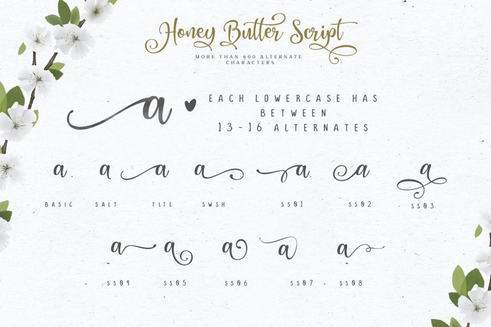
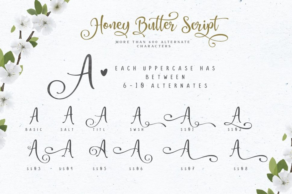
Sometimes, designers create fonts that we believe could have been done better. It’s not always easy to get the kerning, leading, and tracking jobs done correctly. It takes a whole lot of practice and talent to design a good font, especially given the amount of fonts that invade the market nowadays. Lettersiro is a master of fonts, fact confirmed by Honey Butter, the best font for fall 2018. This is what we will be talking about today.
Honey Butter is Lettersiro’s newest font, a piece of art expressed through letters. The hand-written style has no flaw, creating interest to whoever sees it. Such fonts can be used in many contexts that need a little bit of sparkle. The star of this fall, especially, would work amazingly for logo designs, blog/web headlines, clothing texts, invitations, posters, cafe/resto signs, and many others. Not to mention that the fonts fits perfectly for any season-themed project. The versatile look makes it easy for your design to stand out in the crowd. The font features three versions:
Honey Butter script
Honey Butter sans
Honey Butter serif
The trio font can be pairs interchangeably with ease and they contain more than 600 alternate characters. The creator can also make 260 vectors for Honey Butter Font Trio which you can add to all your designs.
We also make 260 vectors for this font, so you can create many many designs for your projects. Creative market gathers the best font creators of fonts around the globe. We could call it a font heaven. It’s helpful both for the creators, and clients. Letteriro offers this font for a very affordable price of $16. It is important to understand that when you purchase the font, you get the following:
Honey Butter Script Clean with over 600 alternate (OTF/TTF) – Alternate contains stylistic, swash, stylistic set ss01 – ss13 , and ligatures
Character Map for Honey Butter Script Alternates (PDF)
Multilingual support – spread your message globallyAÀÁÂÃÄÅCÇDÐEÈÉÊËIÌÍÎÏNÑOØÒÓÔÕÖUÙÜÚÛWYÝŸÆßÞþ
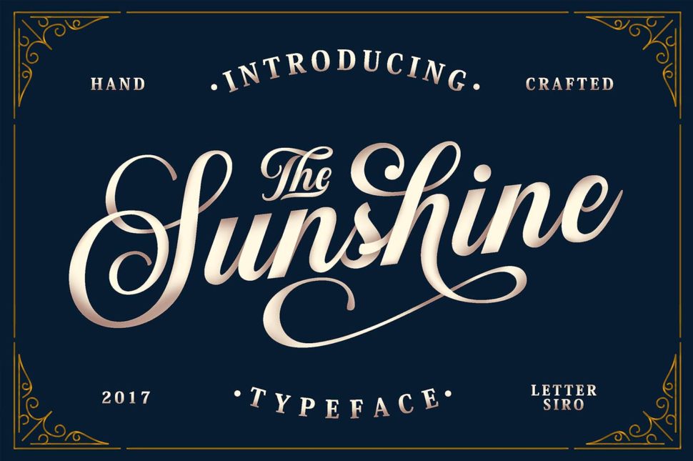
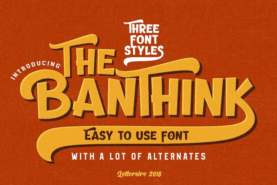
Letteriro created history through his amazing fonts. Below, we cataloged some of his work for anyone interested to check it out.
Holland • 3 Classy Signature Font
Holland • 3 Classy Signature Font
Sunshine & Vintage Ornaments
The Banthink – 3 Font Styles
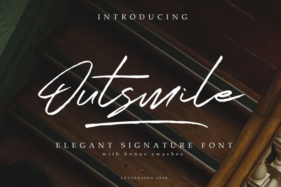
Outsmile Elegant Signature Font
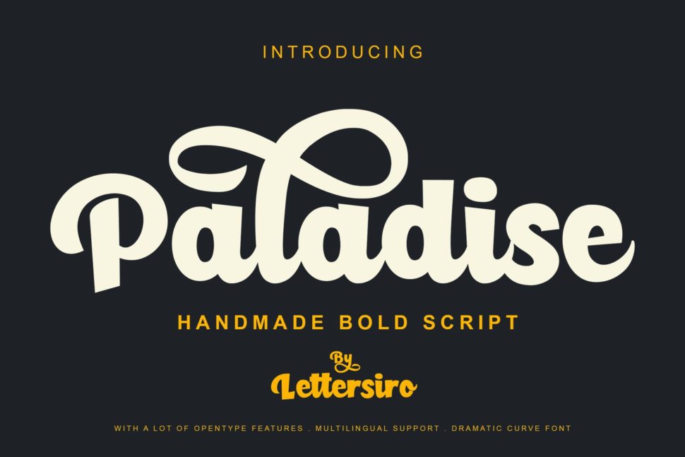
Paladise Font & Extras
Audhistine Font
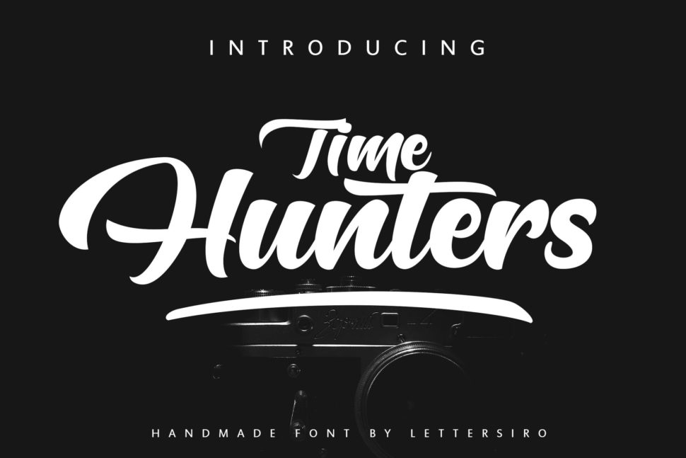
Time Hunters Script
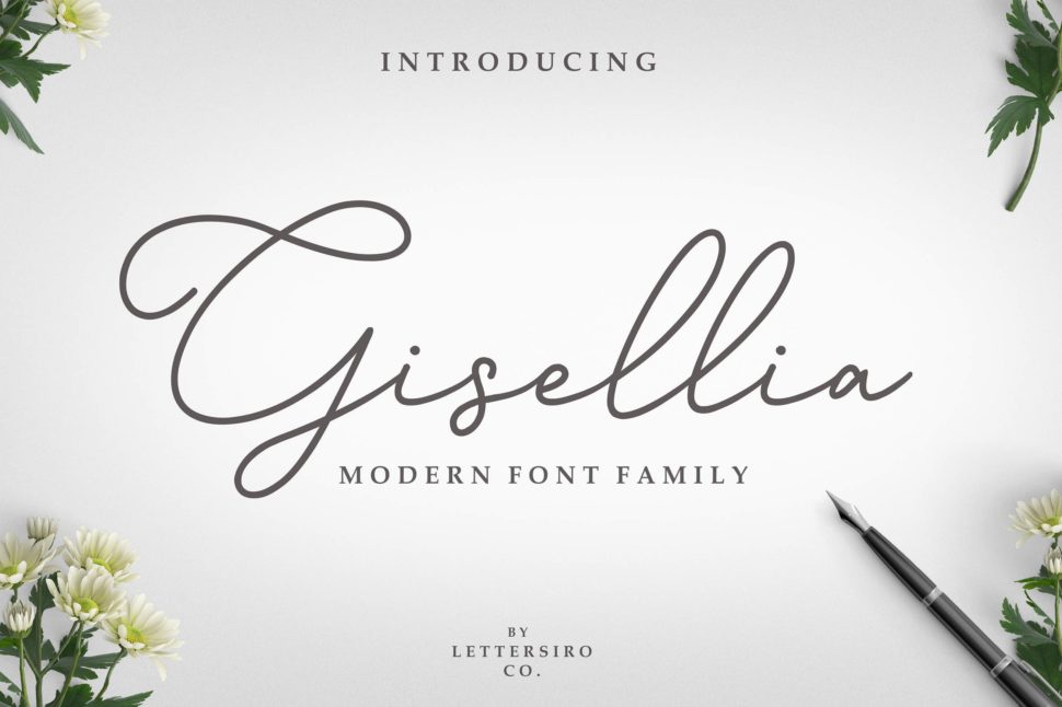
Gisellia – Modern Font Family
Yay! You’ve made it to the end of this article! Are you a font creator? We would like to know more about you. Drop us an email at webdesignledger.blog@gmail.com, and we will tell you all you have to do!
Some people prefer to write JavaScript with React. For others, it’s Vue or jQuery. For others still, it is their own set of tools or a completely blank document. Some setups are minimal, some allow you to get things done quickly, and some are crazy powerful, allowing you to build complex and maintainable applications. Every setup has advantages and disadvantages, but positives usually outweigh negatives when it comes to popular frameworks verified and vetted by an active community.
React and Vue are powerful JavaScript frameworks. Of course they are — that’s why both are trending so high in overall usage. But what is it that makes those, and other frameworks, so powerful? Is it the speed? Portability to other platforms like native desktop and mobile? Support of the huge community?
The success of a development team starts with an agreement. An agreement of how things are done. Without an agreement, code would get messy, and the software unsustainable quite quickly, even for relatively small projects. Therefore, a lot (if not most) of the power of a framework lies within this agreement. The ability to define conventions and common patterns that everyone adheres to. That idea is applicable to any framework, JavaScript or not. Those “rules” are essential to development and bring teams maintainability at any size, reusability of code, and the ability to share work with a community in a form anyone will understand. That’s why we can web search for some component/plugin that solves our problem rather than writing something on our own. We rely on open-source alternatives, no matter what framework we use.
Unfortunately, there are downsides to frameworks. As Adrian Holovaty (one of the Django creators) explains in his talk, frameworks tend to get bulky and bloated with features for one particular use case. It could be the inclusion of a really good idea. It could also be a desire to provide a one-size-fits-all solution for anyone and everyone’s needs. It could be to remain popular. Either way, there are downsides to frameworks in light of all the upsides they also have.
In server-rendered world, where we work with content that’s delivered to the browser from a server, this “framework mission” is filled with skills, ideas, and solutions that people share with co-workers, friends, and others. They tend to adopt consistent development rules and enforce them within their teams or companies, rather than relying on a predefined framework. For a long time, it’s been jQuery that has allowed people to share and reuse code on a global scale with its plugins — but that era is fading as new frameworks are entering the fold.
Let’s take a look at some core points that any framework — custom or not — ought to consider essential for encouraging a maintainable and reusable codebase.
Naming conventions
Some might say that naming is the hardest part of development. Whether it’s naming JavaScript variables, HTML classes, or any other number of things, a naming convention has a big impact on how we work together because it adds context and meaning to our code. A good example of a naming convention is BEM, a CSS methodology created by the folks at Yandex and adopted by many, many front-enders. That sort of standardization and consistency can help inform our objective, which is to have a standard convention for naming JavaScript selectors.
This situation might seem familiar: you revisit a project after a few months and you see some behavior happening on the page — maybe something you want to modify or fix. However, finding the source of that behavior can be a tricky thing. Is it the id attribute I should search for? Is it one of the classes? Maybe the data attribute for this particular element?
I think you get the point. What helps is having some kind of convention to simplify the process and make everyone work with the same names. And it doesn’t really matter if we’re going with classes (e.g. js-[name]) or data attributes (e.g. data-name="[name]"). All that matters is that the names conform to the same style. Surely enough, any framework you will meet will enforce a naming convention of some sort as well, whether it’s React, Vue, Bootstrap, Foundation, etc.
Scope
A developer will likely struggle with JavaScript scope at some point in time, but we are specifically focusing on DOM scope here. No matter what you do with JavaScript, you’re using it to affect some DOM element. Limiting parts of the code to a DOM element encourages maintainability and makes code more modular. Components in both React and Vue operate in a similar fashion, although their “component” concept is different than the standard DOM. Still, the idea scopes the code to a DOM element that is rendered by those components.
While we’re on the topic of DOM manipulation, referencing elements within the root element of the component is super helpful because it help avoids the constant need to select elements. React and Vue do this out of the box in a very good way.
Lifecycle
In the past, the page lifecycle was very straightforward: the browser loaded the page and the browser left the page. Creating or removing event listeners, or making code run at the right time was much simpler, as you would simply create everything you need on load, and rarely bother with disabling your code, since the browser would do it for you by default.
Nowadays, the lifecycle tends to be much more dynamic, thanks to state management and the way we prefer to manipulate changes directly to the DOM or load the contents of pages with JavaScript. Unfortunately, that usually brings some issues where you may need to re-run parts of your code at certain times.
I can’t tell how many times in my life I’ve had to play around with code to get my event handlers to run correctly after re-writing part of the DOM. Sometimes it is possible to solve this with event delegation. Other times, your code handlers don’t run at all or run several times because they are suddenly attached twice.
Another use case would be the need to create an instance of libraries after changing the DOM, like “fake selects.”
In any case, the lifecycle is important and limiting your code to a DOM element certainly helps here as well, since you know that the code applied to that element needs to be re-run in case the element is re-rendered.
Frameworks do the same with functions as componentDidMount or componentDidUpdate, which give you an easy way of running code exactly when you need it.
Reusability
Copying code from somewhere else and reusing it is super common. Who hasn’t used a snippet from a past project or an answer from StackOverflow, right? People even invented services like npm meant for one thing: to easily share and reuse code. There is no need to reinvent the wheel and sharing code with others is something that is convenient, handy, and often more efficient than spinning something up from scratch.
Components, whether it’s React, Vue, or any other building block of a framework encourage reusability by having a wrapper around a piece of code that serves some specific purpose. A standardized wrapper with an enforced format. I would say this is more of a side effect of having some base we can build on, than an intentional effort for reusability, as any base will always need some standard format of a code it can run, the same way programming languages have a syntax we need to follow… but it is a super convenient and useful side effect, for sure. By combining this gained reusability with package managers like Yarn, and bundlers like webpack, we can suddenly make code written by many developers around the world work together in our app with almost no effort.
While not all code is open-source and shareable, a common structure will help folks in smaller teams as well, so anyone is able to understand most of the code written within the team without having to consult its author.
DOM manipulation with performance in mind
Reading and writing to the DOM is costly. Developers of front-end frameworks keep that in mind and try to optimize as much as possible with states, virtual DOM and other methods to make changes to the DOM when it’s needed and where it’s needed… and so should we. While we’re more concerned with server-rendered HTML, most of the code ends up reading or writing to the DOM. After all, that’s what JavaScript is for.
While most of the changes of the DOM are minimal, they can also occur quite often. A nice example of frequent reading/writing is executing a script on page scroll. Ideally, we would like to avoid adding classes, attributes or changing the contents of elements directly in the handler, even if we write the same classes, attributes or contents because our changes still get processed by the browser and are still expensive, even when nothing changes for the user.
Size
Last, but not least: size. Size is critical or at least should be for a framework. The code discussed in this article is meant to be used as a base across many projects. It should be as small as possible and avoid any unnecessary code that could be added manually for one-off use cases. Ideally, it should be modular so that we can pull pieces of it out à la carte, based on the specific needs for the project at hand.
While the size of self-written code is usually reasonable, many projects end up having at least some dependencies/libraries to fill in gaps, and those can make things quite bulky really fast. Let’s say we have a carousel on a top-level page of a site and some charts somewhere deeper. We can turn to existing libraries that would handle these things for us, like slick carousel (10 KB minified/gzipped, excluding jQuery) and highcharts (73 KB minified/gzipped). That’s over 80 KB of code and I’d bet that not every byte is needed for our project. As Addy Osmani explains, JavaScript is expensive and its size is not the same as other assets on a page. It’s worth keeping that in mind the next time you find yourself reaching for a library, though it shouldn’t discourage you from doing it if the positives outweigh the negatives.
A look at a minimal solution we call Gia
Let’s take a look at something I’ve been working on and using for a while with my team at Giant. We like JavaScript and we want to work directly with JavaScript rather than a framework. But at the same time, we need the maintainability and reusability that frameworks offer. We tried to take some concepts from popular frameworks and apply them to a server-rendered website where the options for a JavaScript setup are so wide, and yet so limited.
We’ll go through some basic features of our setup and focus on how it solves the points we’ve covered so far. Note that many of the solutions to our needs are directly inspired by big frameworks, so if you see some similarities, know that it’s not an accident. We call it Gia (get it, like short for Giant?!) and you can get it from npm and find the source code on GitHub.
Gia, like many frameworks, is built around components that give you a basic building block and some advantages we’ll touch on in a bit. But don’t confuse Gia components with the component concepts used by React and Vue, where all your HTML is a product of the component. This is different.
In Gia, a component is a wrapper for your own code that runs in the scope of a DOM element, and the instance of a component is stored within the element itself. As a result, an instance is automatically removed from the memory by the garbage collector in case the element is removed from the DOM. The source code of the component can be found here and is fairly simple.
Apart from a component, Gia includes several helpers to apply, destroy and work with the component instance or communicate between components (with standard eventbus included for convenience).
Let’s start with a basic setup. Gia is using an attribute to select elements, along with the name of the component to be executed (i.e. g-component="[component name]"). This enforces a consistent naming convention. Running the loadComponents function creates the instances defined with the g-component attribute.
Gia components also allow us to easily select elements within the root element with the g-ref attribute. All that needs to be done is to define the refs that are expected and whether we’re working with a single element or an array of them. Reference is then accessible in the this.ref object within the component.
The component includes methods that are executed at different times, in order to solve the lifecycle issue. Here’s an example that shows how a component can be initialized or removed:
Notice how loadComponents function doesn’t apply the same component when it already exists.
It is not necessary to remove listeners attached to the root element of a component or elements within it before re-rendering them since the elements would be removed from the DOM anyway. However, there can be some listeners created on global objects (e.g. window), like the ones used for scroll handling. In this case, it is necessary to remove the listener manually before destroying the component instance in order to avoid memory leaks.
The concept of a component scoped to a DOM element is similar in its nature to React and Vue components, but with a key exception that the DOM structure is outside of the component. As a result, we have to make sure it fits the component. Defining the ref elements certainly helps, as Gia component will tell you when the required refs are not present. That makes the component reusable. The following is example implementation of a basic carousel that could be easily reused or shared:
While we’re talking about reusability, it’s important to mention that components don’t have to be reused in their existing state. In other words, we can extend them to create new components as any other JavaScript class. That means we can prepare a general component and build upon it.
To give an example, a component that would give us the distance between the cursor and the center of an element seems like a thing that could be useful someday. Such a component can be found here. After having that ready, it’s ridiculously easy to build upon it and work with provided numbers, as the next example shows in the render function, although we could argue about the usefulness of this particular example.
Let’s try to look into optimized DOM manipulations. Detecting if a change to the DOM is supposed to happen can be manually stored or checked without directly accessing the DOM, but that tends to be a lot of work which we might want to avoid.
This is where Gia really drew inspiration from React, with simple, stripped down component state management. The state of a component is set similarly to states in React, using a setState function.
That said, there is no rendering involved in our component. The content is rendered by the server, so we need to make a use of the changes in state elsewhere. The state changes are evaluated and any actual changes are sent to the stateChange method of a component. Ideally, any interaction between the component and the DOM would be handled in this function. In case some part of the state doesn’t change, it won’t be present in the stateChanges object passed into a function and therefore won’t be processed — the DOM won’t be touched without it being truly necessary.
Check the following example with a component showing sections that are visible in the viewport:
Notice how writing to the DOM (visualized by the blink) is only done for items where the state actually changes.
Now we are getting to my favorite part! Gia is truly minimal. The entire bundle containing all the code, including all the helpers, takes up a measly 2.68 KB (minified/gzipped). Not to mention that you most likely won’t need all of Gia’s parts and would end up importing even less with a bundler.
As mentioned earlier, the size of the code can rapidly increase by including third-party dependencies. That’s why Gia also includes code splitting support where you can define a dependency for a component, which will only be loaded when the component is being initialized for the first time, without any additional setup required to the bundler. That way, the bulky libraries used somewhere deep within your site or application don’t have to slow things down.
In case you decide one day that you really want to take advantage of all the goodies big frameworks can offer somewhere in your code, there is nothing easier than just loading it like any other dependency for the component.
I guess the main point of this article is that you don’t need a framework to write maintainable and reusable code. Following and enforcing a few concepts (that frameworks use as well) can take you far on its own. While Gia is minimal and does not have many of the robust features offered by big players, like React and Vue, it still helps us get that clean structure that is so important in the long term. It includes some more interesting stuff that didn’t make the cut here. If you like it so far, go check it out!
There are lots and lots of use cases, and different needs require different approaches. Various frameworks can do plenty of the work for you; in other cases, they may be constraining.
What is your minimal setup and how do you account for the points we covered here? Do you prefer a framework or non-framework environment? Do you use frameworks in combination with static site generators like Gatsby? Let me know!
Alex Russell describes his thoughts on the current state of JavaScript and how we might sometimes put a ton of focus on the ease-of-use of development at the expense of user experience. So, for example, we might pick a massive framework to make development easier and faster but then that might have an enormous impact on the user.
Alex describes it as substituting “developer value for user value.”
The “developer experience” bait-and-switch works by appealing to the listener’s parochial interests as developers or managers, claiming supremacy in one category in order to remove others from the conversation. The swap is executed by implying that by making things better for developers, users will eventually benefit equivalently. The unstated agreement is that developers share all of the same goals with the same intensity as end users and even managers. This is not true.
Here’s the kicker, though:
JavaScript is the web’s CO2. We need some of it, but too much puts the entire ecosystem at risk. Those who emit the most are furthest from suffering the consequences — until the ecosystem collapses. The web will not succeed in the markets and form-factors where computing is headed unless we get JS emissions under control.
By that standard, it could also stand to reason that the work we put into “design systems” falls into this trap. But there is something to be said about achieving ease of use on this front: a more consistent codebase is probably a very good thing for accessibility, UX consistency, etc. etc.
So, although I agree with Alex’s premise here, I’m not entirely sure I agree wholeheartedly on this subject.
Whether you’re a multi-year veteran to the UX industry or fresh out of a higher education or boot camp style program, setting out into the job market can be a daunting task for any designer. From freelancing or working for a more boutique studio, doing agency work, or joining the enterprise, a myriad of positions, requirements, and organizations are available for a design practitioner who is looking to take the next steps in their career.
In this article, I’ll present a list of questions from my personal experience to consider leading up to and even during the interview process. I’ll also include the goal when asking the questions, basically what you’re trying to learn, along with responses I’ve received when asking them of prospective employers.
As with anything, your mileage might vary, but considering these topics before an interview may help you better solidify the perspective on what you are looking for from your next position. It is written primarily from the position of an interviewee, however hiring managers may also find them valuable by looking at their company through that lens and considering them for prospective designers.
Jared Spool and other UX leaders have written a few things about the design maturity of organizations and the ideal distribution of design resources. When considering taking a design position within an organization, how might we look at the company through this lens and better understand where they are on their experience journey? With numerous titles being thrown around (Experience Designer, Product Designer, UI Designer, Interaction Designer, UX Designer, and so on), what might provide additional clarity for the working relationship you’re about to enter into and the role you are about to assume?
Having a few years in various design roles, I’ve spent time on both sides of the interview table — both as a hiring manager and as a prospective employee. In every interview I’ve been a part of, be it part of the hiring team or as an interviewee, an opportunity was presented to inquire about the team or organization. “Do you have any questions for us?” is the most common phrase I’ve heard and this presents a golden opportunity to dig deep and gain valuable insights into the dynamics of the team and organization you’re speaking with.
When I am applying, I’m on the verge of entering into a new relationship, and to the best of ability, I want to understand where we are both headed. Just as the organization is investing in me as an individual, I am being asked for a commitment of time, energy, passion, creativity, and least of all artifacts. I would like to understand as much about my partners as possible. Given that no prenuptials exist in the working world, we may eventually part ways, and our engagement should be as profitable as possible for both sides.
I’ve asked the aforementioned question many times of prospective candidates, and in some cases, the response has regrettably been completely passed over. The seemingly benign, “Do you have any questions for us?” opening affords any designer a wealth of opportunity to learn more about the company and design engagement. If design solves problems by gathering information, I propose we attend the hiring process as we would any other research effort.
Interviewing is a great opportunity to get to know the company, take notes! (Large preview)
Interviewing Like A Researcher
The following is a list of questions that can assist in your evaluation of a prospective employer and provide invaluable insight into their organizational maturity in the digital product space. All of these questions can help to paint a more holistic and honest picture of the design process as well as the value that a talented designer might bring to an organization. Below I’ll share questions I’ve asked, as well as their intent, along with some responses I’ve received from prospective employers. Let’s dive in.
Question #1
“What are the three biggest challenges facing your business over the next six months? What about the six months after that?”
Why ask this?
This is on the ground information for any designer. Upcoming challenges should be readily apparent for anyone on the existing team, and they’re already considering how the person being interviewed might help solve them. Framing the question in this way can provide valuable insight into how far ahead the team is thinking and how proficient they are at planning. It also can help a designer quickly bring value and insights to the organization.
What follow-ups might provide more insight?
Does work exist in the pipeline that a designer can help immediately bring to the product through evaluative research?
Is there a product that has been delayed based on initial feedback?
What insights were learned and how can that be used to tighten cycles and quickly iterate to production?
Is a project hemorrhaging funds from a past launch that didn’t grow as quickly as anticipated?
Are there ideas of how to save this investment and help it become successful?
How is this question received?
This is honestly the easiest of any question on this list. It’s a bit of a softball as I would expect any executive, manager, or team member to have this information top-of-mind. That said, when I’ve asked the question it shows that I’m already considering the above and how I might be a positive influence quickly. I’ve consistently gotten great answers to this question, and it also allows for an open conversation on how a candidates’ particular skill set could be leveraged immediately once hired.
Question #2
“Should you be moving fast and breaking things or moving slow and fixing things?”
Why ask this?
Facebook popularized the mantra of “Move fast and break things,” in an effort to fail quickly while continuing to grow from what was learned. While fostering a culture of continual learning is enormously valuable, not all problems can be solved by creating completely new products.
Continuing to cover up technical debt through a constant barrage of new features can be catastrophic. That said, many organizations are held hostage by successful products that continuously add features so much that innovation is completely stifled. It’s very helpful to understand both sides of this question and the value they can bring to a product’s design.
What follow-ups might provide more insight?
How comfortable is the team with the idea of shipping a rough Minimum Viable Product (MVP), to gain insights quickly?
How risk-averse is the company or group or even the design team?
Is the business dealing with a very fragile codebase?
This is a very thought-provoking question for lean/agile organizations and the most common response I’ve received has been, “That’s a really great question,” and the ever-popular “It depends.” I’ve gotten fantastic responses by asking this as it affords an honest reflection on the current state of the business. The design team likely has an opinion on whether they are moving too fast or too slow and if they should behave a bit differently.
The answer doesn’t need to be a scary thing, but it should be honest and should afford some honest reflection. The best designers I’ve known appreciate hearty challenges they can dig into, and this question can provide additional clarity as to what you’re stepping into.
Question #3
“If you’re moving fast, why?
Why ask this?
Moving fast can be very exhilarating, but it may not result in productivity. To some stakeholders I’ve spoken with, the word “Agile” is synonymous with “I get my things faster.” In reality, being agile or ‘lean’ is about learning and delivering the right product or solution in the smallest way to customers. Moving fast can be very advantageous so long as it’s coupled with a willingness from design to show work that may not be perfect but is functional to the point of being usable. This is where moving fast is great; learning can be realized quickly and new product directions can be identified early. This can inform an interviewing designer on how data and research are being collected and distributed to other teams or the larger organization. Alternatively, if this isn’t happening, it could indicate a large opportunity for change or an unmitigated disaster so be on the lookout and follow-up accordingly.
What follow-ups might provide more insight?
Are you trying to break things and learn from failure, or just moving fast because of #things?
Are you looking to gain mindshare in a new market?
How is the growth being managed?
How is the doubling or tripling of staff affecting team dynamics, agile health, or even the company culture?
What plan is in place for documenting and disseminating learning that has been gathered?
How important is this task for the organization and the work I do as a designer?
How is this question received?
This question and the next tend to be contingent on individual teams or parts of the company. I’ve also had it backfire a bit as it’s easy for someone to become defensive of their organizational behavior. One exuberant response I’ve heard is “We’re failing fast and failing often on our teams!” but when pressed with, “What have you learned from those failures? How has that learning been incorporated into the project and received by leadership?” responses were a bit uncomfortable. This is a massive red flag for me — honesty is tremendously important to me. Just be aware this can start to get into uncomfortable territory, but it can also speak volumes about a team or leader in how they manage their response.
Question #4
“If you’re moving slow, why?”
Why ask this?
Sites and applications are like rose bushes: if they aren’t pruned periodically they can get unruly and — eventually — downright ugly. Likewise, the continuous addition of new features to any code base without sufficient refactoring and paying down tech debt can create a very fragile product. The company may have started moving quickly to capture market share or breaking things in order to build quickly and try out changes to the tech stack.
From a design perspective, the biggest experience gains aren’t necessarily from a design system or improved onboarding. The company may need to modernize the tech stack to focus on improved performance or application up-time. The team may need to make changes to their delivery mechanism providing some form of Continuous Integration and Continuous Delivery (CICD), a system where a designer can more easily implement A/B testing and better understand where the most impactful changes might be made.
Most designers would likely not give a second thought to the state of the tech stack because that’s an ‘engineering problem’, amirite? However, getting an up-front look at the state of the product from a technical perspective is immeasurably valuable, even to design.
Understanding where the company is in upgrading their systems, what frameworks are being used, and how willing they are to invest in the infrastructure of a legacy product provides a glimpse into the company or team priorities.
What follow-ups might provide more insight?
Which parts of the site/application/product are least-effective?
Should they be retired or reinvested in?
How might these upgrades impact day-to-day work?
Are new features being prioritized into the new product development so we can phase out aging systems?
How will these changes impact customers?
Can they still get their jobs done in the new system or are they going to be retired?
How is that being communicated to users?
Has there been any communication around sunsetting these retiring systems to lessen the burden?
Has any analysis been done to understand how much revenue is provided by those users whose features are about to come to an end?
How is this question received?
This line of questioning has typically been handled offline as managers I’ve spoken to didn’t have the answers handy. They were typically fielded by an IT or Dev manager, who was more than happy to see that level of interest from a designer. As a designer, I don’t need to understand the details of my team’s API end-points, but I should understand something about the health of my digital product.
The interview process is about mutual discovery—learn as much about your potential team and organization as they are learning about you. (Large preview)
Question #5
“What are the three pieces of your product that are most valuable but also in the most need of an update?”
It’s akin to the food pellet that makes a rat respond to stimuli. It can also be a prime pain-point that’s a massive trigger for catastrophic system failure, and thus ultimate fear within the team. “Don’t do anything to this or our entire system could shut down.” When considering some changes to that legacy system perhaps we simply leave it alone, but we might enhance it in another way leveraging something more modern as an overlay or in a new tab or window?
What follow-ups might provide more insight?
What is standing in the way of doing this work?
What team members could we talk to about these features?
Have they done any research to understand what’s causing the behavior to be erratic or difficult to maintain?
What users can we speak with about the features to understand how they’re using it?
Perhaps there’s a slight tweak that could be made enabling the same outcome, but putting less stress on the system?
Are there small tweaks that could be made to relieve pressure on the back-end and reduce strain on the database?
How is this question received?
Similar to the prior question, this can quickly get technical but it doesn’t have to. I’ve posted the question to a hiring manager who also forwarded it to a member of the product and dev teams who all gave slightly different answers. As suspected, they all provided some overlap which clearly showed what the most important problem was to work on from the business’ perspective. Don’t hesitate to ask they forward the inquiry on to someone who might be better suited or could provide a more nuanced response. Gathering broad viewpoints is a hallmark of what we designers do well.
Question #6
“Do you have a customer I might contact to get their thoughts about your product or service?”
Why ask this?
This may be the boldest question on this list, but it provides so much amazing value as an incoming designer. If we are operating as practitioners of a human-centered approach, we should be comfortable talking to users and our employer should be comfortable ensuring we have access to them. Granted, you may not yet be a member of the team, and they’re not yet your customer. But putting a willing foot forward in this area speaks confidently that you would love to get first-hand access to customer feedback.
What follow-ups might provide more insight?
How familiar is your team talking to their users?
How often does this activity take place?
Assuming this customer is a fan of the company, do we have access to users who aren’t so happy with the product?
Do we ever seek feedback from someone who has canceled the service?
How might the team use any insights you bring back to them?
How is this question received?
This question is bold and can be a bit tricky. Sometimes the team doesn’t have a good customer in mind, or even if they do, they don’t have ready access to them as customers are handled by a separate gatekeeper. At the same time, I would expect most companies to have a short-list of customers who think they’ve hung the moon. The marketing department tends to plaster their quotes all over the home page so feel free to look for that prior to the interview and ask for those contacts directly.
When asking this question, I’ve also provided the questions I was intending to ask as well as the answers I got back. With free user research on the table and an opportunity for the marketing team to gain additional positive feedback asking this worked out in my favor, but that won’t always be the case. Be gracious and understand if someone’s not comfortable providing this access, but it’s a strong play in expectation setting for a human-centered design practice.
Question #7
“What is your dedicated budget for UX and design?”
Why ask this?
If the value of user experience is wrapped up solely in market research, then the company doesn’t understand a human-centered approach through their users. Market research can certainly be valuable by informing the company if a business idea might be financially viable. However, user research can guide the organization in delivering something truly valuable. This question can help a prospective designer understand that the company sees design as an investment and competitive advantage.
What follow-ups might provide more insight?
What percentage of your overall expenditures does this represent and why?
What is the highest-titled member of the design team?
What is the education budget in a given year for training or events?
Has this grown, shrunk, or stayed flat compared to the prior year?
What are the growth areas for the design team overall, i.e. where is the design investment focused?
Research?
Visual design?
Copywriting?
Architecture?
How is this question received?
This is honestly more of a leadership question, but it can be tailored to even an entry-level position. Any organization without a clear operating budget for design isn’t taking the practice seriously nor its practitioners. Product, engineering, and design are the components of a balanced team. Funding one at the behest of another is a dumpster fire and clearly communicates that the balance is out of alignment.
The easiest answer I’ve been given is the salary and position I’m applying for, however, that shows a lack of foresight in terms of both growth for the team by way of headcount, as well as properly empowering designers to do their best work.
Discussions during an interview. You have the floor so use it to your advantage. (Large preview)
Just The Beginning
These are just a few of the types of things we could be talking about during experience or product design interviews. We certainly should care about excellent visual design and elegant UI. We should absolutely care about qualitative and quantitative analytic data and the insights they provide. We should definitely care about motion design, user flows, journey maps, design systems, microcopy, and culture fit. These are all part of the playbook of any strong, digital-design candidate. But the answers to the above topics can be incredibly impactful for the first 90 days and beyond when assuming a new design role.
You may not be able to ask these questions in a face-to-face discussion, but they make a great follow-up email after an interview. Or perhaps they’re questions you keep in the back of your mind as they’ll inevitably come up in your first few months on the job. They could prove very useful to guide a longer-term, strategic vision that empowers you to improve the business by crafting glorious engagement with both your teams and your customers.
Does Asking These Things Actually Help Get The Job?
I’ve been asked if these questions were helpful in landing a better job and truthfully, I don’t know. I did find a very rewarding new position as a Principal Product Designer, and I used these questions throughout the interview process. After I was hired, I spoke to a couple of folks who were part of that process, and they mentioned the questions, so they were at least memorable.
The entire line of questioning has also resulted in the opportunity to co-author a book around using design to address organizational change and reconsidering how the field of experience design is currently defined. I would posit both of these opportunities were impacted in some way by these thought-provoking questions, even if the projects have yet to be fully realized (we are just starting work on the book, but it’s a very exciting concept).
I also used the questions in interviews with several different companies and ultimately, I was able to entertain multiple offers. Through each interview using these questions allowed me deeper insights about the organization than I would have had otherwise. Did the questions directly help me get the position? Of that I’m unsure, but they were absolutely beneficial for both my own awareness and for the team I eventually joined.
Final Thoughts
Approaching the job interview process more like a researcher gave me a very different perspective on the process. Interviewing can be a stressful event, but it can also be a mutual glimpse into a shared future. Any prospective employer is inviting a designer to embark on a life journey with them — or at least a year or two — and the interview is where the two parties really start to get to know one another. The answers to these questions can help paint a more transparent picture of the shared road ahead for both the designer and the teams they might partner with.
Let me know your thoughts in the comments, and whether you have other tough questions you’ve asked during interviews. I would love to know how they’ve been received and continue adding to my own list!
CSS Grid and CSS Flexbox are complimentary web layout technologies that have been hotly anticipated for years. However, despite some superficial similarities they are actually used for very different tasks; they each solve a very different set of problems.
In an ideal scenario, you may find that you employ both for different layout tasks. In this post we’ll look at their differences, look at how they solve various layout problems, and help you choose which (if either) is the right solution for your problem.
Grid is Container-Based, Flexbox is Content-Based
In flexbox layout, the size of a cell (flex-item) is defined inside the flex-item itself, and in the grid layout, the size of a cell (grid-item) is defined inside the grid-container.
Confusing?
Let’s look at an example, here’s the HTML to create a row of elements:
.row {
    margin: 20px auto;
    max-width: 300px;
    display: flex;
}
.row > div {
    border: 1px dashed gray;
    flex: 1 1 auto; /* Size of items defined inside items */
    text-align: center;
    padding: 12px;
}
We defined the size of the cells inside the flex-item by setting flex: 1 1 auto;. The flex property is shorthand to set flex-grow, flex-shrink, and flex-basis properties in one statement; its default value is 0 1 auto. Notice the “row” div is the flex-container, and we don’t set the size of the items there. We set the size inside the flex-item.
When previewed in a browser we get a row of boxes, as you would expect:
Now let’s see how we can generate the same output using grid:
.row {
    margin: 20px auto;
    max-width: 300px;
    display: grid;
    grid-template-columns: 1fr 1fr 1fr 1fr; /* Size of items defined inside container */
}
.row div {
    border: 1px dashed gray;
    text-align: center;
    padding: 12px;
}
Above code will give us exactly the same output.
Notice, now we are defining the cell’s size using grid-template-columns inside the grid-container (.row), not the grid-item.
This is an important difference. It shows that the flexbox layout is calculated after its content is loaded whereas the grid layout is calculated regardless of the content inside it. So, if possible, avoid using flexbox to build the overall layout of your website.
Grid Has a “Gap” Property, Flexbox Doesn’t
You can argue that a major difference between flexbox and grid is that in the latter we can create gutters between grid-items using grid-column-gap, like so:
In order to achieve the same result in flexbox we would have to use padding and nested containers, or increase the width of the flex-container and use the justify-content property to spread the flex-items.
We have to take a circuitous route in flexbox because it doesn’t have a gap property. However, it is on the way; the CSS Box Alignment Module 3 contains CSS features relating to alignment of boxes in all layout modes: block layout, table layout, flex layout, and grid layout. The Box Alignment module collects properties from flexbox, grid, and multi-column which can be used consistently across all the layout models. Eventually we’ll be able to add gaps with row-gap and column-gap properties, but not yet.
Flexbox is One Dimensional, Grid is Two Dimensional
We’ve been arranging elements as rows and columns on the web since we used tables for layout. Both flexbox and grid are based on this concept. Flexbox is best for arranging elements in either a single row, or a single column. Grid is best for arranging elements in multiple rows and columns.
In other words, Flexbox is one dimensional, and Grid is two dimensional. Let’s look at a commonly used one dimensional layout – the social share buttons:
All the elements are in a single row. We can implement this using Flexbox like this:
The justify-content property determines how the extra space of the flex-container is distributed to the flex-items. The space-around value distributes the space in such a way that the flex-items get placed evenly with equal amount of space around them.
Next, let’s take a look at a commonly used 2-dimensional layout:
We can’t implement this layout with a single row or a single column, we need multiple rows and columns to do that, and that’s where we use CSS Grids. Let’s make it using CSS Grid:
Then, inside the grid-items (header, main, aside, and footer) we define how much area those grid-items will cover using the grid-area property.
Flexbox Wraps vs Grid Wraps
When the total width of items inside the container is greater than the width of the container, in that case both the layout models have the option to wrap the items to a new row. However, the way both handle wrapping is different.
Let’s look at that difference by building an sample layout. Create two rows and place 6 divs inside each row:
For the first row, we are using flex: 1 1 100px to give the flex-items a base width of 100px and allow it to grow and shrink.
We are also enabling wrapping of flex-items inside the flex-container by setting the flex-wrap property to wrap, its default value is nowrap.
For the second row, we are using the grid-template-columns property to create columns with minimum width 100px set by the minmax() function. We are using repeat() function to create columns repeatedly.
You can see the beauty of Grid and Flexbox lies in the ability to stretch and squeeze the items based on the amount of space available. Flexbox achieves this using flex-grow and flex-shrink properties, and Grid achieves this using a combination of minmax and auto-fill functions inside the grid-template-columns property.
However, look carefully at the cell 5 and cell 6 as they are pushed down. In the case of Flexbox, the cell 5 and 6 are not the same size as other cells when pushed down. While in case of Grid, they retain the same size as all other cells in the grid.
This happens because when a flex-item is wrapped and pushed in a new row, the Flexbox layout algorithm treats it as a part of a different flex-container. Hence the pushed item loses its context.
This behavior could be used in some use cases, for example, an email subscriber form:
The flex property is the shorthand for three properties: flex-grow, flex-shrink, and flex-basis. We want the width of the “email” field to be double the width of other two input elements, and we achieve this by using its “flex-grow” and “flex-basis”.
The “flex-grow” property of input elements is set to “1”, but that of email input element is set to 2. So, when there is extra space available, the email input element will grow twice compared to other input elements.
Flexbox outperforms Grid in this use case. Yes, you could use some hack to get CSS Grid replicate this behavior using minmax() function, but Flexbox is well-suited for this kind of single dimensional layouts.
However, if you want a multi-dimensional layout with the wrapped elements maintaining their widths, for example, an image gallery, then Grid is the best choice:
One more thing, did you notice we are not using any media queries here. That’s because Flexbox and Grid layouts are built on concept of responsiveness and hence reduce the use of Media Queries.
Will CSS Grid make Flexbox Obsolete in the Future?
Absolutely not.
In fact, that’s what this article was about. CSS grid and Flexbox, both are designed to solve a different set of problems.
Currently, CSS Grid doesn’t have enough support across the browsers to make production ready websites. The general rule of thumb I use is that a feature must cover more than 95% of global usage. Only then I use that feature in real websites. Currently, Flexbox covers 95% of global usage, and Grid covers 87% of global usage.
Soon Grid will also get good support among the browsers, and we will use a mix of Grids and Flexboxes to make amazing website layouts that previously weren’t possible.


