Harry Roberts writes about working on a project with a rather nasty design flaw. The website was entirely dependent on images loading before rendering any of the content. He digs into why this bad for accessibility and performance but goes further to describe how this can ripple into other problems:
While ever you build under the assumption that things will always work smoothly, you’re leaving yourself completely ill-equipped to handle the scenario that they don’t. Remember the fallacies; think about resilience.
Harry then suggests that we should always ask ourselves a key question when developing a website: what if this image doesn’t load? For example, if the user is on a low-end device, using a flakey network, using an obscure browser, looking at the site without a crucial API or feature available… you get the idea.
While we’re on this note, we asked what makes a good front-end developer a little while back and I think this is the best answer to that question after reading Harry’s post: a good front-end developer is constantly asking themselves, “What if?”
Web performance is a huge complicated topic. There are metrics like total requests, page weight, time to glass, time to interactive, first input delay, etc. There are things to think about like asynchronous requests, render blocking, and priority downloading. We often talk about performance budgets and performance culture.
How that first document comes down from the server is a hot topic. That is where most back-end related performance talk enters the picture. It gives rise to architectures like the JAMstack, where gosh, at least we don’t have to worry about index.html being slow.
Images have a performance story all to themselves (formats! responsive images!). Fonts also (FOUT’n’friends!). CSS also (talk about render blocking!). Service workers can be involved at every level. And, of course, JavaScript is perhaps the most talked about villain of performance. All of this is balanced with perhaps the most important general performance concept: perceived performance. Front-end developers already have a ton of stuff we’re responsible for regarding performance. 80% is the generally quoted number and that sounds about right to me.
For a moment, let’s assume we’re going to build a site and we’re not going to server-side render it. Instead, we’re going to load an empty document and kick off data API calls as quickly as we can, then render the site with that data. Not a terribly rare scenario these days. As you might imagine, >we now have another major concern: handling the loading experience.
I mused about this the other day. Here’s an example:
Client side rendering is so interesting. Look at this janky loading experience. The page itself isn’t particularly slow, but it loads in very awkwardly. A whole thing front-end devs are going to have to get good at. pic.twitter.com/sMcD4nsL98
I’d say that loading experience is pretty janky, and I’m on about the best hardware and internet connection money can buy. It’s not a disaster and surely many, many thousands of people use this particular site successfully every day. That said, it doesn’t feel fast, smooth, or particularly nice like you’d think a high-budget website would in these Future Times.
Part of the reason is probably because that page isn’t server-side rendered. For whatever reason (we can’t really know from the outside), that’s not the way they went. Could be developer efficiency, security, a temporary state during a re-write… who knows! (It probably isn’t ignorance.)
What are we to do? Well, I think this is a somewhat new problem in front-end development. We’ve told the browser: “Hey, we got this. We’re gonna load things all out of order depending on when our APIs cough stuff up to us and our front-end framework decides it’s time to do so.” I can see the perspective here where this isn’t ideal and we’ve given up something that browsers are incredibly good at only to do it less well ourselves. But hey, like I’ve laid out a bit here, the world is complicated.
What is actually happening is that these front-end frameworks are aware of this issue and are doing things to help manage it. Back in April of this year, Dan Abramov introduced React Suspense. It seems like a tool for helping front-end devs like us manage the idea that we now need to deal with more loading state stuff than we ever have before:
At about 14 minutes, he gets into fetching data with placeholder components, caching and such. This issue isn’t isolated to React, of course, but keeping in that theme, here’s a conference talk by Andrew Clark that hit home with me even more quickly (but ultimately uses the same demo and such):
Just the idea of waiting to show spinners for a little bit can go a long way in de-jankifying loading.
One reason behind this development is the change we’ve seen in asynchronous programming. Asynchronous programming is a lot easier than it used to be. Most modern languages have good support for loading data on the fly. Modern JavaScript has incorporated Promises and with ES7 comes the async and await keywords. With the async/await keywords one can easily fetch data and process it when needed. This means that we need to think a step further about how we show users that data is loading.
In case you’re still not quite familiar with Angular 7, I’d like to bring you closer to everything this impressive front-end framework has to offer. I’ll walk you through an Angular demo app that shows different concepts related to the Router, such as:
The router outlet,
Routes and paths,
Navigation.
I’ll also show you how to use Angular CLI v7 to generate a demo project where we’ll use the Angular router to implement routing and navigation. But first, allow me to introduce you to Angular and go over some of the important new features in its latest version.
Introducing Angular 7
Angular is one of the most popular front-end frameworks for building client-side web applications for the mobile and desktop web. It follows a component-based architecture where each component is an isolated and re-usable piece of code that controls a part of the app’s UI.
A component in Angular is a TypeScript class decorated with the @Component decorator. It has an attached template and CSS stylesheets that form the component’s view.
Angular 7, the latest version of Angular has been recently released with new features particularly in CLI tooling and performance, such as:
CLI Prompts: A common command like ng add and ng new can now prompt the user to choose the functionalities to add into a project like routing and stylesheets format, etc.
Adding scrolling to Angular Material CDK (Component DevKit).
Adding drag and drop support to Angular Material CDK.
Projects are also defaulted to use Budget Bundles which will warn developers when their apps are passing size limits. By default, warnings are thrown when the size has more than 2MB and errors at 5MB. You can also change these limits in your angular.json file. etc.
Introducing Angular Router
Angular Router is a powerful JavaScript router built and maintained by the Angular core team that can be installed from the @angular/router package. It provides a complete routing library with the possibility to have multiple router outlets, different path matching strategies, easy access to route parameters and route guards to protect components from unauthorized access.
The Angular router is a core part of the Angular platform. It enables developers to build Single Page Applications with multiple views and allow navigation between these views.
Let’s now see the essential Router concepts in more details.
The Router-Outlet
The Router-Outlet is a directive that’s available from the router library where the Router inserts the component that gets matched based on the current browser’s URL. You can add multiple outlets in your Angular application which enables you to implement advanced routing scenarios.
<router-outlet></router-outlet>
Any component that gets matched by the Router will render it as a sibling of the Router outlet.
Routes And Paths
Routes are definitions (objects) comprised from at least a path and a component (or a redirectTo path) attributes. The path refers to the part of the URL that determines a unique view that should be displayed, and component refers to the Angular component that needs to be associated with a path. Based on a route definition that we provide (via a static RouterModule.forRoot(routes) method), the Router is able to navigate the user to a specific view.
The path can be empty which denotes the default path of an application and it’s usually the start of the application.
The path can take a wildcard string (**). The router will select this route if the requested URL doesn’t match any paths for the defined routes. This can be used for displaying a “Not Found” view or redirecting to a specific view if no match is found.
If this route definition is provided to the Router configuration, the router will render ContactListComponent when the browser URL for the web application becomes /contacts.
Route Matching Strategies
The Angular Router provides different route matching strategies. The default strategy is simply checking if the current browser’s URL is prefixed with the path.
The patchMath attribute specifies the matching strategy. In this case, it’s prefix which is the default.
The second ?matching strategy is full. When it’s specified for a route, the router will check if the the path is exactly equal to the path of the current browser’s URL:
A route guard is a feature of the Angular Router that allows developers to run some logic when a route is requested, and based on that logic, it allows or denies the user access to the route. It’s commonly used to check if a user is logged in and has the authorization before he can access a page.
You can add a route guard by implementing the CanActivate interface available from the @angular/router package and extends the canActivate() method which holds the logic to allow or deny access to the route. For example, the following guard will always allow access to a route:
The Angular Router provides the routerLink directive to create navigation links. This directive takes the path associated with the component to navigate to. For example:
<a [routerLink]="'/contacts'">Contacts</a>
Multiple Outlets And Auxiliary Routes
Angular Router supports multiple outlets in the same application.
A component has one associated primary route and can have auxiliary routes. Auxiliary routes enable developers to navigate multiple routes at the same time.
To create an auxiliary route, you’ll need a named router outlet where the component associated with the auxiliary route will be displayed.
In this section, we’ll see a practical example of how to set up and work with the Angular Router. You can see the live demo we’ll be creating and the GitHub repository for the project.
Installing Angular CLI v7
Angular CLI requires Node 8.9+, with NPM 5.5.1+. You need to make sure you have these requirements installed on your system then run the following command to install the latest version of Angular CLI:
Note: You may want to use sudo to install packages globally, depending on your npm configuration.
Creating An Angular 7 Project
Creating a new project is one command away, you simply need to run the following command:
$ ng new angular7-router-demo
The CLI will ask you if you would like to add routing (type N for No because we’ll see how we can add routing manually) and which stylesheet format would you like to use, choose CSS, the first option then hit Enter. The CLI will create a folder structure with the necessary files and install the project’s required dependencies.
Creating A Fake Back-End Service
Since we don’t have a real back-end to interact with, we’ll create a fake back-end using the angular-in-memory-web-api library which is an in-memory web API for Angular demos and tests that emulates CRUD operations over a REST API.
It works by intercepting the HttpClient requests sent to the remote server and redirects them to a local in-memory data store that we need to create.
To create a fake back-end, we need to follow the next steps:
First, we install the angular-in-memory-web-api module,
Next, we create a service which returns fake data,
Finally, configure the application to use the fake back-end.
In your terminal run the following command to install the angular-in-memory-web-api module from npm:
$ npm install --save angular-in-memory-web-api
Next, generate a back-end service using:
$ ng g s backend
Open the src/app/backend.service.ts file and import InMemoryDbService from the angular-in-memory-web-api module:
import {InMemoryDbService} from 'angular-in-memory-web-api'
The service class needs to implement InMemoryDbService and then override the createDb() method:
You can set the API_URL to whatever URL since we are not going to use a real back-end. All requests will be intercepted and sent to the in-memory back-end.
Creating Our Angular Components
Before we can see how to use the different Router features, let’s first create a bunch of components in our project.
Head over to your terminal and run the following commands:
$ ng g c contact-list
$ ng g c contact-detail
This will generate two ContactListComponent and ContactDetailComponent components and add them to the main app module.
Setting Up Routing
In most cases, you’ll use the Angular CLI to create projects with routing setup but in this case, we’ll add it manually so we can get a better idea how routing works in Angular.
Adding The Routing Module
We need to add AppRoutingModule which will contain our application routes and a router outlet where Angular will insert the currently matched component depending on the browser current URL.
We’ll see:
How to create an Angular Module for routing and import it;
How to add routes to different components;
How to add the router outlet.
First, let’s start by creating a routing module in an app-routing.module.ts file. Inside the src/app create the file using:
$ cd angular7-router-demo/src/app
$ touch app-routing.module.ts
Open the file and add the following code:
import { NgModule } from '@angular/core';
import { Routes, RouterModule } from '@angular/router';

const routes: Routes = [];

@NgModule({
  imports: [RouterModule.forRoot(routes)],
  exports: [RouterModule]
})
export class AppRoutingModule { }
We start by importing the NgModule from the @angular/core package which is a TypeScript decorator used to create an Angular module.
We also import the RouterModule and Routes classes from the @angular/router package . RouterModule provides static methods like RouterModule.forRoot() for passing a configuration object to the Router.
Next, we define a constant routes array of type Routes which will be used to hold information for each route.
Finally, we create and export a module called AppRoutingModule(You can call it whatever you want) which is simply a TypeScript class decorated with the @NgModule decorator that takes some meta information object. In the imports attribute of this object, we call the static RouterModule.forRoot(routes) method with the routes array as a parameter. In the exports array we add the RouterModule.
Importing The Routing Module
Next, we need to import this module routing into the main app module that lives in the src/app/app.module.ts file:
import { BrowserModule } from '@angular/platform-browser';
import { NgModule } from '@angular/core';

import { AppRoutingModule } from './app-routing.module';
import { AppComponent } from './app.component';

@NgModule({
  declarations: [
    AppComponent
  ],
  imports: [
    BrowserModule,
    AppRoutingModule
  ],
  providers: [],
  bootstrap: [AppComponent]
})
export class AppModule { }
We import the AppRoutingModule from ./app-routing.module and we add it in the imports array of the main module.
Adding The Router Outlet
Finally, we need to add the router outlet. Open the src/app/app.component.html file which contains the main app template and add the component:
<router-outlet></router-outlet>
This is where the Angular Router will render the component that corresponds to current browser’s path.
That’s all steps we need to follow in order to manually setup routing inside an Angular project.
Creating Routes
Now, let’s add routes to our two components. Open the src/app/app-routing.module.ts file and add the following routes to the routes array:
Make sure to import the two components in the routing module:
import { ContactListComponent } from './contact-list/contact-list.component';
import { ContactDetailComponent } from './contact-detail/contact-detail.component';
Now we can access the two components from the /contacts and contact/:id paths.
Adding Navigation Links
Next let’s add navigation links to our app template using the routerLink directive. Open the src/app/app.component.html and add the following code on top of the router outlet:
We create a contacts array to hold the contacts. Next, we inject ContactService and we call the getContacts() method of the instance (on the ngOnInit life-cycle event) to get contacts and assign them to the contacts array.
Next open the src/app/contact-list/contact-list.component.html file and add:
We loop through the contacts and display each contact’s name and email. We also create a link to each contact’s details component using the routerLink directive.
When we click on the Go to details link, it will take us to ContactDetailsComponent. The route has an id parameter, let’s see how we can access it from our component.
Open the src/app/contact-detail/contact-detail.component.ts file and change the code to look similar to the following code:
We inject ContactService and ActivatedRoute into the component. In ngOnInit() life-cycle event we retrieve the id parameter that will be passed from the route and use it to get the contact’s details that we assign to a contact object.
Open the src/app/contact-detail/contact-detail.component.html file and add:
When we first visit our application from 127.0.0.1:4200/, the outlet doesn’t render any component so let’s redirect the empty path to the contacts path by adding the following route to the routes array:
We want to match the exact empty path, that’s why we specify the full match strategy.
Conclusion
In this tutorial, we’ve seen how to use the Angular Router to add routing and navigation into our application. We’ve seen different concepts like the Router outlet, routes, and paths and we created a demo to practically show the different concepts. You can access the code from this repository.
DOMmy.js is a super-lightweight, standalone Javascript library, designed to work easily with the DOM and produce powerful CSS3 animations via JS.
Full disclosure: I developed DOMmy.js. And in this tutorial I want to demonstrate how it can be used to keep your webpages nice and light.
DOMmy.js has a very shallow learning curve; it’s even shallower if you have ever used an old-generation style framework such as jQuery or Prototype.
DOMmy.js isn’t a next-generation framework like Vue.js, React, or Angular; these are tools which use new technologies such as the virtual DOM, dynamic templating, and data binding; you use next-generation tools to build asyncronous applications.
DOMmy.js is a Javascript frame work for writing “classic” Javascript code, working with the DOM at the core level. A Javascript framework like jQuery does a similar task, with three big differences:
jQuery uses a proprietary, internal engine to work with selectors and to produce animations. This engine is entirely Javascript-based. Conversely, DOMmy.js allows you to select any element in the DOM and create powerful animations, by using the modern and super-powerful specifics of both Javascript and CSS3. I didn’t need to write a Javascript engine to work with DOM and animations. The cross-browser, flexible and powerful tools that allow you to do it are already available. I just wanted a Javascript structure that would assists developers in writing DOM controls and CSS3 animations using the Javascript language.
DOMmy.js is a Javascript structure that looks at the future. It is written to be compatible with some of the latest versions of the major browsers, but I don’t want my code to be compatible with very old software like IE6/7 and similar.
jQuery and Prototype both have complete APIs based on an internal engine, DOMmy.js provides controls for just two main things: DOM operations and animations; other tasks can easily be accomplished with vanilla Javascript or by extending the DOMmy.js central structure.
So, DOMmy.js is a cross-browser, super-lightweight (the minified version weights only 4kb), super-easy to learn, super-fast to execute, Javascript library. In a nutshell, with DOMmy.js you can:
navigate throughout the DOM, by selecting and working with HTML elements and collections of elements;
create powerful CSS3 animations and collections of animations;
add (multiple) events, CSS properties and attributes to elements;
use an element storage to store and retrieve specific content;
work with a coherent this structure;
have a cross-browser DOMReady fashion, with which you do not need to wait for resources (like images and videos) to completely load in order to work with DOM.
Installing DOMmy.js
Implementing DOMmy.js into your web page is simple. You only need to include the script through the script tag, and you’ll be ready to start. You can download the script and use it locally or load it through the project’s website:
Like I said on before, with DOMmy.js we don’t need to wait for the resources of the page to load in order to work with DOM. To do this, we use the $$$ function. The content placed inside this handy function will be executed when the DOM structure (and not the “page”) is ready. Writing code with DOMmy.js is super-fast. I wanted to create a snippet that allowed me to write as less code as possible, so I guess that nothing is faster than writing:
$$$(function() {
        // when DOM is ready do this
});
…in a standalone fashion. Of course, you can use as many DOMReady blocks as you want or need:
// block 1
$$$(function() {
        // when DOM is ready do this
});

// block 2
$$$(function() {
        // when DOM is ready do this
});

// block 3
$$$(function() {
        // when DOM is ready do this
});
Select DOM Elements
So now we can start to work with our DOM structure. You can select the element you want by using an HTML “id”. This is done with the $ function:
// select an element by ID.
// In this case you select the element with ID "myElement"
$('myElement');
And you can select the collection/list of elements you want by using a CSS selector. This is done with the $$ function:
// select a collection of elements by CSS selector
$$('#myid div.myclass p')
Of course you can select multiple elements by using multiple selectors, too:
// a selection of HTML elements
$$('#myfirstelement, #mysecondelement')

// another selection of HTML elements
$$('#myfirstelement div.myclass a, #mysecondelement span')
There are no limits to DOM selection. The elements will be included in the final collection with which you can work with the DOMmy.js methods.
Adding Events
Adding events to elements (in a cross-browser fashion) is very simple. Just use to the on method on the collection of element you want to attach the event(s) to with the specific event:
// add an event to an element that fires when you click the element
$('myElement').on('click', function() {
    log('Hey! You clicked on me!');
});
Note: the function log is a built-in function that works as a global-cross-browser shortcut for console.log. If the browser does not support the console object the result will be printed in a global alert box.
You can add multiple events at once, of course:
// add a events to an element
$$('#myElement p').on({
    // CLICK event
    'click': function() {
        log('Hey, you clicked here!');
    },

    // MOUSEOUT event
    'mouseout': function() {
        log('Hey you mouseovered here!');
    }
});
As you can see, you don’t need to apply the DOMmy.js methods to each element. You apply the methods directly to the result of the DOM selection and the internal engine will properly iterate through the HTML elements.
You can access the “current” element in the iteration simpy by using the this keyword:
In the same way, you can add, edit and retrieve the values of HTML attributes:
// get an attribute
var title = $('myElement').attr('title');

// set an attribute
$('myElement').attr('title', 'my title');

// set multiple attributes
$('myElement').attr({'title': 'my title', 'alt': 'alternate text'});
The attr method works in three different ways:
it returns the value of the specified attribute if the argument you provided is a string;
it sets an HTML attribute to a new value if you pass two arguments;
it sets a collection of HTML attributes if you pass an object of key/value pairs representing the element’s attributes.
Setting CSS Styles
Just like HTML attributes, you can set and get CSS values by means of the css method:
// set single CSS
$('myElement').css('display', 'block');

// set multiple CSS
$('myElement').css({'display': 'block', 'color': 'white'});

// get single CSS
$('myElement').css('display');

// get multiple CSS
$('myElement').css(['display', 'color']);
As you can see, with the powerful css method you can:
set a single CSS property to a new value, if you pass two strings;
get the value of a CSS property, if you pass one string;
set multiple CSS properties, if you pass an object of key/value pairs;
get an array of values, if you pass an array of strings representing CSS properties.
Getting and Setting HTML Content
With the html method you can set and get the element’s HTML value:
// set html
$('myElement').html('new content');

// get html
var content = $('myElement').html();

// logs 'new content'
log ( content );
Iteration
If you select more than one element, you can apply a DOMmy.js method to every element just in one call.
However, when you want to work with each element manually, like when you are getting contents (i.e. HTML content or stored content). In this case, you can use the handy forEach function in the following way:
// get all divs
var myels = $$('div');

// set a stored content
myels.set('val', 10);

// ITERATE through each single div and print its attributes
myels.forEach(function(el, i) {
    log(el.attr('id') + el.get('val') + ' n');
});
The forEach funtion is the preferred way to iterate through HTML collections of elements using DOMmy.js. When applied on a DOMmy.js element, it uses two parameters:
element: the DOMmy.js element you are selecting. You can apply every DOMmy.js method to it;
index: an index representing the position of the element in the collections of elements.
Storage
The storage is a place, that belongs to elements, where you can store as many values as you want and retrieve them at the desired moment. You can work with the storage by using the set and get methods:
// set storage
var myVal = "hello";
$('myElement').set('myVal', myVal);

// multiple storage
var mySecondVal = "everybody";
$('myElement').set({'myVal': myVal, 'mySecondVal': mySecondVal});

// get
$('myElement').get('myVal') + $('myel').get('mySecondVal');
// "hello everybody"
As you can see, you can store single item or multple items at once. The items you store belong to the element that you are selecting.
Note: remember that if you are selecting multiple elements, the item will be stored in each of these elements, even if the CSS is slightly different, because DOMmy.js recognizes each specific element:
// set an item to div#a and div#b
$$('div#a, div#b').set('myStoredValue', 10);

// get from #a, that of course is the same as div#a
$('a').get('myStoredValue'); // 10
Of course DOMmy.js internal mechanics identify “div#a” and “a” / “#a” as the same pointer to the same element, so you can safely work with storage and others DOMmy.js methods in a coherent way.
If you store the DOM element in a single variable, which is the best way to work with HTML elements, you can bypass concurrent calls and earn memory space:
const myEl = $("div#a div");

// store data
myEl.set('myStoredValue', 10);

// get data
myEl.get('myStoredValue');      // 10
CSS3 Animations
The crown jewel of DOMmy.js is its animation engine. This is based on CSS3 animations engine, so it works with all the major browsers. Animations are generated through the fx method, that accepts the following arguments:
an object, representing the CSS property to animate;
a number, representing the duration of the animation, in seconds. Default value is 5 seconds;
a function, representing a callback that will be called once the animation is done;
a boolean, representing whether to chain concurrent animations or not. Default is false.
Let’s see how to use the fx method, by creating two simple animations.
Here we simply alter the CSS properties width and height of #myel in 2 seconds. In the following example we create the same animation with a duration of 1 second and with a callback function that will edit the HTML content of the element with the “Completed!” string.
You can access the current element by using the this keyword:
You can create magic with “animation chaining”: by using true as a value of the fourth parameter, you can chain as many animation as you want. To do this, simple use the fx method more than once on a specific selector. In the following example we change the width of all HTML elements that match the “.myel” selector on multiple times:
Remember that the chained calls will be executed immediately. If you want to chain something at the end of a specific animation you have to set a callback for that animation.
Create an Event Handler That Fires Animations
Now, we want to set up a snippet that produces an animation on a specific element. This animation will fire when the user moves the mouse over the element itself and when he leaves back the mouse. At the end of each step, a proper HTML content will be set:
As you can see, with DOMmy.js is super-easy to work with CSS3 animations. Always remember that this refers to the current element.
Now, we want to produce a chained animation that alters the CSS style of an element in four different steps, using four different callbacks and fire this animation when the user clicks the element:
There’s never a shortage of good deals to be found on a Cyber Monday, and this year is no different. Still, you usually have to do your share of searching to uncover some really great deals.
This little gem easily qualifies as the #1 Cyber Monday deal for designers and developers. It’s offered by Elegant Themes, the creators of the world’s most highly regarded premium WordPress theme – Divi.
Elegant Theme’s offer? 25% off on their Developer and Lifetime accounts, including a free assortment of Divi layouts.
A Few Words About This Exceptional Elegant Themes Deal
If you’re not familiar with Elegant Themes and its wildly popular products, here are a few things you need to know about this website-building tool provider and its Cyber Monday offer.
#1. Elegant Themes is the Ultimate WordPress Toolkit for Designers and Developers
By signing up for a membership you’ll get access to 87 different themes, 3 plugins, and the ultimate WordPress theme and visual page builder – Divi.
You’ll quickly discover how your new membership will forever change for the better, your website-building undertakings.
#2. You Get Unlimited Use
Pricing per website will become a thing of the past. With your Elegant Themes membership, you’ll be able to enjoy unlimited use. Take advantage of the Cyber Monday deal, and the one-time fee you pay will be reduced by 25%!
When you consider the outstanding value you get when paying the full fee for this superb collection of WordPress tools, it’s not hard to see why the Cyber Monday deal represents an opportunity you won’t want to let slip by.
#3. Elegant Themes’ Pricing Plan is About as Simple as it Gets
No beating around the bush, no teaser offers, and most certainly no bait-and-switch offers. It’s simply a matter of paying a one-time fee (at a discount!) for your membership to gain access to Elegant Themes’ entire collection of themes and plugins.
Better yet, you can use these themes and plugins to build as many websites as you want.
#4. You’ll Receive Products You Can Trust
Elegant Themes has been in the WordPress theme and plugin business for the past 10 years. During that time, they’ve created some of the world’s most popular products on the market, products they constantly maintain, refine, and improve – every single one of them.
What Comes With the Cyber Monday Deal
You’ll find “everything” to be quite impressive, since it includes a set of useful products website designers or developers would love to get their hands on.
First, There’s Divi – The World’s #1 Premium WordPress Theme
This is Elegant Theme’s flagship theme, and according to stats supplied by BuiltWith.com it’s the world’s most widely used premium WordPress theme. To call Divi a theme (as everyone does) is in truth somewhat of an understatement.
In reality, Divi is a website builder’s framework that, with it’s outstanding assortment of tools enables its users to build stunning, high-performance websites without coding and without any need to install and configure a collection of special-purpose plugins.
Divi’s enthusiastic community of over 500,000 users attests to its popularity.
Next, There’s the Divi Builder
This drag and drop website-building stand-alone plugin works with any theme. Its authors used the same visual page-building technology they used when creating the hugely successful Divi theme.
The Divi Builder’s intuitive visual design interface enables you to build anything and everything and customize what you’ve created down to the smallest detail.
The Extra WordPress Theme
Extra is Elegant Theme’s ultimate magazine WordPress theme. It’s powered by the Divi Builder framework and extends the Builder’s capabilities with a set of 40 post-based content modules that’s perfect for creating online publications and blogs.
All that’s required of you when using this magazine theme is to choose the content elements you want to use and customize and arrange them to fit your needs.
Bloom – An Easy-to-Use Lead Generating Plugin
This Elegant Themes product makes gathering leads and building an email list a piece of cake. It offers six opt-in types, each of which can be customized to create a sophisticated targeting approach designed to engage visitors and capture leads.
This easy-to-work-with plugin does your email list-building for you. It has every tool needed to entice a visitor to become a follower and a customer.
Monarch – A Plugin Designed to Assist You with Your Social Sharing Activities
It’s social media that makes the Internet tick, and social sharing that uses this media to benefit businesses. Monarch was designed to help you engage and empower vibrant online communities, provide social sharing support, and increase the number of your followers.
Its authors took great care to ensure its use would in no way compromise the integrity of any of your website designs.
Wrapping Up
Given what you get for your money, Elegant Themes’ Cyber Monday deal not only provides value; it provides it in spades. Even its authors call their deal crazy; no doubt because 25% represents the biggest discount they’ve ever offered.
If you were to pay the full fee for Divi, the Divi Builder, Extra, Bloom, and Monarch, it would still be a deal you would not want to pass up.
[- This is a sponsored post on behalf of Elegant Themes -]
This is a feeling I’ve noticed from engineers and designers I’ve worked with in the past, and it’s a sentiment that’s a lot more transparent with the broader web community at large. You can hear it in Medium posts and on indie blogs, whether in conversations about CSS, web performance, or design tools.
The sentiment is that front-end development is a problem to be solved: “if we just have the right tools and frameworks, then we might never have to write another line of HTML or CSS ever again!” And oh boy what a dream that would be, right?
Well, no, actually. I certainly don’t think that front-end development is a problem at all.
What’s behind this feeling? Well, designers want tools that let them draw pictures and export a batch of CSS and HTML files like Dreamweaver promised back in the day. On the other end, engineers don’t want to sweat accessibility, web performance or focus states among many, many other things. There’s simply too many edge cases, too many devices, and too many browsers to worry about. The work is just too much.
Consequently, I empathize with these feelings as a designer/developer myself, but I can’t help but get a little upset when I read about someone’s relationship with Bootstrap or design systems, frameworks or CSS-in-JS solutions — and even design tools like Sketch or Figma. It appears that we treat front-end development as a burden, or something we want to void altogether by abstracting it with layers of tools.
We should see front-end development as a unique skillset that is critical to the success of any project.
I believe that’s why frameworks and tools like Bootstrap are so popular; not necessarily because they’re a collection of helpful components, but a global solution that corrects an inherent issue. And when I begin to see “Bootstrap” in multiple resumés for front-end applications, I immediately assume that we’re going to be at odds with our approaches to design and development.
Bootstrap isn’t a skill though — front-end development is.
And this isn’t me just being a curmudgeon… I hope. I genuinely want tools that help us make better decisions, that help us build accessible, faster, and more beautiful websites in a way that pushes the web forward. That said, I believe the communities built up around these tools encourage designing and developing in a way that’s ignorant of front-end skills and standards.
What’s the point in learning about vanilla HTML, CSS and JavaScript if they wind up becoming transpiled by other tools and languages?
Don’t get me wrong — I don’t think there’s anything wrong with Bootstrap, or CSS-in-JS, or CSS Modules, or fancy design tools. But building our careers around the limitations of these tools is a minor tragedy. Front-end development is complex because design is complex. Transpiling our spoken language into HTML and CSS requires vim and nuance, and always will. That’s not going to be resolved by a tool but by diligent work over a long period of time.
I reckon HTML and CSS deserve better than to be processed, compiled, and spat out into the browser, whether that’s through some build process, app export, or gigantic framework library of stuff that we half understand. HTML and CSS are two languages that deserve our care and attention to detail. Writing them is a skill.
I know I’m standing on a metaphorical soapbox here, and perhaps I’m being a tad melodramatic, but front-end development is not a problem to be solved. It’s a cornerstone of the web, and it’s not going away any time soon.
One of the main motivations for FUIF is to have an image format that is responsive by design, which means it’s no longer necessary to produce many variants of the same image: low-quality placeholders, thumbnails, many downscaled versions for many display resolutions. A single file, truncated at different offsets, can do the same thing.
FLIF isn’t anywhere near ready to use, but it’s a fascinating idea. I love the idea that the format stores the image data in such a way that you request just first few kilobytes of the file and to essentially get a low-quality version, then you request more as needed. See this little demo from Eric Portis that shows it off somewhat via a Service Worker and a progressive JPG.
If this idea ever does get legs and support in browsers, Cloudinary is super well suited to take advantage of that, as they serve the best image format for the current browser — and that is massive for image performance.
It was my dad’s birthday, and I wanted to order a chocolate cake and a shirt for him. I headed over to Google to search for chocolate cakes and clicked on the first link in the search results. There was a blank screen for a few seconds; I didn’t understand what was happening. After a few seconds of staring patiently, my mobile screen filled with delicious-looking cakes. As soon as I clicked on one of them to check its details, I got an ugly fat popup, asking me to install an Android application so that I could get a silky smooth experience while ordering a cake.
That was disappointing. My conscience didn’t allow me to click on the “Install” button. All I wanted to do was order a small cake and be on my way.
I clicked on the cross icon at the very right of the popup to get out of it as soon as I could. But then the installation popup sat at the bottom of the screen, occupying one-fourth of the space. And with the flaky UI, scrolling down was a challenge. I somehow managed to order a Dutch cake.
After this terrible experience, my next challenge was to order a shirt for my dad. As before, I search Google for shirts. I clicked on the first link, and in a blink, the entire content was right in front of me. Scrolling was smooth. No installation banner. I felt as if I was browsing a native application. There was a moment when my terrible internet connection gave up, but I was still able to see the content instead of a dinosaur game. Even with my janky internet, I managed to order a shirt and jeans for my dad. Most surprising of all, I was getting notifications about my order.
I would call this a silky smooth experience. These people were doing something right. Every website should do it for their users. It’s called a progressive web app.
“It happens on the web from time to time that powerful technologies come to exist without the benefit of marketing departments or slick packaging. They linger and grow at the peripheries, becoming old-hat to a tiny group while remaining nearly invisible to everyone else. Until someone names them.”
A Silky Smooth Experience On The Web, Sometimes Known As A Progressive Web Application
Progressive web applications (PWAs) are more of a methodology that involves a combination of technologies to make powerful web applications. With an improved user experience, people will spend more time on websites and see more advertisements. They tend to buy more, and with notification updates, they are more likely to visit often. The Financial Times abandoned its native apps in 2011 and built a web app using the best technologies available at the time. Now, the product has grown into a full-fledged PWA.
But why, after all this time, would you build a web app when a native app does the job well enough?
Let’s look into some of the metrics shared in Google IO 17.
Five billion devices are connected to the web, making the web the biggest platform in the history of computing. On the mobile web, 11.4 million monthly unique visitors go to the top 1000 web properties, and 4 million go to the top thousand apps. The mobile web garners around four times as many users as native applications. But this number drops sharply when it comes to engagement.
A user spends an average of 188.6 minutes in native apps and only 9.3 minutes on the mobile web. Native applications leverage the power of operating systems to send push notifications to give users important updates. They deliver a better user experience and boot more quickly than websites in a browser. Instead of typing a URL in the web browser, users just have to tap an app’s icon on the home screen.
Most visitors on the web are unlikely to come back, so developers came up with the workaround of showing them banners to install native applications, in an attempt to keep them deeply engaged. But then, users would have to go through the tiresome procedure of installing the binary of a native application. Forcing users to install an application is annoying and reduces further the chance that they will install it in the first place. The opportunity for the web is clear.
If web applications come with a rich user experience, push notifications, offline support and instant loading, they can conquer the world. This is what a progressive web application does.
A PWA delivers a rich user experience because it has several strengths:
Fast
The UI is not flaky. Scrolling is smooth. And the app responds quickly to user interaction.
Reliable
A normal website forces users to wait, doing nothing, while it is busy making rides to the server. A PWA, meanwhile, loads data instantaneously from the cache. A PWA works seamlessly, even on a 2G connection. Every network request to fetch an asset or piece of data goes through a service worker (more on that later), which first verifies whether the response for a particular request is already in the cache. When users get real content almost instantly, even on a poor connection, they trust the app more and view it as more reliable.
Engaging
A PWA can earn a place on the user’s home screen. It offers a native app-like experience by providing a full-screen work area. It makes use of push notifications to keep users engaged.
Now that we know what PWAs bring to the table, let’s get into the details of what gives PWAs an edge over native applications. PWAs are built with technologies such as service workers, web app manifests, push notifications and IndexedDB/local data structure for caching. Let’s look into each in detail.
Service Workers
A service worker is a JavaScript file that runs in the background without interfering with the user’s interactions. All GET requests to the server go through a service worker. It acts like a client-side proxy. By intercepting network requests, it takes complete control over the response being sent back to the client. A PWA loads instantly because service workers eliminate the dependency on the network by responding with data from the cache.
A service worker can only intercept a network request that is in its scope. For example, a root-scoped service worker can intercept all of the fetch requests coming from a web page. A service worker operates as an event-driven system. It goes into a dormant state when it is not needed, thereby conserving memory. To use a service worker in a web application, we first have to register it on the page with JavaScript.
(function main () {

   /* navigator is a WEB API that allows scripts to register themselves and carry out their activities. */
    if ('serviceWorker' in navigator) {
        console.log('Service Worker is supported in your browser')
        /* register method takes in the path of service worker file and returns a promises, which returns the registration object */
        navigator.serviceWorker.register('./service-worker.js').then (registration => {
            console.log('Service Worker is registered!')
        })
    } else {
        console.log('Service Worker is not supported in your browser')
    }

})()
We first check whether the browser supports service workers. To register a service worker in a web application, we provide its URL as a parameter to the register function, available in navigator.serviceWorker (navigator is a web API that allows scripts to register themselves and carry out their activities). A service worker is registered only once. Registration does not happen on every page load. The browser downloads the service worker file (./service-worker.js) only if there is a byte difference between the existing activated service worker and the newer one or if its URL has changed.
The above service worker will intercept all requests coming from the root (/). To limit the scope of a service worker, we would pass an optional parameter with one of the keys as the scope.
if ('serviceWorker' in navigator) {
    /* register method takes in an optional second parameter as an object. To restrict the scope of a service worker, the scope should be provided.
        scope: '/books' will intercept requests with '/books' in the url. */
    navigator.serviceWorker.register('./service-worker.js', { scope: '/books' }).then(registration => {
        console.log('Service Worker for scope /books is registered', registration)
    })
}
The service worker above will intercept requests that have /books in the URL. For example, it will not intercept request with /products, but it could very well intercept requests with /books/products.
As mentioned, a service worker operates as an event-driven system. It listens for events (install, activate, fetch, push) and accordingly calls the respective event handler. Some of these events are a part of the life cycle of a service worker, which goes through these events in sequence to get activated.
Installation
Once a service worker has been registered successfully, an installation event is fired. This is a good place to do the initialization work, like setting up the cache or creating object stores in IndexedDB. (IndexedDB will make more sense to you once we get into its details. For now, we can just say that it’s a key-value pair structure.)
self.addEventListener('install', (event) => {
    let CACHE_NAME = 'xyz-cache'
    let urlsToCache = [
        '/',
        '/styles/main.css',
        '/scripts/bundle.js'
    ]
    event.waitUntil(
        /* open method available on caches, takes in the name of cache as the first parameter. It returns a promise that resolves to the instance of cache
        All the URLS above can be added to cache using the addAll method. */
        caches.open(CACHE_NAME)
        .then (cache => cache.addAll(urlsToCache))
    )
})
Here, we’re caching some of the files so that the next load is instant. self refers to the service worker instance. event.waitUntil makes the service worker wait until all of the code inside it has finished execution.
Activation
Once a service worker has been installed, it cannot yet listen for fetch requests. Rather, an activate event is fired. If no active service worker is operating on the website in the same scope, then the installed service worker gets activated immediately. However, if a website already has an active service worker, then the activation of a new service worker is delayed until all of the tabs operating on the old service worker are closed. This makes sense because the old service worker might be using the instance of the cache that is now modified in the newer one. So, the activation step is a good place to get rid of old caches.
self.addEventListener('activate', (event) => {
    let cacheWhitelist = ['products-v2'] // products-v2 is the name of the new cache

    event.waitUntil(
        caches.keys().then (cacheNames => {
            return Promise.all(
                cacheNames.map( cacheName => {
                    /* Deleting all the caches except the ones that are in cacheWhitelist array */
                    if (cacheWhitelist.indexOf(cacheName) === -1) {
                        return caches.delete(cacheName)
                    }
                })
            )
        })
    )
})
In the code above, we’re deleting the old cache. If the name of a cache doesn’t match with the cacheWhitelist, then it is deleted. To skip the waiting phase and immediately activate the service worker, we use skip.waiting().
self.addEventListener('activate', (event) => {
    self.skipWaiting()
    // The usual stuff
})
Once service worker is activated, it can listen for fetch requests and push events.
Fetch Event Handler
Whenever a web page fires a fetch request for a resource over the network, the fetch event from the service worker gets called. The fetch event handler first looks for the requested resource in the cache. If it is present in the cache, then it returns the response with the cached resource. Otherwise, it initiates a fetch request to the server, and when the server sends back the response with the requested resource, it puts it to the cache for subsequent requests.
/* Fetch event handler for responding to GET requests with the cached assets */
self.addEventListener('fetch', (event) => {
    event.respondWith(
        caches.open('products-v2')
            .then (cache => {
                /* Checking if the request is already present in the cache. If it is present, sending it directly to the client */
                return cache.match(event.request).then (response => {
                    if (response) {
                        console.log('Cache hit! Fetching response from cache', event.request.url)
                        return response
                    }
                    /* If the request is not present in the cache, we fetch it from the server and then put it in cache for subsequent requests. */
                    fetch(event.request).then (response => {
                        cache.put(event.request, response.clone())
                        return response
                    })
                })
            })
    )
})
event.respondWith lets the service worker send a customized response to the client.
Offline-first is now a thing. For any non-critical request, we must serve the response from the cache, instead of making a ride to the server. If any asset is not present in the cache, we get it from the server and then cache it for subsequent requests.
Service workers only work on HTTPS websites because they have the power to manipulate the response of any fetch request. Someone with malicious intent might tamper the response for a request on an HTTP website. So, hosting a PWA on HTTPS is mandatory. Service workers do not interrupt the normal functioning of the DOM. They cannot communicate directly with the web page. To send any message to a web page, it makes use of post messages.
Web Push Notifications
Let’s suppose you’re busy playing a game on your mobile, and a notification pops up telling you of a 30% discount on your favorite brand. Without any further ado, you click on the notification and shop your breath out. Getting live updates on, say, a cricket or football match or getting important emails and reminders as notifications is a big deal when it comes to engaging users with a product. This feature was only available in native applications until PWA came along. A PWA makes use of web push notifications to compete with this powerful feature that native apps provide out of the box. A user would still receive a web push notification even if the PWA is not open in any of the browser tabs and even if the browser is not open.
A web application has to ask permission of the user to send them push notifications.
Browser Prompt for asking permission for Web Push notifications. (Large preview)
Once the user confirms by clicking the “Allow” button, a unique subscription token is generated by the browser. This token is unique for this device. The format of the subscription token generated by Chrome is as follows:
The endpoint contained in the token above will be unique for every subscription. On an average website, thousands of users would agree to receive push notifications, and for each of them, this endpoint would be unique. So, with the help of this endpoint, the application is able to target these users in the future by sending them push notifications. The expirationTime is the amount of time that the subscription is valid for a particular device. If the expirationTime is 20 days, it means that the push subscription of the user will expire after 20 days and the user won’t be able to receive push notifications on the older subscription. In this case, the browser will generate a new subscription token for that device. The auth and p256dh keys are used for encryption.
Now, to send push notifications to these thousands of users in the future, we first have to save their respective subscription tokens. It’s the job of the application server (the back-end server, maybe a Node.js script) to send push notifications to these users. This might sound as simple as making a POST request to the endpoint URL with the notification data in the request payload. However, it should be noted that if a user is not online when a push notification intended for them is triggered by the server, they should still get that notification once they come back online. The server would have to take care of such scenarios, along with sending thousands of requests to the users. A server keeping track of the user’s connection sounds complicated. So, something in the middle would be responsible for routing web push notifications from the server to the client. This is called a push service, and every browser has its own implementation of a push service. The browser has to tell the following information to the push service in order to send any notification:
The time to live
This is how long a message should be queued, in case it is not delivered to the user. Once this time has elapsed, the message will be removed from the queue.
Urgency of the message
This is so that the push service preserves the user’s battery by sending only high-priority messages.
The push service routes the messages to the client. Because push has to be received by the client even if its respective web application is not open in the browser, push events have to be listened to by something that continuously monitors in the background. You guessed it: That’s the job of the service worker. The service worker listens for push events and does the job of showing notifications to the user.
So, now we know that the browser, push service, service worker and application server work in harmony to send push notifications to the user. Let’s look into the implementation details.
Web Push Client
Asking permission of the user is a one-time thing. If a user has already granted permission to receive push notifications, we shouldn’t ask again. The permission value is saved in Notification.permission.
/* Notification.permission can have one of these three values: default, granted or denied. */
if (Notification.permission === 'default') {
    /* The Notification.requestPermission() method shows a notification permission prompt to the user. It returns a promise that resolves to the value of permission*/
    Notification.requestPermission().then (result => {
        if (result === 'denied') {
            console.log('Permission denied')
            return
        }

        if (result === 'granted') {
            console.log('Permission granted')
            /* This means the user has clicked the Allow button. We're to get the subscription token generated by the browser and store it in our database.

            The subscription token can be fetched using the getSubscription method available on pushManager of the serviceWorkerRegistration object. If subscription is not available, we subscribe using the subscribe method available on pushManager. The subscribe method takes in an object.
            */

            serviceWorkerRegistration.pushManager.getSubscription()
                .then (subscription => {
                    if (!subscription) {
                        const applicationServerKey = ''
                        serviceWorkerRegistration.pushManager.subscribe({
                            userVisibleOnly: true, // All push notifications from server should be displayed to the user
                            applicationServerKey // VAPID Public key
                        })
                    } else {
                        saveSubscriptionInDB(subscription, userId) // A method to save subscription token in the database
                    }
                })
        }
    })
}
In the subscribe method above, we’re passing userVisibleOnly and applicationServerKey to generate a subscription token. The userVisibleOnly property should always be true because it tells the browser that any push notification sent by the server will be shown to the client. To understand the purpose of applicationServerKey, let’s consider a scenario.
If some person gets ahold of your thousands of subscription tokens, they could very well send notifications to the endpoints contained in these subscriptions. There is no way for the endpoint to be linked to your unique identity. To provide a unique identity to the subscription tokens generated on your web application, we make use of the VAPID protocol. With VAPID, the application server voluntarily identifies itself to the push service while sending push notifications. We generate two keys like so:
web-push is an npm module. vapidKeys will have one public key and one private key. The application server key used above is the public key.
Web Push Server
The job of the web push server (application server) is straightforward. It sends a notification payload to the subscription tokens.
const options = {
    TTL: 24*60*60, //TTL is the time to live, the time that the notification will be queued in the push service
    vapidDetails: {
        subject: 'email@example.com',
        publicKey: '',
        privateKey: ''
    }
}
const data = {
    title: 'Update',
    body: 'Notification sent by the server'
}
webpush.sendNotification(subscription, data, options)
It uses the sendNotification method from the web push library.
Service Workers
The service worker shows the notification to the user as such:
self.addEventListener('push', (event) => {
    let options = {
        body: event.data.body,
        icon: 'images/example.png',
    }
    event.waitUntil(
        /* The showNotification method is available on the registration object of the service worker.
        The first parameter to showNotification method is the title of notification, and the second parameter is an object */
        self.registration.showNotification(event.data.title, options)
    )
})
Till now, we’ve seen how a service worker makes use of the cache to store requests and makes a PWA fast and reliable, and we’ve seen how web push notifications keep users engaged.
To store a bunch of data on the client side for offline support, we need a giant data structure. Let’s look into the Financial Times PWA. You’ve got to witness the power of this data structure for yourself. Load the URL in your browser, and then switch off your internet connection. Reload the page. Gah! Is it still working? It is. (Like I said, offline is the new black.) Data is not coming from the wires. It is being served from the house. Head over to the “Applications” tab of Chrome Developer Tools. Under “Storage”, you’ll find “IndexedDB”.
Check out the “Articles” object store, and expand any of the items to see the magic for yourself. The Financial Times has stored this data for offline support. This data structure that lets us store a massive amount of data is called IndexedDB. IndexedDB is a JavaScript-based object-oriented database for storing structured data. We can create different object stores in this database for various purposes. For example, as we can see in the image above that “Resources”, “ArticleImages” and “Articles” are called as object stores. Each record in an object store is uniquely identified with a key. IndexedDB can even be used to store files and blobs.
Let’s try to understand IndexedDB by creating a database for storing books.
let openIdbRequest = window.indexedDB.open('booksdb', 1)
If the database booksdb doesn’t already exist, the code above will create a booksdb database. The second parameter to the open method is the version of the database. Specifying a version takes care of the schema-related changes that might happen in future. For example, booksdb now has only one table, but when the application grows, we intend to add two more tables to it. To make sure our database is in sync with the updated schema, we’ll specify a higher version than the previous one.
Calling the open method doesn’t open the database right away. It’s an asynchronous request that returns an IDBOpenDBRequest object. This object has success and error properties; we’ll have to write appropriate handlers for these properties to manage the state of our connection.
let dbInstance
openIdbRequest.onsuccess = (event) => {
    dbInstance = event.target.result
    console.log('booksdb is opened successfully')
}

openIdbRequest.onerror = (event) => {
    console.log('There was an error in opening booksdb database')
}

openIdbRequest.onupgradeneeded = (event) => {
    let db = event.target.result
    let objectstore = db.createObjectStore('books', { keyPath: 'id' })
}
To manage the creation or modification of object stores (object stores are analogous to SQL-based tables — they have a key-value structure), the onupgradeneeded method is called on the openIdbRequest object. The onupgradeneeded method will be invoked whenever the version changes. In the code snippet above, we’re creating a books object store with unique key as the ID.
Let’s say that, after deploying this piece of code, we have to create one more object store, called as users. So, now the version of our database will be 2.
let openIdbRequest = window.indexedDB.open('booksdb', 2) // New Version - 2

/* Success and error event handlers remain the same.
The onupgradeneeded method gets called when the version of the database changes. */
openIdbRequest.onupgradeneeded = (event) => {
    let db = event.target.result
    if (!db.objectStoreNames.contains('books')) {
        let objectstore = db.createObjectStore('books', { keyPath: 'id' })
    }

    let oldVersion = event.oldVersion
    let newVersion = event.newVersion

    /* The users tables should be added for version 2. If the existing version is 1, it will be upgraded to 2, and the users object store will be created. */
    if (oldVersion === 1) {
        db.createObjectStore('users', { keyPath: 'id' })
    }
}
We’ve cached dbInstance in the success event handler of the open request. To retrieve or add data in IndexedDB, we’ll make use of dbInstance. Lets add some book records in our books object store.
let transaction = dbInstance.transaction('books')
let objectstore = dbInstance.objectstore('books')

let bookRecord = {
    id: '1',
    name: 'The Alchemist',
    author: 'Paulo Coelho'
}
let addBookRequest = objectstore.add(bookRecord)

addBookRequest.onsuccess = (event) => {
    console.log('Book record added successfully')
}

addBookRequest.onerror = (event) => {
    console.log('There was an error in adding book record')
}
We make use of transactions, especially while writing records on object stores. A transaction is simply a wrapper around an operation to ensure data integrity. If any of the actions in a transaction fails, then no action is performed on the database.
Let’s modify a book record with the put method:
let modifyBookRequest = objectstore.put(bookRecord) // put method takes in an object as the parameter
modifyBookRequest.onsuccess = (event) => {
    console.log('Book record updated successfully')
}
Let’s retrieve a book record with the get method:
let transaction = dbInstance.transaction('books')
let objectstore = dbInstance.objectstore('books')

/* get method takes in the id of the record */
let getBookRequest = objectstore.get(1)

getBookRequest.onsuccess = (event) => {
    /* event.target.result contains the matched record */
    console.log('Book record', event.target.result)
}

getBookRequest.onerror = (event) => {
    console.log('Error while retrieving the book record.')
}
Adding Icon On Home Screen
Now that there is hardly any distinction between a PWA and a native application, it makes sense to offer a prime position to the PWA. If your website fulfills the basic criteria of a PWA (hosted on HTTPS, integrates with service workers and has a manifest.json) and after the user has spent some time on the web page, the browser will invoke a prompt at the bottom, asking the user to add the app to their home screen, as shown below:
Prompt to add Financial Times PWA on home screen. (Large preview)
When a user clicks on “Add FT to Home screen”, the PWA gets to set its foot on the home screen, as well as in the app drawer. When a user searches for any application on their phone, any PWAs that match the search query will be listed. They will also be seen in the system settings, which makes it easy for users to manage them. In this sense, a PWA behaves like a native application.
PWAs make use of manifest.json to provide this feature. Let’s look into a simple manifest.json file.
The short_name appears on the user’s home screen and in the system settings. The name appears in the chrome prompt and on the splash screen. The splash screen is what the user sees when the app is getting ready to launch. The start_url is the main screen of your app. It’s what users get when they tap an icon on the home screen. The background_color is used on the splash screen. The theme_color sets the color of the toolbar. The standalone value for display mode says that the app is to be operated in full-screen mode (hiding the browser’s toolbar). When a user installs a PWA, its size is merely in kilobytes, rather than the megabytes of native applications.
Service workers, web push notifications, IndexedDB, and the home screen position make up for offline support, reliability, and engagement. It should be noted that a service worker doesn’t come to life and start doing its work on the very first load. The first load will still be slow until all of the static assets and other resources have been cached. We can implement some strategies to optimize the first load.
Bundling Assets
All of the resources, including the HTML, style sheets, images and JavaScript, are to be fetched from the server. The more files, the more HTTPS requests needed to fetch them. We can use bundlers like WebPack to bundle our static assets, hence reducing the number of HTTP requests to the server. WebPack does a great job of further optimizing the bundle by using techniques such as code-splitting (i.e. bundling only those files that are required for the current page load, instead of bundling all of them together) and tree shaking (i.e. removing duplicate dependencies or dependencies that are imported but not used in the code).
Reducing Round Trips
One of the main reasons for slowness on the web is network latency. The time it takes for a byte to travel from A to B varies with the network connection. For example, a particular round trip over Wi-Fi takes 50 milliseconds and 500 milliseconds on a 3G connection, but 2500 milliseconds on a 2G connection. These requests are sent using the HTTP protocol, which means that while a particular connection is being used for a request, it cannot be used for any other requests until the response of the previous request is served. A website can make six asynchronous HTTP requests at a time because six connections are available to a website to make HTTP requests. An average website makes roughly 100 requests; so, with a maximum of six connections available, a user might end up spending around 833 milliseconds in a single round trip. (The calculation is 833 milliseconds – 100?6 = 1666. We have to divide 1666 by 2 because we’re calculating the time spend on a round trip.) With HTTP2 in place, the turnaround time is drastically reduced. HTTP2 doesn’t block the connection head, so multiple requests can be sent simultaneously.
Most HTTP responses contain last-modified and etag headers. The last-modified header is the date when the file was last modified, and an etag is a unique value based on the contents of the file. It will only be changed when the contents of a file are changed. Both of these headers can be used to avoid downloading the file again if a cached version is already locally available. If the browser has a version of this file locally available, it can add any of these two headers in the request as such:
The server can check whether the contents of the file have changed. If the contents of the file have not changed, then it responds with a status code of 304 (not modified).
This indicates to the browser to use the locally available cached version of the file. By doing all of this, we’ve prevented the file from being downloaded.
Faster responses are in now place, but our job is not done yet. We still have to parse the HTML, load the style sheets and make the web page interactive. It makes sense to show some empty boxes with a loader to the user, instead of a blank screen. While the HTML document is getting parsed, when it comes across , it will make a synchronous HTTP request to the server to fetch asset.js, and the whole parsing process will be paused until the response comes back. Imagine having a dozen of synchronous static asset references. These could very well be managed just by making use of the async keyword in script references, like . With the introduction of the async keyword here, the browser will make an asynchronous request to fetch asset.js without hindering the parsing of the HTML. If a script file is required at a later stage, we can defer the downloading of that file until the entire HTML has been parsed. A script file can be deferred by using the defer keyword, like .
Conclusion
We’ve learned a lot of many new things that make for a cool web application. Here’s a summary of all of the things we’ve explored in this article:
Service workers make good use of the cache to speed up the loading of assets.
Web push notifications work under the hood.
We use IndexedDB to store a massive amount of data.
Some of the optimizations for instant first load, like using HTTP2 and adding headers like Etag, last-modified and If-None-Match, prevent the downloading of valid cached assets.
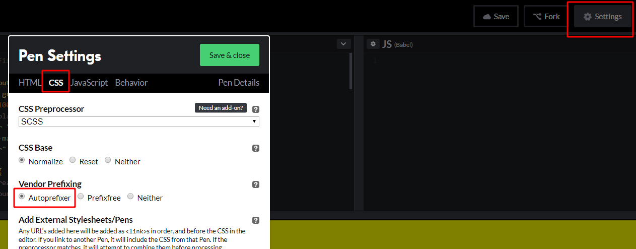
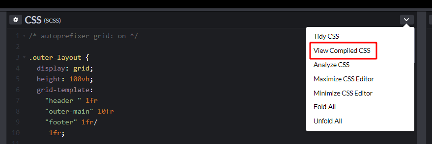
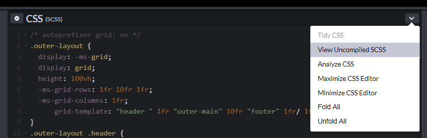
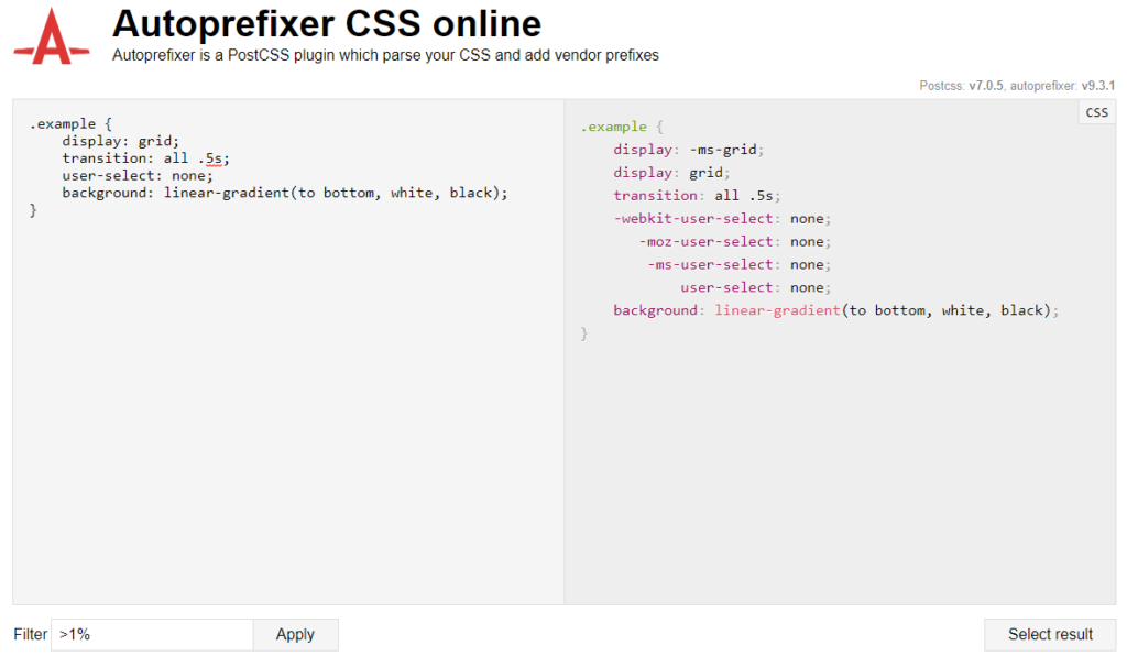
Autoprefixer is now up to version 9.3.1 and there have been a lot of updates since I wrote the original three-part CSS Grid in IE series — the most important update of which is the new grid-areas system. This is mostly thanks to Bogdan Dolin, who has been working like crazy to fix loads of Autoprefixer issues. Autoprefixer’s grid translations were powerful before, but they have gotten far more powerful now!
In Part 2 of the series, I pointed out why Autoprefixer wasn’t able to handle duplicate area names that were used across multiple selectors.
To summarize, this is the example I gave in the article:
.grid-alpha {
  grid-template-areas: "delta echo";
}

.grid-beta {
  grid-template-areas: "echo delta";
}

.grid-cell {
  /* What column does .grid-cell go in? */
  -ms-grid-column: ???;
  grid-area: echo;
}
We thought that since Autoprefixer didn’t have access to the DOM, there was no way of knowing what grid the grid cell belonged to and thus which column the grid cell should go in.
However, I realized something. Grid cells are only ever affected by their direct parent element (ignoring display: contents). That meant that if the grid cell exists, it will always be a direct child of the grid template element. This gave me an idea for how we can solve the grid-area name conflict! ?
.grid-alpha {
  grid-template-areas: "delta  echo";
}

.grid-beta {
  /* Uh oh, duplicate area names! */
  grid-template-areas: "echo  delta";
}

.grid-cell {
  /* We will use the first occurrence by default */
  -ms-grid-column: 2;
  grid-area: echo;
}

/*
  We have detected a conflict!
  Prefix the class with the parent selector.
*/
.grid-beta > .grid-cell {
  /* NO MORE CONFLICT! */
  -ms-grid-column: 1;
}
The entire grid-areas system needed to be re-written to achieve this, but it was totally worth the effort.
The way this new system works is that .grid-cell will default to using the first grid-template-areas property that it comes across. When it hits a conflicting grid template, it will create a new rule placing the parent selector in front of the child selector like so:
[full parent selector] > [direct child selector]
This is what we know purely from looking at the CSS and knowing how CSS Grid works:
A grid cell must be a direct descendant of the parent grid container for CSS Grid to work (assuming display: contents isn’t used).
grid-beta > .grid-cell will only work on .grid-cell elements that have been placed directly inside a .grid-beta element.
.grid-beta > .grid-cell will have no effect on .grid-cell elements placed directly inside .grid-alpha elements.
.grid-beta > .grid-cell will have no effect on .grid-cell elements nested deeply inside .grid-beta elements.
.grid-beta > .grid-cell will override the styling of the lonely .grid-cell CSS rule both because of rule order and specificity.
Because of those reasons, Autoprefixer can pretty safely resolve these conflicts without having any access to the DOM.
That last point in the list can be a little bit dangerous. It increases specificity which means that it may cause some IE styles to override others in a way that is different from how modern overrides are working. Since the generated rules only hold IE-specific grid styles, and they only apply under very specific circumstances, this is unlikely to cause an issue in 99.999% of circumstances. There is still potential for edge cases though.
If you ever find yourself needing to increase the specificity of the grid cell selector, here’s how to go about it.
So why is duplicate area name support so exciting?
Well, for one, it was just plain annoying when accidentally using a duplicate area name in older versions of Autoprefixer. It would break in IE and, in older versions of Autoprefixer, it would fail silently.
The main reason it is exciting though is that it opens up a whole new world of IE-friendly CSS Grid possibilities!
Use modifier classes to adjust a grid template
This was the use case that really made me want to get duplicate area name support into Autoprefixer. Think about this. You have a typical site with a header, a footer, a main area, and a sidebar down either side.
Sometimes we want both sidebars, sometimes we want one sidebar, and sometimes we want no sidebars. This was very difficult to manage back when Autoprefixer didn’t support duplicate area names since we couldn’t share area names across multiple grid templates. We would have to do something like this for it to work:
/*
  Before Duplicate area names were supported
  - n = no side-bars
  - f = first sidebar only
  - s = second sidebar only
  - fs = first and second sidebars
*/
.main-area {
  display: grid;
  grid-template:
    "content-n" /
      1fr;
}

.main-area.has-first-sidebar {
  grid-template:
    "first-sb-f content-f" /
      300px      1fr;
}

.main-area.has-second-sidebar {
  grid-template:
    "content-s second-sb-s" /
      1fr       300px;
}
.main-area.has-first-sidebar.has-second-sidebar {
  grid-template:
    "first-sb-fs content-fs second-sb-fs" /
      200px       1fr        200px;
}

.main-area > .content {
  grid-area: content-n; /* no side-bars */
}

.main-area > .sidebar.first {
  grid-area: first-sb-f; /* first sidebar only */
}

.main-area > .sidebar.second {
  grid-area: second-sb-s; /* second sidebar only */
}

.main-area.has-first-sidebar > .content {
  grid-area: content-f; /* first sidebar only */
}

.main-area.has-second-sidebar > .content {
  grid-area: content-s; /* second sidebar only */
}

.main-area.has-first-sidebar.has-second-sidebar > .content {
  grid-area: content-fs; /* first and second sidebars */
}

.main-area.has-first-sidebar.has-second-sidebar > .sidebar.first {
  grid-area: first-sb-fs; /* first and second sidebars */
}

.main-area.has-first-sidebar.has-second-sidebar > .sidebar.second {
  grid-area: second-sb-fs; /* first and second sidebars */
}
Autoprefixer translation
/*
  Before Duplicate area names were supported
  - n = no sidebars
  - f = first sidebar only
  - s = second sidebar only
  - fs = first and second sidebars
*/

.main-area {
  display: -ms-grid;
  display: grid;
  -ms-grid-rows: auto;
  -ms-grid-columns: 1fr;
      grid-template:
    "content-n" /
     1fr;
}

.main-area.has-first-sidebar {
  -ms-grid-rows: auto;
  -ms-grid-columns: 300px 1fr;
      grid-template:
    "first-sb-f content-f" /
      300px      1fr;
}

.main-area.has-second-sidebar {
  -ms-grid-rows: auto;
  -ms-grid-columns: 1fr 300px;
      grid-template:
    "content-s second-sb-s" /
      1fr       300px;
}

.main-area.has-first-sidebar.has-second-sidebar {
  -ms-grid-rows: auto;
  -ms-grid-columns: 200px 1fr 200px;
      grid-template:
    "first-sb-fs content-fs second-sb-fs" /
      200px       1fr        200px;
}

.main-area > .content {
  -ms-grid-row: 1;
  -ms-grid-column: 1;
  grid-area: content-n; /* no side-bars */
}

.main-area > .sidebar.first {
  -ms-grid-row: 1;
  -ms-grid-column: 1;
  grid-area: first-sb-f; /* first sidebar only */
}

.main-area > .sidebar.second {
  -ms-grid-row: 1;
  -ms-grid-column: 2;
  grid-area: second-sb-s; /* second sidebar only */
}

.main-area.has-first-sidebar > .content {
  -ms-grid-row: 1;
  -ms-grid-column: 2;
  grid-area: content-f; /* first sidebar only */
}

.main-area.has-second-sidebar > .content {
  -ms-grid-row: 1;
  -ms-grid-column: 1;
  grid-area: content-s; /* second sidebar only */
}

.main-area.has-first-sidebar.has-second-sidebar > .content {
  -ms-grid-row: 1;
  -ms-grid-column: 2;
  grid-area: content-fs; /* first and second sidebars */
}

.main-area.has-first-sidebar.has-second-sidebar > .sidebar.first {
  -ms-grid-row: 1;
  -ms-grid-column: 1;
  grid-area: first-sb-fs; /* first and second sidebars */
}

.main-area.has-first-sidebar.has-second-sidebar > .sidebar.second {
  -ms-grid-row: 1;
  -ms-grid-column: 3;
  grid-area: second-sb-fs; /* first and second sidebars */
}
? Oh yeah, and don’t forget media queries! ?
That example was based off actual code that I had to write for an actual project… so yeah, I really wanted to get duplicate area name support into Autoprefixer.
Now that we do have duplicate area name support, we can simplify that code down to something much nicer ?
/*
  Duplicate area names now supported!
  This code will work perfectly in IE with Autoprefixer 9.3.1
*/

.main-area {
  display: grid;
  grid-template:
    "content" /
      1fr;
}

.main-area.has-first-sidebar {
  grid-template:
    "first-sb content" /
      300px    1fr;
}

.main-area.has-second-sidebar {
  grid-template:
    "content second-sb" /
      1fr     300px;
}

.main-area.has-first-sidebar.has-second-sidebar {
  grid-template:
    "first-sb content second-sb" /
      200px    1fr     200px;
}

.content {
  grid-area: content;
}

.sidebar.first {
  grid-area: first-sb;
}

.sidebar.second {
  grid-area: second-sb;
}
With that CSS, we are now able to use the has-first-sidebar and has-second-sidebar classes on the grid element to modify what grid template the browser uses. We no longer have to worry about defining exactly what grid grid cells are placed in.
Assign components reusable area names
One of the limitations of being forced to use unique area names was that components could not be given a single, consistent re-usable area name. We were forced to come up with unique area names for every grid.
Now that Autoprefixer has duplicate area name support, that limitation is gone. We can provide every component with a single area name that is based on their component name. We can then reference that one area name whenever we want to place that component inside a grid layout.
There is one fairly common use case that Autoprefixer still can’t handle at the moment. When the parent selector of the grid cell does not match up with the grid template selector, it tries to resolve a duplicate area name:
.grand-parent .mother {
  grid-template-areas: "child";
}

.grand-parent .father {
  grid-template-areas: "child child";
}

/* This will work */
.grand-parent .mother .child {
  grid-area: child;
}

/*
  This does not work because:
  - ".uncle" != ".grand-parent .mother"
  - ".uncle" != ".grand-parent .father"
  - "child" is a duplicate area name
*/
.uncle .child {
  grid-area: child;
}
Here is a more realistic scenario of the current limitation in Autoprefixer’s algorithm:
.component .grid {
  display: grid;
  grid-template-areas:  "one two";
  grid-template-columns: 1fr 1fr;
}

/* This rule triggers duplicate area name conflicts. */
.component.modifier .grid {
  grid-template-areas:  "one ... two";
  grid-template-columns: 1fr 1fr 1fr;
}

/*
  This does not work because:
  - ".component" != ".component .grid"
  - ".component" != ".component.modifier .grid"
  - area names "one" and "two" both have duplicate area name conflicts
*/
.component .cell-one {
  grid-area: one;
}

.component .cell-two {
  grid-area: two;
}
There are really only three ways of resolving this conflict at the moment.
Option 1: Remove the parent selector from child elements
Without any safeguards in place for scoping styles to a particular component, this is by far the most dangerous way to resolve the issue. I don’t recommend it.
Yep, if you use the BEM naming convention (or something similar), this will practically never be an issue for you. This is easily the preferred way of dealing with the issue if it’s an option.
I have some issues with BEM, but with a few tweaks to the syntax, it can be a really great way to control CSS specificity and scoping.
Other Autoprefixer updates
While I’m here, I’ll give you an update on a couple of other developments that have occurred in Autoprefixer since I wrote the original CSS Grid in IE series.
Before we dive in though, here is how to set things up in CodePen in case you want to follow along with your own experiments.
Using Autoprefixer Grid translations in CodePen
CodePen has already upgraded to version 9.3.1 of Autoprefixer. You will now easily be able to integrate IE-friendly CSS Grid styles into your pens. First, make sure that Autoprefixer is enabled in the CodePen settings (Settings > CSS > [Vendor Prefixing] > Autoprefixer).
Step 1: Turn on Autoprefixer in CodePen
Then add the all new /* autoprefixer grid: on */ control comment to the top of the CSS Panel. I will dive into this awesome new feature a bit more later.
Step 2: Add the control comment
You can now write modern IE-friendly CSS Grid code and CodePen will automatically add in all of the IE prefixes for you.
“View compiled CSS” buttonThe compiled CSS view
In order to actually test your pens in IE though, you will need to view the pen in “Debug Mode” (Change View > Debug Mode). The pen will need to be saved before you will have access to this view.
Enabling Debug Mode for testing in IE
If you’d like to try out a tool that shows you real-time Autoprefixer output, try the online tool just for that. Input CSS on the left. It will output Autoprefixer’s translated CSS on the right as you type.
We don’t always have the ability to alter the Autoprefixer configuration settings. If you have ever tried to do some IE-friendly CSS Grid experiments in CodePen in the past, you will know the pain of not having direct access to the Autoprefixer settings. There are also some frameworks like Create React App and Angular that don’t allow users to alter the Autoprefixer settings. There was also a bit of a skill barrier that prevented some users from using Grid because they were unsure of how to enable Grid translations.
This limitation was causing pain for many users but then Andrey Alexandrov submitted a pull request that introduced a new control comment. This new control comment gave users the ability to easily turn grid translations on and off from inside the CSS file. This was far easier than doing it through configuration settings. It was also accessible to all users no matter how they compile their CSS.
Adding /* autoprefixer grid: on */ will enable grid translations for that entire block while /* autoprefixer grid: off */ will disable grid translations for that block. Only the first grid control comment in a block will be applied.
/* Globally enable grid prefixes */
/* autoprefixer grid: on */

.grid {
  display: grid;
}

.non-ie .grid {
  /* Turn off grid prefixes but only for this block */
  /* autoprefixer grid: off */
  display: grid;

  /*
    Grid control comments affect the whole block.
    This control comment is ignored
  */
  /* autoprefixer grid: on */
  grid-column: 1;
}
The above code translates into the following (I’ve filtered out the explanation comments):
/* autoprefixer grid: on */

.grid {
  display: -ms-grid;
  display: grid;
}

.non-ie .grid {
  /* autoprefixer grid: off */
  display: grid;

  /* autoprefixer grid: on */
  grid-column: 1;
}
@supports can disable grid translations
The new control comments aren’t the only way to selectively prevent Autoprefixer from outputting grid translation code.
Autoprefixer will never be able to support implicit grid auto-placement. If you use an @supports statement that checks for something like grid-auto-rows: 0, Autoprefixer will not output Grid translations for code entered inside that statement.
To support IE, Autoprefixer can generate something like 50 lines of extra CSS sometimes. If you are writing Grid code inside an @supports statement, you will want IE translations to be turned off to reduce the weight of your CSS. If you don’t want to use @supports (grid-auto-rows: 0) then you can use a control comment inside the @supports statement instead.
In the original article series, I said that Autoprefixer was unable to inherit grid-gap values. In version 9.1.1, grid-gap values were able to inherit through media queries. In version 9.3.1, they have become inheritable through more specific selectors as well.
.grid {
  display: grid;
  grid-gap: 20px; /* grid-gap is stated here */
  grid-template:
    "one two" /
    1fr  1fr;
}

@media (max-width: 600px) {
  .grid {
    /* grid-gap is now inhereited here */
    grid-template:
      "one"
      "two" /
       1fr;
  }
}

.grid.modifier {
    /* grid-gap is now inhereited here as well */
    grid-template:
      "one"
      "two" /
       1fr;
}

.one { grid-area: one; }
.two { grid-area: two; }
Autoprefixer translation
.grid {
  display: -ms-grid;
  display: grid;
  grid-gap: 20px; /* grid-gap is stated here */
  -ms-grid-rows: auto;
  -ms-grid-columns: 1fr 20px 1fr;
      grid-template:
    "one two" /
    1fr  1fr;
}

@media (max-width: 600px) {
  .grid {
    /* grid-gap is now inhereited here */
    -ms-grid-rows: auto 20px auto;
    -ms-grid-columns: 1fr;
        grid-template:
      "one"
      "two" /
       1fr;
  }
}

.grid.modifier {
    /* grid-gap is now inherited here as well */
    -ms-grid-rows: auto 20px auto;
    -ms-grid-columns: 1fr;
        grid-template:
      "one"
      "two" /
       1fr;
}

.one {
  -ms-grid-row: 1;
  -ms-grid-column: 1;
  grid-area: one;
}

.grid.modifier > .one {
  -ms-grid-row: 1;
  -ms-grid-column: 1;
}

.two {
  -ms-grid-row: 1;
  -ms-grid-column: 3;
  grid-area: two;
}

.grid.modifier > .two {
  -ms-grid-row: 3;
  -ms-grid-column: 1;
}

@media (max-width: 600px) {
  .one {
    -ms-grid-row: 1;
    -ms-grid-column: 1;
  }

  .two {
    -ms-grid-row: 3;
    -ms-grid-column: 1;
  }
}
grid-template: span X; now works
In Part 2 this series, I mentioned that the following syntax doesn’t work:
.grid-cell {
  grid-column: span 2;
}
This was fixed in version 9.1.1. It now translates into the following:
New warning for mixing manual and area based placement
We had a user complain that Autoprefixer wasn’t handling grid areas correctly. Upon further investigation, we realized that they were applying both a grid-area and a grid-column setting within the same CSS rule.
.grid {
  display: grid;
  grid-template-areas: "a b";
}

/* This doesn't work very well */
.grid-cell {
  grid-column: 2;
  grid-area: a;
}
Either use grid-area on its own, or us grid-column & grid-row. Never use both at the same time.
If you are curious, this is what Autoprefixer outputs for the above code:
.grid {
  display: -ms-grid;
  display: grid;
  grid-template-areas: "a b";
}

/* This doesn't work very well */
.grid-cell {
  -ms-grid-row: 1;
  -ms-grid-column: 1;
  -ms-grid-column: 2;
  grid-column: 2;
  grid-area: a;
}
There is one exception to this. You may need a grid cell to overlap other grid cells in your design. You want to use grid-template-areas for placing your grid cells due to how much easier Autoprefixer makes the overall cell placement. You can’t really create cell overlaps using grid-template-areas though. To create this overlap, you can use grid-[column/row]-end: span X;after the grid-area declaration to force the overlap.
.grid {
  display: grid;
  grid-template-areas:
    "a . ."
    "a b b"
    "a . .";
  grid-template-columns: 1fr 1fr 1fr;
  grid-template-rows: 1fr 1fr 1fr;
}

.grid-cell-a {
  grid-area: a;
  /* place cell span after the grid-area to force an overlap */
  grid-column-end: span 2;
}
However if you have declared grid gaps in your grid, you will need to write the column/row span prefix manually while taking the extra columns/rows generated by Autoprefixer into consideration (IE doesn’t support grid-gap). There is an issue for this on GitHub.
.grid {
  display: grid;
  grid-template-areas:
    "a . ."
    "a b c"
    "a . .";
  grid-template-columns: 1fr 1fr 1fr;
  grid-template-rows: 1fr 1fr 1fr;
  grid-gap: 10px;
}

.grid-cell-a {
  grid-area: a;
  /* IE column span added manually */
  -ms-grid-column-span: 3; /* IE spans 2 columns + the gap */
  grid-column-end: span 2; /* Modern browsers only span 2 columns */
}
This technique currently produces a warning message in Autoprefixer that can’t easily be hidden. An issue for this is on GitHub.
New warning when using [align/justify/place]-[content/items]
Unfortunately. IE does not have the ability to align grid cells from the parent container. The only way to align grid cells in IE is by using the -ms-grid-row-align and the -ms-grid-column-align properties. These translate to align-self and justify-self in modern day grid syntax.
The following properties will trigger a warning in Autoprefixer if used in conjunction with a CSS Grid property:
align-items
align-content
justify-items
justify-content
place-items
place-content
The align-content, justify-content and place-content properties are pretty much impossible to replicate in IE. The align-items, justify-items and place-items properties, on the other hand, are quite easy to replicate using their self equivalents on the child elements (place-self support was added in 9.3.0).
.grid { [align/justify/place]-items } and .grid > * { [align/justify/place]-self } are generally quite interchangeable with one another. This substitution doesn’t always work, but in most cases, the two methods tend to act in much the same way.
Below is a pen demonstrating the difference between the IE friendly alignment method and the IE unfriendly alignment method. In modern browsers they look identical, but in IE one looks the same as the modern browsers and one does not.
I hope you have enjoyed reading about the awesome new improvements the Autoprefixer community has made to the project over the past few months. The new control comments make enabling and disabling grid translations an absolute breeze. The new grid-areas system is also exciting. I love all the new IE-friendly CSS Grid options that the new areas system opens up, and I think you will too. ?
Ire Aderinokun has written a nifty piece using loops and when we might consider replacing it with another method, say .map() and .filter(). I particularly like what she has to say here:
As I mentioned earlier, loops are a great tool for a lot of cases, and the existence of these new methods doesn’t mean that loops shouldn’t be used at all.
I think these methods are great because they provide code that is in a way self-documenting. When we use the filter() method instead of a for loop, it is easier to understand at first glance what the purpose of the logic is.
However, these methods have very specific use cases and may be overkill if their full value isn’t being used. An example of this is the map() method, which can technically be used to replace almost any arbitrary loop. If in our first example, we only wanted to modify the original articles array and not create a new, modified, amazingArticles, using this method would be unnecessary. It’s important to use the method that suits each scenario, to make sure that we aren’t over- or under-performing.
If you’re interested in digging more into this subject, Adan Giese wrote a great post about the .filter() method a short while ago that’s definitely worth checking out. Oh, and speaking of lots of different ways to approach loops, Chris compiled a list of options for looping over querySelectorAll NodeLists where forEach is just one of many options.


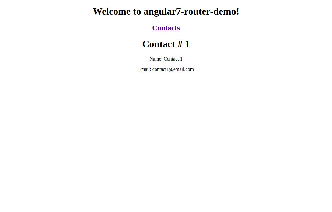


