Gulp for WordPress: Creating the Tasks
This is the second post in a two-part series about creating a Gulp workflow for WordPress theme development. Part one focused on the initial installation, setup, and organization of Gulp in a WordPress theme project. This post goes deep into the tasks Gulp will run by breaking down what each task does and how to tailor them to streamline theme development.
Now that we spent the first part of this series setting up a WordPress theme project with Grunt installed in it, it’s time to dive into the tasks we want it to do for us as we develop the theme. We’re going to get our hands extremely dirty in this post, get ready to write some code!
Article Series:
- Initial Setup
- Creating the Tasks (This Post)
Creating the style task
Let’s start by compiling src/bundle.scss from Sass to CSS, then minifying the CSS output for production mode and putting the completed bundle.css file into the dist directory.
We’re going to use a couple of Gulp plugins to do the heavy lifting. We’ll use gulp-sass to compile things and gulp-clean-css to minify. Then, gulp-if will allow us to conditionally run functions which, In our case, will check if we are in production or development modes before those tasks run and then execute accordingly.
We can install all three plugins in one fell swoop:
npm install --save-dev gulp-sass gulp-clean-css gulp-ifLet’s make sure we have something in our bundle.scss file so we can test the tasks:
$colour: #f03;

body {
  background-color: $colour;
}
Alright, back to the Gulpfile to import the plugins and define the task that runs them:
import { src, dest } from 'gulp';
import yargs from 'yargs';
import sass from 'gulp-sass';
import cleanCss from 'gulp-clean-css';
import gulpif from 'gulp-if';
const PRODUCTION = yargs.argv.prod;

export const styles = () => {
  return src('src/scss/bundle.scss')
    .pipe(sass().on('error', sass.logError))
    .pipe(gulpif(PRODUCTION, cleanCss({compatibility:'ie8'})))
    .pipe(dest('dist/css'));
}
Let’s walk through this code to explain what’s happening.
- The src and dest functions are imported from Gulp.
srcwill read the file that you pass as an argument and return a node stream. - We pull in
yargsto create our flag that separates tasks between the development and production modes. - The three plugins are called into action.
- The
PRODUCTIONflag is defined and held in theprodcommand. - We define
stylesas the task name we will use to run these tasks in the command line. - We tell the task what file we want processed (
bundle.scss) and where it lives (src/scss/bundle.scss). - We create “pipes” that serve as the plungs that run when the
stylescommand is executed. Those pipes run in the order they are written: convert Sass to CSS, minify the CSS (if we’re in production), and place the resulting CSS file into thedist/cssdirectory.
Go ahead. Run gulp styles in the command line and see that a new CSS file has been added to your CSS directory dist/css.
Now do gulp styles --prod. The same thing happens, but now that CSS file has been minified for production use.
Now, assuming you have a functioning WordPress theme with header.php and footer.php, the CSS file (as well as JavaScript files when we get to those tasks) can be safely enqueued, likely in your functions.php file:
function _themename_assets() {
  wp_enqueue_style( '_themename-stylesheet', get_template_directory_uri() . '/dist/css/bundle.css', array(), '1.0.0', 'all' );
}
add_action('wp_enqueue_scripts', '_themename_assets');
That’s all good, but we can make our style command even better.
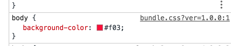
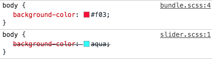
For example, try inspecting the body on the homepage with the WordPress theme active. The styles that we added should be there:
As you can see, it says that our style is coming from bundle.css, which is true. However, it would be much better if the name of the original SCSS file is displayed here instead for our development purposes — it makes it so much easier to locate code, particularly when we’re working with a ton of partials. This is where source maps come into play. That will detail the location of our styles in DevTools. To further illustrate this issue, let’s also add some SCSS inside src/scss/components/slider.scss and then import this file in bundle.scss.
//src/scss/components/slider.scss
body {
  background-color: aqua;
}
//src/scss/bundle.scss
@import './components/slider.scss';
$colour: #f03;
body {
background-color: $colour;
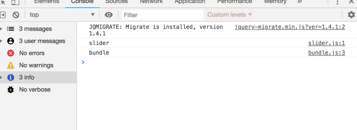
}Run gulp styles again to recompile your files. Your inspector should then look like this:
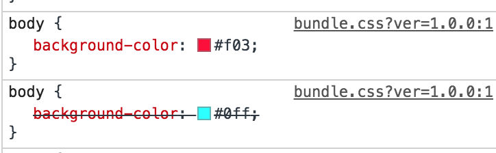
The DevTools inspector will show that both styles are coming from bundle.css. But we would like it to show the original file instead (i.e bundle.scss and slider.scss). So let’s add that to our wish list of improvements before we get to the code.
The other thing we’ll want is vendor prefixing to be handled for us. There’s nothing worse than having to write and manage all of those on our own, and Autoprefixer is the tool that can do it for us.
And, in order for Autoprefixer to work its magic, we’ll need the PostCSS plugin.
OK, that adds up to three more plugins and tasks we need to run. Let’s install all three:
npm install --save-dev gulp-sourcemaps gulp-postcss autoprefixerSo gulp-sourcemaps will obviously be used for sourcemaps. gulp-postcss and autoprefixer will be used to add autoprefixing to our CSS. postcss is a famous plugin for transforming CSS files and autoprefixer is just a plugin for postcss. You can read more about the other things that you can do with postcss here.
Now at the very top let’s import our plugins into the Gulpfile:
import postcss from 'gulp-postcss';
import sourcemaps from 'gulp-sourcemaps';
import autoprefixer from 'autoprefixer';
And then let’s update the task to use these plugins:
export const styles = () => {
  return src('src/scss/bundle.scss')
    .pipe(gulpif(!PRODUCTION, sourcemaps.init()))
    .pipe(sass().on('error', sass.logError))
    .pipe(gulpif(PRODUCTION, postcss([ autoprefixer ])))
    .pipe(gulpif(PRODUCTION, cleanCss({compatibility:'ie8'})))
    .pipe(gulpif(!PRODUCTION, sourcemaps.write()))
    .pipe(dest('dist/css'));
}
To use the the sourcemaps plugin we have to follow some steps:
- First, we initialize the plugin using
sourcemaps.init(). - Next, pipe all the plugins that you would like to map.
- Finally, Create the source map file by calling
sourcemaps.write()just before writing the bundle to the destination.
Note that all the plugins piped between sourcemaps.init() and sourcemaps.write() should be compatible with gulp-sourcemaps. In our case, we are using sass(), postcss() and cleanCss() and all of them are compatible with sourcemaps.
Notice that we only run the Autoprefixer begind the production flag since there’s really no need for all those vendor prefixes during development.
Let’s run gulp styles now, without the production flag. Here’s the output in bundle.css:
body {
background-color: aqua; }
body {
background-color: #f03; }
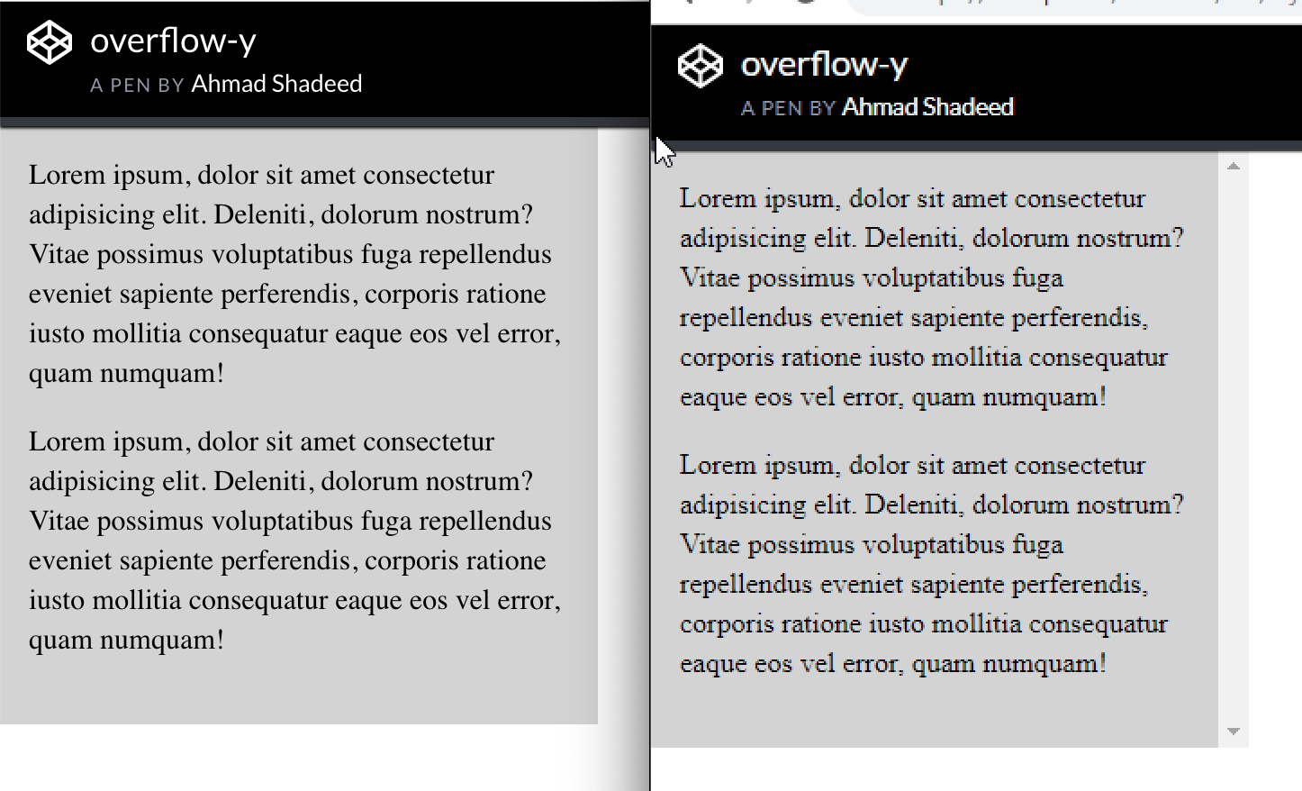
/*#sourceMappingURL=data:application/json;charset=utf8;base64,eyJ2ZXJzaW9uIjozLCJmaWxlIjoiYnVuZGxlLmNzcyIsInNvdXJjZXMiOlsiYnVuZGxlLnNjc3MiLCJjb21wb25lbnRzL3NsaWRlci5zY3NzIl0sInNvdXJjZXNDb250ZW50IjpbIkBpbXBvcnQgJy4vY29tcG9uZW50cy9zbGlkZXIuc2Nzcyc7XG5cbiRjb2xvdXI6ICNmMDM7XG5ib2R5IHtcbiAgICBiYWNrZ3JvdW5kLWNvbG9yOiAkY29sb3VyO1xufVxuOjpwbGFjZWhvbGRlciB7XG4gICAgY29sb3I6IGdyYXk7XG59IiwiYm9keSB7XG4gICAgYmFja2dyb3VuZC1jb2xvcjogYXF1YTtcbn0iXSwibmFtZXMiOltdLCJtYXBwaW5ncyI6IkFDQUEsQUFBQSxJQUFJLENBQUM7RUFDRCxnQkFBZ0IsRUFBRSxJQUFJLEdBQ3pCOztBRENELEFBQUEsSUFBSSxDQUFDO0VBQ0QsZ0JBQWdCLEVBRlgsSUFBSSxHQUdaOztBQUNELEFBQUEsYUFBYSxDQUFDO0VBQ1YsS0FBSyxFQUFFLElBQUksR0FDZCJ9 */#The extra text below is source maps. Now, when we inspect the site in DevTools, we see:
Nice! Now onto production mode:
gulp styles --prodCheck DevTools against style rules that require prefixing (e.g. display: grid;) and confirm those are all there. And make sure that your file is minified as well.
One final notice for this task. Let’s assume we want multiple CSS bundles: one for front-end styles and one for WordPress admin styles. We can create add a new admin.scss file in the src/scss directory and pass an array of paths in the Gulpfile:
export const styles = () => {
  return src(['src/scss/bundle.scss', 'src/scss/admin.scss'])
    .pipe(gulpif(!PRODUCTION, sourcemaps.init()))
    .pipe(sass().on('error', sass.logError))
    .pipe(gulpif(PRODUCTION, postcss([ autoprefixer ])))
    .pipe(gulpif(PRODUCTION, cleanCss({compatibility:'ie8'})))
    .pipe(gulpif(!PRODUCTION, sourcemaps.write()))
    .pipe(dest('dist/css'));
}
Now we have bundle.css and admin.css in the dist/css directory. Just make sure to properly enqueue any new bundles that are separated out like this.
Creating the watch task
Alright, next up is the watch task, which makes our life so much easier by looking for files with saved changes, then executing tasks on our behalf without have to call them ourselves in the command line. How great is that?
Like we did for the styles task:
import { src, dest, watch } from 'gulp';We’ll call the new task watchForChanges:
export const watchForChanges = () => {
  watch('src/scss/**/*.scss', styles);
}
Note that watch is unavailable as a name since we already have a variable using it.
Now let’s run gulp watchForChanges the command line will be on a constant, ongoing watch for changes in any .scss files inside the src/scss directory. And, when those changes happen, the styles task will run right away with no further action on our part.
Note that src/scss/**/*.scss is a glob pattern. That basically means that this string will match any .scss file inside the src/scss directory or any sub-folder in it. Right now, we are only watching for .scss files and running the styles task. Later, we’ll expand its scope to watch for other files as well.
Creating the images task
As we covered earlier, the images task will compress images in src/images and then move them to dist/images. Let’s install a gulp plugin that will be responsible for compressing images:
npm install --save-dev gulp-imageminNow, import this plugin at the top of the Gulpfile:
import imagemin from 'gulp-imagemin';And finally, let’s write our images task:
export const images = () => {
  return src('src/images/**/*.{jpg,jpeg,png,svg,gif}')
    .pipe(gulpif(PRODUCTION, imagemin()))
    .pipe(dest('dist/images'));
}
We give the src() function a glob that matches all .jpg, .jpeg, .png, .svg and .gif images in the src/images directory. Then, we run the imagemin plugin, but only for production. Compressing images can take some time and isn’t necessary during development, so we can leave it out of the development flow. Finally, we put the compressed versions of images in dist/images.
Now any images that we drop into src/images will be copied when we run gulp images. However, running gulp images --prod, will both compress and copy the image over.
Last thing we need to do is modify our watchForChanges task to include images in its watch:
export const watchForChanges = () => {
  watch('src/scss/**/*.scss', styles);
  watch('src/images/**/*.{jpg,jpeg,png,svg,gif}', images);
}
Now, assuming the watchForChanges task is running, the images task will be run automatically whenever we add an image to the src/images folder. It does all the lifting for us!
Important: If the watchForChanges task is running and when the Gulpfile is modified, it will need to be stopped and restarted in order for the changes to take effect.
Creating the copy task
You probably have been in situations where you’ve created files, processed them, then needed to manually grab the production files and put them where they need to be. Well, as we saw in the images task, we can use the copy feature to do this for us and help prevent moving wrong files.
export const copy = () => {
  return src(['src/**/*','!src/{images,js,scss}','!src/{images,js,scss}/**/*'])
    .pipe(dest('dist'));
}
Try to read the array of paths supplied to src() carefully. We are telling Gulp to match all files and folders inside src (src/**/*), except the images, js and scss folders (!src/{images,js,scss}) and any of the files or sub-folders inside them (!src/{images,js,scss}/**/*).
We want our watch task to look for these changes as well, so we’ll add it to the mix:
export const watchForChanges = () => {
  watch('src/scss/**/*.scss', styles);
  watch('src/images/**/*.{jpg,jpeg,png,svg,gif}', images);
  watch(['src/**/*','!src/{images,js,scss}','!src/{images,js,scss}/**/*'], copy);
}
Try adding any file or folder to the src directory and it should be copied over to the the /dist directory. If, however, we were to add a file or folder inside of /images, /js or /scss, it would be ignored since we already handle these folders in separate tasks.
We still have a problem here though. Try to delete the added file and it won’t happen. Our task only handles copying. This problem could also happen for our /images, /js and /scss, folders. If we have old images or JavaScript and CSS bundles that were removed from the src folder, then they won’t get removed from the dist folder. Therefore, it’s a good idea to completely clean the dist folder every time to start developing or building a theme. And that’s what we are going to do in the next task.
Composing tasks for developing and building
Let’s now install a package that will be responsible for deleting the dist folder. This package is called del:
npm install --save-dev delImport it at the top:
import del from 'del';Create a task that will delete the dist folder:
export const clean = () => {
  return del(['dist']);
}
Notice that del returns a promise. Thus, we don’t have to call the cb() function. Using the new JavaScript features allows us to refactor this to:
export const clean = () => del(['dist']);The folder should be deleted now when running gulp clean. What we need to do next is delete the dist folder, run the images, copy and styles tasks, and finally watch for changes every time we start developing. This can be done by running gulp clean, gulp images, gulp styles, gulp copy and then gulp watch. But, of course, we will not do that manually. Gulp has a couple of functions that will help us compose tasks. So, let’s import these functions from Gulp:
import { src, dest, watch, series, parallel } from 'gulp';series() will take some tasks as arguments and run them in series (one after another). And parallel() will take tasks as arguments and run them all at once. Let’s create two new tasks by composing the tasks that we already created:
export const dev = series(clean, parallel(styles, images, copy), watchForChanges)
export const build = series(clean, parallel(styles, images, copy))
export default dev;
Both tasks will do the exact same thing: clean the dist folder, then styles, images and copy will run in parallel one the cleaning is complete. We will start watching for changes as well for the dev (short for develop) task, after these parallel tasks. Additionally, we are also exporting dev as the default task.
Notice that when we run the build task, we want our files to be minified, images to be compressed, and so on. So, when we run this command, we will have to add the --prod flag. Since this can easily be forgotten when running the build task, we can use npm scripts to create aliases for the dev and build commands. Let’s go to package.json, and in the scripts field, we will probably find something like this:
"scripts": {
  "test": "echo "Error: no test specified" && exit 1"
}
Let’s change it to this:
"scripts": {
  "start": "gulp",
  "build": "gulp build --prod"
},
This will allow us to run npm run start in the command line, which will go to the scripts field and find what command corresponds to start. In our case, start will run gulp and gulp will run the default gulp task, which is dev. Similarly, npm run build will run gulp build --prod. This way, we can completely forget about the --prod flag and also forget about running the Gulp tasks using the gulp command. Of course, our dev and build commands will do more than that later on, but for now, we have the foundation that we will work with throughout the rest of the tasks.
Creating the scripts task
As mentioned, in order to bundle our JavaScript files, we are going to need a module bundler. webpack is the most famous option out there, however it is not a Gulp plugin. Rather, it’s a plugin on its own that has a completely separate setup and configuration file. Luckily, there is a package called webpack-stream that helps us use webpack within a Gulp task. So, let’s install this package:
npm install --save-dev webpack-streamwebpack works with something called loaders. Loaders are responsible for transforming files in webpack. And to transform new Javascript versions into ES5, we will need a loader called babel-loader. We will also need @babel/preset-env but we already installed this earlier:
npm install --save-dev babel-loaderLet’s import webpack-stream at the top of the Gulpfile:
import webpack from 'webpack-stream';Also, to test our task, lets add these lines in src/js/bundle.js and src/js/components/slider.js:
// bundle.js
import './components/slider';
console.log('bundle');


// slider.js
console.log('slider')
Our scripts task will finally look like so:
export const scripts = () => {
  return src('src/js/bundle.js')
  .pipe(webpack({
    module: {
      rules: [
        {
          test: /.js$/,
          use: {
            loader: 'babel-loader',
            options: {
              presets: []
            }
          }
        }
      ]
    },
    mode: PRODUCTION ? 'production' : 'development',
    devtool: !PRODUCTION ? 'inline-source-map' : false,
    output: {
      filename: 'bundle.js'
    },
  }))
  .pipe(dest('dist/js'));
}
Let’s break this down a bit:
- First, we specify bundle.js as our entry point in the
src()function. - Then, we pipe the webpack plugin and specify some options for it.
- The rules field in the module option lets webpack know what loaders to use in order to transform our files. In our case we need to transform JavaScript files using the babel-loader.
- The mode option is either production or development. For development, webpack will not minify the output JavaScript bundle, but it will for production. Therefore, we don’t need a separate Gulp plugin to minify JavaScript because webpack can do that depending on our
PRODUCTIONconstant. - The devtool option will add source maps, but not in production. In development, however, we will use
inline-source-maps. This kind of source maps is the most accurate though it can be a bit slow to create. If you find it too slow, check the other options here. They won’t be as accurate asinline-source-mapsbut they can be pretty fast. - Finally, the output option can specify some information about the output file. In our case, we only need to change the filename. If we don’t specify the filename, webpack will generate a bundle with a hash as the filename. Read more about these options here.
Now we should be able to run gulp scripts and gulp scripts --prod and see a bundle.js file created in dist/js. Make sure that minification and source maps are working properly. Let’s now enqueue our JavaScript file in WordPress, which can be in the theme’s functions.php file, or wherever you write your functions.
<?php
function _themename_assets() {
  wp_enqueue_style( '_themename-stylesheet', get_template_directory_uri() . '/dist/css/bundle.css', array(), '1.0.0', 'all' );

  wp_enqueue_script( '_themename-scripts', get_template_directory_uri() . '/dist/assets/js/bundle.js', array(), '1.0.0', true );
}
add_action('wp_enqueue_scripts', '_themename_assets');
Now, looking at the console, let’s confirm that source maps are working correctly by checking the file that the console logs come from:
Without the source maps, both logs will appear coming from bundle.js.
What if we would like to create multiple JavaScript bundles the same way we do for the styles? Let’s create a file called admin.js in src/js. You might think that we can simply change the entry point in the src() to an array like so:
export const scripts = () => {
  return src(['src/js/bundle.js','src/js/admin.js'])
  .
  .
}
However, this will not work. webpack works a bit differently that normal Gulp plugins. What we did above will still create one file called bundle.js in the dist folder. webpack-stream provides a couple of solutions for creating multiple entry points. I chose to use the second solution since it will allow us to create multiple bundles by passing an array to the src() the same way we did for the styles. This will require us to install vinyl-named:
npm install --save-dev vinyl-namedImport it:
import named from 'vinyl-named';…and then update the scripts task:
export const scripts = () => {
  return src(['src/js/bundle.js','src/js/admin.js'])
  .pipe(named())
  .pipe(webpack({
    module: {
      rules: [
        {
          test: /.js$/,
          use: {
            loader: 'babel-loader',
            options: {
              presets: ['@babel/preset-env']
            }
          }
        }
      ]
    },
    mode: PRODUCTION ? 'production' : 'development',
    devtool: !PRODUCTION ? 'inline-source-map' : false,
    output: {
      filename: '[name].js'
    },
  }))
  .pipe(dest('dist/js'));
}
The only difference is that we now have an array in the src(). We then pipe the named plugin before webpack, which allows us to use a [name] placeholder in the output field’s filename instead of hardcoding the file name directly. After running the task, we get two bundles in dist/js.
Another feature that webpack provides is using libraries from external sources rather than bundling them into the final bundle. For example, let’s say your bundle needs to use jQuery. You can run npm install jquery --save and then import it to your bundle import $ from 'jquery'. However, this will increase the bundle size and, in some cases, you may already have jQuery loaded via a CDN or — in case of WordPress — it can exist as a dependency like so:
wp_enqueue_script( '_themename-scripts', get_template_directory_uri() . '/dist/assets/js/bundle.js', array('jquery'), '1.0.0', true );So, now WordPress will enqueue jQuery using a normal script tag. How can we then use it inside our bundle using import $ from 'jquery'? The answer is by using webpack’s externals option. Let’s modify our scripts task to add it in:
export const scripts = () => {
  return src(['src/js/bundle.js','src/js/admin.js'])
    .pipe(named())
    .pipe(webpack({
      module: {
        rules: [
          {
            test: /.js$/,
            use: {
              loader: 'babel-loader',
              options: {
                presets: []
            }
          }
        }
      ]
    },
    mode: PRODUCTION ? 'production' : 'development',
    devtool: !PRODUCTION ? 'inline-source-map' : false,
    output: {
      filename: '[name].js'
    },
    externals: {
      jquery: 'jQuery'
    },
  }))
  .pipe(dest('dist/js'));
}
In the externals option, jquery is the key that identifies the name of the library we want to import. In our case, it will be import $ from 'jquery'. And the value jQuery is the name of a global variable where that the library lives. Now try to import $ from ‘jquery' in the bundle and use jQuery using the $ — it should work perfectly.
Let’s watch for changes for JavaScript files as well:
export const watchForChanges = () => {
  watch('src/scss/**/*.scss', styles);
  watch('src/images/**/*.{jpg,jpeg,png,svg,gif}', images);
  watch(['src/**/*','!src/{images,js,scss}','!src/{images,js,scss}/**/*'], copy);
  watch('src/js/**/*.js', scripts);
}
And, finally, add our scripts task in the dev and build tasks:
export const dev = series(clean, parallel(styles, images, copy, scripts), watchForChanges);
export const build = series(clean, parallel(styles, images, copy, scripts));
Refreshing the browser with Browsersync
Let’s now improve our watch task by installing Browsersync, a plugin that refreshes the browser each time tasks finish running.
npm install browser-sync gulp --save-devAs usual, let’s import it:
import browserSync from "browser-sync";Next, we will initialize a Browsersync server and write two new tasks:
const server = browserSync.create();
export const serve = done => {
  server.init({
    proxy: "http://localhost/yourFolderName" // put your local website link here
  });
  done();
};
export const reload = done => {
  server.reload();
  done();
};
In order to control the browser using Browsersync, we have to initialize a Browsersync server. This is different from a local server where WordPresss would typically live. the first task is serve, which starts the Browsersync server, and is pointed to our local WordPress server using the proxy option. The second task will simply reload the browser.
Now we need to run this server when we are developing our theme. We can add the serve task to the dev series tasks:
export const dev = series(clean, parallel(styles, images, copy, scripts), serve, watchForChanges);Now run npm start and the browser should open up a new URL that’s different than the original one. This URL is the one that Browsersync will refresh. Now let’s use the reload task to reload the browser once tasks are done:
export const watchForChanges = () => {
  watch('src/scss/**/*.scss', series(styles, reload));
  watch('src/images/**/*.{jpg,jpeg,png,svg,gif}', series(images, reload));
  watch(['src/**/*','!src/{images,js,scss}','!src/{images,js,scss}/**/*'], series(copy, reload));
  watch('src/js/**/*.js', series(scripts, reload));
  watch("**/*.php", reload);
}
As you can see, we added a new line to run the reload task every time a PHP file changes. We are also using series() to wait for our styles, images, scripts and copy tasks to finish before reloading the browser. Now, run npm start and change something in a Sass file. The browser should reload automatically and changes should be reflected after refresh once the tasks have finished running.
Don’t see CSS or JavaScript changes after refresh? Make sure caching is disabled in your browser’s inspector.
We can make even one more improvement to the styles tasks. Browsersync allows us to inject CSS directly to the page without even having to reload the browser. And this can be done by adding server.stream() at the very end of the styles task:
export const styles = () => {
  return src(['src/scss/bundle.scss', 'src/scss/admin.scss'])
    .pipe(gulpif(!PRODUCTION, sourcemaps.init()))
    .pipe(sass().on('error', sass.logError))
    .pipe(gulpif(PRODUCTION, postcss([ autoprefixer ])))
    .pipe(gulpif(PRODUCTION, cleanCss({compatibility:'ie8'})))
    .pipe(gulpif(!PRODUCTION, sourcemaps.write()))
    .pipe(dest('dist/css'))
    .pipe(server.stream());
}
Now, in the watchForChanges task, we won’t have to reload for the styles task any more, so let’s remove the reload task from it:
export const watchForChanges = () => {
  watch('src/scss/**/*.scss', styles);
  .
  .
}
Make sure to stop watchForChanges if it’s already running and then run it again. Try to modify any file in the scss folder and the changes should appear immediately in the browser without even reloading.
Packaging the theme in a ZIP file
WordPress themes are generally packaged up as a ZIP file that can be installed directly in the WordPress admin. We can create a task that will take the required theme files and ZIP them up for us. To do that we need to install another Gulp plugin: gulp-zip.
npm install --save-dev gulp-zipAnd, as always, import it at the top:
import zip from "gulp-zip";Let’s also import the JSON object in the package.json file. We need that in order to grab the name of the package which is also the name of our theme:
import info from "./package.json";Now, let’s write our task:
export const compress = () => {
return src([
  "**/*",
  "!node_modules{,/**}",
  "!bundled{,/**}",
  "!src{,/**}",
  "!.babelrc",
  "!.gitignore",
  "!gulpfile.babel.js",
  "!package.json",
  "!package-lock.json",
  ])
  .pipe(zip(`${info.name}.zip`))
  .pipe(dest('bundled'));
};
We are passing the src() the files and folders that we need to compress, which is basically all files and folders (**/), except a few specific types of files, which are preceded by !. Next, we are piping the gulp-zip plugin and calling the file the name of the theme from the package.json file (info.name). The result is a fresh ZIP file an a new folder called bundled.
Try running gulp compress and make sure it all works. Open up the generated ZIP file and make sure that it only contains the files and folders needed to run the theme.
Normally, though, we only need to ZIP things up *after* the theme files have been built. So let’s add the compress task to the build task so it only runs when we need it:
export const build = series(clean, parallel(styles, images, copy, scripts), compress);Running npm run build should now run all of our tasks in production mode.
Replacing the placeholder prefix in the ZIP file
One step we need to do before zipping our files is to scan them and replace the themename placeholder with the theme name we plan to use. As you may have guessed, there is indeed a Gulp plugin that does that for us, called gulp-replace.
npm install --save-dev gulp-replaceThen import it:
import replace from "gulp-replace";We want this task to run immediately before our files are zipped, so let’s modify the compress task by slotting it in the right place:
export const compress = () => {
return src([
    "**/*",
    "!node_modules{,/**}",
    "!bundled{,/**}",
    "!src{,/**}",
    "!.babelrc",
    "!.gitignore",
    "!gulpfile.babel.js",
    "!package.json",
    "!package-lock.json",
  ])
  .pipe(replace("_themename", info.name))
  .pipe(zip(`${info.name}.zip`))
  .pipe(dest('bundled'));
};
Try to building the theme now with npm run build and then unzip the file inside the bundled folder. Open any PHP file where the _themename placeholder may have been used and make sure it’s replaced with the actual theme name.
There is a gotcha to watch for that I noticed in the replace plugin as I was working with it. If there are ZIP files inside the theme (e.g. you are bundling WordPress plugins inside your theme), then they will get corrupted when they pass through the replace plugin. That can be resolved by ignoring ZIP files using a gulp-if statement:
.pipe(
  gulpif(
    file => file.relative.split(".").pop() !== "zip",
    replace("_themename", info.name)
  )
)
Generating a POT file
Translation is a big thing in the WordPress community, so for our final task, we let’s scan through all of our PHP files and generate a POT file that gets used for translation. Luckily, we also have a gulp plugin for that:
npm install --save-dev gulp-wp-potAnd, of course, import it:
import wpPot from "gulp-wp-pot";Here’s our final task:
export const pot = () => {
  return src("**/*.php")
  .pipe(
      wpPot({
        domain: "_themename",
        package: info.name
      })
    )
  .pipe(gulp.dest(`languages/${info.name}.pot`));
};
We want the POT file to generate every time we build the theme:
export const build = series(clean, parallel(styles, images, copy, scripts), pot, compress);Summing up
Here’s the complete Gulpfile, including all of the tasks we covered in this post:
import { src, dest, watch, series, parallel } from 'gulp';
import yargs from 'yargs';
import sass from 'gulp-sass';
import cleanCss from 'gulp-clean-css';
import gulpif from 'gulp-if';
import postcss from 'gulp-postcss';
import sourcemaps from 'gulp-sourcemaps';
import autoprefixer from 'autoprefixer';
import imagemin from 'gulp-imagemin';
import del from 'del';
import webpack from 'webpack-stream';
import named from 'vinyl-named';
import browserSync from "browser-sync";
import zip from "gulp-zip";
import info from "./package.json";
import replace from "gulp-replace";
import wpPot from "gulp-wp-pot";
  const PRODUCTION = yargs.argv.prod;
  const server = browserSync.create();
  export const serve = done => {
    server.init({
      proxy: "http://localhost:8888/starter"
    });
    done();
  };
  export const reload = done => {
    server.reload();
    done();
  };
  export const clean = () => del(['dist']);

  export const styles = () => {
  return src(['src/scss/bundle.scss', 'src/scss/admin.scss'])
    .pipe(gulpif(!PRODUCTION, sourcemaps.init()))
    .pipe(sass().on('error', sass.logError))
    .pipe(gulpif(PRODUCTION, postcss([ autoprefixer ])))
    .pipe(gulpif(PRODUCTION, cleanCss({compatibility:'ie8'})))
    .pipe(gulpif(!PRODUCTION, sourcemaps.write()))
    .pipe(dest('dist/css'))
    .pipe(server.stream());
  }
  export const images = () => {
  return src('src/images/**/*.{jpg,jpeg,png,svg,gif}')
    .pipe(gulpif(PRODUCTION, imagemin()))
    .pipe(dest('dist/images'));
  }
  export const copy = () => {
    return src(['src/**/*','!src/{images,js,scss}','!src/{images,js,scss}/**/*'])
    .pipe(dest('dist'));
  }
    export const scripts = () => {
      return src(['src/js/bundle.js','src/js/admin.js'])
      .pipe(named())
      .pipe(webpack({
        module: {
        rules: [
          {
            test: /.js$/,
            use: {
              loader: 'babel-loader',
              options: {
                presets: []
                }
              }
            }
          ]
        },
        mode: PRODUCTION ? 'production' : 'development',
        devtool: !PRODUCTION ? 'inline-source-map' : false,
        output: {
          filename: '[name].js'
        },
        externals: {
          jquery: 'jQuery'
        },
      }))
      .pipe(dest('dist/js'));
    }
    export const compress = () => {
      return src([
        "**/*",
        "!node_modules{,/**}",
        "!bundled{,/**}",
        "!src{,/**}",
        "!.babelrc",
        "!.gitignore",
        "!gulpfile.babel.js",
        "!package.json",
        "!package-lock.json",
      ])
      .pipe(
        gulpif(
          file => file.relative.split(".").pop() !== "zip",
          replace("_themename", info.name)
        )
      )
      .pipe(zip(`${info.name}.zip`))
      .pipe(dest('bundled'));
    };
    export const pot = () => {
      return src("**/*.php")
        .pipe(
          wpPot({
            domain: "_themename",
            package: info.name
          })
        )
      .pipe(dest(`languages/${info.name}.pot`));
    };
    export const watchForChanges = () => {
      watch('src/scss/**/*.scss', styles);
      watch('src/images/**/*.{jpg,jpeg,png,svg,gif}', series(images, reload));
      watch(['src/**/*','!src/{images,js,scss}','!src/{images,js,scss}/**/*'], series(copy, reload));
      watch('src/js/**/*.js', series(scripts, reload));
      watch("**/*.php", reload);
    }
    export const dev = series(clean, parallel(styles, images, copy, scripts), serve, watchForChanges);
    export const build = series(clean, parallel(styles, images, copy, scripts), pot, compress);
    export default dev;
Phew, that’s everything! I hope you learned something from this series and that it helps streamline your WordPress development flow. Let me know if you have any questions in the comments. If you are interested in a complete WordPress theme development course, make sure to check out my course on Udemy with a special discount for you. ?
The post Gulp for WordPress: Creating the Tasks appeared first on CSS-Tricks.


