How to Increase Mobile Engagement with Simpler Contact Forms
Contact forms are a necessity for websites. Without them, your clients would be relegated to handling website- or business-related matters over the phone or email. Worse, they’d have absolutely no context for the call or message, which would increase the amount of time they’d have to spend responding to it.
Contact forms, instead, gather essential details from visitors so that your clients can go into each conversation better prepared.
Of course, mobile contact forms are tricky. With less screen space to work with, how do you design a form that captures all the details your clients require? The fact of the matter is, you might not be able to. Instead, you’ll have to look at ways to do more with less.
Even if all a form does is collect a name, email, and phone number for someone interested in learning more about a service, the digital collection of that data ensures your clients won’t lose track of leads or capture details incorrectly when writing them by hand. And when forms collect more than that (say, details about an issue they’re experiencing with the website or product), your clients can better prepare themselves for a possibly stressful encounter.
But there’s a delicate balance you must strike when designing forms for mobile users. If you want them to engage with the forms so you can keep your clients from missing out on leads as well as sales, you have to keep a number of things in mind.
Columns
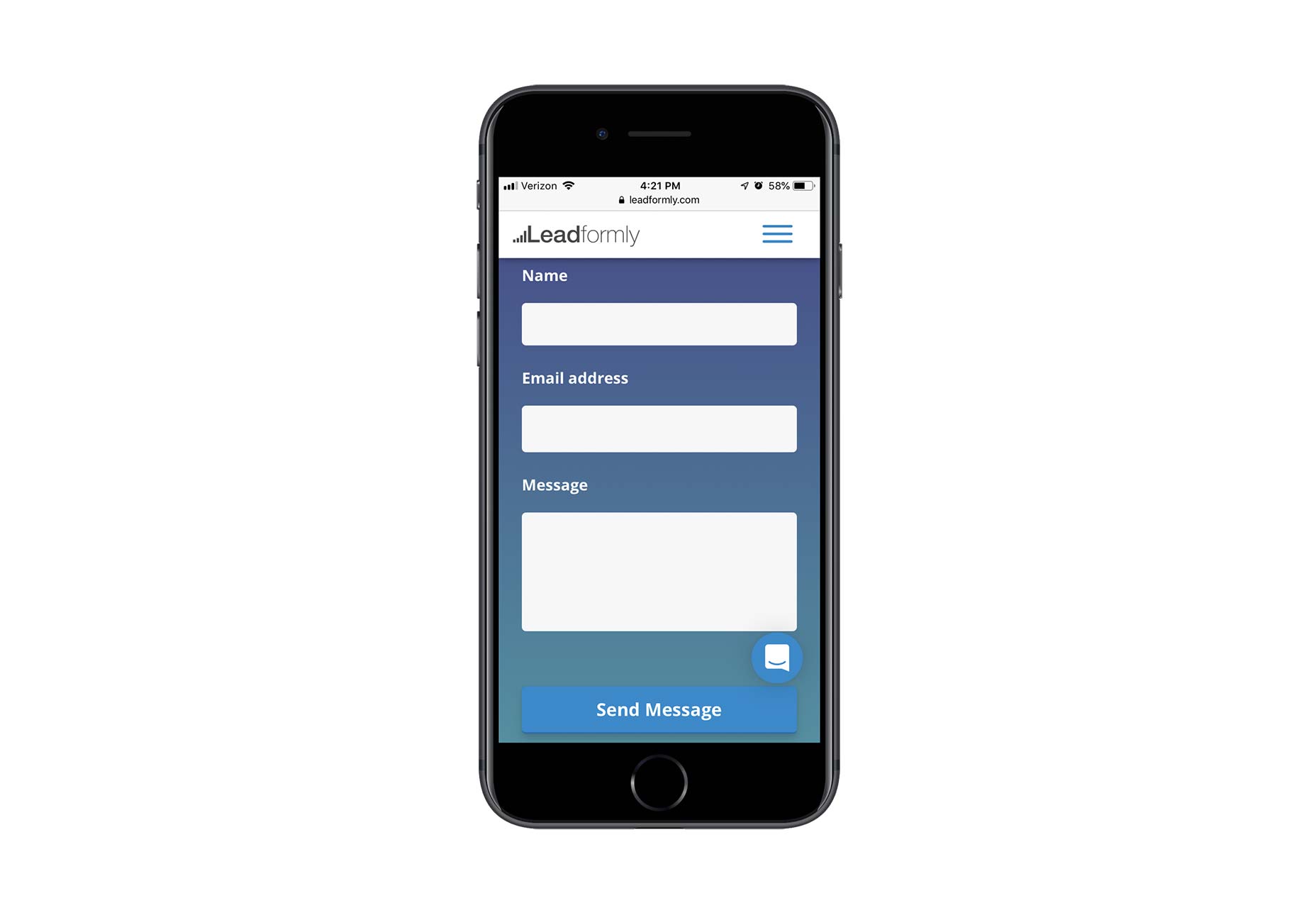
Plain and simple: there’s no excuse for using more than one column on a mobile contact form. Leadformly has a beautiful example of a mobile contact form that keeps everything in a vertical line.
The same principle applies to the fields themselves. If you’re thinking about breaking up the “Name” field into “First Name” and “Last Name”, don’t do it. It’s hard enough inputting information into a mobile contact form. Instead, only place one field per horizontal line and always merge fields that belong together.
Fields
When creating a contact form for your clients’ website, ask yourself: Is each of these fields necessary?
Take, for instance, the Shopify mobile contact form:
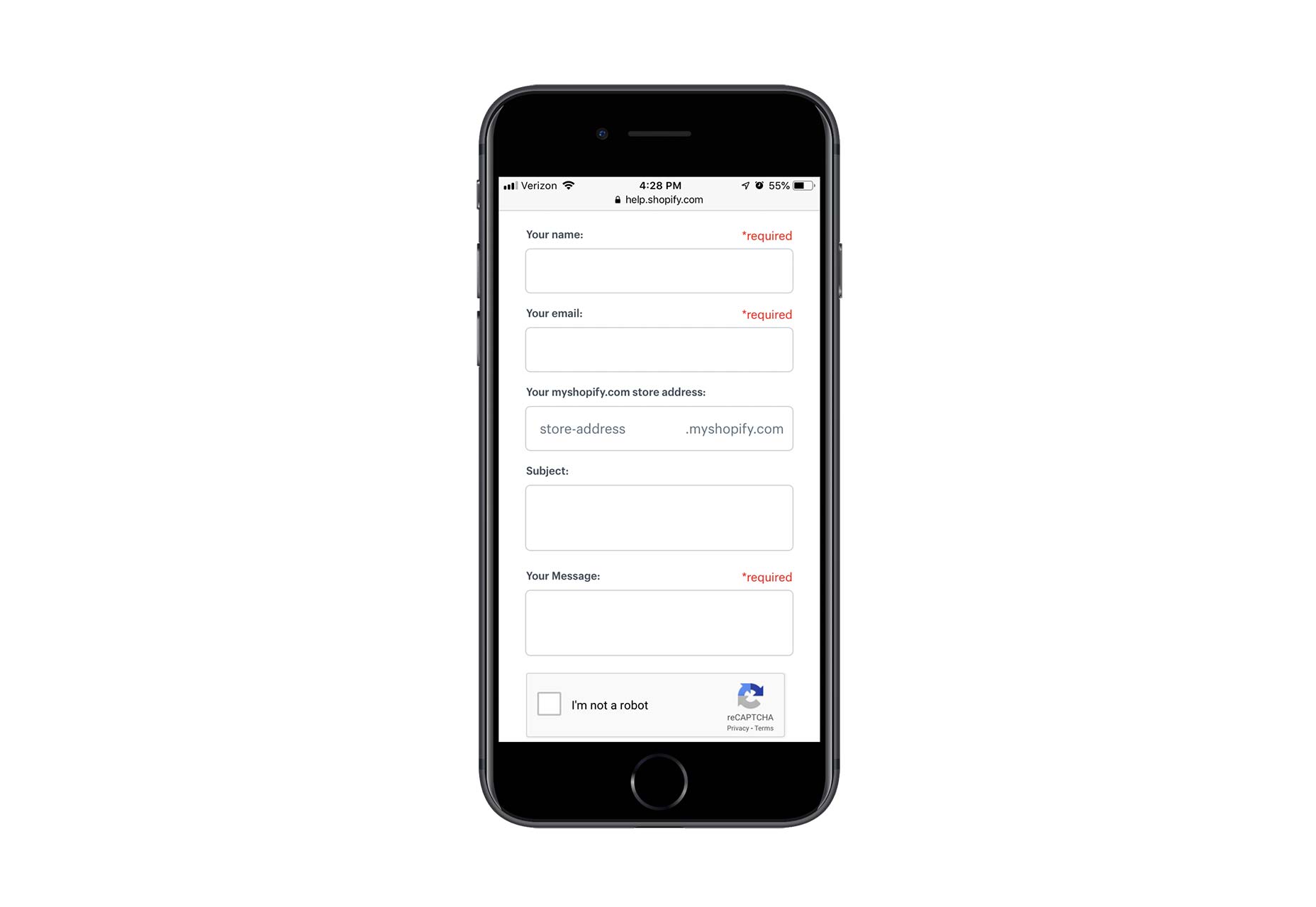
Although the store address field is optional, it’s a good choice in this context since this is a support contact form. If someone’s asking for support, then they’re a Shopify customer with a corresponding store address to share.
The “Subject” field, on the other hand, seems like a waste. This form is coming from the help desk. The designer could easily program submissions from this form to include a descriptive subject line so the support representative knows what he or she is about to read.
When too many unnecessary or optional fields are shown, a few things can happen:
- Visitors will be frustrated with the extra time spent reading each label, deciding whether or not it’s necessary, and then tabbing over to the next one.
- Visitors will give up before they ever get started because the length of the form alone is daunting.
- Visitors will be confused by some of the fields, wondering what they’re for and trying to figure out the answer to them.
All in all, a poor selection of form fields can lead to a negative user experience. But only your client and the end user will know which of these fields is absolutely necessary, so make sure you engage with them so you can create the optimal mobile form experience.
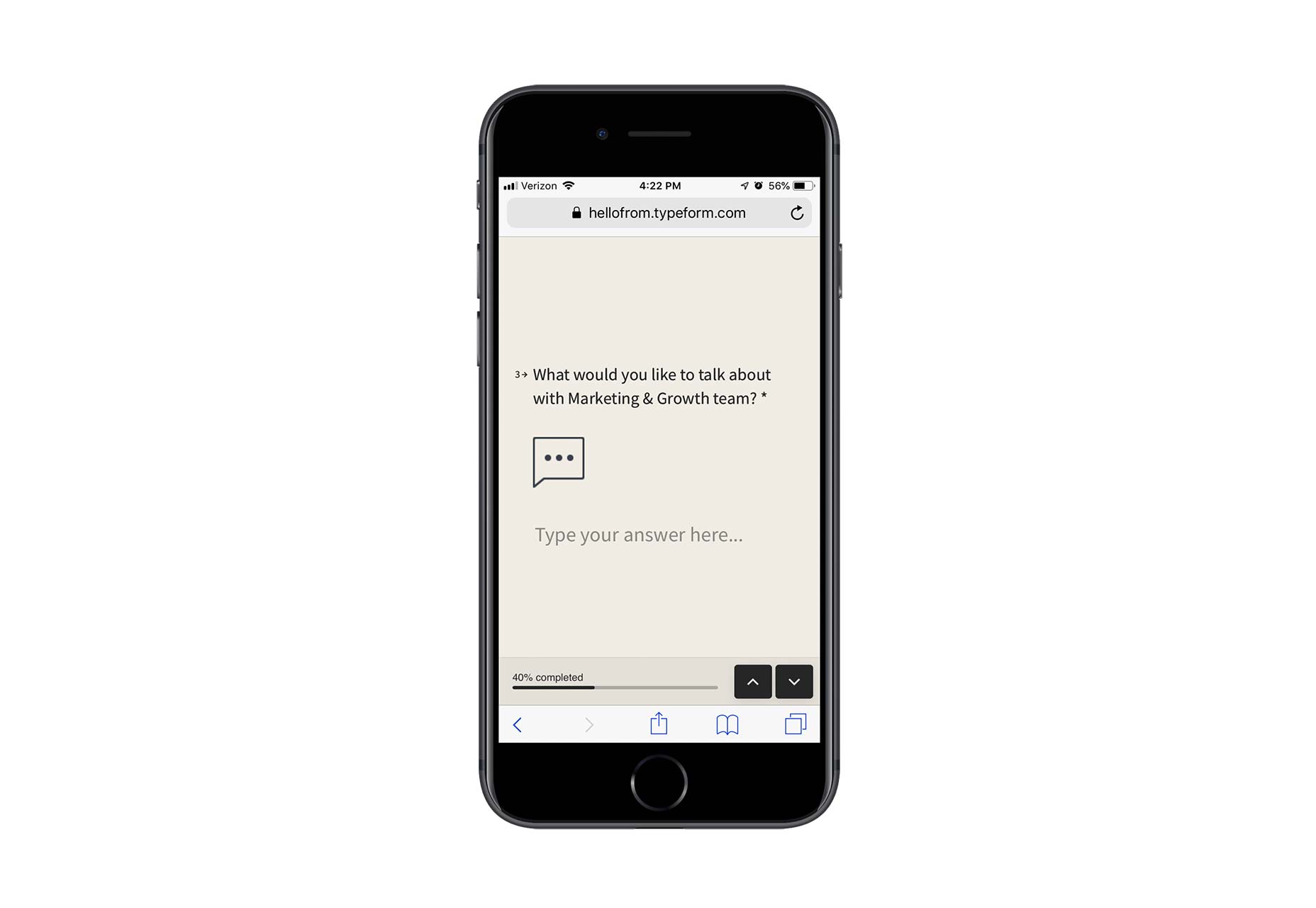
Pages
In cases when you have a lengthy contact form you want to put on mobile, you have to think of ways to keep it from appearing overwhelmingly long.
One way to do this is by creating a multi-page form. While you can do this for mobile contact forms that are legitimately lengthy, this is something anyone could use really. Here’s an example from Typeform:
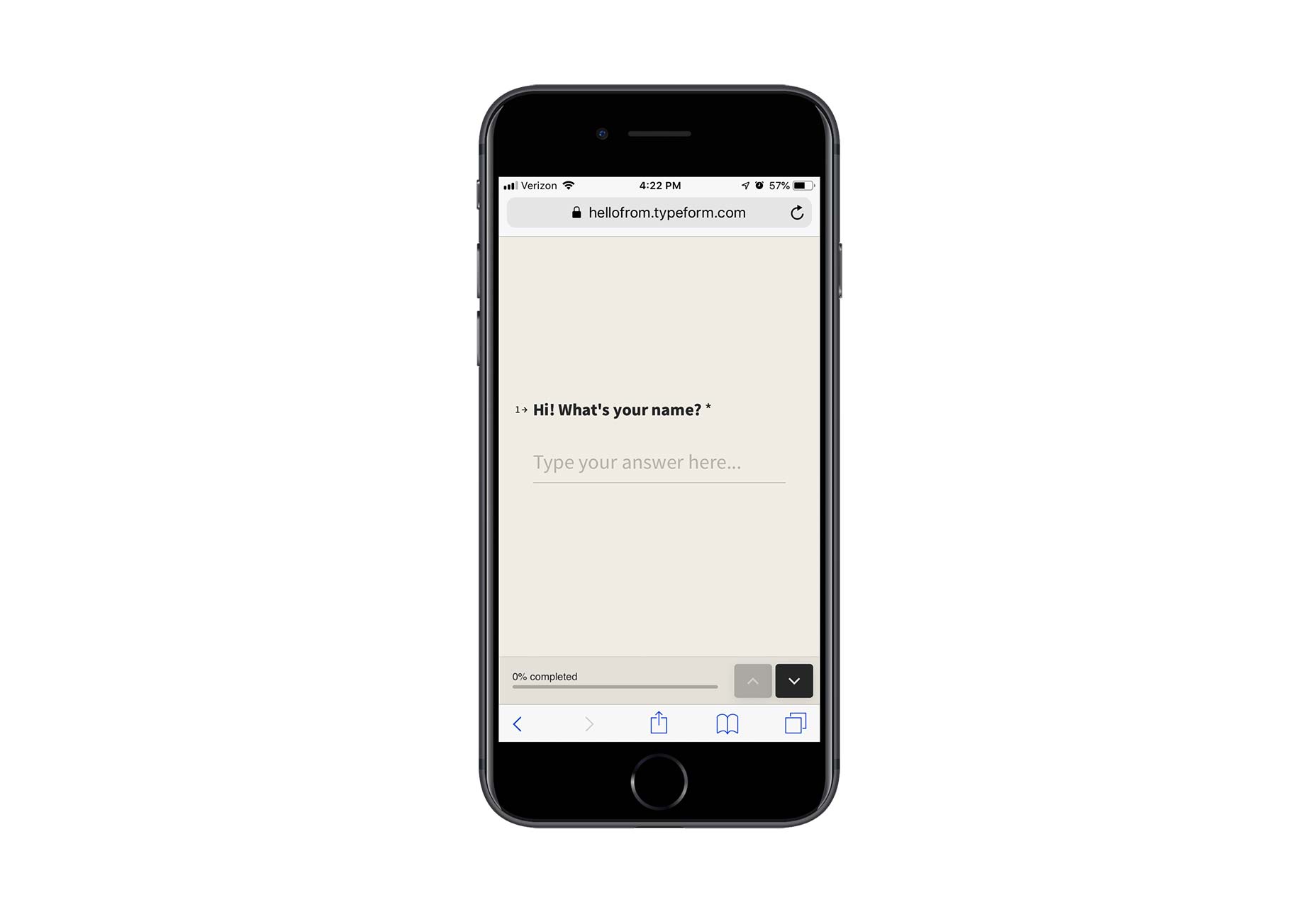
With a handy progress bar at the bottom of the form, users have a clear picture of how much more is left to fill out.
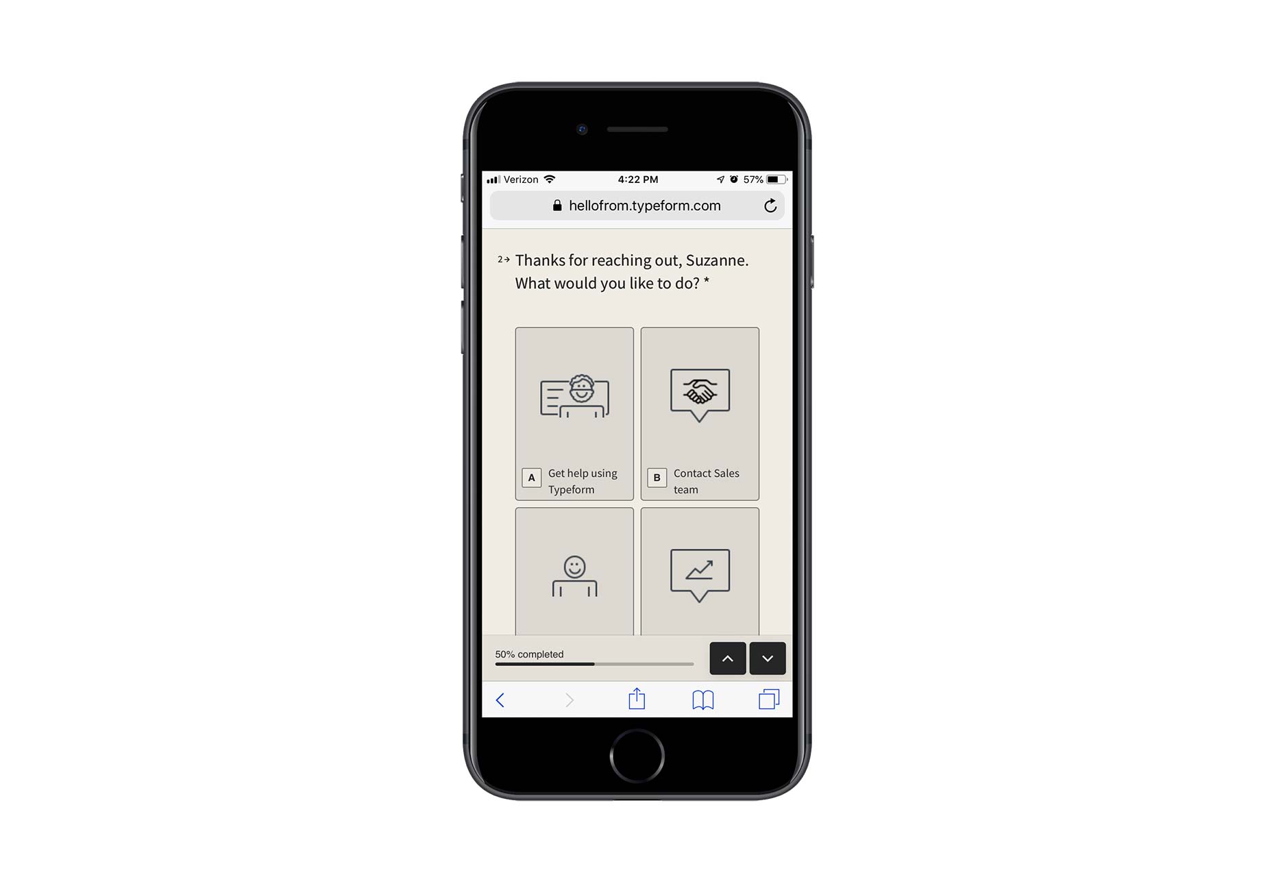
I’d also argue that this is a more engaging mobile contact form experience than a static form stuck to the page.
If you’re not too keen on creating multi-page forms, that’s fine too. There are other things you can do to shorten the space without compromising how many fields are shown. For instance, you can use collapsible menus to only display certain parts of the form at any given time. You can also turn checkbox or radio dial lists into hidden dropdowns.
Labels
In your attempts to conserve space in mobile contact forms, you have to be careful with labels, hints, and error messages that appear within them. Just because you make a form faster to get through space-wise doesn’t mean the instructive text won’t cause friction.
Here’s a good example from MailChimp you can use:
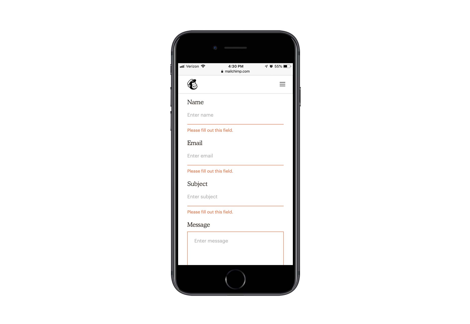
Within this form:
- Each field is succinctly and clearly labeled outside of the field.
- Any hint text (i.e. instructions on what to do with the field) appears inside the field in a lighter color.
- Error messages immediately appear once a user has failed to properly fill in a field.
Also, take notice of the fact that MailChimp does not use asterisks to indicate required fields. This keeps labels clear of unnecessary debris and easy to focus on. If the majority or all of your fields are required, it’s not necessary to mark them as such.
Keyboards
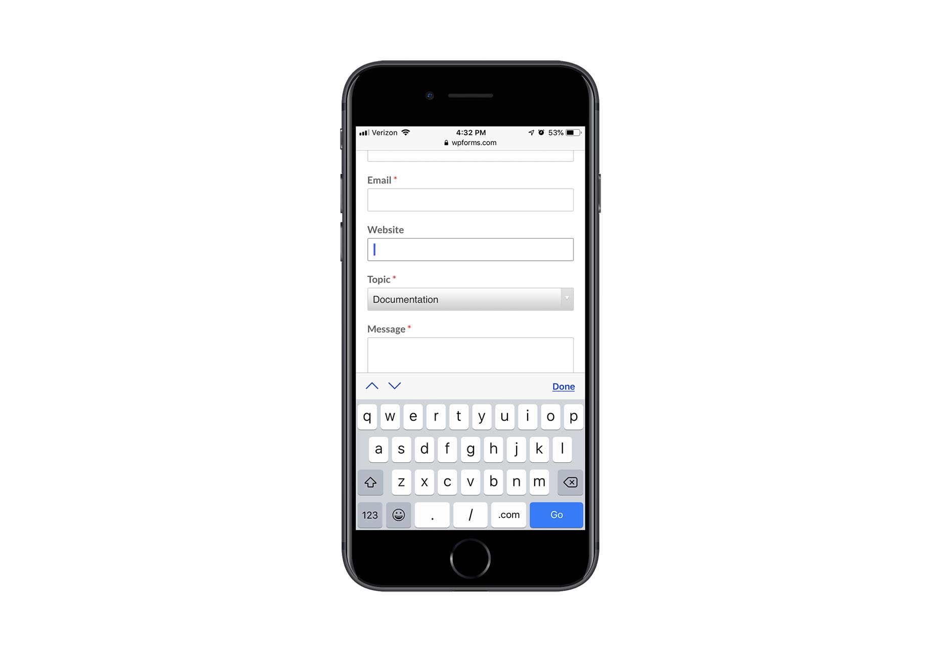
Want to decrease the time it takes users to fill out your mobile contact form? Program it to display the correct keyboard per field. Here is how WPForms does this:
Basic text fields show a standard alpha keyboard:
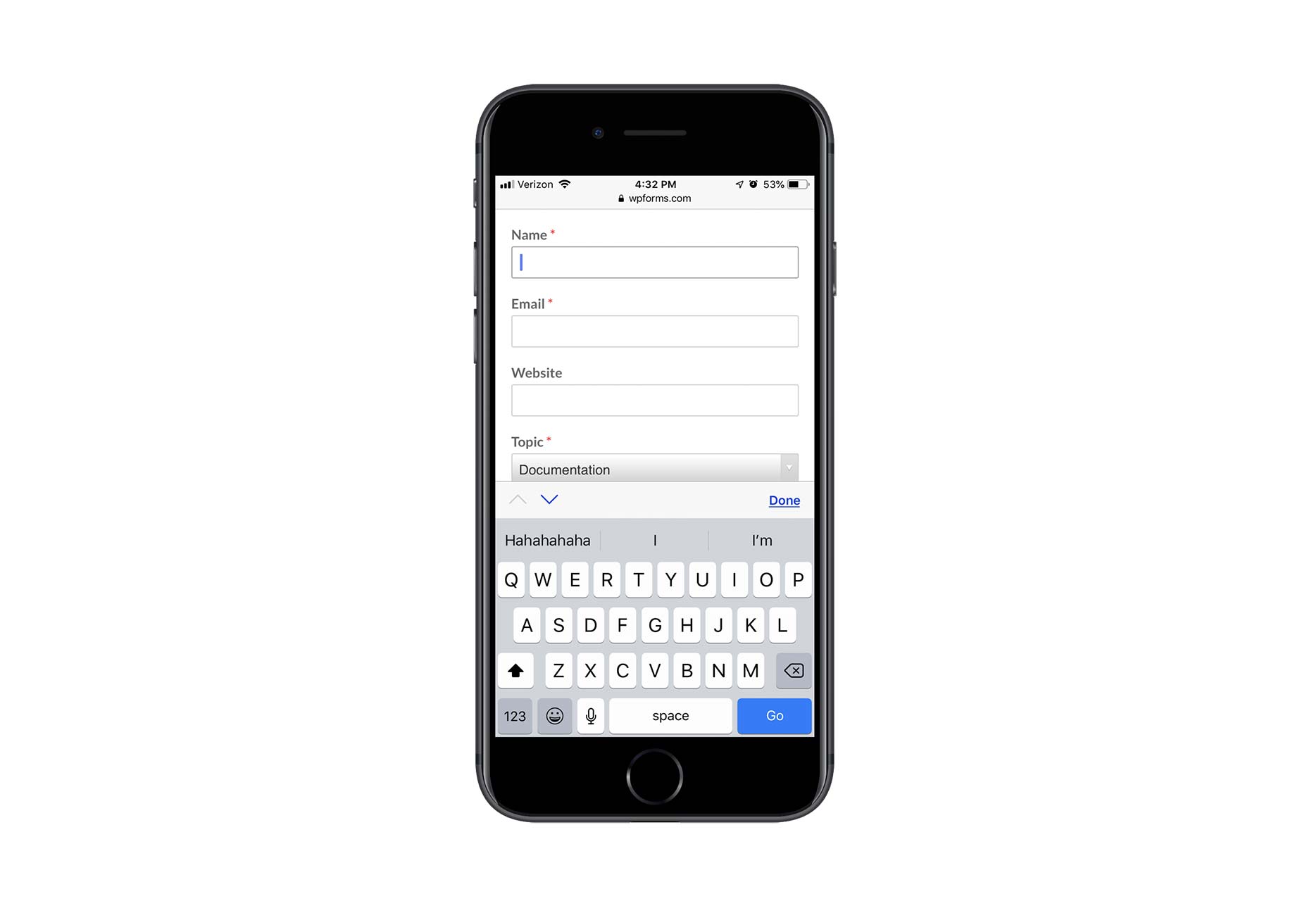
Email fields show a lowercase alpha keyboard along with punctuation commonly used in email addresses:
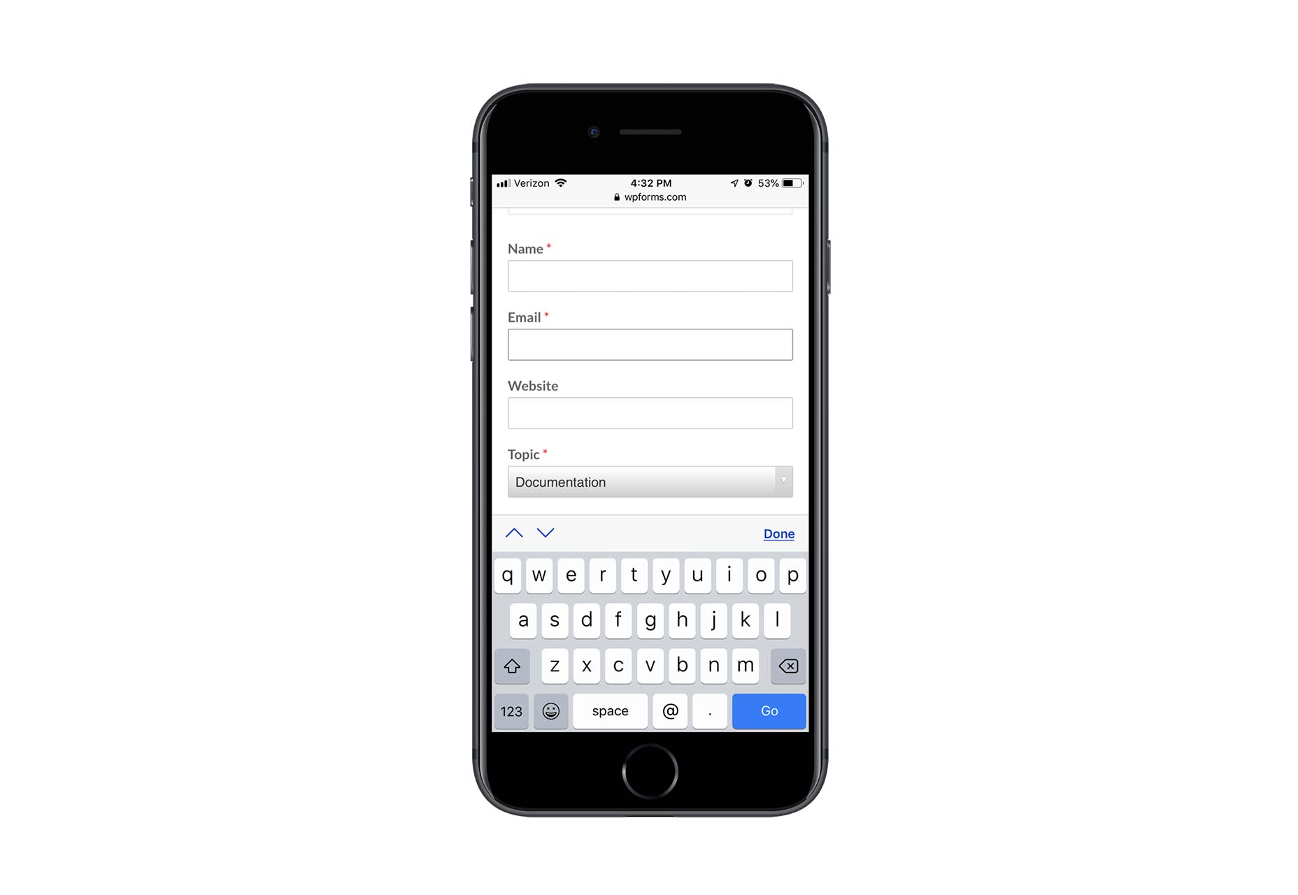
Website fields provide options for “/” as well as “.com”:
Saving users time hunting down punctuation and numbers, or typing out expected responses or snippets, will encourage more of them to complete your form.
Wrap-Up
Let’s be honest: for most businesses, the chances of someone converting from a mobile website are quite low — at least lower than they are on desktop. Until consumers become more confident in converting from a smartphone, we have to find other ways to capture their information so we can stay in touch.
That said, just because mobile visitors are unwilling to convert doesn’t mean they’ll be unwilling to fill out a mobile contact form. It’s a low-risk alternative to entering their sensitive data into a mobile website and device, and puts the onus on the company to take the next step. Of course they’re going to prefer this option, so make sure it’s a worthwhile one to take.
Featured image via Unsplash.
| Add Realistic Chalk and Sketch Lettering Effects with Sketch’it – only $5! |
 |
