IE10-Compatible Grid Auto-Placement with Flexbox
If you work on web applications that support older browsers, and have lusted after CSS Grid from the sidelines like I have, I have some good news: I’ve discovered a clever CSS-only way to use grid auto-placement in IE10+!
Now, it’s not actually CSS Grid, but without looking at the code itself, you wouldn’t be able to tell. The HTML structure looks like CSS Grid. It has a defined set of columns with an undefined amount of rows and it has gutters that support borders and shadows on the cells without hacks. But what’s actually happening behind the scenes is a combination of flexbox and margins.
In this article, I’ll walk through the approach. Here’s a demo of what we’re looking at:
See the Pen
IE10-compatible CSS-Grid-like column layout by Brian Holt (@bholtbholt)
on CodePen.
Auto-flowing rows with flexbox wrap
Getting the basic grid setup is very simple. If you’re at all familiar with flexbox, I’m certain you’ve already guessed flex-wrap: wrap is the trick here. And you’d be right.
Let’s get the HTML markup in place before we write any CSS. We want it to resemble the same structure as if we were using auto-placement — a .grid container and an undefined number of .grid__cells.
<div class="grid">
  <div class="grid__cell">...</div>
  ...
</div>
We set three grid breakpoints. A single-column, two-column, and three-column layout for mobile-devices, small screens, and medium screens, respectively. I’m using the breakpoints used in Bootstrap for this article, though we’d want to define them at actual points where the layout breaks if we were working with real content.
$screen-sm-min: 768px;
$screen-sm-max: 991px;
$screen-md-min: 992px;
A mobile-first approach means our single-column layout is already complete since each .grid__cell is already a block. We set .grid to become a flexbox container after the first breakpoint, and wrap cells.
@media (min-width: $screen-sm-min) {
  .grid {
    display: flex;
    flex-wrap: wrap;
  }
}
Our two- and three-column layouts need explicit widths and flex properties; otherwise they’ll cram onto a single line. While testing IE10, I experienced unexpected behavior with the flex-basis property, and found setting an explicit width with flex-basis: auto was more consistent. This didn’t seem to be a problem with IE11 though.
.grid__cell {
  min-width: 0;
  flex: 1 1 auto;
}

// Two-column grid
@media (min-width: $screen-sm-min) and (max-width: $screen-sm-max) {
  $width: 50%;

  .grid__cell {
    width: $width;
  }
}

// Three-column grid
@media (min-width: $screen-md-min) {
  $width: 33.33%;

  .grid__cell {
    width: $width;
  }
}
We don’t need to wrap .grid__cell in a media query since its flex properties won’t have the effect when the parent isn’t a flexbox container. We also define an upper-limit to the two-column media query so it doesn’t affect the three-column grid.
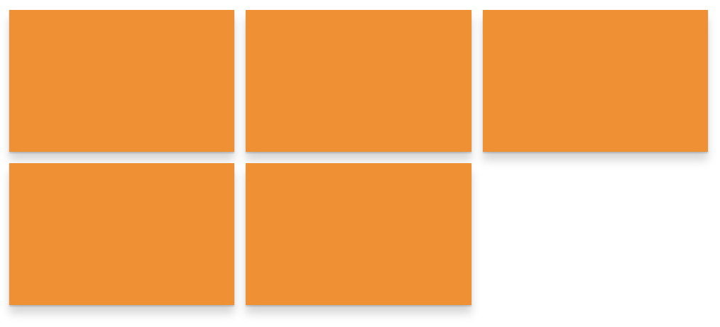
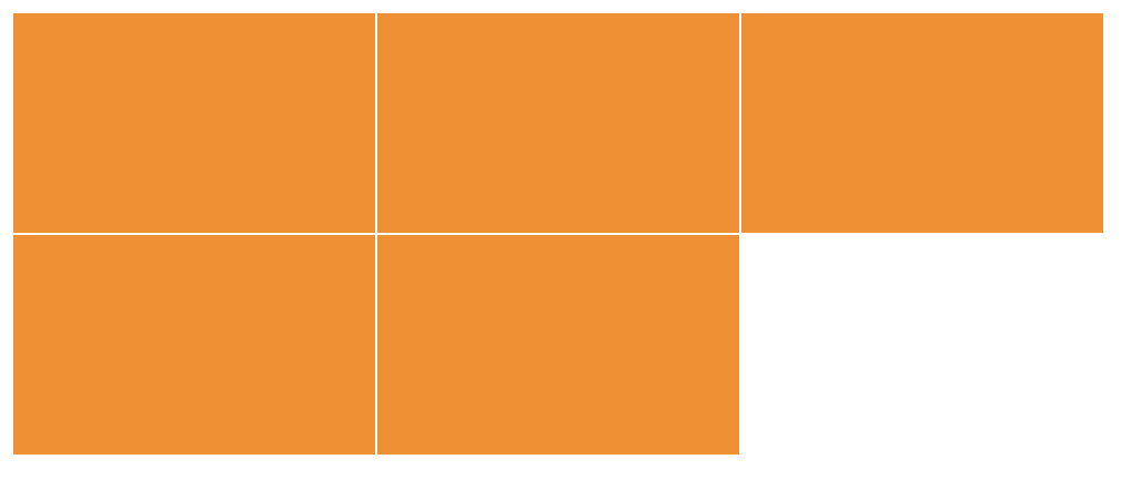
And that’s it! We now have a responsive, fluid, wrapping flexbox grid. The easy part is done… well, as long as we only ever have items that are multiples of two and three. With flex: 1 1 auto, the last item will always take up any remaining space in the last row.
Aligning cells in the last row
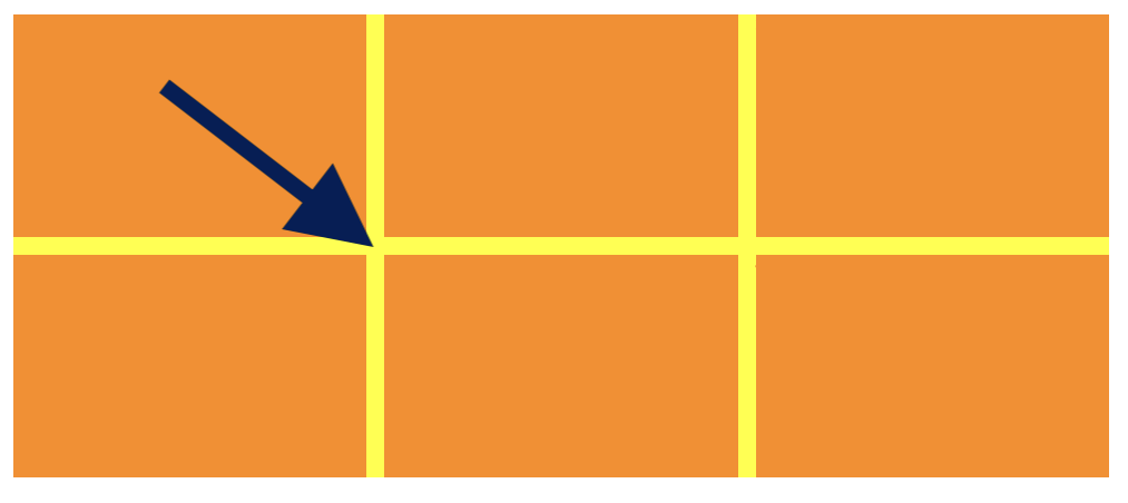
The elusive last row is why we’re here, right? By default, each cell will stretch to the end of the row in a flexbox layout, but grid leaves a blank spot. How do we do that in flexbox? With pseudo-elements!
The trick is to add a pseudo-element to the .grid container and set it like a cell. We define the :after pseudo-element cell at each of our breakpoints with the same width as a real cell.
@media (min-width: $screen-sm-min) {
  .grid {
    ...

    &:after {
      content: '';
      display: block;
      flex: 1 1 auto;
    }
  }
}

@media (min-width: $screen-sm-min) and (max-width: $screen-sm-max) {
  $width: 50%;

  .grid:after {
    width: $width;
  }
}

@media (min-width: $screen-md-min) {
  $width: 33.33%;

  .grid:after {
    width: $width;
  }
}
This creates a fake cell that will push against our real cells and align our two-column grid when the cells are odd. Leaving its height undefined allows it to collapse to nothing when the cells are even.

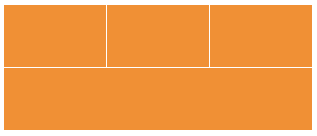
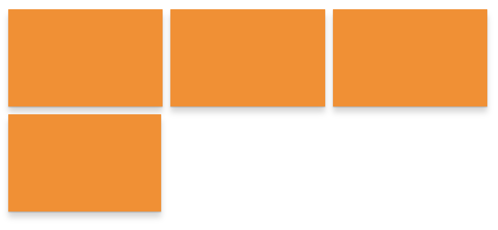
Our three-column grid is a bit more complex because we need to handle multiple states, like when there is one empty cell and when there are two empty cells.
Our one empty cell state is already handled because it isn’t really any different from one empty cell in two columns. The :after cell has its width set and completes the row. The story changes when there are two empty cells though because flex: 1 1 auto rears its head again: the last cell now stretches across 50% of the width when pushed against the pseudo-element.

Using CSS :nth-of-type selectors, we can target the first column in each row. Since our rows are multiples of three, we target them with 3n then count backwards by 2 to get the first element in each row.
@media (min-width: $screen-md-min) {
  .grid__cell {
    ...

    &:nth-of-type(3n-2) {
      background-color: red;
    }
  }
}
We’re broadly targeting all the cells in the first column, but we need to limit the selection to only the last row. Actually, we need to limit it to when it’s the last cell in the first column of the last row. Luckily, there’s a handy pseudo-selector for targeting the last item of its kind. We chain :last-of-type to create the logical statement.
@media (min-width: $screen-md-min) {
  .grid__cell {
    ...
    &:nth-of-type(3n-2):last-of-type {
      background-color: red;
    }
  }
}
Now that we have the last cell in the first column of the last row selected, we use a margin to push the :after cell to the last column and fill the middle cell.
@media (min-width: $screen-md-min) {
  .grid__cell {
    ...

    &:nth-of-type(3n-2):last-of-type {
      margin-right: $width;
    }
  }
}
Here’s our flexbox-defined-auto-placement-grid-imitator in full. Look at its beautifully lined up rows. I bet you can’t even tell it’s not CSS Grid!

Adding gutters with margins
CSS Grid’s spec has a column and row gap to provide space between each cell. Creating gutters in flexbox is much more challenging. It looks like it’s coming to flexbox, but we’re not there yet…and IE will never be.
In Daniel Tonon‘s guide on CSS Grid in IE, he used an inner-cell div with negative margins, borders, a bit of padding, and overflow: hidden. While maybe a bit hacky, the effect works, but it breaks our desire to maintain CSS Grid-like HTML structure. The approach I prefer might feel a bit crude, but I also found it the easiest to read and understand. Further, it continues using :nth-of-type pseudo-selectors which makes the overall approach feel consistent.
We want gaps between the cells, but not around the outside. We also want our cells to sit flush with the container.
Our mobile or single-column grid only needs a bottom margin on the cells. We add that and override the very last cell with margin-bottom: 0 so the cell fits flush against the container. Normally I’d use initial, but there’s no support in IE.
$col-gap: 16px;

.grid__cell {
  ...
  margin-bottom: $col-gap;

  &:last-of-type {
    margin-bottom: 0;
  }
}
Our two- and three-column grids need margins on the right of the cells, no right margins in the last column, and no bottom margins on any of the last row’s cells. Because of the margins, we’ll also need to recalculate our widths since the cells will wrap if they don’t fit.
In a two-column layout, getting the right (or second) column is fairly easy with :nth-of-type(2n) or :nth-of-type(even). I prefer an n-multiplier for consistency with our three-column grid and for calculating the last row.
Our last row is a bit more tricky. When we have odd cells our mobile-first CSS takes care of removing the bottom margins since the cell is the :last-of-type and our :after cell doesn’t have margins applied.

When we have even cells we need to target the second last cell, but only when it is in the first column position. If we didn’t qualify it, the second last cell will grow vertically with to match the height of the second last row. We can target it with :nth-of-type(2n-1):nth-last-of-type(2).
@media (min-width: $screen-sm-min) and (max-width: $screen-sm-max) {
  $width: calc(50% - #{$col-gap});

  .grid__cell {
    ...
    margin-right: $col-gap;

    // Remove margin in last column
    &:nth-of-type(2n) {
      margin-right: 0;
    }

    // For when the last row is complete
    // . .
    // * .
    &:nth-of-type(2n-1):nth-last-of-type(2) {
      margin-bottom: 0;
    }
  }
}
Our three-column gutters take the same approach. We add margin-right to all of them, remove it from the third column, and remove bottom margins from the last row. Again our last cell is handled by our mobile-first approach, but now we need to cover when there are two cells in the last row and when when there are three cells. We can qualify our selectors with nth-of-type and nth-last-of-type.
@media (min-width: $screen-md-min) {
  $width: calc(33% - #{$col-gap});

  .grid__cell {
    ...
    margin-right: $col-gap;

    // Remove margin in last column
    &:nth-of-type(3n) {
      margin-right: 0;
    }

    // For when there two items in the last row
    // . . .
    // * .
    &:nth-of-type(3n-2):nth-last-of-type(2) {
      margin-bottom: 0;
    }

    // For when the last row is complete
    // . . .
    // * * .
    &:nth-of-type(3n-1):nth-last-of-type(2),
    &:nth-of-type(3n-2):nth-last-of-type(3) {
      margin-bottom: 0;
    }
  }
}
We need to adjust the margin of last cell in the last row when it’s alone because of the columns. We use 33% plus a gutter on each side.
@media (min-width: $screen-md-min) {
  $width: calc(33% - #{$col-gap});

  .grid__cell {
    ...
    // When there is only one item in the last rpw
    // Fill the margin so it's like the last item is
    // double the width
    // . . .
    // *->
    &:nth-of-type(3n-2):last-of-type {
      margin-right: calc(33% + #{$col-gap * 2});
    }
  }
}
Now our gutters are installed and the grid is complete! Fill them borders, shadows, or whatever your heart desires.
Wrapping up
Here’s the final result one more time:
See the Pen
IE10-compatible CSS-Grid-like column layout by Brian Holt (@bholtbholt)
on CodePen.
I believe this technique could also support IE9 with minor adjustments, like using inline-blocks instead of flexbox. We could also expand to a four-column grid by adding another breakpoint and using the same approach as the three-column grid. Feel free to use this approach and I hope it helps!
The post IE10-Compatible Grid Auto-Placement with Flexbox appeared first on CSS-Tricks.
