Famous Fonts Used by Powerful Companies

Have you ever wondered what the most used fonts in the most famous logos are? Those logos that happen to be seen hundreds of times, repeated on all the screens, shirts and sheets of paper that surround you.
Well, then this article is made just for you!
In fact, in this article, I want to talk to you about which fonts are used in some of the most famous logos ever.
We’re going to try and understand why these specific fonts were chosen. Because choosing a font is not a simple thing, and behind the choice of a font, there is a very precise message that any brand wants to convey.
In this article, I wanted to analyze 6 fonts in depth.
Ready? Then let’s get started!
A little clarification before starting: many famous brands use private fonts
Almost every major brand opts for a custom font. Of course, these fonts aren’t generally available to the public.
Very often, however, these proprietary fonts are based on already existing and already famous characters. And in a lot of cases, custom fonts that you can purchase or even download for free follow suit shortly after.
Now, let’s really get into it!
What font does YouTube use in its logo?
Bold and tight, the Alternate Gothic was designed by Morris Fuller Benton in 1903 for the American Type Founders Company.
It is a font with a long history, designed at the beginning of the 20th century so that it could be perfect to insert titles in narrow columns.
It was the font used in the YouTube logotype until a few years ago (August 2017, to be precise) when YouTube rebranded. Since then, they’ve used a custom font called YouTube Sans.
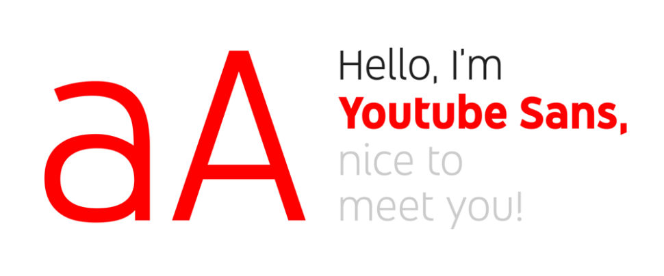
This font was designed from scratch, by the Saffron branding agency, starting right from the shapes and aesthetics of the Alternate Gothic used previously.
Why was this font chosen?
This current one, according to what the Saffron designers write, was chosen to “communicate its brand with only a glance”, that is, to be able to immediately communicate that it is YouTube.
With this, being a reference to the Alternate Gothic that they used previously, the recognition of the brand is strengthened.
But why had the Alternate Gothic been chosen?
Nobody can really say for sure. Most people speculate that it was chosen because of its super easy readability. Being a massive international company, readability in the logo font is a must.
It was designed for editorial use in the minuscule dimensions of column headings but also in the enormous dimensions of the main titles. And so it was readable in every dimension.
What font does Adidas use in its logo?
L’Avant Garde, which in French means cutting-edge, is one of the most influential of the 900 fonts. Created in 1970 by Herb Lubalin (along with Tom Carnase), it was introduced into the font family. Its original intention was to be in the logo of their magazine, which was called “Avant Garde”.
The forms of the Avant-Garde recall very much the natural elegance of the Art Deco of the 1920s and 30s. While transmitting a vintage effect, it is nevertheless able to tell it always in a contemporary way, thanks to its flexibility and naturalness.
In reality, however, the font used in the Adidas logo is not the Avant-Garde.
Here too, it is a proprietary font, AdiHaus. A font inspired, of course, by the Avant-Garde but also by the FF Din (one of my absolute favorites).
Why was the Avant-Garde / AdiHaus chosen?
The Avant Garde was chosen in 1971 by the designers who worked on the first restyling of the Adidas logo.
It was chosen both because it was a font very similar to the one originally designed in ’49, and, I believe, because of its qualities: elegance, naturalness, cleanliness.
What font does Nike use in its logo?
The Futura is one of the most important and influential typefaces in the history of graphics.
Designed in 1928 by Paul Renner, it is now considered the geometric font par excellence.
And it is also used, among the multitude of applications, for the Nike logo.
In particular, in the Bold Condensend Oblique version.
Even more specifically, in the Bold Condensend Oblique version, but with some substantial changes regarding the inclination and kerning (the space between the glyphs).
Why the Futura?
Because, like the “whisker” of the logo, the chosen font also transmits a message: strength (the bold version), dynamism (inclination), stability (the geometry of the Futura).
And it tells, along with with the rest of the image, a very clear message: Nike is a strong brand, buy Nike and you will be strong too.
What font does Instagram use in its logo?
Instagram, in its new logo of May 2016, does not use a real font.
Before now, the Instagram logo was made using the Billabong font. This is a 2006 script font, which has nothing special, other than the fact that it is the font of the Instagram logo.
In 2016, however, there was the famous Instagram rebrand (extremely criticized at the beginning, but now most people think it’s amazing) in which the logo has also changed.
The new logo was created without using any files, no fonts. It is simply designed to be the word “Instagram”.
It was designed by Mackey Saturday starting from the Billabong font, so that it was more functional and harmonious than the previous one while maintaining some characteristic elements.
Why this font?
Here the answer is simple: because Instagram was born as an application that presented itself as something dynamic, fun, and energetic. That font exactly reflected the kind of message they wanted to convey.
What fonts does Linkedin use in its logo?
Very little is known about the Linkedin brand choices, in reality. There are no real studies of designers or agencies that have worked with them, nor is there any mention in the brand manuals.
What is known is that the font used in the logo is certainly the Avenir (at least from 2012 onwards, before it was the Myriad Pro).
The Avenir is one of the many wonderful fonts designed by the extraordinary Adrian Frutiger, in 1988.
It is undoubtedly one of the typefaces I like most. He is able to combine the geometric shapes of the sans serif of the 1920s (such as the Futura), with the more natural and flexible forms of the grotesk characters of the late 1800s (such as the Akzidenz Grotesk) and the post-World War II period (like the Univers, always by Adrian Frutiger).
Why this font?
Because it inspires respect and professionalism. Exactly what a working network like Linkedin wants to convey.

Few other typographical choices would be so suitable.
What font does McDonald’s use in its logo?
McDonald’s has been using for years what is among the most important and today undervalued fonts in the history of graphics: the Akzidenz Grotesk.
It is extremely readable, simple, flexible and of great impact.
It was produced by the German foundry H. Berthold AG in 1896 by an unknown author. The current version available is the one reworked by Günter Gerhard Lange in the 1950s.
Why is it so difficult to recognize it? Well, because it is the base on which some of the most used and known fonts have been built today. Like Helvetica, Univers, Arial, Frutiger, all inspired by the ancestor Akzidenz.
Why exactly this font?
First of all, in my opinion, because it is very beautiful.
But then, I believe, also because it represents tradition, history. Which at McDonald’s, at the beginning, was very interesting to tell.
Conclusion
In this article, I wanted to talk about the font choices of some of the most famous brands in order to give you creative ideas for choosing a font for your project.
Analyzing what other designers have done before you is crucial.
But even more fundamental is trying to understand the reason for certain choices. What did they want to communicate? Why that font instead of another?
The choice of a font is, in fact, a crucial aspect in the process of creating a logo but also in any other aspect of graphic design.
Read More at Famous Fonts Used by Powerful Companies
