Note the interesting caveat: only vote in the poll if you don’t know CSS well.
The winning answer was D! You gotta wonder if the result would have been different if the request for non-CSS experts wasn’t there.
I like to think I know CSS OK, so I didn’t vote. My brain goes like this:
I think he’s asking “by default,” so the answer may assume there’s no other CSS doing anything to that text.
I wish I knew why the box was that particular width, but I guess I’ll just assume it’s a set width.
It’s not B because ellipsis stuff requires extra stuff, and doesn’t work on multiple lines like that — unless we’re talking line clamping, which is even weirder.
It’s not C because that requires hiding overflow which is never really a default — that is, except off the top and left of the browser window, I guess. Or in an iframe.
It’s not D because words just don’t break like that unless you do pretty specific stuff.
A actually makes decent sense. It’s weird to look at, but I’ve been dealing with stuff busting out of containers my whole career. C’est la vie.
Remember, we’ve done a deep dive into CSS IS AWESOME before and how it interestingly captures the weirdness of CSS.
Animating elements, at its most basic, is fairly straightforward. Define the keyframes. Name the animation. Call it on an element.
But sometimes we need something a little more complex to get the right “feel” for the way things move. For example, a sound equalizer might use the same animation on each bar, but they are staggered to give the illusion of being animated independently.
I was recently building a dashboard and wanted the items in one of the widgets to flow into view with a staggered animation.
Just like the sound equalizer above, I started going down the :nth-child route. I used the unordered list (
) as the parent container, gave it a class and employed the :nth-child pseudo selector to offset each list item with animaton-delay.
.my-list li {
  animation: my-animation 300ms ease-out;
}

.my-list li:nth-child(1) {
  animation-delay: 100ms;
}

.my-list li:nth-child(2) {
  animation-delay: 200ms;
}

.my-list li:nth-child(3) {
  animation-delay: 300ms;
}

/* and so on */
This technique does indeed stagger items well, particularly if you know how many items are going to be in the list at any given time. Where things fall apart, however, is when the number of items is unpredictable, which was the case for the widget I was building for the dashboard. I really didn’t want to come back to this piece of code every time the number of items in the list changed, so I knocked out a quick Sass loop that accounts for up to 50 items and increments the animation delay with each item:
.my-list {
  li {
    animation: my-animation 300ms ease-out;

    @for $i from 1 through 50 {
      &:nth-child(#{$i}) {
        animation-delay: 100ms * $i;
      }
    }
  }
}
That should do it! Yet, it feels way too hacky. Sure, it doesn’t add that much weight to the file, but you know the compiled CSS will include a bunch of unused selectors, like nth-child(45).
There must be a better way. This is where I would normally reach for JavaScript to find all of the items and add a delay but… this time I spent a little time exploring to see if there is a way to do it with CSS alone.
How about CSS counters?
The first thing I thought of was using a CSS counter in combination with the calc() function:
The browser support isn’t all that bad (pokes stick at Internet Explorer).
This browser support data is from Caniuse, which has more detail. A number indicates that browser supports the feature at that version and up.
Desktop
Chrome
Opera
Firefox
IE
Edge
Safari
49
36
31
No
16
9.1
Mobile / Tablet
iOS Safari
Opera Mobile
Opera Mini
Android
Android Chrome
Android Firefox
9.3
46
No
67
75
67
One of the great features of CSS is that it will ignore things it doesn’t understand, thanks to the cascade. That means everything will animate in into view together. If that’s not your bag, you can add a feature query to override a default animation:
.my-list li {
  animation: fallback-animation;
}

@supports (--variables) {
  .my-list li {
    animation: fancy-animation;
    animation-delay: calc(var(--animation-order) * 100ms);
  }
}
Vanilla CSS FTW
The more I stop and ask myself whether I need JavaScript, the more I’m amazed what CSS can do on its own. Sure, it would be nice if CSS counters could be used in a calc() function and it would be a pretty elegant solution. But for now, inline custom properties provide both a powerful and flexible way to solve this problem.
Visual testing is the automated process of reviewing software from a purely visual standpoint. Instead of testing the code underneath, visual testing is all about what end users actually see and interact with.
Similar to functional testing, however, visual testing fits directly into your stack and workflow. And with Percy, it’s easy to add snapshots to and run visual reviews for anything that runs in a browser.
Let’s set up an app to test
In this tutorial, we’re going to clone an example Jekyll site, add Percy snapshots, make some visual changes, and review them in Percy.
Before we add Percy, let’s set up our example app:
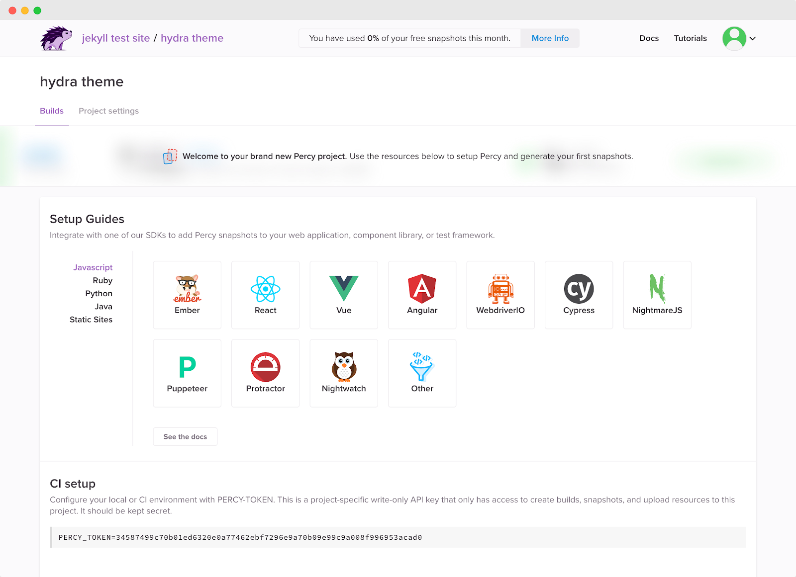
Percy projects correspond to the web application, component library, or static site you’re testing. In this case, we’ll be connecting our Percy project to our Jekyll site.
Generating Percy snapshots
To authenticate your local environment with your new Percy project, copy the PERCY_TOKEN environment variable from the new project screen or your project settings, then run:
Click the build link or head over to your Percy project to check out your first build.
What’s going on behind the scenes?
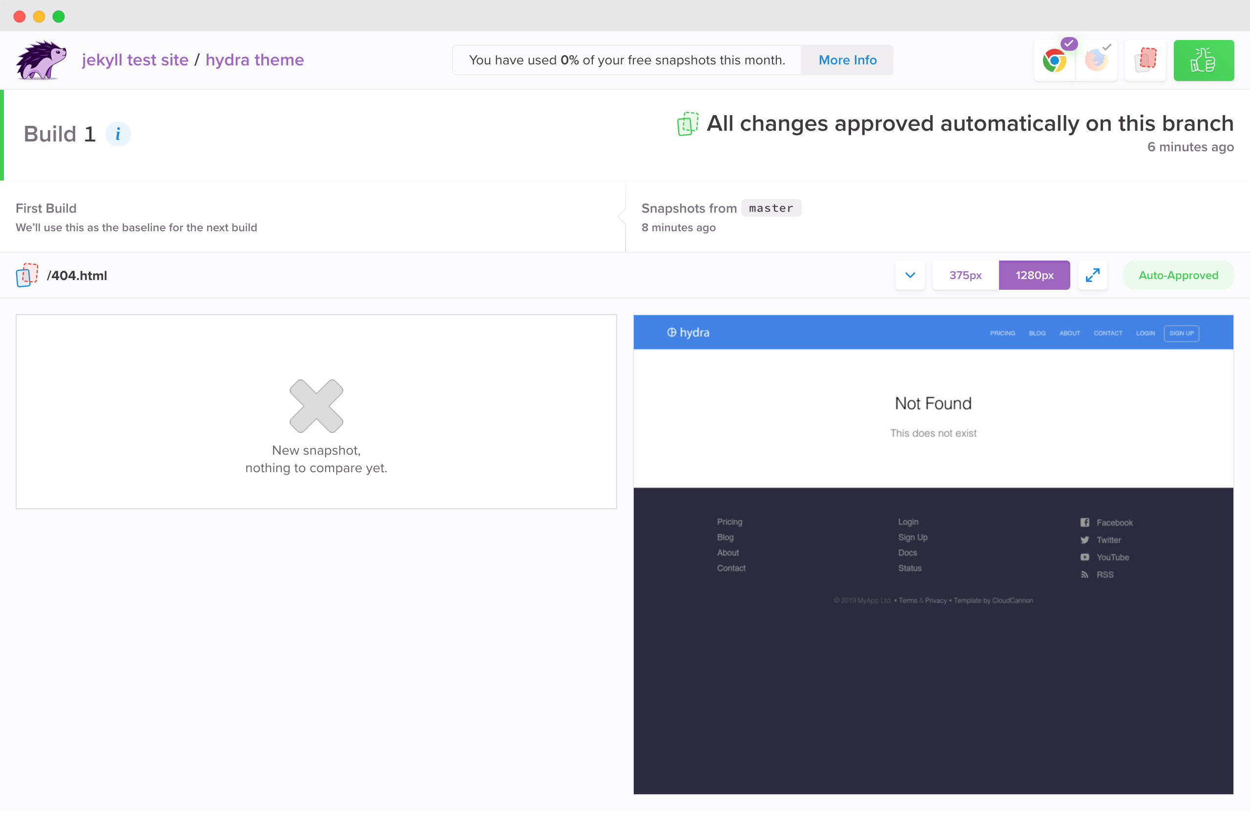
Once npx percy snapshot _site/ was called, Percy captured the DOM snapshots for each page of your Jekyll site. Percy then recreated the snapshots to compare against baseline snapshots and determine which pixels have changed.
Since this is the first build, there isn’t anything to compare it to. It has also been auto-approved because the commit was on master and we assume that master builds are production-ready.
Making and reviewing visual changes
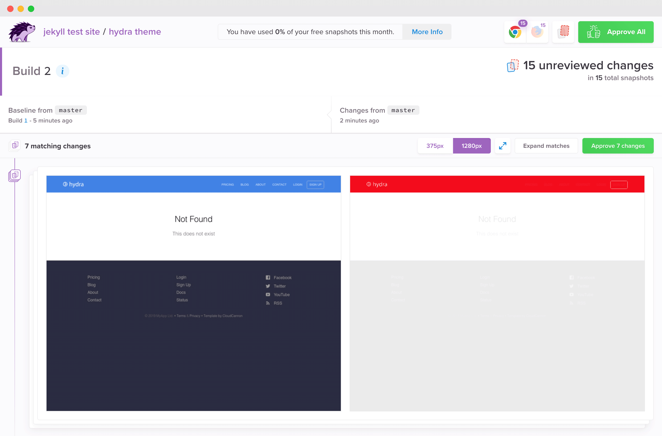
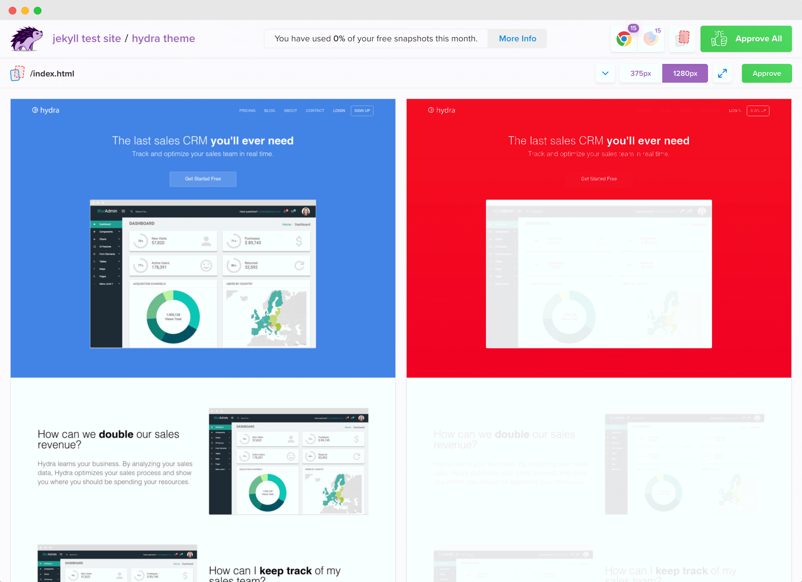
Now that you’ve pushed your first build and established a baseline to compare your next snapshots to, let’s make a visual change to review.
Let’s make a wide sweeping CSS change. Head over to the cloudcannon.scss file and change the brand colors:
The red areas in the right panel represent pixels that have changed—the visual diffs. Clicking that area (or pressing “d”) will toggle between the underlying snapshot and the overlaid diff so you can easily see what exactly has changed. You’ll also notice that the first several diffs have been matched and grouped to make it easier and faster to review.
Each snapshot has been rendered across both Chrome and Firefox, and at mobile and desktop widths. Rendering your site across these variations helps you detect subtle differences caused by browser rendering or responsive bugs.
Now that we’re happy with our fresh new look, hit “Approve All.” ?
You’ve done your first visual review! Visual testing is great not only for catching visual bugs, but also for knowing the exact impact of any given code change. Seeing your UI visualized during code reviews is invaluable, helping you fix regressions before they make their way to production, or to deploy with complete confidence.
Configuring your snapshots
You can configure how and where Percy runs for each build by creating a global .percy.yml file in the root of your project.
You can customize the responsive widths at which your snapshots are rendered. For example, if you want to add a super wide snapshot in addition to our mobile and desktop widths:
version: 1
snapshot:
	widths: [375, 1280, 1920]
You can also ignore certain pages. For example, if you’d like to ignore multiple pages with the same layout like blog categories posts:
Learn more about Percy SDK configuration in our docs).
Adding Percy to your workflow
What we’ve done so far demonstrates how Percy generates snapshots and detects visual changes locally, but to get the most value out of automated visual testing, we recommend integrating Percy with your CI service.
For instructions and to see all of our supported CI services, check out our CI setup documentation. Here are a few of our most popular supported services:
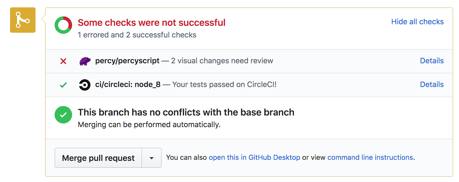
Visual testing is best when done alongside code reviews. We support integrations with GitHub, GitLab, and Bitbucket (coming soon)! With an integration enabled, Percy will show up in your checks commit and pull request checks, notifying you if visual changes are detected:
Clicking “Details” will take you right to the Percy build where you can review visual changes.
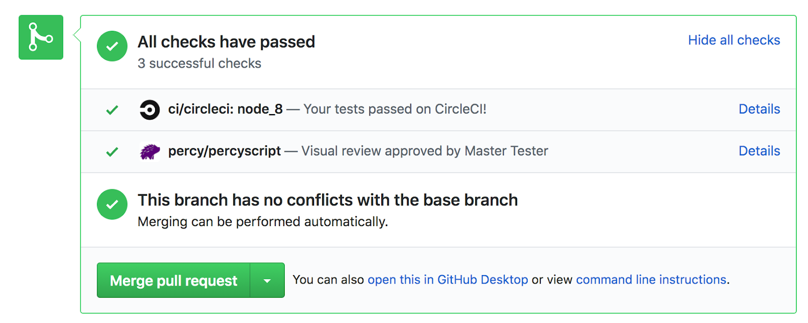
After snapshots are approved, your commit status will change to green and the pull request can be merged.
With continuous visual reviews on every feature branch, it’s easy to have 100% confidence the visual changes you’ll be deploying.
We hope this tutorial has helped you get acquainted with Percy’s visual review platform and workflow. To learn more about how Percy works, feel free to check out these docs:
A Progressive Web App (PWA) is a site that uses modern technology to deliver app-like experiences on the web. It’s an umbrella term for new technologies such as the ‘web app manifest’, ‘service worker’, and more. When joined together, these technologies allow you to deliver fast and engaging user experiences with your website.
This article is a step-by-step tutorial for adding a service worker to an existing one-page website. The service worker will allow you to make your website work offline while also notifying your users of updates to your site. Please note that this is based on a small project that is bundled with Webpack, so we’ll be using the Workbox Webpack plugin (Workbox v4).
Using a tool to generate your service worker is the recommended approach as it lets you manage your cache efficiently. We will be using Workbox — a set of libraries that make it easy to generate your service worker code — to generate our service worker in this tutorial.
Depending on your project, you can use Workbox in three different ways:
A command-line interface is available which lets you integrate workbox into any application you have;
A Node.js module is available which lets you integrate workbox into any Node build tool such as gulp or grunt;
A webpack plugin is available which lets you easily integrate with a project that is built with Webpack.
Webpack is a module bundler. To simplify, you can think of it as a tool that manages your JavaScript dependencies. It allows you to import JavaScript code from libraries and bundles your JavaScript together into one or many files.
To get started, clone the following repository on your computer:
git clone git@github.com:jadjoubran/workbox-tutorial-v4.git
cd workbox-tutorial-v4
npm install
npm run dev
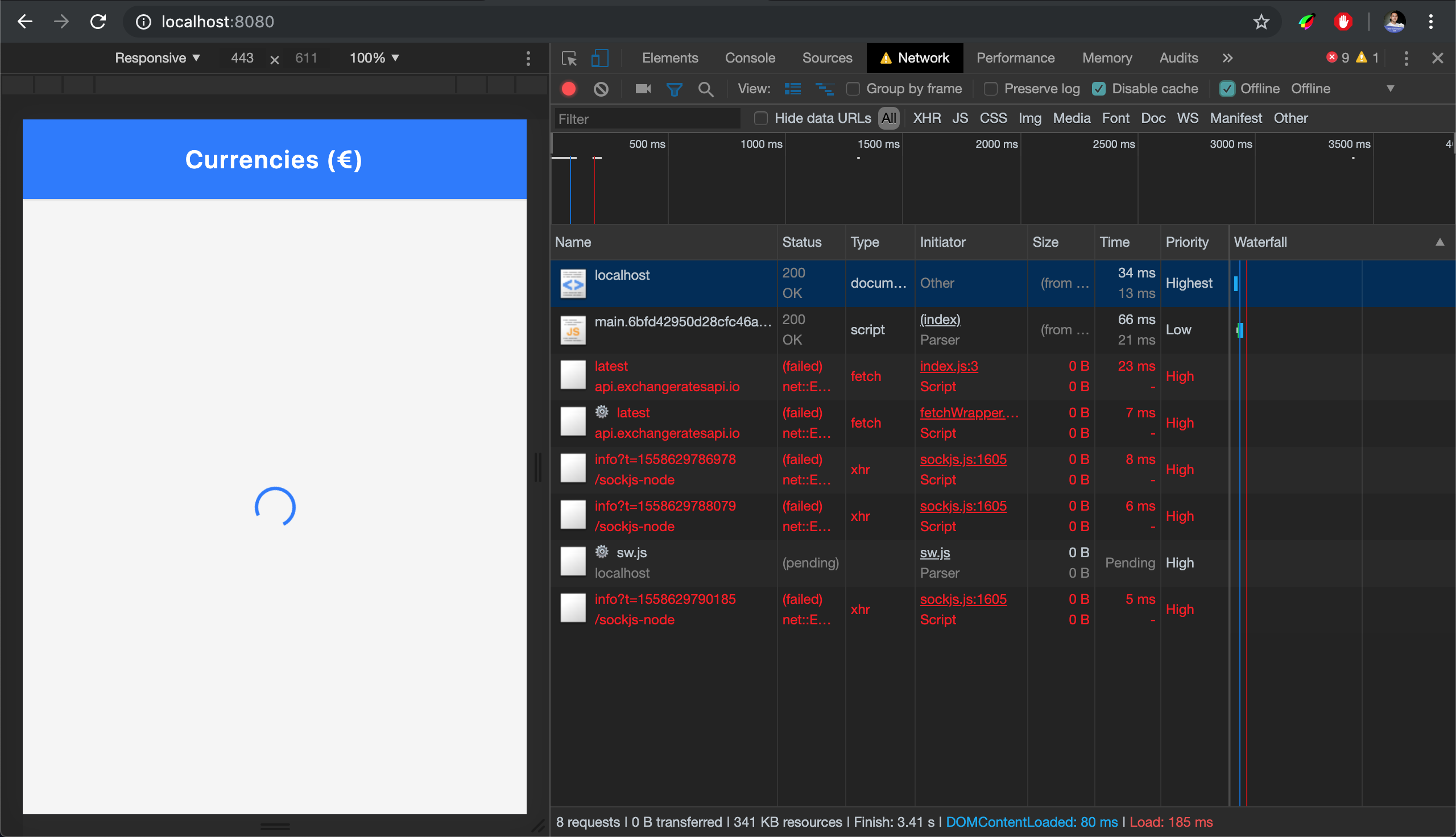
Next, navigate to http://localhost:8080/. You should be able to see the currency app we’ll be using throughout this tutorial:
‘Currencies’ is a PWA that lists conversion fees of currencies against the Euro (€) currency. (Large preview)
Start With An App Shell
The application shell (or ‘app shell’) is a pattern inspired from Native Apps. It will help give your app a more native look. It simply provides the app with a layout and structure without any data — a transitional screen that is aimed to improve the loading experience of your web app.
Here are some examples of app shells from native apps:
Google Inbox App Shell: A few milliseconds before the emails load into the app shell. (Large preview)
Twitter’s native app on Android: App shell showing navbar, tabs, and loader. (Large preview)
Users like the loading experience of app shells because they despise blank screens. A blank screen makes the user feel that the website is not loading. It makes them feel as if the website were stuck.
App shells attempt to paint the navigational structure of the app as soon as possible, such as the navbar, the tab bar as well as a loader signifying that the content you’ve requested is being loaded.
So How Do You Build An App Shell?
The app shell pattern prioritizes the loading of the HTML, CSS and JavaScript that will render first. This means that we need to give those resources full priority, hence you have to inline those assets. So to build an app shell, you simply have to inline the HTML, CSS and JavaScript that are responsible for the app shell. Of course, you should not inline everything but rather stay within a limit of around 30 to 40KB total.
You can see the inlined app shell in the index.html. You can inspect the source code by checking out the index.html file, and you can preview it in the browser by deleting the element in dev tools:
The App Shell that we’re building in this article. (Large preview)
Does It Work Offline?
Let’s simulate going offline! Open DevTools, navigate to the network tab and tick the ‘Offline’ checkbox. When you reload the page, you will see that we will get the browser’s offline page.
The request to the homepage failed so we obviously see this as a result. (Large preview)
That’s because the initial request to / (which will load the index.html file) will fail because the Internet is offline. The only way for us to recover from that request failure is by having a service worker.
Let’s visualize the request without a service worker:
Network request goes from the browser to the Internet and back. (Icons from flaticon.com) (Large preview)
A service worker is a programmable network proxy, which means it sits in between your web page and the Internet. This lets you control incoming and outgoing network requests.
This is beneficial because we can now re-route this failed request to the cache (assuming we have the content in the cache).
Network request gets redirected to the cache when it already exists in the cache. (Icons from flaticon.com) (Large preview)
A service worker is also a type of Web Worker, meaning that it runs separately from your main page and doesn’t have access to either the window or document object.
Precache The App Shell
In order to make our app work offline, we’re going to start by precaching the app shell.
So let’s start by installing the Webpack Workbox plugin:
npm install --save-dev workbox-webpack-plugin
Then we’re going to open our index.js file and register the service worker:
if ("serviceWorker" in navigator){
window.addEventListener("load", () => {
navigator.serviceWorker.register("/sw.js");
})
}
Next, open the webpack.config.js file and let’s configure the Workbox webpack plugin:
//add at the top
const WorkboxWebpackPlugin = require("workbox-webpack-plugin");

//add inside the plugins array:
plugins: [
…
, new WorkboxWebpackPlugin.InjectManifest({
  swSrc: "./src/src-sw.js",
  swDest: "sw.js"
})
]
This will instruct Workbox to use our ./src/src-sw.js file as a base. The generated file will be called sw.js and will be in the dist folder.
Then create a ./src/src-sw.js file at the root level and write the following inside of it:
The precache manifest lists the names of the files that were processed by webpack and that end up in your dist folder. We will use these files to precache them in the browser. This means that when your website loads the first time and registers the service worker, it will cache these assets so that they can be used the next time.
You can also notice that some entries have a ‘revision’ whereas others don’t. That’s because the revision can sometimes be inferred from the chunkhash from the file name. For example, let’s take a closer look at the file name main.49467c51ac5e0cb2b58e.js. It has a revision is in the filename, which is the chunkhash 49467c51ac5e0cb2b58e.
This allows Workbox to understand when your files change so that it only cleans up or updates the files that were changed, rather than dumping all the cache every time you publish a new version of your service worker.
The first time you load the page, the service worker will install. You can see that in DevTools. First, the sw.js file is requested which then requests all the other files. They are clearly marked with the gear icon.
Requests marked with the ?? icon are requests initiated by the service worker. (Large preview)
So Workbox will initialize and it will precache all the files that are in the precache-manifest. It is important to double check that you don’t have any unnecessary files in the precache-manifest file such as .map files or files that are not part of the app shell.
In the network tab, we can see the requests coming from the service worker. And now if you try to go offline, the app shell is already precached so it works even if we’re offline!
Did you notice that when we went offline, the app shell works but not our data? That’s because these API calls are not part of the precached app shell. When there’s no Internet connection, these requests will fail and the user won’t be able to see the currency information.
However, these requests cannot be precached because their value comes from an API. Moreover, when you start having multiple pages, you don’t want to cache all API request in one go. Instead, you want to cache them when the user visits that page.
We call these ‘dynamic data’. They often include API calls as well as images and other assets that are requested when a user does a certain action on your website (e.g. when they browse to a new page).
You can cache these using Workbox’s routing module. Here’s how:
//add in src/src-sw.js
workbox.routing.registerRoute(
  /https://api.exchangeratesapi.io/latest/,
  new workbox.strategies.NetworkFirst({
    cacheName: "currencies",
    plugins: [
      new workbox.expiration.Plugin({
        maxAgeSeconds: 10 * 60 // 10 minutes
      })

  })
);
The caching strategy that we used here is called NetworkFirst; there are two other ones that are often used:
CacheFirst
StaleWhileRevalidate
CacheFirst will look for it in the cache first. If it’s not found, then it will get it from the network. StaleWhileRevalidate will go to the network and the cache at the same time. Return the cache’s response to the page (while in the background) it will use the new network response to update the cache for the next time it’s used.
For our use case, we had to go with NetworkFirst because we’re dealing with currency rates that change very often. However, when the user goes offline, we can at least show them the rates as they were 10 minutes ago — that’s why we used the expiration plugin with the maxAgeSeconds set to 10 * 60 seconds.
Manage App Updates
Everytime a user loads your page, the browser will run the navigator.serviceWorker.register code even though the service worker is already installed and running. This allows the browser to detect if there’s a new version of the service worker. When the browser notices that the file has not changed, it just skips the registration call. Once that file changes, the browser understands that there’s a new version of the service worker, thus it installs the new service worker parallel to the currently running service worker.
However, it pauses at the installed/waiting phase because only one service worker can be activated at the same time.
A simplified life cycle of a service worker (Large preview)
Only when all the browser windows controlled by the previous service worker are installed, then it becomes safe for the new service worker to activate.
You can also manually control that by calling skipWaiting() (or self.skipWaiting() since self is the global execution context in the service worker). However, most of the time you should only do that after asking the user if they want to get the latest update.
Thankfully, workbox-window helps us achieve this. It’s a new window library introduced in Workbox v4 that aims at simplifying common tasks on the window’s side.
Let’s start by installing it with the following:
npm install workbox-window
Next, import Workbox at the top of the file index.js:
import { Workbox } from "workbox-window";
Then we’ll replace our registration code with the below:
if ("serviceWorker" in navigator) {
  window.addEventListener("load", () => {
      const wb = new Workbox("/sw.js");

wb.register();
  });

}
We’ll then find the update button which has the ID app-update and listen for the workbox-waiting event:
//add before the wb.register()
const updateButton = document.querySelector("#app-update");
// Fires when the registered service worker has installed but is waiting to activate.
wb.addEventListener("waiting", event => {
    updateButton.classList.add("show");
    updateButton.addEventListener("click", () => {
    // Set up a listener that will reload the page as soon as the previously waiting service worker has taken control.
    wb.addEventListener("controlling", event => {
        window.location.reload();
    });

    // Send a message telling the service worker to skip waiting.
    // This will trigger the `controlling` event handler above.
    wb.messageSW({ type: "SKIP_WAITING" });
    });
});
This code will show the update button when there’s a new update (so when the service worker is in a waiting state) and will send a SKIP_WAITING message to the service worker.
We’ll need update the service worker file and handle the SKIP_WAITING event such that it calls the skipWaiting:
//add in src-sw.js
addEventListener("message", event => {
  if (event.data && event.data.type === "SKIP_WAITING") {
    skipWaiting();

});
Now run npm run dev then reload the page. Go into your code and update the navbar title to “Navbar v2”. Reload the page again, and you should be able to see the update icon.
Wrapping Up
Our website now works offline and is able to tell the user about new updates. Please keep in mind though, that the most important factor when building a PWA is the user experience. Always focus on building experiences that are easy to use by your users. We, as developers, tend to get too excited about technology and often end up forgetting about our users.
If you’d like to take this a step further, you can add a web app manifest which will allow your users to add the site to their home screen. And if you’d like to know more about Workbox, you can find the official documentation on the Workbox website.
Running a developer survey like the State of CSS is a multi-stage process. First, you need to collect the data. Then, you process it into a usable shape. Finally, you come up with nifty ways to visualize it and release it to the world.
But then, once the dust settles and the traffic dies down comes my favorite part: actually thinking about the data. By taking a deeper look at our data, as well as observing how the community discussed our findings, three unexpected trends ended up coming into focus.
But first, some background for those not already familiar with the project.
I first started the State of JavaScript survey three years ago in 2016 as a way to answer my own uncertainties about the future of web development. At the time, JavaScript fatigue was running wild and I thought a comprehensive developer survey could prove itself the antidote.
The original State of JavaScript 2016 edition
Turns out I hit a nerve: that first survey turned out to be very popular, and our audience has grown each year since, along with the scope of the survey. (I was also joined by Raphael Benitte, creator of the Nivo.js dataviz library, to help me with data processing and visualization.) This year marks the first time we’re pivoting out into a new dimension, namely the not-so-simple world of CSS.
Taking on CSS
Prediction 1: CSS still has a lot of unexplored territory
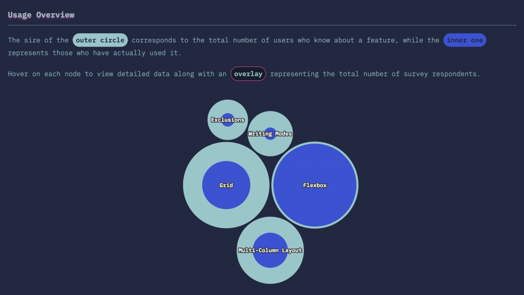
One of the things we wanted to quantify with the survey was how much of CSS was still left “unexplored.” In other words, what CSS features are developers either unfamiliar with, or else hadn’t yet used. For that reason we decided early-on to focus our Features section on new CSS properties, like shapes, masking, or scroll-snap rather than “boring” floats or tables.
The resulting data paints an interesting picture: it turns out that when you look at it this way, CSS morphs from a familiar landscape to a wild, unexplored jungle.
A look at comparing Flexbox vs. CSS Grid provides a good illustration of this trend. While nearly everybody who’s heard of Flexbox has also used it, only 55% of developers who are aware of CSS Grid have actually tried it. That’s a big gap, especially for a technology as important as CSS Grid!
Layout Features
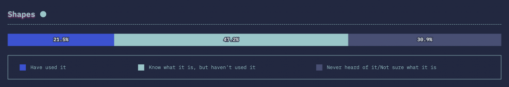
Or take CSS Shapes: 68% of developers are aware of them, only 31% of that group has actually used the feature.
CSS Shapes
This all points at a big gap between what we collectively want to learn and what we actually know. It’s that potential for growth that is exactly what makes CSS so exciting in 2019.
Prediction 2: Functional CSS will keep rising
If you’re old enough to remember the CSS Zen Garden — or to have actually learned CSS through it (in which case I know how you feel, my back hurts when I get up in the morning as well) — then this next trend might seem weird, or even downright wrong.
CSS Zen Garden: one page, many themes.
Functional CSS rejects the platonic ideal of pure, untainted markup free from any styling concerns and embraces “functional” (aka “atomic” or “utility”) classes. Think
...
.
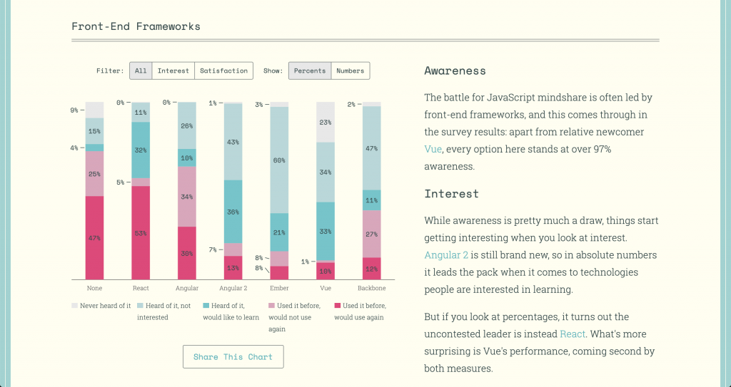
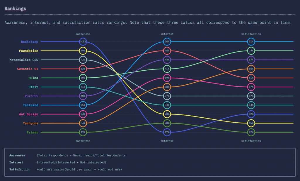
Adopting this approach means you can’t magically update your stylesheet and change your entire design without modifying a single line of markup. But be honest, how often does this happen anyway? Compared to the often theoretical elegance of the Zen Garden philosophy, libraries like Tailwind and Tachyons provide tangible, real-world benefits, which explains why they’re so highly regarded. In fact, those take the #1 and #4 spots, respectively, in terms of satisfaction ratio in the CSS Framework category.
Awareness, interest, and satisfaction ratio rankings for CSS frameworks.
Tailwind especially seems to be picking up speed, at least judging by the Twitter engagement from its community in response to the survey results. Having just hit version 1.0, it’s definitely a project to keep an eye on!
Prediction 3: The battle for CSS has just begun
Looking at our data, I can’t help but wonder if “JavaScript fatigue” will soon be replaced by “CSS fatigue.”
When evaluating technologies, it’s important to look not just at raw usage numbers, but also at user satisfaction. After all, you don’t want to jump on the latest bandwagon just to find out its current occupants can’t wait to hop off it.
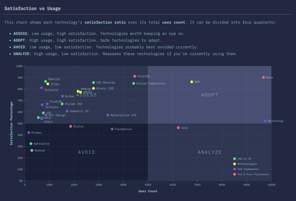
This scatterplot chart that’s divided into quadrants is perfect for this. It plots usage against satisfaction, making it easy to isolate popular, high-satisfaction tools into their own quadrant.
Usage vs. Satisfaction
What’s apparent in this chart is that the most densely populated area is the “Assess” quadrant. In other words, the low-usage, high-satisfaction technologies that are still battling it out for supremacy. This is exactly the state that the JavaScript ecosystem finds itself in as well. Many contenders, but few decisive winners as of today.
This is not necessarily a bad thing: yes, it does make the average developer’s life harder when it comes to picking the right tool, but hey, this is why we do what we do! Additionally, competition can only be good for the ecosystem as a whole. Once the dust settles, we’ll hopefully end up with the best possible options having survived!
CSS in 2019
Overall, the State of CSS survey shows that this is not your grandpa’s CSS anymore. For years, we developers have loved to complain about the inadequacies of CSS and its lack of powerful features. But in 2019, CSS is challenging us to put our money where our mouthes are: here’s all the features you’ve always wanted. Now what are you going to do about it?
I, for one, am very excited to dive even deeper into this new world of styling. And, of course, to tune back in 2020 to see what new trends we find then!
Thinking about doing some blogging for your business? That’s a good idea. Content marketing is one of the best ways to establish credibility and authority, regardless of what kind of business you run.
So, how do you decide where to publish your content?
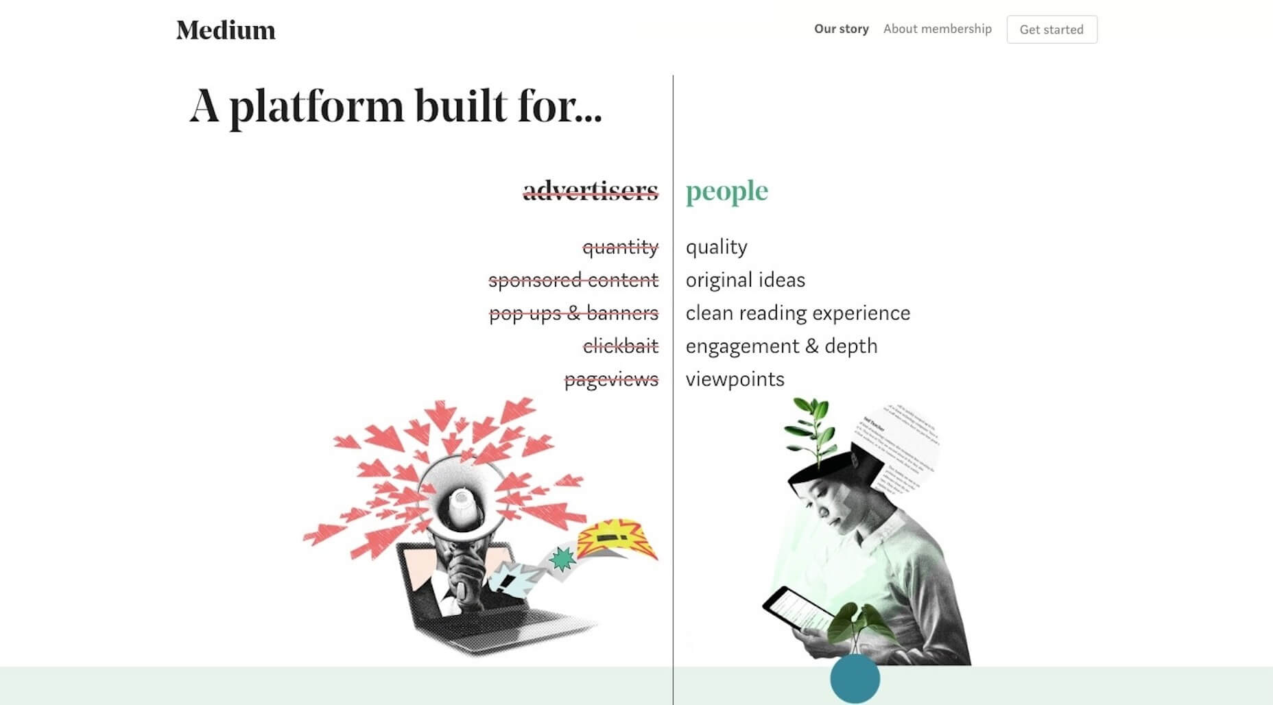
Medium was the platform of choice for some time. Everyone from the hobbyist blogger to the major corporation was publishing content there. Considering it was built specifically as a blogging platform and it costs absolutely nothing to use, why wouldn’t people continue to flock to it as content creators, and readers?
Despite the seeming attractiveness of the platform, it has its flaws — more and more of which are becoming apparent as well-known writers abandon the platform. So, before you go deciding to put all your blogging eggs into Medium’s basket, let’s take a look at the platform and all the reasons why it’s a bad idea for you to publish content there.
The Problem with Medium as a Professional Blogging Platform
I began blogging with Blogger, another publishing tool created by the co-founder of Medium, way back in the day. At the time, it was perfect. It was easy to use and enabled me to get my thoughts on the page and out to readers in no time at all.
That’s because there was nothing to think about. No hosting to purchase. No performance to maintain. No theme to configure. Just type and “Publish”. It was incredibly rudimentary, but it served its purpose for a hobbyist blogger.
Many years later, I discovered Medium and was intrigued. It was like a better-looking, but still easy-to-use Blogger.
I also really liked that it provided a time-to-read estimate. It seemed like a much more convenient and friendly place to get content from.
But that was 2012.
We’ve had plenty of time to give Medium and its ever-growing list of writers a chance to become the premier blogging platform it set out to be.
While I’d say it’s been helpful in giving some people a platform to speak from, this is not the place for professionals in any field — especially web design — to share their content.
Here’s what you need to know:
“Subscribe to Medium” Is the Primary CTA
Even if the content you’re writing isn’t meant to directly sell (which it really shouldn’t), there’s always going to be a call-to-action in the end:
Have questions? Drop us a line.
Experienced something similar? Share in the comments.
Want more content like this? Subscribe now.
But that’s not what happens on Medium. In fact, the primary CTA is all about Medium — and it takes up a good chunk of the reading experience.
The “subscribe” sticky banners are almost always present on Medium. Put them on mobile, and it gets even worse.
If you’re hoping to keep readers’ focus on your content, good luck. They’ll have to be incredibly patient and strong-willed to ignore the constant barrage of Medium’s self-promotional pop-ups.
Perhaps the worst thing about these calls-to-action is that they don’t stop, even if the reader dismisses them. It makes for a terribly distracting experience.
Your Brand Does Not Matter
Why do we do content marketing in the first place? To educate readers, of course. But to what end? We want them to see us for the authority that we are. By providing them with valuable insights they can’t get on their own, we demonstrate what a great asset we would be.
But how are you supposed to do that when most traces of your brand are gone?
It’s not that Medium doesn’t give you an opportunity to share a bio for yourself or to enable readers to follow you.
The problem is with the way Medium positions your content on the site.
I realized Medium is really great about surfacing content, but it removes the face of it. It neutralizes all content to basically be author-agnostic. It’s like Walmart or Amazon in that you can buy from thousands of different brands, but you rarely actually know what brand you’re buying…you just know ‘I got it from Amazon.’
If your goal is simply to write and to be heard, then, by all means, use Medium. However, if your goal is to give authority to your brand, forget about it. Not only will Medium drown out your brand, but it’ll do nothing to help you build a presence in search engines.
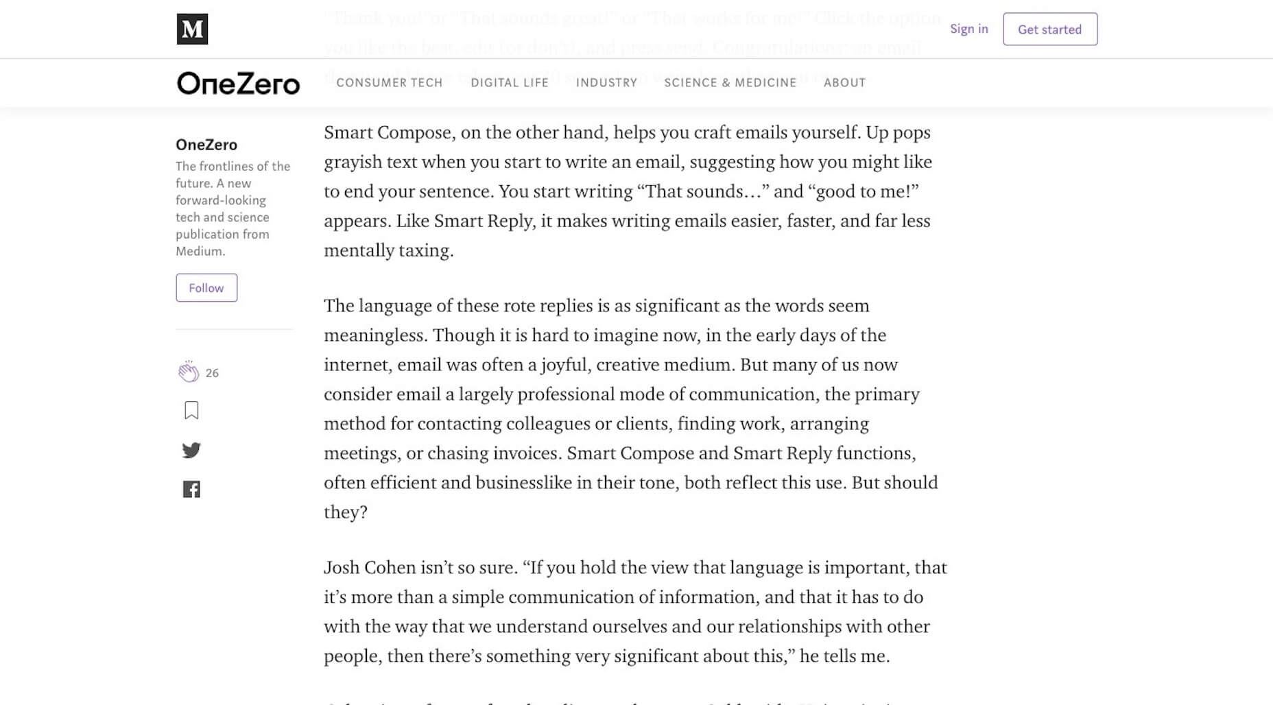
Content Is Too Simplistic
Spend enough time on Medium and you’ll quickly realize the content is mostly in the form of very basic thought pieces. When you look at its editor, you can see why that is:
I know that for my own content, that would never fly.
I write about web design and development, which means a lot of my content includes relevant screenshots of what I’m talking about along with code snippet suggestions. I also write in a way that makes my content easy to scan on the page (e.g. header tags, bulleted lists, quote callouts) and easy to index for search (e.g. metadata, keyword density, schema markup).
I suspect the same would be true for someone like yourself. If you’re in the business of designing or developing solutions for the web, your content should be a reflection of that. And the capabilities provided by Medium just won’t allow for that:
That’s it. Even with these options, your controls are incredibly limited. For example, this is what a basic image upload looks like:
It’s not terrible. But what happens when you want to turn it into a full-page banner image at the top of the post or as a section break?
It’s way too big and, unfortunately, you have absolutely no control over the element.
Then, there’s this issue with video:
For starters, Medium never asked my permission about tracking and cookies, which is a violation of GDPR. Secondly, this looks terrible and now requires readers to take an extra step in order to watch your video. Why add friction where there doesn’t need to be any?
You Still Have to Build and Manage Your Own Website
If you’re writing content for the purposes of marketing your business, you need to have a website. And for web design and development professionals, that’s non-negotiable.
While a well-known platform like Medium might help you get content in front of a much larger audience when your own blog is brand new, why split your time working across two platforms — especially when one of them is going to cannibalize traffic from your own website?
you get to control the flow of traffic into and around your own website
I get why people find Medium’s hosted blogging solution attractive. However, businesses need websites. And while it does take time to build up enough link juice in Google, it’s totally worth it to host content from your own website.
Not only do you remove all of the distractions that divert attention away from your brand, you also have a chance to educate visitors about your business and what you do. On Medium, you can’t share your portfolio. You can’t give them a means to contact you through a form or live chat. You can’t explain your services and pricing.
And, finally, with a self-hosted website, you get to control the flow of traffic into and around your own website. You have total control of the performance of your pages. And you get to peek behind the curtain. Medium only tells you what’s happening with views, reads, and followers. There are more important KPIs that should guide your online marketing efforts.
Wrap Up
If you’re really struggling to get your content into the hands of a larger audience, I get the urge to throw it onto Medium until your website makes a splash. But be careful.
It’s clear that things are on the downswing for Medium
The company just underwent a big round of layoffs, switched to a subscription model, and many suspect that it’s moved its algorithm to prioritize content from paying partners over other writers. It’s clear that things are on the downswing for Medium.
If you’re really desperate to grow your readership, continue to publish content to your own website. Then, seek out guest blogging opportunities on high-authority websites where your audience will be. You’ll have more control over the appearance of your content and your brand will have greater visibility in the long run.
useReducer is one of a handful of React hooks that shipped in React 16.7.0. It accepts a reducer function with the application initial state, returns the current application state, then dispatches a function.
What’s the good for? Well, think about any situation where having the first loaded state of the application might be nice. Let’s say the starting point on an interactive map. Maybe it’s an app that lets the user build a custom car with custom options from a default model. Here’s a pretty neat demo of a calculator app that puts useRedcuer to use in order to reset the calculator to a default state of zero when clearing it out.
We’re going to dig into a couple more examples in this post, but let’s first look at the hook itself to get a better idea of what it is and what exactly it does when it’s used.
The almighty reducer
It’s tough to talk about useState without also mentioning JavaScript’s reduce method. We linked it up at the very top, but Sarah’s post is an excellent overview of reducers and helps set the state for where we’re going here.
The first and most important thing to understand about a reducer is that it will always only return one value. The job of a reducer is to reduce. That one value can be a number, a string, an array or an object, but it will always only be one. Reducers are really great for a lot of things, but they’re especially useful for applying a bit of logic to a group of values and ending up with another single result.
So, if we have an array of numbers, reduce will distill it down to a single number that adds up for as many times as there are values. Say we have this simple array:
const numbers = [1, 2, 3]
…and we have a function that logs each time our reducer makes a calculation into the console. This will help us see how reduce distills the array into a single number.
const reducer = function (tally, number) {
	console.log(`Tally: ${tally}, Next number: ${number}, New Total: ${tally + number}`)
	return tally + number
}
Now let’s run a reducer on it. As we saw earlier, reduce takes dispatches a function that runs against a default state. Let’s plug our reducer function and an initial value of zero in there.
const total = numbers.reduce(reducer, 0)
Here’s what gets logged to the console:
"Tally: 0, Next number: 1, New Total: 1"
"Tally: 1, Next number: 2, New Total: 3"
"Tally: 3, Next number: 3, New Total: 6"
See how reduce takes an initial value and builds on it as each number in the array is added to it until we get a final value? In this case, that final value is 6.
I also really like this (modified) example from Dave Ceddia that shows how reduce can be used on an array of letters to spell a word:
var letters = ['r', 'e', 'd', 'u', 'c', 'e'];

// `reduce` takes 2 arguments:
//   - a function to do the reducing (you might say, a "reducer")
//   - an initial value for accumulatedResult
var word = letters.reduce(
	function(accumulatedResult, arrayItem) {
		return accumulatedResult + arrayItem;
	},
''); // <-- notice this empty string argument: it's the initial value

console.log(word) // => "reduce"
useReducer works with states and actions
OK, that was a lot of refresher to get what we’re really talking about: userReducer. It’s important to get all this, though, because you may have noticed where we’re going now after having seen the way reduce fires a function against an initial value. It’s the same sort of concept, but returns two elements as an array, the current state and a dispatch function.
What’s up with that third init argument? It’s an optional value that will lazily create the initial state. That means we can calculate the initial state/value with an init function outside of the reducer instead of providing an explicit value. That’s handy if the initial value could be different, say based on a last saved state instead of a consistent value.
To get it working, we need to do a few things:
Define an initial state.
Provide a function that contains actions that update the state.
Trigger userReducer to dispatch an updated state that’s calculated relative to the initial state.
The classic example of this a counter application. In fact, that’s what React’s docs use to drive the concept home. Here’s that put into practice:
It’s a good example because it demonstrates how an initial state (a zero value) is used to calculate a new value each time an action is fired by clicking either the increase or decrease button. We could even throw in a “Reset” button in there to clear the total back to the initial state of zero.
In this example, we are making the assumption that the user has selected a car to purchase. However, we want the app to allow the user to add extra options to the car. Each option has a price that adds to the base total.
First, we need to create the initial state which will consist of the car, an empty array to keep track of features, and an additional price that starts at $26,395 and a list of items in the store, so the user can pick what they want.
When the user selects the item she wants, we update the features for the car, increase the additionalPrice and also remove the item from the store. We ensure that the other parts of the state remain as they are.
We do something similar when a user removes an item from the features list – reduce the additional price, return the item to the store.
Here is how the App component looks like.
The actions that get dispatched contains the details of the selected item. We make use of the action type to determine how the reducer function will handle the updating of the state. You can see that the rendered view changes based on what you do – buying an item from the store removes the item from the store and adds it to the list of features. Also, the total amount gets updated. No doubt, there are some improvements that can be done to the application, this is only for learning purpose.
What about useState? Can’t we use that instead?
An astute reader may have been asking this all along. I mean, setState is generally the same thing, right? Return a stateful value and a function to re-render a component with that new value.
const [state, setState] = useState(initialState);
We could have even used the useState() hook in the counter example provided by the React docs. However, useReducer is preferred in cases where state has to go through complicated transitions. Kent C. Dodds wrote up a explanation of the differences between the two and (while he often reaches for setState) he provides a good use case for using userReducer instead:
If your one element of your state relies on the value of another element of your state, then it’s almost always best to use useReducer
For example, imagine you have a tic-tac-toe game you’re writing. You have one element of state called squares which is just an array of all the squares and their value[.]
My rule of thumb is to reach for useReducer to handle complex states, particularly where the initial state is based on the state of other elements.
Oh wait, we already have Redux for this!
Those of you who have worked with Redux already know everything we’ve covered here and that’s because it was designed to use the Context API to pass stored states between components — without having to pass props through other components to get there.
So, does useReducer replace Redux? Nope. I mean, you can basically make your own Redux by using it with the useContext hook, but that’s doesn’t mean Redux is useless; Redux still has plenty of other features and benefits worth considering.
Where have you used userReducer? Have you found clear-cut cases where it’s better than setState? Maybe you can experiment with the things we covered here to build something. Here are a few ideas:
A calendar that focus at today’s date but allows a user to select other dates. Maybe even add a “Today” button that returns the user to today’s date.
You can try improving on the car example – have a list of cars that users can purchase. You might have to define this in the initial state, then the user can add extra features they want with a charge. These features can be predefined, or defined by the user.
I recently wrote a blog post for a web designer client about page speed and why it matters. What I didn’t know before writing it was that her agency was struggling to optimize their mobile websites for speed. As a result, she came back to me concerned with publishing a post on a strategy her agency had yet to adopt successfully.
She was torn though. She understood how important mobile page speeds were to the user experience and, by proxy, SEO. However, their focus has always been on making a great-looking and effective design. Something like page speed optimization was always left to the developers to worry about.
In the end, we decided to hold on publishing it until they could get their own website as well as their clients’ sites properly optimized. In the meantime, it got me thinking:
Is there anything designers can do when creating mobile websites to help developers optimize for speed?
To me, this is a lot like how search optimization is handled. As a writer, I take care of the on-page optimizations while the developer I hand content over to does the technical SEO stuff. Web designers and developers can easily tackle the parts of speed optimization that are in each of their wheelhouses.
Understanding What “Slow” Means On The Mobile Web
There are a number of tools to help you analyze page speeds and implement various fixes to improve them. One tool that’s particularly helpful is called Lighthouse. The only thing is, it’s meant for web developers.
Instead, I suggest that web designers use another Google testing tool called Test My Site.
Test My Site is a mobile page speed testing tool from Think with Google. (Source: Test My Site) (Large preview)
This is strictly for those who want to get a quick evaluation of their mobile site speed. All you need to do is enter your domain name into the field and let the test run.
An example of your page speed test results from Test My Site. (Source: Test My Site) (Large preview)
What I like about this tool compared to other site speed tests is that it’s all spelled out for you in layman’s terms. In this case, my website is “slow”, even when served on 4G networks. Although we’ve been told for years that visitors are willing to wait three seconds for a web page to load, Google considers 2.9 seconds too long. (Which I wholeheartedly agree with.)
You can get an expanded report from Google that tells you how to speed up your mobile loading times, but the suggestions are no different than the updates you’d make on the development side. For example:
Think with Google suggests the typical page speed optimizations. (Source: Test My Site) (Large preview)
We already know this. However, if you (or your developer) haven’t yet implemented any of these fixes, this is a good checklist to work off of.
That said, I didn’t point you to this tool so you could keep doing the same optimizations over and over again, expecting the same result. What is it they always say about the definition of insanity?
Instead, I think you should use this as a quick gut check:
And if you want to really drive that point home, scroll to the bottom of the Test My Site analysis page and run your numbers through the impact analysis calculator:
If you aren’t completely convinced that you need to take your 3-second mobile speed down any further, look at the financial impact just .5 seconds would have on your monthly bottom line.
What Web Designers Can Do To Optimize Mobile Sites For Speed
Let the web developer handle all of the necessary speed optimizations like caching and file minification while you take on the following design tips and strategies:
1. Host Fonts From A CDN
There’s enough you have to worry about when it comes to designing fonts for the mobile experience that you probably don’t want to hear this… but custom web fonts suck when it comes to loading. In fact, there are two recent case studies that demonstrate why custom web fonts are detrimental to page loading speeds.
Thankfully, a CDN could end up being your saving grace.
The Downtime Monkey Example
The first comes from Downtime Monkey. In this case study, Downtime Monkey boasts a page speed improvement of 58% through a variety of optimizations — two of which pertained to how they served fonts to their site.
For their Font Awesome icons, they decided to host them from a CDN. However, Font Awesome’s own CDN proved unreliable, so they switched to the Bootstrap CDN. As a result, this saved them between 200 and 550 milliseconds per page load.
For their Google Font “Cabin”, they decided to host it from the Google CDN. What’s funny to note, however, is that when they ran a page speed test on the site afterwards, they received an optimization suggestion related to the font.
It seems that the link they put in the head of their site was slowing down the rendering of the page. So, they had to implement a workaround that would allow the font to load asynchronously without harming the display of the page as it loaded. They used Web Font Loader to fix the issue and ended up saving between 150 and 300 milliseconds per page load as a result.
Brian Jackson’s Test
Brian Jackson, the Chief Marketing Officer at Kinsta, wrote a post for KeyCDN that demonstrates the best way to serve custom web fonts on a website.
You can see in his example that he suggests a number of optimizations, like limiting which styles and character sets are available for use on the website. However, it’s his experimentation with CDN hosting that’s really interesting.
First, he isolated the most popular Google Fonts and tested how quickly they loaded through Google’s CDN:
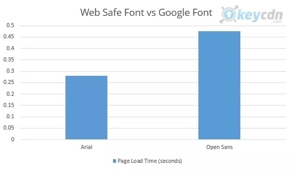
But that shouldn’t automatically make Open Sans the best choice if you’re trying to speed up your website. After all, Opens Sans is a Google Font that has to be served from Google’s servers. When compared against Arial, a web-safe font that isn’t pulled from an external source, this is what happened:
A comparison of loading speeds between Arial and Open Sans. (Source: KeyCDN) (Large preview)
Arial beat Open Sans by almost 200 milliseconds.
Before we move on, I’ll just say that this is one way to solve the slow-loading font dilemma: rather than use externally hosted fonts, use your system ones. They might not be as exciting to design with, but they won’t force users to sit around and wait for your website to load, costing you visitors and customers in the process.
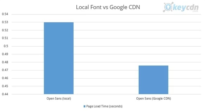
You might be thinking that downloading and hosting your Google font would make more sense then. That way, you don’t have to compromise on which fonts you use and it’ll shave time off of their normal loading speeds. Right?
Well, Brian was curious about that, too, so he did a test:
A comparison between Open Sans hosted locally vs. hosted on Google CDN. (Source: KeyCDN) (Large preview)
When served from a local server, Open Sans took 0.530 milliseconds to load. It’s not a huge difference, but it’s obviously not the right direction to go in.
So, what’s the conclusion? Well, you have a few options.
You can use a web safe font and avoid the issues that come with using externally hosted fonts in the first place.
You can use a Google font and make sure it’s hosted through Google’s CDN.
You can download a Google font and upload it to your own CDN (if you can get it loading faster from there, that is).
Either way, hosting your fonts and icons from a location where they’ll load more quickly can help you optimize your website for performance.
2. Stop Using Cumbersome Design Elements
The following list is somewhat of a rehashing of topics that have been covered before, so I don’t want to waste your time trying to recreate the wheel here. However, I do think this strategy of removing unnecessary design elements (especially weightier ones) to optimize the mobile experience is one worth summarizing here:
For starters, advertisements are served from a third party. Any time you have to call on another party’s servers, you’re further increasing your own loading times as you wait for them to deliver the content to your page.
Statista data on the usage of ad-blocking technology in the U.S. (Source: Statista) (Large preview)
Instead, use monetization methods that move the advertising away from your website, increase your own on-site conversions and won’t drain your server’s resources:
Remarketing
Let your tracking pixel follow visitors around the web and then serve your own ads on someone else’s site.
PPC
There’s good money to be made if you can nail the pay-per-click advertising formula in Google.
Social media ads
These are especially easy to run if your site is publishing new content on a regular basis and you have a compelling offer.
Stop With Pop-Ups
I know that Google says that mobile pop-ups are okay in certain instances. However, if you’re building a website with WordPress or another content management system and you’re using a plugin to create those pop-ups, that’s going to slow down your loading times. It might not be by much, but you’ll notice the difference.
ThemeIsle decided to do some analysis of how certain plugins affect WordPress website speeds. Here is what happened when they tested the effects each of these plugins had on the loading time:
Base loading time (in seconds)
Loading time after install (in seconds)
Change in %
Security plugins
0.93 s
1.13 s
21.50%
Backup plugins
0.93 s
0.94 s
1.07%
Contact form plugins
0.93 s
0.96 s
3.22%
SEO plugins
0.93 s
1.03 s
10.75%
E-commerce plugins
0.93 s
1.22 s
31.10%
Granted, some plugins are coded to be more lightweight than others, but there will always be some sort of difference felt in your loading times. Based on this data, the difference could be as small as .01 and as much as .29 seconds.
If you know that pop-ups aren’t really kosher on the mobile web anyway, why push your luck? Instead, take that promotional offer, cookie notice or announcement and place it on your web pages.
Stop With Cumbersome Contact Channels
Don’t forget about your website’s contact channels. In particular, you have to be careful about designing mobile forms. Of course, part of that has to do with how long it actually takes a user to fill one out. However, there’s also what a lengthy or multi-page form does to your loading speeds that you should think about.
In general, your mobile forms should be lean — only include what’s absolutely necessary.
There is an alternate school of thought to consider as well.
You could ditch the contact form altogether, something I discussed when talking about the trend of replacing mobile forms with chatbots. There are websites that have removed their forms and left information like FAQs, email addresses and phone numbers for visitors to use if they need to get in touch. That would certainly lighten things up from a loading standpoint. I just don’t know if it would be ideal for the user experience.
3. Create A Single-Page Website
The above tips are going to be the simplest and quickest ones to implement, so you should definitely start there if a client or web developer comes to you with issues of too-slow websites. However, if page speed tests still show that a site takes more than 2.5 seconds to load, consider a different approach to redesigning a website for the purposes of speed optimization.
“Single page sites typically convert much easier to mobile and users find them simple to navigate.”
But does that mean that a single-page website will always load more quickly than a multi-page website? Of course not. However, most professional designers choose a single-page design over multi-page for very specific purposes. DevriX has a nice graphic that sums this up:
DevriX sums up the limitations of single-page websites. (Source: DevriX) (Large preview)
To be clear, I’m not suggesting that you turn your website into a single-page application (SPA). If you want to speed up your client’s digital property with service workers, a PWA is a better solution. (More info on that in the next point.)
Instead, what I’m suggesting is that you convert a multi-page website into a single-page one if your client fulfills certain criteria:
Businesses with an extremely narrow and singular focus.
Websites that don’t require much content to get their point across.
A limited range of keywords you need to rank for.
That said, if you are designing a website that fits within those three criteria (or at least two out of three), you could realistically move your website to a more simplistic single-page design.
Because single-page websites force you to do more with less, the limited content and features naturally create a lightweight website. Even if you did push the limits slightly, you could still create a faster-loading website for mobile as Tempus does:
Test My Site reports that the Tempus website loads in 2.1 seconds. (Source: Test My Site) (Large preview)
What’s cool about this single-page website is that it doesn’t skimp on the extensive imagery needed to sell luxury homes. And, yet, its mobile site loads in 2.1 seconds.
On the other hand, not all single-page websites are built with speed in mind. Take developer Davide Marchet‘s website:
Test My Site reports that Davide Marchet’s website loads in 5.4 seconds. (Source: Test My Site) (Large preview)
Because it’s overloaded with animations, it takes 5.4 seconds for the page to load on mobile. You can even see this from the screenshot presented by Think with Google. The image seen there is actually the message that appears while the first animation loads in the background.
So, I would suggest being careful if you’re hoping to use a single-page design to solve your website’s performance woes. The design needs to be simple, super focused and unencumbered by scripts and animation effects that undo the benefits of trimming your content down to one page.
Speed is an inherent part of progressive web apps thanks to the service workers they’re built with. Because service workers exist outside of the web browser and are not contingent on the speed of the user’s network, they load cached content for visitors more quickly.
I would also say that because the design of a PWA more closely resembles that of a native mobile app (at least the shell of it), this forces the design itself to be more trimmed-back than a mobile website.
If you’re struggling to speed up your website after implementing all of the traditional performance optimizations you’re supposed to, now would be a good time to turn your mobile website into a PWA.
Let me show you why:
Imagine you are planning a trip to Chicago with a friend. You’re out at a bar or coffee shop discussing the trip, then realize you have no idea where to stay. So, you do a search for “downtown Chicago hotels” on one of your smartphones.
You’re not thinking about purchasing a room yet; you just want to research your options. So, you click on the website links for two of the top listings Google provides you.
For starters, the PWA is a much better looking and easier to navigate on your smartphone, so it’s going to win major points there. There’s also the matter of speed:
Test My Site compares the two competing hotels’ loading speeds. (Source: Test My Site) (Large preview)
The River North Hotel loads in 2.4 seconds on mobile whereas its Hilton competitor loads in 4 seconds. (You can actually see in the Hilton screenshot that the site hadn’t completely loaded yet.) That’s a difference that visitors are sure to notice.
Even if we’re not doing a side-by-side comparison between the competing websites, the River North Hotel’s PWA blows its former mobile website out of the water.
Brewer Digital Marketing, the agency that developed the PWA for them, shared what happened after they made the switch over. The hotel saw a 300% increase in earnings and a 500% increase in nights booked with the PWA.
5. Convert Your Website Or Blog Into AMP
We have Google to thank for another speedy design trick for the mobile web. This one is called Accelerated Mobile Pages, or AMP, for short.
Initially, AMP was released to help publishers strip down their blog or news pages for faster loading on mobile devices. However, AMP is a web component framework you can use to design whole websites or just specific parts of them (like blog posts). Once implemented, pages load almost instantaneously from search.
Why is AMP so fast to load? There are a number of reasons:
With AMP, you can only load asynchronous JavaScript and inline CSS on your website, which means that your code won’t block or delay page rendering.
Images are also another source of slower loading times. However, AMP solves that issue by automatically loading the page layout before the resources (e.g. images, ads, etc.) Think of it as a form of lazy loading.
There’s a lot more to it, but the basic idea is that it cuts out the elements that tend to drag websites down and forces designers to mostly depend on lightweight HTML to build their pages.
If you want to see an example of this in action, you can look at pretty much any leading digital magazine or news site. If you’re unfamiliar with AMP content, simply look for the lightning bolt icon that appears next to the web page name in Google search. Like this:
Pages with the recognizable lightning bolt symbol were created using Google AMP. (Source: Google AMP) (Large preview)
This Gizmodo AMP page loaded almost instantly from search results. (Source: Gizmodo) (Large preview)
In fact, when Gizmodo made the transition to AMP back in 2016, it saw huge lifts in terms of performance. Its page speeds increased by 300% and it got 50% more page impressions as a result.
Mobify reports on the loading times of AMP (Source: Mobify)
Then, sustain those fast-loading times with the PWA:
Subsequent Page Loads On PWA
Percent of Websites
Load Time (seconds)
10%
0.6
20%
0.8
50%
1.4
60%
1.8
80%
3.0
90%
4.5
95%
6.2
Mobify reports on the loading times of PWAs (Source: Mobify)
Just be careful with AMP and PWAs.
Look at the tables above and you’ll see that some sites have implemented these speedy design tactics and they still don’t beat Google’s 2.5-second benchmark for mobile loading. Just because there is a promise of faster-loading web pages with both, that doesn’t necessarily mean your website will automatically be lightning-fast.
Wrapping Up
As Google does more to reward mobile websites over desktop, this isn’t really a matter you can table for much longer. All versions of your website — but mobile especially — must be optimized for the user experience.
That means the design, the code, the content and everything else within and around it must be optimized. Once the developer has taken care of the traditional performance optimizations to speed up the website, it’s time for the designer to make some changes of their own. In some cases, simple changes like how fonts are served through the website will help. In other cases, more drastic matters may need to be considered, like redesigning your website as a PWA.
First, consider how slowly your client’s website is loading. Then, examine what’s causing the biggest issue on mobile. Trim the fat, bit by bit, and see what you can do as a designer to complement the developer’s technical speed optimizations.
I was trying to research the landscape of these the other day — And by research, I mean light Googling and asking on Twitter. Weirdly, very little comes to mind when thinking about spam detection APIs. I mean some kind of URL endpoint, paid or not, where you can hit it with a block of text and whatever metadata it wants and it’ll tell you if it’s spam or not. Seems like something an absolute buttload of the internet could use and something companies of any size could monetize or offer free to show off their smart computer machines.
It also has a generic API. There are libraries for Dart, JavaScript, PHP, Python, Ruby, Go, etc, as well as plugins for other CMSs. So if you use a different CMS or have your custom app, you can still use Akismet for spam detection.
After you get an API key, you can POST to a URL endpoint with all the data it needs and it’ll respond true if it’s spam or false if it’s not.
To get better results over time, you can also submit content telling it if it’s spam or ham (ham is the opposite of spam… good content).
There is a lot to like here, like the fact that it’s free and returns a JSON response like you might be used to in development. There is the fancy buzzword “Machine Learning” being used here, too. It makes me think that with lots of people using this, it’ll get smarter and smarter as it goes. But there is no way to submit ham/spam, so I’m not sure that’s really the case.
There is other stuff that makes me nervous. It’s clearly on Heroku which is kinda expensive at scale, and so with no pricing model it seems like it could go away anytime. Sorta feels like a fun-but-abandoned side project. Last commit was two years ago, as I write.
OOPSpam
OOPSpam looks super similar to Plino, but has a pricing model, which is nice. They publish their latency, which is over two seconds. I haven’t compared that to the others so I have no idea if they are all that slow. Two seconds seems like a lot for an API call to me, but maybe it’s not that big of a deal since it’s an async submit?
CleanTalk
CleanTalk has a clear pricing structure and appears to have plenty of customers, which is a plus to me. The website looks a little janky though, which makes me worry a little.
(Sorry if that’s a little rude, but it’s just mental math to me. Good design is one of the least expensive investments a company can make to increase trust, so companies that overlook it make me wonder.)
It looks like they have a variety of anti-spam solutions though, which is interesting. For example, you can ask an API to see if an IP, email, or domain is on a blacklist, which is a pretty raw way of blocking bad stuff, but useful for stuff like protecting against spam registrations (rather than just checking blocks of text). They also have a firewall solution, which is interesting for folks trying to block spam before it even touches their servers.
Email options…
There are a couple out there that seem rather specific to testing emails. As in, testing your own emails before you send them to make sure they aren’t considered spam by email services. Here are a couple I cam across while looking around:
Here’s an interesting post by Rich Harris where he’s made a list of some of the problems he’s experienced in the past with web components and why he doesn’t use them today:
Given finite resources, time spent on one task means time not spent on another task. Considerable energy has been expended on web components despite a largely indifferent developer population. What could the web have achieved if that energy had been spent elsewhere?
The most convincing part of Rich’s argument for me is where he writes about progressive enhancement and the dependence on polyfills for using web components today. And I’m sure that a lot of folks disagree with many of Rich’s points here, and there’s an awful amount of snark in the comments beneath his post, but it’s certainly an interesting conversation worth digging into. For an opposing perspective, go read the very last paragraph in the last installment of our Web Components Guide, where author Caleb Williams suggests that there’s no need to wait to use web components in projects:
These standards are ready to adopt into our projects today with the appropriate polyfills for legacy browsers and Edge. And while they may not replace your framework of choice, they can be used alongside them to augment you and your organization’s workflows.
But all of this is a good reminder that hey: web components are a thing that we should be able to freely criticize and talk about without being jerks. And I think Rich does that pretty well.


