React has a built-in hook called useEffect. Hooks are used in function components. The Class component comparison to useEffect are the methods componentDidMount, componentDidUpdate, and componentWillUnmount.
useEffect will run when the component renders, which might be more times than you think. I feel like I’ve had this come up a dozen times in the past few weeks, so it seems worthy of a quick blog post.
import React, { useEffect } from 'react';

function App() {
  useEffect(() => {
    // Run! Like go get some data from an API.
  });

  return (
    <div>
      {/* Do something with data. */}
    </div>
  );
}
In a totally isolated example like that, it’s likely the useEffect will run only once. But in a more complex app with props flying around and such, it’s certainly not guaranteed. The problem with that is that if you’re doing something like fetching data from an API, you might end up double-fetching which is inefficient and unnecessary.
The trick is that useEffect takes a second parameter.
The second param is an array of variables that the component will check to make sure changed before re-rendering. You could put whatever bits of props and state you want in here to check against.
Or, put nothing:
import React, { useEffect } from 'react';

function App() {
  useEffect(() => {
    // Run! Like go get some data from an API.
  }, []);

  return (
    <div>
      {/* Do something with data. */}
    </div>
  );
}
That will ensure the useEffect only runs once.
Note from the docs:
If you use this optimization, make sure the array includes all values from the component scope (such as props and state) that change over time and that are used by the effect. Otherwise, your code will reference stale values from previous renders.
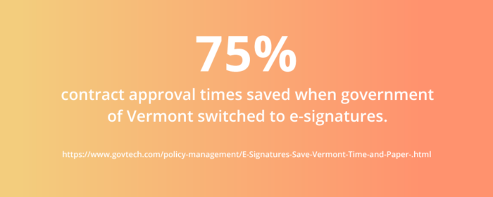
The government of Vermont cut contract approval times by 75 percent when it switched to electronic signatures. Weeks of work became days. Hours of administration turned into minutes. Workers skipped printing, costly couriers, waiting around, and filing.
A small change, like a signature, can prove powerful — 75 percent powerful. Is your organization ready to cut inefficiencies by three-quarters or more?
Some pundits forecast the electronic signature market will grow to $2.02 billion by 2020. Every organization needs signatures, and every organization wants to optimize them.
E-signatures, as electronic signatures are also known, are replacing written signatures. Not only do they save time and money, but they also create less waste and are traceable, time stamped, and more secure. Most important, they’re legally equivalent to written signatures.
Traditional “wet” signatures have been with us for thousands of years. They came in many different forms, including stamps, marks, signs, and seals. However, traditional signatures are quickly becoming outdated as new technology reshapes our world. New ways of signing are simpler and easier. E-signatures are the future that citizens and consumers want, so you need to understand how they work.
Are electronic signatures legally binding? The short answer is yes. The long answer is: Different countries have different laws.
In the United States, the ESIGN Act states that electronic signatures are fully legal as long as all parties agree to use them. In addition to the ESIGN Act, the Uniform Electronic Transactions Act outlines state use of e-signatures. Similar legislation exists in the European Union.
Despite existing legislation, you might need to investigate further online. You can also consult legal counsel for more specific, country-by-country details.
In the United States, you can use an electronic signature for creating a law. Courts allow you to present an electronic signature as evidence in a court case. Moreover, a document, record, or contract can’t be denied just because it’s electronic.
Rest assured, choosing an electronic signature solution won’t harm your organization from a legal standpoint. However, providers must fulfill some conditions for an electronic signature to be legally valid:
Demonstrate the signer had definite intent to sign. For example, provide a clear option not to sign.
Prove the signer consented to conduct their business electronically. Most electronic signatures require you give consent before signing. Some might provide the option to complete the form on paper.
Clearly attribute the signature. This could include an email trail, IP address, or time stamp. Some providers have a two-step identification system for signers. Although this creates an extra step for the signer, it creates a higher standard of attribution.
Associate, or directly connect, the signature with the document being signed.
When you satisfy these requirements, an electronic signature will be legally binding. Remember that the above conditions might already be incorporated into a provider’s solution.
If electronic signatures are just as legal, why aren’t they used in every situation?
Exploring the legal framework
In some cases, an electronic signature is not perceived as appropriate. This might be the case for important documents and ceremonies such as adoption, divorce, and birth and death certificates. Multiple witnesses or a notary are sometimes required, nullifying the convenience of electronic signatures delivered remotely. Another reason for not using e-signatures is if signees aren’t computer literate.
Some key court cases have challenged and tested e-signature laws. Here are the precedents from four relevant cases:
O’Connor v. Uber. Even if an electronic signature is on a tiny iPhone screen, the signature is still valid.
Berkson v. Gogo. Web page design, hyperlink placement, and contract terms must not be designed to confuse or mislead signers.
Barwick v. Geico. The phrase “in writing” can refer to a signature written electronically.
Adams v. Quicksilver. Attribution of an electronic signature needs an auditable trail of data. Others shouldn’t be able to break into that data trail and make changes.
There’s much to learn from real-world examples. Electronic signatures feature in every part of our lives with success. Almost any industry can enjoy digitizing its sign-off procedures.
Examples of different uses
All sectors need contracts, agreements, and forms. You use them to start a company, run an employee background check, and hire subcontractors on a construction site. As a result, e-signatures are everywhere. Electronic signatures can fit in almost any industry, government, or legal application.
Here are a few cases where electronic signatures have proven successful:
Healthcare. For a hospital department, reducing the time it takes to get signatures from doctors, patients, and insurers is vital. In one radiology department, the time needed to get signatures for abdominal examinations dropped from 11 to three days. The time needed for signatures related to chest examinations dropped from 10 to five days. By using e-signatures to shorten or skip steps in employees’ workflow, productivity rose.
Without e-signatures, the future functions of healthcare — long-distance treatment, virtual hospitals, and medical e-commerce — cannot be easily achieved.
Industrial relations. Electronic signatures help traditional organizations get more organized. The same holds true for unions. With changes in policy regarding e-signatures, gathering employee information is much faster. E-signatures also link better with online social networks, helping spread the union’s reach. With e-signatures, unions can organize privately and with higher participation and impact.
Small to medium enterprises. When you’re a small fish competing with whales, it helps if you can swim fast and confirm prices as they change. Agility in commerce is highly valued and for good reason.
Speed can spread to other areas, such as faster sales cycles, product iteration, and more responsive customer service. E-signatures enable leaders to buy into agility and sign contracts minutes after they’re drafted.
Government. Petitions changed forever after the introduction of electronic signatures. Consider a public petition to cancel the United Kingdom’s Brexit deadline. It collected millions of signatures in a few months. Electronic petitions reach a wider audience and spread faster than their wet-signature equivalents.
Family law. One of the final frontiers for e-signatures, electronic wills have been legal in Nevada since 2001. Arizona and Indiana have followed suit. Most other states still require will creators to sign before two witnesses who also sign the document.
Disability services. The move to online information allows consumers with visual challenges to manage their business better. Handheld devices and desktop computers can enlarge document font size. Some consumers may opt to use a text-reader program to read text out loud.
Seniors. It’s a myth that older citizens don’t use online services, like e-signatures. About 42 percent of adults aged 65 and older have smartphones. That number is up from 18 percent in 2013. Internet use and home broadband adoption among this group have also risen. Today, 67 percent of seniors use the internet — a 55 percent increase in 20 years.
Finance. There are many different ways to use an electronic signature in finance. In the United States, credit and loan forms frequently allow e-signatures. Digital mortgages are becoming more commonplace. After February 2018, most states adopted national standards for online notarization.
According to a Federal Reserve survey, if faced with an unexpected expense of $400, four in 10 adults would either not be able to cover it or would cover it by selling something or borrowing money.
One option for covering such an expense is a signature loan, a popular method for borrowing money. The process of securing a signature loan can be improved by using e-signatures.
Electronic signature operations
What is a signature loan?
Personal lending is the fastest growing category of consumer lending. Outstanding balances in the United States rose about 18 percent to $120 billion in the first quarter of 2018.
A signature loan is a loan offered by a financial provider to an individual. These loans are sometimes known as “character loans” or “good faith loans.” The only collateral is the individual’s promise to pay and a signature.
Due to limited collateral, interest rates for signature loans can be high. They range anywhere from 5 to 30 percent and depend on the payer’s circumstances and credit record.
Signature loans are popular for debt consolidation. For example, imagine you have several large credit card debts accruing interest at rates of 20 percent or more. A bank might offer you a signature loan at a lower interest rate. After you pay off your credit cards with the loan, you then pay back the loan amount to the bank. You save money because the debts are consolidated and the interest on the loan is reduced.
Signature loans are also an alternative to a secured loan if you need to make a large one-time payment. In the wake of the 2008 credit crisis, signature loans became a popular choice because they don’t put your home equity at risk. However, because there’s no collateral, a financial provider might demand higher interest. Alternatively, they could demand a more stringent repayment schedule.
Before taking out a loan, always compare different financial providers, the products they provide, and the fees they charge. Shop around to find the best option for your situation. Repayment methods for signature loans can vary; they include
Variable rate. The interest rate is based on a changing index and can fluctuate over time.
Fixed rate. The interest rate remains the same for the life of the loan.
Payday. Also called cash advances, these small, short-term loans often have higher interest.
Convertible. This type of loan can convert into shares or stock and often has lower interest.
Single-payment. The principal and interest on this type of loan is repaid in one payment on an exact date.
Some financial providers, like SoFi, consider more information than a borrower’s credit score. They also consider your occupation, education, and the possibility of a cosigner.
By using e-signatures, online lenders can process applications immediately and furnish a decision within few minutes. Depending on the financial provider you choose, you can receive a signature loan within a few hours or by the next day.
E-signatures are not only useful for financial services. They’re now an everyday part of many software solutions, including Microsoft Office and Adobe products.
Adding or removing an electronic signature from a Microsoft Word or Adobe PDF document
While it might be 35 years old, Microsoft Office is still a dominant software suite in the business world. Keeping up with the times, Office products, such as Word, now integrate e-signatures into documents.
Signing Word files may seem daunting, especially if you’re used to pen and paper or you’re not familiar with the software. First-timers or anyone who needs a refresher on how to sign Word or PDF documents can benefit from this guide.
First of all, it’s important to understand the difference between electronic signatures and digital signatures. This guide discusses the electronic signature, the equivalent of your handwritten signature. An e-signature is merely an image of your signature overlaid on a Word or PDF document.
On the other hand, a digital signature is cryptographically secure data. It verifies that someone with your private signing key has seen the document and authorized it. It’s very secure, but it’s also more complicated. Digital signatures are the online equivalent to a notarized signature. Refer to the next section in this guide for more details on digital signatures.
Using an e-signature line in a Word document, you can request information about the signer and provide instructions. When an electronic copy goes to the signer, this person sees the signature line and a notification requesting their signature. The signer can
Type a signature
Select a picture of an inked signature
Write a signature by using the inking feature on a touchscreen computer or other device
How to create a signature line in Word or Excel (Office 365 or 2019):
In the document, place your cursor where you want a signature line.
On the Insert tab in the Text group, click the Signature Line list. Then, click Microsoft Office Signature Line.
In the Signature Setup dialog box, type the information that will appear beneath the signature line:
Suggested signer: the signer’s full name
Suggested signer’s title: the signer’s title, if any
Suggested signer’s email address: the signer’s email address, if needed
Instructions to the signer: instructions for the signer, such as “Before signing the document, verify that the content is correct”
Select one or both of the following checkboxes:
Allow the signer to add comments in the Sign dialog box: The signer can type in the purpose for signing.
Show sign date in signature line: The date the document was signed will appear with the signature.
To add additional signature lines, repeat these steps.
If the document remains unsigned, the Signatures Message bar appears. Click View Signatures to complete the signature process.
To remove electronic signatures from Word or Excel, follow these steps:
Open the document or worksheet that contains the electronic signature you want to remove.
Right click the signature line.
Click Remove Signature.
Click Yes.
In addition, you can remove a signature by clicking the arrow next to the signature in the Signature Pane and then clicking Remove Signature.
Alternatively, you might require an electronic signature in a PDF document. See the next section for how to use e-signatures in PDF files.
Electronically signing a PDF file
Adobe’s Portable Document Format (PDF) is a common format for fixed-layout documents. Like Word, Adobe PDF has added a range of capabilities since it was introduced to the market in 1993. It’s now possible to electronically sign a PDF file for authentication.
If you’re a Windows user, you’re probably familiar with PDF readers. They are computer programs that allow you to open PDF files, that is, files with the .pdf file extension. The most popular option these days is Adobe Acrobat Reader.
Knowing how to sign PDF documents will give you an edge in today’s online world. For more of an advantage, you may need to be familiar with the language and technology surrounding digital innovations. The next section will look at one of the most confusing aspects of e-signatures.
The difference between e-signatures and digital signatures
“The [Digital Signature] Standard specifies a suite of algorithms that can be used to generate a digital signature. Digital signatures are used to detect unauthorized modifications to data and to authenticate the identity of the signatory.” — National Institute of Standards and Technology
Digital signatures and electronic signatures might sound alike, but they’re quite different. Digital signatures are cryptographic “nuts and bolts.” An electronic signature might just be a typed word, ticked box, or recorded voice. A digital signature is technology that uses complex mathematics to encrypt and decrypt data. This behind-the-scenes encryption is what makes electronic signatures work.
Digital signatures use PKI as a way to verify the identity of a signer. PKI uses two keys, one public and one private, for unique identification. Both the sender and recipient have a digital certificate from a certificate authority. These digital certificates work together like a driver’s license or passport and an ID reader.
For example, Company One needs Alex to sign a contract renewal. During the process, Alex signs using her private key, which encrypts the contract. Alex also gives Company One her public key. If the public key provided to Company One cannot decrypt Alex’s signature, the digital signature is rejected.
Depending on which digital or electronic signature you’re using, you might need to take extra steps for additional security. For example, you can use two-factor authentication. When triggered, it attempts to authenticate your identity by sending a message to your mobile phone. It makes sure the person signing is you and not someone using your login or key.
You may not always need such a high level of security. For low-risk scenarios, there are simpler security options offered through electronic signature providers. Do low-security options affect the validity of a signature? Not necessarily. For example, an e-signature provider without a digital signature can still identify a valid audit trail. They could get it by examining IP address, time stamps, or browser information.
When choosing an e-signature or digital signature solution, your organization will need to balance the needs of security, time, and cost.
As mentioned previously, both e-signatures and digital signatures are legitimate signatures. According to the ESIGN Act, an electronic signature does not have to be a typed name. What other types of signatures are acceptable?
Other e-signature types
Along with digital signatures and e-signatures, other types of electronic signatures are becoming commonly available.
Click-to-sign. A click-to-sign signature is a situation where a single click of the mouse signs the document.
There are legal conditions to be aware of if you’re using a click-to-sign solution. With click-to-sign signatures, the legal principles of intent, consent, attribution, and association still apply. For example, the signer must intend to click and consent to doing business this way. The signature needs an auditable trail of data that attributes the signature to the individual. Finally, the data needs to be directly associated with the document.
Before using click-to-sign on your documents, check local laws regarding these signatures. In most of the United States, click-to-sign is legally binding. Across the border in Canada, investment dealers can use e-signatures.
Blockchain. Originally used in cryptocurrencies, blockchain is now finding uses in mainstream industries, such as monitoring supply chains in fashion. The technology is useful for determining the authenticity of transactions using a distributed ledger. Blockchain is great for maintaining accountability, for example, of currencies like Bitcoin. However, it may not be as useful for situations when an individual or organization wishes to be anonymous.
Biometric signatures. Biometric signatures use information about your body to verify authenticity. They add a part of your body that’s unique to you, such as
Fingerprints. Not just used at a crime scene or an airport anymore, fingerprints are now crucial to consumer technology. Fingerprint scanners are found on smartphones and on credit cards in the United Kingdom. While they provide extra security, they are not as safe as you might think. Researchers have developed “deep master prints” that can hack fingerprint scanners.
Hand geometry. This method calculates the finger lengths and palm size of users.
Eye scans. Eye scans analyze the patterns of blood vessels in the retina or colors and lines in the iris. These scans are difficult to fake because the patterns are unique to each person.
Face ID. Infrared dots shoot out and measure a unique 3D face image. Used in the iPhoneX, Apple claims Face ID is 20 times harder to break than its fingerprint scanner.
BioSig-ID. This authentication software captures unique movements and gestures as the signer draws a four-character password with a finger, stylus, or mouse.
While biometric signatures are harder to forge, they’re also harder to replace. For example, you can quickly create a new password if someone guesses yours. However, you can’t really come up with a new face if someone hacks your Apple Face ID.
Both complex and simpler types of signatures will continue to have their uses. The type of signature you choose will depend on the reason you need the signature. The level of security and sophistication should match the occasion.
In the next section, we’ll examine some common scenarios when you might need an e-signature.
When you need e-signatures most
Legally, you can use an electronic signature anytime you need a signature.
Practically, there are situations when you need simplicity, security, convenience, and a low cost. In these cases, you need an electronic signature.
Here are some more common scenarios when you need an e-signature:
When you need a simple and intuitive solution. Streamline your HR services with electronic signatures. Consider using them on time-sensitive documents, like time sheets, tax forms, and onboarding forms for new hires.
When you need high-level security. When dealing with highly personal information, you need 100-percent assurance. This could include retention or fee agreements, confidentiality agreements, or power of attorney agreements. In these cases, an e-signature could provide strong insurance through an auditable trail.
When you need convenience and speed. Legal services, such as class action communications, might have to go out to hundreds or thousands of people. A quick batch of e-signatures could save you hours or even days. In retail, you could use speedy e-signatures to make sales and sign purchase orders and invoices. It’s sure to impress technologically minded business associates and keep business moving.
When you need to lower costs. In finance, you’re always seeking to cut costs. With e-signatures, you could open, maintain, or close accounts at lower costs by eliminating shipping fees. Similarly, insurance companies can cut the costs of claim assessments or policy agreements by having customers sign online.
Collecting signatures via an online form can get rid of a lot of inconvenience. Instead of sending out forms and waiting for them to come back, you can receive signed documents from anyone at any time. To get that level of convenience, how can you set up signature forms on your website?
How can you apply e-signatures to your JotForm forms?
JotForm accepts electronic signatures, enabling you to authenticate, identify, and secure your form.
Creating an electronic signature for your form is simple. It only takes three steps:
In the Form Elements menu, add E-Signature to your form from the Widgets tab. The e-signature widget allows signers to draw their signature using a mouse, finger, or other input device. The widget requires no additional configuration, and you can resize it to fit your form layout.
Use the Properties menu to configure additional settings:
Required: requires a signature to submit the form
Hover Text: text that appears when the cursor hovers over the signature box
Sub Label: text that appears below the signature box
Duplicate: copies the field with all of the same settings
In the Advanced Properties tab, refine the look of your e-signature using
Question text
Shrink
Move to a new line
Hide field
Remember that signers must consent to provide their signature electronically for it to be legally binding. This also applies when they are completing your form. For example, if a signee makes a financial decision to subscribe to your service, you must establish clear consent. Otherwise, you could face legal action down the road.
The popularity of e-signatures continues to grow. Globally, the amount of e-signatures is projected to grow 34.7 percent annually. Which companies are embracing electronic signatures and offering new solutions?
Electronic signature apps and software
When selecting an e-signature provider, there are a few factors you should take into account:
Price. Some providers offer products exclusively for business and can be expensive. Others cater to lower budgets. Most offer multiple products and services and free introductory trials.
Security. Check the technical specifications the provider uses for identification and authentication. Not every company will use digital signatures. Another issue may be customer service availability — who is available to fix your problem if and when one occurs?
Experience. Has the provider worked with companies of your size in your industry? Read reviews from their customers.
Integration. How will the e-signature service work with your existing software? This could have a significant impact on your ability to streamline your workflow.
Also, be sure to look for solutions that include the features your organization needs. Depending on your business, you might need
Custom branding for your signatures
Scalability, depending on the size of your company and the number of users who will need to use the service
Regulatory compliance to meet the laws that govern your industry
Reporting, workflow visualizations, and dashboards for managers to track progress
Notifications and reminders that prompt signers to complete a signature
Mass signatures for sending out signatures to a large number of people at once
There are many e-signature providers available, and many will likely satisfy your needs. To find the best fit, check the features different companies provide and weigh them against your business needs.
Here is a rundown of the most popular e-signature providers on the market today:
Founded in 2003, DocuSign pioneered some of the key technologies used in e-signatures. Today, the company has more than 475,000 customers and hundreds of millions of users across the world.
You can use DocuSign’s cloud platform. DocuSign works on Mac and Windows, and it integrates with Google, Salesforce, and many other apps.
DocuSign offers excellent security and encryption solutions. It’s the only provider to be ISO 27001 and SSAE 16 certified. In addition, DocuSign also complies with the xDTM Standard — the transaction management standard for an open, digital world.
It all adds up to a first-class service at a first-class price. Individuals or casual users pay $10 per month. The standard plan for multiple users is $25 per user per month. If you’d like to try DocuSign, it’s also available as a 30-day trial.
Adobe Sign
Trusted name in software
Experienced and secure
Good for large organizations
As the second biggest player on the e-signature market, Adobe offers a trusted solution suited to professional use. In fact, many choose Adobe based simply on reputation. It’s one of the most well-known and trusted names in software.
In 1999, Adobe introduced some of the first digital signatures in Adobe Acrobat and Adobe Acrobat Reader. Since then, the company has worked with experts and certificate providers across the industry to create an open standard.
Today, Adobe is the “first global vendor to deliver open, standards-based digital signatures for web and mobile.” The company has worked with experts in the Cloud Signature Consortium to set up a new global standard.
Adobe Sign provides world-class compliance and authentication features built in. It’s also Microsoft’s preferred e-signature solution, so you can take care of signature tasks without ever leaving Office 365.
Pricing for a single user is $9.99 per month. For two to nine users, you’ll need to sign up for Adobe Sign Team, which costs $24.99 per person per month. The price for 10 or more users is $39.99 per user per month. A free 14-day trial is also available.
SignEasy
Mobile and simple
Fast and easy to use
Good for business use
SignEasy’s focus has been on mobility and simplicity. Founded in 2010, SignEasy features secure sockets layer (SSL) technology to encrypt all data transferred between the application on your device and their servers.
Reviews are very positive; however, some reviewers have noted slight interface glitches, lengthy loading times, and the lack of company branding options.
SignEasy uses secure servers at Amazon Web Services to store your files, and only you can access the files with your user credentials. SignEasy works with a variety of apps, including Gmail, Zoho, Google Drive, Dropbox, and Evernote. Users can also sign without leaving the applications they’re working in.
The price is on par with other solutions at $10 per month for individual users with limited needs. To access additional features, other individual plans are priced at $15–$20 per month. Finally, the rate for teams is $60 per month for up to three users. SignEasy also offers a 14-day trial.
KeepSolid Sign
Modestly priced
Simple to use
Offers useful templates
As the name implies, KeepSolid Sign is a sturdy mid-level solution for everyday mobile and multidevice needs. It’s a native app for iOS, macOS, Android, and Windows.
Established in 2013, this newer player on the market does not yet support digital certificates and digital signatures from a Certificate Authority. However, it’s not a lightweight on security. KeepSolid Sign comes with military grade AES-256 encryption.
In reviews, users have noted the handy templates that can reduce the time needed to prepare documents. Some reviewers have observed that the interface might not be suited for larger, more complex tasks.
In terms of cost, KeepSolid is relatively inexpensive. It comes with a 14-day trial, and the single-user rate is $9.99 per month. Teams with up to five members pay $34.99 per month, and larger teams of 10 or less pay $64.99 per month.
Secured Signing
A cheap solution for low-volume needs
Fast (according to reviews)
Versatile for individuals or business
Founded in 2008, this New Zealand-based company offers some impressive features.
Secured Signing includes a cloud-based digital signing service, including a signing workflow with invitations, automated reminders, and signing progress in real time. The X.509 digital signature technology that underpins Secured Signing ensures the authenticity of signees and documents.
While customer reviews stress that the program is fast, some have complained about a confusing interface, lack of features, and no mobile app.
The basic plan is free if you need to send three documents or fewer a month. For up to 10 documents a month, there’s a pay-as-you-go rate starting at $9.95 per month. For companies with higher volume, the team edition starts at $24.95 per month. The price varies based on the number of users and the number of documents sent.
OneSpan
More expensive
Long list of features
High customer satisfaction
Formerly eSignLive by VASCO, OneSpan emphasizes its record of working with governments and regulated industries. Founded in 1991, OneSpan has over 10,000 customers, including more than half of the world’s top 100 banks.
Customer reviews mention ease, flexibility, and security as some of the software’s positive qualities.
When it comes to maintaining trust and achieving the highest completion rates possible, brand consistency is a large concern for big organizations. For a reasonable cost, OneSpan allows companies to deliver highly personalized digital experiences that put their brands front and center.
OneSpan leverages its experience by offering a generous 30-day free trial. After that, it’s $20 per user per month.
Why electronic signatures are essential
Signatures have come a long way since early scratchings on cave walls. As history and technology have shaped society, our signatures have changed as well.
Electronic signatures have countless advantages over wet signatures — they’re fast, environmentally friendly, cheap, and traceable. E-signatures also have many uses in everyday life and business. Today, the market for e-signatures is growing thanks to global commerce, security concerns, and environmental awareness.
The world produces more than 400 million tons of cardboard and paper annually. You can help end the waste caused by printing documents to be signed. Your adoption of new technology will impress your staff while improving your business.
Ultimately, the focus should be on customer convenience. Consumers want more control and choices through online services. Banks have already learned this lesson: 40 percent of consumers say their mobile phone is their principal device for interacting with their bank.
Adapting to new technology is a challenge. However, technology offers many rewards and the opportunity to get more people excited about your organization. Don’t leave electronic signatures out of your operations. E-signatures not only make your operations faster and cheaper — they also make work that much easier.
Back in the first part of this series, we explained why this project came to be. Namely a desire to learn how a small web application could be made in vanilla JavaScript and to get a non-designing developer working his design chops a little.
In part two we took some basic initial designs and got things up and running with some tooling and technology choices. We covered how and why parts of the design changed and the ramifications of those changes.
In this final part, we will cover turning a basic web application into a Progressive Web Application (PWA) and ‘shipping’ the application before looking at the most valuable lessons learned by making the simple web application In/Out:
The enormous value of JavaScript array methods;
Debugging;
When you are the only developer, you are the other developer;
Design is development;
Ongoing maintenance and security issues;
Working on side projects without losing your mind, motivation or both;
Shipping some product beats shipping no product.
So, before looking at lessons learned, let’s look at how you turn a basic web application written in HTML, CSS, and JavaScript into a Progressive Web Application (PWA).
In terms of total time spent on making this little web-application, I’d guestimate it was likely around two to three weeks. However, as it was done in snatched 30-60 minute chunks in the evenings it actually took around a year from the first commit to when I uploaded what I consider the ‘1.0′ version in August 2018. As I’d got the app ‘feature complete’, or more simply speaking, at a stage I was happy with, I anticipated a large final push. You see, I had done nothing towards making the application into a Progressive Web Application. Turns out, this was actually the easiest part of the whole process.
Making A Progressive Web Application
The good news is that when it comes to turning a little JavaScript-powered app into a ‘Progressive Web App’ there are heaps of tools to make life easy. If you cast your mind back to part one of this series, you’ll remember that to be a Progressive Web App means meeting a set of criteria.
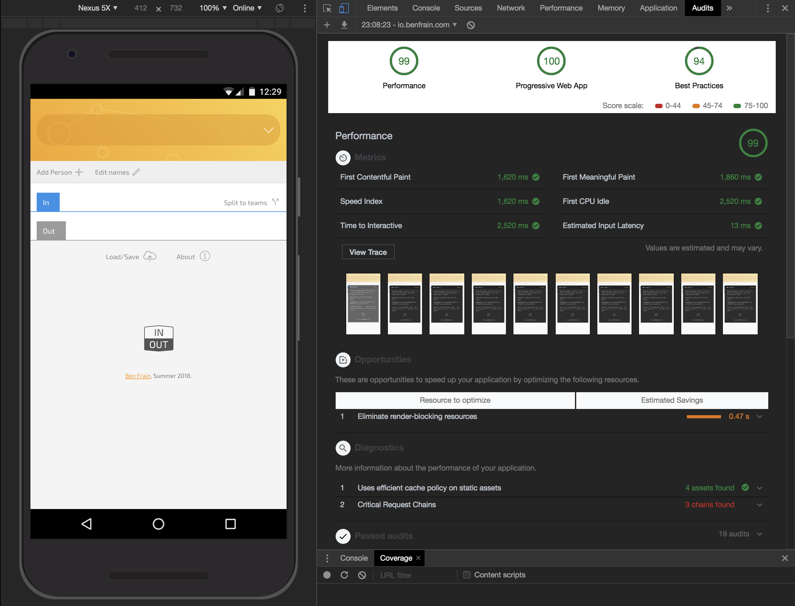
To get a handle on how your web-application measures up, your first stop should probably be the Lighthouse tools of Google Chrome. You can find the Progressive Web App audit under the ‘Audits’ tab.
This is what Lighthouse told me when I first ran In/Out through it.
Initial scores for Progressive Web App weren’t great. (Large preview)
At the outset In/Out was only getting a score of 55?100 for a Progressive Web App. However, I took it from there to 100?100 in well under an hour!
The expediency in improving that score was little to do with my ability. It was simply because Lighthouse told me exactly what was needed to be done!
Some examples of requisite steps: include a manifest.json file (essentially a JSON file providing metadata about the app), add a whole slew of meta tags in the head, switch out images that were inlined in the CSS for standard URL referenced images, and add a bunch of home screen images.
Making a number of home screen images, creating a manifest file and adding a bunch of meta tags might seem like a lot to do in under an hour but there are wonderful web applications to help you build web applications. How nice is that! I used https://app-manifest.firebaseapp.com. Feed it some data about your application and your logo, hit submit and it furnishes you with a zip file containing everything you need! From there on, it’s just copy-and-paste time.
Things I’d put off for some time due to lack of knowledge, like a Service Worker, were also added fairly easily thanks to numerous blog posts and sites dedicated to service workers like https://serviceworke.rs. With a service worker in place it meant the app could work offline, a requisite feature of a Progressive Web Application.
Whilst not strictly related to making the application a PWA, the ‘coverage’ tab of the Chrome Dev Tools were also very useful. After so much sporadic iteration on the design and code over months, it was useful to get a clear indication of where there was redundant code. I found a few old functions littering the codebase that I’d simply forgotten about!
In short order, having worked through the Lighthouse audit recommendations I felt like the teacher’s pet:
Lighthouse makes it easy to get good scores by telling you exactly what to change. (Large preview)
The reality is that taking the application and making it a Progressive Web Application was actually incredibly straightforward.
With that final piece of development concluded I uploaded the little application to a sub-domain of my website and that was it.
Retrospective
Months have passed since parking up development my little web application.
I’ve used the application casually in the months since. The reality is much of the team sports organization I do still happens via text message. The application is, however, definitely easier than writing down who is in and out than finding a scrap of paper every game night.
So, the truth is that it’s hardly an indispensable service. Nor does it set any bars for development or design. I couldn’t tell you I’m 100% happy with it either. I just got to a point I was happy to abandon it.
But that was never the point of the exercise. I took a lot from the experience. What follows are what I consider the most important takeaways.
Design Is Development
At the outset, I didn’t value design enough. I started this project believing that my time spent sketching with a pad and pen or in the Sketch application, was time that could be better spent with coding. However, it turns that when I went straight to code, I was often just being a busy fool. Exploring concepts first at the lowest possible fidelity, saved far more time in the long run.
There were numerous occasions at the beginning where hours were spent getting something working in code only to realize that it was fundamentally flawed from a user experience point of view.
My opinion now is that paper and pencil are the finest planning, design and coding tools. Every significant problem faced was principally solved with paper and a pencil; the text editor merely a means of executing the solution. Without something making sense on paper, it stands no chance of working in code.
The next thing I learned to appreciate, and I don’t know why it took so long to figure out, is that design is iterative. I’d sub-consciously bought into the myth of a Designer with a capital “D”. Someone flouncing around, holding their mechanical pencil up at straight edges, waxing lyrical about typefaces and sipping on a flat white (with soya milk, obviously) before casually birthing fully formed visual perfection into the world.
This, not unlike the notion of the ‘genius’ programmer, is a myth. If you’re new to design but trying your hand, I’d suggest you don’t get hung up on the first idea that piques your excitement. It’s so cheap to try variations so embrace that possibility. None of the things I like about the design of In/Out were there in the first designs.
I believe it was the novelist, Michael Crichton, who coined the maxim, “Books are not written — they’re rewritten”. Accept that every creative process is essentially the same. Be aware that trusting the process lessens the anxiety and practice will refine your aesthetic understanding and judgment.
You Are The Other Dev On Your Project
I’m not sure if this is particular to projects that only get worked on sporadically but I made the following foolhardy assumption:
“I don’t need to document any of this because it’s just me, and obviously I will understand it because I wrote it.”
Nothing could be further from the truth!
There were evenings when, for the 30 minutes I had to work on the project, I did nothing more than try to understand a function I had written six months ago. The main reasons code re-orientation took so long was a lack of quality comments and poorly named variables and function arguments.
I’m very diligent in commenting code in my day job, always conscientious that someone else might need to make sense of what I’m writing. However, in this instance, I was that someone else. Do you really think you will remember how the block of code works you wrote in six months time? You won’t. Trust me on this, take some time out and comment that thing up!
I’ve since read a blog post entitled, Your syntax highlighter is wrong on the subject of the importance of comments. The basic premise being that syntax highlighters shouldn’t fade out the comments, they should be the most important thing. I’m inclined to agree and if I don’t find a code editor theme soon that scratches that itch I may have to adapt one to that end myself!
Debugging
When you hit bugs and you have written all the code, it’s not unfair to suggest the error is likely originating between the keyboard and chair. However, before assuming that, I would suggest you test even your most basic assumptions. For example, I remember taking in excess of two hours to fix a problem I had assumed was due to my code; in iOS I just couldn’t get my input box to accept text entry. I don’t remember why it hadn’t stopped me before but I do remember my frustration with the issue.
Turns out it was due to a, still yet to be fixed, bug in Safari. Turns out that in Safari if you have:
* {
  user-select: none;
}
In your style sheet, input boxes won’t take any input. You can work around this with:
Which is the approach I take in my “App Reset” CSS reset. However, the really frustrating part of this was I had learned this already and subsequently forgotten it. When I finally got around to checking the WebKit bug tracking whilst troubleshooting the issue, I found I had written a workaround in the bug report thread more than a year ago complete with reduction!
Want To Build With Data? Learn JavaScript Array Methods
Perhaps the single biggest advance my JavaScript skills took by undergoing this app-building exercise was getting familiar with JavaScript Array methods. I now use them daily for all my iteration and data manipulation needs. I cannot emphasize enough how useful methods like map(), filter(), every(), findIndex(), find() and reduce() are. You can solve virtually any data problem with them. If you don’t already have them in your arsenal, bookmark https://developer.mozilla.org/en-US/docs/Web/JavaScript/Reference/Global_Objects/Array now and dig in as soon as you are able. My own run-down of my favored array methods is documented here.
ES6 has introduced other time savers for manipulating arrays, such as Set, Rest and Spread. Indulge me while I share one example; there used to be a bunch of faff if you wanted to remove duplicates from even a simple flat array. Not anymore.
Consider this simple example of an Array with the duplicate entry, “Mr Pink”:
Something that used to require hand-rolling a solution or reaching for a library is now baked into the language. Admittedly, on such as short Array that may not sound like such a big deal but imagine how much time that saves when looking at arrays with hundreds of entries and duplicates.
Maintenance And Security
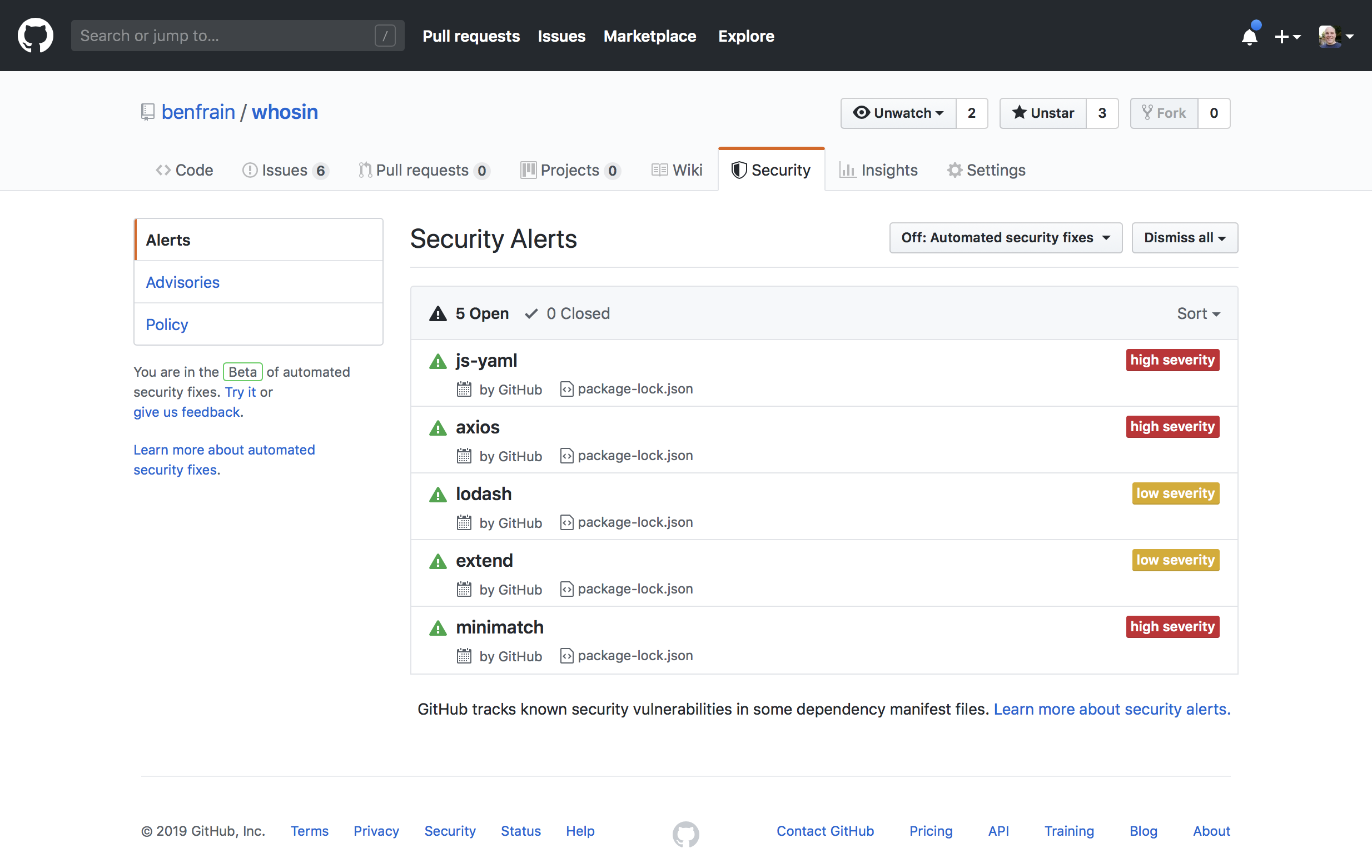
Anything you build that makes any use of NPM, even if just for build tools, carries the possibility of being vulnerable to security issues. GitHub does a good job of keeping you aware of potential problems but there is still some burden of maintenance.
For something that is a mere side-project, this can be a bit of a pain in the months and years that follow active development.
The reality is that every time you update dependencies to fix a security issue, you introduce the possibility of breaking your build.
And by June 2019, I was getting these warnings from GitHub:
Keeping dependencies listed on GitHub means infrequent security warnings. (Large preview)
None were related to plugins I was using directly, they were all sub-dependencies of the build tools I had used. Such is the double-edged sword of JavaScript packages. In terms of the app itself, there was no problem with In/Out; that wasn’t using any of the project dependencies. But as the code was on GitHub, I felt duty-bound to try and fix things up.
It’s possible to update packages manually, with a few choice changes to the package.json. However, both Yarn and NPM have their own update commands. I opted to run yarn upgrade-interactive which gives you a simple means to update things from the terminal.
Yarn makes upgrading project dependencies a little more predicatble. (Large preview)
Seems easy enough, there’s even a little colored key to tell you which updates are most important.
You can add the --latest flag to update to the very latest major version of the dependencies, rather than just the latest patched version. In for a penny…
Trouble is, things move fast in the JavaScript package world, so updating a few packages to the latest version and then attempting a build resulted in this:
As such, I rolled back my package.json file and tried again this time without the --latest flag. That solved my security issues. Not the most fun I’ve had on a Monday evening though I’ll be honest.
That touches on an important part of any side project. Being realistic with your expectations.
Side Projects
I don’t know if you are the same but I’ve found that a giddy optimism and excitement makes me start projects and if anything does, embarrassment and guilt makes me finish them.
It would be a lie to say the experience of making this tiny application in my spare time was fun-filled. There were occasions I wish I’d never opened my mouth about it to anyone. But now it is done I am 100% convinced it was worth the time invested.
That said, it’s possible to mitigate frustration with such a side project by being realistic about how long it will take to understand and solve the problems you face. Only have 30 mins a night, a few nights a week? You can still complete a side project; just don’t be disgruntled if your pace feels glacial. If things can’t enjoy your full attention be prepared for a slower and steadier pace than you are perhaps used to. That’s true, whether it’s coding, completing a course, learning to juggle or writing a series of articles of why it took so long to write a small web application!
Simple Goal Setting
You don’t need a fancy process for goal setting. But it might help to break things down into small/short tasks. Things as simple as ‘write CSS for drop-down menu’ are perfectly achievable in a limited space of time. Whereas ‘research and implement a design pattern for state management’ is probably not. Break things down. Then, just like Lego, the tiny pieces go together.
Thinking about this process as chipping away at the larger problem, I’m reminded of the famous Bill Gates quote:
“Most people overestimate what they can do in one year and underestimate what they can do in ten years.”
Shipping Something Is Better Than Shipping Nothing
Before ‘shipping’ this web application, I reviewed the code and was thoroughly disheartened.
Although I had set out on this journey from a point of complete naivety and inexperience, I had made some decent choices when it came to how I might architect (if you’ll forgive so grand a term) the code. I’d researched and implemented a design pattern and enjoyed everything that pattern had to offer. Sadly, as I got more desperate to conclude the project, I failed to maintain discipline. The code as it stands is a real hodge-bodge of approaches and rife with inefficiencies.
In the months since I’ve come to realize that those shortcomings don’t really matter. Not really.
I’m a fan of this quote from Helmuth von Moltke.
“No plan of operations extends with any certainty beyond the first contact with the main hostile force.”
That’s been paraphrased as:
“No plan survives first contact with the enemy”.
Perhaps we can boil it down further and simply go with “shit happens”?
I can surmise my coming to terms with what shipped via the following analogy.
If a friend announced they were going to try and run their first marathon, them getting over the finish line would be all that mattered — I wouldn’t be berating them on their finishing time.
I didn’t set out to write the best web application. The remit I set myself was simply to design and make one.
More specifically, from a development perspective, I wanted to learn the fundamentals of how a web application was constructed. From a design point of view, I wanted to try and work through some (albeit simple) design problems for myself. Making this little application met those challenges and then some. The JavaScript for the entire application was just 5KB (gzipped). A small file size I would struggle to get to with any framework. Except maybe Svelte.
If you are setting yourself a challenge of this nature, and expect at some point to ‘ship’ something, write down at the outset why you are doing it. Keep those reasons at the forefront of your mind and be guided by them. Everything is ultimately some sort of compromise. Don’t let lofty ideals paralyze you from finishing what you set out to do.
Summary
Overall, as it comes up to a year since I have worked on In/Out, my feelings fall broadly into three areas: things I regretted, things I would like to improve/fix and future possibilities.
Things I Regretted
As already alluded to, I was disappointed I hadn’t stuck to what I considered a more elegant method of changing state for the application and rendering it to the DOM. The observer pattern, as discussed in the second part of this series, which solved so many problems in a predictable manner was ultimately cast aside as ‘shipping’ the project became a priority.
I was embarrassed by my code at first but in the following months, I have grown more philosophical. If I hadn’t used more pedestrian techniques later on, there is a very real possibility the project would never have concluded. Getting something out into the world that needs improving still feels better than it never being birthed into the world at all.
Improving In/Out
Beyond choosing semantic markup, I’d made no affordances for accessibility. When I built In/Out I was confident with standard web page accessibility but not sufficiently knowledgeable to tackle an application. I’ve done far more work/research in that area now, so I’d enjoy taking the time to do a decent job of making this application more accessible.
The implementation of the revised design of ‘Add Person’ functionality was rushed. It’s not a disaster, just a bit rougher than I would like. It would be nice to make that slicker.
I also made no consideration for larger screens. It would be interesting to consider the design challenges of making it work at larger sizes, beyond simply making it a tube of content.
Possibilities
Using localStorage worked for my simplistic needs but it would be nice to have a ‘proper’ data store so it wasn’t necessary to worry about backing up the data. Adding log-in capability would also open up the possibility of sharing the game organization with another individual. Or maybe every player could just mark whether they were playing themselves? It’s amazing how many avenues to explore you can envisage from such simple and humble beginnings.
SwiftUI for iOS app development is also intriguing. For someone who has only ever worked with web languages, at first glance, SwiftUI looks like something I’m now emboldened to try. I’d likely try rebuilding In/Out with SwiftUI — just to have something specific to build and compare the development experience and results.
And so, it’s time to wrap things up and give you the TL;DR version of all this.
If you want to learn how something works on the web, I’d suggest skipping the abstractions. Ditch the frameworks, whether that’s CSS or JavaScript until you really understand what they are dong for you.
Design is iterative, embrace that process.
Solve problems in the lowest fidelity medium at your disposal. Don’t go to code if you can test the idea in Sketch. Don’t draw it in Sketch if you can use pen and paper. Write out logic first. Then write it in code.
Be realistic but never despondent. Developing a habit of chipping away at something for as little as 30 minutes a day can get results. That fact is true whatever form your quest takes.
The web-platform-tests project is a massive suite of tests (over one million in total) which verify that software (mostly web browsers) correctly implement web technologies. It’s as important as it is ambitious: the health of the web depends on a plurality of interoperable implementations.
Although Bocoup has been contributing to the web-platform-tests, or “WPT,” for many years, it wasn’t until late in 2017 that we began collecting test results from web browsers and publishing them to wpt.fyi
Talk about doing God’s work.
The rest of the article is about the incredible pain of scaling a test suite that big. Ultimately Azure Pipelines was helpful.
I had a little rant in me a few months ago about design systems: “Who Are Design Systems For?” My main point was that there are so many public and open source ones out there that choosing one can feel like choosing new furniture for your house. You just measure up what you need and what you like and pick one. But it just isn’t that simple. Some are made for you, some makers want you to use them, and some just ain’t.
… it’s important that you first define who a design system is for and what people should be able to do with it. When you have decided this, and start looking at the implementation for the level of flexibility you require, keep in mind that it’s okay to do something that’s different from what’s already out there. It’s easy to create a lot of flexibility or none at all, the trick is to get it just right.
The levels:
Zero customizability. Sometimes this is the point: enforcing consistency and making it easy to use (no config).
Build your own (BYO) theme. The other end of the spectrum: do whatever you want, fully cusomizable.
Guided theme building. This is baby bear. Like changing preprocessor values to change colors, but it can get fancier.
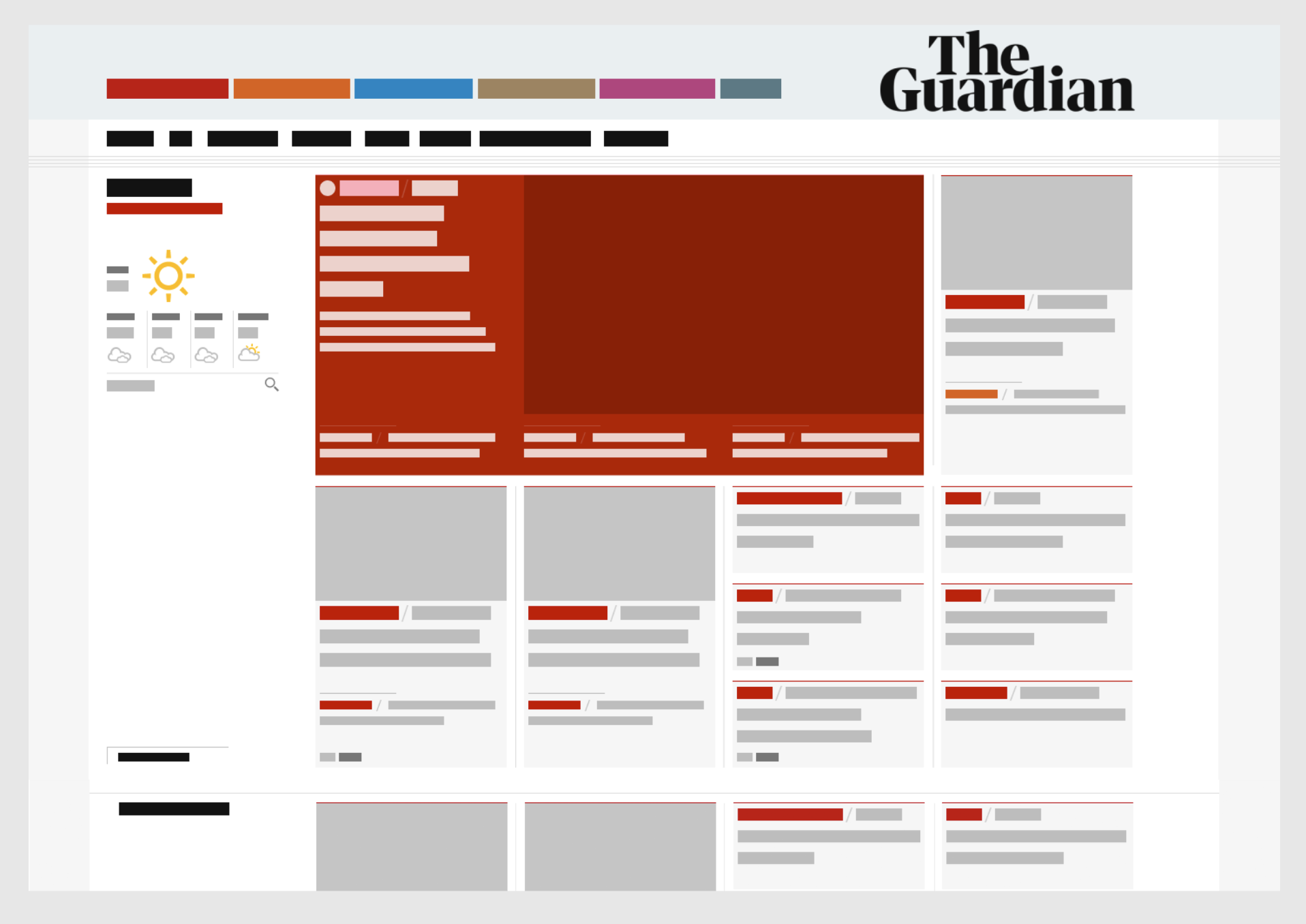
Here’s a fascinating look at The Guardian’s design system with a step-by-step breakdown of what’s gone into it and what options are available to designers and developers. It shows us how the team treats colors, typography, layouts, and visual cues like rules and borders.
I’ve been struggling to think about how to describe design systems internally to folks and this is giving me a ton of inspiration right now. I like that this website has all the benefits of a video (great tone and lovely visuals) with all the benefits of a UI kit (by showing what options are available to folks).
This also loosely ties back into something Chris has been discussing lately, which is being mindful of knowing who a design system is for. Some are meant for internal use and others, some are meant for internal use but are openly available for people like contractors, and others are meant for varying degrees of external use. Here, The Guadian is not explicit about who their design system is for, but the description of it gives a pretty good hint:
A guide to digital design at the Guardian
So please, enjoy looking at this well-documented, highly interactive and gorgeous design system. At the same time, remember it’s made for a specific use case and may not line up with all the needs of your project or organization. It sure is inspirational to look at, one way or the other!
This article is part of a series in which I attempt to use the web under various constraints, representing a given demographic of user. I hope to raise the profile of difficulties faced by real people, which are avoidable if we design and develop in a way that is sympathetic to their needs.
Many of us are lucky enough to be on mobile plans which allow several gigabytes of data transfer per month. Failing that, we are usually able to connect to home or public WiFi networks that are on fast broadband connections and have effectively unlimited data.
But there are parts of the world where mobile data is prohibitively expensive, and where there is little or no broadband infrastructure.
People often buy data packages of just tens of megabytes at a time, making a gigabyte a relatively large and therefore expensive amount of data to buy. — Dan Howdle, consumer telecoms analyst at Cable.co.uk
Just how expensive are we talking?
The Cost Of Mobile Data
A 2018 study by cable.co.uk found that Zimbabwe was the most expensive country in the world for mobile data, where 1 GB cost an average of $75.20, ranging from $12.50 to $138.46. The enormous range in price is due to smaller amounts of data being very expensive, getting proportionally cheaper the bigger the data plan you commit to. You can read the study methodology for more information.
Zimbabwe is by no means a one-off. Equatorial Guinea, Saint Helena and the Falkland Islands are next in line, with 1 GB of data costing $65.83, $55.47 and $47.39 respectively. These countries generally have a combination of poor technical infrastructure and low adoption, meaning data is both costly to deliver and doesn’t have the economy of scale to drive costs down.
Data is expensive in parts of Europe too. A gigabyte of data in Greece will set you back $32.71; in Switzerland, $20.22. For comparison, the same amount of data costs $6.66 in the UK, or $12.37 in the USA. On the other end of the scale, India is the cheapest place in the world for data, at an average cost of $0.26. Kyrgyzstan, Kazakhstan and Ukraine follow at $0.27, $0.49 and $0.51 per GB respectively.
The speed of mobile networks, too, varies considerably between countries. Perhaps surprisingly, users experience faster speeds over a mobile network than WiFi in at least 30 countries worldwide, including Australia and France. South Korea has the fastest mobile download speed, averaging 52.4 Mbps, but Iraq has the slowest, averaging 1.6 Mbps download and 0.7 Mbps upload. The USA ranks 40th in the world for mobile download speeds, at around 34 Mbps, and is at risk of falling further behind as the world moves towards 5G.
As for mobile network connection type, 84.7% of user connections in the UK are on 4G, compared to 93% in the USA, and 97.5% in South Korea. This compares with less than 50% in Uzbekistan and less than 60% in Algeria, Ecuador, Nepal and Iraq.
The Cost Of Broadband Data
Meanwhile, a study of the cost of broadband in 2018 shows that a broadband connection in Niger costs $263 ‘per megabit per month’. This metric is a little difficult to comprehend, so here’s an example: if the average cost of broadband packages in a country is $22, and the average download speed offered by the packages is 10 Mbps, then the cost ‘per megabit per month’ would be $2.20.
It’s an interesting metric, and one that acknowledges that broadband speed is as important a factor as the data cap. A cost of $263 suggests a combination of extremely slow and extremely expensive broadband. For reference, the metric is $1.19 in the UK and $1.26 in the USA.
What’s perhaps easier to comprehend is the average cost of a broadband package. Note that this study was looking for the cheapest broadband packages on offer, ignoring whether or not these packages had a data cap, so provides a useful ballpark figure rather than the cost of data per se.
On package cost alone, Mauritania has the most expensive broadband in the world, at an average of $768.16 (a range of $307.26 to $1,368.72). This enormous cost includes building physical lines to the property, since few already exist in Mauritania. At 0.7 Mbps, Mauritania also has one of the slowest broadband networks in the world.
Taiwan has the fastest broadband in the world, at a mean speed of 85 Mbps. Yemen has the slowest, at 0.38 Mbps. But even countries with good established broadband infrastructure have so-called ‘not-spots’. The United Kingdom is ranked 34th out of 207 countries for broadband speed, but in July 2019 there was still a school in the UK without broadband.
The average cost of a broadband package in the UK is $39.58, and in the USA is $67.69. The cheapest average in the world is Ukraine’s, at just $5, although the cheapest broadband deal of them all was found in Kyrgystan ($1.27 — against the country average of $108.22).
Zimbabwe was the most costly country for mobile data, and the statistics aren’t much better for its broadband, with an average cost of $128.71 and a ‘per megabit per month’ cost of $6.89.
Absolute Cost vs Cost In Real Terms
All of the costs outlined so far are the absolute costs in USD, based on the exchange rates at the time of the study. These costs have not been accounted for cost of living, meaning that for many countries the cost is actually far higher in real terms.
I’m going to limit my browsing today to 50 MB, which in Zimbabwe would cost around $3.67 on a mobile data tariff. That may not sound like much, but teachers in Zimbabwe were striking this year because their salaries had fallen to just $2.50 a day.
For comparison, $3.67 is around half the $7.25 minimum wage in the USA. As a Zimbabwean, I’d have to work for around a day and a half to earn the money to buy this 50MB data, compared to just half an hour in the USA. It’s not easy to compare cost of living between countries, but on wages alone the $3.67 cost of 50 MB of data in Zimbabwe would feel like $52 to an American on minimum wage.
Setting Up The Experiment
I launched Chrome and opened the dev tools, where I throttled the network to a slow 3G connection. I wanted to simulate a slow connection like those experienced by users in Uzbekistan, to see what kind of experience websites would give me. I also throttled my CPU to simulate being on a lower end device.
I opted to throttle my network to Slow 3G and my CPU to 6x slowdown. (Large preview)
I installed ModHeader and set the ‘Save-Data’ header to let websites know I want to minimise my data usage. This is also the header set by Chrome for Android’s ‘Lite mode’, which I’ll cover in more detail later.
I downloaded TripMode; an application for Mac which gives you control over which apps on your Mac can access the internet. Any other application’s internet access is automatically blocked.
You can enable/disable individual apps from connecting to the internet with TripMode. I enabled Chrome. (Large preview)
How far do I predict my 50 MB budget will take me? With the average weight of a web page being almost 1.7 MB, that suggests I’ve got around 29 pages in my budget, although probably a few more than that if I’m able to stay on the same sites and leverage browser caching.
Throughout the experiment I will suggest performance tips to speed up the first contentful paint and perceived loading time of the page. Some of these tips may not affect the amount of data transferred directly, but do generally involve deferring the download of less important resources, which on slow connections may mean the resources are never downloaded and data is saved.
The Experiment
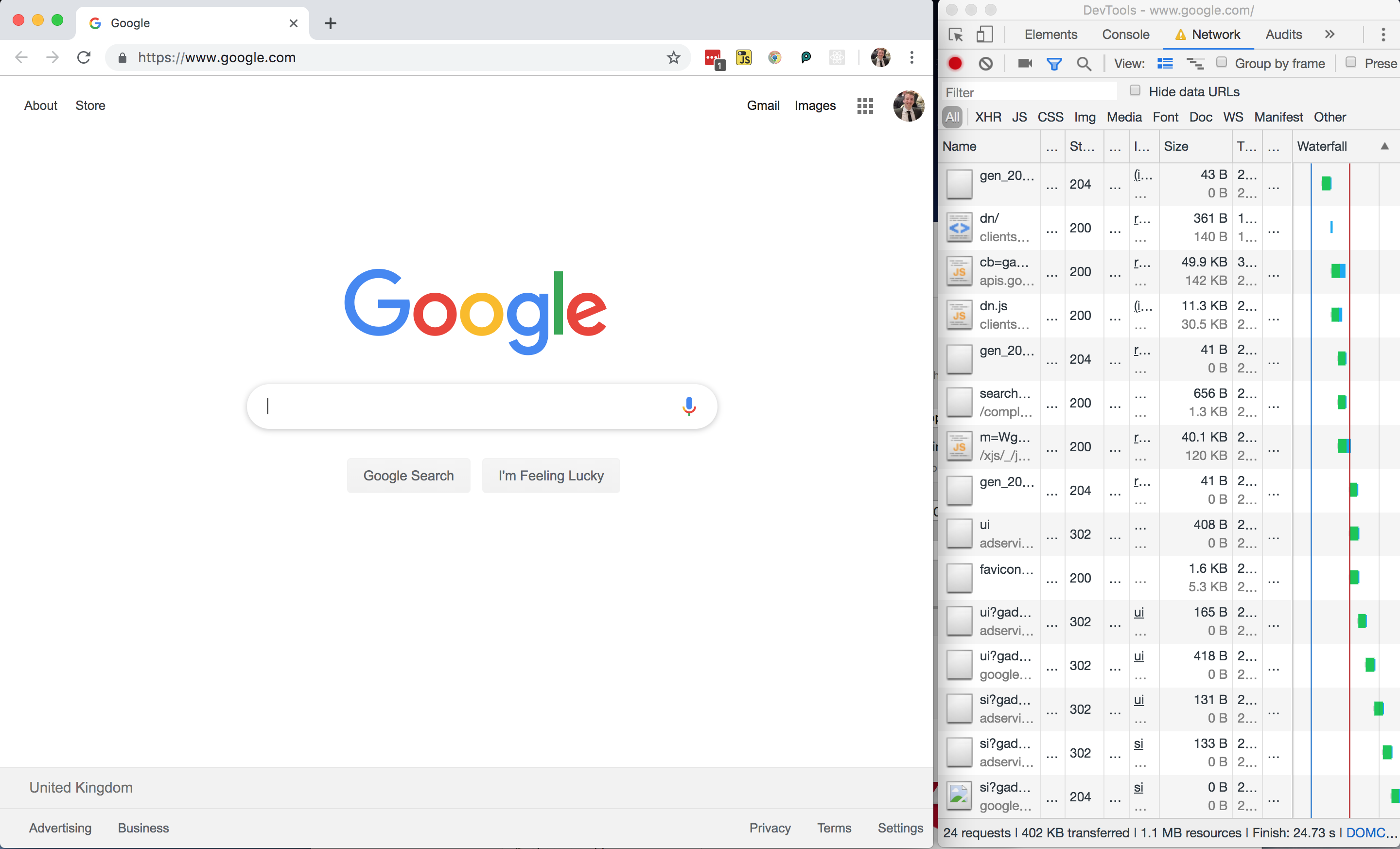
Without any further ado, I loaded google.com, using 402 KB of my budget and spending $0.03 (around 1% of my Zimbabwe budget).
All in all, not a bad page size, but I wondered where those 24 network requests were coming from and whether or not the page could be made any lighter.
Google Homepage — DOM
Chrome devtools screenshot of the DOM, where I’ve expanded one inline style tag. (Large preview)
Looking at the page markup, there are no external stylesheets — all of the CSS is inline.
Performance Tip #1: Inline Critical CSS
This is good for performance as it saves the browser having to make an additional network request in order to fetch an external stylesheet, so the styles can be parsed and applied immediately for the first contentful paint. There’s a trade-off to be made here, as external stylesheets can be cached but inline ones cannot (unless you get clever with JavaScript).
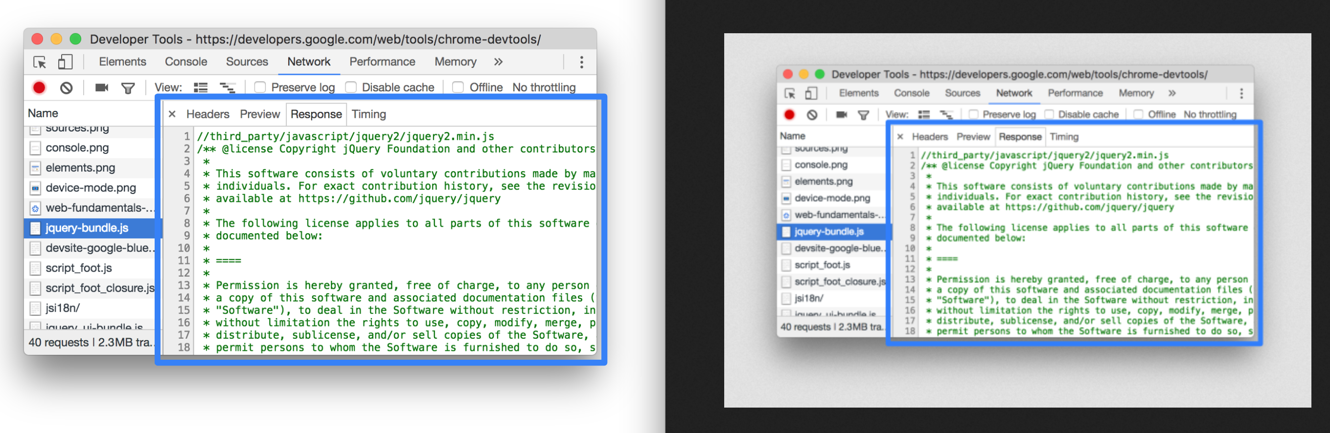
The devtools show a prettified version of the DOM. If you want to see what was actually downloaded to the browser, switch to the Sources tab and find the document.
Switching to Sources and finding the index shows the ‘raw’ HTML that was delivered to the browser. What a mess! (Large preview)
You can see there is a LOT of inline JavaScript here. It’s worth noting that it has been uglified rather than merely minified.
Performance Tip #2: Minify And Uglify Your Assets
Minification removes unnecessary spaces and characters, but uglification actually ‘mangles’ the code to be shorter. The tell-tale sign is that the code contains short, machine-generated variable names rather than untouched source code. This is good as it means the script is smaller and quicker to download.
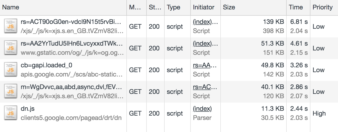
Even so, inline scripts look to be roughly 120 KB of the 210 KB page resource (about half the 60 KB gzipped size). In addition, there are five external JavaScript files amounting to 291 KB of the 402 KB downloaded:
Five external JavaScript files in the Network tab of the devtools. (Large preview)
This means that JavaScript accounts for about 80 percent of the overall page weight.
This isn’t useless JavaScript; Google has to have some in order to display suggestions as you type. But I suspect a lot of it is tracking code and advertising setup.
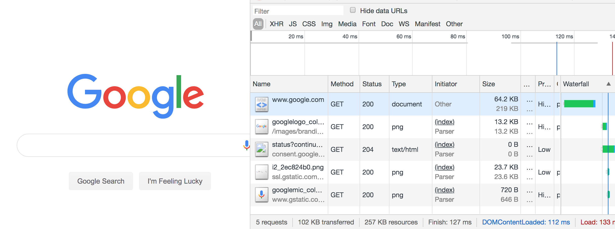
For comparison, I disabled JavaScript and reloaded the page:
The disabled JS version of Google search was only 102 KB and had just 5 network requests. (Large preview)
The JS-disabled version of Google search is just 102 KB, as opposed to 402 KB. Although Google can’t provide autosuggestions under these conditions, the site is still functional, and I’ve just cut my data usage down to a quarter of what it was. If I really did have to limit my data usage in the long term, one of the first things I’d do is disable JavaScript. It’s not as bad as it sounds.
Performance Tip #3: Less Is More
Inlining, uglifying and minifying assets is all well and good, but the best performance comes from not sending down the assets in the first place.
Before adding any new features, do you have a performance budget in place?
Before adding JavaScript to your site, can your feature be accomplished using plain HTML? (For example, HTML5 form validation).
Before pulling a large JavaScript or CSS library into your application, use something like bundlephobia.com to measure how big it is. Is the convenience worth the weight? Can you accomplish the same thing using vanilla code at a much smaller data size?
Analysing The Resource Info
There’s a lot to unpack here, so let’s get cracking. I’ve only got 50 MB to play with, so I’m going to milk every bit of this page load. Settle in for a short Chrome Devtools tutorial.
402 KB transferred, but 1.1 MB of resources: what does that actually mean?
It means 402 KB of content was actually downloaded, but in its compressed form (using a compression algorithm such as gzip or brotli). The browser then had to do some work to unpack it into something meaningful. The total size of the unpacked data is 1.1 MB.
As a general rule, always compress your assets, using something like gzip. But don’t use compression on your images and other binary files — you should optimize these in advance at source. Compression could actually end up making them bigger.
And, if you can, avoid compressing files that are 1500 bytes or smaller. The smallest TCP packet size is 1500 bytes, so by compressing to, say, 800 bytes, you save nothing, as it’s still transmitted in the same byte packet. Again, the cost is negligible, but wastes some compression CPU time on the server and decompression CPU time on the client.
Now back to the Network tab in Chrome: let’s dig into those priorities. Notice that resources have priority “Highest” to “Lowest” — these are the browser’s best guess as to what are the more important resources to download. The higher the priority, the sooner the browser will try to download the asset.
Performance Tip #5: Give Resource Hints To The Browser
The browser will guess at what the highest priority assets are, but you can provide a resource hint using the tag, instructing the browser to download the asset as soon as possible. It’s a good idea to preload fonts, logos and anything else that appears above the fold.
Let’s talk about caching. I’m going to hold ALT and right-click to change my column headers to unlock some more juicy information. We’re going to check out Cache-Control.
There are lots of interesting fields tucked away behind ALT. (Large preview)
Cache-Control denotes whether or not a resource can be cached, how long it can be cached for, and what rules it should follow around revalidating. Setting proper cache values is crucial to keeping the data cost of repeat visits down.
Performance Tip #6: Set cache-control Headers On All Cacheable Assets
Note that the cache-control value begins with a directive of public or private, followed by an expiration value (e.g. max-age=31536000). What does the directive mean, and why the oddly specific max-age value?
A mixture of max-age values and public/private. (Large preview)
The value 31536000 is the number of seconds there are in a year, and is the theoretical maximum value allowed by the cache-control specification. It is common to see this value applied to all static assets and effectively means “this resource isn’t going to change”. In practice, no browser is going to cache for an entire year, but it will cache the asset for as long as makes sense.
To explain the public/private directive, we must explain the two main caches that exist off the server. First, there is the traditional browser cache, where the resource is stored on the user’s machine (the ‘client’). And then there is the CDN cache, which sits between the client and the server; resources are cached at the CDN level to prevent the CDN from requesting the resource from the origin server over and over again.
A Cache-Control directive of public allows the resource to be cached in both the client and the CDN. A value of private means only the client can cache it; the CDN is not supposed to. This latter value is typically used for pages or assets that exist behind authentication, where it is fine to be cached on the client but we wouldn’t want to leak private information by caching it in the CDN and delivering it to other users.
A mixture of max-age values and public/private. (Large preview)
One thing that got my attention was that the Google logo has a cache control of “private”. Other images on the page do have a public cache, and I don’t know why the logo would be treated any differently. If you have any ideas, let me know in the comments!
I refreshed the page and most of the resources were served from cache, apart from the page itself, which as you’ve seen already is private, max-age=0, meaning it cannot be cached. This is normal for dynamic web pages where it is important that the user always gets the very latest page when they refresh.
It was at this point I accidentally clicked on an ‘Explanation’ URL in the devtools, which took me to the network analysis reference, costing me about 5 MB of my budget. Oops.
Google Dev Docs
4.2 MB of this new 5 MB page was down to images; specifically SVGs. The weightiest of these was 186 KB, which isn’t particularly big — there were just so many of them, and they all downloaded at once.
This is a loooong page. All the images downloaded on page load. (Large preview)
That 5 MB page load was 10% of my budget for today. So far I’ve used 5.5 MB, including the no-JavaScript reload of the Google homepage, and spent $0.40. I didn’t even mean to open this page.
What would have been a better user experience here?
Performance Tip #7: Lazy-load Your Images
Ordinarily, if I accidentally clicked on a link, I would hit the back button in my browser. I’d have received no benefit whatsoever from downloading those images — what a waste of 4.2 MB!
Apart from video, where you generally know what you’re getting yourself into, images are by far the biggest culprit to data usage on the web. A study of the world’s top 500 websites found that images take up to 53% of the average page weight. “This means they have a big impact on page-loading times and subsequently overall performance”.
Instead of downloading all of the images on page load, it is good practice to lazy-load the images so that only users who are engaged with the page pay the cost of downloading them. Users who choose not to scroll below the fold therefore don’t waste any unnecessary bandwidth downloading images they’ll never see.
If this page had implemented lazy loading as per the guide above, each of the 38 SVGs would have been represented by a 1 KB placeholder image by default, and only loaded into view on scroll.
Performance Tip #8: Use The Right Format For Your Images
I thought that Google had missed a trick by not using WebP, which is an image format that is 26% smaller in size compared to PNGs (with no loss in quality) and 25-34% smaller in size compared to JPEGs (and of a comparable quality). I thought I’d have a go at converting SVG to WebP.
Converting to WebP did bring one of the SVGs down from 186 KB to just 65 KB, but actually, looking at the images side by side, the WebP came out grainy:
The SVG (left) is noticeably crisper than the WebP (right). (Large preview)
I then tried converting one of the PNGs to WebP, which is supposed to be lossless and should come out smaller. However, the WebP output was *heavier* (127 KB, from 109 KB)!
The PNG (left) is a similar quality to the WebP (right) but is smaller at 109 KB compared to 127 KB. (Large preview)
This surprised me. WebP isn’t necessarily the silver bullet we think it is, and even Google have neglected to use it on this page.
So my advice would be: where possible, experiment with different image formats on a per-image basis. The format that keeps the best quality for the smallest size may not be the one you expect.
Notice the async keyword on the Google analytics script?
Google analytics has ‘low’ priority. (Large preview)
Despite being one of the first things in the head of the document, this was given a low priority, as we’ve explicitly opted out of being a blocking request by using the async keyword.
A blocking request is one that stops the rendering of the page. A call is blocking by default, stopping the parsing of the HTML until the script has downloaded, compiled and executed. This is why we traditionally put calls at the end of the document.
Performance Tip #9: Avoid Writing Blocking Script Calls
By adding the async attribute to our tag, we’re telling the browser not to stop rendering the page but to download the script in the background. If the HTML is still being parsed by the time the script is downloaded, the parsing is paused while the script is executed, and then resumed. This is significantly better than blocking the rendering as soon as is encountered.
There is also a defer attribute, which is subtly different. tells the browser to render the page while the script loads in the background, and even if the HTML is still being parsed by the time the script is downloaded, the script must wait until the page is rendered before it can be executed. This makes the script completely non-blocking. Read “Efficiently load JavaScript with defer and async” for more information.
Anyway, enough Google dissecting. It’s time to try out another site. I’ve still got almost 45 MB of my budget left!
The Amazon homepage loaded with a total weight of about 6 MB. One of these was a 587 KB image that I couldn’t even find on the page. This was a PNG, presumably to have crisp text, but on a photographic background — a classic combination that’s terrible for performance.
This grainy image used over 1% of my budget. (Large preview)
In fact, there were a few several-hundred-kilobyte images in my network tab that I couldn’t actually see on the page. I suspect a misconfiguration somewhere on Amazon, but these invisible images combined chewed through at least 1 MB of my data.
How about the hero image? It’s the main image on the page, and it’s only 94 KB transferred — but it could be reduced in size by about 15% if it were cropped directly around the text and footballers. We could then apply the same background color in CSS as is in the image. This has the additional advantage of being resizable down to smaller screens whilst retaining legibility of text.
I’ve said it once, and I’ll say it again: optimising and lazy-loading your images is the single biggest benefit you can make to the page weight of your site.
Optimizing images provided, by far, the most significant data reduction. You can make the case JavaScript is a bigger deal for overall performance, but not data reduction. Optimizing or removing images is the safest way of ensuring a much lighter experience and that’s the primary optimization Data Saver relies on. — Tim Kadlec, Making Sense of Chrome Lite Pages
To be fair to Amazon, if I resize the browser to a mobile size and refresh the page, the site is optimized for mobile and the total page weight is only 2.1 MB.
Performance Tip #10: Don’t Make Assumptions About Data Connections
It’s difficult to detect if someone on a desktop is on a broadband connection or is tethering through a data-limited dongle or mobile. Many people work on the train like that, or live in an area where broadband infrastructure is poor but mobile signal is strong. In Amazon’s case, there is room to make some big data savings on the desktop site and we shouldn’t get complacent just because the screen size suggests I’m not on a mobile device.
Yes, we should expect a larger page load if our viewport is ‘desktop sized’ as the images will be larger and better optimized for the screen than a grainier mobile one. But the page shouldn’t be orders of magnitude bigger.
The initial ‘desktop’ load may have been 6 MB, but after sitting and watching it for a minute it had climbed to 8.6 MB as the lower-priority resources and event tracking kicked into action. This page weight includes almost 1.7 MB of minified JavaScript. I don’t even want to begin to look at that.
Performance Tip #11: Use Web Workers For Your JavaScript
Which would be worse — 1.7 MB of JavaScript or 1.7 MB of images? The answer is JavaScript: the two assets are not equivalent when it comes to performance.
A JPEG image needs to be decoded, rasterized, and painted on the screen. A JavaScript bundle needs to be downloaded and then parsed, compiled, executed —and there are a number of other steps that an engine needs to complete. Be aware that these costs are not quite equivalent. — Addy Osmani, The Cost of JavaScript in 2018
If you must ship this much JavaScript, try putting it in a web worker. This keeps the bulk of JavaScript off the main thread, which is now freed up for repainting the UI, helping your web page to stay responsive on low-powered devices.
I’m now about 15.5 MB into my budget, and have spent $1.14 of my Zimbabwe data budget. I’d have had to have worked for half a day as a teacher to earn the money to get this far.
Pinterest
I’ve heard good things about Pinterest’s performance, so I decided to put it to the test.
A staggering 327 requests, making 6.1 MB of data. (Large preview)
Perhaps this isn’t the fairest of tests; I was taken to the sign-in page, upon which an asynchronous process found I was logged into Facebook and logged me in automatically. The page loaded relatively quickly, but the requests crept up as more and more content was preloaded.
However, I saw that on subsequent page loads, the service worker surfaced much of the content — saving about half of the page weight:
8.2 / 15.6 MB resources, and 39 / 180 requests handled by the service worker cache. (Large preview)
The Pinterest site is a progressive web app; it installed a service worker to manually handle caching of CSS and JS. I could now turn off my WiFi and continue to use the site (albeit not very usefully):
You can’t do much when you’re offline. (Large preview)
Performance Tip #12: Use Service Workers To Provide Offline Support
Wouldn’t it be great if I only had to load a website once over network, and now get all the information I need even if I’m offline?
A great example would be a website that shows the weather forecast for the week. I should only need to download that page once. If I turn off my mobile data and subsequently go back to the page at some point, it should be able to serve the last known content to me. If I connect to the internet again and load the page, I would get a more up to date forecast, but static assets such as CSS and images should still be served locally from the service worker.
Content that rarely updates and is likely to be used quite regularly is a perfect candidate for service worker treatment. Dynamic sites with ever-changing news feeds aren’t quite so well suited for offline experiences, but can still benefit.
The second Pinterest page load was 443 KB. (Large preview)
Service workers can truly save the day when you’re on a tight data budget. I’m not convinced the Pinterest experience was the most optimal in terms of data usage – subsequent pages were around the 0.5 MB mark even on pages with few images — but letting your JavaScript handle page requests for you and keeping the same navigational elements in place can be very performant. The BBC manages a transfer size of just 3.1 KB for return-visits to articles that are renderable via the single page application.
So far, Pinterest alone has chewed through 14 MB, which means I’ve blown around 30 MB of my budget, or $2.20 (almost a day’s wages) of my Zimbabwe budget.
I’d better be careful with my final 20 MB… but where’s the fun in that?
Gamespot
I picked this one because it felt noticeably sluggish on my mobile in the past and I wanted to dig into the reasons why. Sure enough, loading the homepage consumes 8.5 MB of data.
The Gamespot homepage trickled up to 8.5 MB, and a whopping 347 requests. (Large preview)
6.5 MB of this was down to an autoplaying video halfway down the page, which — to be fair — didn’t appear to download until I began scrolling. Nevertheless…
I could only see half the video in my viewport — the right hand side was clipped. It was also 30 seconds long, and I would wager that most people won’t sit and watch the whole thing. This single asset more than tripled the size of the page.
Performance Tip #13: Don’t Preload Video
As a rule, unless your site’s primary mode of communication is video, don’t preload it.
If you’re YouTube or Netflix, it’s reasonable to assume that someone coming to your page will want the video to auto-load and auto-play. There is an expectation that the video will chew through some data, but that it’s a fair exchange for the content. But if you’re a site whose primary medium is text and image — and you just happen to offer additional video content — then don’t preload the video.
Think of news articles with embedded videos. Many users only want to skim the article headline before moving on to their next thing. Others will read the article but ignore any embeds. And others will diligently click and watch each embedded video. We shouldn’t hog the bandwidth of every user on the assumption that they’re going to want to watch these videos.
To reiterate: users don’t like autoplaying video. As developers we only do it because our managers tell us to, and they only tell us to do it because all the coolest apps are doing it, and the coolest apps are only doing it because video ads generate 20 to 50 times more revenue than traditional ads. Google Chrome has started blocking autoplay videos for some sites, based on personal preferences, so even if you develop your site to autoplay video, there’s no guarantee that’s the experience your users are getting.
If we agree that it’s a good idea to make video an opt-in experience (click to play), we can take it a step further and make it click to load too. That means mocking a video placeholder image with a play button over it, and only downloading the video when you click the play button. People on fast connections should notice no difference in buffer speed, and people on slow connections will appreciate how fast the rest of your site loaded because it didn’t have to preload a large video file.
Anyway, back to Gamespot, where I was indeed forced to preload a large video file I ended up not watching. I then clicked through to a game review page that weighed another 8.5 MB, this time with 5.4 MB of video, before I even started scrolling down the page.
What was really galling was when I looked at what the video actually was. It was an advert for a Samsung TV! This advert cost me $0.40 of my Zimbabwe wages. Not only was it pre-loaded, but it also didn’t end up playing anywhere as far as I’m aware, so I never actually saw it.
This advert wasted 5.4 MB of my precious data. (Large preview)
The ‘real’ video — the gameplay footage (in other words, the content) — wasn’t actually loaded until I clicked on it. And that ploughed through my remaining data in seconds.
That’s it. That’s my 50 MB gone. I’ll need to work another 1.5 days as a Zimbabwean schoolteacher to repeat the experience.
Performance Tip #14: Optimize For First Page Load
What’s striking is that I used 50 MB of data and in most cases, I only visited one or two pages on any given site. If you think about it, this is true of most user journeys today.
Think about the last time you Googled something. You no doubt clicked on the first search result. If you got your answer, you closed the tab, or else you hit the back button and moved onto the next search result.
With the exception of a few so-called ‘destination sites’ such as Facebook or YouTube, where users habitually go as a starting point for other activities, the majority of user journeys are ephemeral. We stumble across random sites to get the answers to our questions, never to return to those sites again.
Web development practices are heavily skewed towards optimising for repeat visitors. “Cache these assets — they’ll come in handy later”. “Pre-load this onward journey, in case the user clicks to read more”. “Subscribe to our mailing list”.
Instead, I believe we should optimize heavily for one-off visitors. Call it a controversial opinion, but maybe caching isn’t really all that important. How important can a cached resource that never gets surfaced again be? And perhaps users aren’t actually going to subscribe to your mailing list after reading just the one article, so downloading the JavaScript and CSS for the mail subscription modal is both a waste of data and an annoying user experience.
The Decline Of Proxy Browsers
I had hoped to try out Opera Mini as part of this experiment. Opera Mini is a mobile web browser which proxies web pages through Opera’s compression servers. It accounts for 1.42% of global traffic as of June 2019, according to caniuse.com.
Opera Mini claims to save up to 90% of data by doing some pretty intensive transcoding. HTML is parsed, images are compressed, styling is applied, and a certain amount of JavaScript is executed on Opera’s servers. The server doesn’t respond with HTML as you might expect — it actually transcodes the data into Opera Binary Markup Language (OBML), which is progressively loaded by Opera Mini on the device. It renders what is essentially an interactive ‘snapshot’ of the web page — think of it as a PDF with hyperlinks inside it. Read Tiffany Brown’s excellent article, “Opera Mini and JavaScript” for a technical deep-dive.
It would have been a perfect way to eek my 50 MB budget as far as possible. Unfortunately, Opera Mini is no longer available on iOS in the UK. Attempting to visit it in the app store throws an error:
It’s still available “in some markets” but reading between the lines, Opera will be phasing out Opera Mini for its new app — Opera Touch — which doesn’t have any data-saving functionality apart from the ability to natively block ads.
Opera desktop used to have a ‘Turbo mode’, acting as a traditional proxy server (returning a HTML document instead of OBML), applying data-saving techniques but less intensively than Opera Mini. According to Opera, JavaScript continues to work and “you get all the videos, photos and text that you normally would, but you eat up less data and load pages faster”. However, Opera quietly removed Turbo mode in v60 earlier this year, and Opera Touch doesn’t have a Turbo mode either. Turbo mode is currently only available on Opera for Android.
Android is where all the action is in terms of data-saving technology. Chrome offers a ‘Lite mode’ on its mobile browser for Android, which is not available for iPhones or iPads because of “platform constraints“. Outside of mobile, Google used to provide a ‘Data Saver’ extension for Chrome desktop, but this was canned in April.
Lite mode for Chrome Android can be forcibly enabled, or automatically kicks in when the network’s effective connection type is 2G or worse, or when Chrome estimates the page will take more than 5 seconds to reach first contentful paint. Under these conditions, Chrome will request the lite version of the HTTPS URL as cached by Google’s servers, and display this stripped-down version inside the user’s browser, alongside a “Lite” marker in the address bar.
‘Lite mode’ on Chrome for Android. Image: Google. (Large preview)
Lite mode shares the HTTPS URL with Google, therefore it makes sense that this mode isn’t available in Incognito. However other information such as cookies, login information, and personalised page content is not shared with Google — according to ghacks.net — and “never breaks secure connections between Chrome and a website”. One wonders why seemingly none of these data-saving services are allowed on iOS (and there is no news as to whether Lite mode will ever become available on iOS).
Data saver proxies require a great deal of trust; your browsing activity, cookies and other sensitive information are entrusted to some server, often in another country. Many proxies simply won’t work anymore because a lot of sites have moved to HTTPS, meaning initiatives such as Turbo mode have become a largely “useless feature“. HTTPS prevents this kind of man-in-the-middle behaviour, which is a good thing, although it has meant the demise of some of these proxy services and has made sites less accessible to those on poor connections.
I was unable to find any OSX or iOS compatible data-saving tool except for Bandwidth Hero for Firefox (which requires setting up your own data compression service — far beyond the technical capabilities of most users!) and skyZIP Proxy (which, last updated in 2017 and riddled with typos, I just couldn’t bring myself to trust).
Conclusion
Reducing the data footprint of your website goes hand in hand with improving frontend performance. It is the single most reliable thing you can do to speed up your site.
In addition to the cost of data, there are lots of good reasons to focus on performance, as described in a GOV.UK blog post on the subject:
More performant web pages are better for the battery life of the user’s device, and typically require less power on the server to deliver. A performant site is good for the environment.
We don’t have the power to change the global cost of data inequality. But we do have the power to lessen its impact, improving the experience for everyone in the process.
Each of the design trends we are spotting this month have to deal with over-the-top techniques. It’s interesting because these big effects don’t always pop on the radar of what’s trending, but these concepts almost begged to be featured with a large number of projects showcasing these design elements.
This type of trend is interested because designers either love them or hate them. Take a look and see if these are concepts you’ll use. Here’s what’s trending in design this month.
Exaggerated White Space
So much white space.
These websites feature exaggerated amounts of whitespace and strong minimal themes with very little color or design ornamentation. And if you are like me, you can’t stop looking at them.
How does a design with so little visual information work?
The design trick here is disruption. If you see one of these designs, they are vastly different than almost any other site you are visiting. That makes you stop, and look, and think about what you are seeing. With the right content it can be quite effective.
While each of the designs here use exaggerated amounts of white space and practically no color, they don’t all look the same and use complementary effects to get a message across.
VS+Company uses a subtle animation with text blocks that appear next to the oversized “POST” and “MGMT” lines. The text provides additional content and information about the website and uses a black color that makes it easy to read.
Lundqvist & Dallyn asks a question to pique user interest. The image on the home screen and throughout the scroll feature hover animations that encourage clicks.
Jillian Hobbs uses white space to help users hone in on the words – in this case project names – to interact with. It’s a risky concept for a design portfolio, but it did encourage clicking through to pages with the same visual pattern, but featuring images and color.
Sharp Edges and Lines
While brutalism has never fully taken off as a widespread design trend, it is influencing designers. Sharp edges and lines are one way that we’re seeing it manifest.
Most recently, projects have had a softer feel with gradient coloring, real images or illustrations, and softer shapes. The projects below feature more hard edges, thick lines and square shapes. These shapes can be paired with different elements to establish a feel. The result is a design trend that’s a little harder, stronger, and harsh. It almost demands that you look at it.
Future London Academy uses bold yellow and black to create the most brutalist feel of the collection. Even the typography has an edge to it.
Purple Rock Scissors has an animated twitch to the hard lines on its homepage, which creates a feeling of unease for users. Why is everything twitching and moving in this way? It almost forces you to scroll. All of the video clips on the site use the same effect, which feels a lot like what we are seeing with the TikTok social network.
The Unshift portfolio focuses on shapes and animation with almost no color to draw users in. The moving cube is intriguing and enough to generate interest.
Screen-Centered Headlines
Hero headlines aren’t a new trend at all. But have you noticed a shift in the placements of the big text on homepages?
It’s vertically and horizontally centered.
The placement makes sense when you think about it. The eye will go right to the middle of the screen and then spread out to other elements. But do you love the super symmetrical feel?
The other benefit to this design technique is for the mobile versions of websites. It fits just a nicely on a mobile screen as desktop. Conversely if the text is positioned strong to the left or right, it often has to be moved when you shift from a more horizontal to vertical screen orientation.
This is one of those neat trends that’s heavily influenced by technology and how we use and interact with devices online.
The only thing to be aware of with a trend like this is that while perfect symmetry is harmonious and visually appealing it might not work with all backgrounds or imagery. It can also start to seem somewhat boring if everyone does it.
Finally, think about the length of words and messaging. With too many characters this style can feel heavy and overwhelming and works best with short blocks of text, such as each of the featured examples below.
Conclusion
When it comes to over-the-top design ideas, what works for you, do you prefer color, space, or typography? While you can see some influences of these trends on each other, what makes them work is that the focus is on one strong design element.
Love these ideas or hate them, each project above has a design style that encourages users to take a second look and consider engaging with the design.
When creating your own website, there are many things that you need to consider – what kind of content you’ll be uploading there, what your design should be like, how you can make it more trustworthy, etc.
However, one of the primary things you should keep in mind is which platform you’ll be using for your site.
Of course, WordPress is by far among the most popular platforms that allow you to build your own website. Almost 30% of all websites on the internet are powered by WordPress, so this makes it a safe choice for you as well.
The thing is that there are two different versions of this platform. WordPress.com and WordPress.org have some major differences between them.
So, before you opt for one, you should compare and contrast them to make the best choice.
WordPress.com
WordPress.com is a platform primarily used by bloggers. It has some great benefits but comes with major disadvantages as well. Let’s take a look.
Benefits
Compared to some other content management systems, WordPress.com has great advantages – three of its key features truly set it apart.
1- Free
WordPress.com allows you to create your account and run your website free of charge. The free version offers you 3GB of space, you have access to free hosting, free subdomain name, some free themes, and some basic customization options.
The free version is rather limited, but it’s the perfect first step for beginners. As you expand your website and learn the ropes, you can easily upgrade to a better version.
2- No maintenance required
There’s no need for you to download any software, pay for hosting services, nor learn how to manage your own web server. If you just want a blogging website, all you need to know how to do is blog.
WordPress.com is managed by Automattic, so you don’t have to worry about updating your software, creating backups, ensuring website security, nor any of that.
Automattic is in charge of all of your other website maintenance needs, so you can simply relax and enjoy the experience.
3- Easy to set up and get started
Essentially, all you need to do is sign up for your free WordPress.com account, and you’ll be good to go. Everything is already set up for you, so your website will be ready for action in just a couple of minutes.
Unless you want to, you don’t even need to choose your themes, nor make any additional changes.
Downsides
As mentioned, your free version of WordPress.com is rather limited. If you want to do more than just blog, this might not be a good choice for you. Let’s take a look at some of the biggest drawbacks of free WordPress.com.
1- No Plug-ins
Plug-ins are what can make your website truly powerful, but unfortunately, no plug-ins are allowed for your free version. You only get free rein for plug-ins with a Business Plan that starts at $25 a month.
2- Limited theme control
With a free WordPress.com, you can only choose from their available free themes. You cannot upload your own, which limits your customization options.
3- Limited SEO and analytics
If you want to keep track of your traffic, you’re out of luck. You cannot install Google Analytics or other tracking tools on your free WordPress.com website.
4- Limited monetization
While your website visitors will see ads on your site, you’ll make no profit from it. If your website traffic builds up over time, you might be able to apply for WordPress.com’s advertising program and share revenue with them.
5- Pay to remove branding
All free sites have a “powered by WordPress.com” link. And your domain name will look something like “yourwebsite.wordpress.com”. If you want to get rid of this, you’ll need to upgrade to a paid plan.
6- No membership and eCommerce features
A free version offers you only the basic website functionality. You have no eCommerce features, no payment gateways, nor can you create a membership site.
WordPress.org
All the good things you’ve heard about WordPress come from WordPress.org. It’s a strong platform that gives you the freedom to create exactly the type of website you want.
Benefits
WordPress.org is also free for anyone to use, but comes with many greater advantages, let’s take a look.
1- Full control over SEO, analytics, themes, and plug-ins
You can basically do whatever you want with your website. Customize it as much as you want, install countless themes and plug-ins, play around with different designs, etc.
The most advantageous feature is that you can gain full control of your SEO, and use any analytics tool that you want to keep track of your site performance.
2- Full control over membership and eCommerce features
Do you want to sell memberships for premium content? How about starting an eCommerce business, selling digital or physical products, and accepting different payment methods?
You can do any of this, and more, with a free WordPress.org website. You have no limitations on what kind of website you want to create (as long as it’s all legal, of course).
3- Your domain
Your domain name is your own. You can get as creative as you’d like, and ensure that your domain name is original and easy to remember.
Even though it can be difficult choosing a domain name, it will look more professional than having a “wordpress.com” behind it.
Downsides
Of course, nothing is perfect, and WordPress.org has some drawbacks that might push you to go for WordPress.com instead.
1- Takes expertise to set up
If you’re a beginner who’s making their own website for the very first time, it can be confusing and overwhelming using WordPress.org.
Not only do you have hundreds of themes and plug-ins to choose from, but you have to set everything up by yourself. Essentially, you’ll be making your website from scratch, and that requires some expertise.
2- Requires Regular Maintenance
If you want to update your security settings, have backups for all your files, or ensure that your website has no glitches and bugs, you’ll have to maintain it all by yourself. This can be easier said than done, so keep this in mind when creating your own site.
3- Periodical costs
Although WordPress.org is free to use, there are some additional costs you’ll have to cover. Website hosting typically goes from 3$ to 10$ a month, but you might have to go for premium themes or plug-ins to ensure they’re compatible and pay an expert to maintain your site.
Conclusion
WordPress.org is a much better option for someone wanting to create a more serious website, but it requires more skill and experience. You can easily move your site from WordPress.com to WordPress.org, and enjoy the benefits that it brings.
As a marketer operating in the digital era, it’s important for you to acknowledge that you’re not only competing with other businesses operating in your industry for the attention of your target audience members.
You also have smartphones to worry about. 4K television sets. Video game consoles. Streaming music services. The list goes on and on.
In an effort to make the strongest possible impression in the shortest amount of time, many marketers have begun to embrace the concept at the heart of minimalism with open arms. Instead of hitting someone with anything and everything you can think of, you instead pare your collateral back to only those few essential elements.
However, success with minimalism is about more than just scaling back your font selections and leveraging tons of white space to your advantage. The ads may look simple, but the designs themselves are often the result of a lot more thought and strategy than people realize. If you truly want to use minimalism to its maximum effect, there are a few key things to keep in mind.
You Can’t Hone Your Design Without First Honing Your Message
One of the biggest mistakes that marketers often make when discussing minimalist designs has to do with assuming that it’s possible for everything to take this straightforward, sophisticated approach. A lot of this is probably because the companies that do minimalism incredibly well – like Apple, for example – make it look very, very easy.
It’s not. It is in your own best interests to stop assuming that to be the case as soon as you can.
To put all this another way, you can’t expect to have a sleek, minimal design unless you have a sleek, minimal message that you’re supporting.
This is why it’s so important to use a service like Respona to help come up with topic ideas and to perform other research before you start up the Infographic maker and get to work. If the message you’re trying to communicate is naturally complicated and “broad,” cramming it into a minimalist box isn’t going to do anybody any good. It’s going to do the message itself a grave disservice and it’s going to make your brand seem like it doesn’t actually have anything to say.
If you were trying to design collateral devote to one of your products and that product had 10 key features, you wouldn’t want to make one add that talked about all ten. In the best case scenario, you would start with ten unique ads that all focus on one feature. That way, you’re still saying something important – but each ad can also embrace that minimalism style that you’ve decided is so important.
Paring Everything Back to the Bare Essentials
Next, you need to understand one of the most important ideas at the heart of minimalist design in the first place: the fewer items you have on screen, the more emphasis is placed on the ones that are actually there.
The concept at the heart of the minimalist design is that you’re taking a single idea and are essentially underlining it by removing any and all distractions that may be present. So if you were using a timeline maker like Visme (which I founded), resist the urge to include too many “ideas” on the timeline itself. Instead of 15, strip everything back to five. Yes, you’re technically including less information – but each of the five will have a greater emphasis placed on them than if they were competing for someone’s attention with 10 other data points.
Finally, understand that minimalist marketing design is every bit as much an art as it is a science. You could design a visually attractive ad with the bare minimum amount of information and it can STILL fail to make an impact with your audience if that isn’t actually what they were looking for in the first place.
Minimalism is probably something you’re going to have to practice, because again – it’s significantly more difficult than it looks. As is true with so many other pieces of collateral, you still need to be incredibly strategic about WHAT you choose to include and WHY. But provided that you keep tips like these in mind, you’ll be left with materials that make an immediate and long-lasting impression on all who view them – thus improving their experience with your brand moving forward.