Reusable Popovers to Add a Little Pop
A popover is a transient view that shows up on top of a content on the screen when a user clicks on a control button or within a defined area. For example, clicking on an info icon on a specific list item to get the item details. Typically, a popover includes an arrow pointing to the location from which it emerged.
Popovers are great for situations when we want to show a temporary context to get user’s attention when interacting with a specific element on the screen. They provide additional context and instruction for users without having to clutter up a screen. Users can simply close them by clicking the same way they were opened or outside the popover.
We’re going to look at a library called popper.js that allows us to create reusable popover components in the Vue framework. Popovers are the perfect type of component for a component-based system like Vue because they can be contained, encapsulated components that are maintained on their own, but used anywhere throughout an app.
Let’s dig in and get started.
But first: What’s the difference between a popover and tooltip?
Was the name “popover” throwing you for a loop? The truth is that popovers are a lot like tooltips, which are another common UI pattern for displaying additional context in a contained element. There are differences between them, though, so let’s briefly spell them out so we have a solid handle on what we’re building.
| Tooltips | Popovers |
|---|---|
| Tooltips are meant to be exactly that, a hint or tip on what a tool or other interaction does. They are meant to clarify or help you use the content that they hover over, not add additional content. | Popovers, on the other hand, can be much more verbose, they can include a header and many lines of text in the body. |
| Tooltips are typically only visible on hover, for that reason if you need to be able to read the content while interacting with other parts of the page then a tooltip will not work. | Popovers are typically dismissible, whether by click on other parts of the page or second clicking the popover target (depending on implementation), for that reason you can set up a popover to allow you to interact with other elements on the page while still being able to read it’s content. |
Popovers are most appropriate on larger screens and we’re most likely to encounter them in use cases such as:
- dropdown menus (navigation menu, custom select)
- user onboarding
- temporary forms
- list item interaction menus
Looking at those use cases, we can glean some requirements that make a good popover:
- Reusability: A popover should allow to pass a custom content to the popover.
- Dismissibility: A popover should be dismissible by clicking outside of the popover and escape button.
- Positioning: A popover should reposition itself when the screen edge is reached.
- Interaction: A popover should allow to interact with the content in the popover.
I created an example to refer to as we go through the process of creating a component.
OK, now that we’ve got a baseline understanding of popovers and what we’re building, let’s get into the step-by-step details for creating them using popper.js.
Step 1: Create the BasePopover component
Let’s start by creating a component that will be responsible for initializing and positioning the popover. We’ll call this component BasePopover.vue and, in the component template, we’ll render two elements:
- Popover content: This is the element that will be responsible for rendering the content within the popover. For now we use a slot that will allow us to pass the content from the parent component responsible for rendering our popover (Requirement #1: Reusability).
- Popover overlay: This is the element responsible for covering the content under the popover and preventing user from interacting with the elements outside the popover. It also allows us to close the popover when clicked (Requirement #2: Dismissibility).
// BasePopover.vue
<template>
  <div>
    <div
      ref="basePopoverContent"
      class="base-popover"
    >
      <slot />
    </div>
    <div
      ref="basePopoverOverlay"
      class="base-popover__overlay"
    />
  </div>
</template>
In the script section of the component:
- we import popper.js (the library that takes care of the popover positioning), then
- we receive the
popoverOptionsprops, and finally - we set initial
popperInstancetonull(because initially we do not have any popover).
Let’s describe what the popoverOptions object contains:
popoverReference: This is an object in relation to which the popover will be positioned (usually element that triggers the popover).placement: This is a popper.js placement option that specifies the where the popover is displayed in relation to the popover reference element (the thing it is attached to)offset: This is a popper.js offset modifier that allows us to adjust popover position by passing x- and y-coordinates.
import Popper from "popper.js"

export default {
  name: "BasePopover",

  props: {
    popoverOptions: {
      type: Object,
      required: true
    }
  },

  data() {
    return {
      popperInstance: null
    }
  }
}
Why do we need that? The popper.js library allows us to position the element in relation to another element with ease. It also does the magic when the popover gets to the edge of the screen an reposition it to be always in user’s viewport (Requirement #3: Positioning)
Step 2: Initialize popper.js
Now that we have a BasePopover component skeleton, we will add few methods that will be responsible for positioning and showing the popover.
In the initPopper method, we will start by creating a modifiers object that will be used to create a Popper instance. We set the options received from the parent component (placement and offset) to the corresponding fields in the modifiers object. All those fields are optional, which is why we first need to check for their existence.
Then, we initialize a new Popper instance by passing:
- the
popoverReferencenode (the element to which the popover is pointing:popoverReferenceref) - the popper content node (the element containing the popover content:
basePopoverContentref) - the
optionsobject
We also set the preventOverflow option to prevent the popover from being positioned outside of the viewport. After initialization we set the popper instance to our popperInstance data property to have access to methods and properties provided by popper.js in the future.
methods: {
...
  initPopper() {
    const modifiers = {}
    const { popoverReference, offset, placement } = this.popoverOptions

    if (offset) {
      modifiers.offset = {
        offset
      }
    }

    if (placement) {
      modifiers.placement = placement
    }

    this.popperInstance = new Popper(
      popoverReference,
      this.$refs.basePopoverContent,
      {
        placement,
        modifiers: {
          ...modifiers,
          preventOverflow: {
            boundariesElement: "viewport"
          }
        }
      }
    )
  }
...
}
Now that we have our initPopper method ready, we need a place to invoke it. The best place for that is in the mounted lifecycle hook.
mounted() {
  this.initPopper()
  this.updateOverlayPosition()
}
As you can see, we are calling one more method in the mounted hook: the updateOverlayPosition method. This method is a safeguard used to reposition our overlay in case we have any other elements on the page that have absolute positioning (e.g. NavBar, SideBar). The method is making sure the overlay is always covering the full screen and prevent user from interacting with any element except the popover and overlay itself.
methods: {
...
  updateOverlayPosition() {
    const overlayElement = this.$refs.basePopoverOverlay;
    const overlayPosition = overlayElement.getBoundingClientRect();

    overlayElement.style.transform = <code>translate(-${overlayPosition.x}px, -${
      overlayPosition.y
    }px)`;
  }
...
}
Step 3: Destroy Popper
We have our popper initialized but now we need a way to remove and dispose it when it gets closed. There’s no need to have it in the DOM at that point.
We want to close the popover when we click anywhere outside of it. We can do that by adding a click listener to the overlay because we made sure that the overlay is always covering the whole screen under our popover
<template>
...
  <div
    ref="basePopoverOverlay"
    class="base-popover__overlay"
    @click.stop="destroyPopover"
  />
...
</template>
Let’s create a method responsible for destroying the popover. In that method we first check if the popperInstance actually exist and if it does we call popper destroy method that makes sure the popper instance is destroyed. After that we clean our popperInstance data property by setting it to null and emit a closePopover event that will be handled in the component responsible for rendering the popover.
methods: {
...
  destroyPopover() {
      if (this.popperInstance) {
        this.popperInstance.destroy();
        this.popperInstance = null;
        this.$emit("closePopover");
      }
    }
...
}
Step 4: Render BasePopover component
OK, we have our popover ready to be rendered. We do that in our parent component, which will be responsible for managing the visibility of the popover and passing the content to it.
In the template, we need to have an element responsible for triggering our popover (popoverReference) and the BasePopover component. The BasePopover component receives a popoverOptions property that will tell the component how we want to display it and isPopoverVisible property bound to v-if directive that will be responsible for showing and hiding the popover.
<template>
  <div>
    <img
      ref="popoverReference"
      width="25%"
      src="./assets/logo.png"
    >
    <BasePopover
      v-if="isPopoverVisible"
      :popover-options="popoverOptions"
    >
      <div class="custom-content">
        <img width="25%" src="./assets/logo.png">
        Vue is Awesome!
      </div>
    </BasePopover>
  </div>
</template>
In the script section of the component, we import our BasePopover component, set the isPopoverVisible flag initially to false and popoverOptions object that will be used to configure popover on init.
data() {
  return {
    isPopoverVisible: false,
    popoverOptions: {
      popoverReference: null,
      placement: "top",
      offset: "0,0"
    }
  };
}
We set popoverReference property to null initially because the element that will be the popover trigger does not exist when our parent component is created. We get that fixed in the mounted lifecycle hook when the component (and the popover reference) gets rendered.
mounted() {
  this.popoverOptions.popoverReference = this.$refs.popoverReference;
}
Now let’s create two methods, openPopover and closePopover that will be responsible for showing and hiding our popover by setting proper value on the isPopoverVisible property.
methods: {
  closePopover() {
    this.isPopoverVisible = false;
  },
  openPopover() {
    this.isPopoverVisible = true;
  }
}
The last thing we need to do in this step is to attach those methods to appropriate elements in our template. We attach the openPopover method to click event on our trigger element and closePopover method to closePopover event emitted from the BasePopover component when the popover gets destroyed by clicking on the popover overlay.
<template>
  <div>
    <img
      ...
      @click="openPopover"
    >
    <BasePopover
      ...
      @closePopover="closePopover"
    >
      ...
    </BasePopover>
  </div>
</template>
Having this in place, we have our popover showing up when we click on the trigger element and disappearing when we click outside of the popover.
Step 5: Create BasePopoverContent component
It does not look like a popover though. Sure, it renders content passed to the BasePopover component, but it does so without the usual popover wrapper and an arrow pointing to the trigger element. We could have included the wrapper component in the BasePopover component, but this would made it less reusable and couple the popover to a specific template implementation. Our solution allows us to render any template in the popover. We also want to make sure that the component is responsible only for positioning and showing the content.
To make it look like a popover, let’s create a BasePopoverContent component. We need to render two elements in the template:
- an arrow element having a popper.js
x-arrowselector needed for the popper.js to properly position the arrow - content wrapper that expose a slot element in which our content will be rendered
<template>
  <div class="base-popover-content">
    <div class="base-popover-content__arrow" x-arrow/>
    <div class="base-popover-content__body">
      <slot/>
    </div>
  </div>
</template>
Now let’s use our wrapper component in the parent component where we use BasePopover
<template>
  <div>
    <img
      ref="popoverReference"
      width="25%"
      src="./assets/logo.png"
      @click="openPopover"
    >
    <BasePopover
      v-if="isPopoverVisible"
      :popover-options="popoverOptions"
      @closePopover="closePopover"
    >
      <BasePopoverContent>
        <div class="custom-content">
          <img width="25%" src="./assets/logo.png">
          Vue is Awesome!
        </div>
      </BasePopoverContent>
    </BasePopover>
  </div>
</template>
And, there we go!
You can see the popover animating in and out in the example above. We’ve left animation out of this article for the sake of brevity, but you can check out other popper.js examples for inspiration.
You can see the animation code and working example here.
Let’s look at our requirements and see if we didn’t missed anything:
| Pass? | Requirement | Explanation |
|---|---|---|
| Pass | Reusability | We used a slot in the BasePopover component that decouples the popover implementation from the content template. This allows us to pass any content to the component. |
| Fail | Dismissibility | We made it possible to close the popover when clicking outside of it. We still need to make sure we can dismiss the popover by pressing the ESC on the keyboard. |
| Pass | Positioning | That’s where popper.js solved an issue for us. It not only gave us positioning superpowers, but also takes care of repositioning the popover when it reaches the edge of the viewport. |
| Fail | Interaction | We have a popover popping in and out, but we do not have any interactions with the popover content yet. As for now, it looks more like a tooltip than popover and could actually be used as a tooltip when it comes to showing and hiding the element. Tooltips are usually shown on hover, so that’s the only change we’d have to make. |
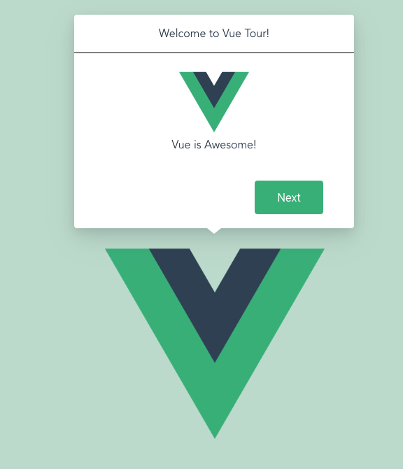
Darn, we failed interaction requirement. Adding the interaction is a matter of creating a component (or components) that will be placed in the BasePopoverContent slot. In the example, I created a very simple component with a header and text showing a few Vue style guide rules. By clicking on the buttons, we can interact with the popover content and change the rules, when you get to the last rule the button changes its purpose and serve as a close button for the popover. It’s a lot like the new user welcome screens we see in apps.
We also need to fully meet the dismissibility requirement. We want to hit ESC on the keyboard to close the popover in addition to clicking anywhere outside it. For kicks, we’ll also add an event that proceeds to the next Vue style guide rule when pressing Enter.
We can handle that in the component responsible for rendering the popover content using Vue event key modifiers. To make the events work we need to make sure that the popover is focused when mounted. To do that we add a tabindex attribute to the popover content and a ref that will allow us to access the element in the mounted hook and call focus method on it.
// VueTourPopoverContent.vue

<template>
  <div
    class="vue-tour-popover-content"
    ref="vueTourPopoverContent"
    tabindex="-1"
    @keydown.enter="proceedToNextStep"
    @keydown.esc="closePopover"
  >
...
</template
...
<script>
export default {
...
  mounted() {
    this.$refs.vueTourPopoverContent.focus();
  }
...
}
</script>
Wrapping up
And there we have it: a fully functional popover component we can use anywhere in our app. Here are a few things we learned along the way:
- Use a popover to expose a small amount of information or functionality. Remember that the content will disappear when user is finished with it.
- Consider using popovers instead of temporary views like sidebars. Popovers leave more space for content and are only temporary.
- Enable a closure behavior that makes sense based on the popover’s function. A popover should be visible only when needed. If it allows user to make a choice, close the popover as soon as the user makes a decision.
- Position popovers onscreen with care. A popover’s arrow should always point directly to the element that triggered it and should never cover the trigger element.
- Display one popover on screen at a time. More than one steals attention.
- Take care of the popover size. Prevent making it too big but bear in mind that proper use of padding can make things look nice and clean.
If you don’t want to dig too deep into the code and you just need the component as it is, you can try out the npm package version of the component.
Hopefully you will find this component useful in your project!
The post Reusable Popovers to Add a Little Pop appeared first on CSS-Tricks.
