Archive

Archive for August, 2019

How Your Agency’s Designers and Developers Can Collaborate More Effectively

August 29th, 2019 No comments

It isn’t uncommon for designers and developers at agencies to clash when building a website — that is, if their collaboration process isn’t streamlined.

As the designers crystalize the look of the site’s front end, they could overlook the functionalities that the developers are hard coding on the backend of the site, causing conflict between the site’s functionality and design. And as the developers code the prototypes that designers have mocked up, they might misunderstand what the creatives had in mind for the way elements interact or resize at different screen dimensions, frustrating designers.

Sure, the convergence of software for prototyping and coding has made these dynamics less contentious than they once were, but software alone won’t solve all your problems. The potential for tensions still lurks, and conflict can escalate rapidly. This can lead to all sorts of problems for the agency manager, such as quarrels in the office, client complaints, missed deadlines, or subpar work.

When all is said and done, it all boils down to your team getting frustrated, your agency losing revenue, and your brand reputation getting smeared.

It’s precisely because of this that you need to streamline how your designers and developers collaborate. And to make that happen, you need to have a clear set of expectations – and the tools to implement them. Here’s the process we recommend.

1. Set up SLAs and Project Wikis.

In the context of this discussion, an SLA (or Service-Level Agreement) is basically the commitment/agreement between your development and design departments. While there are several types of SLAs, we’re going to zoom in on internal SLAs, since we’re talking about improving how two of your organization’s teams collaborate.

The agreement contains what each party commits to deliver to the other and expects to receive from the other. It covers several components like the output that will be provided, the desired measurable quality of the output, the responsibility of each party, the repercussions if the service is not provided, etc.

SLAs are great, since they help ensure everyone’s expectations are aligned. The first step to creating an SLA is to have a meeting with both parties so they can hammer out the expectations and requirements. These can refer to technical requirements, such as file formats and specifications, or they can focus more on workflow and division of labor issues, such as turnaround lag times for various phases of projects.

With an SLA in place, both your designers and web development teams can operate with a level of autonomy, since they know what is expected of them, even without consulting the other department.

Now that we have the SLA bit cleared up, it’s time for you to set up your project wikis. Basically, project wikis are like central filing cabinets with truckloads of important resources that your team members can access any time. This is where you store your SLAs, standards, policies and project assets.

Whenever your designers or web developers are uncertain about something, they can revert to the relevant wiki to make sure that what they’re doing is well within the standards they established, and the output they’re producing is acceptable to the other department.

To help you put together your project wikis, you can use a documentation collaboration tool like Notion. The platform offers a free tier and it’s very easy to use. Notion has several templates your team can use for wikis associated with website build projects.

You can store your documents here so everyone can access them at any time. You can also set permissions for who can view, comment, or edit your files.

By establishing SLAs and using a tool like Notion to set up your project wikis and improve your collaboration, your design and development teams will have all the terms spelled out for collaborating more cohesively.

2. All parties should work together from the get-go.

In most cases, designers have the first crack at creating websites for clients. They are the ones who do research into UX trends in the client’s industry, who create thumbnails and wireframes, deliver mockups, and refine these concepts with the client.

Once designers have finalized how the client’s website to look and function, only then do they hand over the details to the developers, and that’s when tech feasibility assessments and coding processes begin.

But the default workflow described above can be a big mistake.

The thing is, the plan that the designers came up with might have been awesome, but from the developers’ point of view, it’d be impossible to pull off. If not impossible, it’d be too time-consuming or costly, when pegged against the allocated budget or manpower hours for the website.

It’s because of situations like these that designers and developers should be collaborating from the get-go.

As the designer conceptualizes, the developer should also be there validating if the designer’s idea is feasible or not. That way, everyone is on the same page and everyone knows with certainty that the concept the designer came up with is doable – as part of the client-facing planning process.

3. Use a teamwork-friendly production platform.

The same thing happens, no matter what. It doesn’t matter whether your team uses some kind of WordPress sandboxing solution, a prototype-to-production tool, or a dedicated multisite design platform to build out websites. At some point (hopefully quickly), the client will approve your plans, the prototyping phase will be complete, and it will be time to actually build the site.

Is the software you use for this optimized for efficient building of user interfaces and functionalities? Is its purpose primarily to convert file formats and hand off assets from designers to developers, so as to minimize the need for custom coding? Or is it more than that, a solution made for maximizing stakeholder visibility and scaling production processes over time?

Teamwork, after all, is an absolute must for building a successful agency. With a reliable website builder platform that allows for a more streamlined team collaboration, you’ll experience far fewer hiccups during your website creation process.

Duda is a web design platform for agencies bent on scaling business. It has a wide array of features for building websites, managing clients, and team collaboration. To improve how your team works together, Duda has an instant messaging feature that allows clients, marketers, designers, and developers to chat about the project from within pre-launch versions of the site.

Duda also makes it easy to customize page layouts, widgets, and even full website templates, all of which you can save to shared libraries so that your team won’t have to build things from scratch every time a new project starts.

4. Hire a competent project manager.

Sometimes, the reason why your web designers and developers don’t get along is simply that they are managed poorly. Either the project manager is slacking off, or he/she just doesn’t know the psychology behind empowering people and building a cohesive team.

It’s important for your agency to have PMs who wield interpersonal influence over your designers and developers. This allows them to establish meaningful relationships with both parties, and even build bridges to help collaborations between the two-run smoother.

And so the question becomes, where are you supposed to find a reliable project manager? One who can gel your designers and developers together? While it’s primarily used for one-off gig work, Upwork could be a great place to find your ideal project manager.

The platform features literally millions of freelancers who can help you with varying tasks like writing, social media marketing, web design, web development, and… you guessed it, project management.

There are freelancers on Upwork who are tried and tested to produce exceptional work.

Just by looking at their job success rates and the amounts they’ve earned, you’ll have an idea of how seasoned and reliable the freelancer is. You can also view the feedback/reviews the freelancer has received from prior clients.

With a robust freelance marketplace platform like Upwork, it’ll only take you minutes to shortlist competent PMs.

What’s next?

While it might be challenging to run a team of web developers and designers, it is not at all impossible. With the help of the right strategies and tools, you can pull it off swimmingly and be on your way to scale your agency to greater heights.

Categories: Others Tags:

Nested Gradients with background-clip

August 28th, 2019 No comments

I can’t say I use background-clip all that often. I’d wager it’s hardly ever used in day-to-day CSS work. But I was reminded of it in a post by Stefan Judis, which consistently was itself a learning-response post to a post over here by Ana Tudor.

Here’s a quick explanation.

You’ve probably seen this thing a million times:

The box model visualizer in DevTools.

That’s showing you the size and position of an element, as well as how that size is made up: content size, padding, margin, and border.

Those things aren’t just theoretical to help with understanding and debugging. Elements actually have a content-box, padding-box, and border-box. Perhaps we encounter that most often when we literally set the box-sizing property. (It’s tremendously useful to universally set it to border-box).

Those values are the same values as background-clip uses! Meaning that you can set a background to only cover those specific areas. And because multiple backgrounds is a thing, that means we can have multiple backgrounds with different clipping on each.

Like this:

See the Pen
Multiple background-clip
by Chris Coyier (@chriscoyier)
on CodePen.

But that’s boring and there are many ways to pull off that effect, like using borders, outline, and box-shadow or any combination of them.

What is more interesting is the fact that those backgrounds could be gradients, and that’s a lot harder to pull off any other way!

See the Pen
Nested Gradients
by Chris Coyier (@chriscoyier)
on CodePen.

The post Nested Gradients with background-clip appeared first on CSS-Tricks.

Categories: Designing, Others Tags:

Creating a Maintainable Icon System with Sass

August 28th, 2019 No comments

One of my favorite ways of adding icons to a site is by including them as data URL background images to pseudo-elements (e.g. ::after) in my CSS. This technique offers several advantages:

  • They don’t require any additional HTTP requests other than the CSS file.
  • Using the background-size property, you can set your pseudo-element to any size you need without worrying that they will overflow the boundaries (or get chopped off).
  • They are ignored by screen readers (at least in my tests using VoiceOver on the Mac) so which is good for decorative-only icons.

But there are some drawbacks to this technique as well:

  • When used as a background-image data URL, you lose the ability to change the SVG’s colors using the “fill” or “stroke” CSS properties (same as if you used the filename reference, e.g. url( 'some-icon-file.svg' )). We can use filter() as an alternative, but that might not always be a feasible solution.
  • SVG markup can look big and ugly when used as data URLs, making them difficult to maintain when you need to use the icons in multiple locations and/or have to change them.

We’re going to address both of these drawbacks in this article.

The situation

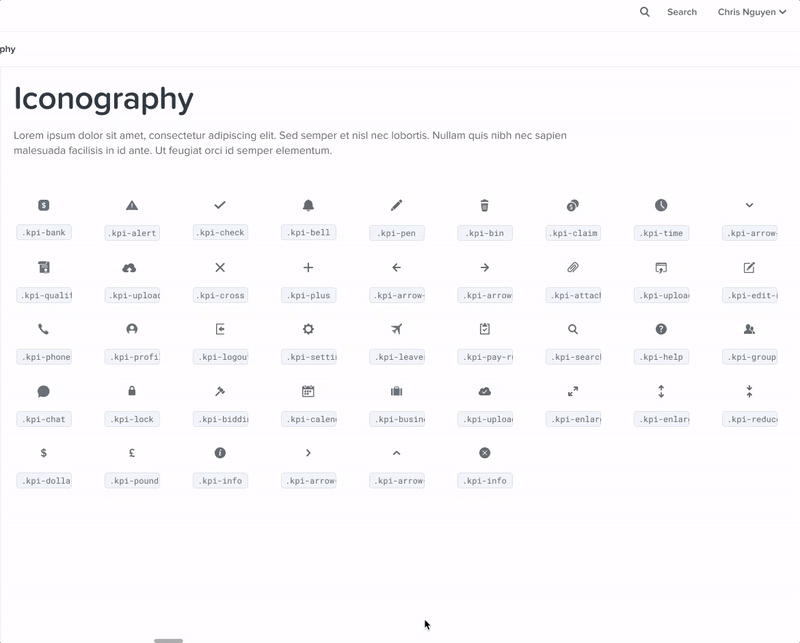
Let’s build a site that uses a robust iconography system, and let’s say that it has several different button icons which all indicate different actions:

  • A “download” icon for downloadable content
  • An “external link” icon for buttons that take us to another website
  • A “right caret” icon for taking us to the next step in a process

Right off the bat, that gives us three icons. And while that may not seem like much, already I’m getting nervous about how maintainable this is going to be when we scale it out to more icons like social media networks and the like. For the sake of this article, we’re going to stop at these three, but you can imagine how in a sophisticated icon system this could get very unwieldy, very quickly.

It’s time to go to the code. First, we’ll set up a basic button, and then by using a BEM naming convention, we’ll assign the proper icon to its corresponding button. (At this point, it’s fair to warn you that we’ll be writing everything out in Sass, or more specifically, SCSS. And for the sake of argument, assume I’m running Autoprefixer to deal with things like the appearance property.)

.button {
  appearance: none;
  background: #d95a2b;
  border: 0;
  border-radius: 100em;
  color: #fff;
  cursor: pointer;
  display: inline-block;
  font-size: 18px;
  font-weight: 700;
  line-height: 1;
  padding: 1em calc( 1.5em + 32px ) 0.9em 1.5em;
  position: relative;
  text-align: center;
  text-transform: uppercase;
  transition: background-color 200ms ease-in-out;

  &:hover,
  &:focus,
  &:active {
    background: #8c3c2a;
  }
}

This gives us a simple, attractive, orange button that turns to a darker orange on the hover, focused, and active states. It even gives us a little room for the icons we want to add, so let’s add them in now using pseudo-elements:

.button {

  /* everything from before, plus... */

  &::after {
    background: center / 24px 24px no-repeat; // Shorthand for: background-position, background-size, background-repeat
    border-radius: 100em;
    bottom: 0;
    content: '';
    position: absolute;
    right: 0;
    top: 0;
    width: 48px;
  }

  &--download {

    &::after {
      background-image: url( 'data:image/svg+xml;utf-8,<svg xmlns="http://www.w3.org/2000/svg" width="30.544" height="25.294" viewBox="0 0 30.544 25.294"><g transform="translate(-991.366 -1287.5)"><path d="M1454.5,1298.922l6.881,6.881-6.881,6.881" transform="translate(2312.404 -157.556) rotate(90)" fill="none" stroke="%23fff" stroke-width="3"/><path d="M8853.866,5633.57v9.724h27.544v-9.724" transform="translate(-7861 -4332)" fill="none" stroke="%23fff" stroke-linejoin="round" stroke-width="3"/><line y2="14" transform="translate(1006.5 1287.5)" fill="none" stroke="%23fff" stroke-width="3"/></g></svg>' );
      }
    }

  &--external {

    &::after {
      background-image: url( 'data:image/svg+xml;utf-8,<svg xmlns="http://www.w3.org/2000/svg" width="31.408" height="33.919" viewBox="0 0 31.408 33.919"><g transform="translate(-1008.919 -965.628)"><g transform="translate(1046.174 2398.574) rotate(-135)"><path d="M0,0,7.879,7.879,0,15.759" transform="translate(1025.259 990.17) rotate(90)" fill="none" stroke="%23fff" stroke-width="3"/><line y2="16.032" transform="translate(1017.516 980.5)" fill="none" stroke="%23fff" stroke-width="3"/></g><path d="M10683.643,5322.808v10.24h-20.386v-21.215h7.446" transform="translate(-9652.838 -4335)" fill="none" stroke="%23fff" stroke-width="3"/></g></svg>' );
    }
  }

  &--caret-right {

    &::after {
      background-image: url( 'data:image/svg+xml;utf-8,<svg xmlns="http://www.w3.org/2000/svg" viewBox="0 0 19.129 34.016"><path d="M1454.5,1298.922l15.947,15.947-15.947,15.947" transform="translate(-1453.439 -1297.861)" fill="none" stroke="%23fff" stroke-width="3"/></svg>' );
    }
  }
}

Let’s pause here. While we’re keeping our SCSS as tidy as possible by declaring the properties common to all buttons, and then only specifying the background SVGs on a per-class basis, it’s already starting to look a bit unwieldy. That’s that second downside to SVGs I mentioned before: having to use big, ugly markup in our CSS code.

Also, note how we’re defining our fill and stroke colors inside the SVGs. At some point, browsers decided that the octothorpe (“#”) that we all know and love in our hex colors was a security risk, and declared that they would no longer support data URLs that contained them. This leaves us with three options:

  1. Convert our data URLs from markup (like we have here) to base-64 encoded strings, but that makes them even less maintainable than before by completely obfuscating them; or
  2. Use rgba() or hsla() notation, not always intuitive as many developers have been using hex for years; or
  3. Convert our octothorpes to their URL-encoded equivalents, “%23”.

We’re going to go with option number three, and work around that browser limitation. (I will mention here, however, that this technique will work with rgb(), hsla(), or any other valid color format, even CSS named colors. But please don’t use CSS named colors in production code.)

Moving to maps

At this point, we only have three buttons fully declared. But I don’t like them just dumped in the code like this. If we needed to use those same icons elsewhere, we’d have to copy and paste the SVG markup, or else we could assign them to variables (either Sass or CSS custom properties), and reuse them that way. But I’m going to go for what’s behind door number three, and switch to using one of Sass’ greatest features: maps.

If you’re not familiar with Sass maps, they are, in essence, the Sass version of an associative array. Instead of a numerically-indexed array of items, we can assign a name (a key, if you will) so that we can retrieve them by something logical and easily remembered. So let’s build a Sass map of our three icons:

$icons: (
  'download':    '<svg xmlns="http://www.w3.org/2000/svg" width="30.544" height="25.294" viewBox="0 0 30.544 25.294"><g transform="translate(-991.366 -1287.5)"><path d="M1454.5,1298.922l6.881,6.881-6.881,6.881" transform="translate(2312.404 -157.556) rotate(90)" fill="none" stroke="%23fff" stroke-width="3"/><path d="M8853.866,5633.57v9.724h27.544v-9.724" transform="translate(-7861 -4332)" fill="none" stroke="%23fff" stroke-linejoin="round" stroke-width="3"/><line y2="14" transform="translate(1006.5 1287.5)" fill="none" stroke="%23fff" stroke-width="3"/></g></svg>',
  'external':    '<svg xmlns="http://www.w3.org/2000/svg" width="31.408" height="33.919" viewBox="0 0 31.408 33.919"><g transform="translate(-1008.919 -965.628)"><g transform="translate(1046.174 2398.574) rotate(-135)"><path d="M0,0,7.879,7.879,0,15.759" transform="translate(1025.259 990.17) rotate(90)" fill="none" stroke="%23fff" stroke-width="3"/><line y2="16.032" transform="translate(1017.516 980.5)" fill="none" stroke="%23fff" stroke-width="3"/></g><path d="M10683.643,5322.808v10.24h-20.386v-21.215h7.446" transform="translate(-9652.838 -4335)" fill="none" stroke="%23fff" stroke-width="3"/></g></svg>',
  'caret-right': '<svg xmlns="http://www.w3.org/2000/svg" viewBox="0 0 19.129 34.016"><path d="M1454.5,1298.922l15.947,15.947-15.947,15.947" transform="translate(-1453.439 -1297.861)" fill="none" stroke="%23fff" stroke-width="3"/></svg>',
);

There are two things to note here: We didn’t include the data:image/svg+xml;utf-8, string in any of those icons, only the SVG markup itself. That string is going to be the same every single time we need to use these icons, so why repeat ourselves and run the risk of making a mistake? Let’s instead define it as its own string and prepend it to the icon markup when needed:

$data-svg-prefix: 'data:image/svg+xml;utf-8,';

The other thing to note is that we aren’t actually making our SVG any prettier; there’s no way to do that. What we are doing is pulling all that ugliness out of the code we’re working on a day-to-day basis so we don’t have to look at all that visual clutter as much. Heck, we could even put it in its own partial that we only have to touch when we need to add more icons. Out of sight, out of mind!

So now, let’s use our map. Going back to our button code, we can now replace those icon literals with pulling them from the icon map instead:

&--download {

  &::after {
    background-image: url( $data-svg-prefix + map-get( $icons, 'download' ) );
  }
}

&--external {

  &::after {
    background-image: url( $data-svg-prefix + map-get( $icons, 'external' ) );
  }
}

&--next {

  &::after {
    background-image: url( $data-svg-prefix + map-get( $icons, 'caret-right' ) );
  }
}

Already, that’s looking much better. We’ve started abstracting out our icons in a way that keeps our code readable and maintainable. And if that were the only challenge, we’d be done. But in the real-world project that inspired this article, we had another wrinkle: different colors.

Our buttons are a solid color which turn to a darker version of that color on their hover state. But what if we want “ghost” buttons instead, that turn into solid colors on hover? In this case, white icons would be invisible for buttons that appear on white backgrounds (and probably look wrong on non-white backgrounds). What we’re going to need are two variations of each icon: the white one for the hover state, and one that matches button’s border and text color for the non-hover state.

Let’s update our button’s base CSS to turn it in from a solid button to a ghost button that turns solid on hover. And we’ll need to adjust the pseudo-elements for our icons, too, so we can swap them out on hover as well.

.button {
  appearance: none;
  background: none;
  border: 3px solid #d95a2b;
  border-radius: 100em;
  color: #d95a2b;
  cursor: pointer;
  display: inline-block;
  font-size: 18px;
  font-weight: bold;
  line-height: 1;
  padding: 1em calc( 1.5em + 32px ) 0.9em 1.5em;
  position: relative;
  text-align: center;
  text-transform: uppercase;
  transition: 200ms ease-in-out;
  transition-property: background-color, color;

  &:hover,
  &:focus,
  &:active {
    background: #d95a2b;
    color: #fff;
  }
}

Now we need to create our different-colored icons. One possible solution is to add the color variations directly to our map… somehow. We can either add new different-colored icons as additional items in our one-dimensional map, or make our map two-dimensional.

One-Dimensional Map:

$icons: (
  'download-white':  '<svg xmlns="http://www.w3.org/2000/svg" width="30.544" height="25.294" viewBox="0 0 30.544 25.294"><g transform="translate(-991.366 -1287.5)"><path d="M1454.5,1298.922l6.881,6.881-6.881,6.881" transform="translate(2312.404 -157.556) rotate(90)" fill="none" stroke="%23fff" stroke-width="3"/><path d="M8853.866,5633.57v9.724h27.544v-9.724" transform="translate(-7861 -4332)" fill="none" stroke="%23fff" stroke-linejoin="round" stroke-width="3"/><line y2="14" transform="translate(1006.5 1287.5)" fill="none" stroke="%23fff" stroke-width="3"/></g></svg>',
  'download-orange': '<svg xmlns="http://www.w3.org/2000/svg" width="30.544" height="25.294" viewBox="0 0 30.544 25.294"><g transform="translate(-991.366 -1287.5)"><path d="M1454.5,1298.922l6.881,6.881-6.881,6.881" transform="translate(2312.404 -157.556) rotate(90)" fill="none" stroke="%23d95a2b" stroke-width="3"/><path d="M8853.866,5633.57v9.724h27.544v-9.724" transform="translate(-7861 -4332)" fill="none" stroke="%23d95a2b" stroke-linejoin="round" stroke-width="3"/><line y2="14" transform="translate(1006.5 1287.5)" fill="none" stroke="%23d95a2b" stroke-width="3"/></g></svg>',
);

Two-Dimensional Map:

$icons: (
  'download': (
    'white':  '<svg xmlns="http://www.w3.org/2000/svg" width="30.544" height="25.294" viewBox="0 0 30.544 25.294"><g transform="translate(-991.366 -1287.5)"><path d="M1454.5,1298.922l6.881,6.881-6.881,6.881" transform="translate(2312.404 -157.556) rotate(90)" fill="none" stroke="%23fff" stroke-width="3"/><path d="M8853.866,5633.57v9.724h27.544v-9.724" transform="translate(-7861 -4332)" fill="none" stroke="%23fff" stroke-linejoin="round" stroke-width="3"/><line y2="14" transform="translate(1006.5 1287.5)" fill="none" stroke="%23fff" stroke-width="3"/></g></svg>',
    'orange': '<svg xmlns="http://www.w3.org/2000/svg" width="30.544" height="25.294" viewBox="0 0 30.544 25.294"><g transform="translate(-991.366 -1287.5)"><path d="M1454.5,1298.922l6.881,6.881-6.881,6.881" transform="translate(2312.404 -157.556) rotate(90)" fill="none" stroke="%23d95a2b" stroke-width="3"/><path d="M8853.866,5633.57v9.724h27.544v-9.724" transform="translate(-7861 -4332)" fill="none" stroke="%23d95a2b" stroke-linejoin="round" stroke-width="3"/><line y2="14" transform="translate(1006.5 1287.5)" fill="none" stroke="%23d95a2b" stroke-width="3"/></g></svg>',
  ),
);

Either way, this is problematic. By just adding one additional color, we’re going to double our maintenance efforts. Need to change the existing download icon with a different one? We need to manually create each color variation to add it to the map. Need a third color? Now you’ve just tripled your maintenance costs. I’m not even going to get into the code to retrieve values from a multi-dimensional Sass map because that’s not going to serve our ultimate goal here. Instead, we’re just going to move on.

Enter string replacement

Aside from maps, the utility of Sass in this article comes from how we can use it to make CSS behave more like a programming language. Sass has built-in functions (like map-get(), which we’ve already seen), and it allows us to write our own.

Sass also has a bunch of string functions built-in, but inexplicably, a string replacement function isn’t one of them. That’s too bad, as its usefulness is obvious. But all is not lost.

Hugo Giradel gave us a Sass version of str-replace() here on CSS-Tricks in 2014. We can use that here to create one version of our icons in our Sass map, using a placeholder for our color values. Let’s add that function to our own code:

@function str-replace( $string, $search, $replace: '' ) {

  $index: str-index( $string, $search );

  @if $index {
    @return str-slice( $string, 1, $index - 1 ) + $replace + str-replace( str-slice( $string, $index + str-length( $search ) ), $search, $replace);
  }

  @return $string;
}

Next, we’ll update our original Sass icon map (the one with only the white versions of our icons) to replace the white with a placeholder (%%COLOR%%) that we can swap out with whatever color we call for, on demand.

$icons: (
  'download':    '<svg xmlns="http://www.w3.org/2000/svg" width="30.544" height="25.294" viewBox="0 0 30.544 25.294"><g transform="translate(-991.366 -1287.5)"><path d="M1454.5,1298.922l6.881,6.881-6.881,6.881" transform="translate(2312.404 -157.556) rotate(90)" fill="none" stroke="%%COLOR%%" stroke-width="3"/><path d="M8853.866,5633.57v9.724h27.544v-9.724" transform="translate(-7861 -4332)" fill="none" stroke="%%COLOR%%" stroke-linejoin="round" stroke-width="3"/><line y2="14" transform="translate(1006.5 1287.5)" fill="none" stroke="%%COLOR%%" stroke-width="3"/></g></svg>',
  'external':    '<svg xmlns="http://www.w3.org/2000/svg" width="31.408" height="33.919" viewBox="0 0 31.408 33.919"><g transform="translate(-1008.919 -965.628)"><g transform="translate(1046.174 2398.574) rotate(-135)"><path d="M0,0,7.879,7.879,0,15.759" transform="translate(1025.259 990.17) rotate(90)" fill="none" stroke="%%COLOR%%" stroke-width="3"/><line y2="16.032" transform="translate(1017.516 980.5)" fill="none" stroke="%%COLOR%%" stroke-width="3"/></g><path d="M10683.643,5322.808v10.24h-20.386v-21.215h7.446" transform="translate(-9652.838 -4335)" fill="none" stroke="%%COLOR%%" stroke-width="3"/></g></svg>',
  'caret-right': '<svg xmlns="http://www.w3.org/2000/svg" viewBox="0 0 19.129 34.016"><path d="M1454.5,1298.922l15.947,15.947-15.947,15.947" transform="translate(-1453.439 -1297.861)" fill="none" stroke="%%COLOR%%" stroke-width="3"/></svg>',
);

But if we were going to try and fetch these icons using just our new str-replace() function and Sass’ built-in map-get() function, we’d end with something big and ugly. I’d rather tie these two together with one more function that makes calling the icon we want in the color we want as simple as one function with two parameters (and because I’m particularly lazy, we’ll even make the color default to white, so we can omit that parameter if that’s the color icon we want).

Because we’re getting an icon, it’s a “getter” function, and so we’ll call it get-icon():

@function get-icon( $icon, $color: #fff ) {

  $icon:        map-get( $icons, $icon );
  $placeholder: '%%COLOR%%';

  $data-uri: str-replace( url( $data-svg-prefix + $icon ), $placeholder, $color );

  @return str-replace( $data-uri, '#', '%23' );
}

Remember where we said that browsers won’t render data URLs that have octothorpes in them? Yeah, we’re str-replace()ing that too so we don’t have to remember to pass along “%23” in our color hex codes.

Side note: I have a Sass function for abstracting colors too, but since that’s outside the scope of this article, I’ll refer you to my get-color() gist to peruse at your leisure.

The result

Now that we have our get-icon() function, let’s put it to use. Going back to our button code, we can replace our map-get() function with our new icon getter:

&--download {

  &::before {
    background-image: get-icon( 'download', #d95a2b );
  }

  &::after {
    background-image: get-icon( 'download', #fff ); // The ", #fff" isn't strictly necessary, because white is already our default
  }
}

&--external {

  &::before {
    background-image: get-icon( 'external', #d95a2b );
  }

  &::after {
    background-image: get-icon( 'external' );
  }
}

&--next {

  &::before {
    background-image: get-icon( 'arrow-right', #d95a2b );
  }

  &::after {
    background-image: get-icon( 'arrow-right' );
  }
}

So much easier, isn’t it? Now we can call any icon we’ve defined, with any color we need. All with simple, clean, logical code.

  • We only ever have to declare an SVG in one place.
  • We have a function that gets that icon in whatever color we give it.
  • Everything is abstracted out to a logical function that does exactly what it looks like it will do: get X icon in Y color.

Making it fool-proof

The one thing we’re lacking is error-checking. I’m a huge believer in failing silently… or at the very least, failing in a way that is invisible to the user yet clearly tells the developer what is wrong and how to fix it. (For that reason, I should be using unit tests way more than I do, but that’s a topic for another day.)

One way we have already reduced our function’s propensity for errors is by setting a default color (in this case, white). So if the developer using get-icon() forgets to add a color, no worries; the icon will be white, and if that’s not what the developer wanted, it’s obvious and easily fixed.

But wait, what if that second parameter isn’t a color? As if, the developer entered a color incorrectly, so that it was no longer being recognized as a color by the Sass processor?

Fortunately we can check for what type of value the $color variable is:

@function get-icon( $icon, $color: #fff ) {

  @if 'color' != type-of( $color ) {

    @warn 'The requested color - "' + $color + '" - was not recognized as a Sass color value.';
    @return null;
  }

  $icon:        map-get( $icons, $icon );
  $placeholder: '%%COLOR%%';
  $data-uri:    str-replace( url( $data-svg-prefix + $icon ), $placeholder, $color );

  @return str-replace( $data-uri, '#', '%23' );
}

Now if we tried to enter a nonsensical color value:

&--download {

  &::before {
    background-image: get-icon( 'download', ce-nest-pas-un-couleur );
  }
}

…we get output explaining our error:

Line 25 CSS: The requested color - "ce-nest-pas-un-couleur" - was not recognized as a Sass color value.

…and the processing stops.

But what if the developer doesn’t declare the icon? Or, more likely, declares an icon that doesn’t exist in the Sass map? Serving a default icon doesn’t really make sense in this scenario, which is why the icon is a mandatory parameter in the first place. But just to make sure we are calling an icon, and it is valid, we’re going to add another check:

@function get-icon( $icon, $color: #fff ) {

  @if 'color' != type-of( $color ) {

    @warn 'The requested color - "' + $color + '" - was not recognized as a Sass color value.';
    @return null;
  }

  @if map-has-key( $icons, $icon ) {

    $icon:        map-get( $icons, $icon );
    $placeholder: '%%COLOR%%';
    $data-uri:    str-replace( url( $data-svg-prefix + $icon ), $placeholder, $color );

    @return str-replace( $data-uri, '#', '%23' );
  }

  @warn 'The requested icon - "' + $icon + '" - is not defined in the $icons map.';
  @return null;
}

We’ve wrapped the meat of the function inside an @if statement that checks if the map has the key provided. If so (which is the situation we’re hoping for), the processed data URL is returned. The function stops right then and there — at the @return — which is why we don’t need an @else statement.

But if our icon isn’t found, then null is returned, along with a @warning in the console output identifying the problem request, plus the partial filename and line number. Now we know exactly what’s wrong, and when and what needs fixing.

So if we were to accidentally enter:

&--download {

  &::before {
    background-image: get-icon( 'ce-nest-pas-une-icône', #d95a2b );
  }
}

…we would see the output in our console, where our Sass process was watching and running:

Line 32 CSS: The requested icon - "ce-nest-pas-une-icône" - is not defined in the $icons map.

As for the button itself, the area where the icon would be will be blank. Not as good as having our desired icon there, but soooo much better than a broken image graphic or some such.

Conclusion

After all of that, let’s take a look at our final, processed CSS:

.button {
  -webkit-appearance: none;
      -moz-appearance: none;
          appearance: none;
  background: none;
  border: 3px solid #d95a2b;
  border-radius: 100em;
  color: #d95a2b;
  cursor: pointer;
  display: inline-block;
  font-size: 18px;
  font-weight: 700;
  line-height: 1;
  padding: 1em calc( 1.5em + 32px ) 0.9em 1.5em;
  position: relative;
  text-align: center;
  text-transform: uppercase;
  transition: 200ms ease-in-out;
  transition-property: background-color, color;
}
.button:hover, .button:active, .button:focus {
  background: #d95a2b;
  color: #fff;
}
.button::before, .button::after {
  background: center / 24px 24px no-repeat;
  border-radius: 100em;
  bottom: 0;
  content: '';
  position: absolute;
  right: 0;
  top: 0;
  width: 48px;
}
.button::after {
  opacity: 0;
  transition: opacity 200ms ease-in-out;
}
.button:hover::after, .button:focus::after, .button:active::after {
  opacity: 1;
}
.button--download::before {
  background-image: url('data:image/svg+xml;utf-8,<svg xmlns="http://www.w3.org/2000/svg" width="30.544" height="25.294" viewBox="0 0 30.544 25.294"><g transform="translate(-991.366 -1287.5)"><path d="M1454.5,1298.922l6.881,6.881-6.881,6.881" transform="translate(2312.404 -157.556) rotate(90)" fill="none" stroke="%23d95a2b" stroke-width="3"/><path d="M8853.866,5633.57v9.724h27.544v-9.724" transform="translate(-7861 -4332)" fill="none" stroke="%23d95a2b" stroke-linejoin="round" stroke-width="3"/><line y2="14" transform="translate(1006.5 1287.5)" fill="none" stroke="%23d95a2b" stroke-width="3"/></g></svg>');
}
.button--download::after {
  background-image: url('data:image/svg+xml;utf-8,<svg xmlns="http://www.w3.org/2000/svg" width="30.544" height="25.294" viewBox="0 0 30.544 25.294"><g transform="translate(-991.366 -1287.5)"><path d="M1454.5,1298.922l6.881,6.881-6.881,6.881" transform="translate(2312.404 -157.556) rotate(90)" fill="none" stroke="%23fff" stroke-width="3"/><path d="M8853.866,5633.57v9.724h27.544v-9.724" transform="translate(-7861 -4332)" fill="none" stroke="%23fff" stroke-linejoin="round" stroke-width="3"/><line y2="14" transform="translate(1006.5 1287.5)" fill="none" stroke="%23fff" stroke-width="3"/></g></svg>');
}
.button--external::before {
  background-image: url('data:image/svg+xml;utf-8,<svg xmlns="http://www.w3.org/2000/svg" width="31.408" height="33.919" viewBox="0 0 31.408 33.919"><g transform="translate(-1008.919 -965.628)"><g transform="translate(1046.174 2398.574) rotate(-135)"><path d="M0,0,7.879,7.879,0,15.759" transform="translate(1025.259 990.17) rotate(90)" fill="none" stroke="%23d95a2b" stroke-width="3"/><line y2="16.032" transform="translate(1017.516 980.5)" fill="none" stroke="%23d95a2b" stroke-width="3"/></g><path d="M10683.643,5322.808v10.24h-20.386v-21.215h7.446" transform="translate(-9652.838 -4335)" fill="none" stroke="%23d95a2b" stroke-width="3"/></g></svg>');
}
.button--external::after {
  background-image: url('data:image/svg+xml;utf-8,<svg xmlns="http://www.w3.org/2000/svg" width="31.408" height="33.919" viewBox="0 0 31.408 33.919"><g transform="translate(-1008.919 -965.628)"><g transform="translate(1046.174 2398.574) rotate(-135)"><path d="M0,0,7.879,7.879,0,15.759" transform="translate(1025.259 990.17) rotate(90)" fill="none" stroke="%23fff" stroke-width="3"/><line y2="16.032" transform="translate(1017.516 980.5)" fill="none" stroke="%23fff" stroke-width="3"/></g><path d="M10683.643,5322.808v10.24h-20.386v-21.215h7.446" transform="translate(-9652.838 -4335)" fill="none" stroke="%23fff" stroke-width="3"/></g></svg>');
}
.button--next::before {
  background-image: url('data:image/svg+xml;utf-8,<svg xmlns="http://www.w3.org/2000/svg" viewBox="0 0 19.129 34.016"><path d="M1454.5,1298.922l15.947,15.947-15.947,15.947" transform="translate(-1453.439 -1297.861)" fill="none" stroke="%23d95a2b" stroke-width="3"/></svg>');
}
.button--next::after {
  background-image: url('data:image/svg+xml;utf-8,<svg xmlns="http://www.w3.org/2000/svg" viewBox="0 0 19.129 34.016"><path d="M1454.5,1298.922l15.947,15.947-15.947,15.947" transform="translate(-1453.439 -1297.861)" fill="none" stroke="%23fff" stroke-width="3"/></svg>');
}

Yikes, still ugly, but it’s ugliness that becomes the browser’s problem, not ours.

I’ve put all this together in CodePen for you to fork and experiment. The long goal for this mini-project is to create a PostCSS plugin to do all of this. This would increase the availability of this technique to everyone regardless of whether they were using a CSS preprocessor or not, or which preprocessor they’re using.

“If I have seen further it is by standing on the shoulders of Giants.”
– Isaac Newton, 1675

Of course we can’t talk about Sass and string replacement and (especially) SVGs without gratefully acknowledging the contributions of the others who’ve inspired this technique.

The post Creating a Maintainable Icon System with Sass appeared first on CSS-Tricks.

Categories: Designing, Others Tags:

Can you rotate the cursor in CSS?

August 28th, 2019 No comments

Kinda! There is no simple or standard way to do it, but it’s possible. You can change the cursor to different built-in native versions with CSS with the cursor property, but that doesn’t help much here. You can also use that property to set a static image as the cursor. But again that doesn’t help much because you can’t rotate it once it’s there.

The trick is to totally hide the cursor with cursor: none; and replace it with your own element.

Here’s an example of that:

See the Pen
Move fake mouse with JavaScript
by Chris Coyier (@chriscoyier)
on CodePen.

That’s not rotating yet. But now that the cursor is just some element on the page, CSS’s transform: rotate(); is fully capable of that job. Some math is required.

I’ll leave that to Aaron Iker’s really fun demo:

See the Pen
Mouse cursor pointing to cta
by Aaron Iker (@aaroniker)
on CodePen.

Is this an accessibility problem? Something about it makes me think it might be. It’s a little extra motion where you aren’t expecting it and perhaps a little disorienting when an element you might rely on for a form of stability starts moving on you. It’s really only something you’d do for limited-use novelty and while respecting the prefers-reduced-motion. You could also keep the original cursor and do something under it, as Jackson Callaway has done here.

The post Can you rotate the cursor in CSS? appeared first on CSS-Tricks.

Categories: Designing, Others Tags:

Beyond The Browser: Getting Started With Serverless WebAssembly

August 28th, 2019 No comments
GIF of our application making parallel calls to a serverless WebAssembly function, and updating plots with the data it returns.

Beyond The Browser: Getting Started With Serverless WebAssembly

Beyond The Browser: Getting Started With Serverless WebAssembly

Robert Aboukhalil

2019-08-28T13:30:59+02:002019-08-28T14:35:15+00:00

Now that WebAssembly is supported by all major browsers and more than 85% of users worldwide, JavaScript is no longer the only browser language in town. If you haven’t heard, WebAssembly is a new low-level language that runs in the browser. It’s also a compilation target, which means you can compile existing programs written in languages such as C, C++, and Rust into WebAssembly, and run those programs in the browser. So far, WebAssembly has been used to port all sorts of applications to the web, including desktop applications, command-line tools, games and data science tools.

Note: For an in-depth case study of how WebAssembly can be used inside the browser to speed up web applications, check out my previous article.

WebAssembly Outside The Web?

Although most WebAssembly applications today are browser-centric, WebAssembly itself wasn’t originally designed just for the web, but really for any sandboxed environment. In fact, there’s recently been a lot of interest in exploring how WebAssembly could be useful outside the browser, as a general approach for running binaries on any OS or computer architecture, so long as there is a WebAssembly runtime that supports that system. In this article, we’ll look at how WebAssembly can be run outside the browser, in a serverless/Function-as-a-Service (FaaS) fashion.

WebAssembly For Serverless Applications

In a nutshell, serverless functions are a computing model where you hand your code to a cloud provider, and let them execute and manage scaling that code for you. For example, you can ask for your serverless function to be executed anytime you call an API endpoint, or to be driven by events, such as when a file is uploaded to your cloud bucket. While the term “serverless” may seem like a misnomer since servers are clearly involved somewhere along the way, it is serverless from our point of view since we don’t need to worry about how to manage, deploy or scale those servers.

Although these functions are usually written in languages like Python and JavaScript (Node.js), there are a number of reasons you might choose to use WebAssembly instead:

  1. Faster Initialization Times
    Serverless providers that support WebAssembly (including Cloudflare and Fastly report that they can launch functions at least an order of magnitude faster than most cloud providers can with other languages. They achieve this by running tens of thousands of WebAssembly modules in the same process, which is possible because the sandboxed nature of WebAssembly makes for a more efficient way of obtaining the isolation that containers are traditionally used for.
  2. No Rewrites Needed
    One of the main appeals of WebAssembly in the browser is the ability to port existing code to the web without having to rewrite everything to JavaScript. This benefit still holds true in the serverless use case because cloud providers limit which languages you can write your serverless functions in. Typically, they will support Python, Node.js, and maybe a few others, but certainly not C, C++, or Rust. By supporting WebAssembly, serverless providers can indirectly support a lot more languages.
  3. More Lightweight
    When running WebAssembly in the browser, we’re relying on the end user’s computer to perform our computations. If those computations are too intensive, our users won’t be happy when their computer fan starts whirring. Running WebAssembly outside the browser gives us the speed and portability benefits of WebAssembly, while also keeping our application lightweight. On top of that, since we’re running our WebAssembly code in a more predictable environment, we can potentially perform more intensive computations.

A Concrete Example

In my previous article here on Smashing Magazine, we discussed how we sped up a web application by replacing slow JavaScript calculations with C code compiled to WebAssembly. The web app in question was fastq.bio, a tool for previewing the quality of DNA sequencing data.

As a concrete example, let’s rewrite fastq.bio as an application that makes use of serverless WebAssembly instead of running the WebAssembly inside the browser. For this article, we’ll use Cloudflare Workers, a serverless provider that supports WebAssembly and is built on top of the V8 browser engine. Another cloud provider, Fastly, is working on a similar offering, but based on their Lucet runtime.

First, let’s write some Rust code to analyze the data quality of DNA sequencing data. For convenience, we can leverage the Rust-Bio bioinformatics library to handle parsing the input data, and the wasm-bindgen library to help us compile our Rust code to WebAssembly.

Here’s a snippet of the code that reads in DNA sequencing data and outputs a JSON with a summary of quality metrics:

// Import packages
extern crate wasm_bindgen;
use bio::seq_analysis::gc;
use bio::io::fastq;
...

// This "wasm_bindgen" tag lets us denote the functions
// we want to expose in our WebAssembly module
#[wasm_bindgen]
pub fn fastq_metrics(seq: String) -> String
{
    ...

    // Loop through lines in the file
    let reader = fastq::Reader::new(seq.as_bytes());
    for result in reader.records() {
        let record = result.unwrap();
        let sequence = record.seq();

        // Calculate simple statistics on each record
        n_reads += 1.0;
        let read_length = sequence.len();
        let read_gc = gc::gc_content(sequence);

        // We want to draw histograms of these values
        // so we store their values for later plotting
        hist_gc.push(read_gc * 100.0);
        hist_len.push(read_length);

        ...
    }

    // Return statistics as a JSON blob
    json!({
        "n": n_reads,
        "hist": {
            "gc": hist_gc,
            "len": hist_len
        },
        ...
    }).to_string()
}

We then used Cloudflare’s wrangler command-line tool to do the heavy lifting of compiling to WebAssembly and deploying to the cloud. Once done, we are given an API endpoint that takes sequencing data as input and returns a JSON with data quality metrics. We can now integrate that API into our application.

Here’s a GIF of the application in action:

Instead of running the analysis directly in the browser, the serverless version of our application makes several POST requests in parallel to our serverless function (see right sidebar), and updates the plots each time it returns more data. (Large preview)

The full code is available on GitHub (open-source).

Putting It All In Context

To put the serverless WebAssembly approach in context, let’s consider four main ways in which we can build data processing web applications (i.e. web apps where we perform analysis on data provided by the user):

This figure shows four ways we can structure data processing in a web app: on the server (without WebAssembly), in the browser using JavaScript, in the browser using WebAssembly, and serverless WebAssembly.

Four different architectural choices that we can take for apps that process data. (Large preview)

As shown above, the data processing can be done in several places:

  1. Server-Side
    This is the approach taken by most web applications, where API calls made in the front-end launch data processing on the back-end.
  2. Client-Side JavaScript
    In this approach, the data processing code is written in JavaScript and runs in the browser. The downside is that your performance will take a hit, and if your original code wasn’t in JavaScript, you’ll need to rewrite it from scratch!
  3. Client-Side WebAssembly
    This involves compiling data analysis code to WebAssembly and running it in the browser. If the analysis code was written in languages like C, C++ or Rust (as is often the case in my field of genomics), this obviates the need to rewrite complex algorithms in JavaScript. It also provides the potential for speeding up our application (e.g. as discussed in a previous article).
  4. Serverless WebAssembly
    This involves running the compiled WebAssembly on the cloud, using a FaaS kind of model (e.g. this article).

So why would you choose the serverless approach over the others? For one thing, compared to the first approach, it has the benefits that come with using WebAssembly, especially the ability to port existing code without having to rewrite it to JavaScript. Compared to the third approach, serverless WebAssembly also means our app is more lightweight since we don’t use the user’s resources for number crunching. In particular, if the computations are fairly involved or if the data is already in the cloud, this approach makes more sense.

On the other hand, however, the app now needs to make network connections, so the application will likely be slower. Furthermore, depending on the scale of the computation and whether it is amenable to be broken down into smaller analysis pieces, this approach might not be suitable due to limitations imposed by serverless cloud providers on runtime, CPU, and RAM utilization.

Conclusion

As we saw, it is now possible to run WebAssembly code in a serverless fashion and reap the benefits of both WebAssembly (portability and speed) and those of function-as-a-service architectures (auto-scaling and per-per-use pricing). Certain types of applications — such as data analysis and image processing, to name a few — can greatly benefit from such an approach. Though the runtime suffers because of the additional round-trips to the network, this approach does allow us to process more data at a time and not put a drain on users’ resources.

(rb, dm, yk, il)
Categories: Others Tags:

How Prevalent is Dark UX?

August 28th, 2019 No comments

Iconic comedy duo Mitchell and Webb once asked a very important question: “Are we the baddies?” Given that, at the time, they were dressed in Nazi uniforms with skulls on their hats, and looked like rejected villains from a Wolfenstein game, the answer was something of a foregone conclusion.

But what about us? No, no web or UX designers that I know of have ever invaded Poland, or done any of the more horrifying things that Nazis are known for, thankfully. But then, we’ve got a whole field of design called “dark UX”, and that’s… concerning. In other words:

It sure feels like dark UX is everywhere…

“Are we the baddies?” How bad is it these days? It sure feels like dark UX is everywhere, with companies trying to get their hands on your cash no matter the cost.

The generally accepted definition of dark UX is something along the lines of: Intentionally malicious, deceitful, or even just highly manipulative design patterns that try to trick you into doing something you otherwise wouldn’t.

I think, to answer that question, we need to establish that the first bit—the intentional malice, deceit, or manipulation—is the defining characteristic of dark UX. Just getting people to do something they might otherwise not… it’s not always a bad thing — doctors and especially dentists, try to do that all the time, to varying degrees of success.

Marketing, even, introduces you to ideas and products you may not otherwise know about, and so would not otherwise buy. While marketing can very often feel scummy, I am forced to admit that there is technically nothing wrong with putting your brand out there.

But when designers (and the companies that hire them) flat-out disregard the will, and/or well-being of the users, that’s when we have a problem. Let’s look at some classic examples, several of which come courtesy of the Dark Patterns twitter feed, because websites never behave badly when you want to take screenshots:

Opt-Out Newletters (or Even Purchases!)

Sign-up forms often come with the option to get their newsletter pre-selected. I’ve also run into airlines that have some of their add-on services pre-selected during the ticket purchase process. Forgetting to unselect those is an expensive mistake to make.

But then there’s this process for unsubscribing from an email newsletter, which is pretty flagrant:

Scummy “No” Buttons

You know, the ones that say things like: “No, I don’t want to better my life immeasurably by receiving these product offers. By clicking this button, I acknowledge that my life is worthless, my children will be left homeless, and I am a terrible person.”

Even Amazon is doing it:

The Complete Lack of “No” Buttons

Then there are the people that don’t even include a “no” button, or an “exit” button. I’ve had it happen with Google Play Music sometimes giving me no way to listen to my music unless I either sign up for their family plan, or refresh the page. I couldn’t get a screenshot of that, so here’s one of CrazyEgg doing something similar:

Also, Twitter won’t even let you turn off their more annoying features. There’s only a button to “see less” of them, and no one’s sure if it actually works.

Intentionally Frustrating Products

Recently, I reviewed a service named Smashinglogo (no relation) for another website. See how I’m not linking it? That’s for a reason. It’s supposed to be an AI-based logo generator and… well it does that. But you have to depend almost entirely on the AI to randomly give you the logo you want. The customization features are minimal, and partially random too.

But the site makes very sure to tell you that you can hire one of their professional designers to finish up your logo at any time. It just costs a bit more.

This sort of design is actually a notorious problem in the world of video games, and not just the mobile titles. Middle Earth: Shadow of War launched as a very grindy sort of game that took a long time to complete, but you could make it easier on yourself by purchasing “just a few, simple time savers” on top of buying the full-priced game. Assassin’s Creed: Odyssey took flak for pretty much the same reason. It wasn’t too bad if you like playing all the side quests in a game, but it was still a problem.

Predatory Features/Mechanics

We can look to video games for even more examples. Mobile games introduced the idea of the “loot box”, a purchase which will always grant you some sort of digital reward within the game. But what you get is randomized, so you can never be sure of getting what you want. They’ve made their way into 60 USD desktop titles as well, and they’re specifically designed to tap into the gambler’s instinct.

It used to be just an industry controversy, but now governments the world over are looking into this situation

It used to be just an industry controversy, but now governments the world over are looking into this situation, with UK Mainstream outlets like the BBC documenting what happens when someone who has compulsive gambling tendencies gets suckered in by video games, which are supposed to be comparatively “safe”.

Dark UX is Everywhere…Oops

I wish I had better news. Look, it’s not that the majority of websites are necessarily using dark UX patterns. I frankly couldn’t find any hard data on that, but I doubt it. Is all their marketing honest? I don’t know about that, but I don’t think that most websites are trying to trick users into clicking stuff.

But not every website is Amazon, Twitter, or Google. While most sites may not have dark UX, a lot of the biggest sites and products do, affecting a number of people that is potentially in the billions.

I’d like to think designers are mostly good people, but the ones employed by bad companies have done a lot of damage. What can we do to correct this? Either we can burn it all down and try to develop a post-money society, or we can try to convince our corporate overlords that treating people right will net them more money in the long run.

I’ve always believed that true (brand) love is better than Stockholm Syndrome. Now we just need to convince everyone else.

Featured image via DepositPhotos.

Source

Categories: Designing, Others Tags:

Going Buildless

August 27th, 2019 No comments

I’m in a long distance relationship. That means I’m on a plane to England every few weeks, and every time I’m on that plane, I think about how nice it would be to read some Reddit posts. What I could do is find a Reddit app that lets me cache posts for offline (I’m sure there is one out there), or I could take the opportunity to write something myself and have fun using the latest and greatest technologies and web standards out there!

On top of that, there has been a lot of discussion around what I like to call going buildless, which I think is really fascinating development in which production projects are created without using a build process (like a bundler).

This post is also a homage to a couple of awesome people in the web community who are making some great things possible. I’ll be linking to all that stuff as we move along. Do note that this won’t be a step-by-step tutorial, but if you want to check out the code, you can find the finished project on GitHub.

Our end result should look something like this:

Let’s dive in and install a few dependencies

npm i @babel/core babel-loader @babel/preset-env @babel/preset-react webpack webpack-cli react react-dom redux react-redux html-webpack-plugin are-you-tired-yet html-loader webpack-dev-server

I’m kidding.

We’re not gonna use any of that.

We’re going to try and avoid as much tooling and dependencies as we can to keep the entry barrier low. What we will be using is:

  • LitElement – LitElement is our component model. It’s easy to use, lightweight, close to the metal, and leverages web components.
  • @vaadin/router – This is a really small (awesome developer experience that I cannot recommend enough.
  • @pika/web – This will help us get our modules together for easy development.
  • es-dev-server – This is a simple dev server for modern web development workflows, made by us at open-wc. Although any HTTP server will doc, feel free to bring your own.

That’s it! We’ll also be using a few browser standards, namely: es modules, web components, import-maps, kv-storage and service-worker.

Let’s go ahead and install our dependencies:

npm i -S lit-element @vaadin/router
npm i -D @pika/web es-dev-server

We’ll also add a postinstall hook to our package.json that’s going to run Pika for us:

"scripts": {
  "start": "es-dev-server",
  "postinstall": "pika-web"
}

? Pika

Pika is a project by Fred K. Schott that aims to bring that nostalgic 2014 simplicity to 2019 web development. Fred is up to all sorts of awesome stuff. For one, he made pika.dev, which lets you easily search for modern JavaScript packages on npm. He also recently gave his talk Reimagining the Registry at DinosaurJS 2019, which I highly recommend you watch.

Pika takes things even one step further. If we run pika-web, it’ll install our dependencies as single JavaScript files to a new web_modules/ directory. If your dependency exports an ES “module” entrypoint in its package.json manifest, Pika supports it. If you have any transitive dependencies, Pika will create separate chunks for any shared code among your dependencies.

What this means, is that in our case our output will look something like:

└─ web_modules/
    ├─ lit-element.js
    └─ @vaadin
        └─ router.js

Sweet! That’s it. We have our dependencies ready to go as single JavaScript module files, and this is going to make things really convenient for us later on in this post, so stay tuned!

? Import maps

Alright! Now that we’ve got our dependencies sorted out, let’s get to work. We’ll make an index.html that’ll look something like this:

<html>
  <!-- head, etc. -->
  <body>
    <reddit-pwa-app></reddit-pwa-app>
    <script src="./src/reddit-pwa-app.js" type="module"></script>
  </body>
</html>

And reddit-pwa-app.js:

import { LitElement, html } from 'lit-element';

class RedditPwaApp extends LitElement {

  // ...

  render() {
    return html`
      <h1>Hello world!</h1>
    `;
  }
}

customElements.define('reddit-pwa-app', RedditPwaApp);

We’re off to a great start. Let’s try and see how this looks in the browser so far, so lets start our server, open the browser and… What’s this? An error?

Oh boy.

And we’ve barely even started. Alright, let’s take a look. The problem here is that our module specifiers are bare. They are bare module specifiers. What this means is that there are no paths specified, no file extensions, they’re just… pretty bare. Our browser has no idea on what to do with this, so it’ll throw an error.

import { LitElement, html } from 'lit-element'; // <-- bare module specifier
import { Router } from '@vaadin/router'; // <-- bare module specifier

import { foo } from './bar.js'; // <-- not bare!
import { html } from 'https://unpkg.com/lit-html'; // <-- not bare!

Naturally, we could use some tools for this, like webpack, or rollup, or a dev server that rewrites the bare module specifiers to something meaningful to browsers, so we can load our imports. But that means we have to bring in a bunch of tooling, dive into configuration, and we’re trying to stay minimal here. We just want to write code! In order to solve this, we’re going to take a look at import maps.

Import maps is a new proposal that lets you control the behavior of JavaScript imports. Using an import map, we can control what URLs get fetched by JavaScript import statements and import() expressions, and allows this mapping to be reused in non-import contexts. This is great for several reasons:

  • It allows our bare module specifiers to work.
  • It provides a fallback resolution so that import $ from "jquery"; can try to go to a CDN first, but fall back to a local version if the CDN server is down.
  • It enables polyfilling of (or other control over) built-in modules. (More on that later, hang on tight!)
  • Solves the nested dependency problem. (Go read that blog!)

Sounds pretty sweet, no? Import maps are currently available in Chrome 75+ behind a flag, and with that knowledge in mind, let’s go to our index.html, and add an import map to our :

<head>
  <script type="importmap">
    {
      "imports": {
        "@vaadin/router": "/web_modules/@vaadin/router.js",
        "lit-element": "/web_modules/lit-element.js"
      }
    }
  </script>
</head>

If we go back to our browser, and refresh our page, we’ll have no more errors, and we should see our

Hello world!

on our screen.

Import maps is an incredibly interesting new standard, and definitely something you should be keeping your eyes on. If you’re interested in experimenting with them, and generate your own import map based on a yarn.lock file, you can try our open-wc import-maps-generate package and play around. Im really excited to see what people will develop in combination with import maps.

? Service Worker

Alright, we’re going to skip ahead in time a little bit. We’ve got our dependencies working, we have our router set up, and we’ve done some API calls to get the data from Reddit and display it on our screen. Going over all of the code is a bit out of scope for this post, but remember that you can find all the code in the GitHub repo if you want to read the implementation details.

Since we’re making this app so we can read reddit threads on the airplane it would be great if our application worked offline, and if we could somehow save some posts to read.

Service workers are a kind of JavaScript Worker that runs in the background. You can visualize it as sitting in between the web page, and the network. Whenever your web page makes a request, it goes through the service worker first. This means that we can intercept the request, and do stuff with it! For example, we can let the request go through to the network to get a response, and cache it when it returns so we can use that cached data later when we might be offline. We can also use a service worker to precache our assets. What this means is that we can precache any critical assets our application may need in order to work offline. If we have no network connection, we can simply fall back to the assets we cached, and still have a working (albeit offline) application.

If you’re interested in learning more about Progressive Web Apps and service worker, I highly recommend you read The Offline Cookbook, by Jake Archibald, as well as this video tutorial series by Jad Joubran.

Let’s go ahead and implement a service worker. In our index.html, we’ll add the following snippet:

<script>
  if ('serviceWorker' in navigator) {
    window.addEventListener('load', () => {
      navigator.serviceWorker.register('./sw.js').then(() => {
        console.log('ServiceWorker registered!');
      }, (err) => {
        console.log('ServiceWorker registration failed: ', err);
      });
    });
  }
</script>

We’ll also add a sw.js file to the root of our project. So we’re about to precache the assets of our app, and this is where Pika just made life really easy for us. If you’ll take a look at the install handler in the service worker file:

self.addEventListener('install', (event) => {
  event.waitUntil(
    caches.open(CACHENAME).then((cache) => {
      return cache.addAll([
        '/',
        './web_modules/lit-element.js',
        './web_modules/@vaadin/router.js',
        './src/reddit-pwa-app.js',
        './src/reddit-pwa-comment.js',
        './src/reddit-pwa-search.js',
        './src/reddit-pwa-subreddit.js',
        './src/reddit-pwa-thread.js',
        './src/utils.js',
      ]);
    })
  );
});

You’ll find that we’re totally in control of our assets, and we have a nice, clean list of files we need in order to work offline.

? Going offline

Right. Now that we’ve cached our assets to work offline, it would be excellent if we could actually save some posts that we can read while offline. There are many ways that lead to Rome, but since we’re living on the edge a little bit, we’re going to go with: Kv-storage!

? Built-in Modules

There are a few things to talk about here. Kv-storage is a built-in module. Built-in modules are very similar to regular JavaScript modules, except they ship with the browser. It’s good to note that while built-in modules ship with the browser, they are not exposed on the global scope, and are namespaced with std: (Yes, really.). This has a few advantages: they won’t add any overhead to starting up a new JavaScript runtime context (e.g. a new tab, worker, or service worker), and they won’t consume any memory or CPU unless they’re actually imported, as well as avoid naming collisions with existing code.

Another interesting, if not somewhat controversial, proposal as a built-in module is the std-toast element, and the std-switch element.

? Kv-storage

Alright, with that out of the way, lets talk about kv-storage. Kv-storage (or “key value storage”) is layered on top of IndexedDB and fairly similar to localStorage, except for only a few major differences.

The motivation for kv-storage is that localStorage is synchronous, which can lead to bad performance and syncing issues. It’s also limited exclusively to String key/value pairs. The alternative, IndexedDB, is… hard to use. The reason it’s so hard to use is that it predates promises, and this leads to a, well, pretty bad developer experience. Not fun. Kv-storage, however, is a lot of fun, asynchronous, and easy to use! Consider the following example:

import { storage, /* StorageArea */ } from "std:kv-storage";

(async () => {
  await storage.set("mycat", "Tom");
  console.log(await storage.get("mycat")); // Tom
})();

Notice how we’re importing from std:kv-storage? This import specifier is bare as well, but in this case it’s okay because it actually ships with the browser.

Pretty neat. We can perfectly use this for adding a ‘save for offline’ button, and simply store the JSON data for a Reddit thread, and get it when we need it.

// reddit-pwa-thread.js:52:
const savedPosts = new StorageArea("saved-posts");

// ...

async saveForOffline() {
  await savedPosts.set(this.location.params.id, this.thread); // id of the post + thread as json
  this.isPostSaved = true;
}

So now if we click the “save for offline” button, and we go to the DevTools “Application” tab, we can see a kv-storage:saved-posts that holds the JSON data for this post:

And if we go back to our search page, we’ll have a list of saved posts with the post we just saved:

? Polyfilling

Excellent. However, we’re about to run into another problem here. Living on the edge is fun, but also dangerous. The problem that we’re hitting here is that, at the time of writing, kv-storage is only implemented in Chrome behind a flag. That’s not great. Fortunately, there’s a polyfill available, and at the same time we get to show off yet another really useful feature of import-maps; polyfilling!

First things first, lets install the kv-storage-polyfill:

npm i -S kv-storage-polyfill

Note that our postinstall hook will run Pika for us again.

Let’s also add the following to our import map in our index.html:

<script type="importmap">
  {
    "imports": {
      "@vaadin/router": "/web_modules/@vaadin/router.js",
      "lit-element": "/web_modules/lit-element.js",
      "/web_modules/kv-storage-polyfill.js": [
        "std:kv-storage",
        "/web_modules/kv-storage-polyfill.js"
      ]
    }
  }
</script>

What happens here is that whenever /web_modules/kv-storage-polyfill.js is requested or imported, the browser will first try to see if std:kv-storage is available; however, if that fails, it’ll load /web_modules/kv-storage-polyfill.js instead.

So in code, if we import:

import { StorageArea } from '/web_modules/kv-storage-polyfill.js';

This is what will happen:

"/web_modules/kv-storage-polyfill.js": [                 // when I'm requested
    "std:kv-storage",                      // try me first!
  "/web_modules/kv-storage-polyfill.js"    // or fallback to me
]

? Conclusion

And we should now have a simple, functioning PWA with minimal dependencies. There are a few nitpicks to this project that we could complain about, and they’d all likely be fair. For example, we probably could’ve gone without using Pika, but it does make life really easy for us. You could have made the same argument about adding a webpack configuration, but you’d have missed the point. The point here is to make a fun application, while using some of the latest features, drop some buzzwords, and have a low barrier for entry. As Fred Schott would say: “In 2019, you should use a bundler because you want to, not because you need to.”

If you’re interested in nitpicking, however, you can read this great discussion about using webpack vs. Pika vs. buildless, and you’ll get some great insights from Sean Larkinn of the webpack core team himself, as well as Fred K. Schott, creator of Pika.

I hope you enjoyed this blog post, and I hope you learned something, or discovered some new interesting people to follow. There are lots of exciting developments happening in this space right now, and I hope I got you as excited about them as I am. If you have any questions, comments, feedback, or nitpicks, feel free to reach out to me on twitter at @passle_ or @openwc and don’t forget to check out open-wc.org ?.

Honorable Mentions

I’d like to give a few shout-outs to some very interesting people that are doing some great stuff, and you may want to keep an eye on.

The post Going Buildless appeared first on CSS-Tricks.

Categories: Designing, Others Tags:

More Flexible Online Stores WooCommerce and Gutenberg Blocks

August 27th, 2019 No comments

Blocks have become an indispensable component for managing content in WordPress since the Gutenberg editor was officially released earlier this year. Not only does WordPress include some nifty blocks right out of the box, but we’re starting to see plugin developers take advantage of them and provide some interesting ones as well.

One of those plugins is WooCommerce. That makes a lot of sense seeing since WooCommerce is part of the Automattic family of products.

WooCommerce Blocks

Blocks are not exactly new to WooCommerce. Well, blocks themselves are a relatively new concept, but WooCommerce was early on the bandwagon to leverage them as a plugin.

For example, the Newest Products block makes it trivial to showcase the most recently added products to a WooCommerce store catalog. In the past, that would have required manually entering and linking up each product. Now, all it takes is dropping a block into place and then on to the next task.

There are a whole slew of blocks like this in WooCommerce. So many, in fact, that making an online store itself has also become somewhat trivial. Sure, sure, e-commerce isn’t easy. But at least the part about building a fully functional store that offers a great user experience is less of a worry.

Here are all of the block currently offered by WooCommerce:

  • Newest Products: Show off the most recently added products.
  • Best-Selling Products: Display top-sellers.
  • Product Categories List: Embeds an unordered list of all available product categories that link to category pages.
  • Products by Category: Create a custom list of products by searching product categories.
  • Featured Product: You guessed it! Same as a featured category, but linked to a specific product page.
  • Hand-Picked Products: Create a custom matrix of products from the catalog.
  • On Sale Products: Highlights only products that are currently marked as on sale from the full retail price.
  • Products by Attribute: This lets you put items together by product characteristics. For example, you could make a page just showing large clothing sizes.
  • Top Rated Products: This one puts all of your products with the best reviews.

Phew, that’s a lot considering this all comes with a standard WooCommerce installation! Seriously, this opens up a huge range of possibilities for building store pages and driving sales.

New WooCommerce Blocks

If 11 blocks were not enough for you to do some pretty awesome things already, WooCommerce is actively developing more and has recently shipped two new ones.

The first one is which is an offshoot of Featured Product. Let’s say you have introduced a collection of products filed under the same category. This block is a perfect way to spotlight that new tag by dropping in a hero component. It takes the description and featured image of the category and places them into an attractive layout that would otherwise require time and development.

The second new block is Products by Tag which is another useful way to group products together on a page or post, just like the Products by Category block. Choose one or multiple tags and those products will display together in a grid.


WooCommerce has really opened the floodgates, giving both developers and store owners new and interesting ways to build an online shopping experience. These are the types of features you might expect to see in some proprietary enterprise-level e-commerce software, but they are freely available in WooCommerce, which is freely available to install into WordPress, which is freely available to anyone who wants a website.

Give WooCommerce a try and see how it can up upgrade your online store.

The post More Flexible Online Stores WooCommerce and Gutenberg Blocks appeared first on CSS-Tricks.

Categories: Designing, Others Tags:

Figma Tips To Kick-Start Your Design Workflow

August 27th, 2019 No comments
import multilple images in Figma

Figma Tips To Kick-Start Your Design Workflow

Figma Tips To Kick-Start Your Design Workflow

Philippe Hong

2019-08-27T13:30:59+02:002019-08-28T09:35:00+00:00

I have made the switch to Figma almost two years ago and I have no regrets so far. In one of my previous blog posts on the topic, I made an in-depth review of Figma, and I’m glad I could help other designers make the switch. After two years of working with this tool, I got really familiar with it and now I’d like to share with you twenty tips that I use every day and which help me work a bit faster and be more effective.

Note About Shortcuts

Most shortcuts are written for both Windows and Mac, where the Ctrl key on Windows corresponds to the Cmd key on the Mac, and Alt is used for both Alt (Windows) and Option/Alt (Mac).

For example, Ctrl/Cmd + Alt + C is Ctrl + Alt + C on Windows and Cmd + Alt/Option + C on the Mac.

Note: This article is for designers who want to try Figma or already are exploring some of its features. To get the most from the article, some experience with Figma Design would be nice to have, but not required.

1. How To Import Multiple Images At The Same Time

We use pictures and images in our designs all the time, and it would be very useful if we could make the process of changing single and multiple images more easy and straightforward.

In Figma, you have the ability to import multiple images (using the shortcut Ctrl/Cmd + Shift + K) and then place them one by one in the layers (objects) in which you want them to appear. This is quite handy because you can see the images being imported and then placed in realtime.

A quick look of how to import multiple images in Figma (Large preview)

2. Better Renaming Options By Using The Layers Batch Rename Feature

Sometimes (and I really mean many times!), we need to rename a group of layers when we need to prepare our design for export (export as icons, or as a set of images), or just when we need to perform a “deep clean” process inside a design file.

In Figma, you have the ability to batch rename layers (and frames) which is a really handy feature. You can rename the entire layer name or just a portion of it. You can also find and rename a specific character in a layer name, and you can add a different number to each layer that will be later exported as a separate file. You can also do a search and replace by just typing in the “Match” field.

I find this feature extremely useful.

A quick look on how to batch rename layers in Figma (Large preview)

Note about layers: If you’re relatively new to Figma, the following Figma help page will shed some light on layers, frames, objects, groups of objects, and more.

3. Using An Emoji In The Frame Name To Display Its Current Work State

Since we started using Figma in our design team, our workflow has been more collaborative, as we usually work on the same design files, and sometimes we even work on them simultaneously.

To know which Frame or screen is still work in progress, and which one is ready (final variant completed), we add an emoji (Windows shortcut: Win key + . or Win key + ; / Mac shortcut: Cmd + Ctrl + space) before the frame name so everyone can see at a glance the frame’s current state.

current state emoji in Figma

An example of current state emoji I use in my projects (Large preview)

4. Re-Organizing Items

One of Figma’s great features is the ability to re-organize items inside a Frame. It’s very handy when used on icons, lists or tabs as shown below:

Reorganise items in Figma
A quick look on how to re-organize your items in Figma (Large preview)

Use Proper Naming To Organize Your Styles (Texts, Colors, Effects)

Local Styles is one of the best features in Figma. It allows you to create a design system or guideline for all components so you can reuse them easily. And if you change the Master Style, it changes all the components linked to it. Super powerful! However, you can get lost with all your styles if you don’t name and categorize them the right way. I’ll share with you how I structured my styles in Figma — read on!

5. Text Styles Naming

You can organize your text styles in subcategories by adding a “/”. For example, I would add a “Heading” and “/” so I’ll have all my headings inside the category “Heading.” Sounds fancy but it’s easier to navigate when you have a lot of different font sizes. Works for Texts and also Colors.

List of Text styles naming in Figma
My List of Text styles naming convention (Large preview)

List of Text styles naming in Figma

My List of Text styles naming convention (Large preview)

6. Adding A Description For Each Style As A Guide

It can be handy to know where to use different components by adding a quick description of how to use the style and where, especially when you have a team of designers. You can add a description when editing the text style, color style or any components.

Style description in Figma
How to add a description for each style (Large preview)

7. How To Switch Instance From The Sidebar

A lot of times, we end up with a lot of components, icons, etc., so the dropdown menu to switch instance is probably not the best way to do this. The little trick is that you can, from the sidebar, drag the component by holding Alt + Ctrl/Cmd to the component you want to switch. Easier and faster!

Switch instance from the sidebar in Figma
How to switch instance from the sidebar (Large preview)

8. How To Copy/Paste All Properties

When duplicating an element or when I just want to copy the style of an element, I can quickly copy the element’s properties (Ctrl/Cmd + Alt + C) and paste them (Ctrl/Cmd + V) on a new element. It’s quite handy for images and styling elements with multiple properties, e.g., fill and stroke, etc.

Copy/paste all properties feature in Figma
A quick view of the copy/paste property feature (Large preview)

9. How To Copy/Paste A Single Property

Another shortcut that I found very useful is the ability to copy a single property — and you can select which property to copy! Select the property from the right panel (like shown in the video) and with a simple Ctrl/Cmd + C and then Ctrl/Cmd + V paste it on another object. I found this to be very useful for images.

Copy/paste property feature in Figma
You can select a single property to copy like shown in this video. (Large preview)

10. Search For Elements With The Same Properties, Instance, Style, And So On

When you have a complex design file, or you just want to tidy up your design system, it’s quite handy to be able to search for elements with the same property (a specific color, for example), and then change the color to a Color Style. Super-useful after you’re settled with the design system and need to better organize all the components!

Select all with the Same Properties menu

The ‘Same Properties’ menu in Figma helps you to select all. (Large preview)

11. Use The Scale Tool To Resize Objects And Their Properties

I found it useful to be able to scale an element and its properties (stroke, effects applied to the object, etc.) all at the same time with the Scale tool (K). I found Figma a bit easier than Sketch in this regard, as you don’t have to select the size of the object. When you scale the object, both the object’s dimensions and its properties will resize proportionally. And by holding Shift, you’ll also keep the ratio while expanding or downsizing the object.

Note: If you need to change the size of an object without changing its properties (stroke, effects, etc.), use the Select tool to select the object, then resize it by using the Properties panel. If you use the Scale tool and resize the object, then both the object’s size and its properties will resize.

Resize tool in Figma
The difference between the normal resize and the scale tool (Large preview)

12. Resize A Frame Without Resizing The Layers Inside It

When designing for different screen resolutions, you want to be able to resize the screen frame without having to resize all the elements inside the frame. In order to do that, hold Ctrl/Cmd while you perform the resize operation. Magic!

Resize frame in Figma
A quick view of resizing frame without resizing the layers inside (Large preview)

13. Create Graphs/Arc In Seconds

With Figma, you can create graphs/arc in literally seconds! No more cutting paths on a circle to create a custom graph. Here’s how you create a loading arc — and all those values can be precisely controlled from the Properties panel on the right.

Graph tool in Figma
A quick look on how to create graphs in seconds (Large preview)

14. Change Spacing On The Go

I love Figma’s feature that allows you to change the spacing for a group of elements. It makes it super easy to lay out a group of elements around your screen. I use this feature for multiple elements but also for single elements as well.

Change spacing in Figma
A quick look on how to change the spacing between objects (Large preview)

15. Component Keywords For Easy Search

When you’re starting to have lots of components, it becomes difficult sometimes to find a specific component in your library. That’s when the component keywords come in handy. You can add keywords to any component so even though the component’s name is different, you’ll have the keywords which will allow to find it more easily. You’ll find an example below:

Keywords in components in Figma
Add keywords in components for easy searching (Large preview)

16. Restore An Earlier Version Of A Design File Or Share The Link To An Earlier Version

I love the feature to be able to go back to a previous version of the file I am currently working on.

No matter the reason (you made a mistake, or a client asks you to switch to an earlier version, etc.), it is really handy to be able to go back in time to a previous version. And not only that, but Figma also lets you copy the link to the previous version so you don’t have to delete the most recent version of the file. Smart!

History version in Figma
Going back in time in your history version (Large preview)

17. UI Kit Libraries To Kick-Start Your Projects

I often use the UI kit libraries to kick-start my projects. For example, I use the Wireframy Kit whenever I need to design some wireframes. I just need to activate the library, and I’m ready to go! I also often use Bootstrap Grid and Figma Redlines. (There’s a ton of free assets available — check them out and pick the ones you need.)

UI Kits in Figma
One of the UI Kit “Wireframy” which I use. (Large preview)

18. Use GIFs In Prototypes

Figma just added the ability to add GIF files to your prototypes, thus adding the possibility to add user interaction animations within your prototypes. Here’s a preview of it from Aris Acoba:

It does work ? @figmadesign pic.twitter.com/G40FiBcsg2

— Aris Acoba (@aris_acoba) July 9, 2019

19. Figma, Tidy Up!

Figma’s Tidy Up feature is really when you want to quickly rearrange elements in a grid or just to make everything aligned. Together with the features which I mentioned in point 4 and point 14 — it’s super powerful! Also, another way to tidy up is by hovering over the bottom-right corner of a selection and clicking the blue icon.

Tidy up in Figma
A quick look on the ‘Tidy Up’ feature in Figma (Large preview)

20. View Settings

It took me a bit of time to find those settings but they are quite handy when you know where they are located. You can configure how you see your workplace in the “Settings” dropdown menu in the top right corner of the window. Allowing you to show Rulers, the Grid, enable/disable “Snap to Pixel Grid” (which sometimes is a bit annoying), but also hide the other players’ (designers) cursors when you want a bit of focus and don’t want to be distracted by others.

View settings panel in Figma

The ‘View’ settings panel in Figma (Large preview)

21. Bonus Tip: Figma Plugins

Figma just recently introduced their new plugins feature which will allow people to build custom plugins tailored for their own workflows.

I think plugins will add a lot of value to the entire Figma ecosystem and will enhance our design workflows. Some of the best plugins I have tried so far include:

  • Content Reel
  • Unsplash
  • Stark
  • Image Palette
  • Google Sheet sync

Plugins in Figma

A list of Plugins in Figma (Large preview)

Have a try yourself and maybe you could even build your own plugin to suit your needs!

Further Reading on SmashingMag:

Smashing Editorial(mb, yk, il)
Categories: Others Tags:

Top 10 Online Video Content Trends to Follow in 2019

August 27th, 2019 No comments

These days, video streaming has become an essential part of our daily lives.

According to a recent survey, the average viewer watches about 1.5 hours of video content on a typical day. 15% of people who responded to the same survey said that they actually watched at least three hours, often more. In fact, by 2020, video-on-demand is expected to make up more than 80% of all internet traffic.

Based on that, it should come as no surprise that 81% of businesses said that they were actively investing in video marketing— a number that was up from just 63% a year ago.

One of the great things about video — both as a communications medium and as a marketing tool — is that it’s malleable. It can be adjusted and shaped in a practically infinite number of ways depending on the marketing and business goals you’ve laid out for yourself. Online video can be an extremely powerful tool for businesses of all types to increase sales, brand awareness, reduce support queries and even increase customer retention and loyalty- all at the same time.

Forbes reported that 90% of customers say video helps them make buying decisions, and 64% say that a high-quality video makes them more likely to make a purchase sooner rather than later. Many people use video as their primary research tool before they make a purchase, or to learn more information about how to get the most out of a product or service once they’ve already invested in it.

According to another recent study, more video content is uploaded in just 30 days than all the major TV networks in the United States have created in the past 30 years. With benefits like these, it’s easy to see why. Plus, you need to remember that we’re only talking about the marketing side of the conversation. Once you open things up to a discussion of creative, narrative fiction content, it’s crystal clear that video isn’t going anywhere anytime soon.

But at the same time, all of this practically demands the question: if this is how far online video has come, how much does it still have left to conquer? We’re living in a time when it’s practically ubiquitous — people watch more online videos on their TVs via an OTT service, on their smartphones and their tablets than they do almost anything else. Is there still room for growth via a technique that proved itself more than “ready for prime time” ages ago?

The answer, as it turns out, is “yes.” There’s still quite a bit of ground to cover, actually.

All of this stems from the fact that video, as we know it, is still changing — and the advent of a new VOD platform on a regular basis was only just the start of it. People still want to watch the content they crave, whenever they want, from any device. The “why” of it all is as firm as it ever was — it’s the “how” that is breaking new ground right before our very eyes.

We’re quickly approaching a time when not just video but live video becomes the new norm. 360-degree videos, augmented reality and even virtual reality content will change the immersive nature of this platform, for the better and for all time. All of this means very good things for the ways that you’re able to connect with your target audience and, more critically, the return on investment you’re getting for the money you’re spending, to begin with.

In fact, there are ten powerful trends currently streaming across the online video landscape that you need to be aware of moving forward. Taken together, they paint a very vivid picture of the shape that the next decade or so of online video consumption will take.

Source: Where’s Video Going? 10 Trends to Watch [Infographic]

Categories: Others Tags: