The holiday season is just around the corner and for eCommerce store owners that means just one thing: SALES.
While some store owners will be dealing with a huge number of orders, a spike in traffic/conversions, and enjoying a significant increase in revenue, other store owners will be busy fixing their slow websites.
No one wants to end up like the latter, and this is we’ve written this article for you to help you speed up your eCommerce store before the holiday season starts.
Why Do You Need to Speed Up Your Ecommerce Store
If you haven’t put much thought on speeding your eCommerce store, it’s time to swallow the pill and work on it. Here are some reasons why you absolutely need to speed up your eCommerce website:
Improves User Experience
Research suggests that 40% of users bounce off a website if it takes more than 3 seconds to load. This stat alone should be enough reason for you to speed up your eCommerce store, especially during the holiday season.
A faster website not only makes it easy for your customers to explore your store and make a purchase, but it also helps increase repeat customers on your store due to a better experience.
Reduces Cart Abandonments
Abandoned carts are one of the biggest pet peeves of eCommerce store owners. But what some fail to understand is that abandoned carts are a result of a slow website. When customers are shopping around and add products to their carts, they expect a smooth checkout process which is only possible if your store is optimized for speed and performance.
The slower your website and cart pages load, the more frustrating it is for the customer and so they usually bounce. A faster website, in contrast, propels users towards checking out!
Better SERP Rankings
Page speed is one of the biggest factors that help your pages rank in search engines. Google prefers a fast website over a slow one, so even if you have great content on your website, your rankings can suffer because Google will prefer some other site.
Now that we have understood the importance of a fast eCommerce store, let’s see how you can speed it up for this holiday season.
How to Speed Up Your Ecommerce Store
There are plenty of ways to speed up your eCommerce store, and I’m going to discuss some of them so you can apply these changes
Compress Images
Heavy images on your website are one of the main reasons why your eCommerce store’s load time is not up to the mark. Yes, the holiday season is near and you are uploading hundreds and thousands of products on your website along with their images, but a simple additional step can improve your site speed significantly: Image compression!
Image compression is a popular practice among site owners, especially online store owners, because of images hog a lot of your server resources. Compressing images means reducing their size without compromising on quality so that they load without using more RAM than they should.
Here are some image compression tools you can use on your WordPress site:
Using a CDN (Content Delivery Network) is a proven method to speed up your website. A CDN is basically a distributed server system designed to improve your site’s performance by copying all the static content (images, videos, JavaScript, and CSS stylesheets, etc.) to remote servers on a network. When a user visits your site, CDN pulls the information from a server closest to them which results in fast loading websites.
You can also cache your website’s content on a CDN after which it is delivered from the nearest server to a visitor, ultimately improving your store’s performance. Other than that, CDNs also purge your website’s content so that only the most updated content is delivered to your store’s visitors.
Here are some of the best CDNs that you can use to speed up your eCommerce store:
Amazon Cloudfront
Cloudflare
Incapsula
A Good, Reliable Web host
The impact of a reliable, robust web hosting for your eCommerce store’s performance cannot be understated. Many store owners tend to go with cheap hosting providers to save costs, which is understandable when the store is in the launch phase and the traffic and data are minimum, but once your store starts to grow, it’s essential that your hosting grows with it.
Since shared hosting is a big no-no for online store owners, we always recommend Cloud hosting due to the many advantages it offers!
On cloud hosting, your website is hosted on a network of virtual servers spread out in different locations of the world. This makes your website accessible from all around the world without compromises on speed and security. Also, Cloud hosting lets you scale your resources whenever you need to, so when the holiday season is near and you expect a surge in traffic, you can upscale your server’s resources to easily handle the surge and then downscale the server when the season is over.
And as far as our cloud hosting recommendation goes, you cannot go wrong with Cloudways.
Cloudways is one of the most reputed managed cloud hosting providers in the industry. It offers cloud hosting for WooCommerce, Magento, Prestashop, and Opencart applications along with WordPress, PHP, Laravel, and Drupal. It provides hosting on 5 different cloud infrastructures; Amazon, Google Cloud, Digital Ocean, Vultr and Linode.
Some prominent features of Cloudways include server scaling, Breeze cache plugin, the Cloudways platform, and PHP 7 servers. Their plans start from $10/month, but thanks to our partnership with them, you can get 3 months of FREE hosting with them if you use WPblog’s discount code: WPB30
Use Cache Plugins
If your store is built on WooCommerce, then you can use cache plugins to further optimize your store for performance. Caching is the process of recycling your website’s data which has already been fetched to speed up your eCommerce store. There are mainly two types of caching:
Client-Side or Browser Caching: Client-side caching is when your browser store’s a website’s static content so that it doesn’t have to fetch it from the server every time someone visits the website. Your content is server from your local system’s hard drive to improve your site speed.
Server-Side Caching: Server-side caching is when your website’s static data is stored on a server. There are several types of caching that come under server-side caching like page caching, mobile caching, and user caching. The good thing about server-side caching is that you can control them using WordPress cache plugins.
Here are the top WordPress cache plugins that you can use on your WooCommerce store.
WP Rocket
W3TC
WP Super Cache
Final Words
The holiday season is a race between you and other store owners, and the one with the most sales wins. The speed of your online store determines whether you end up on the winning side or the losing side so it’s extremely important that you take up all the necessary measures to optimize your store.
In this article, I’ve shared some ways to help you speed up your online store. If you think you have some other great tips for giving WordPress websites blazing fast speed, let me know by starting a conversation in the comments section below.
So much care and planning has gone into creating the web platform, to ensure that even as new features are added, they’re added in a way that doesn’t break the web for anyone using an older device or browser. Can you say the same for any framework out there? I don’t mean that to be perceived as throwing shade (as the kids say). Building the actual web platform requires a deeper level of commitment to these sorts of things out of necessity.
The platform (meaning using standard features built into browsers) might not have everything you need (it often won’t) and using those features will bring long-term resiliency to what you build in a way that a framework may not. The web evolves and very likely won’t break things. Frameworks evolve and very likely will break things.
CSS allows you to create dynamic layouts and interfaces on the web, but as a language, it is static: once a value is set, it cannot be changed. The idea of randomness is off the table. Generating random numbers at runtime is the territory of JavaScript, not so much CSS. Or is it? If we factor in a little user interaction, we actually can generate some degree of randomness in CSS. Let’s take a look!
Randomization from other languages
There are ways to get some “dynamic randomization” using CSS variables as Robin Rendle explains in an article on CSS-Tricks. But these solutions are not 100% CSS, as they require JavaScript to update the CSS variable with the new random value.
We can use preprocessors such as Sass or Less to generate random values, but once the CSS code is compiled and exported, the values are fixed and the randomness is lost. As Jake Albaugh explains:
random in sass is like randomly choosing the name of a main character in a story. it’s only random when written. it doesn’t change.
In the past, I’ve developed simple CSS-only apps such as a trivia game, a Simon game, and a magic trick. But I wanted to do something a little bit more complicated. I’ll leave a discussion about the validity, utility, or practicality of creating these CSS-only snippets for a later time.
Based on the premise that some board games could be represented as Finite State Machines (FSM), they could be represented using HTML and CSS. So I started developing a game of Snakes and Ladders (aka Chutes and Ladders). It is a simple game. The goal is to advance a pawn from the beginning to the end of the board by avoiding the snakes and trying to go up the ladders.
The project seemed feasible, but there was something that I was missing: rolling dice!
The roll of dice (along with the flip of a coin) are universally recognized for randomization. You roll the dice or flip the coin, and you get an unknown value each time.
Simulating a random dice roll
I was going to superimpose layers with labels, and use CSS animations to “rotate” and exchange which layer was on top. Something like this:
Simulation of how the layers animate on a browser
The code to mimic this randomization is not excessively complicated and can be achieved with an animation and different animation delays:
/* The highest z-index is the numbers of sides in the dice */
@keyframes changeOrder {
  from { z-index: 6; }
  to { z-index: 1; }
}

/* All the labels overlap by using absolute positioning */
label {
  animation: changeOrder 3s infinite linear;
  background: #ddd;
  cursor: pointer;
  display: block;
  left: 1rem;
  padding: 1rem;
  position: absolute;
  top: 1rem;
  user-select: none;
}

/* Negative delay so all parts of the animation are in motion */
label:nth-of-type(1) { animation-delay: -0.0s; }
label:nth-of-type(2) { animation-delay: -0.5s; }
label:nth-of-type(3) { animation-delay: -1.0s; }
label:nth-of-type(4) { animation-delay: -1.5s; }
label:nth-of-type(5) { animation-delay: -2.0s; }
label:nth-of-type(6) { animation-delay: -2.5s; }
The animation has been slowed down to allow easier interaction (but still fast enough to see the roadblock explained below). The pseudo-randomness is clearer, too.
But then I hit a roadblock: I was getting random numbers, but sometimes, even when I was clicking on my “dice,” it was not returning any value.
I tried increasing the times in the animation, and that seemed to help a bit, but I was still having some unexpected values.
That’s when I did what most developers do when they find a roadblock they cannot resolve just by searching online: I asked other developers for help in the form of a StackOverflow question.
To simplify a little, the problem was that the browser only triggers the click/press event when the element that is active on mouse down is the same element that is active on mouse up.
Because of the rotating animation, the top label on mouse down was not the top label on mouse up, unless I did it fast or slow enough for the animation to circle around. That’s why increasing the animation times hid these issues.
The solution was to apply a position of “static” to break the stacking context, and use a pseudo-element like ::before or ::after with a higher z-index to occupy its place. This way, the active label would always be on top when the mouse went up.
/* The active tag will be static and moved out of the window */
label:active {
  margin-left: 200%;
  position: static;
}

/* A pseudo-element of the label occupies all the space with a higher z-index */
label:active::before {
  content: "";
  position: absolute;
  top: 0;
  right: 0;
  left: 0;
  bottom: 0;
  z-index: 10;
}
Here is the code with the solution with a faster animation time:
After making this change, the one thing left was to create a small interface to draw a fake dice to click, and the CSS Snakes and Ladders was completed.
This technique has some obvious inconveniences
It requires user input: a label must be clicked to trigger the “random number generation.”
It doesn’t scale well: it works great with small sets of values, but it is a pain for large ranges.
It’s not really random, but pseudo-random: a computer could easily detect which value would be generated in each moment.
But on the other hand, it is 100% CSS (no need for preprocessors or other external helpers) and, for a human user, it can look 100% random.
And talking about hands… This method can be used not only for random numbers but for random anything. In this case, we used it to “randomly” pick the computer choice in a Rock-Paper-Scissors game:
Accessibility is our job. We hear it all the time. But the truth is that it often takes a back seat to competing priorities, deadlines, and decisions from above. How can we solve that?
That’s where An Event Apart comes in. Making sites inclusive by design is just one of the many topics covered over three full days of sessions designed to inspire you and level up your skills while learning from 17 of today’s most talented front-end professionals.
And at An Event Apart, you don’t just learn from the best, you interact with them — at lunch, between sessions, and at the famous first-night Happy Hour party. Web design is more challenging than ever. Attend An Event Apart to be ready for anything the industry throws at you.
CSS-Tricks readers save $100 off any two or three days with code AEACP.
Your product could be the most amazing and useful product in the world, but if your packaging is not on point, then your entire business could be in some major trouble.
Imagine this scenario: You’ve designed the best product in your field, invested all of your funds into creating the product, and put packaging design on the back burner. You get on a free mock-up website, make something in an hour, call it day, and show it to your investors.
Terrible idea.
In my personal opinion, you should put just as much effort into the packaging design of your product as you put into the product itself.
According to science, it only takes a person 1/10th of a second to create or form an opinion about someone or something. That gives you literally not even one second to give someone a great first impression.
The first thing your potential customer is going to see is your packaging. And you better hope to goodness that you’ve aced your first impression and wowed your target audience with your packaging design.
Best Packaging Design Ideas for 2019
I’ve rounded up 20 of my favorite packaging designs for you to be inspired by for your next design project.
This face wash for men is so simplistic in its design that it’s easy and enjoyable for the eye to look at. The black color of the face wash gives off tones of luxury and the pastel colors on the box, combined with flat design, simply works for this packaging.
2. Care Market
Continuing on with the pastel trend, we have Care Market packaging design. The palette they chose here is lovely, as pastels have been all over the place this year. The consistency in font usage is just perfect, using only two different fonts and using dividing lines between each new phrase.
This packaging design shows us that you don’t need elaborate graphic designs to exude elegance and professionalism. All you need is a great color palette, and nice, coinciding fonts.
Less is more, as the saying goes, and botany nailed it. Minimalist, flat design is the key here and with three different color schemes that all complement each other, I can wholeheartedly say, I believe this design will catch the eye of anyone who is looking for a high-quality serum.
4. Roji
When someone is looking for a healthy drink, they’re going to be looking for sleek, professional fonts that look organic. My favorite part of this packaging design is that the designer thought through the choice of font colors.
Since the bottle is made of glass, you’ll be able to see its contents and the yellow font matches the beverage inside the bottle. The yellow-colored font perfectly complements the contents of the bottle. A simple, well-thought-out packaging design overall.
5. Sophia’s Tea
Stepping out a little bit from the pastel color palettes and into something a little bolder, we have Sophia’s Tea packaging design. Flat design really has taken the lead in 2019. We see it all over the place. And luckily for us designers, it makes our job a little easier.
What I appreciate about this design is that the name of each drink matches the design of each recipient. The color scheme on each bottle matches each other, making a buyer recognize the brand, if they were to see each bottle on a shelf in a store.
6. Juice.
Since we’re on a drink roll, check out this summery packaging design for juice. Again, we’re hit with flat design and beautiful colors. The font sticks out perfectly on the foreground of the design. Juice. Simple, clean, clear, and to the point.
7. Brightland
I’ve never seen an olive oil packaged quite like this. At first glance, you would wonder what this beautiful bottle is doing in the oil section.
You’re inclined to pick it up, you read that it’s olive oil, you’re shook, you compare prices between this and another oil, you realize it’s the same price, and naturally you buy the more beautiful packaging design of the two products. Hit people with original, innovative designs and you’re sales will skyrocket.
This bottle makes me want to have a nice, classy night at home with all my friends. The vintage font works beautifully with the design of the bottle, and I love that the color schemes match the rich color of the whiskey itself.
9. Gatorade
Here are some rebranding sketches for Gatorade. Simple design that gets across, yet still embraces the originality of the Gatorade logo. You won’t lose any brand recognizability, and it looks more modern.
10. The Restored
The packaging design for these vitamins is everything. The manly, muted earth tones will remind a person of organic produce, making them trust your brand even more. Color association is very important when it comes to designing your packaging and establishing your brand, so choose wisely!
11. The Restored
Here’s a second version to Restored vitamins. This packaging design is a touch more feminine, using a more pastel green, and creating more dimension in the background by using two different colors. The pop of orange in the corner brings the eyes to the directions.
12. American Crew Fragrance
This simplistic design is one way on the box and reversed on the bottle. By using one font, they really had to play with the scaling and spacing of letters and words to make it interesting and captivating. Again, packaging design can be simple and just as engaging as a super complicated design.
13. Roys Morning Serum
Roys morning serum has two beautiful colors: a muted pink and a relaxing gold. Color association is everything. If you can convince your customers that your product is what they need and you really sell your product by having a luxurious packaging, you’ll have clients talking about you for days.
14. Zinus
You can recognize an eco-friendly package design from a mile away, and most people are becoming very concerned and aware of their consumerism and trash contribution to the world. Using a bio-degradable packaging or using recycled material will help you loads when it comes to sales. And you’ll be helping the world. It’s a win-win.
15. Mapuche Maqui
Sometimes, making healthy choices isn’t the easiest or most fun, so presenting a fun looking health product can be key in your sales. This berry powder packaging design looks fun and friendly, used flat design, a beautiful color palette, and bold font. With all these elements combined, surely it’ll catch the eye of a customer.
16. Botanical Coffee Co
This coffee design is so relaxing to look at. The intricate design on the sides, the simplicity on the front, and the choice of font combinations are just lovely. Again, going with flat design and pastels. See the pattern?
17. Publix Cereal Line
Did you know that the color red increases your appetite significantly? The designer here for kids cereal certainly knew what they were doing. By combining real-life elements and flat design, kids will surely be intrigued by this design and be inclined to beg their parents for the cereal.
18. Coffee
This coffee packaging is so bright and captivating, yet still has colors that are easy on the eyes. When choosing your color palette, you need to be sure that you’re choosing colors that soothe and colors that people want to look at. And of course, brand colors that represent you and that your audience will enjoy.
19. Tesco Fish
Check out these “fishy” illustrations! What I really enjoyed about this packaging design was the fish. I love the very finely defined, cut-off design of the fish, and then the can and text. Each fish is design to represent its kind, and I find this design very creative, colorful, and appetizing.
20. Moon
And finally, we have Moon Night Cream. Notice how to colors and graphic designs represent the night. So simple, clean, and fresh-looking that you actually can’t wait to use this cream tonight before bed.
Wrapping things up
As we all know, packaging is everything when it comes down to actually selling your product. Make sure your design represents you, your brand, and your product, and is creative and makes people feel like they need what you have to offer, in their lives.
I hope you found this article inspiring and you’re more than ready to jump into your next design project.
(This is a sponsored post.) Spend enough time running websites through PageSpeed Insights and you’ll notice that Google has a major beef with traditional image formats like JPG, PNG and even GIF. As well it should.
Even if you resize your images to the exact specifications of your website and run them through a compressor, they can still put a strain on performance and run up bandwidth usage. Worse, all of that image manipulation can compromise the resulting quality.
Considering how important images are to web design, this isn’t an element we can dispose of so easily nor can we afford to cut corners when it comes to optimizing them. So, what’s the solution?
Here’s what Google suggests:
PageSpeed Insights demonstrates how much storage and bandwidth websites stand to save with WebP. (Source: PageSpeed Insights) (Large preview)
Years ago, Google aimed to put a stop to this problem by creating a next-gen image format called WebP. You can see in this screenshot from PageSpeed Insights that Google recommends using WebP and other next-gen formats to significantly reduce the size of your images while preserving their quality.
And if .75 seconds doesn’t seem like much to you (at least in this example), it could make a big difference in the lives of your visitors, the people who sit there wondering how long is too long to wait. Just one less second of loading could make a world of difference to your conversion rate.
But is WebP the best solution for this problem? Today, we’re going to examine:
Google developed WebP back in 2010 after acquiring a company called On2 Technologies. On2 had worked on a number of video compression technologies, which ended up serving as the basis for Google’s new audiovisual format WebM and next-gen image format WebP.
Originally, WebP used lossy compression in an attempt to create smaller yet still high-quality images for the web.
Lossy compression is a form of compression used to greatly reduce the file sizes of JPGs and GIFs. In order to make that happen, though, some of the data (pixels) from the file needs to be dropped out or “lost”. This, in turn, leads to some degradation of the quality of the image, though it’s not always noticeable.
WebP entered the picture with a much more efficient use of lossy compression (which I’ll explain below) and became the much-needed successor to JPG.
KeyCDN shows how five images differ in size between the original, a compressed JPG and a WebP. (Source: KeyCDN) (Large preview)
Notice how significant a difference this is in terms of file size, even after the JPG has been compressed to a comparable quality. As Adrian James explains here, though, you have to be careful with WebP compression.
“Compression settings don’t match up one-to-one with JPEG. Don’t expect a 50%-quality JPEG to match a 50%-quality WebP. Quality drops pretty sharply on the WebP scale, so start at a high quality and work your way down.”
Considering how much more file sizes shrink with WebP compared to JPG, though, that shouldn’t be too much of a sticking point. It’s just something to think about if you’re considering pushing the limits of what WebP can do even further.
Now, as time passed, Google continued to develop WebP technology, eventually getting it to a point where it would support not just true-color web graphics, but also XMP metadata, color profiles, tiling, animation, and transparency.
Eventually, Google brought lossless compression to WebP, turning it into a viable contender for PNG, too.
Lossless Compression For WebP
Lossless compression does not degrade image quality the way lossy does. Instead, it achieves smaller file sizes by removing excess metadata from the backend of the file. This way, the quality of the image remains intact while reducing its size. That said, lossless compression can’t achieve the kinds of file sizes lossy compression can.
That was until WebP’s lossless compression came along.
You can see some beautiful examples of how WebP’s lossy and lossless compression stands up against PNG in Google’s WebP galleries:
The Google WebP Galleries show how PNG images compare in quality and size to compressed WebPs. (Source: Google) (Large preview)
If there’s any degradation in the quality of the WebP images, it’s going to be barely noticeable to your visitors. The only thing they’re really going to notice is how quickly your site loads.
What Are The Advantages Of Using WebP?
It’s not enough to say that WebP is “better” than JPG and PNG. It’s important to understand the mechanics of how WebP works and why it’s so beneficial to use over other file formats as a result.
With traditional image formats, compression always results in a tradeoff.
JPG lossy compression leads to degradation of the clarity and fineness of an image. Once applied, it cannot be reversed.
WebP lossy compression, on the other hand, uses what’s known as prediction coding to more accurately adjust the pixels in an image. As Google explains, there are other factors at work, too:
“Block adaptive quantization makes a big difference, too. Filtering helps at mid/low bitrates. Boolean arithmetic encoding provides 5%-10% compression gains compared to Huffman encoding.”
On average, Google estimates that WebP lossy compression results in files that are between 25% and 34% smaller than JPGs of the same quality.
As for PNG lossless compression, it does work well in maintaining the quality of an image, but it doesn’t have as significant an impact on image size as its JPG counterpart. And certainly not when compared to WebP.
WebP handles this type of compression more efficiently and effectively. This is due to the variety of compression techniques used as well as entropy encoding applied to images. Again, Google explains how it works:
“The transforms applied to the image include spatial prediction of pixels, color space transform, using locally emerging palettes, packing multiple pixels into one pixel and alpha replacement.”
On average, Google estimates that WebP lossless compression results in files that are roughly 26% smaller than PNGs of the same quality.
That’s not all. WebP has the ability to do something that no other file formats can do. Designers can use WebP lossy encoding on RGB colors and lossless encoding on images with transparent backgrounds (alpha channel).
Animated images, otherwise served in GIF format, also benefit from WebP compression systems. There are a number of reasons for this:
GIF
WebP
Compression
Lossless
Lossless + lossy
RBG Color Support
8-bit
24-bit
Alpha Channel Support
1-bit
8-bit
As a result of this powerful combo of lossless and lossy compression, animated videos can get down to much smaller sizes than their GIF counterparts.
Google estimates the average reduction to be about 64% of the original size of a GIF when using lossy compression and 19% when using lossless.
Acceptance Of WebP Among Browsers, Devices And CMS
As you can imagine, when WebP was first released, it was only supported by Google’s browsers and devices. Over time, though, other platforms have begun to provide support for WebP images.
Let’s take a look at where you can expect full acceptance of your WebP images, where you won’t and then we’ll discuss what you can do to get around this hiccup.
As of writing this in 2019, Can I use… has accounted for the following platforms that support WebP:
‘Can I Use’ breaks down which browsers and versions of those browsers provide support for WebP. (Source: Can I use…) (Large preview)
The latest versions of the following platforms are supported:
Edge
Firefox
Chrome
Opera
Opera Mini
Android Browser
Opera Mobile
Chrome for Android
Firefox for Android
UC Browser for Android
Samsung Internet
QQ Browser
Baidu Browser
The platforms that continue to hold back support are:
Internet Explorer
Safari
iOS Safari
KaiOS Browser
It’s not just browsers that are on the fence about WebP. Image editing software and content management systems are, too.
ImageMagick, Pixelmator and GIMP all support WebP, for instance. Sketch enables users to export files as WebP. And for software that doesn’t natively support WebP, like Photoshop, users can usually install a plugin which will allow them to open and save files as WebP.
Content management systems are in a similar spot. Some have taken the lead in moving their users over to WebP, whether they uploaded their files in that format or not. Shopify and Wix are two site builders that automatically convert and serve images in WebP format.
Although there are other platforms that don’t natively support WebP, there are usually extensions or plugins you can use to upload WebP images or convert uploaded ones into this next-gen format.
WordPress is one of those platforms. Drupal is another popular CMS that provides users with WebP modules that add WebP support. Magento is yet another.
It’s pretty rare not to find some sort of add-on support for WebP. The only example that I’m aware of that doesn’t accept it is Squarespace.
Challenges Of Converting And Delivering WebP
Okay, so WebP doesn’t have 100% support on the web. Not yet anyway. That’s okay. For the most part, we have some sort of workaround in terms of adding support to the tools we use to design and build websites.
But what do we do about the browser piece? If our visitors show up on an iOS device, how do we make sure they’re still served an image if our default image is WebP?
First, you need to know how to convert images into WebP.
Last year, front end developer Jeremy Wagner wrote up a guide for Smashing Magazine on this very topic. In it, he covers how to convert to WebP using:
Sketch,
Photoshop,
The command line,
Bash,
Node.js,
gulp,
Grunt,
webpack.
Any of these options will help you convert your PNGs and JPGs into WebPs. Your image editing software will only get you halfway to your destination though.
It’ll handle the conversion, but it won’t help you modify your origin server so that it knows when to deliver WebPs and when to deliver a traditional image format to visitors.
Some of these methods let you dictate how your server delivers images based on the restraints of your visitors’ browsers. Still, it takes a bit of work to modify the origin servers to make this happen. If you’re not comfortable doing that or you don’t want to deal with it, KeyCDN has a solution.
The Solution: Simplify WebP Delivery With KeyCDN
KeyCDN understands how important it is to have a website that loads at lightning-fast speeds. It’s what KeyCDN is in the business to do. That’s why it’s no surprise that it’s developed a built-in WebP caching and image processing solution that helps developers more easily deliver the right file formats to visitors.
What Is WebP Caching?
Caching is an integral part of keeping any website running fast. And WebP caching is only going to make it better. Essentially, it’s a form of content negotiation that takes place in the HTTP header.
It works like this:
Someone visits a website that has KeyCDN’s WebP caching enabled. The visitor’s browser sends an accept HTTP header as part of the request to the server with a list of asset types it prefers. But rather than go to the origin server (at the web host), the request is processed by the edge server (at KeyCDN). The edge server reviews the list of acceptable file types and sends a content-type header in response.
An example of a content-type request that KeyCDN sends to browsers that accept WebP. (Source: KeyCDN)
So, for Google Chrome visitors, the content-type: image/webp would automatically be accepted and the cached WebP assets would be delivered to the browser.
For Safari users, on the other hand, the request would go unaccepted. But that’s okay. Your CDN will know which file format to send instead. In the first line in the example above, you can see that the original image format is JPG, so that’s the version of the file that would be delivered.
As you can see, there’s no need to modify the origin server or prepare multiple versions of your files in order to account for WebP compatibility. KeyCDN WebP caching handles all of it.
How Do You Use KeyCDN WebP Caching?
There are two ways in which KeyCDN users can take advantage of the WebP caching feature.
Image Processing Through KeyCDN
The first requires nothing more than flipping a switch and turning on KeyCDN’s image processing. Once enabled, the accept request header will automatically load.
You can, of course, use the image processing service for more than just WebP caching. You can use it to adjust the size, crop, rotation, blur, and other physical attributes of your delivered images. But if you’re trying to simplify your image delivery system and simply want to speed things up with WebP, just enable the feature and let KeyCDN do the work.
WebP Caching Through Your Origin Server
Let’s say that you generated your own WebP image assets. You can still reap the benefits of KeyCDN’s WebP caching solution.
To do this, you’ll need to correctly generate your WebPs. Again, here’s a link to the guide that shows you how to do that.
It’s then up to you to configure your origin server so that it only delivers WebPs when accept: image/webp is present. KeyCDN provides some examples of how you’ll do this with Nginx:
KeyCDN demonstrates how you can modify the origin server with Apache to deliver your own cached WebP assets. (Source: KeyCDN)
Obviously, this option gives you more control over managing your image formats and how they’re served to visitors. That said, if you’re new to using WebP, KeyCDN’s automated WebP caching and image processing is probably your best bet.
An Alternative For WordPress And Magento Designers
If you design websites in WordPress or Magento, KeyCDN has plugins you can use to add WebP support and caching.
The Cache Enabler plugin offers delivery support for WebPs in WordPress. (Source: Cache Enabler) (Large preview)
Cache Enabler checks to see if your images have a WebP version. If it exists and the visitor’s browser supports it, that’s what it will deliver in the cached file. If it doesn’t exist, then it’ll simply turn to the JPG, PNG or GIF that’s there.
Magento developers have a simplified workaround for converting and delivering WebP, too. First, you’ll need to install the Webp extension. Then, you’ll have to configure the WebP binaries on your server.
Wrapping Up
There’s a reason why Google went to the trouble of developing a new image format and why more and more browsers, design systems and content management systems are supporting it.
Images can cause a lot of problems for websites that have otherwise been built to be lean and mean. If they’re not uploaded at the right size, if they’re not compressed and if caching isn’t enabled, your images could be the reason that your website’s speed is driving visitors away.
But with WebP, your website is sure to load more quickly. What’s more, there doesn’t need to be a tradeoff between image quality (or quantity!) in order to gain that speed. WebP efficiently compresses files while preserving the integrity of the image content.
If you’re really struggling to increase the speed of your website then WebP should be the next tool you turn to for help.
Best I could tell from the last time I compiled the most wished-for features of CSS, styling form controls was a major ask. Top 5, I’d say. And of the native form elements that people want to style, Greg Whitworth has some data that the element is more requested than any other element — more than double the next element — and it’s the one developers most often customize in some way.
Developers clearly want to style select dropdowns.
You actually do a little. Perhaps more than you realize.
Notably, this is an entirely cross-browser solution. It’s not something limited to only the most progressive desktop browsers. There are some visual differences across browsers and platforms, but overall it’s pretty consistent and gives you a baseline from which to further customize it.
That’s just the “outside”
Open the select. Hmm, it looks and behaves like you did nothing to it at all.
Styling a doesn’t do anything to the opened dropdown of items. (Screenshot from macOS Chrome)
Some browsers do let you style the inside, but it’s very limited. Any time I’ve gone down this road, I’ve had a bad time getting things cross-browser compliant.
Firefox letting me set the background of the dropdown and the color of a hovered option.
Greg’s data shows that only 14% (third place) of developers found styling the outside to be the most painful part of select elements. I’m gonna steal his chart because it’s absolutely fascinating:
Frustration
%
Count
Not being able to create a good user experience for searching within the list
27.43%
186
Not being able to style the element to the extent that you needed to
17.85%
121
Not being able to style the default state (dropdown arrow, etc.)
14.01%
95
Not being able to style the pop-up window on desktop (e.g. the border, drop shadows, etc.)
11.36%
77
Insertion of content beyond simple text in the control or its s
11.21%
76
Insertion of arbitrary HTML content in an element
7.82%
53
Not being able to create distinctive unselected/placeholder style and behavior
3.39%
23
Being able to generate new options from a large dataset while the popup is open
3.10%
21
Not being able to style the currently selected (s) to the extent you needed to
1.77%
12
Not being able to style the pop-up window on mobile
1.03%
7
Being able to have the options automatically repeat on scroll (i.e., if you have an list of options 1 – 100, as you reach 100 rather than having the user scroll back to the top, have 1 show up below 100)
1.03%
7
Boiled down, the most painful parts of styling selects are:
Search
Styling the open dropdown, including the individual options, including more than just text
Updating the element without closing it
Styling for cases where “nothing” is selected and when an item is selected
I’m surprised multi-select didn’t make the cut. Maybe it’s not on the table for since it wouldn’t be backwards-compatible?
Browser evolution
Edge recently announced they are improving the look of form controls, but no word just yet on standards or how to customize them.
Select styles in Edge/Chromium before (left) and after (right)
It seems like there is good momentum, though. If you want more information and to follow along with all this progress (I know I will!):
We live in a world where everything is on social media. Everyone has a Facebook account and everyone searches on Google. Most of us have Instagram accounts and write our thoughts on Twitter.
We use LinkedIn to search and apply for jobs. But, on all these platforms the news spread with the speed of light. It is enough to post a video with an interesting topic and it will be shared massively by internauts.
We live in an era when access to information is more accessible than ever before. We open our feed and we are up to date. The information is spreading very quickly, especially that fake news. More and more people think that if it is on the internet, it is true. It might be the case for some news, but not all. Fake news has begun to conquer the internet and divide the people. And how can you better spread fake news if not with the help of people?
When sharing has become so easy, so did the spread of fake news. People do not critically analyze what they read or see on the internet. Instead, they blindly believe everything they see. And the downside is that they help to spread this fake news that has negative consequences on the population. But, why are the people who share fake news so dangerous? Why are fake news dangerous in an online world where freedom of expression is almost total?
1. They Help Manipulate the Population
One experiment conducted by a group of psychologists asked people to read a piece of news and decide if it is true or false. The group that promoted the news about bullying in schools is named American College of Pediatricians. A name that gives the impression that behind this group are doctors who want to share unbiased information to help the population.
It turned out that in 2002 this group separated from the mainstream American Academy of Pediatrics. They separated because they did not agree over the problem of adoption by gay couples. In the end, they were considered a hate group.
This might have negative consequences on the population, especially when it is election time. Because politicians have noticed this wave of sharing information without reading it and they took advantage of this. Massive shares mean that fake information is reaching more and more people and therefore helping at manipulating them.
2. They Share Information Without Even Reading It
In a new study, computer scientists investigated how some links get shared and how many people actually clicked on those links. They followed shortened links distributed by five major news companies. They have also gathered data on how many people clicked those links and how many have shared them on Twitter. The results are overwhelming. 6 out of 10 people shared the link without clicking it.
Analyzing the data gathered, they have noticed something amazing. Those 4 out of 10 people who click links, clicked on links shared by regular Twitter users and not by the media company itself. Most links were not so fresh anymore and it turns out that people have read outdated news.
Going back to the main topic, people who share fake news are dangerous. Why? Because it turned out we live in the era of share bait, an era that overpassed the clickbait one. People share things they do not even read, so we cannot expect them to critically analyze them.
This is why you need to shape your critical thinking skills and to double or triple check what you have just read on the internet, argues Susan May from college-paper.org reviews and online assignment help.
3. They Share Deep Fakes
With all these technological advancements, more and more tools are created. Some of these help people create deep fakes videos. What are these deep fakes videos? Basically, anyone who has a computer can create one. It is a method that helps create manipulated videos or images that appear to be real. Deep fakes are a subset of Artificial Intelligence that combines “deep learning” with fake information.
How are these deep fakes created? An algorithm studies a person’s mimics and speech from different videos and photos. With all the information gathered, it can create a video that will seem real. But it is not. One classic example of a deep fake video shared on the internet is the one which announces that North Korea will play the World Cup Final against Portugal.
The video was shared on YouTube by a North Korean news agency and was even broadcast on television. It showed people from North Korea that their national football team has beaten Japan, the USA, and China. It even shows images of Kim Jong-un encouraging the team. Even though we know that this is not true, the people living there do not have access to technology to check this information and so they believe it.
But videos have long used to grab your attention when you are scrolling your news feed. According to a Stanford study, 82% of middle schoolers were not able to distinguish a piece of fake news from a real one. And because the era of share bait is flourishing, so does the fake news industry.
4. They Influence Others’ Decisions
You probably remember that scandal with Cambridge Analytica and Facebook from 2016. It turned out that the Trump campaign for presidential elections which was run by Cambridge Analytica was based on fake news. But, how did they manage to reach so many people and influence their decision?
It turned out that Cambridge Analytica conducted a massive ads strategy. And, of course, people helped them without even knowing by sharing the fake news. They targeted people that were not decided who to vote and showed them deep fakes with Hillary Clinton and her relationship with Isis. Their goal was to persuade people to vote a certain candidate and they fulfilled it: Trump was elected as the president of the United States of America.
But they couldn’t have done this without the help of the population. They have analyzed the online behavior of people and tied it with innovative ad techniques. And the fact that people do not check what they see on the internet has helped them even more with the spread of fake news. People who promote fake news appeal to people’s biases and use them to their advantage says Michael Klopp, a writer at professional writing services and essay services review.
Studies have shown that students were not able to distinguish fake news from real ones. They did not make any distinguishment about the source either. In fact, they dismiss the information based on their ideology and biases. And it turns out that fake sources are given more credit than the real ones.
So, Why Are the People Who Share Fake News So Dangerous?
It is kind of a moral dilemma. Humans are social beings that need to interact, form relationships and socialize. But living in the era of technology where free speech is a right has also negative consequences. More and more studies are conducted to find out the psychology behind massive shares of fake news. It turned out that:
People share news and do not even click the links to read them
People dismiss true sources of information based on their biases and ideology
People do not double or triple check what they read and see on the internet
People get immersed in the share bait wave of promoting fake news
This leads to massive disinformation of the population. Why? Because more and more entities promote biased and fake news. And people share them. Which leads to more and more people sharing fake news and fewer and fewer people checking them. In the end, all these massive shares can influence one’s decision, especially when it comes to politics.
And it turns out that people are manipulated without even knowing it. Why? Because the era of social media is flourishing. And even if Facebook and Microsoft work to stop the spread of fake news, the technology is constantly evolving. It becomes easier and easier to get a soft that will help you create a deep fake. And then, people just do their job. They share the fake videos and help create false memories.
So, it is better to check everything you read on the internet. The news might seem plausible, but they can prove to be false. Try to see beyond your ideology and biases and select some trusted sources of information. And, most important, do not share something you have not read and checked. Do not be part of this massive share bait. The internet is a wonderful thing, but also a dangerous one.
The distance between Internet Explorer (IE) 11 and every other major browser is an increasingly gaping chasm. Adding support for a technologically obsolete browser adds an inordinate amount of time and frustration to development. Testing becomes onerous. Bug-fixing looms large. Developers have wanted to abandon IE for years, but is it now financially prudent to do so?
First off, we’re talking about a dead browser
Development of IE came to an end in 2015. Microsoft Edge was released as its replacement, with Microsoft announcing that “the latest features and platform updates will only be available in Microsoft Edge”.
Edge was a massive improvement over IE in every respect. Even so, Edge was itself so far behind in implementing web standards that Microsoft recently revealed that they were rebuilding Edge from the ground up using the same technology that powers Google Chrome.
Yet here we are, discussing whether to support Edge’s obsolete ancient relative. Internet Explorer is so bad that a Principal Program Manager at the company published a piece entitled The perils of using Internet Explorer as your default browser on the official Microsoft blog. It’s a browser frozen in time; the web has moved on.
Publications have spelled the fall of IE since 2015.
Browsers are moving faster than ever before. Consider everything that has happened since 2015. CSS Grid. Custom properties. IE11 will never implement any new features. It’s a browser frozen in time; the web has moved on.
It blocks opportunities and encourages inefficiency
The landscape of browsers has also changed dramatically since Microsoft deprecated IE in 2015. Google developer advocate Sam Thorogood has compiled a list of all the features that are supported by every browser other than IE. Once the new Chromium version of Edge is released, this list will further increase. Taken together, it’s a gargantuan feature set, comprising new HTML elements, new CSS properties and new JavaScript features. Many modern JavaScript features can be made compatible with legacy browsers through the use of polyfills and transpilation. Any CSS feature added to the web over the last four years, however, will fail to work in IE altogether.
Let’s dig a little deeper into the features we have today and how they are affected by IE11. Perhaps most notable of all, after decades of hacking layouts on the web, we finally have CSS grid, which massively simplifies responsive layout. Together with CSS custom properties, object-fit, display: contents and intrinsic sizing, they’re all examples of useful CSS features that are likely to leave a website looking broken if they’re not supported. We’ve had some major additions to CSS over the last five years. It’s the cumulative weight of so many things that undermines IE as much as one killer feature.
While many additions to the web over the last five years have been related to layout and styling, we’ve also had huge steps forwards in functionality, such as Progressive Web Apps. Not every modern API is unusable for websites that need to stay backwards compatible. Most can be wrapped in an if statement.
if ('serviceWorker' in navigator) {
// do some stuff with a service worker
} else {
  // ???
}
You will, however, be delivering a very different experience to IE users. Increasingly, support for IE will limit the choice of tools that are available as library and frameworks utilize modern features.
Take this announcement from Evan You about the release of Vue 3, for example:
The new codebase currently targets evergreen browsers only and assumes baseline native ES2015 support.
The Vue 3 codebase makes use of proxies — a JavaScript feature that cannot be transpiled. MobX is another popular framework that also relies on proxies. Both projects will continue to maintain backwards-compatible versions, but they’ll lack the performance improvements and API niceties gained from dropping IE. Pika, a great new approach to package management, requires support for JavaScript modules, which are not supported in IE. Then there is shadow DOM — a standardized part of the modern web platform that is unlikely to degrade gracefully.
Supporting it takes tremendous effort
When assessing how much extra work is required to provide backwards compatibility for a deprecated browser like IE11, the long list of unimplemented features is only part of the problem. Browsers are incredibly complex pieces of software and, despite web standards, browsers are inconsistent. IE has long been the most bug-ridden browser that is most at odds with web standards. Flexbox (a technology that developers have been using since 2013), for example, is listed on caniuse.com as having partial support on IE due to the “large amount of bugs present.”
IE also offers by far the worst debugging experience — with only a primitive version of DevTools. This makes fixing bugs in IE undoubtedly the most frustrating part of being a developer, and it can be massively time-consuming — taking time away from organizations trying to ship features.
There’s a difference between support — making sure something is functional and looks good enough — versus optimization, where you aim to provide the best experience possible. This does, however, create a potentially confusing grey area. There could be differences of opinion on what constitutes good enough for IE. This comment about IE9 from Dave Rupert is still relevant:
The line for what is considered “broken” is fuzzy. How visually broken does it have to be in order to be functionally broken? I look for cheap fixes, but this is compounded by the fact the offshore QA team doesn’t abide in that nuance, a defect is a defect, which gets logged and assigned to my inbox and pollutes the backlog…Whether it’s polyfills, rogue if-statements, phantom styles, or QA kickbacks; there are costs and technical debt associated with rendering this site on an ever-dwindling sliver of browsers.
If you’re going to take the approach of supporting IE functionally, even if it’s not to the nth degree, still confines you to polyfill, transpile, prefix and test on top of everything else.
Twitter displays a banner informing IE users that they will not receive the best experience and redirects users to a much older version of the Twitter website. When we think of disruptive companies that are pushing the best in web design, Monzo, Apple Music and Stripe break horribly in IE, while foregoing a warning banner.
Stripe offers no support or warning.
Why the new Chromium-powered Edge browser matters
IE usage has been on a slower downward trend following an initial dramatic fall. There’s one primary reason the browser continues to hang on: ancient business applications that don’t work in anything else. Plenty of large companies still use applications that rely on APIs that were never standardized and are now obsolete. Thankfully, the new Edge looks set to solve this issue. In a recent post, the Microsoft Edge Team explained how these companies will finally be able to abandon IE:
The team designed Internet Explorer mode with a goal of 100% compatibility with sites that work today in IE11. Internet Explorer mode appears visually like it’s just a part of the next Microsoft Edge…By leveraging the Enterprise mode site list, IT professionals can enable users of the next Microsoft Edge to simply navigate to IE11-dependent sites and they will just work.
After using the beta version for several months, I can say it’s a genuinely great browser. Dare I say, better than Google Chrome? Microsoft are already pushing it hard. Edge is the default browser for Windows 10. Hundreds of millions of devices still run earlier versions of the operating system, on which Edge has not been available. The new Chromium-powered version will bring support to both Windows 7 and 8. For users stuck on old devices with old operating systems, there is no excuse for using IE anymore. Windows 7, still one of the world’s most popular operating systems, is itself due for end-of-life in January 2020, which should also help drive adoption of Edge when individuals and businesses upgrade to Windows 10.
In other words, it’s the perfect time to drop support.
Performance costs
All current browsers support ECMAScript 2015 (the latest version of JavaScript) — and have done so for quite some time. Transpiling JavaScript down to an older (and slower) version is still common across the industry, but at this point in time is needed only for Internet Explorer. This process, allowing developers to write modern syntax that still works in IE negatively impacts performance. Philip Walton, an engineer at Google, had this to say on the subject:
Larger files take longer to download, but they also take longer to parse and evaluate. When comparing the two versions from my site, the parse/eval times were also consistently about twice as long for the legacy version. […] The cost of shipping lots of unneeded JavaScript to low-end mobile browsers can be significant! We (on the Chrome team) have seen numerous occurrences of polyfill bloat adding seconds to the total startup time of websites on low-end mobile devices.
It’s possible to take a differential serving approach to get around this issue, but it does add a small amount of complexity to build tooling. I’m not sure it’s worth bothering when looking at the entire picture of what it already takes to support IE.
Yet another example: IE requires a massive amount of polyfills if you’re going to utilize modern APIs. This normally involves sending additional, unnecessary code to other browsers in the process. An alternative approach, polyfill.io, costs an additional, blocking HTTP request — even for modern browsers that have no need for polyfills. Both of these approaches are bad for performance.
As for CSS, modern features like CSS grid decrease the need for bulky frameworks like Bootstrap. That’s lots of extra bites we’re unable to shave off if we have to support IE. Other modern CSS properties can replace what’s traditionally done with JavaScript in a way that’s less fragile and more performant. It would be a boon for both performance and cost to take advantage of them.
Let’s talk money
One (overly simplistic) calculation would be to compare the cost of developer time spent on fixing IE bugs and the amount lost productivity working around IE issues versus the revenue from IE users. Unless you’re a large company generating significant revenue from IE, it’s an easy decision. For big corporations, the stakes are much higher. Websites at the scale of Amazon, for example, may generate tens of millions of dollars from IE users, even if they represent less than 1% of total traffic.
I’d argue that any site at such scale would benefit more by dropping support, thanks to reducing load times and bounce rates which are both even more important to revenue. For large companies, the question isn’t whether it’s worth spending a bit of extra development time to assure backwards compatibility. The question is whether you risk degrading the experience for the vast majority of users by compromising performance and opportunities offered by modern features. By providing no incentive for developers to care about new browser features, they’re being held back from innovating and building the best product they can.
It’s a massively valuable asset to have developers who are so curious and inquisitive that they explore and keep up with new technology. By supporting IE, you’re effectively disengaging developers from what’s new. It’s dispiriting to attempt to keep up with what’s new only to learn about features we can’t use. But this isn’t about putting developer experience before user experience. When you improve developer experience, developers are enabled to increase their productivity and ship features — features that users want.
Web development is hard
It was reported earlier this year that the car rental company Hertz was suing Accenture for tens of millions of dollars. Accenture is a Fortune Global 500 company worth billions of dollars. Yet Hertz alleged that, despite an eye-watering price tag, they “never delivered a functional site or mobile app.”
Among the most mind-boggling allegations in Hertz’s filed complaint is that Accenture didn’t incorporate a responsive design… Despite having missed the deadline by five months, with no completed elements and weighed down by buggy code, Accenture told Hertz it would cost an additional $10m – on top of the $32m it had already been paid – to finish the project.
The Accenture/Hertz affair is an example of stunning ineptitude but it was also a glaring reminder of the fact that web development is hard. Yet, most companies are failing to take advantage of things that make it easier. Microsoft, Google, Mozilla and Apple are investing massive amounts of money into developing new browser features for a reason. Improvements and innovations that have come to browsers in recent years have expanded what is possible to deliver on the web platform while making developers’ lives easier.
Move fast and ship things
The development industry loves terms — like agile and disruptive — that imply light-footed innovation. Yet rather than focusing on shipping features and creating a great experience for the vast bulk of users, we’re catering to a single outdated legacy browser. All the companies I’ve worked for have constantly talked about technical debt. The weight of legacy code is accurately perceived as something that slows down developers. By failing to take advantage of what modern browsers have to offer, the code we write today is legacy code the moment it is written. By writing for the modern web, you don’t only increase productivity today but also create code that’s easier to maintain in the future. From a long-term perspective, it’s the right decision.
Recruitment and retainment
Developer happiness won’t be viewed as important to the bottom line by some business stakeholders. However, recruiting good engineers is notoriously difficult. Average tenure is low compared to other industries. Nothing can harm developer morale more than a day of IE debugging. In a survey of 76,118 developers conducted by Mozilla “Having to support specific browsers (e.g. IE11)” was ranked as the most frustrating thing in web development. “Avoiding or removing a feature that doesn’t work across browsers” came third while testing across different browsers reached fourth place. By minimising these frustrations, deciding to end support for IE can help with engineer recruitment and retainment.
IE users can still access your website
We live in a multi-device world. Some users will be lucky enough to have a computer provided by their employer, a personal laptop and a tablet. Smartphones are ubiquitous. If an IE user runs into problems using your site, they can complete the transaction on another device. Or they could open a different browser, as Microsoft Edge comes preinstalled on Windows 10.
The reality of cross-browser testing
If you have a thorough and rigorous cross-browser testing process that always gets followed, congratulations! This is rare in my experience. Plenty of companies only test in Chrome. By making cross-browser testing less onerous, it can be made more likely that developers and stakeholders will actually do it. Eliminating all bugs in browsers that are popular is far more worthwhile monetarily than catering to IE.
When do you plan to drop IE support?
Inevitably, your own analytics will be the determining factor in whether dropping IE support is sensible for you. Browser usage varies massively around the world — from almost 10% in South Korea to well below one percent in many parts of the world. Even if you deem today as being too soon for your particular site, be sure to reassess your analytics after the new Microsoft Edge lands.
COPE is a strategy for reducing the amount of work needed to publish our content into different mediums, such as website, email, apps, and others. First pioneered by NPR, it accomplishes its goal by establishing a single source of truth for content which can be used for all of the different mediums.
Having content that works everywhere is not a trivial task since each medium will have its own requirements. For instance, whereas HTML is valid for printing content for the web, this language is not valid for an iOS/Android app. Similarly, we can add classes to our HTML for the web, but these must be converted to styles for email.
The solution to this conundrum is to separate form from content: The presentation and the meaning of the content must be decoupled, and only the meaning is used as the single source of truth. The presentation can then be added in another layer (specific to the selected medium).
For example, given the following piece of HTML code, the is an HTML tag which applies mostly for the web, and attribute class="align-center" is presentation (placing an element “on the center” makes sense for a screen-based medium, but not for an audio-based one such as Amazon Alexa):
<p class="align-center">Hello world!</p>
Hence, this piece of content cannot be used as a single source of truth, and it must be converted into a format which separates the meaning from the presentation, such as the following piece of JSON code:
This piece of code can be used as a single source of truth for content since from it we can recreate once again the HTML code to use for the web, and procure an appropriate format for other mediums.
Why WordPress
WordPress is ideal to implement the COPE strategy due of several reasons:
It is versatile. The WordPress database model does not define a fixed, rigid content model; on the contrary, it was created for versatility, enabling to create varied content models through the use of meta field, which allow the storing of additional pieces of data for four different entities: posts and custom post types, users, comments, and taxonomies (tags and categories).
It is powerful. WordPress shines as a CMS (Content Management System), and its plugin ecosystem enables to easily add new functionalities.
It is widespread. It is estimated that 1/3rd of websites run on WordPress. Then, a sizable amount of people working on the web know about and are able to use, i.e. WordPress. Not just developers but also bloggers, salesmen, marketing staff, and so on. Then, many different stakeholders, no matter their technical background, will be able to produce the content which acts as the single source of truth.
It is headless. Headlessness is the ability to decouple the content from the presentation layer, and it is a fundamental feature for implementing COPE (as to be able to feed data to dissimilar mediums).
Since incorporating the WP REST API into core starting from version 4.7, and more markedly since the launch of Gutenberg in version 5.0 (for which plenty of REST API endpoints had to be implemented), WordPress can be considered a headless CMS, since most WordPress content can be accessed through a REST API by any application built on any stack.
In addition, the recently-created WPGraphQL integrates WordPress and GraphQL, enabling to feed content from WordPress into any application using this increasingly popular API. Finally, my own project PoP has recently added an implementation of an API for WordPress which allows to export the WordPress data as either REST, GraphQL or PoP native formats.
It has Gutenberg, a block-based editor that greatly aids the implementation of COPE because it is based on the concept of blocks (as explained in the sections below).
Blobs Versus Blocks To Represent Information
A blob is a single unit of information stored all together in the database. For instance, writing the blog post below on a CMS that relies on blobs to store information will store the blog post content on a single database entry — containing that same content:
As it can be appreciated, the important bits of information from this blog post (such as the content in the paragraph, and the URL, the dimensions and attributes of the Youtube video) are not easily accessible: If we want to retrieve any of them on their own, we need to parse the HTML code to extract them — which is far from an ideal solution.
Blocks act differently. By representing the information as a list of blocks, we can store the content in a more semantic and accessible way. Each block conveys its own content and its own properties which can depend on its type (e.g. is it perhaps a paragraph or a video?).
For example, the HTML code above could be represented as a list of blocks like this:
Through this way of representing information, we can easily use any piece of data on its own, and adapt it for the specific medium where it must be displayed. For instance, if we want to extract all the videos from the blog post to show on a car entertainment system, we can simply iterate all blocks of information, select those with type="embed" and provider="Youtube", and extract the URL from them. Similarly, if we want to show the video on an Apple Watch, we need not care about the dimensions of the video, so we can ignore attributes width and height in a straightforward manner.
How Gutenberg Implements Blocks
Before WordPress version 5.0, WordPress used blobs to store post content in the database. Starting from version 5.0, WordPress ships with Gutenberg, a block-based editor, enabling the enhanced way to process content mentioned above, which represents a breakthrough towards the implementation of COPE. Unfortunately, Gutenberg has not been designed for this specific use case, and its representation of the information is different to the one just described for blocks, resulting in several inconveniences that we will need to deal with.
Let’s first have a glimpse on how the blog post described above is saved through Gutenberg:
With the exception of global (also called “reusable”) blocks, which have an entry of their own in the database and can be referenced directly through their IDs, all blocks are saved together in the blog post’s entry in table wp_posts.
Hence, to retrieve the information for a specific block, we will first need to parse the content and isolate all blocks from each other. Conveniently, WordPress provides function parse_blocks($content) to do just this. This function receives a string containing the blog post content (in HTML format), and returns a JSON object containing the data for all contained blocks.
Block Type And Attributes Are Conveyed Through HTML Comments
Each block is delimited with a starting tag and an ending tag which (being HTML comments) ensure that this information will not be visible when displaying it on a website. However, we can’t display the blog post directly on another medium, since the HTML comment may be visible, appearing as garbled content. This is not a big deal though, since after parsing the content through function parse_blocks($content), the HTML comments are removed and we can operate directly with the block data as a JSON object.
Blocks Contain HTML
The paragraph block has "
Look at this wonderful tango:
" as its content, instead of "Look at this wonderful tango:". Hence, it contains HTML code (tags and
) which is not useful for other mediums, and as such must be removed, for instance through PHP function strip_tags($content).
When stripping tags, we can keep those HTML tags which explicitly convey semantic information, such as tags and (instead of their counterparts and which apply only to a screen-based medium), and remove all other tags. This is because there is a great chance that semantic tags can be properly interpreted for other mediums too (e.g. Amazon Alexa can recognize tags and , and change its voice and intonation accordingly when reading a piece of text). To do this, we invoke the strip_tags function with a 2nd parameter containing the allowed tags, and place it within a wrapping function for convenience:
function strip_html_tags($content)
{
  return strip_tags($content, '<strong><em>');
}
The Video’s Caption Is Saved Within The HTML And Not As An Attribute
As can be seen in the Youtube video block, the caption "An exquisite tango performance" is stored inside the HTML code (enclosed by tag ) but not inside the JSON-encoded attributes object. As a consequence, to extract the caption, we will need to parse the block content, for instance through a regular expression:
function extract_caption($content)
{
  $matches = [];
  preg_match('/<figcaption>(.*?)</figcaption>/', $content, $matches);
  if ($caption = $matches[1]) {
    return strip_html_tags($caption);
  }
  return null;
}
This is a hurdle we must overcome in order to extract all metadata from a Gutenberg block. This happens on several blocks; since not all pieces of metadata are saved as attributes, we must then first identify which are these pieces of metadata, and then parse the HTML content to extract them on a block-by-block and piece-by-piece basis.
Concerning COPE, this represents a wasted chance to have a really optimal solution. It could be argued that the alternative option is not ideal either, since it would duplicate information, storing it both within the HTML and as an attribute, which violates the DRY (Don’t Repeat Yourself) principle. However, this violation does already take place: For instance, attribute className contains value "wp-embed-aspect-16-9 wp-has-aspect-ratio", which is printed inside the content too, under HTML attribute class.
Note:I have released this functionality, including all the code described below, as WordPress plugin Block Metadata. You’re welcome to install it and play with it so you can get a taste of the power of COPE. The source code is available in this GitHub repo.
Now that we know what the inner representation of a block looks like, let’s proceed to implement COPE through Gutenberg. The procedure will involve the following steps:
Because function parse_blocks($content) returns a JSON object with nested levels, we must first simplify this structure.
We iterate all blocks and, for each, identify their pieces of metadata and extract them, transforming them into a medium-agnostic format in the process. Which attributes are added to the response can vary depending on the block type.
We finally make the data available through an API (REST/GraphQL/PoP).
Let’s implement these steps one by one.
1. Simplifying The Structure Of The JSON Object
The returned JSON object from function parse_blocks($content) has a nested architecture, in which the data for normal blocks appear at the first level, but the data for a referenced reusable block are missing (only data for the referencing block are added), and the data for nested blocks (which are added within other blocks) and for grouped blocks (where several blocks can be grouped together) appear under 1 or more sublevels. This architecture makes it difficult to process the block data from all blocks in the post content, since on one side some data are missing, and on the other we don’t know a priori under how many levels data are located. In addition, there is a block divider placed every pair of blocks, containing no content, which can be safely ignored.
For instance, the response obtained from a post containing a simple block, a global block, a nested block containing a simple block, and a group of simple blocks, in that order, is the following:
A better solution is to have all data at the first level, so the logic to iterate through all block data is greatly simplified. Hence, we must fetch the data for these reusable/nested/grouped blocks, and have it added on the first level too. As it can be seen in the JSON code above:
The empty divider block has attribute "blockName" with value NULL
The reference to a reusable block is defined through $block["attrs"]["ref"]
Nested and group blocks define their contained blocks under $block["innerBlocks"]
Hence, the following PHP code removes the empty divider blocks, identifies the reusable/nested/grouped blocks and adds their data to the first level, and removes all data from all sublevels:
/**
 * Export all (Gutenberg) blocks' data from a WordPress post
 */
function get_block_data($content, $remove_divider_block = true)
{
  // Parse the blocks, and convert them into a single-level array
  $ret = [];
  $blocks = parse_blocks($content);
  recursively_add_blocks($ret, $blocks);

  // Maybe remove blocks without name
  if ($remove_divider_block) {
    $ret = remove_blocks_without_name($ret);
  }

  // Remove 'innerBlocks' property if it exists (since that code was copied to the first level, it is currently duplicated)
  foreach ($ret as &$block) {
    unset($block['innerBlocks']);
  }

  return $ret;
}

/**
 * Remove the blocks without name, such as the empty block divider
 */
function remove_blocks_without_name($blocks)
{
  return array_values(array_filter(
    $blocks,
    function($block) {
      return $block['blockName'];
    }
  ));
}

/**
 * Add block data (including global and nested blocks) into the first level of the array
 */
function recursively_add_blocks(&$ret, $blocks)
{
  foreach ($blocks as $block) {
    // Global block: add the referenced block instead of this one
    if ($block['attrs']['ref']) {
      $ret = array_merge(
        $ret,
        recursively_render_block_core_block($block['attrs'])
      );
    }
    // Normal block: add it directly
    else {
      $ret[] = $block;
    }
    // If it contains nested or grouped blocks, add them too
    if ($block['innerBlocks']) {
      recursively_add_blocks($ret, $block['innerBlocks']);
    }
  }
}

/**
 * Function based on `render_block_core_block`
 */
function recursively_render_block_core_block($attributes)
{
  if (empty($attributes['ref'])) {
    return [];
  }

  $reusable_block = get_post($attributes['ref']);
  if (!$reusable_block || 'wp_block' !== $reusable_block->post_type) {
    return [];
  }

  if ('publish' !== $reusable_block->post_status || ! empty($reusable_block->post_password)) {
    return [];
  }

  return get_block_data($reusable_block->post_content);
}
Calling function get_block_data($content) passing the post content ($post->post_content) as parameter, we now obtain the following response:
[[
  {
    "blockName": "core/image",
    "attrs": {
      "id": 70,
      "sizeSlug": "large"
    },
    "innerHTML": "n<figure class="wp-block-image size-large"><img src="http://localhost/wp-content/uploads/2017/12/sandwich-1024x614.jpg" alt="" class="wp-image-70"/><figcaption>This is a normal block</figcaption></figure>n",
    "innerContent": [
      "n<figure class="wp-block-image size-large"><img src="http://localhost/wp-content/uploads/2017/12/sandwich-1024x614.jpg" alt="" class="wp-image-70"/><figcaption>This is a normal block</figcaption></figure>n"
    ]
  },
  {
    "blockName": "core/paragraph",
    "attrs": [],
    "innerHTML": "n<p>Lorem ipsum dolor sit amet, consectetur adipiscing elit, sed do eiusmod tempor incididunt ut labore et dolore magna aliqua.</p>n",
    "innerContent": [
      "n<p>Lorem ipsum dolor sit amet, consectetur adipiscing elit, sed do eiusmod tempor incididunt ut labore et dolore magna aliqua.</p>n"
    ]
  },
  {
    "blockName": "core/columns",
    "attrs": [],
    "innerHTML": "n<div class="wp-block-columns">nn</div>n",
    "innerContent": [
      "n<div class="wp-block-columns">",
      null,
      "nn",
      null,
      "</div>n"
    ]
  },
  {
    "blockName": "core/column",
    "attrs": [],
    "innerHTML": "n<div class="wp-block-column"></div>n",
    "innerContent": [
      "n<div class="wp-block-column">",
      null,
      "</div>n"
    ]
  },
  {
    "blockName": "core/image",
    "attrs": {
      "id": 69,
      "sizeSlug": "large"
    },
    "innerHTML": "n<figure class="wp-block-image size-large"><img src="http://localhost/wp-content/uploads/2017/12/espresso-1024x614.jpg" alt="" class="wp-image-69"/></figure>n",
    "innerContent": [
      "n<figure class="wp-block-image size-large"><img src="http://localhost/wp-content/uploads/2017/12/espresso-1024x614.jpg" alt="" class="wp-image-69"/></figure>n"
    ]
  },
  {
    "blockName": "core/column",
    "attrs": [],
    "innerHTML": "n<div class="wp-block-column"></div>n",
    "innerContent": [
      "n<div class="wp-block-column">",
      null,
      "</div>n"
    ]
  },
  {
    "blockName": "core/paragraph",
    "attrs": [],
    "innerHTML": "n<p>This is how I wake up every morning</p>n",
    "innerContent": [
      "n<p>This is how I wake up every morning</p>n"
    ]
  },
  {
    "blockName": "core/group",
    "attrs": [],
    "innerHTML": "n<div class="wp-block-group"><div class="wp-block-group__inner-container">nn</div></div>n",
    "innerContent": [
      "n<div class="wp-block-group"><div class="wp-block-group__inner-container">",
      null,
      "nn",
      null,
      "</div></div>n"
    ]
  },
  {
    "blockName": "core/image",
    "attrs": {
      "id": 71,
      "sizeSlug": "large"
    },
    "innerHTML": "n<figure class="wp-block-image size-large"><img src="http://localhost/wp-content/uploads/2017/12/coffee-1024x614.jpg" alt="" class="wp-image-71"/><figcaption>First element of the group</figcaption></figure>n",
    "innerContent": [
      "n<figure class="wp-block-image size-large"><img src="http://localhost/wp-content/uploads/2017/12/coffee-1024x614.jpg" alt="" class="wp-image-71"/><figcaption>First element of the group</figcaption></figure>n"
    ]
  },
  {
    "blockName": "core/paragraph",
    "attrs": [],
    "innerHTML": "n<p>Second element of the group</p>n",
    "innerContent": [
      "n<p>Second element of the group</p>n"
    ]
  }
]
Even though not strictly necessary, it is very helpful to create a REST API endpoint to output the result of our new function get_block_data($content), which will allow us to easily understand what blocks are contained in a specific post, and how they are structured. The code below adds such endpoint under /wp-json/block-metadata/v1/data/{POST_ID}:
/**
 * Define REST endpoint to visualize a post's block data
 */
add_action('rest_api_init', function () {
  register_rest_route('block-metadata/v1', 'data/(?Pd+)', [
    'methods'  => 'GET',
    'callback' => 'get_post_blocks'
  ]);
});
function get_post_blocks($request)
{
  $post = get_post($request['post_id']);
  if (!$post) {
    return new WP_Error('empty_post', 'There is no post with this ID', array('status' => 404));
  }

  $block_data = get_block_data($post->post_content);
  $response = new WP_REST_Response($block_data);
  $response->set_status(200);
  return $response;
}
To see it in action, check out this link which exports the data for this post.
2. Extracting All Block Metadata Into A Medium-Agnostic Format
At this stage, we have block data containing HTML code which is not appropriate for COPE. Hence, we must strip the non-semantic HTML tags for each block as to convert it into a medium-agnostic format.
We can decide which are the attributes that must be extracted on a block type by block type basis (for instance, extract the text alignment property for "paragraph" blocks, the video URL property for the "youtube embed" block, and so on).
As we saw earlier on, not all attributes are actually saved as block attributes but within the block’s inner content, hence, for these situations, we will need to parse the HTML content using regular expressions in order to extract those pieces of metadata.
After inspecting all blocks shipped through WordPress core, I decided not to extract metadata for the following ones:
"core/columns" "core/column" "core/cover"
These apply only to screen-based mediums and (being nested blocks) are difficult to deal with.
"core/html"
This one only makes sense for web.
"core/table" "core/button" "core/media-text"
I had no clue how to represent their data on a medium-agnostic fashion or if it even makes sense.
This leaves me with the following blocks, for which I’ll proceed to extract their metadata:
To extract the metadata, we create function get_block_metadata($block_data) which receives an array with the block data for each block (i.e. the output from our previously-implemented function get_block_data) and, depending on the block type (provided under property "blockName"), decides what attributes are required and how to extract them:
/**
 * Process all (Gutenberg) blocks' metadata into a medium-agnostic format from a WordPress post
 */
function get_block_metadata($block_data)
{
  $ret = [];
  foreach ($block_data as $block) {
    $blockMeta = null;
    switch ($block['blockName']) {
      case ...:
        $blockMeta = ...
        break;
      case ...:
        $blockMeta = ...
        break;
      ...
    }

    if ($blockMeta) {
      $ret[] = [
        'blockName' => $block['blockName'],
        'meta' => $blockMeta,
      ];
    }
  }

  return $ret;
}
Let’s proceed to extract the metadata for each block type, one by one:
"core/paragraph"
Simply remove the HTML tags from the content, and remove the trailing breaklines.
case 'core/paragraph':
  $blockMeta = [
    'content' => trim(strip_html_tags($block['innerHTML'])),
  ];
  break;
'core/image'
The block either has an ID referring to an uploaded media file or, if not, the image source must be extracted from under . Several attributes (caption, linkDestination, link, alignment) are optional.
case 'core/image':
  $blockMeta = [];
  // If inserting the image from the Media Manager, it has an ID
  if ($block['attrs']['id'] && $img = wp_get_attachment_image_src($block['attrs']['id'], $block['attrs']['sizeSlug'])) {
    $blockMeta['img'] = [
      'src' => $img[0],
      'width' => $img[1],
      'height' => $img[2],
    ];
  }
  elseif ($src = extract_image_src($block['innerHTML'])) {
    $blockMeta['src'] = $src;
  }
  if ($caption = extract_caption($block['innerHTML'])) {
    $blockMeta['caption'] = $caption;
  }
  if ($linkDestination = $block['attrs']['linkDestination']) {
    $blockMeta['linkDestination'] = $linkDestination;
    if ($link = extract_link($block['innerHTML'])) {
      $blockMeta['link'] = $link;
    }
  }
  if ($align = $block['attrs']['align']) {
    $blockMeta['align'] = $align;
  }
  break;
It makes sense to create functions extract_image_src, extract_caption and extract_link since their regular expressions will be used time and again for several blocks. Please notice that a caption in Gutenberg can contain links (), however, when calling strip_html_tags, these are removed from the caption.
Even though regrettable, I find this practice unavoidable, since we can’t guarantee a link to work in non-web platforms. Hence, even though the content is gaining universality since it can be used for different mediums, it is also losing specificity, so its quality is poorer compared to content that was created and customized for the particular platform.
Simply retrieve the video URL from the block attributes, and extract its caption from the HTML content, if it exists.
case 'core-embed/youtube':
  $blockMeta = [
    'url' => $block['attrs']['url'],
  ];
  if ($caption = extract_caption($block['innerHTML'])) {
    $blockMeta['caption'] = $caption;
  }
  break;
'core/heading'
Both the header size (h1, h2, …, h6) and the heading text are not attributes, so these must be obtained from the HTML content. Please notice that, instead of returning the HTML tag for the header, the size attribute is simply an equivalent representation, which is more agnostic and makes better sense for non-web platforms.
Unfortunately, for the image gallery I have been unable to extract the captions from each image, since these are not attributes, and extracting them through a simple regular expression can fail: If there is a caption for the first and third elements, but none for the second one, then I wouldn’t know which caption corresponds to which image (and I haven’t devoted the time to create a complex regex). Likewise, in the logic below I’m always retrieving the "full" image size, however, this doesn’t have to be the case, and I’m unaware of how the more appropriate size can be inferred.
Obtain the video URL and all properties to configure how the video is played through a regular expression. If Gutenberg ever changes the order in which these properties are printed in the code, then this regex will stop working, evidencing one of the problems of not adding metadata directly through the block attributes.
Now that we have extracted all block metadata, we need to make it available to our different mediums, through an API. WordPress has access to the following APIs:
REST, through the WP REST API (integrated in WordPress core)
Let's see how to export the data through each of them.
REST
The following code creates endpoint /wp-json/block-metadata/v1/metadata/{POST_ID} which exports all block metadata for a specific post:
/**
 * Define REST endpoints to export the blocks' metadata for a specific post
 */
add_action('rest_api_init', function () {
  register_rest_route('block-metadata/v1', 'metadata/(?Pd+)', [
    'methods'  => 'GET',
    'callback' => 'get_post_block_meta'
  ]);
});
function get_post_block_meta($request)
{
  $post = get_post($request['post_id']);
  if (!$post) {
    return new WP_Error('empty_post', 'There is no post with this ID', array('status' => 404));
  }

  $block_data = get_block_data($post->post_content);
  $block_metadata = get_block_metadata($block_data);
  $response = new WP_REST_Response($block_metadata);
  $response->set_status(200);
  return $response;
}
To see it working, this link (corresponding to this blog post) displays the metadata for blocks of all the types analyzed earlier on.
GraphQL (Through WPGraphQL)
GraphQL works by setting-up schemas and types which define the structure of the content, from which arises this API's power to fetch exactly the required data and nothing else. Setting-up schemas works very well when the structure of the object has a unique representation.
In our case, however, the metadata returned by a new field "block_metadata" (which calls our newly-created function get_block_metadata) depends on the specific block type, so the structure of the response can vary wildly; GraphQL provides a solution to this issue through a Union type, allowing to return one among a set of different types. However, its implementation for all different variations of the metadata structure has proved to be a lot of work, and I quit along the way ?.
As an alternative (not ideal) solution, I decided to provide the response by simply encoding the JSON object through a new field "jsonencoded_block_metadata":
Note: This functionality is available on its own GitHub repo.
The final API is called PoP, which is a little-known project I've been working on for several years now. I have recently converted it into a full-fledged API, with the capacity to produce a response compatible with both REST and GraphQL, and which even benefits from the advantages from these 2 APIs, at the same time: no under/over-fetching of data, like in GraphQL, while being cacheable on the server-side and not susceptible to DoS attacks, like REST. It offers a mix between the two of them: REST-like endpoints with GraphQL-like queries.
The block metadata is made available through the API through the following code:
class PostFieldValueResolver extends AbstractDBDataFieldValueResolver
{
  public static function getClassesToAttachTo(): array
  {
    return array(PoPPostsFieldResolver::class);
  }

  public function resolveValue(FieldResolverInterface $fieldResolver, $resultItem, string $fieldName, array $fieldArgs = [])
  {
    $post = $resultItem;
    switch ($fieldName) {
      case 'block-metadata':
        $block_data = LeolosoBlockMetadataData::get_block_data($post->post_content);
        $block_metadata = LeolosoBlockMetadataMetadata::get_block_metadata($block_data);

        // Filter by blockName
        if ($blockName = $fieldArgs['blockname']) {
          $block_metadata = array_filter(
            $block_metadata,
            function($block) use($blockName) {
              return $block['blockName'] == $blockName;
            }
          );
        }
        return $block_metadata;
    }

    return parent::resolveValue($fieldResolver, $resultItem, $fieldName, $fieldArgs);
  }
}
To see it in action, this link displays the block metadata (+ ID, title and URL of the post, and the ID and name of its author, à la GraphQL) for a list of posts.
In addition, similar to GraphQL arguments, our query can be customized through field arguments, enabling to obtain only the data that makes sense for a specific platform. For instance, if we desire to extract all Youtube videos added to all posts, we can add modifier (blockname:core-embed/youtube) to field block-metadata in the endpoint URL, like in this link. Or if we want to extract all images from a specific post, we can add modifier (blockname:core/image) like in this other link|id|title).
Conclusion
The COPE (“Create Once, Publish Everywhere”) strategy helps us lower the amount of work needed to create several applications which must run on different mediums (web, email, apps, home assistants, virtual reality, etc) by creating a single source of truth for our content. Concerning WordPress, even though it has always shined as a Content Management System, implementing the COPE strategy has historically proved to be a challenge.
However, a couple of recent developments have made it increasingly feasible to implement this strategy for WordPress. On one side, since the integration into core of the WP REST API, and more markedly since the launch of Gutenberg, most WordPress content is accessible through APIs, making it a genuine headless system. On the other side, Gutenberg (which is the new default content editor) is block-based, making all metadata inside a blog post readily accessible to the APIs.
As a consequence, implementing COPE for WordPress is straightforward. In this article, we have seen how to do it, and all the relevant code has been made available through several repositories. Even though the solution is not optimal (since it involves plenty of parsing HTML code), it still works fairly well, with the consequence that the effort needed to release our applications to multiple platforms can be greatly reduced. Kudos to that!

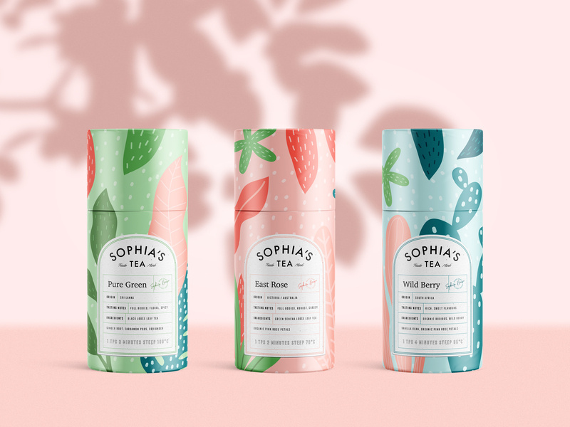
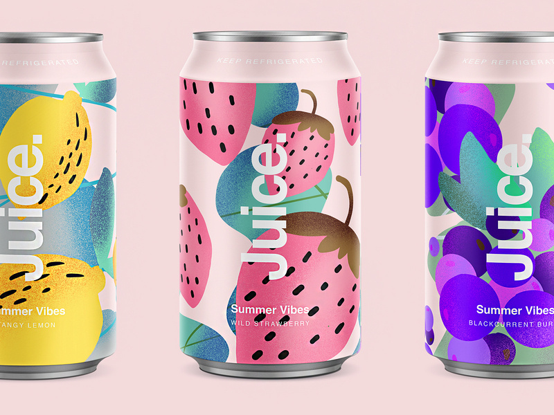
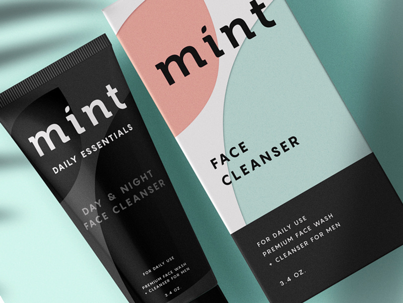
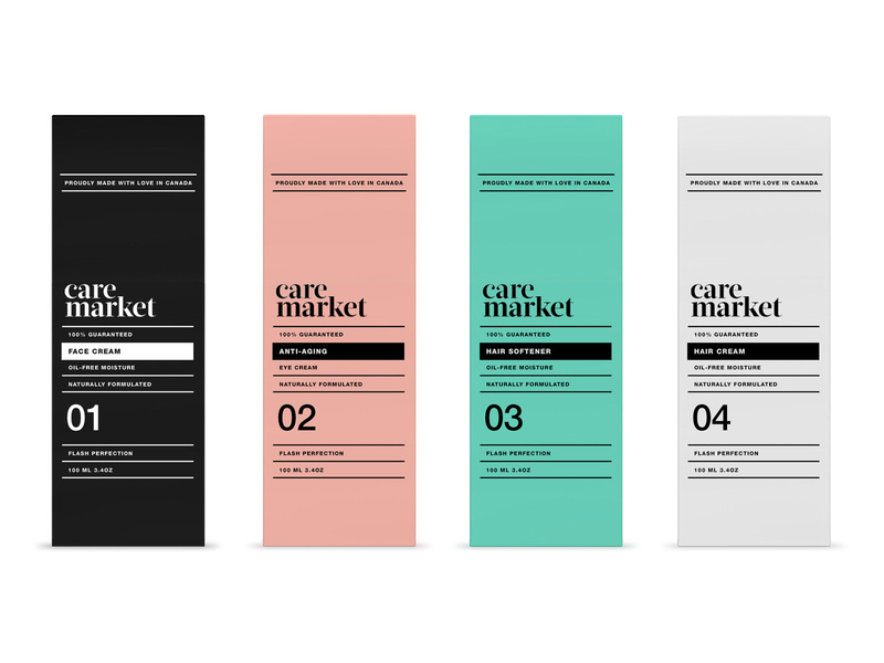
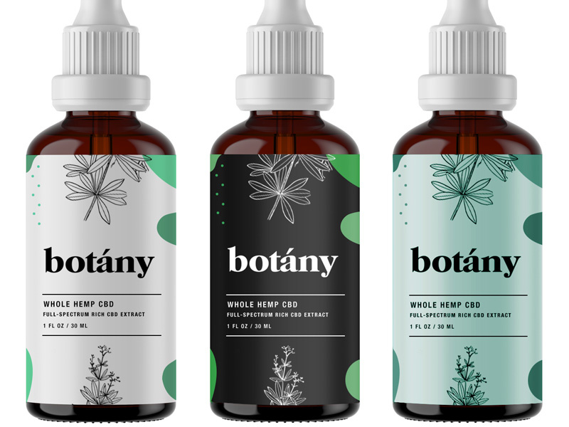


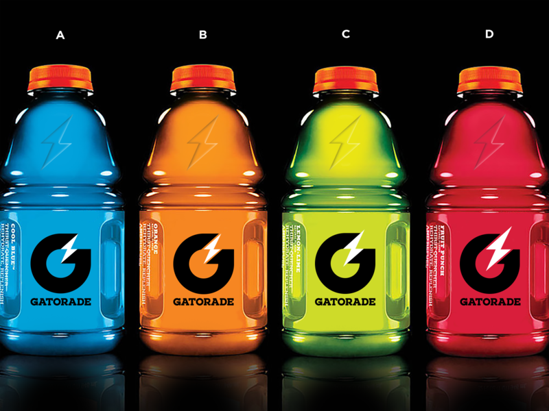
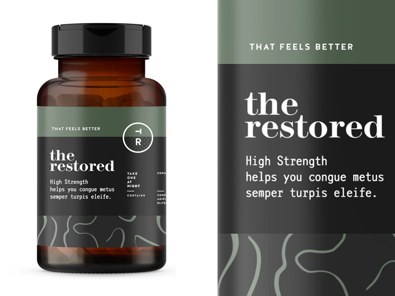
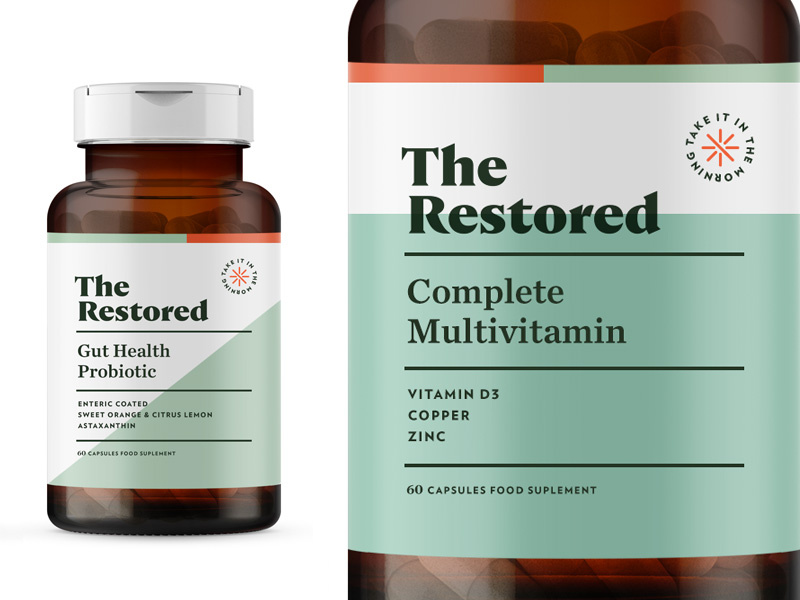


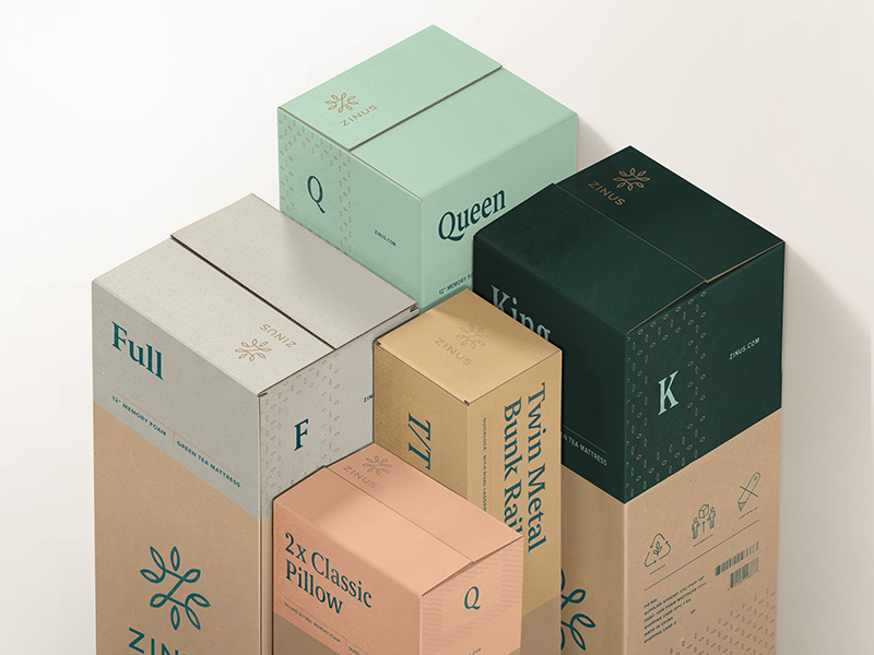

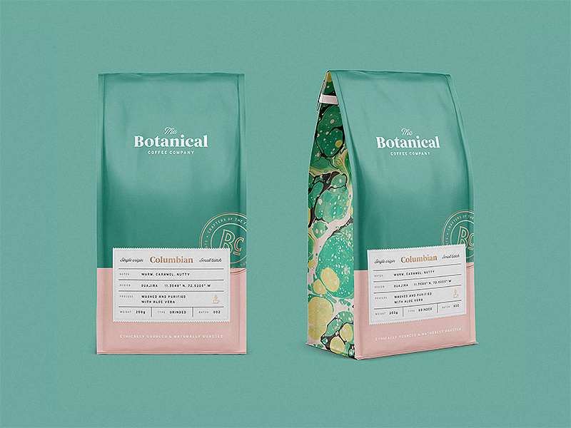


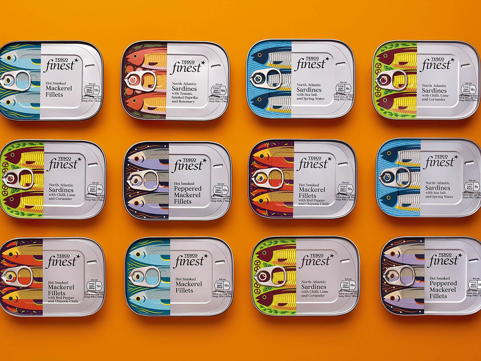
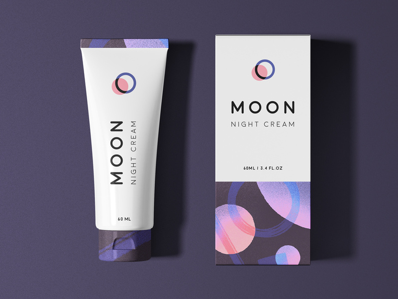
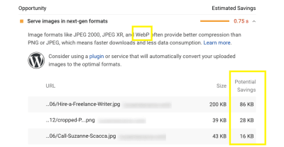


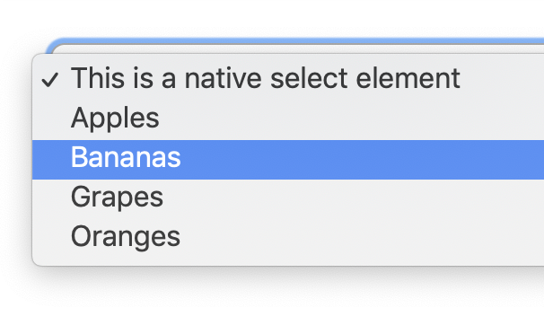
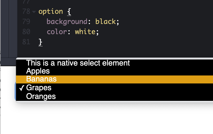


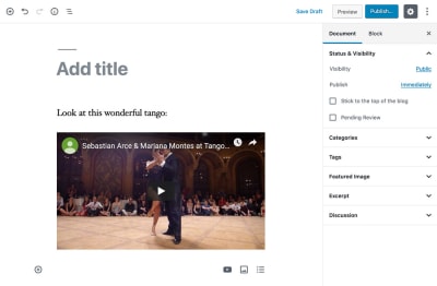

