Page reloads are a thing. Sometimes we refresh a page when we think it’s unresponsive, or believe that new content is available. Sometimes we’re just mad at the dang site and rage-refresh to let it know we’re displeased.
Wouldn’t be nice to know when a user refreshes the page? Not just that, but how many times? That data can help us trigger some sort of behavior after a certain number of reloads.
A sports site is a good example. If I want to check the score of a game that’s in progress but the scores aren’t live-updated, then I might find myself refreshing a bunch.
Our goal is to break users out of that habit. We’ll use our page-refresh-counting powers to let folks know that refreshes are unnecessary, thanks to real-time score updates. And if they reload more than three times? We’ll kick ‘em out of their session. That’ll show them.
Here’s a simple demo of that concept.
Let’s re-create it together. But before we get going, there are few questions we need to answer before we start coding:
How can we persist the number of times user reloaded the site? We need a place to keep the number of times user reloaded the site (reloadCount), this place needs to persist that value between the reloads — localStorage sounds like a good solution.
How do we detect if user reloaded the site or just came back after few hours? If we store the reloadCount in localStorage it will persist the value between the reloads, but it will keep that value until we remove programmatically or clear the browser storage. It means that if we come back after few hours the site will still remember last reloadCount and may perform logout after first refresh without warning. We want to avoid that and allow user to reload the site two times each time the user comes back after some period of time. That last sentence holds the answer to the question. We need to store the time when the user left the site and then when the site loads again check when that happened. If that time period wasn’t long enough, we activate the reload counting logic.
How do we know when the user leaves the site? To store that time, we use beforeunload window event and store that value in localStorage.
OK, now that we have the answers, let’s dive into the code.
Step 1: We’ve gotta store the last reload time
We will store the time of last reload using a beforeunload window event. We need two things: (1) an event listener that will listen to the event and fire the appropriate method, and (2) our beforeUnloadHandler method.
First, let’s create a function called initializeReloadCount that will set our event listener using the addEventListener method on the window object.
function initializeReloadCount() {
  window.addEventListener("beforeunload", beforeUnloadHandler)
}
Then we create a second method that will be fired before we leave the site. This method will save the time the refresh happens in localStorage.
function beforeUnloadHandler() {
  localStorage.setItem("lastUnloadAt", Math.floor(Date.now() / 1000))
  window.removeEventListener("beforeunload", beforeUnloadHandler);
}
Step 2: We need a way to handle and store the reload count
Now that we have the time when the site was last closed, we can proceed and implement logic that’s responsible for detecting and counting how many times the site was reloaded. We need a variable to hold our reloadCount and tell us how many times user reloaded the site.
let reloadCount = null
Then, in our initializeReloadCount function, we need to do two things:
Check if we already have a reloadCount value stored in our localStorage, and if so, get that value and save it in our reloadCount. If the value doesn’t exist, it means that the user loaded the site for the first time (or at least did not reload it). In that case, we set the reloadCount to zero and save that value to localStorage.
Detect if the site was reloaded or the user came back to the site after longer period of time. This is the place where we need our lastUnloadAt value. To detect if the site was actually reloaded, we need to compare the time when the site gets loaded (the current time) with the lastUnloadAt value. If those two happened within, say, five seconds (which is totally arbitrary), that means the user reloaded the site and we should run reload count logic. If the time period between those two events is longer, we reset the reloadCount value.
With that, let’s create a new function called checkReload and keep that logic there.
The last function we need in this step is a method responsible for what happens when we confirm that the user reloaded the site. We call that function onReloadDetected, and inside it, we increment the value of reloadCount. If the user refreshed the site third time, we drop the bomb and call our logout logic.
function onReloadDetected() {
  reloadCount = reloadCount + 1
  localStorage.setItem("reloadCount", reloadCount)
  if (reloadCount === 3) {
    logout()
  }
}
Step 3: “Dear user, why you didn’t listen?!”
In this step, we implement the logic responsible for the situation when the user reloads the site to the point of breaching our three-limit threshold, despite our clear warnings to stop doing it.
When that happens, we call our API to log the user out, then we clean up all properties related to the reload count logic. That will allow the user to come back and have a clean account of reloads. We can also redirect the user somewhere useful, like the login screen. (But wouldn’t it be funny to send them here instead?)
function logout(params) {
  // logout API call
  resetReloadCount()
}

function resetReloadCount() {
  window.removeEventListener("beforeunload", beforeUnloadHandler)
  localStorage.removeItem("lastUnloadAt")
  localStorage.removeItem("reloadCount");
}
Bonus: Let’s re-Vue it!
Now that we have the logic implemented, let’s see how can move that logic to a Vue site based on this example:
First, we need to move all of our variables into our component’s data, which is where all reactive props live.
Since we are using Vue and its reactivity system, we can drop all direct DOM manipulations (e.g. document.getElementById("app").innerHTML) and depend on our warningMessages data property. To display the proper warning message we need to add a computed property that will re-calculate each time our reloadCount is changed so that we can return a string from our warningMessages.
Last thing we need to do is find a proper place to activate the reload prevention logic. Vue comes with component lifecycle hooks that are exactly what we need, specifically the created hook. Let’s drop that in.
And there it is, the logic that checks and counts how many times a page has been refreshed. I hope you enjoyed the ride and you find this solution useful or at least inspiring to do something better. ?
Say you have a design system and you’re having a moment where it doesn’t have what you need. You need to diverge and create something new. Yesenia Perez-Cruz categorizes these moments from essentially ooops to niiice:
There are three kinds of deviations that come up in a design
system:
Unintentional divergence typically happens when designers can’t find the information they’re looking for. They may not know that a certain solution exists within a system, so they create their own style. Clear, easy-to-find documentation and usage guidelines can help your team avoid unintentional variation.
Intentional but unnecessary divergence usually results from designers not wanting to feel constrained by the system, or believing they have a better solution. Making sure your team knows how to push back on and contribute to the system can help mitigate this kind of variation.
Intentional, meaningful divergence is the goal of an expressive design system. In this case, the divergence is meaningful because it solves a very specific user problem that no existing pattern solves.
We want to enable intentional, meaningful variation.
And while we’re linking up books about design systems, check out Andrew Couldwell’s Laying the Foundations.
System design is not a scary thing — this book aims to dispel that myth. It covers what design systems are, why they are important, and how to get stakeholder buy-in to create one. It introduces you to a simple model, and two very different approaches to creating a design system. What’s unique about this book is its focus on the importance of brand in design systems and creating documentation.
Email marketing campaigns serve additional purposes on top of increasing a business’ sales. For one thing, they increase brand visibility, and for another – they encourage communication and feedback.
Now, it is critically important to remember that email marketing is still marketing. Even if the communication is virtual, your customers are living people with all sorts of psychological conundrums that fact entails.
What does it portend?
You’ll want to make your customers feel special. Address them by first names, ask for their feedback and encourage communication through email and social media channels (and by phone, if you run such a business).
No matter what you do, remember that every brand has competition and, since businesses are increasingly going online, that the competition will think along the same lines as you do. Subscribing to competitors’ mailing lists provides a great insight into trends and gives you an advantage over the offer.
How Popular Is Email Marketing?
There are many stats and studies aimed at calculating the efficiency of email marketing campaigns. Figures vary and are not set in stone, but there’s no denying that email marketing is highly popular, not least in part because it is the cheapest way of advertising.
Further out, given that over 90% of adults worldwide make use of email (and many of them spend hours checking new messages on a daily basis), the benefits of email marketing should not be surprising at all.
Finally, the number of email users is highly unlikely to go down. Ever since its inception, emails has been free and available to everyone. Even with the rise of modern technologies and apps that have partially taken over some of the original purposes of emails, the service is going strong and remains the primary means of communication between families and business associates.
Privacy, anyone? That must be it!
Types of Email Campaigns
There are campaigns and campaigns, and no magic formula to stellar success, but there are numerous stats that help marketers determine what types of campaigns to run.
First of all, in order for any email campaign to be successful regardless of the quality of its contents, you must first define your audience(s). Most businesses have different audiences served by different campaigns in line with the insights.
In simple English, high spenders will expect exclusive offers, while people on a budget will be looking for special deals and discounts. These two groups should receive different offers, in line with their preferences and needs.
Further out, the finest of email campaigns feature social media connectivity and additional contact information. This is crucial for long-term success of your brand. Customers should always know how to contact you immediately without having to spend hours browsing for the contact info.
Last but not least, all emails should feature a call to action and the unsubscribe button. The first should lead to a mobile-optimized page where the desired action is to be performed, and the second ensures that your messages won’t end up in the spam folder. There will always be people who are no longer interested in the offer since audiences change over time, so don’t be bothered about it.
Now that we know the essential elements of every email, it’s time to determine which types of email to send and which ones not. Here are our recommendations:
1. Welcome Emails
Personalization is known to do wonders in terms of relationships, and you do wish for a cordial and beneficial relationship with your customers. Send a personalized welcome message to each subscriber to let them know they matter. By personalized, we imply using the first name to address people and providing contact information early on.
These types of emails also happen to be the most frequently overlooked ones, with even large businesses failing to see the value in them, so grab your chance!
2. Order Status Emails
Order status emails are a no-brainer. Every order absolutely must be confirmed by email with the contact information provided for immediate support at any given time. There are numerous things that can go wrong with orders and (especially) delivery, particularly if you run a global brand.
It is, therefore, crucial to follow the process from start to finish and keep the customer updated regularly.
Some feats of the order process play an important role in customers deciding which brand they will trust. One of these is tracking information, which should be provided whenever possible.
3. Abandonment and Re-Order Emails
Abandonment messages are another frequently overlooked type of emails, all to a business’ woe. A great majority of abandonments is due to technical issues, so following up with the customer is always highly recommended. At other times, people will not have found out the payment method they are looking for, so you may use abandonment emails to ask them for an alternative.
Abandonment emails may generate up to $17.90 per email, which is not to be easily overlooked.
In regards to re-order emails, they may prove extremely beneficial for some businesses, i.e. for brands dealing with consumer goods. Before the offer runs out, remind your customers they can still order it.
Other email types should be sent on an as-needed basis. Newsletters may be beneficial, if written the right way and sent at appropriate intervals and special offer announcements, too. However, these should be left to the discretion of each respective business and should be in line with a comprehensive strategy based on detailed analysis and insights.
I move to a new state every two to three years, so it’s important for me to live “light”. Every time I prepare to move, I go through the “Do I really need to keep this?” exercise. Although I’ve been doing this for almost 20 years, it never gets any easier. I wonder things like:
What if I sell my bed and never have a comfortable night’s sleep again?
What if I get rid of the fancy dress I wore once but might need for some hypothetical future event?
What if I decide to start baking cupcakes again and don’t have my cupcake tin anymore?
It’s easy to get attached to things when they served you well at one time or another. But if you take a closer look at the “stuff” you’ve accumulated, you’ll realize that a lot of it has lost its usefulness along the way.
I think it’s important to run through a similar type of decluttering exercise in the work you do as a designer. That way, the apps you build always look fresh and modern instead of weighed down by antiquated features or functionality that at one time had a purpose.
Before you start charging ahead into the new year, take a moment to reflect on how you approach mobile app design. If you’re still holding onto components or functionality that no longer serve any purpose or, worse, intrude on the user experience, it’s time for a change.
Want some help? I’m going to run through some elements you can afford to scrap from mobile app builds in 2020 and beyond.
You know why marketers, influencers, and designers use FOMO (i.e. it can be really effective in boosting sales). However, you also know how damaging it can be for users’ mindsets (not to mention the distrust they feel towards brands as a result).
You could avoid FOMO altogether, but it’s a tricky thing, isn’t it?
You know that (when left to their own devices) mobile app users may forget that your app even exists on their phones without something to pull them back in. But it’s too easy to go overboard with FOMO-inducing components.
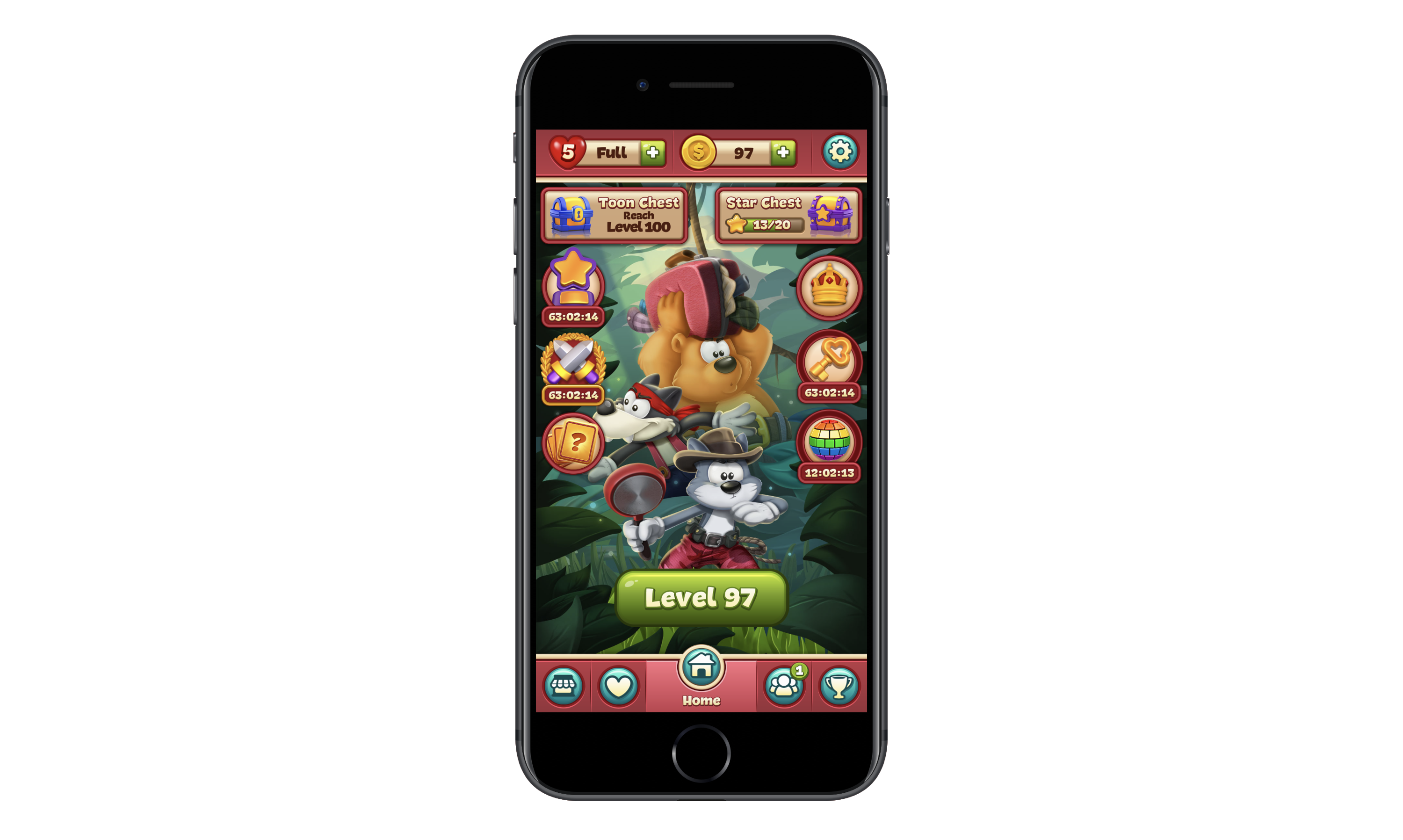
The ToonBlast gaming app has numerous modules and countdown timers to induce constant FOMO. (Image source: ToonBlast) (Large preview)
The home screen is incredibly overwhelming. More than that, those ticking clocks (there are four of them) are a nightmare for users who can’t help but click on things they feel they’re going to miss out on by not doing so. And for users who can ignore the timers, they won’t be completely unaffected by them either. The game displays pop-up reminders for each of the countdowns. It’s impossible to ignore them.
This is FOMO at its absolute worst.
Even if reminders for each of the countdowns were sent as push notifications instead of disruptive pop-ups, it still would be bad for the user experience. There are just too many things competing for the user’s attention and each of the clocks is like a ticking time bomb.
I know it might seem like giving app users more reasons to engage is a good idea, especially if you’re struggling to attract and retain users. But if that’s really an issue, then you need to work on improving the core product first and foremost.
Going forward, I think we’d all do well to move away from harmful FOMO elements and embrace more simplified and stronger core products.
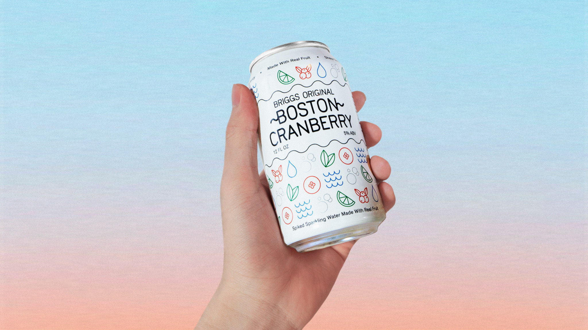
If you’re not sure what that looks like, I’d recommend turning your attention to Instagram:
Instagram is working on removing FOMO from its app. (Image source: Instagram) (Large preview)
Instagram is a simple and straightforward product. Users turn their news feeds into personal curations of people and accounts they want to follow while sharing their own content with the world.
Now, Instagram isn’t completely FOMO-free as you can see from the Stories bar at the top of the page. However, there’s nothing really urgent about the way these stories are displayed. They don’t take up much space in the app (unlike the way Facebook handles it, for instance) nor are there any screaming alarms that say, “Hey! So-and-so’s story is about to expire! Watch it now!”
That said, Instagram is working to remove the harmful effects of FOMO in its app by doing away with like counters and cracking down on influencers and companies that don’t mark ads as such. If you want to create a strong yet simple product that keeps harmful FOMO elements out of the picture, keep this one on your radar.
2. Out-of-Context Access Requests
Unlike mobile websites and PWAs, mobile apps have the ability to get in front of 100% of users who activate push notifications. But that’s the catch. Your users have to be willing to press “OK” or “Allow” when you display that push notification (or phone access) request pop-up.
So, how do you get more of them to do that without constantly shoving those requests down their throats?
Some brands haven’t figured this out yet, to be honest. Take Snapchat, for example.
Snapchat doesn’t like when users disable notifications and phone access. (Image source: Snapchat) (Large preview)
This is one of those apps that just goes way overboard when it comes to requesting access to users’ devices. It wants to:
Send push notifications.
Use the camera.
Use the microphone.
Access saved photos.
Enable location tracking.
And so on.
Rather than ask for access when it’s relevant, it often sends a deluge of requests first thing when users sign into the app. That’s the wrong way to create a welcoming environment for your users.
A better way to go about asking for access or permissions would be to place it in the context of the app — and only when it makes sense. I’ll show you a couple of examples.
ParkWhiz reminds users about the benefits of enabling location tracking. (Image source: ParkWhiz) (Large preview)
Look at the section called “Help Us Find You” toward the bottom.
Not only does ParkWhiz gently remind users to enable location tracking on their devices, but it does so by explaining the reasons why it would benefit them to do so. Notice also that this isn’t displayed in an intrusive pop-up at the point of entry. Instead, it’s in a spot in the app where, when enabled, it can help streamline the search experience.
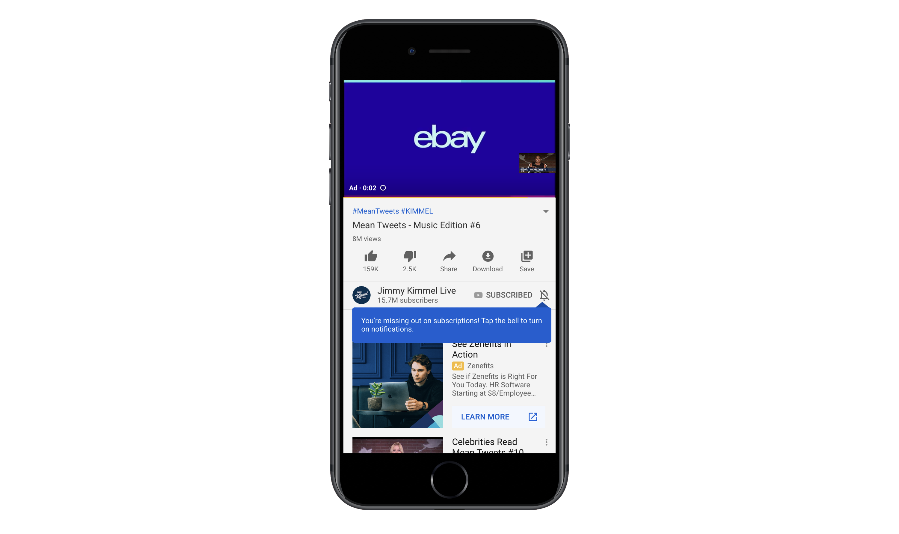
YouTube displays a small tooltip to remind users to turn on notifications. (Image source: YouTube) (Large preview)
In this example, YouTube quickly displays a tooltip over the disabled notification icon. The notice reads:
“You’re missing out on subscriptions! Tap the bell to turn on notifications.”
They’re right. I’m subscribed to this channel and, yet, I haven’t received notifications (push or email) about new videos for a while. I hadn’t realized this until I saw this reminder.
The way this is handled is nice. It makes users stop and think about what they’re missing out on instead of rushing to close out another request pop-up. It also doesn’t force them to turn on push for everything. They can customize which notifications they receive.
Push notifications are supposed to be helpful. And access to your users’ phones is supposed to enhance their experience. That’s why it’s important to ask for their cooperation in enabling these features within the right context. Rather than bombard them with request after request at the outset of installing or opening an app, deliver them within the experience as in-line elements.
3. Unnecessary Icon Labels
Note that this point is called unnecessary icon labels and not just a sweeping generalization of all of them. That’s because there are certain parts of an app where icon labels still work well. Like the navigation bar.
However, I’ve noticed an alarming trend lately whereby apps pair every page or tab name with a matching icon. There are a number of reasons why this is an issue and I’m going to use the GEICO app to demonstrate them.
The GEICO mobile app home page comes with a list of services and modules paired with icons. (Image source: GEICO) (Large preview)
This home page makes it easy for users to take advantage of their auto insurance and related services on the go. Let’s focus on the “Vehicle Trouble” section though.
There are four tabs:
Emergency Roadside Service represented by a tow truck icon,
Start a New Claim represented by a car with what looks like a crash symbol,
Report Glass Damage represented by a car with a crack on the windshield,
View Recent Claims represented by a clipboard with the letter “C” on it.
The icons aren’t all that easy to decipher (except the tow truck) and I’m just not sure they add any value here. Really, if you can’t think of anything better than putting a letter “C” on a clipboard to represent claims, maybe icons aren’t needed after all?
Next, let’s take a look at the GEICO app’s list of settings:
The GEICO app’s navigation pairs each page with an icon. (Image source: GEICO) (Large preview)
There are a lot of settings pages here. Not only that, they’re not the kinds of pages you’d typically see in other mobile apps, so the designer has had to get creative in pairing them with icons.
If this navigation didn’t have icons, I think it would be much easier to read through the options. The same goes for the home page. Without the icons, the font size could be increased so the focus could strictly be on the page names and insured users could get to the information they need more quickly. As it stands now, the icons are just wasted space.
Let’s look at another example.
Rover is an app that pet owners can use to book pet sitting and walking services. Icons are used sparingly through the app to distinguish services from one another as well as to label the navigation pages.
The Rover mobile app includes icons to label its navigation and services. (Image source: Rover) (Large preview)
I don’t think the icons on this page are necessary in terms of expediting user selection (e.g. “I need overnight house sitting so I’m going to choose the moon-over-the-house icon.”). That said, I don’t think the icons detract from the button text since each option is clearly labeled with big, bold font. What’s more, the icons do a nice job of bringing balance to the buttons so there aren’t huge white gaps in the middle.
Now, let’s look at what the designer has chosen to do under the “More” tab:
Rover’s list of “More” settings don’t include icons like the rest of the app. (Image source: Rover) (Large preview)
This is similar to GEICO’s slide-out navigation menu. But notice how Rover’s is text only. Considering how common these settings are from app to app, it would’ve been easy enough to add icons to each, but the designer chose to leave them off and I think that was a good decision.
There’s a time and place when icons serve a purpose. As far as labeling a secondary navigation menu in your app, it’s time to do away with that. I’d also express caution over labeling pages with icons if it’s a struggle to find a match. That should be a sign to you that they’re not needed to begin with.
4. Excessively Long Home Pages
In web design, we’re seeing much shorter home pages than in years past, thanks to the need for more efficient mobile experiences. So, why isn’t this something we’re doing in mobile app design?
There are some apps where this isn’t an issue. Namely, ones where there’s no scrolling at all (e.g. dating apps, gaming apps, etc.). And there are some cases where endless scrolling on the home page is fine (e.g. news and social media apps).
But what about other apps?
Listings apps (like for real estate or travel) sometimes have a hard time with this. For example, this is the top of the Airbnb mobile app:
Airbnb app home page with search bar and categories. (Image source: Airbnb) (Large preview)
This part of the page is well done and includes everything users need to find what they’re looking for:
A search bar,
A list of travel categories to swipe through,
Quick links to recent search queries.
But for some reason, Airbnb has designed this home page to go on and on and on with sections for:
Top-rated experiences,
Airbnb Plus places to stay,
Introducing Airbnb Adventures,
Places to stay around the world,
Featured Airbnb Plus destinations,
Stay with a superhost,
Unique places to stay for your next trip,
Explore New York City,
And on and on it goes.
Airbnb includes over a dozen sections of content on the home page of its app. (Image source: Airbnb) (Large preview)
I’m not sure what the logic was here. While I understand wanting to help your users by providing them with useful recommendations, this goes way overboard. It’s not even as though this is personalized content based on the user’s profile or recent searches. It’s just a smattering of categories that, if anything, are going to overload and overwhelm users with options.
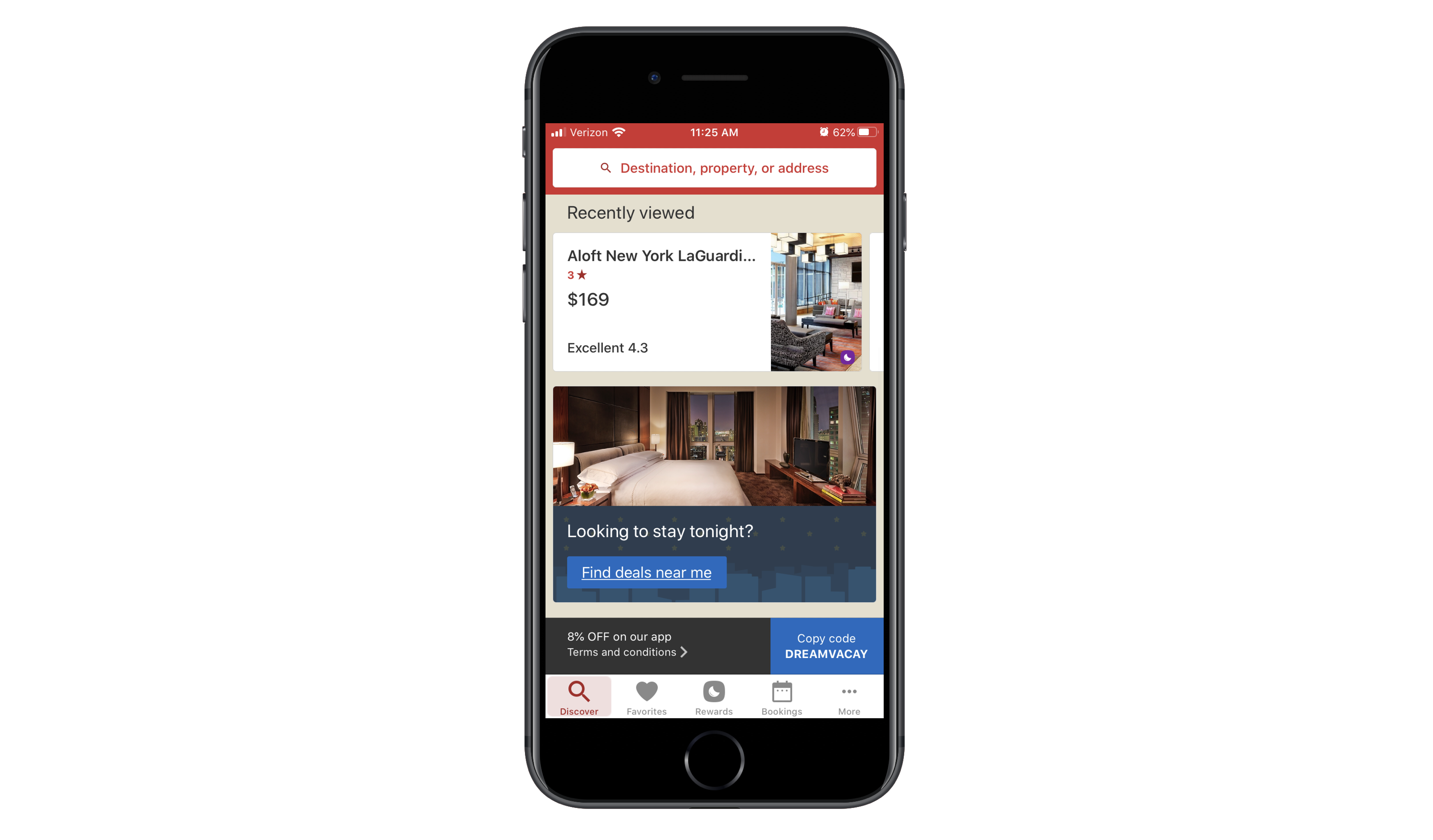
If the app you’re building or have built runs into a similar problem, check out Hotels.com for inspiration:
The Hotels.com app provides users with a search bar and recently viewed hotels upon entering the app. (Image source: Hotels.com) (Large preview)
Unlike Airbnb, Hotels.com’s home “Discover” page is short. All it takes is three swipes to get to the bottom of the page. Users see sections for:
Recent searches,
A city guide (based on a recent query),
Last-minute deals,
Current bookings,
Hotels.com Rewards standings (if relevant).
For the most part, the content is 100% relevant to the user and not just meant to promote every possible service or feature of the app.
If you really feel like users would benefit from seeing every possible feature, create a secondary navigation for it. That way, they can quickly scan through the options and pick the one(s) they’re most interested in. When you give them an endless home page to scroll through and too many listings and buttons to click, you’re only going to make it harder for them to take action.
5. Dark Patterns in Ads
You have to monetize a mobile app if you’re going to make the original investment worth your while. It’s as simple as that.
But I’ve recently encountered some very scary dark patterns in mobile app monetization — specifically, with the way ads are designed. And it’s got me wondering if third-party ad networks are really the smartest way to monetize if they’re going to compromise everything you’ve done to create an awesome in-app experience otherwise.
Now, I understand that app designers usually don’t have any role in designing the ads that appear. That said, do you really think your users know anything about ad networks and how those ad placements get inside your app? Of course not!
So, when one of your users has a bad experience with an ad, what do you think is going to happen? They’re not going to think:
“Oh, that advertiser is terrible for doing that.”
Instead, they’re going to think:
“If I see one more ad like this, I’m uninstalling this app.”
Let me show you some examples of ads that will push the limits of your users’ patience.
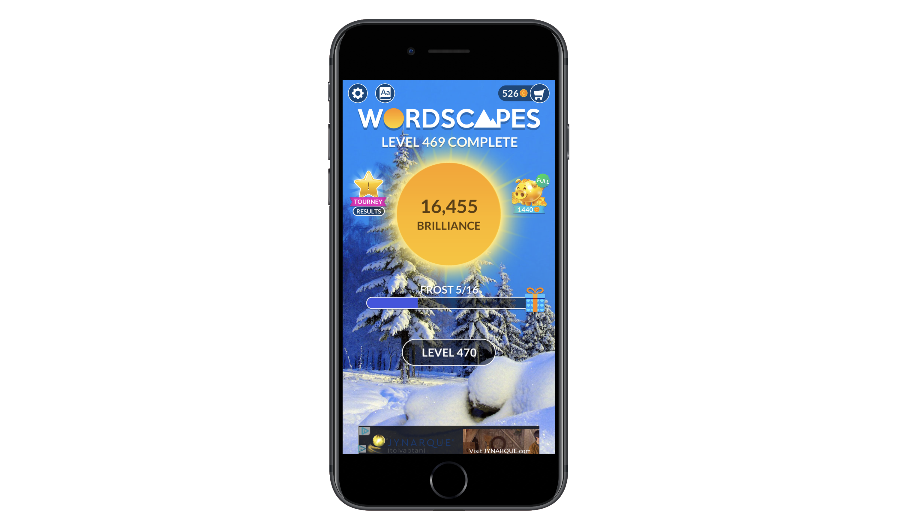
This is Wordscapes, a gaming app I’m quite fond of:
A banner ad at the bottom of the Wordscapes app is cut off. (Image source: Wordscapes) (Large preview)
I’ve been playing Wordscapes for a long time and when I first started, it was great. The banner ads were there, but they never really got in the way. And the interstitial video ads only appeared every few rounds or so. They were always easy to dismiss, too.
Over the past year or so, however, the quality of ads has majorly deteriorated. Take the banner ad above. That’s actually a video ad that doesn’t fit in the allotted space.
Then, you have this badly designed banner ad for Jynarque:
A banner ad that’s too dark appears at the bottom of Wordscape (Image source: Wordscapes) (Large preview)
Neither of these banner ads are really dark patterns. However, they do suggest there’s something not quite right about where Wordscapes is sourcing their ad content from.
Now, I’m going to show you some of the more deceptive ads I’ve come across.
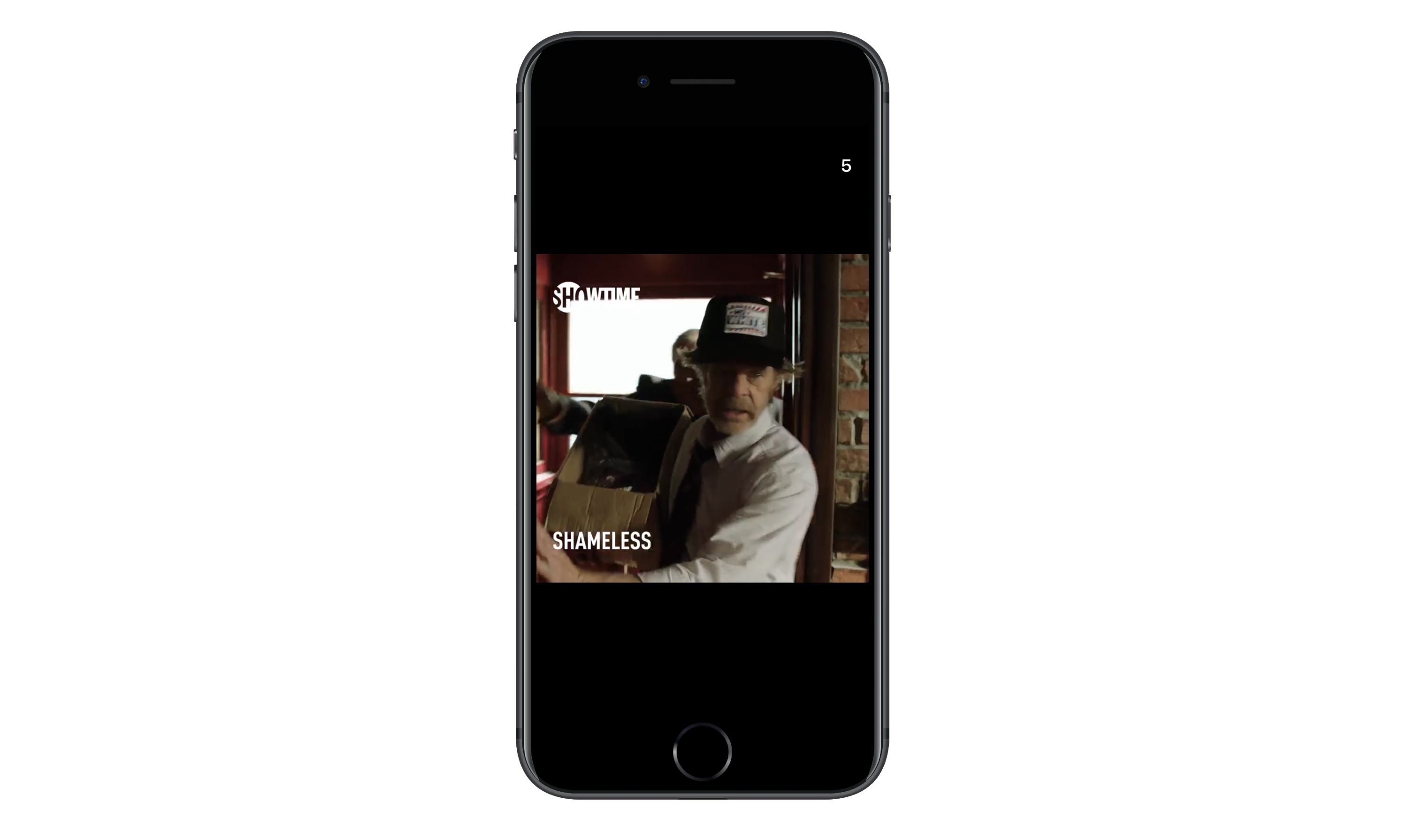
This is an ad from Showtime to promote the TV show Shameless:
Wordscapes shows an interstitial video ad for Showtime’s Shameless. (Image source: Wordscapes) (Large preview)
See the number “5” in the top-right corner? That’s a countdown timer, which should tell users how long they have to wait until they can dismiss the ad. However, when the timer is up, this icon appears:
A Showtime ad provides users with an untraditional escape after the timer runs out. (Image source: Wordscapes) (Large preview)
The timer gets to “0” and is replaced by this button. It’s not the traditional “X” that app users are accustomed to when it comes to watching ads, so they might not realize this will take them back into the game. In fact, they might misinterpret this “Next” symbol as a “Play” button and watch the ad in full. While it’s nice that Showtime gives users an exit, it would be better if the iconography were consistent with other video ads.
This is what the ad looks like the second it appears on the screen, which is actually encouraging.
“An ad that’s going to let us exit out of it right away! Woohoo!”
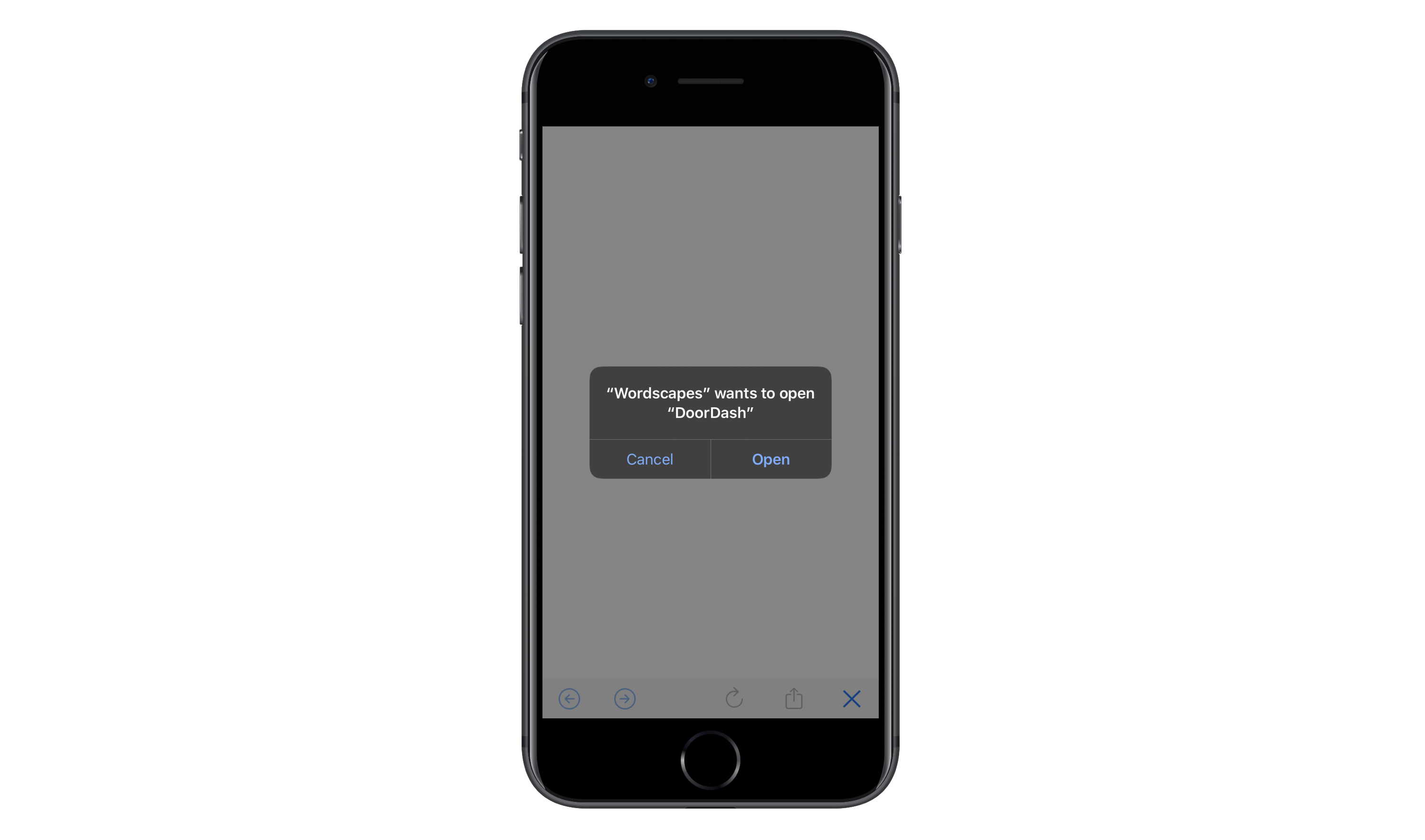
But that’s not the case at all. Notice how there are two X’s in the top-right corner. One of them looks fake (the plain “X” symbol) while the other looks like an “X” you’d use to dismiss an ad.
The first time I saw this, I clicked on the good “X”, hoping my finger would be small enough to miss the fake target. Yet, this is where I ended up:
An ad for DoorDash tries to take Wordscapes visitors to the app store (Image source: Wordscapes) (Large preview)
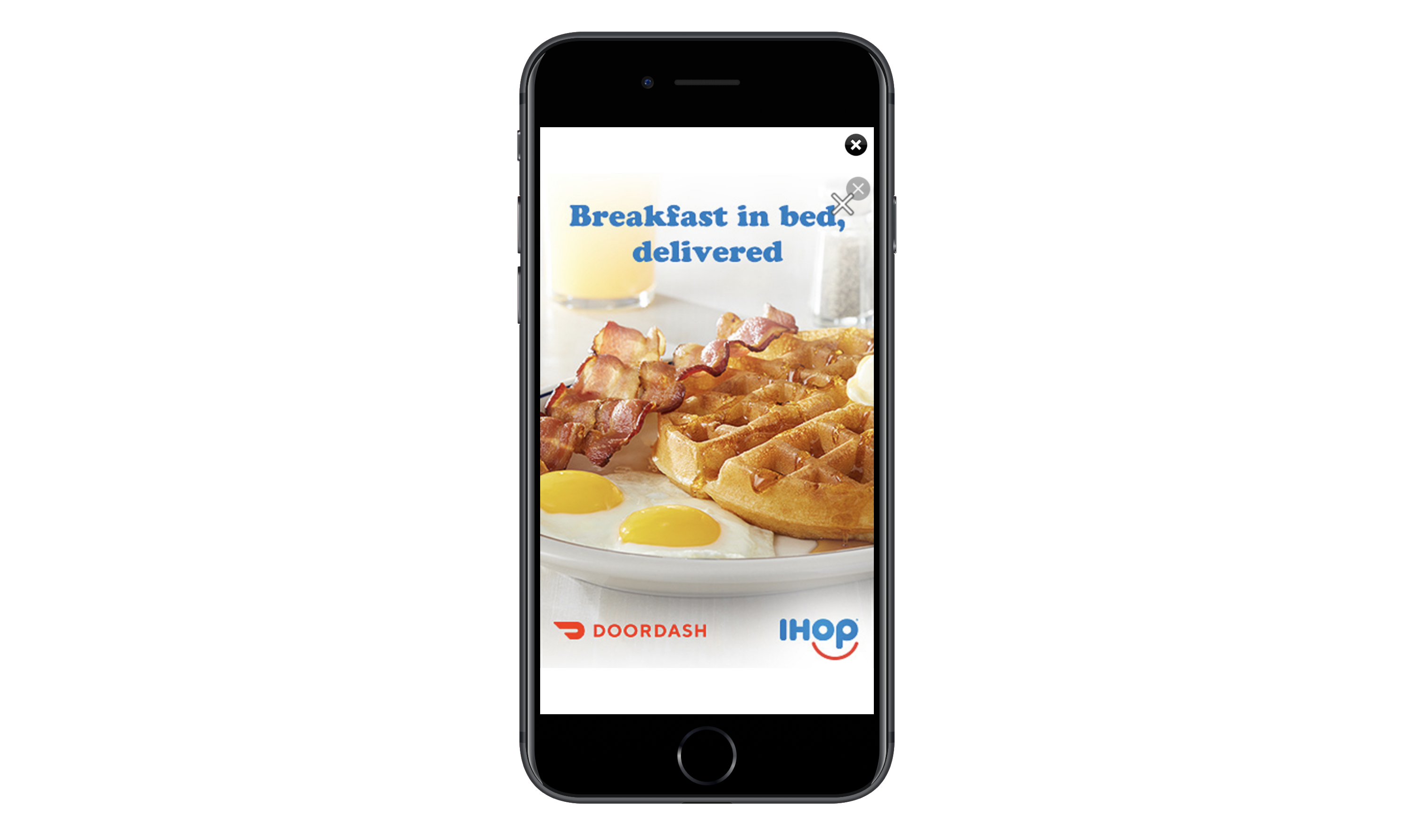
The click takes users out of the Wordscapes app and tries to move them to the app store. After hitting “Cancel” and sitting through five more seconds of the DoorDash ad, this new “X” appears in the top-right corner:
DoorDash finally displays the real exit button for its mobile ad. (Image source: Wordscapes) (Large preview)
At this point, I can’t imagine users are very happy with DoorDash or Wordscapes for this experience.
These examples of bad ads and dark patterns in monetization are just the tip of the iceberg, too. There are ads that:
Provide no timer or indication of when the ad will end.
Switch the placement of the “X” so users unintentionally click the ad instead of leave it.
Auto-play sound even when the device’s sound is turned off.
I know I’m picking on Wordscapes because I spend the most time inside the app, but it’s not the only one whose reputation is being hurt by third-party ad content.
Again, I recognize that you have no say in the design or execution of ads that come from ad networks. That said, I’d really urge you to talk to your clients about being more discerning about where they source their ads from. If mobile ads continue to be this bad, it might be worth sourcing your own ad content from partners and sponsors you trust instead of random companies that use deceptive advertising tactics.
Wrapping Up
There are a ton of reasons to declutter your mobile app designs. But if these examples have demonstrated anything, the most important reason to clean up is to get rid of useless and sometimes harmful design elements or techniques.
And if you’re having a hard time getting rid of the excess, I’d encourage you to reevaluate the core product. If it’s not strong enough to stand on its own, in its simplest of forms, then it’s time to go back to the drawing board because no amount of distractions you fill it with will make it a worthwhile download for your users.
We’ve all been there. It’s 4pm on a Friday afternoon, you’re already in your “weekend outfit” (underwear and hoody combo) and you get an email. It’s Client X: Hey, erm, I’ve just had a couple of thoughts, can we talk?
Wearily, you reach for the phone.
Sure enough, the “couple of thoughts” become a rambling monologue on the virtues of asymmetric grid layout, mouse-controllable content and parallax scrolling (“that shouldn’t be too hard, right?”) which lasts for 90 minutes. They basically want this, on their budget of $1200.
If that wasn’t bad enough, of course you also know that what they’re asking for — even if you could deliver it on time and in budget — will make no sense at all to their users.
Don’t panic, here’s what you can do.
1. Make a Connection
Believe it or not, from a certain angle, there’s probably method to their madness. By discovering it, you’ll not only unlock ways to solve the problem, but develop your working relationship in a positive direction too.
Have you ever wondered why Client X wants their app to auto-play “We are the Champions” every time it loads? Maybe they’re trying to send a positive message about their company or looking for a lighthearted feel. Have they seen something similar that actually works? Are they trying to express their personality through the work they’re asking you to do?
In his book Nonviolent Communication, psychologist Marshall Rosenberg argues we can find resolution to any conflict by addressing the needs that underlie it, and urges us to start by acknowledging the other person’s reality.
Here’s how it works: don’t argue. At least not yet. Let them talk. Ask questions. Acknowledge what they’re saying. Listen. At the same time, try to build up a picture of what’s important to them at the emotional level. When you do talk, reflect back what you’ve understood. You’ll probably find the situation calms right down.
Maybe this seems time consuming. It is. But then again, so are those rambling “wouldn’t it be great if we…” phone-calls. You may as well put them to some use…
2. Sell Your Vision
From another perspective, in trying to persuade someone out of their mad idea, you’re really trying to sell them your own. As such, the psychology of selling has a lot to offer you, if that’s your cup of tea. Just remember: Your ability to sell is only as good as your understanding of the client. If you try to use a one-size-fits-all approach, it will sound naff. Invest time and effort in understanding what they really want, then find ways to link your sane ideas to it.
Be honest. Don’t try to sell something that isn’t going to satisfy. Most people will see through it, and the ones that don’t will leave the interaction feeling bitter.
Appeal to Emotion
Client X isn’t going to change their mind because of logical arguments. They’ve made their decision on a whim, a feeling. You can only really address it at the same level. Maybe they want people to respect their business: If so, use words and examples that evoke respect for your preferred idea: “Have you seen the Armani website? They’ve used more of a symmetric grid and it looks pretty strong don’t you think?”.
Pain, Problem, Solution
As any good salesperson will tell you, Client X’s unhinged desire for parallax scrolling arises first and foremost from pain, as in: “Jeez, this design is boring!”. They formulate this as a problem: “There’s not enough movement”. A (naive) solution follows: “We need more animation”.
You can use your understanding of the deeper need (more movement) to highlight the advantages of something simpler: “Yeah I see your point. We can also look at the colors and typefaces. Do any of these look more dynamic?”
Offer Choices
Sometimes, clients are challenging because they “want to be involved”. You can help them scratch that itch by offering choices, like the example above.
Tell a Story
Story is the difference between the value of my autograph, and the value of Neil Armstrong’s. You can dramatically increase the appeal of your vision by finding preferred brands that use it, or examples of work which went really well because of, say, grid layout.
3. Full Charm Offensive
Although you might feel like throwing your phone (or possibly them) out of the window, by giving Client X short shrift, you’ll probably dent their ego and leave them plotting ways to get revenge.
The more you nourish and protect your relationship with clients, the more they’ll respect and respond to you, and the easier your life will be. Here are some suggestions:
Put Your Effort in Early
By getting it right at the briefing stage, when the train-smash moment arrives, you can steer it towards a reasonable outcome.
Don’t be a Prima Donna
The days of the genius designer toiling away in secret are over: Clients want to be involved in the creative process and probably have a right to be. Co-creation in the planning stage will give the client ownership, and a warm feeling about you for letting them experience it. Once they’ve seen how complex the work is, they’ll probably be less inclined to chuck it, or haggle over the price as well.
Compromise
If the client insists on something that really won’t work, and won’t listen to your carefully crafted vision, you know what? That’s on them. You don’t need to fight it. If it involves extra work that wasn’t in your brief then say so, explain, and suggest alternatives. Work with the client. Find ways to identify what their real needs are, and work towards those. Keep track of decisions that are made, and who made them in case of blowback.
Over Deliver
Use your knowledge of the underlying (often unconscious) desires of the client to completely wow them. Go the extra mile in areas which will likely have big impact, even if these aren’t core priorities from a pure design perspective. Try to understand the client’s expectations and exceed them in any way you can.
Be Confident, not Abrasive
In most situations with clients, you genuinely are the expert. Share stories about your experiences in a lighthearted way, explain why you think that something will or won’t work. Smile, relax. Don’t be like Sheldon.
4. Be a Proper Professional
Painful as it may be, challenging clients, like plagues of fire-breathing locusts, are an unfortunate part of life as a web designer. Get prepared up front.
Nail the Brief
As well as specifying the finished product, do yourself a favor by going beyond it: discuss brand strategy. Get the client talking about their target market, and where this project fits into their global vision. Use mood-boards, even a design principles framework, to nail down hard evidence of what you’ve both agreed are the priorities. This will be important later on!
Establish a Point of Contact
Find out who will be the decision maker(s), and who will be communicating with you. Then you know who to contact when the project starts to drift towards fantasy land. If you’ve ever found yourself on a call to client X’s great Aunt Lilly who “went to design school once” and “knows all about UX”, you haven’t done this right!
Be Organised
If you’re not using a project or client management tool, you’re probably making it hard for yourself to keep track of things. With challenging clients, you’ll often need to quickly find that email where “he literally said the exact opposite of what he’s saying he said”, even if just for your own sanity.
Be Firm
Be flexible, but set limits. Use the evidence you’ve collected to make your points. Negotiate a budget increase if the work is out of spec, or politely say no if you need to. Give reasons and alternatives.
The Real Secret: Know Your Customer
It’s a cliché, but an important one: The better you understand the mad behaviour you’re seeing, the better you can influence it.
The fact is, everyone, even Client X, is coming from somewhere. Sure they’ve got a bit lost, but at the end of the day, just like you, they’re trying to reach their goals.
If you can bring yourself to find out where they’re coming from and where they’re going, you might be able to help. At the very least, you’ll keep your phone, and also yourself, the right side of the window.
Nature can be a great source of inspiration. Art has borrowed from nature for millennia.
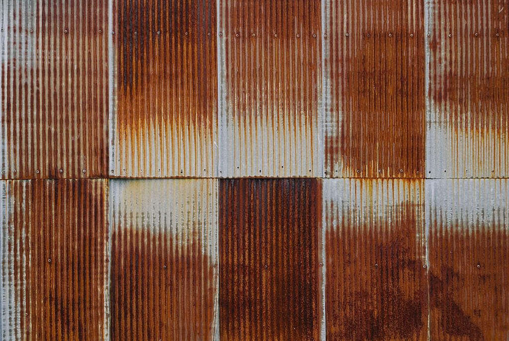
Even in our digitalized age, graphic designers still turn to nature for inspiration. In this article, we’ll look at rust textures as an often-overlooked alternative to more popular texture types.
Using rich textures in your work can add a stronger composition, make it more eye-catching or increase the quality of your work by adding depth. Rust textures or any type of texture can also be a good background for posters, magazines, websites, online forms or even your computer wallpaper.
Oxidized metal, while usually has a negative connotation such as abandonment, can also have the opposite meaning with bright, and rich colors. Here’s a list of 50 rust texture backgrounds that we’ve compiled for you. These can be a good source of inspiration or you can simply use them as a background for your projects.
Most of these images are royalty-free, but we advise you to check the resources and/or give credit to their original publishers.
Stick around in this field for a while, and you’ll see these libraries, languages, build processes, and heck, even entire philosophies on how best to build websites come and go like a slow tide.??
You might witness some old-timer waving their fist from time to time, yelling that we should learn from the mistakes of the past. You could also witness some particularly boisterous youth waving their fists just as high, pronouncing the past an irrelevant context and no longer a useful talking point.
??They’re both right, probably. As long as nobody is being nasty, it’s all part of the flow.
I’ve spent this whole year thinking about how I think the term front-end developer is still pretty meaningful, despite the divide in focus. The widening of the role just brings about more opportunity.
Every week users submit a lot of interesting stuff on our sister site Webdesigner News, highlighting great content from around the web that can be of interest to web designers.
The best way to keep track of all the great stories and news being posted is simply to check out the Webdesigner News site, however, in case you missed some here’s a quick and useful compilation of the most popular designer news that we curated from the past week.
Note that this is only a very small selection of the links that were posted, so don’t miss out and subscribe to our newsletter and follow the site daily for all the news.
Creating a Checkbox like it’s 2020
9 Web Design Trends for 2020
4 Essential Steps for Building a Website
10 Websites with Inspiring Micro-Interactions
Top Landing Page Design Trends You Should Follow in 2020
10 Things I Learned About SEO in 2019
Top 10 Logo Design Trends for 2020: Insights And Examples
Is Web Design Easier or Harder than it was 10 Years Ago?
React: Designer’s Guide to the Terminal
Creative 404 Page Designs
6 Design Factors Behind a Truly Successful Website
The 9 Best Interactive Design of the Year
UX Starter Crash Course
Iarcade: Free Arcade Script
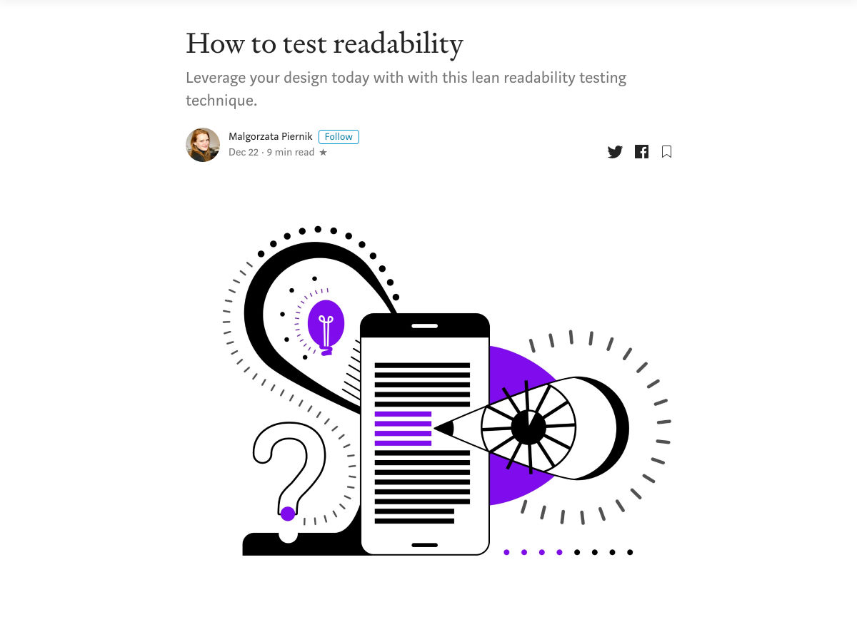
How to Test Readability
Best Data Visualization Projects of 2019
5 Tips for a Great Presentation of your Design Projects
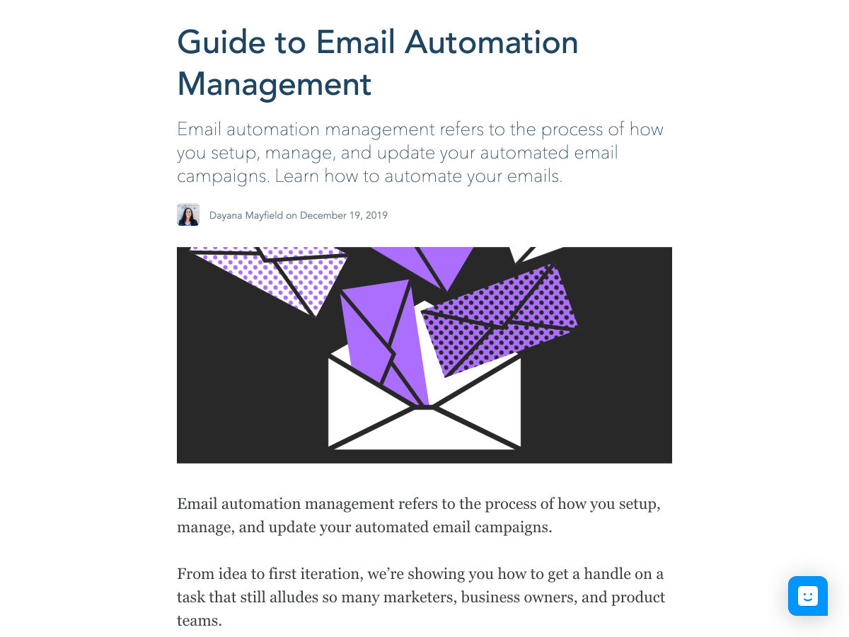
Guide to Email Automation Management
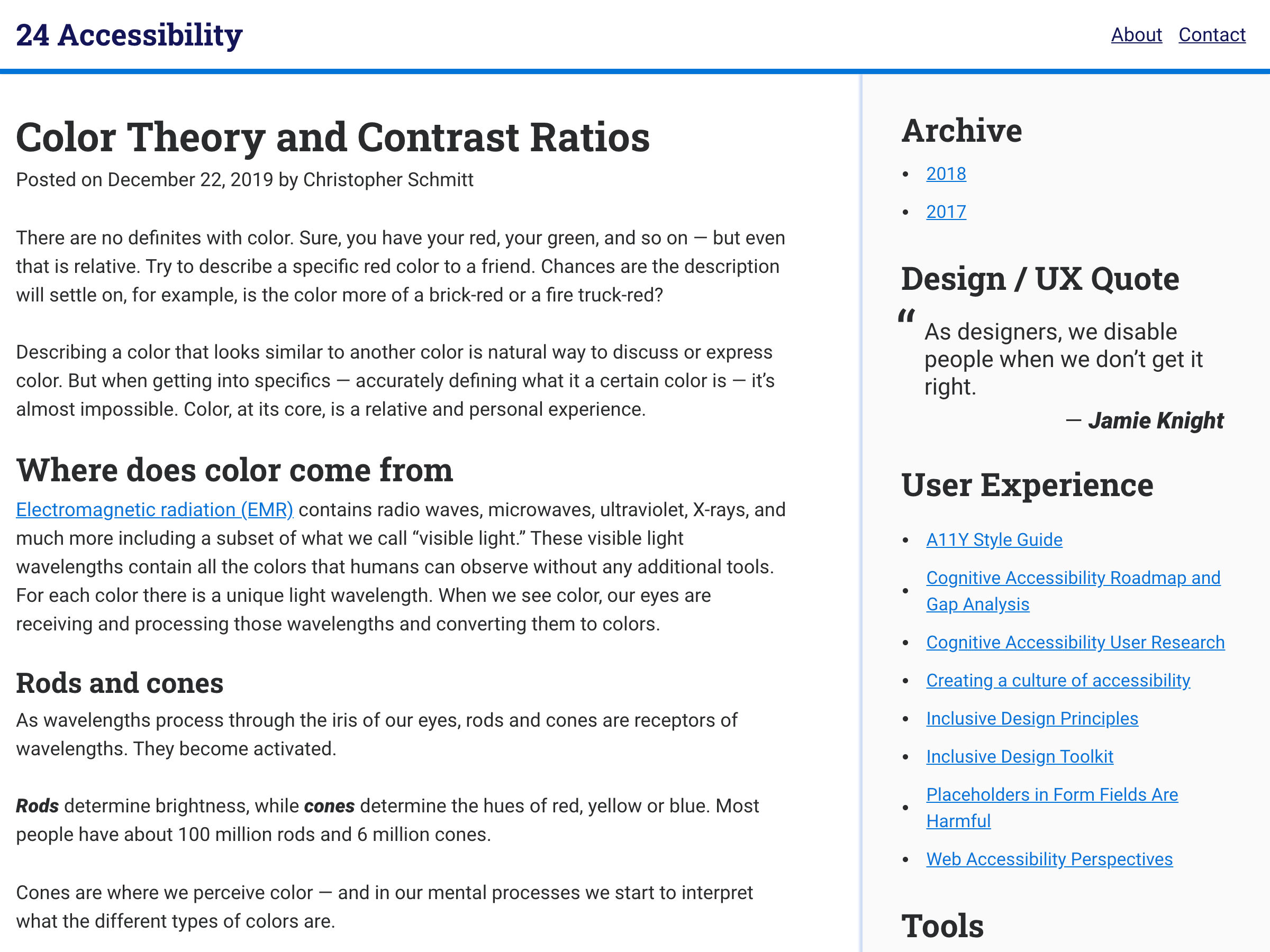
Color Theory and Contrast Ratios
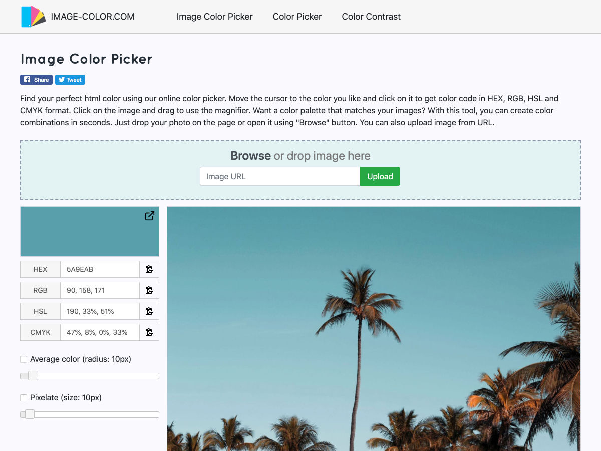
Online Image Color Picker for Designers
3 Underused CSS Features to Learn for 2020
15 Illustrations to Share Winter Beauty and Christmas Magic
Manrope – Free Sans-Serif Variable Font
6 Steps for a Better Product Design Workflow
Winter Wonderland: 40+ Illustrations of Christmas and Winter
Want more? No problem! Keep track of top design news from around the web with Webdesigner News.
2020 is literally just hours away and we want to talk about 5 graphic design trends in 2020 that you’ll need to be looking out for.
We all know that there are some design trends that are bomb and some that should just hide under a rock and go away forever.
Today, we only want to go over the best of the best of graphic design trends in 2020.
So let’s do this.
Graphic Design Trends in 2020 You Need To Look Out For
So let’s do this. May the new year bring loads of good times and good graphic design trends!
Realism
Realism and 3D designs are a trend that reigned all of 2019, and we expect it to become even more popular during 2020.
Technology is constantly evolving and improving and we’re always impressed and excited to see what designers will do with this. We’re convinced that we will continue to see 3D designs all throughout 2020.
Lots of people always like to combine real objects and images into their designs, but if this is something you choose to do, make sure you avoid the uncanny effect!
I’ve been reading a lot about color associations recently and I’ve learned that people will ignore neutral colors or worse, won’t even notice them, whereas when someone sees a vibrant color after seeing lots of neutrals, it’ll break the boredom and they will feel notions of excitement and fun.
This year in 2020, break all of the rules and embrace the vibrant colors that this world has to offer.
Life is short, use all the colors!
Stand out of the crowd by using bright and vibrant colors.
Thanks for sticking by our side another year and we are more than thrilled to see what design trends this next year holds for each of us.
We wish you a happy New Year’s and all our best wishes.
We hope you enjoyed the 2020 design trends that you can expect to see. What trends do you expect to see in 2020? Let us know in the comment sections below.
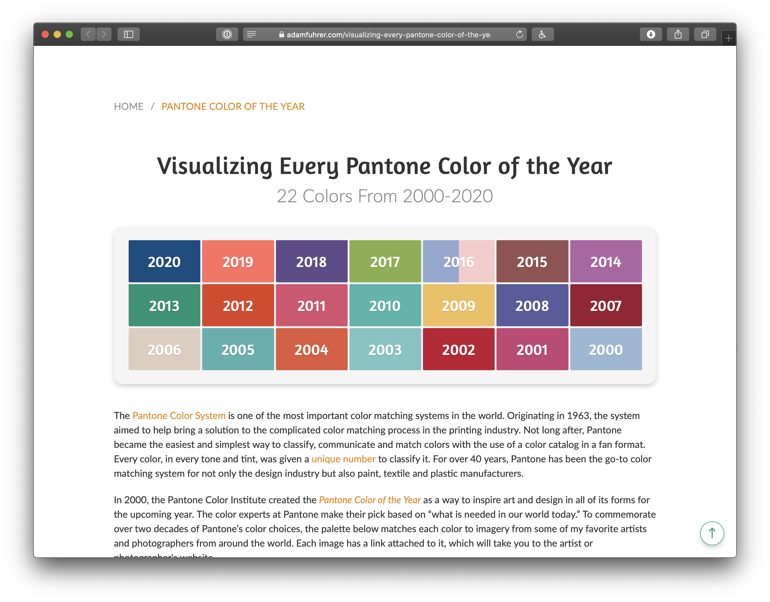
There’s been a run of tools, articles, and resources about color lately. Please allow me to close a few tabs by rounding them up here for your enjoyment.
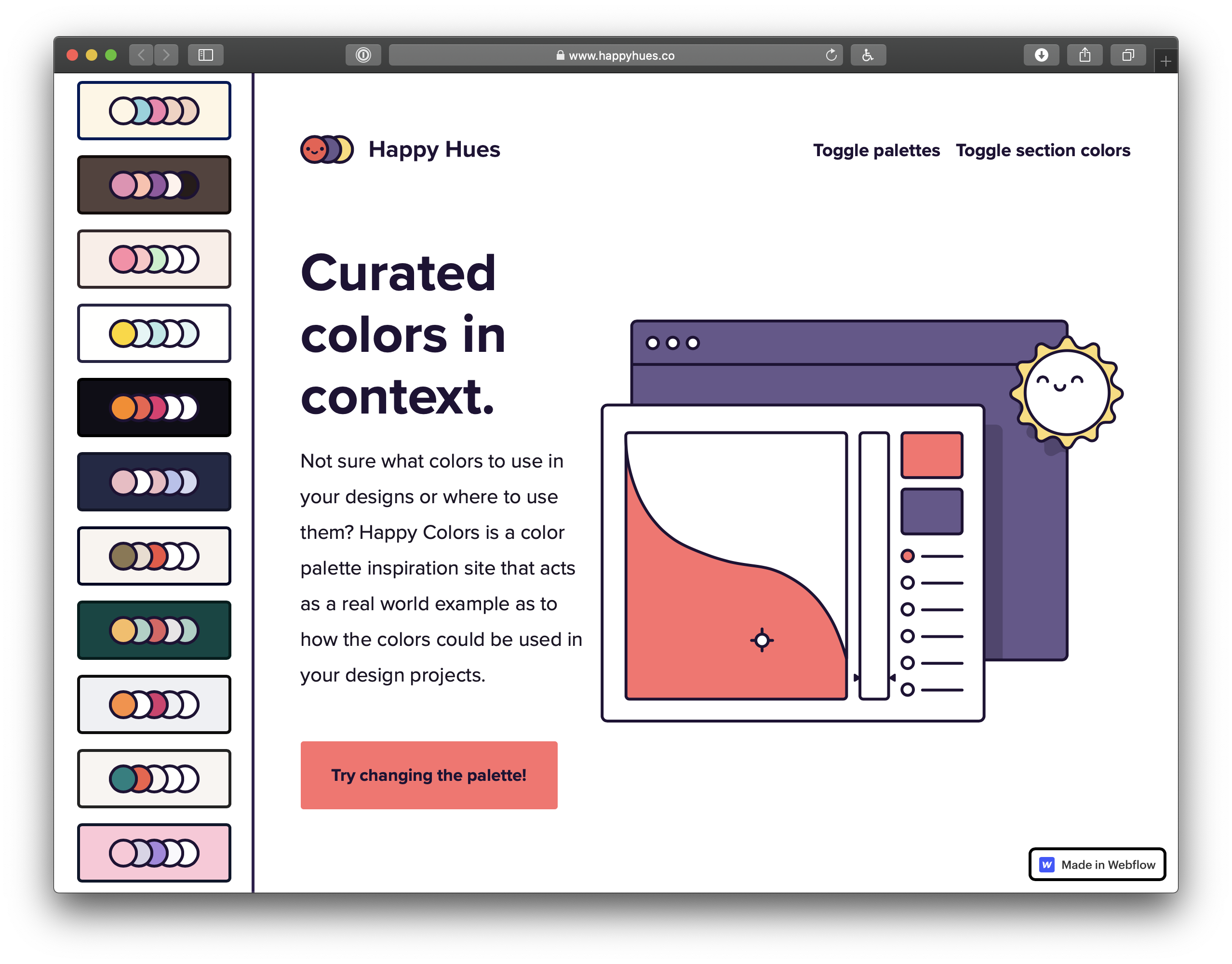
Curated colors in context
Happy Hues demonstrates a bunch of color palettes in the context of the site itself. That’s a nice way to do it, because choosing nice colors isn’t enough — it’s all about context. It can go bad, as the Refactoring UI blog demonstrates.
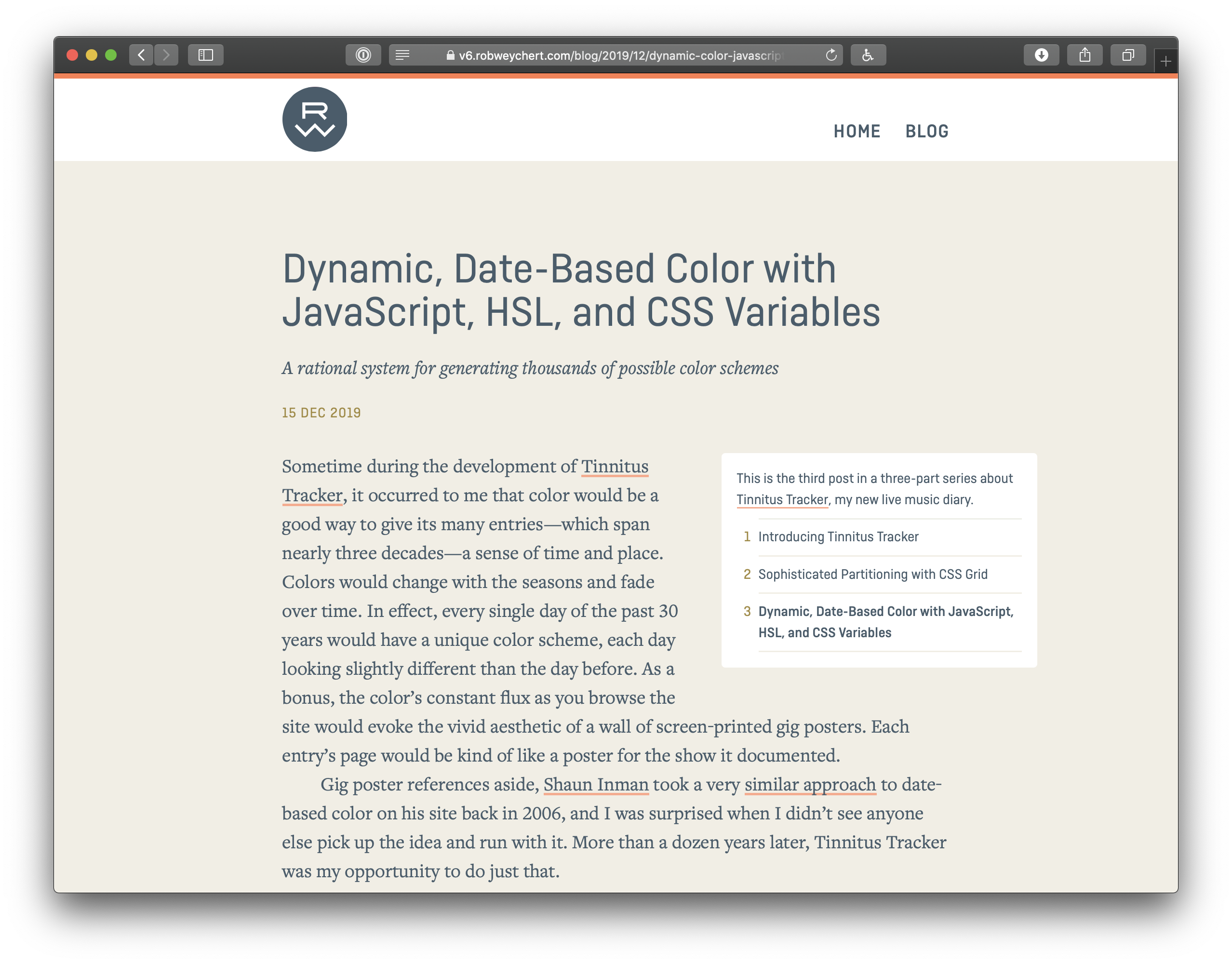
Dynamic, Date-Based Color with JavaScript, HSL, and CSS Variables
Rob Weychert shows off how he created date-based color schemes (so that every single day of the past 30 years would have a unique color scheme, each day looking slightly different than the day before).
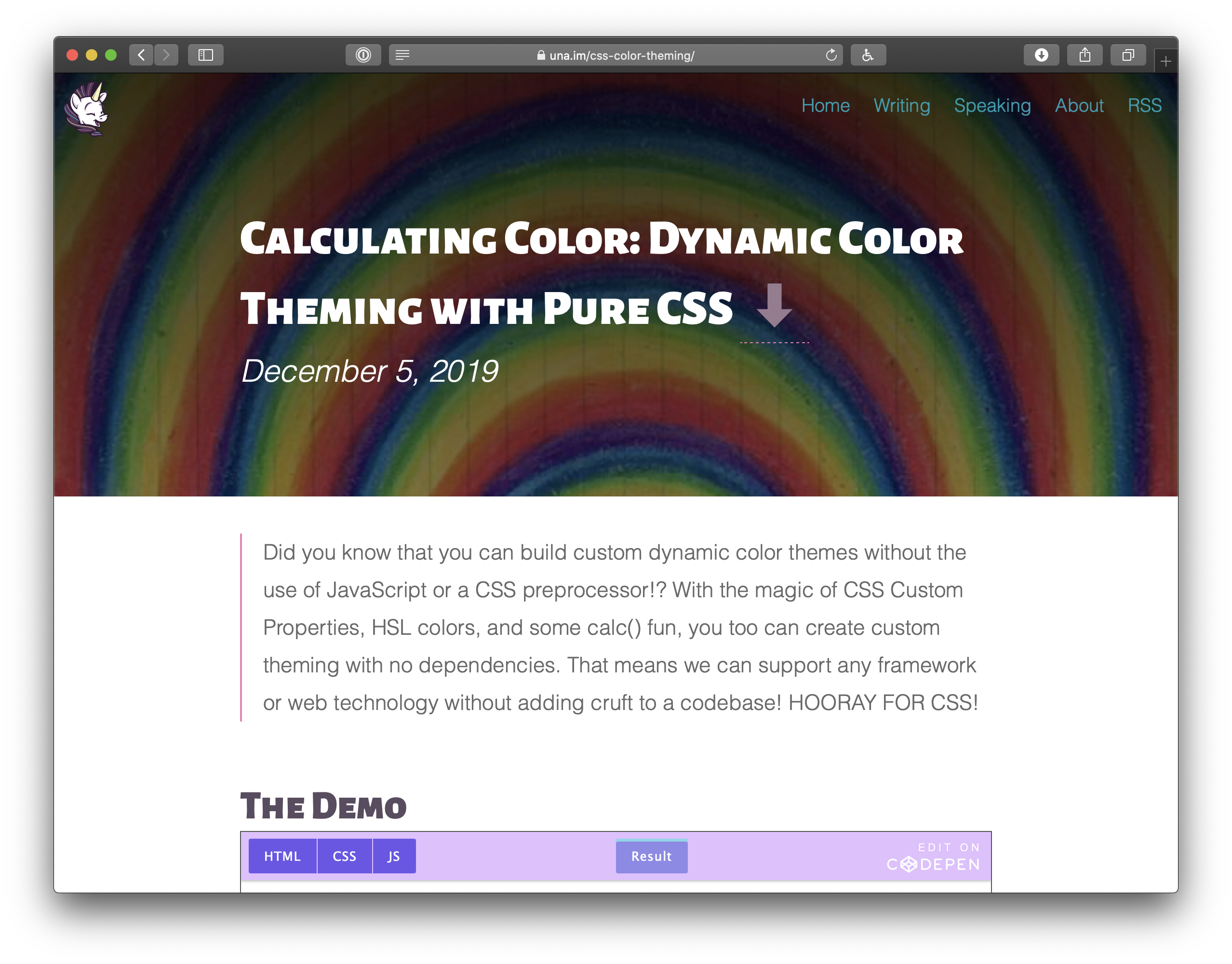
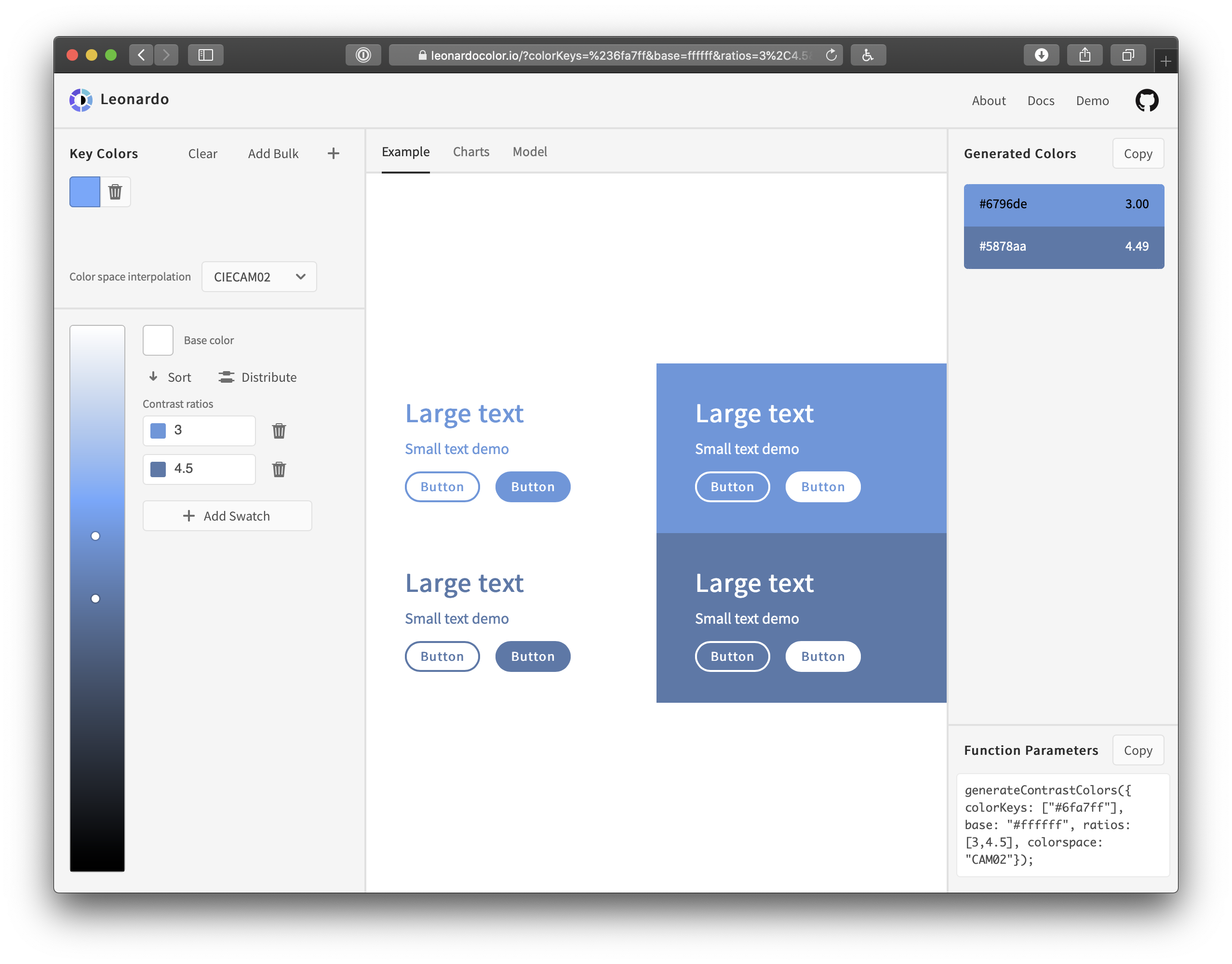
Calculating Color: Dynamic Color Theming with Pure CSS.