Historically, mobile app development has been based on monolithic architectures that are rigid in nature. In such an architecture, the different functionalities and components of an app are in a single instance.
Today, this trend is shifting and changing the mobile app development landscape. Mobile app developers and mobile app development companies are leveraging microservices and containers to deploy much more flexible app architectures, known as microservices.
These apps have a micro-architecture that provides a wide range of benefits to the developers, though it does have its negatives as well.
But before we jump into the nuances of the relationship between containers and apps with micro-architecture, let’s first understand “what are microservices and containers?”
Defining microservices and containers?
Microservices is a modern approach to mobile app development in which the architecture of an app is split into multiple services with a dedicated micro-function within the app.
Each microservice has its own logical function and is a deviance from the old-school style of monolithic app structures, in which, as we discussed, all components are in a single instance.
Containers are like boxes or packages used to store everything that an app needs to function, such as code, libraries, binaries, and dependencies. It is a self-contained unit that helps with the development, shipment, and deployment (even on the cloud) of an app, alongside the hardware requirements.
Today, the two most famous containers in the industry are Dockers and Kubernetes. They are used to build and run containers, though it is fair to say that Kubernetes is rising as an industry standard, with its ability to run multiple containers in different computing environments.
So what’s the relationship between microservices and containers? Essentially, you put your microservices in containers. Though it is possible to use Virtual Machines for this purpose, containers take up less space and are faster to boot.
Benefits of Using Microservice architecture In Mobile App Development?
The development of microservices or apps with micro-architecture is the answer to the problems associated with monolithic application development.
I will be explaining these problems and how they are solved in apps with the benefits of containerizing apps with micro-architecture.
Working With A Smaller Codebase
Since each component or service within an application has its own container, developers have a smaller codebase to work with. This helps boost development speed by simplifying individual tasks.
There are bound to be fewer complexities and dependencies of functions in apps with micro-architecture that are developed in containers than monolithic apps.
The application’s technology stack can differ through microservices.
Developers can leverage a wide range of technologies, be it language or library. This is because there is no monolithic dependency in the mobile app development process like there is in monolithic app development.
Scalability will be independent of each microservices.
Developers have the ability to scale different components of the app, depending on the resources. Unlike in monolithic apps, containerized microservices eliminate the need for making multiple instances of every component during the scaling process. It saves you from making multiple copies of the whole app and makes the process much more efficient.
Isolate failures.
As each microservice within an app with micro-architecture are in their own containers, a bug in one of those services is unlikely to malfunction the entire system or disturb any other microservice or component of the app, since there’s limited dependency.
In monolithic apps, one bug, if not caught properly, can bring down your whole app’s process and system, setting back the work you’ve done.
Drawbacks Of Using Containerized Microservices
Though it’s true that micro-architecture apps came into existence as an answer to the problems of monolithic app architecture, they came with their own set of drawbacks and limitations.
From splitting monolithic structured apps into microservices to managing apps with micro-architecture, these are some of the problems that arise in the process.
Some problems with a containerized micro-architecture app are:
Keeping Track of Microservices is Harder
As the number of microservices grows, especially for enterprise mobile app development, it can become hard to keep track of all of them. Setting up continuous delivery and continuous integration can become a hassle when you’re dealing with the complexity of managing multiple microservices.
Increased project complexity
Microservice-based mobile apps require an increased number of network calls when there’s an interaction between two different microservices. This is one kind of problem that doesn’t exist within monolithic app structures.
How you handle this inter-services communication, deal with errors, and increase test cases for each service can be a challenging notion for developers, which is much simpler when you have to only deploy one instance of an app in monolithic apps.
Tracing bugs can take a lot of time
While bugs in one microservice are isolated to its own container, in the cases where there are different routes that your microservice uses to communicate with other microservices, it becomes harder to identify and locate faulty code or bugs and can take up a lot of time.
Tools That Can Help You Execute Apps With A Micro-Architecture
Kubernetes
Kubernetes is a container orchestration platform that allows developers to develop, deploy, and scale all of their containers. It offers them the ability to automate the deployment process of a containerized microservice, making it.
Istio
Istio is an open-source service mesh designed to mitigate some of the drawbacks that come with micro-architecture apps. It helps you manage a distributed microservice architecture by providing a robust mechanism for tracing, monitoring, and securing your microservices.
It provides security within the microservice while allowing you the ability to manage the traffic of your microservice.
Istio can be integrated on top of Kubernetes, making it extremely useful and incredibly accessible for developers to use.
Is Containerization Essential For Running Apps With Mico-Architecture?
I think while it’s not necessary to use containers, it’s the ideal choice for mobile app development. Kubernetes is an open-source container orchestration platform, which means that building your app with a micro-architecture using it will not be a huge challenge, but will ensure that your app is ready to scale and grow.
The decision between using a microservice architecture vs. a monolithic architecture should be based on scalability and long-term sustainable usability.
While you can start your mobile app development project using a monolithic structure if you scale it as such, then containerizing it as a micro-service architecture later can be an incredibly challenging task. So if you’re planning for the future, it’s ideal to initiate your mobile app development project as a containerized micro-architecture app.
This helps you leverage rapid development and production, giving you the ability to develop enterprise-level mobile apps.
Laura Kalbag wrote How to read RSS in 2020. This would be a nice place to send someone curious about RSS: what it is, what it’s for, and how you can start using it as a reader. I like this callout, too:
Sometimes the content is just an excerpt, encouraging you to read the rest of the content on the original site. I think this defeats the point of providing RSS, where a big benefit is that the reader can customise how the posts display in their feed reader to improve their reading experience.
I absolutely love Khoi Vinh’s writing, but have long been surprised that his feed is truncated. Barely even excerpts. WHY KHOI WHY?!
Laura linked up lire as a reader, and I’d never seen that one before. It’s apparently got good screenreader support.
Louis Lazaris wrote Front-end RSS Feeds (2020 Edition). It has OPML files that are in big groups of feeds that you’ll be subscribed to once their imported into a feed reader (some have that as an option). There is also just a big list too.
I haven’t had a chance to play with Unread 2 yet for iOS, but I love the idea that it “automatically determines which feeds contain only article summaries” and goes and fetches the rest of the content from the site for you.
This is so cool. I mean, GraphQL is already cool. It’s very satisfying to write an understandable-looking query for whatever you want and then use that data in templates.
But what if you didn’t have to write the query at all? What if you just wrote the templates pretending you already had the data, and the query built itself? I haven’t even tried this project yet but it feels like how things should be.
Reminds me of how Perch CMS doesn’t ask you to model data up front. You build page templates, and the CMS creates data entry pages based on the data you need in the template.
CSS Grid provides us with a powerful layout system for websites. The CSS-Tricks guide gives you a comprehensive overview of Grid’s properties with layout examples. What we’re going to do here is a reverse approach to show you the smallest possible set of grid properties you need to know to meet most of your layout needs.
These five properties will get you up and running:
display (for the grid value)
grid-template-columns
grid-gap
grid-auto-flow
grid-column / grid-row
Here’s how simple it is. Let’s assume you want to implement the following layout for small, medium and large screens.
If we apply a few baseline styles, this is what we get, which is already sufficient for small screens:
CodePen Embed Fallback
Now we can get into the grid properties!
Use display: grid to divide the page into independent layout containers
First, we need to determine which parts of the page should be aligned with grid layouts. It is possible to define a single grid layout for the whole page. However, for websites with a very complex structure (e.g. news websites), handling a large grid quickly becomes complicated to wrangle. In this case, I recommend breaking things down into several, independent grid containers.
Like this:
Where do you draw the line between what is and isn’t a grid? Here’s a personal rule of thumb I follow:
If the layout in a particular part of the page does not fit into the grid of an adjacent or surrounding part of the page, make that part its own grid container.
I have drawn the grid lines into the page section with the class .container-main in the following image You may notice that the section with the .container-inner class from the markup does not fit exactly into the grid of rows.
Here’s another possible layout where the small sections fit into the surrounding grid if a finer line raster is chosen. A separate grid container is not absolutely necessary here.
To kick this off, let’s .container-main into a grid container. This is the basic building block for CSS Grid — turning an element into a grid container with the display property:
.container-main {
  display: grid;
}
We’ll want to do the same with our other grid containers:
Use grid-template-columns to define the required columns
Next, we’re going to define the number of columns we need in each grid container and how wide those columns should be. My guideline for the number of columns: use the smallest common multiple of the maximum number of columns required for the different screen sizes.
How does that work? The .container-main element has a total of two columns on medium-sized screens. If we take that and multiply it by the number of columns on large screens (three), we get a total of six columns.
We can do the same for our navigation, the .container-inner element. There are three columns on medium-sized screens, which we multiple by one column on large screens to get a total of three columns.
The .container-nav element provides no number of columns. In this case, the grid system should automatically adjust the number of columns to the number of menu elements. It’s common to add or remove items in a navigation, and it’d be great if it responded accordingly, which is something grid can help us with a little later on.
OK, so we defined the number of columns for each grid container. Let’s use the grid-template-columns property to set those into place. But, first a couple of minor details:
The grid-template-columns property is only used on the grid container. In other words, you won’t find it being used (at least correctly) on a grid item inside the container.
The property accepts a bunch of different values that both define the number of columns and how wide they should be. The one we’re interested in here is the fractional (fr) unit. I’d highly suggest checking out Robin’s overview because it’s unique to grid and does an amazing job doing calculations to decide how grid elements fit inside a grid container.
We need six equal-width columns in .container-main. We can write that like this:
By default, grid uses all the space it has in a grid container to fit in grid items. Having elements flush next to one another might be a design requirement, but not for the particular layout we’re making. We want some breathing room between things!
We have the grid-gap property for that. Again, this is a property that’s just for grid containers and what it does is create vertical and horizontal spacing between grid items. It’s actually a shorthand property that combines the vertical spacing powers of grid-row-gap and horizontal spacing powers of grid-column-gap. It’s handy that we’re able to break things out like that but, in times like this where we’re working with the same amount of spacing in each direction, the shorthand grid-gap is much nicer to write.
We want 20px of space between grid items in .container-main, 10px of space in .container-inner, and 5px of space in .container-nav. No problem! All it takes is a one-liner on each grid container.
Use grid-column and grid-row to determine the size of the individual grid items
Now it is time to put the layout into the shape we want it!
First is the grid-column property, which allows us to extend a grid item across n columns, where n is the number of columns to span. If you’re thinking this sounds an awful lot like the rowspan attribute that lets us extend cells across multiple rows in HTML tables, you wouldn’t be wrong.
It looks like this when we use it on a grid .item in our .container-main element, and on the .inner-item elements in .container-inner:
What we’re saying here is that each item span six rows in our main container and three rows in our inner container — which is the total number of columns in each container.
An interesting thing about CSS Grid is that we are able to name the lines of the grid. They come with implicit names out of the box but naming them is a powerful way to distinguish between the starting and ending lines for each column on the track.
We can change the number of columns and rows the items should span at different breakpoints:
Using grid-auto-flow to control the placing of the elements
CSS Grid places elements one row after the other. This is why the result in our example looks like this at the moment:
A column-by-column placement can be achieved by setting the grid-auto-flow property to column (row is the default value). Our layout will profit from column-wise placement in two cases. First, it makes our menu items finally appear in a horizontal orientation. Secondly, it brings the elements of the container class into the desired grouping.
The final result
CodePen Embed Fallback
Conclusion: More or less specification?
The grid system allows us to work under the motto, “make as many specifications as necessary, but as few as possible.” We’ve only covered a few of the specifications necessary to turn elements into a CSS grid container and the items inside it into grid items for the sake of showing just how little you need to know to build even complex layouts with CSS Grid.
CSS Grid supports additional use cases where:
We want to make even fewer specifications in order to instead rely more on automatic positioning.
We want to make even more specifications in order to determine more details of the resulting layout.
If the first case applies, then it’s worth considering the following additional grid options:
When creating the grid with grid-template-columns, you can have the grid system automatically determine the width of individual columns with the auto keyword or adapt it to the existing content with the settings min-content, max-content, or fit-content.
You can let the grid system automatically determine the number of required columns with the help of repeat, auto-fill, auto-fit, and minmax. Even media queries can become redundant and these tools help make things flexible without adding more media queries.
If the second case applies, CSS Grid offers even more settings options for you:
You can explicitly specify the width of the columns in the unit of your choice (e.g. px or %) using the grid-template-columns property. In addition, the property grid-template-rows is available to define the number and width of rows, should there be a specific number of them.
You can also define specific column or row numbers for positioning as values for grid-column and grid-row (or use the properties grid-column-start, grid-column-end, grid-row-start, or grid-row-end).
And we haven’t even gotten into CSS Grid alignment! Still, the fact that we can accomplish so much without even broaching that topic shows how powerful CSS Grid is.
“Design is not just what it looks like and feels like. Design is how it works.”
— Steve Jobs
Like written words are to language, fonts, colors, shapes and icons are to visual design. An effective visual design language not only acts as a communication framework for all stakeholders on a product development team, but unites a brand and its customers to ensure that a company’s brand identity matches a customer’s brand perception.
We use language as a tool for communication with other people. Writers use words to communicate with their readers, while designers use visual language to communicate with their users. Fonts, colors, shapes, visual elements such as icons — those are elements of design language. Effective design language streamlines communication.
While working at Fantasy in 2016, my team was tasked with designing the interface for Huawei’s mobile OS (EMUI 5 interface). I personally was responsible for the visual design language for this OS. Surprisingly, the company didn’t have its own language at initiation; instead, they relied on a customized version of Android that was plagued by inconsistency and lacked a coherent vision. This was largely due to the existence of multiple teams and multiple functional roles with different skillsets and perspectives all grasping at straws to invent a way to communicate. UX designers, interaction designers, visual designers and graphic designers had all worked on the OS in the past, all using their own best efforts to communicate.
Without a uniform system of communication, not only was the user experience jumbled and confusing, it was extremely difficult to integrate changes into a final design. It was a true Tower of Babel.
By unifying the project teams under one shared language, a project can move forward with clarity, cohesion and speed.
Consistency
Digital design has few physical constraints compared to industrial disciplines. This gives designers a lot of power to experiment and propose a variety of solutions to any given challenge. However, this can easily lead to disjointed user experiences.
To achieve consistency in design, it’s vital to define reusable and cross-platform components and styling options. Consistent design makes it much easier to ship products on a multitude of platforms and devices, which is especially crucial for companies like Huawei.
Brand Recall
When they interact with a product that has a strong visual language, users tend to remember it better. Unfortunately, a majority of products available on the market have generic designs. It is too easy to confuse one product with another when they share the same visual styles.
Creating a strong visual identity is a goal that design teams should state when working on visual design. This is the personality of a digital product! The colors, typefaces, photos, illustrations, animations are all part of a brand, and they should be designed in a way that helps people remember the product. When an authentic design language is followed consistently, it creates recognizability for the brand.
Clarity
We put a strong focus on clarity — we wanted to make our GUI clean, not cluttered. By following a minimalist approach, we minimized the number of elements that users have on every screen and created a highly-focused experience.
Minimalist design helps to focus user attention on important elements of your design. EMUI 5.0 Concept by Fantasy (Design concept of EMUI 5 interface) (Large preview)
A Way To Innovate
With so much competition in the phone market, companies invest significant resources to make people try their products. Companies invest in innovation and try to break new ground to attract users and peak their interest. Visual design is often the fastest and cheapest way for a product to innovate.
How Do We Create A Design Language?
For me and my teams, the process of creating a design language, we follow the same rubric we would create any complete consumer product: research-ideate-design-validate- implement. This is how we ensure that the language will work for our target audience.
Research
Often, the VDL is the most important, cornerstone product we create. And like every product you design, research should always be the first. When we started this Huawei project, it was important to understand the opportunities for our design. Jeshua Nanthakumar, a lead UX designer on this project, and his UX research team analyzed all mobile OS available on the market and identified the full range of challenges typically faced by users.
The UI Audit
As I’ve mentioned above, achieving consistency was one of the goals of creating a shared design language. It’s essential to standardize the visual design. That’s why even before starting work on a visual language, we decided to conduct a UI audit. Our goal was to understand the anatomy of the Android OS.
We broke down the whole mobile OS into atomic elements—colors, shapes, shadows, lines, transitions. By decomposing the design, our team was able to see how individual pieces work together and form a greater whole. At the end of UI audit, we had all the elements that make up the digital product (buttons, navigation bars, icons, etc.) grouped into distinct categories.
Understand How Users Perceive The Brand
When working on visual language, it’s essential to have a clear understanding of who you’re designing for and how they perceive your brand. Ideally, brand identity (the way the brand wants to be perceived by users) should match with the brand image (the way users actually perceive the brand). Designers have a direct impact on brand identity. Aesthetic styles, language & tone, iconography, and illustrations — all these are elements of brand identity.
Our goal was to create an innovative design language that feels customized for its audience. To understand how your users perceive the Huawei brand, our team invested in user research. We knew that design language should successfully meet the needs of both Eastern and Western design sensibilities, so we categorized large groups of users and created summaries based on the available information about our target groups. Every summary about our audience had the following information blocks — demographics, what they care about, and their expectations. Here is an example of the summary of the group of North American customers:
Huawei’s core audience lives both Urban and Suburban environments;
They are driven by business, social status, and personal organization;
Age range 30-64;
Average income: USD $75.000 per annum
They care about:
Being organized and ordered
Efficiency and productivity to enable them to enjoy their own time
Their expectations
Contributing to something bigger than themselves
Maximizing life and living for happiness
With the idea that design should match the audience’s lifestyle and be extremely refined, we evaluated every design decision in accordance with the needs of our target segments. This understanding will give you a reason for your visual direction.
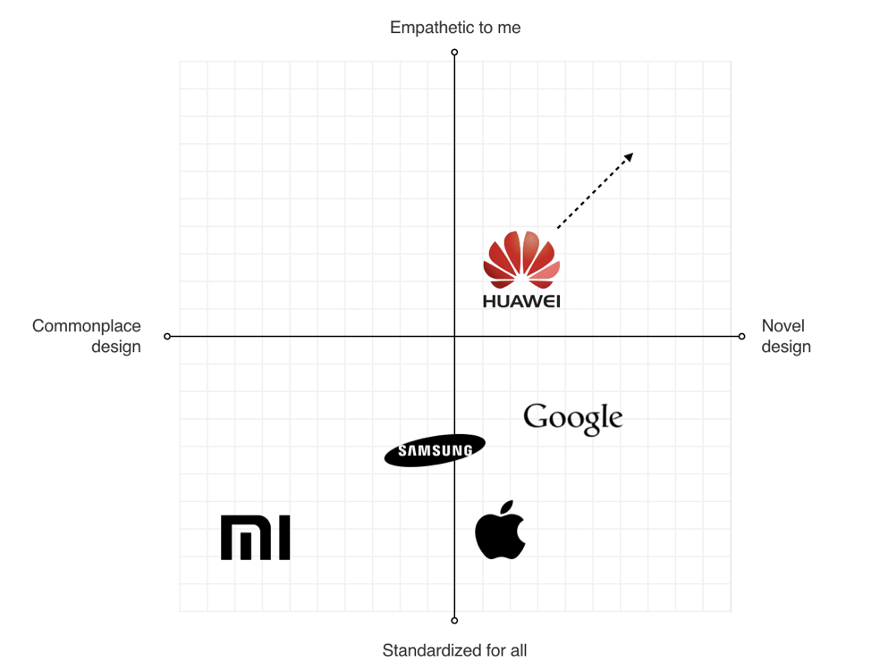
Analyze Major Competitors
To identify strategic design opportunities, our team conducted the competitors’ analysis. We’ve identified four major competitors who had strong design languages and focussed on identifying their strengths and weaknesses. For example, when we evaluated Apple iOS, we’ve mentioned the following strengths of the language — scalable across devices, great focus on standardization, unique identity — and the following weakness — inconsistency with iconography, overuse of blur effects.
Four major competitors of Huawei at the time of our analysis. Every brand represented a large part of the market and had its own robust visual language. (Large preview)
This analysis helped us to identify four major directions that brands followed when they create products:
Empathetic to me (design tailored for the needs of the target audience; design that demonstrates real empathy with the human and truly reflects the audience)
Novel design (design that uses innovative visual styles and interaction patterns)
Commonplace design (design that utilizes conservative style elements)
Standardized for all (heavy standardized design)
We put every brand on the plot with those four directions.
Identifying opportunities for Huawei visual language (Large preview)
This process helped us to identify the opportunities for Huawei language:
Scalable Design Language
The language should scale across devices and across third-party developer apps as well.
Unique Design DNA
The language should be unique and distinct from the major competitors.
Be Bold Yet Timeless
The language should be long-lasting.
Define Requirements For Visual Hierarchy
When UX researchers analyzed typical user complaints, they found that the location of key interactive elements was one of the most common problems that many mobile users mentioned. In 2016 mobile screens become larger and larger, but the location of key functional elements in Android remained the same — the top area of the screen. As a result, users had to stretch their fingers or change their grip in order to interact with the elements.
Thumb Zone: how easy it is for our thumbs to tap areas on a phone’s screen. (Image credit: Luke W) (Large preview)
Today a bottom-area navigation is an industry-standard, but back in 2016, the situation was a bit different. We’ve reached the Huawei engineering team with this insight and asked about the technical feasibility of moving controls to the bottom area of the screen — this area is more comfortable for user interaction. The engineering team confirmed that it was possible to move the elements, and we helped define the new default location for functional elements.
Functional controls are located at the bottom of the screen — in the easy-to-reach area. (Design concept of EMUI 5 interface by Fantasy) (Large preview)
Ideation: Defining A Design Vision
Creating A Philosophy Of Design
Imagine that you need to design a language that will be integrated into products that will be used by people all over the world. The natural language we use in interpersonal communications cannot be separated from a culture because it has a close relation to the attitude or behavior of speakers of the languages. The digital language is absolutely the same — it should look natural for customers in the Americas, Europe, Asia, Africa, and Oceania.
The success of any visual design highly relates to how people perceive it. Many factors are influencing human perception, and the significant part goes to psychology. To create a sophisticated design, you need to consider the meaning of shapes and the impact which they have on users’ minds.
Creating a philosophy of design is extremely challenging, and you cannot do it alone. That’s why I worked with Abigail Brody, a former Apple creative director who joined Huawei in September 2015 as Chief UX design and VP of Huawei Devices. At Apple, Abigail was responsible for iOS design. She was the one who described the methodology of visual language to me.
Together we spend a lot of time trying to find the direction for visual design, and we’ve decided to use the philosophy of organic design as a foundation for our design language. Organic design is centered around using nature as the biggest inspiration.
Organic Design was pioneered by Frank Lloyd Wright who believed in creating harmony between people and nature. (Image credit: museiitaliani) (Large preview)
According to this philosophy, design should help to achieve harmony between people and nature. When we worked on our visual language, we focused on incorporating natural forms (smooth curves and organic forms) in our visual design. As a result, all visual elements, such as buttons, icons, and shapes, had an organic design aesthetic.
Round shapes are one of the things that make organic objects different from non-organic. (Large preview)
Using Motion Design To Create A Distinct Visual Identity
There is no doubt about the importance of the role that motion plays in mobile design. For many product motion serves a purely-functional role—it provides feedback for user action and connects different states of the mobile app together. The well-crafted motion also makes things more attractive, and as we know, attractive things work better (the aesthetic-usability effect says that people are more tolerant of minor usability issues when they find an interface visually appealing).
Our team put high stakes on the motion. Our ultimate goal was to use motion to breathe life into our products — make the interface feel alive and dynamic. We wrote a motion design manifesto with solid design principles. Every animated effect and transition that we wanted to introduce in our design was measured in accordance with the functional and emotional benefits it delivers to end-users.
We know that early impressions of a product design are especially important. And for that very reason our key focus was on creating magical moments — surprise and delight users while they interact with the OS.
This video demonstrates the visual effects we used in EMUI.
Design And Testing: Build, Test, Iterate
Baking Meaning Into Every Design Element/Design Decision
Just like we have rules for using words in sentences in a natural language, we should have rules for using visual elements in visual language. Strong semantics is what makes visual communication efficient.
When a team works on a visual language, it should take two rules into account:
There are no random visual elements in a visual language. Every element serves a purpose.
There should be no isolated units in visual language. Every unit in a visual language should be a part of a greater whole.
The animated effect behind the user avatar is used to convey a sense of active call. The animation is both meaningful and pleasurable. (Design concept of EMUI 5 interface) (Large preview)
Experimentation And Design Review
It’s impossible to create a great design from the first attempt. Design is an iterative process, and whenever our team created a new visual solution, they evaluated it by comparing it with previous solutions. The comparison was visual—the screens were laid side by side on a board, so everyone could see the parts that require additional polishing. Team members gather together on informal design reviews where they discuss the pros and cons of individual solutions.
Design review in progress at Fantasy Interactive (Large preview)
Pattern Libraries, Style Guides And Design Principles
Pattern libraries (reusable building blocks such as UI bars), style guides, and design principles (principles that allow developers to propagate design language in their own apps) are essential elements of design language. They are the foundation of the design system — a shared resource that teams use when they create interfaces. The fact that we’ve conducted a UI audit during the research phase helped us to categorize the visual design elements. We’ve established a toolbox for everyone who worked on the project. So, when a new member joins a team, all they need is the toolbox, and they are set to maintain consistency.
The Huawei EMUI project was an extremely important project for the Huawei Corporation. It was essential to ensure that the language we’ve defined work for the users. And the only way to get this understanding is to test our design as soon as possible.
We’ve followed a simple but effective technique — build, measure, learn. By following this approach, the design team didn’t postpone the testing design until the release. We’ve incorporated visual language into functional prototypes and tested them both inside our group (dogfooding) and outside (with real users). The feedback collected during the testing allowed us to understand what worked/doesn’t work for users.
Sharing the results of testing with product teams at Fantasy Interactive (Large preview)
Implementation
If you have had a chance to use the Huawei EMUI 5 interface, you are probably thinking to yourself, “Um, that doesn’t look exactly like Gleb said!” And that’s true.
It is a sad reality that almost no design team is responsible for the implementation of this solution. Unfortunately, a lot of solutions we proposed to the engineering team weren’t implemented properly, or at all. As a result, the design language we’ve created and the design language the end-user saw in Huawei products end up as two different animals. But this is purely my opinion. In 2018, Huawei surpassed Apple in smartphone sales. The UI was a critical element to user confidence.
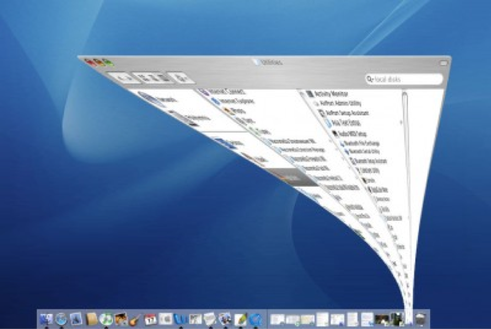
Based on my experience, the challenge of implementation is common for large-scale corporations. When designers who created the language aren’t invited into the process of implementing this language into the product, the final results will always be compromised. What usually happens is the engineering team follows a path of least resistance — they adjust the design solutions to the technical constraints they face when they start.
Every company needs a top-manager who cares about design and is ready to fight for it. It’s a well-known fact that when the original minimize animation in macOS that was proposed by the Apple motion design team, the engineering team said that it was impossible to implement that. At that time, Steve Jobs insisted that this animation is a must-have for MacOS. As a result, this animation became not only the most memorable transition for first-time users but also one of the things that contribute to good UX in MacOS.
The instantly memorable window animation of the Mac OS (Large preview)
A Robust Visual Design Language Is The Heart Of Good UX
Visual language can have a dramatic impact on user experience. It’s able not only to reduce friction by making UI more predictable but also to create delight. By pairing great form with excellent function, we will have an excellent user experience.
Visual language is a by-product of product design, and it requires a similar design process. It’s iterative and requires validation at every step along the way. When you build a visual language, you establish a new ecosystem for designers, and this ecosystem creates harmony between different teams involved in product development.
This month’s website designs are showing elements of what is happening in the world around us. While this is often true, some of the things we are seeing right now are an immediate reaction to current events.
Trending this month are designs for website notifications and pop-ups, retro typography, and blue and green color schemes. Here’s what’s trending in design this month.
Website Notifications
The COVID-19 world health pandemic has created a need for many designers to add notices to websites. From temporary closures to delayed shipping to changes in business operations, almost every transactional website has a need for a notification.
And while many of us are having to react fast, there’s no reason these notifications need to look bad.
The keys are to ensure simplicity, readability, and user-friendliness.
Each of these three website examples does it in a different way, but all meet the three goals above.
One big change to these pop-ups from others that we’ve looked at recently is the mood of the design. It is somber and informative, not bright and cheery like many of the more sales-oriented pop-ups that have been popular.
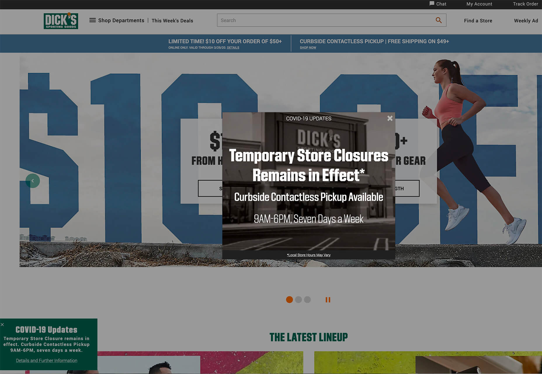
Dick’s Sporting Goods uses a simple popup with a store image in the background that’s faded out with bold white text on top. The message is direct and to the point. There’s a secondary popup notice at the bottom of the screen for users who want to know more.
The pop-up notification has an obvious X to close the window. When the primary, center screen pop-up is displayed the rest of the website has a dark overlay to help bring focus to the notification.
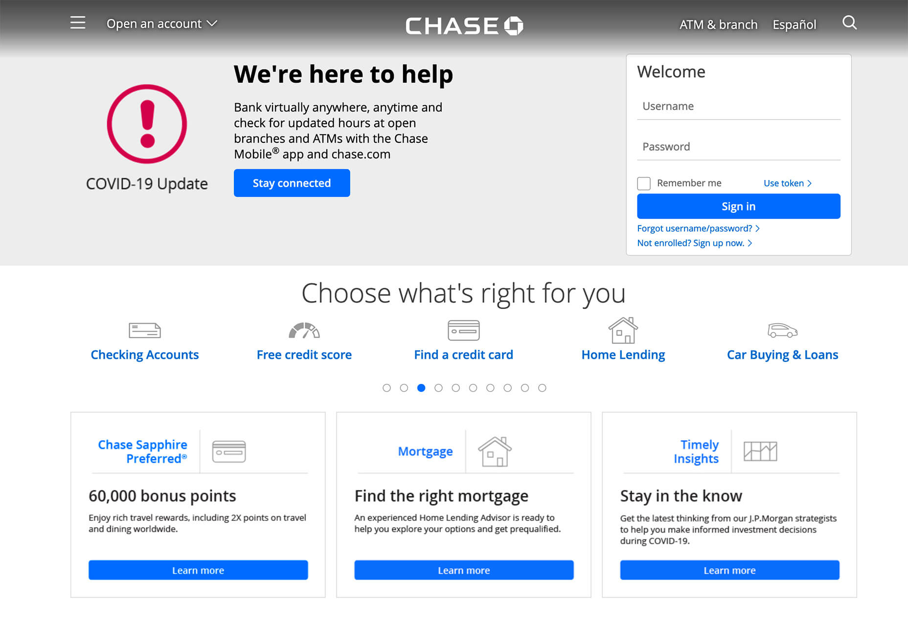
Chase retooled their website header, stripping out images, to include a COVID-19 update notice alongside the customer login box. Information is easy to read and the red icon distinguishes this as important information. The button is large and visible, making it easy to find more information about what the financial institution is doing and how to find help if you need it.
The shift from an image header to this informational one changes the whole mood of the website to one that is appropriate for the times.
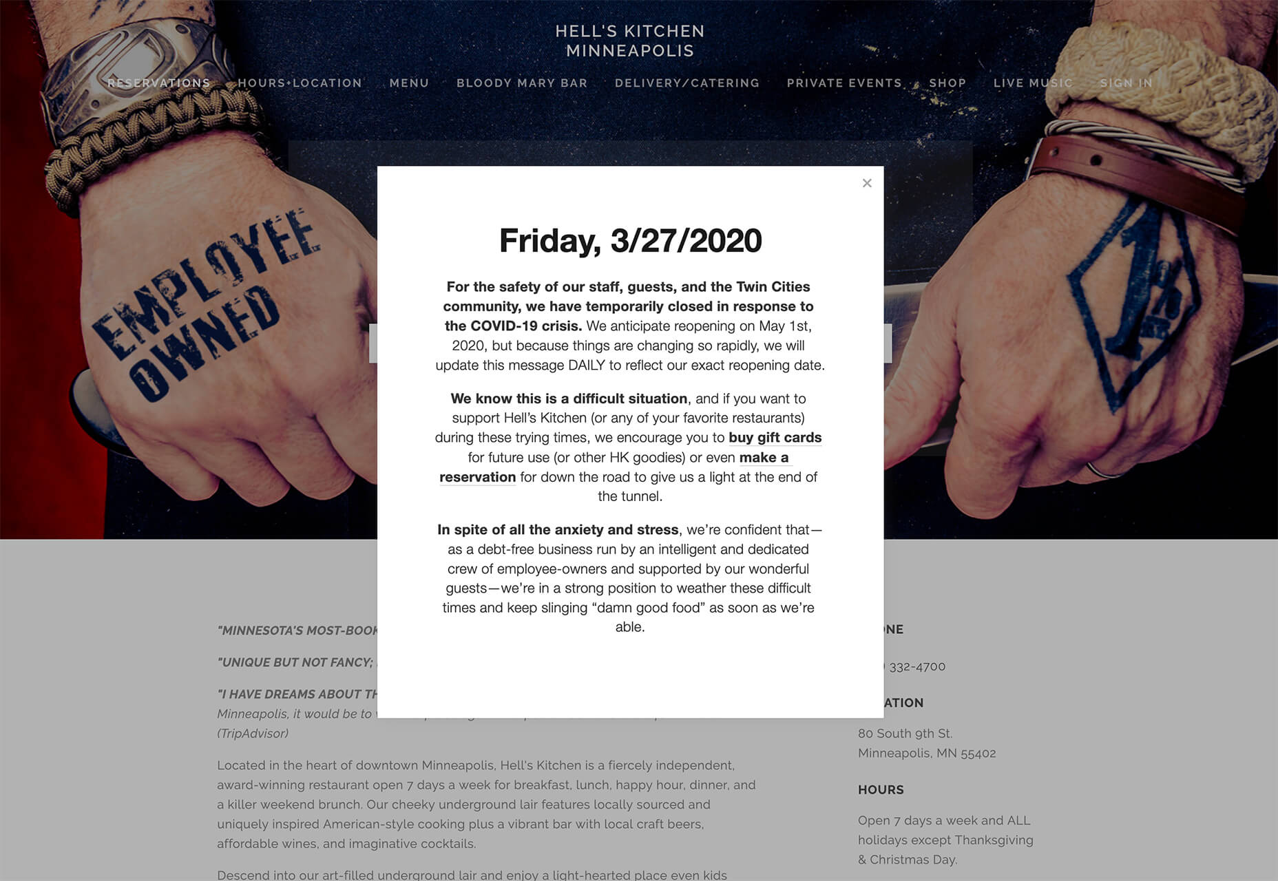
Hell’s Kitchen uses a simple pop-up with a full-screen overlay that darkens the rest of the design. This pop-up notification contains a lot of information. But blocks of text and bolding in the right places keep it organized. The date as a headline also helps customers know that the information is up-to-date with fast-moving changes that are happening everywhere.
Note that the notification also includes links to other parts of the business that can be patronized, such as buying gift cards or making a reservation in the future. Adding a relevant link or button to a notification is a good way to help users do something with the website when they can’t necessarily do what they originally came for.
When creating this style of notification for your website, pay attention to relevant settings. With sales-based notifications or pop-ups, they may time out, stop displaying due to a cookie, or only appear for certain customers or on certain pages.
With a notification such as the ones we are seeing for COVID-19, it is likely that you’ll want to think about these settings carefully. You will likely want a popup to appear on every visit for every customer. You may need a couple of notification types; one for a physical closure and another to note delayed shipping times, for example.
Retro Typography
Old styles almost always come back around.
Designers seem to be experimenting with retro typography styles in a big way lately, making this a website design trend this month.
Retro styles are being used in a variety of ways and there isn’t one dominant typography style. The most common theme seems to be retro typefaces that are a little flowier with a lot of character and personality.
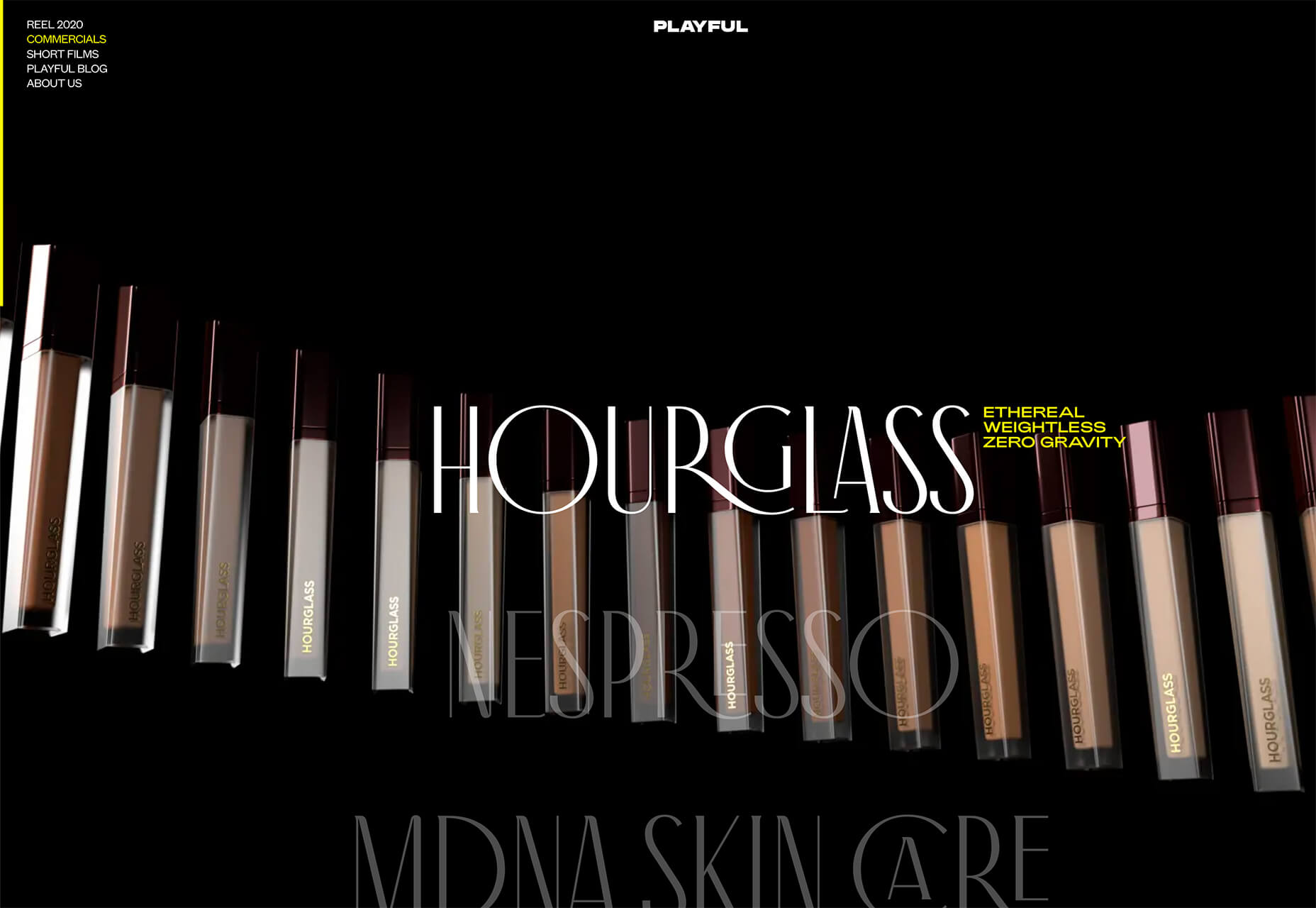
Retro typography styles are nice because they can create a very intentional mood for a project. One of the concepts that has trended in 2020 is the notion of throwing back to the 1920s. That retro style is something you can see hints of in the typography choice for Playful.
Without saying anything more, a typeface can transport someone to a different era or mood. That’s exactly what this design trend does for these projects.
Playful uses Antiga Regular for the main headlines.
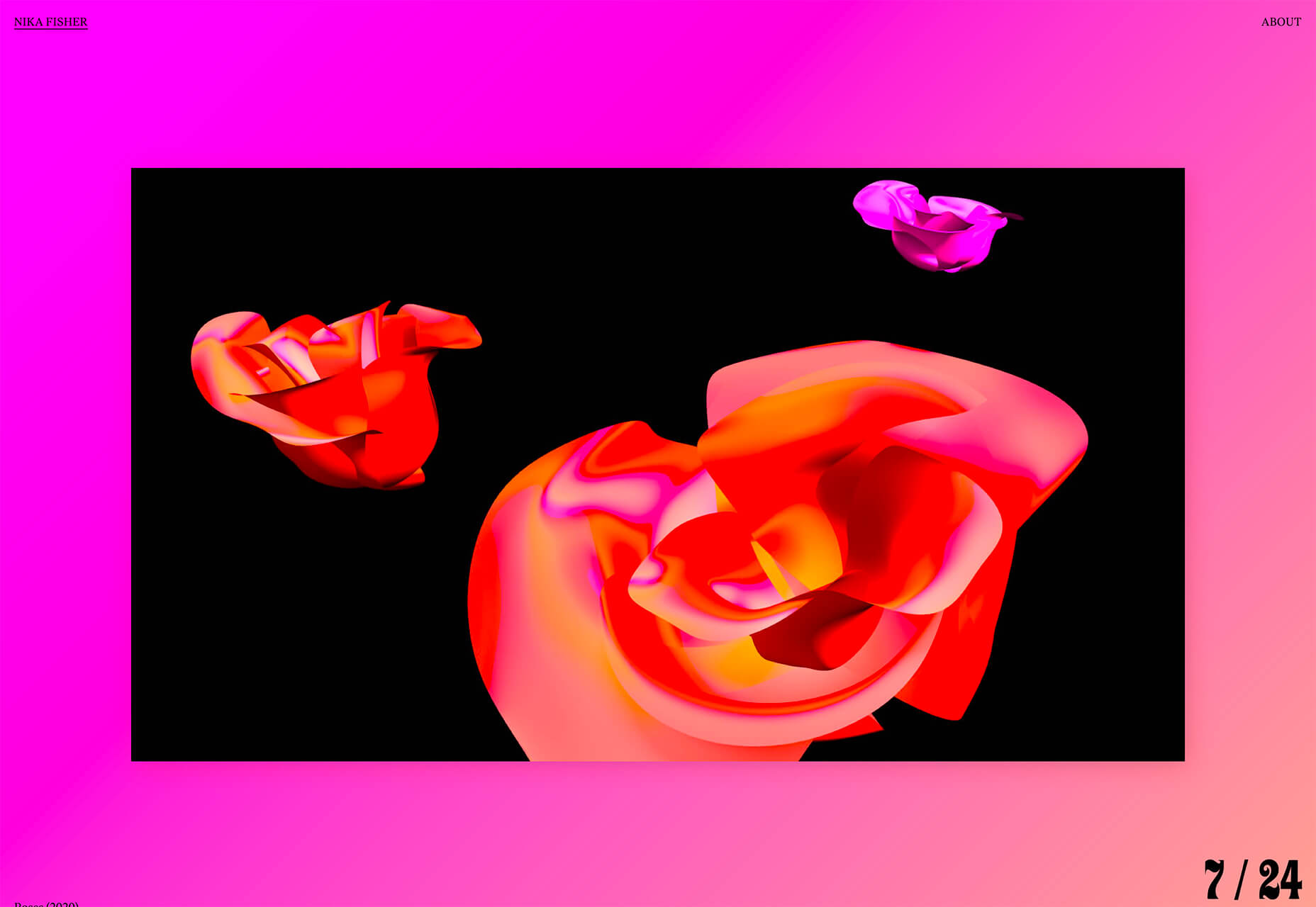
Nika Fisher uses Ziggy for the nifty counter in the bottom right corner.
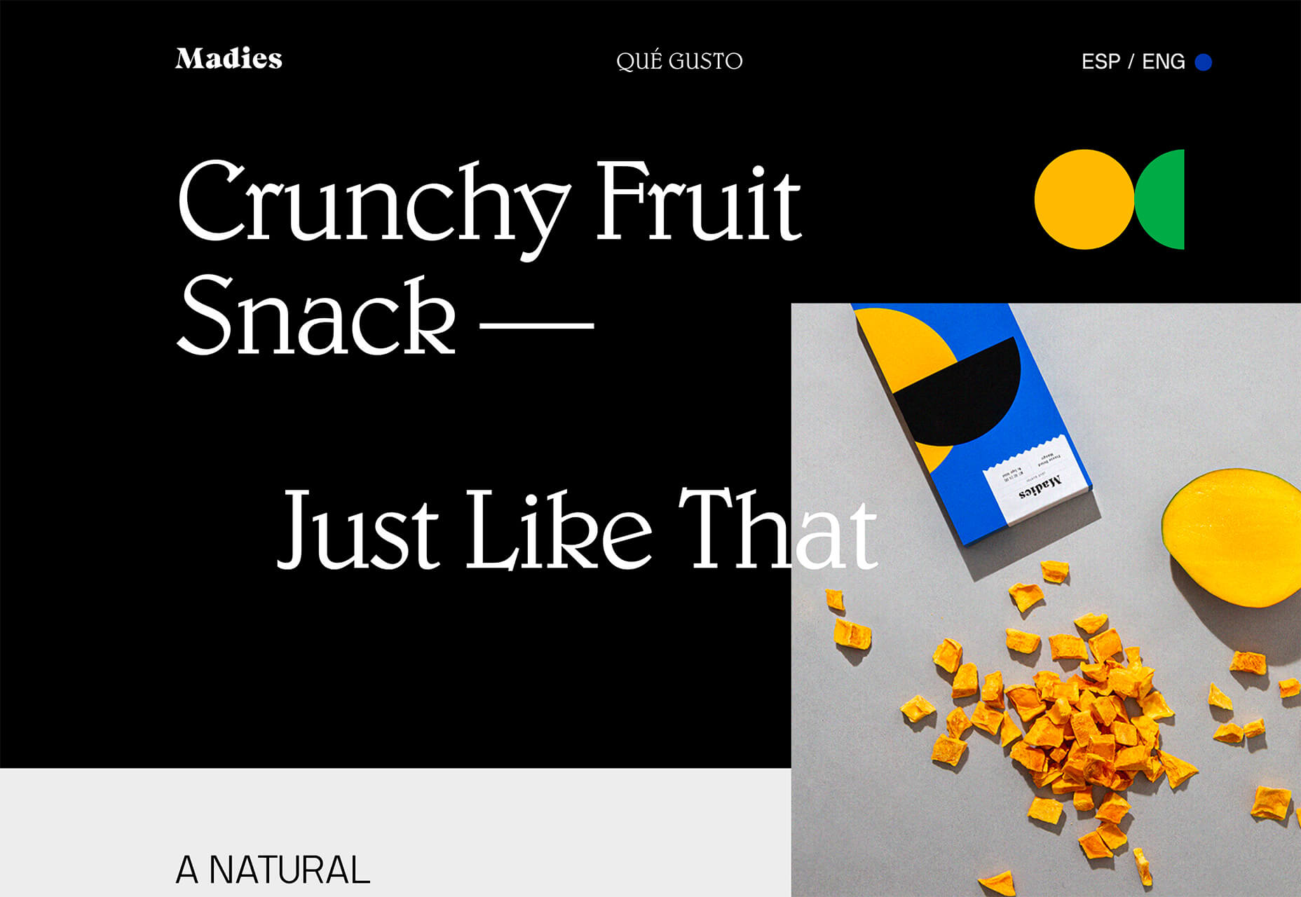
Madies uses Blw for the main headlines. (Note that the logo also uses a different retro style as well.
Blue and Green Color Schemes
Blue and green color schemes make you think of nature: Green grass and trees and blue sky. These palettes can be calming, soothing, and very harmonious. (All things that might be a fresh feel in a tumultuous world, right now.)
While the use of blues and greens is not new, it is a combination that we haven’t seen a lot of in website design projects for some time.
These color schemes are evolving in a few different ways and are an easy fit with many brand colors and styles (thanks to a mostly neutral feel).
If you are interested in using this trend, play with different shades of blue and green. Start with a blue or green that is part of your brand color palette (if you have one), and incorporate colors around it.
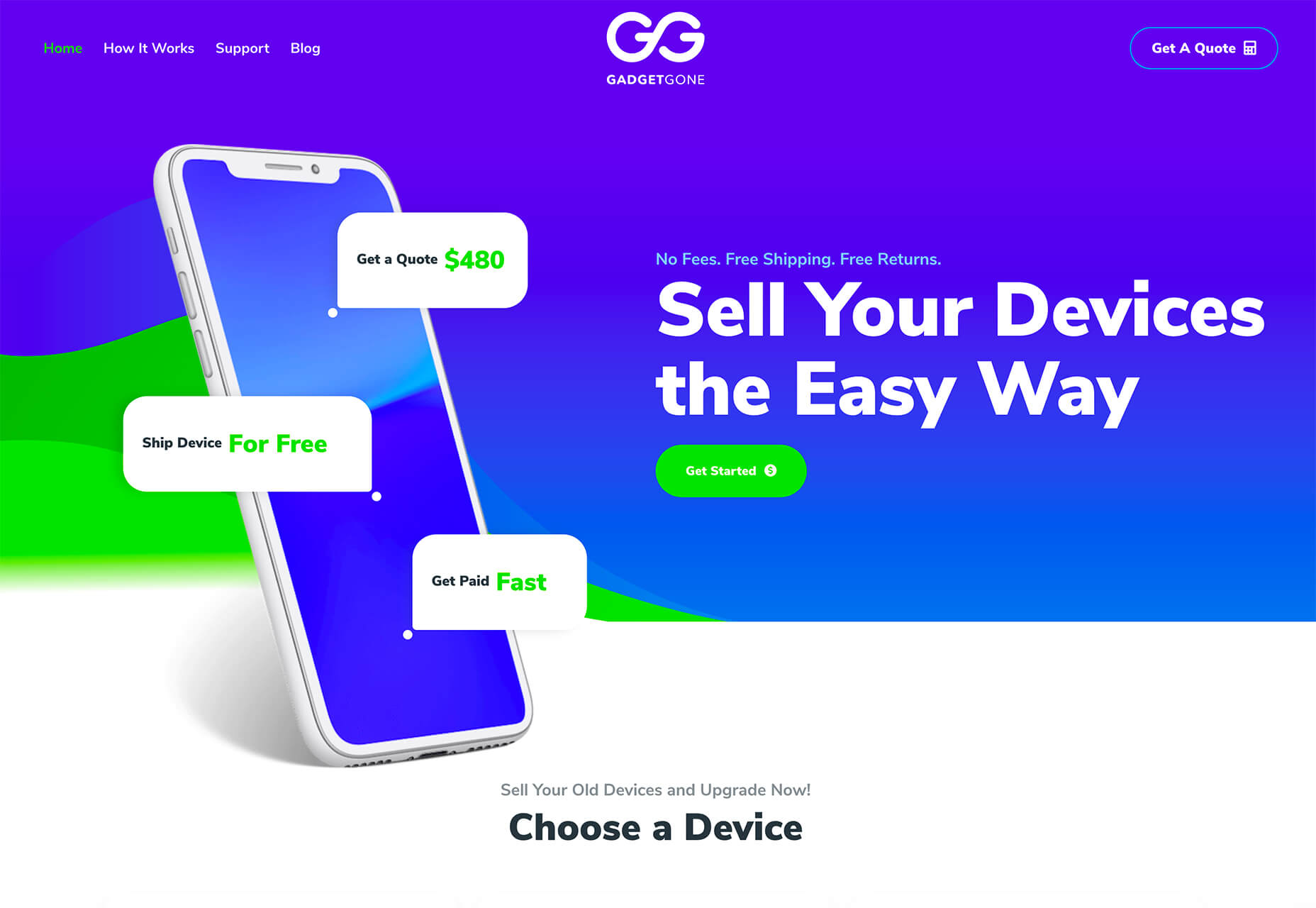
Another option is to work from a blue or green that you might have used as part of another color trend, such as the super bright colors from GadgetGone. The blues and greens here have a definite Material Design vibe to them.
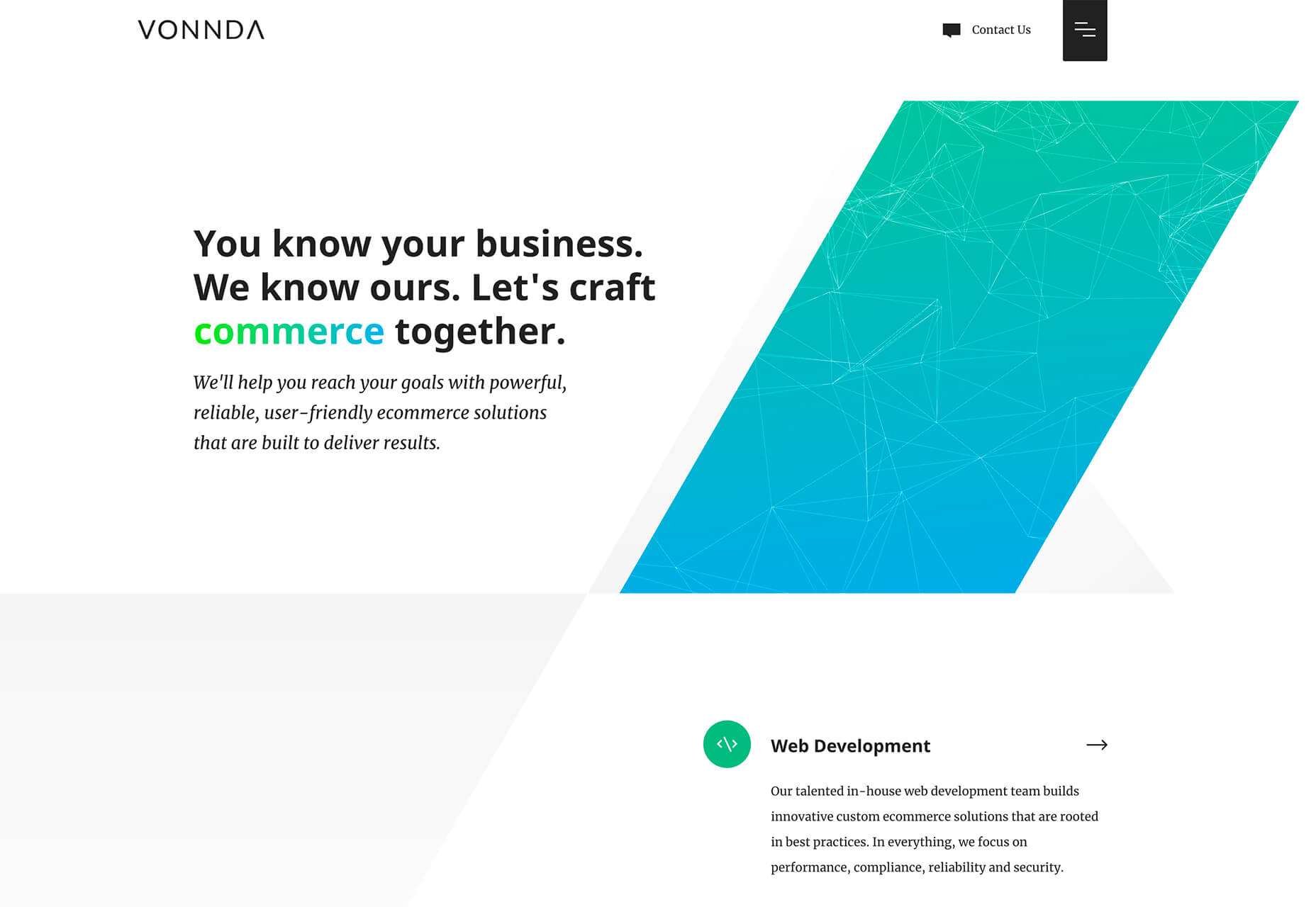
Vonnda mixes the gradient trend with green and blue to create a striking visual on its homepage. The color combo makes a cool gradient in the oversized geo shape on the right side of the screen (which has a nice balance with all the whitespace) and helps the eye move through the text thanks to “commerce” highlighted using the same green-blue gradient.
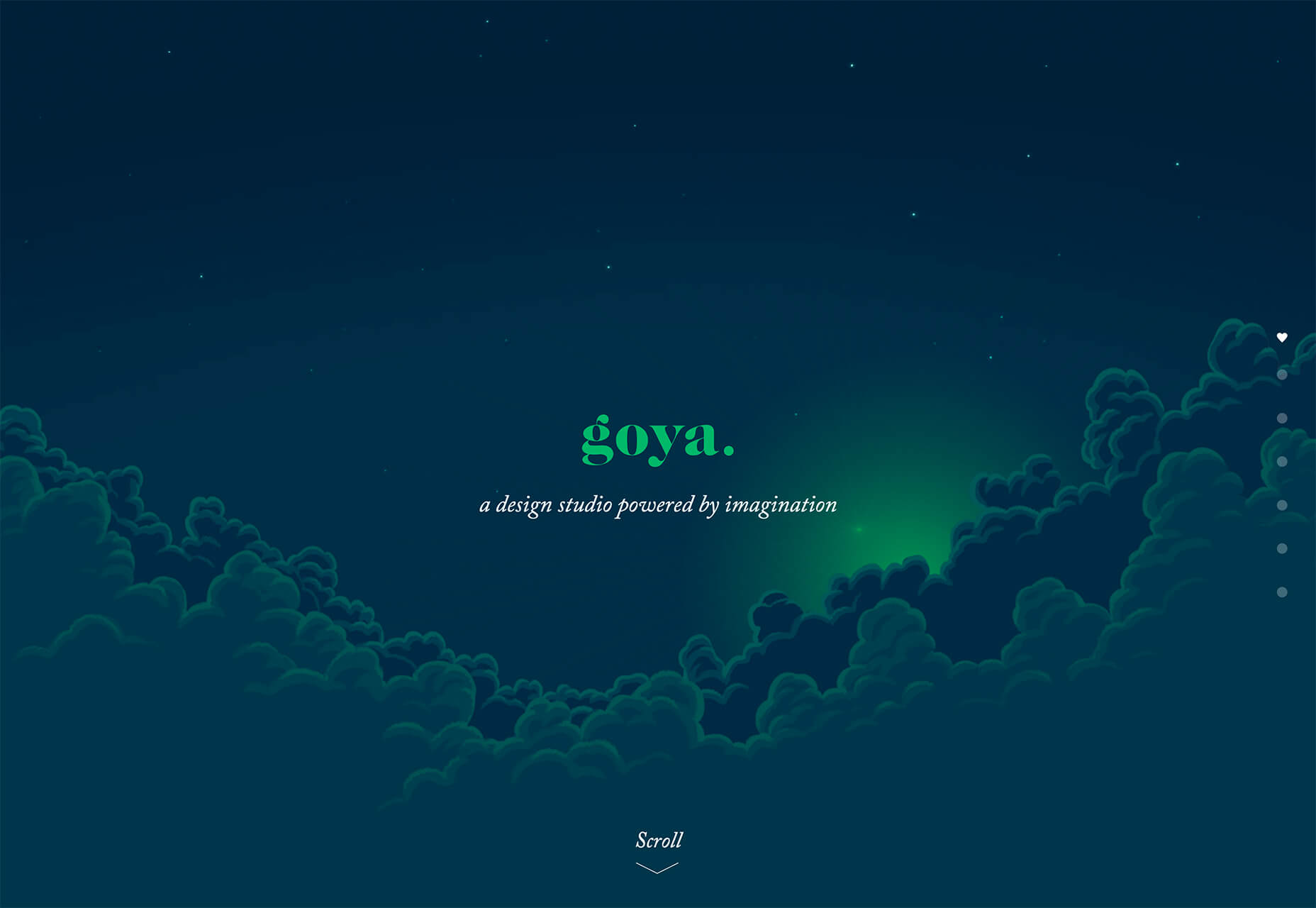
Goya uses a deep navy background with a striking emerald green to create a simple homepage aesthetic. Green is used as a highlight color in the downpage illustration and is the brand color that serves as a thread between scrolls in the one-page design. This example shows how to start with a brand color (emerald) and build a trendy palette around it.
Conclusion
While this month’s design trends might be a little more somber than in recent months, it is a reflection of world events. Even in uncertain times, design work continues and new trends will emerge.
Sharing the things we have learned is at the heart of everything we do at Smashing. That goes for the team as well as our authors, and Vitaly has been working on a set of checklists to accompany his workshop, Smart Interface Design Patterns. The resulting PDF is 152 pages packed with useful information to help you create better interfaces. And, we’re offering it to you free of charge.
These checklists are based on the work Vitaly has been doing for many years, exploring and examining examples of desktop and mobile interfaces. Learning what works and what doesn’t in usability tests and user interviews.
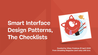
The cover of the PDF deck on “Smart Interface Design Patterns”, curated by Vitaly Friedman. You can get the entire deck (150 pages) by subscribing to our lovely email newsletter.
In the PDF is a collection of over 150 questions to ask yourself when designing and building almost anything — accordions, drop-downs, carousels, timelines, tables, sliders, advanced configurators, maps, seating selection, and onboarding. They can act as a jumping-off point for discussion, as designers and developers sit together to plan a component, or work through a particular design problem.
An example: Hamburger Design Checklist, with questions to discuss when designing and building a good navigation.
They can help to bring to mind all the fine details that go into interface design. How large should a hamburger icon be to avoid rage clicks? Should sections in an accordion collapse automatically when moving from one to another? Can users tap on the same spot to undo actions when zooming or filtering?
These aren’t golden rules, but rather starting points to help you consider all angles when working alone, or in a team. These checklists have been created after years of work on real projects with real users. Your projects can benefit from all of that existing knowledge, rather than needing to discover these issues for yourself or wait for your visitors to tell you about the problems they are having.
The PDF deck features some examples of design patterns as well. A quick peek at some navigation design patterns without hamburger navigation. Large preview)
Subscribe To Newletter and Get The PDF
To download, we ask for one thing: your real email address. In return, you’ll get the checklist and also our Smashing bi-monthly email newsletter and occasional emails when we have a new book or event that might be of interest. We don’t spam, nor do we pass on your email address to anyone outside of Smashing.
Verify your email. Please check your inbox and click on a button in the confirmation email.
Download the checklist PDF. Voilà! We hope you’ll find the PDF useful for your work.
Smashing Newsletter
Every second Tuesday, we send a newsletter on front-end and UX. Subscribe and get “Smart Interface Design Checklists” in your inbox.
Front-end, design and UX. Sent 2× a month. You can always unsubscribe with just one click.
After subscribing, you’ll get a link to the PDF via email. If you are already subscribed, look out for the link in the upcoming newsletter issue coming this Tuesday, March 31. And please, ask your friends and colleagues to subscribe rather than simply forwarding the link on.
There is a huge amount of work that has gone into this PDF. We hope you’ll find it useful in your work. Thank you for your trust, and we hope to release more useful tools for you soon!
Worldwide tourism has immense potential for growth, and this sector has evolved drastically in the last few decades. Now travel, and tourism is becoming one of the mainstays of the world economy.
According to The United Nations World Tourism Organization report, International tourist arrivals worldwide have grown from 25 million in 1950 to 1.4 billion tourists per year, to present times. Similarly, international tourism revenues worldwide have grown from 2 billion US dollars in 1950 to 1.3 trillion in 2017. This sector contributes 10.4% to the world’s GDP and generates 319 million jobs in 2018 globally.”
Technological advancements, like big data, artificial intelligence, and machine learning, are offering great opportunities for the travel and tourism industry to grow and sustain. The new age travellers’ planning begins with googling and ends with online agencies. Technology is transforming the traveller experience. For example, What does perfect travel consist of? Before enjoying a sunset on the beach, you need to spend time finding budget-friendly accommodation, book a flight ticket, and spend at least a couple of hours to check-in. That’s how this was going before chatbots were formally introduced in the travel industry. Now, with the help of a chatbot and your smartphone, you can instantly book and pay for hotels, flights, and even do hassle-free check-in in the hotel too.
What is Chatbot?
A chatbot is a computer software interface that conducts human-like communication with the website visitor. It communicates via text or voice-based commands. Chatbots are enabled with Artificial Intelligence and Machine Learning and use Natural Language Processing(NLP) to process user queries. This tool instantly answers your questions anytime and anywhere. It scans your keywords search and responds with pre-set answers available in the database. Chatbots make the customer experience more responsive, accurate, and intelligent.
Facts About Chatbot
The first chatbot, ELIZA, was created by Joseph Weizenbaum in 1966.
According to a survey, US is home to the most significant portion of the world’s chatbot users (36%), followed by India (11%). Germany comes in the third place (4%)
Experts predict 90% of customer interaction will be automated by 2022.
Companies will save 2.5 billion customer service hours using chatbots by the end of 2023.
Chatbots software provides unbeaten experience to businesses and their customers. Nowadays most people are eternally dependent on the internet to plan their trip. That’s the reason chatbot has a significant influence on the travel industry. This software answers your frequently asked questions without human interaction and saves money as well as time. In this way, Chatbot can manage multiple customers concurrently and even handle your complex issues and give a proper solution to what you are seeking. It has aligned the process to improve traveller experience and hospitality business to decrease customer churn, boost sales and revenues.
The chatbot market is growing swiftly. We already have millions of chatbots activated in different industries, which is why investing in chatbots could give you a decisive edge over the competition.
1) Reduce Operational Cost and Workload
Chatbots are an extremely cost-effective solution. Artificial intelligence-enabled bots assist travel agencies in solving routine customer queries. This means businesses no longer depend on third party customer care centers. Additionally, new travel startups can directly shift to chatbots instead of developing a mobile app to save resources. The technology and algorithm used behind the development are sophisticated enough to create a complex solution with ease. Chatbot has the potential to reduce both the workload on your employees, and customer support costs up to 30%. According to the reports, The average cost of building a chatbot from scratch is around $10,000 — $15,000.
2) Save Time and Efforts
Chatbot can handle multiple customer queries and save productive time. This will enable management to engage their workforce in other complex managerial activities. For instance, If your bot is intelligent enough to handle frequently asked customer queries, then it will reduce pressure on the many airline employees; from ground staff to cabin crew. Also, it will save customers’ time that is spent reaching out to service representatives and listening to that annoying 30 min long solo music on the helpline!
3) Enhance personalization and Customer Engagement
Travel chatbots work tirelessly to serve customers 24×7, 365 days a year. This continuous accessibility enhances customer engagement in the travel sector. Where customers seek their problems to be resolved immediately, even as they travel across time-zones.
Chatbot can serve as a local tour guide as they can tell you about nearby hotels, restaurants, and other attractions. For example, Foursquare’s chatbot, Marsbot, allows travelers to find restaurants, cafes, and bars wherever they go, based on their preferences and their location.
Of course, travel chatbots can ensure maximum customer personalization too.
4) Give More Revenue Opportunity
Travel agencies can use chatbot as a lead capturing tool. This tool can take the customer from awareness stage to conversion stage within minutes. Research shows that 65% of the holiday tourists and 69% of business travelers find online booking more convenient, and 92% of millennials find live chat engaging. In this way, you can add offers, coupons, and even a payment gateway in your chatbots to grab more customers online and make them lifelong subscribers of the platform. All these things bring the possibilities of increasing revenue growth through chatbots.
Popular Travel Chatbot Examples
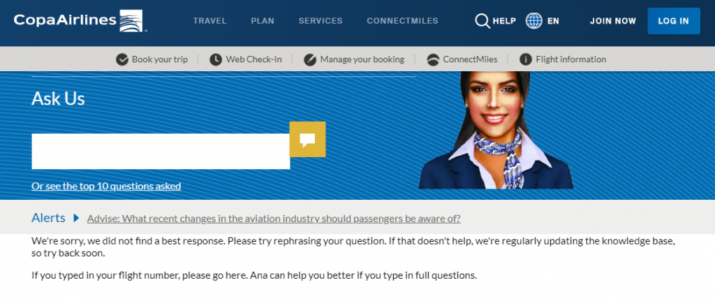
1) Ana: Copa Airlines’ virtual Assistant
Copa Airlines comes with Ana- web-based chatbot. It uses natural language processing to answer simple FAQs, such as what destinations Copa Airlines flies to or How many bags can one bring with them? And she will respond instantly within your browser. Most of the answers she offers are available elsewhere on the website.
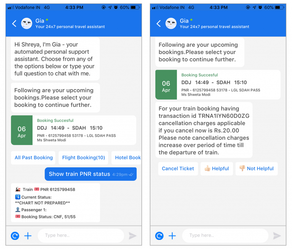
2) Goibibo’s chatbot Gia
Goibibo’s chatbot reduces human intervention in the ticket-booking and seat-selection process, as well as post-booking inquiries, by 25%. Gia chatbot seamlessly delivers hotel vouchers on the customer’s choice messaging app. Goibibo coined the term ‘Human Interactions Saved’ to measure Gia’s efficiency. Currently, Gia solves 60% of all customer queries.
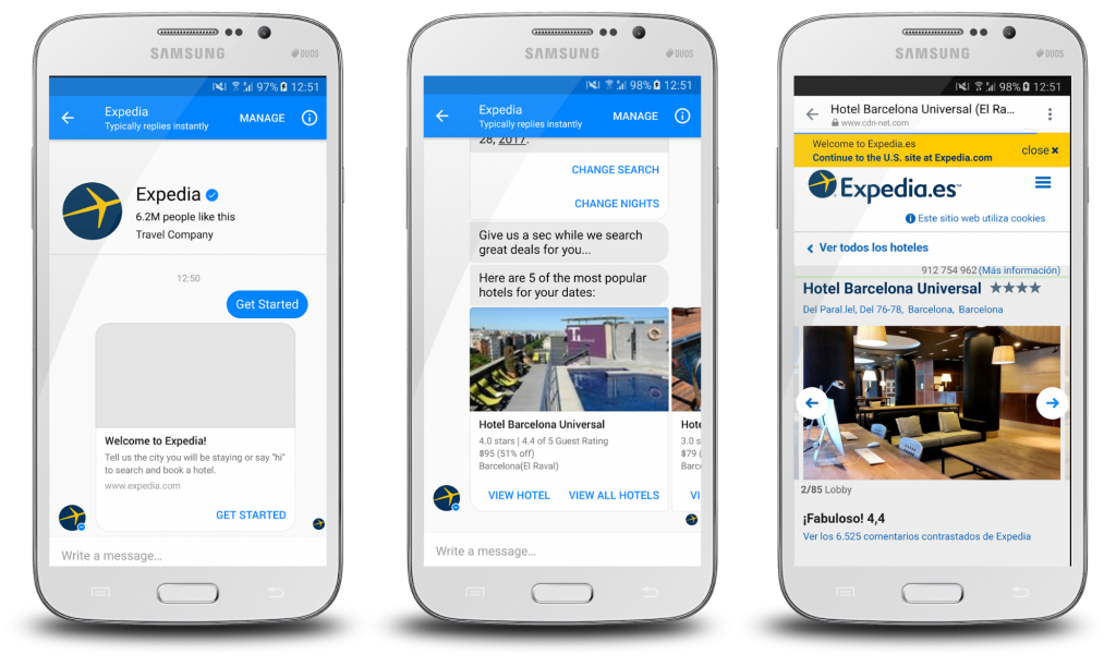
3) Expedia Facebook Messenger Bot
Expedia unveiled its Facebook chatbot on June 8, 2016. it allows users to search and book a hotel through chatbot. Users simply need to open Facebook Messenger and type in Expedia, and then you come across with their chatbot, which asks you a bit about your travel plans, and some related questions. Once the bot has enough information to process, it will show you the most popular hotel options for your location.
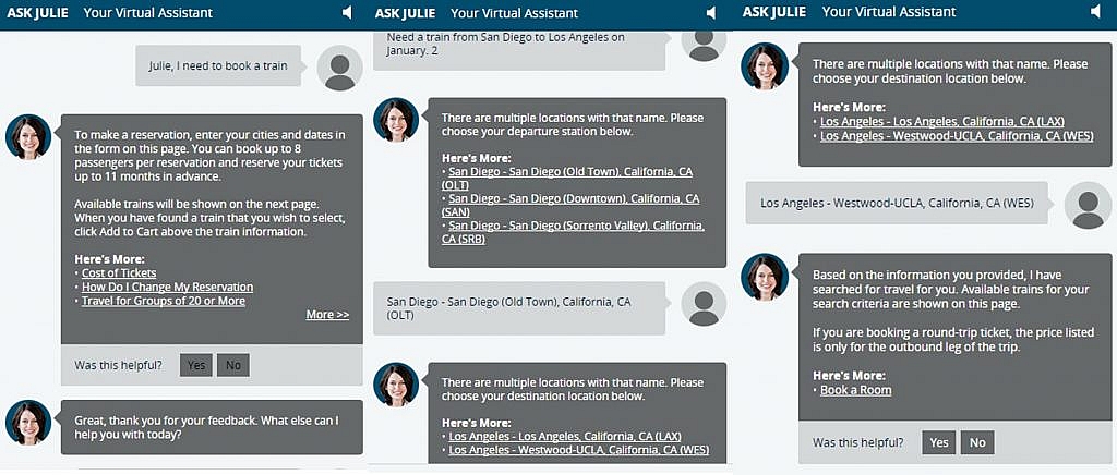
4) Julie: Virtual assistant for Amtrak
Amtrak integrates virtual assistant Julie on their site. This chatbot works on NLP protocols to process the question asked by the customer. Julie redirects you to the most relevant webpage on-site and gives you a specific answer to your question or keyword inquiry. It operates in a separate pop-up box so that you can easily navigate the Amtrak site. Julie can help you with booking reservations, learning about the train stations. While she doesn’t fill out travel information for you, she can vocalize and advise her answers, so that you can do it correctly.
5) Hello Hipmunk
Hipmunk is an online platform founded in 2010. It offers a variety of services that help users to plan a trip and book reservations. It also can classify through booking emails and calendar items to build personalized itineraries.
Hipmunk’s chatbot Software, Hello Hipmunk, is a chatting interface that allows a user to send their questions or comments like, “Can you find me a hotel for June?” or “Send me flights to Boston for this weekend.” The Hello Hipmunk then processes these queries and will respond with recommendations that it has pulled from the various airline, hotel, or other travel sites.
Final Verdict
Sustainability is the biggest issue, and staying ahead of the competition is the biggest challenge in the travel and tourism industry. If you want to provide high-quality customer experience and keep them engaged with your platform, your business needs a travel chatbot.
With many successful use cases, you can develop a chatbot to meet the needs of a travel business of any size.
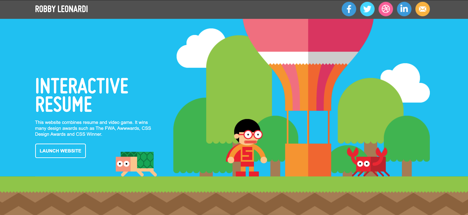
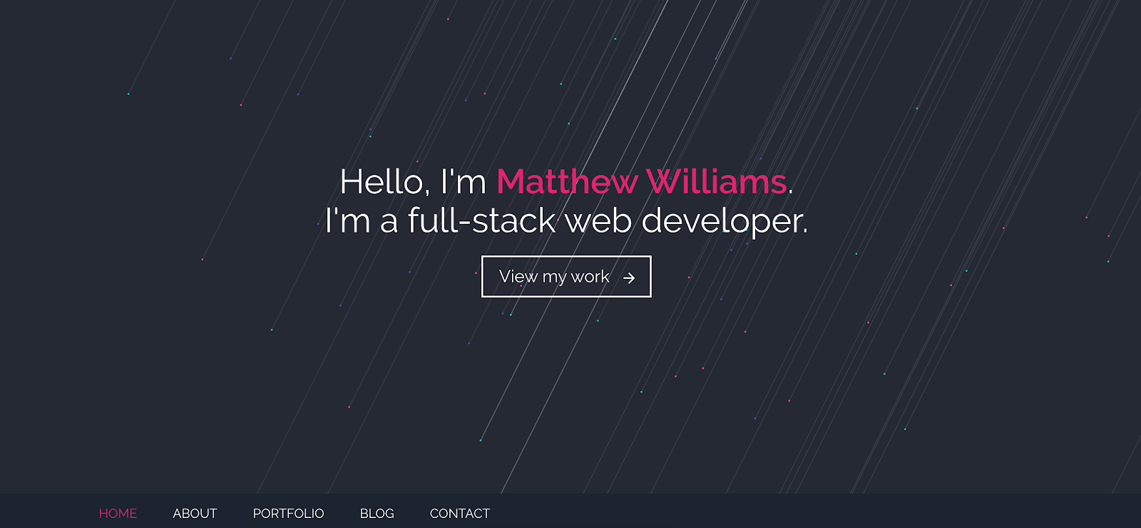
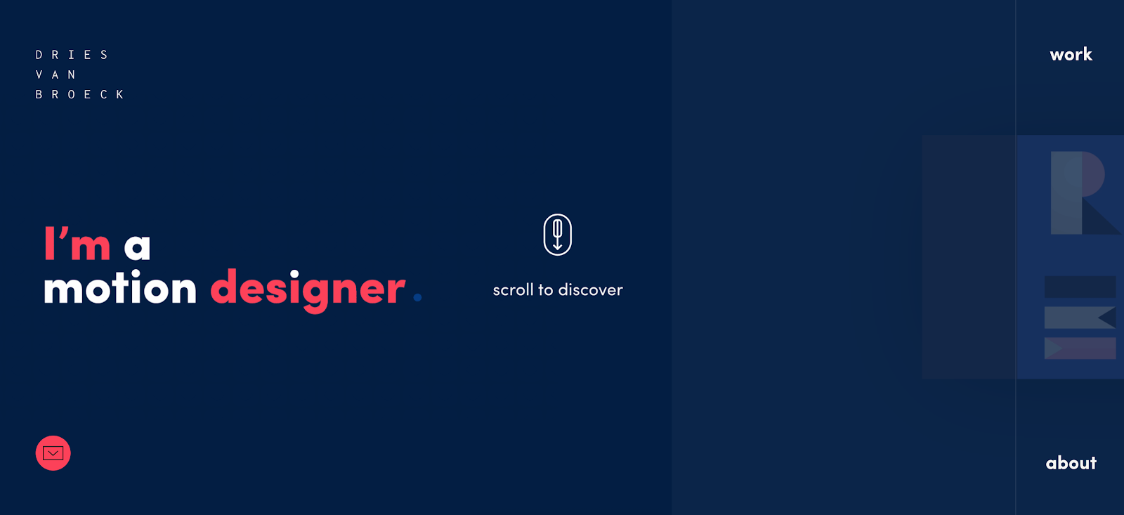
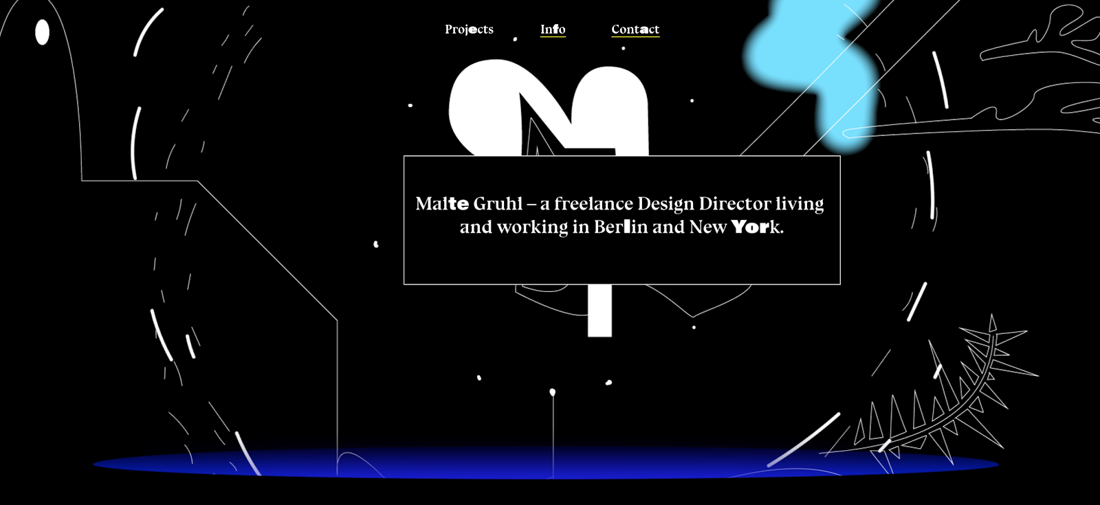
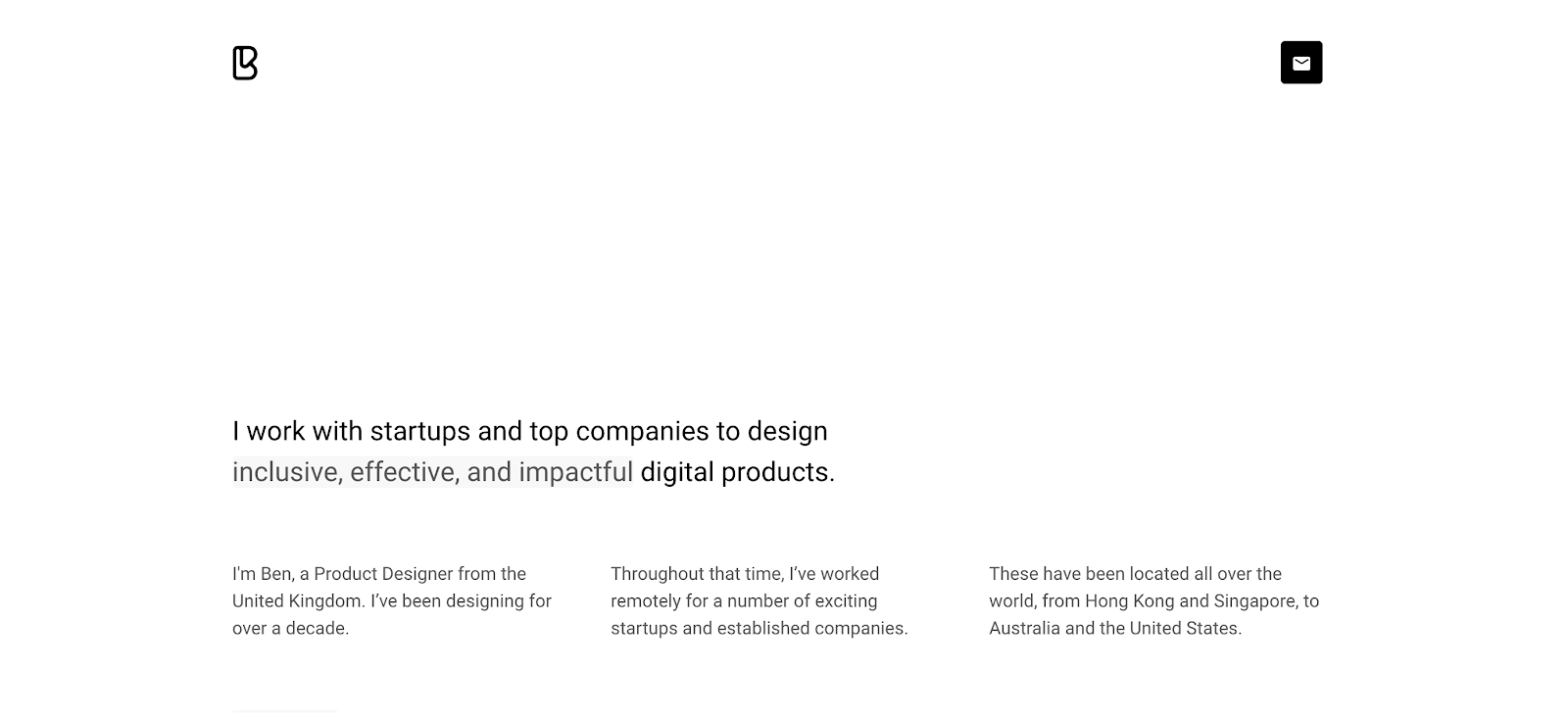
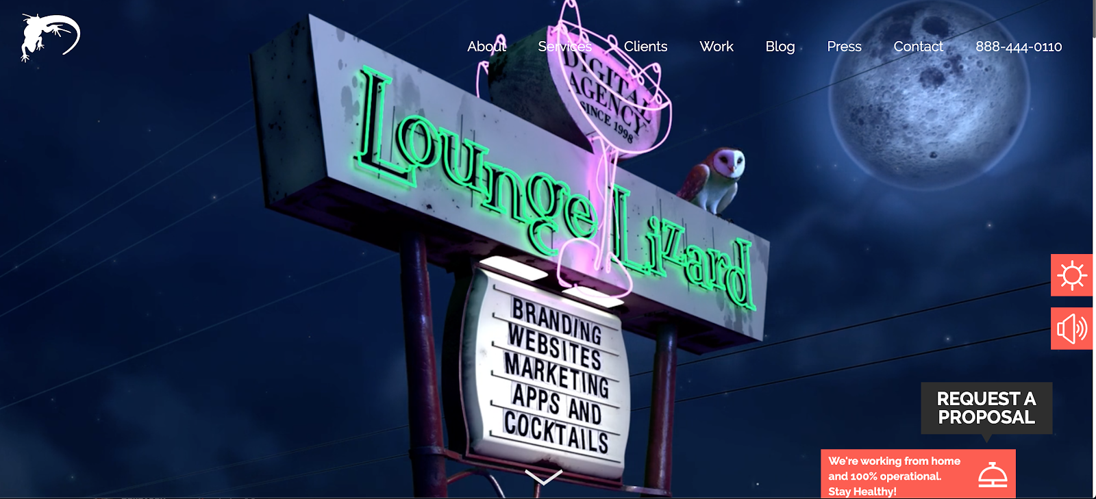
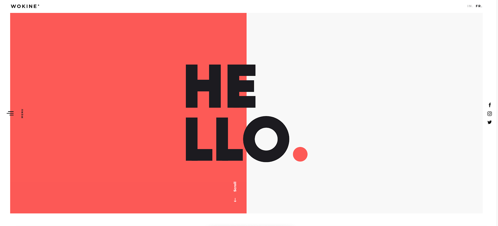
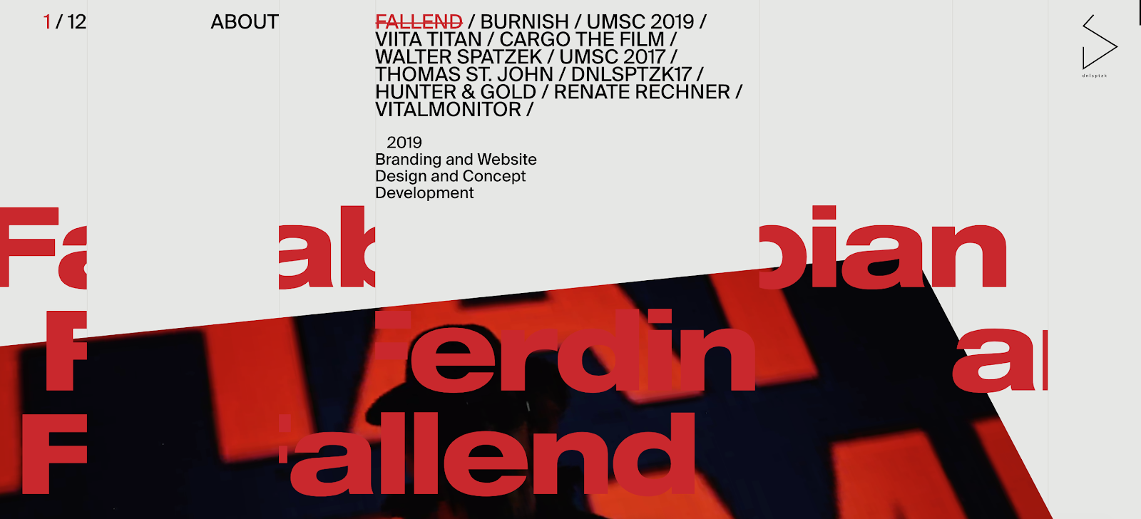
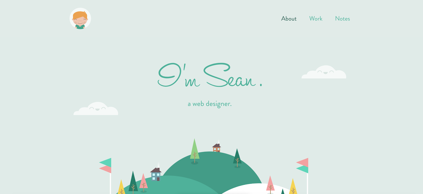
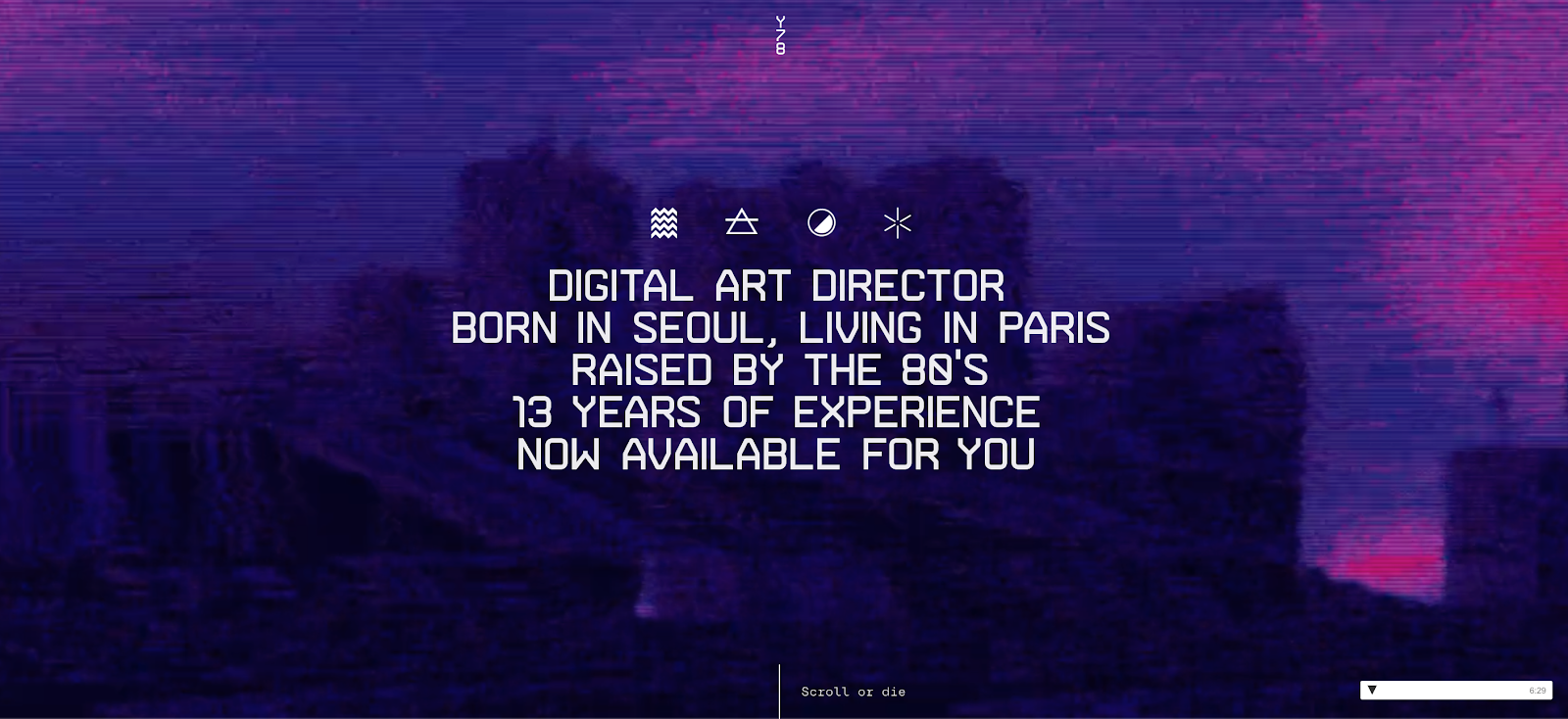
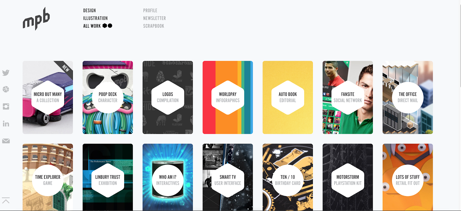
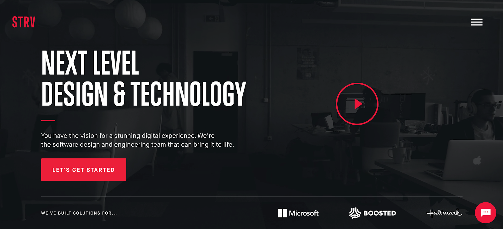
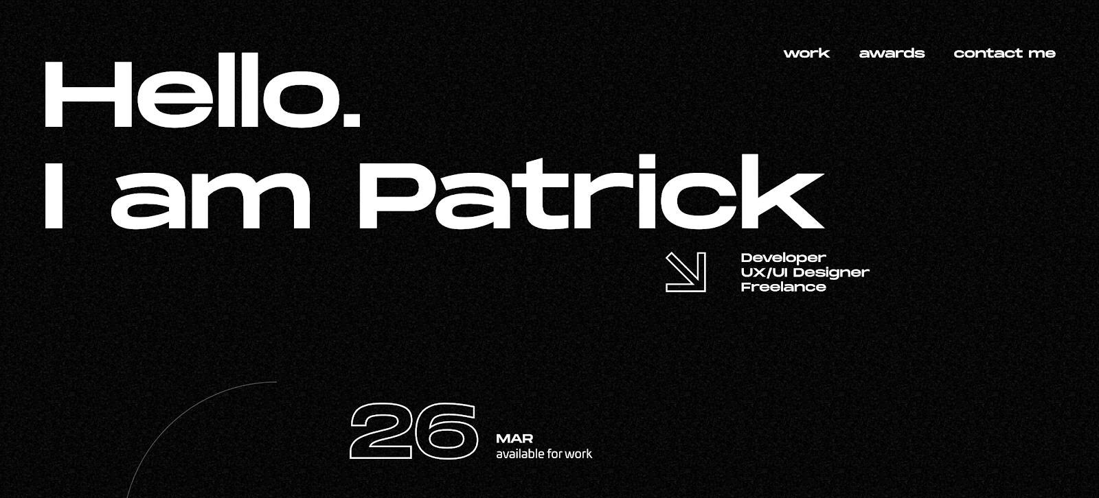
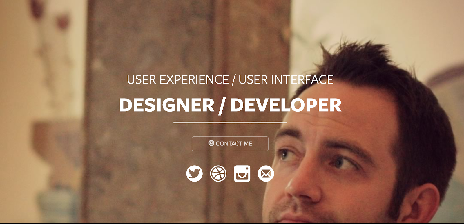
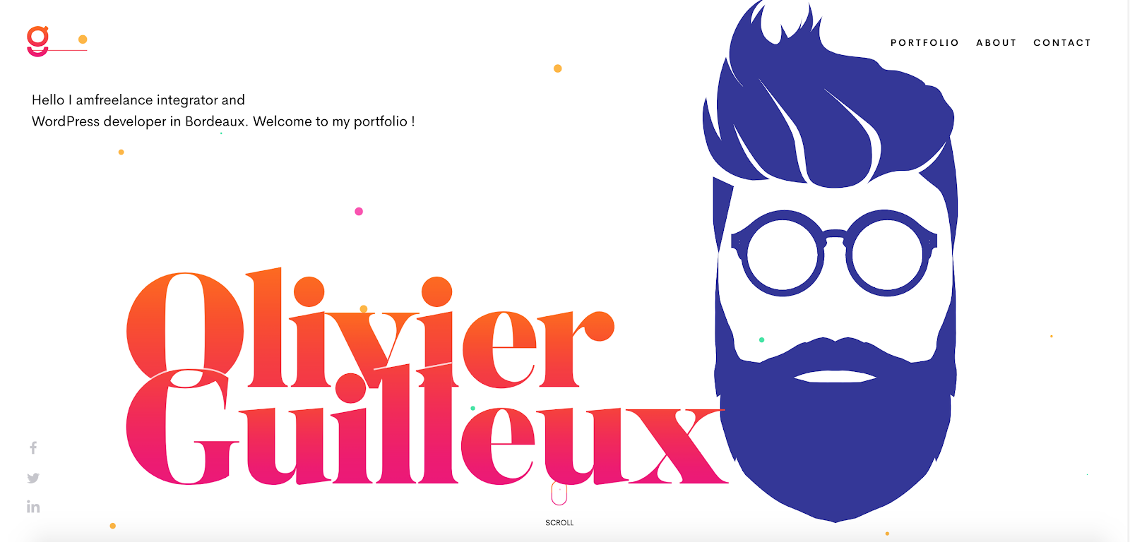
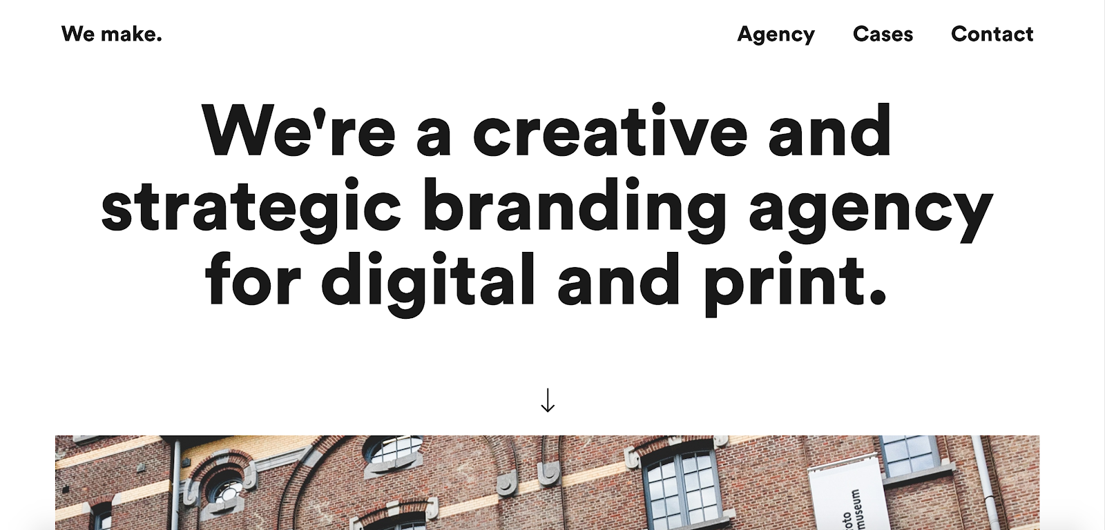
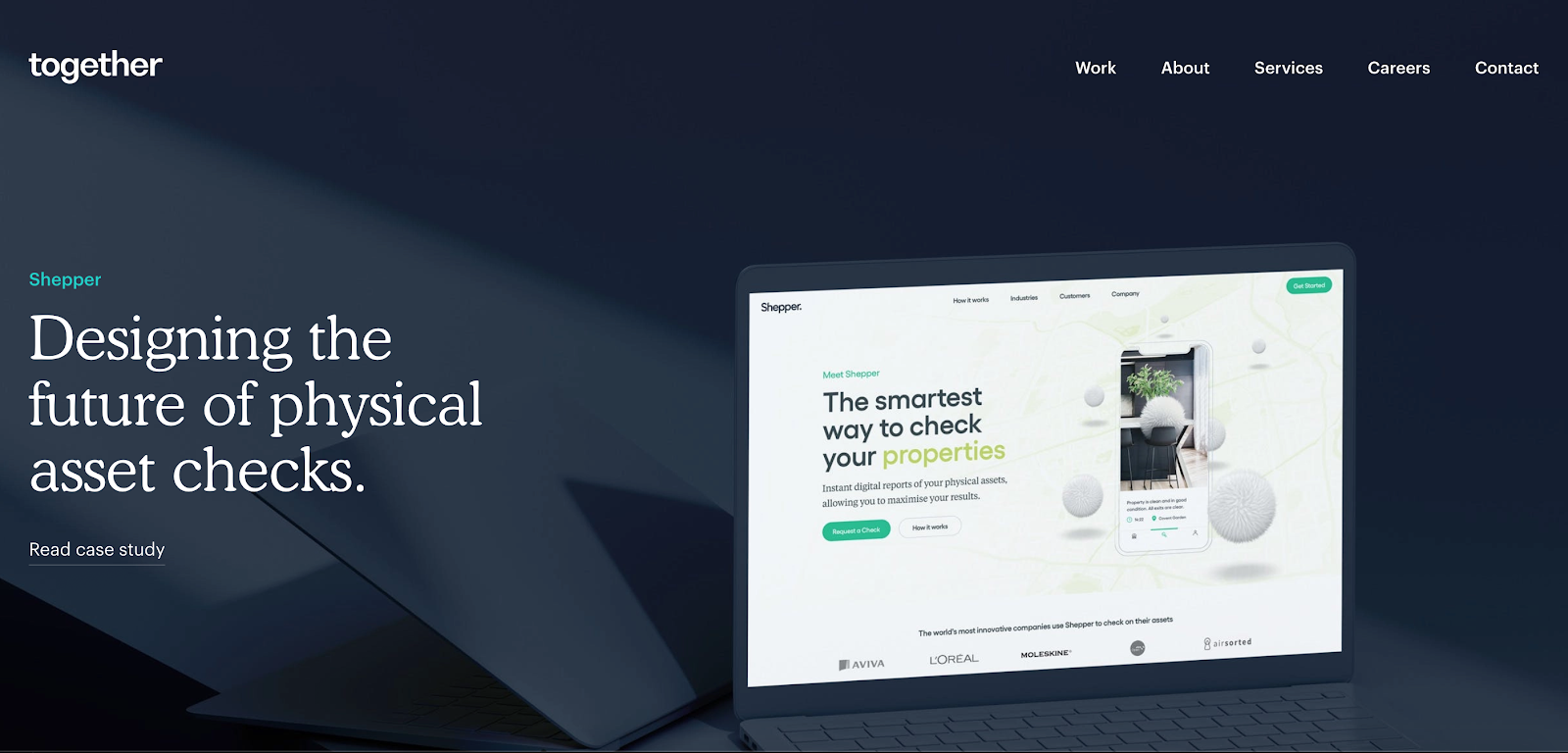
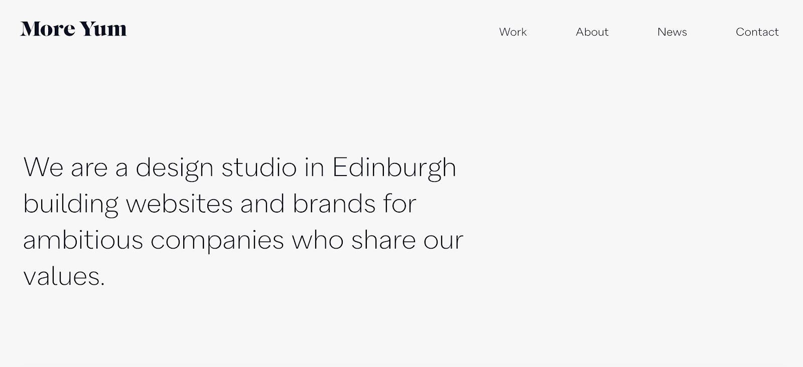
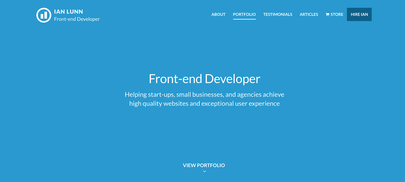
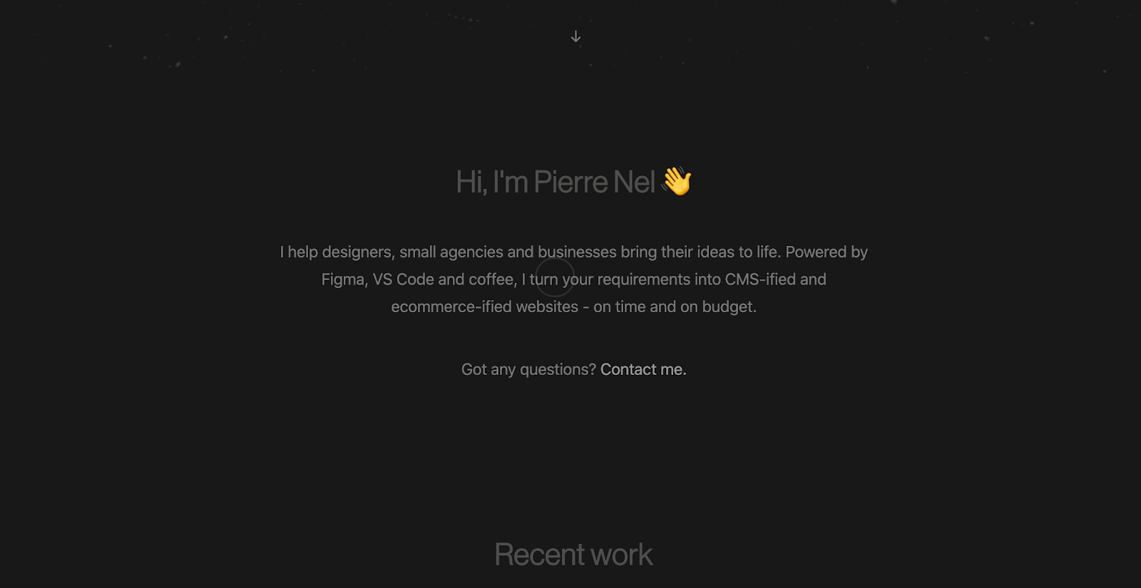
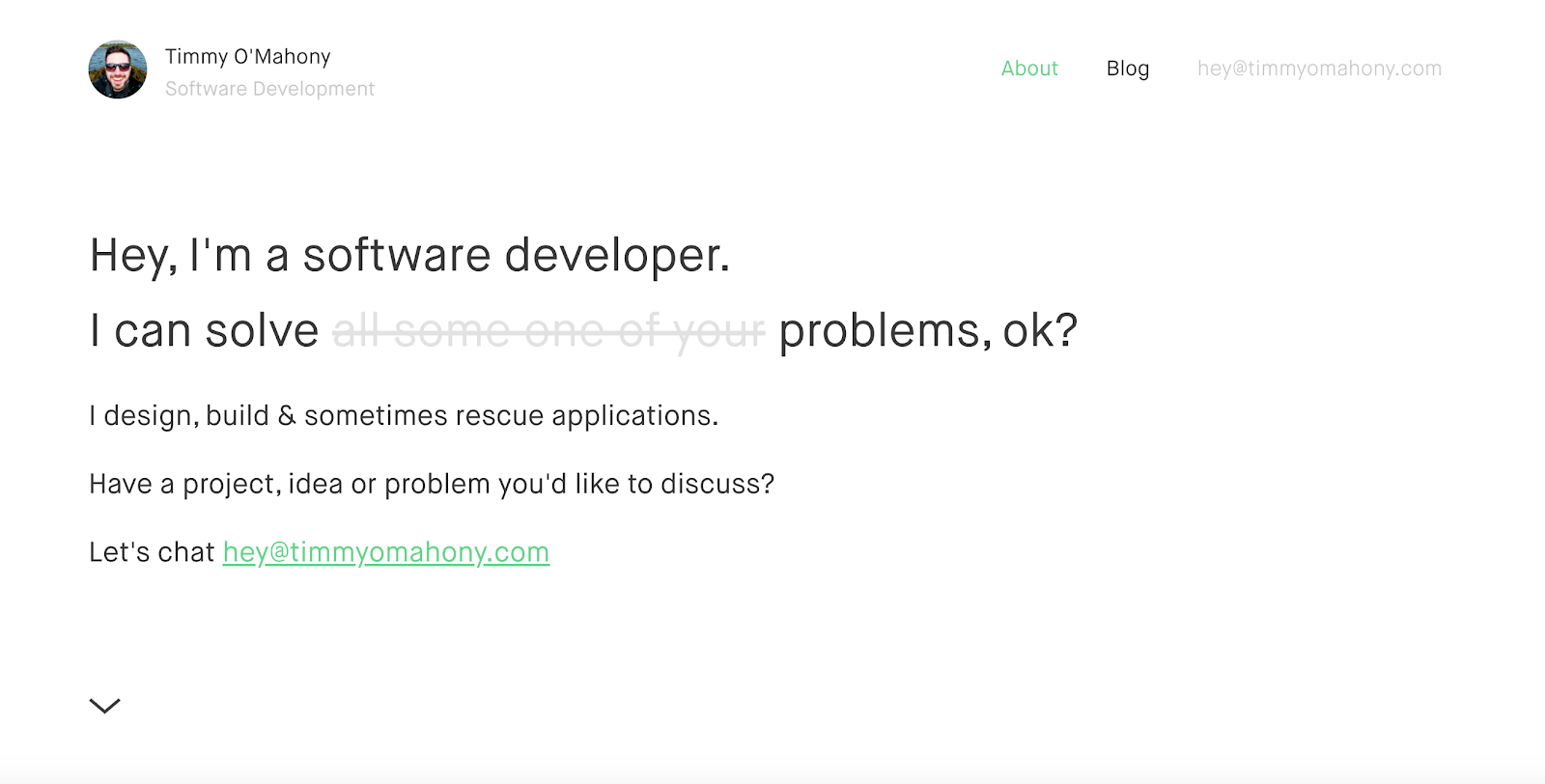
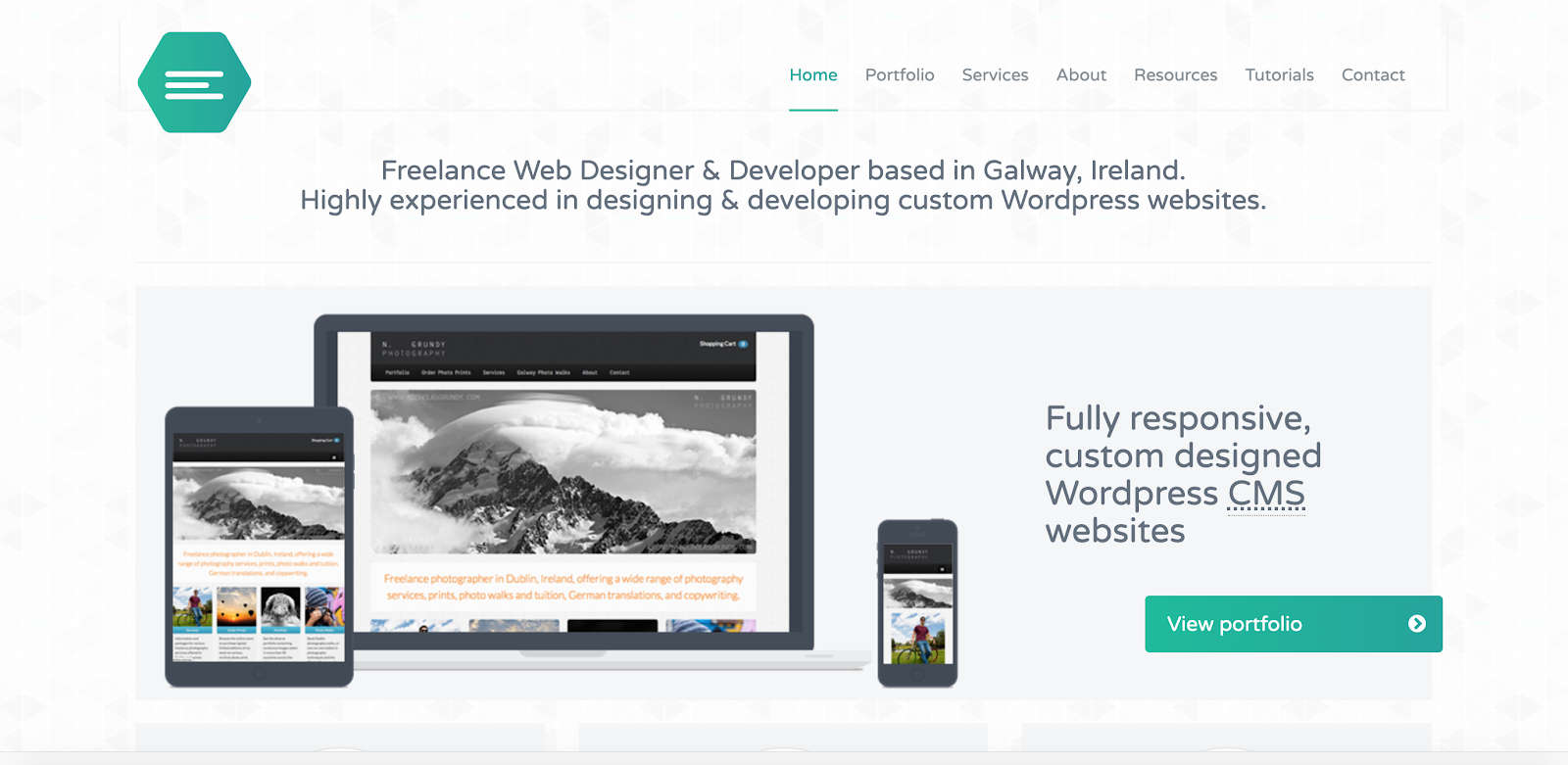
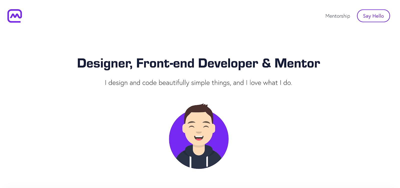
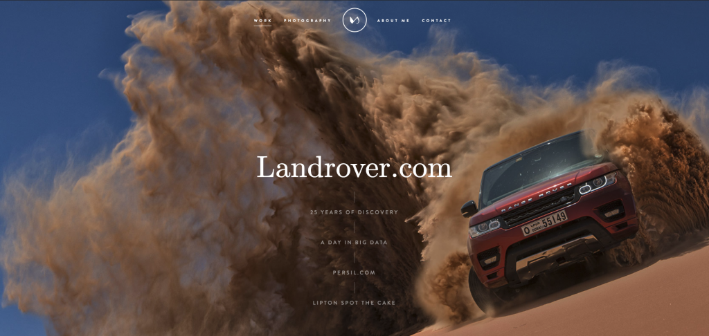
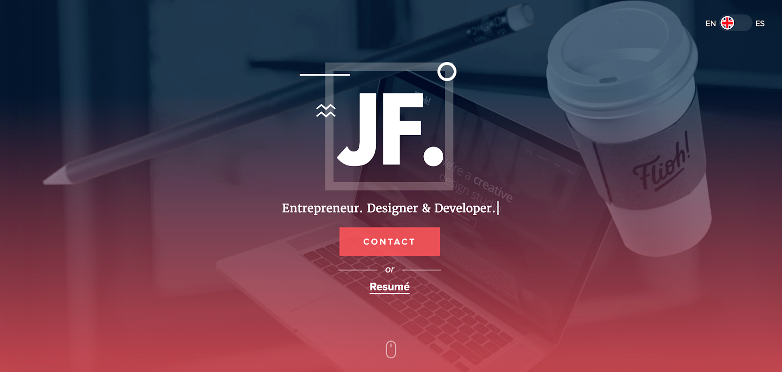
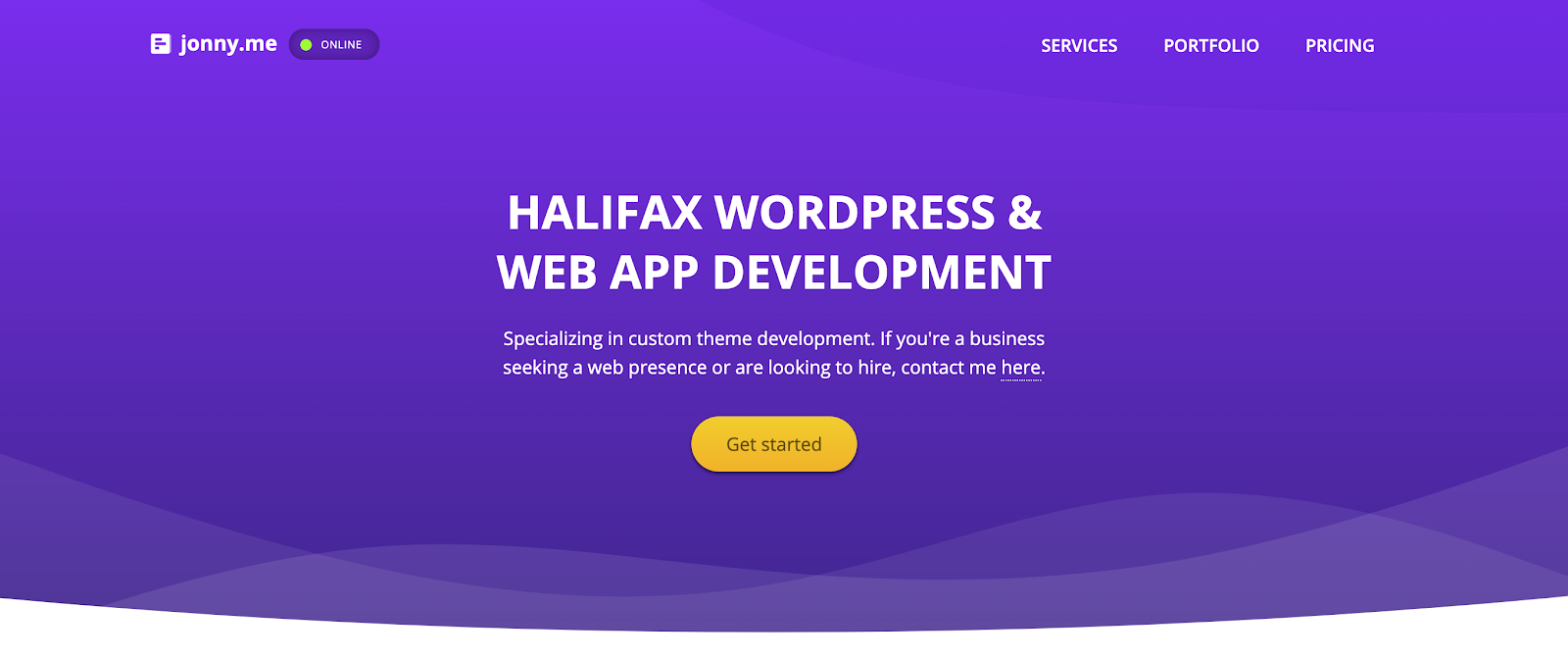
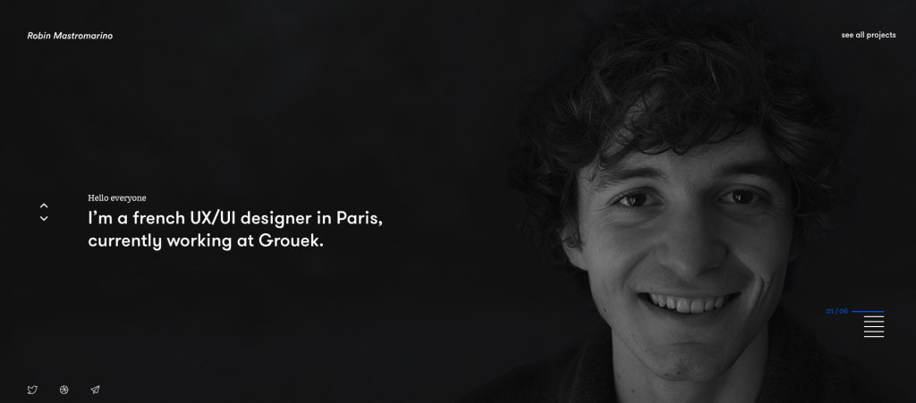
Web development, especially freelance web development has been steadily growing as businesses are increasingly going online. Many talented developers offer freelance web development in addition to their day jobs or some of them have fully embraced the freelance life.
Nevertheless, every web developer that wants to be successful needs to have their web developer portfolio on the internet where it can be accessed easily.
If you’re just getting started with web development or are looking for ways to improve your own web developer portfolio, you can check the list of examples of our favorite web developer portfolio websites.
Or you might be just looking for a web developer to make your website. Anyway, before we delve into our web developer portfolio examples first, let’s look at what constitutes a good web developer portfolio.
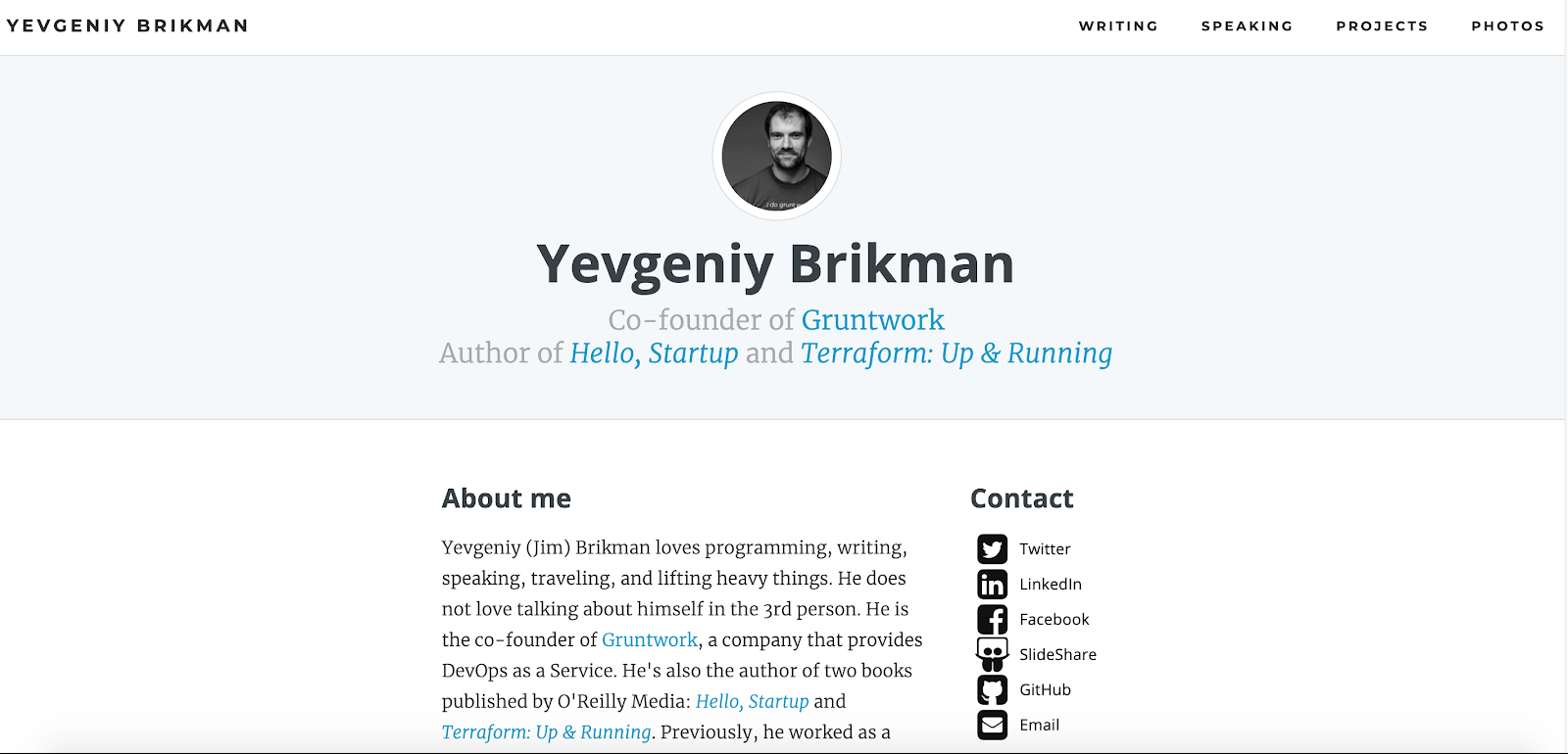
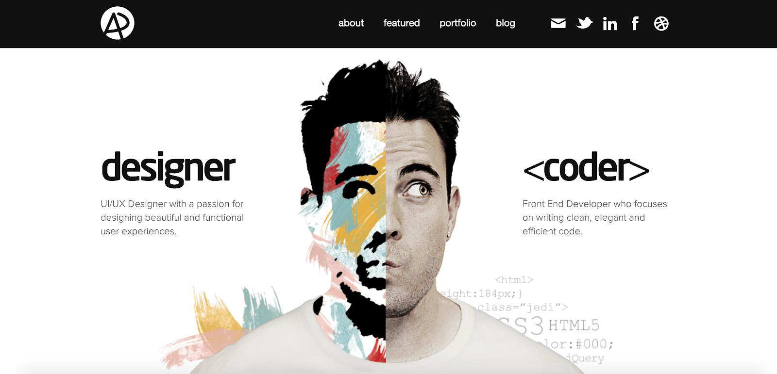
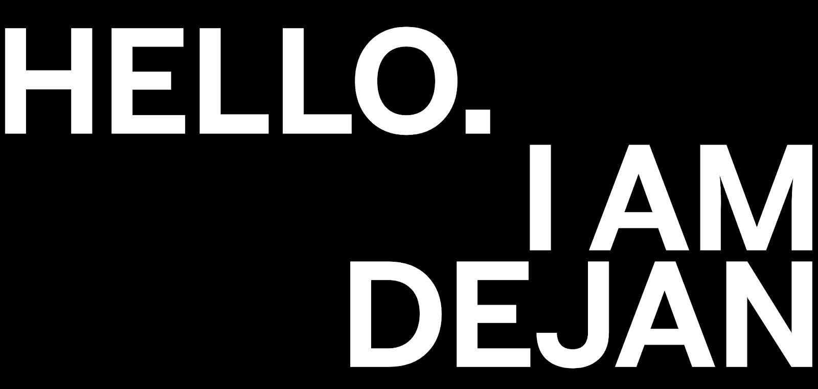
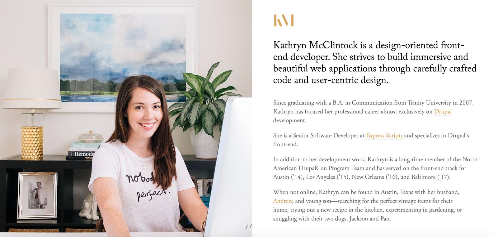
Include an “About Me” Page
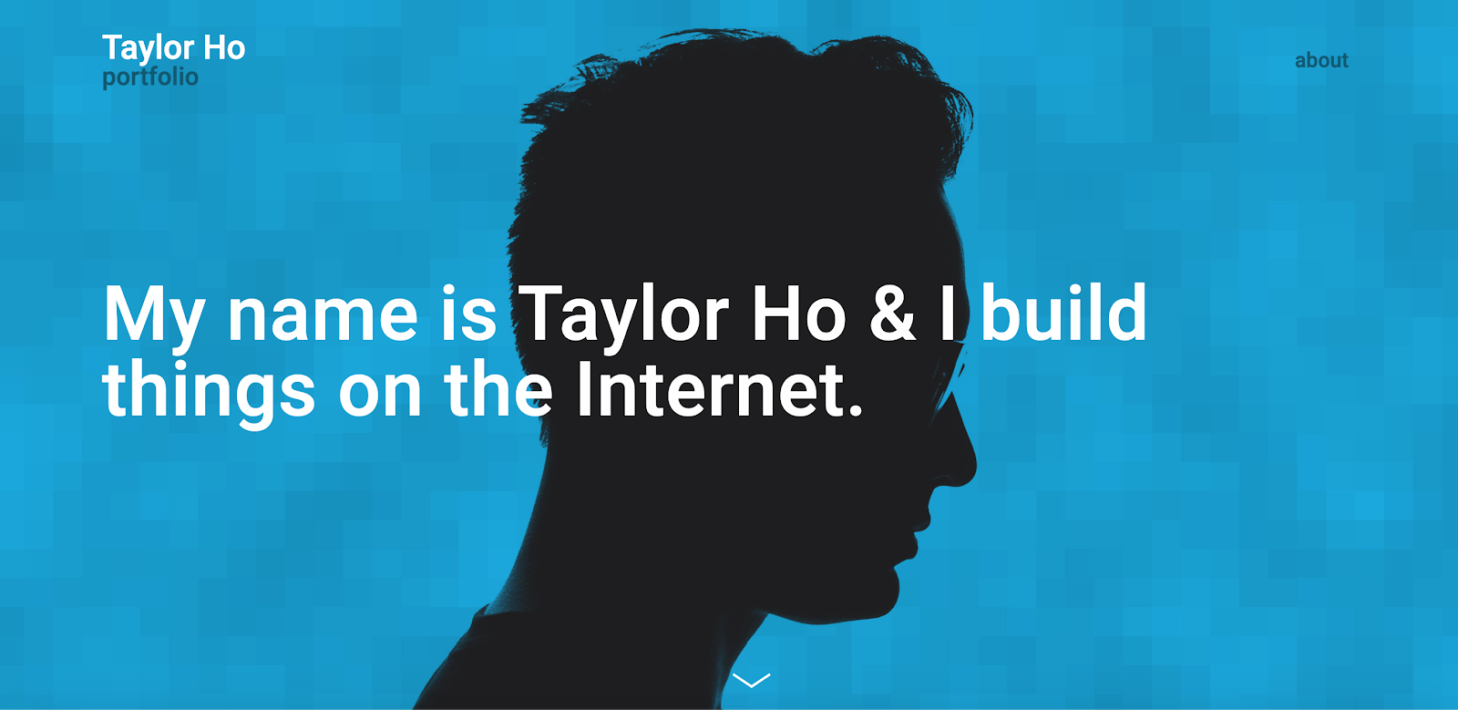
Your portfolio website is essentially like your business card where it’s the initial point of contact your potential customers make contact with you and your work. So, it’s always a good practice to include an about page where you communicate important information about yourself, your work, your experience, your approach, and skills.
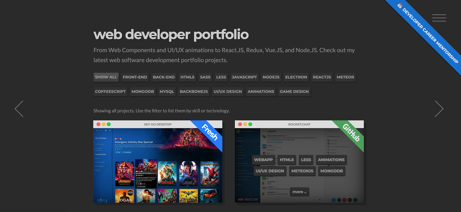
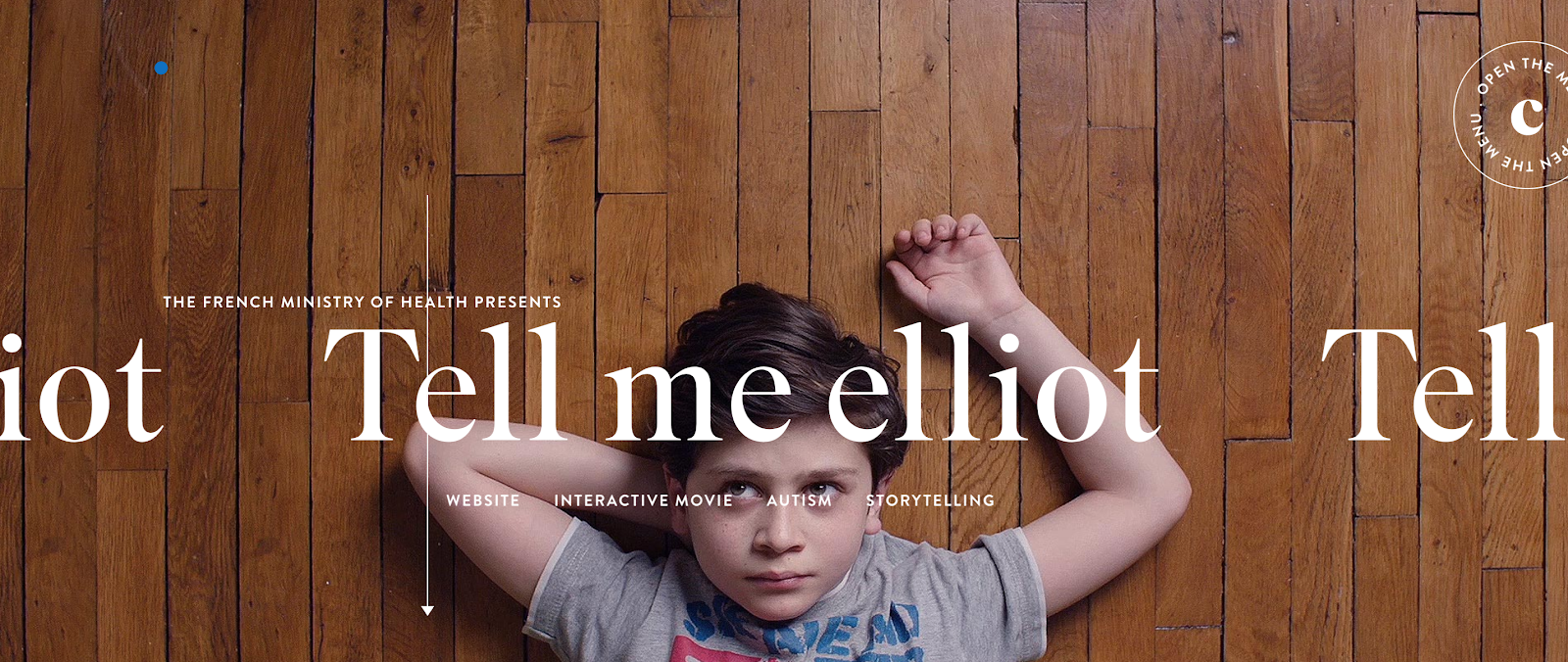
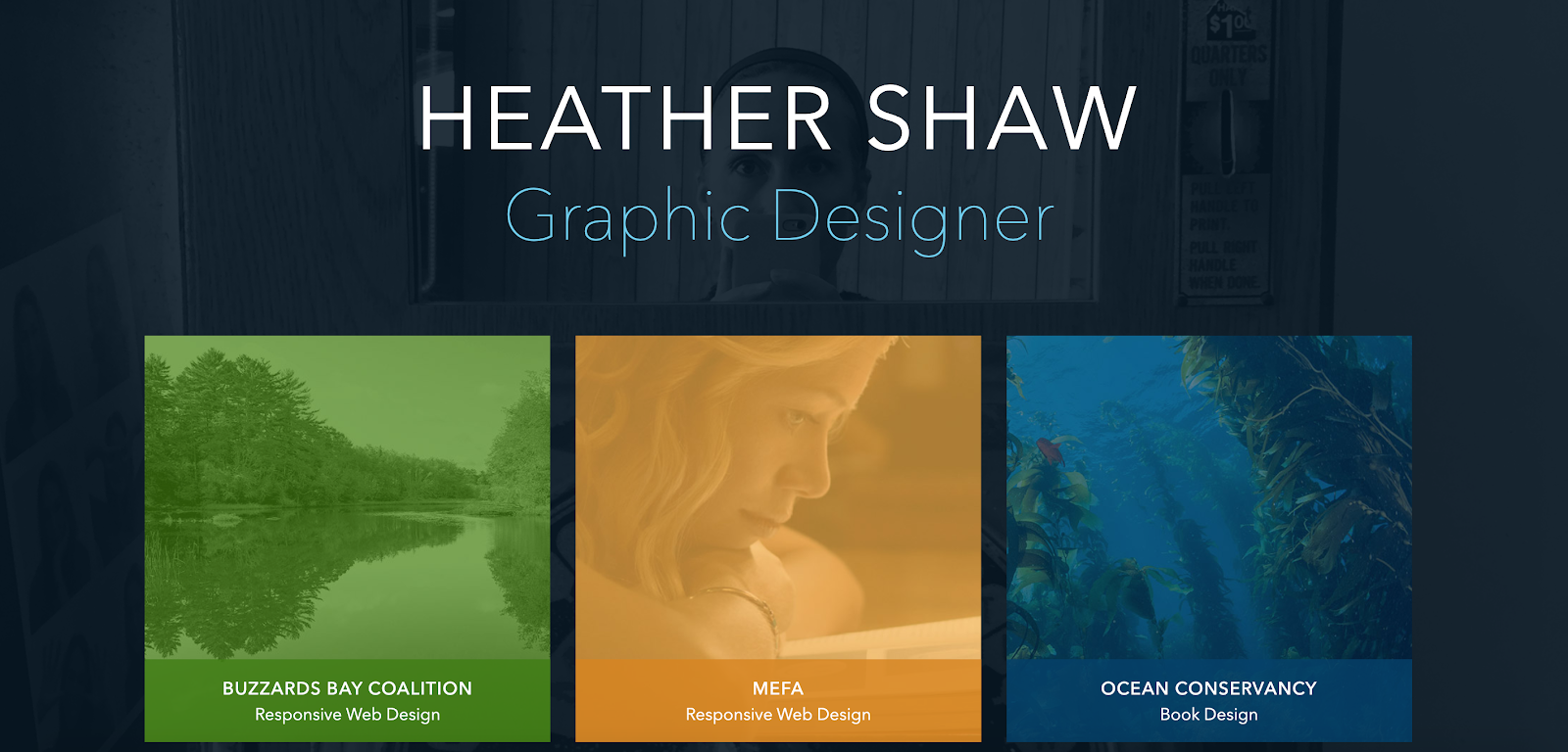
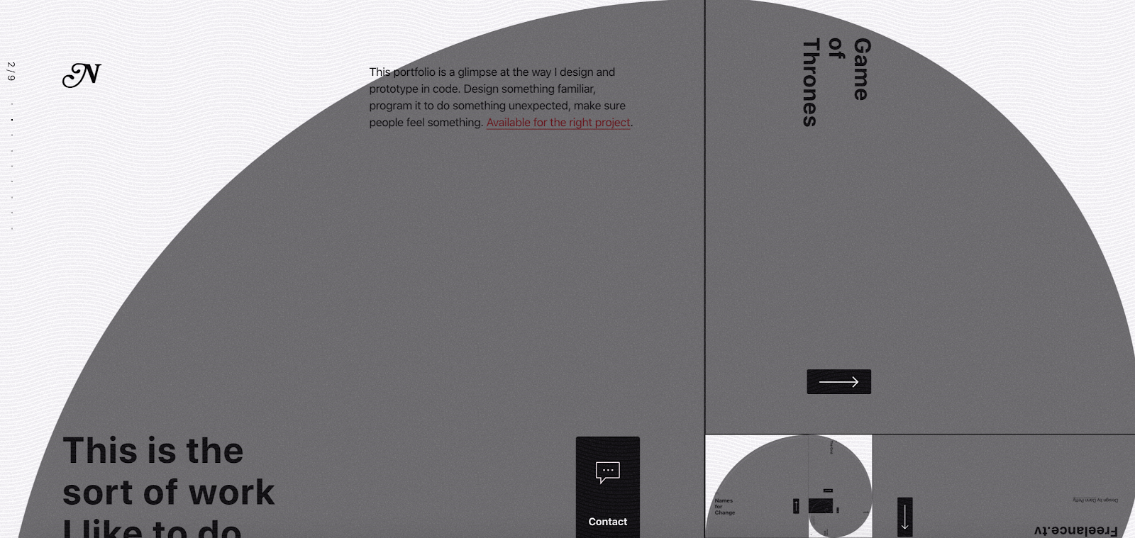
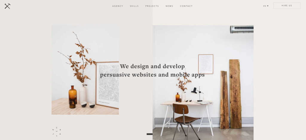
Sample Websites
Especially if the clients browsing your website aren’t that tech-savvy, it’s important for them to see your previous work. In most cases, you won’t probably be able to share projects that you’ve done for clients directly on your website so you can include 1-2 personal projects that reflect the quality and style of your work and provide links to the websites you’ve built. You can get creative here. Some web developers include both their wildest projects and their more practical projects in their portfolio.
Showing a balanced portfolio can ease the process of the client trusting you as they can see how creative you can get but also how you can deliver results that the client expects. Sometimes, things that are too flashy might scare away clients as some have the prejudice of “I don’t need an artist, I need a developer”.
Testimonials
Adding testimonials, if you have them, is probably the best way to provide social proof about your work. These can be quotes from clients, instructors, friends, etc. but also you can provide just the names of the brands that you had worked with.
If you can demonstrate that you have worked with some reputable clients, and share their experiences about how it was to work with you, that can help potential clients to have a better idea about working with you.
Contact Information
It’s also important to leave your contact information on your website such as your email address, social media accounts. But, it’s equally important to provide your visitors with an alternative way to reach you. For example, having a contact form on your website will be a great way to do so.
These should be a good place to start building your web developer portfolio, but to help these sink in, let’s first go over the examples we’ve chosen for you.
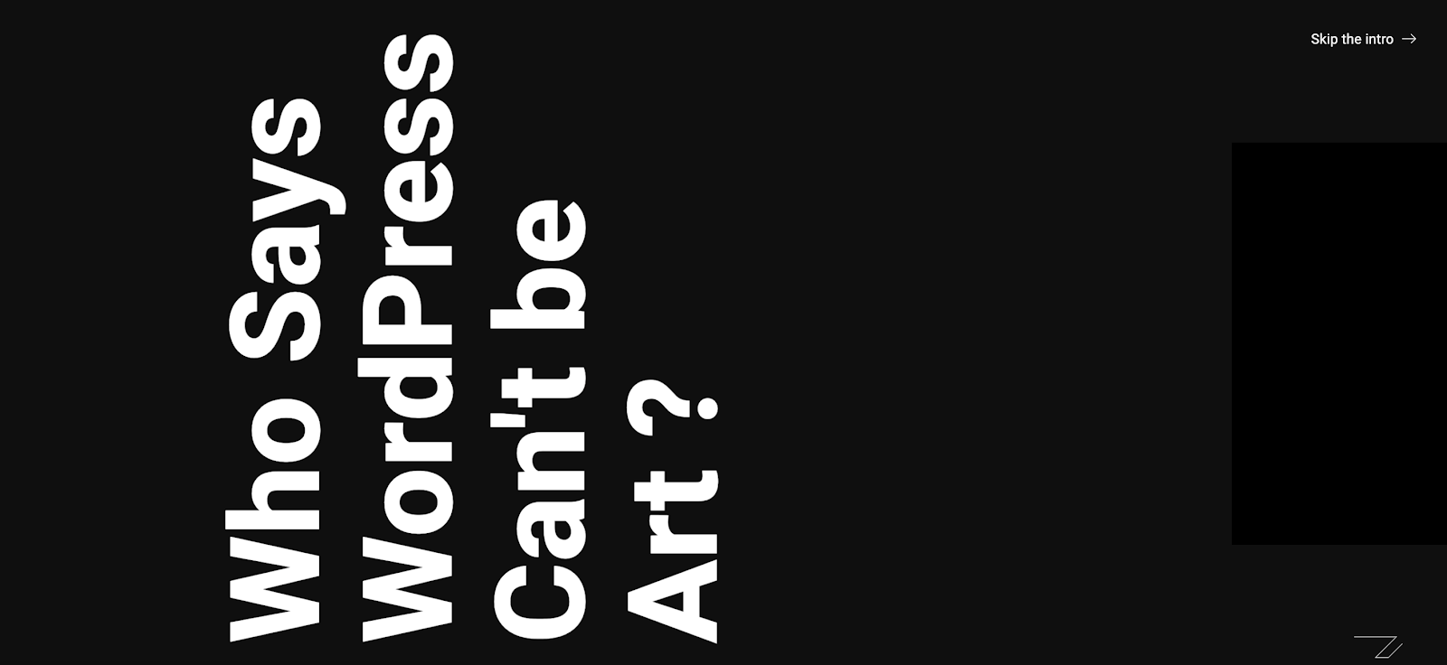
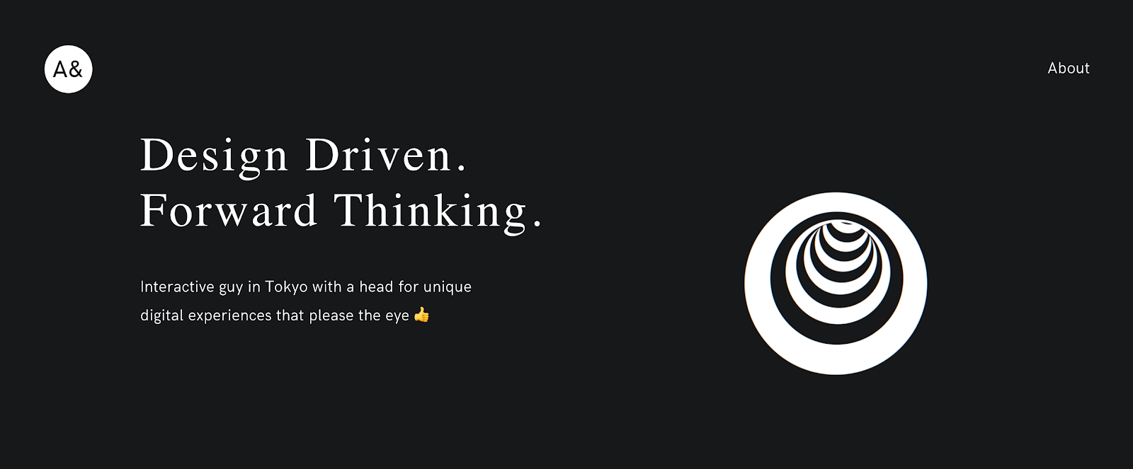
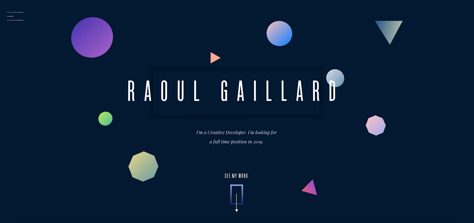
If you’ve read this far, first of all, thank you! And secondly, we hope that our list of portfolios were helpful. As you might have realized, every developer has their own style and they have most probably sunk dozens of hours to create their own websites. Out of all of the examples we gathered, none of them had any issues and all ran smoothly. For now, we’ve only included screenshots but most of these portfolio websites are interactive and quite vivid. Visit their websites and see for yourself.
Please let us know if we have missed any or if you believe that you have your own portfolio website that should be listed here.