Force all the content of an element to be selected when clicked with user-select: all;
If you click a second time, let the user select just parts of the text as normal.
Second click? Well, it’s a trick. You’re really using a time-delayed forwards-ending @keyframes animation when the element is in :focus to change it to user-select: text;
CodePen Embed Fallback
Will’s article has a bunch of more useful information and use-cases for user-select.
That’s the title of a public post from David Baron, a Principal Engineer at Firefox, with thoughts toward container queries. I know a lot of people have been holding their breath waiting for David’s ideas, as he’s one of few uniquely qualified to understand the ins and outs of this and speak to implementation possibility.
We’re still in the early stages of container queries. Every web designer and developer wants them, the browsers know it, but it’s a super complicated situation. It was very encouraging in February 2020 to hear positive signals about a possible switch-statement syntax that would give us access to an available-inline-size used to conditionally set individual values.
Now we’re seeing a second idea that is also in the realm of the possible.
This ideas uses an @rule instead for the syntax. From the document:
I’m not sure if you’d have to repeat the selector inside as well? Or if dropping property/value pairs in there automatically applies to the selector in the @rule.
David says “The rules can match only that container’s descendants. Probably we’d need support for some properties applying to the container itself, but others definitely can’t.” I’d hope grid properties are a strong contender for something you can change, but I have no idea. Otherwise, I think we’d see people wrapping elements with
to get around the “only descendants” limit.
Containment seems to be a very important part of this. Like if the element isn’t property contained, the container query just won’t work. I don’t know that much about containment, but Rachel has a great deep dive from late last year.
Again, this is super early days, I’m just having fun watching this and none of us really have any idea what will actually make it to browsers.
We have big JavaScript frameworks that tons of people already use and like, including React, Vue, Angular, and Svelte. Do we need another JavaScript library? Let’s take a look at Alpine.js and you can decide for yourself. Alpine.js is for developers who aren’t looking to build a single page application (SPA). It’s lightweight (~7kB gzipped) and designed to write markup-driven client-side JavaScript.
The syntax is borrowed from Vue and Angular directive. That means it will feel familiar if you’ve worked with those before. But, again, Alpine.js is not designed to build SPAs, but rather enhance your templates with a little bit of JavaScript.
For example, here’s an Alpine.js demo of an interactive “alert” component.
CodePen Embed Fallback
The alert message is two-way bound to the input using x-model="msg". The “level” of the alert message is set using a reactive level property. The alert displays when when both msg and level have a value.
It’s like a replacement for jQuery and JavaScript, but with declarative rendering
Alpine.js is a Vue template-flavored replacement for jQuery and vanilla JavaScript rather than a React/Vue/Svelte/WhateverFramework competitor.
Since Alpine.js is less than a year old, it can make assumptions about DOM APIs that jQuery cannot. Let’s briefly draw a comparison between the two.
Querying vs. binding
The bulk of jQuery’s size and features comes in the shape of a cross-browser compatibility layer over imperative DOM APIs — this is usually referred to as jQuery Core and sports features that can query the DOM and manipulate it.
The Alpine.js answer to jQuery core is a declarative way to bind data to the DOM using the x-bind attribute binding directive. It can be used to bind any attribute to reactive data on the Alpine.js component. Alpine.js, like its declarative view library contemporaries (React, Vue), provides x-ref as an escape hatch to directly access DOM elements from JavaScript component code when binding is not sufficient (eg. when integrating a third-party library that needs to be passed a DOM Node).
One of jQuery’s key features is its effects, or rather, it’s ability to write easy animations. Where we might use slideUp, slideDown, fadeIn, fadeOut properties in jQuery to create effects, Alpine.js provides a set of x-transition directives, which add and remove classes throughout the element’s transition. That’s largely inspired by the Vue Transition API.
Also, jQuery’s Ajax client has no prescriptive solution in Alpine.js, thanks to the Fetch API or taking advantage of a third party HTTP library (e.g. axios, ky, superagent).
Plugins
It’s also worth calling out jQuery plugins. There is no comparison to that (yet) in the Alpine.js ecosystem. Sharing Alpine.js components is relatively simple, usually requiring a simple case of copy and paste. The JavaScript in Alpine.js components are “just functions” and tend not to access Alpine.js itself, making them relatively straightforward to share by including them on different pages with a script tag. Any magic properties are added when Alpine initializes or is passed into bindings, like $event in x-on bindings.
There are currently no examples of Alpine.js extensions, although there are a few issues and pull requests to add “core” events that hook into Alpine.js from other libraries. There are also discussions happening about the ability to add custom directives. The stance from Alpine.js creator Caleb Porzio, seems to be basing API decisions on the Vue APIs, so I would expect that any future extension point would be inspired on what Vue.js provides.
Size
Alpine.js is lighter weight than jQuery, coming in at 21.9kB minified — 7.1kB gzipped — compared to jQuery at 87.6kB minified — 30.4kB minified and gzipped. Only 23% the size!
Most of that is likely due to the way Alpine.js focuses on providing a declarative API for the DOM (e.g. attribute binding, event listeners and transitions).
For the sake of comparison, Vue comes in at 63.5kB minified (22.8kB gzipped). How can Alpine.js come in lighter despite it’s API being equivalent Vue? Alpine.js does not implement a Virtual DOM. Instead, it directly mutates the DOM while exposing the same declarative API as Vue.
Let’s look at an example
Alpine is compact because since application code is declarative in nature, and is declared via templates. For example, here’s a Pokemon search page using Alpine.js:
CodePen Embed Fallback
This example shows how a component is set up using x-data and a function that returns the initial component data, methods, and x-init to run that function on load.
Bindings and event listeners in Alpine.js with a syntax that’s strikingly similar to Vue templates.
Alpine:x-bind:attribute="express" and x-on:eventName="expression", shorthand is :attribute="expression" and @eventName="expression" respectively
Vue:v-bind:attribute="express" and v-on:eventName="expression", shorthand is :attribute="expression" and @eventName="expression" respectively
Rendering lists is achieved with x-for on a template element and conditional rendering with x-if on a template element.
Notice that Alpine.js doesn’t provide a full templating language, so there’s no interpolation syntax (e.g. {{ myValue }} in Vue.js, Handlebars and AngularJS). Instead, binding dynamic content is done with the x-text and x-html directives (which map directly to underlying calls to Node.innerText and Node.innerHTML).
An equivalent example using jQuery is an exercise you’re welcome to take on, but the classic style includes several steps:
Imperatively bind to the button click using $('button').click(/* callback */).
Within this “click callback” get the input value from the DOM, then use it to call the API.
Once the call has completed, the DOM is updated with new nodes generated from the API response.
If you’re interested in a side by side comparison of the same code in jQuery and Alpine.js, Alex Justesen created the same character counter in jQuery and in Alpine.js.
Back in vogue: HTML-centric tools
Alpine.js takes inspiration from TailwindCSS. The Alpine.js introduction on the repository is as “Tailwind for JavaScript.”
Why is that important?
One of Tailwind’s selling points is that it “provides low-level utility classes that let you build completely custom designs without ever leaving your HTML.” That’s exactly what Alpine does. It works inside HTML so there is no need to work inside of JavaScript templates the way we would in Vue or React Many of the Alpine examples cited in the community don’t even use script tags at all!
Let’s look at one more example to drive the difference home. Here’s is an accessible navigation menu in Alpine.js that uses no script tags whatsoever.
CodePen Embed Fallback
This example leverages aria-labelledby and aria-controls outside of Alpine.js (with id references). Alpine.js makes sure the “toggle” element (which is a button), has an aria-expanded attribute that’s true when the navigation is expanded, and false when it’s collapsed. This aria-expanded binding is also applied to the menu itself and we show/hide the list of links in it by binding to hidden.
Being markup-centric means that Alpine.js and TailwindCSS examples are easy to share. All it takes is a copy-paste into HTML that is also running Alpine.js/TailwindCSS. No crazy directories full of templates that compile and render into HTML!
Since HTML is a fundamental building block of the web, it means that Alpine.js is ideal for augmenting server-rendered (Laravel, Rails, Django) or static sites (Hugo, Hexo, Jekyll). Integrating data with this sort of tooling can be a simple as outputting some JSON into the x-data="{}" binding. The affordance of passing some JSON from your backend/static site template straight into the Alpine.js component avoids building “yet another API endpoint” that simply serves a snippet of data required by a JavaScript widget.
Client-side without the build step
Alpine.js is designed to be used as a direct script include from a public CDN. Its developer experience is tailored for that. That’s why it makes for a great jQuery comparison and replacement: it’s dropped in and eliminates a build step.
While it’s not traditionally used this way, the bundled version of Vue can be linked up directly. Sarah Drasner has an excellent write-up showing examples of jQuery substituted with Vue. However, if you use Vue without a build step, you’re actively opting out of:
the Vue CLI
single file components
smaller/more optimized bundles
a strict CSP (Content Security Policy) since Vue inline templates evaluate expressions client-side
So, yes, while Vue boasts a buildless implementation, its developer experience is really depedent on the Vue CLI. That could be said about Create React App for React, and the Angular CLI. Going build-less strips those frameworks of their best qualities.
There you have it! Alpine.js is a modern, CDN-first library that brings declarative rendering for a small payload — all without the build step and templates that other frameworks require. The result is an HTML-centric approach that not only resembles a modern-day jQuery but is a great substitute for it as well.
If you’re looking for a jQuery replacement that’s not going to force you into a SPAs architecture, then give Alpine.js a go! Interested? You can find out more on Alpine.js Weekly, a free weekly roundup of Alpine.js news and articles.
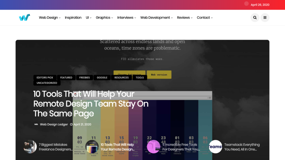
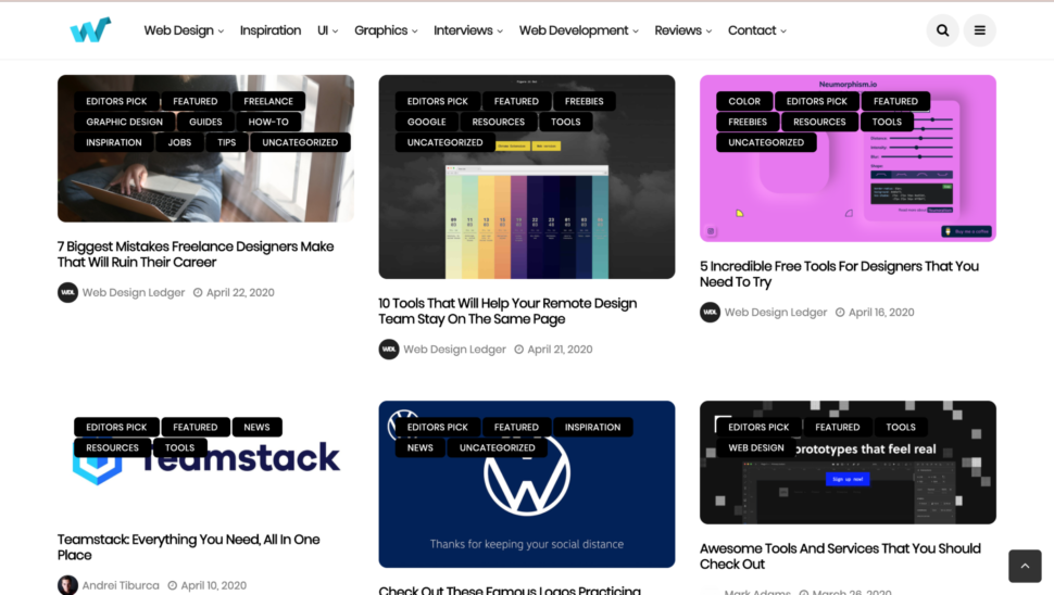
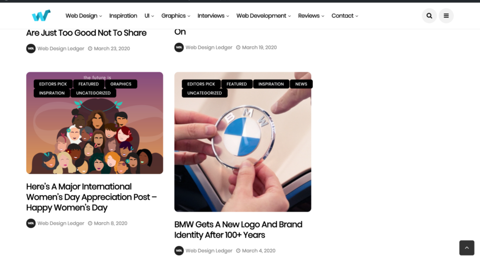
The news is true, we completely redesigned the best blog in the world, Web Design Ledger!
Okay, maybe we’re a little bit biased, but there’s no denying that the new web design layout is amazing.
We are so excited to show you guys the finished product.
Let me just hit you with the most satisfying before and after ever.
Before…
After!
Amazing, right?!
With this new era and new decade that we’ve come into this year, we wanted to bring our design blog along with it and let it go through a major change.
We really wanted it to symbolise a new design era.
It was about time our blog got a facelift, and we’re obsessed with it.
Everything is minimal and has soft edges, and what I’m really thrilled about is that gradient bar at the top of the home page.
Our blog is easier to browse through now than ever and it just has an all-around crisp and fresh vibe to it.
We’ve been working on this design for a long time now, and we couldn’t be happier for you guys to see it.
The old design was great too, but it was time for the old design to retire and for the new design to have its moment and really flourish.
We hope that the rest of this year will be full of exciting things and new changes.
We’re excited to be alongside you through this year and see what it all has to offer.
I know we’re all going through a strange time right now, but together, we’ll pull through this and come out newer and better than ever.
For the most part, we tend to underestimate things that are familiar to us. It is also very likely that we will underestimate those things that though new, seem very simple to process. And that is correct to some degree. But, when we are faced with complex cases and all measures are taken, a good and solid understanding of the basics could help us to find the right solutions.
In this article, we will take a deeper look at one of the most simple, thus, quite often underrated activities in web development that is the design of wireframes. We will find out what are wireframes, why we need to design them, how to get the most out of the wireframes design, and how to take it to the next level.
According to The Top 20 Reasons Startups Fail report by CB Insights, 17% of startups reported lack of user-friendliness as the reason for their failure. Designing a user-friendly interface is not a trivial task, especially for large and complex products where there are many entities, dependencies, and elements to be organized. To design such complex products you should follow a top-down approach and wireframes design is the best technique that could help you with that.
First, Let’s Define Terms
Wireframe — also known as a page schematic or screen blueprint, and it is a visual guide that represents the skeletal framework of a website or an application.
Additional definition we will look at is wireframing — a process of designing a wireframe, and commonly used to lay out content and functionality on a page which takes into account user needs and user journeys. Wireframes are used early in the development process to establish the basic structure of a page before visual design and content is added.
At first glance, wireframing seems simple. And herein lies the major problem: that we tend not to pay enough attention to simple things. One way to help us get the most benefits from wireframing is to define the goals of the product or service.
The main goal of wireframing, that we could get is to show the team and stakeholders which entities, pages, and components the application is going to have and how these elements of the digital product will interact with each other.
From the goal definition we can see how big the impact of wireframing is for both the development process and the final product.
When we keep in mind the goals of the wireframing process, we still need to pay attention to what are the common pitfalls to avoid during wireframes design.
Wireframing Mistakes We Want To Avoid
Creating wireframes for the sake of ‘box-checking’;
Skipping wireframes stage at all;
Preparing wireframes after the visual designs;
Not understanding why to use wireframes.
Wireframes should precede the stage of visual design, not vice versa. It’s like deciding on the technology stack for your application after having the code written.
Wireframe design lays the foundation for the quality of the design, and the better we understand the goal of this phase the more benefits we could get. So let’s dive deeper and find out why we need to design wireframes and what values this technique brings.
Businesses that lack knowledge of the product design may welcome the practice of skipping wireframe design as it allows them to cut the project costs, but this decision may lead to potential failure in the long run. And you, as the designer, should explain why we are doing it, how it will help the final product, and how it could even save future expenses.
Next, let’s check some points that could help you better understand why we need wireframes and see how wireframes help to get feedback from your developers, clients and future users of your product.
Why You Should Design Wireframes
Help Your Team Estimate And Refine The Scope Of Work
Wireframes allow designers to quickly create a visual representation of the future product and demonstrate it to the team for the needed revisions. Wireframes also help you show your team which screens the application is going to have, which elements and controls will be on each screen, and how all the elements will interact with each other. In addition, looking through wireframes is way faster than reading specifications. Also, it helps us avoid discrepancies in scope between the initial estimates and the final ones.
Involve All Team Members In The Product Design Stage
We all have been in the position of having created a top-notch design, only to be faced with development constraints. The use of wireframes allows us to involve developers in discussing designs at the early stages, enabling them to provide feedback and suggest changes before you start working on visual design. This way, you can speed up the design process and avoid wasting time and money.
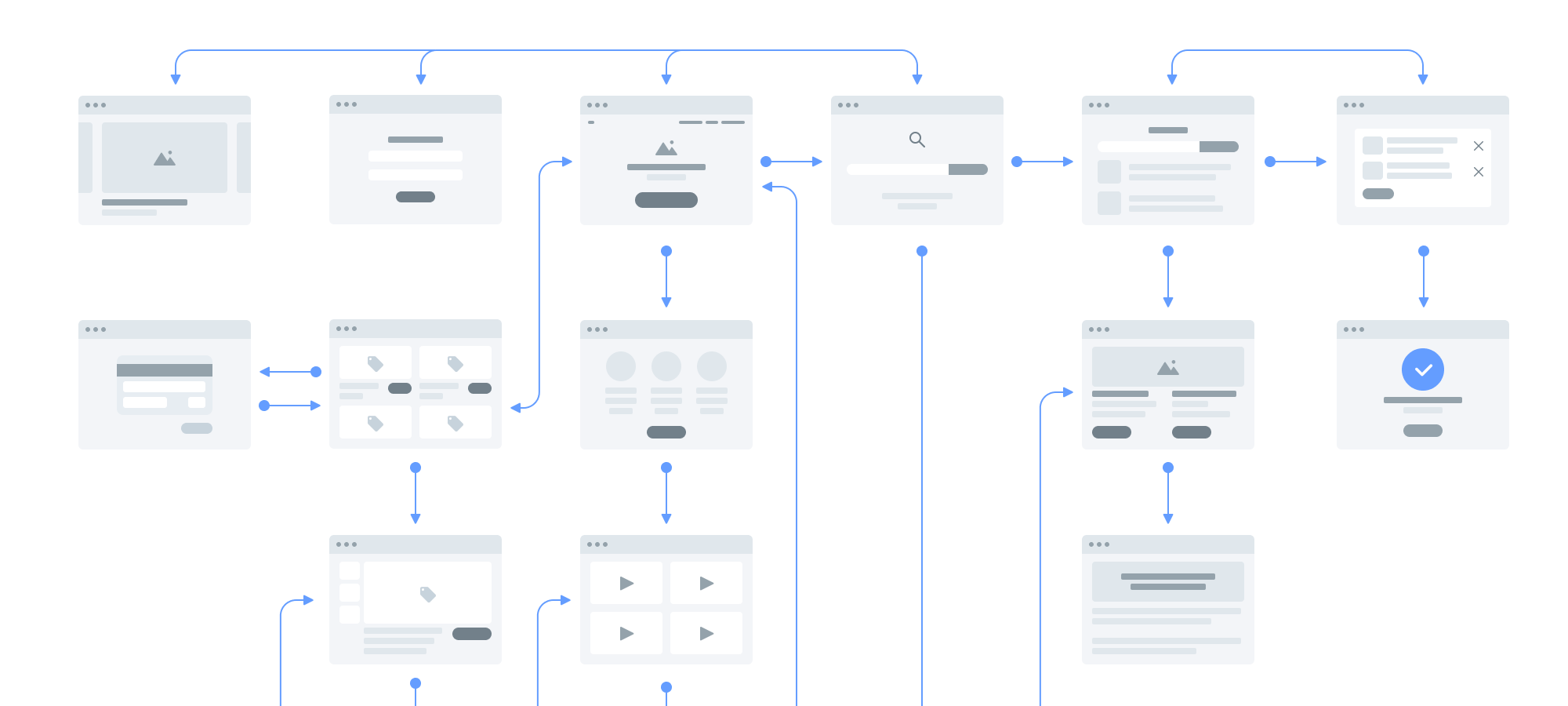
Stages of software design & development life cycle where wireframes can be used in one form or another. (Large preview)
Hold A Demo For Clients
Getting rapid feedback from your clients and stakeholders is an important component of the design process. Also, we all have experienced multiple change-requests from our stakeholders and that is normal. With wireframes, we could make this process more efficient. Making changes to prototypes requires more time and effort than making changes to wireframes, it will let you be more agile and don’t waste extra time on rework.
Carry Out User Testing
According to Eric Ries, author of Lean Startup, the sooner you carry out user testing, the better — no one wants to roll out an application and find out that users don’t get how to use it right. Wireframes can help designers get valuable feedback from potential users and don’t spend time on developing complex interactive prototypes when they are not needed.
The fact that UI/UX designers use wireframes does not necessarily mean that they do it right. For that, you should remember and follow the best practices.
Wireframing Best Practices
To bring the best results and serve a solid foundation for further UI, you need to follow several simple rules:
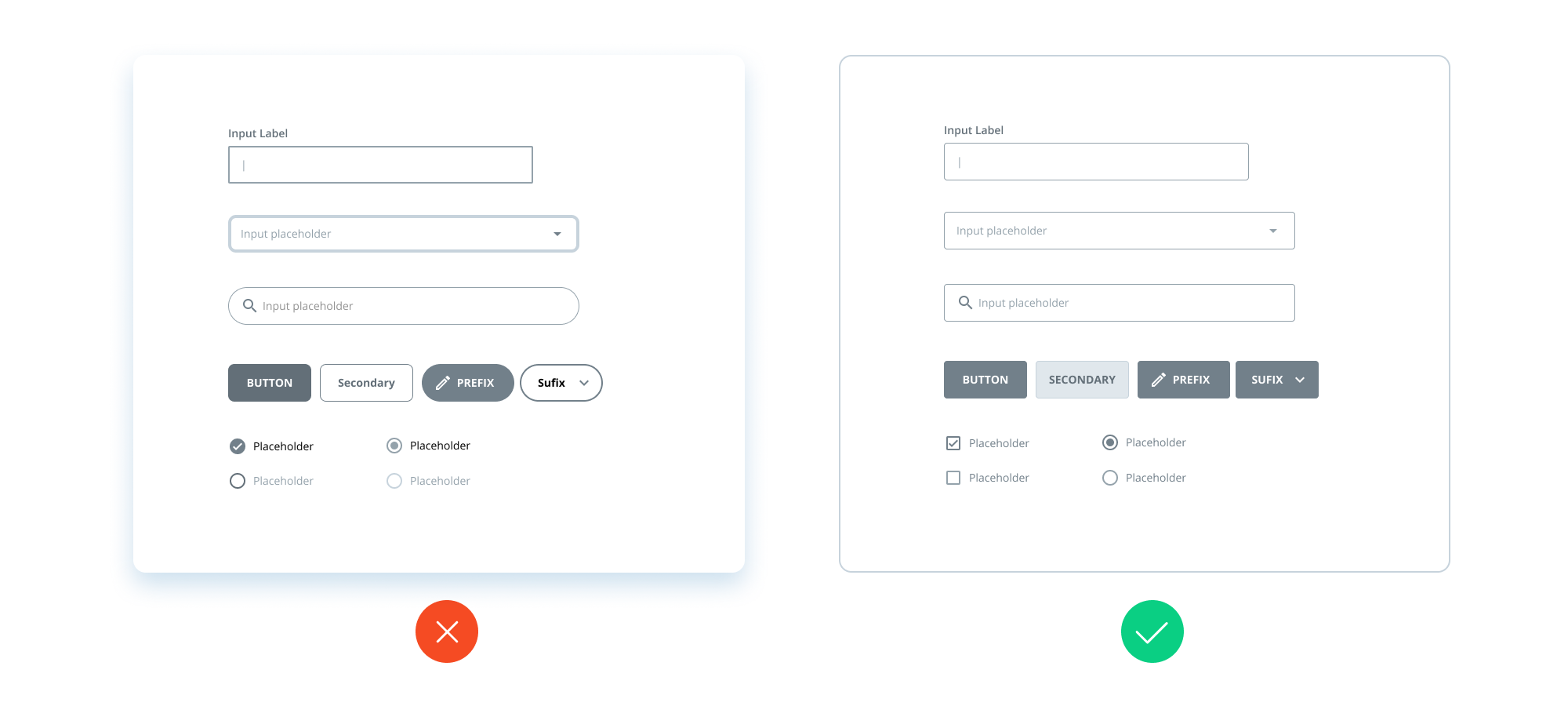
1. Minimize The Use Of Color In Wireframes
If you’re using rich color palettes in your wireframes, remind yourself of the goal of wireframing (to show which elements the product is going to have, and how they should interact with each other) and think if extra colors help you to achieve it.
Minimize the use of color in wireframes, we will have dedicated phase for this. (Large preview)
In some cases, they could. But in general, adding colors to your wireframes might distract the viewer’s attention and will surely make any updates more difficult. Moreover, there’s another important issue to consider — not all clients have a good understanding of UX techniques and might take colored wireframes for final designs.
Example of correct color using in wireframes. (Large preview)
However, this doesn’t mean you should never use color on wireframes and strictly stick with the black and white palette. Sometimes using color to highlight specific components is justified. For example, you can use red for error states or blue for notes, etc.
2. Use Simple Design Of Components
When you add components to your wireframes, go for basic designs. Wireframes aren’t intended to contain thoroughly designed and detailed components. Instead, they should be easily recognized by your team members and stakeholders. Adding detailed components will cost you a lot of time and effort without being particularly useful.
Use simple design of components and make its functional purpose clear. (Large preview)
3. Maintain Consistency
Similar components must look the same on all your wireframes. If the same components look different, developers are likely to question if they are actually the same and even add extra time to the estimates because of different designs. When working on wireframes, remember a simple rule: be consistent and try not to create confusion.
Maintain consistency between similar components and avoid using same look for different components. (Large preview)
4. Use Real Content
From time to time we could see that UI/UX designers don’t add real content on the wireframes and use lorem ipsum instead. That’s a common mistake that few designers even realize they make. You may object and say that the content isn’t available at the stage of design. Well, it’s enough to use the draft version of the content.
Use real content instead of lorem ipsum. (Large preview)
Content impacts the design you’ll create, and the draft content will help you make the right decisions and deliver the superb design. If you use lorem ipsum, however, you won’t see the full picture and will likely need to make a lot of adjustments to the UI or even worse — you will create a design that doesn’t work. Also, the real content will add value to your wireframes, explain the context better and maybe indicate that you need to start gathering the real content already.
5. Use Annotations
It may happen that some design solutions can’t be visually illustrated, so stakeholders or developers might have questions about them. For example, the logic behind some controls. In such cases, you can provide on-screen annotations to explain the logic behind that. This way, your team will understand your solutions, and you won’t need to spend time discussing them.
Use annotations to describe specific logic. (Large preview)
6. Low To High-Fidelity
There’s no strict rule. Sometimes you should go for low-fidelity wireframes, while some projects might require high-fidelity ones. It depends on the project, so if you feel like adding more details to the wireframes — don’t hesitate to do it. But according to Eric Ries, don’t do extra work when this doesn’t bring value, start from the basics and then add details as long as they are needed. For instance, if you need to draw the developers’ attention to some custom solution, then add more details to illustrate it in your wireframes.
Both low and high-fidelity wireframes have a place to be. (Large preview)
7. Extend Wireframes To Prototypes
As designers we work with different products, some of them have simple and common interactions, and some of them have quite advanced ones. Sometimes wireframes are not enough to illustrate the interaction of complex and uncommon interfaces, but instead of writing long notes and spending hours on explanations, you could extend your wireframes to interactive prototypes.
Developing interactive prototype now easier than ever. (Large preview)
The good news is that today we have a wide range of simple but very powerful tools like Figma, Invision, Adobe XD, UXPin, Axure, Moqups, etc. and we definitely need to review them and choose the best tool for designing the wireframes and developing simple prototypes.
Wireframe Design Tools
Now it’s time to choose a superb wireframing tool that will help you create amazing designs and streamline your workflow. There are a lot of different options you can use for wireframing, and you might have used some of them before. I’d like to give you a basic understanding of how different they are.
Most wireframe tools are tailored to:
Simplicity They have a low barrier to entry and are perfect for people who take their first steps in UI/UX design and lack experience using more sophisticated software.
Collaboration These are packed with a rich functionality for teamwork. Collaboration is a backbone of modern software development, so the best wireframing tools not only provide lots of features but allow for efficient and easy collaboration between all team members involved in the design process.
Here are the most widely used wireframe tools tailored to collaboration:
Figma A powerful cloud-based tool that comes in a web version and desktop applications for Windows and macOS. Figma comes with a lot of powerful features for building wireframes, prototypes, UIs, and more (see table below).
Sketch This tool is extremely popular with UI/UX designers. If you need to go beyond the default Sketch toolset, you can use dozens of plugins to get extra functions. Unlike many of its competitors, Sketch is available only on macOS and you will need a 3rd-party solution for collaboration.
There are plenty of applications you can use to design wireframes. You shouldn’t make a choice based solely on the features provided in the application. Instead, I would advise you to try and explore all of them and decide which works for you best. Below you can find a list of some of the most popular tools to start with.
Advanced features to create and edit vector images
Large community
Can be used to design wireframes if you don’t have any other option
Paid
Not dedicated to design UI
No web-based app
No prototyping features
No collaboration features
Overwhelmed UI
As an example of the power of modern design tools, I’d like to share my own experience and show you how we set up an effective wireframing design process with one of the tools above.
Case Study: How We Set Up A Wireframing Process Across Multiple Teams
Context
The company I worked at was building complex fintech digital products. Apart from the design team, there was a professional team of business analysts (BAs). They prepared the requirements and created low-fidelity wireframes that they passed on to our design team.
Picking The Tool
We needed to choose an all-in-one tool for the BA and design teams. Since most business analysts have fairly low design skills, we wanted to find a tool that would be simple enough for BAs and — at the same time — powerful enough for designers. Also, easy collaboration was our team’s priority. Based on these criteria, we opted for Figma.
Creating The Library Of Components
To streamline the product design process, we created a custom library of components that the BA team could use. This allowed us to speed up the wireframing, as the business analysts could quickly use ready-made blocks instead of drawing their own.
Training The Team
To show how to use Figma and the library of components, we held a workshop for our BA team. We also found it important to teach them some extra features, such as prototyping.
Diagram of relations between teams in wireframing design process. (Large preview)
Result
In our case Figma proved to be efficient for wireframing and collaboration, even though the team members were located in Ukraine, Australia, and the Philippines. We currently use Figma for the communication channel — it proved to be more convenient to collaborate on the wireframes by mail or in messengers.
Summing Up
Being a simple practice, wireframes design usually doesn’t get enough awareness from us, designers, when we face them for the first time.
As a result, lack of attention for this technique leads to a number of flaws, when we either add a lot of decoration to wireframes, or create low-fi wireframes for the sake of box-checking when the project rather requires a more detailed solution, or even skip this stage and go straight to visual UI design.
Usually, all of these mistakes are the result of poor understanding of both wireframes design objectives (that is to show which elements the product is going to have, and how they should interact with each other), as well as poor understanding of when wireframes could help us, like:
Wireframes could help the team to get more precise estimates of the project.
Wireframes could help to involve all team members to design processes and avoid engineering mistakes that will affect the development process.
Wireframes could help us to make early presentations to clients, stakeholders and conduct user testing sessions to get feedback as soon as possible, and save time on the development of poor solutions.
Today, as designers, we are lucky as never before because there are dozens of tools available for us to design wireframes and also smoothly integrate this activity in our general design process.
The only thing that we need to do is to spend some time to incorporate both the technique and tools in our own design process, and find a way how to make them work for us to take our product design process to the next level. That they certainly can.
One of the struggles that marketers face is how to send the right message at exactly the right time to target people in a way that will appeal to them. To solve the problem, businesses need to get themselves acquainted with new technologies and the power of personalization.
In the past few years, digital marketing as we know it has undergone numerous changes, distinguishing itself from the traditional marketing of the past.
With new technologies on the rise, marketing has become easier and smarter, enabling businesses to achieve more than they did. More specifically, the use of AI and machine learning has allowed businesses to refine their marketing campaigns, placing the customer at the center of their operations.
As a channel, email has proven itself…to have the best ROI
However, how can you capture a customer’s attention without being physically there to engage with them and show them that your business is the right place to spend their time and money? One of your best allies to show consumers that you aren’t a faceless brand is none other than email marketing.
As a channel, email has proven itself not only to be convenient for modern consumers, but also to have the best ROI; $55 for every $1 you spend on it.
Your mail campaigns are indeed efficient lead nurturing tools, but everything will be in vain if you don’t target your audience with highly personalized messages.
Why Do Businesses Need Personalization?
Modern consumers receive hundreds of promotional emails on a daily basis. However, some of them end up in their trash without being read. Why?
Well, with the rise of scams, the majority of consumers have trained themselves to identify fake messages and fraudulent content.
As a result, emails that look spammy, impersonal and irrelevant — even if that wasn’t your intention — will eventually end up in users’ trash folders.
This will harm your email deliverability and give you a bad send reputation that will prevent you from reaching your subscribers’ inbox.
To ensure that your email campaigns get the desired open and click-through rates, you have to make sure that your messages are tailored to your subscribers’ needs. That’s where personalization comes in.
Personalized content will show your recipients that your message is unique and not part of a one-size-fits-all email campaign.
Of course, you can’t send every single campaign manually. To save time, marketing automation has enabled businesses to automate the process and deliver numerous campaigns automatically without cutting down on personalization.
To do so, you need a platform to provide you with valuable, real-time insights and powerful personalization tools. If you still haven’t chosen one, you can try one of the available free email marketing services to get an idea of how email personalization works.
Personalization will help your audience see the value of your message, primarily because it will be addressed to them.
Consequently, tailored content will help you get more engagement, build a loyal audience who will anticipate your content, and turn them from subscribers into satisfied customers. As email marketing statistics show, personalization is so powerful that it can increase your open rate even by 29%.
What About Hyper-Personalization?
A simple first name in your emails might be effective, but as marketing evolves, it won’t be enough to attract your subscribers’ attention.
For that, businesses have tried to discover new ways to get their audience to click on their incentives and promote their business development. According to a survey by SmarterHQ 72% of consumers say they now only engage with marketing tailored to their interests.
72% of consumers say they now only engage with marketing tailored to their interests
This consumer tendency has created a new form of personalization called hyper-personalization.
Hyper-personalization leverages data to provide more personalized suggestions and messages that will be tailored to each customer’s needs.
Through this advanced form of personalization, you can improve customer experience and drive your prospects and leads a step further down your marketing and sales funnels.
To make hyper-personalization possible, you need to leverage the power of AI and data. But before you do that, you need to know how to collect customer data and then leverage it through AI and machine learning.
Collecting Customer Data
Your first step to personalizing your marketing is to decide what kind of data you need to collect, and why you need it. Especially after GDPR regulations came to existence and consumers’ rising concerns about data privacy.
Here’s an example from Bulgari’s website, informing visitors about their privacy policy in a fully transparent manner:
This cookie policy is right there, complete with everything one would need to know when viewing a brand’s website, even before signing up.
It will make your prospects feel safe right off the bat since the website not only acknowledges its use of cookies but also gives the prospect an opportunity to review why this happens.
There is, of course, no set of rules regarding the data you may need from a prospect. It could be anything.
Now that you’ve made your privacy policy clear it’s time to start collecting your visitors’ information. In this case, Bulgari has created an efficient form to capture its visitors’ emails and at the same time collect valuable information that will improve their newsletter open and click rate:
Segmenting Your Subscribers
Adding the right input fields into your forms will give your new subscribers an idea of what you’ll do with their information.
Bulgari’s form is a great example that includes all the right fields to collect insight into its audience’s preferences.
After your prospects click on your CTA and join your mailing list, you can start segmenting each subscriber based on their interests and preferences.
Segmentation is one of the most efficient practices to personalize your email content and deliver tailored content that will convert your audience into loyal customers.
For instance, demographic segmentation will help you come up with unique campaigns for your female and male subscribers. Then, you can use their individual data to further personalize the email content based on their interests.
Segmenting your audience, though, is only the beginning to achieve hyper-personalization.
Leveraging the power of AI will help you deliver personalized product recommendations in the form of amazing email campaigns that will convince your audience to click-through and buy more.
How To Use Customer Data The Right Way
The first thing you need to know is how AI enables hyper-personalization. Essentially, it’s how you can fully leverage data to improve your marketing activities.
Machines learn in the same way humans do. By feeding data into the machine and adding more and more scenarios, you’re teaching the platform to distinguish between scenarios and find patterns in a quicker and more accurate manner.
More importantly, the machine is taught to connect past “purchases” and come up with suggestions for a marketing team.
Essentially, the more data the machine can go through, the more scenarios it can come up with and the more prospects it can connect to. This will lead to the creation of a unique buyer persona that will be more accurate than the traditional buyer personas created by marketers.
In the end, the personas you create through AI will be able to provide tailor-made solutions and appeal to the general sentiment of each segment of your audience.
Now that you’ve created your personas and know which segment of your list is interested in which of your products, you can use your promotional content more effectively.
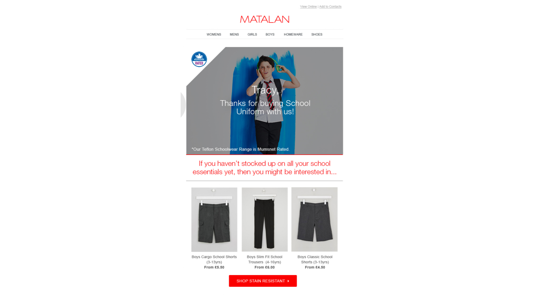
Here’s an example from Matalan that uses a customer’s previous purchase data to come up with a personalized cross-sell email:
With a hyper-personalized email, you’ll be able to target your audience with more accuracy.
The use of data will help you craft more messages that will be personalized and tailor-made. So, when you apply them to the AI-generated user persona you will step up your customer lifecycle marketing efforts effectively.
Takeaway
If you use AI and data correctly, you’ll be able to provide one-on-one content down the line, seeing as AI is able to track and trace the kind of content individuals are most interested in, through social media data, engagement data, and so on.
This will help marketers to create amazing content that will be both valuable and engaging for your new prospects.
What’s more, personalization will enable marketing teams to create something that will feel natural, incentivizing your audience to click on your CTAs and move a step further down your marketing funnel.
This is just a tiny little trick that might be helpful on a site where you don’t have the time or desire to build out a really good on-site search solution. Google.com itself can perform searches scoped to one particular site. The trick is getting people there using that special syntax without them even knowing it.
There is no doubt that web forms play an integral role in our web site or applications. By default, they provide a useful set of elements and features — from legends and fieldsets to native validation and states — but they only get us so far when we start to consider the peculiarities of using them. For example, how can we manipulate the state of a form? How about different forms of validation? Even hooking a form up to post submissions is a daunting effort at times.
Component-driven front-end libraries, like React, can ease the task of wiring web forms but can also get verbose and redundant. That’s why I want to introduce you to Formik, a small library that solves the three most annoying parts of writing forms in React:
State manipulation
Form validation (and error messages)
Form submission
We’re going to build a form together in this post. We’ll start with a React component then integrate Formik while demonstrating the way it handles state, validation, and submissions.
Creating a form as a React component
Components live and breathe through their state and prop. What HTML form elements have in common with React components is that they naturally keep some internal state. Their values are also automatically stored in their value attribute.
Allowing form elements to manage their own state in React makes them uncontrolled components. That’s just a fancy way of saying the DOM handles the state instead of React. And while that works, it is often easier to use controlled components, where React handles the state and serves as the single source of truth rather than the DOM.
The markup for a straightforward HTML form might look something like this:
This is a bit verbose but it comes with some benefits:
We get a single source of truth for form values in the state.
We can validate the form when and how we want.
We get performance perks by loading what we need and when we need it.
OK, so why Formik again?
As it is with anything JavaScript, there’s already a bevy of form management libraries out there, like React Hook Form and Redux Form, that we can use. But there are several things that make Formik stand out from the pack:
It’s declarative: Formik eliminates redundancy through abstraction and taking responsibility for state, validation and submissions.
It offers an Escape Hatch: Abstraction is good, but forms are peculiar to certain patterns. Formik abstracts for you but also let’s you control it should you need to.
It co-locates form states: Formik keeps everything that has to do with your form within your form components.
It’s adaptable: Formik doesn’t enforce any rules on you. You can use as less or as much Formik as you need.
Easy to use: Formik just works.
Sound good? Let’s implement Formik into our form component.
Going Formik
We will be building a basic login form to get our beaks wet with the fundamentals. We’ll be touching on three different ways to work with Formik:
I’ve created a demo with the packages we need, Formik and Yup.
Method 1: Using the useFormik hook
As it is right now, our form does nothing tangible. To start using Formik, we need to import the useFormik hook. When we use the hook, it returns all of the Formik functions and variables that help us manage the form. If we were to log the returned values to the console, we get this:
We’ll call useFormik and pass it initialValues to start. Then, an onSubmit handler fires when a form submission happens. Here’s how that looks:
// This is a React component
function BaseFormik() {
  const formik = useFormik({
    initialValues: {
      email: "",
      password: ""
    },
    onSubmit(values) {
      // This will run when the form is submitted
    }
  });

 // If you're curious, you can run this Effect
 //  useEffect(() => {
 //   console.log({formik});
 // }, [])


  return (
    // Your actual form
  )
}
Then we’ll bind Formik to our form elements:
// This is a React component
function BaseFormik() {
  const formik = useFormik({
    initialValues: {
      email: "",
      password: ""
    },
    onSubmit(values) {
      // This will run when the form is submitted
    }
  });

 // If you're curious, you can run this Effect
 //  useEffect(() => {
 //   console.log({formik});
 // }, [])


  return (
  // We bind "onSubmit" to "formik.handleSubmit"
  <form className="baseForm" onSubmit={formik.handleSubmit} noValidate>
    <input
      type="email"
      name="email"
      id="email"
      className="email formField"
      value={formik.values.email} // We also bind our email value
      onChange={formik.handleChange} // And, we bind our "onChange" event.
    />
  </form>
  )
}
This is how the binding works:
It handles form submission with onSubmit={formik.handleSubmit}.
It handles the state of inputs with value={formik.values.email} and onChange={formik.handleChange}.
If you take a closer look, we didn’t have to set up our state, nor handle the onChange or onSubmit events as we’d typically do with React. The complete change to our form goes:
However as you might have noticed, our form contains some redundancy. We had to drill down formik and manually bind the form input’s value and onChange event. That means we should de-structure the returned value and immediately bind the necessary props to a dependent field, like this:
// This is a React component
function BaseFormik() {
  const {getFieldProps, handleSubmit} = useFormik({
    initialValues: {
      email: "",
      password: ""
    },
    onSubmit(values) {
      // This will run when the form is submitted
    }
  });

 // If you're curious, you can run this Effect
 //  useEffect(() => {
 //   console.log({formik});
 // }, [])


  return (
  <form className="baseForm" onSubmit={handleSubmit} noValidate>
    <input
      type="email"
      id="email"
      className="email formField"
      {...getFieldProps("email")} // We pass the name of the dependent field
    />
  </form>
  )
}
Let’s take things even further with the included component.
Method 2: Using Formik with React context
The component exposes various other components that adds more abstraction and sensible defaults. For example, components like <Form/>, , and are ready to go right out of the box.
Keep in mind, you don’t have to use these components when working with but they do require (or withFormik) when using them.
Using requires an overhaul because it uses the render props pattern as opposed to hooks with useFormik. The render props pattern isn’t something new in React. It is a pattern that enables code re-usability between components — something hooks solve better. Nevertheless, has a bagful of custom components that make working with forms much easier.
Notice that initialValues and onSubmit have been completely detached from useFormik. This means we are able to pass the props that needs, specifically initialValues and useFormik.
returns a value that’s been de-structured into getFieldProps and handleSubmit. Everything else basically remains the same as the first method using useFormik.
We haven’t actually put any components to use just yet. I’ve done this intentionally to demonstrate Formik’s adaptability. We certainly do want to use those components for our form fields, so let’s rewrite the component so it uses the component.
We replaced with and removed the onSubmit handler since Formik handles that for us. Remember, it takes on all the responsibilities for handling forms.
We also replaced with and removed the bindings. Again, Formik handles that.
There’s also no need to bother with the returned value from anymore. You guessed it, Formik handles that as well.
Formik handles everything for us. We can now focus more on the business logic of our forms rather than things that can essentially be abstracted.
We’re pretty much set to go and guess what? We’ve haven’t been concerned with state managements or form submissions!
“What about validation?” you may ask. We haven’t touched on that because it’s a whole new level on its own. Let’s touch on that before jumping to the last method.
Form validation with Formik
If you’ve ever worked with forms (and I bet you have), then you’re aware that validation isn’t something to neglect.
We want to take control of when and how to validate so new opportunities open up to create better user experiences. Gmail, for example, will not let you input a password unless the email address input is validated and authenticated. We could also do something where we validate on the spot and display messaging without additional interactions or page refreshes.
Here are three ways that Formik is able to handle validation:
At the form level
At the field level
With manual triggers
Validation at the form level means validating the form as a whole. Since we have immediate access to form values, we can validate the entire form at once by either:
Both validate and validationSchema are functions that return an errors object with key/value pairings that those of initialValues. We can pass those to useFormik, or withFormik.
While validate is used for custom validations, validationSchema is used with a third-party library like Yup.
Here’s an example using validate:
// Pass the `onSubmit` function that gets called when the form is submitted.
const formik = useFormik({
  initialValues: {
    email: "",
    password: ""
  },
  // We've added a validate function
  validate() {
    const errors = {};
    // Add the touched to avoid the validator validating all fields at once
    if (formik.touched.email && !formik.values.email) {
      errors.email = "Required";
    } else if (
      !/^[A-Z0-9._%+-]+@[A-Z0-9.-]+.[A-Z]{2,4}$/i.test(formik.values.email)
    ) {
      errors.email = "Invalid email address";
    }
    if (formik.touched.password && !formik.values.password) {
      errors.password = "Required";
    } else if (formik.values.password.length <= 8) {
      errors.password = "Must be more than 8 characters";
    }
    return errors;
  },
  onSubmit(values) {
    // Do stuff here...
  }
});
// ...
And here we go with an example using validationSchema instead:
const formik = useFormik({
  initialValues: {
    email: "",
    password: ""
  },
  // We used Yup here.
  validationSchema: Yup.object().shape({
    email: Yup.string()
      .email("Invalid email address")
      .required("Required"),
    password: Yup.string()
      .min(8, "Must be more than 8 characters")
      .required("Required")
  }),
  onSubmit(values) {
    // Do stuff here...
  }
});
Validating at the field level or using manual triggers are fairly simple to understand. Albeit, you’ll likely use form level validation most of the time. It’s also worth checking out the docs to see other use cases.
Method 3: Using withFormik as a higher-order component
withFormik is a higher-order component and be used that way if that’s your thing. Write the form, then expose it through Formik.
A couple of practical examples
So far, we’ve become acquainted with Formik, covered the benefits of using it for creating forms in React, and covered a few methods to implement it as a React component while demonstrating various ways we can use it for validation. What we haven’t done is looked at examples of those key concepts.
So, let’s look at a couple of practical applications: displaying error messages and generating a username based on what’s entered in the email input.
Displaying error messages
We’ve built our form and validated it. And we’ve caught some errors that can be found in our errors object. But it’s no use if we aren’t actually displaying those errors.
Formik makes this a pretty trivial task. All we need to do is check the errors object returned by any of the methods we’ve looked at — , useFormik or withFormik — and display them:
Imagine a form that automatically generates a username for your users based on their email address. In other words, whatever the user types into the email input gets pulled out, stripped of @ and everything after it, and leaves us with a username with what’s left.
For example: jane@doe.com produces @jane.
Formik exposes helpers that can “intercept” its functionality and lets us perform some effects.In the case of auto-generating a username, one way will be through Formik’s setValues:
onSubmit(values) {
  // We added a `username` value for the user which is everything before @ in their email address.
  setValues({
    ...values,
    username: `@${values.email.split("@")[0]}`
  });
}
Type in an email address and password, then submit the form to see your new username!
Wrapping up
Wow, we covered a lot of ground in a short amount of space. While this is merely the tip of the iceberg as far as covering all the needs of a form and what Formik is capable of doing, I hope this gives you a new tool to reach for the next time you find yourself tackling forms in a React application.
If you’re ready to take Formik to the next level, I’d suggest looking through their resources as a starting point. There are so many goodies in there and it’s a good archive of what Formik can do as well as more tutorials that get into deeper use cases.
One of the most commonly requested software features is dark mode (or night mode, as others call it). We see dark mode in the apps that we use every day. From mobile to web apps, dark mode has become vital for companies that want to take care of their users’ eyes.
Dark mode is a supplemental feature that displays mostly dark surfaces in the UI. Most major companies (such as YouTube, Twitter, and Netflix) have adopted dark mode in their mobile and web apps.
While we won’t go in depth into React and styled-components, a basic knowledge of React, CSS, and styled-components would come in handy. This tutorial will benefit those who are looking to enhance their web applications by catering to those who love dark mode.
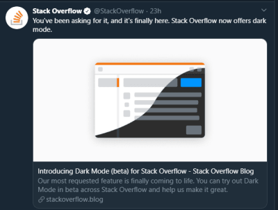
StackOverflow announces dark mode on Twitter (Large preview)
A few days before the writing of this article, StackOverflow announced its release of dark mode, giving users the chance to toggle between the two modes.
Dark mode reduces eye strain and helps when you’re working for a long time on a computer or mobile phone.
What Is Dark Mode?
Dark mode is the color scheme of any interface that displays light text and interface elements on a dark background, which makes the screen a little easier to look at mobile phones, tablets, and computers. Dark mode reduces the light emitted by the screen, while maintaining the minimum color-contrast ratios required for readability.
Why Should You Care About Dark Mode?
Dark mode enhances visual ergonomics by reducing eye strain, adjusting the screen to current light conditions, and providing ease of use at night or in dark environments.
Before implementing dark mode in our app, let’s look at its benefits.
Battery Saving
Dark mode in web and mobile apps can prolong the battery life of a device. Google has confirmed that dark mode on OLED screens has been a huge help to battery life.
For example, at 50% brightness, dark mode in the YouTube app saves about 15% more screen energy than a flat white background. At 100% screen brightness, the dark interface saves a whopping 60% of screen energy.
Dark Mode Is Beautiful
Dark mode is beautiful, and it can significantly enhance the appeal of the screen.
While most products are going for that similar bland white look, dark mode offers something different that feels mysterious and new.
It also provides great opportunities to present graphic content such as dashboards, pictures, and photos in a fresh way.
The beauty of Twitter’s dark mode over light mode (Large preview)
Now that you know why you should implement dark mode in your next web app, let’s dive deep into styled-components, which is the defining resource of this tutorial.
Throughout this article, we will be using the styled-components library very often. There have always been many ways to style a modern web app. There’s the traditional method of styling at the document level, which includes creating an index.css file and linking it to the HTML or styling inside the HTML file.
A lot has changed in the ways that web apps are styled recently, since the introduction of CSS-in-JS.
CSS-in-JS refers to a pattern in which CSS is composed using JavaScript. It utilizes tagged template literals to style components in a JavaScript file.
styled-components is a CSS-in-JS library lets you use all of the features of CSS that you love, including media queries, pseudo-selectors, and nesting.
Why styled-components?
styled-components was created for the following reasons:
No class name hell
Instead of you scratching your head to find a class name for an element, styled-components generates unique class names for your styles. You’ll never have to worry about misspellings or using class names that have no meaning.
Using props
styled-components allow us to extend styling properties using the props parameter, commonly used in React — thus, dynamically affecting the feel of a component via the application’s state.
Supports Sass syntax
Writing Sass syntax out of the box without having to set up any preprocessors or extra build tools is possible with styled-components. In your style definitions, you can use the & character to target the current component, use pseudo-selectors, and experiment with nesting.
Theming
styled-components have full theming support by exporting a ThemeProvider wrapper component. This component provides a theme to all React components within itself via the Context API. In the rendering tree, all styled-components will have access to the provided theme, even when they are multiple levels deep. As we continue in this tutorial, we will look deeper into the theming features of styled-components.
Here, we’ve defined and exported lightTheme and darkTheme objects with distinct color variables. Feel free to experiment and customize the variables to suit you.
globalStyles Component
Remaining in your components folder, create a globalStyles.js file, and add the following code:
We’ve imported createGlobalStyle from styled-components. The createGlobalStyle method replaces the now deprecated injectGlobal method from styled-components version 3. This method generates a React component, which, when added to your component tree, will inject global styles into the document, in our case, App.js.
We defined a GlobalStyle component and assigned background and color properties to values from the theme object. Thus, every time we switch the toggle, the values will change depending on the dark theme or light theme objects that we are passing to ThemeProvider (which will be created later, as we proceed).
The transition property of 0.50s enables this change to occur a little more smoothly, so that as we toggle back and forth, we can see the changes happen.
Creating Theme-Toggling Functionality
To implement the theme-toggling functionality, we need to add only a few lines of code. In the App.js file, add the following code (note that the highlighted code is what you should add):
The highlighted code is the one newly added to App.js. We’ve imported ThemeProvider from styled-components. ThemeProvider is a helper component in the styled-components library that provides theming support. This helper component injects a theme into all React component below itself via the Context API.
In the rendering tree, all styled-components will have access to the provided theme, even when they are multiple levels deep. Check out the section on “Theming”.
Next, we import the GlobalStyle wrapper from ./components/Globalstyle. Lastly, from the top, we import both the lightTheme and darkTheme objects from ./components/Themes.
In order for us to create a toggling method, we need a state that holds our theme’s initial color value. So, we create a theme state, and set the initial state to light, using the useState hook.
Now, for the toggling functionality.
The themeToggler method uses a ternary operator to check the state of the theme, and it toggles either dark or light based on the value of the condition.
ThemeProvider, a styled-components helper component, wraps everything in the return statement and injects any components below it. Remember that our GlobalStyles inject global styles into our components; hence, it’s called inside the ThemeProvider wrapper component.
Lastly, we created a button with an onClick event that assigns our themeToggler method to it.
Let’s see the outcome thus far.
Dark mode implemented without persistence (Large preview)
Our App.js file needs to be refactored; a lot of its code is not DRY. (DRY stands for “don’t repeat yourself”, a basic principle of software development aimed at reducing repetition.) All of the logic seems to be in App.js; it’s good practice to separate our logic for the sake of clarity. So, we’ll create a component that handles the toggling functionality.
Toggle Component
Still within the components folder, create a Toggler.js file, and add the following code to it:
To keep things neat, we’ve styled our toggle button in the Toggle component, using the styled function from styled-components.
This is purely for presentation; you can style the button as you see fit.
Inside the Toggle component, we pass two props:
the theme provides the current theme (light or dark);
the toggleTheme function will be used to switch between themes.
Next, we return the Button component and assign a toggleTheme function to the onClick event.
Lastly, we use propTypes to define our types, ensuring that our theme is a string and isRequired, while our toggleTheme is func and isRequired.
Using Custom Hooks (useDarkMode)
When building an application, scalability is paramount, meaning that our business logic must be reusable, so that we can use it in many places and even in different projects.
That is why it would be great to move our toggling functionality to a separate component. For that, we would create our own custom hook.
Let’s create a new file named useDarkMode.js in the components folder, and move our logic to this file, with some tweaks. Add the following code to the file:
setMode
We use localStorage to persist between sessions in the browser. So, if a user has chosen the dark or light theme, that’s what they’ll get upon their next visit to the app or if they reload the page. Hence, this function sets our state and passes theme to localStorage.
themeToggler
This function uses a ternary operator to check the state of the theme and toggles either dark or light based on the truth of the condition.
useEffect
We’ve implemented the useEffect hook to check on component mounting. If the user has previously selected a theme, we will pass it to our setTheme function. In the end, we will return our theme, which contains the chosen theme and the themeToggler function to switch between modes.
I think you’ll agree that our dark-mode component looks sleek.
First, we import our custom hook, destructure the theme and themeToggler props, and set it with the useDarkMode function.
Note that the useDarkMode method replaces our theme state, which was initially in App.js.
We declare a themeMode variable, which renders either a light or dark theme based on the condition of the theme mode at the time.
Now, our ThemeProvider wrapper component is assigned our just recently created themeMode variable to the theme prop.
And lastly, in place of the regular button, we pass in the Toggle component.
Remember that in our Toggle component, we defined and styled a button and passed both theme and toggleTheme to them as props. So, all we have to do is pass these props appropriately to the Toggle component, which will act as our button in App.js.
Yes! Our dark mode is set, and it persists, not changing color when the page is refreshed or visited in a new tab.
Let’s see the outcome in action:
Dark mode implemented, but with a glitch in the button color when the browser reloads. (Large preview)
Almost everything works well, but there is one small thing we can do to make our experience splendid. Switch to the dark theme and then reload the page. Do you see that the blue color in the button loads before the gray for a brief moment? That happens because our useState hook initiates the light theme initially. After that, useEffect runs, checks localStorage, and only then sets the theme to dark. Let’s jump over to our custom hook useDarkMode.js and add a little code:
The highlighted code is the only one added to useDarkMode.js. We’ve created another state named mountedComponent and set the default value to false using the useState hook. Next, inside the useEffect hook, we set the mountedComponent state to true using setMountedComponent. Lastly, in the return array, we include the mountedComponent state.
Finally, let’s add a bit of code in App.js to make it all work.
We’ve added our mountedComponent state as a prop in our useDarkMode hook, and we’ve checked whether our component has mounted, because this is what happens in the useEffect hook. If it hasn’t happened yet, then we will render an empty div.
Now, you’ll notice that while in dark mode, when the page reloads, the button’s color doesn’t change.
Conclusion
Dark mode is increasingly becoming a user preference, and implementing it in a React web app is a lot easier when using the ThemeProvider theming wrapper in styled-components. Go ahead and experiment with styled-components as you implement dark mode; you could add icons instead of a button.
Please do share your feedback and experience with the theming feature in styled-components in the comments section below. I’d love to see what you come up with!
Want to blog on my iPad? I can. Want to do it on my phone? No problem. On a machine I don’t normally use? Not an issue, as long as it has a browser.
First, it’s worth understanding that by using WordPress it doesn’t opt you out of using a static site generator. WordPress has an API, and that opens the door to hit that API during a build process and build your site that way. That’s what Gatsby does, there is a plugin that exports a static site, and projects like Frontity really blur the lines.
But I agree with Kev here on his reasoning. For all his reasons, and 1,000 more, it’s a perfectly acceptable and often smart choice to run a WordPress site. I think about it in terms of robustness and feature-readiness. Need e-commerce? It’s there. Need forms? There are great plugins. Need to augment how the CMS works? You have control over the types of content and what is in them. Need auth? That’s a core feature. Wish you had a great editing experience? Gutenberg is glorious.
Time and time again, I build what I wanted to build with WordPress quickly and efficiently and it’s made me feel productive and powerful. But I don’t wanna make this specifically about WordPress; this can be true of any “classic” CMS. Craft CMS has a GraphQL API out of the box. We just posted about a Drupal + Jamstack webinar.
In the relatively new world of static sites, a little thing can end up a journey of research and implementation, like you’re the only third person on Earth to ever do it.
Now all that said…
What do I think of static site generators and the Jamstack world? They are awesome.
I think there is a lot to be said about building sites this way. The decoupling of data and front-end is smart. The security is great. The DX, what with the deploy previews and git-based everything is great. The speed you get out of the gate is amazing (serving HTML from a CDN is some feat).
Just like a classic server-side CMS doesn’t opt you out of building a static site, building with a static site doesn’t opt you out of doing dynamic things — even super duper fancy dynamic things. Josh Comeau has a great new post going into this. He built a fancy little app that does a ton in the browser with React, but that doesn’t mean he still can’t deliver a good amount of it statically. He calls it a “mindset shift,” referring to the idea that you might think you need a database call, but do you really? Could that database call have already happened and generated a static file? And if not, still, some of it could have been generated with the last bits coming over dynamically.
I can’t wait for a world where we start really seeing the best of both worlds. We do as much statically as possible, we get whatever we can’t do that way with APIs, and we don’t compromise on the best tools along the way.
When to go with a static site…
If you can, you should consider it, as the speed and security can’t be beaten.
If you’re working with a Greenfield project.
If your project builds from and uses accessible APIs, you could hit that API during the build process as well as use it after the initial HTML loads.
If functionality (like build previews) would be extremely helpful for a workflow.
When to go with server-side software…
If you need the features of a classic CMS (e.g. WordPress), and the technical debt of going static from there is too high.
If you’re already in deep with a server-rendered project (Ruby on Rails, Python, etc.) and don’t have any existing trouble.
If that is where you have the most team expertise.
If a cost analytics says it would be cheaper.
If there aren’t good static solutions around for what want to build (e.g. forums software).
If you have an extreme situation, like millions of URLs, and the build time for static is too high.
Bad reasons to avoid a static site…
You need to do things with servers. (Why? You can still hit APIs on servers, either at build or during runtime.)
You need auth. (Why? Jamstack is perfectly capable of auth with JWTs and such.)
You haven’t even looked into doing things Jamstack-style.
Bad reasons to choose server-side software…
You haven’t even looked into doing things Jamstack-style.
Because you think using comfortable / existing / classic / well-established / well-supported tools opt you out of building anything statically.
Something something SEO. (If anything, statically rendered content should perform better. But it’s understandable if a move to static means moving to client-side calls for something like product data.)


