Recently, CSS has added a lot of new cool features such as custom properties and new functions. While these things can make our lives a lot easier, they can also end up interacting with preprocessors, like Sass, in funny ways.
So this is going to be a post about the issues I’ve encountered, how I go around them, and why I still find Sass necessary these days.
The errors
If you’ve played with the new min() and max() functions, you may have ran into an error message like this when working with different units: “Incompatible units: vh and em.”
An error when working with different types of units in the min()/ max() function
This is because Sass has its ownmin() function, and ignores the CSS min() function. Plus, Sass cannot perform any sort of computation using two values with units that don’t have a fixed relation between them.
For example, cm and in units have a fixed relation between them, so Sass can figure out what’s the result of min(20in, 50cm) and doesn’t throw an error when we try to use it in our code.
The same things goes for other units. Angular units, for example, all have a fixed relation between them: 1turn, 1rad or 1grad always compute to the same deg values. Same goes for 1s which is always 1000ms, 1kHz which is always 1000Hz, 1dppx which is always 96dpi, and 1in which is always 96px. This is why Sass can convert between them and mix them in computations and inside functions such as its own min() function.
But things break when these units don’t have a fixed relation between them (like the earlier case with em and vh units).
And it’s not just different units. Trying to use calc() inside min() also results in an error. If I try something like calc(20em + 7px), the error I get is, “calc(20em + 7px) is not a number for min.”
An error when using different unit values with calc() nested in the min()function
Another problem arises when we want to use a CSS variable or the result of a mathematical CSS function (such as calc(), min() or max()) in a CSS filter like invert().
In this case, we get told that “$color: 'var(--p, 0.85) is not a color for invert.”
var() in filter: invert() error
The same thing happens for grayscale(): “$color: ‘calc(.2 + var(--d, .3))‘ is not a color for grayscale.”
calc() in filter: grayscale() error
opacity() causes the same issue: “$color: ‘var(--p, 0.8)‘ is not a color for opacity.”
var() in filter: opacity() error
However, other filter functions — including sepia(), blur(), drop-shadow(), brightness(), contrast() and hue-rotate()— all work just fine with CSS variables!
Turns out that what’s happening is similar to the min() and max() problem. Sass doesn’t have built-in sepia(), blur(), drop-shadow(), brightness(), contrast(), hue-rotate() functions, but it does have its own grayscale(), invert() and opacity() functions, and their first argument is a $color value. Since it doesn’t find that argument, it throws an error.
For the same reason, we also run into trouble when trying to use a CSS variable that lists at least two hsl()or hsla() values.
var() in color: hsl() error.
On the flip side, color: hsl(9, var(--sl, 95%, 65%)) is perfectly valid CSS and works just fine without Sass.
The exact same thing happens with the rgb()and rgba() functions.
var() in color: rgba() error.
Furthermore, if we import Compass and try to use a CSS variable inside a linear-gradient() or inside a radial-gradient(), we get another error, even though using variables inside conic-gradient() works just fine (that is, if the browser supports it).
var() in background: linear-gradient() error.
This is because Compass comes with linear-gradient() and radial-gradient() functions, but has never added a conic-gradient() one.
The problems in all of these cases arise from Sass or Compass having identically-named functions and assuming those are what we intended to use in our code.
Drat!
The solution
The trick here is to remember that Sass is case-sensitive, but CSS isn’t.
That means we can write Min(20em, 50vh)and Sass won’t recognize it as its own min() function. No errors will be thrown and it’s still valid CSS that works as intended. Similarly, writing HSL()/ HSLA()/ RGB()/ RGBA() or Invert() allows us to avoid issues we looked at earlier.
As for gradients, I usually prefer linear-Gradient() and radial-Gradient() just because it’s closer to the SVG version, but using at least one capital letter in there works just fine.
But why?
Almost every time I tweet anything Sass-related, I get lectured on how it shouldn’t be used now that we have CSS variables. I thought I’d address that and explain why I disagree.
First, while I find CSS variables immensely useful and have used them for almost everything for the past three years, it’s good to keep in mind that they come with a performance cost and that tracing where something went wrong in a maze of calc() computations can be a pain with our current DevTools. I try not to overuse them to avoid getting into a territory where the downsides of using them outweigh the benefits.
Not exactly easy to figure out what’s the result of those calc() expressions.
In general, if it acts like a constant, doesn’t change element-to-element or state-to-state (in which case custom properties are definitely the way to go) or reduce the amount of compiled CSS (solving the repetition problem created by prefixes), then I’m going to use a Sass variable.
Secondly, variables have always been a pretty small portion of why I use Sass. When I started using Sass in late 2012, it was primarily for looping, a feature we still don’t have in CSS. While I’ve moved some of that looping to an HTML preprocessor (because it reduces the generated code and avoids having to modify both the HTML and the CSS later), I still use Sass loops in plenty of cases, like generating lists of values, stop lists inside gradient functions, lists of points inside a polygon function, lists of transforms, and so on.
Here’s an example. I used to generate n HTML items with a preprocessor. The choice of preprocessor matters less, but I’ll be using Pug here.
- let n = 12;

while n--
  .item
Then I would set the $n variable into the Sass (and it would have to be equal to that in the HTML) and loop up to it to generate the transforms that would position each item:
However, this meant that I would have to change both the Pug and the Sass when changing the number of items, making the generated code very repetitive.
CSS generated by the above code
I have since moved to making Pug generate the indices as custom properties and then use those in the transform declaration.
- let n = 12;

body(style=`--n: ${n}`)
  - for(let i = 0; i < n; i++)
    .item(style=`--i: ${i}`)
Sure, I could generate it as a list variable from Pug, but doing so doesn’t take advantage of the dynamic nature of CSS variables and it doesn’t reduce the amount of code that gets served to the browser, so there’s no benefit coming out of it.
Another big part of my Sass (and Compass) use is tied to built-in mathematical functions (such as trigonometric functions), which are part of the CSS spec now, but not yet implemented in any browser. Sass doesn’t come with these functions either, but Compass does and this is why I often need to use Compass.
And, sure, I could write my own such functions in Sass. I did resort to this in the beginning, before Compass supported inverse trigonometric functions. I really needed them, so I wrote my own based on the Taylor series. But Compass provides these sorts of functions nowadays and they are better and more performant than mine.
Mathematical functions are extremely important for me as I’m a technician, not an artist. The values in my CSS usually result from mathematical computations. They’re not magic numbers or something used purely for aesthetics. A example is generating lists of clip paths points that create regular or quasi-regular polygons. Think about the case where we want to create things like non-rectangular avatars or stickers.
Let’s consider a regular polygon with vertices on a circle with a radius 50% of the square element we start from. Dragging the slider in the following demo allows us to see where the points are placed for different numbers of vertices:
CodePen Embed Fallback
Putting it into Sass code, we have:
@mixin reg-poly($n: 3) {
  $ba: 360deg/$n; // base angle
  $p: (); // point coords list, initially empty

  @for $i from 0 to $n {
    $ca: $i*$ba; // current angle
    $x: 50%*(1 + cos($ca)); // x coord of current point
    $y: 50%*(1 + sin($ca)); // y coord of current point
    $p: $p, $x $y // add current point coords to point coords list
  }

  clip-path: polygon($p) // set clip-path to list of points
}
Note that here we’re also making use of looping and of things such as conditionals and modulo that are a real pain when using CSS without Sass.
A slightly more evolved version of this might involve rotating the polygon by adding the same offset angle ($oa) to the angle of each vertex. This can be seen in the following demo. This example tosses in a star mixin that works in a similar manner, except we always have an even number of vertices and every odd-indexed vertex is situated on a circle of a smaller radius ($f*50%, where $f is sub-unitary):
CodePen Embed Fallback
We can also have chubby stars like this:
CodePen Embed Fallback
Or stickers with interesting border patterns. In this particular demo, each sticker is created with a single HTML element and the border pattern is created with clip-path, looping and mathematics in Sass. Quite a bit of it, in fact.
CodePen Embed Fallback
Another example are these card backgrounds where looping, the modulo operation and exponential functions work together to generate the dithering pixel background layers:
CodePen Embed Fallback
This demo just happens to rely heavily on CSS variables as well.
Then there’s using mixins to avoid writing the exact same declarations over and over when styling things like range inputs. Different browsers use different pseudo-elements to style the components of such a control, so for every component, we have to set the styles that control its look on multiple pseudos.
Sadly, as tempting as it may be to put this in our CSS:
input::-webkit-slider-runnable-track,
input::-moz-range-track,
input::-ms-track { /* common styles */ }
…we cannot do it because it doesn’t work! The entire rule set is dropped if even one of the selectors isn’t recognized. And since no browser recognises all three of the above, the styles don’t get applied in any browser.
We need to have something like this if we want our styles to be applied:
input::-webkit-slider-runnable-track { /* common styles */ }
input::-moz-range-track { /* common styles */ }
input::-ms-track { /* common styles */ }
But that can mean a lot of identical styles repeated three times. And if we want to change, say, the background of the track, we need to change it in the ::-webkit-slider-runnable-track styles, in the ::-moz-range-track styles and in the ::-ms-track styles.
The only sane solution we have is to use a mixin. The styles get repeated in the compiled code because they have to be repeated there, but we don’t have to write the same thing three times anymore.
Working with wrapper elements is definitely on both those lists. Wrappers (or containers or whatever) are so common — especially when establishing grid layouts and boundaries for the elements inside them — that it’s easy to take them for granted and reach for them without stepping back to consider how they work, why we use them, and how to use them effectively.
Ahmed Shadeed wrote up the most exhaustive article on wrappers I’ve ever read. He provides a brief overview of them before diving into a bunch of considerations and techniques for working with them, including:
When to use them
How to size them
Positioning them
Adding margin and padding
Working with CSS grid and other display values
Breaking out of the wrapper
Using CSS custom properties
If you take the images from the article, it tells a pretty cool story.
Storytelling is essential when it comes to branding.
Without a story, your brand won’t stand out and you’ll look like everyone else.
When you have a story, people are more likely to remember who you are and what you have to offer.
Storytelling in branding can have an emotional impact on your clients, and while you tell your story, you’re also telling them important facts about your business.
You may have an amazing story, but you might not be telling it right.
You can tell your story just through your design and it can be very easy to understand.
Today we’re going to cover 5 essential elements of storytelling in branding that you need to know about.
Let’s do it!
1. Know Your Audience
You know you have an amazing, effective brand story when you can impact your audience in all stages of their customer journey.
One of the greatest ways you can find out who your audience is through the use of research.
So who is your core demographic?
You can answer this is a few different ways, but two ways specifically are obtaining customer data using the browser and purchase history to track preferences, and also by asking your followers directly on your social media.
The reason why it’s so important to know your audience is because you’re designing for them.
You need to know who you are trying to reach because design is not one-size-fits-all.
Once you know who your audience is, you’ll know what style to go for.
2. Find Your Style and Be Authentic
Once you know your audience, it’s time to determine your style.
You don’t need to fit into the mold and be like everyone else.
You need to be authentic, true to yourself, and relevant to your product.
A few questions you can ask yourself before figuring out your style are:
Why does my brand exist?
What problems do I help people solve?
What do I do differently than my competitors?
What obstacles have we overcome as a brand?
Once you start answering some of these questions, you can start designing.
3. Be Consistent
You’ve heard it been said before, “Consistency is key”.
Having consistent branding is going to be crucial in your brand recognition.
You can’t have half of your branding be neutral, flat design and minimalistic, and the other half neon and 3-D.
It just doesn’t work.
Your branding needs to be aesthetic and should be consistent over all platforms.
Once you create a consistent branding style that works for you, people will begin to recognize your brand subconsciously.
4. Build Your Character
In order to have effective brand storytelling, you have to build a brand character that your audience will be able to relate to.
You have to be approachable by your audience.
The way that you can build character for your brand is by using a language that your audience would use, so that you’re relatable.
So if you are approaching a younger, fun generation, then maybe use terminology they understand and create fun memes to post on social media, talk to them like they’re as your friends, etc.
You could create cool and colorful visuals that they would be happy to share.
And the opposite would be true for a more formal branding approach. If you’re a large corporation, then use more formal language and more elegant and sleek visuals.
Create the character that reflects your brand and try to reach your audience at the level they’re at.
Be true to yourself and your brand, because people can see right through a pretend character.
5. Find Your Competitors, Then Do Better
My final piece of advice definitely sounds a bit harsh, but find your competitors, research their branding, see what you like and dislike about what they’ve done, then do better.
You need to prove yourself to your audience and tell them why they should use your services and buy your product, instead of buying your competitor’s products.
What makes you different? What makes you stand out?
Answer those questions throughout your website through your design.
So, see what your competition is doing, do it better.
Do it for yourself.
Your product deserves the attention of others and you’ll get that through great storytelling in your branding.
We hope you found these 5 tips helpful and that you’ll have a great time finding clever ways to implement your story into your branding.
Notifications have become a stable part of the web nowadays. It’s not uncommon to come across sites asking for permission to send notifications to your browser. Most modern web browsers implement the push API and are able to handle push notifications. A quick check on caniuse shows that the API enjoys wide support among modern chrome-based browsers and Firefox browser.
There are various services for implementing notifications on the web. Notable ones are Pusher and Firebase. In this article, we’ll implement push notifications with the Firebase Cloud Messaging (FCM) service, which is “a cross-platform messaging solution that lets you reliably send messages at no cost”.
I assume that the reader has some familiarity with writing a back-end application in Express.js and/or some familiarity with React. If you’re comfortable with either of these technologies, then, you could work with either the frontend or backend. We will implement the backend first, then move on to the frontend. In that way, you can use whichever section appeals more to you.
So let’s get started.
Types Of Firebase Messages
The Firebase documentation specifies that an FCM implementation requires two components.
A trusted environment such as Cloud Functions for Firebase or an app server on which to build, target, and send messages.
An iOS, Android, or web (JavaScript) client app that receives messages via the corresponding platform-specific transport service.
We will take care of item 1 in our express back-end app, and item 2 in our react front-end app.
The docs also state that FCM lets us send two types of messages.
Notification messages (sometimes thought of as “display messages”) are handled by the FCM SDK automatically.
Data messages are handled by the client app.
Notification messages are automatically handled by the browser on the web. They can also take an optional data payload, which must be handled by the client app. In this tutorial, we’ll be sending and receiving data messages, which must be handled by the client app. This affords us more freedom in deciding how to handle the received message.
Setting Up A Firebase Project
The very first thing we need to do is to set up a Firebase project. FCM is a service and as such, we’ll be needing some API keys. This step requires that you have a Google account. Create one if you don’t already have one. You can click here to get started.
After setting up your Google account, head on to the Firebase console.
Click on add project. Enter a name for your project and click on continue. On the next screen, you may choose to turn off analytics. You can always turn it on later from the Analytics menu of your project page. Click continue and wait a few minutes for the project to be created. It’s usually under a minute. Then click on continue to open your project page.
Once we’ve successfully set up a project, the next step is to get the necessary keys to work with our project. When working with Firebase, we need to complete a configuration step for the frontend and backend separately. Let’s see how we can obtain the credentials needed to work with both.
Frontend
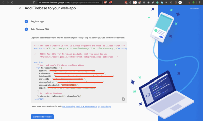
On the project page, click on the icon to add Firebase to your web app.
Give your app a nickname. No need to set up Firebase hosting. Click on Register app and give it a few seconds to complete the setup. On the next screen, copy out the app credentials and store them somewhere. You could just leave this window open and come back to it later.
We’ll be needing the configuration object later. Click on continue to console to return to your console.
Backend
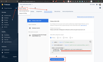
We need a service account credential to connect with our Firebase project from the backend. On your project page, click on the gear icon next to Project Overview to create a service account for use with our Express backend. Refer to the below screenshot. Follow steps 1 to 4 to download a JSON file with your account credentials. Be sure to keep your service account file in a safe place.
Steps for creating a service account credential. (Large preview)
I’ll advise you not to download it until you’re ready to use it. Just remember to come back to these sections if you need a refresher.
So now we’ve successfully set up a Firebase project and added a web app to it. We’ve also seen how to get the credentials we need to work with both the frontend and backend. Let’s now work on sending push notifications from our express backend.
Getting Started
To make it easier to work through this tutorial, I’ve set up a project on Github with both a server and a client. Usually, you’ll have a separate repo for your backend and frontend respectively. But I’ve put them together here to make it easier to work through this tutorial.
Create a fork of the repo, clone it to your computer, and let’s get our front-end and back-end servers started.
Fork the repo and check out the 01-get-started branch.
Open the project in your code editor of choice and observe the contents.
In the project root, we have two folders, client/ and server/. There’s also a .editorconfig file, a .gitignore, and a README.md.
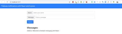
The client folder contains a React app. This is where we will listen for notifications.
Open a terminal and navigate to the client/ folder. Run the yarn install command to install the project dependencies. Then run yarn start to start the project. Visit http://localhost:3000 to see the live app.
Create a .env file inside the server/ folder and add the CONNECTION_STRING environment variable. This variable is a database connection URL pointing to a PostgreSQL database. If you need help with this, check out the Connecting The PostgreSQL Database And Writing A Model section of my linked article. You should also provide the PORT environment variable since React already runs on port 3000. I set PORT=3001 in my .env file.
Open a separate terminal and navigate to the server/ folder. Run the yarn install command to install the project dependencies. Run yarn runQuery to create the project database. Run yarn startdev to start the project. Visit http://localhost:3001/v1/messages and you should see some messages in a JSON format.
Frontend and backend servers running. (Large preview)
Now that we have our front-end and back-end apps running, let’s implement notifications in the backend.
Setting Up Firebase Admin Messaging On The Backend
Sending out push notifications with FCM on the backend requires either the Firebase admin SDK or the FCM server protocols. We’ll be making use of the admin SDK in this tutorial. There’s also the notifications composer, which is good for “testing and sending marketing and engagement messages with powerful built-in targeting and analytics”.
In your terminal, navigate to the server/ folder and install the Admin SDK.
The value of this variable is the path to your downloaded service account credentials. At this point, you probably want to go back to the section where we created the service account for our project. You should copy the admin initialization code from there and also download your service account key file. Place this file in your server/ folder and add it to your .gitignore.
Remember, in an actual project, you should store this file in a very secure location on your server. Don’t let it get into the wrong hands.
Open server/src/settings.js and export the application credentials file path.
# export the service account key file path
export const googleApplicationCredentials = process.env.GOOGLE_APPLICATION_CREDENTIALS;
Create a file server/src/firebaseInit.js and add the below code.
We import the admin module from firebase-admin. We then initialize the admin app with our service account file. Finally, we create and export the messaging feature.
Note that I could have passed the path to my service account key file directly, but it is the less secure option. Always use environment variables when dealing with sensitive information.
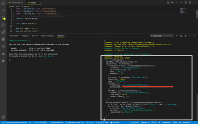
To check that you completed the initialization successfully, open up server/src/app.js and include the following lines.
import { messaging } from './firebaseInit'
console.log(messaging)
We import the messaging instance and log it in the console. You should see something like the picture below. You should remove these once you verify that your admin is set up correctly.
If you run into any problems, you can check out the 02-connect-firebase-admin branch of my repo for comparison.
Now that we’ve successfully setup admin messaging, let’s now write the code to send the notifications.
Sending Push Notifications From The Backend
FCM data message configuration is very simple. All you have to do is supply one or more target(s) and a JSON of the message you wish to send to the client(s). There are no required keys in the JSON. You alone decide what key-value pairs you want to include in the data. The data messages form works across all platforms, so our notification could also be processed by mobile devices.
There are additional configurations for other platforms. For example, there’s an android settings that only work with android devices and apns settings that work on only iOS devices. You can find the configuration guide here.
Create a file server/src/notify.js and enter the below code.
import { messaging } from './firebaseInit';

export const sendNotificationToClient = (tokens, data) => {
  // Send a message to the devices corresponding to the provided
  // registration tokens.
  messaging
    .sendMulticast({ tokens, data })
    .then(response => {
      // Response is an object of the form { responses: [] }
      const successes = response.responses.filter(r => r.success === true)
        .length;
      const failures = response.responses.filter(r => r.success === false)
        .length;
      console.log(
        'Notifications sent:',
        `${successes} successful, ${failures} failed`
      );
    })
    .catch(error => {
      console.log('Error sending message:', error);
    });
};
We created a function that accepts an array of token strings and a data object. Each token string represents a device that has accepted to receive notifications from our back-end application. The notification will be sent to each client in the tokens array. We’ll see how to generate the token in the front-end section of the tutorial.
The messaging instance’s sendMulticast method returns a promise. On success, we get an array from which we count the number of successes as well as failed notifications. You could certainly handle this response anyhow you want.
Let’s use this function to send out a notification each time a new message is added to the database.
Open server/src/controllers/message.js and update the addMessage function.
This function handles a post request to the /messages endpoint. Once a message is successfully created, a notification is sent out by the sendNotificationToClient function followed by the response to the client. The only missing piece in this code is the tokens to send the notifications to.
When we connect the client app, we’ll copy the generated token and paste it in this file. In a production app, you’ll store the tokens somewhere in your database.
With this last piece of code, we’ve completed the back-end implementation. Let’s now switch over to the frontend.
This is a regular react component styled with react-bootstrap. There’s a toast component right at the top of our app, which we shall use to display notifications. Note that we also set the baseURL for the axios library. Everything of note happens inside the component. Let’s now take a look at its content.
Open up client/src/Messaging.js and inspect the content.
We have two state variables, messages and requesting. messages represent the list of messages from our database and requesting is for toggling our loader state. We have a React.useEffect block where we make our API call to the /messages endpoint and set the returned data in our messages state.
In the return statement, we map over the messages and display the name and message fields. On the same page, we include a form for creating new messages.
We’re using the Formik library to manage our form. We pass the component an initialvalues props, an onSubmit prop and the form component we want to render. In return, we get back some handy functions such as handleChange which we can use to manipulate our form inputs, and handleSubmit which we use to submit the form. isSubmitting is a boolean that we use to toggle the submit button state.
I encourage you to give formik a try. It really simplifies working with forms. We will replace the code in the onSubmit method later.
Let’s now implement the method that will request a browser’s permission and assign it a token.
To start using Firebase in the frontend, we have to install the Firebase JavaScript client library. Note that this is a different package from the firebase-admin SDK.
“The full Firebase JavaScript client includes support for Firebase Authentication, the Firebase Realtime Database, Firebase Storage, and Firebase Cloud Messaging.”
So here, we import only the messaging feature. At this point, you could refer to the section on creating a Firebase project to get the config object. We then initialize Firebase and export the messaging feature. Let’s add in the final block of code.
The requestFirebaseNotificationPermission function requests the browser’s permission to send notifications and resolves with a token if the request is granted. This is the token that FCM uses to send a notification to the browser. It is what triggers the prompt you see on browsers asking for permission to send a notification.
The onMessageListener function is only invoked when the browser is in the foreground. Later, we will write a separate function to handle the notification when the browser is in the background.
Open up client/src/App.js and import the requestFirebaseNotificationPermission function.
import { requestFirebaseNotificationPermission } from './firebaseInit'
Then inside the App function, add the below code before the return statement.
Once the app loads this function runs and requests the browser’s permission to show notifications. If the permission is granted, we log the token. In a production app, you should save the token somewhere that your backend can access. But for this tutorial, we’re just going to copy and paste the token into the back-end app.
Now run your app and you should see the notification request message. Click allow and wait for the token to be logged to the console. Since you’ve granted the browser permission, if we refresh the page you won’t see the banner anymore, but the token will still be logged to the console.
You should know that Firefox browser (v75) doesn’t ask for notification permission by default. The permission request has to be triggered by a user-generated action like a click.
This is a good point for me to commit my changes. The corresponding branch is 04-request-permission.
Let’s now complete the code for saving a message to our database.
Open up client/src/Messaging.js and replace the onSubmit function of our form with the below code.
onSubmit={(values, actions) => {
  axios
    .post("/messages", values)
    .then((resp) => {
      setMessages(resp.data.messages.concat(messages));
      actions.setSubmitting(false);
      toast.success("Submitted succesfully");
    })
    .catch((err) => {
      console.log(err);
      toast.error("There was an error saving the message");
    });
}}
We make a post request to the /messages endpoint to create a new message. If the request succeeds we take the returned data and put it at the top of the messages list. We also display a success toast.
Let’s try it out to see if it works. Start the front-end and back-end servers. Before trying out the post request, open server/src/controllers/messages.js and comment out the line where we’re sending the notification.
# this line will throw an error if tokens is an empty array comment it out temporarily
// sendNotificationToClient(tokens, notificationData);
Try adding some messages to the database. Works? That’s great. Now uncomment that line before continuing.
Copy the notification token from the developer console and paste it into the tokens array. The token is a very long string, as shown below.
Open client/src/Messaging.js, import the onMessageListener and invoke it just under the useEffect block. Any position within the function is fine as long it’s before the return statement.
The listener returns a promise which resolves to the notification payload on success. We then display the title and body in a toast. Note that we could have taken any other action once we receive this notification but I’m keeping things simple here. With both servers running, try it out and see if it’s working.
Works? That’s great.
In case you run into problems, you could always compare with my repo. The corresponding branch at this point is 05-listen-to-notification.
There’s just one bit we need to take care of. Right now we can only see notifications when the browser is in the foreground. The point about notifications is that it should pop up whether the browser is in the foreground or not.
If we were to be sending a display message i.e. we included a notification object in our notification payload, the browser will take care of that on its own. But since we’re sending a data message, we have to tell the browser how to behave in response to a notification when our browser is in the background.
To handle the background notification we need to register a service worker with our front-end client.
Create a file client/public/firebase-messaging-sw.js and enter the following content:
At the top of the file, we’re importing the firebase-app and the firebase-messaging libraries since we only need the messaging feature. Don’t worry if the import syntax is new. It’s a syntax for importing external scripts into service worker files. Make sure that the version being imported is the same as the one in your package.json. I’ve run into issues that I solved by harmonizing the versions.
As usual, we initialize Firebase, then we invoke the setBackgroundMessageHandler, passing it a callback, which receives the notification message payload. The remaining part of the code specifies how the browser should display the notification. Notice that we can also include an icon to display as well.
We can also control what happens when we click on the notification with the notificationclick event handler.
Create a file client/src/serviceWorker.js and enter the below content.
This function registers our service worker files. Note that we have replaced the more detailed version generated by React. We first check if the serviceWorker is present in the navigator object. This is simple browser support. If the browser supports service workers, we register the service worker file we created earlier.
Now open client/src/index.js, import this function, and invoke it.
# other imports

import { registerServiceWorker } from './serviceWorker'

ReactDOM.render(
  ...
);

registerServiceWorker()
If all goes well, you should see the service worker’s scope logged to your console.
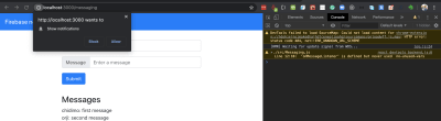
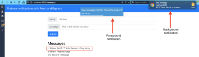
Open http://localhost:3000/messaging in a second browser and create a message. You should see the notification from the other browser come into view.
Background and foreground notifications. (Large preview)
In this article, we learned about the different types of notification messages we can send with the Firebase Cloud Messaging (FCM). API. We then implemented the “data message” type on the backend. Finally, we generated a token on the client app which we used to receive notification messages triggered by the back-end app. Finally, we learned how to listen for and display the notification messages when the browser is in either the background or foreground.
I encourage you to take a look at the FCM docs to learn more.
Ya know, for a site called “CSS-Tricks” that I’ve run for well over a decade, it’s a little funny we’ve never done a book under that name. I’ve written a book about WordPress and SVG, but never CSS!
Well, allow me to change that. I’ve been working on a “book” called The Greatest CSS Tricks Vol. I, as my attempt to stay true to this site’s name! The big idea to make it like a coffee-table book for CSS, where each chapter is totally independent and talks about one literal CSS trick that I’ve found to be exceptionally clever and useful. A book about quite literally the best CSS tricks I’ve come across over the years.
I quoted the word “book” above because this is the loosest possible definition of a book. I have not yet made it into an eBook format. I have not even considered printing it yet (although there is a “full book” URL available with the whole book together for printing and print-to-PDFing). This book exists as URLs which are essentially fancy blog posts grouped together. I’m also calling it Volume I as there are already ideas for another one!
Some chapters are fairly broadly known concepts that I’m writing up to put a point on. But many of the chapters are based on ideas that can be traced back to individual people and I always try to credit them directly.
I say so far because I might add a few and rearrange them and such, not to mention it could still use a healthy bit of editing. But I think the bulk of the value of the book is already there.
Value? I think so. While it’s fun to learn some CSS trickery, I think there is value beyond the tricks themselves. Tricks help you see how CSS works at a deeper level. When you understand the trick, you’re seeing how that part of CSS works through a new lens and it helps you be more in tune with the nature of that CSS. It will help you reach for those CSS properties more intuitively when you know what they are capable of.
In another sense, it’s like taking a walk with weights in your backpack. You do it on purpose so that when you walk normally, it feels easier. The tricks are like mental weights. They make writing non-tricky CSS feel easier.
So about buying the book. You don’t buy the book directly. What you buy is an MVP Supporter membership to this site. When you’re an MVP Supporter, you have access to the book, and more. This is the whole package:
No Ads. You see no ads on this site, except for sponsored posts which are just blog posts and I try to make useful anyway.
Extra Content. You can read the digital books I’m making (you can already read some chapters, but they are under progress.)
Easier Commenting. You’ll be logged in, so leaving comments is easier and won’t require the delay for approval.
Good feels. An extreme sense of satisfaction of supporting this site and our commitment to bringing you useful tech knowledge.
It’s just just $20/year.
Have I, or this site, helped you out over the years? This is the best way to say thanks.
Also, if you would really like to have access to read the book, and can’t afford it right now, I totally get it. Email me at chriscoyier@gmail.com and we can work that out.
Your website’s homepage is the forefront of your business. It could lure people in or scare them out of your store.
This is the place where you introduce your products, explain how they can help people solve their problems, gain people’s trust and ensure them that you’re the business they need to work with, help them deal with their uncertainties, etc.
If you already don’t have a strategy to address all these in your homepage, you’re basically missing out on a lot of growth potential. Your visitors are passively visiting your homepage and you’re missing out the opportunity to capture them as leads and increase your conversions. Here are some practised to optimize your homepage and increase homepage conversions:
1. CTA’s above the fold
There’s always been a debate on whether you should include your most important CTA’s (call to actions) above the fold or below it. It seems quite logical to note that people see above the fold first and so it should have more influence on them. However, some marketers argue that people tend to scroll through the page (especially on their mobile phones) and the notion of above the fold might not be that relevant these days. They tend to look for CTA’s below the fold where they scroll down to find more information.
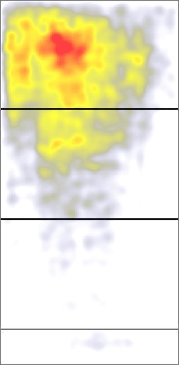
However, according to a study by Nielsen Norman Group, people view the 100 pixels above the fold %102 more than the 100 pixels below the fold. This is the heatmap that the study presents to back its claim:
Red dots are the places people look at the most. Yellow dots are the places people looked less, and white dots are the places people paid almost no attention to. So obviously marketers defending the above the fold notion have something to say when it comes to data-driven research.
This has a strong message for marketers:
If you want the most important elements on your page to be seen and clicked more often, you need to place them above the fold where people pay the most attention.
One of the most important elements of a home page is the call to actions (CTA’s). Some buttons with texts asking you to do a specific action such as “subscribe”, “read more”, “buy now” or any other action. You need to use these CTA’s to trigger people to do the action you desire the most from your visitors. If you need your visitors’ email addresses for email marketing, it’s a good idea to offer a lead magnet and use a “subscribe” button to ask for their email address in exchange for your lead magnet. If you want them to read your blog first and get to know your thought process, it’s good to use a “read more” CTA button.
The point is to have the maximum visibility and effect on your readers, you need to insert your most desired CTA right above the fold.
2. Various CTA’s
Now that you know the importance of CTA’s in a home page, it’s a good idea to consider whether you should only include one specific CTA with only one intention in your homepage, or you should include various CTA’s with different goals in it.
It makes sense that using only one CTA will make the decision-making process way easier for your visitors. If browsing our Joomla templates inventory is the main action we want our visitors to do why not only one CTA to ask people to do it without adding other CTA’s to divert them from the main action we want them to do.
Some marketers might disagree with unilateral CTA’s on the homepage because it would attract only a portion of your visitors. People come across your website with different intentions. They might be looking to review your products, they might tend to read your blog, or they might have done their research and only visit your website to buy right away from you. In this case, it makes perfect sense to include some CTA’s with different intentions to make sure you’re eliciting some action from all your visitor segments.
In a study published on WordStream, I found that most top business websites had multiple CTA’s above the fold and that the most common combination of these CTA’s was Sample + More info type CTA’s. In another study, ReferralCandy explains that for a CTA to be effective, it needs to have certain features including:
Using action phrases
Using first-person
Creating a sense of urgency
Eliminating roadblocks or friction
Standing out and easy to find
3. Social proof
When people visit your homepage for the first time, they’re looking for some signs that indicate they can trust you. It’s not that they would be amazed at your services and buy from you right away. They do everything they can to make sure your claims are valid and that they can trust you.
Your homepage plays an important part in building trust with your visitors. You need to use social proof on your homepage to gain people’s trust. Some of the most popular social proofs are:
Case studies: You could mention the detailed success story of your clients.
Testimonials: You could use recommendations from your happy customers.
Reviews: You could feature real reviews of your products or services by trusted sources.
Social Media: Showing how many followers you have or showing their positive posts about you is a good way to gain new visitors’ trust.
Trust Icons: You can showcase the logos of the companies you’ve worked with or the publications you’ve been featured on.
Data/Numbers: If you have worked with an impressive number of people or have achieved impressive results with them, you can show the data/numbers on your homepage.
Getting any of these social proof elements for your website is easier said than done. You need to have a really good track record so that you could get testimonials from your clients. Reach out to your previous clients and ask for testimonials. You should also actively reach out to bloggers and ask them to review your products in their review articles. An example of a great review article to be featured on is Ben Aston’s best Gantt Chart Makers review. You might want to offer them a free trial of your software and an affiliate link to get featured in their review articles. You can then take an extract from the article and feature it on your homepage as a positive review. A good website template is a time saver when placing testimonials on a page. If you’re using WordPress, a good WordPress template has the testimonial section by default.
Using any of these elements on your homepage would make it possible for your visitors to trust you. Automate.io uses various social proof types on their Zapier alternative landing page to build the most level of trust with their visitors.
Finally:
To increase your homepage conversions, you need to stick to some of the tried and tested homepage optimization practices recommended by most experts. You can also A/B test some of these elements and see what’s working best for you. Some of these practices are using your main CTA’s above the fold, using various CTA types to capture people with different intentions, and using social proof on your homepage to build trust.
Your website’s homepage is the forefront of your business. It could lure people in or scare them out of your store.
This is the place where you introduce your products, explain how they can help people solve their problems, gain people’s trust and ensure them that you’re the business they need to work with, help them deal with their uncertainties, etc.
If you already don’t have a strategy to address all these in your homepage, you’re basically missing out on a lot of growth potential. Your visitors are passively visiting your homepage and you’re missing out the opportunity to capture them as leads and increase your conversions. Here are some practised to optimize your homepage and increase homepage conversions:
1. CTA’s above the fold
There’s always been a debate on whether you should include your most important CTA’s (call to actions) above the fold or below it. It seems quite logical to note that people see above the fold first and so it should have more influence on them. However, some marketers argue that people tend to scroll through the page (especially on their mobile phones) and the notion of above the fold might not be that relevant these days. They tend to look for CTA’s below the fold where they scroll down to find more information.
However, according to a study by Nielsen Norman Group, people view the 100 pixels above the fold %102 more than the 100 pixels below the fold. This is the heatmap that the study presents to back its claim:
Red dots are the places people look at the most. Yellow dots are the places people looked less, and white dots are the places people paid almost no attention to. So obviously marketers defending the above the fold notion have something to say when it comes to data-driven research.
This has a strong message for marketers:
If you want the most important elements on your page to be seen and clicked more often, you need to place them above the fold where people pay the most attention.
One of the most important elements of a home page is the call to actions (CTA’s). Some buttons with texts asking you to do a specific action such as “subscribe”, “read more”, “buy now” or any other action. You need to use these CTA’s to trigger people to do the action you desire the most from your visitors. If you need your visitors’ email addresses for email marketing, it’s a good idea to offer a lead magnet and use a “subscribe” button to ask for their email address in exchange for your lead magnet. If you want them to read your blog first and get to know your thought process, it’s good to use a “read more” CTA button.
The point is to have the maximum visibility and effect on your readers, you need to insert your most desired CTA right above the fold.
2. Various CTA’s
Now that you know the importance of CTA’s in a home page, it’s a good idea to consider whether you should only include one specific CTA with only one intention in your homepage, or you should include various CTA’s with different goals in it.
It makes sense that using only one CTA will make the decision-making process way easier for your visitors. If browsing our Joomla templates inventory is the main action we want our visitors to do why not only one CTA to ask people to do it without adding other CTA’s to divert them from the main action we want them to do.
Some marketers might disagree with unilateral CTA’s on the homepage because it would attract only a portion of your visitors. People come across your website with different intentions. They might be looking to review your products, they might tend to read your blog, or they might have done their research and only visit your website to buy right away from you. In this case, it makes perfect sense to include some CTA’s with different intentions to make sure you’re eliciting some action from all your visitor segments.
In a study published on WordStream, I found that most top business websites had multiple CTA’s above the fold and that the most common combination of these CTA’s was Sample + More info type CTA’s. In another study, ReferralCandy explains that for a CTA to be effective, it needs to have certain features including:
Using action phrases
Using first-person
Creating a sense of urgency
Eliminating roadblocks or friction
Standing out and easy to find
3. Social proof
When people visit your homepage for the first time, they’re looking for some signs that indicate they can trust you. It’s not that they would be amazed at your services and buy from you right away. They do everything they can to make sure your claims are valid and that they can trust you.
Your homepage plays an important part in building trust with your visitors. You need to use social proof on your homepage to gain people’s trust. Some of the most popular social proofs are:
Case studies: You could mention the detailed success story of your clients.
Testimonials: You could use recommendations from your happy customers.
Reviews: You could feature real reviews of your products or services by trusted sources.
Social Media: Showing how many followers you have or showing their positive posts about you is a good way to gain new visitors’ trust.
Trust Icons: You can showcase the logos of the companies you’ve worked with or the publications you’ve been featured on.
Data/Numbers: If you have worked with an impressive number of people or have achieved impressive results with them, you can show the data/numbers on your homepage.
Getting any of these social proof elements for your website is easier said than done. You need to have a really good track record so that you could get testimonials from your clients. Reach out to your previous clients and ask for testimonials. You should also actively reach out to bloggers and ask them to review your products in their review articles. An example of a great review article to be featured on is Ben Aston’s best Gantt Chart Makers review. You might want to offer them a free trial of your software and an affiliate link to get featured in their review articles. You can then take an extract from the article and feature it on your homepage as a positive review. A good website template is a time saver when placing testimonials on a page. If you’re using WordPress, a good WordPress template has the testimonial section by default.
Using any of these elements on your homepage would make it possible for your visitors to trust you. Automate.io uses various social proof types on their Zapier alternative landing page to build the most level of trust with their visitors.
Finally:
To increase your homepage conversions, you need to stick to some of the tried and tested homepage optimization practices recommended by most experts. You can also A/B test some of these elements and see what’s working best for you. Some of these practices are using your main CTA’s above the fold, using various CTA types to capture people with different intentions, and using social proof on your homepage to build trust.
The biggest trend we’re talking about this month started at WWDC as Apple provided a glimpse of what’s coming next for their operating systems. This time around there’s a distinct design element. Did you catch it?
Here’s what’s trending in design this month.
1. Text Highlights and Underlines
There’s always been an unwritten rule in website design that text uses more plain styles. Bold is acceptable, italics are OK from time to time, but underlining is seldom used.
This design trend bucks that concept with text elements that use highlighter or underline elements to emphasize key words. And it works rather nicely.
What it takes to make this work is plenty of contrast and a design style that fits with underline or highlighted elements.
This design trend works thanks to clear intention. The words are obviously important to the overall meaning of the design or what visitors should take away from the content.
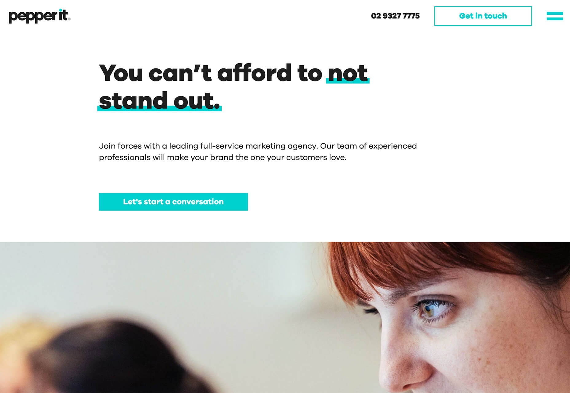
Pepper It uses a nifty underline that the letters seem to rest inside of to highlight a key phrase. The shape and color also mimic that of the larger button below, helping the eyes move from one element to the next. It’s an effective use of an underline (or maybe you could call it a highlight) effect in conjunction with brand colors.
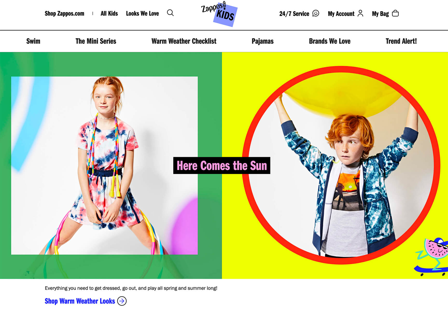
Zappos Kids uses a fun highlight in a colorful scheme to highlight a key text element. It almost looks like a button and helps website visitors understand that the entire hero image area is clickable. The highlight serves to make the text more readable and the interactive element more functional.
Zeus Jones uses a variety of text treatments on the homepage, but arguable the underline is most noticeable, likely because it is the most unfamiliar in the context of website design.
2. Distinct Geometry
Geometric shapes in website design have popped up as trending elements in a variety of forms. This iteration is pretty simple: Use of distinct geometry as part of the overall aesthetic.
Geometry might pair with illustrations, photos, text, or in the background or foreground. What’s great about shapes is that they are versatile and work with a lot of other design patterns.
What can be the most challenging about shapes and design is that distinct geometry requires some space and thought. Just tossing a few triangles or rectangles in a design without reason can look rather strange.
So how can you add geometric shapes to a design so that they look intentional? These examples do it well (and in three different ways).
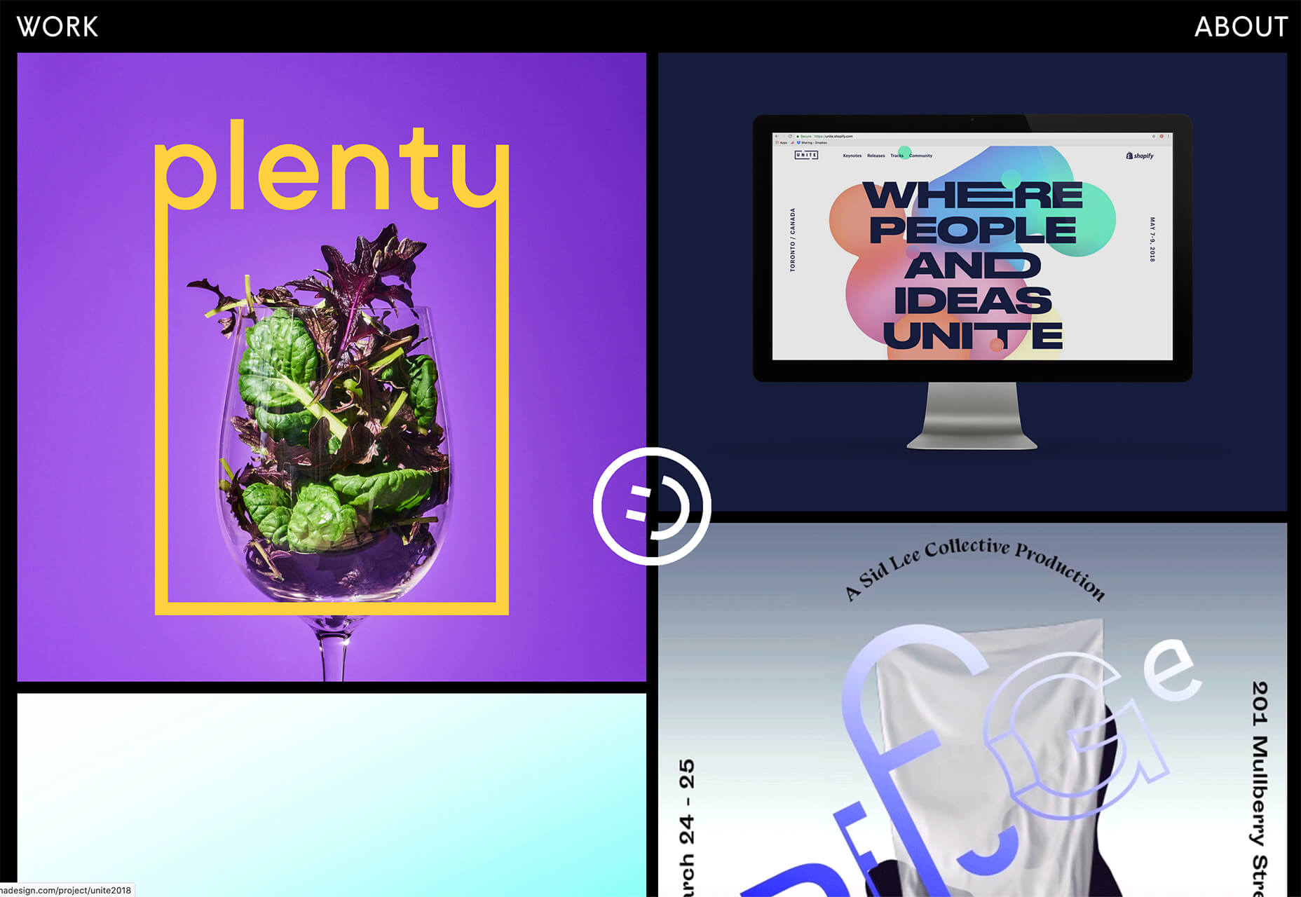
Rui Ma uses square and rectangular containers in a modular grid with portfolio projects inside each. This is one of the most common and applicable uses of geometry – as a container element. What makes it stand out is the circle, smiley wheel (also a geometric shape) that never leaves the center of the screen. The black background for the grid is also a nice contrast element for content blocks.
Thompson Stenning uses shapes in the background and with illustrations to create a stunning homepage visual. It’s big and bold and has just enough going on that you want to look at it and figure out the scene. Maybe what’s most intriguing about the visual concept is that it uses lots of geometric shapes – rectangles, squares, triangles, ad circles – whereas most projects pick one shape to focus on.
Romain Penchenat uses three-dimensional style angles to draw you into the portfolio website. They use a simple animation that “floats” on the homepage and follows the scroll with other geometric elements.
3. Shadow and Gradient Icons
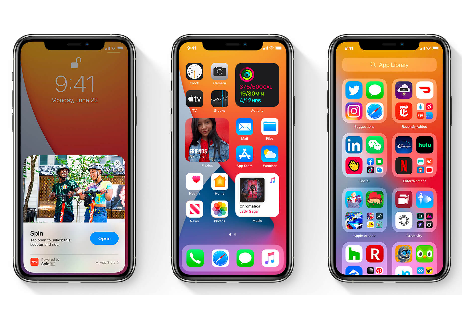
Did you notice all the gradients and subtle shadows in icons in the images previewing iOS 14 or were you just looking at other changes (such as widgets) on the iPhone screen?
We’ve been seeing more designers incorporating more shadows and depth into icons for a while, but this move by a major player in design will push it to the forefront fast. Each of the icons moves from a flat style to one with a background gradient color as well as more shadows within icon elements for depth.
Don’t worry, the design still looks very much like Apple, but is a little more reminiscent of the skeuomorphism style icons from earlier versions of iOS.
It’s nice that the color and shadow elements are contained within each icon. This creates more visual interest and depth for each element without getting cluttered or junky. The gradients are also super simple, using a darker version of the main color in a monotone element.
It’s an iconography style that others are already using. DG Studio has a collection of icons on its homepage with subtle gradients and shadowing in the designs. Again, what’s nice about this trend is that it adds depth to visuals without tricks that get in the way of visual comprehension.
Guillaume Gouessan uses gradients in image icons in much the same way as the previous examples but with a little more color variation. Here, you can see what the gradient looks like when using a color change that’s not super drastic, but more dramatic than a monotone option. You can find some use of the more monotone gradient on his site below the scroll in the large desk image. (It’s definitely worth a few clicks to check it out.)
Love it or hate it, gradients and shadows seem to be here to stay for a while.
Conclusion
How often do you find yourself looking to major brands and companies for design inspiration? While a lot of web design trends start as experiments with smaller sites, the big players can really shape what gets popular (or not).
The example of Apple moving to icons with more shadows and gradients is a prime example. We’ve been seeing more of these elements creeping in for a while, but this style is about to get very big again.
Every week users submit a lot of interesting stuff on our sister site Webdesigner News, highlighting great content from around the web that can be of interest to web designers.
The best way to keep track of all the great stories and news being posted is simply to check out the Webdesigner News site, however, in case you missed some here’s a quick and useful compilation of the most popular designer news that we curated from the past week.
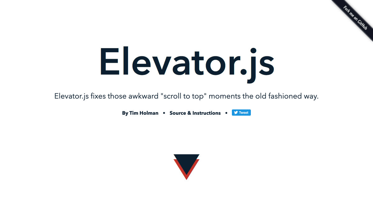
Elevator.js – A “back to Top” Button that Behaves like a Real Elevator
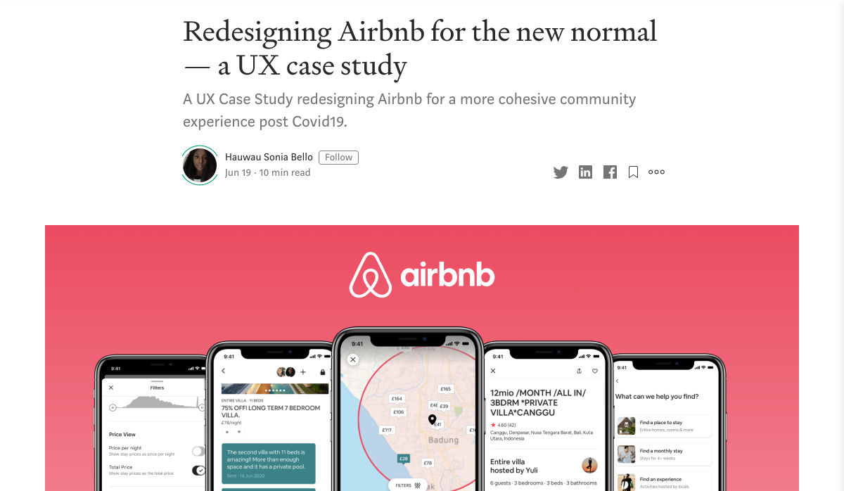
Redesigning Airbnb for the New Normal – a UX Case Study
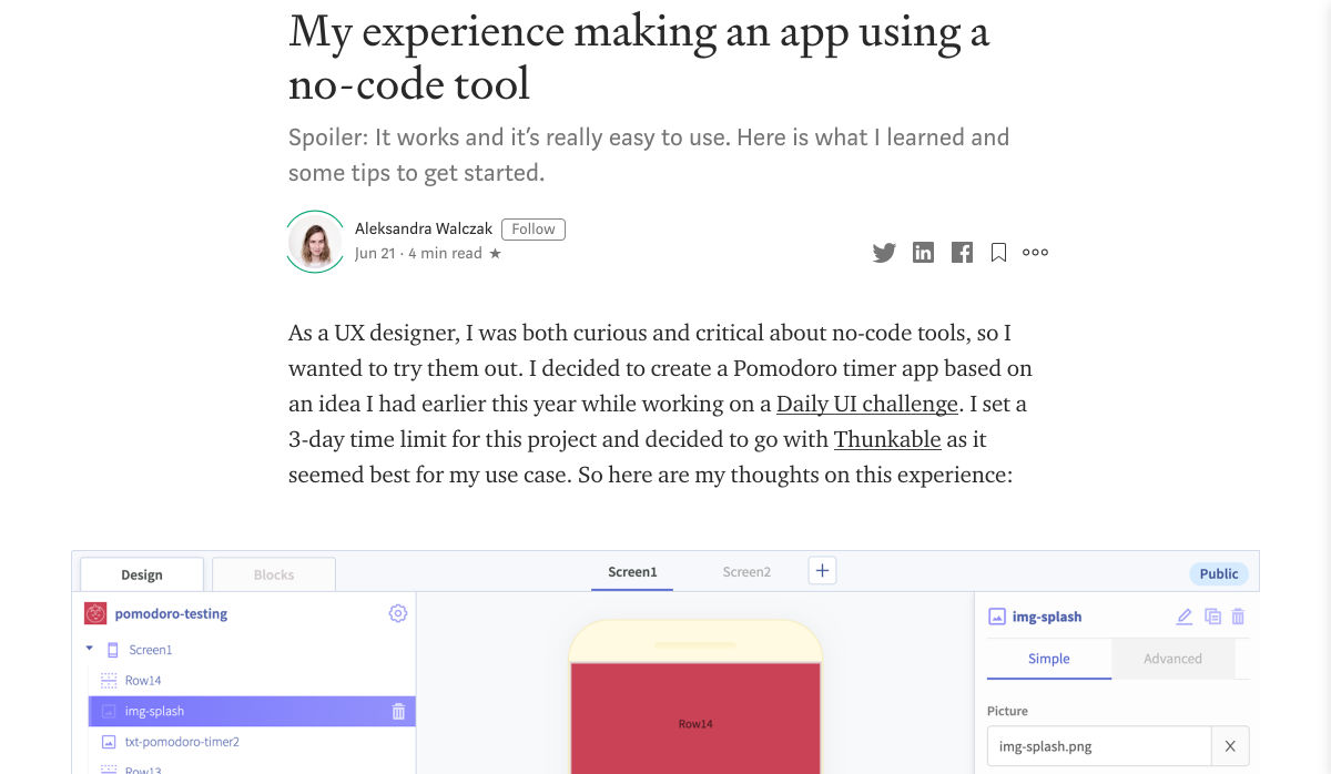
My Experience Making an App Using a No-Code Tool
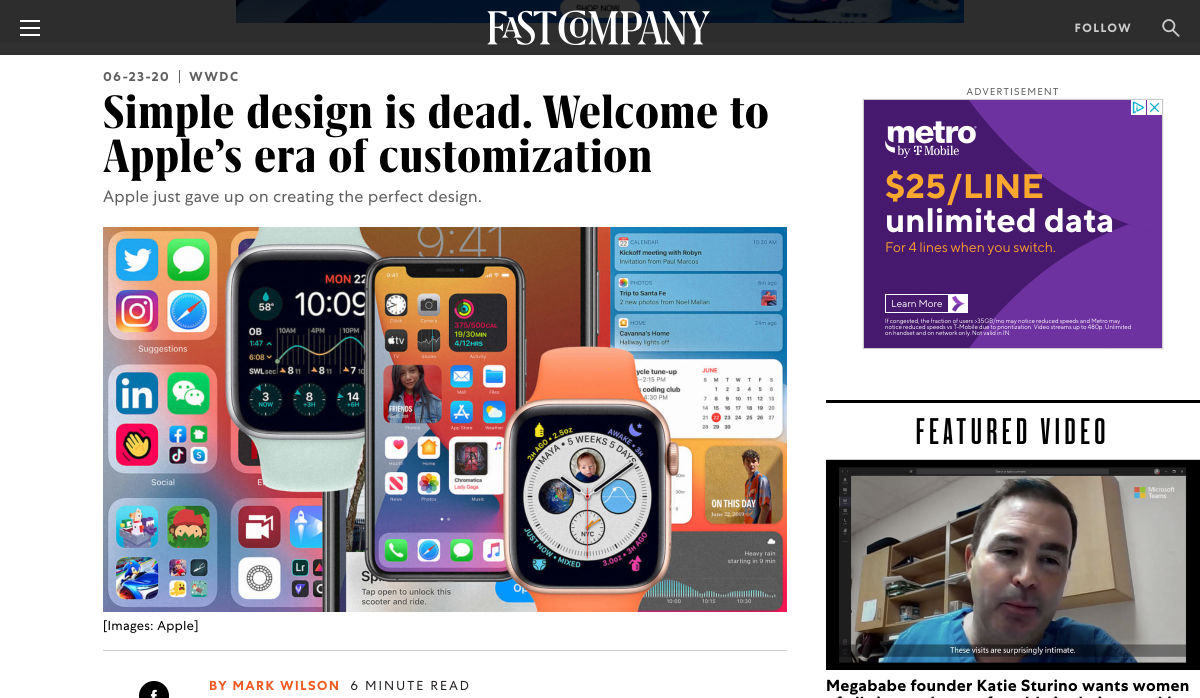
Simple Design is Dead. Welcome to Apple’s Era of Customization
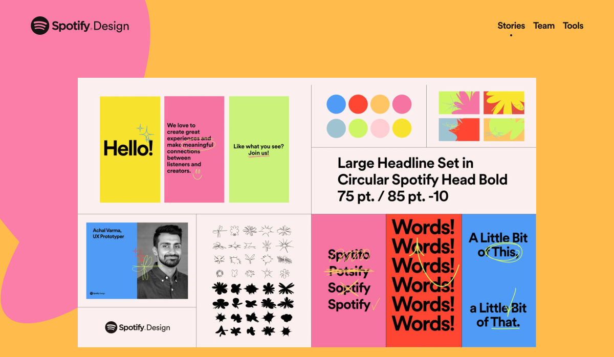
Making the Brand: Redesigning Spotify Design
Neon Mode: Building a New Dark UI
The Return of the 90s Web
Design Roundup June 2020
Google Quietly Launches an AI-powered Pinterest Rival Named Keen
Apple’s Siri Gets First Major Redesign in Years
Perfection will Kill your Design
Using 6 Google Analytics Features to Improve UX and Website Metrics
Yale Rebrands for Warmth and a Digital Future
3 Awesome Digital Marketing Strategies to Boost your Web Presence
Onboarding is Dead, Here Comes Noboarding
User Experience (UX) Testing: 4 UX Best Practices
8 Ways to Promote your Business Without a Marketing Budget
10 Interaction Design Rules You Must Never Break
On Racism and Sexism in Branding, User Interface, and Tech
Staying Creative During Hard Times
Serious UX Mistakes that Might Be Sabotaging your Sales
10 Key Things a Small Business Website Must Have
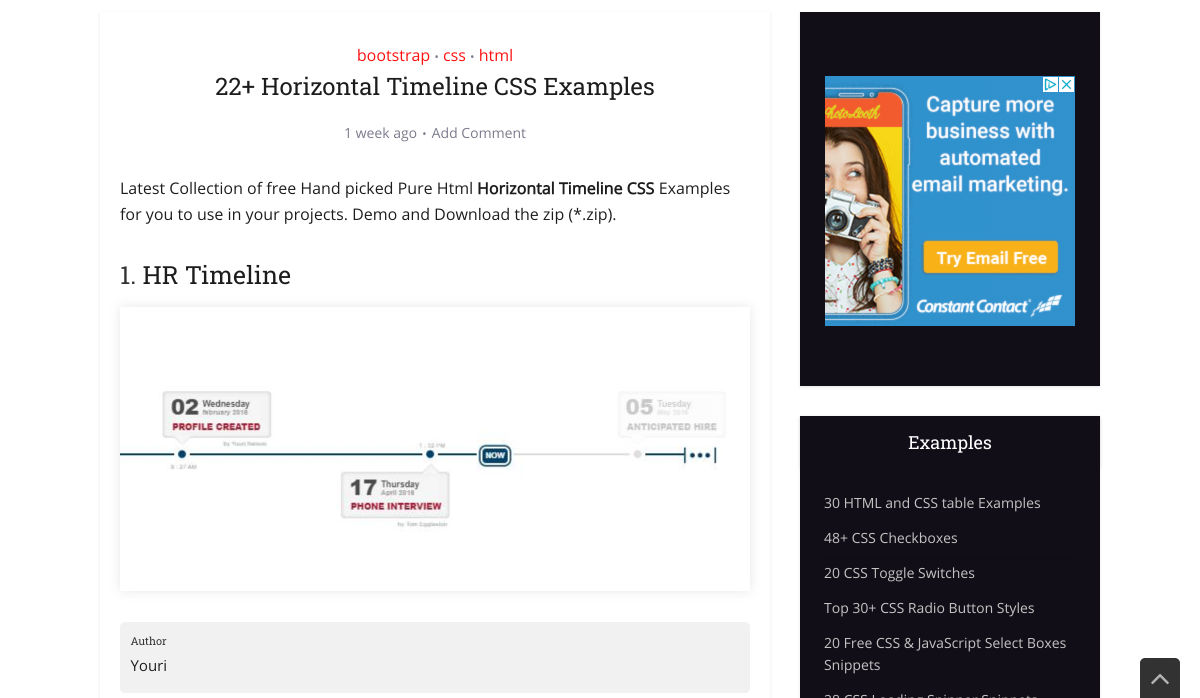
22+ Horizontal Timeline CSS Examples
How to Write an Effective Design Brief in 9 Easy Steps
Creative Exercises to Help You Through your Anxiety
Want more? No problem! Keep track of top design news from around the web with Webdesigner News.
Sarah Higley has some CSS tricks up her sleeve for dealing with High Contrast Mode on Windows, which I learned is referred to as WHCM.
Here’s the first trick:
[…] if the default CSS outline property doesn’t give you the visual effect you want [in WHCM] for focus states, there’s a very simple fix. Instead of overriding default browser focus styles with outline: none, make it transparent instead: outline 3px solid transparent.
That will essentially do nothing outside of WHCM, but in WHCM, it will be a thick white border, which is a strong, good visual focus style.