It’s a pretty low-effort thing to get a big fancy link preview on social media. Toss a handful of specific tags on a URL and you get a big image-title-description thing. Here’s Twitter’s version of an article on this site:
It’s particularly low-effort on this site, as our Yoast SEO plugin puts the correct tags in place automatically. The image it uses by default is the “featured image” feature of WordPress, which we use anyway.
I’m a fan of that kind of improvement for that so little work. Jetpack helps the process, too, by automating things.
But let’s say you don’t use these particular tools. Maybe creating an image per blog post isn’t even something you’re interested in doing, but you still want something nice to show for the social media preview.
We’ve covered this before. You can design the “image” with HTML and CSS, using content and metadata you already have from the blog post. You can turn it into an image with Puppeteer (or the like) and then use that for the image in the meta tags.
Create a route on your site that takes dynamic data from the URL to create the layout
Make a cloud function that hits that route, turns it into an image, and uploads it to Cloudinary (for optimizing and serving)
Any time the image is requested, check to see if you’ve already created it. If so, serve it from Cloudinary; if not, make it, then serve it.
This stuff gets my brain cooking. What if we didn’t need to create a raster image at all?
Maybe rather than needing to create a raster image we could use SVG? SVG would be easy to template, and we know is extremely capable. But… Twitter says:
Images must be less than 5MB in size. JPG, PNG, WEBP and GIF formats are supported. Only the first frame of an animated GIF will be used. SVG is not supported.
Fifty sad faces, Twitter. But let’s continue this thought experiment.
We need raster. The element can spit out a PNG. What if the cloud function that you talked to was an actual browser? Richard Young called that a “browser function” last year. Maybe the browser-in-the-cloud could do that SVG templating we’re dreaming of, but then draw it to a canvas and spit out that PNG.
Meh, I’m not sure that solves anything since you’d still have the Puppeteer dependency and, if anything, this just complicates how you make the image. Still, something appeals to me about being able to use native browser abilities at the server level.
Alec Pollak was little more than a junior art director cranking out print ads when he got a call that would change the path of his career. He worked at advertising agency, Grey Entertainment, later called Grey Group. The agency had spent decades acquiring some of the biggest clients in the industry.
Pollak spent most of his days in the New York office, mocking up designs for magazines and newspapers. Thanks to a knack for computers, a hobby of his, he would get the odd digital assignment or two, working on a multimedia offshoot for an ad campaign. Pollak was on the Internet in the days of BBS. But when he saw the World Wide, the pixels brought to life on his screen by the Mosaic browser, he found a calling.
Sometime in early 1995, he got that phone call. “It was Len Fogge, President of the agency, calling little-old, Junior-Art-Director me,” Pollak would later recall. “He’d heard I was one of the few people in the agency who had an email address.” Fogge was calling because a particularly forward-thinking client (later co-founder of Warner Bros Online Donald Buckley) wanted a website for the upcoming film Batman Forever. The movie’s key demographic — tech-fluent, generally well-to-do comic book aficionados — made it perfect for a web experiment. Fogge was calling Pollak to see if that’s something he could do, build a website. Pollak never had. He knew little about the web other than how to browse it. The offer, however, was too good to pass up. He said, yes, he absolutely could build a website.
Art director Steve McCarron was assigned the project. Pollak had only managed to convince one other employee at Grey of the web’s potential, copywriter Jeffrey Zeldman. McCarron brought the two of them in to work on the site. With little in the way of examples, the trio locked themselves in a room and began to work out what they thought a website should look and feel like. Partnering with a creative team at Grey, and a Perl programmer, they emerged three months later with something cutting edge. The Batman Forever website launched in May of 1995.
The Batman Forever website
When you first came to the site, a moving bat (scripted in Perl by programmer Douglas Rice) flew towards your screen, revealing behind it the website’s home page. It was filled with short, punchy copy and edgy visuals that played on the film’s gothic motifs. The site featured a message board where fans could gather and discuss the film. It had a gallery of videos and images available for download, tiny low-resolution clips and stills from the film. It was packed edge-to-edge with content and easter eggs.
It was hugely successful and influential. At the time, it was visited by just about anyone with a web connection and a browser, Batman fan or not.
Over the next couple of years — a full generation in Internet time — this is how design would work on the web. It would not be a deliberate, top-down process. The web design field would form from blurry edges focused a little at a time. The practice would taken up not by polished professionals but by junior art directors and designers fresh out of college, amateurs with little to lose at the beginning of their careers. In other words, just as outsiders built the web, outsiders would design it.
Interest in the early web required tenacity and personal drive, so it sometimes came from unusual places. Like when Gina Blaber recruited a team inside of O’Reilly nimble and adventurous enough to design GNN from scratch. Or when Walter Isaacson looked for help with Pathfinder and found Chan Suh toiling away at websites deeply embedded in the marketing arm of a Time Warner publication. These weren’t the usual suspects. These were web designers.
Jamie Levy was certainly an outsider, with a massive influence on the practice of design on the web. A product of the San Fernando Valley punk scene, Levy came to New York to attend NYU’s Interactive Telecommunications Program. Even at NYU, a school which had produced some of the most influential artists and filmmakers of the time, Levy stood out. She had a brash attitude and a sharp wit, balanced by an incredible ability to self-motivate and adapt to new technology, and, most importantly, an explosive and immediately recognizable aesthetic.
Levy’s initial resistance to computers as a glorified calculator for shut-ins dropped once she saw what it could do with graphics. After graduating from NYU, Levy brought her experience in the punk scene designing zines — which she had designed, printed and distributed herself — to her multimedia work. One of her first projects was designing a digital magazine called Electric Hollywood using Hypercard, which she loaded and distributed on floppy disks. Levy mixed bold colors and grungy zine-inspired artistry with a clickable, navigable hypertext interface. Years before the web, Levy was building multimedia that felt a lot like what it would become.
Electric Hollywood was enough to cultivate a following. Levy was featured in magazines and in interviews. She also caught the eye of Billy Idol, who recruited her to create graphical interactive liner notes for his latest album, Cyberpunk, distributed with floppys alongside the CD. The album was a critical and commercial failure, but Levy’s reputation among a growing clique of digital designers was cemented.
Still, nothing compared to the first time she saw the web. Levy experienced the World Wide Web — which author Claire Evans describes in her book, Broad Band — “as a conversion.” “Once the browser came out,” Levy would later recall, “I was like, ‘I’m not making fixed-format anymore. I’m learning HTML and that was it.‘” Levy’s style, which brought the user in to experience her designs on their own terms, was a perfect fit for the web. She began moving her attention to this new medium.
People naturally gravitated towards Levy. She was a fixture in Silicon Alley, the media’s name for the new tech and web scene concentrated in New York City. Within a few years, they would be the ushers of the dot-com boom. In the early ’90’s, they were little more than a scrappy collection of digital designers and programmers and writers; “true believers” in the web, as they called themselves.
Levy was one of their acolytes. She became well known for her Cyber Slacker parties; late-night hangouts where she packed her apartment with a ragtag group of hackers and artists (often with appearances by DJ Spooky). Designers looked to her for inspiration. Many would emulate her work in their own designs. She even had some mainstream appeal. Whenever she graced the covers of major magazines like Esquire and Newsweek, she always had a skateboard or a keyboard in her hands.
It was her near mythic status that brought IT company Icon CMT calling about their new web project, a magazine called Word. The magazine would be Levy’s most ambitious project to date, and where she left her greatest influence on web design. Word would soon become a proving ground for her most impressive design ideas.
Word Magazine
Levy was put in charge of assembling a team. Her first recruit was Marisa Bowe, whom she had met on the Echo messaging board (BBS) run by Stacy Horn, based in New York. Bowe was originally brought on as a managing editor. But when editor in chief Jonathan Van Meter left before the project even got off the ground, Bowe was put in charge of the site’s editorial vision.
Levy found a spiritual partner in Bowe, having come to the web with a similar ethos and passion. Bowe would become a large part of defining the voice and tone that was so integral to the webzine revolution of the ’90’s. She had knack for locating authentic stories, and Word’s content was often, as Bowe called it “first-person memoirs.” People would take stories from their life and relate it to the cultural topics of the day. And Bowe’s writing and editorial style — edgy, sarcastic, and conversational — would be backed by the radical design choices of Levy.
Articles that appeared on Word were one-of a kind, where the images, backgrounds and colors chosen helped facilitate the tone of a piece. These art-directed posts pulled from Levy’s signature style, a blend of 8-bit graphics and off-kilter layouts, with the chaotic bricolage of punk rock zines. Pages came alive, representing through design the personality of the post’s author.
Word also became known for experimenting with new technologies almost as soon as they were released. Browsers were still rudimentary in terms of design possibilities, but they didn’t shy away from stretching those possibilities as far as they could go. It was one of the first magazines to use music, carefully paired with the content of the articles. When Levy first encountered what HTML tables could do to create grid-based layouts, she needed to use it immediately. “Everyone said, ‘Oh my God, this is going to change everything,’” she later recalled in an interview, “And I went back to to Word.com and I’d say, ‘We’ve got to do an artistic piece with tables in it.’ Every week there was some new HTML code to exploit.”
The duo was understandably cocky about their work, and with good reason. It would be years before others would catch up to what they did on Word. “Nobody is doing anything as interesting as Word, I wish someone would try and kick our ass,” Levy once bragged. Bowe echoed the sentiment, describing the rest of the web as “like frosting with no cake.” Still, for a lot of designers, their work would serve as inspiration and a template for what was possible. The whole point was to show off a bit.
Levy’s design was inspired by her work in the print world, but it was something separate and new. When she added some audio to a page, or painted a background with garish colors, she did so to augment its content. The artistry was the point. Things might have been a bit hard to find, a bit confusing, on Word. But that was ok. The joy of the site was discovering its design. Levy left the project before its first anniversary, but the pop art style would continue on the site under new creative director Yoshi Sodeoka. And as the years went on, others would try to capture the same radical spirit.
A couple of years later, Ben Benjamin would step away from his more humdrum work at CNet to create a more personal venture known as Superbad, a mix of offbeat, banal content and charged visuals created a place of exploration. There was no central navigation or anchor to the experience. One could simply click and find what they find next.
The early web also saw its most avant-garde movement in the form of Net.art, a loose community of digital artists pushing their experiments into cyberspace. Net artists exploited digital artifacts to create works of interactive works of art. For instance, Olia Lialina created visual narratives that used hypertext to glue together animated panels and prose. The collective Jodi.org, on the other hand, made a website that looked like complete gibberish, hiding its true content in the source code of the page itself.
These were the extreme examples. But they served in creating a version of the web that felt unrefined. Web work, therefore, was handed to newcomers and subordinates to figure out.
And so the web became defined, by definition, by a class of people that were willing to experiment — basically, it was twenty-somethings fresh out of college, in Silicon Valley, Silicon Alley, and everywhere in between who wrote the very first rules of web design. Some, like Levy and the team at Grey, pulled from their graphic design roots. Others tried something completely new.
There was no canvas, only the blaring white screen of a blank code editor. There was no guide, only bits of data streaming around the world.
But not for long.
In January of 1996, two web design books were published. The first was called Designing for the Web, by Jennifer Robbins, one of the original designers on the GNN team. Robbins had compiled months of notes about web design into a how-to guide for newbies. The second, designing web graphics, was written by Lynda Weinman, by then already owner of the eponymous web tutorial site Lynda.com. Weinman brought her experience in the film industry and with animation to bring a visual language to her practical guide to the web in a fusion of abstract thoughts on a new medium and concrete tips for new designers.
At the time, there were technical manuals and code guides, but few publications truly dedicated to design. Robbins and Weinman provided a much needed foundation.
Six months later, a third book was published, Creating Killer Websites, written by Dave Siegel. It was a very different kind of book. It began with a thesis. The newest generation of websites, what Siegel referred to as third generation sites, needed to guide visitors through their experiences. They needed to be interactive, familiar, and engaging. To achieve this level of interactivity, Siegel argues, required more than what the web platform could provide. What follows from this thesis is a book of programming hacks, ways to use HTML in ways it wasn’t strictly made for. Siegel popularized techniques that would soon become a de facto standard, using HTML tables and spacer GIFs to create advanced layouts, and using images to display heading fonts and visual backgrounds.
The publishing cadence of 1996 makes a good case study for the state and future of web design. The themes and messages of the books illustrate two points very well.
The first is the maturity of web design as a practice. The books published at the beginning of the year drew on predecessors — including Robbins from her time as a print designer, and Lynda from her work in animation — to help contextualize and codify the emerging field of web design. Six months later, that codification was already being expanded and made repeatable by writers like Siegel.
The second point it illustrates is a tension that was beginning to form. In the next few years, designers would begin to hone their craft. The basic layouts and structures of a page would become standardized. New best practices would be catalogued in dozens of new books. Web design would become a more mature practice, an industry all of its own.
But browsers were imperfect and HTML was limited. Coding the intricate designs of Word or Superbad required a bit of creative thinking. Alongside the sophistication of the web design field would follow a string of techniques and tools aimed at correcting browser limitations. These would cause problems later, but in the moment, they gave designers freedom. The history of web design is interweaved with this push and pull between freedom and constraint.
In March of 1995, Netscape introduced a new feature to version 1.1 of Netscape Navigator. It was called server push and it could be used to stream data back and forth between a server and a browser, updated dynamically. Its most common use was thought to be real-time data without refreshes, like a moving stock ticker or an updating news widget. But it could also be used for animation.
On the day that server push was released, there were two websites that used it. The first was the Netscape homepage. The second was a site with a single, animated bouncing blue dot. This produced its name: TheBlueDot.com.
TheBlueDot.com
The animation, and the site, were created by Craig Kanarick, who had worked long into the night the day before Netscape’s update release to have it ready for Day One. Designer Clay Shirky would later describe the first time he saw Kanarick’s animation: “We were sitting around looking at it and were just […] up until that point, in our minds, we had been absolutely cock of the walk. We knew of no one else who was doing design as well as Agency. The Blue Dot came up, and we wanted to hate it, but we looked at it and said, ‘Wow, this is really good.’”
Kanarick would soon be elevated from a disciple of Silicon Alley to a dot-com legend. Along with his childhood friend Jeff Dachis, Kanarick created Razorfish, one of the earliest examples of a digital agency. Some of the web’s most influential early designers would begin their careers at Razorfish. As more sites came online, clients would come to Razorfish for fresh takes on design. The agency responded with a distinct style and mindset that permeated through all of their projects.
Jonathan Nelson, on the other hand, had only a vague idea for a nightclub when he moved to San Francisco. Nelson worked with a high school friend, Jonathan Steuer on a way to fuse an online community with a brick and mortar club. They were soon joined by Brian Behlendorf, a recent Berkeley grad with a mailing list of San Francisco rave-goers, and unique experiences for a still very new and untested World Wide Web.
Steuer’s day job was at Wired. He got Nelson and Behlendorf jobs there, working on the digital infrastructure of the magazine, while they worked out their idea for their club. By the time the idea for HotWired began to circulate, Behlendorf had earned himself a promotion. He worked as chief engineer on the project, directly under Steuer.
Nelson was getting restless. The nightclub idea was ill-defined and getting no traction. The web was beginning to pass him by, and he wanted to be part of it. Nelson was joined by his brother and programmer Cliff Skolnick to create an agency of their own. One that would build websites for money. Behlendorf agreed to join as well, splitting his time between HotWired and this new company.
Nelson leased an office one floor above Wired and the newly formed Organic Online began to try and recruit their first clients.
When HotWired eventually launched, it had sold advertising to half a dozen partners. Advertisers were willing to pay a few bucks to have proximity to the brand of cool that HotWired was peddling. None of them, however, had websites. HotWired needed people to build the ads that would be displayed on their site, but they also needed to build the actual websites the ads would link to. For the ads, they used Razorfish. For the brand microsites, they used Organic Online. And suddenly, there were web design experts.
Within the next few years, the practice of web design would go through radical changes. The amateurs and upstarts that had built the web with their fresh perspective and newcomer instincts would soon consolidate into formal enterprises. They created agencies like Organic and Razorfish, but also Agency.com, Modem Media, CKS, Site Specific, and dozens of others. These agencies had little influence on the advertising industry as a whole, at least initially. Even CKS, maybe the most popular agency in Silicon Valley earned what one writer noted, was the equivalent of “in one year what Madison Avenue’s best-known ad slingers collect in just seven days.”
On the other end, the web design community was soon filled by freelancers and smaller agencies. The multi-million dollar dot-com contracts might have gone to the trendy digital agencies, but there were plenty of businesses that needed a website for a lot less.
These needs were met by a cottage industry of designers, developers, web hosts, and strategists. Many of them collected web experience the same way Kanarick and Levy and Nelson and Behlendorf had — on their own and through trial and error. But ad-hoc experimentation could only go so far. It didn’t make sense for each designer to have to re-learn web design. Shortcuts and techniques were shared. Rules were written. And web design trod on more familiar territory.
The Blue Dot launched in 1995. That’s the same year that Word and the Batman Forever sites launched. They were joined that same year by Amazon and eBay, a realization of the commercial potential of the web. By the end of the year, more traditional corporations planted their flag on the web. Websites for Disney and Apple and Coca Cola were followed by hundreds and then thousands of brands and businesses from around the world.
Levy had the freedom to design her pages with an idiosyncratic brush. She used the language of the web to communicate meaning and re-inforce her magazine’s editorial style. New websites, however, had a different value proposition. In most cases, they were there for customers. To sell something, sometimes directly or sometimes indirectly through marketing and advertising. In either case, they needed a website that was clear. Simple. Familiar. To accomodate the needs of business, commerce, and marketing online, the web design industry turned to recognizable techniques.
Starting in 1996, design practice somewhat standardized around common features. The primary elements on a page — the navigation and header — smoothed out from site to site. The stylistic flourishes in layout, color, and use of images from the early web replaced by best practices and common structure. Designers drew on the work of one another and began to create repeatable patterns. The result was a web that, though less visually distinct, was easier to navigate. Like signposts alongside a road, the patterns of the web became familiar to those that used it.
In 1997, a couple of years after the launch of Batman Forever, Jeffrey Zeldman created the mailing list (and later website) A List Apart, to begin circulating web design tutorials and topics. It was just one of a growing list of web designers that rushed to fill the vacuum of knowledge surrounding web design. Web design tutorials blanketed the proto-blogosphere of mailing lists and websites. A near limitless hypertext library of techniques and tips and code examples was available to anyone that looked hard enough for it. Through that blanket distribution of expertise, came new web design methodologies.
Writing a decade after the launch of A List Apart, in 2007, designer Jeffrey Zeldman defined web design as “the creation of digital environments that facilitate and encourage human activity; reflect or adapt to individual voices and content; and change gracefully over time while always retaining their identity.” Zeldman here advocates for merging a familiar interface with brand identity to create predictable, but still stylized, experiences. It’s a shift in thinking from the website as an expression of its creator’s aesthetic, to a utility centered on the user.
This philosophical shift was balanced by a technical one. The two largest browsers, Microsoft and Netscape, vied for market control. They often introduced new capabilities — customizations to colors or backgrounds or fonts or layouts unique to a single browser. That made it hard for designers to create websites that looked the same in both browsers. Designers were forced to resort to fragile code (one could never be too sure if it would work the same the next day), or to turn to tools to smooth out these differences.
Visual editors, Microsoft Frontpage and Macromedia Dreamweaver and a few others, were the first to try and right the ship of design. They gave designers a way to create websites without any code at all. Websites could be built with just the movement of a mouse. In the same way you might use a paintbrush or a drawing tool in Photoshop or MS Paint, one could drag and drop a website into being. The process even got an acronym. WYSIWYG, or “What You See Is What You Get.”
The web, a dynamic medium in its best incarnation, required more frequent updates than designers were sometimes able to do. Writers wanted greater control over the content of their sites, but they were often forced to call the site administrator to make updates. Developers worked out a way to separate the content from how it was output to the screen and store it in a separate database. This led to the development of the first Content Management Systems, or CMS. Using a CMS, an editor or writer could log into a special section of their website, and use simple form fields to update the content of the site. There were even rudimentary WYSIWYG tools baked right in.
Without the CMS, the web would never have been able to keep pace with the blogging revolution or the democratization of publishing that was somewhat borne out in the following decade. But database rendered content and WYSIWYG editors introduced uniformity out of necessity. There were only so many options that could be given to designers. Content in a CMS was inserted into pre-fabricated layouts and templates. Visual editors focused on delivering the most useful and common patterns designers used in their website.
In 1998, PBS Online unveiled a brand new version of its website. At the center of it all was a brand new section, “TeacherSource”: a repository of supplemental materials custom-made for educators to use in their classrooms. In the time since PBS first launched its website three years earlier, they had created a thriving online destination — especially for kids and educators. They had tens of thousands of pages worth of content. Two million visitors streamed through the site each day. They had won at the newly created Webby Awards two years in a row. TeacherSource was simply the latest in a long list of digital-only content that enhanced their other media offerings.
The PBS TeacherSource website
Before they began working on TeacherSource, PBS had run some focus groups with teachers. They wanted to understand where they should put their focus. The teachers were asked about the site’s design and content. They didn’t comment much about the way that images were being used, or their creative use of layouts or the designer’s choice of colors. The number one complaint that PBS heard was that it was hard to find things. The menu was confusing, and there was no place to search.
This latest version of PBS had a renewed design, with special attention given to its navigation. In an announcement about the site’s redesign, Cindy Johanson referred to the design’s more understandable navigation menu and in-site search as a “new front door and lots of side doors.”
It’s a useful metaphor; one that designers would often return to. However, it also doubles as a unique indicator of where web design was headed. The visual design of the page was beginning to recede into the background in favor of clarity and understanding.
The more refined — and predictable — practice of design benefited the most important part of a website: the visitor. The surfing habits of web users were becoming more varied. There were simply more websites to browse. A common language, common designs, helped make it easier for visitors to orient themselves as they bounced from one site to the next. What the web lost in visual flourish it gained back in usability. By the next major change in design, this would go by the name User Experience. But not before one final burst of creative expression.
The second version of MONOcrafts.com, launched in 1998, was a revelation. A muted palette and plain photography belied a deeper construction and design. As you navigated the site, its elements danced on the page, text folding out from the side to reveal more information, pages transitioning smoothly from one to the next. One writer described the site as “orderly and monochromatic, geometric and spare. But present, too, is a strikingly lyrical component.”
The MONOcrafts website
There was the slightest bit of friction to the experience, where the menu would move away from your mouse or you would need to wait for a transition to complete before moving from one page to the next. It was a website that was mediative, precise, and technically complex. A website that for all its splendor, contained little more than a description of its purpose and a brief biography of its creator, Yugo Nakamura.
Nakamura began his career as a civil engineer, after studying civil engineering and architecture at Tokyo University. After working several years in the field, he found himself drawn to the screen. The physical world posed too many limitations. He would later state, “I found the simple fact that every experience was determined by the relationship between me and my surroundings, and I realised that I wanted to design the form of that relationship abstractly. That’s why I got into the web.” Drawing on the influences of notable web artists, Nakamura began to create elaborately designed websites under the moniker yugop, both for hire and as a personal passion.
yugop became famous for his expertise in a tool that gave him the freedom of composition and interactivity that had been denied to him in real-world engineering. A tool called Flash.
Flash had three separate lives before it entered the web design community. It began as software created for the pen computing market, a doomed venture which failed before it even got off the ground. From there, it was adapted to the screen as a drawing tool, and finally transformed, in 1996, into a keyframe animation package known as FutureSplash Animator. The software was paired with a new file format and embeddable player, a quirk of the software that would affirm its later success.
Through a combination of good fortune and careful planning, the FutureSplash player was added to browsers. The software’s creator, Jonathan Gay, first turned to Netscape Navigator, adapting the browser’s new plugin architecture to add widespread support for his file format player. A stroke of luck came when Microsoft’s web portal, MSN, had a need to embed streaming videos on its site, a feature for which the FutureSplash player was well-suited. To make sure it could be viewed by everyone, Microsoft baked the player directly into Internet Explorer. Within the span of a few months, FutureSplash went from just another animation tool to an ubiquitous file format playable in 99% of web browsers. By the end of 1996, Macromedia purchased FutureSplash Animator and rebranded it as Flash.
Flash was an animation tool. De facto support in major browsers made it adaptable enough to be a web design tool as well. Designers learned how to recreate the functionality of websites inside of Flash. Rather than relegating a Flash player to tiny corner of a webpage, some practitioners expanded the player to fill the whole screen, creating the very first Flash websites. By the end of 1996, Flash had captivated the web design community. Resources and techniques sprung up to meet the demand. Designers new to the web were met with tutorials and guides on how to build their websites in Flash.
The appeal to designers was its visual interface, drag and drop drawing tools that could be used to create animated navigation, transitions and audiovisual interactivity the web couldn’t support natively. Web design practitioners had been looking for that level of precision and control since HTML tables were introduced. Flash made it not only possible but, compared to HTML, nearly effortless. Using your mouse and your imagination — and very little, if any, code — could lead to sophisticated designs.
Even among the saturation that the new Flash community would soon become, MONOcrafts stood out. It’s use of Flash was playful, but with a definitive structure and flow.
Flash 4 had been released just before Nakamura began working on his site. It included a new scripting language known as ActionScript, which gave designers a way to programmatically add new interactive elements to the page. Nakamura used ActionScript, combined with the other capabilities of Flash, to create elements that would soon be seen on every website (and now feel like ancient relics of a forgotten past).
MONOcrafts was the first time that many web designers saw an animated intro bring them into the site. In the hands of yugop and other Flash experts, it was an elegant (and importantly, brief) introduction to the style and tone of a website. Before long, intros would become interminable, pervasive, and bothersome. So much so, designers would frequently add a “Skip Intro” button to the bottom of their sites. Clicking that button as soon as it appeared became almost a reflex for browsers of the mid-90’s, Flash-dominated web.
Nakamura also made sophisticated use of audio, something possible with ActionScript. Digitally compressed tones and clicks gave the site a natural feel, bringing the users directly into the experience. Before long, sounds would be everywhere, music playing in the background wherever you went. After that, audio elements would become an all but extinct design practice.
And MONOcrafts used transitions, animations, and navigation that truly made it shine. Nakamura, and other Flash experts, created new approaches to transitions and animations, carefully handled and deliberately placed, that would be retooled by designers in thousands of incarnations.
Designers turned to Flash, in part, because they had no other choice. They were the collateral damage of the so-called “Browser Wars” being played out by Netscape and Microsoft. Inconsistent implementations of web technologies like HTML and CSS made them difficult tools to rely on. Flash offered consistency.
This was met by a rise in the need for web clients. Companies with commercial or marketing needs wanted a way to stand out. In the era of Flash design, even e-commerce shopping carts zoomed across the page, and were animated as if in a video game. But the (sometimes excessive) embellishment was the point. There were many designers that felt they were being boxed in by the new rules of design. The outsiders who created the field of web design had graduated to senior positions at the agencies that they had often founded. Some left the industry altogether. They were replaced by a new freshman class as eager to define a new medium as the last. Many of these designers turned to Flash as their creative outlet.
The results were punchy designs applied to the largest brands. “In contrast to the web’s modern, business-like aesthetic, there is something bizarre, almost sentimental, about billion-dollar multinationals producing websites in line with Flash’s worst excess: long loading times, gaudy cartoonish graphics, intrusive sound and incomprehensible purpose,” notes writerWill Bedingfield. For some, Flash design represented summit of possibility for the web, its full potential realized. For others, it was a gaudy nuisance. It’s influence, however, is unquestionable.
Following the rise of Flash in the late 90’s and early 2000’s, the web would see a reset of sorts, one that came back to the foundational web technologies that it began with.
In April of 2000, as a new millennium was solidifying the stakes of the information age, John Allsopp wrote a post for A List Apart entitled “A Dao of Web Design.” It was written at the end of the first era of web design, and at the beginning of a new transformation of the web from a stylistic artifact of its print predecessors to a truly distinct design medium. “What I sense is a real tension between the web as we know it, and the web as it would be. It’s the tension between an existing medium, the printed page, and its child, the web,” Allsopp wrote. “And it’s time to really understand the relationship between the parent and the child, and to let the child go its own way in the world.”
In the post, Allsopp uses the work of Daoism to sketch out ideas around a fluid and flexible web. Designers, for too long, had attempted to assert control over the web medium. It is why they turned to HTML hacks, and later, to Flash. But the web’s fluidity is also its strength, and when embraced, opens up the possibilities for new designs.
Allsopp dedicates the second half of the post to outline several techniques that can aid designers in embracing this new medium. In so doing, he set the stage for concepts that would be essential to web design over the next decade. He talks about accessibility, web standards, and the separation of content and appearance. Five years before the article was written, those concepts were whispered by a barely known community. Ten years earlier, they didn’t even exist. It’s a great illustration of just how far things had come in such a short time.
Allsopp puts a fine point on the struggle and tension that existed on the web for the past decade as he looked to the future. From this tension, however, came a new practice entirely. The practice of web design.
Ask a hundred front-end developers, and most, if not all, of them will have used the box-shadow property in their careers. Shadows are enduringly popular, and can add an elegant, subtle effect if used properly. But shadows occupy a strange place in the CSS box model. They have no effect on an element’s width and height, and are readily clipped if overflow on a parent (or grandparent) element is hidden.
We can work around this with standard CSS in a few different ways. But, now that some of the CSS Houdini specifications are being implemented in browsers, there are tantalizing new options. The CSS Paint API, for example, allows developers to generate images programmatically at run time. Let’s look at how we can use this to paint a complex shadow within a border image.
A quick primer on Houdini
You may have heard of some newfangled CSS tech hitting the platform with the catchy name of Houdini. Houdini promises to deliver greater access to how the browser paints the page. As MDN states, it is “a set of low-level APIs that exposes parts of the CSS engine, giving developers the power to extend CSS by hooking into the styling and layout process of a browser’s rendering engine.”
The CSS Paint API
The CSS Paint API is one of the first of these APIs to hit browsers. It is a W3C candidate recommendation. This is the stage when specifications start to see implementation. It is currently available for general use in Chrome and Edge, while Safari has it behind a flag and Firefox lists it as “worth prototyping”. There is a polyfill available for unsupported browsers, though it will not run in IE11.
While the CSS Paint API is enabled in Chromium, passing arguments to the paint() function is still behind a flag. You’ll need to enable experimental web platform features for the time being. These examples may not, unfortunately, work in your browser of choice at the moment. Consider them an example of things to come, and not yet ready for production.
The approach
We’re going to generate an image with a shadow, and then use it for a border-image… huh? Well, let’s take a deeper look.
As mentioned above, shadows don’t add any width or height to an element, but spread out from its bounding box. In most cases, this isn’t a problem, but those shadows are vulnerable to clipping. A common workaround is to create some sort of offset with either padding or margin.
What we’re going to do is build the shadow right into the element by painting it in to the border-image area. This has a few key advantages:
border-width adds to the overall element width
Content won’t spill into the border area and overlap the shadow
Padding won’t need any extra width to accommodate the shadow and content
Margins around the element won’t interfere with that element’s siblings
For that aforementioned group of one hundred developers who’ve used box-shadow, it’s likely only a few of them have used border-image. It’s a funky property. Essentially, it takes an image and slices it into nine pieces, then places them in the four corners, sides and (optionally) the center. You can read more about how all this works in Nora Brown’s article.
The CSS Paint API will handle the heavy lifting of generating the image. We’re going to create a module for it that tells it how to layer a series of shadows on top of each other. That image will then get used by border-image.
These are the steps we’ll take:
Set up the HTML and CSS for the element we want to paint in
Create a module that draws the image
Load the module into a paint worklet
Call the worklet in CSS with the new paint() function
Setting up the canvas
You’re going to hear the term canvas a few times here, and in other CSS Paint API resources. If that term sounds familiar, you’re right. The API works in a similar way to the HTML element.
First, we have to set up the canvas on which the API will paint. This area will have the same dimensions as the element that calls the paint function. Let’s make a 300×300 div.
HTTPS is required for any JavaScript worklet, including paint worklets. You won’t be able to use it at all if you’re serving your content over HTTP.
The second step is to create the module that is loaded into the worklet — a simple file with the registerPaint() function. This function takes two arguments: the name of the worklet and a class that has the painting logic. To stay tidy, we’ll use an anonymous class.
registerPaint(
  "shadow",
  class {}
);
In our case, the class needs two attributes, inputProperties and inputArguments, and a method, paint().
registerPaint(
  "shadow",
  class {
    static get inputProperties() {
      return [];
    }
    static get inputArguments() {
      return [];
    }
    paint(context, size, props, args) {}
  }
);
inputProperties and inputArguments are optional, but necessary to pass data into the class.
Adding input properties
We need to tell the worklet which CSS properties to pull from the target element with inputProperties. It’s a getter that returns an array of strings.
In this array, we list both the custom and standard properties the class needs: --shadow-colors, background-color, and border-top-width. Pay particular attention to how we use non-shorthand properties.
static get inputProperties() {
  return ["--shadow-colors", "background-color", "border-top-width"];
}
For simplicity, we’re assuming here that the border is even on all sides.
Adding arguments
Currently, inputArguments are still behind a flag, hence enabling experimental features. Without them, use inputProperties and custom properties instead.
We also pass arguments to the paint module with inputArguments. At first glance, they may seem superfluous to inputProperties, but there are subtle differences in how the two are used.
When the paint function is called in the stylesheet, inputArguments are explicitly passed in the paint() call. This gives them an advantage over inputProperties, which might be listening for properties that could be modified by other scripts or styles. For example, if you’re using a custom property set on :root that changes, it may filter down and affect the output.
The second important difference for inputArguments, which is not intuitive, is that they are not named. Instead, they are referenced as items in an array within the paint method. When we tell inputArguments what it’s receiving, we are actually giving it the type of the argument.
The shadow class is going to need three arguments: one for X positions, one for Y positions, and one for blurs. We’ll set that up as three space-separated lists of integers.
Anyone who has registered a custom property may recognize the syntax. In our case, the keyword means any whole number, while + denotes a space-separated list.
static get inputArguments() {
  return ["<integer>+", "<integer>+", "<integer>+"];
}
To use inputProperties in place of inputArguments, you could set custom properties directly on the element and listen for them. Namespacing would be critical to ensure inherited custom properties from elsewhere don’t leak in.
Adding the paint method
Now that we have the inputs, it’s time to set up the paint method.
A key concept for paint() is the context object. It is similar to, and works much like, the HTML element context, albeit with a few small differences. Currently, you cannot read pixels back from the canvas (for security reasons), or render text (there’s a brief explanation why in this GitHub thread).
The paint() method has four implicit parameters:
The context object
Geometry (an object with width and height)
Properties (a map from inputProperties)
Arguments (the arguments passed from the stylesheet)
paint(ctx, geom, props, args) {}
Getting the dimensions
The geometry object knows how big the element is, but we need to adjust for the 30 pixels of total border on the X and Y axis:
Properties and arguments hold the resolved data from inputProperties and inputArguments. Properties come in as a map-like object, and we can pull values out with get() and getAll():
get() returns a single value, while getAll() returns an array.
--shadow-colors will be a space-separated list of colors which can be pulled into an array. We’ll register this with the browser later so it knows what to expect.
We also need to specify what color to fill the rectangle with. It will use the same background color as the element:
As mentioned earlier, arguments come into the module as an array, and we reference them by index. They’re of the type CSSStyleValue right now — let’s make it easier to iterate through them:
Convert the CSSStyleValue into a string with its toString() method
Now that we have the dimensions and properties, it’s time to draw something! Since we need a shadow for each item in shadowColors, we’ll loop through them. Start with a forEach() loop:
Finally, we’ll use the fillRect() method to draw in the canvas. It takes four arguments: X position, Y position, width, and height. For the position values, we’ll use border-width from inputProperties; this way, the border-image is clipped to contain just the shadow around the rectangle.
This technique can also be done using a canvas drop-shadow filter and a single rectangle. It’s supported in Chrome, Edge, and Firefox, but not Safari. See a finished example on CodePen.
Almost there! There are just a few more steps to wire things up.
Registering the paint module
We first need to register our module as a paint worklet with the browser. This is done back in our main JavaScript file:
Something else we should do, but isn’t strictly necessary, is to tell the browser a little more about our custom properties by registering them.
Registering properties gives them a type. We want the browser to know that --shadow-colors is a list of actual colors, not just a string.
If you need to target browsers that don’t support the Properties and Values API, don’t despair! Custom properties can still be read by the paint module, even if not registered. However, they will be treated as unparsed values, which are effectively strings. You’ll need to add your own parsing logic.
Like addModule(), this is added to the main JavaScript file:
These are unitless values. Since we’re drawing a 1:1 image, they equate to pixels.
Adapting to display ratios
We’re almost done, but there’s one more problem to tackle.
For some of you, things might not look quite as expected. I’ll bet you sprung for the fancy, high DPI monitor, didn’t you? We’ve encountered an issue with the device pixel ratio. The dimensions that have been passed to the paint worklet haven’t been scaled to match.
Rather than go through and scale each value manually, a simple solution is to multiply the border-image-slice value. Here’s how to do it for proper cross-environment display.
First, let’s register a new custom property for CSS that exposes window.devicePixelRatio:
Since we’re registering the property, and giving it an initial value, we don’t need to set it on :root because inherit: true passes it down to all elements.
And, last, we’ll multiply our value for border-image-slice with calc():
It’s important to note that paint worklets also have access to the devicePixelRatio value by default. You can simply reference it in the class, e.g. console.log(devicePixelRatio).
Finished
Whew! We should now have a properly scaled image being painted in the confines of the border area!
I’d be remiss to not also demonstrate a solution that uses background-image instead of border-image. It’s easy to do with just a few modifications to the module we just wrote.
Since there isn’t a border-width value to use, we’ll make that a custom property:
We’ll also have to control the background color with a custom property as well. Since we’re drawing inside the content box, setting an actual background-color will still show behind the background image.
As expected, this will paint the shadow in the background. However, since background images extend into the padding box, we’ll need to adjust padding so that text doesn’t overlap:
As we all know, we don’t live in a world where everyone uses the same browser, or has access to the latest and greatest. To make sure they don’t receive a busted layout, let’s consider some fallbacks.
Padding fix
Padding on the parent element will condense the content box to accommodate for shadows that extend from its children.
section.parent {
  padding: 6px; /* size of shadow on child */
}
CodePen Embed Fallback
Margin fix
Margins on child elements can be used for spacing, to keep shadows away from their clipping parents:
div.child {
  margin: 6px; /* size of shadow on self */
}
CodePen Embed Fallback
Combining border-image with a radial gradient
This is a little more off the beaten path than padding or margins, but it’s got great browser support. CSS allows gradients to be used in place of images, so we can use one within a border-image, just like how we did with paint(). This may be a great option as a fallback for the Paint API solution, as long as the design doesn’t require exactly the same shadow:
If you don’t mind some extra markup and CSS positioning, and need an exact shadow, you can also use an inset pseudo-element. Beware the z-index! Depending on the context, it may need to be adjusted.
And that, folks, is how you can use the CSS Paint API to paint just the image you need. Is it the first thing to reach for in your next project? Well, that’s for you to decide. Browser support is still forthcoming, but pushing forward.
In all fairness, it may add far more complexity than a simple problem calls for. However, if you’ve got a situation that calls for pixels put right where you want them, the CSS Paint API is a powerful tool to have.
What’s most exciting though, is the opportunity it provides for designers and developers. Drawing shadows is only a small example of what the API can do. With some imagination and ingenuity, all sorts of new designs and interactions are possible.
Google Fonts is one of the most useful tools designers have, with hundreds of amazing fonts provided for free. But if you just grab one of the top ten suggestions, you’re missing out on a vast wealth of typographic gems.
Just about every font on Google Fonts is worth trying out, but the very best designs — designs that engage, inspire, and delight — combine two or more fonts. It’s the same principle as sweet and sour; two competing tastes that are both familiar and surprising; that’s a good font combination.
But how do you pick out those flavors? How do you know what complements and what clashes? Does Inter work okay with Open Sans? Does Merriweather look good with Roboto?
Well, today we’ve got a deal for you that will answer those questions and more. Our sister site, MightDeals.com, has arranged an extraordinary discount on The Preposterously Huge Book of Google Font Combinations. To date, it’s the single largest collection of Google font combinations ever produced.
Read on to find out how the PHBGFC will save you time, update your design choices, and keep you inspired throughout 2021 and beyond…
What’s Preposterous About the PHBGFC?
The Preposterously Huge Book of Google Font Combinations is almost 8,000 pages long. If you use one of the suggested font combinations every week, it will take you 125 years to exhaust it.
We think you’ll agree that that’s a truly preposterous number of design options.
What Exactly is the PHBGFC?
When you visit Google Fonts, you see a nice clean interface, with some dropdowns. You can pick a font. And then maybe pick another. But there’s no real way of discovering, trying out or otherwise selecting font combinations.
The Preposterously Huge Book of Google Font Combinations changes that by lining up all the possible combinations in an easy-to-browse package.
Step 1: Navigate to the index at the front of the book.
Step 2: Locate a font you’re interested in, in the index.
Step 3: Click the font name to navigate to the corresponding page in the book.
Step 4: Scroll back and forth through the pages to review the possible combinations for your font.
It’s that easy!
The Preposterously Huge Book of Google Font Combinations lays out all the best Google Font combinations for you — every font included has a regular, bold, italic, and bold italic version — saving you days of hunting through the site hoping to hit upon a combination that works.
What If I Don’t Like the Suggestions?
The Preposterously Huge Book of Google Font Combinations isn’t a set of rules or guidelines; it’s a tool to help you make the best design decisions you can make in the shortest possible time.
The Preposterously Huge Book of Google Font Combinations purposefully doesn’t exclude any combinations — even ugly combinations are deliberately included — so you’re free to compare an unredacted list of font options.
Every design decision you take is yours, but instead of spending hours downloading, installing, and comparing prospective fonts, you can review a combination in seconds.
Who Should Use the PHBGFC?
The Preposterously Huge Book of Google Font Combinations is an essential purchase for anyone working with Google Fonts. It will save you time and improve your familiarity with one of the web’s best resources.
If you like fonts, then you’re going to enjoy just scrolling through the Preposterously Huge Book of Google Font Combinations. It’s a beautifully realized catalog of font options.
Whether you’re a design student, a web developer curious about design, or a seasoned design professional, The Preposterously Huge Book of Google Font Combinations won’t just save you time; it will help develop your eye for great font combinations.
Grab The Preposterously Huge Book of Google Font Combinations Today!
This incredible resource, designed to help you maximize your use of Google Fonts, will save you hours of fruitless hunting through Google’s UI.
The Preposterously Huge Book of Google Font Combinations normally sells for $69, but thanks to our sister-site MightyDeals.com, WebDesignerDepot readers can grab it for just $24! That’s a suitably preposterous 65% off the full retail price.
Head over to MightyDeals today to download your copy of The Preposterously Huge Book of Google Font Combinations and start making Google Fonts work for you.
B2B content marketing is the process of generating leads and sales via content creation. You’ll also use content to strengthen your brand and expand your audience.
The biggest difference between this and B2C content marketing is that you’re appealing directly to other businesses instead of consumers.
Your overall goal?
It’s to create valuable content that results in a win-win situation for you and your prospects. Your plan should include the following types of content:
Thought leadership posts
Blog posts with tips for overcoming industry challenges
Social media posts highlighting a recent conference or company meeting
Here are tips for building out a content marketing strategy.
Identify Your Target Audience
Take time to learn about your audience so that your content marketing plan hits home. Always remember that your audience includes individuals and your messaging must resonate with one reader at a time.
It’s common to create barriers to this process by convincing yourself that you can’t focus your audience down into specific reader personas.
However, it’s a good exercise to use your website’s Google Analytics data to get as granular as possible.
For example, you can see demographic information such as:
Age
Gender
Location
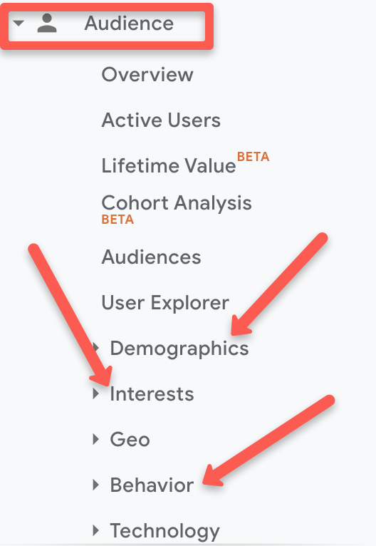
Use Analytics to understand more about your target audience and investigate other important factors, such as Interests, Behavior, or User Flow:
Gaining this kind of insight helps when it comes to your content marketing plan because you know how to most effectively communicate with your readers.
For example, you probably don’t want to use a lot of emojis or memes if you discover that your readers are predominantly between the ages of 45 and 60, as opposed to a Millennial audience.
Research Your Competitors
Become aware of how your competitors utilize content marketing but don’t outright copy their efforts.
How well do their audiences respond to curated content?
What type of content do they curate?
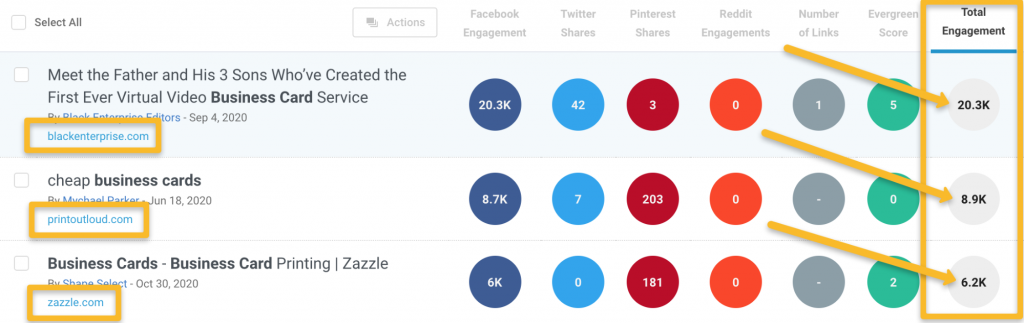
Use BuzzSumo to uncover competitor social reach:
Use tools like Ahrefs, Ubersuggest, or SEMrush to uncover important competitor data such as domain rating, backlinks, monthly visitors, and ranking keywords:
Write Down Specific Goals
Don’t run your B2B content marketing strategy without a concrete plan that incorporates specific goals to guide your content team with.
Write down each goal and create content that helps you accomplish those goals.
Here’s a specific example:
If you want to generate leads, then consider a blog post that educates. Teach your readers a specific combination of tips that helps them see you as an expert.
Then, offer prospects a content upgrade that requires an email address. Or, lead them directly to your booking page to set up a 1:1 call with one of your reps.
Either way, you collect information that allows you and your sales team to follow up multiple times.
Set Reasonable Completion Dates
Creating content requires time and effort.
Stay realistic when you’re setting completion dates so that everyone on the team feels comfortable that they’ll finish their responsibilities in time.
Plan For Challenges
In the real world, plans never work out exactly the way you think they will. Even with an established business roadmap planned out, something unexpected is bound to occur.
For instance, dozens of industries were crippled by the COVID-19 pandemic which saw a record number of people starting to work from home. While this example is extreme, the point is this: identify and factor in risks.
Build that reality into your content marketing strategy so that you don’t become surprised or frustrated when it’s time to adjust expectations.
Think about potential problems that could arise. Work with your marketing team to discover practical methods for resolving those challenges or even preventing them from happening in the first place.
Track Progress
Monitor and track your goals consistently. If you’re at five daily sales qualified leads (SQLs) and you’ve set a goal to reach 20 daily SQLs, then look at the results weekly or monthly.
Paying close attention to the data allows you to make decisions that either keep you on track or help you make up ground.
Let’s now take a look at the specific benefits of using content marketing for your business.
Educating via valuable blog posts produces more quality leads and the process helps fill the pipeline for your sales team.
Obtain More Customers
40% of businesses report that content plays a big big part in their overall marketing strategy. The reason for this is that content marketing leads directly to acquiring more customers.
Not only do B2B prospects need more time when it comes to making a buying decision, but you’re often communicating with someone other than the ultimate decision maker.
Providing valuable content helps your B2B buyer make their way down your sales funnel. For instance, this occurs as they consume a blog post that leads to email communication and finally, a sales call.
Improve Your SEO Results
The very act of producing content and hosting it on your website means that your search engine optimization efforts improve.
Web copy, white papers and blog posts all send a signal to Google that your site is active with content your audience loves to engage with.
You’ll notice an increase in search rankings, traffic, and lead flow the longer your marketing team consistently produces quality content.
Become a Thought Leader
Gaining thought leader status should be a long-term goal of your B2B content marketing strategy.
Make sure your team stays up-to-date on trends and industry changes so that the information is passed on inside the content produced.
Two things happen here:
Your readers want to do business with leading industry thought leaders
Google recognizes your thought leadership and it positively impacts SEO results
Keep in mind that material that leads to thought leadership doesn’t only need to come from you directly.
Your company’s subject matter experts, sales managers and other key players should contribute. Even long-term customers can help you create excellent content in this area. This also doesn’t only have to be blog posts.
You can become a thought leader by offering other content such as YouTube videos, creating online courses, ebooks, webinars, podcasts, or really any type of content that people consume
Save Time
At first glance, you might think that content marketing takes too much time to implement well. In fact, the Content Marketing Institute reports that lack of time is the top complaint heard from B2B marketers when discussing their content strategy.
Here’s the reality:
Content marketing saves you and your staff time in the long run. Automate your daily tasks as a content marketer, and see your content efforts yielding results faster than expected.
How often do you and your team get asked by prospects or clients to see more detailed information or a product demo?
You’ll have recorded webinars, product demo videos, and lengthy blog posts that get shown instantly to customers.
The process shaves time off the old method of explaining these types of details to each prospect or customer in 1:1 situations.
Improve Customer Retention
In a study by GfK Roper Public Affairs & Corporate Communications, it was discovered that 68% of customers feel better about purchasing from companies that produce custom content.
66% of customers also reported that they’re more likely to continue purchasing from the same company when receiving that custom content.
Sending relevant, segmented, and personalized content to your customers keeps those people engaged and willing to stay with your company on a long-term basis.
Your Next Step
You should now see the difference that a solid content marketing plan will make for your business.
Make a commitment to start the process.
Don’t allow it to become an idea that may or may not happen.
The sooner you begin, the sooner your company can benefit from an increase in traffic, leads, and sales.
The answer to “What is the most accessible HTML for an SVG icon?” isn’t one-size-fits all, because what an icon needs to do on a website varies. I’m partial to Heather Migliorisi’s research on all this, but I can summarize.
The icon is decorative
As in, the icon is just sitting there looking pretty but it doesn’t matter if it entirely went away. If that’s the case:
<svg aria-hidden="true" ... ></svg>
There’s no need to announce the icon because the label next to it already does the job. So, instead of reading it, we hide it from screenreaders. That way, the label does what it’s supposed to do without the SVG stepping on its toes.
The icon is stand-alone
What we mean here is that the icon is unaccompanied by a visible text label, and is a meaningful action trigger on its own. This is a tricky one. It’s gotten better over time, where all you need for modern browsers is:
This works for an SVG inside a , say, or if the SVG itself is playing the “button” role.
The icon is wrapped by a link
…and the link is the meaningful action. What’s important is that the link has good text. If the link has visible text, then the icon is decorative. If the SVG is the link where it’s wrapped in an (rather than am internal-SVG link), then, give it an accessible label, like:
I’ve always liked tag clouds. I like the UX of seeing what tags are most popular on a website by seeing the relative font size of the tags, popular tags being bigger. They seem to have fallen out of fashion, though you do often see versions of them used in illustrations in tools like Wordle.
How difficult is it to make a tag cloud? Not very difficult at all. Let’s see!
Let’s start with the markup
For our HTML, we’re going to put each of our tags into a list,
. We’ll be injecting into that with JavaScript.
If your tag cloud is already in HTML, and you are just looking to do the relative font-size thing, that’s good! Progressive enhancement! You should be able to adapt the JavaScript later on so it does just that part, but not necessarily building and injecting the tags themselves.
I have mocked out some JSON with a certain amount of articles tagged with each property. Let’s write some JavaScript to go grab that JSON feed and do three things.
First, it we’ll create an
from each entry for our list. Imagine the HTML, so far, is like this:
Third, and last, we’ll create a link around each tag that goes to the correct place. This is where we can set the font-size property for each item depending on how many articles that property is tagged with, so animation that has 13 articles will be much bigger than background-color which only has one article.
const dataURL =
  "https://gist.githubusercontent.com/markconroy/536228ed416a551de8852b74615e55dd/raw/9b96c9049b10e7e18ee922b4caf9167acb4efdd6/tags.json";
const tags = document.querySelector(".tags");
const fragment = document.createDocumentFragment();
const maxFontSizeForTag = 6;

fetch(dataURL)
  .then(function (res) {
    return res.json();
  })
  .then(function (data) {
    // 1. Create a new array from data
    let orderedData = data.map((x) => x);
    // 2. Order it by number of articles each tag has
    orderedData.sort(function(a, b) {
      return a.tagged_articles.length - b.tagged_articles.length;
    });
    orderedData = orderedData.reverse();
    // 3. Get a value for the tag with the most articles
    const highestValue = orderedData[0].tagged_articles.length;
    // 4. Create a list item for each result from data.
    data.forEach((result) => handleResult(result, highestValue));
    // 5. Append the full list of tags to the tags element
    tags.appendChild(tag);
  });
The JavaScript above uses the Fetch API to fetch the URL where tags.json is hosted. Once it gets this data, it returns it as JSON. Here we seque into a new array called orderedData (so we don’t mutate the original array), find the tag with the most articles. We’ll use this value later on in a font-scale so all other tags will have a font-size relative to it. Then, forEach result in the response, we call a function I have named handleResult() and pass the result and the highestValue to this function as a parameter. It also creates:
a variable called tags which is what we will use to inject each list item that we create from the results,
a variable for a fragment to hold the result of each iteration of the loop, which we will later append to the tags, and
a variable for the max font size, which we’ll use in our font scale later.
Next up, the handleResult(result) function:
function handleResult(result, highestValue) {
  const tag = document.createElement("li");
  tag.classList.add("tag");
  tag.innerHTML = `<a class="tag__link" href="${result.href}" style="font-size: ${result.tagged_articles.length * 1.25}em">${result.title} (${result.tagged_articles.length})</a>`;

  // Append each tag to the fragment
  fragment.appendChild(tag);
}
This is pretty simple function that creates a list element set to the variable named tag and then adds a .tag class to this list element. Once that’s created, it sets the innerHTML of the list item to be a link and populates the values of that link with values from the JSON feed, such as a result.href for the link to the tag. When each li is created, it’s then added as a string to the fragment, which we will later then append to the tags variable. The most important item here is the inline style tag that uses the number of articles—result.tagged_articles.length—to set a relative font size using em units for this list item. Later, we’ll change that value to a formula to use a basic font scale.
I find this JavaScript just a little bit ugly and hard on the eyes, so let’s create some variables and a simple font scale formula for each of our properties to tidy it up and make it easier to read.
function handleResult(result, highestValue) {
  // Set our variables
  const name = result.title;
  const link = result.href;
  const numberOfArticles = result.tagged_articles.length;
  let fontSize = numberOfArticles / highestValue * maxFontSizeForTag;
  fontSize = +fontSize.toFixed(2);
  const fontSizeProperty = `${fontSize}em`;

  // Create a list element for each tag and inline the font size
  const tag = document.createElement("li");
  tag.classList.add("tag");
  tag.innerHTML = `<a class="tag__link" href="${link}" style="font-size: ${fontSizeProperty}">${name} (${numberOfArticles})</a>`;

  // Append each tag to the fragment
  fragment.appendChild(tag);
}
By setting some variables before we get into creating our HTML, the code is a lot easier to read. And it also makes our code a little bit more DRY, as we can use the numberOfArticles variable in more than one place.
Once each of the tags has been returned in this .forEach loop, they are collected together in the fragment. After that, we use appendChild() to add them to the tags element. This means the DOM is manipulated only once, instead of being manipulated each time the loop runs, which is a nice performance boost if we happen to have a large number of tags.
Font scaling
What we have now will work fine for us, and we could start writing our CSS. However, our formula for the fontSize variable means that the tag with the most articles (which is “flex” with 25) will be 6em (25 / 25 * 6 = 6), but the tags with only one article are going to be 1/25th the size of that (1 / 25 * 6 = 0.24), making the content unreadable. If we had a tag with 100 articles, the smaller tags would fare even worse (1 / 100 * 6 = 0.06).
To get around this, I have added a simple if statement that if the fontSize that is returned is less than 1, set the fontSize to 1. If not, keep it at its current size. Now, all the tags will be within a font scale of 1em to 6em, rounded off to two decimal places. To increase the size of the largest tag, just change the value of maxFontSizeForTag. You can decide what works best for you based on the amount of content you are dealing with.
function handleResult(result, highestValue) {
  // Set our variables
  const numberOfArticles = result.tagged_articles.length;
  const name = result.title;
  const link = result.href;
  let fontSize = numberOfArticles / highestValue * maxFontSizeForTag;
  fontSize = +fontSize.toFixed(2);

  // Make sure our font size will be at least 1em
  if (fontSize <= 1) {
    fontSize = 1;
  } else {
    fontSize = fontSize;
  }
  const fontSizeProperty = `${fontSize}em`;

  // Then, create a list element for each tag and inline the font size.
  tag = document.createElement("li");
  tag.classList.add("tag");
  tag.innerHTML = `<a class="tag__link" href="${link}" style="font-size: ${fontSizeProperty}">${name} (${numberOfArticles})</a>`;

  // Append each tag to the fragment
  fragment.appendChild(tag);
}
Now the CSS!
We’re using flexbox for our layout since each of the tags can be of varying width. We then center-align them with justify-content: center, and remove the list bullets.
We’ll also use flexbox for the individual tags. This allows us to vertically align them with align-items: center since they will have varying heights based on their font sizes.
I find this is handy on small screens especially for people who might find it harder to tap on links. The initial text-decoration is removed as I think we can assume each item of text in the tag cloud is a link and so a special decoration is not needed for them.
I’ll just drop in some colors to style things up a bit more:
The color scheme for this was stolen directly from Chris’ blogroll, where every fourth tag starting at tag one is yellow, every fourth tag starting at tag two is red, every fourth tag starting at tag three is purple. and every fourth tag starting at tag four is blue.
We then set the focus and hover states for each link:
I could probably have created a custom variable for the colors at this stage—like --yellow: #ffd560, etc.—but decided to go with the longhand approach for IE 11 support. I love the box-shadow hover effect. It’s a very small amount of code to achieve something much more visually-appealing than a standard underline or bottom-border. Using em units here means we have decent control over how large the shadow would be in relation to the text it needed to cover.
OK, let’s top this off by setting every tag link to be black on hover:
Working on your branding, social media posts, or any sort of marketing effort? You probably need a good font that fits your budget. Here’s a selection of 100% free and public domain fonts you can use for both personal and commercial needs.
Public domain fonts, or open typographies, are all the fonts that are not only free to use but also open to edit, customize and modify, as well as redistribute.
On the other hand, 100% free fonts are made available by the authors to use for both personal and commercial use, but should not be modified or redistributed.
If you need a free font for your marketing purposes, whether it be a display font for a sleek landing page, a new logo, or even social media posts, this selection’s got you covered.
We separated the fonts into four different categories, so you can choose by style.
Serif fonts
Serif fonts are a classic choice: they are one of the oldest types of typography and are characterized by the extra swooshes and details at the ends and “feet” of letters.
Serif fonts date back to the 18th century when stonemasons still carved letters in rock. They that your brand is established and trustworthy, but also traditional and refined.
Plenty of world-known brands use serif fonts, such as Vogue, T Mobile, Sony, Volvo, and many others.
Check out these free and public domain serif fonts you can use with no extra weight on your budget.
This is a very noticeable font you’ve seen a thousand times, but you probably don’t realize that. It’s an Open Type proportional serif typeface, that was mainly created as a more contemporary and sleek alternative to the Times font family.
What’s great about this font is that it has more than 2,000 glyphs and encompasses the Greek and Hebrew alphabet, as well as the Cyrillic script. If your branding efforts need to be translated and used internationally, consider using this font.
And if you still can’t remember where you’ve seen it: it’s the Wikipedia logo.
Bodoni XT is a newer, reworked version of the classical Bodoni font, that dates back to the late 18th century when it was created by the Italian type-designer, printer, and publisher Giambattista Bodoni.
The original Bodoni font is used by fashion mega-brands such as Calvin Klein and even the Vogue magazine. Bodoni XT was modified by designer Manfred Klein, and is slightly more condensed and has longer feet.
Sansita Swashes is a newer, less famous, but definitely more playful typeface than the previous ones on this list. It makes a great font to use in the beauty industry or food packaging. It has a hand lettering feel to it, but it’s precise and elegant.
Oranienbaum is another, more modern Antiqua style font (same as Bodoni), with a high-contrast and well-defined features. It is a typeface whose look is typical for type designs from the early 20th century and characterized by pronounced serifs and contrasting geometry. It is created by type designer Oleg Poslpelov, with the art direction and publishing of Jovanny Lemonad.
This eroded and fancy-looking font looks nothing like pretzels but has a slight nod to Gothic typeface design and Bavarian aesthetic.
The eroded effect makes it look old and mystical, but the generous spacing and width of the letters balance it out to result in a clean and elegant design. Keep in mind that it only has uppercase letters.
The last free serif font on this list is leaner and sleeker, but perfectly legible and stylish. It makes a great display font, and the gentle extra swooshes allow for it to be paired with any sans serif or script font. It is also an internationalized typeface with all sorts of glyphs and symbols, so it can be used in a selection of languages other than ones using the Latin Alphabet.
Sans serif fonts
Whereas serif fonts are elegant, traditional and playful, sans serif fonts are the face of the contemporary, minimal and clean design. The difference is in the name: the “sans” part means that they don’t have the extra swooshes and ornamental additions on the letters’ endings.
They give off a sense of approachability, youthfulness and corporate design.
This luscious Art Deco-inspired vintage font comes in all uppercase letters and a bigger height. Since there are no lowercase letters, if you use it for web design or headings, you’ll need to pair it up with another font for your body text. However, used on itself as a display font, in packaging, poster design, or even as a logo font, it looks very retro and impressive.
The Bebas font, created by designer Ryoichi Tsunekawa, is perfect for headlines, captions, and titling. It’s also a commonly used font since the whole Bebas font family is available on online design tools such as Canva. But, that shouldn’t discourage you from using it yourself: it’s subtle and sleek and makes a great font for all your web design and social media post needs.
This cool (excuse the pun) font is built from scratch even though you might think it’s a variation of the more famous, classical Helvetica. It’s aesthetic is based on American chain store logos from the 1960s, an era when everyone was modifying Helvetica. Coolvetica successfully manages to mimic that style, but with a tighter kerning and funky curls, as the author Typodermic Fonts notes. It comes in four styles: regular, condensed, compressed, and crammed.
When the designers behind this font named it bold, they really meant it. This bulky typeface is noticeable, but clean, and will make a great headline or logo font. It has perfect circular shapes and a geometric base, similar to Art Deco fonts. Keep in mind that you might need to pair it up with a lighter and legible secondary font to balance out the noisiness of the design.
If the previous font was heavy and noticeable, Kiona is quite the opposite: contemporary, light, sleek and very elegant. It’s a very modern sans serif type, that will fit beautifully on luxurious packaging, logo design, or even collateral designs.
Possibly inspired by the Kenzo logo font, this fashionable font is characterized by rough cuts and geometric shapes. It’s slightly condensed but still lavishly designer, and will make a great font for both headlines, digital marketing ads, and even print design.
The Varicka font is yet another example on our list of typography that came to be from the industrial Art Deco movement of the 1920s. Flowy vertical lines and geometrically defined diagonals lend it a classy charm, but the sans serif nature of it makes it perfectly clean and legible.
Script fonts
A script font is a typeface that mimics handwriting, most often in cursive, and calligraphy lettering. Sometimes script fonts are based on personal handwriting, while other times they are made from scratch to just imitate a certain style. Nonetheless, both versions look elegant and flowy, and script fonts are known to be used in more creative, feminine and playful designs.
Thumbellia Test looks like the younger, more childish cousin of the Instagram logo font—it’s playful and very obviously mimicking cursive handwriting, but the legibility and distinguishable qualities are there. It makes a great font for a company in the beauty industry, fashion, or anything related to children’s products.
Instead of mimicking an ink or pen texture, Alita Brush looks exactly like it’s been written with a painter’s brush. It’s an urban, youthful and hip typeface, that will fit great on ads and posters.
Here is a font that is perfect to pair up with a stern-looking sans serif, and offer a feminine touch that will shake up the corporate look for sure. The Boardy is a bit harder to read, so it’s not recommended to use it as a primary font, but put it as a secondary and more ornamental font and you’ll do wonders to your design.
The Stella script font by Sudarman Mulkais the digitized format of the designer’s handwriting, and is a perfect choice to use if you feel like creating a logo or stationery that is supposed to mimic handwriting. It is dynamic and gentle, but probably not fitting as a header font or in web design body text.
Decorative fonts
Decorative fonts, as the name clearly tells you, are more ornamental and often include texture, three-dimensional design, or additional ligatures. They are a pretty addition to any design but keep in mind that the background and other design elements you’ll include with them have to be minimal, in order not to overwhelm the complete look of your design project.
Misto is a quirky font that looks both retro and futuristic at the same time; the oval-shaped circular letters and the bold vertical lines have a Bauhaus-style likeness, but the cleanliness of the design looks like it would fit a Dune poster.
This clean and simple sans serif font has an extra trick up its sleeve: it’s designed as a wooden 3D frame signage typeface. So, if you want a vintage Americana look or an industrial early 20th-century style typography, this one’s for you.
The last entry on our list of free and public domain fonts is Deadender, which has unique imitations of Art Deco metal parallel metal rods and curved angles. It’s a very noticeable and decorative font, so use it sparingly.
The fact that passwords alone are not effective enough anymore gave rise to more advanced alternatives, including passwordless sign-in techniques that involve biometrics or hardware tokens.
The classic forms of multi-factor authentication (MFA) are somewhere in between. Despite a good deal of criticism, they pose a decent way to access web accounts securely, enhancing the authentication logic with an extra factor such as a verification phone call or a one-time password (OTP) sent to a smartphone.
While undoubtedly working better than static passwords that can be guessed or brute-forced in a snap, MFA via text messages has its downsides. The major weak link is that it hinges on public switched telephone networks (PSTN) whose architecture is inherently vulnerable to a handful of well-trodden exploitation methods. The same goes for GSM networks, which are categorized as elements of the broad PSTN ecosystem.
The booming MFA adoption will encourage malicious actors to focus on breaking these mechanisms, and SMS-based authentication could turn out to be the lowest-hanging fruit in this area. It is susceptible to all common types of credential compromise: social engineering, phishing, account hacking, malware, you name it. Furthermore, device theft has particularly adverse implications here.
The cons of using MFA via SMS
The following paragraphs highlight the main pitfalls of opting for SMS as an authentication factor.
Low flexibility
Since a plethora of telecommunication appliances are designed to receive messages over PSTN networks, these messages’ format is strictly unified to ensure maximum support regardless of the receiving device.
It means that there are hardly any options to extend the functionality of SMS in terms of MFA beyond submitting a short OTP. Innovation is a misnomer in this context because we cannot possibly enhance the security and features of the traditional text message framework.
Dismal protection of data in transit
Neither the SMS protocol nor its voice counterpart involves encryption. This peculiarity stems from the obvious usability criteria: these messages would not be human-readable if their contents were encrypted. Pair that with the risk of SMS or calls being intercepted by threat actors within the radio range of a phone, and the risk escalates considerably.
Here is some extra food for thought: telco networks interact with one another through the Signaling System 7 (SS7) telephony protocol. It was developed back in 1975 and continues to be in use around the world, failing to address the current security and privacy challenges.
There are devices and services that allow for eavesdropping on these networks, as is the case with the SS7 intercept scheme, the use of fake cell towers, and a technique that weaponizes femtocells whose original purpose is to enhance the cellular signal. To top it off, criminals may be able to get unauthorized access to the switching network infrastructure and therefore tap on phone traffic without even having to be nearby.
Social engineering can play its evil role
Modern telco systems are backed by huge customer care infrastructures. This hallmark exposes PSTN services to vulnerabilities that revolve around the human error. Manipulating a customer support agent could be easier than hacking software. A little bit of charm or outright bribery could pave an evildoer’s way toward tweaking some configurations or obtaining sensitive information that belongs to the would-be victim.
A particularly adverse situation kicks in if the attacker knows the phone numbers of contacts the person has been calling the most, plus some personally identifiable data (PID) such as the social security number. By providing these details, the impostor may hoodwink the provider company into rerouting the victim’s text messages to the wrong SIM card.
To add insult to injury, this trickery could lead to SIM duplication if the crook manages to convince the support agent to issue another card with the same number because the current one has been lost or damaged.
Account takeover
Most mobile carriers allow their customers to create online accounts that can be used to enable or disable services, modify settings, and review phone usage statistics. A clever phishing hoax may enable a perpetrator to hack a person’s online account. For instance, the victim may be redirected to a fake login form and instructed to enter their username and password – obviously, these credentials instantly go to the malefactor. In this scenario, the crook can turn on SMS or call forwarding to intercept OTPs used for authentication.
Rogue recovery
MFA systems based on text messages usually provide a recovery option that helps users continue to use secure authentication if they lose their phone or change the number. This feature mostly works via email. If a malicious actor obtains access to your email account, they can abuse the recovery functionality to specify a fake phone number for verification. In the aftermath of this foul play, OTPs will be submitted to the criminal.
Mobile carrier slip-ups
No matter how progressive a specific PSTN system is, it is prone to message delivery and reporting failures. Depending on the region and network equipment being used, a certain percentage of text messages never arrive at their destination. The unsuccessful delivery rate can be as low as 50% in some areas.
MFA services have no way of knowing that a message did not get through and therefore must hinge on statistical network-specific data to identify issues. This is a shot in the dark to an extent. By and large, if you are using SMS to receive OTPs for authentication, you cannot be confident that the message will make it to your device.
Regulatory factors
Since SMS spam is a growingly common phenomenon, regulators have imposed requirements regarding message content and transmit rates. Whereas these are effective initiatives when it comes to pulling the plug on fraud campaigns that involve texts, they may entail delivery outages and even prevent MFA messages from ever reaching the intended recipients. Given that OTP codes are typically valid for a limited amount of time, your authentication experience might go down the drain if the SMS delivery is delayed or the message is filtered.
Narrow context
The amount of information that can be transmitted over SMS is strictly limited. The standard maximum length is 160 characters. If GSM encoding is not being used, the limit goes down to 70 characters. Practically speaking, it means that MFA providers cannot provide any additional authentication context to thwart phishing and other exploitation vectors.
What about the alternatives?
It goes without saying that multi-factor authentication is turning into a must these days. The right question you need to ask yourself is not “Should I use MFA?” It is “Which MFA method should I use?”
With the serious downsides of leveraging SMS for multi-factor authentication coming to the fore, there are more reliable methods that can take the security of your sign-in routine to the next level. For example, you can opt for biometric techniques where available.
App-based authentication is growingly popular across the board, too. Some services are marketing it as a cure-all that eliminates the loopholes intrinsic to text messages. This technique employs encryption, ensures a hassle-free user experience, and provides sufficient context to fend off different types of abuse.
However, authenticator apps have a few disadvantages. If you lose or change your phone, you will not be receiving OTP codes until you reinstall the app and register the new device with the MFA provider. If MFA through SMS is enabled, the authentication process would not be interrupted in such a scenario.
Furthermore, secure sign-in using a specially crafted app is mainly a matter of tapping or clicking “Yes” or “Allow” on an authentication request pop-up. The fundamental problem with this mechanism is that most people are naturally inclined to green-light such requests without a second thought. If an attacker is trying to access a person’s account, the slightest lack of vigilance could be a recipe for a takeover.
These caveats make app-based authentication a double-edged sword. It is more reliable than its SMS counterpart, no doubt, but it is not immaculate. That said, it seems that the silver bullet for secure MFA has yet to be masterminded.
2020 has been one of the most memorable years in our history. Few of us have been alive long enough to experience a more turbulent time. But throughout the year, we saw design respond to challenging events with positivity, color, and a desire to elevate those people and projects working to make the world better.
As we head into 2021, there’s no denying that 2020 has changed our outlook on life and marked a major turning point in web design trends.
Here’s a collection of the websites we loved the most this year. Enjoy!
Looks Like You Need Iceland
On Looks Like You Need Iceland, you are invited to record a scream, which will then be broadcast into the Icelandic wilderness. It’s meant as a form of therapy. The idea is that you will one day visit Iceland in person. That might still be some way off for most of us, but we could certainly use a good therapeutic scream.
Black Lives Matter
Across 2020 there were major protests around the world in support of Black Lives Matter. The movement’s website is a central hub for news, resources, and civil rights information in 38 countries.
2º Earth
2ºC Earth takes the user to 5 locations worldwide and shows what will happen there if global temperatures rise by 2ºc. Sound is used really well here to create an immersive experience, along with some beautiful photography.
Github
Along with some new features announced earlier this month, GitHub has a glossy new homepage. It has a clean feel, with some nice scrolling animation and sparing but effective use of illustration.
I Weigh Community
Political and social initiatives were big in 2020, and non-profit activism initiative I Weigh Community is the brainchild of actress Jameela Jamil. It’s devoted to radical inclusivity, communicated with bold, expressive graphics.
UNREAL
Back in January, we clicked around UNREAL’s site for hours, enjoying the sharp transitions. The Swiss agency produced a wonderfully chaotic love letter to web animation.
Delassus
Delassus grows fruit, from citrus to avocados. The Moroccan company employs a cornucopia of 3D design to make its site bold, fun, and practical.
Lynn Fisher
We loved everything about Lynn Fisher’s site back in May. The homepage illustration was awesome. It was a humorous approach to RWD that we really appreciated. The site has since changed, with tons more to explore.
Minervo
The Minervo site feels distinctly Latin, with the hot pinks and sun-blasted desaturation feeling suitably South American. We love the cropping on the custom typeface.
Babord
Norwegians have an almost mystical connection with the sea, which is evident in the site for Babord, a Norwegian seafood supplier. We loved the brand font too.
Calexo
Calexo makes THC-infused beverages, and back in April, we loved the color and positivity of the site. The animated hamburger menu was a hit too.
Moooi
Moooi’s site layers illustration with a maximal effect that makes you feel like you’re chasing a white rabbit. There are tons of great UI details here, especially the bar that reveals the product videos.
Blind Barber Anniversary
The Blind Barber celebrates 10 years of success with this microsite. A deconstructed grid and an entirely black and white design, but with color photos, create energy and a sense of joy.
Zand Harirchi Architects
Zand Harirchi is an architecture firm based in Tehran, Iran. Its site features subtle references to architecture, like the delightful thumbnails reminiscent of small windows.
WFN
The WFN (Women’s Funding Network) is an international alliance supporting women’s foundations and gender justice funders. The sophisticated color palette and clean type are both confident and feminine.
A tribute to the life and work of Käthe Kollwitz, an Expressionist printmaker. There’s a catalog of her work, presented alongside large type and splashy color transitions.
Emotive Feels
Emotive Feels is a design manifesto from the Emotive Brand agency that illustrates an A–Z of potential brand emotions with simple animations that we likened to a Blue Note release.
A. N Other
A.N Other’s site for perfume highlights quality ingredients, materials, simplicity, craftsmanship, and the environment; in the process, it cleverly invokes a sense of luxury.
Playtype
Danish type foundry Playtype’s site fits its name perfectly. The playful site with bright blocks of color and the occasional animation shows off some pretty nice typefaces.
Feijoo Montenegro
All-text sites are always a thrill, and back in June, we were treated to this simple one-pager by Feijoo. Details like the numerals being replaced by words are delightful.
Wavering Stripes
Although this site’s subject matter is harrowing, it is presented in a very beautiful, thoughtful manner.
The Oyster & Fish House
Sophisticated typography, the wave textures, the nostalgic feel of the photography, and even the cookie notice’s on-brand styling all show attention to detail, which gives this site its appeal.
When Curbed came under the umbrella of New York magazine earlier this year, it got a makeover. Neon highlights and a distorted grid give an edge to the classic magazine layout.
Yolélé
The carousel of fonio (it’s a West African grain) products on Yolélé’s landing page is a good example of horizontal scrolling that works well. There are some great page transitions too.
Pantheone Audio
Pantheone Audio’s site employs elegant scrolling to enable seamless navigation of an extremely luxurious site, underpinned by a complex grid.
Aelfie
Bright color, an irregular grid, illustrations, and a display type that feels almost hand-drawn perfectly captures the aesthetic of this NY-based home furnishing brand.
Highcourt
This site for private membership leisure club Highcourt uses subtle background color changes and simple line illustrations to create a sense of calm. Black and white are softened to dark blue and ivory, and gentle animation adds interest.
Kate Jackling
Kate Jackling’s site takes a step back and allows the content to bask in the glow of attention, placing her photography at center stage.
Treaty
While there is less hustle and bustle outside than we were used to pre-pandemic, we could certainly all use some calm. Treaty’s site for CBD oils reflects that calm with a combination of video, whitespace, and botanical drawings.
Ukrainian Railroad Ladies
Ukrainian Railroad Ladies is a book of photographs of women, and some men, who work on the Ukrainian railways. The site is basic, even brutalist, but it has charm, and the photographer’s fascination with his subject comes through.
Year & Day
Year & Day is an ecommerce site that sells tableware, from glassware to ceramics. The colorful collection is designed to complement different types of food, and the site’s color scheme reflects that perfectly.
Juan Mora
Juan Mora’s ‘under construction’ holding page has probably been crafted with more care than many full-blown sites. This showcase cleverly manages to demonstrate its subject’s skills without showing a single piece of work.
Lucciano’s
Lucciano’s homepage hero video alone will have your mouth watering for some of their gelato. Much of the appeal of food is visual, and the photography here does not disappoint. Circular text boxes in ice cream colors complement the product shots nicely.
Bored Solutions
Back in April, we were already a little weary of lockdown — if only we’d known how long it would last! The amazing color blobbing of bored.solutions was the ideal distraction.
Grand Matter
Grand Matter is an artist agency representing illustrators. There is a wealth of talent on show here and a broad enough range of styles to keep the web interesting for a good while.
Dunderville
This site for Dunderville motion design studio features a paper fold detail, which adds tactility to the virtual. Some superb type and vector animations showcase an impressive portfolio.
Album Colors of the Year
Album Colors has taken the covers from 150 albums released this year and arranged them by dominant color. The hex code for each color is provided if you want to copy it.
Mammut Expedition Baikal
Mammut uses stunning photography and a strong narrative to present its Eiger Extreme outdoor clothing. Longing for the great outdoors will either be alleviated or exacerbated by this one.
808303
808303.studio is a virtual Roland TR-808 drum machine and TB 303 bass synthesizer. You can program, record, and share your very own 80s techno masterpiece.
Bliss
Humor can be hard to get right, especially when you want to be taken seriously at the same time. Here, it works, and the result is a memorable site, oozing with confidence.
Jazz Keys
Type your message into Jazz Keys, and you’ll hear it in sound. You can send the message to anyone and let them hear your words — the web lives for side-projects like this.
Érika Moreira
The fabulous, simple site for Sao Paulo-based Érika Moreira has some awesome big type and creative case studies. It’s an excellent example of a non-visual portfolio.
G.F Smith
Earlier this year, the site for leading paper supplier G.F Smith got a redesign. It is a simpler design than the previous site and keeps the visual focus on the products and the colors.
Abbotsford Convent
Abbotsford Convent is a creative arts venue in Melbourne, Australia, based in a former convent. The UI for its site blends architectural forms to acknowledge the building’s heritage.
Waka Waka
Waka Waka designs and builds wooden furniture. The mid-century typography and the noise textures transport the site to the last century’s radical graphic design. There’s some clever disruption to the typical thumbnail approach.
Cone
Sites advertising apps always seem to want to box the design into a hastily de-branded mock-up. Cone takes a daringly refreshing approach by depicting a more expansive mobile experience.
Ride Out
Amsterdam’s Ride Out bike store teases the content with an intriguingly masked video. Plus, we love the wheel-inspired spinning links.
Puddle Sound
This site is a model of minimalism. Beautiful photographs and very little text, there is nothing to distract from the product on display.