Applying Marie Kondo’s (KonMari) decluttering method to design processes

Doing a quick Google search on ‘UX design methods’ will yield hundreds of hits. If you’ve just mastered your design resume, and are new to UX design, or in a rush, wading through all that info is guaranteed to give you a headache.
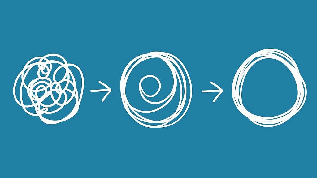
How about this instead—before adding something, ask yourself “will it spark joy?”
Invented by Netflix star Marie Kondo, the KonMari method of decluttering is a full-on embrace of minimalism. Her approach removes the distractions from an environment until what remains is free to bring joy to the person(s) occupying the space.
So, how does KonMari relate to UX design, and how may creatives apply the process? Keep reading to find out!
Uncluttering From the Base: What’s the KonMari Organization Method?
The KonMari movement was founded by the tidying expert and TV personality Marie Kondo. She transforms cluttered homes into spaces of serenity and inspiration. She is the star of the Netflix Show, “Tidying Up With Marie Kondo” and has written four best-seller books on organizing and tidying a home.
The KonMari method doesn’t just involve discarding old items. The items removed are not necessarily useless; only what brings a smile to your face is to be kept.
Getting More Out of Minimalism
The Marie Kondo method is a part of minimalism — a movement that has guided several different disciplines for centuries.
There are traces of minimalism in 12th-century Japanese philosophy, including Ma and Wabi-Sabi. Then, the Netherlands started the very restrictive De Stijl in the 20th century, the same as the groundbreaking “form follows function” Bauhaus movement in Germany.
However, minimalism, as we now know it, was established in America in the 1960s – 70s.
The expression “keep it simple” has influenced design heavily, as can be seen in the interface designs of social media platforms like Instagram and WhatsApp, and email programs.
Here’s some common wisdom when it comes to ‘keeping it simple’.
- Simplicity: The phrase ‘less is more’ cannot be more true than when it comes to design. Having too many elements can make something hard to visually parse. So, instead of trying to show off your design chops, you need to ask yourself “can this design make sense without this?” If the answer is yes, then consider not including it. Not only will this make for a better final product, but you’ll also save yourself some time as well!
In practice, a common example is designers using a relaxed, short color palette and one to two fonts (maximum). This allows for the message being put forward to be conveyed through contrast rather than risk a messy design.
- Structured Visual Hierarchy: How the elements on a webpage are laid out indicates to a reader their priority. A good designer arranges elements in a logical and strategic manner, so they are led to the areas of focus. Finding the appropriate place to look in a user interface (UI) design can be challenging if the piece has an ambiguous visual hierarchy.
For instance, a landing page that places “Review our Services” or “Policy” at the top and sends “Get a Free Quote” or “Register Now” to the bottom has a terrible visual hierarchy.
- Proportion and Composition: Successful designers understand how individual elements come together to create a compelling whole. This is where grids come in. Grids provide organization to your work, showing how every part contributes to the final design.
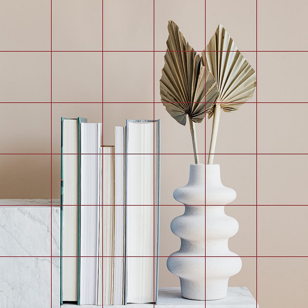
The above image shows how grids can help a designer understand how much negative space an asset has and how the final product may look to a viewer.
- Affordances of All Elements: Minimalism mandates that the numerous elements in your UX design have relatable affordances. The affordance of a design is the possibility of action that the user may take on it (the possibility of an action on an object). For example, the affordance of a car is that it can be driven and the affordance of a bell is that it can be rung.
When you introduce this concept to your design, it helps your audience to know what your product can do at a glance. Let’s say you’re designing a special email product, users should immediately know what they can do as soon as they see your design. The emphasis is that your system elements are arranged in a way that users may quickly and accurately identify the actions that the system allows them to perform.
A designer may achieve this effect by first understanding the users’ perspective and specific cultural and social signifiers that they would be familiar with.
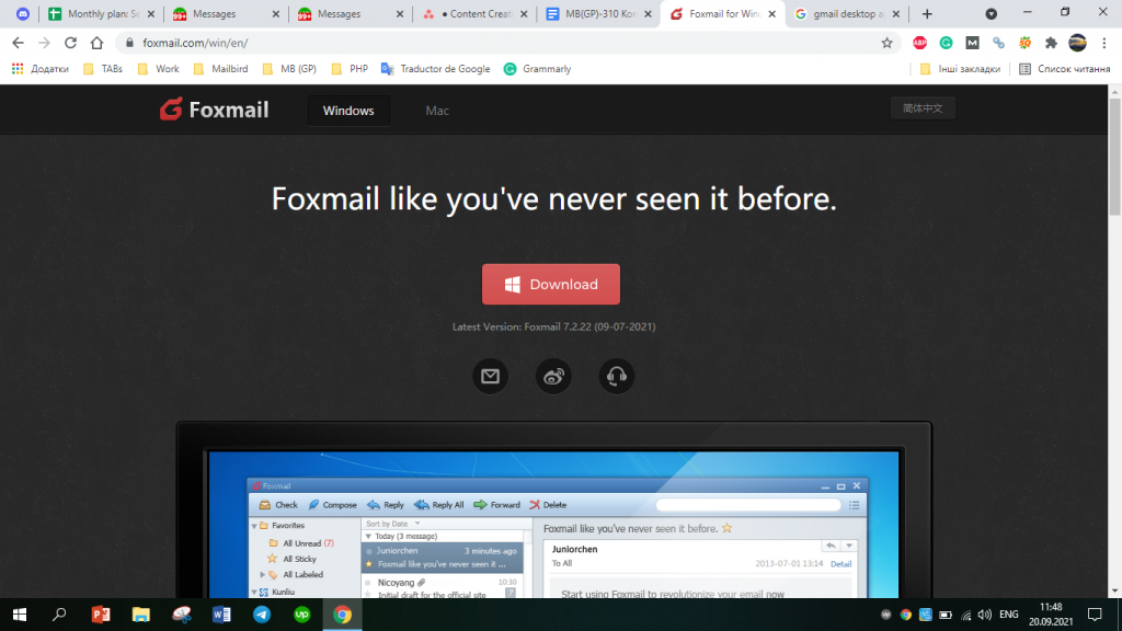
The Foxmail (popular Gmail desktop app) homepage is loaded with affordances – e.g., the shape makes the rose rectangle stand out as a button.
- Presence of White Space: White space refers to the untouched space in a design, although this doesn’t necessarily describe a blank space with a white background. It may be of any color, texture, and pattern. Think of its purpose as something like the function of silence in music.
Having the right amount of white space is essential when trying to convey something important. Things like product images, calls-to-action, and steps in a guide need to be clear. Use white space to ensure a user is clear on what it is they should be focusing on.
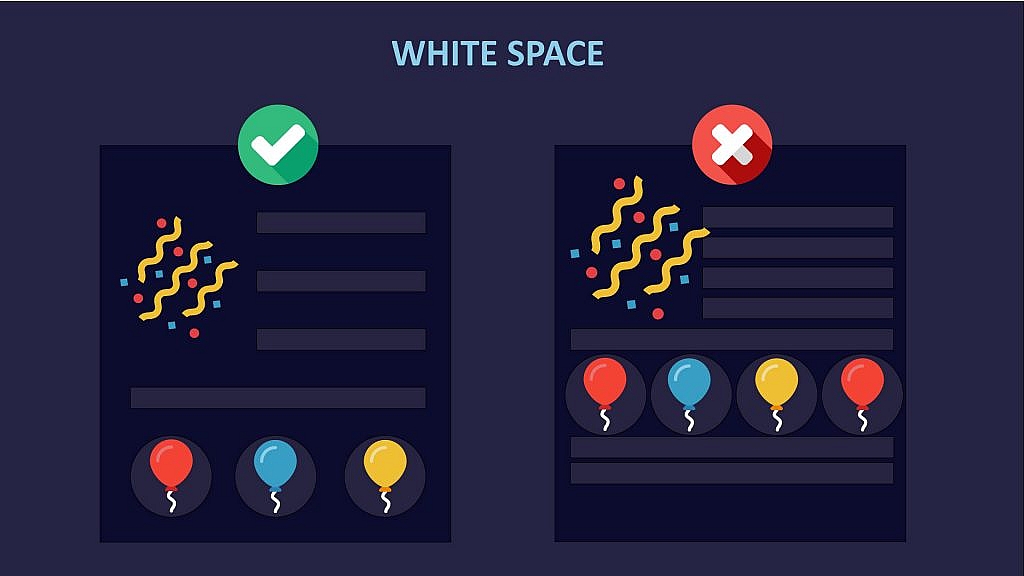
Designers may use white space properly by spacing out their designs, like commas and periods. Consider the illustration above.
- Use of the Golden Ratio: Although there are different views of what makes a good design, the golden ratio is something almost every designer can agree is necessary for a strong design.

The Golden Ratio can be obtained by splitting a line into two parts: a bigger part (a) and a smaller part (b), in such a way that a divided by b equals a + b divided by a. In turn, both will have to equal 1.618, meaning that the first equation gives 1.618, the same as the second. The Divine Proportion can be used to find the perfect ratio for typography, layout and hierarchy definition, image cropping and resizing, and logo development.
Suppose your body copy is at size 11. You may get the ideal size for your header text by multiplying 11 by 1.618, which would be 17.798. Considering this, the perfect header text size would be 18x.
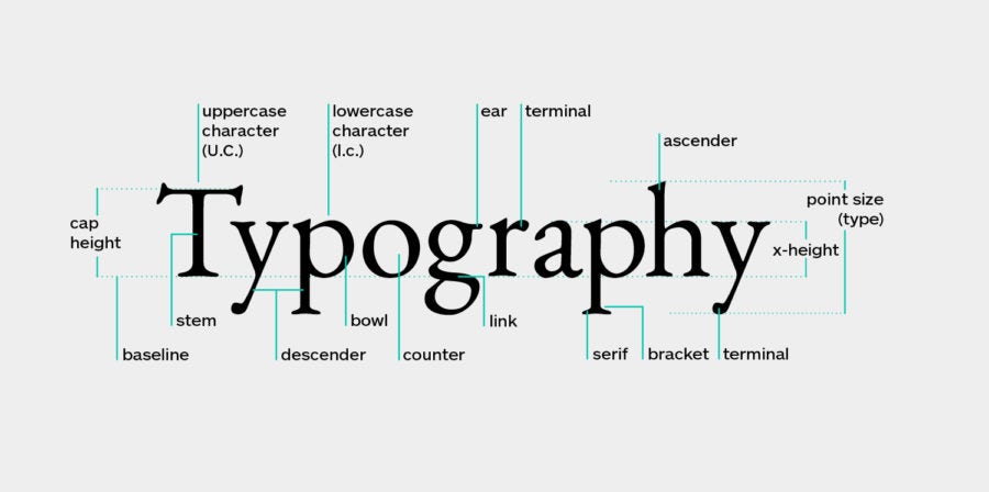
- Typography as a Crucial Design Variable: A few words on a page can be incredibly powerful, especially when they’re well placed.
The type of typeface that you employ can convey a message in itself. When deciding what to use, try placing the same text in multiple typefaces to see how the feel of the message changes.
How Your UX Design Can Benefit from the KonMari Method
The KonMari method embraces the idea of keeping it simple, but with the special twist of ‘sparking joy’. With it in mind, you can streamline your process and create some truly beautiful designs. And, in the process, shave off costly hours of work for yourself.
How “Sparking Joy” Helps Your Design Process
By focusing only on what sparks joy, a designer can better place their time on making the intention behind the design stand out.
Consider your local grocery store. Whenever they have a new product they want to promote, the approach they’d take is to place it in a highly visible area. Sure, some information about it would be somewhere nearby, but the main focus would be to have the product ‘speak for itself’ through clever lighting.
By the same token, your designs should focus on highlighting the product, CTA, etc. in the best possible light. The user’s eye should naturally lead to the action you want them to take. Everything else needs to be in service to that.
Less Chaos, More Organization
The problem of too much can start as early as the ideation stage. Creativity is great, but when you have loose ideas flying around it can be hard to work on a single thought. To better organize your thinking, you can use tools such as mind mapping, card sorting, or stakeholder mapping to stay on track.
The Kondo Approach is Life-changing
KonMari partly draws inspiration from Shintoism (or Kami). This ancient Japanese religion significantly emphasizes certain rituals and spiritualities with a clear objective: expelling negative energy to uplift the divine spirit. Kami concentrates on living the right way, and the first step is tidying up.
The same is true of designers. According to Warren Berger (founder of aMoreBeautifulQuestion), design may not change the world in the ridiculous, grand way people expect.
However, design resolves individual problems worldwide. Thus, it changes lives one at a time.
Practical Tips to Apply KonMari to the UX Design Process
Applying KonMari to product design can be challenging for beginners. The following tips will help you to apply this organizational method.
Know the Procedure (and Trust It)

The UX designing process doesn’t change regardless of the audience or the content type — whether an ecommerce business flyer or a job advert. Why? There’s a purpose for every part of the sequence. The designer has a reason for the low-to-high fidelity osmosis during the prototype, a reason for concentrating on the customer’s challenges before fashioning solutions, and also a reason for iterative tests.
KonMari has the same protocol. You organize clothing to begin, then books before paper, miscellaneous items, and end with mementos.
It’s critical to know and understand the objectives of every phase in the design process. This will provide a foundation to build off of. This also makes selecting the appropriate tools easier.
Think Critically Before Deleting

Digital assets don’t physically exist meaning deleting them is simple. This can have an effect on your thinking as, with time, you might forget how much work went into a specific asset. Often, this split-second action is triggered by critique or feedback. Sometimes all that’s required is a small change, but whoops, you’ve gone and deleted the whole thing!
The KonMari method can help avoid this.
Instead of simply deleting the design outright, consider whether it could be recycled for a future project instead. Save iterations: it takes no time to duplicate your design after creating it. There are days you’ll be grateful you did!
Communicate What’s Possible

Visibility inspires communication in KonMari. The process includes selecting a place for the objects you’re keeping so that they can be found easily. According to this method, invisibility equals an absence.
Sometimes called “discoverability and learnability”, design your product such that a user can easily know if they may achieve a particular objective with it. Communicate
For instance, placing a placeholder text in a text box tells the user what to input in that box. Similarly, having placeholder text in a search box gives the user a clear idea of what to search for. Doing this will ensure the user fills a form correctly or gets accurate search results in their first attempt.
Final Thoughts
KonMari is an outstanding organizational strategy, thanks to its reliability. Cutting out the clutter in your home lets you find joy in what’s left. The same applies to your design. Removing the unnecessary, over-designed and overly complicated elements leaves behind a final design that really emphasizes what’s important.
