Archive

Archive for October, 2021

Eye-Tracking In Mobile UX Research

October 27th, 2021 No comments

The eye-tracking methodology can be extremely valuable for usability tests since it records the journey without interfering with the users’ natural behavior. Imagine, for example, that you test a prototype but discover that users are not interacting with the interface how they are supposed to. You most likely think that the buttons might be too small or you need to change the color, font, or position. As a result, you make the buttons more prominent, and still, the users are not interacting with the interface as intended.

After spending time and resources on improvements, you realize that the problem is not that they don’t see the buttons, but that even when they see them, they don’t know what to do with them. Utilizing an eye-tracking device, however, would help the researcher notice the lack of understanding right away. This is one example of the benefits of using eye-tracking. When the researcher can see through the user’s eyes, recognizing a usability problem sooner would save the client and developer time and money.

Eye-tracking provides information on how people navigate on a page and how attracted they are to visual elements on the screen, like in this study conducted by Nielsen Norman Group which shows the pattern that people use to scan comparison tables. If you are designing an app or a website, you can test how easy and intuitive it is to complete a specific task, fill out a form, find certain information, or buy a product.

Eye-Tracking Evolution

The first time someone conducted a study observing the movement of the eyes was through direct observations in the 1800s. Since then, technology has evolved, and what started with naked-eye observations has become a sophisticated and accurate technology to measure eye movements.

Eye-tracking is nothing but new, but recent developments in technology made the methodology accessible to businesses of all sizes.

In the late 1990s, marketing and advertising agencies saw the potential of eye-tracking for the Internet and started using the technology to analyze how people consume content online. One of the few advertising companies that used eye-tracking back then was EURO RSCG/DSW Partners. They used eye-tracking to measure visual attention on banners, animated graphics, and navigational tools in websites. Before those studies, web pages were designed as printed media, with columns and big blocks of text.

It was the implementation of eye-tracking that provided useful insights that helped shape the work of web designers.

For instance, Nielsen’s research conducted in 2006 showed that people read content on the Internet in an F-shaped pattern. Users tend to start reading from top/left. Next, they move to the top/right of the page, skimming through the content that stands out, such as images and subheadings.

Nowadays, hardware and software are designed to conduct eye-tracking studies for marketing, UX, psychological and medical research, gaming, and several other use cases.

In marketing, eye-tracking is used to test advertising, product placement, and packaging, such as this use case that shows the visual attention that different smoothie brands receive from shoppers:

Another area that has been showing huge potential is eye-tracking in the context of virtual reality. VR headsets use eye-tracking to see where the person is really looking and make the experience significantly more immersive. For PC gaming, eye-tracking allows the player to just look at the object that they want to interact with and press a button instead of using the mouse or controller to guide them to the place the player has their eyes on.

The eye-tracking market is expected to be worth USD 1.75 billion by 2025, being present in different segments and industries.

How Eye-Tracking Works

To incorporate eye-tracking in your research, it is necessary to understand how this methodology works. The researcher uses an eye tracker, namely a device designed to measure the eyes’ movements (usually glasses), or software integrated with a webcam or selfie camera of the smartphone, to conduct a test.

Usually, researchers select areas of the stimulus to be displayed, namely Area of Interest (AOI). In usability, it can be a filter function in the app or an advertisement on the website, for example. The AOI will determine what areas you will calculate metrics for. Besides the AOI, two concepts are extensively used in eye-tracking:

  1. Fixation
    When the person’s gaze stops moving and rests focused on one object.
  2. Saccade
    The movement of the eyes between the fixations.

After defining the AOIs and designing the test, it is time for the participants to join the study and interact with your app or website. The metrics and how they will be shown depending on the eye-tracking tool you choose. It also ranges from studying individual recordings to gather data about the behavior of specific users to quantitatively comparing the number of users who looked at an AOI, the amount of time that they spent on it, and the speed with which it is first detected.

By visualizing the gaze path on video recordings or heatmaps, you can see where the person is looking, for how long, and get actionable data. For example, a long time for the user to first fixate on the AOI (more than 0.15 seconds) can indicate that the AOI should be positioned elsewhere. Or conversely, a long time looking at an AOI can suggest that either it was not clear for the user what to do with that information or simply that the AOI was engaging enough to get the user’s attention for a long time. The data needs to be analyzed in context so that it can be interpreted correctly.

That is why eye-tracking can and should be combined with other methodologies such as surveys, Thinking Aloud (when users verbalize what goes through their mind while performing a task during a usability test), and click rate to provide valuable insights for the researcher.

Eye-Tracking For UX Research

Although some information provided by eye-tracking could be obtained with click heatmaps (visual representation using thermal imaging that shows where people are clicking) or surveys, eye-tracking can also capture data that the participant does not remember, does not describe, or interacts with only visually, without tapping or clicking on it.

With eye-tracking, product designers can get actionable data about how the users perceive and interact with the UI, on both desktop and mobile. However, the price of eye-tracking used to be much higher than heatmaps, as measuring users’ gaze required special hardware to be used in-lab. However, conducting eye-tracking studies became considerably cheaper recently, with software that can transform any webcam or selfie camera of the smartphone into an eye tracker.

Next, we will focus on usability in mobile research and present a use case that shows how UX teams can incorporate eye-tracking in their research toolbox.

Mobile UX Research

Incorporating eye-tracking in mobile UX research was complicated until very recently due to the technological struggle to measure eyes’ movements on the smartphone. Web designers worked until recently with a desktop-first approach. Since 2014, however, mobile users have been gaining more and more importance. Designing for mobile is not only about the size of the screen but also about the users’ behavior. When using smartphones, people are usually distracted, have shorter attention spans, or want to perform a task quickly — such as buying a ticket or finding an address. For this reason, doing UX research for mobile nowadays is essential to many companies.

Eye trackers, the glasses used for most eye-tracking studies, are usually not as precise to track the small screens of smartphones. Therefore, it needed elaborate synchronization of the screen content and the eye-tracking data, resulting in a complex study design and analysis. At the same time, using the webcam does not allow the user to test the app or website in a natural setting; after all, the users usually interact with mobile apps and websites on the smartphone. However, conducting online experiments is a fairly inexpensive way to develop better websites, apps, services, and strategies and make decisions not based on intuition, but on scientific data.

Companies such as Amazon, Facebook, Google, and Microsoft conduct more than 10,000 controlled online tests annually each: they know the investment pays off. Bing also benefited from testing and made revenue-related improvements that resulted in a 10% to 25% increase in revenue per search every year.

Luckily, technology has evolved, from eye trackers and webcams to mobile software, to now enable the opportunity to conduct eye-tracking tests for mobile UX research directly on the smartphone — with no additional hardware required. Software-only solutions can be up to 100x more affordable than eye-tracker studies and allow researchers to conduct tests with participants from all over the world and get accurate results immediately that will help them draw strategies for their digital product.

How To Conduct An Eye-Tracking Study

An eye-tracking study always begins with a question. Let’s say, for example, that you are launching an e-commerce app and want to find out if people see the sales banner placed on the main page. Based on this well-thought research question, you can formulate a hypothesis that reflects your assumptions regarding the users’ behavior, such as “using a photo of the products on sale will drive more conversion”. This will enable you to test predictions and make it easier to analyze the results. After defining assumptions you select the essential metrics to track and measure whether your assumptions indeed reflect the users’ behavior. Next, you create the tasks and the visual stimuli the participants will interact with.

It is very productive for web and mobile eye-tracking research to conduct studies with different versions of your website, application or advertisement, and competitors’ websites, known as A/B testing. By running comparative studies, you will be able to evaluate which elements work best. Once you have designed the test and implemented the study in the testing tool of your choice, it is time to think about the people who will join your study.

For studies where researchers will analyze only heatmaps, it is necessary to recruit at least 30 participants. Although heatmaps are visually appealing and tend to be more popular among researchers, they require many participants to generate more satisfactory results. You can also conduct smaller studies, watching the individual video replays while listening to what they say with the thinking aloud method. For this kind of study, you should have at least six participants joining.

The study can be conducted in-lab or remotely, moderated or unmoderated. In-lab studies demand more time and resources and it is limited to participants who can join the study in person. All the eye-tracking devices and software must be provided in the lab and the study must be monitored by researchers and facilitators.

Remote studies can be conducted with participants from all over the world, which suits companies who have clients located in different cities or even countries. Remote studies can be done unmoderated with the help of tools that can collect and save the data. All the researcher needs to do is to send out the invitation and relax while the technology does all the work.

The metrics available in eye-tracking can vary from tool to tool. Most tools offer qualitative as well as some quantitative results. What is more relevant to you highly depends on the type of study that you run. Some of the most used metrics to measure eyes’ movements quantitatively are Time to first Fixation, First Fixation Duration, Dwell Time, Revisits, amongst many others.

Eye-Tracking Insights

A study conducted by Eye Square, a market research institute, using their in-real context testing and Oculid’s smartphone eye-tracking technology, shows that remote eye-tracking research conducted on smartphones can give insightful data for UX teams.

The Eye Square and Oculid study was based on tests done by 100 respondents across the United States to find out how shoppers interact with e-commerce and what are the elements that get them engaged in a product, with samples being collected during two days. Each tester was given 3 to 5 minutes to complete each test. Two UX-related scenarios were included in this study: an online shopping scenario and a scenario where advertising was tested in context.

The eye-tracking study was designed on Oculid’s platform. (Source: Oculid) (Large preview)

The analysis of the study provided deep insights into what customers were doing and why, while at the same time guaranteeing their privacy. It is an automated, anonymous analysis, with full transparency for testers and compliant with the regulation in EU law General Data Protection Regulation 2016/697 (GDPR). The data is recorded only with the explicit consent of the user and deleted according to GDPR regulations.

Here are the findings of the two scenarios analyzed in the eye-tracking study:

1. Online Shopping

When examining or considering online shopping, eye-tracking shows which elements engage the consumers at first sight. Eye Square conducted an A/B test, a process in which two or more versions of a variable (page element, advertising, app) are shown to different segments of users, using Oculid’s eye-tracking technology.

An A/B test is conducted by having two groups interacting with two different versions of the website:

  • A (the control): this one confirms the hypothesis;
  • B (the challenger): this one is a modification.

The analysis showed that less than 10% of shoppers scroll down to see products that are not visible on the first page.

The A/B test also demonstrated that consumers engage with visual triggers they already know, but also with other images that are big and clear. However, the decision-making does not limit to the visuals of the page, but it is also influenced by the content. For example, shoppers tend to spend a long time reading the Product Detail Page, proving the importance of having compelling copywriting on the product page.

The second UX scenario was an advertisement in the social media context.

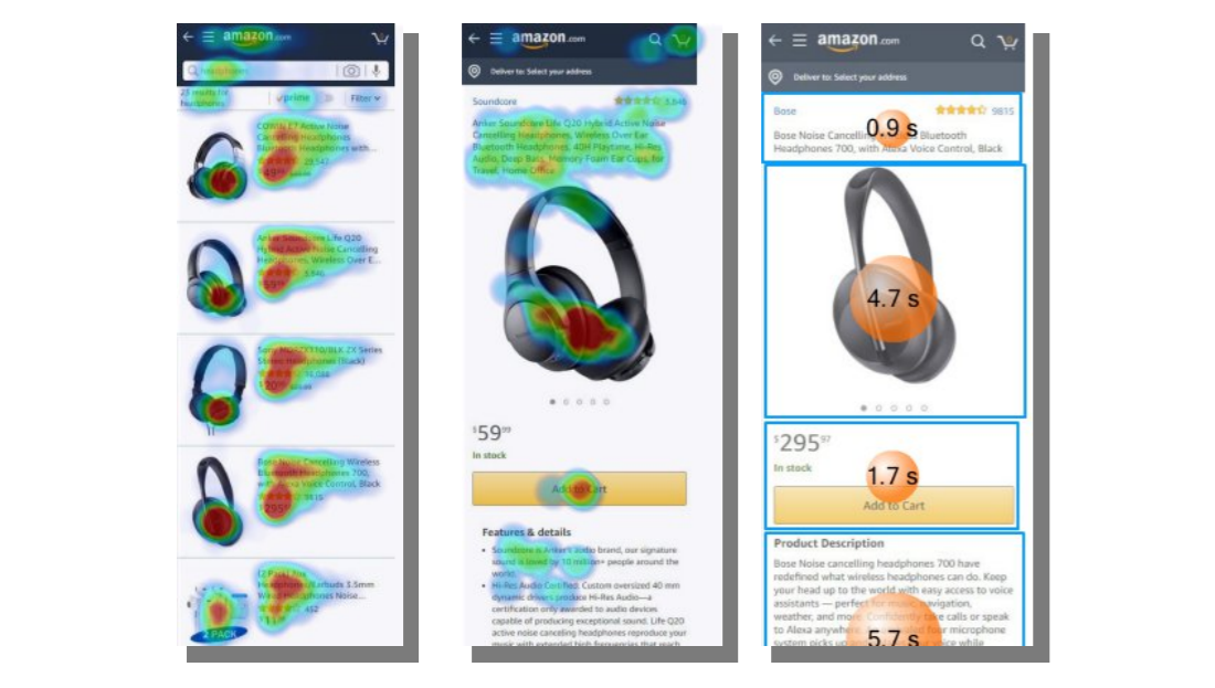
2. Advertising In Context

In the scenario of the Eye Square and Oculid study where an ad was displayed in context, the participants first viewed an Instagram feed which, amongst other items, showed a video advertising a specific pair of headphones. Subsequently, the participants of the study were asked to shop online for a pair of headphones. Here it was not specified what type of headphones that should be. Participants were directed to the webpage of Amazon where they saw different products from this category with different brands being displayed.

The analysis of Oculid’s eye-tracking data provided by the advertisement in context revealed that the specific headphone displayed in the video advertising received more visual attention than products from the competitor brands. The advertised headphones received 2.4 seconds of visual attention as compared to 2.1 seconds from the closest competitor, even though the closest competitor was listed before.

This was true even though the researched product was listed as fourth in the online shopping platform, demonstrating that the advertisement contributes to getting the customers’ attention. In addition to receiving longer viewing times overall, customers of the Eye Square and Oculid study showed 50% more interactions/clicks with the advertised product than with any other competing product. For UX teams, this study showcases how measuring visual attention can give information about patterns that people follow when accessing a website or an app.

Conclusion

Eye-tracking used to be an expensive and challenging methodology, which turned many researchers away from it and made it difficult for UX researchers to conduct mobile studies. Nowadays, smartphones have up to 50-megapixel selfie cameras and can be used as highly accurate eye trackers to conduct mobile UX research. Thanks to technology and easy integration of study design and data analysis, eye-tracking can be easily incorporated into the researchers’ toolbox.

Including eye-tracking in the process of usability testing can offer many benefits for UX teams. For one, it allows you to test prototypes and make changes based not only on what users say but on what they do, almost like seeing over the shoulders of the users, but in their natural environment. Also, it can provide insights about users’ behavior that will save time and money for the company.

The technology can be used by eye-tracking experts, but also by UX teams that are only familiar with other methodologies. Knowledge about usability testing and some reading about the main metrics of eye-tracking and how to interpret them is enough to get started and try out. Giving a chance to test this methodology can complement usability testing and take it to a higher level.

It is certain that not every question on mobile UX can be answered with eye-tracking alone. As mentioned before, combining different methods is recommended to get different perspectives of users’ behavior. However, the technology combined with online questionnaires, Thinking Aloud, interviews, and so on can offer insights about subconscious processes that affect decision-making and are not obtained through other methods.

Sources

Categories: Others Tags:

20 Best New Sites, October 2021

October 25th, 2021 No comments

We’re well on our way to Hallowe’en already, and it’s time for another collection of websites that have caught our eye.

It’s a mixed bag of candy this month, but nothing that should make you scream with fright. Enjoy!

Tether

This single-page site for forthcoming cycle safety system Tether uses a balanced combination of hero video and illustration to explain its features.

Wayfinder 

Wayfinder is a game about our connection to nature that uses generative code, artificial intelligence, machine learning, and data mining to create a new experience each time it is played.

Beechhouse

Beechhouse has a clean, airy feel, with subtle scrolling animation. For a tattoo studio, the overall feel is refreshingly light, without a rose-filled skull to be seen.

edenspiekermann_ 

This is how you do a portfolio site with absolute confidence.

Forward Festival 

Forward Festival is a series of creative conferences run by Forward Creatives design agency. This is an excellent example of a classic magazine site with enough individuality to pull the user in and keep them engaged.

Danmarks Motionsuge 

Denmark’s Exercise Week focuses on a national campaign (in Denmark) to get Danish people to be more active. A fresh color scheme, offset grid, and strong photography all create a dynamic feel. And it is somehow reassuring to the rest of us that even the second happiest population in the world needs to exercise more.

Franco Maria Ricci 

Because we have come to expect load times to be almost nothing, loading screens are not something too many sites bother with. However, this site for publisher Franco Maria Ricci is a pleasing exception.

Pierre Yovanovitch 

Stylishly curated portfolio and catalog site for interior and furniture designer Pierre Yovanovitch.

Gir

Silicone spatulas are probably not the first subject most of us fantasize about designing a site for, but that’s what makes this site for Gir extra good. The ‘add to cart’ footer widget on individual product pages is done well, making sure a buy button is always present but without being over pushy.

Gastronomical 

Bright, bold, and in your face, this site for Gastronomical pancake and waffle mix is about as far from Betty Crocker as it could get, bringing ‘cool’ to home baking.

FC XV

Marking 15 years of Dutch fashion brand Fabienne Chapot, this microsite makes a feature of the illustration style used by the brand for its prints.

Websmith Studio

This is a good, simple portfolio site with good use of color to highlight, and the background noise effect adds subtle interest. Good name too.

Van Gogh Museum

This is definitely one of the better museum websites around. The use of color creates warmth without detracting from the sense of space. The ability to search the collection visually is a welcome feature.

Chérie Healey 

Life coach Chérie Healey’s site manages to stay on the right side of positive and uplifting without tipping over into hippy meme territory.

Kalso 

To mark the launch of the new Earth Shoes website, this microsite traces the history of the original Kalso Earth shoes, starting with their inventor Anne Kalsø herself.

The Order of the Good Death 

The Order of the Good Death is aimed at changing attitudes around a subject that most of us find extremely difficult, in a way that is informative and at the same time appealing. The tone of the content is as essential here as the visual style.

Air Company 

The use of split-screen works well here for Air Company, to show now and future, along with some great photography and video.

Wild Fi 

Wild Fi design agency’s site manages to be colorful but clean at the same time. Bold type and a balance between black on white and white on black make an impact.

Firefly 

This site for Firefly digital design agency has some great little details, notably a glow around the cursor.

StudioBand 

Dark neutral colors provide a calm, muted background for video and photography of work in StudioBand’s portfolio site redesign.

Source

The post 20 Best New Sites, October 2021 first appeared on Webdesigner Depot.

Categories: Designing, Others Tags:

The Semantics of Jamstack

October 25th, 2021 No comments

The past year has seen a healthy debate around the term ‘Jamstack’ as the definition gets stretched to include new use cases. I recently posted my take on a Jamstack definition in “Static vs. Dynamic vs. Jamstack: Where’s The Line?” In this article, I want to look at the evolution of Jamstack and what that means for the term.

Developers have been creating static sites long before the term Jamstack was coined. The most common use case was an easy way for developers to host their blog or open-source documentation on GitHub Pages. Some pioneers were pushing larger, commercial projects on static sites, but it certainly wasn’t as common as it is today.

Static sites had been perceived as limited — old technology from the 90s. Why would forward-looking companies want to use this ancient way of building websites? Phil Hawksworth hit it right on the button in his IJS talk about static being a loaded term:

Are we talking about a static experience, or are we talking about a static architecture?

The potential for ambiguity is incredibly confusing, especially to non-developers. The static websites of the 90s are not the same as modern static sites. There are new technologies that warrant giving static sites a second look:

  • JavaScript has evolved into a powerful language for building applications in the browser. Gmail launched in 2004 and was the first mainstream application to make heavy use of Ajax.
  • Static Site Generators (SSGs) have brought many dynamic site advantages such as layouts and separating content from code. Jekyll was the first widely popular SSG, launching in 2008.
  • CDNs used to be a technology that only large enterprises could afford. When AWS Cloudfront launched in 2008, you could set up a CDN in minutes, and at a small scale, it would only cost you a few dollars.
  • Git workflows, and the CI/CD tools built around it, have made error-prone FTP deployments a thing of the past.
  • Ecosystem — there’s a growing number of standalone tools you can drop into a static site to enable extra functionality, from search and eCommerce to databases, comments and more.

Jamstack helped change people’s perception of static websites. And the shifting winds on static were what lead Matt Biilmann to coin the term Jamstack itself in 2016. Suddenly, we had a word that captured the benefits of modern static sites without the baggage of static. Cassidy Williams does a fantastic job of capturing the essence of Jamstack:

Jamstack is about building web applications in the same style as mobile applications: the UI is compiled, and then data is pulled in as needed.

Jamstack struck a chord with many WordPress developers in particular. Coming from the world of intricate theming and plugin APIs, the simplicity and control you got with an SSG was refreshing. The movement had begun, and a community formed around Jamstack’s decoupled approach.

As Jamstack grew in popularity, so did the size and complexity of projects. We saw the principles of Jamstack move beyond websites, and as they made their way into web applications, we soon reached the technical limits of what a static site was capable of doing. Platforms added new features and workflows to expand Jamstack principles, allowing larger and more complex applications to take a Jamstack approach.

I’m excited to take part in this evolution with CloudCannon. We’re seeing a significant shift in how developers build software for the web. There’s a flourishing ecosystem of specialty tools and platforms enabling front-end developers to do more, and for sophisticated applications to live at the edge.

My concern is we can’t agree on what Jamstack actually means. We have succinct definitions that paint a clear boundary of what is and isn’t Jamstack. Many of my favorites are in this article. We’re seeing the term Jamstack used for more and more dynamic behavior. Some of the community is on board with this usage, and some aren’t. Ambiguity and perception were the original reasons for coining the term, and we’re at risk of coming full circle here.

It’s a difficult problem the Jamstack community faces because there is so much cross-over between the original meaning of “Jamstack” and the new, evolved, more dynamic-ish usage of the word. I’m conflicted myself because I love the idea of applying Jamstack principles to more dynamic approaches. I briefly considered the idea of using “Jamstack” to describe static usage, and “Jamstack++” the more dynamic usage. But quickly realized that would probably create more confusion than it solves.

Matt Biilmann nailed it with Netlify’s announcement of Distributed Persistent Rendering (DPR):

For any technology, the hardest part is not establishing simplicity, but protecting it over time.

This perfectly captures my thoughts. It’s reassuring to know I’m not limited if I build a new project with a Jamstack approach. If my site gets enormous or I need dynamic behavior, I have options. Without these options, Jamstack would be seen as a limited technology for small use cases. On the other hand, the more we emphasize these more dynamic solutions, the further we get from the elegant simplicity that created the Jamstack movement in the first place.

DPR is an exciting new technology. It’s an elegant solution to the painful limitation of prebuilding large sites. For a 100k page site, would I make the tradeoff of prebuilding a subset of those pages and have the rest build on demand the first time they’re requested, thus reducing build time significantly? Heck yes, I would! That’s a tradeoff that makes sense.

I’ve been doing a lot of thinking about where DPR fits into the Jamstack picture, mostly because it’s right on the edge. Whether you include it or exclude it from the Jamstack umbrella has rippling ramifications.

Sean Davis has a Jamstack definition I’m a fan of:

Jamstack is an architecture for atomically building and delivering precompiled, decoupled front-end web projects from the edge.

This resonates with what I believe Jamstack is all about. If we’re to include DPR in this definition, it needs some work:

Jamstack is an architecture for atomically building and delivering precompiled (or on-demand generated webpages, but only if it’s the first request and then it’s persisted), decoupled front-end web projects from the edge.

The official Jamstack definition works better for DPR:

Jamstack is the new standard architecture for the web. Using Git workflows and modern build tools, pre-rendered content is served to a CDN and made dynamic through APIs and serverless functions.

DPR either delivers content using a serverless function or as static file through a CDN so it fits the definition.

It’s interesting to see how the definition has changed over time. Before late 2020, the official Jamstack definition, posted directly on Jamstack.org at the time, was as follows:

Fast and secure sites and apps delivered by pre-rendering files and serving them directly from a CDN, removing the requirement to manage or run web servers.

Technology evolves over time, as does language, so it’s great to see the definition tweaked to keep up with the times. Introducing “serverless” into the definition makes sense on one hand as the technology is becoming more approachable to front-end developers, who are the predominant Jamstack audience. On the other hand, it goes against the core Jamstack principles of pre-rendering and decoupling. Do we need to update these core principles too?

I’m still processing all of these thoughts and ideas myself. I’m a big fan of Jamstack, it has served as a major catalyst for the growth in static site generators, and given us a language to talk about the approach of pre-rendering and decoupling websites. Looking ahead, I can see five directions Jamstack can go:

  1. Jamstack is cemented in its original meaning, prerendering and decoupling. The more dynamic, Jamstack-inspired approaches get their own name.
  2. Jamstack evolves and the definition and principles are expanded. As a result, the meaning likely becomes more ambiguous.
  3. Jamstack is the name of the community. It’s a set of guidelines and there are no hard and fast rules.
  4. Jamstack has lifted the baggage of static, and we can talk about static vs. hybrid vs. dynamic websites.
  5. Jamstack becomes mainstream enough that we can simply call it modern web development.

There are people in all of these camps pulling in different directions, leading to much confusion and discussion in the community. What is clear is that this community of people is deeply passionate about this approach to building websites. Frankly, I couldn’t be more excited about the innovations happening in this space. What we need is consensus and a path forward. Without this, I believe, for better or worse, we’re going to end up with a mix of options 3, 4 and 5.


The post The Semantics of Jamstack appeared first on CSS-Tricks. You can support CSS-Tricks by being an MVP Supporter.

Categories: Designing, Others Tags:

A Deep Dive Into object-fit And background-size In CSS

October 25th, 2021 No comments

We’re not always able to load different-sized images for an HTML element. If we use a width and height that isn’t proportional to the image’s aspect ratio, the image might either be compressed or stretched. That isn’t good, and it can be solved either with object-fit for an img element or by using background-size.

First, let’s define the problem. Consider the following figure:

Why is this happening?

An image will have an aspect ratio, and the browser will fill the containing box with that image. If the image’s aspect ratio is different than the width and height specified for it, then the result will be either a squeezed or stretched image.

We see this in the following figure:

The Solution

We don’t always need to add a different-sized image when the aspect ratio of the image doesn’t align with the containing element’s width and height. Before diving into CSS solutions, I want to show you how we used to do this in photo-editing apps:

Now that we understand how that works, let’s get into how this works in the browser. (Spoiler alert: It’s easier!)

CSS object-fit

The object-fit property defines how the content of a replaced element such as img or video should be resized to fit its container. The default value for object-fit is fill, which can result in an image being squeezed or stretched.

Let’s go over the possible values.

Possible Values for object-fit

object-fit: contain

In this case, the image will be resized to fit the aspect ratio of its container. If the image’s aspect ratio doesn’t match the container’s, it will be letterboxed.

object-fit: cover

Here, the image will also be resized to fit the aspect ratio of its container, and if the image’s aspect ratio doesn’t match the container’s, then it will be clipped to fit.

object-fit: fill

With this, the image will be resized to fit the aspect ratio of its container, and if the image’s aspect ratio doesn’t match the container’s, it will be either squeezed or stretched. We don’t want that.

object-fit: none

In this case, the image won’t be resized at all, neither stretched nor squeezed. It works like the cover value, but it doesn’t respect its container’s aspect ratio.

Aside from object-fit, we also have the object-position property, which is responsible for positioning an image within its container.

Possible Values For object-position

The object-position property works similar to CSS’ background-position property:

The top and bottom keywords also work when the aspect ratio of the containing box is vertically larger:

CSS background-size

With background-size, the first difference is that we’re dealing with the background, not an HTML (img) element.

Possible Values for background-size

The possible values for background-size are auto, contain, and cover.

background-size: auto

With auto, the image will stay at its default size:

background-size: cover

Here, the image will be resized to fit in the container. If the aspect ratios are not the same, then the image will be masked to fit.

background-size: contain

In this case, the image will be resized to fit in the container. If the aspect ratios are off, then the image will be letterboxed as shown in the next example:

As for background-position, it’s similar to how object-position works. The only difference is that the default position of object-position is different than that of background-position.

When Not to Use object-fit or background-size

If the element or the image is given a fixed height and has either background-size: cover or object-fit: cover applied to it, there will be a point where the image will be too wide, thus losing important detail that might affect how the user perceives the image.

Consider the following example in which the image is given a fixed height:

.card__thumb {
    height: 220px;
}

If the card’s container is too wide, it will result in what we see on the right (an image that is too wide). That is because we are not specifying an aspect ratio.

There is only one of two fixes for this. The first is to use the padding hack to create an intrinsic ratio.

.card__thumb {
    position: relative;
    padding-bottom: 75%;
    height: 0;
}

.card__thumb img {
    position: absolute;
    left: 0;
    top: 0;
    width: 100%;
    height: 100%;
    object-fit: cover;
}

The second fix is to use the new aspect-ratio CSS property. Using it, we can do the following:

.card__thumb img {
    aspect-ratio: 4 / 3;
}

Note: I’ve already written about the aspect-ratio property in detail in case you want to learn about it: “Let’s Learn About Aspect Ratio In CSS”.

Use Cases And Examples

User Avatars

A perfect use case for object-fit: cover is user avatars. The aspect ratio allowed for an avatar is often square. Placing an image in a square container could distort the image.

.c-avatar {
    object-fit: cover;
}

Logos List

Listing the clients of a business is important. We will often use logos for this purpose. Because the logos will have different sizes, we need a way to resize them without distorting them.

Thankfully, object-fit: contain is a good solution for that.

.logo__img {
    width: 150px;
    height: 80px;
    object-fit: contain;
}

Article Thumbnail

This is a very common use case. The container for an article thumbnail might not always have an image with the same aspect ratio. This issue should be fixed by the content management system (CMS) in the first place, but it isn’t always.

.article__thumb {
    object-fit: cover;
}

Hero Background

In this use case, the decision of whether to use an img element or a CSS background will depend on the following:

  • Is the image important? If CSS is disabled for some reason, would we want the user to see the image?
  • Or is the image’s purpose merely decorative?

Based on our answer, we can decide which feature to use. If the image is important:

<section class="hero">
    <img class="hero__thumb" src="thumb.jpg" alt="" />
</section>
.hero {
    position: relative;
}

.hero__thumb {
    position: absolute;
    left: 0;
    top: 0;
    width: 100%;
    height: 100%;
    object-fit: cover;    
}

If the image is decorative, we can go with background-image:

.hero {
    position: relative;
    background-image: linear-gradient(to top, #a34242, rgba(0,0,0,0), url("thumb.jpg");
    background-repeat: no-repeat;
    background-size: cover;
}

The CSS is shorter in this case. Make sure that any text placed over the image is readable and accessible.

Adding a Background to an Image With object-fit: contain

Did you know that you can add a background color to img? We would benefit from that when also using object-fit: contain.

In the example below, we have a grid of images. When the aspect ratios of the image and the container are different, the background color will appear.

img {
    object-fit: contain;
    background-color: #def4fd;
}

Video Element

Have you ever needed a video as a background? If so, then you probably wanted it to take up the full width and height of its parent.

.hero {
    position: relative;
    background-color: #def4fd;
}

.hero__video {
    position: aboslute;
    left: 0;
    top: 0;
    width: 100%;
    height: 100%;
}

To make it fully cover the width and height of its parent, we need to override the default object-fit value:

.hero__video {
    /* other styles */
    object-fit: cover;
}

Conclusion

As we’ve seen, both object-fit and background-size are very useful for handling different image aspect ratios. We won’t always have control over setting the perfect dimensions for each image, and that’s where these two CSS features shine.

A friendly reminder on the accessibility implications of choosing between an img element and a CSS background: If the image is purely decorative, then go for a CSS background. Otherwise, an img is more suitable.

I hope you’ve found this article useful. Thank you for reading.

Categories: Others Tags:

A Deep Dive Into `object-fit` And `background-size` In CSS

October 25th, 2021 No comments

We’re not always able to load different-sized images for an HTML element. If we use a width and height that isn’t proportional to the image’s aspect ratio, the image might either be compressed or stretched. That isn’t good, and it can be solved either with object-fit for an img element or by using background-size.

First, let’s define the problem. Consider the following figure:

Why is this happening?

An image will have an aspect ratio, and the browser will fill the containing box with that image. If the image’s aspect ratio is different than the width and height specified for it, then the result will be either a squeezed or stretched image.

We see this in the following figure:

The Solution

We don’t always need to add a different-sized image when the aspect ratio of the image doesn’t align with the containing element’s width and height. Before diving into CSS solutions, I want to show you how we used to do this in photo-editing apps:

Now that we understand how that works, let’s get into how this works in the browser. (Spoiler alert: It’s easier!)

CSS object-fit

The object-fit property defines how the content of a replaced element such as img or video should be resized to fit its container. The default value for object-fit is fill, which can result in an image being squeezed or stretched.

Let’s go over the possible values.

Possible Values for object-fit

object-fit: contain

In this case, the image will be resized to fit the aspect ratio of its container. If the image’s aspect ratio doesn’t match the container’s, it will be letterboxed.

object-fit: cover

Here, the image will also be resized to fit the aspect ratio of its container, and if the image’s aspect ratio doesn’t match the container’s, then it will be clipped to fit.

object-fit: fill

With this, the image will be resized to fit the aspect ratio of its container, and if the image’s aspect ratio doesn’t match the container’s, it will be either squeezed or stretched. We don’t want that.

object-fit: none

In this case, the image won’t be resized at all, neither stretched nor squeezed. It works like the cover value, but it doesn’t respect its container’s aspect ratio.

Aside from object-fit, we also have the object-position property, which is responsible for positioning an image within its container.

Possible Values For object-position

The object-position property works similar to CSS’ background-position property:

The top and bottom keywords also work when the aspect ratio of the containing box is vertically larger:

CSS background-size

With background-size, the first difference is that we’re dealing with the background, not an HTML (img) element.

Possible Values for background-size

The possible values for background-size are auto, contain, and cover.

background-size: auto

With auto, the image will stay at its default size:

background-size: cover

Here, the image will be resized to fit in the container. If the aspect ratios are not the same, then the image will be masked to fit.

background-size: contain

In this case, the image will be resized to fit in the container. If the aspect ratios are off, then the image will be letterboxed as shown in the next example:

As for background-position, it’s similar to how object-position works. The only difference is that the default position of object-position is different than that of background-position.

When Not to Use object-fit or background-size

If the element or the image is given a fixed height and has either background-size: cover or object-fit: cover applied to it, there will be a point where the image will be too wide, thus losing important detail that might affect how the user perceives the image.

Consider the following example in which the image is given a fixed height:

.card__thumb {
    height: 220px;
}

If the card’s container is too wide, it will result in what we see on the right (an image that is too wide). That is because we are not specifying an aspect ratio.

There is only one of two fixes for this. The first is to use the padding hack to create an intrinsic ratio.

.card__thumb {
    position: relative;
    padding-bottom: 75%;
    height: 0;
}

.card__thumb img {
    position: absolute;
    left: 0;
    top: 0;
    width: 100%;
    height: 100%;
    object-fit: cover;
}

The second fix is to use the new aspect-ratio CSS property. Using it, we can do the following:

.card__thumb img {
    aspect-ratio: 4 / 3;
}

Note: I’ve already written about the aspect-ratio property in detail in case you want to learn about it: “Let’s Learn About Aspect Ratio In CSS”.

Use Cases And Examples

User Avatars

A perfect use case for object-fit: cover is user avatars. The aspect ratio allowed for an avatar is often square. Placing an image in a square container could distort the image.

.c-avatar {
    object-fit: cover;
}

Logos List

Listing the clients of a business is important. We will often use logos for this purpose. Because the logos will have different sizes, we need a way to resize them without distorting them.

Thankfully, object-fit: contain is a good solution for that.

.logo__img {
    width: 150px;
    height: 80px;
    object-fit: contain;
}

Article Thumbnail

This is a very common use case. The container for an article thumbnail might not always have an image with the same aspect ratio. This issue should be fixed by the content management system (CMS) in the first place, but it isn’t always.

.article__thumb {
    object-fit: cover;
}

Hero Background

In this use case, the decision of whether to use an img element or a CSS background will depend on the following:

  • Is the image important? If CSS is disabled for some reason, would we want the user to see the image?
  • Or is the image’s purpose merely decorative?

Based on our answer, we can decide which feature to use. If the image is important:

<section class="hero">
    <img class="hero__thumb" src="thumb.jpg" alt="" />
</section>
.hero {
    position: relative;
}

.hero__thumb {
    position: absolute;
    left: 0;
    top: 0;
    width: 100%;
    height: 100%;
    object-fit: cover;    
}

If the image is decorative, we can go with background-image:

.hero {
    position: relative;
    background-image: linear-gradient(to top, #a34242, rgba(0,0,0,0), url("thumb.jpg");
    background-repeat: no-repeat;
    background-size: cover;
}

The CSS is shorter in this case. Make sure that any text placed over the image is readable and accessible.

Adding a Background to an Image With object-fit: contain

Did you know that you can add a background color to img? We would benefit from that when also using object-fit: contain.

In the example below, we have a grid of images. When the aspect ratios of the image and the container are different, the background color will appear.

img {
    object-fit: contain;
    background-color: #def4fd;
}

Video Element

Have you ever needed a video as a background? If so, then you probably wanted it to take up the full width and height of its parent.

.hero {
    position: relative;
    background-color: #def4fd;
}

.hero__video {
    position: aboslute;
    left: 0;
    top: 0;
    width: 100%;
    height: 100%;
}

To make it fully cover the width and height of its parent, we need to override the default object-fit value:

.hero__video {
    /* other styles */
    object-fit: cover;
}

Conclusion

As we’ve seen, both object-fit and background-size are very useful for handling different image aspect ratios. We won’t always have control over setting the perfect dimensions for each image, and that’s where these two CSS features shine.

A friendly reminder on the accessibility implications of choosing between an img element and a CSS background: If the image is purely decorative, then go for a CSS background. Otherwise, an img is more suitable.

I hope you’ve found this article useful. Thank you for reading.

Categories: Others Tags:

Popular Design News of the Week: October 18, 2021 – October 24, 2021

October 24th, 2021 No comments

Every day design fans submit incredible industry stories to our sister-site, Webdesigner News. Our colleagues sift through it, selecting the very best stories from the design, UX, tech, and development worlds and posting them live on the site.

The best way to keep up with the most important stories for web professionals is to subscribe to Webdesigner News or check out the site regularly. However, in case you missed a day this week, here’s a handy compilation of the top curated stories from the last seven days. Enjoy!

CSS Squid Game

Alter 3D Illustrations – Hundreds of 3D Illustrations for your Designs

25 Quirky & Highly Creative Free Fonts for Designers

HTML with Superpowers

Smart CSS Solutions for Common UI Challenges

Expandable Sections Within a CSS Grid

Bright Color Palette: How and When to Use One

Everything Apple Announced at its 2021 MacBook Pro Event

UX Design has a Dirty Secret

Building a Multi-select Component

Source

The post Popular Design News of the Week: October 18, 2021 – October 24, 2021 first appeared on Webdesigner Depot.

Categories: Designing, Others Tags:

Can Include (a Certain HTML element within another Certain HTML Element)

October 22nd, 2021 No comments

A single-serving website from Alexander Vishnyakov for testing if it’s valid to put any particular HTML element within another type of HTML element. Kinda neat to have a quick reference for this.

Some combinations feel fairly obvious: can you put a inside an <input>? Uh, no. Some are trickier: can you put a

inside an

? Nope — that one bit me this week (derp). Some are a little confusing, like

is an invalid child of an

    but a valid child of a

    .

    Direct Link to ArticlePermalink


    The post Can Include (a Certain HTML element within another Certain HTML Element) appeared first on CSS-Tricks. You can support CSS-Tricks by being an MVP Supporter.

Categories: Designing, Others Tags:

How To Leverage Social Proof Successfully

October 22nd, 2021 No comments

Customer reviews are incredibly valuable to your company. Around 95% of customers say they read reviews before they make a purchase. Another 72% say that they won’t even consider buying your items until they’ve read the reviews associated with your business or product. 

No matter how good your marketing and promotion strategies might be, your audience will always turn to other customers for a credible insight into what buying from your brand is really like. That’s why it’s so important to leverage as much social proof as you can.

Unfortunately, gathering reviews and displaying them correctly on your website can be challenging.

In this article, we’re going to look at what you can do to make your reviews stand out when you’re ready to display them online. 

The Different Kinds of Review

Before we get into looking at all the different ways you can effectively display your reviews on your website, let’s get the basics out of the way. 

There’s more than one type of review. Some are simply comments left on the bottom of your product pages by customers that were impressed by whatever you sold. Other reviews are available in the form of videos or badges. When you want your website to look as credible as possible, the best thing you can do is decide which types of reviews will have the most impact. 

Ideally, you’ll want a combination of different review types to add depth to your site. Putting various kinds of reviews on your website increases your credibility while also boosting your SEO

Here are your main options:

The Testimonial

Testimonials are one of the most common types of review. Essentially, these are the messages shared by your customers that highlight the things they liked and didn’t like about your product. Testimonials often include a picture of the person leaving the message, and their name, to give them a greater sense of authenticity. You might also include a link to a website or case study with a testimonial to give it more depth. 

Most testimonials go at the bottom of pages. You can showcase these reviews on your home page to start generating credibility as soon as someone interacts with your brand. Alternatively, you could allow users to place their reviews on product pages. Here’s an example of what a testimonial might look like from ducttapemarketing.com:

Review Badges and Widgets

If your customers tend to leave reviews about your company on other sites, like Angie’s List or Yelp, then you can add a widget or badge to your website that makes it easier for other customers to find them. Sometimes, you’ll just include a small button on the bottom of a website pay that says, “find us on Yelp.” Other times, you can add your star rating too.

Some review sites will also give you the option to showcase the actual reviews in a widget that frequently updates with new messages. 

If you’re only showing reviews from one third-party site on your website, it’s best to focus on Google reviews, as it’s one of the most recognizable options. 

Provided that you’re using them correctly, badges and review widgets shouldn’t slow your website down too much, and many can be customized to suit the style of your site too. However, it’s essential to ensure that you don’t add too many widgets to your site if you want to avoid performance issues. 

Case Studies

Case studies go beyond the basics of the standard review and provide potential leads with a tremendous amount of information about how you’ve previously interacted with other companies. With a case study, you’ll often create a structured document that demonstrates a customer’s problem and your strategies to overcome those issues. 

Case studies often exist on their own pages, so you can go in-depth with sharing valuable information. For example, you’ll include an overview that introduces the customer you worked with and details on the outcomes you achieved together. 

Although it’s much harder to interview customers for complete case studies and get all the statistics and numbers that make these reviews appealing, it’s often worth the effort. Particularly if you’re running a B2B company, case studies demonstrate the effort you go through to support your customers. They also act as proof of your success and set valuable expectations for customers. Here’s an example of a case study page by Fabrikbrands.com:

The Rating

If you’re just posting basic five-star ratings on your website or asking your customers to give you a number between one and ten for how positively they’d rate your service, then you can use a few handy automation tools to create one of these visuals. 

All you need to do is add a little basic CSS to your website or use a star rating widget that automatically calculates your average score based on all of the reviews that you collect from customers. 

Just make sure that your star ratings are positive not just on your website but on other review sites too. For instance, if you give yourself five stars by adjusting the CSS and then get three stars from Yell, customers will begin questioning your authenticity. 

Notably, while star ratings grab customer attention, they are a little basic if you’re trying to convert people and convince them to buy an expensive product. Most customers will often need more information than a basic star rating can provide. 

How to Display Reviews on Your Website

Now that you know what kind of reviews customers can leave about your product or brand, you can start exploring ways to display them on your website. 

You could decide to let your reviews show up on other third-party sites and leave it at that. For instance, if you’re a hotel manager, you may know that your customers are already leaving reviews on Booking.com and TripAdvisor. However, leaving your audience to seek your reviews out for themselves means that they spend less time where you want them – on your website. 

There’s also a risk that failing to add reviews to your site will make you look less credible. If you don’t own your rating or score, customers might wonder what you have to hide. 

Fortunately, we’ve got some great options to help you get started.

1. Create a Testimonials Page

The first and perhaps most accessible option for showcasing your reviews and testimonials is to design a page where your customers can easily find all the information they need about your brand. Having a dedicated testimonials page can be a great way to demonstrate transparency as a brand and show your customers that you’re not hiding anything. 

You could even add a form at the bottom of your testimonials page that allows other customers to leave their reviews and information. Just make sure that you have a CAPTCHA or another security measure in place to prevent people from spamming your site. 

It makes sense to showcase some of your most positive reviews at the top of your page, so your customers see those first. However, it could also be a good idea to showcase some negative reviews alongside them. That’s because customers generally expect to see at least some negativity associated with your brand. If all your reviews are positive, they might assume that you’re hiding something.

When displaying your negative reviews, make sure you also show that you’ve responded to them and are working hard to address any issues. You can even publish the “thank you” you get from an unhappy customer after rectifying the problem. 

2. Show Reviews in Your Website Header

The great thing about using reviews and testimonials on your website is that if you have a little coding knowledge and the correct information, you can display them wherever you choose. Most companies leave the reviews at the bottom of the website, but this could mean you’re missing out on an excellent opportunity to connect with your audience as soon as they visit you. 

Having a positive review highlighted at the top of your page could immediately boost your credibility and give your audience a reason to keep reading. Remember that a picture of the person sharing the review and their name can make them look a lot more credible when you’re trying to build trust. 

3. Add Some Reviews to Your About Us Page

It’s best not to hide your reviews somewhere your customers will have to search for them, but that doesn’t mean that you can’t scatter a few testimonials around other pages. A great way to give more credibility to your brand and your website is to create a sidebar on your “About Us” page or just showcase a handful of reviews underneath the description of your business. 

Suppose you don’t want to show customer testimonials on your About Us page. In that case, you could always show different kinds of reviews, like badges that show your certification with certain industry bodies or awards and recognition you’ve received.

Showing that you’re connected with major industry groups and that you’ve been recognized in your sector is a kind of review in itself. It indicates that other people have already assessed your business and see you in a positive light. 

Every review doesn’t necessarily have to come from your customers. Any business or person who can give more credibility to your business deserves some representation too!

4. Embed a Carousel on Your Site

As your business begins to grow, the number of regular reviews and testimonials you get from happy customers should start to skyrocket too. You might even get to a point where you’re not sure how to fit all the reviews you want to showcase onto the same page of your website. If you already have a dedicated “reviews” page where people can go to get more insights into your growing collection of social proof, try a carousel. 

Carousels are a great and dynamic way to showcase customer reviews while getting your audience more involved with your website. Give them a button they can click so that they can browse through a broader range of reviews after they’ve seen the ones that show up straight away on your carousel. It’s also worth including a link nearby the carousel widget that the user can click to visit your review page or your company’s page on a dedicated review website. 

If you want to go beyond putting carousels on your home page, remember that you can add them to your product pages and menus too. Online reviews impact around 67.7% of purchasing decisions, so it makes sense to put them somewhere your customers will see them when they’re figuring out whether or not they should hit the buy button. 

5. Add Reviews to Your Social Media Ads

Reviews can be an excellent way to add an extra spark to your advertisements elsewhere in the digital landscape. Telling your audience on Facebook that you have the best steaks in the country is great – but it’s not going to make a significant impact on most of them. That’s because every business claims to be the best. Most of your clients expect you to speak well of yourself. 

However, if you can combine an attractive image on social media with a quoted review from one of your happy customers, your ads will make more of an impact. You can include the quote from your customer in the text above your Facebook ad or create an image to display it instead.

Remember to add any hashtags and extra information that might make your ad more appealing and share it as often as you can with the right audience. Targeting your audience carefully towards people who are in the “consideration” stage of the buyer journey may help you to get more conversions. 

While customers usually scroll past dozens of social media ads every day, a genuine statement from a real person still shakes up the status quo and grabs attention. Include a button below the ad so your customer can learn more about the product the customer is talking about. 

6. Link to Reviews in Email Signatures

Finally, social media ads aren’t the only way to bring attention to your reviews outside of your website. If you want to get more external customers to go and check out your products or rediscover what your business is all about, you can add review links to your email signature too. These links can go directly to the case study or review pages on your website, reminding customers what it is that makes your service or product special. Alternatively, you can get dedicated signatures for your email that link to specific review sites too. 

Showing your clients how many ratings you have on Yelp or how many stars your products have earned with Google Reviews gives every message you send a lot more credibility. Most email marketing software solutions make it relatively easy to add information like this to the footer of your email.

Remember, your signature shouldn’t take up too much space in your email, so don’t add any specific reviews from customers. A star rating and a link back to a page where consumers can get more information will spruce up your content without weighing down your emails. 

Show Off Your Social Proof

Successfully collecting positive reviews that show your prospects how much customers love your company can be challenging enough. However, that’s just the first piece of the puzzle. Once you’ve got all those great reviews, you also need to show them off in the most effective way. From dedicated pages on your website to scrolling carousels and Facebook ads, there are a million ways to prove your credibility to your customers with testimonials.


Featured image via Pexels.

Source

The post How To Leverage Social Proof Successfully first appeared on Webdesigner Depot.

Categories: Designing, Others Tags:

How To Build A Real-Time Multi-User Game From Scratch

October 22nd, 2021 No comments

As the pandemic lingered, the suddenly-remote team I work with became increasingly foosball-deprived. I thought about how to play foosball in a remote setting, but it was clear that simply reconstructing the rules of foosball on a screen would not be a lot of fun.

What _is_ fun is to kick a ball using toy cars — a realization made as I was playing with my 2-year old kid. The same night I set out to build the first prototype for a game that would become Autowuzzler.

The idea is simple: players steer virtual toy cars in a top-down arena that resembles a foosball table. The first team to score 10 goals wins.

Of course, the idea of using cars to play soccer is not unique, but two main ideas should set Autowuzzler apart: I wanted to reconstruct some of the look and feel of playing on a physical foosball table, and I wanted to make sure it is as easy as possible to invite friends or teammates to a quick casual game.

In this article, I’ll describe the process behind the creation of Autowuzzler, which tools and frameworks I chose, and share a few implementation details and lessons I learned.

First Working (Terrible) Prototype

The first prototype was built using the open-source game engine Phaser.js, mostly for the included physics engine and because I already had some experience with it. The game stage was embedded in a Next.js application, again because I already had a solid understanding of Next.js and wanted to focus mainly on the game.

As the game needs to support multiple players in real-time, I utilized Express as a WebSockets broker. Here is where it becomes tricky, though.

Since the physics calculations were done on the client in the Phaser game, I chose a simple, but obviously flawed logic: The first connected client had the doubtful privilege of doing the physics calculations for all game objects, sending the results to the express server, which in turn broadcasted the updated positions, angles and forces back to the other player’s clients. The other clients would then apply the changes to the game objects.

This led to the situation where the first player got to see the physics happening in real-time (it is happening locally in their browser, after all), while all the other players were lagging behind at least 30 milliseconds (the broadcast rate I chose), or — if the first player’s network connection was slow — considerably worse.

If this sounds like poor architecture to you — you’re absolutely right. However, I accepted this fact in favor of quickly getting something playable to figure out if the game is actually fun to play.

Validate The Idea, Dump The Prototype

As flawed as the implementation was, it was sufficiently playable to invite friends for a first test drive. Feedback was very positive, with the major concern being — not surprisingly — the real-time performance. Other inherent problems included the situation when the first player (remember, the one in charge of everything) left the game — who should take over? At this point there was only one game room, so anyone would join the same game. I was also a bit concerned by the bundle size the Phaser.js library introduced.

It was time to dump the prototype and start with a fresh setup and a clear goal.

Project Setup

Clearly, the “first client rules all” approach needed to be replaced with a solution in which the game state lives on the server. In my research, I came across Colyseus, which sounded like the perfect tool for the job.

For the other main building blocks of the game I chose:

  • Matter.js as a physics engine instead of Phaser.js because it runs in Node and Autowuzzler does not require a full game framework.
  • SvelteKit as an application framework instead of Next.js, because it just went into public beta at that time. (Besides: I love working with Svelte.)
  • Supabase.io for storing user-created game PINs.

Let’s look at those building blocks in more detail.

Synchronized, Centralized Game State With Colyseus

Colyseus is a multiplayer game framework based on Node.js and Express. At its core, it provides:

  • Synchronizing state across clients in an authoritative fashion;
  • Efficient real-time communication using WebSockets by sending changed data only;
  • Multi-room setups;
  • Client libraries for JavaScript, Unity, Defold Engine, Haxe, Cocos Creator, Construct3;
  • Lifecycle hooks, e.g. room is created, user joins, user leaves, and more;
  • Sending messages, either as broadcast messages to all users in the room, or to a single user;
  • A built-in monitoring panel and load test tool.

Note: The Colyseus docs make it easy to get started with a barebones Colyseus server by providing an npm init script and an examples repository.

Creating A Schema

The main entity of a Colyseus app is the game room, which holds the state for a single room instance and all its game objects. In the case of Autowuzzler, it’s a game session with:

  • two teams,
  • a finite amount of players,
  • one ball.

A schema needs to be defined for all properties of the game objects that should be synchronized across clients. For example, we want the ball to synchronize, and so we need to create a schema for the ball:

class Ball extends Schema {
  constructor() {
   super();
   this.x = 0;
   this.y = 0;
   this.angle = 0;
   this.velocityX = 0;
   this.velocityY = 0;
  }
}
defineTypes(Ball, {
  x: "number",
  y: "number",
  angle: "number",
  velocityX: "number",
  velocityY: "number"
});

In the example above, a new class that extends the schema class provided by Colyseus is created; in the constructor, all properties receive an initial value. The position and movement of the ball is described using the five properties: x, y, angle, velocityX, velocityY. Additionally, we need to specify the types of each property. This example uses JavaScript syntax, but you can also use the slightly more compact TypeScript syntax.

Property types can either be primitive types:

  • string
  • boolean
  • number (as well as more efficient integer and float types)

or complex types:

  • ArraySchema (similar to Array in JavaScript)
  • MapSchema (similar to Map in JavaScript)
  • SetSchema (similar to Set in JavaScript)
  • CollectionSchema (similar to ArraySchema, but without control over indexes)

The Ball class above has five properties of type number: its coordinates (x, y), its current angle and the velocity vector (velocityX, velocityY).

The schema for players is similar, but includes a few more properties to store the player’s name and team’s number, which need to be supplied when creating a Player instance:

class Player extends Schema {
  constructor(teamNumber) {
    super();
    this.name = "";
    this.x = 0;
    this.y = 0;
    this.angle = 0;
    this.velocityX = 0;
    this.velocityY = 0;
    this.teamNumber = teamNumber;
  }
}
defineTypes(Player, {
  name: "string",
  x: "number",
  y: "number",
  angle: "number",
  velocityX: "number",
  velocityY: "number",
  angularVelocity: "number",
  teamNumber: "number",
});

Finally, the schema for the Autowuzzler Room connects the previously defined classes: One room instance has multiple teams (stored in an ArraySchema). It also contains a single ball, therefore we create a new Ball instance in the RoomSchema’s constructor. Players are stored in a MapSchema for quick retrieval using their IDs.

Now, with all the magic happening on the server, the client only handles the input and draws the state it receives from the server to the screen. With one exception:

Interpolation On The Client

Since we are re-using the same Matter.js physics world on the client, we can improve the experienced performance with a simple trick. Rather than only updating the position of a game object, we also synchronize the velocity of the object. This way, the object keeps on moving on its trajectory even if the next update from the server takes longer than usual. So rather than moving objects in discrete steps from position A to position B, we change their position and make them move in a certain direction.

Lifecycle

The Autowuzzler Room class is where the logic concerned with the different phases of a Colyseus room is handled. Colyseus provides several lifecycle methods:

  • onCreate: when a new room is created (usually when the first client connects);
  • onAuth: as an authorization hook to permit or deny entry to the room;
  • onJoin: when a client connects to the room;
  • onLeave: when a client disconnects from the room;
  • onDispose: when the room is discarded.

The Autowuzzler room creates a new instance of the physics world (see section “Physics In A Colyseus App”) as soon as it is created (onCreate) and adds a player to the world when a client connects (onJoin). It then updates the physics world 60 times a second (every 16.6 milliseconds) using the setSimulationInterval method (our main game loop):

// deltaTime is roughly 16.6 milliseconds
this.setSimulationInterval((deltaTime) => this.world.updateWorld(deltaTime));

The physics objects are independent of the Colyseus objects, which leaves us with two permutations of the same game object (like the ball), i.e. an object in the physics world and a Colyseus object that can be synced.

As soon as the physical object changes, its updated properties need to be applied back to the Colyseus object. We can achieve that by listening to Matter.js’ afterUpdate event and setting the values from there:

Events.on(this.engine, "afterUpdate", () => {
 // apply the x position of the physics ball object back to the colyseus ball object
 this.state.ball.x = this.physicsWorld.ball.position.x;
 // ... all other ball properties
 // loop over all physics players and apply their properties back to colyseus players objects
})

There’s one more copy of the objects we need to take care of: the game objects in the user-facing game.

Client-Side Application

Now that we have an application on the server that handles the synchronization of the game state for multiple rooms as well as physics calculations, let’s focus on building the website and the actual game interface. The Autowuzzler frontend has the following responsibilities:

  • enables users to create and share game PINs to access individual rooms;
  • sends the created game PINs to a Supabase database for persistence;
  • provides an optional “Join a game” page for players to enter the game PIN;
  • validates game PINs when a player joins a game;
  • hosts and renders the actual game on a shareable (i.e. unique) URL;
  • connects to the Colyseus server and handle state updates;
  • provides a landing (“marketing”) page.

For the implementation of those tasks, I chose SvelteKit over Next.js for the following reasons:

Why SvelteKit?

I have been wanting to develop another app using Svelte ever since I built neolightsout. When SvelteKit (the official application framework for Svelte) went into public beta, I decided to build Autowuzzler with it and accept any headaches that come with using a fresh beta — the joy of using Svelte clearly makes up for it.

These key features made me choose SvelteKit over Next.js for the actual implementation of the game frontend:

  • Svelte is a UI framework and a compiler and therefore ships minimal code without a client runtime;
  • Svelte has an expressive templating language and component system (personal preference);
  • Svelte includes global stores, transitions and animations out of the box, which means: no decision fatigue choosing a global state management toolkit and an animation library;
  • Svelte supports scoped CSS in single-file-components;
  • SvelteKit supports SSR, simple but flexible file-based routing and server-side routes for building an API;
  • SvelteKit allows for each page to run code on the server, e.g. to fetch data that is used to render the page;
  • Layouts shared across routes;
  • SvelteKit can be run in a serverless environment.

Creating And Storing Game PINs

Before a user can start playing the game, they first need to create a game PIN. By sharing the PIN with others, they can all access the same game room.

This is a great use case for SvelteKits server-side endpoints in conjunction with Sveltes onMount function: The endpoint /api/createcode generates a game PIN, stores it in a Supabase.io database and outputs the game PIN as a response. This is response is fetched as soon as the page component of the “create” page is mounted:

Storing Game PINs With Supabase.io

Supabase.io is an open-source alternative to Firebase. Supabase makes it very easy to create a PostgreSQL database and access it either via one of its client libraries or via REST.

For the JavaScript client, we import the createClient function and execute it using the parameters supabase_url and supabase_key we received when creating the database. To store the game PIN that is created on each call to the createcode endpoint, all we need to do is to run this simple insert query:

import { createClient } from '@supabase/supabase-js'

const database = createClient(
 import.meta.env.VITE_SUPABASE_URL,
 import.meta.env.VITE_SUPABASE_KEY
);

const { data, error } = await database
 .from("games")
 .insert([{ code: 123456 }]);

Note: The supabase_url and supabase_key are stored in a .env file. Due to Vite — the build tool at the heart of SvelteKit — it is required to prefix the environment variables with VITE_ to make them accessible in SvelteKit.

Accessing The Game

I wanted to make joining an Autowuzzler game as easy as following a link. Therefore, every game room needed to have its own URL based on the previously created game PIN, e.g. https://autowuzzler.com/play/12345.

In SvelteKit, pages with dynamic route parameters are created by putting the dynamic parts of the route in square brackets when naming the page file: client/src/routes/play/[gamePIN].svelte. The value of the gamePIN parameter will then become available in the page component (see the SvelteKit docs for details). In the play route, we need to connect to the Colyseus server, instantiate the physics world to render to the screen, handle updates to game objects, listen to keyboard input and display other UI like the score, and so on.

Connecting To Colyseus And Updating State

The Colyseus client library enables us to connect a client to a Colyseus server. First, let’s create a new Colyseus.Client by pointing it to the Colyseus server (ws://localhost:2567in development). Then join the room with the name we chose earlier (autowuzzler) and the gamePIN from the route parameter. The gamePIN parameter makes sure the user joins the correct room instance (see “match-making” above).

let client = new Colyseus.Client("ws://localhost:2567");
this.room = await client.joinOrCreate("autowuzzler", { gamePIN });

Since SvelteKit renders pages on the server initially, we need to make sure that this code only runs on the client after the page is done loading. Again, we use the onMount lifecycle function for that use case. (If you’re familiar with React, onMount is similar to the useEffect hook with an empty dependency array.)

onMount(async () => {
  let client = new Colyseus.Client("ws://localhost:2567");
  this.room = await client.joinOrCreate("autowuzzler", { gamePIN });
})

Now that we are connected to the Colyseus game server, we can start to listen to any changes to our game objects.

Here’s an example of how to listen to a player joining the room (onAdd) and receiving consecutive state updates to this player:

this.room.state.players.onAdd = (player, key) => {
  console.log(`Player has been added with sessionId: ${key}`);

  // add player entity to the game world
  this.world.createPlayer(key, player.teamNumber);

  // listen for changes to this player
  player.onChange = (changes) => {
   changes.forEach(({ field, value }) => {
     this.world.updatePlayer(key, field, value); // see below
   });
 };
};

In the updatePlayer method of the physics world, we update the properties one by one because Colyseus’ onChange delivers a set of all changed properties.

Note: This function only runs on the client version of the physics world, as game objects are only manipulated indirectly via the Colyseus server.

updatePlayer(sessionId, field, value) {
 // get the player physics object by its sessionId
 let player = this.world.players.get(sessionId);
 // exit if not found
 if (!player) return;
 // apply changes to the properties
 switch (field) {
   case "angle":
     Body.setAngle(player, value);
     break;
   case "x":
     Body.setPosition(player, { x: value, y: player.position.y });
     break;
   case "y":
     Body.setPosition(player, { x: player.position.x, y: value });
     break;
   // set velocityX, velocityY, angularVelocity ...
 }
}

The same procedure applies to the other game objects (ball and teams): listen to their changes and apply the changed values to the client’s physics world.

So far, no objects are moving because we still need to listen to keyboard input and send it to the server. Instead of directly sending events on every keydown event, we maintain a map of currently pressed keys and send events to the Colyseus server in a 50ms loop. This way, we can support pressing multiple keys at the same time and mitigate the pause that happens after the first and consecutive keydown events when the key stays pressed:

let keys = {};
const keyDown = e => {
 keys[e.key] = true;
};
const keyUp = e => {
 keys[e.key] = false;
};
document.addEventListener('keydown', keyDown);
document.addEventListener('keyup', keyUp);

let loop = () => {
 if (keys["ArrowLeft"]) {
   this.room.send("move", { direction: "left" });
 }
 else if (keys["ArrowRight"]) {
   this.room.send("move", { direction: "right" });
 }
 if (keys["ArrowUp"]) {
   this.room.send("move", { direction: "up" });
 }
 else if (keys["ArrowDown"]) {
   this.room.send("move", { direction: "down" });
 }
 // next iteration
 requestAnimationFrame(() => {
  setTimeout(loop, 50);
 });
}
// start loop
setTimeout(loop, 50);

Now the cycle is complete: listen for keystrokes, send the corresponding commands to the Colyseus server to manipulate the physics world on the server. The Colyseus server then applies the new physical properties to all the game objects and propagates the data back to the client to update the user-facing instance of the game.

Minor Nuisances

In retrospect, two things of the category nobody-told-me-but-someone-should-have come to mind:

  • A good understanding of how physics engines work is beneficial. I spent a considerable amount of time fine-tuning physics properties and constraints. Even though I built a small game with Phaser.js and Matter.js before, there was a lot of trial-and-error to get objects to move in the way I imagined them to.
  • Real-time is hard — especially in physics-based games. Minor delays considerably worsen the experience, and while synchronizing state across clients with Colyseus works great, it can’t remove computation and transmission delays.

Gotchas And Caveats With SvelteKit

Since I used SvelteKit when it was fresh out of the beta-oven, there were a few gotchas and caveats I would like to point out:

  • It took a while to figure out that environment variables need to be prefixed with VITE_ in order to use them in SvelteKit. This is now properly documented in the FAQ.
  • To use Supabase, I had to add Supabase to both the dependencies and devDependencies lists of package.json. I believe this is no longer the case.
  • SvelteKits load function runs both on the server and the client!
  • To enable full hot module replacement (including preserving state), you have to manually add a comment line in your page components. See FAQ for more details.

Many other frameworks would have been great fits as well, but I have no regrets about choosing SvelteKit for this project. It enabled me to work on the client application in a very efficient way — mostly because Svelte itself is very expressive and skips a lot of the boilerplate code, but also because Svelte has things like animations, transitions, scoped CSS and global stores baked in. SvelteKit provided all the building blocks I needed (SSR, routing, server routes) and although still in beta, it felt very stable and fast.

Deployment And Hosting

Initially, I hosted the Colyseus (Node) server on a Heroku instance and wasted a lot of time getting WebSockets and CORS working. As it turns out, the performance of a tiny (free) Heroku dyno is not sufficient for a real-time use case. I later migrated the Colyseus app to a small server at Linode. The client-side application is deployed by and hosted on Netlify via SvelteKits adapter-netlify. No surprises here: Netlify just worked great!

Conclusion

Starting out with a really simple prototype to validate the idea helped me a lot in figuring out if the project is worth following and where the technical challenges of the game lay. In the final implementation, Colyseus took care of all the heavy lifting of synchronizing state in real-time across multiple clients, distributed in multiple rooms. It’s impressive how quickly a real-time multi-user application can be built with Colyseus — once you figure out how to properly describe the schema. Colyseus’ built-in monitoring panel helps in troubleshooting any synchronizing issues.

What complicated this setup was the physics layer of the game because it introduced an additional copy of each physics-related game object that needed to be maintained. Storing game PINs in Supabase.io from the SvelteKit app was very straightforward. In hindsight, I could have just used an SQLite database to store the game PINs, but trying out new things is half of the fun when building side projects.

Finally, using SvelteKit for building out the frontend of the game allowed me to move quickly — and with the occasional grin of joy on my face.

Now, go ahead and invite your friends to a round of Autowuzzler!

Further Reading on Smashing Magazine

Categories: Others Tags:

What if… you could use Visual Studio Code as the editor of in-browser Developer Tools?

October 21st, 2021 No comments

It’s not uncommon for my front-end workflow to go something like this:

  1. Work on thing.
  2. See that thing in an automatically refreshed browser.
  3. See something wrong with that thing.
  4. Inspect and correct the thing in DevTools.
  5. Apply the correct code in my code editor.
  6. See that correct code automatically refreshed in the browser.

I know, it’s not always great. But I’d bet the lint in my pocket you do something similar, at least every now and then.

That’s why I was drawn to the title of Chris Hellman’s post: “What if… you could use Visual Studio Code as the editor of in-browser Developer Tools?”

The idea is that VS Code can be used as the editor for DevTools and we can do it today by enabling it as an experimental feature, alongside Microsoft Edge. So, no, this is not like a prime-time ready universal thing, but watch Chris as he activates the feature, connects VS Code to DevTools, gives DevTools access to write files, then inspects the page of a local URL.

Now, those changes I make in DevTools can be synced back to VS Code, and I have direct access to open and view specific files from DevTools to see my code in context. Any changes I make in DevTools get reflected back in the VS Code files, and any changes I make in VS Code are updated live in the browser. Brilliant.

I’m not sure if this will become a thing beyond Edge but that sort of cross-over work between platforms is something that really excites me.

Direct Link to ArticlePermalink


The post What if… you could use Visual Studio Code as the editor of in-browser Developer Tools? appeared first on CSS-Tricks. You can support CSS-Tricks by being an MVP Supporter.

Categories: Designing, Others Tags: