A big heaping 19-minute bowl of not-too-hot, not-too-cold baby bear porridge website building from Rich Harris. I’ve certainly overheard more than my fair share of arguments about Single Page Apps (SPAs) vs Multi-Page Apps (MPAs).
Although, I will say it’s only recently that I’ve heard people put an acronym to MPA, and it feels weird. My guess is that most folks actually hold appropriately-nuanced opinions about what site-building architectures are appropriate for the sites they are building. But it’s fun to pit hardline-opinioned caricatures of developers against each other and extract the best points from each side.
The irony is that the way the industry is going, picking SPA or MPA isn’t an all-in choice. You can literally have aspects of both on one site. And while technologies, like SvelteKit and Astro, are helping it along directly, I’m sure there are lots of sites out there already doing it by virtue of being a hodgepodge of technology smushed together to make business happen over long spans of years. (I may or may not be talking about my own experience on CodePen.)
I quite like how some very newfangled stuff is awesome and worth picking up and taking advantage of, while some old stuff has really stood the test of time and is just as useful today as ever.
What is that one goal website owners dream of achieving? They want their websites to appear at the top of the search engine results.
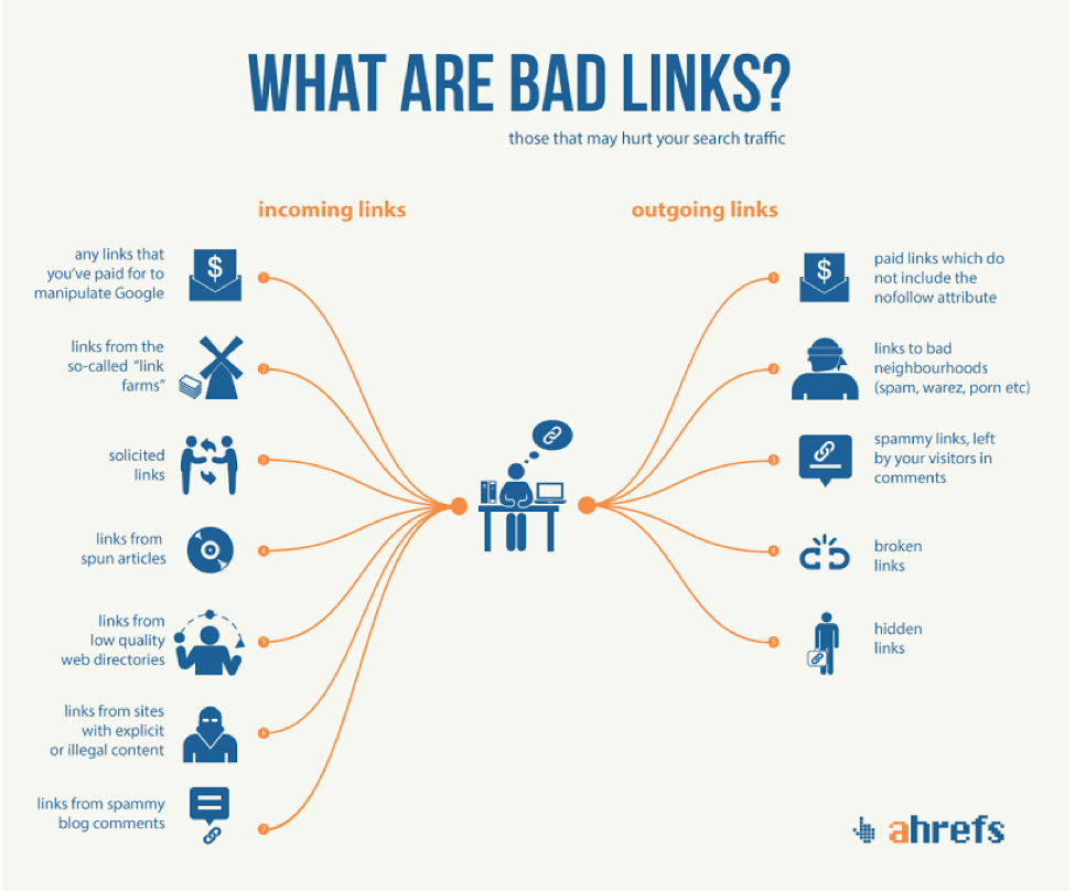
High-quality backlinks are vital to making this dream a reality. This means that auditing backlinks and removingbad backlinksare essential steps website owners need to take on a regular basis.
Examples of bad backlinksinclude links coming from foreign websites, links with duplicate texts, links with over-optimized anchor texts, and links coming from the comment sections of other websites.
Previously, website owners were able to achieve high search engine ranking by getting a huge number of backlinks. They easily got away with black hat tactics like toxic, sponsored, and spammy backlinks. But, this is not the case today. Websites with unnatural and suspicious backlinks face penalties and are taken down to the bottom of the search engine results.
Bad backlinkssimplymean bad news. Hence, you need to remove bad backlinks that can negatively impact your site search rankings and authority. Let’s dig deeper to understand why removing bad backlinks is of paramount importance.
The Importance of Removing Bad Backlinks
As you may already know, backlinks are an extremely important aspect of your SEO strategy. When your site attracts a lot of backlinks from authoritative websites, it works as an approval stamp. It signals search engines that others think of you as a trusted information source. This is what makes search engines decide if your site deserves a high ranking.
The quality of backlinks gained even more importance with the Google Penguin update back in 2012. Its principal purpose is to find and penalize sites that indulge in dubious backlink practices.
When your site has a lot ofbad backlinks, it questions your credibility. It shows that you resorted to suspicious and unnatural means to gain those links, which triggers the spam filter of Google and can get your site penalized. Moreover, your website is likely to witness a huge fall in search engine rankings and may even be banned by Google.
As all of these consequences can severely hamper your business growth; therefore, it is essential to remove bad backlinks.
Note:
In 2016, Penguin became a part of the core search algorithm of Google. The search engine now monitors sites for possibilities of spam, too, in real-time. This points to one thing – website owners must make it a point to remove bad backlinks on a regular basis.
Now, let’s discuss the various types of bad backlinks, so you are well aware of which ones you need to remove.
Types of Bad Backlinks
The quality of the linking website is what differentiates bad backlinks from good backlinks. In other words, bad backlinks are the links coming to your site from irrelevant, low-authority, and/or suspicious websites.
Bad backlinks can be segregated into different categories based on the type of website they come from. Let’s discuss the various types of bad backlinks you can come across:
1. Sitewide Links
These are the links that appear on every page of a website. Usually, they appear in the sidebar section, the header, and the footer.
Before the introduction of the Google Penguin update, site owners extensively implemented this technique to earn a lot of backlinks quickly. But this is now regarded as unnatural and can get your website penalized. It is better to have one backlink coming from an authoritative domain rather than several backlinks from a low-authority one.
2. Directory Links
Web directory submissions are one of the best ways to organically earn high-quality backlinks. But this is only applicable to high-authority directories that hold relevance to your niche. In case your site has a lot of backlinks coming from low-quality and random directories, it is likely to be penalized.
3. Links from Blog Comments
There is a high chance that you may have come across a flood of spam in the comment sections of a blog. Such types of comments, which often have links to other sites, are marked as nofollow so that Google doesn’t index them. When these types of spam comments link to your website, it adversely impacts your inbound link profile.
4. Links with Over-Optimized Anchor Texts
Let’s understand this with an example. Suppose you are an owner of a handbag store. If a lot of websites link back to your site using “designer handbags” as anchor text, Google will think of this as unnatural. Such a thing only gets your website penalized.
Other examples of bad links or unnatural links are those that come from the below-mentioned sources:
Blogrolls
Link networks
Profile link and signatures
Forums
How to Remove Bad Backlinks?
This step-by-step guide will help you identify and remove bad backlinks.
1. Gather Your Backlink Data
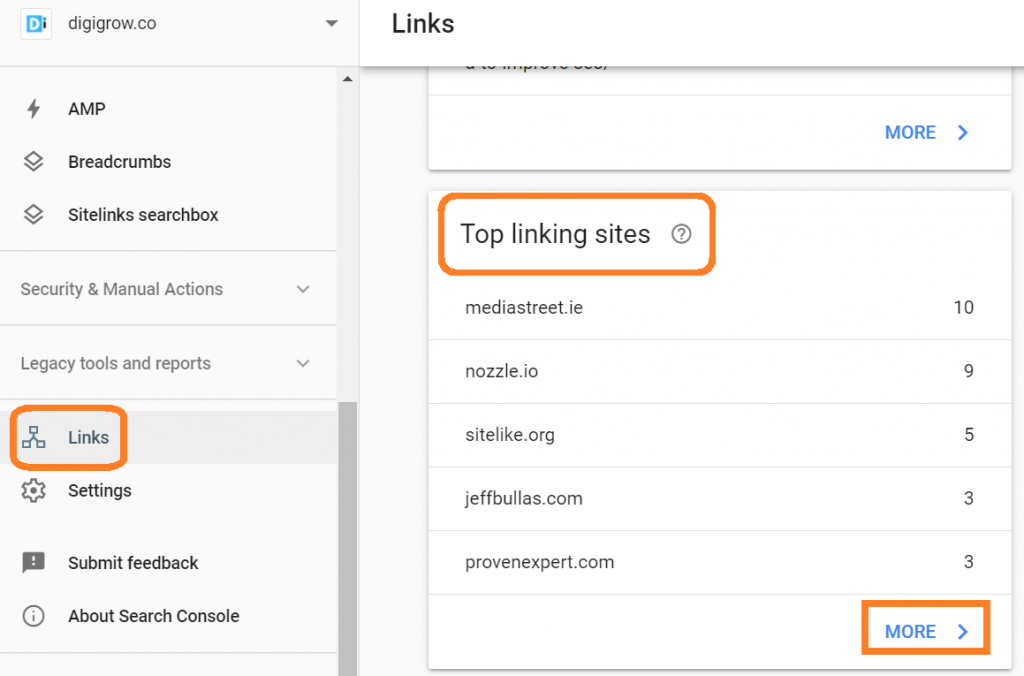
As a first step, you should create a list that contains every backlink coming to your website from different sources. For this, you can use the Google Search Console (make sure your domain is connected to Google Analytics). Follow these steps for the same:
Head to the Google Search Console
Click on “Search Traffic”
Select “Links to Your Site”
Click on “more” from the “Who links the most” section when a new page opens
With this, you get a list of all of your backlinks in CSV format.
2. Find Bad Backlinks
Now, how to find bad backlinksfrom the list? To identify bad backlinks, you have to manually audit all the backlinks. When you check a backlink, see if the link’s content is relevant to your site. If this is not the case, it means that the backlink may not be adding a lot of value to your inbound link profile.
During this time, you can also use SpyFu’s backlink checker for quickly identifying toxic backlinks. All you have to do is enter your website’s URL and click on “search.” It will provide you with a list of Google-ranked sites linking to you along with their domain strength (the list will not include sites that Google has not indexed).
Now, to identify bad backlinks from the list, find and note the websites with lower domain strength.
Tip: Make it a point to check the spam score of the websites in the list. For this, you can visit Link Explorer. All you need to do is type in the URL of the website, and you will be able to see the website’s spam score. A site with a high spam score can negatively impact your SEO efforts.
3. Remove Bad Backlinks
Now we know how to find bad backlinks. But,how to removethese bad backlinks? For this, you need to contact the webmasters or owners of the linking websites. You need to request them to remove the backlinks. Ensure you let them know the exact location of the backlink you want to get removed.
4. Track, Track, and Track
Only sending a deletion request to the owners and webmasters of the linking websites will not suffice in getting the bad backlinks removed. You need to track if they have accepted your request and have done the needful. In case they haven’t taken the required action, send them a follow-up mail within 5-10 days.
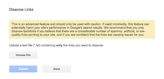
5. Disavow The Remaining Bad Backlinks
What should you do if webmasters refuse to remove bad backlinks or simply don’t respond? Thankfully, Google lets you disavow the backlinks you don’t wish to be associated with your site.
How to disavow backlinks?
As a first step, compile a list of links to disavow in an Excel spreadsheet. Next, head to the Google Disavow Links tool and upload your list. Doing so informs Google not to take these very links into account at the time of determining the search engine rankings of your website.
All in all, do this when faced with the question ofhow to disavow backlinks.
Conclusion
Now that you know how to find and remove bad backlinks, it is important to check and remove them so that your website doesn’t get penalized. The best way to do so is to carry out backlink audits to know about toxic backlinks and take the required measures to remove them. With different tools at your disposal, you can easily search for low-quality backlinks and make it a point to get them removed.
What is that one goal website owners dream of achieving? They want their websites to appear at the top of the search engine results.
High-quality backlinks are vital to making this dream a reality. This means that auditing backlinks and removingbad backlinksare essential steps website owners need to take on a regular basis.
Examples of bad backlinksinclude links coming from foreign websites, links with duplicate texts, links with over-optimized anchor texts, and links coming from the comment sections of other websites.
Previously, website owners were able to achieve high search engine ranking by getting a huge number of backlinks. They easily got away with black hat tactics like toxic, sponsored, and spammy backlinks. But, this is not the case today. Websites with unnatural and suspicious backlinks face penalties and are taken down to the bottom of the search engine results.
Bad backlinkssimplymean bad news. Hence, you need to remove bad backlinks that can negatively impact your site search rankings and authority. Let’s dig deeper to understand why removing bad backlinks is of paramount importance.
The Importance of Removing Bad Backlinks
As you may already know, backlinks are an extremely important aspect of your SEO strategy. When your site attracts a lot of backlinks from authoritative websites, it works as an approval stamp. It signals search engines that others think of you as a trusted information source. This is what makes search engines decide if your site deserves a high ranking.
The quality of backlinks gained even more importance with the Google Penguin update back in 2012. Its principal purpose is to find and penalize sites that indulge in dubious backlink practices.
When your site has a lot ofbad backlinks, it questions your credibility. It shows that you resorted to suspicious and unnatural means to gain those links, which triggers the spam filter of Google and can get your site penalized. Moreover, your website is likely to witness a huge fall in search engine rankings and may even be banned by Google.
As all of these consequences can severely hamper your business growth; therefore, it is essential to remove bad backlinks.
Note:
In 2016, Penguin became a part of the core search algorithm of Google. The search engine now monitors sites for possibilities of spam, too, in real-time. This points to one thing – website owners must make it a point to remove bad backlinks on a regular basis.
Now, let’s discuss the various types of bad backlinks, so you are well aware of which ones you need to remove.
Types of Bad Backlinks
The quality of the linking website is what differentiates bad backlinks from good backlinks. In other words, bad backlinks are the links coming to your site from irrelevant, low-authority, and/or suspicious websites.
Bad backlinks can be segregated into different categories based on the type of website they come from. Let’s discuss the various types of bad backlinks you can come across:
1. Sitewide Links
These are the links that appear on every page of a website. Usually, they appear in the sidebar section, the header, and the footer.
Before the introduction of the Google Penguin update, site owners extensively implemented this technique to earn a lot of backlinks quickly. But this is now regarded as unnatural and can get your website penalized. It is better to have one backlink coming from an authoritative domain rather than several backlinks from a low-authority one.
2. Directory Links
Web directory submissions are one of the best ways to organically earn high-quality backlinks. But this is only applicable to high-authority directories that hold relevance to your niche. In case your site has a lot of backlinks coming from low-quality and random directories, it is likely to be penalized.
3. Links from Blog Comments
There is a high chance that you may have come across a flood of spam in the comment sections of a blog. Such types of comments, which often have links to other sites, are marked as nofollow so that Google doesn’t index them. When these types of spam comments link to your website, it adversely impacts your inbound link profile.
4. Links with Over-Optimized Anchor Texts
Let’s understand this with an example. Suppose you are an owner of a handbag store. If a lot of websites link back to your site using “designer handbags” as anchor text, Google will think of this as unnatural. Such a thing only gets your website penalized.
Other examples of bad links or unnatural links are those that come from the below-mentioned sources:
Blogrolls
Link networks
Profile link and signatures
Forums
How to Remove Bad Backlinks?
This step-by-step guide will help you identify and remove bad backlinks.
1. Gather Your Backlink Data
As a first step, you should create a list that contains every backlink coming to your website from different sources. For this, you can use the Google Search Console (make sure your domain is connected to Google Analytics). Follow these steps for the same:
Head to the Google Search Console
Click on “Search Traffic”
Select “Links to Your Site”
Click on “more” from the “Who links the most” section when a new page opens
With this, you get a list of all of your backlinks in CSV format.
2. Find Bad Backlinks
Now, how to find bad backlinksfrom the list? To identify bad backlinks, you have to manually audit all the backlinks. When you check a backlink, see if the link’s content is relevant to your site. If this is not the case, it means that the backlink may not be adding a lot of value to your inbound link profile.
During this time, you can also use SpyFu’s backlink checker for quickly identifying toxic backlinks. All you have to do is enter your website’s URL and click on “search.” It will provide you with a list of Google-ranked sites linking to you along with their domain strength (the list will not include sites that Google has not indexed).
Now, to identify bad backlinks from the list, find and note the websites with lower domain strength.
Tip: Make it a point to check the spam score of the websites in the list. For this, you can visit Link Explorer. All you need to do is type in the URL of the website, and you will be able to see the website’s spam score. A site with a high spam score can negatively impact your SEO efforts.
3. Remove Bad Backlinks
Now we know how to find bad backlinks. But,how to removethese bad backlinks? For this, you need to contact the webmasters or owners of the linking websites. You need to request them to remove the backlinks. Ensure you let them know the exact location of the backlink you want to get removed.
4. Track, Track, and Track
Only sending a deletion request to the owners and webmasters of the linking websites will not suffice in getting the bad backlinks removed. You need to track if they have accepted your request and have done the needful. In case they haven’t taken the required action, send them a follow-up mail within 5-10 days.
5. Disavow The Remaining Bad Backlinks
What should you do if webmasters refuse to remove bad backlinks or simply don’t respond? Thankfully, Google lets you disavow the backlinks you don’t wish to be associated with your site.
How to disavow backlinks?
As a first step, compile a list of links to disavow in an Excel spreadsheet. Next, head to the Google Disavow Links tool and upload your list. Doing so informs Google not to take these very links into account at the time of determining the search engine rankings of your website.
All in all, do this when faced with the question ofhow to disavow backlinks.
Conclusion
Now that you know how to find and remove bad backlinks, it is important to check and remove them so that your website doesn’t get penalized. The best way to do so is to carry out backlink audits to know about toxic backlinks and take the required measures to remove them. With different tools at your disposal, you can easily search for low-quality backlinks and make it a point to get them removed.
As the year begins to wind down, there are still plenty of new and evolving website design trends going strong. Much of what you’ll see this month carries over from things we’ve been seeing all year but with fresh touches.
From peek-a-boo designs with neat animated elements to vertical bars to brutalist blocks, there are a lot of highly usable trends to work with.
Here’s what’s trending in design this month.
Peek-a-Boo with Animation
Designers have been experimenting with cut-out and layering elements with animation for some time, which has evolved into full peek-a-boo styles with a lot of visual interest.
How each design comes together is a little different. Some have the animation in the back, others in the front, and some include text as part of the style. There’s almost no set of actual rules to how to make this design trend work.
Each of the examples below does it somewhat differently with varying degrees of success. The commonality here is that it is almost one of those visuals that you either see and love or hate.
Jatco Insurance is the most stunning example here, with a bold color choice and a peek-a-book element inside the oversized “J.” The overall effect is soothing and interesting and naturally draws the user across the screen from the top left to the background video layer. The small tagline, “Individual attention you deserve,” is perfectly placed.
Liron Moran Interiors takes a different approach with the peek-a-boo concept with the letters peeking out from behind an image. The animation is restricted to a hover and scroll effect that adds a liquid element to the image as well as changes to the image and color background. The challenge here is in readability. More of the words show on wider screens, but is it enough?
Melon Fashion also layers text and animated effects for a neat peek-a-book style that almost seems cut out from the background. The overall look appears to have three layers: background video, middle layer for the yellow color block, and text on top. The opacity of text elements with the peeking video is interesting and well pulled together without sacrificing too much readability.
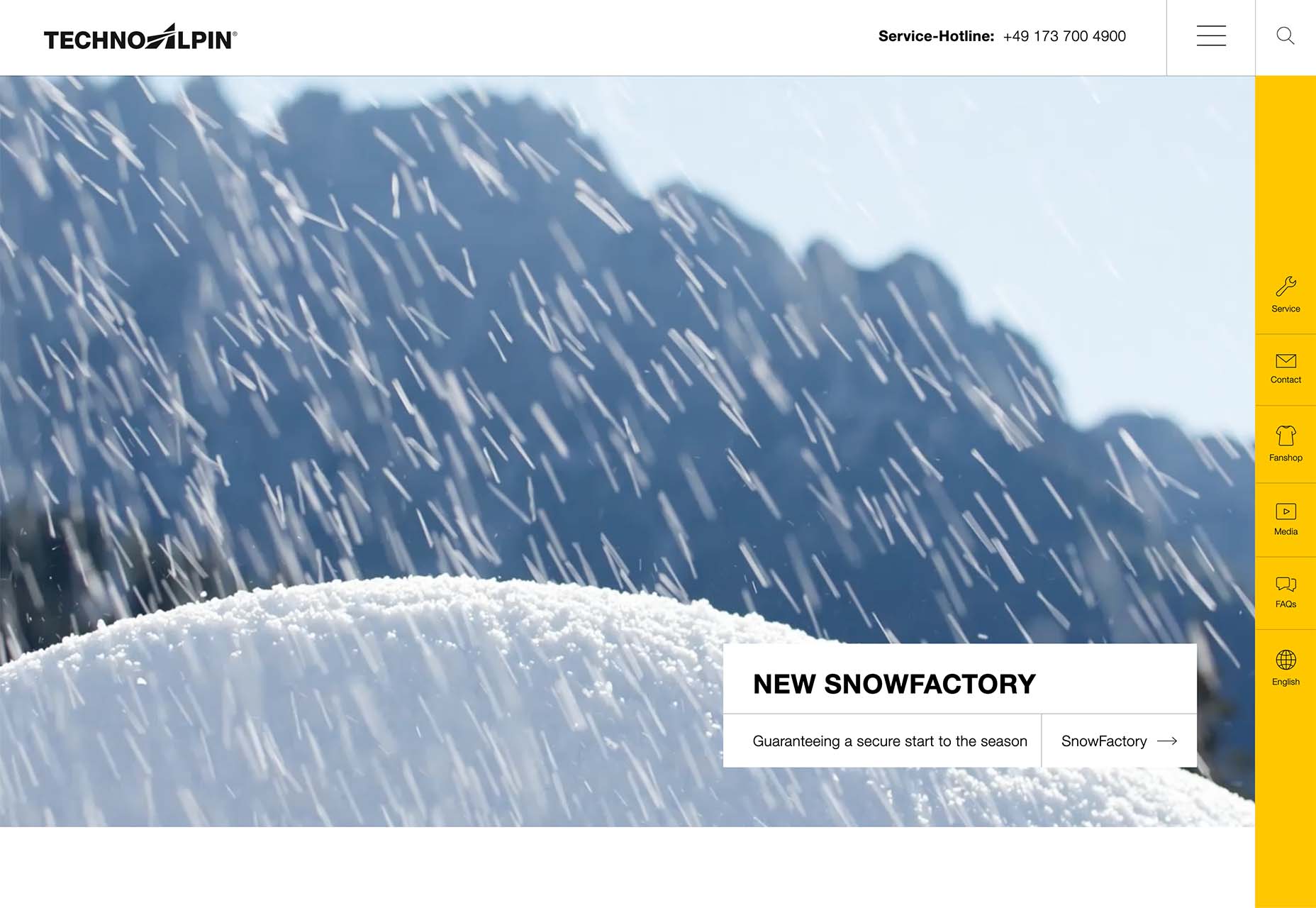
Vertical Bars
Vertical color bars are a design element that keeps popping up in different ways. Designers can use it as a standalone element or container for content, such as navigation or other click actions.
Vertical elements are helpful because they can help create a more consistent and unified user experience from desktop to mobile screens. This shape can also be somewhat disruptive because you don’t see it featured that often. (Although with this style trending that might become less true over time.)
New Classrooms uses a vertical color bar on the left to help you move through the design. The color actually changes as each slide progresses on the homepage.
Serving uses multiple vertical bars as links to different content entry points. Clickability is emphasized with a change from a red overlay to a full-color image. The navigation is also tucked inside a white bar on the left side of the screen with a hamburger menu therein.
TechnoAlpin goes with a skinny vertical navigation menu on the right side of the screen. The icons with menu elements make navigation highly visual and intuitive. The color, which significantly contrasts with the rest of the design, also helps.
Brutalist Blocks
Not many people thought brutalism would stick around when it started trending. Elements of brutalism keep sneaking in, though, although they are much less stark and harsh than some of those original trending website designs.
This version of brutalism focuses on block elements that contain images or text and often click to other pages in the design. The blocks themselves are essentially the buttons that help you navigate to additional content.
The critical question about this design technique is whether this click action is intuitive enough. Will users interact without buttons?
The answer likely depends on your audience base, but if you opt for a style like this, it is essential to keep a close eye on analytics to ensure that users know and understand how to engage.
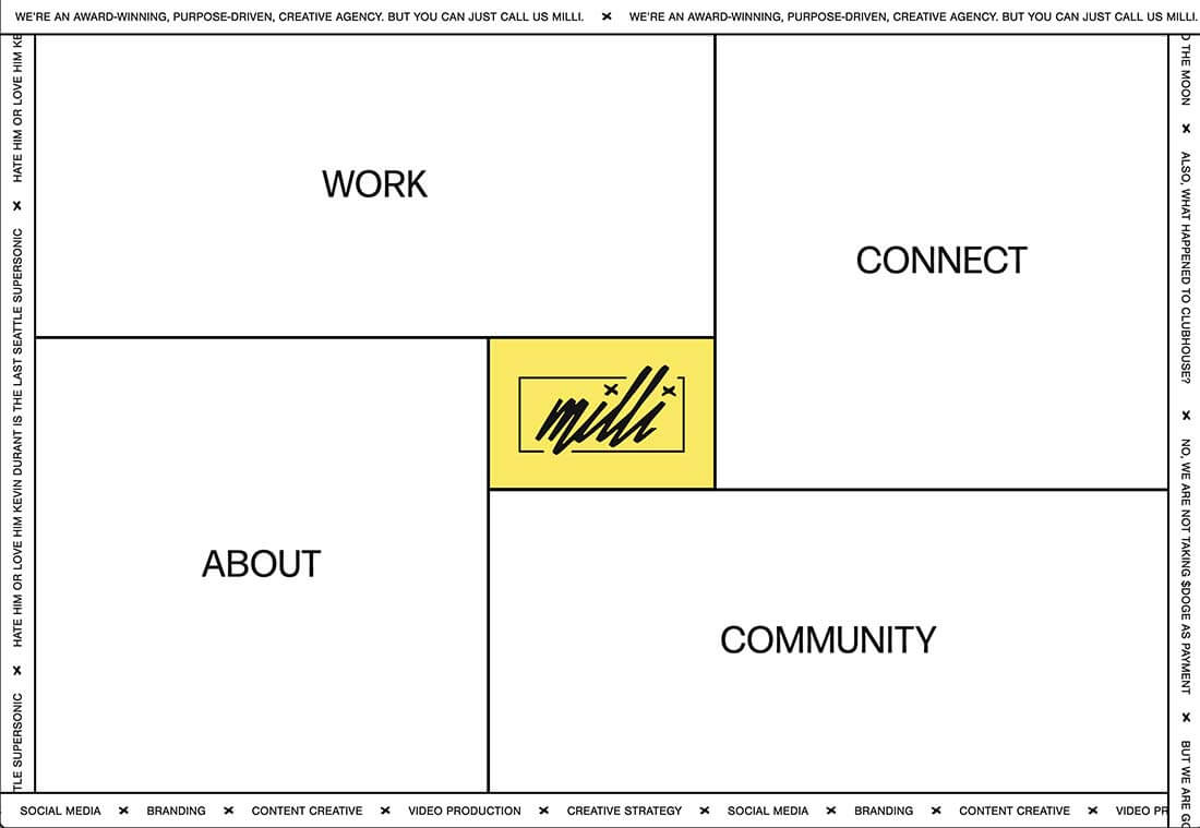
Milli Agency might be the most intuitive example of the brutalist blocks trend. The homepage is essentially a giant navigation menu. Each block changes from white to yellow on hover and expands, further encouraging clicks.
Sick Agency uses brutalist blocks with experimental typefaces and bold color for an in-your-face design. You can’t help but look at all the different things happening here. The biggest question might be, where should you focus and click next? The cursor provides some visual cues, but it’s not quite as intuitive as you might want it to be.
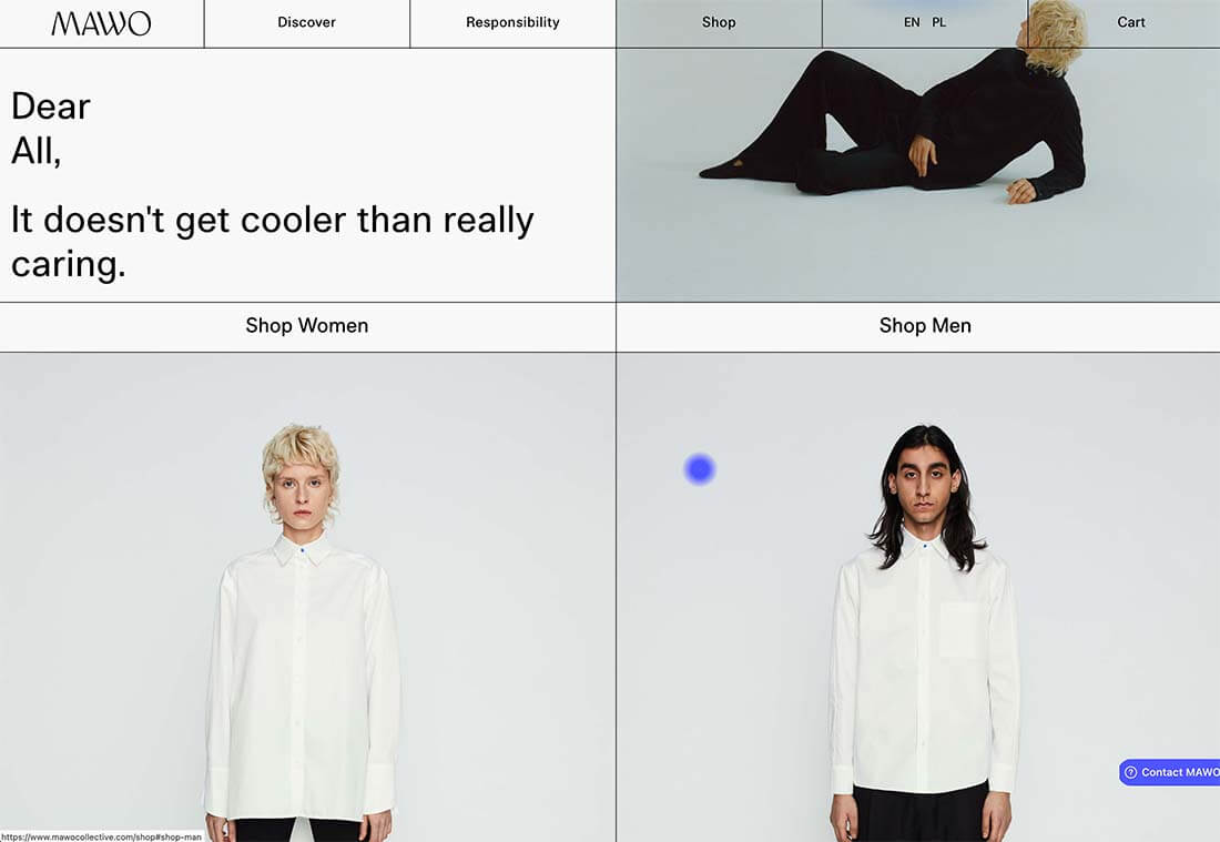
Mawo mixes brutalist blocks with a big blue cursor to help users click through the design to see more clothing options. Even the images here have a rather stark feel, which isn’t typical for e-commerce. Every block element above the scroll on the homepage includes a click action from the navigation blocks across the top to the “Shop Women” and “Shop Men” images. Further, the blue cursor dot helps show where users can click, and text buttons change to blue on hover as well.
Conclusion
Most of the examples here show trends as homepage elements, but you aren’t limited to that application. Try some of these techniques on landing pages or interior pages that you want to add a little something special to.
This can be an excellent way to test the design and see if your users like the style and know-how to interact with it. If it works, then you can extend the aesthetic to more of the design.
We’re all familiar with the concept of autocompletion, right? You type something into a search box and it tries to guess what you’re looking for as you type, displaying suggestions, often below the cursor. While we’re used to autocomplete on eCommerce sites that redirect to search or product pages, an underrated usage is when used as a secondary search pattern to augment the typing experience.
In modern web applications, there’s no reason a composition box has to be a dull, plain text area, or limit itself to rich text formatting. Social and productivity apps like Twitter, Slack, Notion, Google Docs, and Asana have popularized the “@mention” pattern, allowing you to reference other users as you type. You can mention another person, a channel, a file, or some other queryable object using triggers, such as the @ or # characters. This opens a panel with suggestions, letting you complete your message with the right reference.
A Twitter-like compose box with a @mention feature on user names.
The text box acts as a search input, and the suggestions panel acts as a typing assistant, allowing users to reference the right resource without leaving their keyboard. When implemented correctly, everything is only a few keystroke away, including when users misspell something.
Along with powering a composition box, this pattern drives consistency in user-generated content. Hashtags are a good example: users are empowered to create semi-structured data in a free-form context, which then helps categorize content without needing to post-process it. Once users have mentioned other people in a document, referenced resources, or added several hashtags, you get a graph of connections across all the resources available on your app, making it a lot simpler to recommend related content and understand how users think.
Beyond letting users find what they want, a great @mention autocomplete feature should be as fluid as possible. The goal is to create a seamless typing experience where the pattern behaves as an assistant that learns as you type and helps you out, but knows when to get out of your way. You can keep typing, ignoring the suggestions and letting them go away, or you can leverage them to complete your message without friction.
On Twitter, which popularized the pattern with mentions and hashtags, the panel closes as soon as the word being typed is no longer considered a token, to avoid bugging users who want out. Twitter user handles don’t support spaces, so it closes the panel immediately after a space.
Twitter dismisses the @mention panel when hitting Space.
Slack works a bit differently, allowing spaces to let you search full names. It uses different heuristics to determine what signals that users want out.
Slack allows spaces to let users search in full names.
When selecting a suggestion, Twitter closes the panel, replaces the token, and adds a space so the user can keep typing seamlessly. This kind of attention to detail might seem insignificant in isolation, but when they add up, they give a sense of fluidity that empowers users to embrace the pattern instead of fighting it.
Twitter adds a space on select to let users keep on typing.
When you start adding mentions in a composition box like this, they become part of your text, but should also retain full interactivity to let users edit them.
On Twitter, for example, you can “focus” a mention by either clicking on it or navigating the text box with the Left and Right arrow keys. Twitter detects it and reopens the panel with the mentions as the search query. It ensures who is notified when the tweet is sent, and allows you to edit the mention in case of mistake.
Twitter lets you inspect and edit mentions.
One way to build such experiences with minimal effort is using the open-source Autocomplete library. Autocomplete is designed to integrate best with Algolia, but works with any source, static or remote. It lets you build multi-source dynamic and accessible autocomplete experiences, and works great for @mention features.
Mixing different types of suggestions
Having a symbol per result type works well when you have a few, distinct types, such as “@” for people, and “#” for hashtags. As soon as you have more types with blurrier limits, chances are good that users are unable to remember them all. Isolating them could make the experience more cumbersome.
Instead, assigning more than a single type per symbol with federated search (multi-source) helps discover all possible types without having to “learn” too many patterns.
On Slack, suggestions are mixed and differentiated with visual cues (such as different icons and badges). Still, the results look similar to how you experience them in the rest of the app. For example, people suggestions show the users’ avatar, display name, and status. This helps users feel more confident about who or what they mention.
On Slack, the “@” symbol searches for people, groups, and apps.
On Notion, suggestions are grouped by type. Unlike a typical search experience which favors per-result relevance, this approach favors consistency: until you refine the query, you always get dates first, then people, then links. This helps users build muscle memory as they use the tool, by setting expectations regarding where things are.
On Notion, the “@” symbol searches for dates, people, and links.
Grouping by type is achievable either by querying multiple sources at once, or using grouping mechanisms such as Autocomplete’s Reshape API, that transform results after retrieving them.
Another cool Notion pattern is the dynamic placeholder, or predictive suggestion, that they inject based on the active suggestion. By default, the placeholder helps users take action by hinting about what they can do. Then, as they browse, the placeholder updates, letting users know what to expect if they select a suggestion.
When users start typing, suggestions update in the panel, but the placeholder also adapts by pre-filling the input. Users can apply a suggestion with Enter or Tab.
Peeking into Notion’s code, you can see how they leverage CSS Custom Properties to do this: every time you move through suggestions, they set the CSS variable --pseudoAfter--content on the input’s parent element with JavaScript. This CSS variable is then used with the content property on a ::before pseudo-element. Nifty!
When drawing results from multiple sources, it can become harder to control the number of results. That’s because each source might return the number of requested suggestions, or less, when it doesn’t have enough matches. This can result in a “jumpy” UI, where the number of results fluctuate as the user types.
You can mitigate this either with a fixed height panel containing a scrollbar, or by using combine and limit mechanisms like Autocomplete’s Reshape API.
There are always four results. The number of suggestions varies depending on the number of recent searches.
Thinking outside the search results
When you work on search and discovery every day like I do, you start seeing it everywhere. It’s fantastic how creative you can get with the @mention pattern when you go beyond how it is typically implemented.
If you’re using Slack, you might be used to looking for emojis by typing “:” then refining by name. While it doesn’t look like search or mentions, it uses the same exact mechanisms: you open a suggestions panel with a special character, search for the right item, and “apply” it on select.
On Slack, the “:” symbol searches for emojis.
This is even more striking on Notion, where the panel doesn’t look like search results at all.
Notion uses the “:” sign to let users search for emojis.
What’s interesting here is how versatile the pattern can be when changing simple things like item templates and styling results differently. It integrates even better in a composition box and creates a fluid experience that users recognize across all the apps they use.
A Slack-like compose box with a custom emoji autocomplete
Mentions are the most common use case when using dynamic suggestions in a composition box, but you can go a lot further. While mentions help you “complete” a sentence and enhance the typing experience, a composition box can also be a conversational interface between the user and the app.
On Notion, typing the special character “/” gives you access to inserting actions. You still get to refine suggestions by typing further, but instead of filling the input, selecting a result creates a brand new block of a given type.
On Notion, the “/” symbol lets you create a brand new block of a given type.
This pattern, commonly known as “shortcuts” or “slash commands” was popularized in game chats and has become a standard in general purpose chat applications like Slack and Discord.
On Slack, the “/” symbol lets you type shortcuts to trigger custom actions such as starting a Zoom call, leaving a channel, posting a GIF, etc.
Shortcuts are interesting because it lets users perform common tasks in one place, without having to look for the feature. For example, it’s common to do impromptu Zoom meetings with remote coworkers, and usually requires sending a Zoom link over Slack. But having to open Zoom, copy the link, then paste it into Slack is cumbersome. The “/zoom” shortcut removes those hurdles by centralizing common tasks in a single interface.
While features like slash commands used to be dedicated to power users, they’re now emerging in more and more apps and targeting all kinds of users.
Ultimately, augmenting the typing experience isn’t about unlocking “power features” but about uncovering content, as well as reducing friction and the cognitive load: instead of teaching users about the complexity of your system ahead of time, you’re bringing the right information at the right time, where and when users need it.