Archive

Archive for August, 2022

How to Start a Web Design Agency in 28 Days: Week Four

August 31st, 2022 No comments

Three weeks ago, you started a web design agency. Then over the last two weeks, you’ve taken a leap toward making your business viable by defining who you are as a business and putting together your documents.

This week, we’ll tie up loose ends so that you’re a fully functional agency able to pick and choose the work you accept.

Day 22: Pitch Deck

Over the next few years, you’ll be doing a lot of pitching: walking into a room and trying to convince someone to give you their business.

Here’s the good news: if you’re in the room, you’ve probably got the job. Stakeholders in successful businesses are usually very busy, so if they take the time to see you, they take you seriously.

The best way to allay their doubts and secure the work is to walk in with a pitch deck. Pitch decks are usually associated with startups but work well for design agencies.

Consider your pitch deck a portfolio formatted for business concerns. Include work samples if you have them, your elevator pitch, and as many provable facts about the service you offer as possible. Keep it short, and use it as a framework for meetings.

Day 23: Kick-Off Checklist

No one is going to suggest that web design is painting by numbers. You can’t knock out websites with a checklist as if you were doing your laundry. However, some stages of the process are repetitive, one of which is the kick-off process.

Far too many projects are derailed by a slow start. You’ve probably agreed to a deadline, and making sure you have everything you need to make progress is vital in hitting that deadline.

As with any repetitive process, creating a document, in this case, a checklist, is advisable to speed up this stage of your projects.

Day 24: Find Some Backup

Whether starting as a freelancer, in a partnership, or with a skeleton crew, you can’t do everything yourself.

This doesn’t mean hiring staff — that is a costly step that you should only consider if you have the financial resources to guarantee a stable cash flow.

Instead, reach out to your network or even freelance boards and see who’s available if and when you need assistance. For example, it is always helpful to have the contact details of an experienced server admin — you’ll only need them once or twice a year, but when you need them, they’re worth their weight in gold. It’s also worth having a couple of contacts who can do simple, time-consuming tasks like image processing.

Outsourcing means focusing on the parts of the job that maximise your profits. Don’t wait until you need them; start developing these networks now, so when the need does arise, you know who to reach out to.

Day 25: Website

OK, 25 days in, it’s finally time to build your website. Yes, in one day.

You already have your elevator pitch, logo, and the niche you intend to target. You also have the terms of service and a link to your social media. That’s everything you need to get a simple business card design online.

Naturally, as you begin to onboard clients, you will develop a portfolio that will allow you to improve your site. But right now, you need a presence quickly.

You picked up your hosting on day 19; today’s the day to put something on it.

Day 26: Client No. 1

The biggest challenge for any web design agency is acquiring good, paying clients.

I know an agency that burnt through seed money for a whole year, waiting for clients to knock at the door. I also know an agency that was only founded because one high-profile client turned up at the creative director’s dorm room. Those are the extremes, but no matter your story, your clients will define it.

Way back on day eight, you wrote a list of potential clients. Today, you’re going to approach one. Your goal is to set up a meeting at which you can sell your service to them. You don’t have to telephone or visit in person; it’s OK to email or message them on social media if those are your strengths. Then, invite them for coffee and an informal chat at the coffee shop you picked on day twelve.

Most of you are going to get knocked back. That’s the nature of the business. The key is to get back on the horse. Try to learn from your approach, and take steps to improve next time.

Your first cold approach is nerve-racking; if it isn’t, then maybe you aren’t taking this seriously enough. But I can promise that approach number two is more easier, and by the time you’ve done a few dozen, you may even start to enjoy it.

Day 27: Quit

A wise man once said, “You’ll never make money working for someone else.” Twenty-seven days ago, you started this process, hoping to seize control of your destiny.

The last step is to quit whatever dead-end job you’ve been tolerating up until now. You don’t need to burn your bridges; you don’t need to punch the boss and kiss your office crush on the way out the door; you do need to take a mental break from your old life to focus on the future.

If you can’t afford to quit, then it’s fine to quiet quit. Just make sure you find the mental space to give your agency the attention it needs.

Day 28: Rest

Over the past four weeks, you’ve manoeuvred yourself into the best position possible to launch your new agency. You’ve decided who you are, who you plan to become, and how you’ll communicate that to the world.

Whether this plan is viable long-term is entirely up to you. You make your own luck in this life.

Today, do what you always do on the last day of the week and rest. Then, tomorrow, you’ll start forging your path to success.


Featured image via Pexels.

Source

The post How to Start a Web Design Agency in 28 Days: Week Four first appeared on Webdesigner Depot.

Categories: Designing, Others Tags:

Finding The Balance (September 2022 Desktop Wallpapers Edition)

August 31st, 2022 No comments

Lush green slowly turning into yellows, reds, and browns in the Northern hemisphere; nature awakening from its slumber in the Southern part of the world: September is a time of change. A chance to leave old habits behind and embrace the beginning of something new. And, well, sometimes it only takes a small change in routines to spark fresh inspiration and, who knows, maybe even great ideas.

With that in mind, we embarked on our monthly wallpapers challenge more than eleven years ago, and since then, artists and designers from all across the globe have accepted the challenge and submitted their designs to it to cater for a bit of variety on your desktop and mobile screens. Of course, it wasn’t any different this time around.

This post features their wallpapers for September 2022. All of them come in versions with and without a calendar, so it’s up to you to decide if you want to have the month at a glance or keep things simple. As a little bonus goodie, we also collected some timeless favorites from past September editions at the end of this post. A big thank-you to all the artists who have submitted their wallpapers. This post wouldn’t exist without you.

  • You can click on every image to see a larger preview,
  • We respect and carefully consider the ideas and motivation behind each and every artist’s work. This is why we give all artists the full freedom to explore their creativity and express emotions and experience through their works. This is also why the themes of the wallpapers weren’t anyhow influenced by us but rather designed from scratch by the artists themselves.
  • Submit a wallpaper!
    Did you know that you could get featured in our next wallpapers post, too? We are always looking for creative talent.

Cultivating Community

“Climate action, peace, justice, and inclusive societies — we’re proud to be aligning our volunteer goals with the 2030 Agenda for Sustainable Development. Mad Fish Digital encourages team members to recognize the non-profit organizations they care about by giving their time throughout the year. We encourage you to look to your community for volunteer opportunities and use your skills and passion to make a positive difference!” — Designed by Mad Fish Digital from Portland, OR.

Autumn Foliage

“‘Autumn is a second spring when every leaf is a flower.’ (Albert Camus) Our September calendar aims to make you feel the autumn coziness through your desktop. The warm tones of autumn leaves, the wet raincoat, and squeaky rain boots are the first signs that autumn is knocking at our doors.” — Designed by PopArt Studio from Serbia.

Sweet Dreams

Designed by Ricardo Gimenes from Sweden.

A Cozy Evening

“The leaves are changing their colors now, but the nights are still warm. There’s something different tonight… do you feel it? It’s like the air tastes like a soft marshmallow and you’re sitting by a warm fire in the middle of the forest, while the nature that surrounds you is transforming. It’s ok, small changes are normal and all you can do is sit back, look at the stars and embrace the world that evolves around you.” — Designed by Creative Pinky from The Netherlands.

The Rebel

Designed by Ricardo Gimenes from Sweden.

The First Harbinger of Autumn

“Autumn is an incredibly beautiful time — its aromas are so bright that they easily come to mind. One of the brightest autumn aromas is the smell of fallen oak leaves. It inspired our designers to create this calendar. More free calendars can be found in our post.” — Designed by MasterBundles from Ukraine.

Oldies But Goodies

Below you’ll find a selection of September wallpapers from our archives that are just too good to be forgotten. Please note that these designs don’t come with a calendar. Enjoy!

Wine Harvest Season

“Welcome to the wine harvest season in Serbia. It’s September, and the hazy sunshine bathes the vines on the slopes of Fruška Gora. Everything is ready for the making of Bermet, the most famous wine from Serbia. This spiced wine was a favorite of the Austro-Hungarian elite and was served even on the Titanic. Bermet’s recipe is a closely guarded secret, and the wine is produced by just a handful of families in the town of Sremski Karlovci, near Novi Sad. On the other side of Novi Sad, plains of corn and sunflower fields blend in with the horizon, catching the last warm sun rays of this year.” — Designed by PopArt Studio from Serbia.

Sunny September

“September greets us and invites us to enjoy warm and sunny days.” — Designed by LibraFire from Serbia.

Go Bananas

Designed by Ricardo Gimenes from Sweden.

Terrazzo

“With the end of summer and fall coming soon, I created this terrazzo pattern wallpaper to brighten up your desktop. Enjoy this month!” — Designed by Melissa Bogemans from Belgium.

Funny Cats

“Cats are beautiful animals. They’re quiet, clean, and warm. They’re funny and can become an endless source of love and entertainment. Here for the cats!” — Designed by UrbanUI from India.

Cacti Everywhere

“Seasons come and go, but our brave cactuses still stand. Summer is almost over, and autumn is coming, but the beloved plants don’t care.” — Designed by Lívia Lénárt from Hungary.

Long Live Summer

“While September’s Autumnal Equinox technically signifies the end of the summer season, this wallpaper is for all those summer lovers, like me, who don’t want the sunshine, warm weather and lazy days to end.” — Designed by Vicki Grunewald from Washington.

Listen Closer… The Mushrooms Are Growing

“It’s this time of the year when children go to school and grown-ups go to collect mushrooms.” — Designed by Igor Izhik from Canada.

Autumn Rains

“This autumn, we expect to see a lot of rainy days and blues, so we wanted to change the paradigm and wish a warm welcome to the new season. After all, if you come to think of it: rain is not so bad if you have an umbrella and a raincoat. Come autumn, we welcome you!” — Designed by PopArt Studio from Serbia.

Maryland Pride

“As summer comes to a close, so does the end of blue crab season in Maryland. Blue crabs have been a regional delicacy since the 1700s and have become Maryland’s most valuable fishing industry, adding millions of dollars to the Maryland economy each year. With more than 455 million blue crabs swimming in the Chesapeake Bay, these tasty critters can be prepared in a variety of ways and have become a summer staple in many homes and restaurants across the state. The blue crab has contributed so much to the state’s regional culture and economy, in 1989 it was named the State Crustacean, cementing its importance in Maryland history.” — Designed by The Hannon Group from Washington DC.

Stay Or Leave?

Designed by Ricardo Gimenes from Sweden.

Flower Soul

“The earth has music for those who listen. Take a break and relax and while you drive out the stress, catch a glimpse of the beautiful nature around you. Can you hear the rhythm of the breeze blowing, the flowers singing, and the butterflies fluttering to cheer you up? We dedicate flowers which symbolize happiness and love to one and all.” — Designed by Krishnankutty from India.

Colors Of September

“I love September. Its colors and smells.” — Designed by Juliagav from Ukraine.

Red Beetle

Designed by Oxana Kostromina from Russia/Germany.

Still In Vacation Mood

“It’s officially the end of the summer and I’m still in vacation mood, dreaming about all the amazing places I’ve seen. This illustration is inspired by a small town in France, on the Atlantic coast, right by the beach.” — Designed by Miruna Sfia from Romania.

Summer Is Leaving

“It is inevitable. Summer is leaving silently. Let us think of ways to make the most of what is left of the beloved season.” — Designed by Bootstrap Dashboards from India.

Office

“Clean, minimalistic office for a productive day.” — Designed by Antun Hiršman from Croatia.

Viva Mexico

“This month is Mexico’s independence day and I decided to illustrate in my wallpaper one of the things Mexico’s best known for: the Lucha Libre.” — Designed by Maria Keller from Mexico.

Finding The Balance

“One evening last week I felt a little stressed, so I decided to have a short walk outside. When I went out of the door, I saw two young hares jumping around, and a bat which flew just over my head. I sat down on a garden chair and watched while Jupiter slowly rose above the trees. The crisp air of the autumn night reminded me of how the seasons keep changing. Here in Finland the differences between seasons are extremely large, as both the temperatures and the duration of sunlight vary a lot. However, twice a year on the equinoxes everything is in balance. I hope we all can find the same balance in our own lives.” — Designed by Tuomas Karjalainen from Finland.

Weekend Relax

“I’m looking forward for the weekend to enjoy drinks with friends!” — Designed by Robert from the United States.

Batmom

Designed by Ricardo Gimenes from Sweden.

#Spring

“Such a lovely time of the year in Melbourne!” — Designed by Tazi from Australia.

Categories: Others Tags:

Benefits Of Using A Branding Agency

August 31st, 2022 No comments

There’s no doubt that branding has become an important part of a business’s competitive edge in today’s economy. With so many companies competing for customers, it is essential to have a strong branding strategy. Read this guide to understand the benefits of using a branding agency for your business.

Access to Experience and Expertise

If you’re looking to achieve success with your branding efforts, you need access to the best expertise and experience. Branding agencies can help you with skills, a wealth of experience, and knowledge of making a successful brand.

Top branding agencies can provide you with the resources and support you need to create a successful brand, such as identity design, website, social media management, internal communication material, presentations, etc They can also help you identify and market your brand to the right people. They know how to create a strong reputation for your brand and how to attract new customers.

So stop reinventing the wheel, and start freeing up your time by hiring top branding agencies to tell your story to the rest of the world. 

Eye-Catching Campaigns

Branding agencies can help you create eye-catching campaigns that promote your business.

The branding agency can help you create a campaign that is unique, and attractive to consumers and that brings more engagements to their business. They can help you design marketing materials that are effective and persuasive. Their efforts will result in campaigns that are well-executed, creative, and visually appealing.

Boost Awareness and Recognition

Branding agencies can help your business to boost awareness and recognition. They can help to create a unique identity for your company and help to promote it across the internet, in print media, and on radio and television.

Creative agencies can help you to create marketing materials that will help you to reach your target market. They can design logo designs, advertising campaigns, and even marketing slogans for your business.

By using a creative branding agency, you can ensure that your business is well-known and respected in the marketplace.

Build Brand Trust and Loyalty

When you choose a branding agency, you’re investing in its ability to create a unique and memorable brand for your business. This is essential if you want your customers to trust and be loyal to your product or service.

A branding agency can help you build trust and loyalty among customers by creating a strong brand identity for your company. They will create a logo, website, and marketing materials that reflect your company’s values and personality.

With a reputable branding agency, you can ensure your business has the foundation it needs to move in today’s competitive marketplace.

Improve Your ROI

When you’re looking to improve your business, it’s important to find a branding agency that can provide you with the best possible results. A branding agency can help you increase your ROI by creating a unique brand for your business.

Experience with Multiple Technologies and Methods

Branding agencies can provide a variety of benefits when it comes to using technology and marketing. They are experienced with a variety of technologies and methods, which can help you reach your target audience.

A good website design agency can help you create a website with a user-friendly interface and visual appearance to match your professional brand. By ensuring your website is attractive, they can also help you increase its visibility on the internet.

Branding agencies can help you reach the right person on social media. They create campaigns that are tailored to the individual or group of people targeted. They can also help you to manage your social media accounts effectively so that you remain compliant with all the laws governing social media platforms.

Easy accessibility to assets

Branding agencies offer a wealth of resources. This means that you can find the information you need without having to search through numerous websites.

Branding agencies can help create solutions that are specific to your business. This means that you can customize your branding strategy to fit your specific needs.

Branding agencies have years of experience in the area of branding. They can help you develop a successful brand by generating quality content and guarding your reputation.

A Fresh Perspective

Branding agencies can offer a fresh perspective on your company and help to create a unique identity.

Branding agencies can help you to ideate and brainstorm about your company in different ways that address its needs and goals. They can help you to develop a new identity for your company that will be unique and appealing to potential customers. This approach can help you to break through the clutter and make your company more visible.

A branding agency can also provide guidance on how to market your company effectively. They can give you advice on how to create marketing campaigns that are tailored to your company’s needs and target audience. 

A Strong Brand Boosts Revenue

Many businesses believe that a strong brand is key to success. This is because a strong brand can boost revenue in several ways.

A strong brand can increase the demand for products and services. With a recognizable brand and established reputation, people are more likely to spend money on products or services that they offer.This means that the company will be able to sell more products and services than other companies in its industry.

A strong brand can increase the visibility of a company. This increased exposure may lead to more customers and more business opportunities.

Gain Access to a Versatile Talent Pool

One of the benefits of using a branding agency is its diverse talent pool. This pool contains experts in marketing, design, and other fields. They can help you create a special and efficacious brand.

Another benefit of using a branding agency is its flexibility & versatility. This means that you won’t have to waste time and money trying to create a brand that doesn’t fit your business.

Overall, branding agencies are an important resource for businesses of all sizes. Their versatile talent pool and ability to customize services make them valuable assets.

Rely on Creative Agility

When it comes to finding the right branding agency, you need someone who can provide you with creative agility. This means that the agency can quickly adapt to changes in your business and create a unique branding strategy that stands out from the rest.

Branding agencies have the skills, years of experience, and knowledge to help you market your business. They are likely to know what will work best for your business and can help you to reach your target market. In addition, they can help you to develop a consistent brand message that will be effective across all aspects of your marketing efforts.

Cost-Effectiveness

The cost-effectiveness of using a branding agency is hard to beat. Branding agencies can help businesses with a range of branding needs, from developing a new logo to creating a marketing campaign.

Branding agencies can also provide assistance with other strategic business decisions, such as choosing the right location for a business or determining the best way to market the company. 

Branding agencies can also help businesses to attract new customers and increase sales in a cost-effective way

Conclusion

Branding has come a long way in the past decade or so, and there are plenty of benefits to using a branding agency for your business. From increasing brand awareness to creating more engaging content, a good branding agency can do wonders for your business.

The post Benefits Of Using A Branding Agency appeared first on noupe.

Categories: Others Tags:

Interpolating Numeric CSS Variables

August 30th, 2022 No comments

We can make variables in CSS pretty easily:

:root {
  --scale: 1;
}

And we can declare them on any element:

.thing {
  transform: scale(--scale);
}

Even better for an example like this is applying the variable on a user interaction, say :hover:

:root {
  --scale: 1;
}

.thing {
  height: 100px;
  transform: scale(--scale);
  width: 100px;
}

.thing:hover {
  --scale: 3;
}
CodePen Embed Fallback

But if we wanted to use that variable in an animation… nada.

:root {
  --scale: 1;
}

@keyframes scale {
  from { --scale: 0; }
  to { --scale: 3; }
}

/* Nope! */
.thing {
  animation: scale .25s ease-in;
  height: 100px;
  width: 100px;
}

That’s because the variable is recognized as a string and what we need is a number that can be interpolated between two numeric values. That’s where we can call on @property to not only register the variable as a custom property, but define its syntax as a number:

@property --scale {
  syntax: "<number>";
  initial-value: 1;
  inherits: true;
}

Now we get the animation!

CodePen Embed Fallback

You’re going to want to check browser support since @property has only landed in Chrome (starting in version 85) as of this writing. And if you’re hoping to sniff it out with @supports, we’re currently out of luck because it doesn’t accept at-rules as values… yet. That will change once at-rule()becomes a real thing.

CodePen Embed Fallback

Interpolating Numeric CSS Variables originally published on CSS-Tricks, which is part of the DigitalOcean family. You should get the newsletter.

Categories: Designing, Others Tags:

How To Improve And Measure Your Progress Learning Web Design

August 30th, 2022 No comments

This article is a sponsored by Uxcel

Web design is full of people who value open collaboration and knowledge sharing. It’s a career in which you can be completely self-taught, using affordable — if not free — resources from experts and like-minded people around the world. This is worth celebrating!

But with so much to learn, how do we decide what to focus our time on? How do we maintain our existing skills? Where should a beginner start? How do we become hireable? Let’s take a look at how Uxcel (pronounced “You Excel”) goes about answering these questions.

The Three Pillars

Uxcel believes its platform can help you become a better web designer using three core pillars. These essentially involve an iterative process of learning and practicing, with the aim to use progress enough (and have something to show for it) to improve our job prospects over time.

1. Improve Your Design Skills With Interactive Learning

We start with learning — no surprise there! Uxcel has courses specific to individual areas of web design, each one consisting of many interactive bite-sized lessons. This removes the time that gets wasted when you don’t know what to focus on next. Each lesson is small enough to fit in during the spare time. With all the courses being available at the same time, without needing to register for a specific course, you are able to dip your toes into any areas of design without committing to an entire course.

2. Test And Measure Your Design Knowledge

Closely linked to interactive learning is the importance of testing yourself. Alongside the courses, Uxcel also has an entire section of skill tests and assessments dedicated to measuring your progress as you improve. Particularly intriguing is that you can only take these tests once a month! This is a clever mechanism for ensuring you don’t cheat yourself and are able to see a real indication of your improvement over time rather than just practicing to pass tests.

3. Build Your Professional Profile And Get Hired

After learning and measuring come improving your professional profile and hireability. Getting the roles you want can be hard, especially at the early stage of your career. It’s often a catch-22 situation between needing experience to get a job and needing a job to get experience. So showing that you have a clear focus on the steps, you need to take and are regularly practicing can help to elevate your profile when applying for a new role.

Theory, practice, and getting a job. This may sound idealistic; however, it’s a framework that, when done regularly with purpose, is bound to help you go in the right direction. One thing is clear though: whether you use Uxcel or Bootcamps, YouTube or University, you’ve got to put the work in.

Don’t Cheat Yourself

Osmosis. Have you ever bought a book that is full of valuable information and somehow felt good about seeing it on your bookshelf but never actually ended up reading it? Or maybe you keep a gym membership even when you haven’t been in a while? I’m guilty, too; it’s such a natural thing to do even when we all know full well you need to put the work in!

Uxcel’s Skill Tests can only be completed once a month. At first, this felt like the antithesis of not cheating yourself; it felt lazy. But when you think about it, learning shouldn’t be a chore or something you feel bad about if you miss a day. The technique of stopping for a moment and looking back at your progress over the past month is a really useful tool that you can use.

In fact, completing these skill tests once a month helps to prevent you from cheating yourself. You cannot go back and change your answers; your ranking against the other designers on the site for that assessment will stay the same for an entire month. So you’re going to feel the encouragement to do it well and to focus and take pride in what you’re doing.

This is a concept we can apply to much of what we do. How often have you marked an article as “Read later” and never did it? I do it all the time, but it’s just a subconscious attempt at osmosis.

Improve Your Skills In Five Minutes

According to Uxcel, even just 5 minutes per day over the course of a month is enough time to see measurable improvement in anything you’re trying to learn. This might sound in direct contrast to not cheating; five minutes is hardly any time at all. But — as with any fad diet — if you try to deep dive, you may learn a lot in a short amount of time, but it will not become part of your routine, and it will not be a long-lasting habit.

  • Build a habit.
    Bad habits are hard to break, and good habits are hard to make. To build a habit, we need to keep up the momentum, which means it’s better to have low expectations and minimal effort. The more we see progress on achievable goals, the more rewarding it is, and the more we can maintain the habit.
  • Anyone can find five minutes in a day.
    It’s really easy to persuade ourselves against learning. Maybe it’s too expensive or too hard. By keeping the aim manageable, it becomes easy to fit around our daily lives.
  • Interactivity is fun!
    If your experience of education to date has not been so great, perhaps even five minutes of concerted learning a day sounds tedious to you. But let me promise you, this is a fun way to learn! It’s so easy to get carried away completing the skill tests and reading the theory.

Building up a mechanism for knowing how to learn efficiently will always help with everything we do going forward. We can take these approaches of keeping small manageable chunks per day to achieve anything we want.

How Do I Know What I Don’t Know?

So you’ve decided to learn a new area of web design. You have set aside 5 minutes a day. You know it will require effort on your part there’s no point in cheating yourself. Now, the question is where to start?

Let’s make one thing clear. You will never be able to know everything, and you don’t need to. It’s impossible. Technologies and best practices that feel like they are the final solution quickly become old hats. Entire new disciplines crop up, sometimes seemingly out of the blue. Trends and opinions flow in and out like the tide.

There are countless ways to successfully navigate challenges in order to learn just enough about the right thing at the right time.

If you’re anything like me, it can feel like a ping-pong ball. One minute you can feel like an expert, and the next, as if you’ve started back at square one. Even knowing how and where to start learning it is full of choices, and not every solution is as suitable as another.

Let’s take a quick look at Smashing Magazine, for example. This is a website full to the brim of content written by all kinds of people in the industry. It’s completely free to read and browse more than a decade of articles. As I said in my introduction, we are incredibly lucky to be in a situation like this. However, browsing aimlessly through thousands of articles is a lovely thing to do, and of course, there is so much to learn. We do need some kind of structure to effectively be productive in our learning.

Uxcel structures the courses in a very clear way. Each course is clear from the title what it covers at the high level, for example, “Design Accessibility,” “UX Design Foundations” and “HTML for designers”. This helps the initial overwhelming sensation that is so common when looking for information as it feels like a small list to choose from despite each containing a large amount of information. Then when you go into the course, it’s again broken down into very easily digestible chunks such as “Common Designer Roles”, “Atomic Design by Brad Frost” and “Design Grids”.

This structure provides the best of both worlds. It gives you both the freedom to explore and the structure to be guided further.

Am I Really Making Progress?

My favorite way to learn something new has always been to apply it to a side project. This complements the courses in Uxcel very well as having little side projects you can apply the lessons learned in the courses will help to cement the knowledge, and you’re likely to see the difference when measuring your progress each month.

Unfortunately, side projects can feel like a disappointment. I start a new project thinking it’s a great idea, and I then realize how much time I’ve spent on something that no one else will ever see. It’s easy to feel disheartened by this and feel like these projects have been a waste of time. I know I’m not the only one!

To change this mindset, I’ve been going through old projects and making notes of what I learned from them. In theory, I would write an in-depth case study each time. But that hardly ever happens, So setting a goal of a few bullet points for each project is much more achievable and helps to see the benefit from the effort I’ve put in over time.

I noticed a similar approach with Uxcel. The monthly skill tests are just like my bullet points; a low-pressure way to check in with your progress without high expectations. I see there being two kinds of progress to test and measure: specific goals that you have a strong focus on, and general stuff that you learn as you go. I often had specific goals for the side projects, but even if I didn’t achieve those goals, I was still able to find benefits from looking at the things I did learn, even if I had not intended to.

Learning Through Play

Children learn everything from coordination to social skills through play. It is interesting to see a platform that specializes in self-development have a section of these games in their navigation alongside Courses, Skill Tests and Job Board. Uxcel treats games as a first-class citizens on their platform.

In fact, gamification is a key part of Uxcel across the entire platform. In the skills tests, it doesn’t tell you which answers you got wrong but it does say how you compared against everyone else. I have to admit, as a developer that has always had an informal interest in design, to be placed in the “top 10% of designers” (humble brag!) is rather motivational!

What makes these games useful? They are specifically targeted at practical skills that will benefit you as a web designer. And so it comes back to the second pillar “Test and measure your design knowledge”; having these informal games that you can play as often as you want means there’s a way for you to continuously test and measure yourself on these hyper-focussed practical tasks. It’s great to understand the theory of design, but you need to be able to put it into practice and these small games give you practice for skills that you will be using time and time again.

Another key point is that it’s fun and challenging; there’s something healthily addictive about trying to get a high score in comparing color contrasts.

Getting Hired

The third pillar is to build a professional profile and to make it easier to be hired. I considered skipping this pillar entirely — thinking it is not related to learning. I’ve come to the realization that this isn’t true. One main reason for learning is to improve your career. If I look back at things I’ve learned over time, I can see a clear correlation between the stuff I focussed on learning and the roles I later got because of it.

Uxcel understand this. While it may not be as simple as “Course + Test = Job”, the platform is organized in such a way that your profile is being updated as you go through the courses and skill tests. Without even necessarily realizing it, you’re building a picture that shows the things you are focusing your time on. You’re building your professional profile — you’re breaking out of the Catch-22 situation. Say, for example, you’ve been working in a visual design role but want to move into a UX role. You can use this profile as a way to prove that alongside your work experience, you also have a keen focus on UX.

No matter where you are in your career, the idea of using stepping stones to plan your journey is important. Seeds that can be sown, knowing where you want to get to and how you can go about it. Learning and career improvement is intrinsically related.

Learning As A Team

Taking it a step further, Uxcel provides tools for companies to use Uxcel within their teams. Many companies already use a Skill Matrix to see which areas of knowledge and experience are well covered within the team and how it’s distributed across members.

If a team of designers is using Uxcel as a learning platform, then it gives a consistent approach to managing this skill matrix as the strengths and weaknesses can be easily measured. This is not to judge employees but to assist in the development of skills across the team.

In Conclusion

Building a career will always be hard, but we’ve seen that by applying a focus on how we learn, we are able to give ourselves the best possible start. This is true for anyone with an ambition of improving their skill set, no matter how far along the journey you already are. Uxcel has a clear vision for its platform; the three pillars are being implemented in everything they do. This is something we can take forward ourselves, whether using the platform or not. The key is to make purposeful choices, have a structure to fall back on, put the effort in, and measure our progress throughout.

Categories: Others Tags:

3 Essential Design Trends, September 2022

August 29th, 2022 No comments

As the season starts to change, so do some of the trends that web designers are using in projects. From a return of blur to interesting frame edges for images to neon color, there’s a lot to get excited about.

Here’s what’s trending in design this month.

1. Blur is Back

Blur as a design element is gaining traction in a big way. This web design trend can look like a lot of different things and be used in a variety of ways.

From backgrounds to blur in images to blurred elements in the foreground, there’s a use case for almost everything.

The thing that makes blur a highly usable design element is that it is easy to create and use. Blur can be created in Adobe Photoshop or similar software, with CSS, or be part of the way an image is created. It can be soft or hard, with or without color, and any size or shape.

The versatility and flexibility make it a popular choice for backgrounds and foreground elements, as you’ll see below.

Future London Academy uses blur in a bit of an unusual way with a blur element in the foreground that blurs the edges of some oversized lettering. The technique is repeated on the scroll and on some images as well.

Outcrowd uses blur in the background with animation to help create visual focus as you scroll. The colorful blurred circles get smaller and less blurred as the user moves down the page to contribute to the story the design is trying to communicate.

Bricklayer Dao uses blur in the background, almost as a red “sunspot” to help create a focal point on the center of the screen. Note how the blur here does not have a distinct shape; it’s almost a swash that leads the eye across and down the screen.

2. Interesting Edges

Most containers that you see for images and videos online are either rectangular or circular. Straight lines help separate content elements from one another.

But more designers are thinking outside the box – literally – with interesting edges for content elements. (Note this website design trend is pretty tricky to pull off and you’ll really have to think about these shapes work together, especially when you switch from horizontal to vertical orientations.)

The commonality with all of these projects that use interesting edges is that images are tucked in behind an element that isn’t a shape you’d typically expect. Most include some element of motion as well, from a load or scroll animation to video. (You should click through to see how each of these examples works.)

Lenka Daviesova has an image behind two cut out shapes that includes a simple load animation. What makes this interesting is that you don’t feel like anything is missing from the parts of the image you can’t see. Your brain fills in the blanks for you.

Ho Daigi Mountain Resort has moving images behind a foreground element in the shape of a mountain. This shape helps provide information about the location and is a clever way to tuck the logo into the lower third of the home hero area. The mountain edge is carried through every scroll on the homepage design.

Kafeaterra uses interesting edges in a totally different way. While the shape is a common rectangle, it’s highly dramatic and text elements encroach into the space. It’s so unexpected that the overlap of elements with no real space of their own, sets a very specific tone for the content.

3. Neon Yellow

One of the most difficult color choices to portray on screens is trending – neon yellow.

Neons are traditionally difficult because they can create visual and contrast challenges and not always look as intended due to user settings. Neon yellow is showing up everywhere right now with black or dark backgrounds though. (Maybe because of the popularity of dark mode.)

The commonality for most of these trending designs is that the yellow is an accent and is not used widely, for the most part. Too much neon can get difficult to read or result in eyestrain.

There also seems to be a consistent vibe with these projects that feels somewhat masculine and stark.

Metaluxe uses neon yellow for text accents and a giant QR code on the homepage. The hue is designed to help move you through content with ease from top to bottom to the call to action.

Robbert Lokhorst uses neon yellow – two shades here, actually – in the logo, as a button highlight, and for keywords in the all-text hero area. Note how the logo and button hues are more yellow than the primary text.

Tortoise & Hare CX Agency uses neon yellow on a black and white video roll as a text and button accent. While this could be a tricky combination, the extra shading over the video helps create enough contrast for it to all come together. Generally, it is not advised to use a neon yellow over white or light colors because there isn’t enough contrast to read it. Here, though, they do a great job of pulling the pieces together.

Conclusion

One of the things that’s interesting about this collection of trends is that we are seeing new iterations of things that were popular in the not-so-distant past. Blur was a major trend just a couple of years ago and seems to be re-emerging again. Neons seem to come and go pretty regularly.

If nothing else, these “recycled” trends are a good reminder to file work well so you can dig out some of those old ideas when they come into fashion again.

Source

The post 3 Essential Design Trends, September 2022 first appeared on Webdesigner Depot.

Categories: Designing, Others Tags:

What Makes A Great Toggle Button? (Case Study, Part 2)

August 29th, 2022 No comments

In the first article of this two-parter, we have covered a crucial yet unresolved problem in UI design concerning toggle buttons. Getting across which option is active isn’t easy. There are many visual cue types to choose from: font style, colors, and outlines, just to name a few. To assess which visual cues communicate effectively the option toggled on, we have conducted a thorough case study with over 100 real users and 27 visual cues. Read on to learn about our findings and their implications to take away when designing toggle buttons of your own.

Case Study Results

Let’s see what we found out about effective ways to put an emphasis on a button to make it clear that it’s active. But first, a quick summary of our participants.

Participant Review

After our data collection was completed, we first had to review the quality of participants in our study. This review has led to the disqualification of some participants, mainly those who have shown signs of choosing the answers at random 50-50, a clear sign of not making an effort to complete the tasks genuinely. After we removed these offenders, we were left with the following numbers of participants per study:

Study type: 5-Second Test 20-Second Test
Group: 1 2 1 2
Number of participants: 28 29 30 27

Note: These numbers are still higher than the number of results that we set out to collect as the minimum since we accounted for a dropout rate of up to 16% while launching our recruitment online.

Metric For Comparing Utility Of Visual Cues

We conducted four studies with the tool Five Second Test. Two with a 5-second time limit and two with a 20-second limit. We needed a metric that could objectively compare toggles to each other and how a specific toggle fared in 5-second and 20-second test variants.

We created a weighted metric, which we named the Success-Confidence score. The Success-Confidence score is derived from the number of correct answers (according to expectations) combined with the Likert scale answers to the question: “How sure do you feel about your answer?”

First, we calculate the average confidence for correct and incorrect answers separately and for every toggle. Average confidence can range from 0 to 1 based on how participants answered the Likert scale question. For example, if every respondent who chose the correct toggle side were to respond with “Absolutely sure” on the Likert, the average confidence for the correct answers for the given toggle would be 1.

We then used the calculated average confidence for correct and incorrect answers and calculated the Success-Confidence score of the toggle by using the following formula:

Success-Confidence score = (correct_num  correct_conf) - (incorrect_num  incorrect_conf)

correct_num -> number of correct answers

incorrect_num -> number of incorrect answers for toggle

correct_conf -> average confidence with correct answers

incorrect_conf -> average confidence with incorrect answers 

Since we had different numbers of participants available for each test, we normalized the Success-Confidence score by dividing it by the total number of participants for the given test. Resulting in the following formula:

Normalized Success-Confidence score = Success-Confidence score / number of participants

The scale of normalized Success-Confidence score is -1 to 1. Minus 1 designates a toggle where all participants provide wrong answers with high confidence, and 1 designates a toggle where all respondents answer correctly with high confidence.

Evaluation Of Research Questions

RQ 1: Bold text

A low error rate of 1.7% and a high Success-Confidence score of 0.86 confirmed our expectation that emboldened text in a toggle button makes options perceived as active compared to regular text. This version of the toggle even performed well enough to earn the third best average rank among all the evaluated toggles. Based on this result, we can safely pronounce bold text in the active button as a functional yet simple solution for communicating which toggle option is selected. This knowledge should be particularly useful if all your toggle buttons use fonts of equal weight, as is often the case.

RQ 2: Text size

We tested four toggles with varying size differences between the text in the active and inactive buttons. As predicted, the toggle where the font size difference was barely noticeable performed the worst with an error rate of almost 15% and a confidence score of only 0.63. Compared to that, the toggle with the greatest difference in font size was perceived with an error rate of only 4.4% and a confidence score of 0.81, which are both significant improvements when compared to the smallest difference. The performance of the two middle toggles was set between these two extremes. Unexpectedly, the toggle with the second smallest difference slightly outperformed the toggle with the second greatest difference. However, this irregularity is small enough to be explained by noise in the data.

Since the performance rate grew in general with the font size, our expectation of “greater size difference means better visual cue for toggles” was confirmed. However, since using a significantly bigger font to represent the active state can prove to be visually unappealing, we suggest using bold text instead. Bold text is not only easier to include in your design, but also performs better.

RQ 3: Contrast of inverted colors in text labels

The black & white and orange & blue inverted color combinations proved to be some of the worst performing toggles we’ve tested, with error rates of 19.3% and 23.7% and confidence of only 0.56 and 0.41, respectively. The low confidence levels suggest that even the respondents who managed to select the correct answer weren’t confident at all in their answers. Our prediction of the darker colors perceived as active was confirmed by the error rate of less than 0.5 in both cases. However, the low confidence deteriorates the strength of the lower error rates. This means that our hypothesis that inverted font colors are an ineffective visual cue was confirmed. Try to avoid using colors of the same visual importance, as also seen in research question number 8 which concerns toggle backgrounds.

RQ 4: Cultural perception of red vs. green in text labels

A seemingly surprising (although not completely unexpected) result came from the toggle with red and green text. The error rate for this toggle is 32.5% and confidence only 0.32, making it one of the worst performing toggles overall, with an average rank of 24.67. This result suggests that the red/green combination not only fails to improve the results compared to other color couples but actually makes it worse. The possible explanation could be that the green color was perceived as a switch, not a sign of an active state. Red-green colorblindness is also the most common type of color vision deficiency, which is reason enough not to use this visual cue, as wrong answers in our experiment also reflect.

RQ 5: Color vs. black/white in text labels

The combination of colorful and white labels performed well (avg rank of 9.33). The toggle which was surprisingly problematic was the combination of color and black. This toggle with an error rate of 14% and confidence of only 0.59 shows that the participants weren’t able to pick the active side reliably. We predict that this phenomenon was most likely caused by the visual strength of black text compared to colored text, regardless of hue. Therefore, simply distinguishing active and inactive toggles by turning inactive black text colorful isn’t recommended. For better color-based approaches, simply continue reading our findings for the next research questions.

RQ 6: Primary color vs. neutral color (shades of gray) in text labels

Compared to the toggles from the immediately preceding research question, this toggle represents a middle ground between the white and black inactive options with its gray color. This was reflected in the resulting average rank of 12, which is better than the color vs. black option, but worse than color vs. white.

RQ 7: Different saturation of the same color in text labels

The last text color variant of toggles we tested also confirmed our theory. The difference in saturation was a strong enough cue to secure satisfying results (an error rate of 8.7% with a confidence of 0.77). This suggests that the respondents reliably selected the correct option. Note that while the error rate was comparable to primary vs. neutral color, different saturations of the same color inspired higher confidence. Therefore, the preferable option is to use a lower saturation of the same color instead of greyscale for inactive toggle buttons.

RQ 8: Contrast of inverted colors in the background and RQ 9: Cultural perception of red and green in the background

The toggles defined in these hypotheses were counterparts to the toggles from hypotheses 3 and 4. We kept the color pairs the same, but this time we filled the toggle’s backgrounds with the color instead of coloring the text. The results with background colors followed the same pattern as with the text, with the black-&-white combination performing the best, the orange-&-blue coming second and red-&-green taking last place. However, compared to the colored text variants, the filling variants performed better than their text alternative (error rate improvement by 5-8%).

What may seem counterintuitive at first is that although black-&-white filling has a stronger potential to stimulate confusion due to dark/light mode settings, it still performed better than black-&-white text alternative or inverted colors with hue. How a light/dark mode setting would affect the results for this specific toggle could bear further investigation. However, for building an optimal toggle, it might be unnecessary, considering the overall better results achieved by other types of toggle backgrounds.

RQ 10: Different saturations of the same color in the background

Different shades of orange achieved an error rate of 9.7% and a normalized Success-Confidence score of 0.72. Compared to that, different shades of gray had an error rate of 15% and a normalized Success-Confidence score of 0.63 for the gray toggle — both overall decent scores which proved these visual cues as usable. The improvement of the orange color over the greyscale variant has been significant (resulting in an average rank of 13.67 compared to 18). It is important to note that even though the orange variant performed better than the gray one, their performance was still average at best. If background colors are used in this form, we recommend combining them with another visual cue.

RQ 11: Saturated colors and grayscale colors in the background

As expected, the version where the inactive button was a lighter shade of gray performed better (6.1% error rate and 0.79 confidence) than the darker gray version (12.3% error rate and 0.66 confidence). It also outperformed the orange version from hypothesis 10 and overall performed well, earning the average rank of 6.67 (sixth best). The more saturated version was placed in the bottom half but still managed to outperform the grayscale version from hypothesis 10 (average rank 15 compared to 18). The results of these two hypotheses suggest that if we want to use a saturated color fill to denote activity, it is best coupled with low saturated gray.

RQ 12: Inverted design of buttons

We believed that the inversion of design would be more confusing to the users than the saturations described in hypotheses 10 and 11. With a 6.1% error rate and 0.78 Success-Confidence score, this toggle ranks just below the best saturation variant (saturated color and less saturated gray), scoring seventh place overall with an average rank of 7.33. However, it is important to note that this toggle performed significantly worse in the 20-second test compared to the 5-second test (a drop of 9 between the rankings). This can be explained by the fact that the half with the filled background (the correct one to pick) lures the user’s attention very quickly (resulting in better performance on a 5-second test). However, when the user is provided with a longer time to observe the toggle, they start to question their instincts, resulting in a more than doubled error rate (from 3.5% to 8.8%). Therefore, we recommend avoiding inversion of toggle buttons in favor of visual cues that avoid potential confusion and don’t highlight the inactive button in any way.

RQ 13: Highlighted outline of the active button

As expected, the highlighted outline provided a reliable cue for respondents to decide (8.8% error rate and 0.76 Success-Confidence score). The average rank of 10 puts this toggle in the top half of toggles performance-wise. Due to being outperformed by other visual cues, a combination with another cue is recommended for better visual clarity.

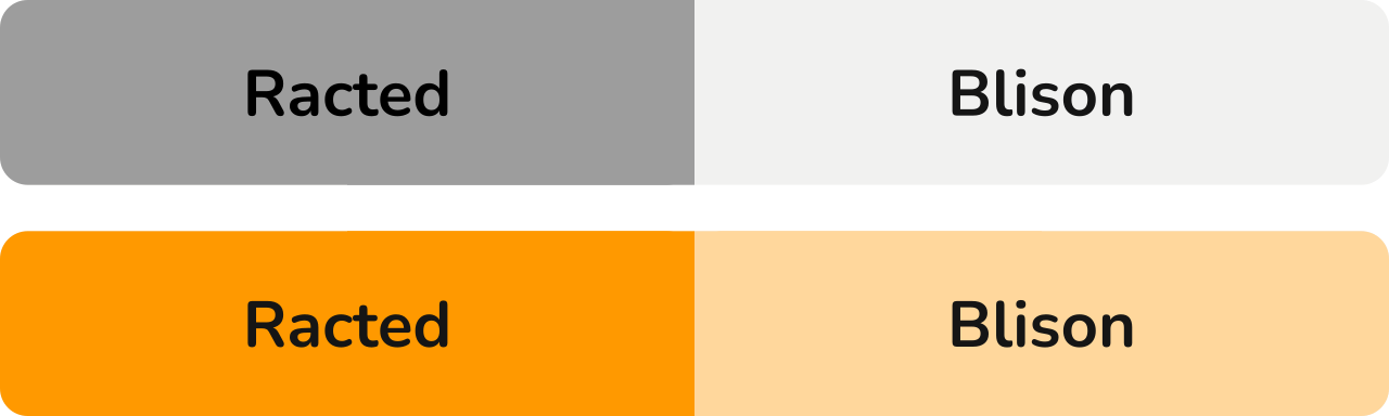
RQ 14: Inactive button coincides with the background

Another exciting result. Although we suspected that the respondents could have problems perceiving the inactive button as a button at all, this toggle achieved stellar results. With an error rate of only 0.9% and confidence of more than 0.89, it ranked first overall with an average rank of 1.33, which is an improvement over the simple saturated color vs. grayscale toggle seen in RQ11. This means that having the inactive button of the same color as the surroundings is a supreme way to communicate selection in a toggle button.

RQ 15: Embossed vs. debossed button

The error rate for both embossed toggles was 83.3% and the confidence score was the same as well with -0.58. This means that chasing skeuomorphism isn’t always the right solution, at least when it comes to toggles.

We expect this result is due to the common use of embossing effects in digital interfaces to bestow more weight on interface elements. A toggle with more visual weight would be perceived as active.

RQ 16: Check sign

As expected from its straightforward nature, the check sign icon added to an active button in a toggle performed very well, achieving the second best average rank of 2.33 with only a 5% error rate on Success-Confidence score of 0.86. The only problem we see in choosing this toggle is its potential cumbersome inclusion in the design of the web, and it may induce unwanted connections with checkboxes.

RQ 17: Radio button

Even though the nature of the radio button toggle is similar to the check sign design, when used as an icon, its meaning is less explicit. This was confirmed by achieving a worse average rank of 5.67 and a higher error rate of 9% combined with a lower Success-Confidence score of only 0.8. Despite the rather good performance of this visual cue, using radio buttons as toggles doesn’t align with their semantics since the radio buttons are meant to be used in forms, while toggles are meant to signify an immediate change of state.

Ranking The Visual Cues

We ranked the visual cues represented by toggles separately for the results they achieved in 5-second tests, 20-second tests, and the two combined. This resulted in 3 separate rankings. We calculated the average rank for every toggle and came up with the three worst and three best toggles.

Worst Toggles

Third last place — Toggle #9 — Red & Green Text Labels

  • Average rank: 24.67
  • 5-second test rank: 25
  • 20-second test rank: 24
  • Combined rank: 25

Second last place — Toggle #22 — Embossed button (no shadow version)

  • Average rank: 26.33
  • 5-second test rank: 27
  • 20-second test rank: 26
  • Combined rank: 26

Last place — Toggle #27 — Embossed button (shadow version)

  • Average rank: 26.67
  • 5-second test rank: 26
  • 20-second test rank: 27
  • Combined rank: 27

Best Toggles

Third place winner — Toggle #2 — Bold text

  • Average rank: 2.67
  • 5-second test rank: 4
  • 20-second test rank: 2
  • Combined rank: 2

Second place winner — Toggle #24 — Check sign

  • Average rank: 2.33
  • 5-second test rank: 1
  • 20-second test rank: 3
  • Combined rank: 3

First place winner — Toggle #26 — Inactive button coincides with the background

  • Average rank: 1.33
  • 5-second test rank: 2
  • 20-second test rank: 1
  • Combined rank: 1

Difference between the 5-second and 20-second test

Our secondary goal was to learn the difference in perception of toggles based on the time the respondents had to observe them, before deciding on an answer. Our expectation was that the result from the 20-second tests should be better overall (lower error rate and higher confidence score) than the results of the 5-second tests since the participants would have more time to think about the toggles in front of them.

We have calculated the average values and the results can be seen in the following table:

Test type Average error rate Average n. confidence score
5-second test 0.1728 0.5749
20-second test 0.1670 0.6013

The results confirmed our expectations since the average error rate was lower in the 20-second tests and the Success-Confidence score was higher. However, these differences were not significant. What interested us was whether any specific toggles showed significant differences between the two test variants. Therefore we focused on toggles that showed the biggest improvements/deteriorations between the 5-second and 20-second test results.

Toggles that performed better after 20 seconds

The greatest improvement in the number of ranks gained between a 5-second and a 20-second test is shared between toggles #4, #11, and #18 seen below. They all gained 6 ranks once participants had more time to observe them. This signifies that the clarity of the cues improved with added observation time.

  • 5-second test rank: 16
  • 20-second test rank: 10
  • Error Rate Difference: -0.0527
  • Normalized Success-Confidence Score Difference: 0.0913

This visual cue had the second smallest font size difference between the active and inactive states. We believe the change in rank is due to some participants needing time to notice smaller font size differences. However, the difference was noticeable enough to matter when the additional time was added to the test.

The next two toggles have enough in common for us to analyze them together.

  • 5-second test rank: 12
  • 20-second test rank: 6
  • Error Rate Difference: -0.0526
  • Normalized Success-Confidence Score Difference: 0.0912

  • 5-second test rank: 17
  • 20-second test rank: 11
  • Error Rate Difference: -0.0526
  • Normalized Confidence Score Difference: 0.0772

Both these cues were designed in a way that the more pronounced/saturated color denotes the active option while the inactive option is portrayed by a lighter color. The difference in results shows that a certain percentage of users initially view a lighter color as the more pronounced one. However, the percentage decreases when users spend more seconds thinking about the toggle. To make a toggle that is easy to comprehend right away, an interface designer should probably look at the other visual cues.

Toggles that performed worse after 20 seconds

Toggle 15

Toggle 17

Toggle Number 5-second test rank 20-second test rank Error Rate Difference N. Confidence Score Difference
15 11 19 0.0526 -0.1018
17 15 21 0.0877 -0.1299

Toggle 15 showed the biggest drop in rank, while toggle 17 suffered the most significant negative changes in error rate and confidence score.

We explain the drop in these two by the fact that these two toggles are similar in a way — both have a dark and a light half — which means they would be perceived differently, for example, when using the light mode versus dark mode setting on a mobile device. While the user’s instinctive reaction may be to pick the darker color as active, given some time, more people will begin to second-guess themselves. Instead of the darker color capturing their gaze, they may start overthinking that the brighter color is highlighted against the dark. A good toggle shouldn’t encourage such doubts.

Potential For Future Research

All the cues we tested in our study were simple/singular. Going from here, the natural next step for research would be to go deeper, with a study that focuses on evaluating our findings in more detail: Can I use a bold font in an inactive toggle button if the inactive button is even bolder? Will the combination of visual cues perform better than either cue individually? While the answers may seem intuitive, research data may prove otherwise, as our study has shown.

Another next step would be testing the effect of color alterations. Would the saturation of green work just as well as the saturation of orange?

Testing the performance of visual cues in prototypes of website navigation using different color schemes is another ambitious area for continued research. We tested our toggles in the void, but it’s possible that their performance would vary depending on the visual context.

Conclusion

In this article, we described our research where we analyzed a complex list of visual cues used by toggle buttons to communicate which of their options is active. By testing our research questions with real users, we collected a respectable amount of data to make reliable statements about the effectiveness of visual cues.

Here are some of the main points we arrived at that you should keep in mind when designing your next toggle button:

  • If you choose to use color as the main lead, we suggest you use a combination of a saturated lively color (ideally corresponding with your CTA color scheme) and a light grayscale neutral color. Using the colors in the toggle’s background fill is preferable to using colored text. If the color of the inactive button is the same as the surrounding background, this will further improve the button’s comprehensibility.
  • Contrasting colors of similar visual weight should not be used under any circumstances. Red and green’s cultural perceptions won’t help you communicate what’s selected. There are much better ways to go about this. Be wary of the black and white combination as well. Toggles that use this color scheme are the ones most prone to the confusion rooted in the dark/light mode settings.
  • You may choose a minimalistic path and use the font itself to show the difference between button states. The bold-thin combination is the go-to solution, but you may also use different font sizes. Just make sure to differentiate the font sizes well enough. Using font-weight or size is recommended to support other visual cues as well since it’s very flexible.
  • If you decide to use embossment as the main cue — you really shouldn’t. It proved to be unreliable at communicating the active state of a toggle. Even a simple border was more effective. If you decide to use embossed toggles for their visual appeal, we suggest combining embossment with a primary visual cue, such as bold text or color fill.
  • There’s no shame in using designs that you are sure will work. A tick or a radio-button icon both performed very well. The evident drawback of choosing them is the cumbersome inclusion in the design of your web since radio buttons as UI elements serve a different function from toggles. The ticks could be perceived as outdated (akin to a physical form more than a website). As for radio button icons, you might as well use a radio button instead.

Follow these tips, and your toggle button designs will no longer cause users to hesitate about what’s selected at the moment.

Resources

Categories: Others Tags:

How Cloud Computing is Adding Value to the Higher Education Sector

August 29th, 2022 No comments

Cloud computing is adding value to every sector, including education, and is expected to drive a range of transformations in the coming years.

The education sector is undergoing significant transformation, which is one of the driving forces of the digital era. Implications, risks, and challenges of the digitalization of higher education using Cloud Computing give information about the most recent tools and technology being utilized to examine learning in higher education. Undoubtedly, cloud computing combines with academics and industry, improving educational quality.

Academics and businesses have been pushed to realign their survival and growth plans as a result of the opportunities and difficulties that Higher Education Institutions (HEIs) have experienced in the past few years as a result of technological upheavals. It is increasingly essential for educators to continuously upskill and reskill in order to meet the demands of the future of employment, particularly in the digital age, as cloud computing adoption in higher education has increased. The pace of technological development is relentless, and it is gaining an important place in the education sector. 

Astute Analytica reports that by 2030, cloud computing in higher education market will reach US$ 15,180.1 Mn in 2030 from US$ 2,693.5 Mn in 2021. Here is the list of seven potential areas that are getting enhanced by Cloud Computing. 

Business Operations

Cloud computing is removing all the limitations in the learning area. The primary advantage of cloud computing is that it automatically streamlines the process in the business sector. Institutes can take benefit by deploying applications that could handle the business side, such as maintaining financials, enrolment, and housing. Thus, universities are significantly inclining toward digitalization. Jenzabar made headlines in the past as the company worked with around 1,350 universities to develop, launch, and scale courses for students online. Further, the firm also inked a partnership with IBM in order to give access to the software for the management of higher education institutions. The software operates on the IBM SoftLayer platform.

Improving the productivity of students

Students get hold of all the courses without any additional effort. Everything is not just a tap away. Therefore, realizing the cloud computing opportunities, universities are significantly shifting to innovative platforms. Cloud computing allows on-demand self-service, which is the permission to use information resources automatically. Apart from that, it offers broad network access and resources to the users. It also increases the flexibility of the students, allowing them to prepare for the courses anytime and at any place, minimizing distant travels, hectic schedules, expenses, etc. Cisco, in June 2022, added its new Webex Calling innovations in the Webex Suite. It improves the work flexibility, reliability, and audio quality and minimizes the challenges related to call dropping, broadband bandwidth issues, background noise, etc. Moreover, the Salesforce Connected Student Reports that nearly 58% of higher education staff push institutions on expanding their investment in supporting learners. 

Expanding the reach of Institutions and Students

Institutions can now offer effective distant classes through virtual platforms. Thus, it helps them expand their geographical reach without any limitations. For instance, Student360 offers users a taste of the world of work before the students finish secondary school. It helps students recognize their strengths and skills in order to explore a future career pathway.

More Personalized Education Experience

Higher education institutions and students both benefit greatly from cloud computing. With the use of cloud computing, teachers can access the whole database of their students’ development. It enables teachers to keep a close eye on students’ progress and store the data for later use. Additionally, kids have a number of advantages, including a secure atmosphere, which was crucial during the COVID-19 pandemic. 

Privacy and Security

When it comes to cloud technology, concerns related to data privacy also revolve. Therefore, various acts and regulations have been enacted in order to secure students’ data. For instance, the Gramm-Leach-Bliley Act requires institutions to strengthen data security. As per the law, it is mandatory for institutions to reveal how they share their customers’ nonpublic personal information (NPI). 

Unlimited Space to Store Data

Higher education institutions can automatically erase outdated or inactive videos, photographs, communications, and files by adopting automation and content retention solutions. With the use of these technologies, administrators can specify criteria for the duration of storage and recovery windows, enabling users to recover deleted files for a predetermined amount of time. Moreover, institutes can even diversify the platform as per their requirements. Various firms offer flexible consumption or pay-per-use pricing models. Moreover, Institutes can also get access to separate individual storage. Moreover, institutes are no longer required to pour high funds into data center maintenance. Moreover, it is expected to soon replace aging physical IT hardware, which requires a high cost for maintenance. 

Contactless Services to Increase the Safety

This COVID-19 pandemic has significantly made everyone realize the importance of contactless services. However, it never occurred that education could be contactless ever before. Cloud computing can significantly drive the new paperless, cashless, and contactless era in the education sector. For instance, CollPoll, a renowned digital learning platform, enable higher education institutions to go fully digital, from contactless online classrooms and support requests through the Campus Help Center to paperless admissions and exams, cashless fees, and event purchases.

Higher education institutions get the opportunity to improve operational efficiency, provide better data and reports, and streamline communication all through the use of campus management software.

Conclusion

Cloud technology is steadily expanding its foothold across the globe, gaining a vital place in almost every industry vertical. The education sector is no more an exception as various institutes are now leveraging technological benefits. Moreover, it is helping institutes grow their business and reach out to more audiences. Therefore, cloud computing is expected to reshape the outlook of the entire education sector, including higher education. 

The post How Cloud Computing is Adding Value to the Higher Education Sector appeared first on noupe.

Categories: Others Tags:

Cloud Marketing 101: Personalized Digital Marketing

August 29th, 2022 No comments

Cloud technology has led to innovations across many disciplines. The ability to store and access data from anywhere has been a game-changer. On top of that, the power of AI-assisted analytics is giving businesses faster and more accurate insights than ever. 

It’s no surprise, then, that marketing has embraced cloud technology. Personalization of marketing is something marketers have been working towards for some time. With cloud marketing, it is possible to perfect this strategy with real-time data insights.  

What Does Cloud Marketing Mean?

When we talk about cloud marketing, we’re talking about all of your business’s online marketing efforts. What makes cloud marketing different from online marketing, in general, is the integration of all these separate channels. 

The goal of cloud marketing is to provide each customer with an individualized experience. This experience should be consistent across all the channels where they interact with your business. 

To make this possible, marketers use technologies like cloud data warehouse storage and AI data processing. We collect and analyze data on customer behaviors and preferences. Then, we use this to personalize marketing materials that a given customer sees.

Free to use image sourced from Pixabay

Cloud marketing is a technology-driven solution. It relies on data insights from analytics, but the distribution of marketing is often automated too. Several different technologies work together to deliver the solution.

That’s why many businesses turn to single, integrated solutions known as cloud marketing platforms.   

What Is a Cloud Marketing Platform?

Broadly speaking, we can separate cloud marketing into two areas, media and tools. Media makes up the channels where you interact with customers, whether email, your website, or social media. Tools are what you use to track data and deliver your marketing campaigns. 

A cloud marketing platform aims to combine these tools into a single interface. This allows you to manage campaigns across all your media channels. Salesforce, IBM, and other major business software providers have their versions of these software suites.

Image Sourced from contentmarketinginstitute.com

The Benefits of a Marketing Cloud

Compared with traditional marketing, using a marketing cloud brings you closer to your customers. Being able to personalize marketing materials and accurately target a customer’s preferred channels is a huge advantage. 

Data-Driven Insights

In the past, marketing relied on direct feedback from customers or market research for insight. This was costly, hard to obtain and often out of date by the time it was analyzed. Compared with analyzing real-time customer data, the old ways can’t compete.  

We used to judge the success of our marketing campaigns based on related metrics like sales volume. Now, we can see the effects of changes in marketing reflected in customer behaviors. We can even see which customers respond to different types of messaging. 

All of this gives us as marketers far more knowledge of our individual customers. We get more control over what a customer sees across all marketing channels. It allows for the kind of consistent, personalized experience that customers are looking for. 

Scalability

When you’re still growing as a business, scalability is imperative. You don’t want to make a costly investment today that your business will outgrow in a year. A key advantage of cloud-based solutions is that they can scale with your business. 

Whether we’re talking about professional phone systems or data warehousing solutions, space in the cloud is affordable and accessible. There’s little to limit your growth, though costs will increase proportionally, and large businesses may even provide their own cloud hosting. 

Image Sourced from wordstream.com

Global Collaboration

Cloud-based marketing enhances your collaborative abilities. When you’re engaging with a global audience, it’s important to tailor your marketing with different cultures in mind. Having the ability to instantly collaborate with colleagues in different localities enables this flexibility.  

Business communications have embraced cloud technology in the same way as marketing. Cloud phone systems and workplace collaboration apps like Slack can play a big role in enhancing your internal efficiency. 

Cost & Efficiency Savings

The relatively low cost of online advertising has been a draw for marketers since the dawn of ecommerce. With cloud marketing strategies, the cost savings multiply. Automation in the distribution of marketing materials saves time and money.   

Making the most of social marketing with the assistance of data insights is a highly cost-effective way of targeting your advertising. With a better way of targeting your ideal customers, less of your marketing efforts go to waste on non-viable prospects. 

How to Implement a Cloud Marketing Strategy

Depending on the stage of your business, there will be different levels of investment and effort required. Maybe your marketing is done online, and you just need a way to integrate your systems. Or, maybe you’re just moving into digital marketing

Whatever scenario you’re in, the following four steps will guide you in implementing your cloud marketing strategy. 

1. Plan

First, you need to take stock of your current marketing channels. Make a list of any software and hardware that your marketers are using. This could mean anything from your campaign management software to your consultants’ mobile business plans. 

Once you have these details, set your goals for implementing cloud marketing. Set your budget, then research your options. This will help you assess what systems you need to replace, what you can integrate, and what will be your most cost-effective solution.  

Once your systems are in place, plan your campaigns. Digital marketing requires a constant flow of content. Online platforms must stay up to date, social media feeds need to post consistently, and so on. Automation will help with scheduling, but the content needs to be ready.

2. Test

When you have access to real-time customer data and analysis, testing should become a habit. Use your automated tools and customer data to run A/B marketing tests on your audience segments.   

3. Evaluate

Make use of all the data you are collecting. You planned your campaign based on data insights, keep that going. Use both your test data and the feedback you collect from user behaviors. Look at your highest and lowest engagement rates and learn from successes and mistakes.  

4. Refine

Cloud marketing aims to elevate the entire customer experience. You should always keep this in mind as you refine your strategy. Ensure your marketing department is not isolated from your sales and customer service. All these teams help shape your customer experience.  

With cloud marketing, you create a positive data feedback loop with the rest of your business. This will help you keep that all-important customer experience consistent across your marketing, sales, and service channels. 

Final Thoughts

Cloud marketing isn’t for every business. There is a high requirement for consistent content output that could deter smaller companies. The technologies that make this strategy work are available to all businesses at some level.

It could be that digital asset management or cloud data storage fit your needs, even if you don’t implement a full multichannel marketing platform. Looking forward to where this technology can fit in with your business could help future-proof your operations.

The post Cloud Marketing 101: Personalized Digital Marketing appeared first on noupe.

Categories: Others Tags:

Ridiculously Challenging WordPress Quiz

August 26th, 2022 No comments

I bet you didn’t know that WordPress is the world’s most popular website builder and content management system (CMS).

Just kidding…of course, you did! But that’s not all there is to know about WordPress, so take our ridiculously challenging WordPress quiz and see how much of an expert you are…

(Scroll to the bottom for the correct answers.)

1. What is WordPress?

  1. SEO plugin to check your keyword density
  2. AI tool to create illustrations
  3. Online software to create websites
  4. A coffee shop in Canada

2. What is the number of websites using WordPress?

  1. 75 million
  2. 1.3 billion
  3. 2 thousand
  4. 7.1 billion

3. WordPress has a tradition of naming its major releases after:

  1. American presidents
  2. Famous jazz musicians
  3. British kings
  4. Heavy metal bands

4. How many websites are created on WordPress per day?

  1. Two websites
  2. 20,040 websites
  3. Over 500 websites
  4. 60-80 websites

5. What is the correct WordPress website address?

  1. WordPress.org
  2. WordPress.us
  3. WordPress.com
  4. WordPress.au

6. Who is the WordPress CEO?

  1. Elon Mask
  2. Bill Gates
  3. Leonardo DiCaprio
  4. No CEO

7. Which US government website is using WordPress?

  1. WhiteHouse.gov
  2. U.S. Embassy Websites
  3. State.gov
  4. All of them

8. How many languages is WordPress available in?

  1. 21
  2. 72
  3. 78
  4. 1

9. What is the most downloaded WordPress theme of all time?

  1. Divi
  2. Gutenberg
  3. WoodMart
  4. Astra

10. How many Fortune websites are using WordPress?

  1. 11
  2. 25
  3. 90
  4. 78

11. What is the average salary of a WordPress developer per year?

  1. $100k
  2. $56k
  3. $24k
  4. $201k

12. When was the first WordPress version released?

  1. 1999
  2. 2010 
  3. 2007
  4. 2003

Answers

1. What is WordPress? – 3. WordPress is online, open-source software that you can use to create websites.

2. What is the number of websites using WordPress? – 2. In 2021, WordPress powers over 1.3 billion websites all over the web, and this number continues to grow.

3. WordPress has a tradition of naming major releases after – 2. WordPress has a habit of naming its big releases after famous jazz musicians. For example, in the first version of January 2004, they called 1.0 (Davis), named after American trumpeter Miles Davis. Another version of May 2004 was named 1.2 (Mingus).

4. How many websites are created on WordPress per day? – 3. Over 500 websites are created on WordPress every day. At the same time, only 60-80 sites are built on popular platforms like Squarespace and Shopify. Besides, every second, 17 new blog posts are published on WordPress!

5. What is the correct WordPress website address? – 1. The fact that always confuses beginners is that WordPress.org and WordPress.com are entirely different companies that provide separate services. WordPress.org is the real WordPress everyone talks about that helps you to build websites. While WordPress.com is a hosting provider created by Automattic, the co-founder of WordPress.

6. Who is the WordPress CEO? – 4. WordPress is a free, open-source project. That’s why it does not have a CEO; volunteer developers run the project from all over the globe. This is the reason anyone can submit a report about a bug or suggest features.

7. Which US government website is using WordPress? – 4. The correct answer is all of them. All major websites of the US federal government use WordPress for their websites. The list includes all government sites of big and small cities, counties, universities, and high schools.

8. How many languages is WordPress available in? – 2. The Default WordPress language is English; however, the platform provides a fully translated platform with plugins that allow you to change your site’s language in seconds. The software has been successfully used in over 72 languages and can be modified for more!

9. What is the most downloaded WordPress theme of all time? – 4. Astra is the most downloaded WordPress theme of all time. Astra is claimed to be the most potent and fast theme trusted by many popular brands. Besides, the theme earned over $30M.

10. How many Fortune 500 websites use WordPress? – 1. 11 Fortune websites, such as Walt Disney Company, ABM Industries, and 21st Century Fox, use WordPress.

11. What is the average salary of a WordPress developer per year? – 2. The average WordPress developer earns $56,000 per year, according to Payscale.

12. When was the first WordPress version released? – 4. The first version of WordPress was released on May 27, 2003, which makes WordPress much older than Twitter and Facebook.


Featured image via upklyak on Freepik

Source

The post Ridiculously Challenging WordPress Quiz first appeared on Webdesigner Depot.

Categories: Designing, Others Tags: