If you’ve been working with JavaScript for a while, you may be fairly familiar with DOM (Document Object Model) and CSSOM (CSS Object Model) scripting. Beyond the interfaces defined by the DOM and CSSOM specifications, a subset of methods and properties are specified in the CSSOM View Module, providing an API for determining and manipulating DOM element geometry to render interesting user interfaces on the web.
The CSS Object Model (CSSOM) is a set of APIs allowing CSS manipulation from JavaScript. Just like the DOM provides the interface for manipulating the HTML, the CSSOM allows authors to read and manipulate CSS.
The CSSOM View is a module of CSS that contains a bunch of properties and methods, all bundled up to provide authors with a separate interface for obtaining information about the visual view of elements. The properties in this module are predominantly read-only and are calculated each time they are accessed — live values.
Currently, the CSSOM View Module is only a working draft and under revision in the W3C’s Table of Specification. Its essence, therefore, is to define these interfaces, both already existing and new, in a manner that can be compatible across browsers.
Why Do Geometry Methods and Properties Matter At All?
From my perspective, there are a few reasons to try understanding and using the CSSOM View properties and methods.
First, it is not that the everyday user interface requires movable components to achieve its most basic user stories. Unless you’re building a game interface, you may not always need to make stuff movable on your website. Geometry properties are useful despite these because the ability to programmatically manipulate the visual view of DOM elements gives developers more superpowers for implementing dynamic user interfaces.
Kanban boards are implemented because components can be dragged and dropped at relevant sections. More content is loaded as users scroll to the bottom of a document because scroll position values are readable. So, while it may not seem immediately obvious, it is through knowing the accurate size and position information of elements that these features are achievable.
Second, when viewing HTML documents in a web browser, DOM Elements are rendered in visual shapes, so they have a corresponding visual representation made viewable/visual by browsers. Accessing the live visual properties of these DOM elements through the CSSOM View properties and methods gives an advantage over the regular CSS properties. And then you ask how:
After setting the width and height properties of HTML elements in CSS, the CSS box-sizing property finally sets how an element’s total width and height are calculated. This creates an error-prone JavaScript if the value of our box-sizing changes.
Second, there’s hardly any way to read an exact numeric value of an element’s width set to auto. And sometimes, we need the width in exact pixels and sizes.
Finally, it just seems way more flexible and useful to have a set of read-only lives values that can be relied on when writing some other code that manipulates the elements based on the current live values.
Element Node Geometry
Offsets
Coordinates specified using the “offset” model use the top-left corner of the element being examined or on which an event has occurred. — MDN
Unlike other properties in the CSSOM View, offset properties are only available to HTMLElement nodes derived from the Element node. As such, you cannot read the offset properties of an SVGElement because they don’t exist.
Offset Left and Top
Using the read-only properties offsetLeft and offsetTop gives the x/y coordinates of an element relative to its offsetParent. The offsetLeft property returns the distance of the outer left border of the current element relative to the inner left border of the offsetParent while the offsetTop property returns the distance of the outer top border of the current element relative to the inner top border of the offsetParent.
Offset Parent
The offsetParent of any element is its nearest ancestor element which has a CSS position property that is not static, a
,
, or
element or at the base, the element.
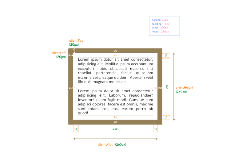
Offset Width and Height
These read-only properties provide the full outer size of element nodes. The offsetWidth is determined by calculating the total size of an element’s vertical borders, padding, and content, including any scrollbars that may exist. The offsetHeight is calculated in the same way using an element’s horizontal borders, padding, and content height.
Clients
Client Left and Top
In the most basic sense of it, these read-only properties give the size in pixels of an element’s left border width and the top-border width, respectively. In a deeper sense, however, the value of the clientLeft and clientTop properties of an element gives the relative coordinates of the inner side (outer padding) of that element from its outer side (outer border).
So, where a document has a right-to-left writing direction and left vertical scrollbars, the clientLeft will return coordinate values, including the size of the scrollbar. This is because the scrollbar displays between the inner side (outer padding) of that element from its outer side (outer border).
Client Width and Height
The read-only clientWidth and clientHeight properties of an element return the size of the area inside the element’s borders. The clientWidth property will return the size of an element’s content width and its vertical padding without the scroll bar. If there is no padding, then the clientWidth is just the size of that element’s content width. This is the same for the clientHeight property, which will return the size of an element’s content height plus horizontal padding, and in the absence of any padding, it will return just the content height as the clientHeight.
Scrolls
Scroll Left and Top
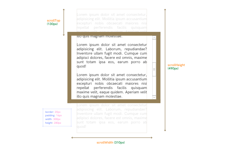
An element with no overflowing content on its x-axis or y-axis will return 0 when its scrollLeft and scrollTop properties are queried, respectively. An element’s scrollLeft property returns the distance in pixels that an element’s content is scrolled horizontally, while the scrollTop property gives the distance in pixels that an element’s content is scrolled vertically.
The pixels returned by the scrollLeft and scrollTop properties of an element are not always viewable in the scrollable viewport or client area due to the scrolling. The pixels can be viewed as representing the size of the area that has been scrolled away either to the left or to the top.
The scrollLeft and scrollTop properties are read-write properties, so their values can be manipulated.
Note: The scrollLeft and scrollTop properties may not always return whole numbers and can return floating point values.
Scroll Width and Height
The scrollWidth property of an element calculates its clientWidth plus the entire overflowing content on its left and right side, while the scrollHeight property calculates an element’s clientHeight plus the entire overflowing content on the element’s top and bottom side.
This is why if an element has no overflowing content on its x or y axes, its scrollWidth and scrollHeight properties will return the same values, respectively, as its clientWidth and clientHeight properties.
MDN explains the scrollWidth and scrollHeight property values as:
“… Equal to the minimum width or height the element would require in order to fit all the content in the viewport without using a horizontal or vertical scrollbar.”
Window and Document Geometry
The Window interface represents a window containing a DOM document; the document property points to the DOM document loaded in that window.
The geometry properties of the document loaded in the window and the window itself are relevant for several reasons. Sometimes we need to read the width of the entire viewport and the entire height of our document, other times, we even want to scroll a page to some definite extent and whatnot. Well, of course, the properties to read the relevant values and information are not left out in the CSSOM View Module.
Because there’s a root element (labeled as Document.documentElement in the DOM) that defines the whole HTML document, we can also get the various height, width, and position properties of the HTML document by querying the root element.
Window Width and Height
The properties for calculating the width and height of the window are divided into inner and outer width and height properties. To calculate the outer width and height of the window, the outerWidth and outerHeight read-only properties are used, and they respectively return the width and height of the whole browser window.
To obtain the inner width and height of the window, the innerWidth and innerHeight properties are used. What is returned is the width and height (including scroll bars) of the entire viewport where the document is visible.
You may need to obtain the inner — viewport width or height of the window without the scrollbar and borders and, in such cases, use the clientWidth or clientHeight on the Document.documentElement, which is the root element representing the document.
Document Width and Height
We never set borders, padding, or margin values on the root element itself. Still, on elements contained in the Document, using the scrollWidth and scrollHeight properties on the root element Document.documentElement will return the document’s entire width and height.
Window and Document Scroll Values
Scroll Left and Top
As explored in the Element Node Geometry section, the scrollLeft and scrollTop properties return in pixels the size of the left or top scrolled away area of an element.
Thus, to determine the left or top scroll state of a document, using the scrollLeft and scrollTop properties on the Document.documentElement will return values representing the size of the part of the Document that has been scrolled away and is not visible in the window’s viewport.
The scroll state values of a document can alternatively and more preferably be obtained using the window.pageXOffset and window.pageYOffset values.
Window and Document Scroll Methods
We can programmatically scroll the page in response to certain user interactions using scroll methods defined in the CSSOM View Module. Let’s consider them.
The scroll() and scrollTo() Methods
These two window methods are basically the same methods and allow you to scroll the page to specific (x, y) coordinates in the Document. The coordinates values represent an absolute position from the top and left corners of the document itself.
To simply visualize this, let’s run this code:
window.scrollTo(0, 500);
//Scrolls the page vertically to 500 pixels from the page’s origin (0, 0).
window.scrollTo(0, 500);
//Page stays at the same point.
After running window.scrollTo(0, 500) the first time, an attempt to run it a second time does nothing because the page is already at an absolute position of 500 pixels from the Document’s origin on its y-axis.
The scroll() and scrollTo() methods define x and y parameters for corresponding arguments representing the number of pixels along the horizontal and vertical axes, respectively, that you want the page scrolled to or a dictionary of options containing top, left, and behavior values.
The behavior value determines how the scroll occurs. It could be "smooth", which gives a smooth scrolling effect, or "auto", which makes the scrolling like a quick jump to the specified coordinates.
The scrollBy() Method
This is a relative scroll method. It scrolls the page relative to its current position and does not regard the Document origin whatsoever.
To examine this method, let’s use the code example from the scroll() and scrollTo() methods section:
window.scrollTo(0, 500);
//Scrolls the page 500 pixels from the current position, say (0, 0), to (0, 500).
window.scrollTo(0, 500);
//Scrolls the page another 500 pixels from the current position to (0, 1000).
Coordinates
Coordinate systems are the bane of how positions of elements are defined in the CSSOM View methods and properties.
When specifying the location of a pixel in a graphics context, its position is defined relative to a fixed point in the context. This fixed point is called the origin. The position is specified as the number of pixels offset from the origin along each dimension of the context.
The CSSOM uses standard coordinate systems, and these are generally only different in terms of where their origin is located.
Window and Document Coordinates
While the CSSOM uses four standard coordinate systems, the client and page coordinate systems are the most used in the CSSOM View Module. The dimensions or positions of elements are usually defined relative to either the document or the viewport.
Client Coordinates (Window Relative)
I found no better description of client coordinates than the one from MDN:
The “client” coordinate system uses as its origin the top-left corner of the viewport or browsing context in which the event occurred. This is the entire viewing area in which the document is presented. Scrolling is not a factor.
Client coordinates values are similar to using position: fixed in CSS and are calculated from the view port’s top left edge.
Page Coordinates (Document Relative)
The “page” coordinate system gives the position of a pixel relative to the top-left corner of the entire Document in which the pixel is located. That means that a given point in an element within the document will keep the same coordinates in the page model unless the element moves (either directly by changing its position or indirectly by adding or resizing other content).
Page coordinates values are similar to using position: absolute in CSS and are calculated from the Document’s top left edge. The page-relative position of an element will always stay the same regardless of scrolling, while its window-relative position will depend on the document scrolling.
Element Coordinates
The Element.getBoundingClientRect() Method
This method returns an object called a DOMRect object whose properties are window-relative pixel positions and dimensions of an element. This is the one method you turn to when you need to manipulate an element relative to the viewport.
You should note that in certain cases, the returned DOMRect object does not always hold the same property values or dimensions for the same element. This is specifically true whenever transforms (skew, rotate, scale) are added to an element.
The reason for this is pretty logical:
In case of transforms, the offsetWidth and offsetHeight returns the element’s layout width and height, while getBoundingClientRect() returns the rendering width and height. As an example, if the element has width: 100px; and transform: scale(0.5); the getBoundingClientRect() will return 50 as the width, while offsetWidth will return 100. — MDN
You can visualize this by clicking the display button in this pen below:
The object returned by the getBoundingClientRect() method holds six dimension properties of the element the method was called on. These properties are:
x and y properties return the x and y coordinates of the element’s origin relative to the window;
top and bottom properties return the y coordinates for the top and bottom edge of the element’s box;
left and right properties return x coordinates for the left and right edge of the element’s box;
height and width properties return the entire width and height of the element as if the element is set to box-sizing: border-box.
Mouse and Pointer Events Coordinates
All mouse or pointer event objects have coordinate properties that define both window-relative and document-relative coordinates where the mouse or pointer event occurs.
The window-relative coordinates for mouse events are stored in the clientX and clientY properties which denote the x and y coordinates, respectively.
On the other hand, the document-relative coordinates for mouse and pointer events are stored in the event object’s pageX and pageY properties for the x and y coordinates, respectively.
Use Cases
The APIs in the CSSOM View Module combine the most foundational yet useful methods and properties for accessing geometry properties of DOM Elements as rendered in the browser. Because these properties are live, they are more reliable in specific cases than their CSS values. But how can these APIs be used to create real-life user interface features?
We’d examine four everyday user interface solutions used in everyday modern websites and web apps that can be created using these APIs.
In this section, we will focus solely on the JavaScript code for implementing these user interface solutions, not the CSS nor HTML.
Scroll-to-top Component
The scroll-to-top button allows a user to quickly return to the top of the page with little effort. The CSSOM View API provides a simple method to achieve this with its scrollTo() and duplicate scroll() methods.
Here’s an implementation of the scroll-to-top button:
Then we register a handler for this event which executes (handles) what happens when this button is clicked. The code in the event handler calls the window’s scrollTo() method, with values that define the top of the page and the behaviour for the scroll.
For user experience, it’d definitely serve no use to see a scroll-to-top button if a user is already at the top of the page:
The code above displays the scroll-to-top button only when the user has scrolled some distance by using the window.pageYOffset value to determine how far the page has been scrolled. If the page has been scrolled up to 500 pixels to the top, the scroll-to-top component becomes visible, and if not, it stays invisible.
Infinite Scrolling
With its implementation in popular social media, infinite scrolling allows users to scroll down a page; more content automatically and continuously loads at the bottom, eliminating the user’s need to click the next page.
Can you guess how the browser knows to load more content as a user scrolls down the page? How does one determine when a user has reached the bottom?
We know that document.scrollHeight gives the total height of a document, document.clientHeight gives the size of the viewable screen or viewport, and document.scrollTop or window.pageYOffset gives the size of the part of the document that has been scrolled away to the top. Could we take an intuitive guess that if document.scrollTop + document.clientHeight >= document.scrollHeight, then the user has reached the bottom of the page? I think so.
This pen uses the infinite scrolling technique to load cards on a page until they reach their maximum count. At its most basic form, it imitates how e-commerce websites display search results for products. Let’s break down how this is achieved.
We use HTML and CSS to define the form and style of the cards container and the styles each element with the class of card should have. In our pen, we hard-code the first set of cards with HTML.
First, we get and assign to constants the following:
card container element, which is the parent element for all the cards;
status element that displays the current number of cards loaded.
We set a maximum on the number of cards that should be loaded on the page, and we also have a calculated value for the number of cards to be added to the page per load. So, we define a totalCardsNo and cardLoadAmount constants to store the values for the maximum number of cards and the number of cards to be added:
We need to write a test that checks when a user is at the bottom of the page and loads the cards. By our earlier guess, if document.scrollTop + document.clientHeight >= document.scrollHeight, then our user is at the bottom of the page.
In our pen, we add a scroll event listener to our document and use an arrow function to handle the scroll event. This function “handles” all card loading-related actions but does this only when the user is truly at the bottom of that page, that is, the condition document.scrollTop + document.clientHeight >= document.scrollHeight returns true:
document.addEventListener("scroll", (e) => {
if (document.documentElement.scrollTop + document.documentElement.clientHeight >= document.documentElement.scrollHeight) {
const children = cardContainer.children;
lastIndex = children.length;
}
});
Once the user is at the bottom of the page, we initialize a constant, children, to hold an HTMLCollection of all the currently loaded cards, which are the current children of the cardContainer. The length of children also represents the index (not an array-like index) of the last card, and we store that value in the lastIndex variable.
In our code, we use the value of the lastIndex to know whether to load more cards or whether we’ve reached the totalCardsNo after which we can no longer load cards. If the value of lastIndex is less than totalCardNo, we load more cards:
This second condition is contained in the first condition, and when it returns false, the event handler function adds no cards.
Animate on Scroll
One of the cooler features in websites and landing pages is components or elements that animate as the page is scrolled to a certain position (usually where the element should be visible) in a document.
Here’s a final result of a page with elements that animate on scroll. Let’s walk through how this is achieved:
Because the idea of animating an element on scroll depends on when the element becomes visible, we need a test to figure out when an element has become visible, that is, has entered the viewport.
Our visible context is the viewport — the window; we need viewport-relative coordinates of an element. Remember,
The Element.getBoundingClientRect() method returns a DOMRect object providing information about the size of an element and its position relative to the viewport.
In a vertically scrolled page, an element is visible when its getBoundingClientRect().top value is less than the viewport’s height. In our pen, this is the condition we test to decide when to animate our element.
To start, we first get and store all the elements we will be animating in an array:
Our test is summarised in this conditional below. There’s a slight addition to the simple condition that tests if the value of the element’s getBoundingClientRect().top is less than the height of the viewport (defined in document.documentElement.clientHeight).
We want the animation or transition on an element also to be visible, so adding 50 to an element’s getBoundingClientRect().top value sets a condition for the element to be animated when it is at least 50 pixels visible in the viewport:
Now we add a scroll event listener to our document and register a handler that checks if the element is 50 pixels visible on the viewport. If the condition returns true, the animated class is added to the visible element once and for all.
Range Slider
While they may vary in implementation and use, range sliders are one of the more common web components. They are input controls that allow users to select a value or change a state from a control or sliding bar.
Take a look at the final result of this pen, where I implement a basic slider:
We use HTML and CSS to define and style the elements designated with the classes .track and .thumb, respectively. A “drag” technique is the major implementation in sliders because the thumb is dragged within the track, which defines some sort of range.
So, we are getting and assigning the .track and .thumb elements to constants. Then we declare but don’t initialize the variables draggable and shiftX, to be used later:
const thumb = document.querySelector(".thumb");
const slider = document.querySelector(".track");
let draggable;
let x;
In its most basic sequence, drag-and-drop is achieved by:
Moving the pointer to the object.
Pressing and holding down the button on the mouse or other pointing device to “grab” the object (defined as a “pointerdown” event).
“Dragging” the object to the desired location by moving the pointer to that location is defined as a “pointermove” event).
“Drop” the object by releasing the button defined as a “pointerup” event).
These sequences of actions are each defined in UI Events, specifically, the mouse and pointer events. Because as we saw in the Mouse and Pointer Events Coordinates section, these mouse events have document-relative and window-relative coordinate properties, and we would use them to create a drag-and-drop algorithm for our slider.
Events need handlers, so we declare handlers for the pointerdown, pointermove, and pointerup events each. The first handler we declare is a prepDrag function for the pointerdown event. The pointerdown event fires whenever the mouse or pointer is pressed down on the element that has a listener for the event:
function prepDrag(event) {
draggable = event.target;
x = event.clientX - draggable.getBoundingClientRect().left;
document.addEventListener("pointermove", startDrag);
document.addEventListener("pointerup", endDrag);
}
The role of this handler is to prepare the element for moving. For instance, if the element was statically positioned, to prepare the element for a moving or “dragging” event, the prepDrag handler will have to set the element’s position to absolute or relative to be able to manipulate the element’s position through it’s top, left values.
Initialising the globally declared draggable and x in the prepDrag handler’s local scope makes the values accessible to the other handlers which will be executed in that scope.
Lastly, in this handler, we add the pointermove and pointerup event listeners to the document and not the thumb element. The reason is that the mousemove event triggers often, but not for every pixel. As such, it can cause unintended drag-and-drop responses. Adding the event listener to the document is a more reliable way to catch the mousemove event.
The second function, startDrag, handles the pointermove event, and it executes all the logic that determines how the thumb element moves and its positioning by manipulating its top and left style values:
We want to constrain the dragging of the thumb to the boundaries of the track, such that even if the pointer is moved out of the track while pressed down, the thumb doesn’t get dragged out too.
This is implemented by manipulating the left style value of the draggable only when the mouse event’s clientX property is within the width of the track. Thus, while the pointer is pressed down and moving, the draggable element’s left position style only changes if the mouse event’s clientX value is not less than the track’s offsetLeft value nor greater than the track’s getBoundingClientRect().right value.
The last function, endDrag, handles the pointerup event. It removes the pointermove and pointerup event listeners from the document:
function endDrag() {
document.removeEventListener("pointermove", startDrag);
document.removeEventListener("pointerup", endDrag);
}
Since these events are set to initiate in a continuous sequence, it makes sense that their handlers don’t continue to run once the pointerdown event (which begins the sequence) ends:
thumb.addEventListener("pointerdown", prepDrag);
Finally, we add a pointerdown event listener to the thumb element to register a handler for the very first event we listen for.
Conclusion
The use cases covered in this article merely scratch the surface of what is achievable with CSSOM View Module API.
When the heavy DOM manipulation is not considered, I believe the methods and properties in this API give us a lot of tools to customize the geometric properties of web components to suit various interface needs.
Amelia is a WordPress booking plugin that saves businesses time and money from the beginning by replacing their manual or semi-automated appointment and event booking operations with a fully automated one.
Amelia is easy to set up and use. Fitness centers, consulting organizations, training institutions, beauty salons and spas, photographers, medical centers, and other businesses that rely heavily on client and customer appointment or event bookings will profit from using it.
Clients can go online to make appointments 24/7, change or cancel appointments, and make payments. They can also purchase tickets for events and add special requirements.
Amelia automatically sends notifications, reminders, and follow-ups by SMS, WhatsApp, and email (reducing no-shows while keeping clients aware of upcoming special sessions or events).
Amelia also manages group appointments, packages of appointments, employees’ schedules, special days, and days offs.
All the above can be managed at one or multiple locations from a single dashboard.
Amelia integrates with Google Calendar, Google Meet, Zoom, and Outlook Calendar. Click on the banner to learn more about what this amazing application could do for your business.
Creating an informative table or chart for your website can be pretty labor-intensive.
You may have to work with and organize copious amounts of data.
You need to avoid compromising your website’s design at the expense of getting the tables or charts you want.
Your tables and charts may need to be responsive, editable, informative, and readable.
wpDataTables plugin does all the above for you and more. It is packed with powerful table and chart-building features that include –
4 chart-building engines: Google Charts, Chart.js, Apex Charts, and Highcharts
The ability to accept data from multiple database sources and in numerous standard formats
The ability to highlight critical data, or color code data using Conditional Formatting
A wealth of powerful data filtering and sorting features
Live data from Google spreadsheets or JSON API
wpDataTables integrates seamlessly with Avada, Divi, Elementor, Gutenberg, and WPBakery. Click on the banner to learn even more about this popular WordPress plugin.
To automate a booking operation, you might need one tool to book appointments, one to accept payments, another to manage employee schedules, and so on. Of course, if your business provides services at multiple locations, then you would multiply the number of tools times the number of locations, and you’ll be good to go.
Or, you could go with Trafft, a single tool with which you can manage all of the above, at multiple locations, all from a single platform.
Clients can book appointments online 24/7.
They can make payments online using PayPal, Stripe, Mollie, or Authorize .net.
Trafft sends reminders and notifications automatically via email or SMS.
Trafft integrates smoothly with Google Calendar, Google Meet, Outlook, and Zoom.
Click on the banner to learn about all of Trafft’s booking capabilities. You’ll be impressed.
WordLift helps your website speak the language of Google. This way, your content will be discovered by users, giving you more organic traffic and helping your business website achieve excellent rankings.
WordLift uses AI to transform unstructured content into structured data that search engines can understand.
WordLift creates a knowledge graph, automates SEO tasks, and analyzes search intent.
Other features include automatic schema markup, content recommendation widgets, WooCommerce, and Image SEO, all designed to improve user engagement.
Three words summarize Total: flexible, easy, and complete. This aptly named WordPress theme is WooCommerce compatible and has everything you need to create one-of-a-kind sites.
Total puts excellent selections of demos, templates, and postcards at your fingertips.
The popular Slider Revolution plugin is included, as is Total’s flexible drag-and-drop page builder.
The 50% Black Friday discount is automatically applied when you order.
TheGem – the versatile WordPress website builder – offers unlimited customizations, plenty of design & marketing focused features, an extended library of pre-built designs, and the fastest loading times:
You have ready access to a rich selection of 400+ pre-built websites in outstanding design quality
It enables you to build every part of your website right away in Elementor or WPBakery: headers & footers, WooCommerce pages, blogs, mega menus, popups, and much more.
You’ll love the 5-star user support, just as have 60,000 others.
TheGem can be yours at a 40% Black Friday discount.
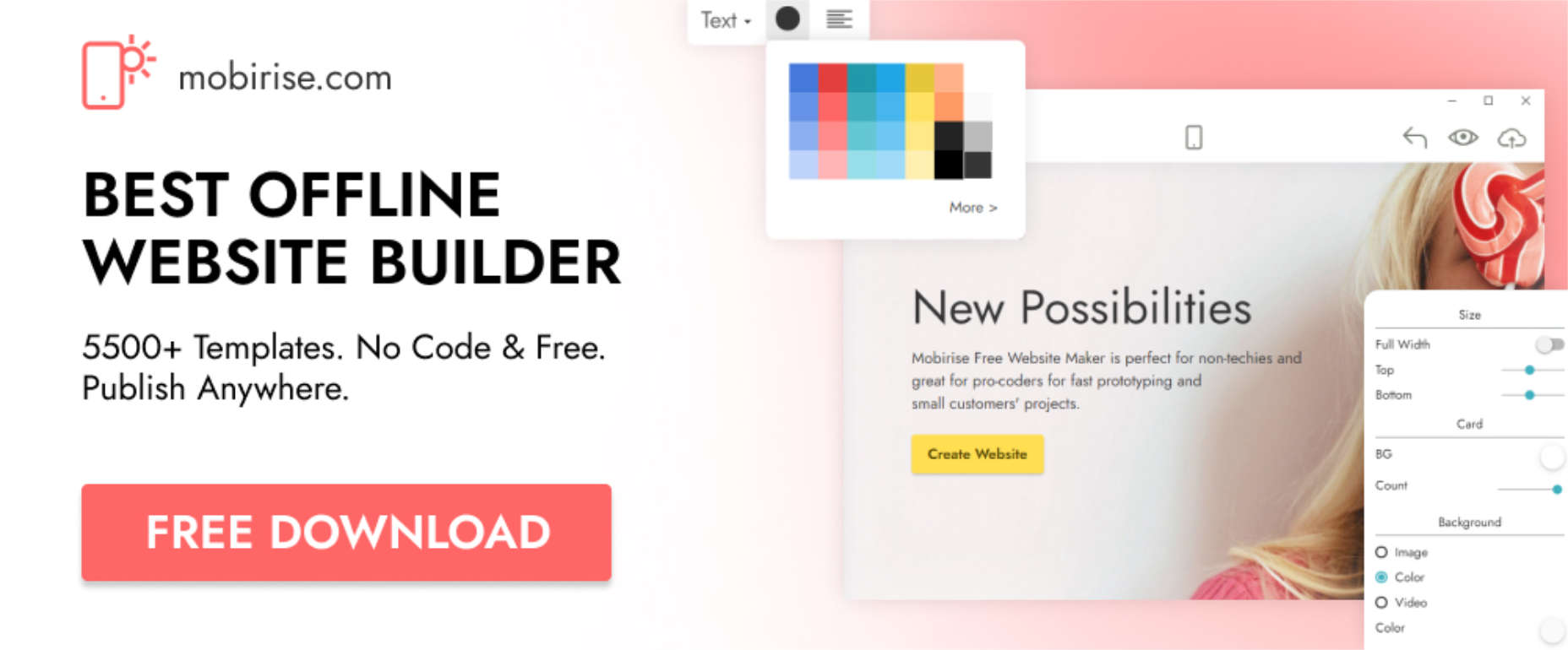
The best offline website builder for 2022 is free to use. That is in itself a great bargain. Mobirise’s team has sweetened the pot by offering a 33% Black Friday discount for their All-in-One Kit with its 175 premium themes and extensions.
Mobirise is strictly drag-and-drop and features huge selections of blocks, templates, icons, and images.
Your site is yours to host anywhere you want
More than 2 million sites have already been created using Mobirise.
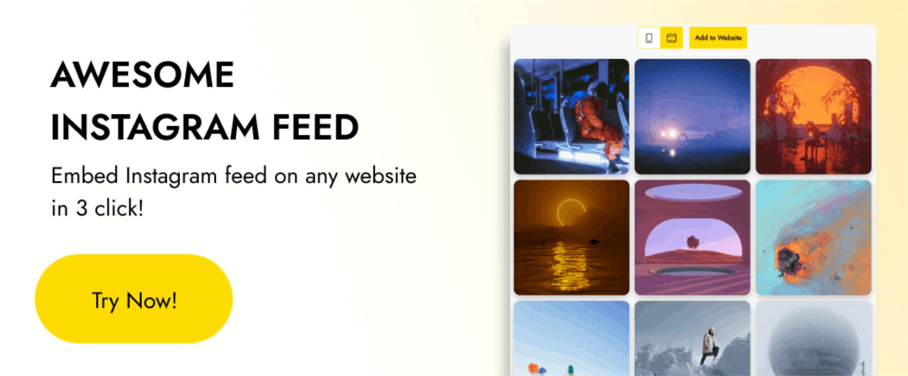
Instagram offers a terrific way to promote your business’s products or services. Its focus on visual communication makes it an extremely effective marketing tool.
It takes but three simple steps to embed Instagram into your website.
A variety of display options are available.
Your feed will be fully responsive and compatible with mobile devices.
An Instagram feed is yours at a 33% Black Friday discount.
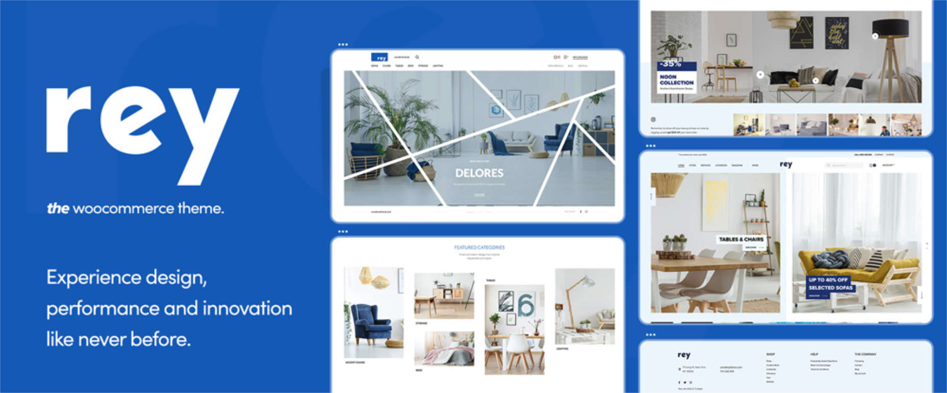
Rey is an innovative WooCommerce theme that is loaded with WooCommerce-friendly features and is easy to set up and use.
Key WooCommerce features include filtering, search, templating, and navigation.
Rey’s smart search helps site visitors find exactly what they want
Quickview and Ajax search is also available
Headers are customized for eCommerce, and visitors will appreciate Rey’s helpful cart, wish list, and checkout features.
Black Friday is not far off. Before you know it, many producers of WordPress themes, tools, and services will be offering tempting discounts.
Even if you come across a deal that appeals to you, it doesn’t hurt to look around to see if you can find a better one.
Keep in mind that the quality of a product or service is more important than its reduced price. It’s always best to pick and choose carefully. So, we’ve put together this list of the best Black Friday deals for 2022 to help you do just that.
[- This is a sponsored post on behalf of BAW media -]
No matter how tough the job market may seem, there are always ways you can stand out in the crowd. What if we told you there’s an easy way to make yourself memorable for any job you applied for? If you’re hoping to be the next president or CEO, we might not be able to help. But for the rest of us, getting a personal message in front of the hiring managers is the ticket.
How can we do that? The simple answer is to create your own online resume website. A personal portfolio gives you the ultimate flexibility to choose what to say and how to say it. The best part? Not many job applicants have figured out this trick–or at least, not many have bothered to do it.
Here’s a look at why every job seeker should have their own website. Plus, we’ll look at some things you’ll want on it and how to put one together easily.
Why Should Every Job Seeker Have a Personal Website?
The traditional documents you submit during a job search each have their purposes. First, the cover letter introduces you to your potential employer and makes that vital first impression. Its purpose is to set the hook.
Your resume or CV is also important. It starts reeling that big fish in. It provides the statistics of your training, education, and work background. Beyond an occasional interesting data point, employers can’t tell much about you from either of these documents. What they do, however, is prove whether or not you’re qualified for the position in question.
The problem for hiring managers, then, is obvious. Many jobs have over 100 applicants–some have thousands. Your cover letter and resume will prove or disprove if you meet the qualifications, but it might still mean that dozens or hundreds of applicants are left with you.
Everything left in the hiring process comes down to soft skills–are you really talented, and are you a person people want to work with? How do you show a hiring manager or future coworker that you have real skills? That you can communicate clearly, and work well with others?
In some fields, it’s very common to create online portfolio websites. These are usually associated with artists, photographers, or video producers. In these fields, just having a resume isn’t enough. Anyone looking to hire you needs to see the work you are capable of, not just where you went to school and where you worked last.
However, you can apply this same logic to every job applicant in every field. As we all know from experience, a website can be anything. It can be a gallery of photographs, a writer’s portfolio of best works, or a sampling of successful business projects with graphs and charts. However you dream it, you can make it on the web.
When you think about it, not putting such a uniquely personal and customized item in front of a hiring manager is silly. If you want the job, an online website with a personal introduction is a surefire way to get an in-person interview. Anything you can do to tip the odds in your favor is worthwhile, especially if it’s a proven and effective tactic.
Statistics seem to bear this out. Hiring managers want to see more personal portfolios, and they regularly admit that they are memorable and catch their attention. But only a handful of applicants bother to put one together.
What Should a Personal Website Include?
So, we can agree that an online website is an important part of the job search process, but what does it need to include? Unfortunately, there’s no easy answer since all industries and job requirements differ. But if your site has one overarching theme, it should be, “What does the hiring manager want to see?”
Keep in mind that if an employer has come to your site, they’ve probably already had their interest piqued. Your job is then to seal the deal and not mess anything up.
Start by creating a mission or a focus for your site. Think about what you need to accomplish with it, who will see it, and how you intend to communicate with them. For most job applicants, this will include that you want to prove you are qualified for the job, good at what you do, and easy to work with.
Think about what your hiring manager would most like to see from an applicant. Can you share any work projects that prove you would be exceptional in this new job? At the very least, you can show that you can create a beautifully designed website that is free of errors! If you include examples of clear communications (writing, infographics, videos, or whatever it is you do) and some personal touches that show a little personality, then you’ll be on the right track.
Whatever you do, don’t overlook the small stuff. Spelling, grammar, and dead links matter! Keep your site design clean, simple, and professional. Don’t post things you don’t want an employer or potential employer to look at. Many professionals make multiple websites, each with its own focus and purpose.
Finally, make sure your website includes a follow up action of some sort. For a job applicant, it might be as simple as having your contact information at the bottom of each page. This way, if they’re inspired to call you in for an interview, it’s easy for them to do so.
How Do You Make a Website?
If all of this has you signing up for an HTML web-building course, hit pause on that. Making a website has never been easier, thanks to web-based design tools.
Pixpa has over 150+ professionally-designed templates to choose from. You can create a professional website easily and include any element you want – all with drag-and-drop ease of creation.
When compared to other website builders out there, Pixpa gives you more options and more flexibility. As you create online portfolio elements, you can progressively get more advanced. The possibilities are endless on the platform, and integrating complex content is much easier than doing it elsewhere.
However, the best thing about Pixpa is the ability to customize the content to meet your needs. You’ll have access to beautiful, professionally-made templates. But you also have the power to change anything quickly and easily to make it your own.
Conclusion
If you’re in the job market, there’s no reason not to have a personal website. It can be a portfolio or a simple introduction and polished application. But the ultimate goal is to provide you with a unique product that your potential employers will enjoy and remember. Once they’ve clicked your link, there should be no doubt that you’re a superstar with technology. You can build your own beautiful website, and you can communicate effectively. That’s an excellent place to start with a new employer, don’t you think?
The Make Core blog has a heavy emphasis on meeting notes for the various core teams, rather than highlighting new features. This makes it difficult for developers who are not contributors or who just occasionally contribute to find the relevant information among the team-related posts.
Josepha describes the blog further in the announcement post:
These are types of content that lend themselves more toward the long-form content of a blog. However, there are more practical reasons for this new home for developers on WordPress.org:
Posts that detail updated or new APIs.
A way to subscribe to development-related updates.
A place to keep up with ongoing discussions.
Perhaps the most important reason for the Developer Blog is to have a central place for WordPress extenders. Information can fragment across various sites, and developers spend valuable time seeking it out. This blog is an attempt to provide a curated experience of the most important updates.
Hear, hear! This is exactly the sort of thing I feel has been missing in the WordPress development space: quality information from established developers that shares useful tips, tricks, and best practices for working with WordPress in this new era of full-site editing. With WordPress Core development taking place at break-neck speeds, having a central source of updated information and a way to syndicate it is a welcome enhancement for sure.
There are already a few excellent articles in there to kick-start things:
Single Page Applications (SPAs) can provide a rich, interactive user experience when dealing with real-time, dynamic data. But they can also be heavy, bloated, and perform poorly. In this article, we’ll walk through some of the front-end optimization tips to keep our Vue apps relatively lean and only ship the JS we need when it’s needed.
Note: Some familiarity with Vue and the Composition API is assumed, but there will hopefully be some useful takeaways regardless of your framework choice.
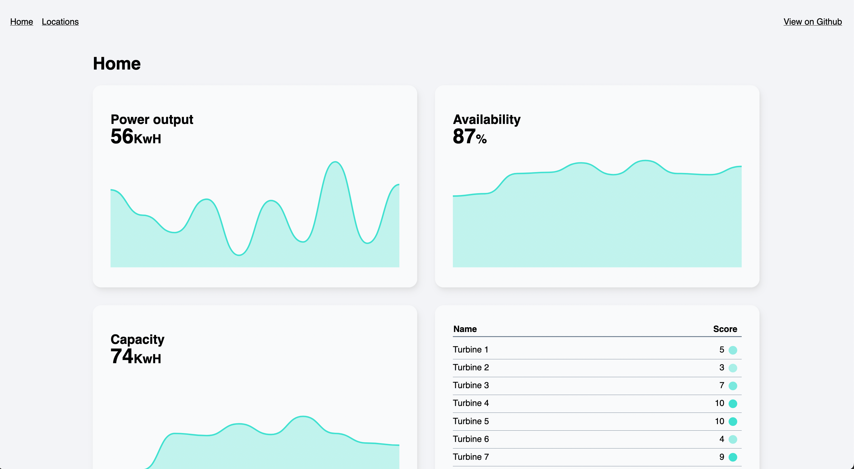
As a front-end developer at Ada Mode, my job involves building Windscope, a web app for wind farm operators to manage and maintain their fleet of turbines. Due to the need to receive data in real time and the high level of interactivity required, an SPA architecture was chosen for the project. Our web app is dependent on some heavy JS libraries, but we want to provide the best experience for the end user by fetching data and rendering as quickly and efficiently as possible.
Choosing A Framework
Our JS framework of choice is Vue, partly chosen as it’s the framework I’m most familiar with. Previously Vue had a smaller overall bundle size compared to React. However, since recent React updates, the balance appears to have shifted in React’s favor. That doesn’t necessarily matter, as we’ll look at how to only import what we need in the course of this article. Both frameworks have excellent documentation and a large developer ecosystem, which was another consideration. Svelte is another possible choice, but it would have required a steeper learning curve due to unfamiliarity, and being newer, it has a less developed ecosystem.
As an example to demonstrate the various optimizations, I’ve built a simple Vue app that fetches data from an API and renders some charts using D3.js.
We’re using Parcel, a minimal-config build tool, to bundle our app, but all of the optimizations we’ll cover here are applicable to whichever bundler you choose.
Tree Shaking, Compression, And Minification With Build Tools
It’s good practice to only ship the code you need, and right out of the box, Parcel removes unused Javascript code during the build process (tree shaking). It also minifies the result and can be configured to compress the output with Gzip or Brotli.
As well as minification, Parcel also employs scope hoisting as part of its production process, which can help make minification even more efficient. An in-depth guide to scope hoisting is outside of the scope (see what I did there?) of this article. Still, if we run Parcel’s build process on our example app with the --no-optimize and --no-scope-hoist flags, we can see the resulting bundle is 510kB — around 5 times higher than the optimized and minified version. So, whichever bundler you’re using, it’s fair to say you’ll probably want to make sure it’s carrying out as many optimizations as possible.
But the work doesn’t end here. Even if we’re shipping a smaller bundle overall, it still takes time for the browser to parse and compile our JS, which can contribute to a slower user experience. This article on Bundle Size Optimization by Calibre explains how large JS bundles affect performance metrics.
Let’s look at what else we can do to reduce the amount of work the browser has to do.
Vue Composition API
Vue 3 introduced the Composition API, a new set of APIs for authoring components as an alternative to the Options API. By exclusively using the Composition API, we can import only the Vue functions that we need instead of the whole package. It also enables us to write more reusable code using composables. Code written using the Composition API lends itself better to minification, and the whole app is more susceptible to tree-shaking.
Note: You can still use the Composition API if you’re using an older version of Vue: it was backported to Vue 2.7, and there is an official plugin for older versions.
Importing Dependencies
A key goal was to reduce the size of the initial JS bundle downloaded by the client. Windscope makes extensive use of D3 for data visualization, a large library and wide-ranging in scope. However, Windscope only needs part of it (there are entire modules in the D3 library that we don’t need at all). If we examine the entire D3 package on Bundlephobia, we can see that our app uses less than half of the available modules and perhaps not even all of the functions within those modules.
One of the easiest ways to keep our bundle size as small as possible is only to import the modules we need.
Let’s take D3’s selectAll function. Instead of using a default import, we can just import the function we need from the d3-selection module:
// Previous:
import * as d3 from 'd3'
// Instead:
import { selectAll } from 'd3-selection'
Code Splitting With Dynamic Imports
There are certain packages that are used in a bunch of places throughout Windscope, such as the AWS Amplify authentication library, specifically the Auth method. This is a large dependency that contributes heavily to our JS bundle size. Rather than import the module statically at the top of the file, dynamic imports allow us to import the module exactly where we need it in our code.
Instead of:
import { Auth } from '@aws-amplify/auth'
const user = Auth.currentAuthenticatedUser()
We can import the module when we want to use it:
import('@aws-amplify/auth').then(({ Auth }) => {
const user = Auth.currentAuthenticatedUser()
})
This means that the module will be split out into a separate JS bundle (or “chunk”), which will only be downloaded by the browser if and when it is needed. Additionally, the browser can cache these dependencies, which may change less frequently than the code for the rest of our app.
Lazy Loading Routes With Vue Router
Our app uses Vue Router for navigation. Similarly to dynamic imports, we can lazyload our route components, so they will only be imported (along with their associated dependencies) when a user navigates to that route.
In our index/router.js file:
// Previously:
import Home from "../routes/Home.vue";
import About = "../routes/About.vue";
// Lazyload the route components instead:
const Home = () => import("../routes/Home.vue");
const About = () => import("../routes/About.vue");
const routes = [
{
name: "home",
path: "/",
component: Home,
},
{
name: "about",
path: "/about",
component: About,
},
];
The code for the ‘About’ route will only be loaded when the user clicks the ‘About’ link and navigates to the route.
Async Components
In addition to lazyloading each route, we can also lazyload individual components using Vue’s defineAsyncComponent method.
This means the code for the KPI component will be dynamically imported, as we saw in the router example. We can also provide some components to display while it’s in a loading or error state (useful if we’re loading a particularly large file).
Our application is primarily concerned with data visualization and relies heavily on fetching large amounts of data from the server. Some of these requests can be quite slow, as the server has to perform a number of computations on the data. In our initial prototype, we made a single request to the REST API per route. Unfortunately, we found this resulted in users having to wait a long time — sometimes up to 10 seconds, watching a loading spinner before the app successfully received the data and could begin rendering the visualizations.
We made the decision to split the API into several endpoints and make a request for each widget. While this could increase the response time overall, it means the app should become usable much quicker, as users will see parts of the page rendered while they’re still waiting for others. Additionally, any error that might occur will be localized while the rest of the page remains usable.
You can see the difference illustrated here:
Conditionally Load Components
Now we can combine this with async components to only load a component when we’ve received a successful response from the server. Here we’re fetching the data, then importing the component when our fetch function returns successfully:
To handle this process for every component, we created a higher order component called WidgetLoader, which you can see in the repository.
This pattern can be extended to any place in the app where a component is rendered upon user interaction. For example, in Windscope, we load a map component (and its dependencies) only when the user clicks on the ‘Map’ tab. This is known as Import on interaction.
CSS
If you run the example code, you will see that clicking the ‘Locations’ navigation link loads the map component. As well as dynamically importing the JS module, importing the dependency within the component’s block will lazyload the CSS too:
At this point, we have our API requests running in parallel, with components being rendered at different times. One thing we might notice is the page appears janky, as the layout will be shifting around quite a bit.
A quick way to make things feel a bit smoother for users is to set an aspect ratio on the widget that roughly corresponds to the rendered component so the user doesn’t see quite as big a layout shift. We could pass in a prop for this to account for different components, with a default value to fall back to.
On a page with a large number of API requests, what should happen if the user navigates away before all the requests have been completed? We probably don’t want those requests to continue running in the background, slowing down the user experience.
We can use the AbortController interface, which enables us to abort API requests as desired.
In our setup function, we create a new controller and pass its signal into our fetch request parameters:
Then we abort the request before the component is unmounted, using Vue’s onBeforeUnmount function:
onBeforeUnmount(() => controller.abort());
If you run the project and navigate to another page before the requests have been completed, you should see errors logged in the console stating that the requests have been aborted.
Stale While Revalidate
So far, we’ve done a pretty good of optimizing our app. But when a user navigates to the second view and then back to the previous one, all the components remount and are returned to their loading state, and we have to wait for the request responses all over again.
Stale-while-revalidate is an HTTP cache invalidation strategy where the browser determines whether to serve a response from the cache if that content is still fresh or “revalidate” and serve from the network if the response is stale.
In addition to applying cache-control headers to our HTTP response (out of the scope of this article, but read this article from Web.dev for more detail), we can apply a similar strategy to our Vue component state, using the SWRV library.
First, we must import the composable from the SWRV library:
import useSWRV from "swrv";
Then we can use it in our setup function. We’ll rename our loadComponent function to fetchData, as it will only deal with data fetching. We’ll no longer import our component in this function, as we’ll take care of that separately.
We’ll pass this into the useSWRV function call as the second argument. We only need to do this if we need a custom function for fetching data (maybe we need to update some other pieces of state). As we’re using an Abort Controller, we’ll do this; otherwise, the second argument can be omitted, and SWRV will use the Fetch API:
Then we’ll remove the loadingComponent and errorComponent options from our async component definition, as we’ll use SWRV to handle the error and loading states.
This means we’ll need to include the Loader and Error components in our template and show and hide them depending on the state. The isValidating return value tells us whether there is a request or revalidation happening.
It might be useful if we could show an indicator to the user while our request is revalidating so that they know the app is checking for new data. In the example, I’ve added a small loading indicator in the corner of the component, which will only be shown if there is already data, but the component is checking for updates. I’ve also added a simple fade-in transition on the component (using Vue’s built-in Transition component), so there is not such an abrupt jump when the component is rendered.
Prioritizing performance when building our web apps improves the user experience and helps ensure they can be used by as many people as possible. We’ve successfully used the above techniques at Ada Mode to make our applications faster. I hope this article has provided some pointers on how to make your app as efficient as possible — whether you choose to implement them in full or in part.
SPAs can work well, but they can also be a performance bottleneck. So, let’s try to build them better.
The word “outsourcing” frequently carries a bad reputation. Businesses often employ it when relocating jobs across borders to save money. This is partially true, but it’s not the complete picture. Another definition of outsourcing is hiring independent contractors or freelancers to perform tasks outside of a company’s core competencies. Outsourcing is growing in popularity for a variety of reasons, particularly when it comes to offshore outsourcing. This blog post will look at a few causes of this expanding tendency.
What is Outsourcing?
“Outsourcing” refers to contracting with a company or individual outside one’s organization to provide goods or services. Typically, businesses outsource functions that are non-core to their business model or operations to focus on their core competencies. The most common types of outsourcing arrangements are offshoring and nearshoring.
Offshoring is contracting with a company or individual in another country to provide goods or services. Typically, businesses offshore functions that are non-core to their business model or operations to save on costs. Nearshoring is contracting with a company or individual in a nearby country to provide goods or services. This outsourcing arrangement is often used when businesses want to maintain control over the outsourced function and when cultural similarities make communication and coordination easier.
The growing trend in outsourcing can be attributed to many factors, including the following:
The increasing global interconnectedness of economies has made it easier for businesses to find qualified providers of goods and services outside their own country.
Advances in technology have made it easier for businesses to communicate and coordinate with external providers, even if they are located in different time zones.
The ever-increasing pressure on businesses to do more with less has made outsourcing an attractive option for companies looking to cut costs without sacrificing quality.
How do offshore staffing agencies help?
Offshore staffing agencies play a vital role in outsourcing and help you avoid spending the time, energy, and money necessary to find, train, schedule, and manage extra workers. Instead, while you focus on completing more work, the recruitment agency takes care of all the procedures and formalities.
Agencies offering offshore staffing solutions assist candidates with their mobilization and employment for such positions while offering specialized assistance to small and large enterprises seeking to hire offshore personnel.
What are the benefits of outsourcing?
There are many benefits of outsourcing, especially offshore outsourcing. The most significant benefits include cost savings, access to skilled labor, increased efficiency, and improved quality.
Cost savings is one of the most commonly cited reasons for outsourcing. When done correctly, outsourcing can lead to a reduction in labor costs. This is because businesses can source labor from countries where wages are lower than in developed economies. In addition, companies can save on costs associated with employee benefits and training.
Access to skilled labor is another significant benefit of outsourcing. By sourcing labor from other countries, businesses can find workers with the necessary skills and qualifications. This is often difficult in developed economies where talent competition is high.
Increased efficiency is another benefit of outsourcing. When businesses outsource specific tasks or functions, they free up time and resources that can be used more effectively elsewhere. This leads to increased efficiency and productivity overall.
Enhanced quality is another advantage of outsourcing. Outsourcing done right might result in better-quality goods and services. This is so that companies may select suppliers who have a track record of providing high-quality goods and services and have access to a global talent pool.
What are the risks of outsourcing?
There are many risks associated with outsourcing, particularly when outsourcing to countries with lower labor costs. These risks can include the following:
Language barriers: If you’re outsourcing to a country where English is not the primary language, communication difficulties can make it hard to get your message across or understand instructions.
Cultural differences: There can also be cultural differences that make it challenging to work together effectively. For example, different countries have different ideas about punctuality, work ethic, and acceptable levels of customer service.
Quality control issues: When you outsource, you give up some control over the quality of the provided good or service. If standards are not followed or if there are flaws in the finished product, this could be an issue.
Increased costs: While outsourcing can save money on labor costs in the short term, it can also lead to increased costs if problems arise or quality control issues must be addressed.
There are some reasons for a growing trend in outsourcing, especially offshore. One of the key reasons is that it can help businesses to save money. When companies outsource their work to another country, they can often take advantage of lower wage rates. This can help to reduce overall costs, which can be passed on to consumers in the form of lower prices.
Another reason for the growing popularity of outsourcing is that it can help businesses to focus on their core competencies. By outsourcing non-core activities, companies can free up resources that can be better used to focus on areas that are more important to the company. This can help to improve overall efficiency and competitiveness.
Finally, many businesses are turning to outsourcing as a way to gain access to new markets and talent pools. By working with an offshore provider, companies can expand their reach into new geographic markets and tap into new pools of skilled workers. This can help them to grow their business and stay ahead of the competition.
Conclusion
There are many reasons why outsourcing has become a growing trend, especially offshore. It can be a cost-effective way to get quality work done for businesses. For employees, it can provide more opportunities and flexibility. And for countries like India and the Philippines, it can help boost their economies. Whatever the reason, outsourcing is here to stay and is likely to continue growing in popularity in the years to come.
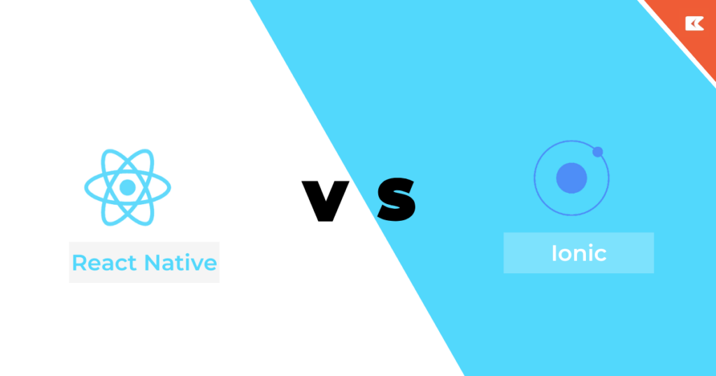
Want to build a mobile application? Wondering how to build it cost-efficiently and quickly?
The answer to this question is using cross-platform applications like React Native or Ionic. These frameworks allow you to target both iOS and Android using the same codebase which saves a lot of time and effort.
In this blog, we will discuss in detail the difference between React Native vs Ionic which will help to find out which is better. We will also discuss the advantages of both Ionic and ReactJS. By the end, you will get to know which framework is best for mobile app development. So let’s get started.
What is React Native?
React Native is an open-source UI software framework developed by Meta Platforms. It provides a smooth and responsive user interface by reducing load time to a great extent. React Native mobile app developmentis faster and cheaper to build apps in React Native without compromising the quality and functionality. It helps build a fully functional app for Android and iOS in less time using just one coding language. It is used by popular apps like Facebook, Skype, Instagram, Tesla, Walmart, Discord, etc. So till now, you have got a basic idea about React Native it’s time to discuss the advantages and disadvantages of React Native for mobile app development.
Advantages of React Native
Some of the common advantages of using React Native are mentioned below:
Code Reusability: One of the major advantages of React Native is that you don’t need a separate code for both iOS and Android. Most of the code can be reused which helps to increase development speed and efficiency. So you get faster time to market.
Cost-friendly: The code reusability feature of React Native helps you save costs to a great extent. As you don’t have to hire different teams for iOS and Android. Also, there are many pre-built components that speed up the mobile app developmentprocess.
Large development community: React Native has a large development community of more than 50000 developers. The engineers at Facebook are always updating the platforms which makes it easier to get expert support.
Third-party Plugins: React Native has a number of third-party plugins. These plugins help to enhance mobile app development performance and functionality.
Live Reload: This feature of React Native allows you to see changes in real-time. You can make changes in the code and it will be reflected in the app with the automatic reload feature.
What is Ionic?
Ionic is an open-source SDK for mobile app development. It was created by Max Lynch, Ben Sperry, and Adam Bradley in 2013. The ionic Capacitor is a cross-platform bridge that allows you to transform any project into an iOS or Android application. The ionic framework extends capacitor by providing an amazing library of UI components, mobile routing, gestures, navigation, and animations. It works with pacific JavaScripts frameworks like React, Angular, and Vue. Till now you must have got a basic idea about Ionic its time to move to the next section and discuss the advantages of Ionic.
Advantages of Ionic
Ionic is an amazing framework to develop hybrid applications. It provides a lot of benefits and allows the development of mobile applications that work seamlessly. Some of the other advantages of using Ionic are:
Cross-platform development: Ionic is based on the ideology of code once run anywhere. It ensures that less code, resources, and effort are required to build an app that runs on both iOS and Android.
Easy testing: With Ionic, mobile app testing gets simpler on mobile browsers and iOS devices. It is easy to test an application for Android and iOS using Cordova commands.
Free and open source: Ionic is a completely free and open-source framework licensed under MIT. Ionic development is quick, dependable, and steady. Also, it fosters the quick development of an application.
Huge community support: While developing any application the most challenging part is to understand the framework and its usage. Ionic has a huge community of developers that have an amazing knowledge of the framework. So you can connect with developers and easily get the solution to any development issue.
Cost-effective: Building an app with Ionic is really very cost-friendly. It takes less time resulting in less development cost.
Which is better: React Native or Ionic?
In this section, we will discuss in detail the difference between Ionic and React Native. On the basis of these differences, we will conclude which is better formobile app development.
Compatibility React Native targets both Android and iOS, you can build apps for both platforms using the same codebase. Ionic is completely cross-platform; it supports Electron, iOS, Android, and the web. With minor modifications, a single codebase can be compiled for all these platforms.
Ionic has the ability to support desktop and web apps which makes it the right choice for this category.
Learning Curve We all know that React Native is an extension of React so it is also based on JavaScript. On the other hand, Ionic allows only the web standard programming languages: JavaScript, HTML, and CSS.
So if you are familiar with JavaScript you will learn React Native quite easily.
Complexity It is pretty difficult to compare the complexity levels of both Ionic and React Native for mobile app development. React Native is easy to learn if you are comfortable with JavaScript. On the other hand, if you are coming from a web development background Ionic will be easier to learn.
Documentation Documentation is another important aspect of a framework. Good documentation helps developers quickly find the solution to their problems. Both Ionic and React Native for mobile app development have amazing documentation. React Native documentation includes examples with outputs. On the other hand, Ionic documentation includes best practices for development. So both frameworks offer excellent documentation.
Performance When it comes to performance it’s best to hire React Native developers. Any framework that uses a web view will face UI/UX performance issues. Native build-in components outperform all other implementations so the native app is the most prominent option. React Native leverage Native components that make it faster than Ionic.
Conclusion
So how to decide which framework is good for your project? Choose Ionic if you are planning to build a desktop or web app and performance optimization is not very crucial for your project. Also, your development team is comfortable with web technologies. On the other hand, go for React Native for mobile app development if your development team is familiar with React, and performance optimization is really crucial for your project. If you are still confused then get in touch with a trusted mobile app development company and get guidance from their experts.
Starting a business in the digitalized world without a quality modern website is almost impossible. The web resource represents your product/service in the online space, demonstrating your offerings to potential customers.
Recent statistics indicate that 70% of projects miscarry due to insufficient management. Furthermore, only 2.5% of projects are accomplished as was defined initially.
In order to get to the part of positive statistics, it is worth involving a solid development approach, as well as the high competence of specialists who participate in a web project. Understanding the roles of each member will help you in the proper allocation of work and resources, which is sure to result in a successful web product.
Let’s dive deeper into the description of the web development team, as well as the flow the experts participate in.
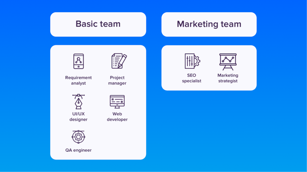
Web Development Essential Team Composition
Of course, website development is not possible without the appropriate expertise of the team members. First and foremost, you need to choose technical partners with solid experience and a portfolio that reflects your needs.
When opting for custom development, otherwise known as development from scratch, the list of teammates for your team may vary depending on your industry, scope, and project concept.
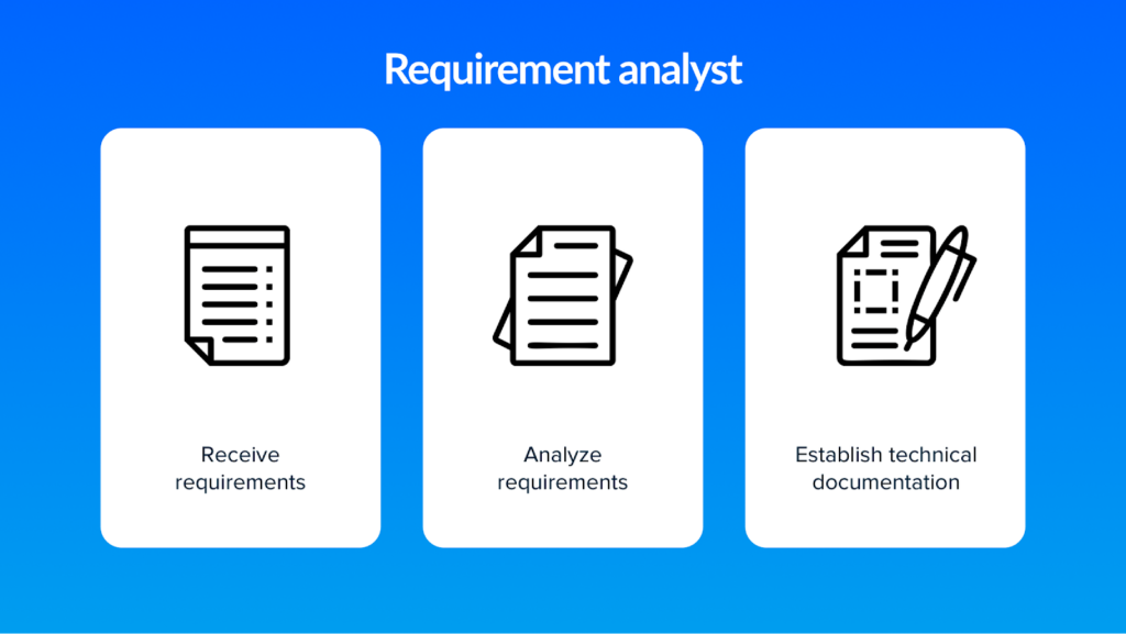
Business Analyst
This expert gathers the client’s requirements at the initial stage. Such teammates analyze the market, determine the current web development tendencies, and plan the right strategies on what functionality to comprise in your solution. Together, the customer and the BI expert consult on the fundamental purposes of a web resource, what functions it should perform, and which requirements to meet. After gathering these comprehensive details, BI specialists roughly calculate the cost to build a website.
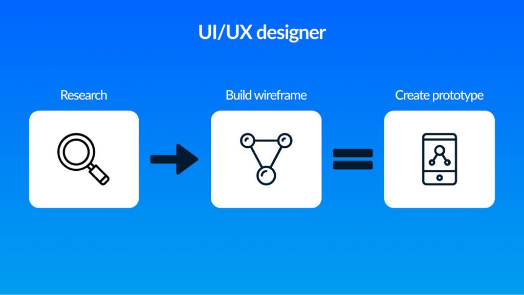
UI/UX designer
Creates the UX and UI design of the site. Such experts are those who determine the future appearance of your website interface and its visual conception.
If we consider the design separately, the UX specialist creates a prototype through which it becomes clear the placement of layout elements, the functionality of the web product, and the tools required for its functionality, are implemented later by developers. The UI expert visually designs the prototype to make it stylish, attractive, friendly, and understandable to the user.
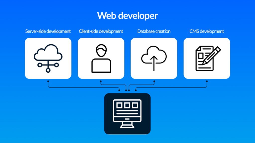
Frontend Website Developer
He is also a layout designer. It is impossible to develop a web project without such a specialist in the team to create the site. The main task of the layout developer is to convert the designer’s rendered layouts into HTML using CSS and scripts. It can be said that the appearance and visual perception of the web resource depends on the front-end developer, who has made it up according to the layout.
Backend Website Developer
Also called a programmer. He is also an indispensable specialist in the team for creating websites. The task of the backend engineers is to implement all the ideas of the designer, making them operable, have working tools, and be compatible with the layout. Thanks to the programmer, the website is able to solve the set tasks To illustrate, for the customer side we may refer to ordering, buying, and paying for goods, integration with CRM, sending data to the server, administration, etc.
Depending on the complexity of the project and the amount of realized options and functions, a team of frontend and backend specialists is employed. For example, when the developers of online stores are required, the team may include several frontend and backend specialists, especially if it is planned to create a large-scale e-commerce resource. Yes, it happens that an expert is excellent at both the layout of the software and hardware part of the project. In this case, such a professional is considered to be a full-stack developer and, as a rule, independently develops an online platform.
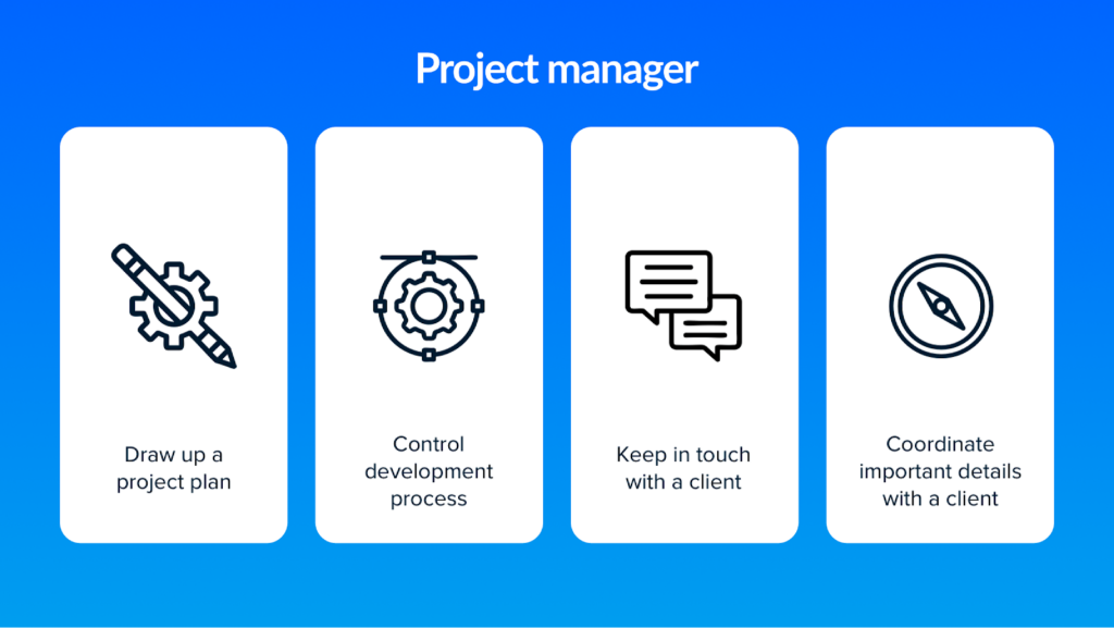
Project Manager
The team for the creation of the site, as we have already found out, includes different specialists, each of whom has its own range of tasks, speed of work, temperament, etc. And this team, as practice shows, needs control. Therefore, you need a Project Manager to support communication, both within the team and with the customer. After the development in the future, such employees will need to deliver the website, and discuss challenges which will also have to be explored and resolved with the client.
The project manager’s tasks are as follows:
Solutions to organizational and administrative tasks
Management of deadlines, compliance with deadlines
Tracking the stages and progress of the project
Controlling compliance with the requirements of the terms of reference
Responsibility for the final result is delegated to the Project Manager because this expert takes on the functions of control and management of the project, removing this responsibility from the client.
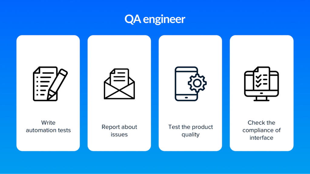
Quality Assurance Engineer
A specialist of this kind will check the finished web product for errors. A considerable number of different tests are used for this, manual or automated. Then, according to the information provided by the tester, the program will be refined and corrected.
Website Promotion: Required Teammates
Let’s now get acquainted with the experts you will need to promote your website and make it rank higher in the search engine.
SEO Specialist
Another individual on the team needs to develop and promote a website. The task of an SEO specialist is to optimize the results of the developers so that the website created by them is attractive to search engines and is promoted in an organic, free search.
To do this, SEO expert performs a range of the following activities:
Formed a semantic core of keywords
A content plan is created
Conducted an initial technical audit
Text structure and meta-tags are elaborated
Increases trust and authority of the website in terms of search engines
SEO expert provides an opportunity for a search engine to see the web resource, index it, understand the subject, and show its users that it will be helpful. After all, even the best website developers, as practice shows, do not really take into account the work of the requirements of search engines.
Internet Marketing Specialist
This integral teammate is able to form a strategy for the development of the website on the Internet. Without a marketing specialist, it is not easy to choose the correct vector for promoting the project. The main task of this specialist is analytics:
Exploring the needs of the target audience,
Creation of a strategy and an optimal set of promotion tools,
Understanding of the processes: what, how, and at what stage should be implemented in the course of development and after the project release.
The second important aspect of a marketer’s work is the elimination of risks. Analyzing the competitors’ and customers’ needs, he takes the best experience, successful solutions, and valuable recommendations and ensures the implementation of all that on his project.
Content Manager
Without filling the site with practical, relevant information, it is difficult to imagine its promotion. That is why the team often involves a content manager. His job is to add to the website texts, images, photos, videos, and other content, the design of new pages. Also, his functions may include proofreading and editing the articles provided by the copywriter.
Unlike the previous participants, without whom it is impossible to do, the content manager’s function is not narrowly focused. Often they are delegated to a frontend developer or SEO specialist.
Wrapping Up
The team for web development is the factor that primarily determines your project’s success. It’s essential to include the utterly required expertise to design a competitive and sought-after web product. Besides, you should focus on the specialists’ competence and experience before starting the cooperation.
In the previous article, we talked about how to improve accessibility for keyboard users using HTML and CSS. Those languages can do the job most of the time, but certain design requirements and the nature of certain components create the need for more complex interactions, and this is where JavaScript comes into play.
For keyboard accessibility purposes, most of the job is done with basic tools that open many possibilities for keyboard interactivity. This article covers a toolset that you can mix into different components to improve accessibility for keyboard users.
The Basics
Most of the time, your job with JavaScript to enhance components’ keyboard accessibility will be done with just a handful of tools, including the use of event listeners and certain JavaScript methods of a couple of Web APIs that can help us in this task.
One of the most important tools we have to add interactivity to our projects is the existence of events, which is the execution of functions that trigger when the element you’re checking receives a change.
keydown Event
One example of an event you can listen to with this Web API is the keydown event, which checks when a key is pressed.
Now, this isn’t used to add keyboard accessibility to elements like buttons or links because, by default, when you add a click event listener to them, this will also trigger the event when you use the Enter (for button and links) and Space keys (button only). Instead, the utility of the keydown event comes when you need to add functionality to other keys.
To add an example, let’s come back to the tooltip we created in the first part of this article. I mentioned that this tooltip needs to be closed when you press the Esc key. We’d need a keydown event listener to check if the pressed key is Esc. For that, we need to detect the event’s pressed key. In this case, we’ll check the event key’s property.
We’ll use keycode.info to check the event dump for this key. If you press the Esc key on this page, you’ll notice that e.key is equal to "Escape".
Note:There are two other ways to detect the pressed key, and those are checking e.keyCode and e.which. They will return a number. In the case of the Esc key, it’ll be27. But, keep in mind those are deprecated alternatives, and while they work, e.key is the preferred option.
With that, we need to select our buttons and add the event listener. My approach to this matter is to use this event listener to add a class to the button and add this class as an exception to show it using the :not() pseudo-class. Let’s start changing our CSS a bit:
And there you have it! With just a sprinkle of JavaScript, we have added an accessibility function to our tooltip. And that was just the start of what we can do with a keydown event listener. It’ll be a crucial tool to improve keyboard accessibility for multiple components, but there is another event listener we should take into consideration.
blur Event
There is another event we’ll use often. This one detects when the element stops receiving focus. This event listener is important, and most of the time, you’ll use it to reverse the possible changes you have made with the keydown event listener.
Let’s come back to the tooltip. Right now, it has a problem: if you press the Esc key to close the tooltip, and then you focus on the same element again, the tooltip won’t appear. Why? Because we added the hide-tooltip class when you press the Esc key, but we never removed this class. This is where blur comes into play. Let’s add an event listener to revert this functionality.
element.addEventListener("blur", (e) => {
if (element.classList.contains("hide-tooltip")) {
element.classList.remove("hide-tooltip");
}
});
Other Event Listeners (And Why You Might Don’t Need Them)
I mentioned that we’re going to need two event listeners in our toolkit, but there are other event listeners you could use, like focusout or focus. However, I think use cases for them are quite scarce. There is a special mention to focus because even if you can find good use cases for it, you need to be very careful. After all, if you don’t use it properly, you can cause a change of context.
A change of context is defined by WCAG as “major changes that, if made without user awareness, can disorient users who are not able to view the entire page simultaneously.” Some examples of change of context include:
Opening a new window;
Changing the layout of your site significantly;
Moving the focus to another part of the site.
This is important to keep in mind because creating a change of context at the moment of focusing on an element is a failure of WCAG criteria 3.2.1:
When any user interface component receives focus, it does not initiate a change of context.
— Success Criterion 3.2.1: Focus order
If you’re not careful, bad use of a function that listens to the focus event can create a change of context. Does that mean you shouldn’t use it? Not really, but to be honest, I can hardly find a use for this event. Most of the time, you’ll be using the :focus pseudo-class to create similar functionalities.
With that said, there is at least one component pattern that can benefit from this event listener in some cases, but I’ll cover it later when I start talking about components, so let’s put a pin on that topic for now.
focus() Method
Now, this is something we’ll be using with some frequency! This method from the HTMLElement API allows us to bring the keyboard focus to a particular element. By default, it’ll draw the focus indicator in the element and will scroll the page to the element’s location. This behavior can be changed with a couple of parameters:
preventScroll When it’s set to true, will make the browser doesn’t scroll until the programmatically focused element.
focusVisible When set to false, it will make the programmatically focused element doesn’t display its focus indicator. This property works only on Firefox right now.
Keep in mind that to focus the element, it needs to be either focusable or tabbable. If you need to bring the focus to a normally not tabbable element (like a dialog window), you’ll need to add the attribute tabindex with a negative integer to make it focusable. You can check out how tabindex works in the first part of this guide.
And there you have it! This method will be very handy in a lot of components in tandem with the keydown attribute, so understanding how both of them work is crucial.
Changing HTML Attributes With JavaScript
Certain HTML attributes need to be modified with JavaScript to create accessibility in complex component patterns. Two of the most important ones for keyboard accessibility are tabindex and the more recently added inert. tabindex can be modified using setAttribute. This attribute requires two parameters:
name It checks the name of the attribute you want to modify.
value It will add the string this attribute requires if it doesn’t require a particular attribute (for example, if you add the attributes hidden or contenteditable, you’ll need to use an empty string).
setAttribute will help a lot for accessibility in general. (I use it a lot to change ARIA attributes when needed!) But, when we talk about keyboard accessibility, tabindex is almost the only attribute you’ll be modifying with this method.
I mentioned the inert attribute before, and this one works a bit differently because it has its own property in the HTMLElement Web API. HTMLElement.inert is a boolean value that will let us toggle the inert attribute.
Keep in mind a couple of things before thinking about using this attribute:
You’ll need a polyfill because it’s not fully implemented in all browsers and is still quite recent. This polyfill created by Chrome engineers works pretty well in the tests I have made, so if you need this property, this is a safe approach, but keep in mind that it might have unexpected behaviors.
You can use setAttribute to change this attribute as well! Both work equally well, even with a polyfill. Whichever you decide to use is up to you.
const button = document.querySelector("button")
// Syntax with HTMLElement.inert
button.inert = true
// Syntax with Element.setAttribute()
button.setAttribute("inert", "")
This combination of tools will be handy for keyboard accessibility purposes. Now let’s start to see them in action!
Component Patterns
Toggletips
We learned how to make a tooltip in the previous part, and I mentioned how to enhance it with JavaScript, but there is another pattern for this kind of component called toggletip, which is a tooltip that works when you click them, instead of hovering on them.
Let’s check a quick list of what we need to make sure it happens:
When you press the button, the information should be announced to screen readers. That should happen when you press the button again. Pressing the button won’t close the toggletip.
The toggletip will be closed when you either click outside the toggletip, stop focusing the button, or press the Esc key.
I’ll take Heydon Pickering’s approach that he talks about in his book Inclusive Components. So, let’s start with the markup:
<p>If you need to check more information, check here
<span class="toggletip-container">
<button class="toggletip-button">
<span class="toggletip-icon" aria-hidden="true">?</span>
<div class="sr-only">Más información</div>
</button>
<span role="status" class="toggletip-info"></span>
</span>
</p>
The idea is to inject the necessary HTML inside the element with the role="status". That’ll make screen readers announce the content when you click it. We’re using a button element to make it tabbable. Now, let’s create the script to show the content!
As Heydon mentions in his book, we use this approach of first removing the container’s HTML content and then using setTimeout to add it to make sure every time you click it, it’ll be announced for screen reader users. Now we need to check that when you’re clicking elsewhere, the content stops showing.
With that out of the way, it’s time to add keyboard accessibility to this component. We don’t need to make the toggletip’s content show when you press the button because a good HTML semantic does that for us already. We need to make the toggletip’s content stop showing when you press the Esc key and when you stop focusing on this button. It works very similarly to what we did for tooltips in the previous section as examples, so let’s start working with that. First, we’ll use the keydown event listener to check when the Esc key is pressed:
Tabbed interfaces are patterns that you can still see from time to time. They have a very interesting functionality when we talk about keyboard navigation: when you press the Tab key, it’ll go to the active tab panel. To navigate between the tab list, you’ll need to use the Arrow keys. This is a technique called roving tabindex that consists in removing the ability of the non-active elements to be tababble by adding the attribute tabindex="-1" and then using other keys to allow the navigation between those items.
With tabs, this is the expected behavior for those:
When you press Left or Up keys, it’ll move the keyboard focus onto the previous tab. If the focus is on the first tab, it’ll move the focus to the last tab.
When you press the Right or Down keys, it’ll move the keyboard focus onto the next tab. If the focus is on the first tab, it’ll move the focus to the last tab.
Creating this functionality is a mix of three techniques we saw before: modifying tabindex with setAttribute, the keydown event listener, and the focus() method. Let’s start by checking the markup of this component:
We are using aria-selected="true" to show which is the active tab, and we’re adding tabindex="-1" to make the non-active tabs unable to be selected with the Tab key. Tabpanels should be tabbable if there is no tabbable element inside of it, so this is why I added the attribute tabindex="0" and the non-active tabpanels are hidden by using the attribute hidden.
Time to add the navigation with the arrow keys. For this, we’ll need to create an array with the tabs and then create a function for it. Our next step is to check which is the first and last tab in the list. This is important because the action that will happen when you press a key will change if the keyboard focus is on one of those elements.
After that, we’ll add a keydown event listener to each tab. I’ll start by adding the functionality with Left and Up arrows.
// Previous code of the createKeyboardNavigation function
TABS.forEach((element) => {
element.addEventListener("keydown", function (e) {
if (e.key === "ArrowUp" || e.key === "ArrowLeft") {
e.preventDefault();
if (element === firstTab) {
lastTab.focus();
} else {
const focusableElement = TABS.indexOf(element) - 1;
TABS[focusableElement].focus();
}
}
}
}
This is what’s happening here:
First, we check that the pressed key is the Up or Left arrow. For that, we check the event.key.
If that’s true, we need to prevent those keys scroll the page because, remember, by default, they do that. We can use e.preventDefault() for this goal.
If the focused key is the first tab, it’ll automatically bring the keyboard focus to the last one. This is made by calling the method focus() to focus the last tab (which we store in a variable).
If it’s not the case, we need to check which is the position of the active tab. As we store the tab elements in an array, we can use the method indexOf() to check the position.
As we’re trying to navigate to the previous tab, we can subtract 1 from the result of indexOf() and then search the corresponding element in the TABS array and programmatically focus it with the focus() method.
Now we need to do a very similar process with the Down and Right keys:
// Previous code of the createKeyboardNavigation function
else if (e.key === "ArrowDown" || e.key === "ArrowRight") {
e.preventDefault();
if (element == lastTab) {
firstTab.focus();
} else {
const focusableElement = TABS.indexOf(element) + 1;
TABS[focusableElement].focus();
}
}
As I mentioned, it’s a very similar process. Instead of subtracting one from the indexOf() result, we add1 because we want to bring the keyboard focus to the next element.
Showing The Content And Changing HTML Attributes
We created the navigation, and now we need to show and hide the content as well as manipulate the attributes aria-selected and tabindex. Remember, we need to make that when the keyboard focus is on the active panel, and you press Shift + Tab, the focus should be in the active tab.
First, let’s create the function that shows the panel.
What we’re doing here is checking the id of the tab is being pressed, then hiding all the tab panels, and then looking for the tab panel we want to activate. We’ll know it’s the tab because it has the attribute aria-labelledby and uses the same value as the tab’s id. Then we show it by removing the attribute hidden.
Now we need to create a function to change the attributes:
What we’re doing here is, again, checking the id attribute and then looking at each tab. We’ll check if this tab’s id corresponds with the pressed element’s id.
If it’s the case, we’ll make it keyboard tabbable by either removing the attribute tabindex (because it’s a button, so it’s keyboard tabbable by default) or by adding the attribute tabindex="0". Additionally, we’ll add an indicator to screen reader users that this is the active tab by adding the attribute aria-selected="true".
If it doesn’t correspond, tabindex and aria-selected will be set to -1 and false, respectively.
Now, all we need to do is add a click event listener to each tab to handle both functions.
And that’s it! We created the functionality to make tabs work, but we can do a little something else if needed.
Activate Tab On Focus
Do you remember what I mentioned about the focus event listener? You should be careful when you use it because it can create a change of context by accident, but it has some use, and this component is a perfect opportunity to use it!
According to ARIA Authoring Practices Guide (APG), we can make the displayed content show when you focus on the tab. This concept is often referred to as a follow focus and can be helpful for keyboard and screen reader users because it allows navigating more easily through the content.
However, you need to keep a couple of considerations about it:
If showing the content means making a lot of petitions and, by extension, making the network slower, making the displayed content follow the focus is not desired.
If it changes the layout in a significant way, that can be considered a change of context. That depends on the kind of content you want to show, and doing a change of context on focus is an accessibility issue, as I explained previously.
In this case, the amount of content doesn’t suppose a big change in either network or layout, so I’ll make the displayed content follows the focus of the tabs. This is a very simple task with the focus event listener. We can just literally copy and paste the event listener we created and just change click to focus.
And there you have it! Now the displayed content will work without the need to click the tab. Doing that or making it only work with a click is up to you and is surprisingly a very nuanced question. Personally, I’d stick just with making it shows when you press the tab because I think the experience of changing the attribute aria-selected by just focusing on the element can be slightly confusing. Still, it’s just a hypothesis on my part so take what I say with a grain of salt and always check it with users.
Additional keydown Event Listeners
Let’s come back to the createKeyboardNavigation for a moment. There are a couple of keys we can add. We can make the Home and End key brings the keyboard focus to the first and last tab, respectively. This is completely optional, so it’s ok if you don’t do it, but just to reiterate how a keydown event listener helps out, I’ll do that.
It’s a very easy task. We can create another couple of if statements to check if the Home and End keys are being pressed, and because we have stored the first and last tabs in variables, we can you focus them with the focus() method.
// Previous code of the createKeyboardNavigation function
else if (e.key === "Home") {
e.preventDefault();
firstTab.focus()
} else if (e.key === "End") {
e.preventDefault();
lastTab.focus()
}
And this is our result!
Opening And Closing The Modal
Modals are quite a complex pattern when we talk about keyboard accessibility, so let’s start with an easy task — opening and closing the modal.
It is indeed easy, but you need to keep something in mind: it’s very likely the button opens the modal, and the modal is far away in the DOM. So you need to manage the focus programmatically when you manage this component. There is a little catch here: you need to store which element opened the modal so we can return the keyboard focus returns to this element at the moment we close it.
Luckily, there is an easy way to do that, but let’s start by creating the markup of our site:
As I mentioned, the modal and the button are far away from each other in the DOM. This will make it easier to create a focus trap later, but for now, let’s check the modal’s semantics:
role="dialog" will give the element the required semantics for screen readers. It needs to have a label to be recognized as a dialog window, so we’ll use the modal’s title as the label using the attribute aria-labelledby.
aria-modal="true" helps to make a screen reader user can only read the content of the element’s children, so it blocks access from screen readers. However, as you can see on the aria-modal page for a11ysupport.com, it’s not fully supported, so you can’t rely just on that for this task. It’ll be useful for screen readers who support it, but you’ll see there is another way to ensure screen reader users don’t interact with anything besides the modal once it’s opened.
As I mentioned, we need to bring the keyboard focus to our modal, so this is why we added the attribute tabindex="-1".
With that in mind, we need to create the function to open our modal. We need to check which was the element that opened it, and for that, we can use the property document.activeElement to check which element is being keyboard-focused right now and store it in a variable. This is my approach for this task:
Then we bring the focus to the modal with the focus() method.
It’s essential that you store the button before bringing the focus to the modal. Otherwise, the element that would be stored in this case would be the modal itself, and you don’t want that.
Now, we need to create the function to close the modal:
This is why it’s important to store the proper element. When we close the modal, we’ll bring back the keyboard focus to the element that opened it. With those functions created, all we have to do is add the event listeners for those functions! Remember that we also need to make the modal closes when you press the Esc key.
Right now, it looks very simple. But if that were all, modals wouldn’t be considered a complex pattern for accessibility, were they? This is where we need to create a very key task for this component, and we have two ways to do it.
Creating A Focus Trap
A focus trap ensures the keyboard focus can’t escape from the component. This is crucial because if a keyboard user can interact with anything outside a modal once it’s opened, it can create a very confusing experience. We have two ways to do that right now.
One of them is checking each element that can be tabbable with a keyboard, then storing which are the first and the last, and doing this:
When the user presses Shift + Tab and the keyboard focus is on the first tabbable element (remember, you can check that with document.activeElement), the focus will go to the last tabbable element.
When the user presses Tab, and the keyboard focus is on the last tabbable element, the keyboard focus should go to the first tabbable element.
Normally, I’d show you how to make this code, but I think A11y solutions made a very good script to create a focus trap. It sort of works as the keyboard navigation with the arrow keys we created for tab elements (as I mentioned before, patterns repeat themselves!), so I invite you to check this page.
I don’t want to use this approach as the main solution because it’s not exactly flawless. Those are some situations this approach doesn’t cover.
The first one is that it doesn’t take into account screen readers, especially mobile screen readers. As Rahul Kumar mentions in his article “Focus Trapping for Accessibility (A11Y)”, Talkback and Voiceover allow the user of gestures and double taps to navigate to the next or previous focusable element, and those gestures can’t be detected with an event listener because those gestures are something that technically speaking doesn’t happen in the browser. There is a solution for that, but I’ll put a pin on that topic for a moment.
The other concern is that this focus trap approach can lead to weird behaviors if you use certain combinations of tabbable elements. Take, for example, this modal:
Technically speaking, the first tabbable element is the first input. However, all the inputs in this example should focus on the last tabbable element (in this case, the button element) when the user presses the keys Shift + Tab. Otherwise, it could cause a weird behavior if the user presses those keys when the keyboard focus is on the second or third input.
If we want to create a more reliable solution, the best approach is using the inert attribute to make outer content inaccessible for screen readers and keyboard users, ensuring they can interact only with the modal’s content. Remember, this will require the inert polyfill to add more robustness to this technique.
Note: It’s important to note that despite the fact a focus trap and using inert in practice help to ensure keyboard accessibility for modals, they don’t work exactly the same. The main difference is that setting all documents but modal as inert, it’llstilllet you move outside of the website and interact with the browser’s elements. This is arguably better for security concerns but deciding if you want to create a focus trap manually or use the inert attribute is up to you.
What we’ll do first is select all areas that don’t have the role dialog. As inert will remove all keyboard and screen reader interaction with the elements and their children, we’ll need to select only the direct children of body. This is why we let the modal container exist at the same level as tags like main, header, or footer.
// This selector works well for this specific HTML structure. Adapt according to your project.
const nonModalAreas = document.querySelectorAll("body > *:not([role='dialog'])")
Now we need to come back to the openModal function. After opening the modal, we need to add the attribute inert to those elements. This should be the last step in the function:
What about when you close the modal? You need to go to the closeModal function and remove this attribute. This needs to go before everything else in the code runs. Otherwise, the browser won’t be able to focus on the button that opened this modal.
Let’s suppose you don’t feel comfortable using the inert attribute right now and want to create a focus trap manually, as the one A11y Solutions shows. What can you do to ensure screen reader users can’t get out of the modal? aria-modal can help with that, but remember, the support for this property is quite shaky, especially for Talkback and VoiceOver for iOS. So the next best thing we can do is add the attribute aria-hidden="true" to all elements that are not the modal. It’s a very similar process to the one we made for the inert attribute, and you can use the same elements in the array we used for this topic as well!
So, whether you decide to use the inert attribute or create a focus trap manually, you can ensure user experience for keyboard and screen reader users works at its best.
Element
You might notice the markup I used and that I didn’t use the relatively new element, and there is a reason for that. Yes, this element helps a lot by managing focus to the modal and to the button that opened easily, but, as Scott O’Hara points out in his article “Having an open dialog”, it still has some accessibility issues that even with a polyfill are not fully solved yet. So I decided to use a more robust approach there with the markup.
If you haven’t heard about this element, it has a couple of functions to open and close the dialog, as well as some new functionalities that will be handy when we create modals. If you want to check how it works, you can check Kevin Powell’s video about this element.
That doesn’t mean you shouldn’t use it at all. Accessibility’s situation about this element is improving, but keep in mind you still need to take into consideration certain details to make sure it works properly.
Other Component Patterns
I could go on with many component patterns, but to be honest, I think it’ll start getting redundant because, as a matter of fact, those patterns are quite similar between the different kinds of components you can make. Unless you have to make something very unconventional, those patterns we have seen here should be enough!
With that said, how can you know what requirements you will need for a component? This is an answer with many nuances that this article cannot cover. There are some resources like Scott O’Hara’s accessible components’ repository or UK government’s design system, but this is a question that does not have a simple answer. The most important thing about this topic is to always test them with disabled users to know what flaws they can have in terms of accessibility.
Wrapping Up
Keyboard accessibility can be quite hard, but it’s something you can achieve once you understand how keyboard users interact with a site and what principles you should keep in mind. Most of the time, HTML and CSS will do a great job of ensuring keyboard accessibility, but sometimes you’ll need JavaScript for more complex patterns.
It’s quite impressive what you can do for keyboard accessibility once you notice most of the time, the job is made with the same basic tools. Once you understand what you need to do, you can mix those tools to create a great user experience for keyboard users!
Providing a straightforward, intuitive user experience (UX) is key to the success of your blog, e-commerce site, or online journal. Without a clear sense of direction, users will turn to alternatives and your bounce rate will skyrocket.
You can improve your UX dramatically by optimizing your website’s navigation standards based on consumer behavior. You can use consumer data to track bounce and trace the customer journey from the landing page to the exit page.
You may need to complete a UX audit to get a more accurate understanding of consumer behavior. A UX audit will assess factors like accessibility, mobile formatting, and broken links on your site and improve your website’s navigation standards.
Ethically Obtaining Consumer Data
Data collection is a hot topic in website design. You need accurate data to ensure that your site is operating optimally, but you can’t overreach and infringe on consumers’ privacy.
In reality, most website designers and administrators end up collecting more data than they need or can reasonably use. This can be an issue if you experience a data breach or if you have a security flaw. Assess your current data collection strategy, and ask yourself the following:
Is the data you’ve collected personally identifiable?
Would you be liable if the data fell into the wrong hands?
Do you have a reasonable need to use the data?
Are you transparent about the data you are collecting?
Answering these questions will give you a sense of whether or not your current data collection strategy is ethical. It may also make your strategy more efficient, as you’ll cut down on unnecessary or unusable data that is slowing down your decision-making process.
Interpreting Consumer Data
Using the consumer data that you’ve obtained ethically is key to optimizing your website’s navigation standards. However, many marketing departments and website administrators don’t fully understand how to improve navigation based on consumer behavior data.
You can start website navigation analysis by tracking and recording inbound traffic sources. Starting with traffic sources allows you to estimate the effectiveness of your SEO strategy and will give you an idea of who, exactly, is making it to your website.
Filter your search results to remove “fake” traffic, and refine your search to learn more about the folks who make it to your site. Being thorough at this stage will save you time in the future, as you’ll know if consumers coming from social sites are bouncing once they see information like prices, or whether there’s an issue in your navigation menus that is preventing pay-per-click users from finding the information they are looking for.
Once you’ve filtered users and understood your consumers, it’s time to track and navigate the consumer journey through your site.
Tracing Consumer Journey
You can increase the accuracy of your consumer journey by creating journey maps for your website. A journey map will identify things like:
Consumer touchpoints: where do consumers first encounter your brand?
Consumer pain points: what stops consumers from converting?
Desired actions: how do you want your consumers to navigate your pages?
A detailed journey map will identify the navigation that your ideal user will take and help you spot moments when users deviate from the course you set them on.
You can assess your consumer’s actual journey using Google Analytics (GA4). Use GA4 to assess path exploration using the “explore” panel on the GA4 homepage. This will allow you to see the actual pathways that real users have taken to land on your pages.
Filter these results as many times as you need to assess the effectiveness of your pages. Combine these insights with things like the length of the user’s session and the bounce rate of certain pages. If you find that some pages have high bounce rates or an excessively long “dwell time”, you likely have a problem with your navigation standards.
If the results of your pathway exploration assessment are concerning, you need to complete a general UX audit.
General UX Audit
A general UX audit can transform your site structure and optimize your consumer journey. Start by assessing your current UX standards and compare them to the established navigation best practices:
Consistent: Can users utilize the same buttons and tabs to find their way through your site?
Visible: Are symbols accompanied by text? Can users quickly find the menu page or drop-down?
Flexible: Do you account for a reasonable range of consumer preferences? Can users quickly retrace their steps if needed?
Concise: Do you utilize too many “mega menus”? Is there a better way to present navigation options?
An audit of your current navigation principles shouldn’t take too long. You already have the hard data that points toward problem pages, so you can find the issue and experiment with different ways to present navigation options.
Once you’ve assessed your navigation options, complete an audit of your site structure. Highly hierarchical sites are suboptimal from a UX and SEO perspective. While categorization is useful, strict hierarchies can produce silos and isolate some pages from the rest of your site. Try connecting silos with horizontal linking that helps users find the information they need.
Accessibility
Accessibility is essential for website design and maintenance today. Millions of users have some form of disability that changes the way they interact with your website. This means that cherishing accessibility can lead to a higher ROI on your web development spend and improve your brand image.
When auditing your website navigation for accessibility, consider the following:
Does anchor text accurately describe the linked content?
Do you have suitable title tags on each page?
Can your entire site be navigated with a keyboard? Do you have “mouse traps”?
Are your buttons suitably descriptive and screen-reader friendly?
Creating an accessible website will help improve your navigation metrics and ensure that all users can interact with your content in the way it is designed.
Mobile Formatting
Mobile formatting can be a real headache for website designers and administrators. Mobile sites have a limited amount of space to use, and you don’t want navigation menus to take up the entire page.
Providing an intuitive, user-friendly mobile experience is imperative. When designing a mobile site, try to minimize the amount of scrolling and typing users have to do. Repetitive scrolling can cause mobile users significant pain and lead to inflammation and swelling in users’ thumbs and fingers.
Give mobile users a better UX by utilizing classic mobile site design options like the “hamburger” menu icon and adding text-with-icon buttons so mobile users can see the information that they want to access.
Conclusion
You can use consumer data to trace your customer journey and identify issues. Use key insights like bounce rate and dwell time to identify areas of concern. When revamping your site, stick with classic options like the “hamburger” menu icon and ensure all your navigation tools are fully accessible.