Accessible Front-End Patterns For Responsive Tables (Part 2)
In Part 1, we explored general patterns of creating responsive and accessible tables depending on the design, use case, and data complexity. In this article, we’ll cover a few more complex and more specific examples, check out how we can improve performance on larger tables, and cover some JavaScript libraries that can further enhance tables with various functionalities like pagination, filtering, search, and others.
A quick note on accessibility before we start: The following examples lean more toward the design aspect of responsiveness compared to the previous article. I’ve used the same approach to accessibility as I did in the examples from the previous article. Still, as these are more complex and specific examples, further testing and adjustments might be required for these use cases, and I strongly encourage them.
That being said, let’s dive into the examples.
Working With Complex Enterprise Tables
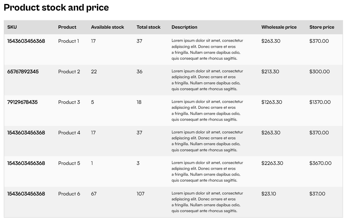
Enterprise data tables display a large amount of complex data across lots of columns, and they rely on searching and filtering to quickly find the data we’re looking for. We’re not going to cover those actions in this article because they do not affect responsiveness and only serve to reduce the number of displayed rows.
The responsive patterns that we covered in the previous article won’t completely solve the UX issue here. The stacking and accordion pattern, for this case, might be too clunky for mobile use, and the scrolling pattern would make the table unusable and difficult to scan.
Lalatendu Satpathy suggests in his article about designing enterprise tables to use the stacking context but display only the critical data that the user will most likely want to search for.
Once users have found a row they were looking for, either by scanning, searching, or filtering, they can open up the details view by tapping the row.

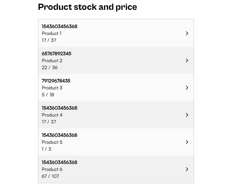
Notice how we’re utilizing the limited screen space to the fullest extent for each operation — we’re showing as many data rows as possible, which contain only primary information, and then we are using an off-canvas element, a full-page element to display all data for a single row.
We’re using the recommended markup for the table element and ARIA labels that we’ve covered in the previous article, so let’s focus on the off-canvas element. First, let’s create a hidden off-canvas element and add empty elements where we’ll append row data for the row that has been clicked on.
<aside id="offcanvas" class="offcanvas" aria-hidden="true">
  <header class="offcanvas-header">
    <button tabindex="-1" onclick="closeOffcanvas()" aria-label="Return to table"><!-- ... --></button>
</header>
  <div><strong id="slot-1"></strong></div>
  <h1 id="slot-2"></h1>
  <dl>
    <dt>Available stock</dt>
    <dd id="slot-3"></dd>
   <!-- ... -->
  </dl>
</aside>
We’re using CSS to make sure that this element only displays on smaller viewports. On larger viewports, even though the off-canvas element could be activated, it won’t be displayed. Alternatively, we could have also used JavaScript’s match media element to prevent the function from running.
@media screen and (max-width: 1260px) {
  .offcanvas {
    display: block;
  }
}
Let’s move onto the row click handle function, which populates off-canvas element slots and applies an active class. We are populating the off-canvas slots by iterating over columns and using an index to target the id-s. Additionally, we are removing the aria-hidden attribute and moving the focus onto the element. We can also use focus trapping to prevent the user from leaving the off-canvas element while it’s opened.
function openAndPopulateAside() {
  if(offcanvas.classList.contains("offcanvas-active")) {
    return;
  }

  const row = window.event.target.closest("tr");
  const columns = Array.from(row.children);

  columns.forEach(function (child, i) {
    const id = `slot-${i + 1}`;
    document.getElementById(id).innerHTML = child.innerHTML;
  });

  offcanvas.classList.add("offcanvas-active");
  offcanvas.removeAttribute("aria-hidden",);
  offcanvas.querySelector("button").tabIndex = undefined;
  offcanvas.focus();
}
We also need to have a way to close the off-canvas element and undo the changes we applied when we activated the modal.
function closeOffcanvas() {
  offcanvas.setAttribute("aria-hidden", "true");
  offcanvas.classList.remove("offcanvas-active");
  offcanvas.querySelector("button").tabIndex = -1;
  document.getElementById("table-wrapper").focus();
}
In these examples, we’re relying on additional elements outside of tables (like our off-canvas element) to help us make full use of the available screen space to fully display table data. Check out the following CodePen example and see how these elements work together to improve table UX on smaller screens.

Comparing this to the previous example, the only primary column is the title & platform column. We cannot pick any other column to include for comparison since they are equally important and depend on user preference. Using a stacked column approach is also not an option, as we want users to compare the review scores to different games and between the review sites. This table is also too complex for a scrollable table, as both the primary column and table headers are equally important. It would take too much screen space if we used the fixed-column approach.
Let’s tackle this problem with the approach described in Joe Winter’s article. First, let’s focus on vertical scanning.
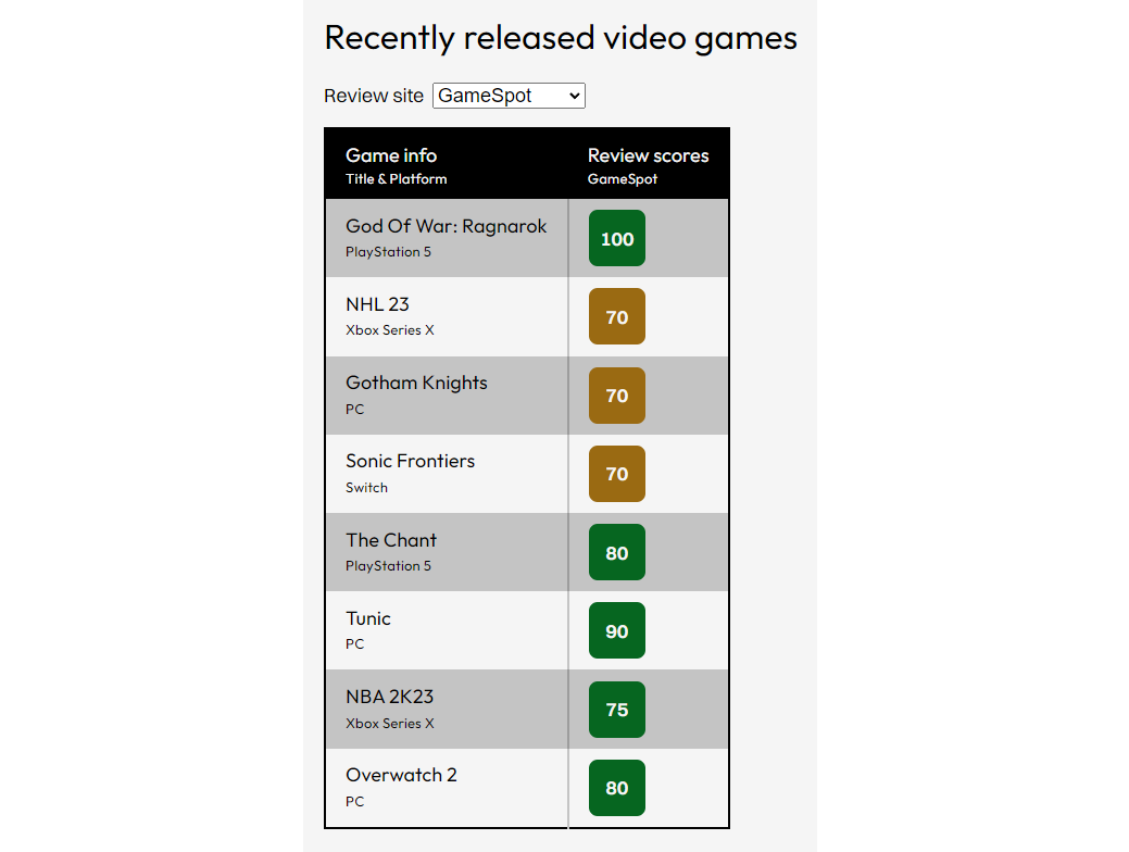
Let’s give users an option to choose the additional column they’ll use for comparison — their preferred review game review site. We’ll use a select element in this case, but tabs and other similar controls work well. We can store their preference in local storage if we want to keep track of user preferences and store it for future use.
<form>
  <label for="filter">Review site</label>
  <select onchange="filterChange()" id="filter">
    <option value="1">GameSpot</option>
    <option value="2">IGN</option>
    <option value="3">Dexerto</option>
    <option value="4">GameInformer</option>
    <option value="5">VG247</option>
  </select>
</form>
const allBodyRows = document.querySelectorAll("tbody > tr");
const mainHeadCols = document.querySelectorAll("thead > tr:last-child > th");

function filterChange() {
  const value = parseInt(select.value);

  mainHeadCols.forEach(function (col, i) {
    const colIndex = i + 1;

    // Skip the first (primary column).
    if (i == 0) {
      return;
    }

    if (colIndex === 1 || colIndex === value + 1) {
      col.classList.remove("hidden");
    } else {
      col.classList.add("hidden");
    }
  });

  allBodyRows.forEach(function (row) {
    const cols = row.querySelectorAll("td");

    cols.forEach(function (col, i) {
      const colIndex = i + 1;

      if (colIndex === value) {
        col.classList.remove("hidden");
      } else {
        col.classList.add("hidden");
      }
    });
  });
}
Next, we’ll implement the same off-canvas element as we did in the previous example to cover the horizontal scanning, where we display all column data for a selected row.
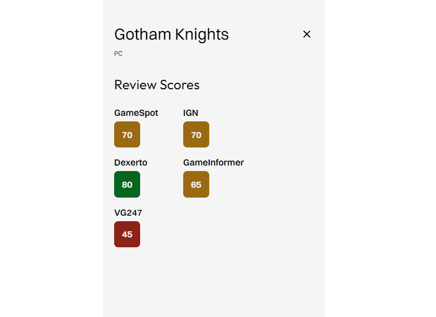
We’ll use a very similar function and go through the same motions of opening, populating, and closing the off-canvas element.
function openAndPopulateAside() {
  const row = this.window.event.target.closest("tr");
  const columns = Array.from(row.children);

  columns.forEach(function (child, i) {
    const id = `slot-${i + 1}`;
    document.getElementById(id).innerHTML = child.innerHTML;
  });

  offcanvas.classList.add("offcanvas-active");
  offcanvas.removeAttribute("aria-hidden");
  offcanvas.querySelector("button").tabIndex = undefined;
  offcanvas.focus();
}

function closeOffcanvas() {
  offcanvas.setAttribute("aria-hidden", "true");
  offcanvas.classList.remove("offcanvas-active");
  offcanvas.querySelector("button").tabIndex = -1;
  document.getElementById("table-wrapper").focus();
}
We’ve improved upon the previous example by giving users an option to select an additional primary column alongside the “Title & Platform” so users can select which column will be used for comparison between the rows.

But what about more complex calendars used for planning and schedule? They can contain a variable amount of information within the cells, and scaling them down for mobile is not always viable.

We could either use the stacking pattern or scrolling pattern, but they’re not ideal for this calendar project. User needs to see their schedule for today and at least for the next day and have a general overview (a summary) for a wider timespan.
We can divide the large calendar app into two elements on the smaller screens:
- List element: the schedule for today and the next day;
- Table element: general, high-level, 5-day overview.

There are too many differences between the large screen and small screen views, so there is no smart way of using CSS to transform between the two. We need to duplicate the element and make sure to hide the inactive element with CSS. This will also hide it from screen readers and make the element not accessible with the keyboard.
<figure class="table-wrapper">
  <figcaption id="caption">
    <h1>Consultation schedule</h1>
  </figcaption>

  <table aria-labelledby="caption" class="table-full">
    <!-- ... -->
  <table>

  <ol class="list">
    <!-- ... -->
  </ol>

  <table aria-labelledby="caption" class="table-map">
    <!-- ... -->
  </table>
</figure>
@media screen and (min-width: 960px) {
  .table-map, .list {
    display: none;
  }
}

@media screen and (max-width: 959px) {
  .table-full {
    display: none;
  }
}
These two views can be easily generated with JavaScript or JavaScript frameworks like React and Svelte, but also with static HTML generators.

However, pagination is not an ideal fit for all tables and data types. Sometimes we just want to display the whole table and allow users to scroll the entire data table without restrictions or interruptions. What can we do if we need to display the whole table regardless of the number of rows and columns?
Virtualization
We can use virtualization. We keep the entire table data in memory but dynamically render table rows and columns that are currently visible to the user. We update the state while the user is scrolling and interacting with the table, all the while maintaining the illusion that every row and column is present by changing inner dimensions to compensate for missing elements.
This can be seen in the example below, where we render out only a handful of rows in DOM out of a total of 100,000 rows! Notice the inlined height style attribute on the second tr element.

The same approach can be used for large lists and various other HTML elements. There are some specialized virtualization libraries like Clusterize.js if you’re looking to implement just that in your project, but many popular JavaScript table libraries like Tabulator and component libraries support this out of the box.
If you want to read more about the effectiveness of table virtualization, Robert Cooper of Basedash published a case study on how table virtualization introduced significant improvements to their React project.
The root cause of the problem was that we were trying to render the entire table at once, even if most of the data for the table was off the screen/viewport. Also, the React code for rendering a single table cell was quite inefficient, so when we needed to render thousands of table cells on initial load, all those inefficiencies compounded. (…)
Overall, after implementing both virtualization and improvements to our table cell, we were able to speed up table load times by 4-5x in most cases and over 10x in extreme cases. All while increasing the default page size from 50 rows to 100.
Depending on the approach you choose, either by implementing virtualization yourself or by using an existing library, make sure to test if the solution is accessible for your use-case — both for keyboard navigation and for assistive devices.
CSS approach
Interestingly enough, there is a non-JS way to optimize table render performance. We can try to apply CSS contain: strict to the table element to signal that the massive table won’t affect the style or layout of any other elements on the page.
This is exactly how Johan Isaksson improved the performance (on his machine) of Google Search Console, which wasn’t using virtualization at the time, after experiencing issues browsing a table with 500 rows (which resulted in over 16,000 DOM elements being rendered).
However, this is not a universal and perfect solution, and depending on your use case, it might cause visual bugs, especially if you are dealing with a dynamic table that can be filtered, search, and reordered.
As the “strictest” of the containment values, this value should be used with careful consideration. This is due to the dimension requirements it imposes on the contained element. With these requirements, this containment value does offer the most potential performance benefits of containment.
If you are working with dynamic tables, which is often the case with enterprise data, you’d want to either use pagination or virtualization, depending on the design and use case, to create fully optimized complex data tables that perform optimally.
JavaScript Libraries For Enhancing Tables
Additional table features like searching, filtering, ordering, and others can improve table UX even on smaller screens by allowing users to easily scan the table and quickly find the information that they’re looking for. There are so many JavaScript-based solutions out there, both specialized and as part of a larger UI components library, and I’d like to highlight some of them here.
Tabulator is a zero-dependency vanilla JavaScript library for enhancing tables with a plethora of aforementioned functionalities and more. It also features separate NPM packages for React, Angular, and Vue. If you are working on a project that heavily features tables and requires lots of features and interactions, Tabulator can do a lot of heavy lifting for you.
As for the framework-specific libraries, I’ve only used react-table, which worked wonderfully on the projects I’ve worked on. It’s fully implemented with React hooks, so it’s fully customizable and doesn’t enforce any markup, design, or HTML structure.
As for table virtualization specifically, Clusterize.js is a solid vanilla JS solution that works well and has been recently updated in the last year at the time of writing. As for the framework-specific library, there is react-virtualized, but it hasn’t been updated for a while so make sure to test if it fits your use case before committing to using it on your project.
Keep in mind that you should always consult Bundlephobia to see package size and dependencies, and make sure to check out the package repository to see if the package is currently being maintained and if the issues raised are being actively addressed.
Conclusion
Creating responsive and accessible tables requires a careful and thoughtful approach, so the table remains usable even on smaller screen sizes. In this article, we’ve covered some highly specific use cases and approaches like an enterprise data table and a calendar. Large & complex data tables may introduce performance issues due to the DOM tree growing too large, so we need to use either pagination or table virtualization to avoid the potential issues. In conclusion, make sure that, regardless of the design and use case, your tables are responsive, usable, accessible, and performant on various types of devices and screen sizes.
References
- “Design better data tables”, Andrew Coyle
- “How I made Google’s data grid scroll 10x faster with one line of CSS”, Johan Isaksson
- “Designing a complex table for mobile consumption (nom)”, Joe Winter
- “Designing better data tables for enterprise UX”, Lalatendu Satpathy
- “Avoid an excessive DOM size”, web.dev
- “How virtualization increased our table performance by 500%”, Robert Cooper
- “List Virtualization”, patterns.dev
