The Pros and Cons of Responsive Web Design in 2023
Responsive web design has been such a success for many web designers that it is generally seen as the default approach to creating a website, but it’s not as cut and dried as all that.
There are many different factors to consider when deciding whether or not to use a responsive approach to designing your websites, such as budget, timescale, and audience.
In this blog post, we’ll weigh the pros and cons of responsive web design to help you make an informed decision.
What Is Responsive Web Design?
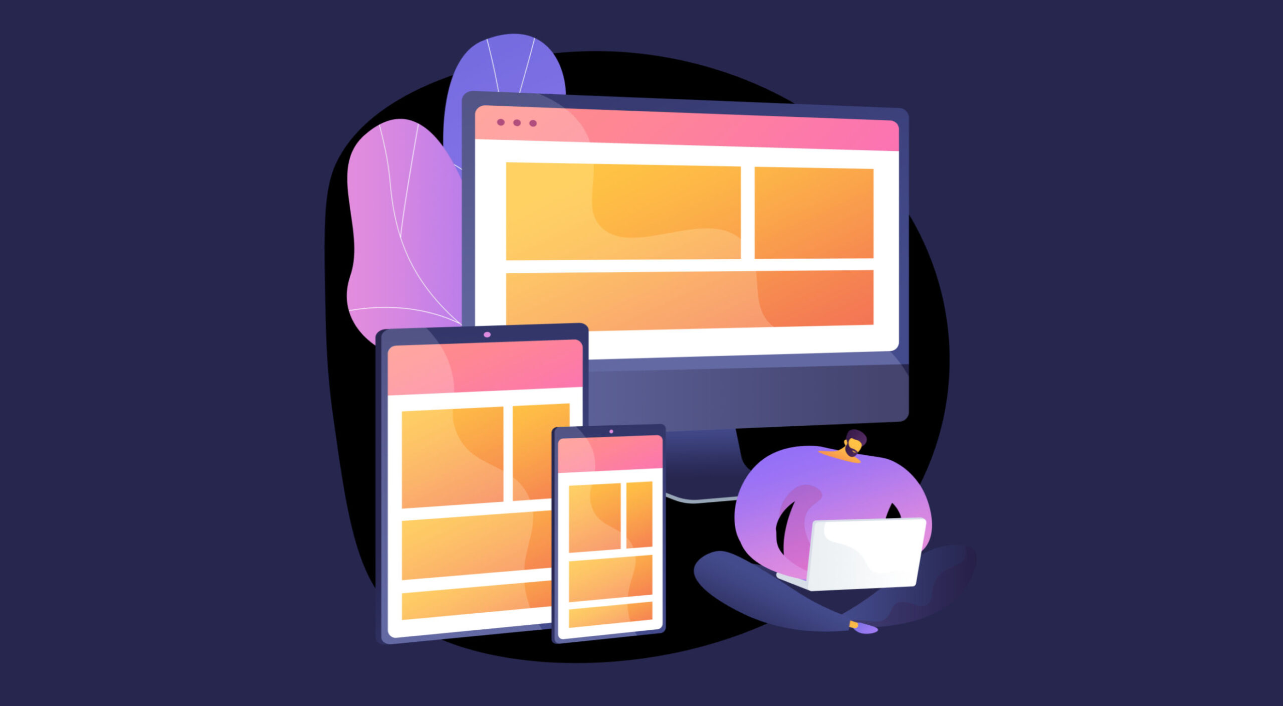
In short, responsive web design (RWD) is a modern approach to designing websites that allows the website to respond intelligently to the device on which it is being viewed.
RWD uses techniques like media queries and relative units to create a flexible design that can grow or shrink depending on the size of the screen. Rather than having multiple versions for mobile and desktop, as used to be the case, this type of web design offers an all-in-one solution with a flexible layout that can adapt to various scenarios.
RWD is often confused with mobile-first web design, firstly because mobile-first is a crucial technique of responsive workflows, and secondly because RWD grew in popularity as the number of mobile devices users viewed the web on grew. However, you can have a mobile-first site that isn’t responsive.
Responsive web design essentially eliminates the need to have separate versions of sites for mobile and desktop-style devices.
The Pros of Responsive Web Design
There are seemingly endless pros to responsive web design.
- UX-friendly: RWD is excellent for responding to the needs of users. It allows users to access your website on any device, so they don’t have to switch devices. It also allows you to reach customers who don’t have a computer and only use a mobile device like a cell phone.
- SEO-friendly: RWD is good for SEO (Search Engine Optimization) because it helps people find your website on different devices, like phones and computers. Also, because you don’t have to maintain separate versions of your website for mobile and desktop, Google is less likely to penalize your site for duplicate content.
- Cost-effective: RWD can save a lot of time and money in creating multiple versions of the same website. Additionally, responsive web design allows you to maintain one website instead of several, which reduces maintenance and hosting costs.
- Future-proof: As technology continues to evolve, websites that are built responsively will be able to adapt quickly and keep up with the changes. This means that with responsive web design, your website won’t become obsolete as quickly.
The Cons of Responsive Web Design
Although there are considerable benefits to a responsive approach to building your websites, there are a few drawbacks that it’s important to consider.
- Front-end only: The biggest flaw with RWD is that it is a front-end approach only. This means that while you can change the layout of your website, you can’t change the actual content using responsive techniques.
- Design restrictions: As clever as RWD can be, some design elements don’t translate to different screen sizes; menus can be particularly difficult. You may find that you must compromise on your vision to make a site responsive.
- Increased development time: Creating a responsive website can take significantly longer than creating two versions (one for mobile and one for desktop), so it’s important to factor in additional development time when considering RWD.
- Performance issues: RWD uses code to adapt the design to different viewports. That code adds to the website payload and, if not carefully managed, can impact the performance of the website.
Is Responsive Web Design Worth the Effort?
For the vast majority of sites, RWD is a practical approach to creating a website. It increases the number of users you’re able to attract and ensures that when they arrive, your users have a better experience. RWD also improves your search engine ranking.
However, there are some cases when RWD is not the right choice. For example, if you need to deliver different content for mobile devices than desktop devices, then you will need separate sites for each type of device.
Tips for Responsive Web Design
If you choose an RWD approach, you can do a few things to mitigate the downsides and ensure that your website performs as well as you hope.
- Design for multiple viewports early: Create different designs for every significant viewport size. Make sure you know how the design should change at different sizes, so you’re not forced to adapt the design as you build it.
- Choose mobile-first: Take a mobile-first approach by designing the mobile version of your site before the desktop version; it is easier to scale a design up than scale it down.
- Limit media queries: Media queries are great for adapting a design but quickly lead to code bloat. Instead, rely on relative units as much as possible and reserve media queries for essential changes.
- Test extensively: Testing is essential for responsive web design. You must preview your finished site on as many devices as possible so that you know how your users will see it.
Conclusion
Responsive web design can be an excellent choice for most websites, as it allows you to create an experience that is optimized for different devices without the need for separate versions of your website.
However, there are some drawbacks to RWD that should also be taken into account before making a decision. It’s important to consider how much time and effort will go into creating a responsive site, whether or not you have content that must vary between mobile and desktop users, and if there may be any performance issues.
By following best practices, such as adopting a mobile-first approach and spending extra time on the design phase to ensure you have layouts prepared for multiple viewports, you can ensure that your website looks great across all devices while avoiding potential pitfalls associated with RWD.
Featured Image by vectorjuice on Freepik
The post The Pros and Cons of Responsive Web Design in 2023 first appeared on Webdesigner Depot.
