Data visualization is a popular tool that helps companies make proper judgments. According to Bain & Company, firms with advanced analytics skills make prompt decisions five times more than their market peers.
Visual data allows you to organize information. So it’s easy to understand and allows for better planning in the future. However, data visualization can be overwhelming if you need help knowing where to start or how it works.
In this article, we’ll walk you through five ways data visualization in decision-making can benefit you. We also answer some of the frequently asked questions.
How Data Visualization in Decision-Making Helps Your Business
Here are the top five ways in which information visualization can improve your decision making
1. It Empowers Teamwork Amongst Staff
Data visualization can help you empower your team to make better decisions. It gives everyone access to the same information and makes it easy for everyone to contribute. Thus it builds trust and transparency among team members. This can be important when working across departments. Or with external partners who need the same level of insight as those within your organization.
When you team with outside groups like contractors or vendors. Or even just across offices, all parties should have access to the same data. Hence, they can come together in decision-making processes. You want to avoid one group assuming something because they were able to see it first. If someone else already saw the data point, misinformation could be floating around. This could lead nowhere good.
2. It Boosts Your Accuracy
Data visualization can help you to spot errors and make edits. It also lets you quickly see patterns, trends, and outliers with a glance. This means that your decision-making process will become more accurate and efficient. Hence, enabling you to make better judgments by spotting problems faster.
You can visualize data in many ways: graphs, charts, or maps are all effective. The key is to use multiple visual tools to explore different aspects of the same data set simultaneously.
Lastly, it not only shows your data in a way others can understand. Ensure you also show it in such a way as to highlight problems within it. Visualization is most powerful when used as part of an ongoing talk about improving organizational processes and outcomes.
3. Data Visualization in Decision-Making Enhances Your Speed
Visualization can help you make decisions faster. In a world of big data, we often face the challenge of making sense of massive amounts of structured and unstructured information.
It takes time to analyze all this data manually. This can make it difficult to respond quickly when business conditions change.
Visualization tools such as Google chats, ChartExpo, and Microsoft Power BI help you make better decisions by providing a bird’s eye view. Or a high-level overview of your data that helps you identify trends and patterns at a glance.
This idea is not limited only to business operations, informed data visualization can help anyone to make a quick and important decision, from searching for the biggest available car insurance discounts to better managing your personal finances.
Visualizations also allow you to drill down into more detailed data as needed. Hence you don’t have to pull additional reports or export specific datasets into Excel spreadsheets before analyzing them further.
4. It Helps You Identify Trends Quicker
Visualization can help identify trends and patterns more quickly than through text alone. This is a vital aspect of the decision-making process. It allows you to look at all the data you have in front of you and see if there are any crucial patterns or trends.
If data visualization shows that a specific type of product has been selling well, this might prompt you to make more products like that. So, you can continue getting profits from that category.
If there’s little difference between your top three sales items. Or if all four are doing equally well, it may be time for some experiments with new types of products. This will generate more revenue from existing customers who already know what they like about your brand.
5. Improve and Simplify Communication in a Company
Visualization is a great way to share data with others. If you work in a team, you should ensure everyone is on the same page when planning or trying to do something.
You can use visuals to illustrate complex data. Hence it makes the data easier to understand for those who may be unfamiliar with statistics or numbers in general.
Typically, the human brain processes visual data 60000 times faster than text. This is according to reports from the University of Minnesota.
You can also use visualizations as part of communication. Remember, they aren’t just used for analysis but also storytelling. They help answer questions.
If something doesn’t make sense or is missing from your work, consider using visuals as an aid. So other people don’t miss any crucial details by mistake.
Frequently Asked Questions
What is a good visualization of data?
A good visualization of data conveys the message clearly and concisely. Hence you won’t rely on text or numbers to explain it. It also needs to be visually appealing. A bad visualization will confuse people or make them think they are missing something.
What is the impact of information visualization on decision-making?
Information visualization can help decision-makers gain insights from their data. Hence it will facilitate better decisions. For example, by comparing two bar charts with a single glance, you can quickly get the relative size of each bar. You can also look at the distribution of values along the y-axis. It shows how much variation there is in each group.
How effective is data visualization?
Data visualization is highly effective at communicating information as it appeals directly to our senses. It helps us see patterns in data that we might not otherwise notice. Additionally, we are naturally inclined towards visual stimuli rather than text-based ones. When we see something, we can more easily understand how it works and behaves than if we just read about it in text form.
What is the primary goal of data visualization?
The main goal of data visualization is to communicate information effectively and efficiently. It should tell a story and allow you to explore the data at your own pace.
Conclusion
Data visualization in decision-making can be a powerful tool for you. It allows you to make sense of large quantities of data. You can identify patterns in ways that would not be possible with other methods. It also offers a way to share your findings with others in a way that is easy for them to understand. Suppose you want to improve your decision-making process; or help others make good choices, consider using data visualization.
You can spot them on every other homepage: carousel widgets with auto-rotating content. Those who use them want to show more content within a limited space. At the same time, they aim to present the most important messages as prominently as possible. However, if design and development do not receive proper attention, you will be at the highest risk of creating usability and accessibility issues.
This particularly affects people with cognitive, motor, or visual impairments, for whom using the complex design pattern is usually even more challenging. Whether you call it an “eye candy” or “devil’s spawn”, if you want to implement the carousel in a user-friendly and accessible way, a whole range of requirements is to be considered.
“Should I Use A Carousel?”
As widely used as they are, carousel widgets have a bad reputation among UX professionals. They are ignored by users (Nielsen Norman Group), only 1% interact with a carousel at all, and 89% of them only with the first slide (Eric Runyon). Jared Smith even responds to the question “Should I use A Carousel?” by saying, “Seriously, you really shouldn’t.” Others state that there isn’t one answer. You have to consider various factors, such as function, design, platform (desktop or mobile) and, most importantly, context. For whatever reason you include a carousel on a website, make sure it is user-friendly and accessible.
Accessible Implementation
For a carousel to be accessible, it is essential that all users can perceive the widget and its components and that they can easily navigate it using a mouse, touch gestures, a keyboard, a screen reader, and any other assistive technology. The rotation of the slides must not interfere with users’ ability to operate the carousel or use the website as a whole.
The W3C’s WAI-ARIA working group provides guidance on implementing an accessible carousel in its ARIA Authoring Practices Guide (APG). This article is based on those recommendations and wants to create a profound understanding of elements and ARIA attributes applied and their impact on users.
Auto-Rotating
I assume we have all been there at some point: Constantly changing content can be rather annoying. For some people, however, uncontrolled rotation can be absolutely critical:
People need different times to read content. If the available time is not enough, auto-advancing carousels can become very frustrating. It’s not very satisfying to just be able to skim the text before new content appears without any request.
Some people, especially people with cognitive impairments such as attention deficit disorder, may experience moving content distracting. The movement could prevent users from concentrating and interacting with the rest of the website. People within the autistic spectrum may even have to leave such a page entirely.
Screen reader users may not be aware of the rotation. They might read a heading on “slide 1” and execute the keyboard command for “read next item.” Instead of hearing the next element on “slide 1”, the screen reader announces a text from “slide 2” — without the person knowing that the element just read out is from an entirely new context.
Add a “Pause” or “Stop” button if you cannot give up auto-rotation at all. The “Pause” button is the minimum solution (if the movement does not end automatically after 5 seconds).
In addition, usability experts recommend the following:
Pause auto-rotation as long as a slide is being hovered. There is usually a correlation between the mouse position and the user’s interest in a piece of content. Don’t risk a slide change a few milliseconds before a person activates a link and then ends up on the wrong page and, to make things worse, not realizing that this was not the intended one.
Stop the rotation permanently when users are setting focus on interactive elements using a keyboard or interacting with the carousel. An action such as actively changing slides also indicates that the user might be interested in the content. People may temporarily explore other parts of the page but possibly want to come back. Furthermore, you make keyboard navigation easier if the carousel stops as soon as a control receives focus.
Visibility
For all of us, user interface elements are intuitively easier to use if we can perceive them well. For people with visual impairments, however, this aspect is crucial.
Ensure sufficient contrast. Most often, icons are used to indicate the controls: simple arrows for advancing the slides as well as the widely used dots for selectively fading in. However, these icons often have poor contrast against the background, especially when placed on images. The easiest way to avoid contrast issues is to position the icons outside the slides.
Provide a visible focus indicator. People navigating with a keyboard need to be able to see which interactive element they are currently focusing on. Often design merely (if at all) provides a slight and barely discernible change in color of the controls. If color is the only way to indicate focus, both colors (the one used for non-focused and focused state) must meet at least a contrast ratio of 3.0:1 with each other. This minimum contrast requirement also applies to the icon against its background and to other kinds of focus indicators (e.g., a border that indicates the focus state of a button).
The size of the controls affects their visibility as well. Besides, with a reasonable target size combined with sufficient distance between interactive elements, you reduce the risk of accidentally activating a nearby button or a linked slide. This not only benefits people with limited dexterity but also minimizes errors when using mobile devices.
Indicate the current position within the set of slides. It is not the only option, but often this is done by highlighting one of several progress dots. To ensure that people with color deficiencies can access visual information, you must not rely on color alone but use a color-independent indicator, for example, a filled and unfilled dot.
Activation With A Simple Pointer Input
Many people are used to moving slides on touch devices by swiping. But there are also users who cannot perform this gesture because of their impairment or because of the assistive technology they use. In addition to swiping, enable users with an alternative way of navigating (WCAG 2.5.1 Pointer Gestures).
Provide interaction with a simple pointer input (e.g., simple click or tap). That means if there are no slide picker controls to display content directly, you need to implement “Previous” and “Next” buttons.
Structure, Semantics And Labelling
The carousel widget is designed primarily for two-dimensional, visual use. For screen reader users who do not see the carousel as a whole, it is much harder to understand the composition of controls and content. These users have different perspectives when using a website. They explore content linearly, tab through interactive elements, and use shortcuts for navigation. The challenge is to provide a meaningful structure and semantics and inform users about controls and slides in a way that enables them to build a mental model of the widget. Use semantic markup for different sections, controls, and content and proper labeling to ensure good orientation.
Regions And Groups
Using the HTML element
(or role="region") with an accessible name, you can set a generic landmark and thus mark smaller regions of a page. Landmarks provide a way to identify the structure of a web page to screen reader users and help them with orientation. Using a screen reader, you can display these sections in a table of contents and use specific keyboard shortcuts for landmarks to move focus to the corresponding content.
When navigating to the landmark, the assistive technology announces the name and type of the section, for example: “[name] — region”. In browse mode (exploring content with arrow keys), the screen reader tells users when they enter or exit a region. They will hear something like “[name] — region” or “out of region”. (This output in browse mode is currently well-supported by the screen reader NVDA, but unfortunately, with JAWS, users have to set screen reader settings accordingly.)
role="group" is intended to form a logical set of items as a group. Since it is not a landmark, the group is not included in a landmark listing displayed by the user. For that reason, use this role in contrast to role="region" for less important sections of a page. You could use role="group", for example, to group (custom) form controls (compare
Businesses are expanding quickly to create new technology today. Small and medium-sized companies frequently use ERP solutions to grow and keep up with digital revolutions.
ERP is a tool that any company may utilize to support all business communications, productivity, on-demand product marketing, real-time data access, and the consolidation of data from several sources into a single source.
This is where the best odoo development services provide a variety of company apps and features to assist practically every corporate administration.
ERP systems increase business productivity by reducing manual labor and adapting to shifting market demands.
Odoo is currently every SME’s preferred ERP due to its user-friendly and practical features. Today, SMEs can work in various industries, including manufacturing, retail, trading, etc. Furthermore, there is no license fee for Odoo ERP, making it a highly economical choice for SMEs.
So let’s have a look at how Odoo helps small and medium businesses to achieve their goals:
One Application for All
Every element a business could require, from purchasing and production to shipping and inventory management, is included in the Odoo ERP solution.
Every company needs a range of software programs, such as fleet management, CRM, and human resource software, to manage the various departments that must be controlled.
Small businesses need help to afford the costs of running several software programs and relying on vendors.
Software that integrates all functional and administrative divisions onto a single platform, like Odoo ERP, may be helpful to businesses in this situation.
The Odoo ERP system comprises several modules, including those for manufacturing, inventory, sales, and accounting. The Odoo app store offers relevant software at an incredibly low cost for many small, medium, or large organizations.
Enables Collaboration
Small and medium businesses usually need an integrated solution to their objectives of efficient collaboration.
Employees may need help to convey information and maintain consistency across all users. As a result, there needs to be more communication and teamwork.
However, when a technology like Odoo is utilized, all employees can access information regardless of where they are in the organization.
They can see the bigger picture and better understand how the company runs.
Odoo ERP is Economical
The Odoo platform significantly impacts the category of economic instruments SMEs use because of its alluring subscription-based purchasing strategy.
It also has lower running costs than other ERP solutions, making it an excellent and generally economical choice for SMEs.
Odoo ERP offers all the functions for a more moderate to lower cost because the company’s financial stability is not in danger.
It Develops your Business
Odoo ERP was created with the knowledge that, depending on their stage of development, SMEs have various needs.
The optimum system is influenced by a wide range of factors, including the organization’s size, resources, and operational reach.
Odoo suggests smartphone applications that let you customize your device because the modularity concept was considered when designing it.
This management software’s features are given through various intricately integrated apps.
Small and medium-sized enterprises perform various duties, but the models are adaptable and can be used separately.
Cloud-based
Many hosting providers provide cloud hosting, which could help SMEs avoid many infrastructure requirements associated with ERP adoption.
The server resources are very scalable when using cloud hosting. Any business expansion is supported by scalability.
Your small and medium-sized business might benefit from the effective growth that Odoo ERP, a reasonably priced ERP solution, can provide. It is more suitable and easy to know.
The Odoo ERP can be trusted to supply and streamline business needs as they increase because it offers the fundamental toolbox needed for every startup.
Odoo Offers Entire Solutions
Many different business sectors can use Odoo ERP. Odoo is an open-source enterprise resource planning system with modules for manufacturing and trade services across several industries. For SMEs, it was initially created. Many different business sectors can use Odoo Development Company.
Odoo is an open-source enterprise resource planning system with modules for manufacturing and trade services across several industries. For SMEs, it was initially created.
Though there are a number of benefits to using the Odoo ERP solution, one of them is that it is an easy web-based ERP platform that enables information updating and changing from any location.
Flexibility for Customization
In contrast to other ERPs, Odoo provides a selection of sector-specific business management modules that are easy to adapt to the organization’s requirements.
ERP can be accessed from any device, including a smartphone or tablet, and any platform, including a private network, a standalone web server, or a cloud server.
Easily Reachable
If the ERP is Odoo, buying one for any business is simple due to how simple it is to locate and download the software online.
Anyone with access to the internet can assess Odoo’s features and capabilities to see if they satisfy their unique business needs.
Provides a Competitive Edge to Small and Medium-Sized Businesses
Nearly all small and medium-sized enterprises can benefit from Odoo’s fully integrated, customizable solutions. The system has been developed, is outfitted to manage small business workflows, and perfectly satisfies all organizational requirements.
Odoo helps your company and gives it more confidence because it lets you customize and modify your ERP. Comparing Odoo to other systems, the low operating and maintenance costs are a further advantage.
Small enterprises have a competitive advantage in the market thanks to the combination of all these attributes. They can synchronize the user interface across the entire company and improve operational efficiency.
Wrapping it up
One of the best-integrated options for small and medium enterprises is Odoo ERP, which is both beneficial and practical. Even with limited resources and other market restrictions, a small business can significantly profit from and develop from the advantages of this excellent system.
Choosing wisely for your Odoo development team might help you with a number of critical implementation-related responsibilities. If you are looking for an experienced partner to install Odoo, The odoo development company USA can be your best choice.
Content syndication is the process of distributing content to third-party websites and other publishers to increase its exposure.
This article will discuss content syndication in more detail, how it works, and the benefits of using this technique. We’ll also share some tips for setting up a successful content syndication campaign.
What Is Content Syndication And Why Should You Consider It?
Content syndication involves taking an existing piece of content, such as a blog post, article, or video, and publishing it on another website with a link back to the source. This way, even if readers don’t visit your website directly, they may still be exposed to your content through syndicated sources. When done correctly, content syndication can help you reach new audiences and boost brand awareness.
As content marketing becomes increasingly competitive, you must be creative in distributing content. Content syndication can help make your content stand out and reach a broader audience. It’s an effective way to drive more traffic to your website without needing paid advertising.
The Benefits Of Content Syndication
Here are the benefits of content syndication.
Reach a Wider Audience: By distributing your content on third-party websites, more people will have access to your content. This distribution will potentially lead to increased website visitors and conversions.
Increase Brand Visibility and SEO Rankings: Syndicating your content on authoritative websites can help boost your brand visibility and search engine rankings. High-authority sites are more frequently crawled by search engines, leading to better placement in the SERPs (search engine results pages).
Generate More Leads and Sales: As your content is exposed to a broader audience, you can generate more leads and sales. Since the content you’re syndicating is already high-quality and engaging, it will be more likely to convert visitors into customers. Keeping the proper criteria of what good content is in mind can help you create content that has the potential to generate more leads and sales.
Cost-Effective Promotion: Syndicating your content is a practical yet cost-effective way to promote it. Unlike other forms of promotion, such as paid advertising, content syndication does not require any upfront costs and can still be highly successful in driving targeted traffic to your website.
Types Of Content That Can Be Syndicated
Not all content holds the same potential for syndication. Here are four types of content that can be effectively syndicated to drive more traffic and conversions:
Blog Posts: Syndicating a blog post is an effective way to get your content in front of more people. Ensure you create well-written, high-quality posts with compelling headlines, images, and engaging content. After publishing an article, use this blog checklist to optimize everything for maximum visibility.
Videos: Video content can be highly effective in driving conversions as it captures people’s attention and engages them more quickly than text-based content. Make sure you create high-quality videos with compelling visuals and audio. Also, using the best video generators can ensure your videos appeal to the right audience.
Infographics: Infographics are a great way to showcase data or statistics in an easily digestible format. Make sure you create eye-catching designs that contain accurate information and valuable insights. Additionally, include a call-to-action that directs viewers back to your website.
White Papers and Ebooks: Whitepapers and ebooks are great resources for sharing in-depth information about a particular subject matter. When creating these products, focus on creating original content with valuable insights that will benefit readers.
How To Create A Successful Content Syndication Strategy
Now that we’ve covered the basics let’s dive into how to create a successful content syndication strategy.
Set Objectives
Before you begin your content syndication journey, you must set clear objectives for what you want to achieve with it. Are you looking to increase brand visibility or drive more traffic? Setting objectives will help guide the rest of your strategy and ensure that everything is working towards a common goal.
Identify Targets & Outlets
After setting your goals and objectives, start by researching potential content outlets and decide which would be most beneficial for reaching your target audience. You can also consider leveraging influencer marketing if appropriate, as this can have an even greater reach than traditional content syndication methods.
Research Your Competitors’ Activity
Research your competition’s syndication efforts to understand what strategies are working for them and how you can differentiate yourself. This will also help you identify potential opportunities you may have overlooked.
Create Quality Content And Add Your Own Angle
Once you’ve identified the outlets, start creating high-quality content tailored explicitly toward your audience. Ensure each piece of content contains unique insights created in your voice. In addition, add a clear call to action so viewers can easily find more information or take further action on your website.
Measure Performance and Optimize the Strategy
As part of your strategy, track performance metrics such as engagement rates, impressions, and clicks. This will help you identify areas to improve and refine your system over time.
Best Practices For Measuring Success With Your Content Syndication Efforts
Measuring the success of your content syndication efforts is an essential step in refining and optimizing your strategy. Here are some best practices to help you measure a successful campaign:
Analyze Traffic: Monitor how many people view each piece of content and where they’re coming from. You can better understand which outlets drive more visitors to your site by tracking website traffic.
Monitor Engagement: Pay attention to social media metrics such as likes, shares, comments, and retweets. While these metrics aren’t the most conclusive, they can still indicate how well a particular piece of content resonates with readers.
Track Conversions: Track any conversions that occur as a result of the syndicated content. This could include newsletter sign-ups, downloads of whitepapers or ebooks, or any other actions on your website resulting from the content syndication efforts. A workforce software like Monday with advanced reporting capabilities can help you keep track of these metrics more efficiently and accurately.
Measure Brand Awareness and Perception: Keep an eye on how your brand is performing regarding reputation and sentiment by monitoring industry forums, reviews, comments, and mentions on social media, etc. This will give you a better idea of how the content syndication efforts affect how people perceive your brand.
Getting The Most Out Of Your Content Syndication Efforts
Here are some final tips to help you get the most out of your content syndication efforts:
Do Not Sacrifice Quality: Quality should always come first when it comes to content syndication – make sure each piece of content is tailored towards the audience of the outlet hosting it and contains unique insights with a clear call-to-action at the end.
Leverage Existing Relationships: Reach out to outlets with which you already have a relationship. This will make it easier for them to accept your content and may even result in them giving it preferential treatment.
Balance Paid and Organic Content Syndication Strategies: While paid syndication can help you reach new audiences quickly, organic syndication is still essential for long-term success. Try to strike a balance between the two, so you get the most out of both strategies.
Conclusion
Content syndication is an effective way to reach larger audiences and increase brand exposure. By tracking your results and optimizing your content syndication strategy, you can maximize the impact of your efforts and ensure that you’re getting the most out of every piece of content.
The quality of websites in 2023 has moved up a gear, with designers cherry-picking trends as tools, embracing new ideas, and plenty of innovative UI details.
Every month we put together this roundup of the best new websites we’ve seen over the previous four weeks. In February’s edition, you’ll find warm colors to brighten grey days and lots of animation. Enjoy!
CTRL SHIFT!
CTRL SHIFT! is a podcast about people who changed the world by changing their perspectives. Its site features an excellent scrolling set of animations.
Earthfoam
Earthfoam is a new kind of mattress and pillow. It uses soft colors and subtle animation to create a sense of calm and well-being. There’s fantastic attention to detail on this site.
July 01
The microsite for July 01, a new typeface from Studio K95, is brilliantly engaging with retro art direction and some well-chosen gradients. This is how fonts should be sold.
The Checkout 2022
The Checkout 2022 is a look back at last year through the lens of purchases made via Klarna. The microsite features pixel-style animation and typography that is very 2023.
Water
Water is a collection of kitchen products by Falmec. The site is like a high-end brochure, with intelligent content design and an overarching aesthetic.
Summer Afternoon
Summer Afternoon is a beautiful Studio Ghibli-esque 3D experiment. Explore the environment and discover five different secrets. It’s delightful.
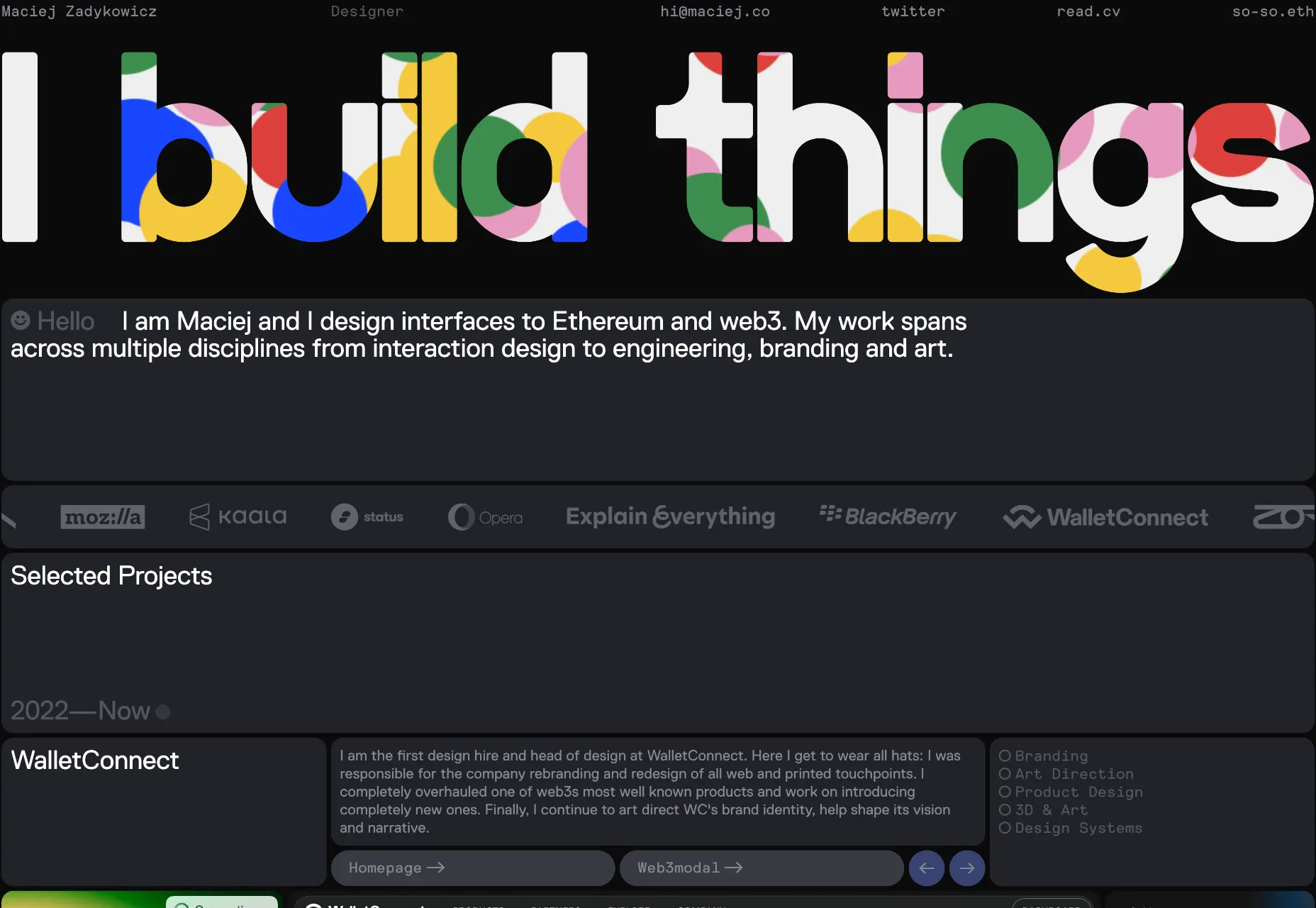
Maciej Zadykowicz
Maciej Zadykowicz’s portfolio is suitably dark mode for someone who specializes in Ethereum and web3, but it’s brought to life by the splashes of animated color.
Dot Pad
Dot Pad is an innovative tactile display for visual data. It allows you to feel the world you see. Its site has many clever details; we particularly like what happens with the menu when you scroll.
Cal.com
Cal.com is an event scheduler app. Its site features black-and-white typography that is elevated by subtle shadows and a clear hierarchy. Simple ordered, and appropriate.
Pure Sunfarms
Pure Sunfarms sells cannabis, and its retro vibes take us all back to long Summer days when the world seemed more innocent and chilled.
Madre Mezcal
The warm terracotta color of Madre Mezcal transports you to warmer climes. The illustrations and typography are on-brand, but what we really love is the variable scrolling on the content columns.
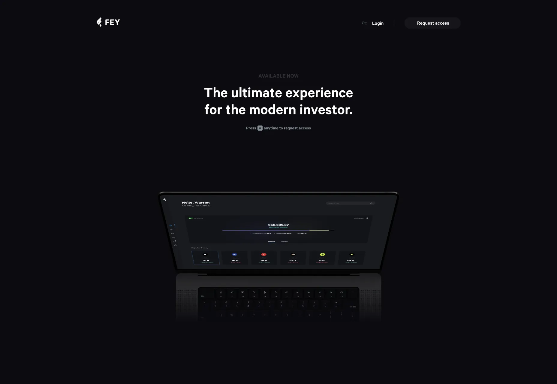
Fey
Fey is an app for investors, and its simple site is suitably restrained and high-quality. Some nice animations do a great job of highlighting the app’s features.
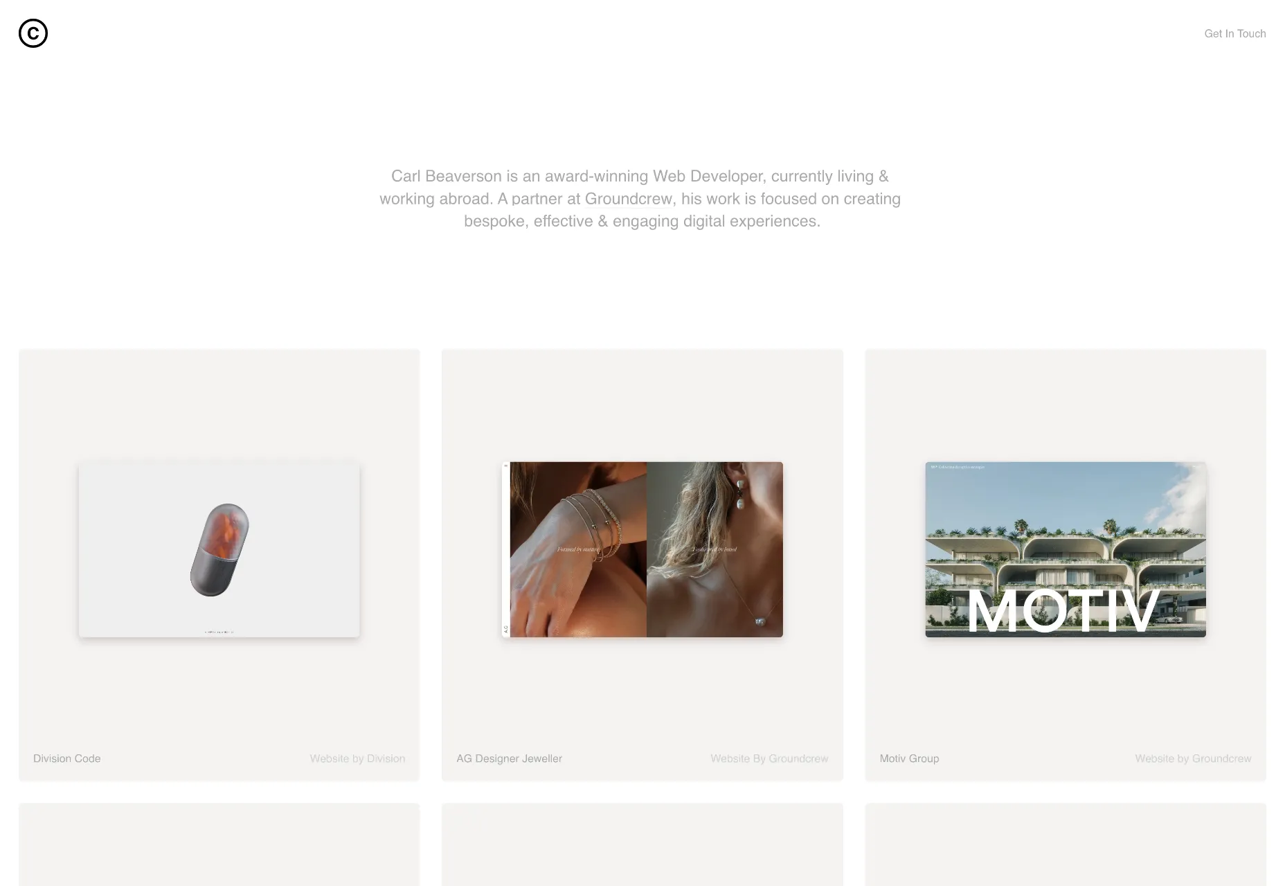
Carl Beaverson
Carl Beaverson’s portfolio is an exercise in restraint. It‘s just a series of tastefully presented thumbnails. Obvious accessibility issues aside, the pale text looks beautiful against the soft grey backgrounds.
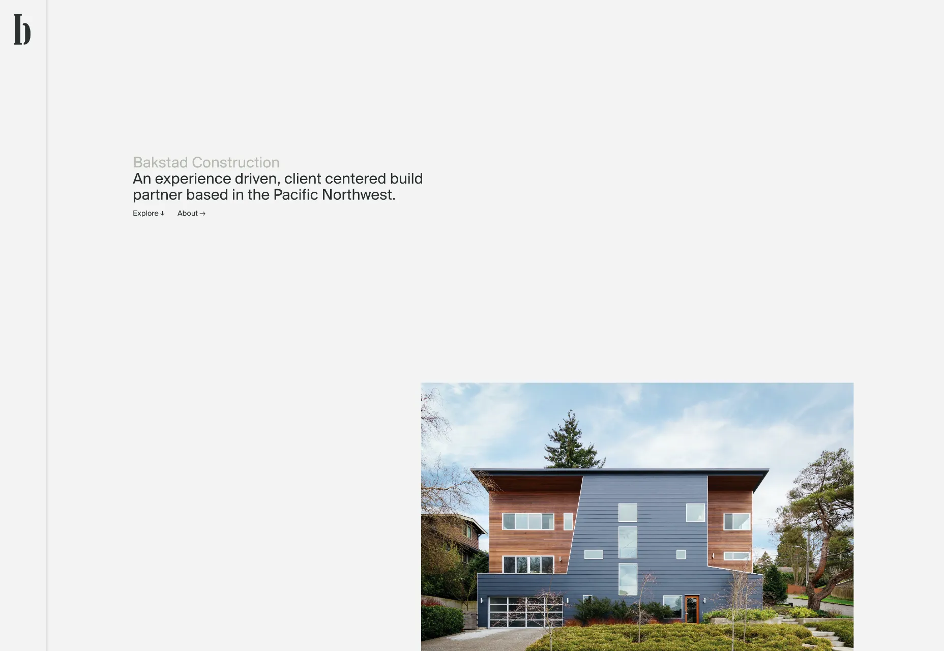
Bakstad Construction
2022’s Brutalism trend has waned, and we’re seeing a lot less of the style. But in the case of Bakstad Construction, nothing could be more appropriate.
Nightworks
Nightworks creates stunning lighting products that would grace any home. Its site oozes luxury from every pixel. The type, colors, and layout all convey quality.
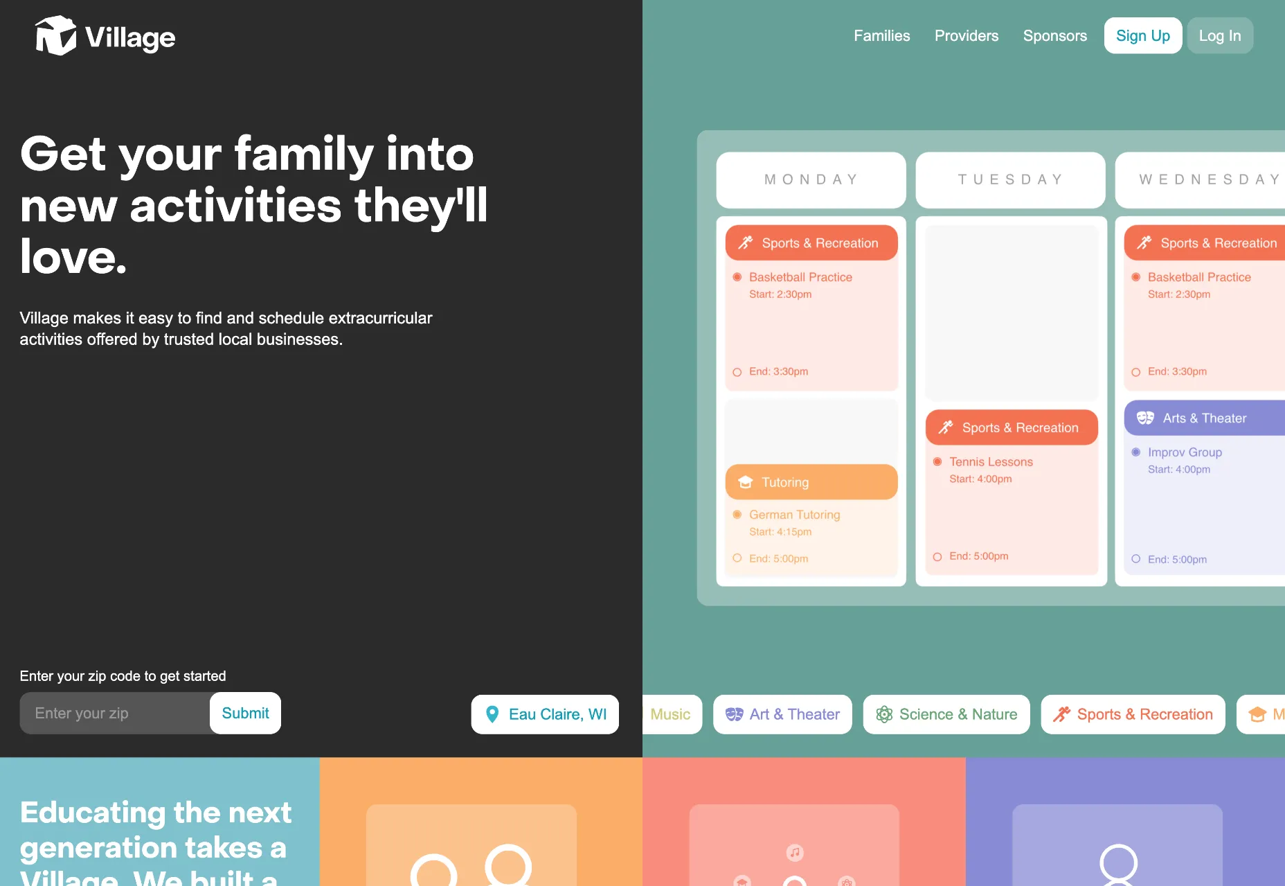
Village
We’re used to team scheduling apps, but Village is a team scheduling app for your family. The desaturated colors and modern look is perfectly pitched at young families.
Hotel 23
Hotel 23 is amazing-looking in Medellín, Columbia. Its site features shapes and colors that reflect the building’s decor, and the room slideshow is charming and original.
Flat Camp
Flat Camp is a retreat for up to 50 members of the Statamic community. Its site is clean and clear without being dull and minimal. And the hilltop illustration is highly appealing.
Aviv Katz
We love the playfulness of Aviv Katz’s portfolio. There’s lots to explore in the UI and some great work on display.
Samara
When you’re selling six-figure products, you better have a great site. Samara sells small houses that fit in a backyard, with everything you need included. It’s ideal for a home office or an Airbnb.
It’s a question I hear asked quite often: Is it possible to create shadows from gradients instead of solid colors? There is no specific CSS property that does this (believe me, I’ve looked) and any blog post you find about it is basically a lot of CSS tricks to approximate a gradient. We’ll actually cover some of those as we go.
But first… another article about gradient shadows? Really?
Yes, this is yet another post on the topic, but it is different. Together, we’re going to push the limits to get a solution that covers something I haven’t seen anywhere else: transparency. Most of the tricks work if the element has a non-transparent background but what if we have a transparent background? We will explore this case here!
Before we start, let me introduce my gradient shadows generator. All you have to do is to adjust the configuration, and get the code. But follow along because I’m going to help you understand all the logic behind the generated code.
Let’s start with the solution that’ll work for 80% of most cases. The most typical case: you are using an element with a background, and you need to add a gradient shadow to it. No transparency issues to consider there.
The solution is to rely on a pseudo-element where the gradient is defined. You place it behind the actual element and apply a blur filter to it.
.box {
  position: relative;
}
.box::before {
  content: "";
  position: absolute;
  inset: -5px; /* control the spread */
  transform: translate(10px, 8px); /* control the offsets */
  z-index: -1; /* place the element behind */
  background: /* your gradient here */;
  filter: blur(10px); /* control the blur */
}
It looks like a lot of code, and that’s because it is. Here’s how we could have done it with a box-shadow instead if we were using a solid color instead of a gradient.
box-shadow: 10px 8px 10px 5px orange;
That should give you a good idea of what the values in the first snippet are doing. We have X and Y offsets, the blur radius, and the spread distance. Note that we need a negative value for the spread distance that comes from the inset property.
Here’s a demo showing the gradient shadow next to a classic box-shadow:
CodePen Embed Fallback
If you look closely you will notice that both shadows are a little different, especially the blur part. It’s not a surprise because I am pretty sure the filter property’s algorithm works differently than the one for box-shadow. That’s not a big deal since the result is, in the end, quite similar.
This solution is good, but still has a few drawbacks related to the z-index: -1 declaration. Yes, there is “stacking context” happening there!
CodePen Embed Fallback
I applied a transform to the main element, and boom! The shadow is no longer below the element. This is not a bug but the logical result of a stacking context. Don’t worry, I will not start a boring explanation about stacking context (I already did that in a Stack Overflow thread), but I’ll still show you how to work around it.
The first solution that I recommend is to use a 3D transform:
Instead of using z-index: -1, we will use a negative translation along the Z-axis. We will put everything inside translate3d(). Don’t forget to use transform-style: preserve-3d on the main element; otherwise, the 3D transform won’t take effect.
CodePen Embed Fallback
As far as I know, there is no side effect to this solution… but maybe you see one. If that’s the case, share it in the comment section, and let’s try to find a fix for it!
If for some reason you are unable to use a 3D transform, the other solution is to rely on two pseudo-elements — ::before and ::after. One creates the gradient shadow, and the other reproduces the main background (and other styles you might need). That way, we can easily control the stacking order of both pseudo-elements.
.box {
  position: relative;
  z-index: 0; /* We force a stacking context */
}
/* Creates the shadow */
.box::before {
  content: "";
  position: absolute;
  z-index: -2;
  inset: -5px;
  transform: translate(10px, 8px);
  background: /* .. */;
  filter: blur(10px);
}
/* Reproduces the main element styles */
.box::after {
  content: """;
  position: absolute;
  z-index: -1;
  inset: 0;
  /* Inherit all the decorations defined on the main element */
  background: inherit;
  border: inherit;
  box-shadow: inherit;
}
CodePen Embed Fallback
It’s important to note that we are forcing the main element to create a stacking context by declaring z-index: 0, or any other property that do the same, on it. Also, don’t forget that pseudo-elements consider the padding box of the main element as a reference. So, if the main element has a border, you need to take that into account when defining the pseudo-element styles. You will notice that I am using inset: -2px on ::after to account for the border defined on the main element.
As I said, this solution is probably good enough in a majority of cases where you want a gradient shadow, as long as you don’t need to support transparency. But we are here for the challenge and to push the limits, so even if you don’t need what is coming next, stay with me. You will probably learn new CSS tricks that you can use elsewhere.
Transparent solution
Let’s pick up where we left off on the 3D transform and remove the background from the main element. I will start with a shadow that has both offsets and spread distance equal to 0.
CodePen Embed Fallback
The idea is to find a way to cut or hide everything inside the area of the element (inside the green border) while keeping what is outside. We are going to use clip-path for that. But you might wonder how clip-path can make a cut inside an element.
Indeed, there’s no way to do that, but we can simulate it using a particular polygon pattern:
Tada! We have a gradient shadow that supports transparency. All we did is add a clip-path to the previous code. Here is a figure to illustrate the polygon part.
The blue area is the visible part after applying the clip-path. I am only using the blue color to illustrate the concept, but in reality, we will only see the shadow inside that area. As you can see, we have four points defined with a big value (B). My big value is 100vmax, but it can be any big value you want. The idea is to ensure we have enough space for the shadow. We also have four points that are the corners of the pseudo-element.
The arrows illustrate the path that defines the polygon. We start from (-B, -B) until we reach (0,0). In total, we need 10 points. Not eight points because two points are repeated twice in the path ((-B,-B) and (0,0)).
There’s still one more thing left for us to do, and it’s to account for the spread distance and the offsets. The only reason the demo above works is because it is a particular case where the offsets and spread distance are equal to 0.
Let’s define the spread and see what happens. Remember that we use inset with a negative value to do this:
CodePen Embed Fallback
The pseudo-element is now bigger than the main element, so the clip-path cuts more than we need it to. Remember, we always need to cut the part inside the main element (the area inside the green border of the example). We need to adjust the position of the four points inside of clip-path.
We’ve defined a CSS variable, --s, for the spread distance and updated the polygon points. I didn’t touch the points where I am using the big value. I only update the points that define the corners of the pseudo-element. I increase all the zero values by --s and decrease the 100% values by --s.
CodePen Embed Fallback
It’s the same logic with the offsets. When we translate the pseudo-element, the shadow is out of alignment, and we need to rectify the polygon again and move the points in the opposite direction.
There are two more variables for the offsets: --x and --y. We use them inside of transform and we also update the clip-path values. We still don’t touch the polygon points with big values, but we offset all the others — we reduce --x from the X coordinates, and --y from the Y coordinates.
Now all we have to do is to update a few variables to control the gradient shadow. And while we are at it, let’s also make the blur radius a variable as well:
CodePen Embed Fallback
Do we still need the 3D transform trick?
It all depends on the border. Don’t forget that the reference for a pseudo-element is the padding box, so if you apply a border to your main element, you will have an overlap. You either keep the 3D transform trick or update the inset value to account for the border.
Here is the previous demo with an updated inset value in place of the 3D transform:
CodePen Embed Fallback
I‘d say this is a more suitable way to go because the spread distance will be more accurate, as it starts from the border-box instead of the padding-box. But you will need to adjust the inset value according to the main element’s border. Sometimes, the border of the element is unknown and you have to use the previous solution.
With the earlier non-transparent solution, it’s possible you will face a stacking context issue. And with the transparent solution, it’s possible you face a border issue instead. Now you have options and ways to work around those issues. The 3D transform trick is my favorite solution because it fixes all the issues (The online generator will consider it as well)
Adding a border radius
If you try adding border-radius to the element when using the non-transparent solution we started with, it is a fairly trivial task. All you need to do is to inherit the same value from the main element, and you are done.
CodePen Embed Fallback
Even if you don’t have a border radius, it’s a good idea to define border-radius: inherit. That accounts for any potential border-radius you might want to add later or a border radius that comes from somewhere else.
It’s a different story when dealing with the transparent solution. Unfortunately, it means finding another solution because clip-path cannot deal with curvatures. That means we won’t be able to cut the area inside the main element.
This part was very tedious, and I struggled to find a general solution that doesn’t rely on magic numbers. I ended up with a very complex solution that uses only one pseudo-element, but the code was a lump of spaghetti that covers only a few particular cases. I don’t think it is worth exploring that route.
I decided to insert an extra element for the sake of simpler code. Here’s the markup:
<div class="box">
  <sh></sh>
</div>
I am using a custom element, , to avoid any potential conflict with external CSS. I could have used a
, but since it’s a common element, it can easily be targeted by another CSS rule coming from somewhere else that can break our code.
The first step is to position the element and purposely create an overflow:
As you can see, the pseudo-element uses the same code as all the previous examples. The only difference is the 3D transform defined on the element instead of the pseudo-element. For the moment, we have a gradient shadow without the transparency feature:
CodePen Embed Fallback
Note that the area of the element is defined with the black outline. Why I am doing this? Because that way, I am able to apply a mask on it to hide the part inside the green area and keep the overflowing part where we need to see the shadow.
I know it’s a bit tricky, but unlike clip-path, the mask property doesn’t account for the area outside an element to show and hide things. That’s why I was obligated to introduce the extra element — to simulate the “outside” area.
Also, note that I am using a combination of border and inset to define that area. This allows me to keep the padding-box of that extra element the same as the main element so that the pseudo-element won’t need additional calculations.
Another useful thing we get from using an extra element is that the element is fixed, and only the pseudo-element is moving (using translate). This will allow me to easily define the mask, which is the last step of this trick.
It’s done! We have our gradient shadow, and it supports border-radius! You probably expected a complex mask value with oodles of gradients, but no! We only need two simple gradients and a mask-composite to complete the magic.
Let’s isolate the element to understand what is happening there:
Note how the inner radius matches the main element’s border-radius. I have defined a big border (150px) and a border-radius equal to the big border plus the main element’s radius. On the outside, I have a radius equal to 150px + R. On the inside, I have 150px + R - 150px = R.
We must hide the inner (blue) part and make sure the border (red) part is still visible. To do that, I’ve defined two mask layers —One that covers only the content-box area and another that covers the border-box area (the default value). Then I excluded one from another to reveal the border.
Yes, this definitely not perfect. The first issue you may face is related to using a border on the main element. This may create a small misalignment in the radii if you don’t account for it. We have this issue in our example, but perhaps you can hardly notice it.
The fix is relatively easy: Add the border’s width for the element’s inset.
Another drawback is the big value we’re using for the border (150px in the example). This value should be big enough to contain the shadow but not too big to avoid overflow and scrollbar issues. Luckily, the online generator will calculate the optimal value considering all the parameters.
The last drawback I am aware of is when you’re working with a complex border-radius. For example, if you want a different radius applied to each corner, you must define a variable for each side. It’s not really a drawback, I suppose, but it can make your code a bit tougher to maintain.
The online generator only considers a uniform radius for the sake of simplicity, but you now know how to modify the code if you want to consider a complex radius configuration.
Wrapping up
We’ve reached the end! The magic behind gradient shadows is no longer a mystery. I tried to cover all the possibilities and any possible issues you might face. If I missed something or you discover any issue, please feel free to report it in the comment section, and I’ll check it out.
Again, a lot of this is likely overkill considering that the de facto solution will cover most of your use cases. Nevertheless, it’s good to know the “why” and “how” behind the trick, and how to overcome its limitations. Plus, we got good exercise playing with CSS clipping and masking.
And, of course, you have the online generator you can reach for anytime you want to avoid the hassle.
Are you looking to build a website for your law firm, or do you want to optimize the law firm website that you already have? Anyhow, this article will be your guide!
Continue reading to learn the fundamentals of designing an effective law firm website.
How does website design help your business to grow?
Many legal professionals find creating a website outside their field of expertise. Hence, this can be a daunting experience for them. But to continue growing, your law firm needs to have a website in today’s age.
With personal referrals, it is essential to remember that potential clients will likely look up recommendations online. And your firm’s online marketing efforts are even more critical for those who turn directly to the web when facing a legal problem because they don’t have someone to ask for a recommendation.
Marketing your law firm website
There is ample opportunity for growing your practice by law firm content marketing. However, selling online also requires a significant level of responsibility for attorneys.
The first step in marketing your law firm is to make a marketing plan by developing your firm’s mission, vision, and value statement. Learning and applying these marketing strategies and regulations is essential in law firm marketing.
Website development and design basics
After deciding to invest in your website’s design, a good next step is:
How to set up your website?
Which website will work best for your firm’s needs?
How do you want it to look?
Factors to consider for hiring a law firm website designer
If you hire a professional website designer, ensure you get what you are looking for at the best price. Apart from price estimates, the following are some questions to consider when hiring a web developer for your law firm website:
How long will the website take?
Can you update content on your own?
Will you be available for any software or security update in the future?
How will your website be optimized for search engines?
Who will be the owner of the domain and hosting accounts?
However, some of these questions are up-front to answer. But factors like cost and time need a little bit of discussion. And find someone matching your budget, knowledge level, and time availability.
How to make your website accessible?
Following are There are technical ways to make your website accessible.
You can use many tools to evaluate the accessibility of website design for law firms.
An excellent place to start is to turn off the styling for your website.
It will leave mainly text behind, so you’ll quickly see whether or not you’ve arranged the information on your site correctly.
Website design
A website design should be easy, as a website is fundamental to your firm’s marketing strategy. Often, it is the first interaction for your prospective clients that they will have with your brand! It will not only help your website to generate leads, but it will also set you apart from the competition.
Best law firm website tips and best practices
So, are you ready to build your law firm website? If you want to create an excellent law firm website,
Put your website and visitors first
While your law firm’s website is a marketing tool for your practice, it’s essential to remember that the most successful websites focus on meeting what clients are looking for rather than only marketing to clients.
Consider the essential pages
Your website needs to have essential sections or pages that should be present in your law firm website:
About page
On the about page, you will discuss which areas of law you’re passionate about, what you want to bring about, and why! Start by writing as if you are introducing yourself to a client face-to-face. It will make your website more friendly and personable.
Contact page
Another essential page that Your website must have is a contact page, which will be perfect if it complements a form.
You can further widen the horizon by providing a list of your contact information. Ideally, your contact page should have the following:
Address
Email address
Contact number
Social media platforms link
Blogs
Blogs are used to talk and discuss what you know best. It will discuss the law relating to the individual’s regular issues. It’ll help engage your future clients instead of just a block of legal jargon.
Testimonials
If happy clients willingly let you quote on your site, do it! If you want compelling testimonials, it’s best to be specific. Ask clients to be precise with what they liked about your service. The testimonial will sound more legitimate. Your audience will better understand your past successes and why you’re better than the competition.
Fees
What do you charge? Do you charge per hour or a flat fee? How flexible? Unless your jurisdiction requires it, you can put an exact number down. It will help you give your clients a rough idea of what they expect to pay.
Conclusion
This guide has highlighted and discussed how to market your website design using the tips and tricks mentioned above. Doing so can make the perfect website for your firm to help you grow your business! In a nutshell, this is a complete guide to building a website design for law firms.
Every now and then, a one blog post is published and it spurs a reaction or response in others that are, in turn, published as blogs posts, and a theme starts to emerge. That’s what happened this past week and the theme developed around the cost of JavaScript frameworks — a cost that, in this case, reveals just how darn important it is to use JavaScript responsibly.
This is where the story begins. Eric goes to a health service provider website to book an appointment and gets… a blank screen.
In addition to a terrifying amount of telemetry, Modern Health’s customer-facing experience is delivered using React and Webpack.
If you are familiar with how the web is built, what happened is pretty obvious: A website that over-relies on JavaScript to power its experience had its logic collide with one or more other errant pieces of logic that it summons. This created a deadlock.
If you do not make digital experiences for a living, what happened is not obvious at all. All you see is a tiny fake loading spinner that never stops.
D’oh. This might be mere nuisance — or even laughable — in some situations, but not when someone’s health is on the line:
A person seeking help in a time of crisis does not care about TypeScript, tree shaking, hot module replacement, A/B tests, burndown charts, NPS, OKRs, KPIs, or other startup jargon. Developer experience does not count for shit if the person using the thing they built can’t actually get what they need.
This is the big smack of reality. What happens when our tooling and reporting — the very things that are supposed to make our work more effective — get in the way of the user experience? These are tools that provide insights that can help us anticipate a user’s needs, especially in a time of need.
I realize that pointing the finger at JavaScript frameworks is already divisive. But this goes beyond whether you use React or framework d’jour. It’s about business priorities and developer experience conflicting with user experiences.
Partisans for slow, complex frameworks have successfully marketed lemons as the hot new thing, despite the pervasive failures in their wake, crowding out higher-quality options in the process.
These technologies were initially pitched on the back of “better user experiences”, but have utterly failed to deliver on that promise outside of the high-management-maturity organisations in which they were born. Transplanted into the wider web, these new stacks have proven to be expensive duds.
There’s the rub. Alex ain’t mincing words, but notice that the onus is on the way frameworks haved been marketed to developers than developers themselves. The sales pitch?
Once the lemon sellers embed the data-light idea that improved “Developer Experience” (“DX”) leads to better user outcomes, improving “DX” became and end unto itself, and many who knew better felt forced to play along. The long lead times in falsifying trickle-down UX was a feature, not a bug; they don’t need you to succeed, only to keep buying.
As marketing goes, the “DX” bait-and-switch is brilliant, but the tech isn’t delivering for anyone but developers.
Tough to stomach, right? No one wants to be duped, and it’s tough to admit a sunken cost when there is one. It gets downright personal if you’ve invested time in a specific piece of tech and effort integrating it into your stack. Development workflows are hard and settling into one is sorta like settling into a house you plan on living in a little while. But you’d want to know if your house was built on what Alex calls a “sandy foundation”.
I’d just like to pause here a moment to say I have no skin in this debate. As a web generalist, I tend to adopt new tools early for familiarity then drop them fast, relegating them to my toolshed until I find a good use for them. In other words, my knowledge is wide but not very deep in one area or thing. HTML, CSS, and JavaScript is my go-to cocktail, but I do care a great deal about user experience and know when to reach for a tool to solve a particular thing.
And let’s acknowledge that not everyone has a say in the matter. Many of us work on managed teams that are prescribed the tools we use. Alex says as much, which I think is important to call out because it’s clear this isn’t meant to be personal. It’s a statement on our priorities and making sure they along to user expectations.
Just blocking a file shouldn’t totally wreck a website, but it often does! In JavaScript, that may be because the developers have written first-party JavaScript (which I’ll generally allow) that depends on third-party JavaScript (which I’ll generally block).
[…]
If I block resources from tracking-website.com, now my first-party JavaScript is going to throw an error. JavaScript isn’t chill. If an error is thrown, it doesn’t execute more JavaScript further down in the file. If further down in that file is transitionToOnboarding();— that ain’t gonna work.
Maybe it’s worth revisiting your workflow and tweaking it to account to identify more points of failure.
So here’s an idea: Run your end-to-end tests in browsers that have popular content blockers with default configs installed.
Doing so may uncover problems like this that stop your customers, and indeed people in need, from being stopped in their tracks.
Good idea! Hey, anything that helps paint a more realistic picture of how the app is used. That sort of clarity could happen a lot earlier in the process, perhaps before settling on development decisions. Know your users. Why are they using the app? How do they browse the web? Where are they phsically located? What problems could get in their way? Chris has a great talk on that, too.
Despite the massive strides tech has taken in the last few years, we rarely see a week as tumultuous as this.
When your grandkids ask you where you were when AI took over, you’ll be reminiscing about February 2023.
ChatGPT Goes ‘Pro’
First, we felt a great disturbance in AI, as if millions of chatbots cried out in terror and were suddenly silenced. ChatGPT has reached capacity.
ChatGPT is one of the more accomplished AI tools available, and until now, it’s been free to use, which has prompted an AI gold rush — ProductHunt transformed in weeks into a list of ‘trustworthy’ chatbots. OpenAI, the company behind ChatGPT, is a commercial company and has opted to release a premium account for ChatGPT that provides priority access for $20/month.
In addition to derailing the plans of thousands of indy-developers, there are ethical questions about an AI that is trained on other people’s content, questions that were less pressing when access was free.
Bing Chat Beats Google
Google has dominated search for a long time. Its main strength has been its jealously guarded algorithm.
When Microsoft — no stranger itself to monopolies — launched Bing, there was speculation that Google would lose its dominance. But the move away from Google never materialized.
So Bing’s product team returned to the drawing board to find a way to combat Google’s algorithm. The solution they came up with was Bing Chat, a chatbot that, in addition to returning search results, would also answer the query in a simple statement cribbed from the most credible results.
Bing Chat is powered by ChatGPT — Microsoft is presumably paying $20/month for priority access.
The move from search engines directing users to results hosted on sites to search engines taking, rewriting, and presenting answers as their own will make the fuss over AMP pale into insignificance.
Google Bard Gets It Wrong
Google was so spooked by Bing Chat that it rushed out a preview of Bard, its own AI-powered service.
Google is generally regarded as one of the leading lights in AI research, so being caught napping when it can to AI search integration must have stung someone into pushing the launch button too soon.
In a preview video intended to take the wind out of Microsoft’s sails, Bard was asked, “What new discoveries from the James Webb space telescope can I tell my nine-year-old about?” The response from Bard stated the JWST took the very first pictures of a planet outside of Earth‘s solar system. However, those very first photos were actually taken in 2004, 17 years before the JWST was launched.
And just like that, $100 billion was wiped off (Google parent company) Alphabet‘s share price.
As Google spokespeople were quick to point out, Bard is still being tested and will be much more powerful when using the full version of LaMDA. But the error highlights one of the biggest problems with AI content: It is not only highly inaccurate but also extremely convincing, making errors difficult to spot.
What’s Next?
The thrust and parry between Google Bard and Microsoft Bing leaves us on the brink of another remarkable technology race. Bing won the first round, but somewhere in The Googleplex, an audit is taking place with the express purpose of not losing any more ground. And this is all before the rumored Apple iSearch is installed by default on millions of iPhones.
There are so many ethical, technical, and cultural questions surrounding AI that it’s impossible to know where this is heading.
One thing is certain: something changed this week. We’ve seen the first exchanges in a competition that will transform the web over the next decade.
There are plenty of services nowadays that work with photos. Retouched images usually fulfill their purposes much better than raw ones. If you develop a service that allows its users to upload photos, wrapping a photo editing tool right in the service prior to uploading could save much time for your end users. Even though there is a large amount of photo editing software, both for desktop and mobile and online, editing a photo or a batch of photos in such software could be slower than editing the photo within your service UI.
Let’s imagine a user choosing a photo, applying some changes to it, and simply uploading it. They wouldn’t need to use a complex desktop or mobile software; they wouldn’t need to waste time by uploading the original photo to an online image editing tool first, then having to save the edited image locally, and finally uploading it to your service.
A perfect example of such a use case is an online marketplace for used cars. It would be really hard to sell a car without providing some photos of it, right? You may want to touch up a number of photos before uploading them, e.g. by masking the car plate or adjusting the tones and colors. Another example is a property management platform. Again, photos are vital for selling or renting a property, and retouching may come in handy, as well as adding some text over the photos for explanations and clarifications. Stock photo platforms may also benefit from allowing their end users to customize their purchased stock photos before they download them.
There are many solutions to this problem. When choosing the best one for your website or app, you’d better take the following into consideration:
Easy To Integrate Into Your Product You don’t want to read tons of documentation in order to integrate such a tool.
As Many Various Features As You Like
Simplicity The majority of the end users need easy-to-use tools to edit their photos.
Rich API The more control you have over the photo editor, the better.
White-Label Support You want to make it look like part of your brand.
Optimized Output Images Web performance is vital.
Affordable Pricing
One of the image editors that you may like to consider and try out is Pixo. And for full exposure, that’s the one we are currently working on, with a friendly free plan available as well. Pixo can be integrated into any website or app because of its easy integration (just a few JavaScript lines) and rich API. It is also available to WordPress as a plugin, replacing the default image editor in WP Admin. Pixo Editor has all the features of the default editor plus a few more.
One of them is batch editing which allows the site administrator/editor to make some changes to a photo and replicate them to the whole batch. Simply select a batch of photos in the Media Library and choose Batch Edit. When Pixo opens the first photo for editing, the site editor makes some changes — chooses a filter, adjusts colors, and adds text. On save, the changes will be replicated to the rest of the photos from the batch!
But something even cooler is the fact that Pixo can be integrated into a WordPress site’s frontend — no matter which theme is chosen or which plugins there are. Pixo attaches to a file input field and listens for image selection; when the end user picks a photo, Pixo Editor opens it for editing. The user can then make some changes and save them back to the file input. Submitting the file input will actually submit the edited photo, not the original one. This basically makes the editor very easy to integrate anywhere.
You can make it attach to every file input field on the page, or a specific one, via CSS selector. The form submission handler can be an online shop plugin or a contact form plugin. Does not really matter as long as it prints a file input field on the page and handles the file upload on form submission.
As Pixo is a SaaS, it can be integrated anywhere with a few lines of JavaScript. It can load an image from the DOM or from a URL, base64 string or dataurl, from the local file system, and more.
var image = document.getElementById('myimage'); // DOM image
var image = 'https://yourdomain.com/path/to/image.jpg'); // image url
var image = 'abfdSDFEWwq2332Wdsdsdf435esf345SDfdr4S='; // base64 encoded image
var image = 'data:image/png;base64,abfdSDFEWwq2332Wdsdsdf43..'; // dataurl
var image = '{...}'; // previously exported image as JSON

var constructor_options = { apikey: 'abc123xyz000' }; // must be a valid API key issued by https://pixoeditor.com
new Pixo.Bridge(constructor_options).edit(image);
When the edited image is exported, you can decide what to do with it in a callback function.
new Pixo.Bridge({
    apikey: 'abc123xyz000',
    onSave: function(image){
       // download the photo
       image.download();
       // or inject it into the DOM
       document.body.appendChild(image.toImage());
       // or serialize it as JSON
       image.toJSON();
       // or upload the photo
       var data = new FormData();
       data.append('image', image.toBlob());
       var request = new XMLHttpRequest();
       request.open('POST', 'http://yourdomain.com/path/to/upload.php');
       request.send(data);
    }
 }).edit('http://yourdomain.com/path/to/imagetoedit.jpg');
Here is a CodeSandbox example showing some of the available input and output options:
Photo Editing Features
Pixo Editor implements the most common image editing tools — crop and rotate, color correction, adding rich text over the image, filters and stickers. There is a stock stickers library, but the end user can upload another image and insert it as a sticker.
One of the greatest features is the Background tool. It allows the end users to replace the background with a solid color, another image from Unsplash, or a custom image.
There are drawing tools that allow the end users to draw freely on top of the image. The Pencil tool is useful for circling some parts of the image or drawing arrows to point to something. The Blur tool is excellent for masking parts of a photo — car plates, faces, or other sensitive information. The Erase tool does what it says — erases parts of inserted stickers and other images. Unfortunately, the Erase tool does not work on the source photo.
Another interesting feature is session restoration. When the user edits a photo in Pixo, downloads it, and then opens it for editing, all objects like text and stickers are editable, and the undo/redo history is there too. This is really cool because if the user makes a mistake, s/he can fix it very easily. Session restoration also works if the user closes the web browser by accident. Opening the editor with the same photo will prompt the user to restore the previous session, and his/her work won’t be lost.
Last but not least, output photos get great compression without any quality loss, so you don’t have to worry about traffic and storage. The editor also supports WebP format.
White Label Support
Pixo Editor has full white-label support. You can change the look and feel of the editor completely in order to match your own brand — logo, colors, fonts, and even layout. The API gives the possibility to define your color palette with a few JavaScript properties. But you can even upload a custom CSS file with overrides and change basically anything. The editor comes with six default themes that you can build your own on top of.
Templates
Creating templates is yet another cool feature of the service. With Pixo Editor, you can apply changes to an image and export it as a template. Then, when the end user selects this template, your application code can load it in Pixo Editor, replacing the source image with the one selected by the user. This way, all edits, like text blocks, filters, and color corrections, will be applied to the user’s image at once. This is very useful for poster images.
You can create templates with text placeholders. When the end users edit these templates, they can add their custom text to the placeholders and export the final result as an image.
Here are JSFiddle examples:
Template Creator An instance of Pixo being used to create a template and save it to localStorage for simplicity.
Template Consumer An instance of Pixo being used to pick an image and apply the template to it.
API
Pixo provides an API that allows developers to configure the editor, as well as to execute commands and apply changes to the currently loaded photo. For example, you can extend the stock stickers library with your custom stickers very easily:
pixo_instance.filterStickers(function (stock_stickers) {
   // merge or completely replace the stickers
   return my_stickers;
});
A similar approach can be used if you want to amend the stock photo frames, fonts (for the text tool), and pre-defined crop sizes. And if you want to apply a change to the current photo programmatically, you can do it with the exec command. You can do almost everything the end user can do within the editor — simply by executing the corresponding command. This includes applying a filter, inserting a sticker, removing the background, color correction, cropping, transforming, and more. Combined with some custom CSS, you can quickly implement your own controls and use only the canvas and the business logic from Pixo:
In the example above, we hide the built-in controls with CSS (display: none), and we leave only the canvas visible. And with some HTML, CSS and JavaScript that calls the exec API, we basically implement our own custom controls. This can be in handy if, for some reason, we cannot fully customize the UI the way we like with just CSS.
But there are many more use cases for the API. For example, we can ensure that the edited images match a specific aspect ratio by cropping the image on load using the API. Or, we can insert a watermark when the editing is done by the end-user, on export:
REST API
Pixo also provides a REST endpoint. You can call it posting an image binary file or with a URL to an image or its base64 representation, and apply the same changes as the end user can do within the editor:
Pixo is a JavaScript-based service designed for websites or web applications, but it can also be integrated into native mobile applications thanks to the WebView component, supported by both iOS and Android. The flow is very simple:
The User picks up a photo for editing using a native Image Picker component;
The photo is encoded to base64 string;
Pixo is loaded inside a WebView component;
The base64 string is sent to Pixo using the WebView messaging API;
The User edits the photo with the editor;
The User is happy with the edited photo and exports it;
Pixo calls back a native function through the WebView API and passes the edited photo as a base64 string;
The same approach could be implemented into an Electron desktop app.
Pros And Cons
Using a third-party image editing service is great because of its very easy integration. Adding an image editing SDK or even implementing such an editor on your own requires much more effort. Also, the service “automatically updates”, i.e. you will get the latest, greatest and coolest new features, bug fixes and improvements, and new browsers support automatically — without having to change anything on your end. This, however, increases the risk of getting new bugs introduced if the newer version was not properly tested by the vendor.
But since it’s an online service, there is a risk that it could be down for some time, and during this period, your end users won’t be able to do their work. The self-hosted solution will always be up and running as long as your main app or website is live. Still, Pixo’s average uptime is 99.993% (according to the public status report) which is not that bad.
Final Thoughts
Pixo seems to be a good image editing solution for all websites and web apps that need to provide image editing as a feature. Its detailed documentation and examples make the integration very easy. Pixo has a 30-day full-featured free trial. After that, you can continue using its basic editing tools and APIs for free or get a subscription plan with full features.