Archive

Archive for the ‘Others’ Category

Iconography In Design Systems: Easy Troubleshooting And Maintenance

April 3rd, 2024 No comments

We all have an inherent tendency to like aesthetic and approachable things. That’s why any designer strives to deliver an intuitive and comprehensive design. And any designer knows it’s a pain in the neck, particularly when it comes to complex projects with lots of pages of design, components, and prototypes. As someone who has already traveled that road and learned quite a few valuable lessons, I have some wisdom to share with you.

Granted, tons of articles have been written about design systems, their complexity, and all the ways they can benefit a project. So, I’m not going to waste too many words on the matter. Instead, in this article, I want to dig deeper into iconography as part of a design system. Besides, I’ll share with you doable tips that will turn icon creation and maintenance into an enjoyable — or at least bearable — process. Shall we?

Design Systems: From Chaos To Order

Design Systems 101

Before we actually dive into the alluring and frightening world of iconography, I want to take some time to introduce you to the concept of a design system, as well as share my thoughts and rules that I follow while working with them.

If I were to call a design the way your interface speaks with your user, then — building on the metaphor — it would be fair to view a design system as a language.

Simply put, a design system is a functional set of defined technical standards, best user behavior practices, and navigational patterns that are used to build a pixel-perfect digital product.

It is a powerful designer tool that helps you make sure that you will end up with a coherent product and not a pathetic mess.

It seems that nowadays, designers are obliged to try their hand at creating or at least adopting a design system. So what exactly makes it an all-around beneficial thing for the designer lot? Let’s have a look:

  • The design system makes for the only source of truth since all the components are under one roof and are easily referable.
  • It hosts all the guidelines on how to implement existing components. And following the very same guidelines, designers can easily create new ones that match the former.
  • In the case of a two- (or more) designer team, a design system allows for visual consistency (which is crucial if your project is major and fast-evolving).
  • You can either use ready-made design components or alter them swiftly and in accordance with the guideline if any need arises.
  • You have access to a library of surefire design patterns, which greatly reduces the strain of coming up with new solutions.

That sounds like a treat, right? Still, creating a design system is generally viewed as an exceptionally time- and effort-consuming endeavor. If you do want to develop a design system, there is a way to make the process a bit easier. Enter the atomic design approach.

Atomic Design Approach

It’s been over six years since I first introduced the atomic approach into my workflow, and let me tell you, it was a game-changer for me as a designer. This methodology is a blessing if you work on a big project with a team of fellow designers.

If you know the pain of trying to track the changes in components throughout the projects, especially if these components are minor, then you’ll see why I’m so enthusiastic about the atomic approach. It allows for smooth and well-coordinated teamwork where every designer is aware of what component they are creating and how to make it consistent with the rest of the system.

The atomic design approach was pioneered by Brad Frost (a chemist of all occupations). It implies building your system brick-by-brick, starting with the smallest items and going all the way up while sustaining hierarchy. There are five stages to the process.

  • Atoms
    In a nutshell, these are basic HTML elements.
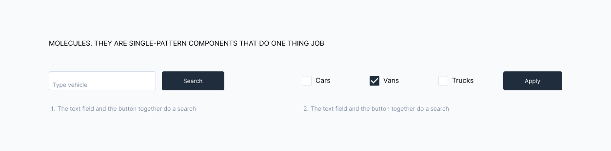
  • Molecules
    They are single-pattern components that do one thing.
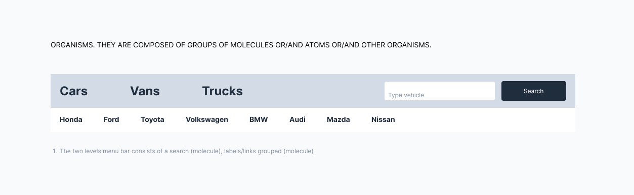
  • Organisms
    They are composed of groups of molecules, or/and atoms, or/and other organisms.

  • Templates
    They provide a context for using molecules and organisms and focus on the page’s underlying content structure. In other words, templates are the guidelines.

  • Pages
    They show what a UI looks like with proper content.

What exactly makes this approach a thing designers gravitate towards? Here are my two cents on the matter:

  • Creating a design system resembles playing with a construction set. You begin with the smallest components and progress in size, which means you are eating the elephant a bite at a time and don’t get overwhelmed.
  • Altering a component in one place will cause updates wherever a certain atom, molecule, or organism is applied. This eliminates any need for manual tweaking of components.
  • This approach provides designers with design patterns, meaning that you no longer need to create new ones and worry about their consistency.

That’s clearly not all the advantages of this methodology, so if you are interested, go ahead and read more about it in Brad Frost’s book.

What I’m really willing to focus on is our job as designers in creating and maintaining those fabled design systems, both atomic and regular. More specifically, on iconography. And even more specifically, on the pitfalls we have a nasty habit of falling into when dealing with icons as the atoms of our systems. Off we go.

Iconography In Design Systems: Maladies and Remedies

Common Problems

Since I’m relying on my own experience when it comes to design systems, it would only be fair if I shared the biggest issues that I personally have with iconography in the context of design systems and how I solve them. I’ll share with you surefire tips on how to keep your iconography consistent and ensure its smooth integration into design environments.

If we regard a single icon from the atomic design standpoint, we would consider it an atom — the smallest but essential element, just like the color palette or typography. If we continue with our language analogy, I will take the liberty of calling icons a design’s vocabulary. So, it’s fairly clear that icons are the actual core of your design.

As any designer knows, users heavily rely on icons as an interactional element of an interface. Despite being the smallest of components, icons might prove to be a major pain in the neck in terms of creation. This is the lesson I have learned during my tenure as a UX designer.

Tip 1: Since an atom is not just an autonomous element, you have to think beforehand about how it will behave as part of a larger component, like a molecule, an organism, or a template.

These are the variables you have to keep in mind when developing an icon:

  • Is your icon scalable?
  • Does it have color variations?
  • Do you classify your icon according to meaning, group, style, or location?
  • Is there an option to change the icon’s meaning or style?
  • How can you easily introduce a new icon into an existing roster?
  • How should you navigate a situation when different designers develop icons separately?
  • How can you make locating a certain icon within your design system easier?

Here are some challenges that I personally face while developing iconography for a design system:

  • How should I keep track of icon updates and maintain their consistency?
  • How should I develop icon creation guidelines?
  • What should I do if current icons happen to be inconsistent?
  • How should I inform my design team of any changes?

It might be hard to wrap your head around so many questions, but worry not. I’ll try my best to cover all these issues as we go on.

Rules Of Thumb

An icon isn’t just a little pictogram with a certain meaning behind it. An icon is a symbol of action, an interactive element of a digital interface that helps users navigate through the system.

In other words, it is a tool, and the process of building a tool implies following rules. I found out firsthand that if you master the basic icon rules, then you’ll be able to build both stand-alone icons and those that are part of a larger environment with equal efficiency. Besides, you’ll enhance your ability to create icon sets and various icon types within a single project, all while maintaining their readability and accessibility.

Tip 2: Keep consistency by establishing the basic icon rules before building your icon library.

The following are the rules that I abide by:
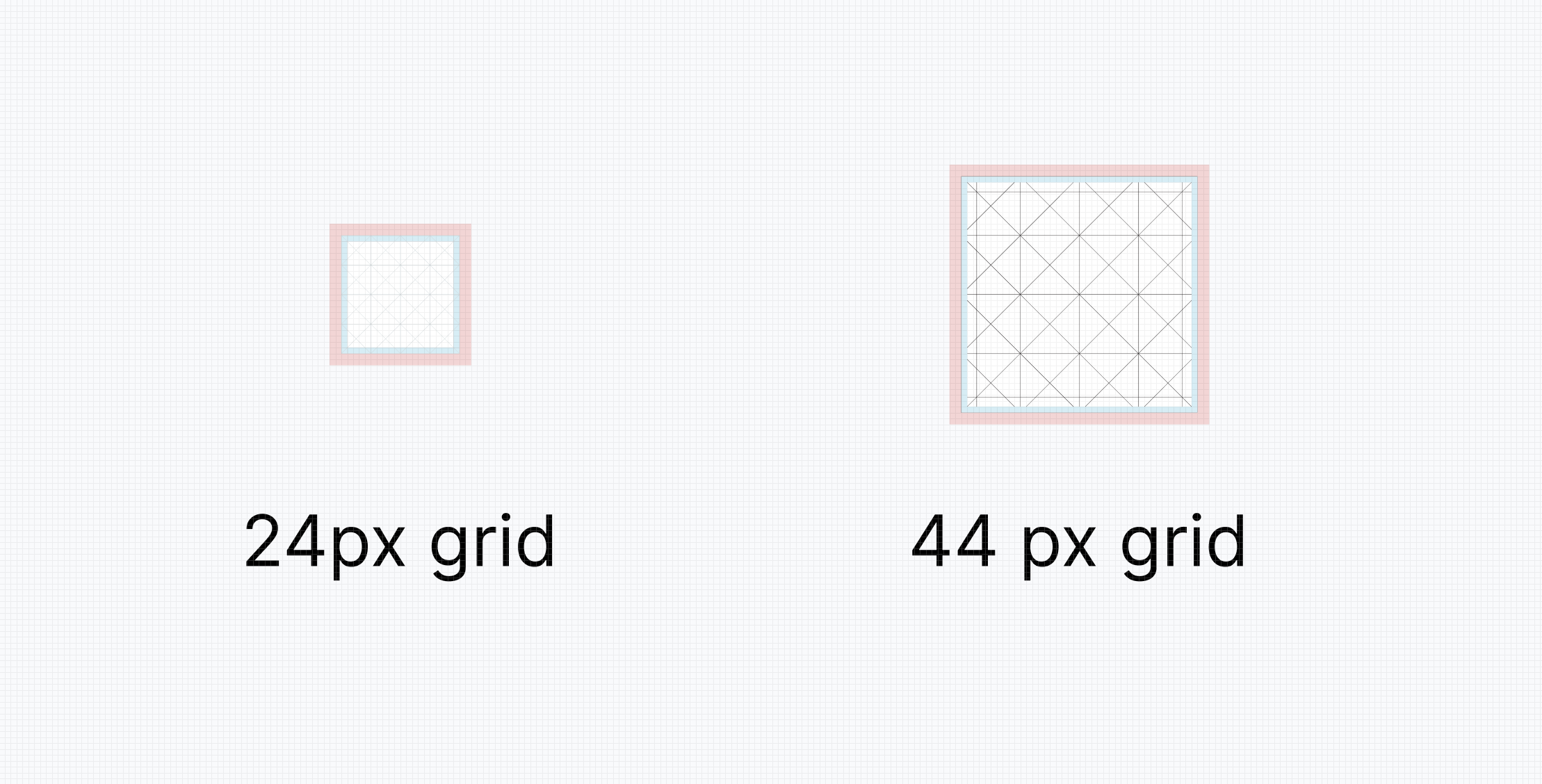
Grid

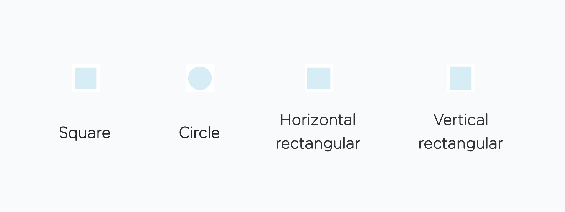
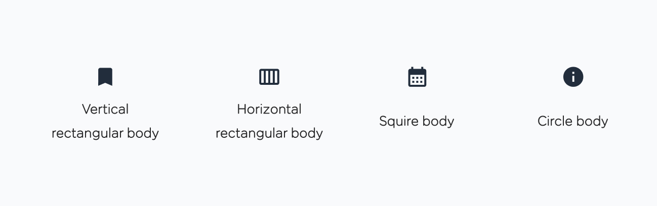
I use the classic 24px grid for standard icons and a 44px grid for larger icons. Each grid consists of the padding area (marked in red, 2 px) and the live area (marked in blue, 20 px). The live area is the space that your icon content stays inside. Its shape depends on the icon’s body and could be circular, square, vertical-rectangular, or horizontal-rectangular.

Before you sit down to draw your icon, decide how much space your icon’s body will occupy in order to come up with the proper shape.

Size

Each icon within a design system has to have a primary size, which is the size that up to 90% of all icons share. I consider the 24px icon size suggested by Google’s Material Design to be the golden standard. This size works well both for desktop and mobile devices.

Still, there is room for exceptions in this rule when an icon needs to be smaller or larger. In this case, I employ a 4-pixel step rule. I increase or decrease the icon’s size by 4 pixels at a time (e.g., I go from 24 to 20, then 16, then 12 px, or 28, 32 px, and so on). I would still personally prefer the golden standard of 24 pixels since I find smaller sizes less readable or larger sizes too visually domineering.

Weight

Another key property to consider is the outline weight of your icon if you opt for this type. If you are building an icon library from scratch, it would be wise to test several outline weight values before you make a decision. This is especially crucial for icons that contain fine details.

Granted, you can assign different weight values to different types of icons, but you might struggle to write clear guidelines for your fellow designers. I usually make a conscious decision to go with a unified outline weight for all the icons, namely, 2 points.

Fill

A solid icon variant might considerably enhance the accessibility and readability of an interface icon. It’s really handy to have both solid and outline icon types. But not all your icons should have two options. If you choose to draw a solid option, determine what parts of your icon you want to make solid.

Design principles

As I’ve mentioned before, an icon is an essential interface element. This means that an icon should be simplistic, bold, and — what’s even more important in the context of design systems — created according to the unified rules.

I have a little trick I use to see how well a new icon fits the standard. I simply integrate the new icon into the interface populated by already existing elements. This helps determine if the new icon matches the rest.

Anatomy

Such aspects as corner, counterstroke, and stroke terminal provide the much-desired visual consistency. Obviously, all these elements should be unified for all the icons within a design system. A comprehensive guide to icon anatomy is available at Material Design.

Icon Consistency: Surefire Tips

Before I actually share my tips on how to deal with icons within a design system efficiently, here’s a little backstory to how I came up with them. It all started when I joined a project that already had an established host of icons. There were over a hundred of them. And the number grew because the project was a fast-evolving thing. So, the design system, like any other, was like a living being, constantly in a state of change.

The icon library was a mishmash of different icon types, creating quite a noise. The majority of icons differed in style, size, and application. Another problem I had was the fact that most of the icons did not have the source file. So, there was no way to quickly tweak an icon to match the rest.

The first and most important thing I did was to establish the basic rules for icon creation (that’s something we’ve already covered). This step was supposed to keep the design team from creating inconsistent icons.

Tip 3: Put all your icons on one layout. This way, you’ll get a full visual understanding of your icons and determine repetitive design patterns.

Now, here comes the juicy stuff. Here is my guide on how to sustain iconography in the context of a design system.

  • Divide your icons into subcategories.
    This rule works wonders when you have an array of inconsistent icons on your hands. There is no rule on what subcategories there should be. It all depends on your design system and the number of existing icons.
    In my case, I established three groups divided by size and icon style, which resulted in three subcategories: regular icons, detailed icons, and illustrations. Once you divide your icons in the same manner, it’ll be easier to apply the same rules to each group. Besides, this approach allows for a more structured storage of these icons within your design system.

  • Determine guidelines for each icon type.
    The next step is as wise as it is hard to pull off. You need to assign certain icon creation rules for each of the icon types (provided you have more than one). This is the basis upon which all your other attempts at achieving visual consistency will be built. To tame all the mismatched icons, I used the basic icon rules we’ve covered above. To keep track, I created a page in Figma for each of the icon types and used the basic size as the file name.

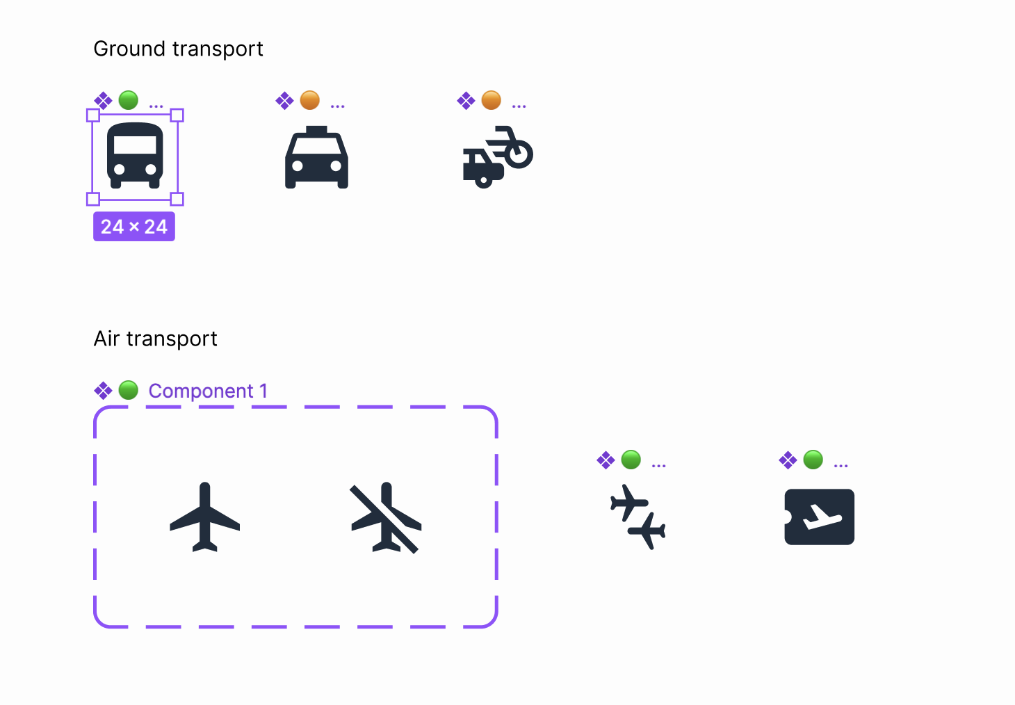
  • Group your icons wisely.
    When naming icons, I opt for the semantic section approach. Generally, you can divide all your icons into groups based on their meaning or application in the interface. Look at the example below; we have three distinct semantic sections: Transport, Services, and Warnings. Depending on their meaning, icons should be assigned to the corresponding sections. Then, those sections are, in turn, divided into subsections. For instance, the Transport section has Ground Transport and Air Transport. The main idea you should stick to is to keep your icons in separate sections.

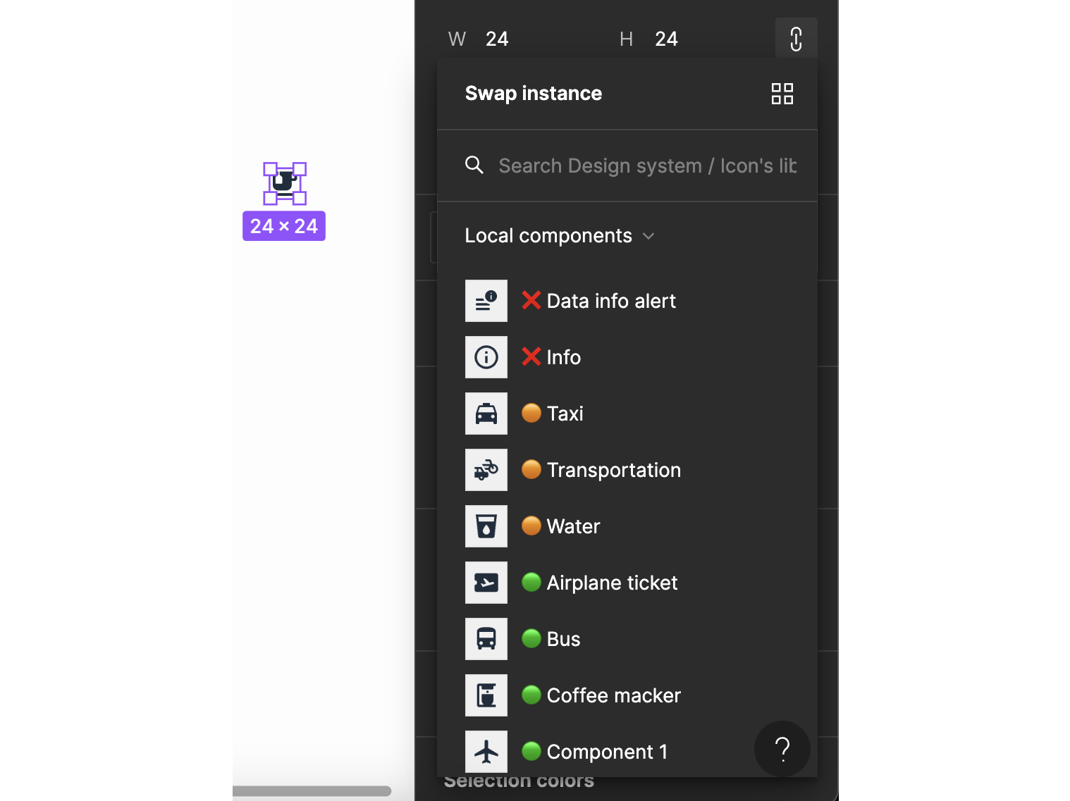
  • Stick to clear names and descriptions.
    I have to admit that dividing icons into semantic sections does have a massive disadvantage: this division could be quite subjective. This is why it is crucial to add a detailed description to each of the icons. This will simplify icon search within a design system and will give a clear understanding of an icon’s application. This is how I create a description:

    • Tags: reference words that facilitate searching for an icon within the system.
    • Usage: a brief description of an icon’s application.
    • Group Name: the name of the group an icon belongs to. This helps with locating an icon right within the library.
    • Designs: an incredibly nifty tool that allows you to insert a link to the design and documentation that features the icon in question. This way, you’ll know the context in which the icon is applied.

  • Use color coding and symbols while updating icon design.
    This trick works best when you are not yet done with the icon library, but you need to communicate to your team which icons are ready to use and which still need a bit of enhancement. For instance, I mark the names of finished icons with a green symbol. An orange symbol marks those icons that need to be improved. And in case I need an icon deleted or drawn anew, I use a red cross.

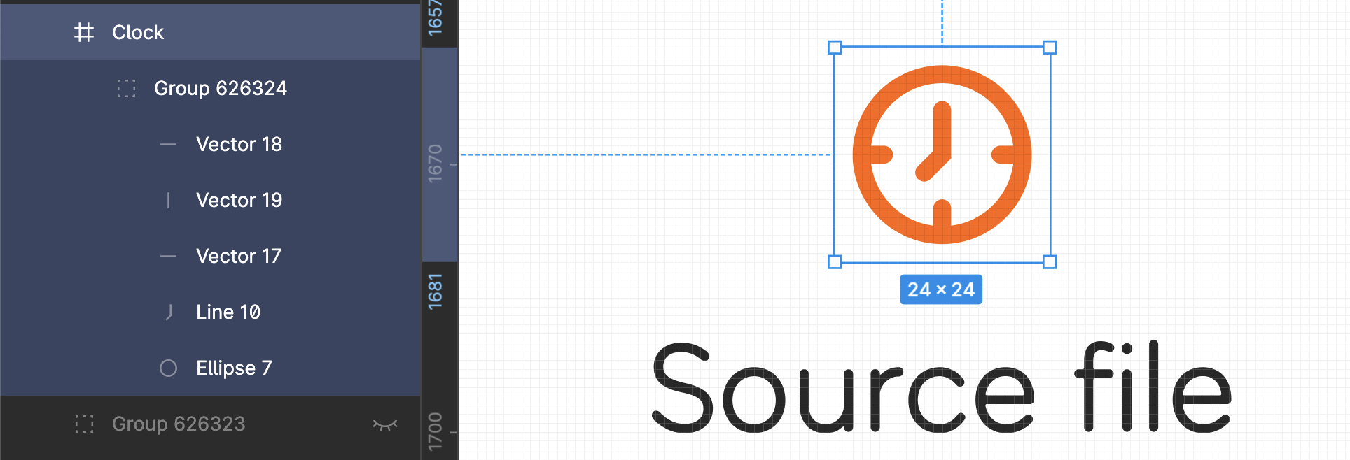
  • Keep non-rasterised versions of icons.
    It can be handy to have a non-rasterised version of an icon at arm’s length. There’ve been cases when I was asked to create a similar icon or an icon that could use the same graphic forms as the existing ones. Should this happen again, I can simply take the original file and easily draw an icon. I store all the non-rasterised icons on a separate page in the file following the defined hierarchy.

  • Rasterise the icon vector.
    Be sure to apply the Outline Stroke feature before you create the icon component. This will allow for easy color change (more on this in the next tip) and scaling.

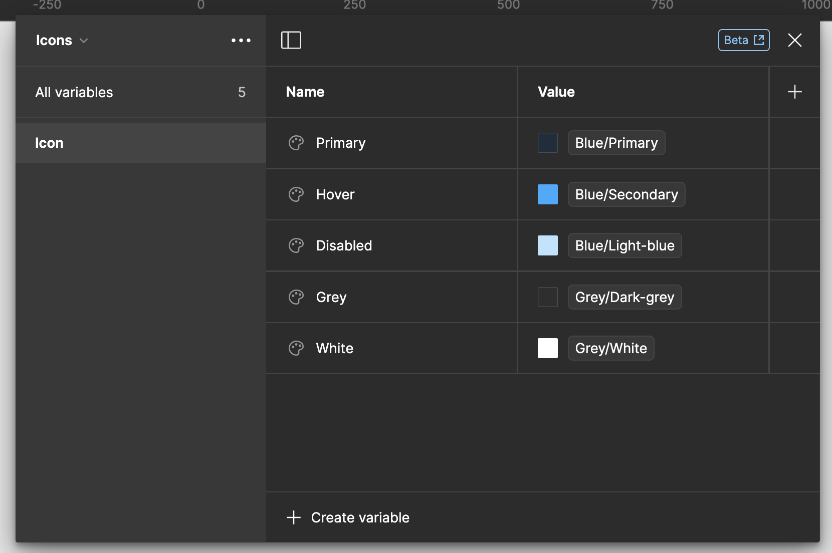
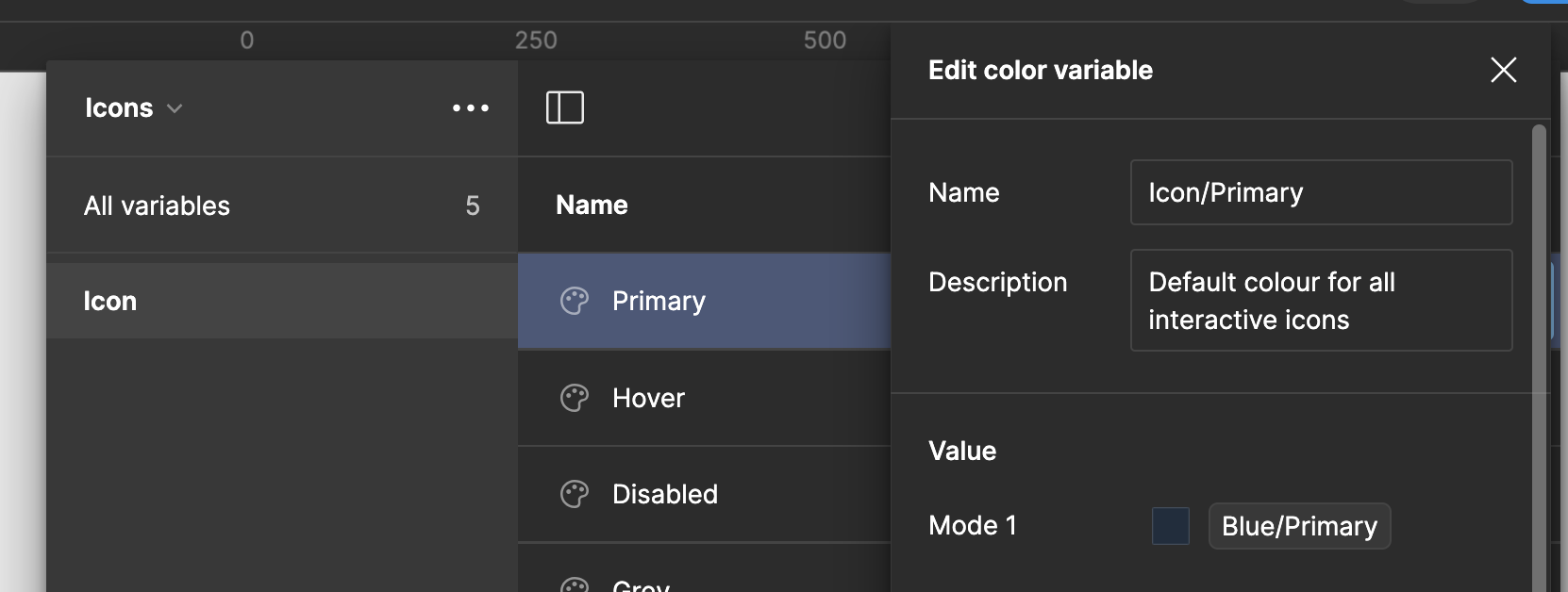
  • Mind the colors of your icons.
    I suggest keeping icons in the primary, most commonly used color by default. Another worthwhile thing to do is to name all icon colors according to their intended use and the interactions they perform. In order to do that, you need to equip your color library with a separate set of colors for all icon states, like primary, hover, and disabled. Make sure to name each set properly.

  • Assign a designer to maintain icons in the system.
    This is a seemingly trivial tip that, however, will save you trouble maintaining style and categorization consistency. I’ve personally had edge cases when the established rules failed. Having a designated designer who knew their way around the system helped to find a quick solution.

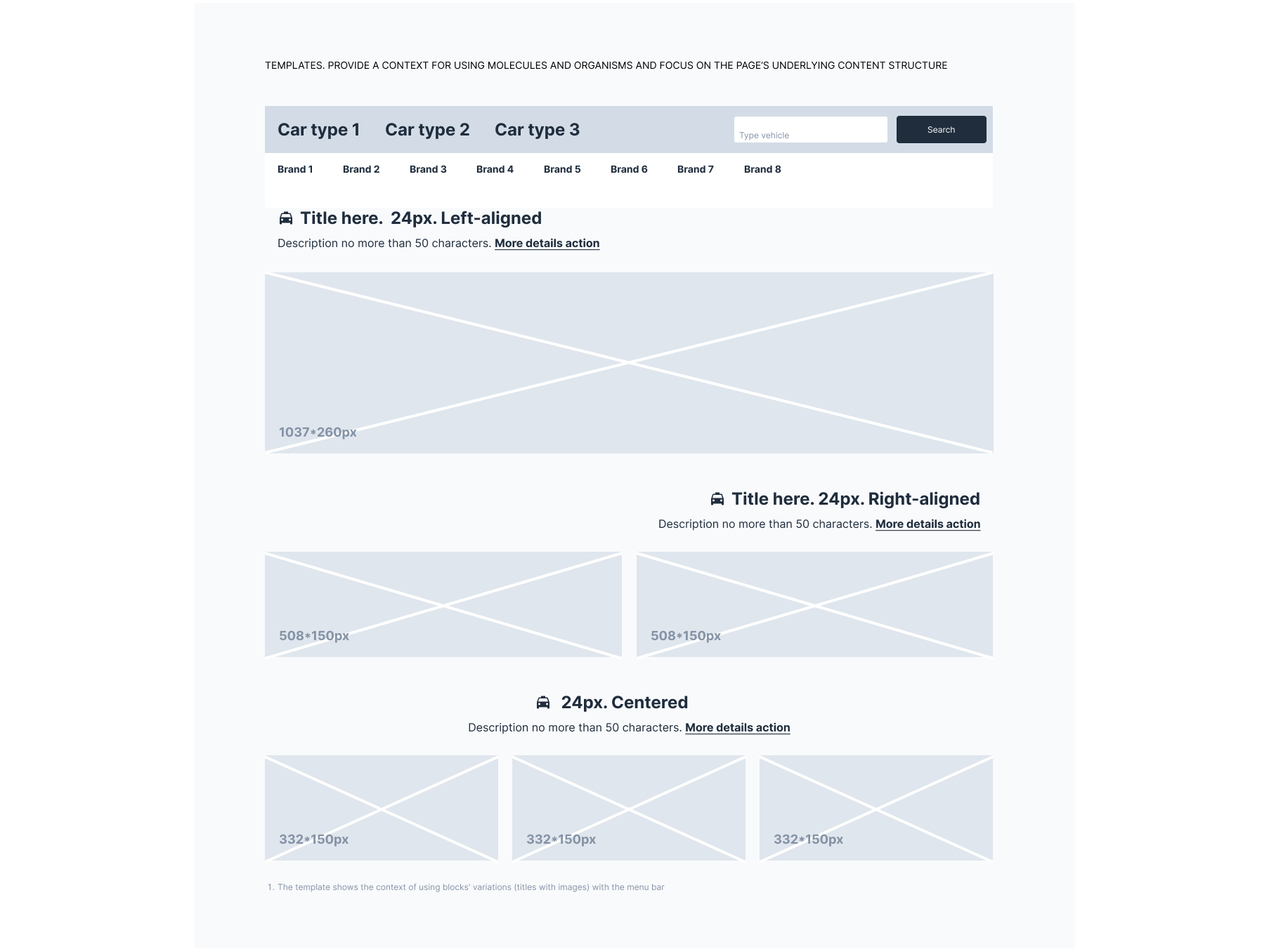
Real Example Of Guidelines Applied

To wrap up this whole lecture and actually see all these rules in action, take a look at the following template file.

Final Thoughts: Is It Worth It?

No matter how sick you might be dealing with unending visual inconsistency, design systems are still challenging. They can scare any designer regardless of their experience. Still, if you want to bring order to chaos, introducing a design system into your workflow is worth the trouble, especially when it comes to maintaining iconography.

After all, iconography is the most volatile part of a design system in terms of visual variety. That’s why iconography was the biggest challenge I had to face in my tenure as a designer. And that’s exactly why I am genuinely proud that I’ve tamed that beast and can now share my hacks with you.

Resources

Public design systems:

Design systems resources:

Icons resources:

Categories: Others Tags:

Generative AI in Creative Fields in 2024

April 1st, 2024 No comments

Creativity and innovation are being dramatically reshaped by the incredible advancements in generative AI. The integration of artificial intelligence in creative fields is now a vivid reality, transforming how art, music, literature, and design are conceived, created, and consumed. This evolution is not just altering the toolkit available to creators but is also redefining the boundaries of creativity itself.

In recent years, the emergence of AI as a partner in the creative process has been both exhilarating and thought-provoking. From AI-generated art that rivals human creativity to algorithmically composed music that stirs the soul, the capabilities of generative AI are pushing us to reconsider what it means to be a creator in the digital age.

In this article, we’ll explore the current state of generative AI in creative fields in 2024, highlighting groundbreaking projects, the evolving role of the artist, and the societal implications of this technological leap forward. 

What is Generative AI?

Generative AI refers to algorithms and models that can generate new content, be it text, images, music, or even ideas, that haven’t been explicitly programmed into them. Unlike traditional AI, which might predict the next word in a sentence based on its training, generative AI can create entire paragraphs, artwork, or melodies from scratch, often with minimal input. It’s like having a muse that not only inspires but also participates in the creative process, offering outputs that can sometimes astonish even the most seasoned creators.

How does generative AI work?

The magic behind generative AI lies in its intricate networks and algorithms, particularly in models known as Generative Adversarial Networks (GANs) and Variational Autoencoders (VAEs). These models are trained on vast datasets, learning patterns, styles, and structures inherent in the data. 

GANs, for instance, work through a fascinating process of push and pull between two neural networks—the generator, which creates new content, and the discriminator, which evaluates this content against the training data. This iterative competition drives the generator to produce increasingly sophisticated and realistic outputs.

How Generative AI Is Changing Creative Work?

The impact of generative AI on creative work is profound and multifaceted. For artists and creators, it opens up new vistas of expression and experimentation. Lots of artists collaborate with AI to produce stunning visual art that merges human emotion with algorithmic precision, creating pieces that resonate on a deeply personal level yet carry an unmistakably unique signature.

In writing, generative AI tools have become collaborators, helping authors overcome writer’s block, generate ideas, or even co-write stories. This partnership between humans and machines is redefining the very act of storytelling, making it a more inclusive and expansive endeavor.

Moreover, generative AI is democratizing creativity, making tools and techniques available to a broader audience. Individuals without formal training in art or music can now explore their creative impulses, guided and aided by AI. This democratization is not just about making creation easier; it’s about unlocking the creative potential within each of us, challenging the notion that creativity belongs only to the traditionally trained or innately talented.

Applications of Generative AI

Every application, from art to scientific research, underscores the transformative power of Generative AI technology. It’s a reminder of how generative AI is not just a tool for creating and discovering but a lens through which we can glimpse the future of human creativity and innovation. Here are the most common areas of application:

1. Art and Design

One of the most visually striking applications of generative AI lies in the fields of art and design. Artists and designers are leveraging these tools to create stunning visuals, patterns, and artworks that might take a human counterpart weeks or months to produce. 

It’s not just about speed; it’s about introducing a new form of collaboration between human and machine intelligence. This synergy enables the creation of pieces that are not only beautiful but also carry a depth of complexity and novelty that’s genuinely breathtaking.

2. Music and Sound Production

In music, generative AI is hitting all the right notes, transforming the way melodies are composed and produced. As someone who dabbles in music, witnessing AI algorithms compose pieces that resonate with human emotions is utterly fascinating. 

These AI systems can generate music in various styles and genres, offering artists and producers a bottomless well of inspiration and a new set of tools for experimentation and expression.

3. Writing and Content Creation

Generative AI has also made significant strides in writing and content creation. From drafting articles to composing poetry, AI tools are now capable of producing written content that’s increasingly difficult to distinguish from that written by humans. 

This doesn’t mean AI is replacing human writers, but rather, it’s offering a new way to overcome writer’s block, generate ideas, or even draft initial content that writers can then refine and imbue with their unique voice and perspective.

4. Gaming and Interactive Media

In the gaming world, generative AI is revolutionizing how environments, narratives, and characters are developed. Game designers are using AI to create dynamic, evolving worlds that respond to player actions in ways previously unimaginable. 

This not only enhances the gaming experience but also opens up new avenues for storytelling and player engagement.

5. Scientific Research and Innovation

Beyond the realms of creativity and entertainment, generative AI is playing a pivotal role in scientific research and innovation. It’s being used to model complex systems, simulate experiments, and predict outcomes, accelerating the pace of discovery in fields ranging from pharmaceuticals to environmental science. 

The ability of AI to sift through vast datasets and identify patterns and connections that might elude human researchers is a game-changer, paving the way for breakthroughs that could reshape our world.

Benefits and Challenges of Generative AI

The potential of generative AI to enrich our lives and solve complex problems is immense, but it requires a concerted effort to harness its power responsibly. As we move forward, our goal should be to create a future where generative AI serves as a force for good, amplifying human creativity and ingenuity while safeguarding against its potential pitfalls.

Benefits of Generative AI

Unleashing Creativity

One of the most exhilarating benefits of generative AI is its ability to unlock new dimensions of creativity. It serves as a muse and a collaborator, offering creators a palette of possibilities that were previously unimaginable. This technology empowers artists, musicians, writers, and designers to push the boundaries of their craft, blending human intuition with AI’s capability to generate novel ideas and patterns.

Accelerating Innovation

Generative AI is a catalyst for innovation, dramatically accelerating the process of ideation, experimentation, and discovery. In fields like drug development and environmental science, it can sift through vast datasets to identify patterns and predict outcomes, leading to breakthroughs at a pace that would be impossible for humans alone. This acceleration is not just about speed; it’s about the capacity to explore a broader set of possibilities and solutions to complex problems.

Enhancing Productivity

The efficiency and productivity gains offered by generative AI are undeniable. Whether it’s drafting content, creating prototypes, or generating code, AI tools can perform tasks in seconds that might take humans hours or days. This efficiency allows creative and professional individuals to focus on the more nuanced aspects of their work, where human insight and empathy are irreplaceable.

Challenges of Generative AI

Ethical and Moral Considerations

The rise of generative AI has ignited a flurry of ethical and moral questions. Issues of copyright, authenticity, and the potential for creating misleading or harmful content are at the forefront of the discourse. Navigating these waters requires a thoughtful approach, balancing the benefits of generative AI with the need to protect intellectual property and prevent misuse.

Impact on Employment and Skills

There’s a palpable concern about the impact of generative AI on employment, particularly in creative fields. As AI becomes more capable, there’s fear that it might replace human roles. However, my perspective is more optimistic; I see generative AI as augmenting human capabilities rather than replacing them. The challenge lies in adapting our skills and education systems to prepare for a future where AI is a tool, not a competitor.

Technical and Security Issues

With the adoption of generative AI, technical and security challenges abound. Ensuring the integrity of the data used to train these models, protecting against biases, and safeguarding against malicious use are critical issues that must be addressed. These challenges underscore the importance of robust, transparent AI governance and the development of secure, ethical AI systems.

Conclusion

This 2024, it’s evident that we’re at the dawn of a transformative era, where the convergence of artificial intelligence and human ingenuity is unlocking unprecedented opportunities for creativity and expression. The integration of generative AI into the arts has not only revolutionized traditional practices but also democratized creativity, making it more accessible to diverse voices worldwide. 

Despite the challenges and ethical considerations that accompany its adoption, the potential for positive impact is immense. As we continue to explore this dynamic technology, the collaboration between creators and AI promises to redefine our understanding of creativity, fostering a future where technology amplifies human potential, paving the way for innovations that we have yet to imagine.

Featured image by ilgmyzin on Unsplash

The post Generative AI in Creative Fields in 2024 appeared first on noupe.

Categories: Others Tags:

14 Top UX Tools for Designers in 2024

April 1st, 2024 No comments

User Experience (UX) is one of the most important fields of design, so it should come as no surprise that there are a multitude of tools available to help UX designers succeed.

Categories: Designing, Others Tags:

Colorful Blossoms And Rainy Days (April 2024 Wallpapers Edition)

March 31st, 2024 No comments

New month, new wallpapers! To cater for a fresh dose of colorful inspiration on a regular basis, we embarked on our monthly wallpapers journey more than 13 years ago. It’s the perfect occasion for creatives to put their artistic skills to the test, indulge in a little project just for fun, or tell the story they’ve always wanted to tell. Of course, it wasn’t any different this time around.

In this post, you’ll find beautiful, unique, and inspiring wallpapers for April 2024. Created with love by artists and designers from across the globe, they come in versions with and without a calendar and can be downloaded for free. As a little bonus goodie, we also added some April favorites from our wallpapers archives to the collection — maybe you’ll rediscover one of your almost-forgotten favorites in here, too? A big thank you to everyone who shared their designs with us this month! Happy April!

  • You can click on every image to see a larger preview,
  • We respect and carefully consider the ideas and motivation behind each and every artist’s work. This is why we give all artists the full freedom to explore their creativity and express emotions and experience through their works. This is also why the themes of the wallpapers weren’t anyhow influenced by us but rather designed from scratch by the artists themselves.
  • Submit a wallpaper!
    Did you know that you could get featured in our next wallpapers post, too? We are always looking for creative talent.

Oceanic Wonders

“Celebrate National Dolphin Day on April 14th by acknowledging the captivating beauty and importance of dolphins in our oceans!” — Designed by PopArt Studio from Serbia.

Don’t Give Up

Designed by Ricardo Gimenes from Sweden.

Dung Beetle

Designed by Ricardo Gimenes from Sweden.

Live Life To The Fullest

“Live life to the fullest by daring to dream big, seizing every moment with purpose, and embracing challenges as opportunities for growth. Cultivate meaningful relationships, savoring shared experiences and creating lasting memories. Find joy in the ordinary, appreciate the beauty of the world around you, and always strive to make a positive impact, leaving a legacy of fulfillment and happiness.” — Designed by Hitesh Puri from Delhi, India.

Sow Smiles, Reap Joy

“Through this design, I aim to capture the essence of Baisakhi, a celebration of gratitude, unity, and the bountiful blessings of nature. In creating my Baisakhi artwork, I was inspired by the timeless imagery of wheat fields and dancing figures. The golden grains symbolize abundance and prosperity, while the lively dancers represent the joyous spirit of the harvest season.” — Designed by Cronix Web from the United States.

Warmest Eid Greetings

“Inspired by the timeless tradition of giving and sharing during Eid, my wallpaper design depicts the happiness of being together with family, the soft light of the Eid moon, and the cheerful feeling of celebration.” — Designed by Cronix Web from the United States.

Swing Into Spring

“Our April calendar needs not mark any special occasion — April itself is a reason to celebrate. It was a breeze creating this minimal, pastel-colored calendar design with a custom lettering font and plant pattern, for the ultimate spring feel.” — Designed by PopArt Studio from Serbia.

Spring Awakens

“Despite the threat that has befallen us all, we all look forward to the awakening of a life that spreads its wings after every dormant winter and opens its petals to greet us. Long live spring, long live life.” — Designed by LibraFire from Serbia.

The Loneliest House In The World

“March 26 was Solitude Day. To celebrate it, here is the picture about the loneliest house in the world. It is a real house, I found it on Youtube.” — Designed by Vlad Gerasimov from Georgia.

Dreaming

“The moment when you just walk and your imagination fills up your mind with thoughts.” — Designed by Gal Shir from Israel.

Coffee Morning

Designed by Ricardo Gimenes from Sweden.

Clover Field

Designed by Nathalie Ouederni from France.

Rainy Day

Designed by Xenia Latii from Berlin, Germany.

The Perpetual Circle

“Inspired by the Black Forest, which is beginning right behind our office windows, so we can watch the perpetual circle of nature, when we take a look outside.” — Designed by Nils Kunath from Germany.

Inspiring Blossom

“‘Sweet spring is your time is my time is our time for springtime is lovetime and viva sweet love,’ wrote E. E. Cummings. And we have a question for you. Is there anything more refreshing, reviving, and recharging than nature in blossom? Let it inspire us all to rise up, hold our heads high, and show the world what we are made of.” — Designed by PopArt Studio from Serbia.

A Time For Reflection

“‘We’re all equal before a wave.’ (Laird Hamilton)” — Designed by Shawna Armstrong from the United States.

Purple Rain

“This month is International Guitar Month! Time to get out your guitar and play. As a graphic designer/illustrator seeing all the variations of guitar shapes begs to be used for a fun design. Search the guitar shapes represented and see if you see one similar to yours, or see if you can identify some of the different styles that some famous guitarists have played (BTW, Prince’s guitar is in there and purple is just a cool color).” — Designed by Karen Frolo from the United States.

Sakura

“Spring is finally here with its sweet Sakura’s flowers, which remind me of my trip to Japan.” — Designed by Laurence Vagner from France.

Wildest Dreams

“We love the art direction, story, and overall cinematography of the ‘Wildest Dreams’ music video by Taylor Swift. It inspired us to create this illustration. Hope it will look good on your desktops.” — Designed by Kasra Design from Malaysia.

Good Day

“Some pretty flowers and spring time always make for a good day.” — Designed by Amalia Van Bloom from the United States.

Springing

“It’s spring already, my favorite season! You can smell it, you can see it, you can feel it in the air. Trees blossom, the grass is smiling at the sun, everything is so eager to show itself.” — Designed by Vane Kosturanov from Macedonia.

I “Love” My Dog

Designed by Ricardo Gimenes from Sweden.

April Showers

“April Showers bring hedgehogs under flowers!” — Designed by Danaé Drews from the United States.

Fresh Kicks

“Spring time means the nicer weather is rolling in, so that means the nice shoes roll out as well.” — Designed by Alex Shields from the United States.

April Fox

Designed by MasterBundles from the United States.

Flying On A Rainy Day

“April is the month of spring or autumn depending where you live on the globe! It’s also the second rainiest month of the year. I was inspired by one simple motif to illustrate rain, birds, and flowers. So whether you witness rainy days or colorful ones… enjoy April!” — Designed by Rana Kadry from Egypt.

Fairytale

“A tribute to Hans Christian Andersen. Happy Birthday!” — Designed by Roxi Nastase from Romania.

Spring Serenity

“My inspiration was the arrival of spring that transmits a sense of calmness and happiness through its beautiful colors.” — Designed by Margarida Granchinho from Portugal.

Ice Scream

Designed by Ricardo Gimenes from Sweden.

Puddle Splash

“I designed this playful and fun wallpaper inspired by nature that is present during the early spring.” — Designed by Marla Gambucci from the United States.

Take Our Daughters And Sons To Work Day

“The day revolves around parents taking their children to work to expose them to future job possibilities and the value of education. It’s been an annual event since 1992 and helps expose children to the possibilities of careers at a young age.” — Designed by Ever Increasing Circles from the United Kingdom.

Categories: Others Tags:

What Negative Effects Does a Bad Website Design Have On My Business?

March 29th, 2024 No comments

Consumer expectations for a responsive, immersive, and visually appealing website experience have never been higher. In fact, 72% report that a badly designed website affects their opinion of a business.

If your website is badly designed, you may lose potential customers, waste money, increase bounce rates, decrease conversion rates, and damage your search engine optimization (SEO) rankings.

Categories: Designing, Others Tags:

How Developers Can Strengthen Their Mental Health Amidst High-Pressure Projects

March 29th, 2024 No comments

I have had my fair share of projects that have given me life because of what I accomplished, as well as those that have cost me life when I reflect on the terrible stress they caused. I know I’m not unique that way; sometimes, my work makes me feel like a rock star and other times, I question whether I should be a developer at all. Some projects test you — like really test you.

In the first week of December 2023, I got a contract to rebuild an entire web app from the ground-up using a new technology designed to be launched alongside a “new year, new system” initiative heading into 2024.

I think you know where this is going. I built up a lot of confidence heading into the project but soon found that I had bitten off way more than I could chew. The legacy code I inherited was the epitome of “legacy” code, and its spaghetti nature needed more than one developer to suss out. The project looked doomed from the beginning, and I hadn’t even written a line of code!

I quit the job. After weeks of stress-laden sleep, I simply couldn’t stomach the work. I actually dreaded work altogether. And with that dread came doubts about my career and whether I should start looking outside the industry.

Is this starting to sound familiar?

That job wasn’t just a project that posed a personal challenge; no, it was a battle for my mental health. I was officially burned out. Thankfully, I was relieved of some pressure when, to my surprise, the client was weirdly understanding and offered to bring in an additional developer to share the load. That really helped, and it gave me what I needed to roll my sleeves back up and finish the job.

Is This Success?

The project launched, and the client was happy with it. But I still experience aftershocks, even today, where the trauma from that contract seeps back in and reminds me just how awful it was and the extent to which it made me question my entire career.

So, even though the project was ultimately a success, I wouldn’t say it was “successful.” There was a real non-monetary cost that I paid just for taking the job.

I’m sure it is the same for you. We’ve all had stressful projects that push us to the brink of what feels like self-destruction. It’s clear because there are so many other articles and blog posts about it, all offering insightful personal advice for relieving stress, like exercise, sleep, and eating right.

In fact, as I reflected back on projects that predated this one particular nightmare, I realized there had been other projects I’d taken that had likely contributed to the burnout. Interestingly, I found a few common threads between them that I now use as “warning flags” going into new work.

All of our experiences are unique to us, and there is no standard recipe for managing stress and protecting your mental health. Advice in this area is always best described as “your mileage may vary” for no other reason than that it is scoped to a specific individual. True, one’s experiences can go so far as to help someone through a tough situation. I find it’s the same thing with self-help books — the best advice is usually the same advice found elsewhere, only articulated better or in a way that resonates with you.

Think of this article as more of my personal story of experiences safeguarding my mental health when finding myself in super specific work situations.

The Urgent Hotfix

Remember that project with the “comfortable” deadline? Yeah, me neither. It’s that common thing where you ask when the project needs to be completed, and you get back a sarcastic “last Tuesday.”

In this particular instance, it was a usual Monday morning. There I was, still in bed, happily rested after a fulfilling weekend. Then Slack started blasting me with notifications, all of which were in the vein of,

“Hey, users can’t make payments on the app — urgent!”

You can fault me for having Slack notifications enabled early on a Monday. But still, it killed my good mood and practically erased whatever respite I gained from the weekend. But I got up, headed over to the laptop, and began working as quickly as the day had started.

The timeline for this sort of fix is most definitely a “due last Tuesday” situation. It’s urgent and demands immediate attention at the expense of dropping everything else. There’s nothing easygoing about it. The pressure is on. As we were all trying to fix the bug, the customer support team also added to the pressure by frequently reporting the rising number of users having difficulties processing payments.

We read through this huge codebase and ran different kinds of tests, but nothing worked. I think it was around 40 minutes before the deadline that a colleague came across a Reddit post (dated six years ago or so) that had the solution in it. I tell you, that bug stood no chance. We finally got the payment system up and running. I was relieved, but at what cost?

What I Learned About HotFixes

Urgent hotfixes are a reality for most developers I know. They sort of come with the territory. But allowing them to take away your well-earned peace of mind is all too easy. A day can go from peaceful to panicking with just one Slack notification, and it may happen at any time, even first thing on a Monday morning.

What I’d Do Differently

It’s funny how Slack is called “Slack” because it really does feel like “slacking off” when you’re not checking in. But I can tell you that my Slack notifications are now paused until more reasonable hours.

Yes, it was a very real and very urgent situation, but allowing it to pull me completely out of my personal time wasn’t the best choice. I am not the only person on the team, so someone else who is already readily available can take the call.

After all, a rested developer is a productive developer, especially when faced with an urgent situation.

The Pit Of Procrastination

I once got myself into a contract for a project that was way above my skill set. But what’s that thing developers love saying, “Fake it ’til you make it,” or something like that? It’s hard to say “no” to something, particularly if your living depends on winning project bids. Plus, I won’t lie: there’s a little pride in not wanting to admit defeat.

When I accepted the job, I convinced myself that all I needed was two full days of steady focus and dedication to get up to speed and knock things out. But guess what? I procrastinated.

It actually started out very innocently. I’d give myself a brain break and read for 30 minutes, then maybe scroll through socials, then switch to YouTube, followed by… you get the picture. By the time I realize what happened, I’m several hours off schedule and find stress starting to harbor and swell inside me.

Those half hours here and there took me right up to the eleventh hour.

Unfortunately, I lost the contract as I couldn’t hit my promised timeline. I take full responsibility for that, of course, but I want to be honest and illustrate the real consequences that happen when stress and fear take over. I let myself get distracted because I was essentially afraid of the project and wasn’t being honest with myself.

What I Learned About Procrastination

The “fake it ’til you make it” ethos is a farce. There are relatively “safe” situations where getting into unfamiliar territory outside your skillset is going to be just fine. However, a new client with a new project spending new money on my expertise is not one of them.

Saying “yes” to a project is a promise, not a gamble.

And I’m no longer gambling with my client’s projects.

What I’d Do Differently

Learning on the job without a solid plan is a bad idea. If a project screams “out of my league,” I’ll politely decline. In fact, I have found that referring a client to another developer with the right skill set is actually a benefit because the client appreciates the honesty and convenience of not having to find another lead. I actually get more work when I push away the work I’m least suited for.

The Unrealistic Request

This happened recently at a startup I volunteered for and is actually quite funny in hindsight. Slack chimed in with a direct message from a marketing lead on the team:

“Hi, we are gonna need to add an urgent feature for a current social media trend. Can you implement it ASAP?”

It was a great feature! I dare say I was even eager to work on it because I saw its potential for attracting new users to the platform. Just one problem: what exactly does “ASAP” mean in this instance? Yes, I know it’s “as soon as possible,” but what is the actual deadline, and what’s driving it? Are we talking one day? One week? One month? Again, startups are famous for wanting everything done two weeks ago.

But I didn’t ask those questions. I dropped everything I was doing and completed the feature in two weeks’ time. If I’m being honest, there was also an underlying fear of saying “no” to the request. I didn’t want to disappoint someone on my team.

That’s the funny part. “ASAP” was really code for “as soon as possible with your current workload.” Was that communicated well? Definitely not. Slack isn’t exactly the best medium for detailed planning. I had a lot more time than I thought, yet I let myself get swept up by the moment. Sure, I nailed the new feature, and it did indeed attract new users — but again, at what cost? I patted myself on the back for a job well done but then swiveled my chair around to realize that I was facing a pile of work that I let mount up in the meantime.

And thus, the familiar weight of stress began taking its typical toll.

What I Learned About Unrealistic Requests

Everything has a priority. Someone else may have a pressing deadline, but does it supersede your own priorities? Managing priorities is more of a juggling act, but I was treating them as optional tasks that I could start and stop at will.

What I’d Do Differently

There are two things I’d do differently next time an unrealistic request comes up:

  • First, I’ll be sure to get a firm idea of when the request is actually needed and compare it to my existing priorities before agreeing to it.
  • Second, I plan on saying “no” without actually saying it. How different would the situation have been had I simply replied, “Yes, if…” instead, as in, “Yes, if I can complete this thing I’m working on first, then I’d be happy to jump on that next.” That puts the onus on the requester to do a little project management rather than allowing myself to take on the burden carte blanche.

The 48-Hour Workday

How many times have you pulled an all-nighter to get something done? If the answer is zero, that’s awesome. In my experience, though, it’s come up more times than I can count on two hands. Sometimes it’s completely my doing; I’ll get sucked into a personal side project or an interesting bug that leads to hours passing by like minutes.

I have more than a few friends and acquaintances who wear sleepless nights like merit badges as if accumulating them is somehow a desirable thing.

The most recent example for me was a project building a game. It was supposed to be pretty simple: You’re a white ball chasing red balls that are flying around the screen. That might not be the most exciting thing in the world, but it was introducing me to some new coding concepts, and I started riding a wave I didn’t want to leave. In my head, this little game could be the next Candy Crush, and there was no way I’d risk losing success by quitting at 2:00 a.m. No way.

To this day, the game is sitting dormant and collecting digital dust in a GitHub repository, unfinished and unreleased. I’m not convinced the five-day marathon was worth it. If anything, it’s like I had spent my enthusiasm for the job all at once, and when it burned me out, I needed a marathon stretch of sleep to get back to reality.

What I Learned About All-Nighters

The romanticized image of a fast-typing developer sporting a black hoodie in a dark room of servers and screens only exists in movies and is not something to emulate. There’s a reason there are 24 hours in a day instead of 48 — we need breaks and rest, if for nothing else, to be better at what we do. Mimicking a fictional stereotype is not the path to becoming a good developer, nor is it the path to sustainable living conditions.

What I’d Do Differently

I’m definitely more protective of the boundaries between me and my work. There’s a time to work, just as there’s a time for resting, personal needs, and even a time for playing.

That means I have clearly defined working hours and respect them. Naturally, there are days I need to be adaptable, but having the boundaries in place makes those days the exception as opposed to the rule.

I also identify milestones in my work that serve as natural pauses to break things up into more manageable pieces. If I find myself coding past my regular working hours, especially on consecutive days, then that’s an indication that I am taking on too much, that I am going outside of scope, or that the scope hasn’t been defined at all and needs more definition.

Bugged By A Bug

There are no escaping bugs. As developers, we’re going to make mistakes and clean them up as we go. I won’t say I enjoy bugfixes as much as developing new features, but there is some little part of me at the same time that’s like, “Oh yeah, challenge accepted!” Bugs can often be approached as mini puzzles, but that’s not such a bad thing.

But there are those bugs that never seem to die. You know, the kind you can’t let go of? You’re absolutely sure that you’ve done everything correctly, and yet, the bug persists. It nearly gets to the point where you might be tempted to blame the bug on the browser or whatever dependency you’re working with, but you know it’s not. It sticks with you at night as you go to bed.

Then comes the epiphany: Oh crap, it’s a missing X. And X is usually a missing semicolon or anything else that’s the equivalent of unplugging the thing and plugging it back in only to find things are working perfectly.

I have lots of stories like this. This one time, however, takes the cake. I was working on this mobile app with React Native and Expo. Everything was going smoothly, and I was in the zone! Then, a rendering error cropped up for no clear reason. My code compiled, and all the tests passed, but the app refused to render on my mobile device.

So, like any logical developer, I CTRL + Z’d my way back in time until I reached a point where I was sure that the app rendered as expected. I still got the same rendering error.

That was when I knew this bug was out for my blood. I tried every trick I knew in the book to squash that thing, but it simply would not go away. I was removing and installing packages like a madman, updating dependencies, restarting VS Code, pouring through documentation, and rebooting my laptop. Still nothing.

For context: Developers typically use Expo on their devices to render the apps in real-time when working with React Native and Expo. I was not, and therein lies the problem. My phone had decided to ditch the same Wi-Fi network that my laptop was connected to.

All I had to do was reconnect my phone to the network. Problem solved. But agony in the process.

What I Learned About Bugfixes

Not every code bug has a code solution. Even though I had produced perfectly valid scripts, I doubted my work and tackled the issue with what’s natural to me: code.

If I had stepped back from my work for even a moment, then I probably would have seen the issue and saved myself many hours and headaches. I let my frustration take over to the extent that the bug was no longer a mini puzzle but the bane of my existence. I really needed to read my temperature level and know when to take a break.

Bugs sometimes make me doubt my credibility as a developer, especially when the solution is both simple and right under my nose the entire time — like network connectivity.

What I’d Do Differently

There’s an old Yiddish saying: To a worm in horseradish, the world is horseradish. You may recognize it as the leading quote in Malcolm Gladwell’s What the Dog Saw and Other Adventures. It’s closely related to other common sayings along the lines of, “To a hammer, everything is a nail.”

In addition to trying to look at bugs from a non-horseradish perspective, I now know to watch my frustration level when things start feeling helpless. Take breaks. Take a walk. Eat lunch. Anything to break the cycle of rumination. It’s often in that moment of clarity that the puzzle finally starts to come together.

The Meeting-Working Imbalance

I don’t like meetings, and I’m sure many developers would agree with me on that. They’re somewhat of a necessary evil right? There’s value, for example, in the weekly standups for checking in on the team’s progress and staying on the same page as far as what’s coming up in the following week of planning.

If only that was the one single meeting I had to attend on a given day.

Let me describe one particular day that I feel is emblematic of what I think is a common conflict between time spent in meetings and time spent working. I got to my workspace and was ready for the usual half-hour weekly team check-in. It went a little over, which was fine, but it did mean I had to rush to the next meeting instead of having a little buffer between the two. That meeting was a classic one, the type where everyone wants a developer in the room in case something technical comes up but never does, leaving me bored and dividing my attention with my actual work.

We had five meetings that day. In my book, that’s a full day completely wasted because I was unable to get around to writing any code at all, save for a few lines I could squeeze in here and there. That’s no way to work, but is unfortunately a common pattern.

What I Learned About Meetings

Meetings have to happen. I get that. But I’ve learned that not every meeting is one that I personally need to attend. In many cases, I can get the gist of what happened in a meeting by watching the recording or reading the project manager’s notes. I now know that meetings can “happen” in lots of ways, and what comes from them can still be learned asynchronously in many instances.

What I’d Do Differently

From here on out, I am asking (politely, of course) whether my attendance is mandatory or not when certain meetings come up. I also ask if I can either prepare something for the group in advance or get caught up to speed after the meeting has happened.

Conclusion

That’s it! These are a handful of situations I have found myself in the past couple of years. It’s funny how seemingly small events are able to coalesce and reveal patterns of behavior. There’s a common thread of stubbornness running through them that has opened my eyes to the way I work and how I manage my mental health.

I’m sure it is the same for you. What times can you remember when stress, anxiety, and frustration consumed you? Are you able to write them down? Do you see a pattern forming? I believe doing this sort of mental inventory is valuable because you start to see specific things that trigger your feelings, and with that, it’s possible to recognize and avoid them in the future.

Further Reading On SmashingMag

Categories: Others Tags:

Top React Templates & Themes 

March 27th, 2024 No comments

In today’s fast-paced web development landscape, React stands out as the go-to framework for creating captivating and interactive user interfaces. To accelerate your projects, a wealth of ready-to-use React templates and themes awaits. These versatile templates combine adaptability with elegance, catering to a wide range of project needs. In this guide, we’ll explore 12 exceptional React templates, each packed with unique features. Whether you’re building an admin panel, a data-rich dashboard, or any other application, you’ll discover solutions that align perfectly with your requirements.

Streamlining Development with Pre-Built Components

React templates offer more than just aesthetics. They provide a treasure trove of meticulously crafted UI components, acting as building blocks for your application. Say goodbye to coding every element from scratch! These templates save you time, allowing you to focus on your project’s core functionalities and unique features. From buttons and forms to navigation menus and data visualizations, these components are not only visually appealing but also designed for code reusability and maintainability.

Enhancing User Experience Through Modern Design

The best React templates prioritize user experience (UX) by adhering to contemporary design principles. Their clean, intuitive interfaces make navigation effortless and encourage user engagement. Many templates leverage the power of Material Design, ensuring a seamless and delightful user journey.

A Closer Look: Unveiling 12 Top-Tier React Templates and Themes

Now that we’ve explored the undeniable benefits of React templates and themes, let’s delve into a curated selection of 12 exceptional options, each catering to a specific set of requirements:

1. Datta Able React Admin Template: Architecting Feature-Rich Admin Panels

Datta Able stands out as the perfect solution for crafting sophisticated admin panels. It perfectly combines style with functionality, making it both beautiful and useful. This comprehensive template furnishes you with a vast arsenal of components and pre-configured pages, expediting the development process for intricate admin areas. You can also check out more react templates by CodedThemes.

2. Berry MUI React Dashboard Template: Embracing Minimalism for a Modern Dashboard Experience

Berry champions a minimalist design philosophy, leveraging the power of Material-UI to deliver a modern and user-centric dashboard experience. It caters perfectly to developers seeking a clean and visually cohesive interface.

3. Mantis MUI React Dashboard Template: Building Enterprise-Grade Applications with User-Centric Design

Similar to Berry, Mantis is built upon the robust foundation of Material-UI and prioritizes a user-centric design approach. It’s meticulously crafted for the development of enterprise-level applications, boasting an intuitive layout and an extensive suite of features.

4. Able Pro MUI React Admin Dashboard Template: Expediting Admin Panel Development with a Material Design Flair

With a keen focus on Material UI, Able Pro caters to developers seeking to expedite the development of admin panels and dashboards. It provides a comprehensive collection of UI components and a wide array of layout choices, all wrapped in a sleek and modern design aesthetic. This template empowers you to construct feature-rich admin areas efficiently, adhering to the Material Design principles for a user-friendly experience.

5. Gradient Able Reactjs Admin Dashboard: A Splash of Visual Excitement

Gradient Able Reactjs Admin Dashboard distinguishes itself from the competition with its vibrant gradients and dynamic color schemes. It injects a dose of visual flair into your dashboard without compromising on functionality. This template is ideal for projects that demand a visually captivating user interface while retaining the core functionalities of a well-designed admin dashboard.

6. Next React Admin Dashboard: Unlocking Performance and SEO Advantages

This design utilizes the capabilities of Next.js, a renowned framework for React that enhances server-side rendering (SSR) and optimizes search engine visibility. These features make Next React Admin Dashboard a compelling choice for projects where performance and organic search visibility are paramount. Server-side rendering ensures your application delivers blazing-fast loading times, while enhanced SEO guarantees your dashboard ranks higher in search engine results pages, making it more discoverable by potential users.

7. Materially ReactJS Admin Dashboard: Striking the Perfect Balance Between Aesthetics and Utility

Materially ReactJS Admin Dashboard offers a responsive and visually appealing dashboard solution crafted by combining the strengths of ReactJS and Material Design. This template seamlessly adapts to various project types, maintaining an ideal balance between aesthetics and utility. It empowers you to construct a user-friendly and visually captivating dashboard that caters to your specific project requirements.

8. Minimal – Client and Admin Dashboard: Championing Simplicity and User Focus

True to its name, Minimal offers a straightforward and uncluttered interface for both client-facing applications and admin dashboards.It places user experience at the forefront, focusing on ease of use and a design philosophy centered around the user’s needs. This template is ideal for projects that demand clean and uncluttered interfaces that prioritize user ease of use.

9. Elstar – React Admin Tailwind Template: Unleashing the Power of Utility-First CSS for Rapid Customization

Elstar leverages the power of Tailwind CSS, a utility-first CSS framework, to provide exceptional customization capabilities. Tailwind’s approach empowers you to rapidly construct unique UIs without the need to write copious amounts of CSS code. This template grants you extensive control over the visual appearance of your application, allowing you to craft a user interface that aligns perfectly with your brand identity.

10. Gogo – React Admin Template: A Feature-Rich Powerhouse for Flexibility and User Engagement

Renowned for its adaptability and feature-rich nature, Gogo offers a comprehensive collection of UI components and layouts to cater to a multitude of project requirements. This template prioritizes flexibility and user engagement, empowering you to construct an application that seamlessly adapts to various use cases and fosters user interaction.

11. Emilus – React Admin Template: A Blend of Modern Design and Intuitive Functionality

Emilus stands out with its contemporary design aesthetic and intuitive interface. It provides a diverse selection of widgets and components, each of which can be finely customized to meet the unique requirements of your application. This template is a strong choice for projects that demand a visually appealing user interface coupled with a comprehensive set of functionalities.

12. Endless – React Admin Template: A Canvas for Complex and Feature-Dense Applications

Aptly named, Endless offers a vast array of customization options, empowering you to construct intricate and feature-dense applications. This template ensures your project delivers an exceptional user experience by using it.

Conclusion: Choosing the Perfect React Template or Theme

With this extensive array of exceptional React templates and themes at your disposal, selecting the ideal solution for your project might seem daunting. Here are some key considerations to guide your decision:

Project Requirements: Clearly define the purpose and functionalities of your application. Are you building an admin panel, a data-rich dashboard, or a user-facing client application? Matching your needs with a template’s core strengths is crucial.

Design Preferences: Consider the desired visual aesthetic for your application. Do you favor a minimalist approach like Minimal, or a vibrant and dynamic theme like Gradient Able?

Technical Expertise: Evaluate your team’s comfort level with the underlying technologies employed by the template. If your team is proficient in Material-UI, templates like Berry or Able Pro might be a perfect fit.

 Customization Needs: Assess the level of customization required for your project. Some templates offer a wider range of configuration options than others.

Remember, the best React template or theme serves as a launchpad, not a straitjacket. Don’t hesitate to leverage its pre-built components and functionalities as a foundation while incorporating your unique design vision and functionalities.

React templates and themes offer a compelling value proposition for developers of all experience levels. They expedite the development process, elevate the user experience of your application, and ensure your project stands out from the crowd. By strategically selecting the right template and effectively leveraging its capabilities, you can streamline your workflow and craft exceptional React applications that leave a lasting impression.

The post Top React Templates & Themes  appeared first on noupe.

Categories: Others Tags:

10+ Best Resources & Tools for Web Designers (2024 update)

March 27th, 2024 No comments

Is searching for the best web design tools to suit your needs akin to having a recurring bad dream? Does each “promising ad” look like any other, and you find yourself reading them over and over again?

We published this list to give you some temporary, and hopefully permanent, relief.

Categories: Designing, Others Tags:

The Future Of User Research: Expert Insights And Key Trends

March 27th, 2024 No comments

This article is a sponsored by Maze

How do product teams conduct user research today? How do they leverage user insights to make confident decisions and drive business growth? And what role does AI play? To learn more about the current state of user research and uncover the trends that will shape the user research landscape in 2024 and beyond, Maze surveyed over 1,200 product professionals between December 2023 and January 2024.

The Future of User Research Report summarized the data into three key trends that provide precious insights into an industry undergoing significant changes. Let’s take a closer look at the main findings from the report.

Trend 1: The Demand For User Research Is Growing

62% of respondents who took the Future of User Research survey said the demand for user research has increased in the past 12 months. Industry trends like continuous product discovery and research democratization could be contributing to this growth, along with recent layoffs and reorganizations in the tech industry.

Emma Craig, Head of UX Research at Miro, sees one reason for this increase in the uncertain times we’re living in. Under pressure to beat the competition, she sensed a “shift towards more risk-averse attitudes, where organizations feel they need to ‘get it right’ the first time.” By conducting user research, organizations can mitigate risk and clarify the strategy of their business or product.

Research Is About Learning

As the Future of User Research report found out, organizations are leveraging research to make decisions across the entire product development lifecycle. The main consumers of research are design (86%) and product (83%) teams, but it’s also marketing, executive teams, engineering, data, customer support, and sales who rely on the results from user research to inform their decision-making.

As Roberta Dombrowski, Research Partner at Maze, points out:

“At its core, research is about learning. We learn to ensure that we’re building products and services that meet the needs of our customers. The more we invest in growing our research practices and team, the higher our likelihood of meeting these needs.”

Benefits And Challenges Of Conducting User Research

As it turns out, the effort of conducting user research on a regular basis pays off. 85% of respondents said that user research improved their product’s usability, 58% saw an increase in customer satisfaction, and 44% in customer engagement.

Connecting research insights to business outcomes remains a key challenge, though. While awareness for measuring research impact is growing (73% of respondents track the impact of their research), 41% reported they find it challenging to translate research insights into measurable business outcomes. Other significant challenges teams face are time and bandwidth constraints (62%) and recruiting the right participants (60%).

Growing A Research Mindset

With the demand for user research growing, product teams need to find ways to expand their research initiatives. 75% of the respondents in the Maze survey are planning to scale research in the next year by increasing the number of research studies, leveraging AI tools, and providing training to promote research democratization.

Janelle Ward, Founder of Janelle Ward Insights, sees great potential in growing research practices, as an organization will grow a research mindset in tandem. She shares:

“Not only will external benefits like competitive advantage come into play, but employees inside the organization will also better understand how and why important business decisions are made, resulting in more transparency from leadership and a happier and more thriving work culture for everyone.”

Trend 2: Research Democratization Empowers Stronger Decision-Making

Research democratization involves empowering different teams to run research and get access to the insights they need to make confident decisions. The Future of User Research Report shows that in addition to researchers, product designers (61%), product managers (38%), and marketers (17%) conduct user research at their companies to inform their decision-making.

Teams with a democratized research culture reported a greater impact on decision-making. They are 2× more likely to report that user research influences strategic decisions, 1.8× more likely to state that it impacts product decisions, and 1.5× more likely to express that it inspires new product opportunities.

The User Researcher’s New Role

Now, if more people are conducting user research in an organization, does this mark the end of the user researcher role? Not at all. Scaling research through democratization doesn’t mean anyone can do any type of research. You’ll need the proper checks and balances to allow everyone to participate in research responsibly and effectively. The role is shifting from a purely technical to an educational role where user researchers become responsible for guiding the organization in its learning and curiosity.

To guarantee data quality and accuracy, user researchers can train partners on research methods and best practices and give them hands-on experience before they start their own research projects. This can involve having them shadow a researcher during a project, holding mock interviews, or leading collaborative analysis workshops.

Democratizing user research also means that UX researchers can open up time to focus on more complex research initiatives. While tactical research, such as usability testing, can be delegated to designers and product managers, UX researchers can conduct foundational studies to inform the product and business strategy.

User Research Tools And Techniques

It’s also interesting to see which tools and techniques product teams use to gather user insights. Maze (46%), Hotjar (26%), and UserTesting (24%) are the most widely used user research tools. When it comes to user research methods, product teams mostly turn to user interviews (89%), usability testing (85%), surveys (82%), and concept testing (56%).

According to Morgan Mullen, Lead UX Researcher at User Interviews, a factor to consider is the type of projects teams conduct. Most teams don’t change their information architecture regularly, which requires tree testing or card sorting. But they’re likely launching new features often, making usability testing a more popular research method.

Trend 3: New Technology Allows Product Teams To Significantly Scale Research

AI is reshaping how we work in countless ways, and user research is no exception. According to the Future of User Research Report, 44% of product teams are already using AI tools to run research and an additional 41% say they would like to adopt AI tools in the future.

ChatGPT is the most widely-used AI tool for conducting research (82%), followed by Miro AI (20%), Notion AI (18%), and Gemini (15%). The most commonly used research tools with AI features are Maze AI (15%), UserTesting AI (9%), and Hotjar AI (5%).

The Strengths Of AI

The tactical aspect of research is where AI truly shines. More than 60% of respondents use AI to analyze user research data, 54% for transcription, 48% for generating research questions, and 45% for synthesis and reporting. By outsourcing these tasks to artificial intelligence, respondents reported that their team efficiency improved (56%) and turnaround time for research projects decreased (50%) — freeing up more time to focus on the human and strategic side of research (35%).

The Irreplaceable Value Of Research

While AI is great at tackling time-consuming, tactical tasks, it is not a replacement for a skilled researcher. As Kate Pazoles, Head of Flex User Research at Twilio, points out, we can think of AI as an assistant. The value lies in connecting the dots and uncovering insights with a level of nuance that only UX researchers possess.

Jonathan Widawski, co-founder and CEO at Maze, sums up the growing role that AI plays in user research as follows:

“AI will be able to support the entire research process, from data collection to analysis. With automation powering most of the tactical aspects, a company’s ability to build products fast is no longer a differentiating factor. The key now lies in a company’s ability to build the right product — and research is the power behind all of this.”

Looking Ahead

With teams adopting a democratized user research culture and AI tools on the rise, the user researcher’s role is shifting towards that of a strategic partner for the organization.

Instead of gatekeeping their knowledge, user researchers can become facilitators and educate different teams on how to engage with customers and use those insights to make better decisions. By doing so, they help ensure research quality and accuracy conducted by non-researchers, while opening up time to focus on more complex, strategic research. Adopting a research mindset also helps teams value user research more and foster a happier, thriving work culture. A win-win for the organization, its employees, and customers.

If you’d like more data and insights, read the full Future of User Research Report by Maze here.

Categories: Others Tags:

How to Write E-Commerce Content: 5 Tips for SEO

March 27th, 2024 No comments

Not every type of content should follow the same strategy. A blog has to be different from an academic write-up. Likewise, e-commerce content has to be written effectively if you want to generate engagement, leads, and conversions.

If you search for ways to optimize e-commerce content on the internet, you are likely to see tons of advice. 

But not all of these instructions are worth following. You have to be choosy and follow on those that help you achieve e-commerce goals in the long run.

Being a copywriter, I have written content for a variety of e-commerce stores, and luckily, it proved to be pretty useful in helping them get traffic, engagement, and sales.

So today, I will share my five secret recipes to assist you in writing well-optimized content for e-commerce stores.

If you want to write worthy on-site content, these five suggestions can help you beat competitors and even big-box retailers.

Tip 1: Optimize for Keywords

You are not supposed to optimize your copy for keywords without understanding how customers are searching for your products. 

That means first, you have to perceive how people are looking for stuff that you sell on the internet.

Identify potential keywords through top-rated keyword research tools such as Google Keyword Planner, Google Trends, SEMrush, and Ahrefs.

 You just have to enter a couple of words related to your products/services, and the tool will provide you with a complete list of potentially well-performing keywords.

After you have a good keyword resource, use them in page titles, permalinks (URL), headers, and throughout the text body.

 However, make sure the keyword is not used forcefully. Instead, make it look naturally used in the content to avoid stuffing impressions.

Tip 2: Create Useful and Engaging Content

You cannot expect visitors to engage with your content if it’s not created to engage them. You have to put yourself in customers’ shoes to understand their requirements.

While you write content for e-commerce, make sure to include all the important elements, such as comprehensive product descriptions, original customer reviews, specifications, and all possible images.

Imagine yourself as a customer and think of the questions that you may have in mind while looking to purchase something online. Try answering all those possible queries beforehand.

 Do not just keep adding information without following a specific pattern. Instead, use proper formatting and give breaks to divide long textual information into chunks.

One more thing that you should not overlook at all is being warm and friendly. Readers do not like reading info that does not connect with them personally. 

So, make sure to maintain a conversational tone till the end.

Don’t use complex terminologies unless they are extremely important. If you are into the habit of using those fancy words, try running your copy through an online paraphraser and this will help you make your content sound human. It also takes complicated texts and converts them into easy-to-read information within a few seconds. Using it is a piece of cake as no technicalities are involved in the paraphrasing process.

Tip 3: Focus on User Intent

Understanding user intent is one of the best tricks you can use to craft more engaging and compelling e-commerce content. 

Anticipate why people are searching for you on the internet. Do they want to buy something? Are they intending to learn? Do they want to compare two options?

These are some of the questions that you should ask yourself before creating a copy. If you think that a visitor comes to your site with different intents, then consider creating a clear structure addressing each intent in detail. 

Create appropriate headings and subheadings to provide clarity on all aspects.

Tip 4: Publish Updated and Fresh Content

Visitors and search engines like sites that keep adding new products, articles, guides, and deals.

 If you want to gain returning visitors, then you have to keep posting new content regularly. Create a content calendar and make sure you never miss out on your schedules.

Sometimes, it is necessary to update old information with the latest stats, facts, and figures. Run an audit of your previous posts and replace outdated information with the latest data to maintain relevancy and accuracy.

Never miss the opportunity to publish seasonal content such as holiday-related posts. This strategy works well to engage with your audience on an individual level. 

For instance, you can create deals for Christmas, Boxing Day, Easter, Cyber Monday, and other prominent events taking place throughout the year.

Tip 5: Optimize Content for Mobile Users

Approximately 4.88 billion people have smartphones as of 2024. They are likely to reach 6 billion by the end of 2027. These statistics show the increasing number of smartphone users across the globe.

If you really wish to optimize your e-commerce content, you have to take mobile users into account. Focus on designing sites that are responsive. 

Mobile users should not have any problem reading your articles and taking recommended actions from a small screen.

Generate short and easily scannable snippets of texts so that users can go through the details while being on the go. 

Optimize images for mobile to avoid visitors from confusion. Run mobile-friendliness tests to identify and fix weak points. 

Remember, you are not likely to achieve better results without having content that is well-optimized for handheld devices.

Conclusion

A perfectly optimized e-commerce copy is crucial to your online success. Although it may take some time to learn and implement the techniques discussed above, yet they will benefit you in the long run. 

Looking for the right keywords and using them naturally throughout content can make a real difference in terms of organic traffic. Useful content can give rise to engagement levels.

Likewise, considering user intent, keeping your prose updated with the latest information, and optimizing content for mobile users can help achieve short and long-term e-commerce goals.

 So, feel free to follow these suggestions and see the difference in your metrics.

The post How to Write E-Commerce Content: 5 Tips for SEO appeared first on noupe.

Categories: Others Tags: