In this month’s collection we’re seeing some minor trends, like the return of sliders, over-sized text, and liquid effects. But the biggest thing of note is a brand new trend: brutalist typography and layouts, made more appealing by soft, feminine color palettes. Enjoy!
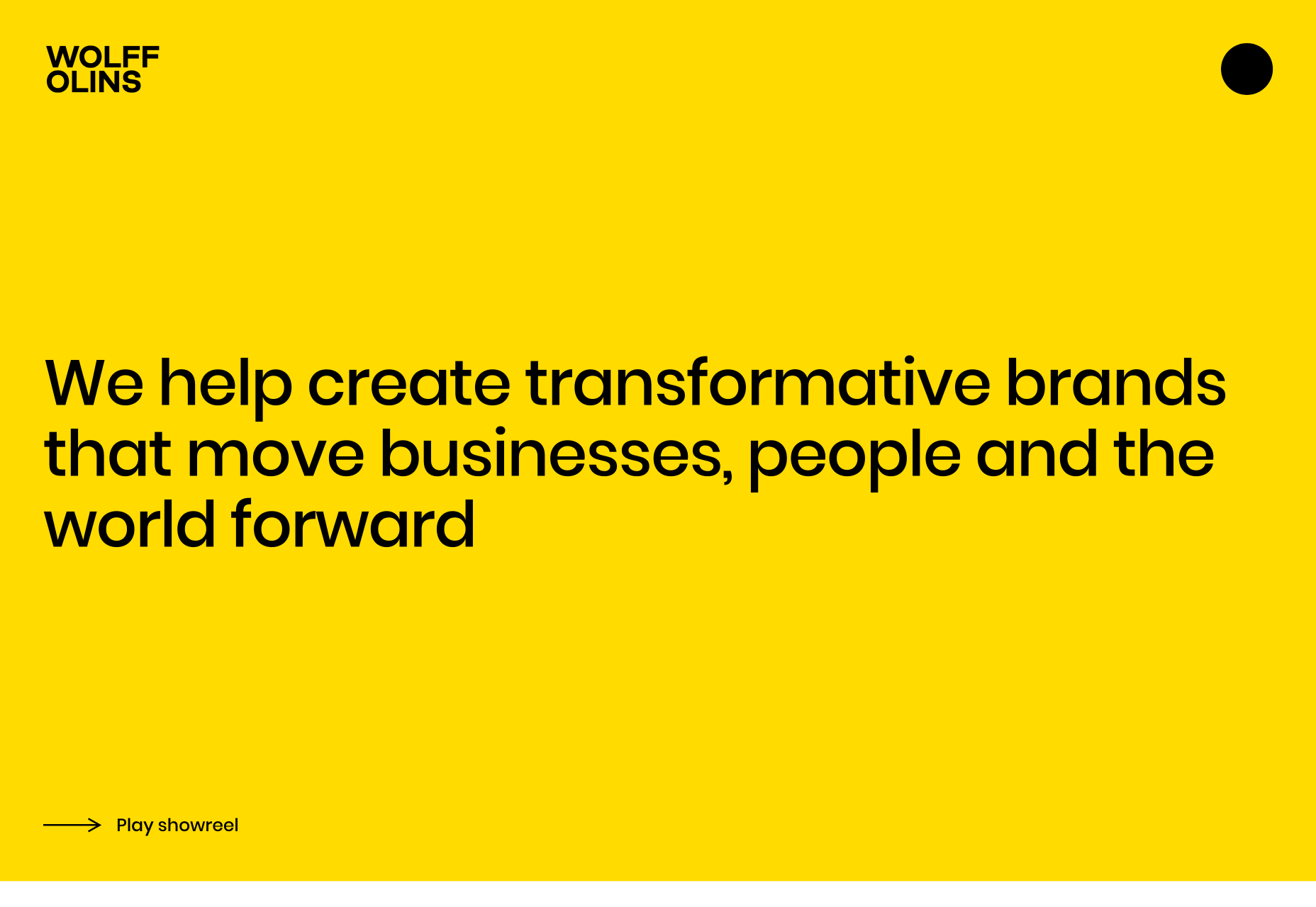
Wolff Olins
Globally renowned agency Wolff Olins’ new site is engagingly simple, but when a company like this embraces a trend, you know it’s got staying power. Edge-to-edge text, and a brutalist approach softened with color, are both evident.
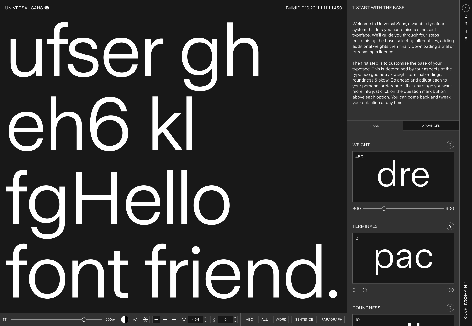
Universal Sans
Universal Sans is a variable font with a pretty awesome site that allows you to adapt the font for your own purposes. For many of us it’s as close as we’ll get to designing a typeface. Once you’re happy you can even buy your customized font.
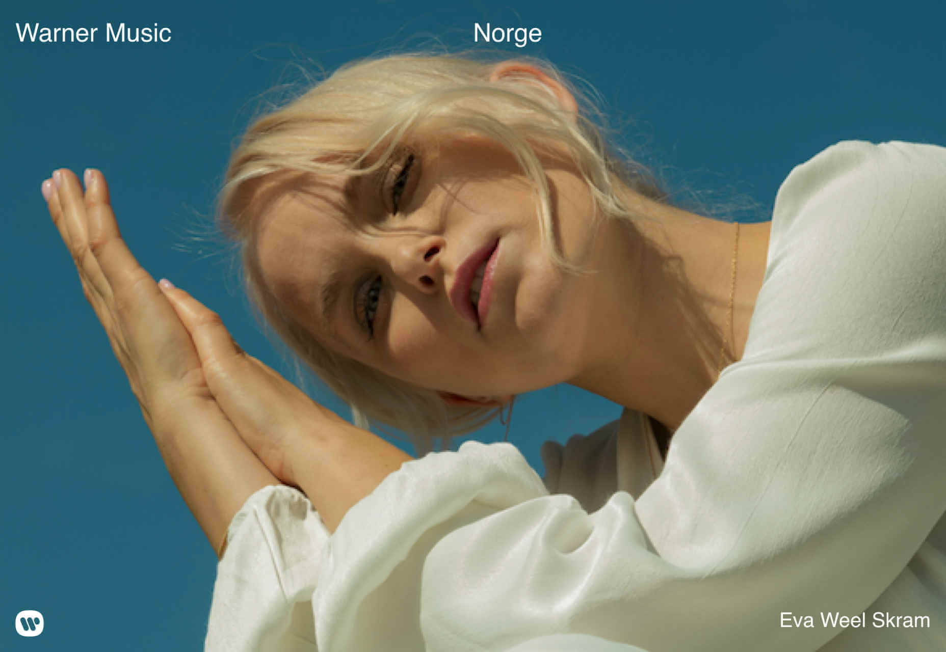
Warner Music Norway
Warner Music Norway embraces a traditional slider to highlight some of the artists it represents. It works because there’s no text to read, you either recognize the musician or you don’t. Scroll a little and you’ll find on-trend brutalism.
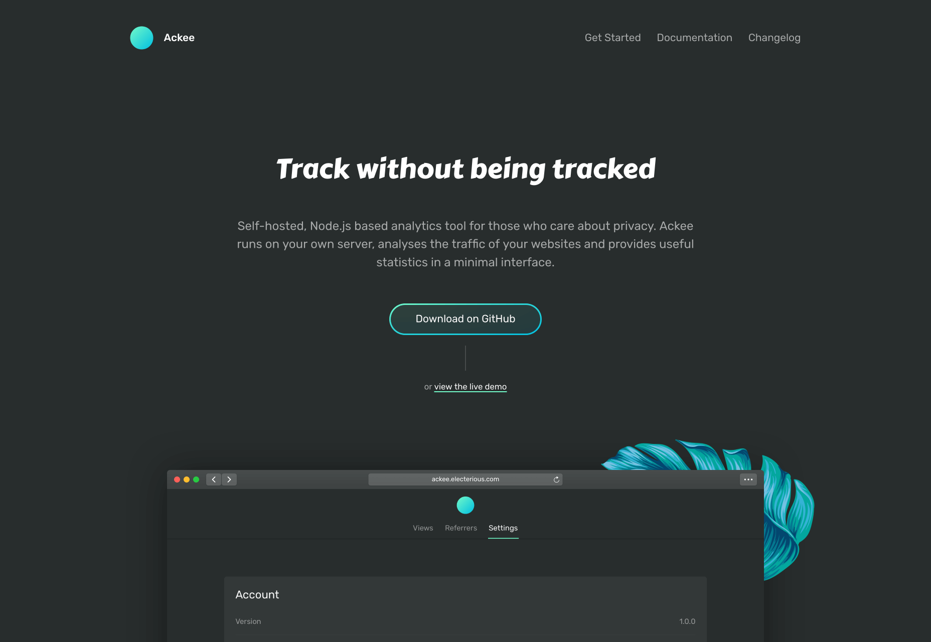
Ackee
Ackee is self-hosted analytics software. Its site opts for a bold typeface for headings, and makes use of some beautifully illustrated palms to introduce brand colors. The subtle animation does an excellent job of illustrating how the product works.
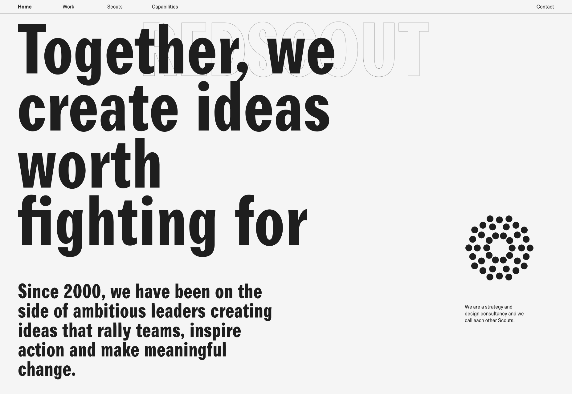
Redscout
Redscout‘s logo is big and bold, and stretches across the screen. It stays fixed in place as an outline as you scroll, before getting bold again when you reach the bottom of the page. The black text on white, and the overlapping grid is classic brutalism.
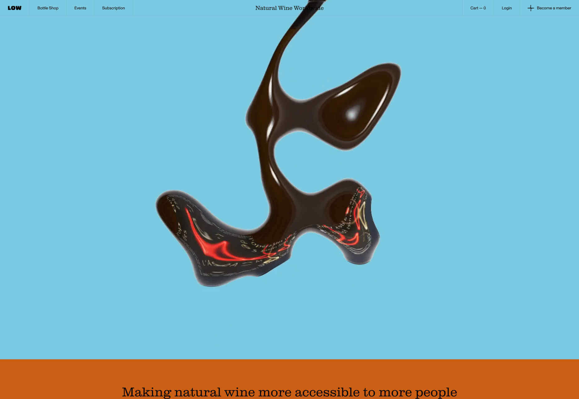
Low Intervention
Low Intervention embraces several of the current trends, most notably the liquid effect, and brutalism toned down by the use of a sophisticated color palette. Brutalism is still the dominant theme, with edge-to-edge content, and little whitespace.
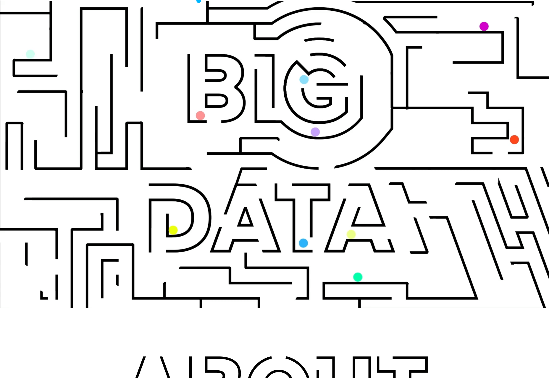
Marble
Marble‘s purpose is to bring together art and science to tackle some of the problems faced by children around the world. Its delightful site features maze-like text, with dozens of marbles rolling around referencing both problem solving, and play.
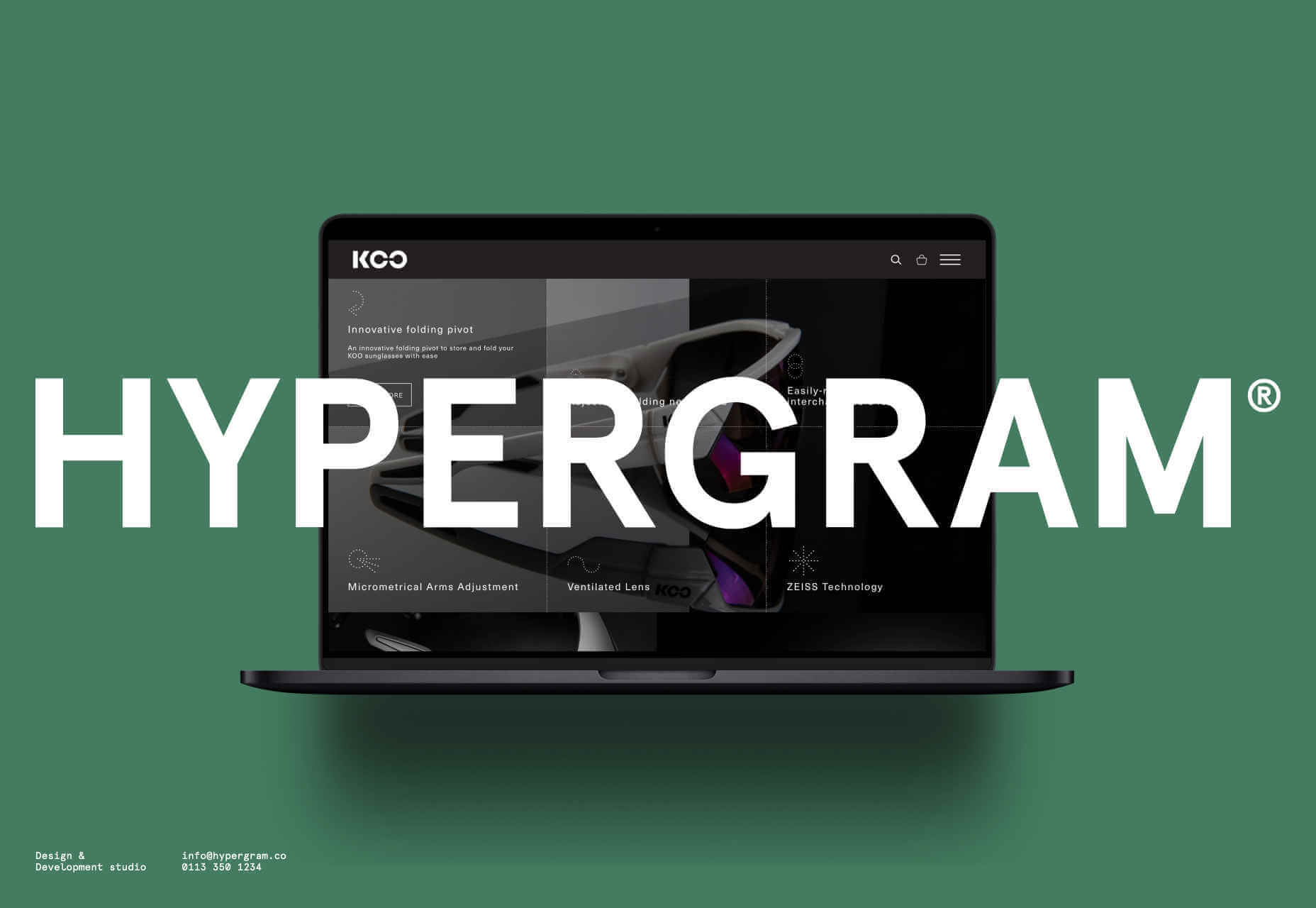
Hypergram
Never let it be said that you can’t make the logo bigger. Hypergram‘s logo takes up the entire page, obscuring the portfolio. The changing background color is a nice effect, and offsets the work in the slideshow perfectly.
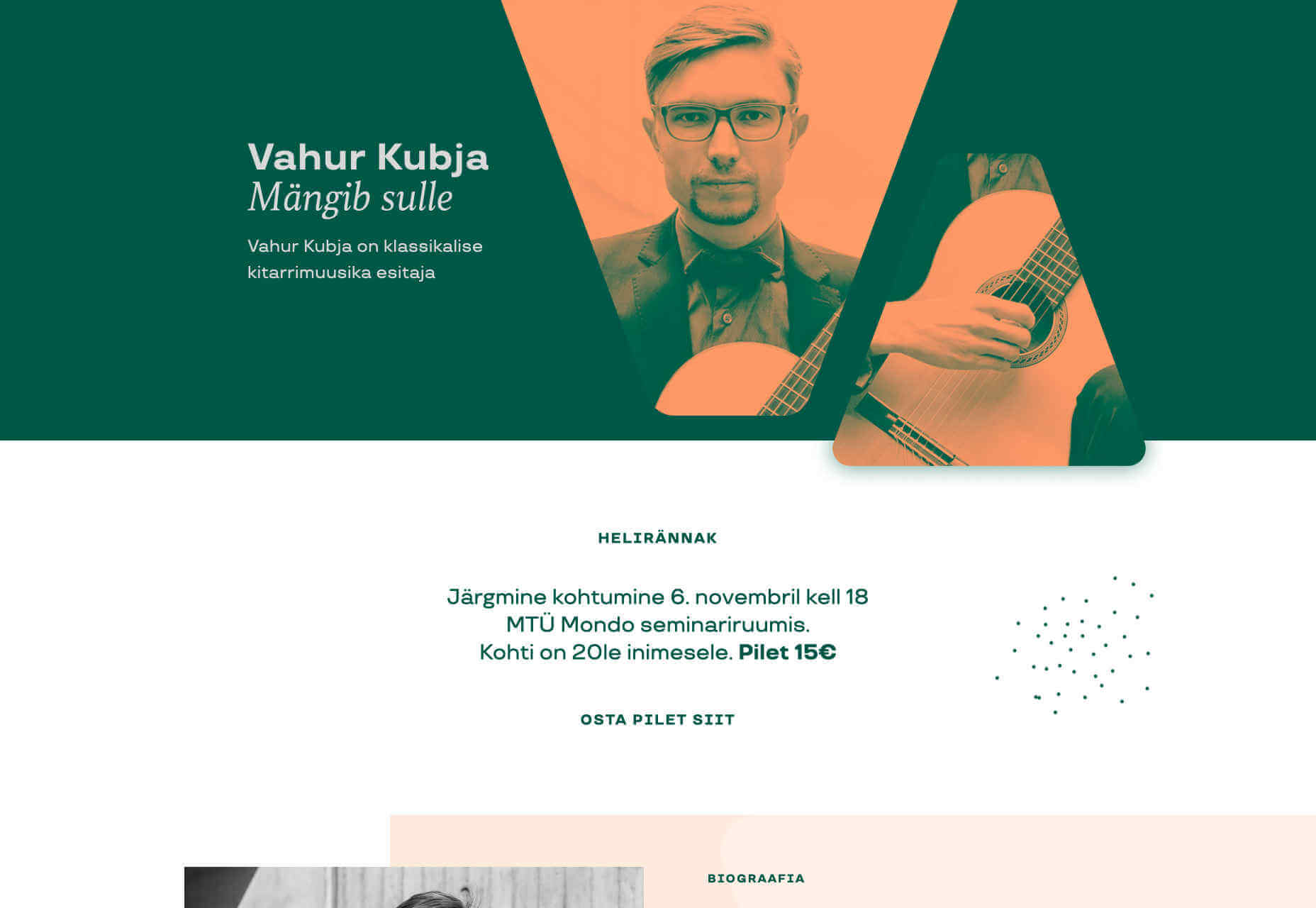
Vahur Kubja
Vahur Kubja’s site is one of the first sites we’ve seen to adopt the latest design trend: it’s relentlessly brutalist in all but one respect, the color scheme is a sophisticated minimalist palette of green, peach, and pink.
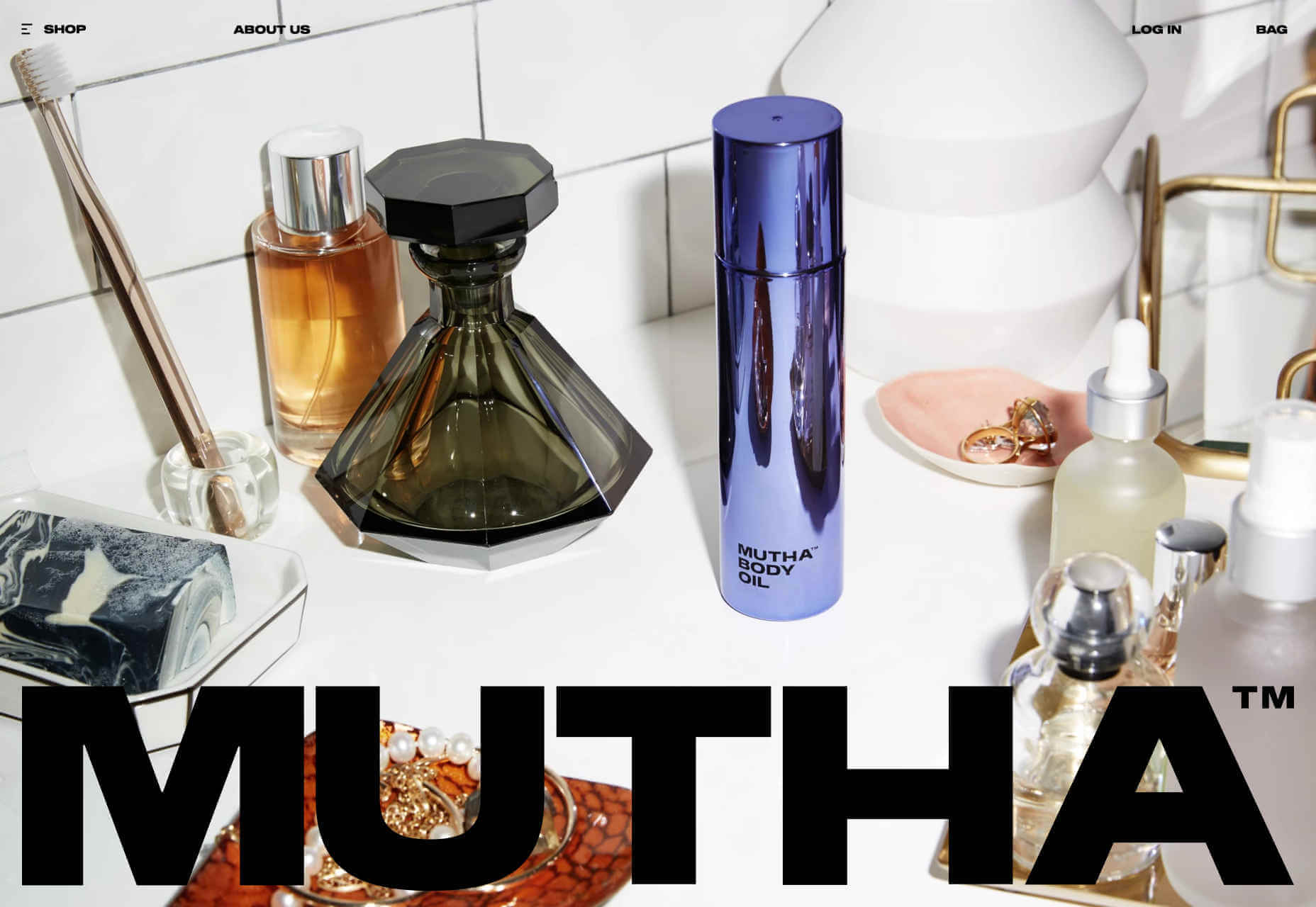
Mutha
Mutha’s site is big, brash, and bold. With heavy black text. Not the style you’d expect of a skincare company — which would typically be light, gentle, and unassuming. Which is exactly why this brutalist site stands out.
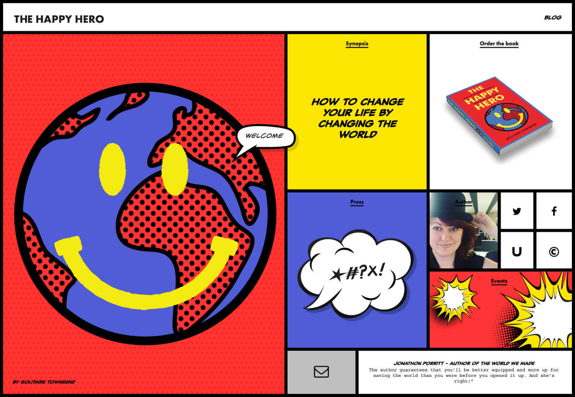
The Happy Hero
If you’re a big fan of this year’s brutalist trend, then you’ll love this micro-site for The Happy Hero, a self-help book about positivity. The site’s adopted brutalism and then subverted it, drawing inspiration from both Pop Art and De Stijl.
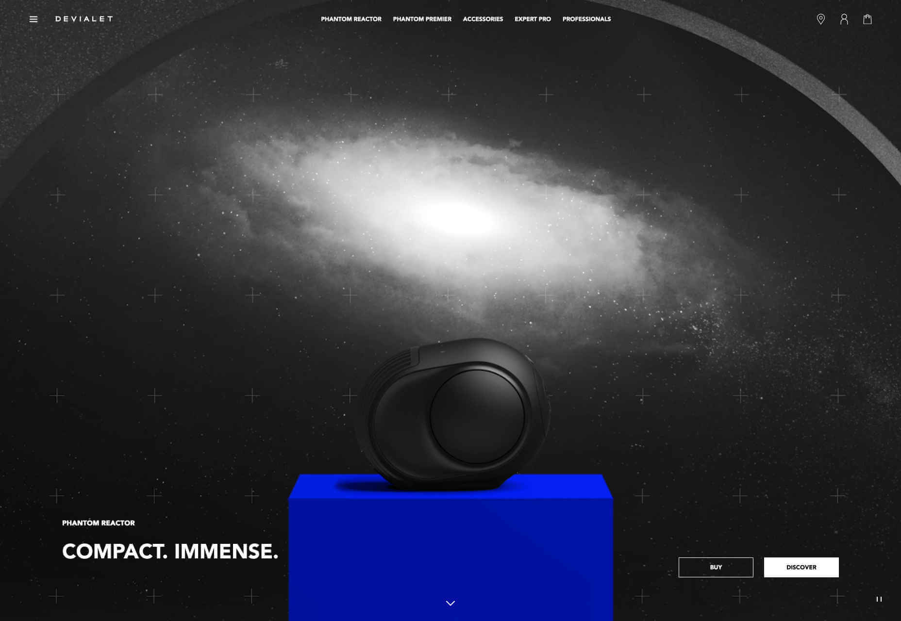
Devialet
Most people browse the web with the sound off, which presents a challenge to companies selling audio products. Devialet solves the problem brilliantly, with a swirling galaxy creating the impression of depth, range, and power.
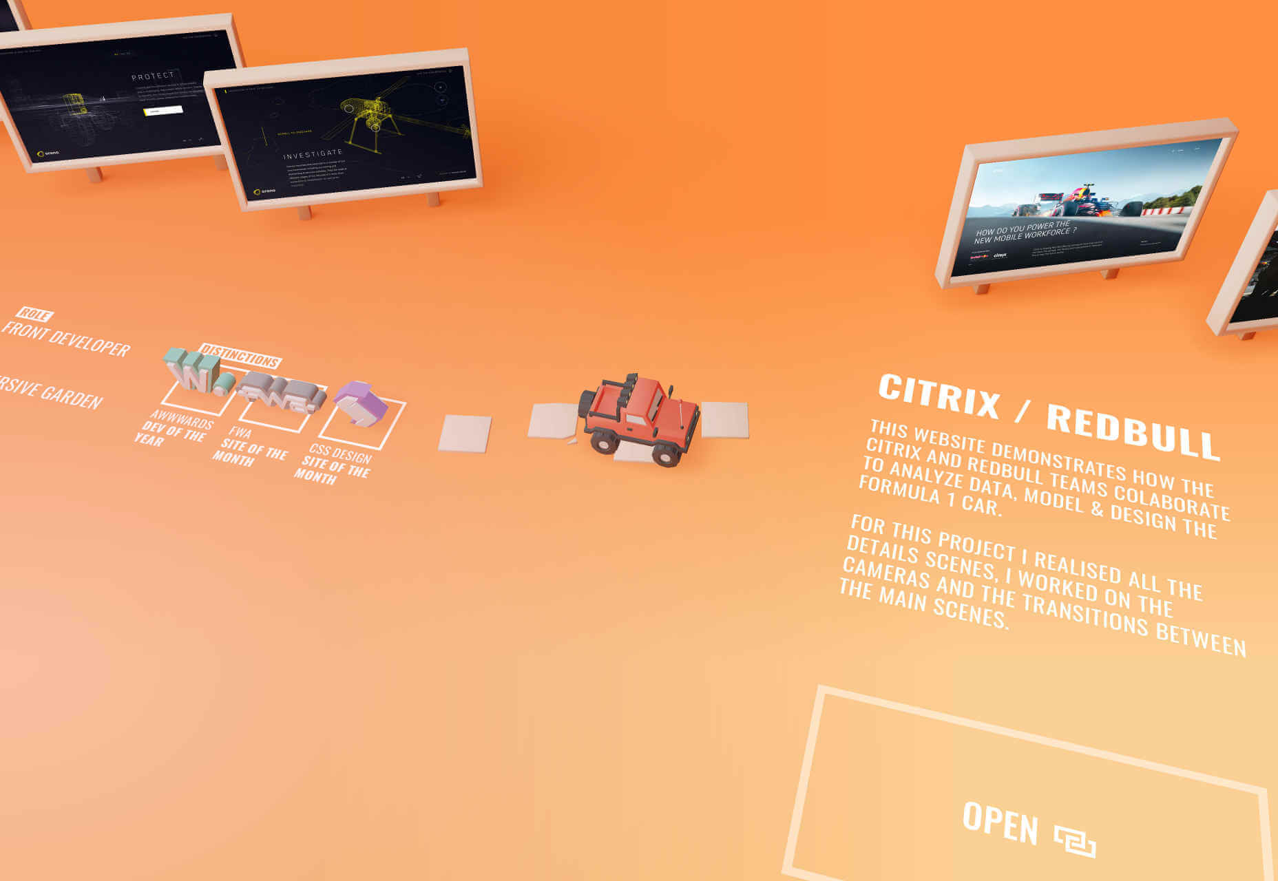
Bruno Simon
What can you say about Bruno Simon’s site, other than you have to play it to understand it. Drive the toy truck around the site, knocking over awards and breaking the scenery. It’s not practical, but it’s fun, and a great showcase for his skills.
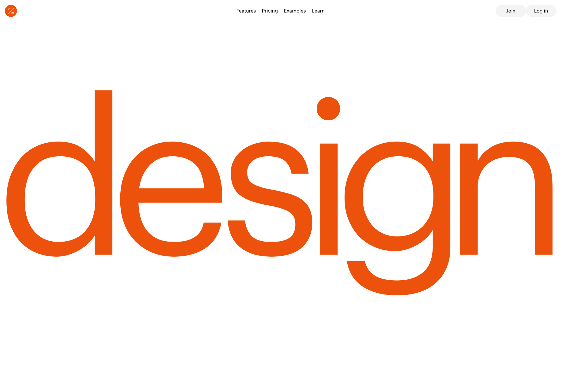
Readymag
Readymag is a browser-based design tool for creating simple sites. Its landing page features oversized typography, which is impactful, and fairly daring for a company of this type. They’re laying their cards on the table right away.
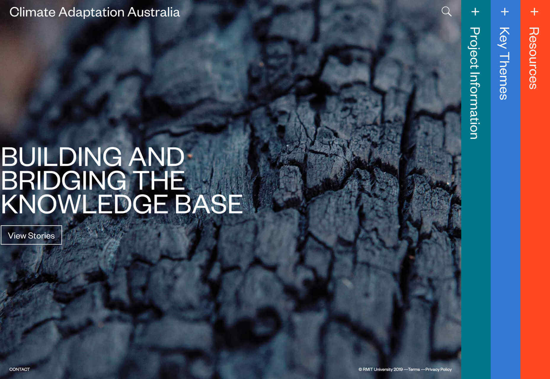
Climate Adaptation Australia
Alongside the nice, bold menu system, Climate Adaption Australia features one of the very few effective sliders you’ll see. Sliders have largely been discredited as a design pattern with poor user experience, but in this case it works.
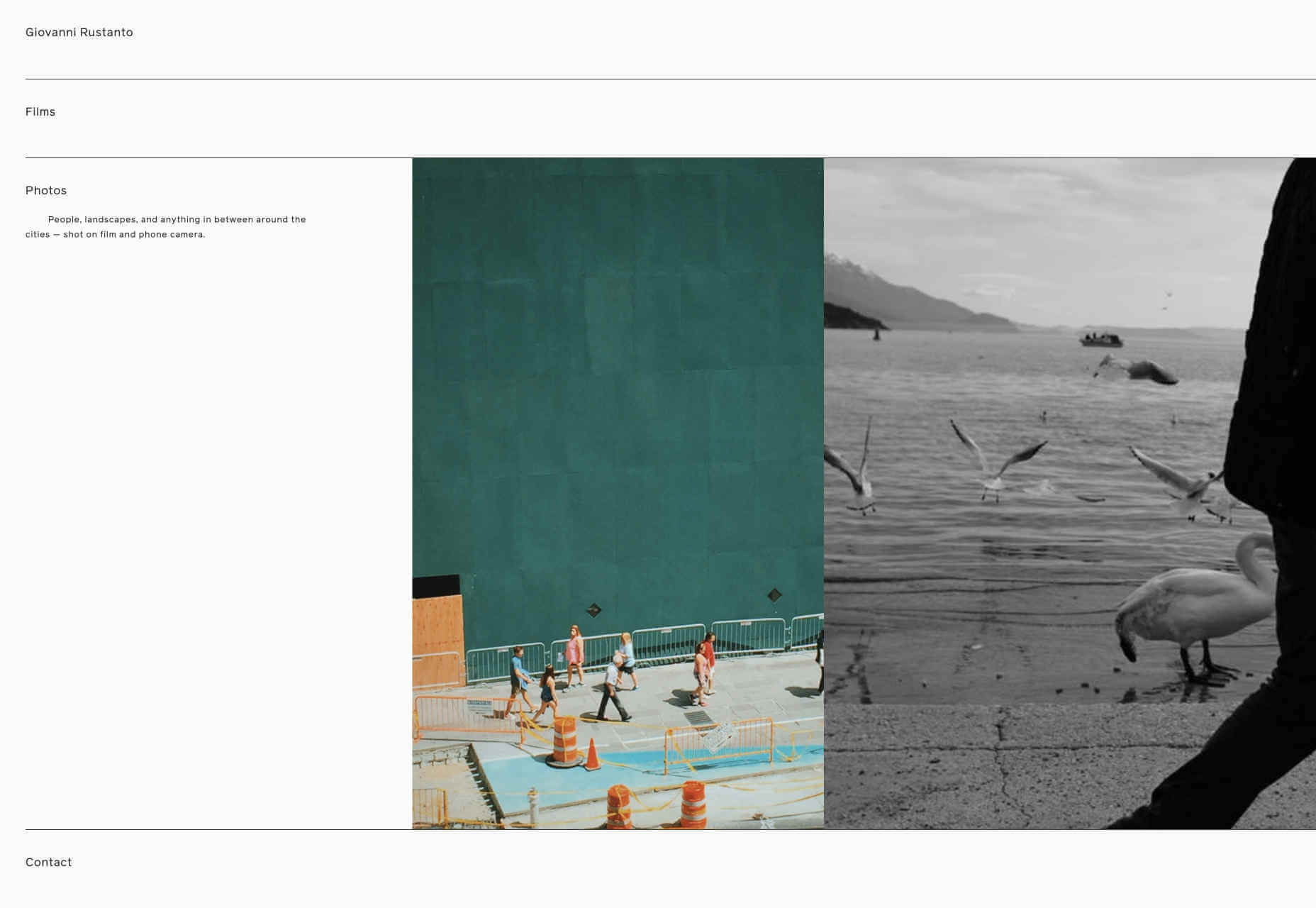
Giovanni Rustanto
If brutalism is too much for you, you can let out a sigh of relief with this one. Giovanni Rustanto’s site is elegantly minimal in both visuals, and interaction. The pleasing burst of terracotta right at the end adds some much needed flavor to the color palette.
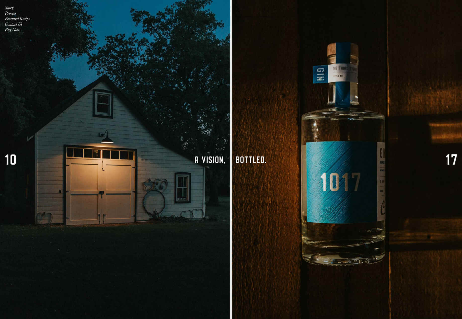
1017 Gin
1017 Gin’s site is a high-class mix of glossy magazine layout, and coffee-table book. The one-pager is understated, with just a nod to trends with undersized images. The way the page splits when you click buy, is lovely, because it’s unexpected.
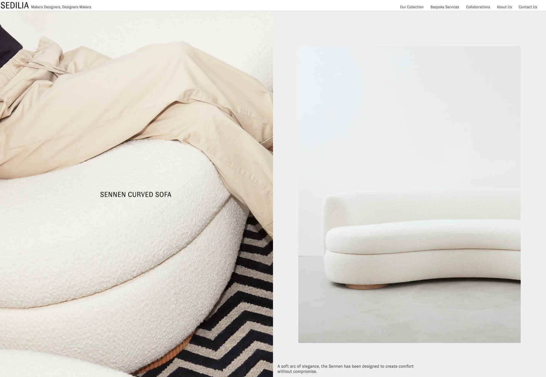
Sedilia
Sedilia is a minimalish site, that exudes comfort, simplicity, and style. The product photography is great, but it’s the framing that makes the difference. The site also features excellent typography and an unusual choice of font (it’s GT Zirkon).
Gyro
Gyro is another site that features over-sized typography, and again it’s the company logo. Move your cursor and it explodes in an interesting 3D effect. Gyro also has all the hallmarks of brutalism, tempered by a lovely color palette.
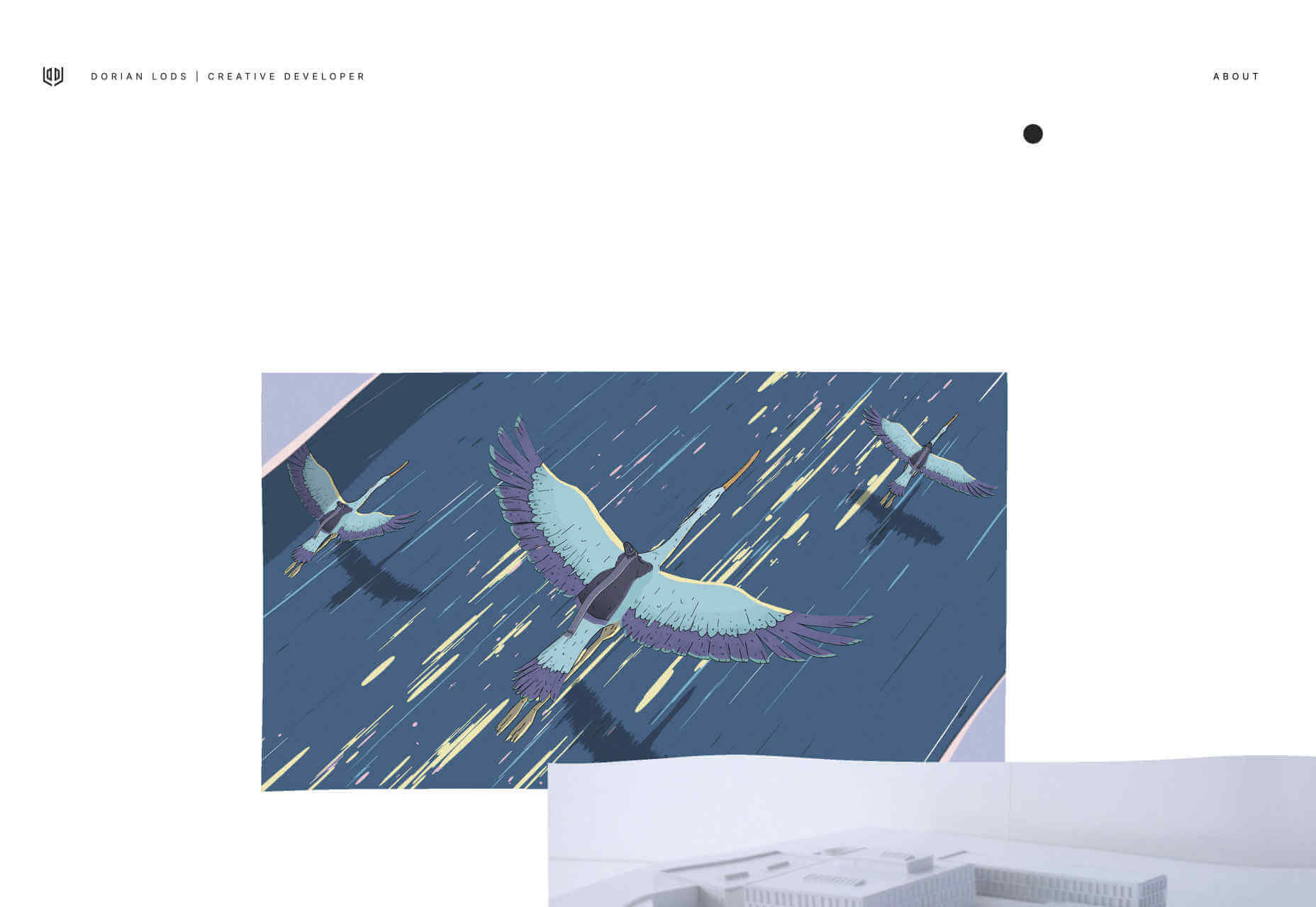
Dorian Lods
Dorian Lods’ site is another example of the trend common among developers at present: a liquid effect. This is a particularly standout version, not least thanks to the way it integrates into the rest of the site, as a device, not a crutch.