The year might be coming to an end, but plenty of design trends are still beginning to emerge. It’ll be interesting to see how many of these website design elements remain popular into the new year. From vintage elements to circles to happier feelings, there’s a lot to play with here.
Here’s what’s trending in design this month…
Old-School Print Inspired
Vintage design elements seem to circle back in new iterations at a pretty frequent pace. This time website designers are finding inspiration from old-school print design.
These projects mimic the look of old newspapers and magazines with styles that look like news or advertising content. One of the most exciting takeaways might be color, with beige backgrounds that almost seem like aged paper.
Note the font choices, scale, and imagery as well. All of these things have an old-school feel that’s modern enough to help encourage interaction.
Each of these designs keeps visitors engaged with trendy effects that pair with the vintage aesthetic so that while there’s an old-school look, the overall design is modern and fresh.
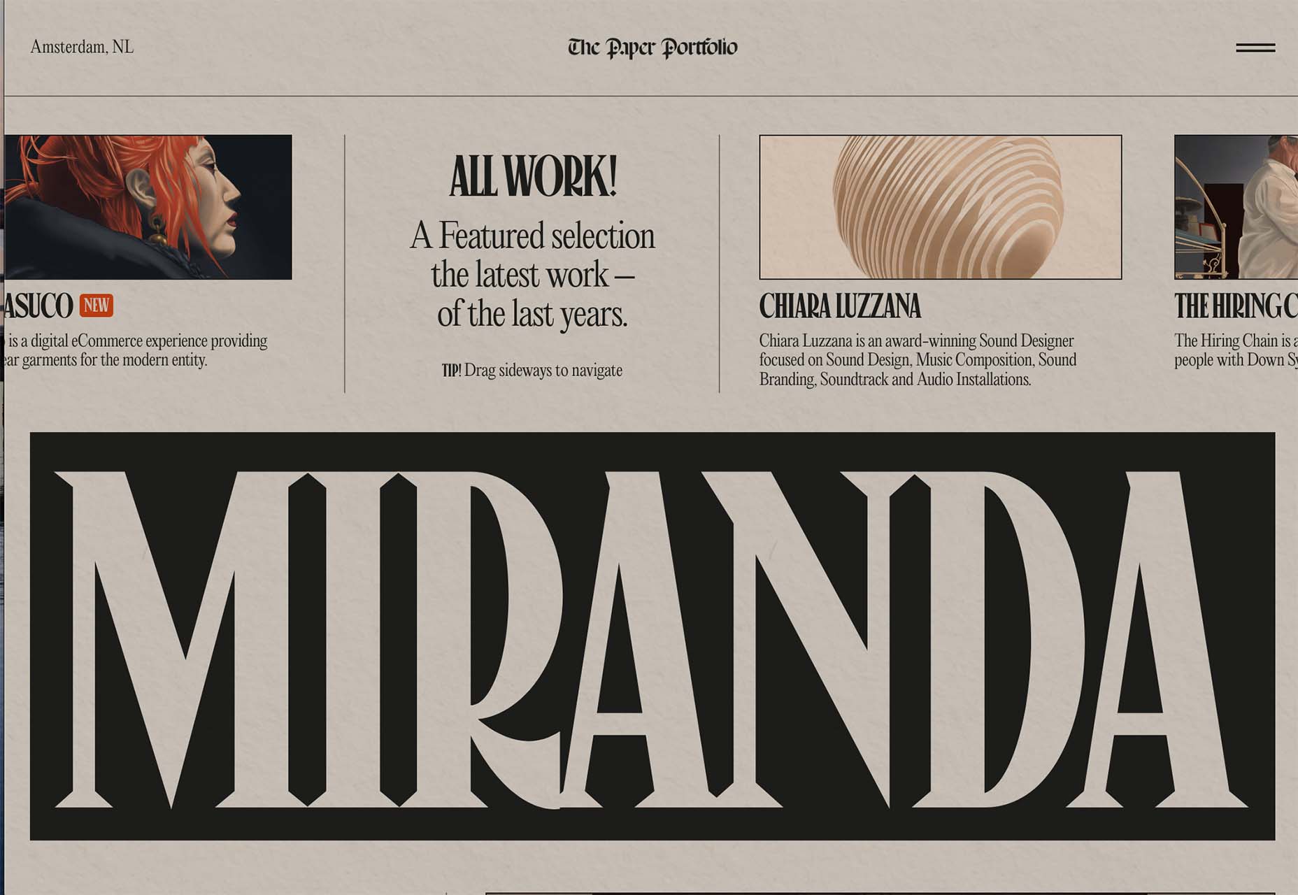
The portfolio of Niccolo Miranda feels like a “WAR” day on the front page of a major newspaper, but with modern touches – computer illustrations, animated images, and button-style icons.
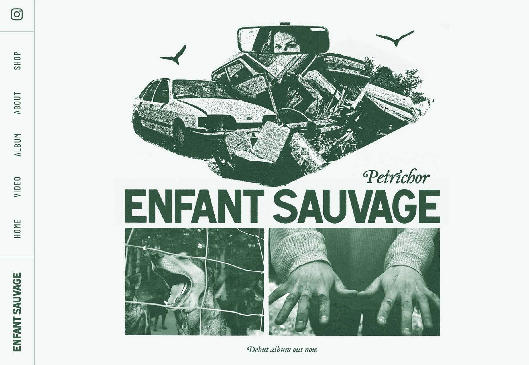
Enfant Sauvage Music takes on the feel of an old-style newspaper or magazine ad with a single color design and grainy imagery. An oversized funky pointer on hover and side navigation keeps the design interesting.
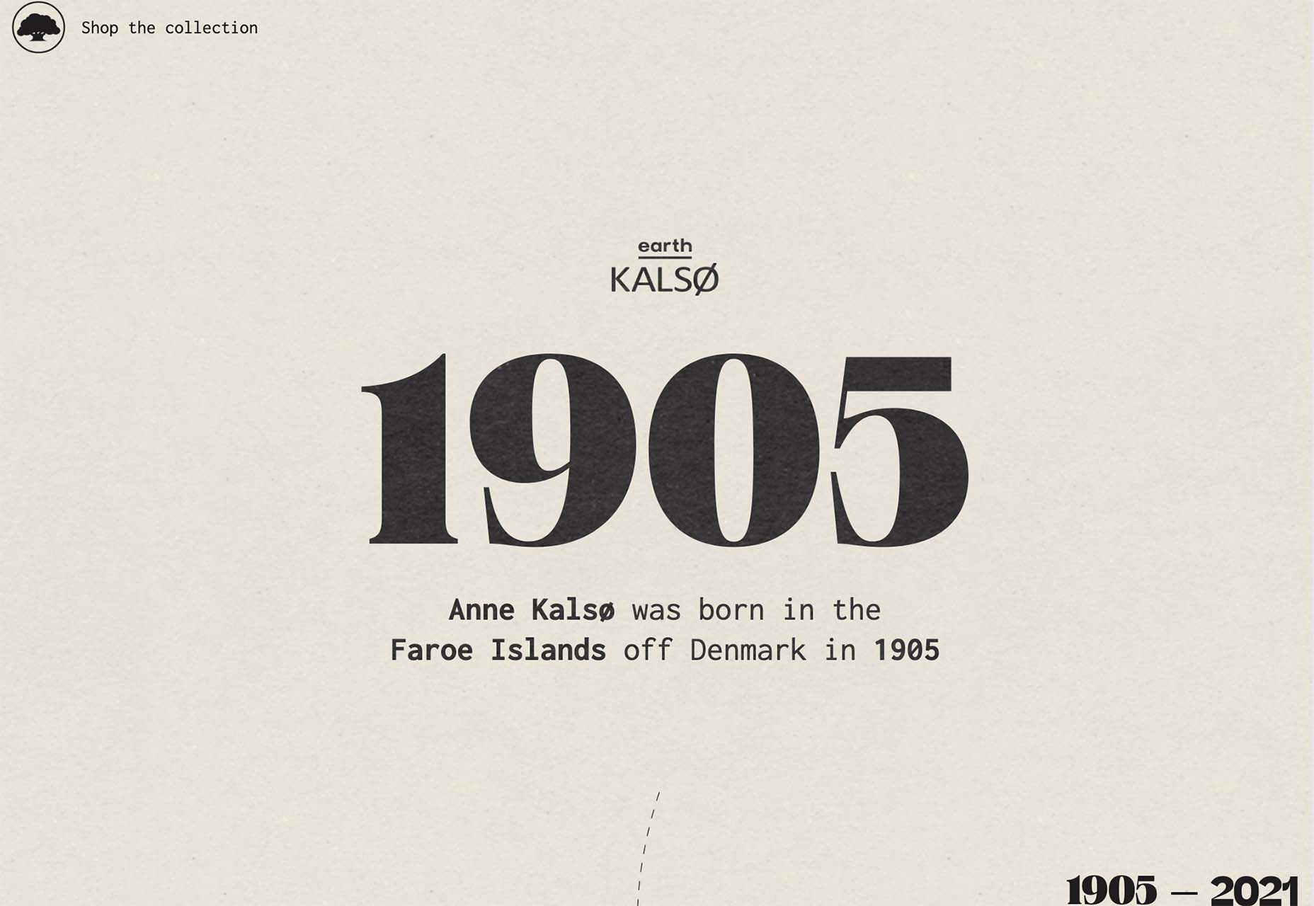
Kalso uses a giant timeline with typography and effects that mimic the era on the screen. Animation and motion keep the design with the times and on-trend.
Center-Screen Circles
Circles seem to be a website design trend that just never goes out of style – it only evolves.
The newest iteration includes center-screen circles. And you can use them in all kinds of different ways. The nice thing about a circle is the shape is innately harmonious and can pull a design together and make everything feel together and unified.
They can be an excellent container for text or other elements or serve as a button.
Circles work with almost any overall design pattern, in any color, and with virtually any type of image or video. The shape is practically perfect! (That’s why it’s a trend that never really gets old.)
Each of these examples uses a center-screen circle in a slightly different way.
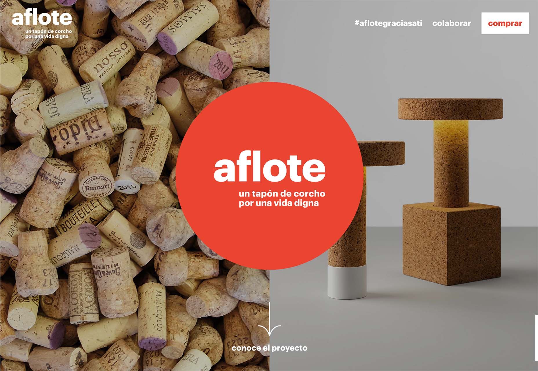
Aflote uses a center circle as part of its overall branding effort and to help draw the eye from the split-screen images to the center arrow, encouraging users to scroll to the next bit of content. Color helps here, and the circle is a container for brand and some other content with a nice layer on top of the images.
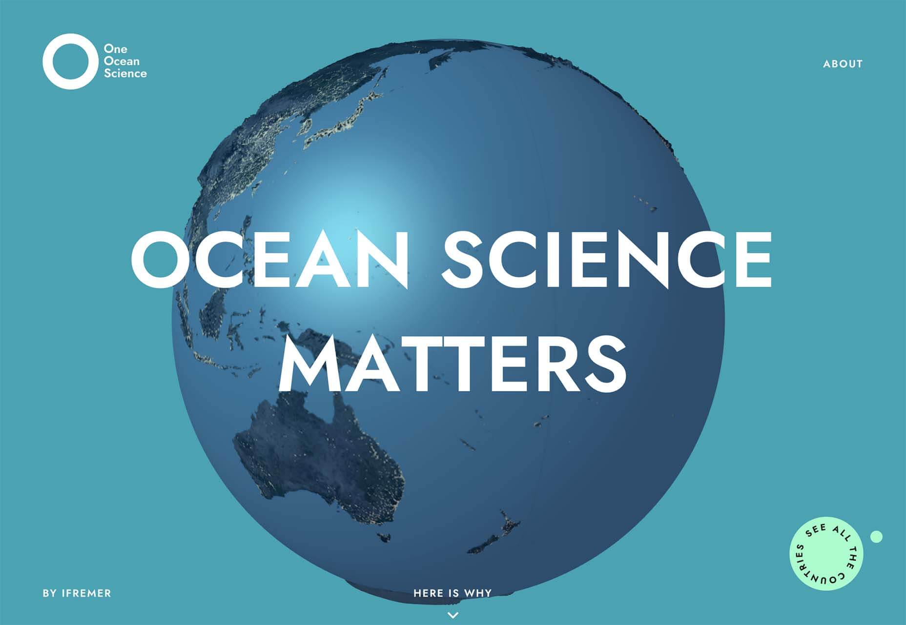
One Ocean Science uses one of the oldest circles we know – the globe – as a dominant art element that rotates in the center of the screen. The layer on top – the exact text in multiple languages – gets extra attention thanks to the center placement. The design also uses a top left corner circle for branding and a bottom right corner circle as a CTA, helping create a visual flow through the design from top to center to bottom to click.
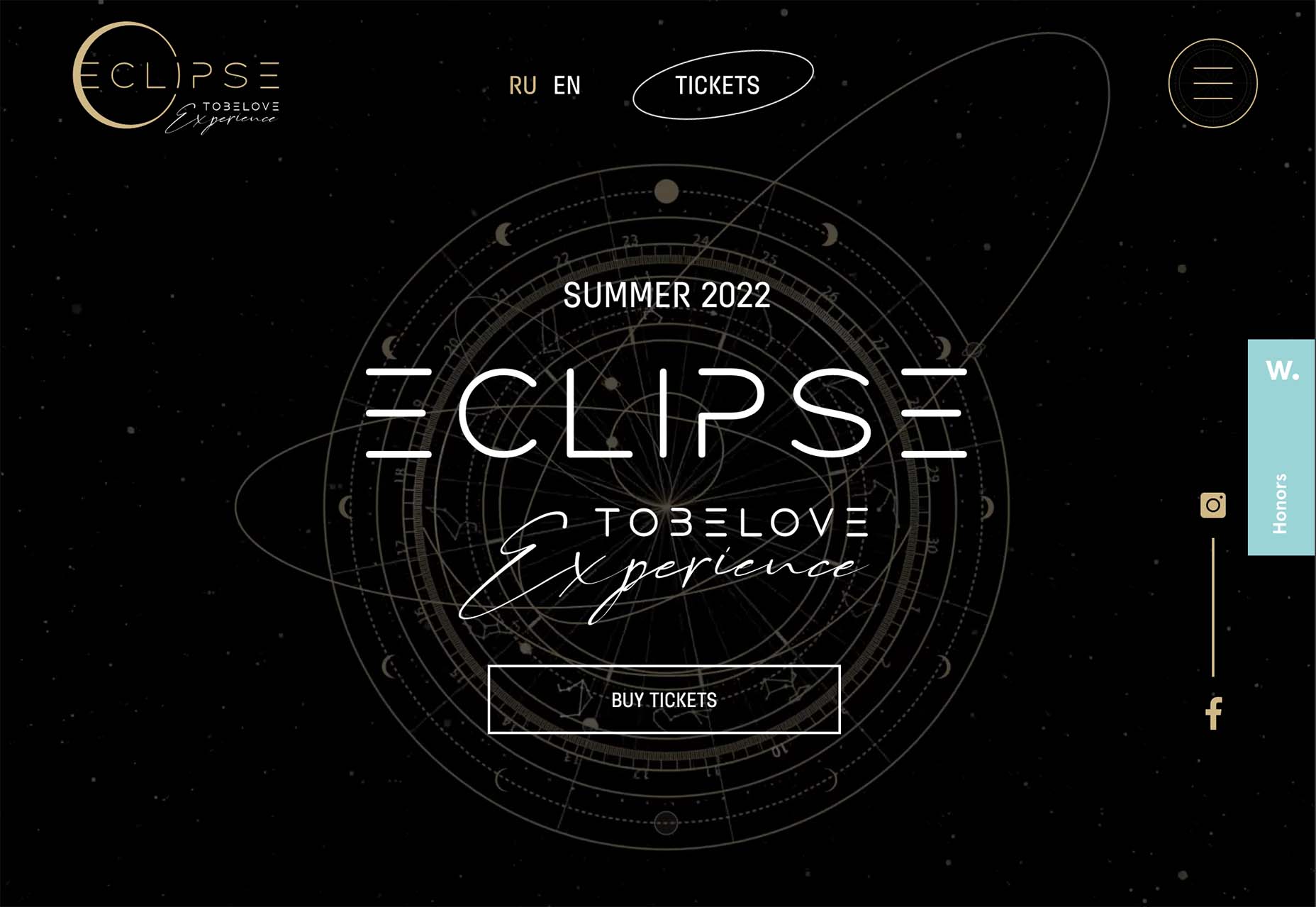
To Be Love uses a fantastic animated set of concentric circles to pull together the name of the event and draw interest to the CTAs. The circle is just the right size in a sea of black sky to draw the eye to the content in the middle of the screen.
Lighter, Happier Designs
After a couple of years of pandemic life and a world that’s just been a little less than cheery, website designers include lighter, happier elements to projects. This might just be the design trend we all need right now.
This effect can be designed in several ways, including color, imagery, animation, scale, and even typography. It’s hard to pinpoint what makes a design lighter and happier until you see it, but when you do, you’ll know it. (It might just be that little grin at the corner of your mouth when you see it.)
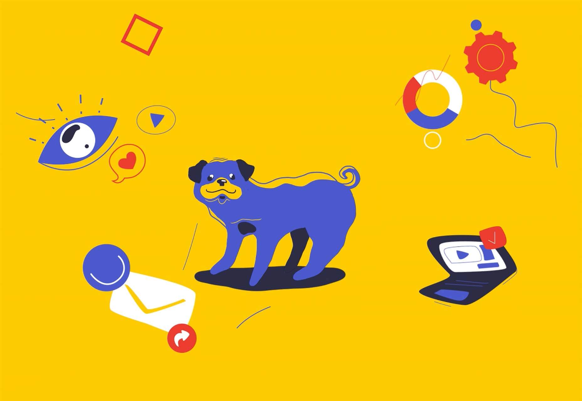
Meanpug uses fun, animated illustrations as a load screen with a full-text homepage (you’ll have to click through to see it). Between color and animation, you can’t help but feel good looking at the design. What might be most interesting is that the website is for a marketing agency that works with law firms. (Probably not what you expected at all.)
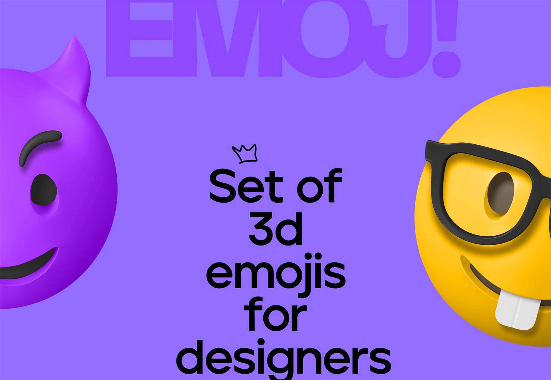
Happy smiling faces are hard not to feel good about. Even the devil emoji seems somewhat joyful. Add in big, bold typography and the yellow smiley, and the world just feels a little less dark.
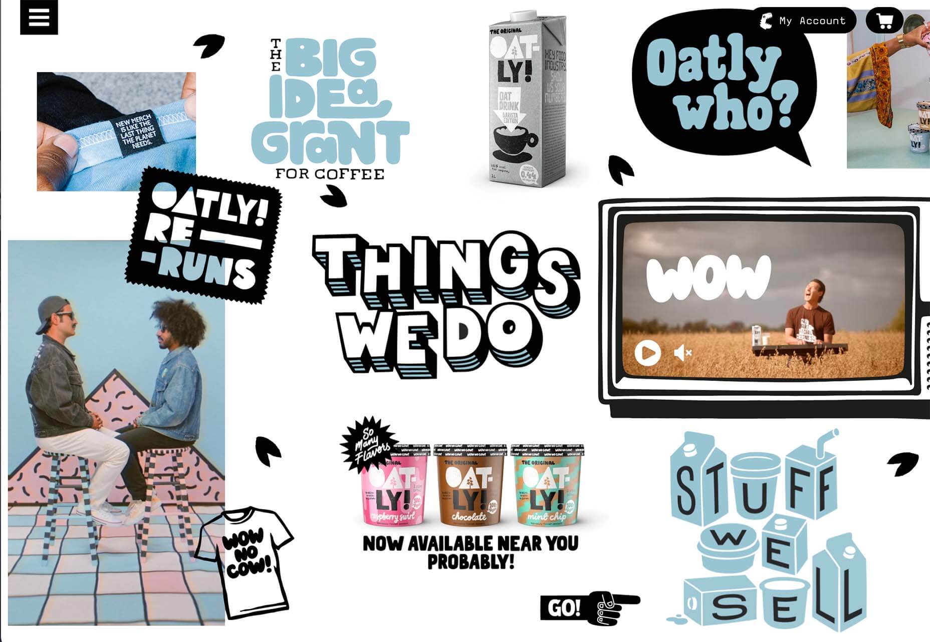
Oatly uses lots of small elements in a cartoon-style aesthetic that is light and interesting. In addition to fun fonts and animation, all of the words on the website also contribute to a feeling of ease and happiness. It’s a solid strategy for sales; make people feel good about what they are thinking of buying to help propel them toward a purchase.
Conclusion
One of the most exciting things that we’ve seen with design trends in the past year is how world events – from the pandemic to isolation to working remotely – have impacted design projects as a whole.
We’ve seen fewer faces, more illustrations and typography, and an overall shift in feeling to some of the lighter, happier design elements featured here. Cheers to 2022!
The post 3 Essential Design Trends, December 2021 first appeared on Webdesigner Depot.