Archive

Archive for March, 2011

Vandelay Premiere Textures Giveaway: Winners Announced!

March 28th, 2011 No comments
premium-texture-bundle-giveaway

Thanks to everyone who commented on the great premium textures giveaway sponsored by Vandelay Premiere!

The winners are:

Ruan Cowley
Su Hall
Payton H.

Congratulations!

Check your email soon for the prizes!

Categories: Others Tags:

Easy Percentage Grid System with HTML5

March 22nd, 2011 No comments

Web grid systems help front end coders to layout a document faster. In this article I am presenting a percentage based grid system that is included in the Easy framework’s CSS.

The main characteristics of this grid system is that all the columns have percentage based width so they adapt to the container element. It means that with using this system you will not have to define a width of each column by hand, you can simply throw it inside any container and the column widths and column gutters will be automatically set.

This system supports up to 6 equal width columns, so you can choose anywhere from 2 to 6 columns in the set. In each column set you can have double, triple, quadruple or even quintuple columns. The column gutters are set to 2 percent for each column set, so in case you have different column sets in one container you will have equal column gutters.

Naming the columns and column containers

Grid system often compromise the semantics. Unfortunately that is something we have to live with if we want to use this kind of approach.
Important thing about Easy Percentage Grid System is that column containers must have the base class name cols (as in columns – plural) while each column must have a class name col (column – singular). By using this base classes alone the grid system can properly display two equal columns. So this code

<div class="cols">
    <div class="col first"></div>
    <div class="col"></div>
</div>

can be used for creating 2 equal columns. Note the class name first. I am using it (along with :first-child pseudo selector) to erase the left margin for the first column.

If you want to create more than 2 column set you need to add a class name colsX to the container where X represents the number of columns in the set. Here’s a sample:

<div class="cols cols4">
    <div class="col first"></div>
    <div class="col"></div>
    <div class="col"></div>
    <div class="col"></div>
</div>

If you need to include a column with multiple width (double or triple width column) you can add a class name colX where X is the number that defines how wide the column is. Again note the singular here! Here’s an example of 5 columns set where second column is double the width of the default ones.

<div class="cols cols5">
    <div class="col first"></div>
    <div class="col col2"></div>
    <div class="col"></div>
    <div class="col"></div>
</div>

Demos

Take a look at the demos to see how it all looks like.

So, to recap, Easy Percentage Grid System features:

  • place inside any fluid or fixed width container, without having to worry about each column width
  • supports up to 6 equal columns
  • supports multiple width columns (double width, triple width etc.)
  • column gutters have the same width for each column set
  • basic, solid CSS styling for HTML elements included

Download the Easy Percentage Grid System

Edit: Column Padding

It is possible to add side paddings to columns expressed in percentages too. The principle would be, add padding you desire to the “global” column definition (let’s say we want 1% side padding):

.col, .col2, .col3, .col4, .col5{
    float:left;
    display:inline;	
    margin-left:2%;
    padding:0 1%;
    background:#f1f1f1; /* only for demo purposes - remove this line */
    }

What we need to do is decrease the width of each column by double that percentage. Left padding 1% and right padding 1% makes 2% decrease in column width. So instead of 49% width for default column, it will now be 47%. You need to manually adjust the width for each column, but it’s not that big edit. I prepared a 1% side padding demo for you.

Take a look at the fixed width container demo with 1% side padding

Categories: Designing, Others Tags:

Easy Paginate jQuery plugin for pagination

March 9th, 2011 No comments

Today I am presenting a simple jQuery plugin I made. This plugin allows you to browse easily through the list of items with pagination controls. It is very easy to implement and very lightweight so it might come in handy to use in your own projects. It’s main purpose is to view certain number of list items at once, but it can also be set up to view one item by one.

Simple demo
Styled demo
Auto pagination
Download the plugin

How does it work?

The plugin takes a list of items, calculates a number of child elements of a certain object, divides it by step parameter (which can be easily adjusted) and generates “control buttons”. Controls are inserted immediately after the selected object in a form of ordered list.

For target object I recommend using unordered list, although plugin will work with any other type of element that contains any type of child elements. If you want to have it set up that way, child elements can be of a different type!

To apply this plugin you will of course need to link to jQuery library and the plugin js file:

<script type="text/javascript" src="https://ajax.googleapis.com/ajax/libs/jquery/1.4.4/jquery.min.js"></script>
  <script type="text/javascript" src="js/easypaginate.js"></script>

You will need to initiate the plugin:

<script type="text/javascript">
  
  jQuery(function($){ 
  $('ul#items').easyPaginate();
  }); 
  
</script>

This is the source code for the target object I am using in my example:

<ul id="items">
  <li>Page 1</li>
  <li>Page 2</li>
  <li>Page 3</li>
  <li>Page 4</li>
  <li>Page 5</li>
  <li>Page 6</li>
  <li>Page 7</li>
  <li>Page 8</li>
  <li>Page 9</li>
  <li>Page 10</li>
  <li>Page 11</li>
  <li>Page 12</li>
  <li>Page 13</li>
  <li>Page 14</li>
</ul>

This is the generated source code for control buttons (inserted immediately after the target element):

<ol id="pagination">
  <li class="prev">Previous</li>
  <li class="current" data-index="1">1</li>
  <li data-index="2">2</li>
  <li data-index="3">3</li>
  <li data-index="4">4</li>
  <li class="next">Next</li>
</ol>

Options

There are several options you can modify. First and most important is the step parameter. Step parameter defines how many child items will be visible at a time. It is also used in calculating of number of pages. By default this parameter is set to 4. To use your own step value, change the step parameter:

jQuery(function($){
  
  $('ul#items').easyPaginate({
  step:3
  });
  
}); 

Here’s the full list of available options:

step

Default value: 4
Defines a number of items visible on each “page”.

delay

Default value: 100
Items on each “page” fade in one by one. This parameter controls the pause between each item’s appearance so we can create “wave” effect. It is defined in milliseconds.

numeric

Default value: true
Boolean. If set to true then the numeric pagination buttons will show.

nextprev

Default value: true
Boolean. If set to true then the next and previous pagination buttons will show.

auto

Default value: false
Boolean. If set to true then the plugin will automatically rotate the “pages”

pause

Default value: 4000
If set to auto pagination, this parameter controls the length of the pause in milliseconds between each “page turn”.

clickstop

Default value: true
If set to auto pagination, this parameter controls whether the pages will continue to automatically rotate. If you want to continue the rotation set this parameter to false.

controls

Default value: ‘pagination’
As mentioned, the plugin generates an ordered list for the purpose of navigating through “pages”. This parameter defines the list’s ID.

current

Default value: ‘current’
This parameter defines a class name of a current “page” in the numeric navigation. It is used for styling purposes.

If you want to create multiple paginations on the same page, have in mind that this plugin uses IDs to target control buttons so you need to define control id parameter for each pagination.

Enjoy!

Categories: Designing, Others Tags:

Premium Textures Giveaway from Vandelay Premiere

March 6th, 2011 No comments
vandelay-premier

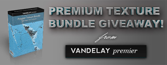
I am very pleased to announce that we have received some gorgeous Premium Texture Bundle‘s from the good folks over at Vandelay Premier to give away FREE to our readers!

What do you get?

Three lucky winners will get a free Premium Texture Bundle from Vandelay Premiere. High resolution textures are among the most popular resources at Vandelay Premier, and the Premier Texture Bundle includes 100 textures (up to 4000 pixels by 3000 pixels) of all kinds, including paper, concrete, stone, bark, wood, grunge, and more. The bundle normally sells for $19.

textures-preview

Who is Vandelay Premiere?

Vandelay Premier offers high-quality design resources including textures, brushes, vectors, icons, PSD files, templates, and more. Resource packs can be purchased individually, or memberships are available to get unlimited access to all of the resources on the site. At the moment there are more than 200 resource packs and more than 2,500 total resources available, and new ones are added several times each week.

How do you enter?

To enter the contest simply leave a comment on this post. We’ll select 3 random winners to get the Premier Texture Bundle.

That’s all?

Yes, that’s all there is to it. Just leave a comment and you have a chance to win one of these fabulous texture packs.

Liscense Info

Like all of the other design resources at Vandelay Premier, the textures come with an extended license that allows for personal and commercial use on an unlimited number of projects. This also includes use in items that are created for mass distribution, such as templates, WordPress themes, t-shirts, business cards, etc.

The winners will be picked on Tuesday, March 29 2011.

The post Premium Textures Giveaway from Vandelay Premiere first appeared on High Resolution Textures.

Categories: Others Tags:

Premium Textures Giveaway from Vandelay Premiere

March 6th, 2011 No comments
vandelay-premier

I am very pleased to announce that we have received some gorgeous Premium Texture Bundle‘s from the good folks over at Vandelay Premier to give away FREE to our readers!

What do you get?

Three lucky winners will get a free Premium Texture Bundle from Vandelay Premiere. High resolution textures are among the most popular resources at Vandelay Premier, and the Premier Texture Bundle includes 100 textures (up to 4000 pixels by 3000 pixels) of all kinds, including paper, concrete, stone, bark, wood, grunge, and more. The bundle normally sells for $19.

textures-preview

Who is Vandelay Premiere?

Vandelay Premier offers high-quality design resources including textures, brushes, vectors, icons, PSD files, templates, and more. Resource packs can be purchased individually, or memberships are available to get unlimited access to all of the resources on the site. At the moment there are more than 200 resource packs and more than 2,500 total resources available, and new ones are added several times each week.

How do you enter?

To enter the contest simply leave a comment on this post. We’ll select 3 random winners to get the Premier Texture Bundle.

That’s all?

Yes, that’s all there is to it. Just leave a comment and you have a chance to win one of these fabulous texture packs.

Liscense Info

Like all of the other design resources at Vandelay Premier, the textures come with an extended license that allows for personal and commercial use on an unlimited number of projects. This also includes use in items that are created for mass distribution, such as templates, WordPress themes, t-shirts, business cards, etc.

The winners will be picked on Tuesday, March 29 2011.

Categories: Others Tags: