Microsoft Edge is now used on 9.54 percent of desktops worldwide, a mere 0.3 percent behind Apple’s Safari, which stands at 9.84 percent. Google Chrome continues to hold first place with an overwhelming 65.38 percent of the market. Mozilla Firefox takes fourth place with 9.18 percent.
In January 2021, Safari held a 10.38 percent market share and appears to be gradually losing users to rival browsers over time. If the trend continues, Apple is likely to slip to third or fourth place in the near future.
Scoping the data down even by continent is entirely different. Like in Europe, Edge has already passed Safari, but in North America, the gap is still 5%.
What does it matter to you or me? Nothing, I hope. These global stats should mean very little to us, outside a little casual nerdy cocktail party chatter. Please don’t make decisions about what to support and not support based on global statistics. Put some kind of basic analytics in place on your site, get data from actual visits, and make choices on that data. That’s the only data that matters.
Globally, IE’s current market share is under 0.5%. And even in Japan, which has a higher market share of IE compared to other countries, IE’s market share is close to 2% and has a downward tendency.
Until now we kept supporting IE due to its market share. But now, there are basically no good reasons to keep supporting IE.
Again it seems so bizarre to me that any of us would make a choice on what to support based on a global usage statistic. Even when huge players make choices, they do it based on their own data. When Google “dropped” IE 11 (they still serve a perfectly fine baseline experience), they “did the math.” WordPress, famously powering somewhere in the “a third of the whole internet” range, factored in usage of their own product.
Even if you’re building a brand new product and trying to make these choices, you’ll have analytic data soon enough, and can make future-facing support choices based on that as it rolls in.
We’ve discussed a lot about the internals of using CSS in this ongoing series on web components, but there are a few special pseudo-elements and pseudo-classes that, like good friends, willingly smell your possibly halitotic breath before you go talk to that potential love interest. You know, they help you out when you need it most. And, like a good friend will hand you a breath mint, these pseudo-elements and pseudo-classes provide you with some solutions both from within the web component and from outside the web component — the website where the web component lives.
I’m specifically referring to the ::part and ::slotted pseudo-elements, and the :defined, :host, and :host-context pseudo-classes. They give us extra ways to interact with web components. Let’s examine them closer.
::part, in short, allows you to pierce the shadow tree, which is just my Lord-of-the-Rings-y way to say it lets you style elements inside the shadow DOM from outside the shadow DOM. In theory, you should encapsulate all of your styles for the shadow DOM within the shadow DOM, i.e. within a element in your element.
But sometimes we might need to style an element in the shadow DOM based on information that exists on the page. For instance, let’s say we have a page for each zombie in the undying love system with matches. We could add a class to profiles based on how close of a match they are. We could then, for instance, highlight a match’s name if he/she/it is a good match. The closeness of a match would vary based on whose list of potential matches is being shown and we won’t know that information until we’re on that page, so we can’t bake the functionality into the web component. Since the
is in the shadow DOM, though, we can’t access or style it from outside the shadow DOM meaning a selector of zombie-profile h2 on the matches page won’t work.
But, if we make a slight adjustment to the markup by adding a part attribute to the
Like a spray of Bianca in the mouth, we now have the superpowers to break through the shadow DOM barrier and style those elements from outside of the :
But you can add a part attribute on that element and style it via its own part name.
What happens if we have a web component inside another web component, though? Will ::part still work? If the web component appears in the page’s markup, i.e. you’re slotting it in, ::part works just fine from the main page’s CSS.
But if the web component is in the template/shadow DOM, then ::part cannot pierce both shadow trees, just the first one. We need to bring the ::part into the light… so to speak. We can do that with an exportparts attribute.
To demonstrate this we’ll add a “watermark” behind the profiles using a web component. (Why? Believe it or not this was the least contrived example I could come up with.) Here are our templates: (1) the template for , and (2) the same template for but with added a element on the end.
Since ::part(watermark) is only one shadow DOM above the , it works fine from within the ’s template styles. Also, since we’ve used exportparts="copyright" on the , the copyright part has been pushed up into the ‘s shadow DOM and ::part(copyright) now works even in external styles, but ::part(watermark) will not work outside the ’s template.
CodePen Embed Fallback
We can also forward and rename parts with that attribute:
Structural pseudo-classes (:nth-child, etc.) don’t work on parts either, but you can use pseudo-classes like :hover. Let’s animate the high match names a little and make them shake as they’re lookin’ for some lovin’. Okay, I heard that and agree it’s awkward. Let’s… uh… make them more, shall we say, noticeable, with a little movement.
The ::slotted CSS pseudo-element actually came up when we covered interactive web components. The basic idea is that ::slotted represents any content in a slot in a web component, i.e. the element that has the slot attribute on it. But, where ::part pierces through the shadow DOM to make a web component’s elements accessible to outside styles, ::slotted remains encapsulated in the element in the component’s and accesses the element that’s technically outside the shadow DOM.
In our component, for example, each profile image is inserted into the element through the slot="profile-image".
<zombie-profile>
<img slot="profile-image" src="photo.jpg" />
<!-- rest of the content -->
</zombie-profile>
That means we can access that image — as well as any image in any other slot — like this:
Similarly, we could select all slots with ::slotted(*) regardless of what element it is. Just beware that ::slotted has to select an element — text nodes are immune to ::slotted zombie styles. And children of the element in the slot are inaccessible.
The :defined pseudo-class
:defined matches all defined elements (I know, surprising, right?), both built-in and custom. If your custom element is shuffling along like a zombie avoiding his girlfriend’s dad’s questions about his “living” situation, you may not want the corpses of the content to show while you’re waiting for them to come back to life errr… load.
You can use the :defined pseudo-class to hide a web component before it’s available — or “defined” — like this:
:not(:defined) {
display: none;
}
You can see how :defined acts as a sort of mint in the mouth of our component styles, preventing any broken content from showing (or bad breath from leaking) while the page is still loading. Once the element’s defined, it’ll automatically appear because it’s now, you know, defined and not not defined.
I added a setTimeout of five seconds to the web component in the following demo. That way, you can see that elements are not shown while they are undefined. The
and the
that holds the components are still there. It’s just the web component that gets display: none since they are not yet defined.
CodePen Embed Fallback
The :host pseudo-class
Let’s say you want to make styling changes to the custom element itself. While you could do this from outside the custom element (like tightening that N95), the result would not be encapsulated, and additional CSS would have to be transferred to wherever this custom element is placed.
It’d be very convenient then to have a pseudo-class that can reach outside the shadow DOM and select the shadow root. That CSS pseudo-class is :host.
In previous examples throughout this series, I set the width from the main page’s CSS, like this:
zombie-profile {
width: calc(50% - 1em);
}
With :host, however, I can set that width from inside the web component, like this:
:host {
width: calc(50% - 1em);
}
In fact, there was a div with a class of .profile-wrapper in my examples that I can now remove because I can use the shadow root as my wrapper with :host. That’s a nice way to slim down the markup.
CodePen Embed Fallback
You can do descendant selectors from the :host, but only descendants inside the shadow DOM can be accessed — nothing that’s been slotted into your web component (without using ::slotted).
That said, :host isn’t a one trick zombie. It can also take a parameter, e.g. a class selector, and will only apply styling if the class is present.
:host(.high) {
  border: 2px solid blue;
}
This allows you to make changes should certain classes be added to the custom element.
You can also pass pseudo-classes in there, like :host(:last-child) and :host(:hover).
CodePen Embed Fallback
The :host-context pseudo-class
Now let’s talk about :host-context. It’s like our friend :host(), but on steroids. While :host gets you the shadow root, it won’t tell you anything about the context in which the custom element lives or its parent and ancestor elements.
:host-context, on the other hand, throws the inhibitions to the wind, allowing you to follow the DOM tree up the rainbow to the leprechaun in a leotard. Just note that at the time I’m writing this, :host-context is unsupported in Firefox or Safari. So use it for progressive enhancement.
Here’s how it works. We’ll split our list of zombie profiles into two divs. The first div will have all of the high zombie matches with a .bestmatch class. The second div will hold all the medium and low love matches with a .worstmatch class.
<div class="profiles bestmatch">
  <zombie-profile class="high">
    <!-- etc. -->
  </zombie-profile>
  <!-- more profiles -->
</div>

<div class="profiles worstmatch">
  <zombie-profile class="medium">
    <!-- etc. -->
  </zombie-profile>
  <zombie-profile class="low">
    <!-- etc. -->
  </zombie-profile>
  <!-- more profiles -->
</div>
Let’s say we want to apply different background colors to the .bestmatch and .worstmatch classes. We are unable to do this with just :host:
That’s because our best and worst match classes are not on our custom elements. What we want is to be able to select the profiles’s parent elements from within the shadow DOM. :host-context pokes past the custom element to match the, er, match classes we want to style.
Well, thanks for hanging out despite all the bad breath. (I know you couldn’t tell, but above when I was talking about your breath, I was secretly talking about my breath.)
How would you use ::part, ::slotted, :defined, :host, and :host-context in your web component? Let me know in the comments. (Or if you have cures to chronic halitosis, my wife would be very interested in to hear more.)
As we move closer to spring, we’re going to see a change in typography styles come with it. While we always need new serifs and sans serifs to design with, in the spring, it’s not uncommon to use more nature-inspired and whimsical fonts to usher in the warmer temps, wedding season, and holidays like Earth Day and Mother’s Day.
As such, the following list of best new fonts offers up a good range of fonts, from spring-inspired styles to more evergreen selections.
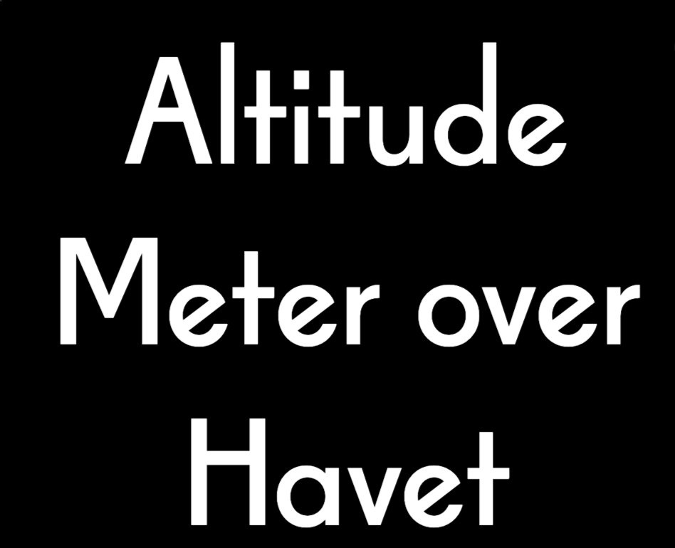
Alti
Alti is a geometrical sans serif font with a single style. Inspired by modernism and Art Deco, Alti combines extra-tall ascenders (see the lowercase “d”) with eccentric angles (the lowercase “e”) and balance (the capital “H”).
Antodits
Antodits is a handwritten font that looks similar to something we might scribble on a Post-it note, a moving box, or a label. If you want to give logos, hero images, social media banners, and other graphics a casual hand-drawn feel, this would be a fun one to play with.
AW Conqueror Sans
AW Conqueror Sans is a combination of geometric and humanist sans serif styles. There are 16 styles available, and the font designer recommends using them for different moods or tones. The AW Conqueror Sans family could be the one you use for various brands while giving each a unique style of their own.
Birra
Birra is an interesting family of fonts. Unlike the usual typography styles and weights we’re accustomed to (e.g., Thin, Heavy, Italic), Birra’s styles are inspired by different types of beer and the breweries they’re found in — Stout, Saison, Pils, and more.
Boby Marlyn Script
Boby Marlyn Script is a delicate cursive font in just one style. The designer suggests using it for romantic themes, so it would go nicely with matters related to wedding planning, florist shops, relationship retreats, and parenting blogs. It could also work well on marketing images and banners around holidays like Valentine’s Day and Mother’s Day.
Delvard
The release of Delvard has brought us three new fonts: Delvard Serif Display, Delvard Serif Subhead, and Delvard Serif Text. There are 24 styles in this collection of art nouveau-inspired serifs, so there’s a lot you can do with this creative and legible font.
Evoque Text
Evoque Text is a humanist serif family of 14 fonts. While there are bold styles that would work effectively in headlines, this font was explicitly designed to give website visitors a comfortable reading experience over long passages.
Forme
Forme Grotesque and Forme Grotesque Arabic is a sans serif font inspired by 19th century British Grotesque font styles. Forme Grotesque is a beautiful multilingual font that would be a great addition to various websites.
Gamer Station
Gamer Station comes in two styles: Regular and Outline. This cartoon-inspired typography would be a good one to use on websites that sell kids’ products and experiences — books, toys, entertainment centers, etc. It could also be instrumental in gaming app design.
Hyperpolar
Hyperpolar is a retro all-caps font inspired by 1950s crime stories. While the gritty vibe is most obvious in the Brush styles, the Regular and Outline styles take a more subdued approach. If you’re looking to add drama or intrigue to your logo, headers, or marketing graphics, you have obvious and subtle ways of playing it up with this font.
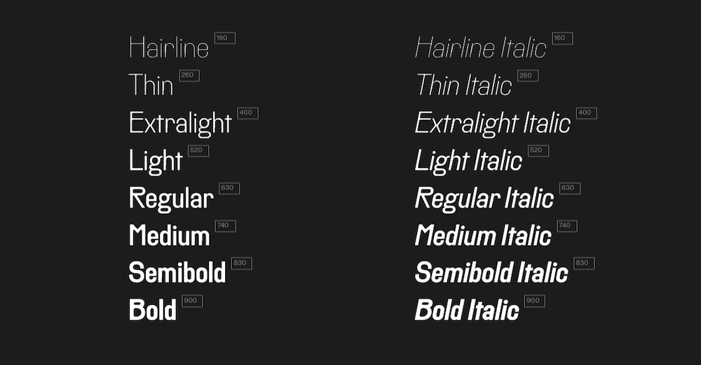
LargePoint
LargePoint is a bold sans serif font in two styles — Sharp and Rounded — with eight weights apiece. While the font was initially designed for a sports brand, it looks great in editorial headlines. So, if you’re designing a news site, blog, or literary publication that pushes out high-impact stories, consider using this font to style your headlines.
Monttocks Script Font
Monttocks Script Font is an elegant handwritten font that comes in two styles. The tight cursive lettering looks authentic, which could be an excellent way to add a personal touch to websites representing female entrepreneurs or small business owners. (Check out Marie Forleo’s site, and you’ll see what I mean.)
Räder
Räder is a sans serif font inspired by vintage road signage. Unlike today’s signage, old road signs prioritized both beauty and clarity of message. Because of its roots, this font and its 16 weights would be an effective way to design attention-grabbing headers.
Rosales
Rosales is a versatile humanist font. It comes with eight weights, eight italic variants, and two alternative sets of capital letters if you prefer something more stylistic than the basic sans serif. Because of the great variety in character sets and styles, Rosales can be used to improve the look and legibility of text in any part of your website or app.
Yellow Sunflower
Yellow Sunflower is a calligraphy font that exudes warmth and friendliness. There’s only one style available, and it would work best in display settings and in conjunction with a neutral sans serif.
Did you know, 25% of apps downloaded by mobile app users are used only once after their installation?
With an estimated 53,000+ health apps floating around us, making users stay glued around to experience your app is a tedious task. Although the health and wellness mobile app category has the highest rates of download, a high percentage of them struggle to retain active users over time.
So the question is, how would you make your healthcare app stand out and prevent app abandonment?
Increased abandonment is often because the app does not lead users to value quickly enough after they open the app. Initial interest is what keeps them coming back for more, and it relies on onboarding, personalization and encouraging in-app messaging. Try out these mobile app retention strategies for healthcare if you’re struggling to increase retention.
#1. Optimize onboarding experience
One of the primary steps to accelerate your app’s user experience is – application onboarding. You have barely a few seconds to make a good impression of your app. So, make sure that your app’s onboarding process is spot-on. Do not bombard users with multiple in-app messages right after the login process.
Here’s how you can enhance your app’s user onboarding experience: keep it short, show your app’s key features and how the onboarding screen deals with the progress bar.
The key point here is to keep your users engaged, informed and excited to explore your app without frustrating them with unwanted popups and messages.
One of the best ways to bend the retention curve is to target the new initial days of usage and in particular the first visit – Andrew Chen.
Here’s what you should avoid while optimizing your app onboarding process:
Do not ask users to rate and review the app before they complete the onboarding process.
Do not force users to sign in or subscribe to any feature before they check out the app and use it for a few days.
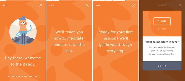
Let’s take the example of the meditation app Headspace and its user-friendly onboarding process. It offers a step-by-step guide to users to meditate along with leveraging custom options to change the session length.
Don’t want to meditate now? No worries! You can skip the guide and explore the app. How convenient.
#2. Use gamification to enhance engagement
Gamification focuses on applying game mechanisms to non-game contexts to engage audiences and inject fun into otherwise mundane activities along with generating motivation and cognitive benefits.
Gamification in healthcare has attracted a great deal of attention because of increased access to healthcare, lack of adherence to treatment and the rise of wearable devices.
Involving gamification features in your mobile app makes using your healthcare mobile app fun, interactive and rewarding. Majorly, these incentives can be in the form of accumulating points or getting a free subscription; something that encourages users to take action.
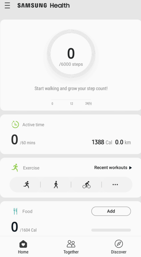
Samsung Health offers a personalized workout opportunity to its users to help them reach their potential personal goals.
Reward positive behavior to keep users coming back.
Trigger personalized notifications to keep users engaged or to remind them of the next actions to take.
#3. Personalized the app for different niches
If your app targets multiple user groups, the question here is, can targeting specific groups of users help increase your healthcare app’s user retention?
Think about the different users your app targets and multiple use-cases that can be created for each of them.
For example, you can create a unique pregnancy app for expecting mothers that keeps a track of their baby’s progress, nutrients needed, pre-pregnancy workout, and more.
The mobile app retention strategy here is clear: creating a personalized app for different niche users and providing a personalized user experience.
#4. Make your navigation smooth
It’s critical to get the navigation right since your user retention will directly correlate with how users navigate through your healthcare app.
Remember, users come to your app to accomplish certain tasks. If they fail to identify what they’re looking for, they’ll uninstall your app and switch to your competitor’s app. So, how can your healthcare mobile app retain users with great UX/UI?
Make sure to keep the action simple and obvious while the user journey progresses. The icons should be marked and visible by keeping the taps and interactions minimum to accomplish a task.
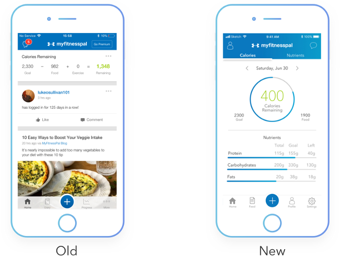
MyFitnessPal’s app reduces the number of steps needed for a user to finish their primary goal. The redesigned screen helps users track the calories left to be consumed to hit the goal along with detailed nutrient information on the go.
Common mistakes to avoid while designing your app’s navigation are:
Make sure that your app flow needs less interaction and is simple to understand.
Keep navigation icons and gestures familiar. Avoid using too many or very few menu options.
Do not hide important navigation links.
Ensure a simple, user-friendly and smooth journey for app users.
#5. Ensure frustration-free gesture
Measuring gesture UX has become a crucial aspect of mobile apps since the time iPhone shifted from the home button and android devices adapted full-screen gestures. Making your gesture smooth and user-friendly is a key aspect of the app’s overall user experience.
But working on usability gestures, one of the most underrated aspects is – identifying your target audience. We often forget to identify for whom we are designing the app.
Does your target audience include people moving from one place to another (such as a food ordering app) or senior citizens who consult doctors on virtual calls (mHealth or telemedicine apps)?
Make sure that your app’s UI and gestures are optimized to their levels.
A perfect example of touch heatmaps.
For a better user experience, do not forget to place your key elements within the thumb’s reach. To analyze gesture-based usability, touch heatmaps are the best tool to monitor physical gestures and not just the interaction ones.
#6. Use of in-app messages
When used correctly, in-app messages relieve user frustrations and deliver personalized and contextual messaging where and when it matters the most.
So what are in-app messages? They are a direct line of communication between you and your users. You can send them while the user engages with your web or mobile app.
The different ways to use in-app messaging for your healthcare app development include:
Patient-physician 1:1 chat
Medical reports shared directly in the conversation
Patient centric-group conversations
Medication reminders
Chatbots
Telemedicine platforms, mHealth apps, telehealth apps and healthcare software commonly use in-app messages to make user communication relevant and effective.
#7. Retention email marketing
Customer retention is complex, and no single strategy will solve user churn completely. That said, email is still the most effective channel to engage inactive users and bring them back to use your app.
Now you may be thinking, why use emails to retarget app users? The reasons are:
Users prefer brands to show up in their inbox as it’s less obstructive compared to notifications. They are shared with active and inactive app users over email.
Email marketing has a jaw-dropping ROI of 122%, higher than any other channel (yes even search and social fall behind).
Using a CRM such as EngageBay, emails can be personalized for specific customer segments. Segmented email campaigns have a 100% higher click-through rate than generic campaigns!
Update your mobile app with new features and personalized content to keep users hooked.
To update your app, keep a track of users’ behavior, gather feedback and see what major updates would entice a user to stay glued to your app. Another way is to keep an eye on your competitor’s offering and offer the better, improved, or updated version of it.
P.S. What else can you do to retain your app users?
Consult your users and ask them what they like about your healthcare app and what else can be done to craft a better mobile experience.
Do not surprise them with the hidden charges. Have transparent pricing.
Keep your user’s data safe and secured.
Focus on connectivity by integrating wearable technology.
Healthcare mobile app retention strategies: A little planning goes a long way
Retention is not a quick fix, rather, a well-thought strategy that revolves around the entire user journey.
With these mobile app retention strategies for healthcare, you can show customers you understand them and care about their experience with your app.
Every day design fans submit incredible industry stories to our sister-site, Webdesigner News. Our colleagues sift through it, selecting the very best stories from the design, UX, tech, and development worlds and posting them live on the site.
The best way to keep up with the most important stories for web professionals is to subscribe to Webdesigner News or check out the site regularly. However, in case you missed a day this week, here’s a handy compilation of the top curated stories from the last seven days. Enjoy!”
The first option has a “trailing slash.” The second does not.
I’ve always preferred this thinking: you use a trailing slash if that page has child pages (as in, it is something of a directory page, even if has unique content of its own). If it’s the end-of-the-line (of content), no trailing slash.
I say that, but this very site doesn’t practice it. Blog posts on this site are like css-tricks.com/blog-post/with a trailing slash and if you leave off the trailing slash, WordPress will redirect to include it. That’s part of the reason Zach is interested here. Redirects come with a performance penalty, so it’s ideal to have it happen as infrequently possible.
Performance is one thing, but SEO is another one. If you render the same content, both with and without a trailing slash, that’s theoretically a duplicate content penalty and a no-no. (Although that seems weird to me, I would think Google would smart enough not to be terribly concerned by this.)
Where resources resolve to seems like the biggest deal to me. Here’s Zach:
If you’re using relative resource URLs, the assets may be missing on Vercel, Render, and Azure Static Web Apps (depending on which duplicated endpoint you’ve visited).
on /resource/ resolves to /resource/image.avif
on /resource resolves to /image.avif
That’s a non-trivial difference and, to me, a reason the redirect is worth it. Can’t be having a page with broken resources for something this silly.
What complicates this is that the site-building framework might have opinions about this and a hosting provider might have opinions about this. As Zach notes, there are some disagreements among hosts, so it’s something to watch for.
Me, I’d go with the grain as much as I possibly could. As long as redirects are in place and I don’t have to override any config, I’m cool.
In my recent article about CSS underline bugs in Chrome, I discussed text-decoration-thickness and text-underline-offset, two relatively new and widely-supported CSS properties that give us more control over the styling of underlines.
Let me demonstrate the usefulness of text-decoration-thickness on a simple example. The Ubuntu web font has a fairly thick default underline. We can make this underline thinner like so:
:any-link {
text-decoration-thickness: 0.08em;
}
/explanation Throughout this article, I will use the :any-link selector instead of the a element to match hyperlinks. The problem with the a tag as a selector is that it matches all elements, even the ones that don’t have a href attribute and thus aren’t hyperlinks. The :any-link selector only matches elements that are hyperlinks. Web browsers also use :any-link instead of a in their user agent stylesheets.
Hover underlines
Many websites, including Google Search and Wikipedia, remove underlines from links and only show them when the user hovers a link. Removing underlines from links in body text is not a good idea, but it can make sense in places where links are more spaced apart (navigation, footer, etc.). With that being said, here’s a simple implementation of hover underlines for links in the website’s header:
But there’s a problem. If we tested this code in a browser, we’d notice that the underlines in the header have the default thickness, not the thinner style that we declared earlier. Why did text-decoration-thickness stop working after we added hover underlines?
CodePen Embed Fallback
Let’s look at the full CSS code again. Can you think of a reason why the custom thickness doesn’t apply to the hover underline?
The reason for this behavior is that text-decoration is a shorthand property and text-decoration-thickness its associated longhand property. Setting text-decoration to none or underline has the side effect of re-initializing the other three text decoration components (thickness, style, and color). This is defined in the CSS Text Decoration module:
The text-decoration property is a shorthand for setting text-decoration-line, text-decoration-thickness, text-decoration-style, and text-decoration-color in one declaration. Omitted values are set to their initial values.
You can confirm this in the browser’s DevTools by selecting one of the hyperlinks in the DOM inspector and then expanding the text-decoration property in the CSS pane.
In order to get text-decoration-thickness to work on hover underlines, we’ll have to make a small change to the above CSS code. There are actually multiple ways to achieve this. We could:
set text-decoration-thickness after text-decoration,
declare the thickness in the text-decoration shorthand, or
use text-decoration-line instead of text-decoration.
Choosing the best text-decoration option
Our first thought might be to simply repeat the text-decoration-thickness declaration in the :hover state. It’s a quick and simple fix that indeed works.
/* OPTION A */

header :any-link {
  text-decoration: none;
}

header :any-link:hover {
  text-decoration: underline;
  text-decoration-thickness: 0.08em; /* set thickness again */
}
However, since text-decoration is a shorthand and text-decoration-thickness is its associated longhand, there really should be no need to use both at the same time. As a shorthand, text-decoration allows setting both the underline itself and the underline’s thickness, all in one declaration.
/* OPTION B */

header :any-link {
  text-decoration: none;
}

header :any-link:hover {
  text-decoration: underline 0.08em; /* set both line and thickness */
}
If this code looks unfamiliar to you, that could be because the idea of using text-decoration as a shorthand is relatively new. This property was only subsequently turned into a shorthand in the CSS Text Decoration module. In the days of CSS 2, text-decoration was a simple property.
Unfortunately, Safari still hasn’t fully caught up with these changes. In the WebKit browser engine, the shorthand variant of text-decoration remains prefixed (-webkit-text-decoration), and it doesn’t support thickness values yet. See WebKit bug 230083 for more information.
This rules out the text-decoration shorthand syntax. The above code won’t work in Safari, even if we added the -webkit- prefix. Luckily, there’s another way to avoid repeating the text-decoration-thickness declaration.
When text-decoration was turned into a shorthand, a new text-decoration-line longhand was introduced to take over its old job. We can use this property to hide and show the underline without affecting the other three text decoration components.
Since we’re only updating the line component of the text-decoration value, the previously declared thickness remains intact. I think that this is the best way to implement hover underlines.
Be aware of shorthands
Keep in mind that when you set a shorthand property, e.g., text-decoration: underline, any missing parts in the value are re-initialized. This is also why styles such as background-repeat: no-repeat are undone if you set background: url(flower.jpg) afterwards. See the article “Accidental CSS Resets” for more examples of this behavior.
One of the ways to help get a grasp of CSS specificity is thinking terms of “what beats what” or how strong the specificity is. Manuel Matuzovic has a helpful interactive step-by-step demo. You keep clicking the “Add selector” button, and the CSS shown (and applied to the page) changes with ever-increasingly-strong selectors applied to the body that change the background-color. At the end, it veers into not-really-selectors trickery, like using @keyframes to override things.
More specificity practice
If you enjoyed the trickery at the end, check out Francisco Dias’ A Specificity Battle!, an article we published a few years back that does a back-and-forth styling battle with nineteen steps “selecting” the same element to re-style it. CSS is cray sometimes.
Have you been feeling a little unproductive lately? Well, you are not the only one. Of course, we all want to be as productive as possible at work, but that’s not always the case.
According to recent research, we are fully productive for less than 3 hours a day. Stress and poor planning are just two of the reasons why. And this is true in all work environments. No one is exempt from this problem, from employees in central offices to freelancers or managers working from home.
That’s why we have researched and selected the eight best ways to increase your productivity at work. In our search for solutions to boost creativity, we have come across numerous promising approaches and tips that you can use. Here are the best tips you can follow to get the most out of a workday:
1. Plan your Tasks
I can safely say that there is nothing more important than efficient task planning. Planning your tasks can free you from stress and procrastination. Planning everything before the day even starts is probably the best approach.
This is also where time management comes into play. Think about it. How often have you been more productive after setting a specific time frame for a task? You need to plan for the project at hand and then map each workday.
The more you plan your projects and workdays, the more productive you will be. However, it would help if you tried not to spend hours and hours planning.
2. Minimize Distractions
So you have successfully planned your tasks. That should be enough to be productive, right? Well, unfortunately, no. Whether you work in the office or from home, numerous things can distract you daily.
Distractions are ubiquitous, from a colleague wanting to chat about last night’s game to TV at home. When you minimize such distractions, you become better at what you do.
Of course, it’s not always easy to resist temptation. But if you do, you’ll spend more hours focused and engaged in your task. The same goes for leadership positions. You can ask your employees to turn off their cell phones and minimize chats.
We all feel the need to check our phones or chat with our colleagues. This is precisely why the next tip is crucial to your productivity.
3. Take Regular Breaks
According to psychologists, taking regular breaks at work will help you minimize stress and thus improve your performance. Whether you work from home or at headquarters, relaxing and social breaks are necessary. But that’s not all.
As we mentioned earlier, regular breaks are a smart way to avoid distractions. If you know your next break is coming up, you will not need to chat or look at your phone.
This will help you maintain a high level of concentration. On the other hand, if you do not take regular breaks, your performance will continue to decline throughout the day.
4. Stop Multitasking
Once you have scheduled your tasks and breaks, it’s time to think about the actual work process. Contrary to what many believe, multitasking does not make you more productive.
Conversely, multitasking can decrease your performance, drain your energy faster, or even damage your brain. This is another reason why planning is so important. You should always try to engage your brain with one task at a time.
5. Optimize Workplace Conditions
This is one of the most efficient but often underestimated ways to increase productivity. Ensuring that the working temperature is between 20-24 degrees C (68 and 76 degrees F) will help you stay concentrated for more extended periods.
This will also save you a lot of time, whether at home or in the office. On the other hand, if you feel cold or hot, you will be distracted. Therefore, you should think about the working temperature before you start working.
6. Enough Sleep is Key
It’s not news that sleep deprivation can affect our performance. And that’s not just it. Lack of sleep leads to a massive decrease in:
Ability to concentrate
Working memory
Mathematical capacity
Logical reasoning
So sleep is crucial to our overall well-being. According to the National Sleep Foundation, you should try to get between 7 and 8 hours of sleep a night (for adults between 18 and 65).
It becomes evident that getting enough sleep is one of the best ways to increase your productivity at work.
7. Communication is Crucial
Communication is essential, especially for those of you who work from home. You should always have a conversation with the people you live with during your breaks. This can also help you avoid distractions during your work hours.
Try to make everyone around you (including yourself) understand what closed, and open doors mean. This will help you increase your productivity while communicating sufficiently with your loved ones.
The same goes for people who work in offices. You should always try to engage with your colleagues during breaks. Remember that feeling part of a group and sharing your experiences is the key to increasing your productivity.
8. Avoid Social Media
Our last tip is one of the hardest to follow, especially working from home. You may think that this is not a problem for you. Recent studies show that we spend an average of 145 minutes on social media every day. Of course, it’s not a bad idea to cut down on that time.
But, even if you do not, you should try to keep any engagement with social media outside of your work hours. This will help you focus on your tasks and get you one step closer to your goals.
Wrap Up
Keep in mind that we all get stuck at times when working on a project. The more you worry about it, the more stressed you will be. It’s essential to take care of yourself and your mental health. In any case, we hope you will find it easier to increase your productivity now that you have read our tips. All you have to do is follow them.
[…] the will-change property landed in major browsers in August 2015, and I’ve been on the lookout for when to use it ever since. It might seem self-evident to apply it to commonly animated properties such as transform or opacity, but the browser already classifies them as composite properties, thus, they are known as the few properties that you can already expect decent animation performance from. So, heeding the advice of the great developers who came before me, I was cautious and waited for the right opportunity to come along.
I was thinking-out-loud about this as well on ShopTalk not too long ago. I get the spirit behind will-change. It’s like responsive images or DNS prefetching: you give the browser extra information about what you’re about to do, and it can optimize it when it happens. But with will-change… when? Why isn’t there a simple reduced test case demo to showcase something with bad performance, then will-change being applied, and it becomes good performance?
Well Nic found one little directly useful case where a hover-transformed pseudo-element leaves a little dingus of color behind in Safari, and that goes away if you use will-change. I tested it in the latest versions of Safari and found it to be true. Alrighty then, one use case!
I’d love to see a more obvious direct use case. I imagine the sweet spot is on lower-power devices (that still have GPUs) but are new enough to know what will-change is.


