It’s extremely surprising to me that HTML has never had any way to include other HTML files within it. Nor does there seem to be anything on the horizon that addresses it. I’m talking about straight up includes, like taking a chunk of HTML and plopping it right into another. For example the use case for much of the entire internet, an included header and footer for all pages:
People have been looking to other languages to solve this problem for them forever. It’s HTML preprocessing, in a sense. Long before we were preprocessing our CSS, we were using tools to manipulate our HTML. And we still are, because the idea of includes is useful on pretty much every website in the world.
Use PHP
Can you use PHP instead?
...
<body>
   <?php include "./header.html" ?>

   Content

   <?php include "./footer.html" ?>
</body>
...
This will perform the include at the server level, making the request for it happen at the file system level on the server, so it should be far quicker than a client-side solution.
Use Gulp
What’s even faster than a server-side include? If the include is preprocessed before it’s even on the server. Gulp has a variety of processors that can do this. One is gulp-file-include.
Looks like this particular plugin has fancy features where you can pass in variables to the includes, making it possible to make little data-driven components.
Use Grunt
This is what the grunt-bake plugin does. You’d configure Grunt to process your HTML:
There is also fancy features of this that allow for evaluation and passing data. You’ll still need a processor to run it, probably something like gulp-handlebars.
Speaking of templating languages which make use of curly braces… Mustache has them, too.
Use Pug
Pug is an HTML preprocessor that has a whole new syntax for HTML that is a bit more terse. It’s got includes though.
...
body
   include ./header.html"

   p Content

   include ./footer.html"

   ...
Speaking of JavaScript… If you’re building your site using a JavaScript framework of just about any kind, building through components is kind of the main deal there and breaking parts you want to include in other files should be no problem. Some kind of import Header from "./header.js"; and is the territory you’d be in in React land.
But the content in those iframes does not share the same DOM, so it’s a bit weird, not to mention slow and awkward to style (since iframes don’t know the heights of their contents).
Scott Jehl documented a cool idea though: You can have the iframe inject the content of itself onto the parent page then remove itself.
You’d name the files header.html and footer.html and put them in /includes/ and then it’ll make a build with the includes processed when you run the npm script it has you do.
Use Apache SSI
Apache, a super duper common web server, can do includes. You do it like this:
Like I said at the top, it’s very surprising to me that HTML itself hasn’t addressed this directly. Not that I think it would be a great idea for performance to have statements that trigger network requests all over our code, but it seems in-line with the platform. Using ES6 imports directly without bundling isn’t a great idea always either, but we have them. @importing CSS within CSS isn’t a great idea always, but we have it. If the platform had a native syntax, perhaps other tooling would key off that, much like JavaScript bundlers support the ES6 import format.
Two years ago, I wrote about prefers-reduced-motion, a media query introduced into Safari 10.1 to help people with vestibular and seizure disorders use the web. The article provided some background about the media query, why it was needed, and how to work with it to avoid creating disability-triggering visual effects.
We’re now four months into 2019, and it makes me happy to report that we have support for the feature in all major desktop browsers! Safari was first, with Firefox being a close second. Chrome was a little late to the party, but introduced it as of version 74.
This browser support data is from Caniuse, which has more detail. A number indicates that browser supports the feature at that version and up.
Desktop
Chrome
Opera
Firefox
IE
Edge
Safari
74
No
63
No
No
10.1
Mobile / Tablet
iOS Safari
Opera Mobile
Opera Mini
Android
Android Chrome
Android Firefox
10.3
No
No
No
No
No
While Microsoft Edge does not have support for prefers-reduced-motion, it will become Chrome under the hood soon. If there’s one good thing to come from this situation, it’s that Edge’s other excellent accessibility features will (hopefully) have a good chance of being back-ported into Chrome.
Awareness
While I’m happy to see some websites and web apps using the media query, I find that it’s rare to encounter it outside of places maintained by people who are active in CSS and accessibility spaces. In a way, this makes sense. While prefers-reduced-motion is relatively new, CSS features and functionality as a whole are often overlooked and undervalued. Accessibility even more so.
It’s tough to blame someone for not using a feature they don’t know exists, especially if it’s relatively new, and especially in an industry as fast-paced as ours. The deck is also stacked in terms of what the industry prioritizes as marketable, and therefore what developers pay attention to. And yet, prefers-reduced-motion is a library-agnostic feature that ties into Operating System-level functionality. I’m pretty sure that means it’ll have some significant staying power in terms of reward for time spent for skill acquisition.
Speaking of rewards, I think it’s also worth pointing out the true value prefers-reduced-motion represents: Not attracting buzzword-hungry recruiters on LinkedIn, but improving the quality of life for the people who benefit from the effect it creates. Using this media query could spare someone from having to unnecessarily endure a tremendous amount of pain for simply having the curiosity to click on a link or scroll down a page.
The people affected
When it comes to disability, many people just assume “blind people.” The reality is that disabilities are a complicated and nuanced topic, one that is surprisingly pervasive, deeply personal, and full of unfortunate misconceptions. It’s also highly variable. Different people are affected by different disability conditions in different ways — extending to a wide gamut of permanent, temporary, environmental, and situational concerns. Multiple, compounding conditions can (and do) affect individuals, and sometimes what helps one person might hinder another. It’s a difficult, but very vital thing to keep in mind.
If you have a vestibular disorder or have certain kinds of migraine or seizure triggers, navigating the web can be a lot like walking through a minefield — you’re perpetually one click away from activating an unannounced animation. And that’s just for casual browsing.
If you use the web for work, you might have no choice but to endure a web app that contains triggering animations multiple times a week, or even per day or hour. In addition to not having the autonomy to modify your work device, you may also not have the option to quickly and easily change jobs — a privilege easily forgotten when you’re a specialized knowledge worker.
Think of someone working in a large corporation who has to use a provisioned computer with locked-down capabilities. Or someone who isn’t fully aware of what of their tablet is capable of doing past browsing social media, watching video, and messaging their family and friends. Or a cheap and/or unorthodox device that will never support prefers-reduced-motion feature — some people purchase discontinued devices such as the Windows Phone specifically because their deprecation makes them affordable.
Do these people deserve to be hurt because of their circumstances? Of course not.
Considering what’s harmful
You can tie harm into value, the same way you can with delight. Animation intended to nudge a person towards a signup could also drive them away. This kind of exit metric is more difficult to quantify, but it definitely happens. Sometimes the harm is even intentional, and therefore an easier datapoint to capture — what you do with that information is a whole other issue.
If enough harm happens to enough people, it affects that certain something we know as branding. This effect doesn’t even need to be tied to a disability condition. Too much animation, applied to the wrong things in the wrong way will drive people away, even if they can’t precisely articulate why.
You also don’t know who might be on the receiving end, or what circumstances they’re experiencing the moment they load your website or web app. We can’t — and shouldn’t — know this kind of information, either. It could be a prospective customer, the employee at a venture capitalist firm tasked with evaluating your startup, or maybe even your new boss.
We also don’t need to qualify their relationship to us to determine if their situation is worth considering — isn’t it enough to just be proactively kind?
Animation might not always look the way you intend it in these modes. One example would be when the viewport is zoomed and the animation isn’t built using relative units. There’s a non-trivial chance important parts might be pushed out of the viewport, leaving the animation appearing as a random collection of flickering bits. Another example of a specialized browsing mode might be Reader Mode, where the animation may not appear at all.
Taking it to code
Considering all this, I’m wondering if there are opportunities to help web professionals become more aware of, and therefore more considerate of the downsides of poorly conceived and implemented animation.
Maybe we proactively incorporate a media query high up in the cascade to disable all animation for those who desire it, and for those who have devices that can’t support it. This can be accomplished by targeting anything where someone has expressed a desire for a low-to-no-animation experience, or any device that has a slow screen refresh rate.
This code forces all animation that utilizes a declaration of animation-duration or transition-duration to conclude at a rate that is imperceptible to the human eye. It will work when a person has requested a reduced motion experience, or the device has a screen with a slow refresh rate, say e-ink or a cheap smartphone.
Retaining the animation and transition duration also ensures that any functionality that is tied to CSS-based animation will activate successfully (unlike using a declaration of animation: none), while still preventing a disability condition trigger or creating rendering lag.
This declaration is authored with the intent of introducing some intentional friction into our reset styles. Granted, it’s not a perfect solution, but it does drive at a few things:
Increasing the chances of developers becoming aware of the two media features, by way of making them present in the cascade of every inspected element.
Providing a moment to consider why and how animation will be introduced into a website or web app, and what the experience should be like for those who can’t or don’t want to experience it.
Encouraging developers who are less familiar with CSS to think of the cascade in terms of components and nudge them towards making more easily maintainable stylesheets.
Animation isn’t unnecessary
In addition to vestibular disorders and photosensitive conditions, there’s another important aspect of accessibility we must consider: cognitive disabilities.
Animation can be a great tool to help combat some forms of cognitive disability by using it to break down complicated concepts, or communicate the relationship between seemingly disparate objects. Val Head’s article on A List Apart highlights some other very well-researched benefits, including helping to increase problem-solving ability, recall, and skill acquisition, as well as reducing cognitive load and your susceptibility to change blindness.
Reduce isn’t necessarily remove
We may not need to throw the baby out with the bathwater when it comes to using animation. Remember, it’s prefers-reduced-motion, not prefers-no-motion.
If we embrace the cascade, we can work with the animation reset code described earlier on a per-component basis. If the meaning of a component is diminished by removing its animation altogether, we could slow down and simplify the component’s animation to the point where the concept can be communicated without potentially being an accessibility trigger.
If you’re feeling clever, you might even be able to use CSS Custom Properties to help achieve this in an efficient way. If you’re feeling extra clever, you could also use these Custom Properties for a site-wide animation preferences widget.
In the following code sample, we’re defining default properties for our animation and transition durations, then modifying them based on the context they’re declared in:
/* Set default durations */
:root {
  --animation-duration: 250ms;
  --transition-duration: 250ms;
}

/* Contextually shorten duration length */
@media screen and (prefers-reduced-motion: reduce), (update: slow) {
  :root {
    --animation-duration: 0.001ms !important;
    --transition-duration: 0.001ms !important;
  }
}

@media screen and (prefers-reduced-motion: reduce), (update: slow) {
  /* Remove duration for all unknown animation when a user requests a reduced animation experience */
  * {
    animation-duration: var(--animation-duration);
    transition-duration: var(--animation-duration);
  }
}

/* Update the duration when animation is critical to understanding and the device can support it */
@media screen and (prefers-reduced-motion: reduce), (update: fast) {
  .c-educational-concept {
    /* Set a new animation duration scoped to this component */
    --animation-duration: 6000ms !important;
    ...
    animation-name: educational-concept;
    /* Use the scoped animation duration */
    animation-duration: var(--animation-duration);
  }
}
However, trying to test the effectiveness of this slowed-down animation puts us in a bit of a pickle: there’s no real magic number we can write a test against.
We need to have a wide representation of people who are susceptible to animation-based disability triggers to sign off on it being safe, which unfortunately involves subjecting them to something that may potentially not be. That’s a huge ask.
A better approach is to ask about what kinds of animation have been triggers for them in the past, then see if what they describe matches what we’ve made. This approach also puts the onus on yourself, and not the person with a disability, to do the work to provide accommodation.
If you’re having trouble finding people, ask your friends, family, and coworkers — I’m sure there’s more people out there than you think. And if you need a good starting point for creating safer animation, I once again urge you to read Val’s article on A List Apart.
Neurodivergence
There’s a lot to unpack here, and I’m not the most qualified person to talk about it. Here’s what my friend Shell Little, an Accessibility Specialist at Wells Fargo DS4B, has to say about it:
We always try our best to challenge your creativity and get you out of your comfort zone. A great occasion to do so is our monthly wallpapers challenge which has been going on for nine years already. It’s an opportunity to let your creative ideas run free and try something new, to indulge in a little project just for fun. Whatever technique you fancy, whatever story you want to tell with your wallpaper, the submissions to this challenge make for a unique bouquet of community artworks each month anew. Artworks that adorn desktops and, who knows, maybe even spark new ideas.
In this post, you’ll find wallpapers for May 2019, created with love by designers and artists from across the globe. The wallpapers all come in versions with and without a calendar and can be downloaded for free. At the end of this post, we also collected some May favorites from past years’ wallpapers editions that are too good to gather dust somewhere down in the archives.
Now before you decide on your favorite this month, we want to say thank-you to everyone who shared their artworks with us. And, well, if you’re feeling inspired, did you know that your work could get featured in one of our upcoming wallpapers posts, too? We’re always looking for fresh talent, so don’t be shy, join in. 😉
“April and May are usually when everything starts to bloom, especially the magnolia trees. I live in an area where there are many and when the wind blows, the petals make it look like snow is falling.” — Designed by Sarah Masucci from the United States.
“Did you know that there are around 65 pairs of griffon vultures in Serbia? And did you know that one of their natural habitats is located at the river Uvac canyon? Nested between Zlatibor and Zlatar mountains, the wriggling flow of river Uvac is one of the most recognizable marks of Western Serbia and one of the most beautiful natural scenes in the country. And yes, May is just the perfect time to visit and enjoy its glory.” — Designed by PopArt Studio from Serbia.
“My main inspiration behind this were the blooming flowers in May. My mother collects blue and white Japanese china which was the pot inspiration. The blues and pinks together are what I find to be one of the most complimentary color palettes.” — Designed by Olivia Osborne from Pennsylvania.
“I wanted to create something fun and happy for the month of May. It’s a simple concept, but May is typically the time to adventure out into the world and enjoy the best of Spring.” — Designed by Alexander Jubinski from the United States.
“A fear I need to conquer inspired this wallpaper design. I never really liked the ocean because of how much we don’t know about it or anything that lives in it. However, I have decided to try and focus on the beautiful parts of this great unknown by choosing an octopus.” — Designed by Alexandra Covaleski from the United States.
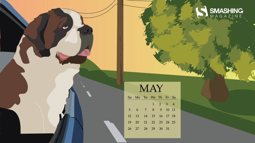
“May reminds me of long car rides while the cool breeze whips through the open windows. What better companion to have than a big friendly dog? Cool breeze, warm sun, and a furry friend.” — Designed by Samantha Strausser from the United States.
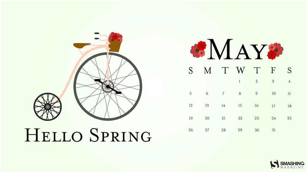
“I was at a local bike shop the other day, and I saw one of the vintage bikes. I loved the shape of it. I also was inspired by May flowers.” — Designed by Olivia Bartoli from the United States.
Whimsical, adventurous, delicate — the May wallpapers which reached us in the past few years are as different as the artists who created them. Here are some of our favorites from the past. Which one is yours? (Please note that these designs come from our archives, and, thus, don’t include a calendar.)
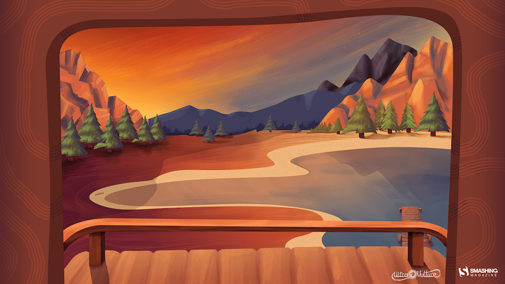
Lake Deck
“I wanted to make a big painterly vista with some mountains and a deck and such.” — Designed by Mike Healy from Australia.
“After going through a super long winter, I was inspired to create this whimsical wallpaper because I wanted to highlight the beauty of nature and how I envision it to be during the warmer seasons that have yet to come.” — Designed by Michaela Schmidt from Maryland.
“Edwin Way Teale once said that ‘[t]he world’s favorite season is the spring. All things seem possible in May.’ Now that the entire nature is clothed with grass and branches full of blossoms that will grow into fruit, we cannot help going out and enjoying every scent, every sound, every joyful movement of nature’s creatures. Make this May the best so far!” — Designed by PopArt Studio from Serbia.
“We don’t usually count the breaths we take, but observing nature in May, we can’t count our breaths being taken away.” — Designed by Ana Masnikosa from Belgrade, Serbia.
“Springtime, especially Maytime is my favorite time of the year. And I like popsicles — so it’s obvious isn’t it?” — Designed by Steffen Weiß from Germany.
“A little-known ‘holiday’ on May 4th known as ‘Bird Day’. It is the first holiday in the United States celebrating birds. Hurray for birds!” — Designed by Clarity Creative Group from Orlando, FL.
“‘As knowledge increases, wonder deepens.’ (Charles Morgan) So I tried to create an illustration based on this.” — Designed by Bisakha Datta from India.
“I designed Magical Sunset as a friendly reminder to take a moment and enjoy life around you. Each sunset and sunrise brings a new day for greatness and a little magic.” — Designed by Carolyn Warcup from the United States.
Please note that we respect and carefully consider the ideas and motivation behind each and every artist’s work. This is why we give all artists the full freedom to explore their creativity and express emotions and experience throughout their works. This is also why the themes of the wallpapers weren’t anyhow influenced by us but rather designed from scratch by the artists themselves.
Thank you to all designers for their participation. Join in next month!
Designers who design logos over time have always known that a logo must work in black and white to be effective. If it doesn’t work in black and white, it doesn’t work one hundred percent. But is this really true?
This article aims to be a complete and exhaustive answer to the question: should a logo work in black and white to be a good logo? Short answer: no, not necessarily. But it depends on the logo, the context, and some other things. The long answer is, of course, is the rest of the article in which I will talk about when a logo may or may not need to work in black and white.
Let’s do this!
Does a logo need to work in black and white to be effective?
The main reason why the effectiveness of a black and white logo has always been considered fundamental in the design phase is simply because up until a few years ago the cost of printing many colors was excessive. Printing a colored logo on every envelope, on every label, letterhead or business card, involved excessive costs for any company. The logos were therefore preferably always printed in black and white, to save ink and therefore money.
A logo that didn’t work in black and white didn’t work in most of the applications that were made of that same logo!
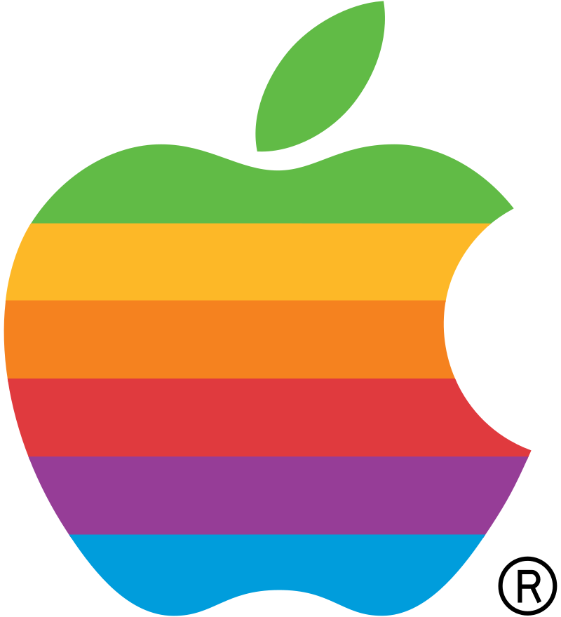
The Apple Logo
The Apple logo in the 80s is a great example (and at the same time the exception) for this rule. The logo was the famous apple that we know today. Back then, it wasn’t colored in that smooth gunmetal, a techy color that we all know now, but a rainbow of colors.
Because of the cost of print, a lot of designers referred to the old logo as “the most expensive logo ever.” The reason they went with this logo was that they wanted to “show off” the wealth and high quality of their products. A color printed logo was rare and therefore conveyed the idea of ??refinement. In the last few years, however, design and logos have shifted from a paper platform to a digital playground. We no longer live in a world dominated by paper but by screens. This, together with the fact that the cost of color printing has been extremely reduced, has resulted in a gradual but important abandonment of that dogma of the logo in black and white. Along with this, another famous dogma of logo design has collapsed in recent years: that of avoiding nuances at all costs.
Logos such as those of the most recent (2016) Instagram rebranding are a prime example.
The Instagram logo
The new Instagram logo breaks all boundaries previously put up by the stigma that logos need to work in black and white. Aside from the personal taste factor, the logo works just as it is, color gradients and all. But why?
I’ll explain. The Instagram logo is shown in 99.99 percent of cases on a screen (almost always on a mobile phone) and is practically never printed. Does shade give problems inside a screen? No. Does it create bad effects as if printed in black and white? No. So, can the Instagram logo can be fine even if not reproducible in black and white? Absolutely yes!
However, this does not mean that a colored or shaded logo should also not have a monochrome variant, as we will see later in this article.
Is it a good idea to start with a black and white logo?
Advice that a lot of seasoned designers give is to start your logo by creating a process by designing it in black and white.
The fact that there is no longer a need for a logo to always work in black and white does not mean that designing it from that point is not useful for the designer.
Let’s try to reformulate this concept. The advice “always start a design in black and white” does not mean “the logo MUST work in black and white”. It is simply a piece of advice that helps to improve your design phase!
When will your logo need to work in black and white?
Although we now live in an age of super-performing digital screens, there are still numerous occasions and situations in which it is useful, if not necessary, to use a black and white logo.
Let’s look at some examples of when a logo is needed to work in a monochrome version.
When printing newspapers or books
The first case to consider is the classic one. Until a few years ago there was a need for logos to be printable in black and white, simply because everything was printed that way.
Even today, if you are dealing with a logo frequently printed in newspapers, magazines or books printed in black and white, you must design a logo that works well when used in such a case.
Black and white newspaper logo when making window stickers
This is another case at the limit. When printing on glass, perhaps with the technique that in English is called “Frosted vinyl”, you need a logo that works well if printed (usually) in white or at least in a monochrome variant.
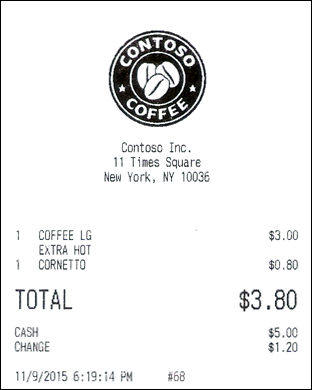
When printing on receipts
When a logo needs to be printed often on receipts, it will inevitably have to work well in its black and white version to be readable and understandable.
Take for example a logo designed for a clothing store. That shop will certainly want to see its logo printed on every receipt of every pair of jeans or t-shirt sold, don’t you think?
When using the white (or colored) version on photo or video (watermark)
Another really important point to make is whether your logo will appear as a watermark for a video or photo. This point is very often overlooked, but it doesn’t mean it’s any less important.
If you have some bright and shiny logo glaring at people in the bottom of a video or photo, it can and most likely will draw everyone’s attention away from the original image.
That being said, having a black and white logo is unavoidable in this case.
How to make a black and white logo work
So, no, it’s not always necessary to have a black and white logo that works, but there are a few cases that it would be beneficial. So what strategies do you have to adapt to make a black and white logo work? Here are a few quick tips:
Start from the beginning with a black and white logo design
Like we talked about above, a lot of designers recommend doing this no matter what. But, if you know that you’ll need a black and white version of the logo, it’s best to start the designing process with that in mind.
Don’t go overboard with the logo
As much fun as it may seem like to have an awesome and elaborate logo, it doesn’t always work out well. The easiest thing to remember here is that the simpler the logo, the more likely it is to look good in black and white (of course, there are exceptions, so use caution).
Have multiple versions of one logo
This can sort of play along with the point above, but it’s a little more complex. Having multiple logos for a variety of uses is not a new practice by any means. In fact, a lot of big name brands like Nike and Adidas use a few different logos, depending on where they’re being used.
The conclusion
As a designer, you may have heard the old piece of advice to start with a black and white design. While it is a good tactic to keep in mind, it’s not always necessary -, especially in this day and age.
As with any good piece of advice, the best thing anyone can tell you, in this case, is to plan ahead. While not all logos need to be used in black and white, some of them do. Knowing this beforehand can save you hours of work, and a headache.
The Internet as a concept, and as a community, is much like a teenager: it’s struggling to establish its identity, everyone is trying to tell it what to do, and it tends to lash out at both people who deserve it as well as those who don’t. It does so at random, and you’re not its real dad, anyway.
The practice of designing websites, however, has gone right past the teenage years and blown past the whole human-life-span metaphor entirely. Web design is, in my opinion, reaching an industrial age, of sorts. You know, the era of smokestacks and Charles Dickens’ really depressing novels.
Let’s see how:
Increased DIY Capability
The sewing machine was invented in 1755, about five years before the “official beginning” of the industrial age. This machine, and others like it, heralded the beginning of that age and the massive machines that would come after, but they also drastically expanded the production capabilities of individuals working at home, or in their place of business.
It started with software like FrontPage and Dreamweaver, and now we’ve got Squarespace, Wix, Weebly, Duda, Webflow, and a host of other options. They’re all designed to enhance the output of the individual, the hobbyist, the business owner, and the freelancing professional. Work that once might have taken a very long time for one person, or a reasonable amount of time for ten people, is all being done by one person, in a lot less time.
And if you’re a purist, you can always sew the buttons onto your web page by hand.
Increased Automation At The Professional-Level
Think of the massive looms in old factories. Now it’s not particularly easy to automate creative visual work, as such. Most of the automation in web design is done at the coding stage, in both front and back end. But even with such simple tools as Symbols in Sketch or Affinity Designer can drastically reduce the work required to produce a large number of designs.
Or at least something like a large number of buttons. It’s not a perfect analogy to the factories of old, but the tools we have are making it consistently easier to produce designs of consistent quality, even if they also have pretty uh… “consistent” layouts and aesthetic styles. This sort of drastically increased output is the very definition of industry.
Expansion Of The Digital Middle Class
Increased DIY capability and automation in the industrial age led to a dramatic expansion in what people could afford. The increased amount of work in general meant that more people could afford that stuff, and thus, the middle class was born.
The same thing is happening in web design. For the hobbyist or professional building sites on the cheap, shared hosting can cost as little as a few dollars a month, and code editors are free. For less code-focused hobbyists and business owners alike, code-free website builders are attractive and largely affordable options, too. Plenty of platforms offer a straight-up free plan.
Getting a web presence of some kind has literally never been easier, and it’s going to keep getting easier.
Outsourcing And Subcontracting
Then, of course, there’s outsourcing and sub-contracting. These come in two major forms: software as a service, and labor. SaaS in particular has become exceedingly popular as a way to build a product that constantly pays for itself, leaving you to focus on maintenance, and improvements. The train engineers of old wish they could have worked on their trains while they were still running.
While few websites are, I think, built by orphans trapped in smoke-filled factories, we should not ignore the fact that there is a lot of cheap labor out there. And you know what? A lot of them are actually really good, and are only cheap because of the economic disparity between nations. This actually leads me to my next point…
Poor Enforcement Of Industry Standards
One of the downsides of industrial ages as they happen all over the world is this: the constant push for progress sometimes leaves much to be desired in the way we treat our fellow humans. Of course, this isn’t happening to web designers in a bubble. The “gig economy” is often used as an excuse not to provide benefits for employees. Cheap labor is often taken advantage of in the worst ways. Overworking people to near-death is accomplished not with whips, but with Instagram and Twitter feeds praising the eighty-hour work week.
And the actual standards meant to ensure the quality of the product are often ignored. The W3C does a lot of good work, but they don’t actually have the power to enforce HTML validation. Well… that’s probably for the best, all things considered, but as we’ve seen, governments are also poorly equipped to provide QA for the Internet as a whole.
However, I should note that I greatly appreciate some of the government-led work done in the field of accessibility, particularly in countries that require WCAG compliance.
Fear Of Obsolescence
The proliferation of industry created a lot of jobs, and killed a lot of others. Design, however, is still a creative discipline, and thus there will always be room for good designers. Even so, automation and code-free design tools have people worried, and I can understand why. That said, lots of people will actually hire you to use Wix for them, so… shrug.
People outsourcing relatively easy tasks might save us, yet.
It’s Not All Doom And Gloom…
We call hand-crafted websites… well… that. Sometimes “bespoke”. Perhaps a better word would be “artisanal”, and we should just get used to being hipsters. I’m only mostly kidding.
In every industrial age we’ve witnessed, things got bad, and then they got better. We haven’t gotten rid of all the smoke stacks yet, but the world is in most ways a much better place than it was, and the Internet is developing faster than the rest of the world. It may be an industrial age now, but imagine what it will be like when they invent computers.
This year, SmashingConf took place at the Fort Mason Center which has superb views of the Bay and Golden Gate Bridge. The weather was very kind to us making it a very pleasant location to spend a few days in.
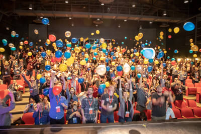
As always with any Smashing Conference, there were plenty of surprises! We had icecream and cookies, our amazing DJ Tobi Lessnow kept everyone well entertained between talks, and Vitaly opened the conference with just the right amount of balloons!
Our attendees collaborated on a Google Doc for both conference days. These documents are a treasure trove of information and links from our speakers.
Collaborative Doc (Day 1)
Notes for talks by Brad Frost, Sara Soueidan, Anna Migas, Darin Senneff, Steve Schoger, Chris Coyier, Jennifer Brook and David P. Simon.
Collaborative Doc (Day 2)
Notes for talks by Miriam Suzanne, Katie Sylor-Miller, Brendan Dawes, Jeremy Wagner, Jason Pamental and Jen Simmons.
In between the scheduled sessions, we had some great lunch sessions on both days from our friends at Deque, Netlify, and Medium.
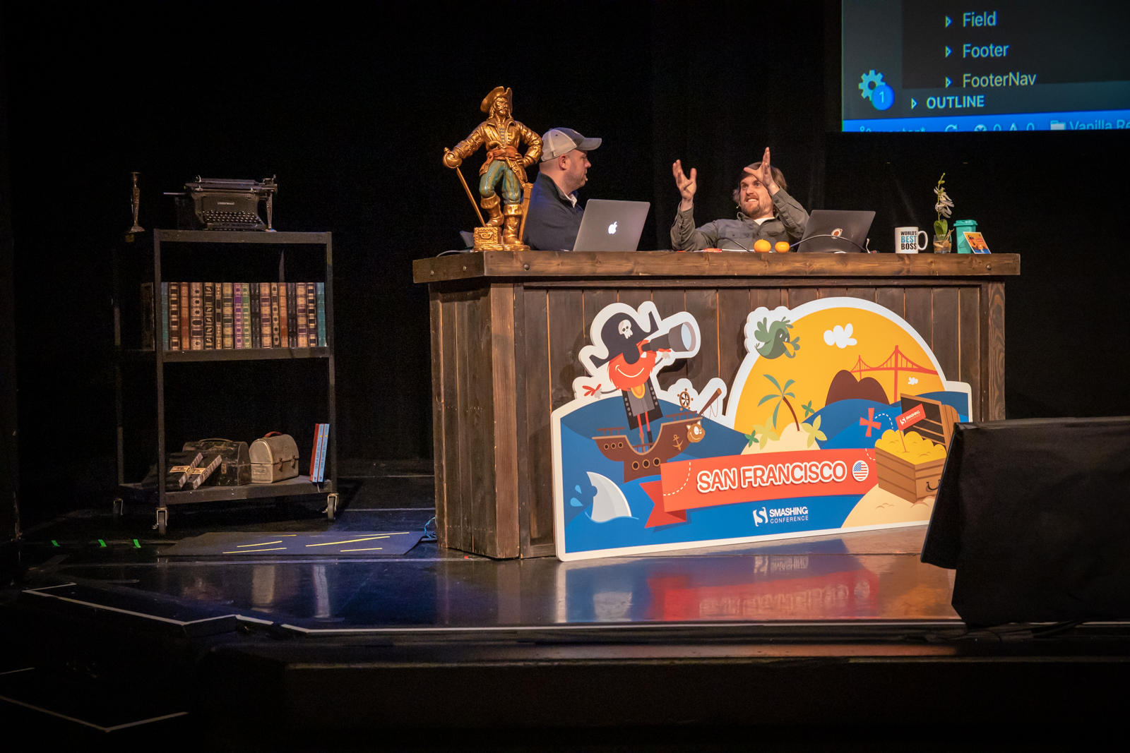
Workshops are a great way to spend a day really thinking about a subject. We ran workshops on Monday (the day before) and on Thursday (the day after the conference); they were all sold out, and the rooms were packed! I got to demo subgrid in my workshop which had just appeared in an early build of Firefox the day previously, so they were some of the first people outside of Mozilla to get to see that working.
Here is the cards example for my @smashingconf workshop tomorrow, which I use to explain why we need subgrid and now I’ll be able to demo. See how the footers line up even if they contain different amounts of content? That’s useful. pic.twitter.com/xqoxPbCCeF
We always want to offer more than the conference, and try to arrange a bunch of side events which offer something for everyone.
Jam Session
On Monday, before the conference began, we had a Jam Session, organized by Mozilla and Shopify and held at the Mozilla offices. In addition to drinks and snacks, there were several micro-talks including:
“Creative Design With CSS Shapes And clip-path,” Mandy Michael
“Building Accessible Experiences,” Tiffany Tse
“The Power Of Code–Based Design,” Marcin Treder
“Axe-Pro: A New Kind Of Accessibility Tool,” April Ellsey
“Scroll Up! Scroll Up! A Tale Of Animating Over 10,000 Data Points,” Becky Rush
Also on Monday, we got together for a graffiti walk led by Scott Whitehead. A group of attendees spent time together exploring the street art of the Clarion Alley Art Street.
At Smashing SF 2018, Josh Clark suggested a morning run, which I helped organize. I thought we should continue the tradition this year and we had two lovely runs on both conference days out towards the Golden Gate Bridge. It has to be one of the most scenic locations possible for a conference run. It really is a great way to start a day of sitting and learning, by stretching your legs and getting some fresh air.
I was surprised to see so many Wednesday morning conference runners, as on Tuesday night we had a party sponsored by Speedcurve. There were drinks, mediterranean food, and the venue was filled with old-school arcade games!
Yesterday thanks to @smashingconf a dream from my childhood came true! Got to play with unlimited tokens all those great arcade games ? Add nice beer to that and cool people to hang out with and you have the best conference party ever!#SmashingConfpic.twitter.com/zayrIm2wYE
After the final day of the conference, some attendees went off on a photo walk, to enjoy a pleasant San Francisco evening. If you have any photos from that we would love to see them — drop a note in the comments.
More Links
There are a few other places you can find conference resources, photos and feedback. If you have written a blog post, posted photos or anything else, add a link in the comments.
We are going to catch our breath and then we will be straight back into getting ready for our next SmashingConf in Toronto. We still have only a few tickets left, so be quick if you don’t want to miss out.
Note: Tickets to SmashingConf SF were quickly sold out. If you are keen to experience Smashing in San Francisco in 2020, tickets for that event are already on sale with super early-bird pricing.
Follow us on Instagram and Twitter for live updates when any Smashing Conference is ongoing — we always try and share some of the buzz and information with our friends around the world.
HTML5 and CSS3 were big. So big that they were buzzwords that actually meant something and were a massive success story in pushing web technology forward. JavaScript names their big releases now too: ES6, ES7, ES8… and it seems like it will keep going that way.
But HTML and CSS are done with that game. Shortly after the whole HTML5/CSS3 thing, the message was that there will be no HTML6/CSS4. There are reasons for that, like perhaps it’s healthier for CSS modules to evolve independently of some global versioning number.
That said… as Dave says:
… the lull in excitement since those days is palpable….
People aren’t equally excited about the big three languages of the web.
I’m on a bit of a quest to understand why these three technologies built to work together are so unequally yoked in popularity and their communities polarized from one another. One end of the spectrum experiences a boom while the other experiences a bust. The rising tide does not lift all boats.
Surely a major version number release for HTML and CSS could spark a ton of fresh enthusiasm.
Sometimes designs are of an acquired taste. That’s our theme for this month.
Each of the projects and trends featured here are things that you’ll probably either love…or hate. But wait to judge these projects until you navigate through them; most of them seem to grow on you the more you dive into the content. Here’s what’s trending in design this month:
Chaos by Design
Have you ever looked at a design and wondered “what were they thinking?”
But then … “that is actually pretty nice.”
It seems like there are plenty of designs out there right now that feature a structure of chaos. These projects are identifiable by an aesthetic that seems to be all over the place, but the more you dig into it, the more it seems to come together.
Common themes include:
Lack of an obvious grid
Lots of motion or animation across multiple elements
Website elements with the same visual weight
“Too many” fonts or colors
Oversized elements that make you think about content
“Trendy” word breaks without hyphenation
Peeking elements from the edges of the canvas
If these things sound like they could make a mess out of the design, you are totally right. But what’s happening with these projects – and the super talented design teams behind them – is that they break all the rules and work.
You will want to keep scrolling through these designs to see what comes next. Each of the examples below incorporates some of these themes and they are stunning.
Oversized Lettering
Big, bold typography has been a trend in website design for some time (we’ve explored that here on multiple occasions.) But there’s been a common theme until now: Most oversized type has been of the sans serif variety.
Now the trend is shifting to an even bolder display above the scroll: Oversized lettering and script fonts.
Each of the examples below uses this trend in a different way:
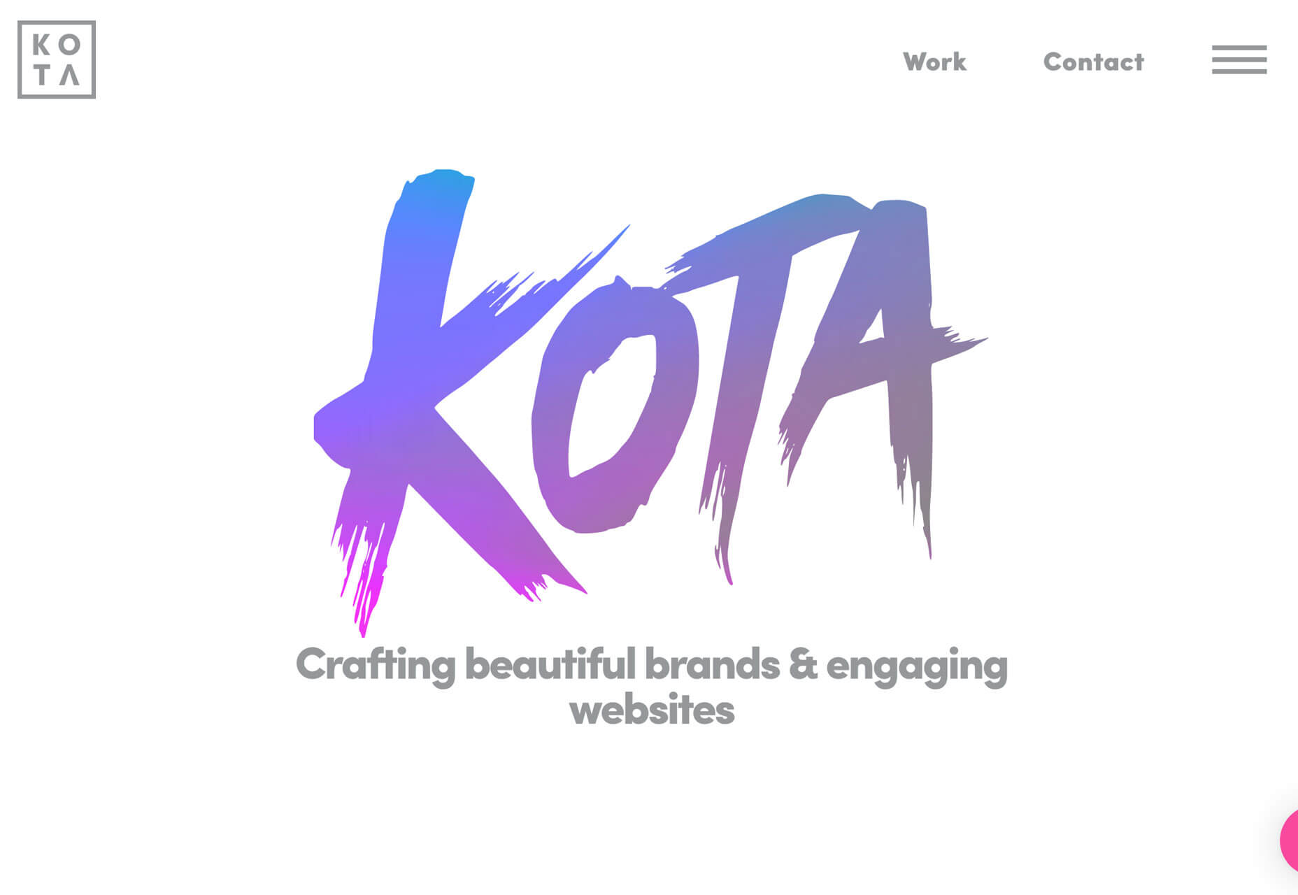
Kota uses a subtle gradient-color animation in a minimal style design. The letters KOTA are the brand of the website and have a memorable design. While the main logo of the site uses a simple square mark with a sans serif, the funky lettering style is carried through the design in the form of call to action links/buttons.
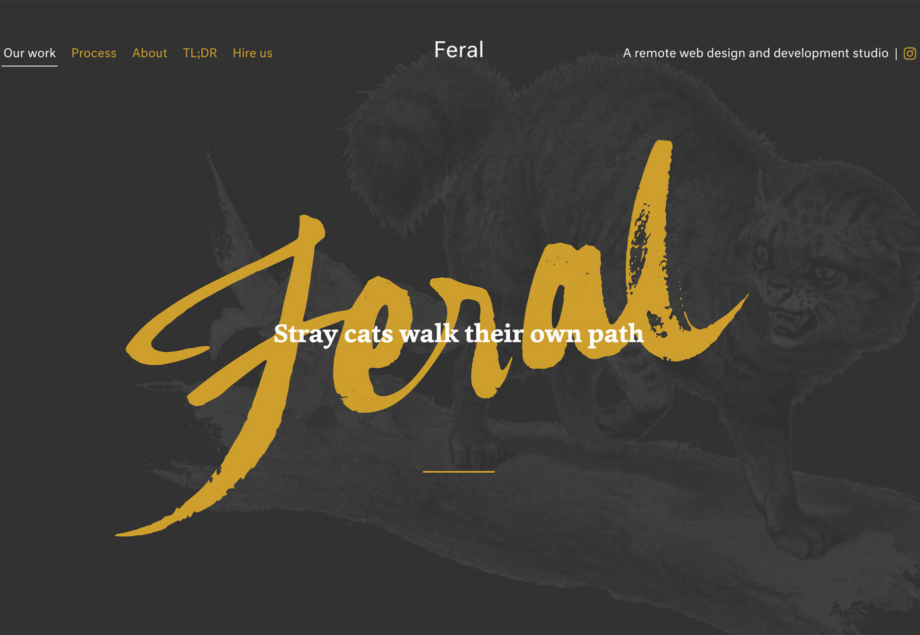
Feral also features its name in the center of the screen with a handwriting style font, but the bright yellow letters are on top of a dark image and behind a simple tagline for the company. The rest of the design is brighter and more minimal, but hints of the funky font carry through in surprising details.
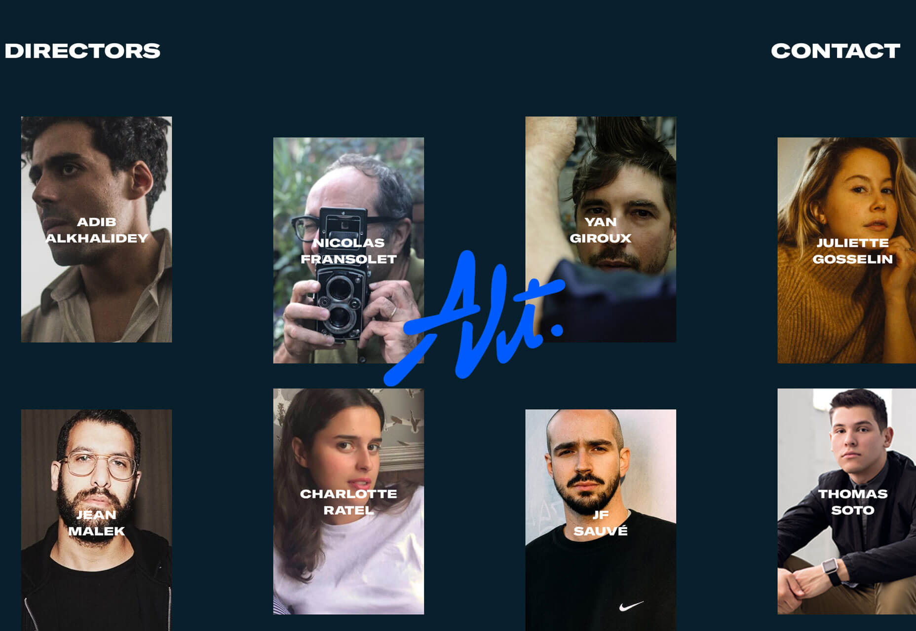
Alt is a little less big than the other featured trending designs, but it is just as bold. What’s nice about the handwriting-style font here is that it is sleek and has a retro feel. As a center-screen element, it draws the eye in among multiple smaller photos and helps create a sense of cohesion among elements. The font and bright blue color combination do a great job of setting the mood for this website design. (Pay attention to the animation as well. The words don’t move while the image pop around it, some behind and some in front.)
The common theme among all three projects is that this style of typography works best with a single word or short phrase. This style of type can be a challenge in terms of readability, so sticking to a simple use is the best option.
Poster-Style Hero Images
Creating a poster-style hero image or homepage screen might be the least controversial trend in the roundup this month, but it can be equally challenging when it comes to design. With multiple layered elements and bold elements, getting the visuals to collapse (or expand) to different responsive viewports can take some work.
There are so many different ways to create a design that follows this trend. The commonality is that the first screen is an immersive visual experience. It’s not a about how much to read or three places to click; it’s about setting the scene for interactions to come.
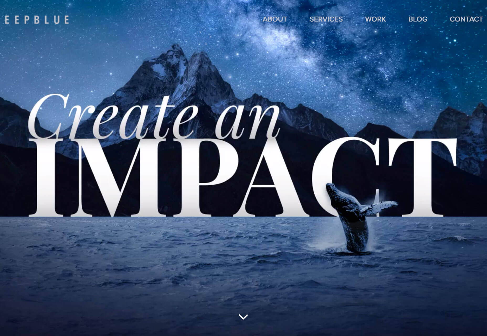
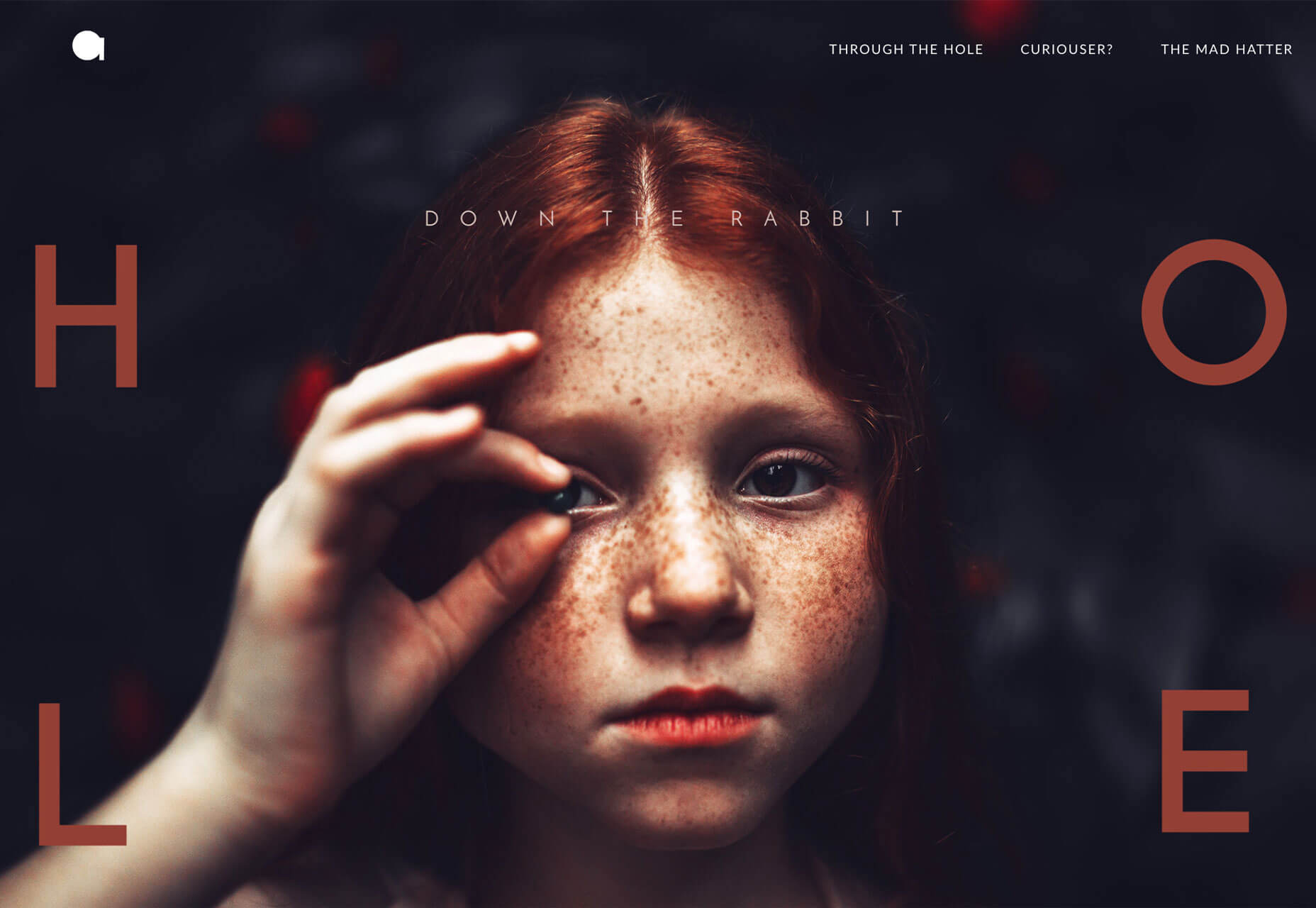
What often makes this design style work is a combination of amazing imagery – each of the examples below start with stunning images – impactful text and enough of a curiosity tease to get users to explore the design more. (It’s also interesting that all three examples are from design studios; that’s where many envelope-pushing trends show up first.)
Deep Blue does this with an amazing visual. You might not know exactly what the website is about at first glance, but it’s so pretty that you’ll probably scroll to learn more. If you do, the design has done its job.
Chaptr Studio uses a striking image in a different way. It grabs your attention with a tiny, animated cursor that expands on clickable elements. Users hardly have to try to understand that there’s much more to this design.
Alber Graphics tugs at your curiosity with a stunning image and visual theme that is reminiscent of “Through the Looking Glass.” The visual presentation is so strong that users want to know what’s next; can you feel yourself wanting to engage with the CTA just to see how they respond?
Conclusion
How many of this month’s trends could you see as part of future design projects?
Working with super trendy elements, especially ones that break common design rules or contrast with principles of design theory, can be a challenge. But if you get it right, there’s a huge upside. That’s what you get with each of the projects above; these risky design concepts are well worth the time and are a lot of fun to explore.
Nearly everyone has experienced frustration while using a website, mobile app, or web application. In these moments, we might wonder “What were they thinking?” followed by “They sure were not thinking about making this easy for me.” One reason we encounter such frustrating moments is that the process of making sound and user-friendly decisions is difficult.
In this article, we’ll identify four decision-related traps that impede good design and offer techniques for avoiding these traps. These decision traps are based on research conducted by psychologists, neuroscientists, molecular biologists, and behavioral economists including several cited in this article.
Too many design decisions occur in isolation, are based on gut feel, or are not carefully examined. The web offers many examples of poor design decisions. For instance, let’s take a look at the example below.
On the left: Are they asking for city, state, or country? On the right: This tooltip does not answer the user’s question. (Large preview)
At first glance, it seems quite straightforward: type the place of birth in the text field. A moment’s reflection, however, raises a question. Should we type the country, state, or city? It’s not clear. Clicking the question mark icon displays the help text shown below, to the right. The problem? The text does not answer the question; it simply restates the original request about entering the place of birth.
The design shown above violates a basic tenet of user experience (UX) immortalized by the title of Steven Krug’s famous book Don’t Make Me Think. Sure, it’s an amusing title, but he’s serious. The entire field of user experience is based on the idea of reducing the user’s cognitive load:
“Just like computers, human brains have a limited amount of processing power. When the amount of information coming in exceeds our ability to handle it, our performance suffers.”
In other words, when a design requires users to guess or think too hard about something as simple as one text entry, users will often make mistakes (costing your organization time and money) or abandon the task altogether.
Lightening the user’s cognitive load means increasing our own cognitive load as designers. We do have to think, hard and carefully. Essential to this effort is learning how to make good design decisions.
There are four common decision traps that we often fall into. I’ll explain how you can avoid them.
A heuristic is a mental shortcut that helps us make decisions quickly. These mental shortcuts are essential in certain situations. For example, if a car veers into your lane, you must act quickly; you don’t have time to review several options.
Unfortunately, heuristics become a flaw when making decisions in situations where many factors and participants must be considered. One such flaw is the availability heuristic, which involves an incomplete examination of current and past information.
A particularly distressing example of the availability heuristic in the design space is the software on the Boeing 737 Max. As of this writing, it appears that this software contributed to the tragedy of the downed airplanes. People around the world have asked how to prevent such tragedies in the future.
Part of the answer lies in avoiding quick fixes. Airbus, Boeing’s chief competitor, had refitted their A320 planes with larger engines. Boeing felt pressured to do the same leading to a variety of changes:
“The bigger engines altered the aerodynamics of the plane, making it more likely to pitch up in some circumstances.”
To compensate, Boeing added new software to the 737 Max:
This software “would automatically push the nose down if it sensed the plane pointing up at a dangerous angle. The goal was to avoid a stall. Because the system was supposed to work in the background, Boeing believed it didn’t need to brief pilots on it, and regulators agreed. Pilots weren’t required to train in simulators.”
The obvious and horrifying conclusion is that Boeing engineers and designers were placed under immense pressure to re-design the 737 Max at record speed resulting in a series of misjudgments. Less obvious, but equally troubling, is the likely role of the availability heuristic in these tragedies.
In short, the information used to make critical design decisions was not sufficient and resulted in tragedy.
The availability heuristic limits our perspective (Large preview)
Solution
One solution is for designers to identify their area of competence. Within this sphere their intuitions are likely to serve them well, explains author Rolf Dobelli in The Art of Thinking Clearly. For example, UX designers should feel comfortable making decisions about layout and interaction design issues like flow, navigation, and how much information to present at one time.
When designers face a decision outside their circle of competence, it’s worth taking time to apply hard, slow, rational thinking. For example, when designing cockpit software for jets, designers would be well advised to work closely with engineers and pilots to ensure that everything in the proposed user interface (UI) is precise, accurate, and provides the information pilots need when they need it.
We are all subject to the availability heuristic. Designers must strive to mitigate this heuristic by consulting a variety of subject matter experts (SMEs), not simply the programmers and engineers on their immediate teams. The downside risk is simply too high.
2. Focalism Bias
The availability heuristic hinders our ability to assess current and past information. The focalism bias concerns our ability to look forward. It refers to the inclination to concentrate on a single point when considering the future. As Harvard psychologist Daniel Gilbert explains in his book Stumbling on Happiness:
“It is difficult to escape the focus of our own attention — difficult to consider what it is we may not be considering.”
The focalism bias restricts our view of the future. (Large preview)
For example, while my colleagues and I were conducting UX research for a U.S. government agency, we discovered that caseworkers could not access information essential to processing applications for medical assistance.
As shown in the diagram below, these caseworkers literally had to stop in the middle of the application process in order to request critical information from another division. Typically, caseworkers had to wait 24 to 48 hours to receive this information.
The focalism bias led to a delay, the opposite of the desired results. Our re-design resolved the issue. (Large preview)
Caseworkers found this delay stressful because it made it more difficult to meet a federal law requiring all applications to be processed within 10 days of receipt.
How did this happen? One reason, surprisingly, was the emphasis on deadlines. Through our observation and interviews, we learned that the system had been rushed into production to meet a project deadline (all too common) and to give caseworkers a way to process applications more efficiently.
The intentions were good, the goals made sense. Unfortunately, the focus on rushing a system into production to supposedly expedite the process had the opposite effect. Designers created a system that delayed the application process.
Solution: Become An Active Problem Seeker
This idea may sound counterintuitive. Why would we look for problems? Don’t we already have enough to deal with? In truth, however, organizations that seek problems, such as Toyota, often demonstrate impressive performance. They’re called high-reliability organizations (HROs). Other examples include the U.S. Navy’s aircraft carriers and air traffic control centers in the U.S., both of which have incredibly low error and failure rates.
As decision expert Michael Roberto of Bryant University explains, leaders of HROs do not wall themselves off from the possibility of failure. On the contrary, they preoccupy themselves with failure. For example, they:
Do not simplify explanations.
Remain sensitive and attentive to their front-line operations as we did while observing caseworkers.
Defer to those who have the local, specialized knowledge as opposed to those who simply have authority in the hierarchy. Again, we relied on the expertise of caseworkers on the ground.
Commit to resilience, to the notion that you cannot prevent all small problems. Rather, the goal is to focus on fixing these small problems before they mushroom into large problems.
Actively seeking problems leads to better decisions. (Large preview)
Problems are not the enemy; hidden problems are because these hidden problems become serious threats down the road as we saw in the government agency examples outlined above. In both cases, earlier and additional contextual inquiry (observing users in their natural home or work environments) would likely have identified current problems and possible UI solutions to these problems.
For example, while conducting contextual inquiry for a large Mexican bank, I observed customers trying (and failing) to transfer money to family members who held accounts at different banks. Customers expressed frustration at this limitation because they wanted an easy way to send money to family members, especially those who lived far away.
While living in Mexico, I learned that loaning and giving money to family members is more common in Mexico than in the U.S., Canada, or parts of Western Europe.
Given the deeply rooted Mexican tradition of supporting family members in financial need, I was initially surprised by this banking limitation. Upon reflection, however, I realized that this limitation was simply a hidden problem. When coding the banking web site, the developers were likely focused on security, paramount in all matters financial. They had not considered including a cross-bank transfer feature.
I identified this missing feature by conducting UX Research with banking customers in Mexico. This real-world example shows how critical it is to become an active problem seeker.
3. Optimism Bias
Focusing on a single point or problem impedes our ability to plan and design for the future. An equally troubling challenge is the optimism bias. We tend to imagine the best-case scenario.
“For example, we underrate our chances of getting divorced, being in a car accident, or suffering from cancer. We also expect to live longer than objective measures would warrant, overestimate our success in the job market, and believe that our children will be especially talented.”
“Sure, this part of the UI is a bit clunky, but customers will get used to it, and then it won’t be an issue.”
In other words:
“We need to ship the product; we don’t want to deal with the cumbersome interaction.”
As anyone who has conducted a survey or usability test knows, this optimism is misplaced. Users and customers are easily frustrated and often show little patience when products and UIs are hard to use.
I witnessed this bias when designing a web application for financial advisers — 70% of whom were male. The client insisted on using a red font to emphasize certain numbers. Even after I explained that approximately 9% of males are color blind, she refused to change the font color. She reasoned that financial advisers would see the numbers in context. In other words, no problem. When I conducted multiple rounds of usability testing, however, two male advisers struggled to distinguish the numbers in red. They could read those numbers, but the figures did not stand out.
The reason for this type of wishful thinking is our tendency to see the future as a variant of the present. We tend to assume that things will go on more or less as they have. In the case of the financial application, because advisers had not complained before so my client assumed that they would not complain in the future. What she failed to grasp was the significance of changing the font to red.
“We tend to simulate the future by re-constructing the past, and the re-construction is rarely accurate.”
Solution: The Pre-Mortem Technique
That’s why it’s essential to resist this innate tendency by leveraging techniques like psychologist Gary Klein’s pre-mortem. The idea is to describe a scenario in which the project failed to meet a specific goal such as a revenue target, an increase in the percentage of new purchases, requests for more information, etc.
Here’s how it works. Before committing to a major initiative, the key stakeholder (often an executive) gathers everyone who is slated to participate. She outlines the key objective and explains “what went wrong.” The statement will sound something like this:
“Imagine that we have rolled out a new e-commerce mobile app at a cost of $3 million with a projected revenue of $10 million for the first year. At the end of one year, revenue is $1 million, a huge failure. Please take 20 minutes to write a history of this failure.”
This pre-mortem exercise:
Legitimizes doubt by providing a safe space for asking questions and expressing concerns about the decision.
Encourages even supporters of the decision to search for threats not previously considered.
An e-commerce mobile app is simply an example. The pre-mortem technique can be applied to nearly any project in any industry because it’s about expanding our perspective in order to identify what could realistically go wrong.
4. Overconfidence Bias
We unconsciously exaggerate our ability to accurately assess the present and predict the future. A study of patients who died in a hospital ICU compared the doctor’s diagnosis to the actual autopsy results. The doctors who were completely confident in their diagnosis were wrong 40% of the time.
When designers fall prey to the optimism bias, they exaggerate their ability to understand how users think. The most common results are information overload and confusing terminology and controls (buttons, checkboxes, sliders, and so on).
For example, while evaluating a client’s tablet-based investment application targeted at lay people, my team and I immediately noticed that:
The screen where users would create a risk profile included extraneous information.
The phrase “time zone” would likely confuse users. The client intended the term to refer to the customer’s investment time horizon. Yet, “time zone” usually means the time in a country or region, such as the U.K. or South Africa.
Plus and minus controls exhibited low affordance meaning that it was hard to tell whether they could be tapped or were simply part of the display.
These observations were supported during a subsequent usability test when participants expressed confusion over these specific points. In short, the designers for this project had overestimated their ability to create an interface that users would understand.
Solution
One solution is to conduct user research as we did with the tablet-based financial application outlined above. If such research is not possible, a second solution is to actively seek case studies beyond your immediate context. For example:
If you are designing an investment application, it might make sense to **refer to banking applications** to identify potential design challenges and what is already working well for customers.
If you are designing a tablet application to help nurse practitioners make a preliminary diagnosis, **look to other projects that are related** but outside your immediate context. Has your company developed a medical device UI for surgeons or ER doctors? What worked well for users? What did not?
Referring to other projects may sound like a no-brainer. Ask yourself, however, how often a systematic review of previous, related (but not identical) projects occurs within your organization. Remember, we are all subject to overconfidence.
Conclusion
In this piece, we’ve identified four common decision traps and corresponding solutions:
The availability heuristic causes us to ignore potentially important current or past information when making decisions. The solution is to expand our perspective by reaching beyond our circle of competence. For designers, this often means consulting highly technical experts.
Closely related is the focalism bias, our tendency to concentrate on a single point when designing thus overlooking other, equally important factors. The solution is to actively seek problems in order to identify and address hidden problems now before they become even larger difficulties.
The optimism bias refers to our tendency to imagine the best-case scenario. The solution is the pre-mortem technique. In this exercise, we imagine that a design project has gone terribly wrong and discuss why and how this happened. As with active problem seeking, the idea is to identify issues before they occur or get worse.
In the design space, the overconfidence bias refers to exaggerating our ability to understand how users think and design accordingly. The solution is to conduct user research and seek case studies similar to the current design initiative.
The cognitive biases discussed here are not intended to criticize designers (I am one). Rather, they are scientific observations about human nature. While we can’t change our biology, we can remain mindful of this biology and apply the four solutions outlined in this article. In so doing, we will increase the chances of creating better, safer, and more engaging designs.
Objectives and Key Results (OKR) is an approach that informs everyone in the organization where they should concentrate their efforts and directs the company to the common goal as a whole. In fact, it’s a simple way to ensure that everyone is striving for the same result and that all the operations are related to the company’s goals.
In the early years of Google, John Doerr, by introducing the idea of ??using OKRs, an organizational system for goal-setting, says that the OKR approach is an effective way of identifying both high-level objectives and at what stage they are to achieve these objectives.
OKR is a way of business that every company can use, regardless of its size. It is beneficial and has been heavily used by companies like Intel, Google, LinkedIn, and ING Bank, it is helpful to the startups and small companies as it is to the giant enterprises.
The OKR approach is an effective way to identify targets and communicate within a company, and to transform company, team and personal goals into measurable results. This system is a driving force that keeps both the company and the employees within the determined common goal.
This is an approach that brings concrete results in many respects, because it provides both the company and the employees with the motivation to achieve their goals, and the opportunity to follow the progress they have made with measurable results.
In fact, OKRs provide strategies and objectives for organizations and teams for a certain period of time. And at the end of this time period, the OKRs provide a reference to see how well the work is being done in achieving the targets.
“Not everything that can be counted counts, and not everything that counts can be counted.” – John Doerr
Objectives and Key Results, a popular approach to objective management, provides a framework for companies to achieve their strategies, improves their focus, provides transparency and encourages and organizes company employees to achieve their common goals.
How does OKRs work?
The OKR methodology includes rules to help company employees prioritize, focus, and measure the results of their work. Thus, the OKR approach helps companies to communicate their strategies in an actionable and measurable way. Likewise, it allows companies to move from an output-based approach to a result-oriented approach
An OKR, as its name implies, is comprised of Objectives, that define the goal to be fulfilled, the Objective contains up to 5 Key Results that measure the process in achieving the Objective. Each OKR also includes Initiatives, the work that needs to be done to progress on Key Results.
One of the most important points to consider is that objectives should be measurable, focused and meaningful. 4 to 6 key results should be planned for each individual within a quarter, but it is possible to set OKRs on a weekly, monthly or yearly basis. Each target is recorded as a percentage, number or currency of how much is achieved.
OKR vs. KPI
Unlike the old KPI methods; everyone can clearly see how everyone works, and they can share their comments and appreciation about each other’s work through the same platform. I think the sharing motivation here is due to our sharing habits on social media. So this is also very fun.
With OKR, leaders in the company can see their teams moving towards important goals, while employees also know exactly what they expect. And as a result, the happiness and efficiency of working in clear goal-oriented environments brings success.
Objectives
Every attempt is made in accordance with an objective. The purpose of determining an objective is to reveal what is expected to be done after a certain period of time or to set a clear course to achieve this objective.
Choosing the right objectives is one of the hardest steps and requires a lot of effort to think and do what is good. For this reason, it is important to determine an objective that can be defined as success when it is achieved and not easy to do.
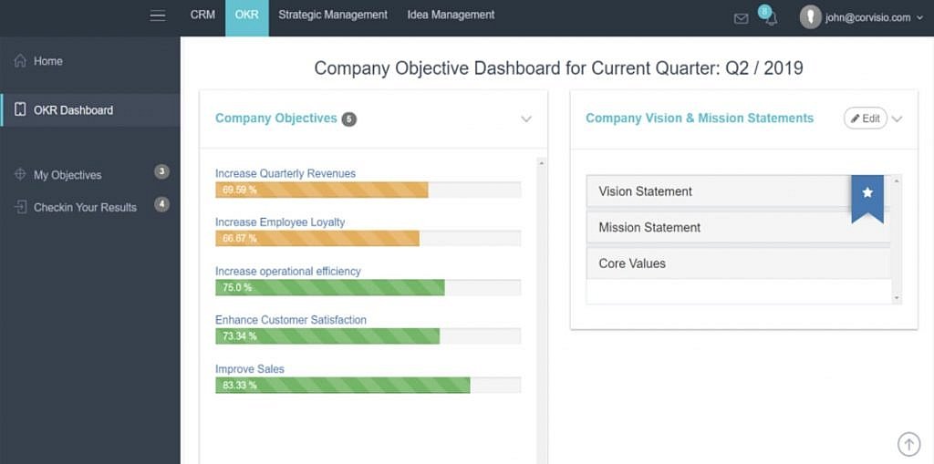
source: Corvisio OKR
The answer to the question “Where to go?” determines our objective. This answer should give a clear direction.
For example;
Increase the gross profit of the last quarter
Provide a very good customer experience
Key Results
In cases in which the objectives are correctly established, Key Results emerge as a weapon of using the OKR approach. Key results are numerical expressions used to achieve goals and to assess progress in this process.
Numerically defined expectations reveal measured and scored results.
The important component here is the measurable success. As general statements about progress and development are subjective, they are not successful enough in explaining the situation to achieve the objective, because immeasurable objectives prevent us from using our capacity sufficiently.
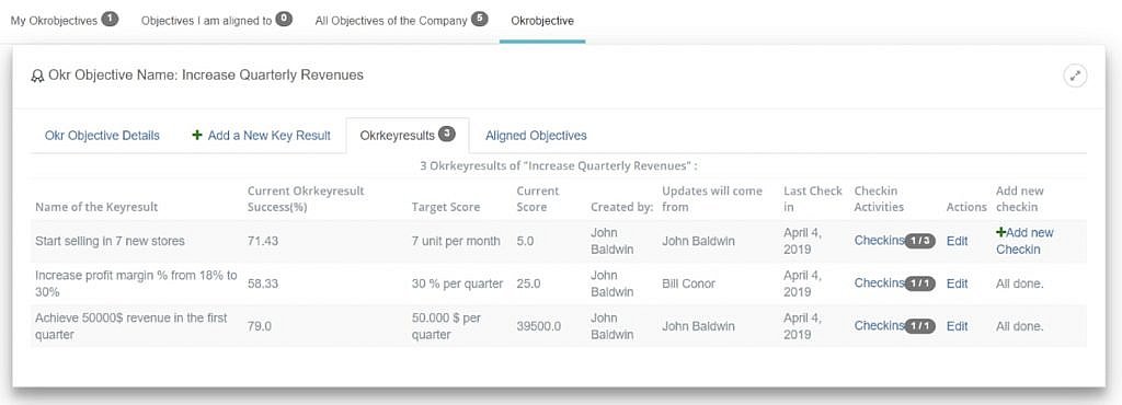
source: Corvisio OKR
The answer to the question “How do we know that we have arrived there?” refers to the Key Results. We can think of it as a GPS device that draws the route of the destination and allows to see the current position. Key Results indicates how close the target is.
What will OKR approach bring to your work?
After talking about what the OKR approach is, we can come to the benefits of the OKR approach and the reasons behind the company’s determination of this approach based on Google, which comes to mind when talking about the OKR approach.
OKR’s main purpose is to unite the team around measurable results, enabling the company, its internal teams and individuals to move together in the right direction. The biggest advantage of OKR is that each individual knows very well what is expected of him / her in line with the company’s goals. Again, everyone can keep track of what others are interested
in and what task they are focusing on. This awesome methodology is actually a roadmap that can be pursued with a goal-oriented approach.
In order to ensure measurability in the OKR approach, it is also intended that employees identify their own OKRs and share it. Karl Sun, who has worked as a manager for a long time on Google, says that all OKRs in Google are clearly in a common area within the company. Likewise, each employee shares his / her own OKRs in this common area.
And if we list what will OKR bring to the company and to the team: Transparency – OKR’s should be visible to everyone so that the people are aware of what others are working on.
Alignment – Similarly, OKR makes sure that every employee in the company align their work, move in the same direction and reach a common goal.
Focus – OKR helps the employees focus on the tasks that have the most impact on the business. There needs to be high impact on company goals after you get the objectives done, otherwise, the objectives are too easy to achieve.
OKR helps the employees to focus their attention on the most important tasks for the time, letting them prioritize them to bring the highest positive impact on the company.
Engagement – People strive to achieve outstanding results when they engage in the process with a purpose. Use a wording that everyone will understand. As a result, you can communicate your goals to everyone in the company and receive deeper engagement.
Everything considered I can’t think of a reason that would set you back from implementing OKR Management into your business. As you may create your own OKR Spreadsheets very easily using MS Excel, but you might prefer to use a cloud-based OKR Software provided by many firms now.


