Considering the amazing professional and personal development possibilities along with the large market offered by the online world, it’s no surprise more and more people of all ages are eager to acquire new skills, whether it’s just for earning extra money from a side job or for setting out on a completely new, exciting career path (as a web designer, marketer, web developer etc).
The online education industry is quickly expanding: according to recent studies, in 2015, the e-learning market was worth $166.5 billion. In 2017, it’s been estimated that this will grow to $255 billion. So, can we consider online learning the future of education?
One form of online education consists of the for-credit courses students enrol in for taking online classes offered by higher education learning institutions. But we will now concentrate on the other form of online education, usually targeted at professionals and students interested in getting online professional training and certification preparation to broaden their horizon.
While the number of people choosing to begin an online course is swelling each year, we can’t ignore the boundaries and the challenges of online education. Some interesting research recently conducted by specialists shows that 96% of people who start online courses never finish them.
For example, if you are an aspiring creative, interested in a career in visual design or illustration with no guidance from a specialist who could answer your questions and help you achieve your creative goals, you might feel lost and drop an otherwise interesting online course. On the other hand, studies show that people who receive one on one teaching will perform 2 standard deviations better than people who don’t have a personal coach.
This is why Rookieup is trying to introduce a level of personalization to the “self-guided online education” industry who could help the students finish their chosen online course, reducing frustration and improving the quality of their work.
How does it work?
You can search the community to find the perfect mentor for you. Then, you schedule a 30-minute session with your chosen mentor to talk about the industry, ask technical questions or receive quick design critique. In case you need more in-depth explanations, career advice or a complete portfolio review, you can go for 60-minute sessions with your mentor. This could develop into a long-term professional relationship with a specialist who can offer you guidance throughout your journey. Whether you are interested in motion graphics, visual design, UX design or photography, mentorship could be your way towards professional achievement.
How does that help you? Receiving good feedback is crucial, especially when you are a beginner. And, even if you have worked on a number of projects, you might sometimes feel at a loss as a designer. You may lack inspiration or get stuck in the same set of color schemes fonts and design elements that you tend to use again and again, project after project. You need innovation and encouragement to break from the old style you are so familiar with. A good mentor will give you fresh insights, will help you get out of your comfort zone and will recommend sources of inspiration that will jump-start your creativity.
How do you know if your mentor is good for you?
You should choose someone whose skill sets are complementary, rather than too similar, so that you have even more to learn from this person. The perfect mentor will understand your strong points and your weak points and will provide all necessary support for you to overcome difficulties.
I am sure you are tired of the corporate environment, and would rather become your own boss. However, becoming a freelance graphic designer/illustrator can be tough. It takes time and great effort to learn and develop new technical skills, gain self-confidence to take up more difficult, challenging projects, build a partner network and find that successful marketing technique that brings you on top. Successful freelancers also know how to choose their clients, how to quote their work, when to stop working and take vacations.
It may take years to learn how to cope with all these aspects, without the help of an experienced mentor who can offer you industry insights and career tips thay might ease your way up. A very important aspect a mentor could help you understand is how to be more efficient with your time and how to take pleasure in your work. After all, you should enjoy your journey and not let stress take away your happiness.
Conclusion
Finally, it’s extremely important to understand that your mentor just gives you direction; but, at the end of the day, it’s YOU who has to make the right choices. Your mentor isn’t there to tell you which direction you should take, they are their to offer guidance, which will only help you down the path you choose to take.
Who knows, perhaps with a little help, you could become the next Kal Michael (one of the first iOS designers), Gemery Mumenthaler (employee 1 at Noun Project), or Mike Casebolt (freelance designer/illustrator). They all became who they are today with the help of great teachers. So, believe in yourself, find a good mentor, and keep up the good work!
Common web design problem: Just writing out why a company is special is usually an insufficient way to tell a story to people in a way that will give them a rapid understanding of what makes a company’s product or service awesome.
We have to get visual—people should be able to blur their eyes when they land on a site and know what you do, and what key actions they would take on the site immediately. But it also takes deeper collaboration with key stakeholders in the company you’re working with to be on board, so you can allocate project resources.
Ideally a site visitor in a company’s demographic should have a positive reaction to the site that is instinctive and immediate. This is why it works so well when sites use photography of a person smiling, interacting with the product or receiving the benefit of the service; when visitors see that, it’s their natural instinct to imagine that scenario—with themselves at the center of the scene. A website created with an understanding of how humans instinctively react to certain types of imagery, will most certainly be more effective in driving action.
If someone imagines themselves as a client, or enjoying the benefits of a product when viewing someone smiling and doing so, it’s referred to as the “mirror effect,” and you can use it to your advantage if you can first get to the core of why the startup you are marketing appeals to it’s best customers. This works best in conjunction with “future pacing” or website copy that invites them to think about what it will be like when they are enjoying their new purchase—like “imagine how you will feel ten days from now when you are driving a Tesla home from work.”
Ask: “Why do your best customers come to you vs. the competitor?”
The answer to this question—is not only pinpointing the core demographic, but is also digging up the key differentiation that’s so critical to hammer on, in a website design. If you can determine not only who the best customers are—but why they come to your client and not their competitor, then it’s time to show the visual representation of that somehow.
Dig deeper—ask key stakeholders or people in the startup to give actual examples of people that have told them why they went with them over competitors. If there is a sales team, there will be many examples, since people often chew through their considerations before closing a deal. If it’s a product, talk to those doing customer service and ask them the questions they get asked over the phone with people considering purchase. These questions, and the positive answers that led to a sale, will be keys to showcase visually on the site.
For instance in the case of juicing startup Juicero, their biggest differentiator is the lack of a mess and the no-hassle aspectof their first at-home cold press juicer for mass market. They show someone enjoying the juice, but also a very clean counter behind them—the number one differentiator between their solution and cheaper at home juicers that make an incredible amount of mess.
If your product has a better user interface than the competitor – perhaps show that in all its glory in a couple different devices, so people can get a feel for what they’re buying, like this site for Oppsource.
And of course – if it’s a beautiful product, simply showcase it with well done photography in a way that shows its best features like this site for Starry Wi-fi systems.
Ask: “What does a successful interaction look like physically? What does a pleased customer look like as they’re receiving the benefit of your product or service?”
A happy customer is always going to be your client’s best sales tool. Whether they be through referral, testimonials on your website, or my favorite—photos of previous customers, or pictures of people happy and receiving the benefit of what the company does.
For a traditional business—this might be a satisfied man in front a perfectly cooked steak, taking his first bite, or a woman looking at herself in the mirror with something she finds fits her perfectly well. This is the single most effective principal of effective web design—it’s not about your product or service, and every detailed feature, it’s the customer or client experience—the benefit, and showcasing the emotional appeal of that benefit that will tell the story you need for the site visitors to feel.
For this medical device and solutions startup Nuance healthcare solutions, they needed to show that their documentation solutions aren’t just the same old, but rather make it more natural with visual components, voice documentation, and imaging exchange within the software.
By showing someone, directly benefiting from the solution—interacting with a patient and using voice documentation, rather than taking notes, they are able quickly allow a visitor to understand, at an instinctual level, how their practice might benefit from the software.
Ask: “How can we get photography, iconography, graphs, visual statistics and trust factor badges to support the claim of superiority for this offering?”
Of course it’s not just about the homepage hero section—there are ways to do icons in a way that feels commonplace and generic, and then there are ways to do them that feel intentional and specific to your brand.
Ask: “How can we show your real team in a fun and down-to-earth way that helps people trust you?”
People want to see who works for the company. Whether that’s two founders by themselves, a 15 person team at a grill out, or even like this photo for Buffer, sharing transparently how they spent 100k on their team retreat and – thanking customers for their support through their subscription:
To recap, the keys to helping people have a positive reaction when they land on the page are:
Making it easy for them to find what the site is about quickly, and what key action the site is for.
Showing smiling faces of customers—or smiling faces on the startups team.
Demonstrating the benefit from the startup’s product or service in a visual way by showing it in action, or someone who is receiving the benefit. Make it immediate and evoke emotion.
Display brand appropriate iconography that actually makes sense with the key points of differentiation the site is supposed to demonstrate, and consider how motion can communicate those unique value propositions.
This is a full chapter excerpt from Wladston Viana Ferreira Filho’s brand new book Computer Science Distilled which he has graciously allowed for us to publish here.
In almost every computation, a variety of arrangements for the processes is possible. It is essential to choose that arrangement which shall tend to minimize the time necessary for the calculation.
—Ada Lovelace
How much time does it take to sort 26 shuffled cards? If instead, you had 52 cards, would it take twice as long? How much longer would it take for a thousand decks of cards? The answer is intrinsic to the method used to sort the cards.
A method is a list of unambiguous instructions for achieving a goal. A method that always requires a finite series of operations is called an algorithm. For instance, a card-sorting algorithm is a method that will always specify some operations to sort a deck of 26 cards per suit and per rank.
Less operations need less computing power. We like fast solutions, so we monitor the number of operations in our algorithms. Many algorithms require a fast-growing number of operations when the input grows in size. For example, our card-sorting algorithm could take few operations to sort 26 cards, but four times more operations to sort 52 cards!
To avoid bad surprises when our problem size grows, we find the algorithm’s time complexity. In this chapter, you’ll learn to:
Count and interpret time complexities
Express their growth with fancy Big-O‘s
Run away from exponential algorithms
Make sure you have enough computer memory.
But first, how do we define time complexity?
Time complexity is written T?(n). It gives the number of operations the algorithm performs when processing an input of size n. We also refer to an algorithm’s T?(n) as its running cost. If our card-sorting algorithm follows T?(n)=n2, we can predict how much longer it takes to sort a deck once we double its size: T?(2?n)T?(n)=4.
Hope for the best, prepare for the worst
Isn’t it faster to sort a pile of cards that’s almost sorted already?
Input size isn’t the only characteristic that impacts the number of operations required by an algorithm. When an algorithm can have different values of T?(n) for the same value of n, we resort to cases:
Best Case: when the input requires the minimum number of operations for any input of that size. In sorting, it happens when the input is already sorted.
Worst Case: when the input requires the maximum number of operations for any input of that size. In many sorting algorithms, that’s when the input was given in reverse order.
Average Case: refers to the average number of operations required for typical inputs of that size. For sorting, an input in random order is usually considered.
In general, the most important is the worst case. From there, you get a guaranteed baseline you can always count on. When nothing is said about the scenario, the worst case is assumed. Next, we’ll see how to analyze a worst case scenario, hands on.
Figure 2.1: “Estimating Time”, courtesy of xkcd.com.
2.1 Counting Time
We find the time complexity of an algorithm by counting the number of basic operations it requires for a hypothetical input of size n. We’ll demonstrate it with Selection Sort, a sorting algorithm that uses a nested loop. An outer for loop updates the current position being sorted, and an inner for loop selects the item that goes in the current position1:
function selection_sort(list)
    for current ← 1 … list.length - 1
        smallest ← current
        for i ← current + 1 … list.length
            if list[i] < list[smallest]
                smallest ← i
        list.swap_items(current, smallest)
Let’s see what happens with a list of n items, assuming
the worst case. The outer loop runs n-1 times and does two
operations per run (one assignment and one swap) totaling 2?n-2 operations. The inner loop first runs n-1 times, then n-2 times, n-3 times, and so on. We know how to sum these types of sequences2:
number of inner loop runs=
n-1???+???n-2?+??+2+1?n-1?total runs of the outer loop.
=
?i=1n-1i=(n-1)?(n)2=n2-n2.
In the worst case, the if condition is always met. This means the inner loop does one comparison and one assignment (n2-n)/2 times, hence n2-n operations. In total, the algorithm costs 2?n-2 operations for the outer loop, plus n2-n operations for the inner loop. We thus get the time complexity:
T?(n)=n2+n-2.
Now what? If our list size was n=8 and we double it, the
sorting time will be multiplied by:
T?(16)T?(8)=162+16-282+8-2?3.86.
If we double it again we will multiply time by 3.90. Double it over and over and find 3.94, 3.97, 3.98. Notice how this gets closer and closer to 4? This means it would take four times as long to sort two million items than to sort one million items.
2.1.1 Understanding Growth
Say the input size of an algorithm is very large, and we increase it even more. To predict how the execution time will grow, we don’t need to know all terms of T?(n). We can approximate T?(n) by its fastest-growing term, called the dominant term.
The Index Card Problem: Yesterday, you knocked over one box of index cards. It took you two hours of Selection Sort to fix it. Today, you spilled ten boxes. How much time will you need to arrange the cards back in?
We’ve seen Selection Sort follows T?(n)=n2+n-2. The fastest-growing term is n2,
therefore we can write T?(n)?n2. Assuming there are n cards per box, we find:
T?(10?n)T?(n)?(10?n)2n2=100.
It will take you approximately (100×2)?hours=200 hours! What if we had used a different sorting method? For example, there’s one called “Bubble Sort” whose time complexity is T?(n)=0.5?n2+0.5?n. The fastest-growing term then gives T?(n)?0.5?n2, hence:
T?(10?n)T?(n)?0.5×(10?n)20.5×n2=100.
Figure 2.2: Zooming out n2,? n2+n-2,? and
?0.5?n2+0.5?n,? as n gets larger and larger.
The 0.5 coefficient cancels itself out! The idea that n2-n-2 and 0.5?n2+0.5?n both grow like n2 isn’t easy to get. How does the fastest-growing term of a function ignore all other numbers and dominate growth? Let’s try to visually understand this.
In Figure 2.2, the two time complexities we’ve seen are compared to n2 at different zoom levels. As we plot them for larger and larger values of n, their curves seem to get closer and closer. Actually, you can plug any numbers into the bullets of T?(n)=??n2+??n+?, and it will still grow like n2.
Remember, this effect of curves getting closer works if the fastest-growing term is the same. The plot of a function with a linear growth (n) never gets closer and closer to one with a quadratic growth (n2), which in turn never gets closer and closer to one having a cubic growth (n3).
That’s why with very big inputs, algorithms with a quadratically growing cost perform a lot worse than algorithms with a linear cost. However, they perform a lot better than those with a cubic cost. If you’ve understood this, the next section will be easy: we will just learn the fancy notation coders use to express this.
2.2 The Big-O Notation
There’s a special notation to refer to classes of growth: the Big-O notation. A function with a fastest-growing term of 2nor weaker is O?(2n); one with a quadratic or weaker growth is O?(n2); growing linearly or less, O?(n), and so on. The notation is used for expressing the dominant term of algorithms’ cost functions in the worst case—that’s the standard way of expressing time complexity3.
Figure 2.3: Different orders of growth often seen inside O.
Both Selection Sort and Bubble Sort are O?(n2), but we’ll soon discover O?(n?log?n) algorithms that do the same job. With our O?(n2) algorithms, 10× the input size resulted in 100× the running cost. Using a O?(n?log?n) algorithm, 10× the input size results in only 10?log?10?34?× the running cost.
When n is a million, n2 is a trillion, whereas n?log?n is just a few million. Years running a quadratic algorithm on a large input could be equivalent to minutes if a O?(n?log?n) algorithm was used. That’s why you need time complexity analysis when you design systems that handle very large inputs.
When designing a computational system, it’s important to anticipate the most frequent operations. Then you can compare the Big-O costs of different algorithms that do these operations4. Also, most algorithms only work with specific input structures. If you choose your algorithms in advance, you can structure your input data accordingly.
Some algorithms always run for a constant duration regardless of input size—they’re O?(1). For example, checking if a number is odd or even: we see if its last digit is odd and boom, problem
solved. No matter how big the number. We’ll see more O?(1) algorithms in the next chapters. They’re amazing, but first let’s see which algorithms are not amazing.
2.3 Exponentials
We say O?(2n) algorithms are exponential time. From the graph of growth orders (Figure 2.3), it doesn’t seem the quadratic n2 and the exponential 2n are much different. Zooming out the graph, it’s obvious the exponential growth brutally dominates the quadratic one:
Figure 2.4: Different orders of growth, zoomed out. The linear and logarithmic curves grow so little they aren’t visible anymore.
Exponential time grows so much, we consider these algorithms “not runnable”. They run for very few input types, and require huge amounts of computing power if inputs aren’t tiny. Optimizing every aspect of the code or using supercomputers doesn’t help. The crushing exponential always dominates growth and keeps these algorithms unviable.
To illustrate the explosiveness of exponential growth, let’s zoom out the graph even more and change the numbers (Figure 2.5). The exponential was reduced in power (from 2 to 1.5) and had its growth divided by a thousand. The polynomial had its exponent increased (from 2 to 3) and its growth multiplied by a thousand.
Figure 2.5: No exponential can be beaten by a polynomial. At this zoom level, even the n?log?n curve grows too little to be visible.
Some algorithms are even worse than exponential time algorithms. It’s the case of factorial time algorithms, whose time complexities are O?(n!). Exponential and factorial time algorithms are horrible, but we need them for the hardest computational problems: the famous NP-complete problems. We will see important examples of NP-complete problems in the next chapter. For now, remember this: the first person to find a non-exponential algorithm to a NP-complete problem gets a million dollars5 from the Clay Mathematics Institute.
It’s important to recognize the class of problem you’re dealing with. If it’s known to be NP-complete, trying to find an optimal solution is fighting the impossible. Unless you’re shooting for that million dollars.
2.4 Counting Memory
Even if we could perform operations infinitely fast, there would still be a limit to our computing power. During execution, algorithms need working storage to keep track of their ongoing calculations. This consumes computer memory, which is not infinite.
The measure for the working storage an algorithm needs is called space complexity. Space complexity analysis is similar to time complexity analysis. The difference is that we count computer memory, and not computing operations. We observe how space complexity evolves when the algorithm’s input size grows, just as we do for time complexity.
For example, Selection Sort just needs working storage for a fixed set of variables. The number of variables does not depend on the input size. Therefore, we say Selection Sort’s space complexity is O?(1): no matter what the input size, it requires the same amount of computer memory for working storage.
However, many other algorithms need working storage that grows with input size. Sometimes, it’s impossible to meet an algorithm’s memory requirements. You won’t find an appropriate sorting algorithm with O?(n?log?n) time complexity and O?(1) space complexity. Computer memory limitations sometimes force a tradeoff. With low memory, you’ll probably need an algorithm with slow O?(n2) time complexity because it has O?(1)
space complexity.
Conclusion
In this chapter, we learned algorithms can have different types of voracity for consuming computing time and computer memory. We’ve seen how to assess it with time and space complexity analysis. We learned to calculate time complexity by finding the exact T?(n) function, the number of operations performed by an algorithm.
We’ve seen how to express time complexity using the Big-O notation (O). Throughout this book, we’ll perform simple time complexity analysis of algorithms using this notation. Many times, calculating T?(n) is not necessary for inferring the Big-O complexity of an algorithm.
We’ve seen the cost of running exponential algorithms explode in a way that makes these algorithms not runnable for big inputs. And we learned how to answer these questions:
Given different algorithms, do they have a significant difference in terms of operations required to run?
Multiplying the input size by a constant, what happens with the time an algorithm takes to run?
Would an algorithm perform a reasonable number of operations once the size of the input grows?
If an algorithm is too slow for running on an input of a given size, would optimizing the algorithm, or using a supercomputer help?
1: To understand an new algorithm, run it on paper with a small sample input.
2: In the previous chapter, we showed ?i=1ni=n?(n+1)/2.
3: We say ‘oh’, e.g., “that sorting algorithm is oh-n-squared“.
4: For the Big-O complexities of most algorithms that do common tasks, see http://code.energy/bigo
5: It has been proven a non-exponential algorithm for any NP-complete problem could be generalized to all NP-complete problems. Since we don’t know if such an algorithm exists, you also get a million dollars if you prove an NP-complete problem cannot be solved by non-exponential algorithms!
Computer Science Distilled: Learn the Art of Solving Computational Problems by Wladston Viana Ferreira Filho is available on Amazon now.
These aren’t particularly hard to web search for, but just in case you didn’t know they existed I figured I’d drop them here. I’ve used all three of these in the past and I think they do a good job of driving home how cool of patterns you can make in SVG with such little code.
So there is polygon() in CSS and in SVG. They are closely related, but there are all kinds of weirdnesses. For example, you can use path() in CSS to update the d attribute of a , but you can’t do the same with polygon() and .
Part of the problem is that polygon() in CSS only accepts numbers with units, like px, %, em, or whatever.
The trick is that you can force the SVG coordinates to behave like percentage coordinates (even with weird viewBoxes) with some light math, a transform attribute, and a special clipPathUnits attribute.
Those two values are 1/329.6667 and 1/86, respectively, and they effectively scale every point in the d attribute to fit into the needed 0–1 range. Thus we have an SVG clipping path that scales with the element and fits to its dimensions!
A medical website is only as good, and helpful, as the clarity of the information presented there and the navigability of the site. In acknowledgment of this, the American Cancer Society recently redesigned its site in order to serve its site visitors more effectively. When you’re searching for information about cancer for yourself or family members, you need to find what you’re looking for easily and efficiently.
The Society sought to better serve patients, medical professionals, caregivers and others who are searching for cancer resources. The ACS’s site didn’t only get a facelift; it also was moved onto another platform: Adobe Experience Manager (AEM) to achieve this goal—more than 10,000 webpages were also moved over from the legacy content management system of ACS to AEM. The site is one of the most highly trafficked sites for cancer information, so it was crucial that the UX and mobile friendliness were improved for faster searching success.
While UX and navigability across all devices were primary redesign goals, so was making the site bilingual, specifically to serve the Hispanic audience. The solution? The redesign also resulted in the creation of a Spanish-equivalent site that’s fully functional.
The redesign was quite a challenge because it involved a slew of different objectives.
Finding information on particular forms of cancer is a high priority for many visitors, so the redesign focused on creating better navigation paths that empowered them to discover the information they wanted more easily, including launching the new Cancer A-Z Glossary.
News on cancer is a big part of patient and doctor education. The redesign made sure to establish a lively news center where the content is tagged by cancer type and other, vital particulars. This allows visitors to efficiently filter the news via one-touch access.
Along with the above, 12 unique templates were created to provide ACS site managers with the flexibility the required to create custom pages. At the same time, they were able to stick to ACS design and brand guidelines for a consistent look and feel across the redesigned site.
The end result is a faster site with better information architecture. Part of that is attributable to the clean, minimalistic design approach, too. The homepage features a lot of white space, which helps visitors focus on important site elements like:
The navigation bar
The headline (mission statement)
The Donate CTA
Contact info
The hero image
Scroll down below the fold, and you’ll also see a card-based design that easily chunks content into different information groupings and sections for a seamless transition.
The site’s color palette is also accordingly minimalistic, with red, blue and white being the main colors repeated throughout the design.
Overall, the ACS’ redesign is a study in how good design makes life easier for visitors by improving usability. For a medical resource site like the ACS, there’s no more important task to be accomplished by the designers, as millions of people around the world depend on its high-quality information to help them make educated decisions about their health.
TinyPNG compresses JPG and PNG like no other tool. Especially for PNGs, there are few alternatives, due to the lossy compression that sets TinyPNG apart from the competition. As a WordPress plugin, TinyPNG takes care of optimal image sizes fully automatically.
TinyPNG: No Stranger When it Comes to Image Compression
Loyal Noupe readers have already known TinyPNG for five years. In 2012, I stumbled across the smart tool for PNG compression for the first time. Back then, compressing PNGs was only possible via upload using the web app. It was possible to upload a stack of images and to download it again one by one after successful compression. This was tedious, but it was worth it.
It didn’t take long until the creators of the TinyPNG also provided their algorithm as a Photoshop plugin. I was very excited and bought the software, but didn’t really like it in the end. I found this way of working to be too uncomfortable.
Since then, I’ve been using pngquant for desktop operation, in conjunction with the GUI PNGoo for Windows or Pngyu for macOS, respectively. Pngquant also works with loss compression, and, in batch operation, it is a lot faster than TinyPNG, already because of the lack of image uploads to the web platform.
TinyPNG as a Free WordPress Plugin
What I completely overlooked here is that TinyPNG has released a WordPress plugins in the meantime. Logically, it works with the same algorithm and can automatically compress the images that you upload into your WordPress, no matter if they are JPGs or PNGs. With JPGs, TinyPNG achieves the same values as others, but it really shines when it comes to PNG. Weight losses of up to 75 percent are possible, and they are always at least around 60.
A Free API Key is Required for the Operation
Once installed, you need to get an API key for the TinyPNG API directly from the backend. This is done very easily by entering the name and email address. TinyPNG will then send a confirmation link to said email address. Click it, and it will take you directly to your API key, which you then place in your backend via copy & paste. Now, the plugin is operational.
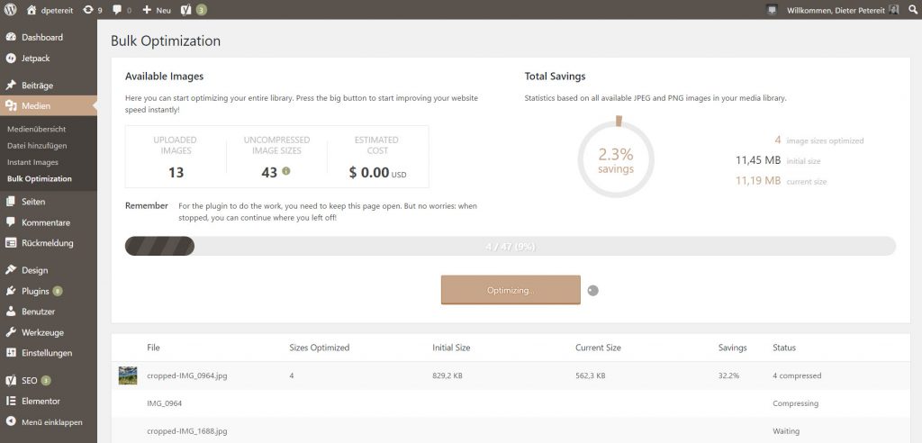
In your WordPress navigation, you won’t see a lot of TinyPNG. You may notice the newly added menu item “Bulk Optimization” under the main menu item “Media.” This is where you compress all of your media library’s images at once. This is only needed during first application because TinyPNG automatically takes care of all newly uploaded images after the installation.
TinyPNG: Bulk Optimization (Screenshot: Noupe)
In the list overview of the media library, you’ll now see the item “Compression” as the last entry on each image. Here, you control which variants of each image were compressed. Under “Details,” you receive information on every image size.
How to Adjust Tiny PNG to Your Needs
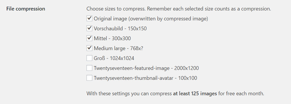
General settings can be found under Settings > Media > JPEG and Image Optimization Here, you can view how many images you have compressed in the current month. This is also where you choose the image formats that you wish to activate a compression for. You won’t use all the ones that your theme provides. That’s the case for me, at least.
TinyPNG: Settings (Screenshot: Noupe)
It is also possible to define a general size limit. This makes sense if the images you upload are normally much larger than what would make sense for WordPress, for example, uploading unedited photos from your 20MP camera. In this case, the option Resize and compress the original image with additional parameters on width and/or height would be useful. This way, TinyPNG would make sure that your 6.000 x 3.000 pixel monster would be compressed to a width defined by you, say 1.024 pixels.
Other options for JPG files let you decide if you want data to remain after compression. This includes the date of creation of the original file, the GPS position the picture was taken at, and any copyright notes.
There is nothing else to configure.
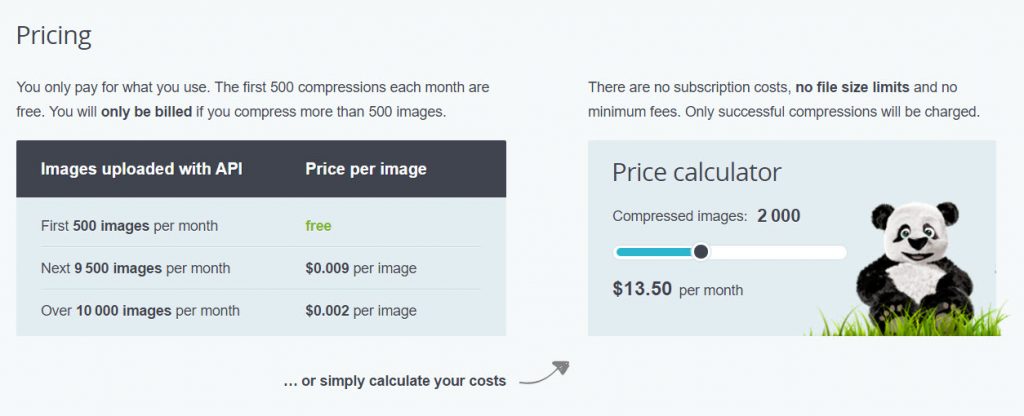
TinyPNG: Free, Yes, But Only For 500 Compressions a Month
TinyPNG for WordPress is available for free, and the compression is free as well, though not unlimited. The API key allows for 500 free compressions a month. At first, this sounds like a lot, but it is relativized very quickly, considering that every defined image size in your theme requires a compression.
If I were to compress all image sizes in my Twenty-Sixteen-powered blog – seven in total – I would only be able to compress 71 images for free. Thus, I have already excluded all sizes that I don’t use, getting me to 125 images a month. This should suffice.
When it comes to the prices for additional compressions, TinyPNG isn’t aggressive. The information is not really easy to find, which I don’t understand as the prices aren’t unfair:
TinyPNG for WordPress: Prices Per Image. (Screenshot: Noupe)
Just play around with the slider a bit (once you found the page ;). 13.50 USD for 2,000 images a month doesn’t sound bad at all. Most bloggers will probably get along with the free package as it is.
TinyPNG for WordPress is an excellent argument for using PNG on your blog by default again. Get the plugin here:
Sometimes all we need is a little inspiration kick to get our creative juices flowing. Maybe your secret is to go for a short walk, have a little chat with a colleague, or scroll through your favorite eye candy resources. Whatever it might be that helps you get new ideas, we, too, have something for you that could work just as good: desktop wallpapers.
To bring you a regular dose of unique and inspiring wallpapers, we embarked on our monthly wallpapers mission eight years ago. Each month, artists and designers from across the globe diligently contribute their works to it. And well, it wasn’t any different this time around. This post features their artwork for March 2017. The wallpapers all come in versions with and without a calendar. Time to freshen up your desktop!
Color is a big deal when it comes to web design, but it’s not just about looking good. A seemingly inconsequential variation in shade can have a significant impact on conversion rates. That’s because colors have a proven and measurable impact on our attitudes and emotions.
This little crash course in color psychology can help you better connect with your ideal audience and build trust with visitors.
Is Color Psychology Really a Thing?
Yes indeed. In fact, key findings related to the subject have been published in peer reviewed journals. Read one for yourself while science is still legal. Aside from the documented scientific proof, consider all the marketing pros who have split tested countless pages to find that certain color schemes can produce vastly different results in terms of conversion, even when all the content is exactly the same.
You’re wielding a lot of power over the human psyche with your use of colors. The question you need to ask yourself is whether your experiments in emotional manipulation are working for you, or against you.
Grow Your Legions of Minions and Master Mind Control with These Color Rules
Earn Trust by Using Blue:
Even if you’re a grotesquely rich corporate overlord you can help foster trust by using the color blue in your web design. Mark Zuckerberg and Facebook should be enough to convince you of this, but I guess we can look at some actual evidence too.
Studies have determined that blue is a universally-liked color.
It promotes feelings of calm and tranquility, according to this credible source.
Facebook, LinkedIn, PayPal, Twitter and hundreds of other corporate entities use some shade of blue as their primary color.
You’ll see blue a lot in the financial world, particularly among credit card companies. Maybe they’re hoping it will help calm customers down before they call to dispute that ridiculous $200 finance charge.
Red for Pasion and Urgency:
Red gets the blood pumping. It’s a color that promotes passions, energy and urgency. Red is often used to promote clearance sales or to draw attention to CTAs.
Orange Inspires Impulsive Behaviors:
According to the marketing wizards at Kiss Metrics, orange can inspire activity, a sense of urgency and even impulsive behavior. When Amazon tempts visitors with a limited offer, it’s usually highlighted by a bright orange banner.
Black is For Luxury and Sophistication:
If high-end class and sophistication is what you’re going for, black does the trick. Using black is also said to promote a certain edginess, making it a great choice luxury goods, fashion and cosmetics.
White for Clean Simplicity:
White is believed to promote cleanliness, virtue and simplicity. It makes a great backdrop for the healthcare industry – or for anyone who enjoys a clean, minimalist approach to design.
Gray Promotes Professionalism:
Gray comes across as professional and subdued. When used correctly it helps create a balanced and calm effect. Used by white color professionals as well as luxury brands, but works well across a wide span of industry types.
Purple is Powerful on Many Levels:
Purple is seen as a color of majesty, opulence and luxury. It’s often associated with success and respect. This is a go-to color for beauty products, massage, yoga spirituality and feminine brands.
Green for Positivity and Health:
This color is associated with health, nature peace and relaxation. Some experts believe the color green can actually help alleviate depression. It’s also a great color for conversions, as it is said to promote decisiveness.
Yellow Keeps it Warm and Cheerful:
Yellow is a great color when it comes to generating a sense of optimism among your visitors. It’s also a great attention grabber. One rule to keep in mind when implementing yellow is to use it sparingly, as this color can easily become overwhelming.
This Infographic Will Show You How to Use Colors Together and Increase Your Conversions
Are you ready to start using colors to generate more results? Take a look at this infographic to learn more about how to use certain color schemes to drive more participation and action with your web design.
This sure is exciting news: the various groups that make up the W3C have agreed upon a set of rules by which we’ll be able to annotate, highlight and make comments to a webpage without the need of a third party script or framework.
Dan Whaley describes why this could be a big deal:
The W3C standards are a key milestone towards a future in which all pages could support rich layers of conversation without requiring any action by their publishers—because that capability can be built into the browser itself and be available as a native feature, just like like web search. The shared vision is that conversations will be able happen anywhere on the Web, or even on documents in native apps, and inline instead of below-the fold, in a federated, standards-based way.