Harry Roberts talks about some methods for getting comfy with a new (“specifically CSS”) code base. Harry’s done this a lot as someone who parachutes into new code bases regularly as a consultant. But I think this is also quite interesting for people starting a new job. So much web development work is working on existing sites, not green fielding new ones.
Framer X is a brand new app that’s about to be released and this quick demo reel takes us on a tour through some of the changes to the previous app—it all looks super exciting.
As a designer, I’m most interested in the prototyping tools and being able to quickly explore complex scene transitions between one state and another. But as a developer, I’m interested in how it all ties into React. The website describes it like so:
Use actual React in your projects to create interactive components from scratch. Want more control? Create custom UI in the properties panel for your components.
I can imagine a wonderful near-future where it’s possible to tie Framer X into a design system so that folks on a team can use all the real life React components without having to worry if they’re up-to-date or not.
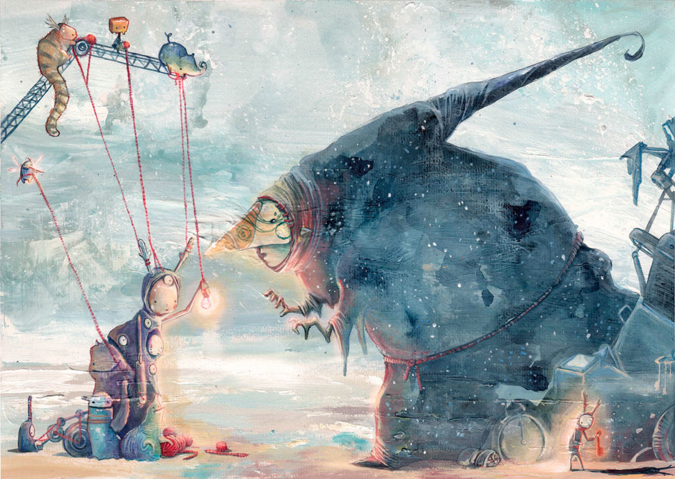
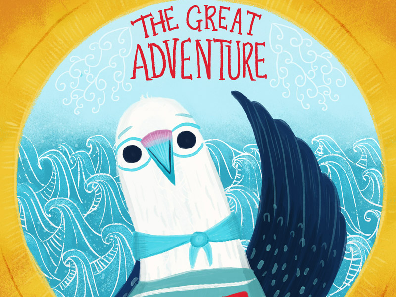
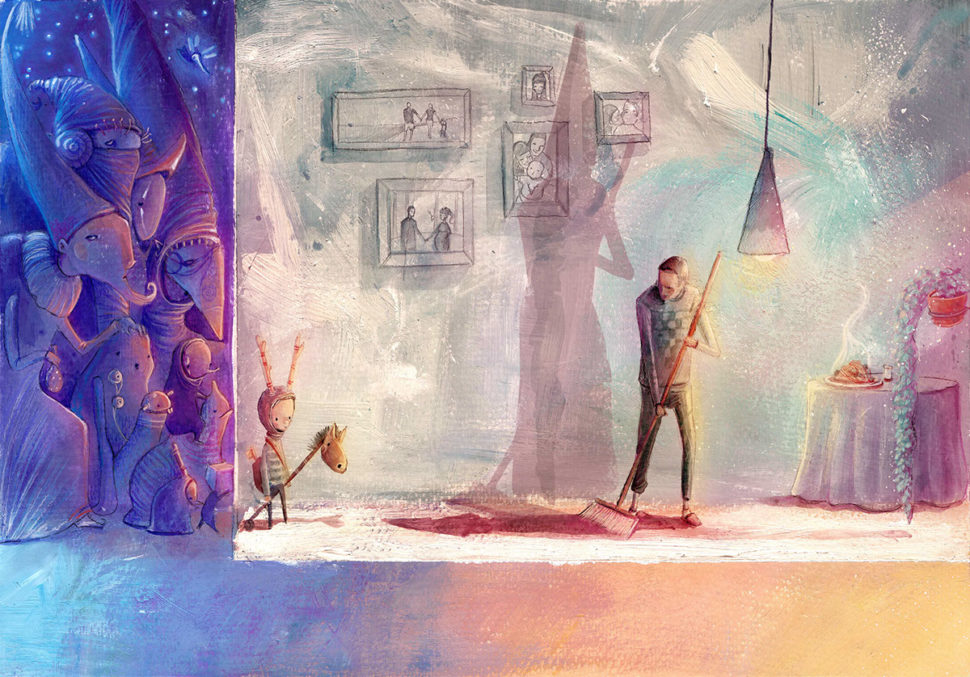
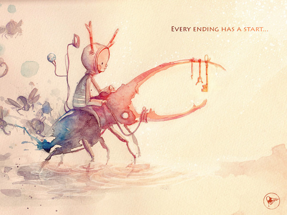
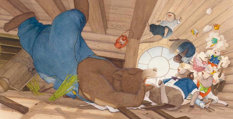
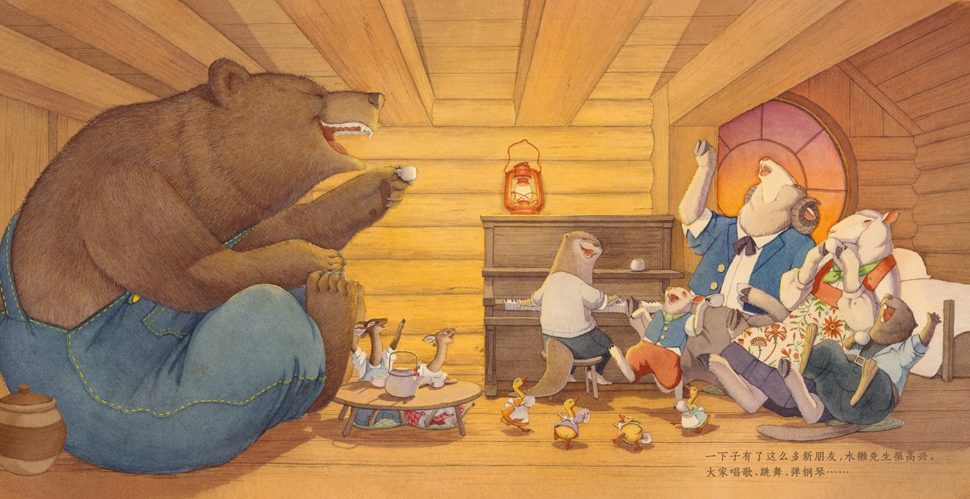
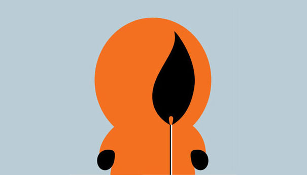
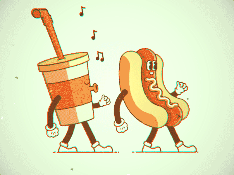
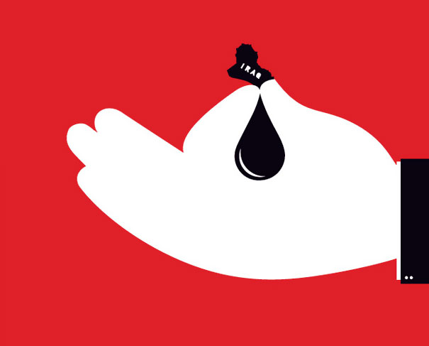
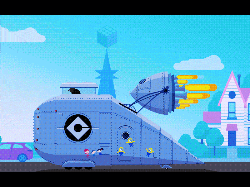
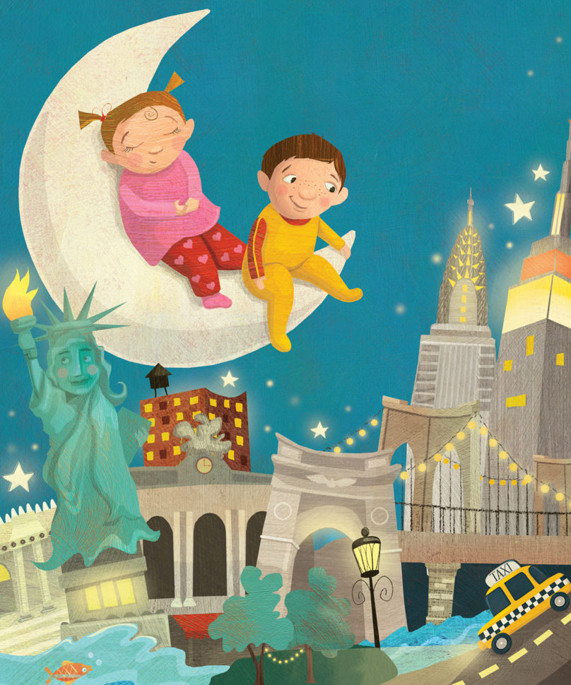
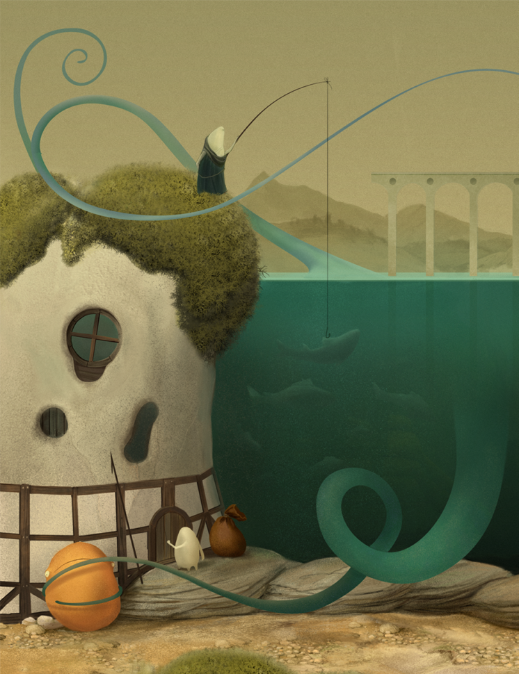
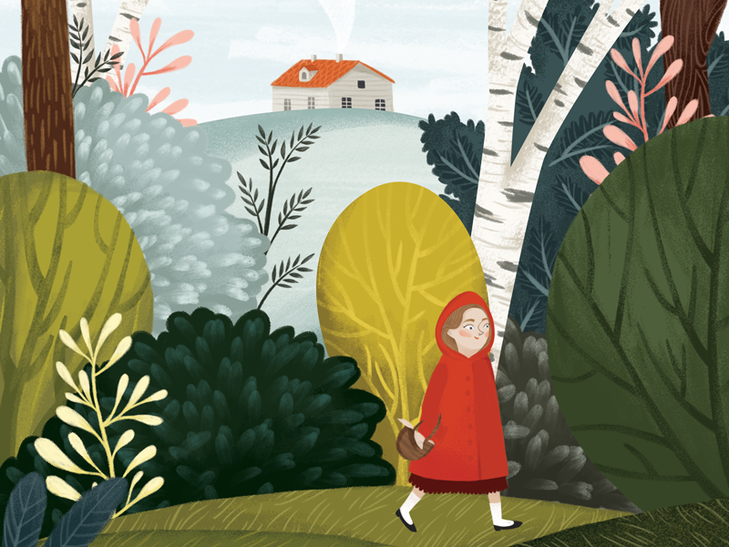
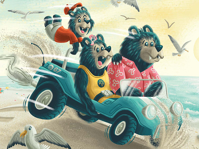
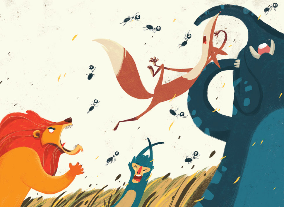
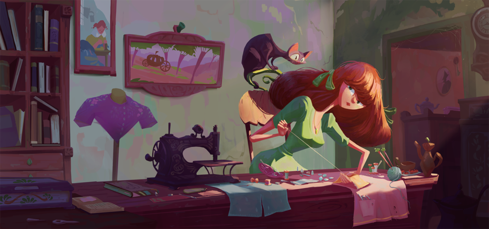
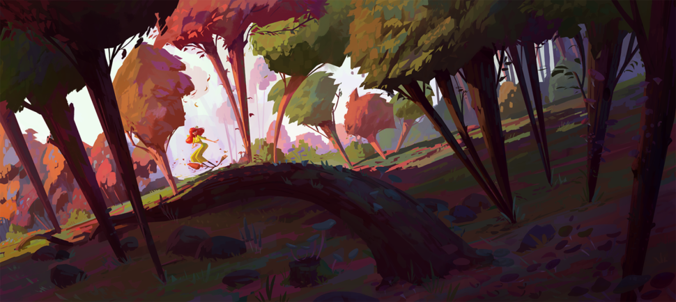
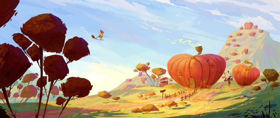
Today we have a fun topic, one that anyone can enjoy, the cartoon illustrations of several creators. Sit back and enjoy.
Illustrations are truly a difficult style of artwork which requires a lot of time and patience to make perfect. Of course, we can’t practice illustration for you, but we can give you some ideas for your inspiration.
Without using any words, illustrations tell a story. Instead of a beginning, middle, and end, an illustration depicts the whole story. Your imagination is your and your clients’ most powerful tool.
Cartoon illustrations never go out of style, and can be enjoyed regardless of your age. No matter where you are in life, it’s always nice to sit back and take a little break. Illustrations are a great way to escape, even if only for a while.
Illustrations hold no particular style. From anime to a scenic waterfall in the mountains, an cartoon portrays whatever is on the illustrator’s mind. Nothing is off limits. It van be as realistic, science-fiction, or imaginary as you want it.
“If you want to be a cartoonist, live the life of a cartoonist.”
? Oliver Gaspirtz
Here is a collection of creative, fresh, interesting cartoon illustrations from children’s books. They bring characters and events to life. Which illustration is your favorite? Please, share with us in the comments below.
We truly hope that you found these cartoon illustrations useful and that they managed to offer you the dose of inspiration you needed today. Make sure you visit us daily for more amazing snippets of creativity, inspiration, and imagination.
Viewport units have always been controversial and some of that is because of how mobile browsers have made things more complicated by having their own opinions about how to implement them.
Case in point: should the scrollbar be taken into account for the vw unit? What about a site’s navigation or page controls — should those count in the calculation? Then there are physical attributes of the devices themselves (hello, notch!) that can’t be overlooked.
First, a little context
The spec is pretty vague about how viewport units should be calculated. With mobile devices, we’re often concerned with the vertical height, so let’s look specifically at viewport height (vh):
vh unit
Equal to 1% of the height of the initial containing block.
So yeah, no clear guidance there when it comes to handling device and browser-specific differentiations.
vh was initially calculated by the current viewport of your browser. If you opened your browser and started to load a website, 1vh was equal to 1% of your screen height, minus the browser interface.
But! If you start scrolling, it’s a different story. Once you get past a piece of the browser interface, like the address bar, the vh value would update and the result was an awkward jump in the content.
Safari for iOS was one of the first mobile browsers to update their implementation by choosing to define a fixed value for the vh based on the maximum height of the screen. By doing so, the user would not experience jumps on the page once the address bar went out of view. Chrome’s mobile browser followed suit around a year ago.
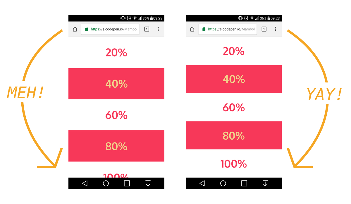
While using a fixed value is nice, it also means that you cannot have a full-height element if the address bar is in view. The bottom of your element will be cropped.
An element gets cropped at the bottom when the address bar is in view (left) but what we want is the full thing (right).
CSS Custom Properties: The trick to correct sizing
The idea struck me that CSS Custom Properties and a few lines of JavaScript might be the perfect way to get the consistent and correct sizing I needed.
In JavaScript, you can always get the value of the current viewport by using the global variable window.innerHeight. This value takes the browser’s interface into account and is updated when its visibility changes. The trick is to store the viewport value in a CSS variable and apply that to the element instead of the vh unit.
Let’s say our CSS custom variable is --vh for this example. That means we will want to apply it in our CSS like this:
.my-element {
  height: 100vh; /* Fallback for browsers that do not support Custom Properties */
  height: calc(var(--vh, 1vh) * 100);
}
OK, that sets us up. Now let’s get the inner height of the viewport in JavaScript:
// First we get the viewport height and we multiple it by 1% to get a value for a vh unit
let vh = window.innerHeight * 0.01;
// Then we set the value in the --vh custom property to the root of the document
document.documentElement.style.setProperty('--vh', `${vh}px`);
So, we told JS to grab the height of the viewport and then drilled it down into 1/100th of that total so we have a value to assign as our viewport height unit value. Then we politely asked JS to create the CSS variable (--vh) at the :root.
As a result, we can now use --vh as our height value like we would any other vh unit, multiply it by 100 and we have the full height we want.
While our work might look done at this point, those of you with an astute eye for detail may have caught that the JavaScript fires but never updates the size of our element when the viewport’s height changes. Go ahead and try resizing the demo above.
We can update the value of --vh by listening to the window resize event. This is handy in case the user rotates the device screen, like from landscape to portrait, or the navigation moves out of view on scroll.
// We listen to the resize event
window.addEventListener('resize', () => {
  // We execute the same script as before
  let vh = window.innerHeight * 0.01;
  document.documentElement.style.setProperty('--vh', `${vh}px`);
});
?? Updating the value of --vh will trigger a repaint of the page and the user may experience a jump as a result. Because of this, I’m not advising that this trick should be used for every project or to replace all usage of the vh unit but only when you may need your users to have an exact viewport unit value.
Also, you may want to implement a debounce method for the resize event to avoid triggering to many events while the user is resizing their browser’s window. You can learn more about it with this article: Debouncing and Throttling Explained Through Examples
You can now resize the demo above and notice that the CSS variable is updated accordingly.
While I recently used this technique on a project and it really helped, you should always think twice when replacing the browser’s default behaviors. (For example, this comes up a lot with ::focus.) Also, browsers tend to update very fast these days, so beware that today’s solution may not work tomorrow.
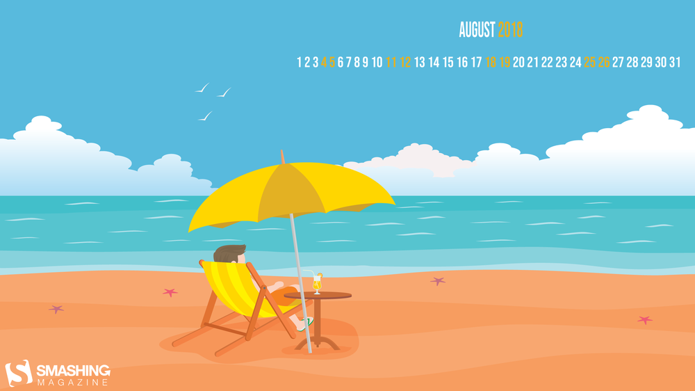
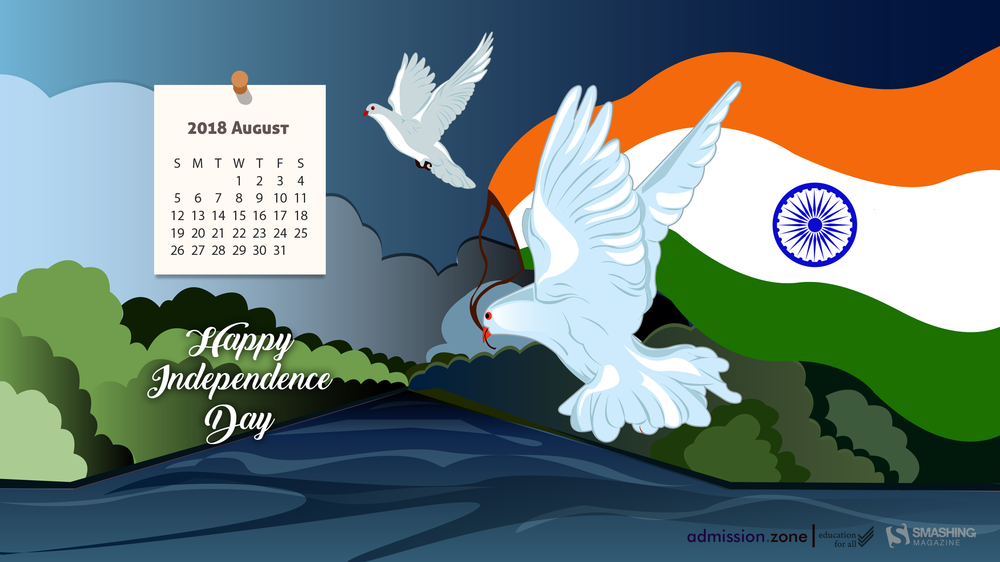
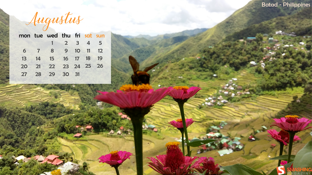
Everybody loves a beautiful wallpaper to freshen up their desktops. So to cater for new and unique artworks on a regular basis, we embarked on our monthly wallpapers adventure nine years ago, and since then, countless artists and designers from all over the world have accepted the challenge and submitted their designs to it. It wasn’t any different this time around, of course.
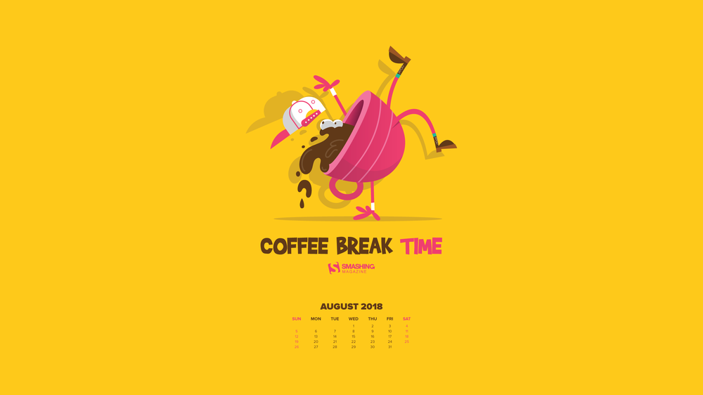
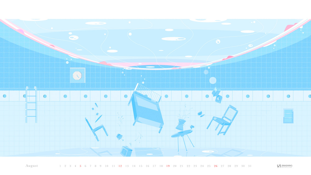
This post features wallpapers created for August 2018. Each of them comes in versions with and without a calendar and can be downloaded for free. A big thank-you to everyone who participated!
Finally, as a little bonus, we also collected some “oldies but goodies” from previous August editions in this collection. Please note, that they only come in a non-calendar version. Which one will make it to your desktop this month?
Please note that:
All images can be clicked on and lead to the preview of the wallpaper,
We respect and carefully consider the ideas and motivation behind each and every artist’s work. This is why we give all artists the full freedom to explore their creativity and express emotions and experience throughout their works. This is also why the themes of the wallpapers weren’t anyhow influenced by us, but rather designed from scratch by the artists themselves.
Submit your wallpaper
We are always looking for creative designers and artists to be featured in our wallpapers posts. So if you have an idea for a wallpaper, please don’t hesitate to submit your design. We’d love to see what you’ll come up with. Join in! ?
Purple Haze
“Meet Lucy: she lives in California, loves summer and sunbathing at the beach. This is our Jimi Hendrix Experience tribute. Have a lovely summer!” — Designed by PopArt Web Design from Serbia.
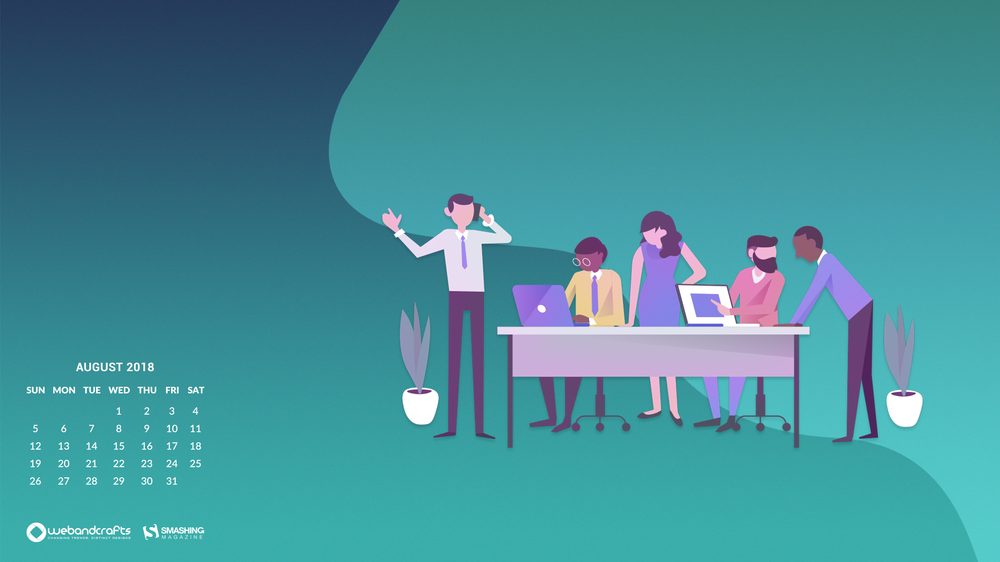
“Here is the August monthly calendar to remind you of your as well as your team’s success in the previous months. Congratulations, you guys deserved all the success that came your way. Hope you continue this success this month and in the coming months.” — Designed by Webandcrafts from India.
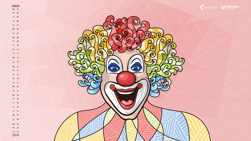
“The countenance of the clown is a reflection of our own feelings and emotions of life in the most colorful way portrayed with a deeper and stronger expression whether it is a happy clown or a sad clown. The actions of the clown signify your uninhibited nature — the faces of life in its crudest form — larger, louder, and in an undiluted way.” — Designed by Acowebs from India.
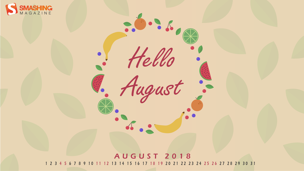
“August brings me to summer, and summer brings me to fruit. In the hot weather there is nothing better than a fresh piece of fruit.” — Designed by Bram Wieringa from Belgium.
“Thoughts, planning, daydreams are simply what minds do. It’s following the human impulse to explore the unexplored, question what doesn’t ring true, dig beneath the surface of what you think you know to formulate your own reality, and embrace the inherent ‘now’ of life. The main character here has been created blending texture and composition. Thoughts will never have an end.” — Designed by Sweans from London.
“In August it’s Relaxation Day on the 15th so that’s why I decided to make a wallpaper in which I showcase my perspective of relaxing. It’s a wallpaper where you’re just chilling at the beach with a nice cocktail and just looking at the sea and looking how the waves move. That is what I find relaxing! I might even dip my feet in the water and go for a swim if I’m feeling adventurous!” — Designed by Senne Mommens from Belgium.
“The freedom and independence sprouts from unbiased and educated individuals that build the nation for peace, prosperity and happiness to reign in the country for healthy growth.” — Designed by Admission Zone from India.
“Somebody once told me that I should make the most out of vacation. So there I was, carefully walking on a stone ridge in the ricefields of Batad. This place is hidden high up in the mountains. Also August is harvesting season.” — Designed by Miguel Lammens from Belgium.
The past nine years have brought forth lots of inspiring wallpapers, and, well, it’d be a pity to let them gather dust somewhere down in the archives. That’s why we once again dug out some goodies from past August editions that are bound to make a great fit on your desktop still today. Please note that these wallpapers, thus, don’t come with a calendar.
Happiness Happens In August
“Many people find August one of the happiest months of the year because of holidays. You can spend days sunbathing, swimming, birdwatching, listening to their joyful chirping, and indulging in sheer summer bliss. August 8th is also known as the Happiness Happens Day, so make it worthwhile.” — Designed by PopArt Studio from Serbia.
“August is one of my favorite months, when the nights are long and deep and crackling fire makes you think of many things at once and nothing at all at the same time. It’s about these heat and cold which allow you to touch the eternity for a few moments.” — Designed by Igor Izhik from Canada.
“August means that fall is just around the corner, so I designed this wallpaper to remind everyone to ‘bee happy’ even though summer is almost over. Sweeter things are ahead!” — Designed by Emily Haines from the United States.
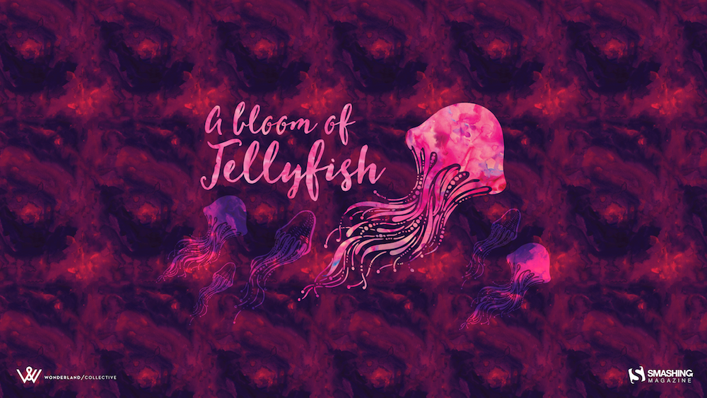
“I love going to aquariums – the colours, patterns and array of blue hues attract the nature lover in me while still appeasing my design eye. One of the highlights is always the jellyfish tanks. They usually have some kind of light show in them, which makes the jellyfish fade from an intense magenta to a deep purple – and it literally tickles me pink. On a recent trip to uShaka Marine World, we discovered that the collective noun for jellyfish is a bloom and, well, it was love-at-first-collective-noun all over again. I’ve used some intense colours to warm up your desktop and hopefully transport you into the depths of your own aquarium.” — Designed by Wonderland Collective from South Africa.
“Let us take a pledge to save these endangered species and create a world that is safe for them to live and perish just like all creatures.” — Designed by Acodez IT Solutions from India.
“I know what you’ll do this August. 🙂 Because August is about holiday. It’s about exploring, hiking, biking, swimming, partying, feeling and laughing. August is about making awesome memories and enjoying the summer. August is about everything. An amazing August to all of you!” — Designed by Ioana Bitin from Bucharest, Romania.
Here’s a little example that Jeremy Keith used to use in his talks. It’s stuck with me as one of the coolest examples of progressive enhancement and Technology Being CoolTM around.
There is this musical notation format called abc. They don’t capitalize it. Kinda like npm, which I guess makes sense as it isn’t an acronym. But it is the name of something so it’s super awkward. Ughakdhk. Anyway.
The format itself is really cool. It’s super simple and text-based. Here’s the example from their homepage:
A little like YAML, I suppose. That’s the music for that whole song. It’s not loaded with all the possibilities of sheet music; it’s just notes and timing. Enough to communicate a folk/traditional song, which is primarily what it’s used for.
You could probably get used to reading it as-is, but I don’t think that’s what it’s really for. My guess is that the format is more about being:
Standardized (it is, and there are 570,000 tunes in it, so I guess that worked)
Text (I bet that entire database of songs is surprisingly tiny)
Ready to be converted into whatever
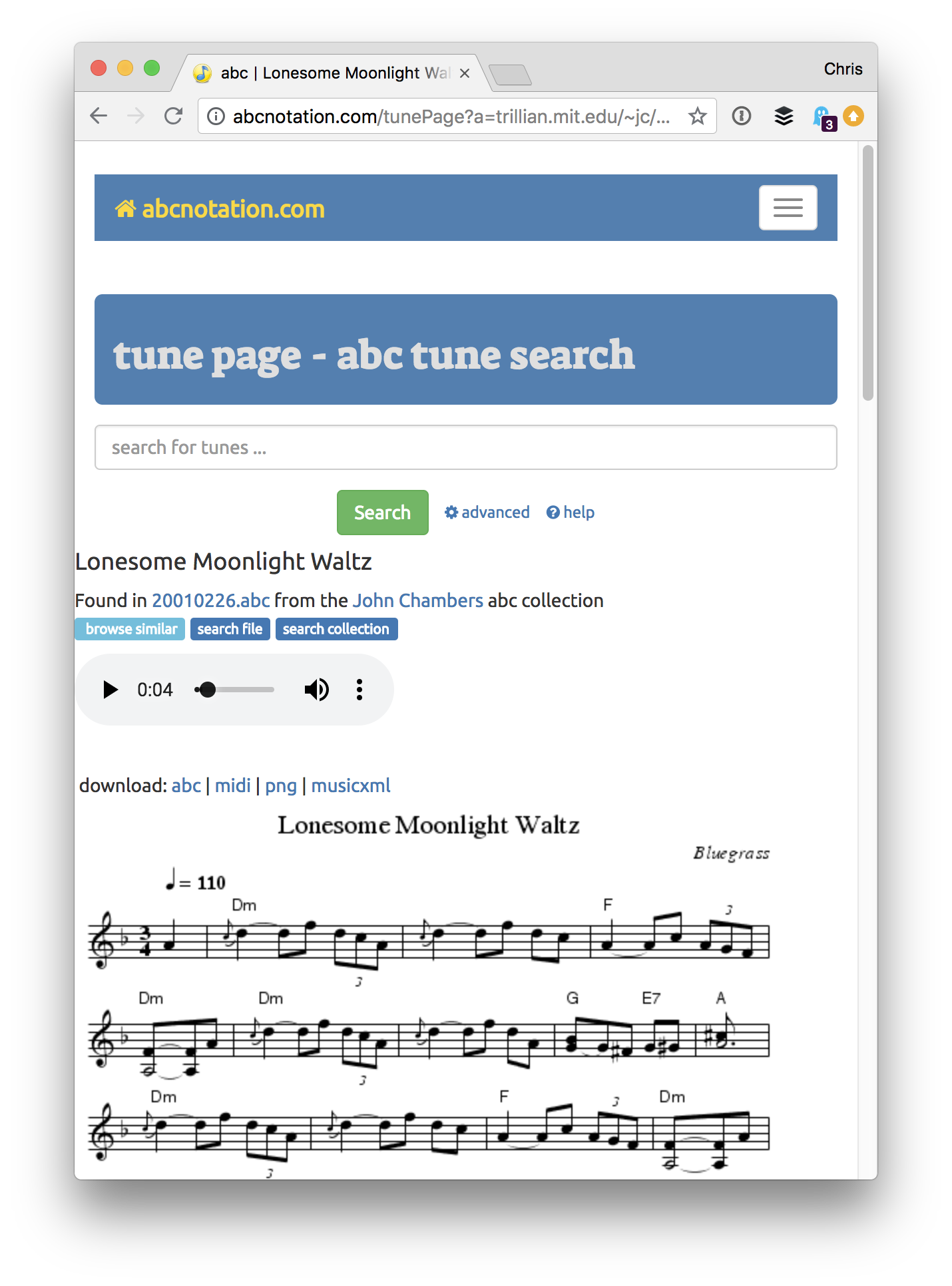
The conversion part being the fun part! You can see it happening right on the homepage for the abc format.
Lonesome Moonlight Waltz, stored in abc format on the site, is being displayed as sheet music in PNG format and being converted into a an audio format playable on the web. Basically MIDI barfed out as MP3.
PNG is fine, but wouldn’t that be so much nicer as SVG? Of course it would.
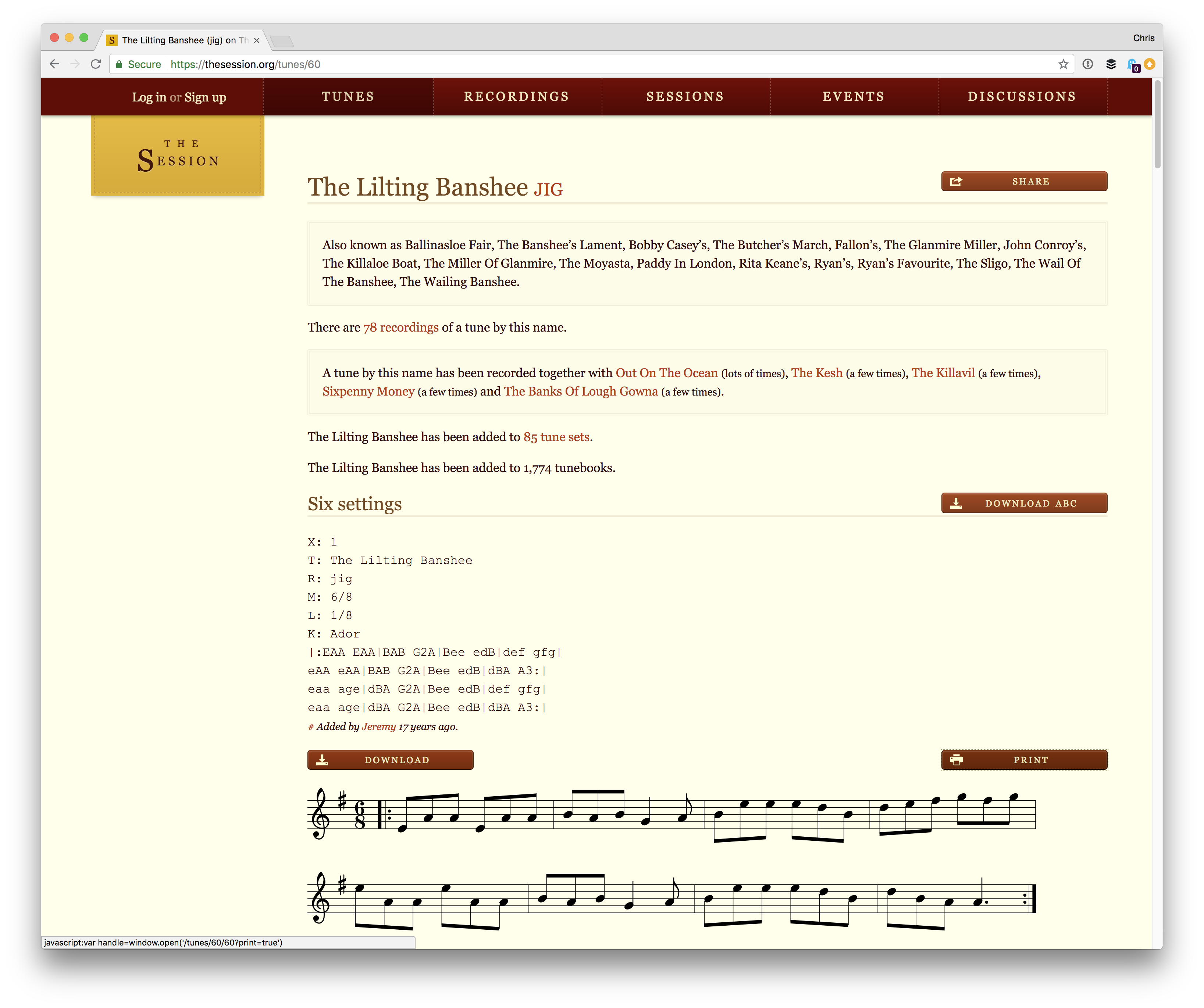
All of this is relevant to Jeremy because he has a website called The Session, which is dedicated to Irish music. He stores tunes on the site, and thus appropriately uses the abc format. On The Session, you can click a Sheet Music button and it will convert abc into SVG and display that.
That sheet music looks great in the crisp SVG format.
The SVG conversion is made possible entirely in JavaScript by an open source library. That’s the progressive enhancement part. Store and ship the basic format, and let the browser enhance the experience, if it can (it can).
That’s all. Just cool.
The JavaScript library that The Session actually uses is abcjs by Paul Rosen and Gregory Dyke. The other one linked to above is Jef Moine’s similar abc2svg.
Today we are shedding a light on talented Adrian Sommeling’s amazing work that shadows the work of thousands of other designers who try to get to his level. At the end of the article, we added a bonus Photoshop manipulation tutorial for everybody to enjoy.
Adrian Sommeling is a conceptual portrait artist from Netherlands. He creates impressive photography by combining different images. We should say that his works are compelling. Quite some time ago, an interest for art and painting sparked within him. Nevertheless, he now uses Photoshop and his camera to create fantastic photography.
Sommeling uses a Sony A7RII, a 16-35 mm lens, and a couple of studio lights to capture his photos. He then uses his computer and Photoshop to create almost anything his heart desires. Photoshop and Nik Color Efex best capture his amazing compositions. He shoots a background photo, then the models separately at home or in the studio. During post-production, he cuts them out, places them on the background photo, adds shadow and does some color corrections. At the end of the post, you’ll find a short, 1-minute video to see the overall process yourself. In order to improve his work, Adrian Sommeling is constantly pushing himself out of his comfort zone to shoot something new.
At the moment, his favorite one is the one exactly below. It is a photo of Adrian and his son sitting at a poker table. He was inspired by Annie Leibovitz for this picture. The photographer created a similar background with 3D software and put his son and himself in the scene. You can see Adrian’s photography, video, and tutorials on his website. For his full collection of artwork, check out his profile on 500px. In a nutshell, have collected his best works to inspire you:
Adrian Sommeling’ Videos
We hope you found the tutorial useful. How long does it take to capture the perfect picture and process it? Tell us more about your creative process. Share this post on social media to inspire others. Don’t forget to subscribe for daily snippets of creative designs!
With the rise of HTML5 usage, many companies start redoing their most popular titles to get rid of outdated Flash and match their products to the latest industry standards. This change is especially visible in the Gambling/Casino & Entertainment industries and has been happening for several years now, so a decent selection of titles has already been converted.
Unfortunately, when browsing the Internet, you can quite often stumble upon examples of a seemingly hasty job, which results in the lover quality of the final product. That’s why it’s a good idea for game developers to dedicate some of their time for getting familiar with the subject of Flash to HTML5 conversion and learning which mistakes to avoid before getting down to work.
Among the reasons for choosing JavaScript instead of Flash, apart from the obvious technical issues, is also the fact that changing your game design from SWF to JavaScript can yield a better user experience, which in turn give it a modern look. But how to do it? Do you need a dedicated JavaScript game converter to get rid of this outdated technology? Well, Flash to HTML5 conversion can be a piece of cake — here’s how to take care of it.
Converting a game to another platform is an excellent opportunity to improve it, fix its issues, and increase the audience. Below are few things that can be easily done and are worth considering:
Supporting mobile devices Converting from Flash to JavaScript allows reaching a broader audience (users of mobile devices); support for touchscreen controls usually needs to be implemented into the game, too. Luckily, both Android and iOS devices now also support WebGL, so 30 or 60 FPS rendering usually can be easily achieved. In many cases, 60 FPS won’t cause any problems, which will only improve with time, as mobile devices become more and more performant.
Improving performance When it comes to comparing ActionScript and JavaScript, the latter is faster than the first one. Other than that, converting a game is a good occasion to revisit algorithms used in game code. With JavaScript game development you can optimize them or completely strip unused code that’s left by original developers.
Fixing bugs and making improvements to the gameplay Having new developers looking into game’s source code can help to fix known bugs or discover new and very rare ones. This would make playing the game less irritating for the players, which would make them spend more time on your site and encourage to try your other games.
Adding web analytics In addition to tracking the traffic, web analytics can also be used to gather knowledge on how players behave in a game and where they get stuck during gameplay.
Adding localization This would increase the audience and is important for kids from other countries playing your game. Or maybe your game is not in English and you want to support that language?
Why Skipping HTML And CSS For In-Game UI Will Improve Game Performance
When it comes to JavaScript game development, it may be tempting to leverage HTML and CSS for in-game buttons, widgets, and other GUI elements. My advice is to be careful here. It’s counterintuitive, but actually leveraging DOM elements is less performant on complex games and this gains more significance on mobile. If you want to achieve constant 60 FPS on all platforms, then resigning from HTML and CSS may be required.
Non-interactive GUI elements, such as health bars, ammo bars, or score counters can be easily implemented in Phaser by using regular images (the Phaser.Image class), leveraging the .crop property for trimming and the Phaser.Text class for simple text labels.
Such interactive elements as buttons and checkboxes can be implemented by using the built-in Phaser.Button class. Other, more complex elements can be composed of different simple types, like groups, images, buttons and text labels.
Note:Each time you instantiate a Phaser.Text or PIXI.Text object, a new texture is created to render text onto. This additional texture breaks vertex batching, so be careful not to have too many of them.
How To Ensure That Custom Fonts Have Loaded
If you want to render text with a custom vector font (e.g. TTF or OTF), then you need to ensure that the font has already been loaded by the browser before rendering any text. Phaser v2 doesn’t provide a solution for this purpose, but another library can be used: Web Font Loader.
Assuming that you have a font file and include the Web Font Loader in your page, then below is a simple example of how to load a font:
Make a simple CSS file that will be loaded by Web Font Loader (you don’t need to include it in your HTML):
@font-face {
    // This name you will use in JS
    font-family: 'Gunplay';
    // URL to the font file, can be relative or absolute
    src: url('../fonts/gunplay.ttf') format('truetype');
    font-weight: 400;
}
Now define a global variable named WebFontConfig. Something as simple as this will usually suffice:
var WebFontConfig = {
   'classes': false,
   'timeout': 0,
   'active': function() {
       // The font has successfully loaded...
   },
   'custom': {
       'families': ['Gunplay'],
       // URL to the previously mentioned CSS
       'urls': ['styles/fonts.css']
   }
};
It the end, remember to put your code in the ‘active’ callback shown above. And that’s it!
How To Make It Easier For Users To Save The Game
To persistently store local data in ActionScript you would use the SharedObject class. In JavaScript, the simple replacement is localStorage API, which allows storing strings for later retrieval, surviving page reloads.
Saving data is very simple:
var progress = 15;
localStorage.setItem('myGame.progress', progress);
Note that in the above example the progress variable, which is a number, will be converted to a string.
Loading is simple too, but remember that retrieved values will be strings or null if they don’t exists.
var progress = parseInt(localStorage.getItem('myGame.progress')) || 0;
Here we’re ensuring that the return value is a number. If it doesn’t exist, then 0 will be assigned to the progress variable.
You can also store and retrieve more complex structures, for example, JSON:
var stats = {'goals': 13, 'wins': 7, 'losses': 3, 'draws': 1};
localStorage.setItem('myGame.stats', JSON.stringify(stats));
…
var stats = JSON.parse(localStorage.getItem('myGame.stats')) || {};
There are some cases when the localStorage object won’t be available. For example, when using the file:// protocol or when a page is loaded in a private window. You can use the try and catch statement to ensure your code will both continue working and use default values, what is shown in the example below:
try {
    var progress = localStorage.getItem('myGame.progress');
} catch (exception) {
    // localStorage not available, use default values
}
Another thing to remember is that the stored data is saved per domain, not per URL. So if there is a risk that many games are hosted on a single domain, then it’s better to use a prefix (namespace) when saving. In the example above 'myGame.' is such a prefix and you usually want to replace it with the name of the game.
Note: If your game is embedded in an iframe, then localStorage won’t persist on iOS. In this case, you would need to store data in the parent iframe instead.
How To Leverage Replacing Default Fragment Shader
When Phaser and PixiJS render your sprites, they use a simple internal fragment shader. It doesn’t have many features because it’s tailored for a speed. However, you can replace that shader for your purposes. For example, you can leverage it to inspect overdraw or support more features for rendering.
Below is an example of how to supply your own default fragment shader to Phaser v2:
function preload() {
    this.load.shader('filename.frag', 'shaders/filename.frag');
}

function create() {
    var renderer = this.renderer;
    var batch = renderer.spriteBatch;
    batch.defaultShader =
        new PIXI.AbstractFilter(this.cache.getShader('filename.frag'));
    batch.setContext(renderer.gl);
}
Note:It’s important to remember that the default shader is used for ALL sprites as well as when rendering to a texture. Also, keep in mind that using complex shaders for all in-game sprites will greatly reduce rendering performance.
How To Change Tinting Method With A Default Shader
Custom default shader can be used to replace default tinting method in Phaser and PixiJS.
Tinting in Phaser and PixiJS works by multiplying texture pixels by a given color. Multiplication always darkens colors, which obviously is not a problem; it’s simply different from the Flash tinting. For one of our games, we needed to implement tinting similar to Flash and decided that a custom default shader could be used. Below is an example of such fragment shader:
// Specific tint variant, similar to the Flash tinting that adds
// to the color and does not multiply. A negative of a color
// must be supplied for this shader to work properly, i.e. set
// sprite.tint to 0 to turn whole sprite to white.
precision lowp float;

varying vec2 vTextureCoord;
varying vec4 vColor;

uniform sampler2D uSampler;

void main(void) {
    vec4 f = texture2D(uSampler, vTextureCoord);
    float a = clamp(vColor.a, 0.00001, 1.0);
    gl_FragColor.rgb = f.rgb * vColor.a + clamp(1.0 - vColor.rgb/a, 0.0, 1.0) * vColor.a * f.a;
    gl_FragColor.a = f.a * vColor.a;
}
This shader lightens pixels by adding a base color to the tint one. For this to work, you need to supply negative of the color you want. Therefore, in order to get white, you need to set:
sprite.tint = 0x000000;  // This colors the sprite to white
Sprite.tint = 0x00ffff;  // This gives red
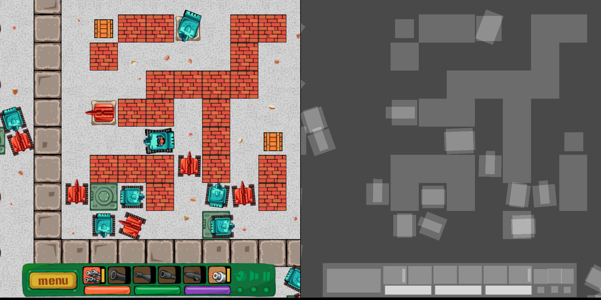
The result in our game looks like this (notice how tanks flash white when hit):
Custom default shader (tanks flashing white).
How To Inspect Overdraw To Detect Fill Rate Issues
Replacing default shader can also be leveraged to help with debugging. Below I’ve explained how overdraw can be detected with such a shader.
Overdrawing happens when many or all pixels on the screen are rendered multiple times. For example, many objects taking the same place and being rendered one over another. How many pixels a GPU can render per second is described as fill rate. Modern desktop GPUs have excessive fill rate for usual 2D purposes, but mobile ones are a lot slower.
There is a simple method of finding out how many times each pixel on the screen is written by replacing the default global fragment shader in PixiJS and Phaser with this one:
This shader lightens pixels that are being processed. The number 7.0 indicates how many writes are needed to turn pixel white; you can tune this number to your liking. In other words, lighter pixels on screen were written several times, and white pixels were written at least 7 times.
This shader also helps to find both “invisible” objects that for some reason are still rendered and sprites that have excessive transparent areas around that need to be stripped (GPU still needs to process transparent pixels in your textures).
The picture on the left shows how a player sees the game, while the one on the right displays the effect of applying the overdraw shader to the same scene.
Why Physics Engines Are Your Friends
A physics engine is a middleware that’s responsible for simulating physics bodies (usually rigid body dynamics) and their collisions. Physics engines simulate 2D or 3D spaces, but not both. A typical physics engine will provide:
object movement by setting velocities, accelerations, joints, and motors;
detecting collisions between various shape types;
calculating collision responses, i.e. how two objects should react when they collide.
At Merixstudio, we’re big fans of the Box2D physics engine and used it on a few occasions. There is a Phaser plugin that works well for this purpose. Box2D is also used in the Unity game engine and GameMaker Studio 2.
While a physics engine will speed-up your development, there is a price you’ll have to pay: reduced runtime performance. Detecting collisions and calculating responses is a CPU-intensive task. You may be limited to several dozen dynamic objects in a scene on mobile phones or face degraded performance, as well as reduced frame rate deep below 60 FPS.
The left part of the image is a scene from a game, while the right side shows the same scene with Phaser physics debug overlay displayed on top.
How To Export Sounds From A .fla File
If you have a Flash game sound effects inside of a .fla file, then exporting them from GUI is not possible (at least not in Adobe Animate CC 2017) due to the lack of menu option serving this purpose. But there is another solution — a dedicated script that does just that:
function normalizeFilename(name) {
   // Converts a camelCase name to snake_case name
   return name.replace(/([A-Z])/g, '_$1').replace(/^_/, '').toLowerCase();
}

function displayPath(path) {
   // Makes the file path more readable
   return unescape(path).replace('file:///', '').replace('|', ':');
}


fl.outputPanel.clear();

if (fl.getDocumentDOM().library.getSelectedItems().length > 0)
   // Get only selected items
   var library = fl.getDocumentDOM().library.getSelectedItems();
else
   // Get all items
   var library = fl.getDocumentDOM().library.items;

// Ask user for the export destination directory
var root = fl.browseForFolderURL('Select a folder.');
var errors = 0;

for (var i = 0; i
How to use the script to export sound files:
Save the code above as a .jsfl file on your computer;
Open a .fla file with Adobe Animate;
Select ‘Commands’ ? ‘Run Command’ from the top menu and select the script in the dialogue that opens;
Now another dialogue file pops up for selecting export destination directory.
And done! You should now have WAV files in the specified directory. What’s left to do is convert them to, for example, MP3’s, OGG, or AAC.
How To Use MP3s In Flash To HTML5 Convertions
The good old MP3 format is back, as some patents have expired and now every browser can decode and play MP3’s. This makes development a bit easier since finally there’s no need to prepare two separate audio formats. Previously you needed, for instance, OGG and AAC files, while now MP3 will suffice.
Nonetheless, there are two important things you need to remember about MP3:
MP3’s need to decode after loading, what can be time-consuming, especially on mobile devices. If you see a pause after all your assets have loaded, then it probably means that MP3’s being decoded;
gaplessly playing looped MP3’s is a little problematic. The solution is to use mp3loop, about which you can read in the article posted by Compu Phase.
So, Why Should You Convert Flash To JavaScript?
As you can see, Flash to JavaScript conversion is not impossible if you know what to do. With knowledge and skill, you can stop struggling with Flash and enjoy the smooth, entertaining games created in JavaScript. Don’t try to fix Flash — get rid of it before everyone is forced to do so!
Want To Learn More?
In this article, I was focused mainly on Phaser v2. However, a newer version of Phaser is now available, and I strongly encourage you to check it out, as it introduced a plethora of fresh, cool features, such as multiple cameras, scenes, tilemaps, or Matter.js physics engine.
If you are brave enough and want to create truly remarkable things in browsers, then WebGL is the right thing to learn from the ground up. It’s a lower level of abstraction than various game-building frameworks or tools but allows to achieve greater performance and quality even if you work on 2D games or demos. Among many websites which you may find useful when learning the basics of WebGL would be WebGL Fundamentals (uses interactive demos). In addition to that, to find out more about WebGL feature adoption rates, check WebGL Stats.
Always remember that there’s no such thing as too much knowledge — especially when it comes to game development!
From light and bright designs to complex data visualizations and a new take on polygons, this month’s design trends are anything but ordinary. And they are so practical you can deploy them on single pages or for a complete design overhaul.
Each of these trends shows and evolution of styles that’s been progressing for some time: minimalism to white and light color schemes, data “everything” to data visualization for the web, and a fresh look at poly shapes.
Here’s what’s trending in design this month:
1. White and Light Color Schemes
White and light color schemes seem to be popping up everywhere. (We could probably have dedicated an entire post to this design trend because there are so many designs featuring this color trend.)
The main characteristic of this design trend is an aesthetic that uses a predominant white or light color scheme. This includes the background, images and even other foreground elements. While white is a popular option, color palettes featuring soft grays, cool cream tones, and even some hardly noticeable pastels are equally impressive.
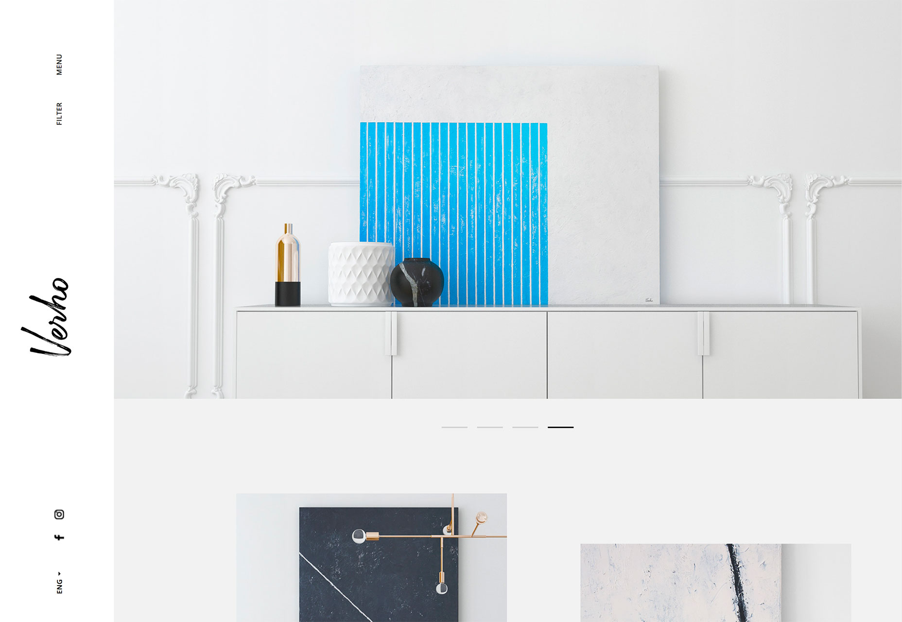
The trick to using this design technique is incorporating other elements so that you don’t just end up with a “plain” white background. Including imagery that also is light or features a lot of white can bring the design together pretty seamlessly, such as the example from Verho.
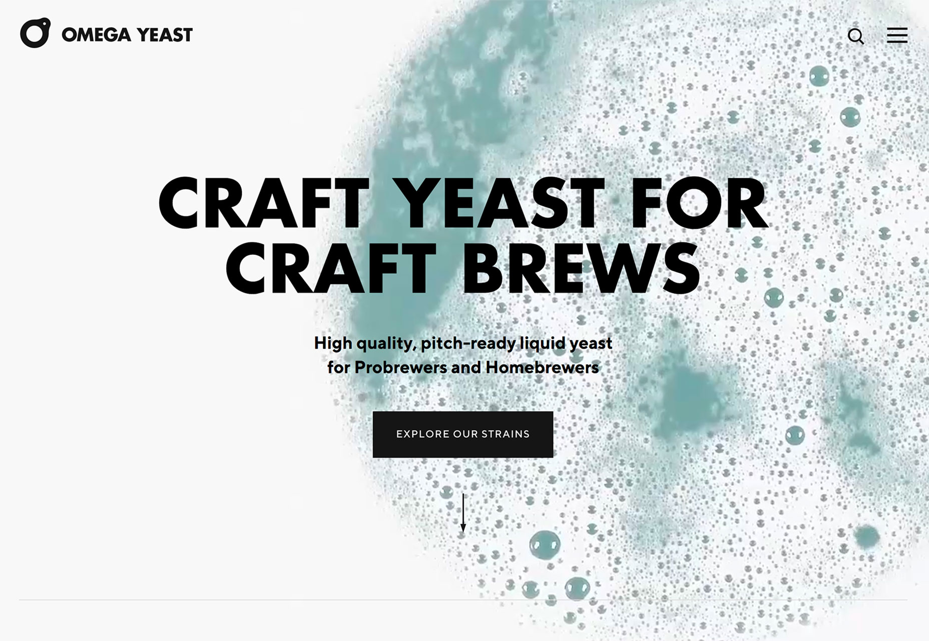
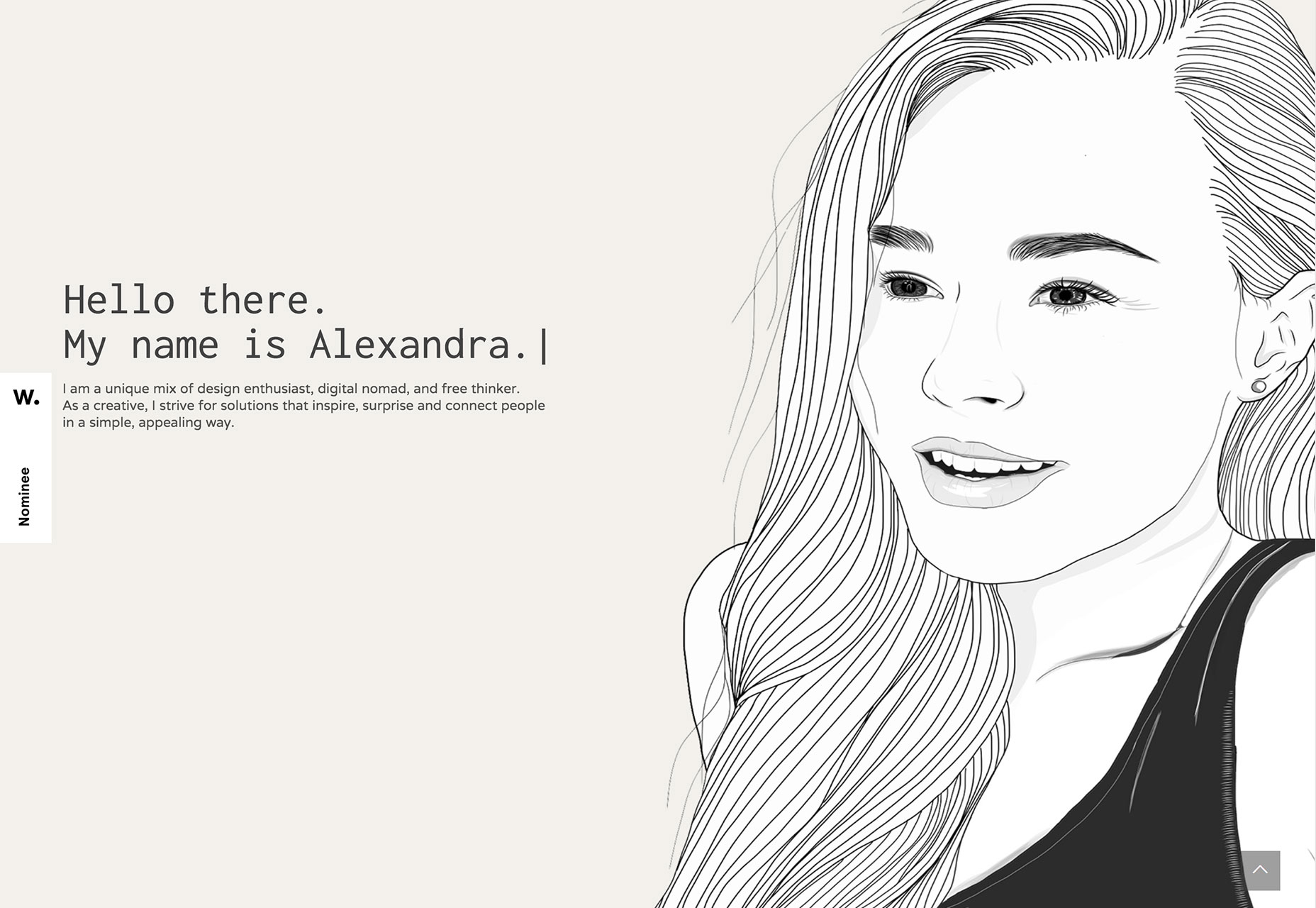
But there’s no rule that images are the only way to implement this design trend. Working with video (such as Omega Yeast) or an illustration (Alexandra Elisa) can be equally engaging.
Use this design trend for a full website theme or opt for a section or page with a light to white design to add particular emphasis to that area. Just make sure to go with a dark text option so that lettering is easy to read.
Add an extra layer of emphasis with a bright colored button or single element so that users find the most important part of the design right away. Consider accent colors in the style of minimalism rather than full color options; a simple one-color concept can work amazingly well.
2. Data Visualization
Data, data everywhere.
Or that seems to be the case anyway.
With such an emphasis on data and information gathering and delivery across industries to provide valuable and reliable information, it’s no real surprise that more designs are featuring large-scale data visualizations.
From maps to charts to interactive animations, a solid data visualization can help a user better understand a topic or information and provide an engaging (and memorable) way to learn about something.
The downside is that it can be a rather large undertaking to manage all that data. Look for a method that allows you to showcase information in an up-to-date manner without the stress of constant management. Automated tools can help. (Google Charts is simple and pretty powerful.)
There are so many different ways to create, embed and include data visualizations in a website design. The most engaging websites using this trend have dynamic information presented in the most interactive formats.
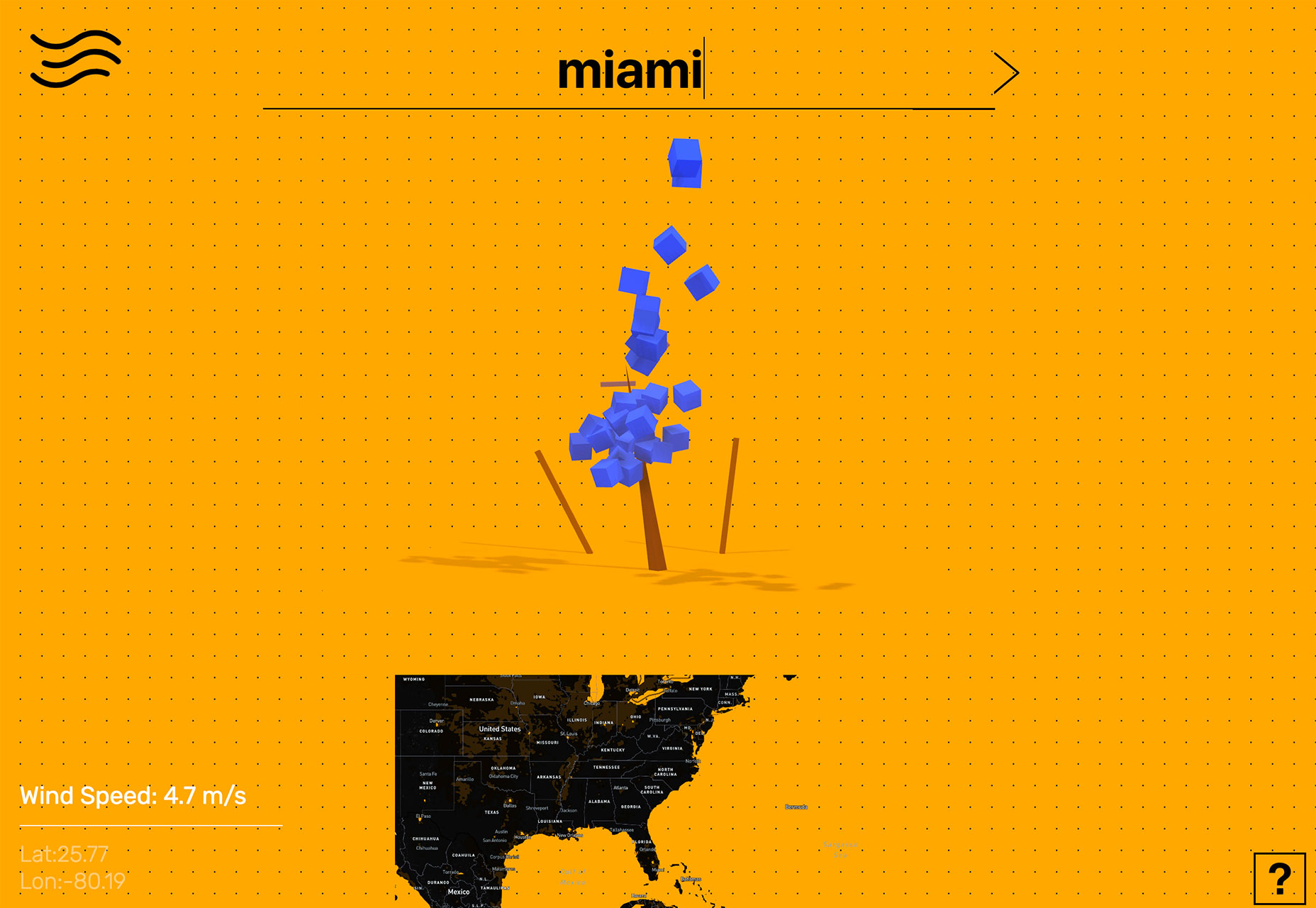
Tree Tree Tree starts by asking the user to enter the location they are interested in learning more about. The result shows the wind speed using a tree with boxes that “blow” as speed increases. Users can also engage using the map at the bottom of the screen. This is data that is begging to be interacted with.
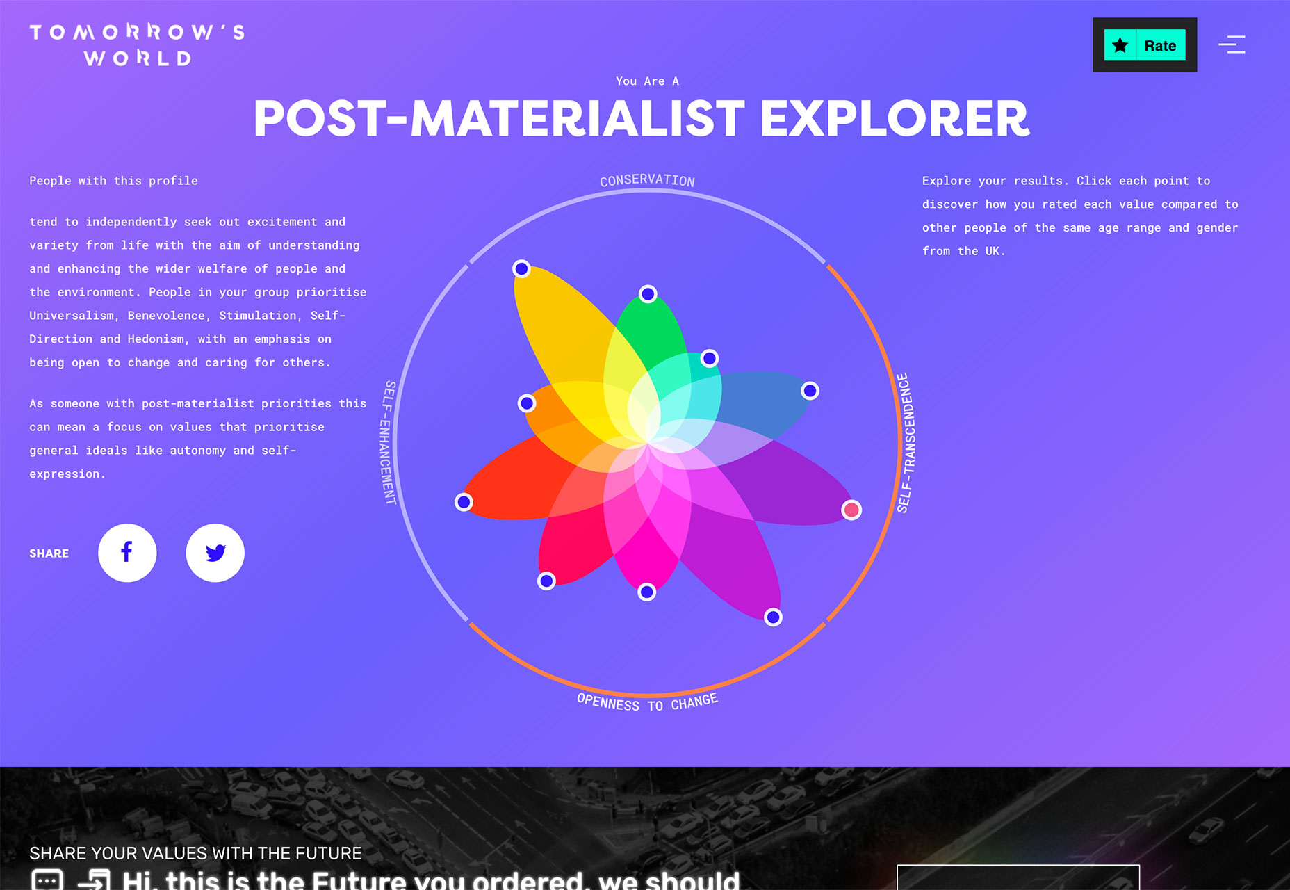
Tomorrow’s World starts with a survey that the user completes and ends with a cool visualization of how those answers compare to others. The data visualization is a tool to help the user learn about him/herself and the world around them.
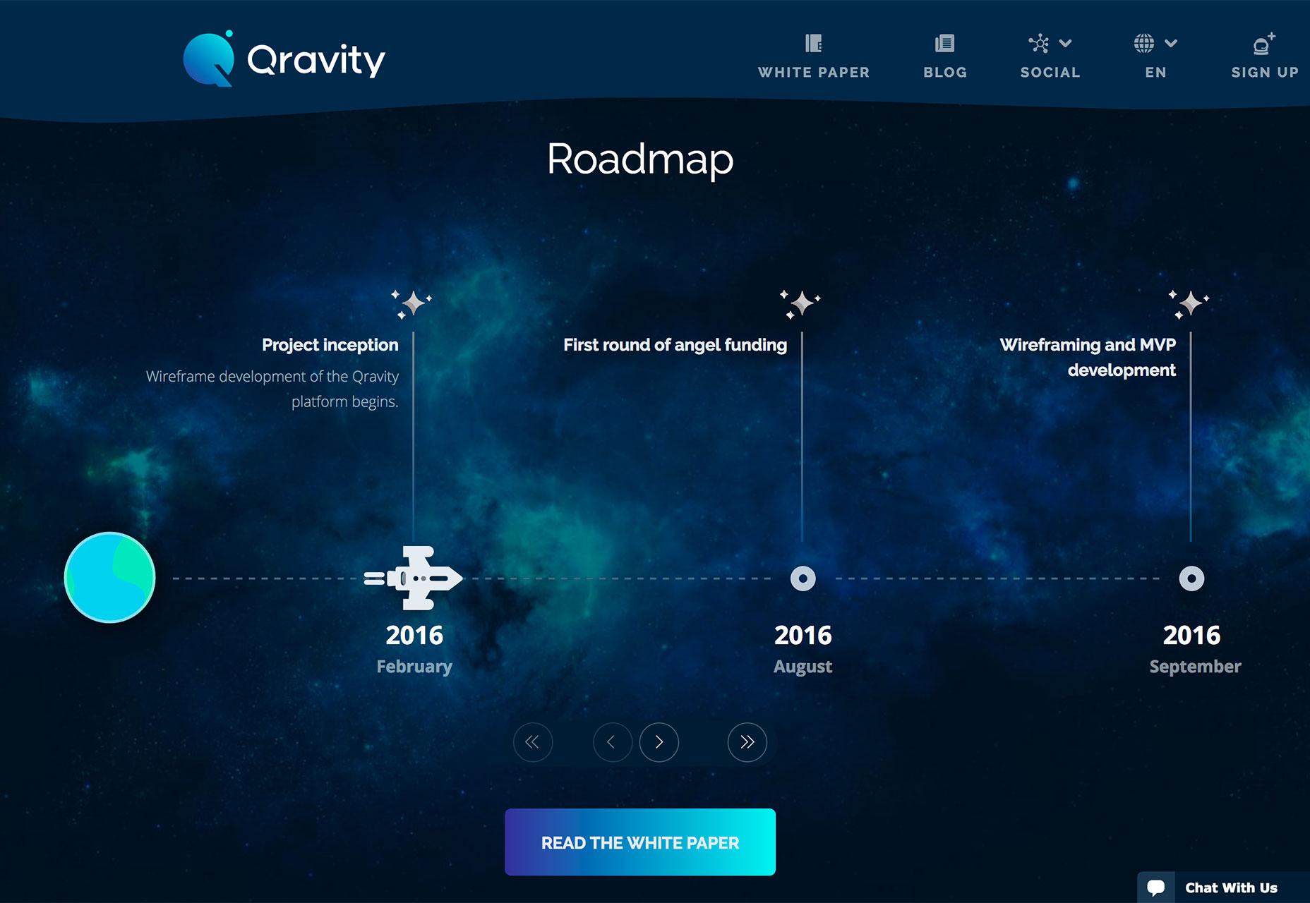
Qravity has multiple points of data entry in its website design. One of the most interesting might be the animated timeline below the scroll. This method of organizing information (dates and events) in a visual way makes the information so much easier to understand than a simple list.
3. Polygons 2.0
Polygon shapes in website design were everywhere in late 2017 and earlier this year. That trend continues but with a different look. Rather than piles of packed polygons to create backgrounds or other design elements, designers are picking a handful of polygons and supersizing them.
These oversized shapes add a fun and funky design element that matches almost any style of project. They can be part of an overall design pattern, accent on a homepage or interesting shape container element for an image or text.
What’s great about poly shapes is that they are a little different than the standard rectangles of circles that are more common and can immediate attract the attention of a user for that reason. These shapes also have a more modern feel because they are different.
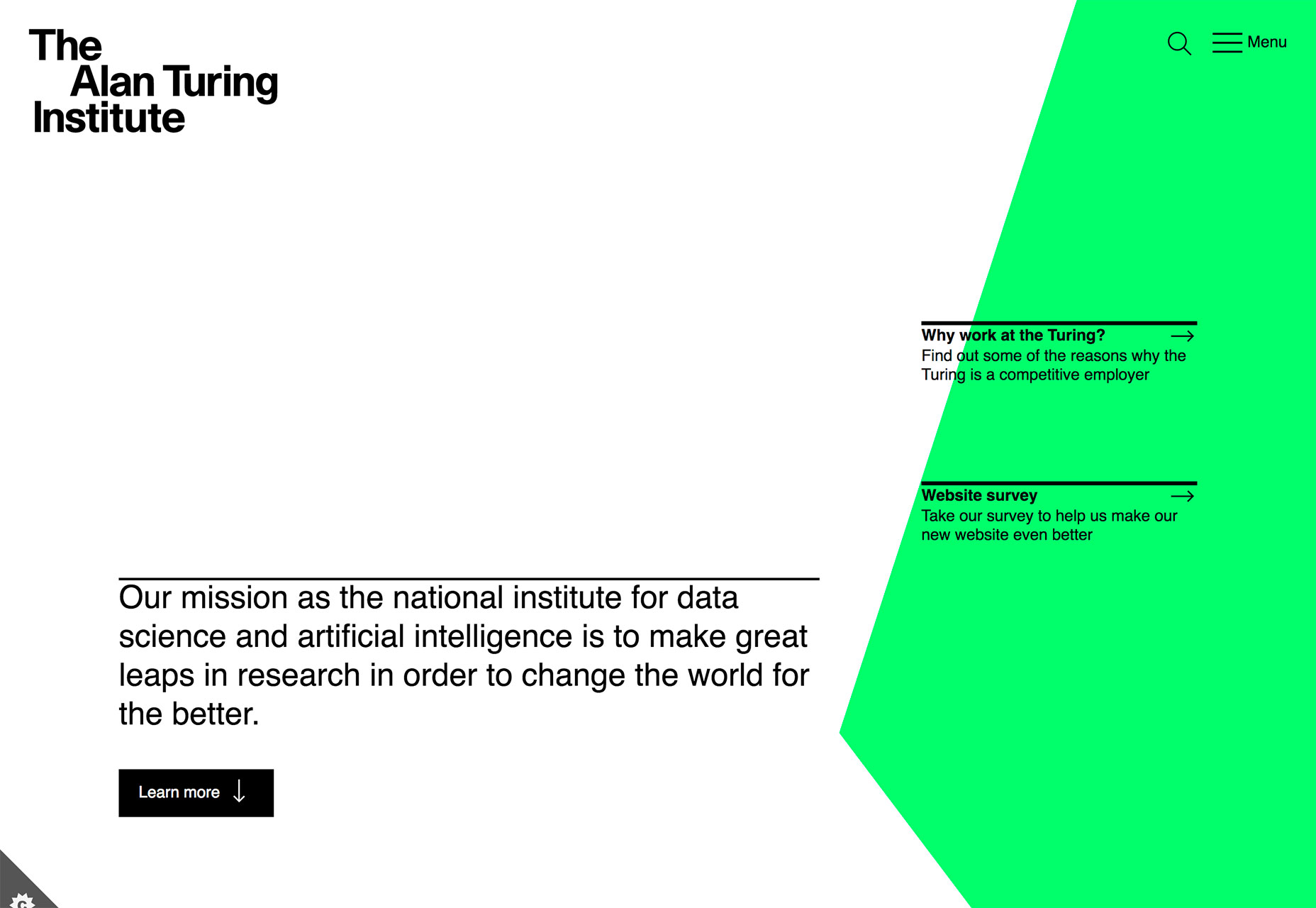
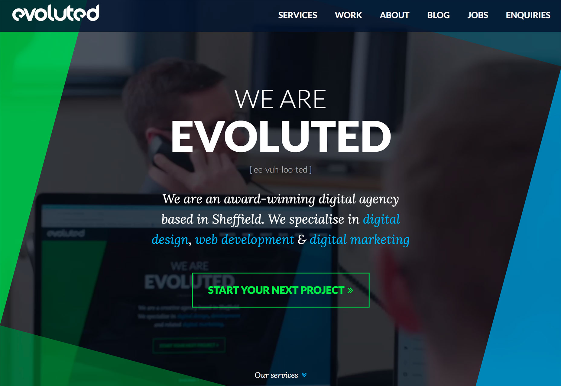
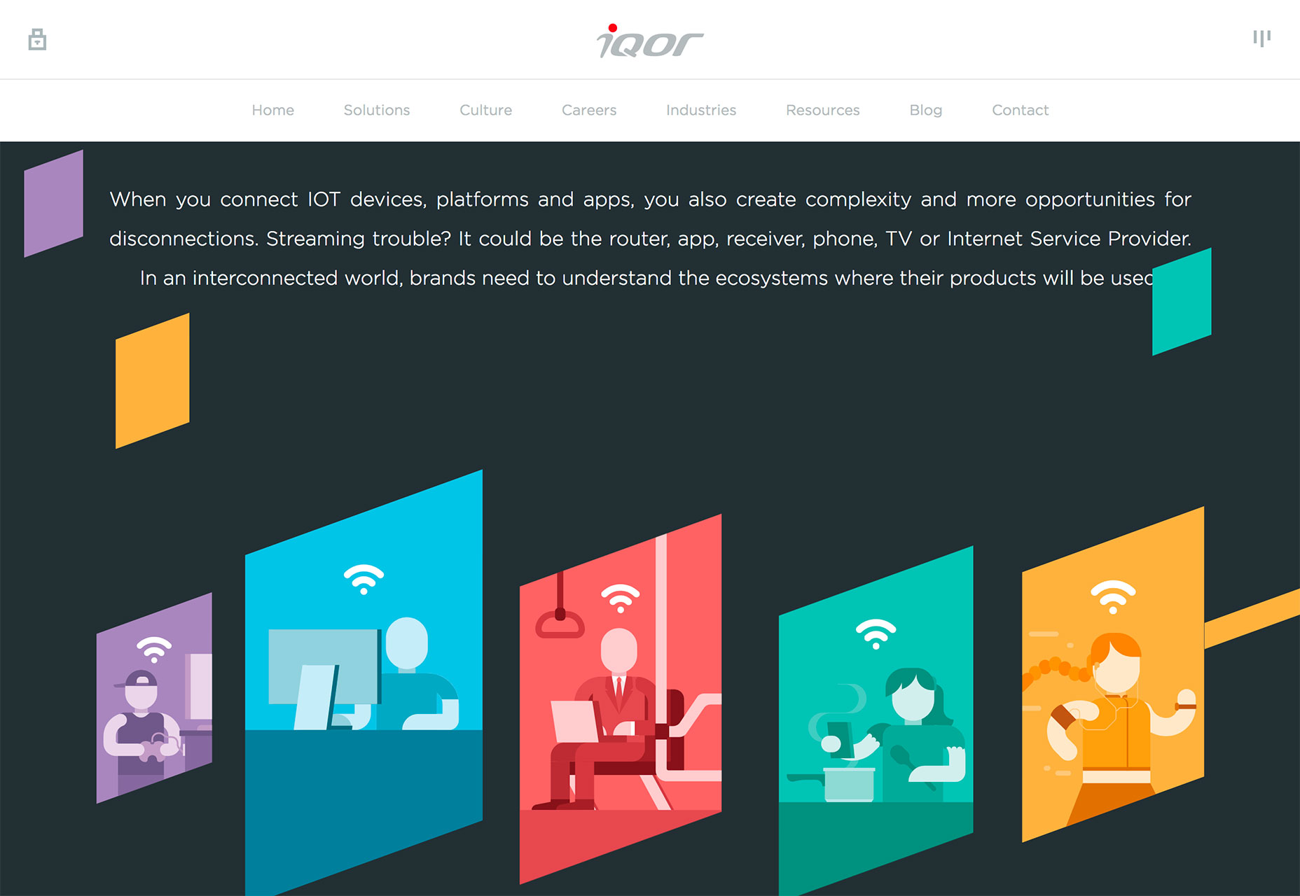
Polygons can feature shapes that have more distinct angles and sides such as the sharp animated triangle to the right side of The Alan Turing Institute website, simple lines that overlap for a more traditional poly feel (Evoluted) or simple shapes that help raw users into specific content (Iqor).
Because poly shapes are such a distinct design element, most projects feature them with bright color for even more emphasis. Just be wary of trying to fit elements inside of tilted or odd shape configurations; this can make elements to text difficult to read.
Polygons are best suited as a background or accent element, not necessarily as a home for messaging or key content items.
Conclusion
Personally, I love the white and bright design trend. With the heat of summer in full swing, these designs are appealing in so many ways. I like how versatile they are as well. A light color scheme is so readable with dark text and can work for almost any type of design project.
What trends are you loving (or hating) right now? I’d love to see some of the websites that you are fascinated with. Drop me a link on Twitter; I’d love to hear from you.
Every week users submit a lot of interesting stuff on our sister site Webdesigner News, highlighting great content from around the web that can be of interest to web designers.
The best way to keep track of all the great stories and news being posted is simply to check out the Webdesigner News site, however, in case you missed some here’s a quick and useful compilation of the most popular designer news that we curated from the past week.
Note that this is only a very small selection of the links that were posted, so don’t miss out and subscribe to our newsletter and follow the site daily for all the news.
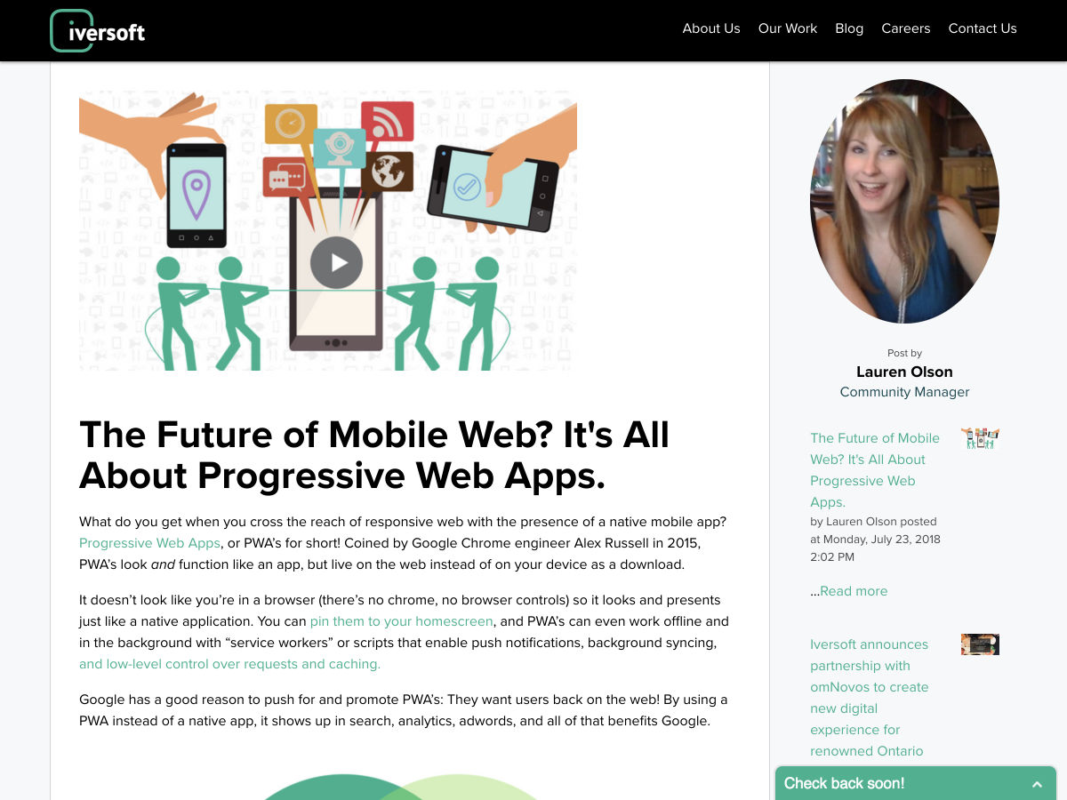
The Future of Mobile Web? It’s all About Progressive Web Apps
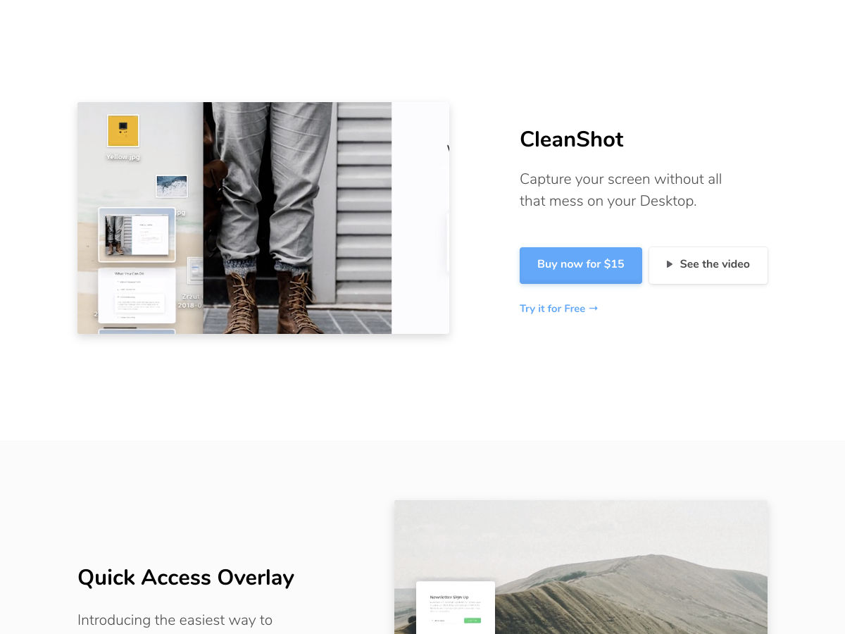
Finally… Capture your Screen Without all that Mess on your Desktop
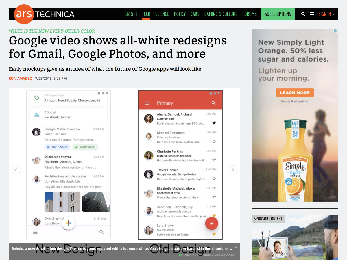
Google Video Shows All-white Redesigns for Gmail, Google Photos, and More
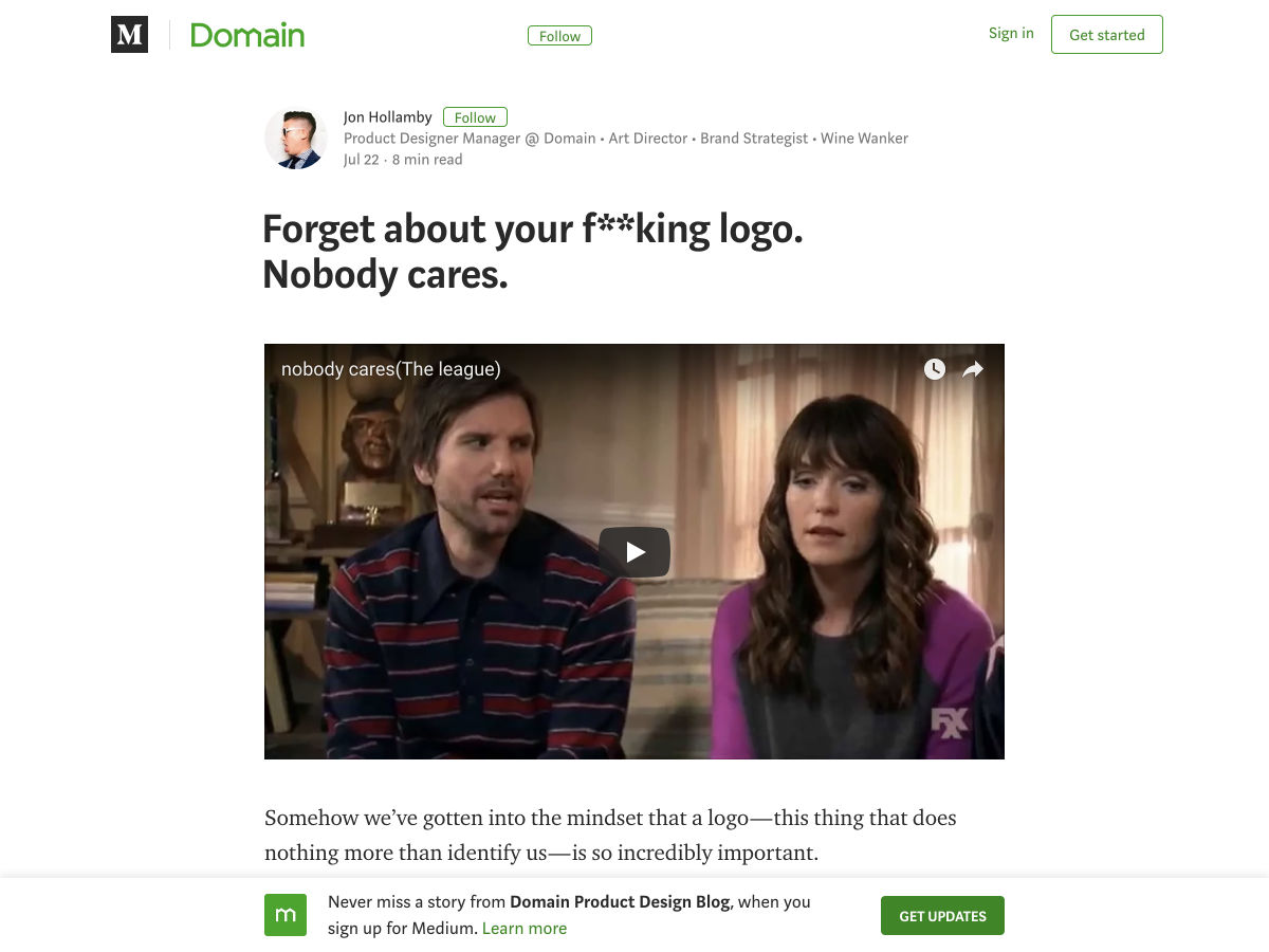
Forget About your Logo. Nobody Cares.
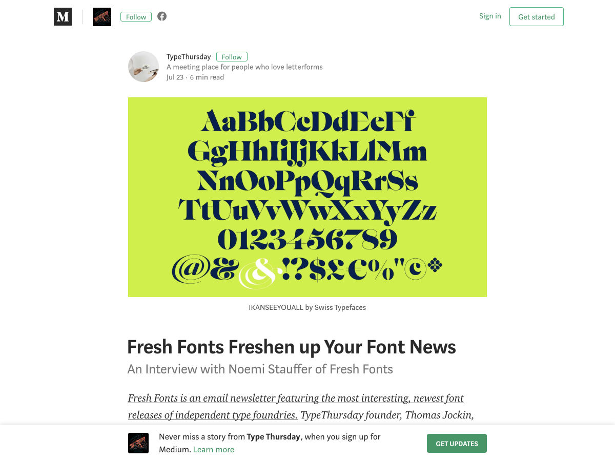
Fresh Fonts Freshen up your Font News
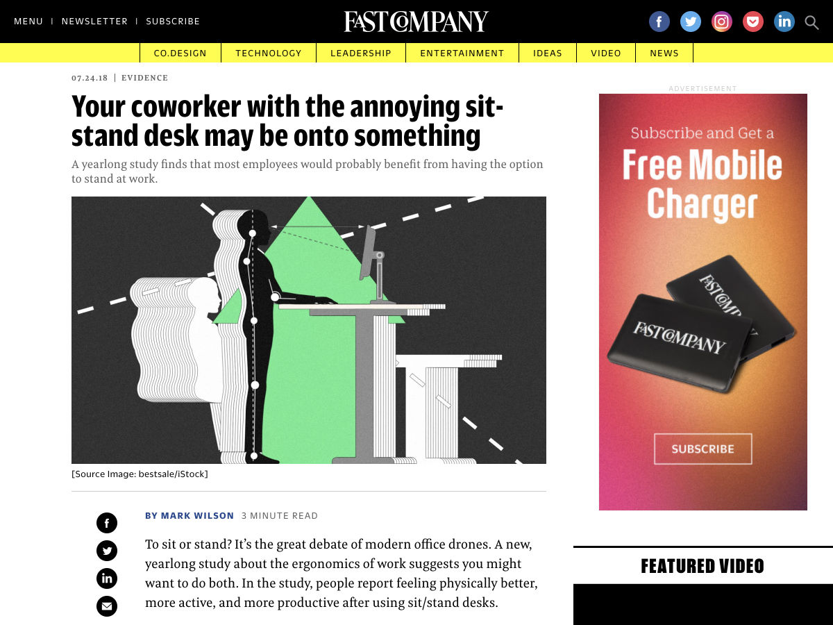
Your Coworker with the Annoying Sit-stand Desk May Be Onto Something
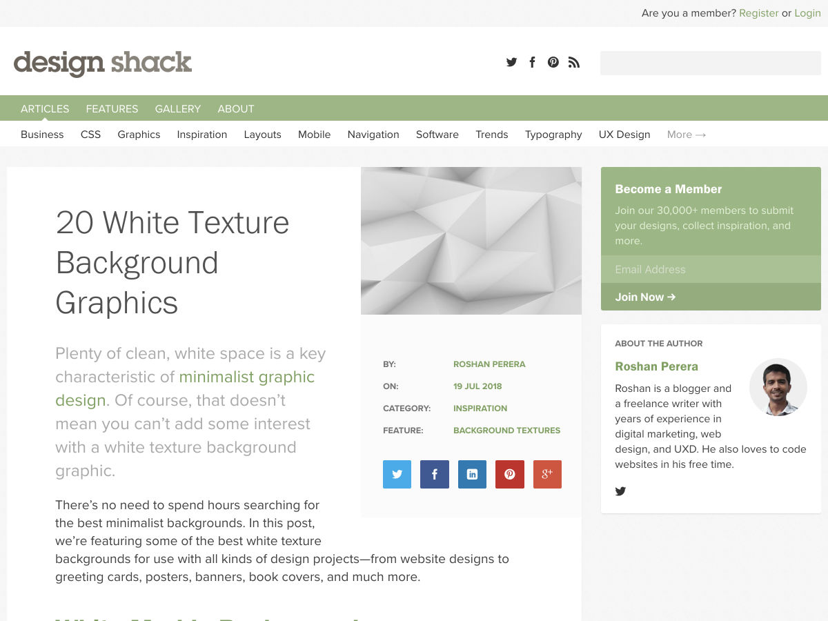
20 White Texture Background Graphics
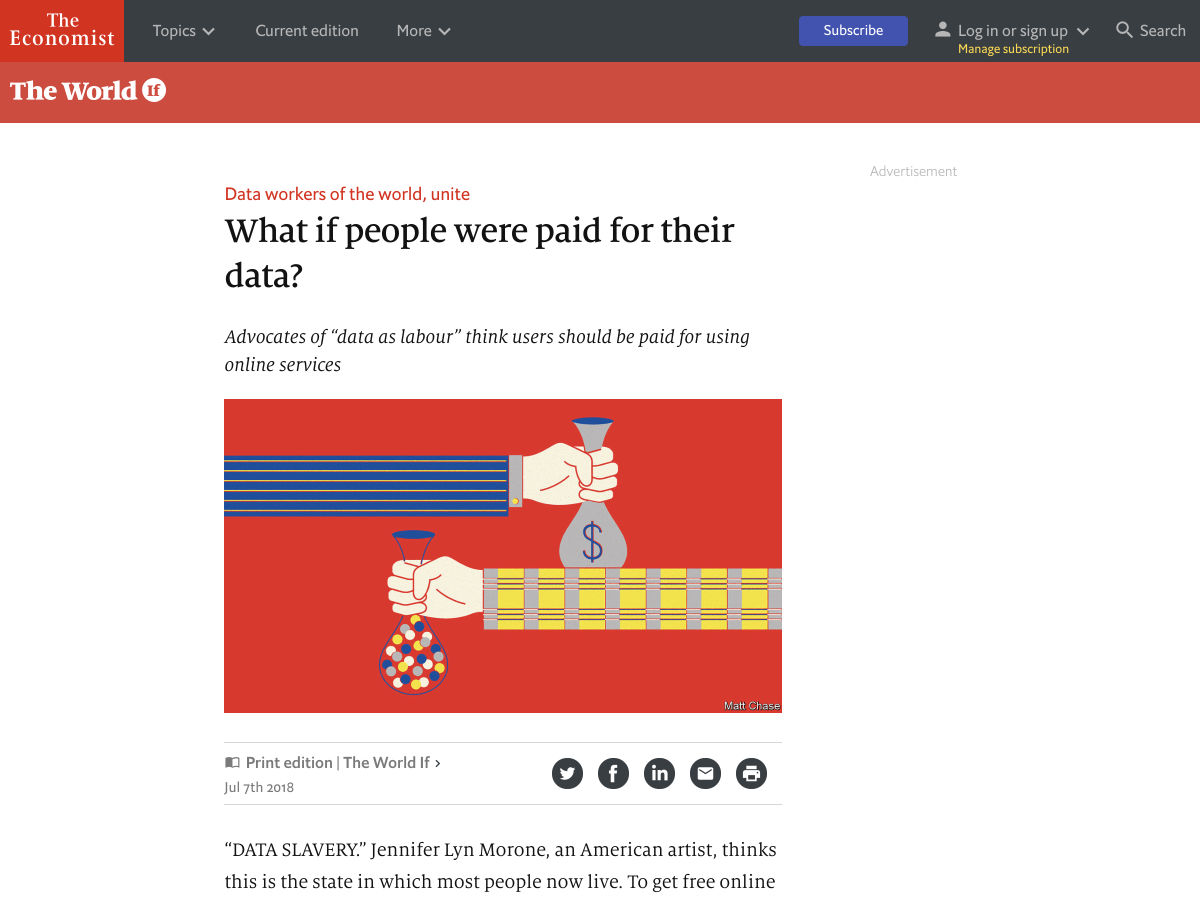
What if People were Paid for their Data?
We’re Underestimating the Mind-warping Potential of Fake Video
5 Ways to Take Better Control of your WordPress Website
Keyframes: A Community for Animators
Designers Talk: What We Didn’t Expect
Hacking User Perception to Make your Websites and Apps Feel Faster
Site Design: Emergence
Queer UX Experience
How to Give Project Estimates—and When not to Estimate at all
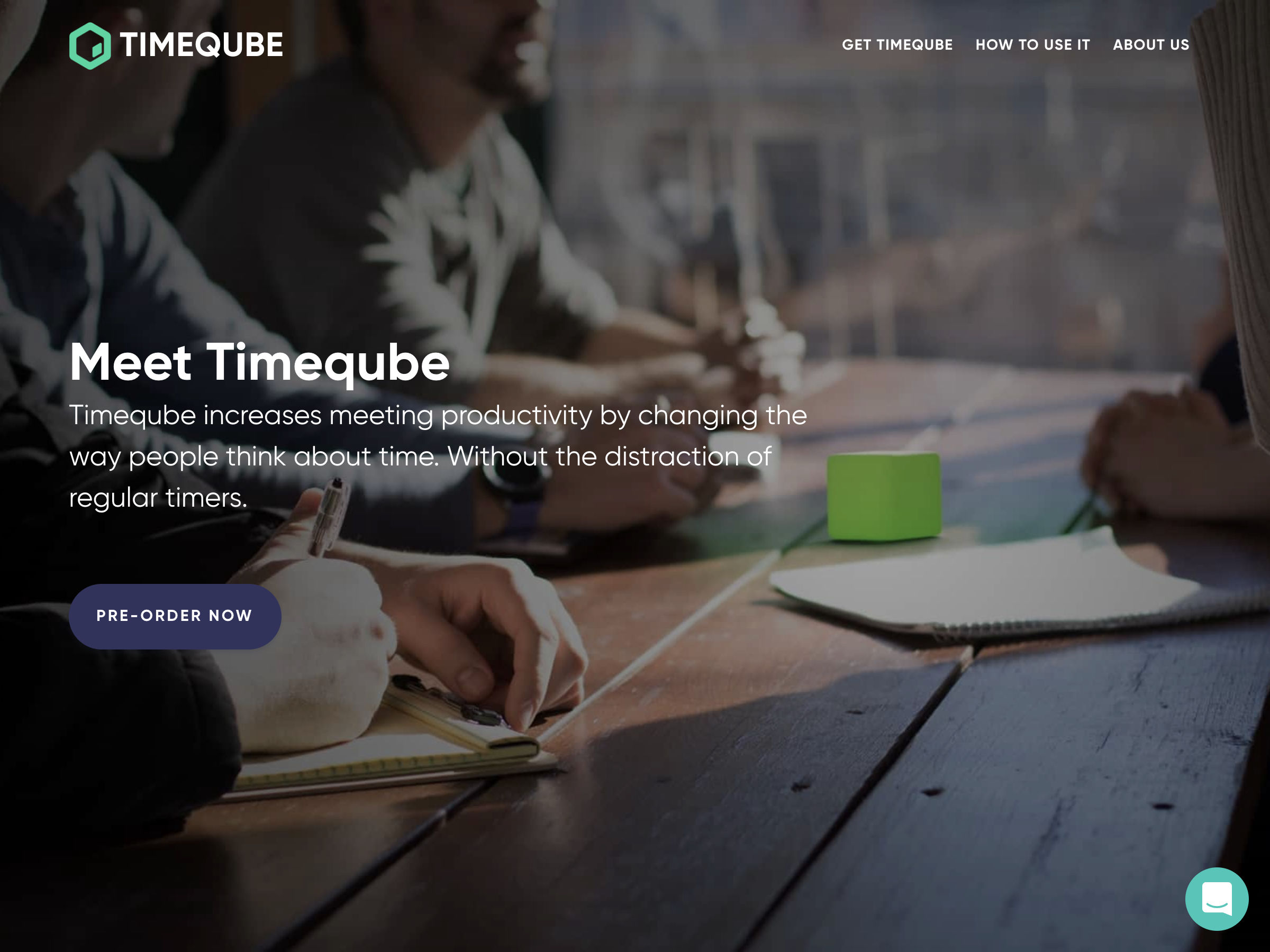
Timeqube – Beautiful Timer that Helps Waste Less Time in Meetings
8 Logo Design Cliches You Should Avoid
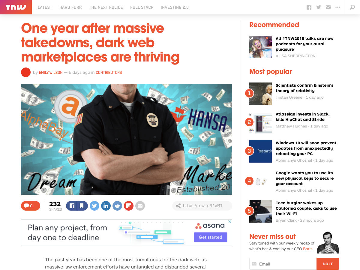
One Year After Massive Takedowns, Dark Web Marketplaces are Thriving
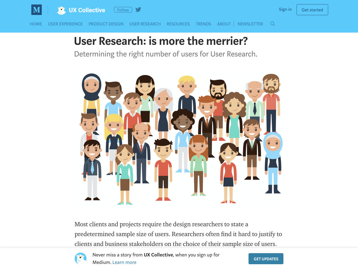
User Research: Is More the Merrier?
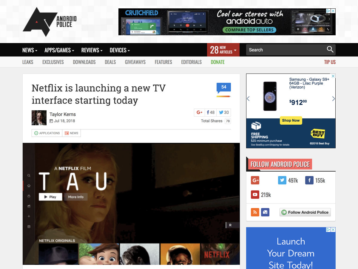
Netflix is Launching a New TV Interface Starting Today
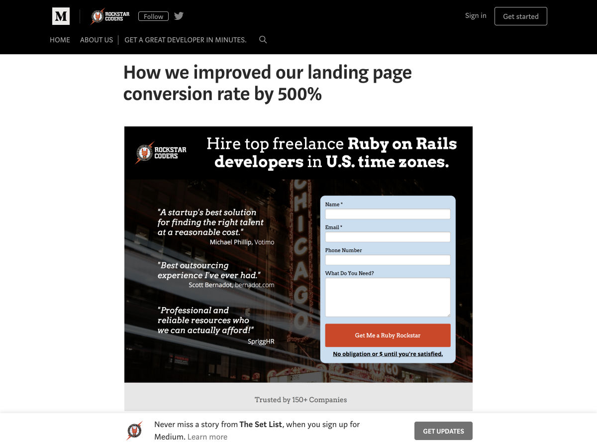
How We Improved Our Landing Page Conversion Rate by 500%
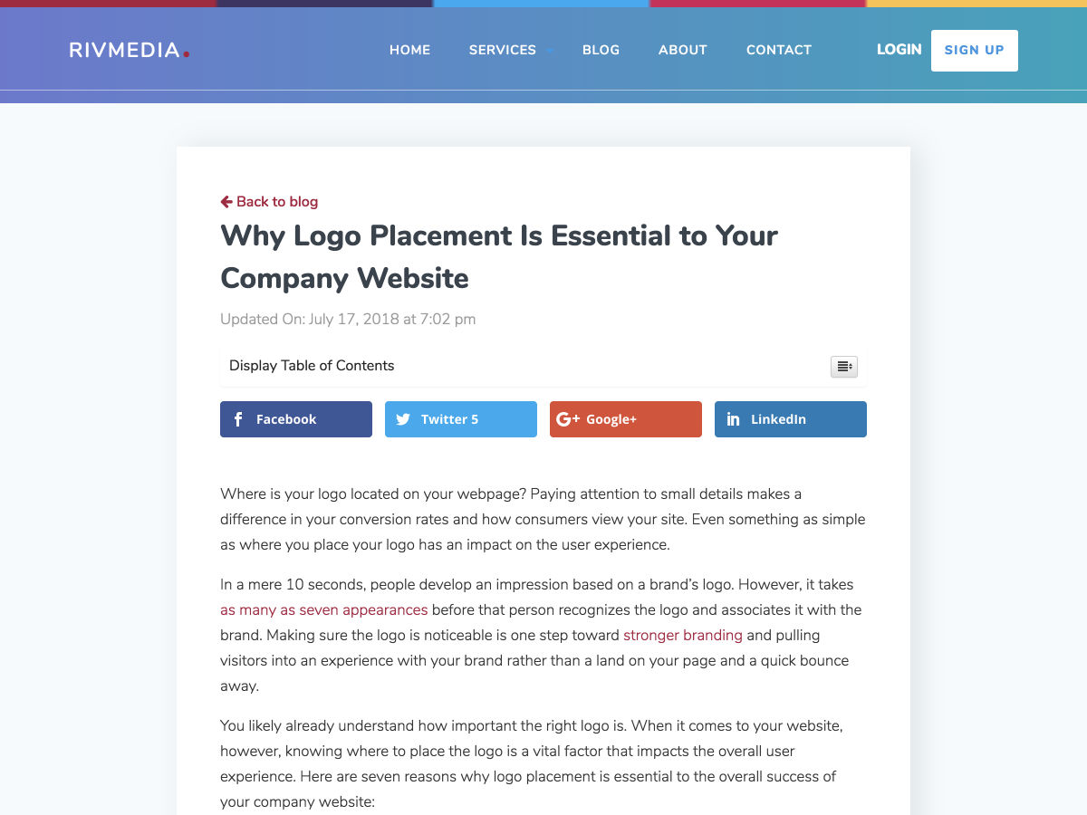
Why Logo Placement is Essential to your Company Website
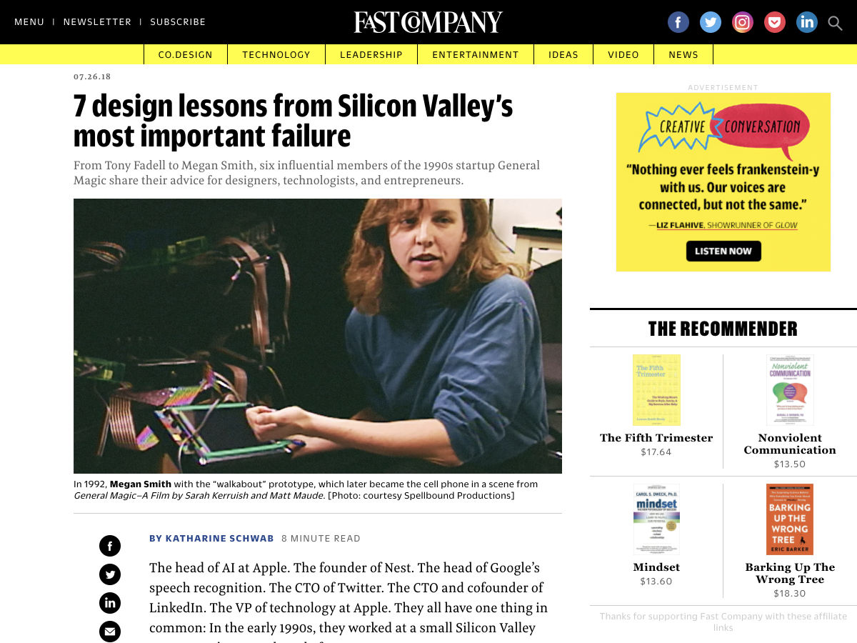
7 Design Lessons from Silicon Valley’s Most Important Failure
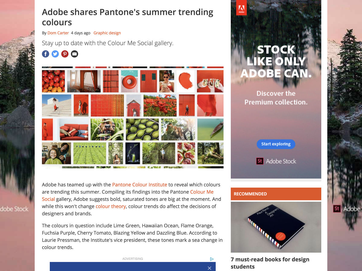
Adobe Shares Pantone’s Summer Trending Colours
Want more? No problem! Keep track of top design news from around the web with Webdesigner News.


