You’re probably used to fetching data in React using axios or fetch. The usual method of handling data fetching is to:
Make the API call.
Update state using the response if all goes as planned.
Or, in cases where errors are encountered, an error message is displayed to the user.
There will always be delays when handling requests over the network. That’s just part of the deal when it comes to making a request and waiting for a response. That’s why we often make use of a loading spinner to show the user that the expected response is loading.
All these can be done using a library called React Async.
React Async is a promised-based library that makes it possible for you to fetch data in your React application. Let’s look at various examples using components, hooks and helpers to see how we can implement loading states when making requests.
For this tutorial, we will be making use of Create React App. You can create a project by running:
npx create-react-app react-async-demo
When that is done, run the command to install React Async in your project, using yarn or npm:
The library allows us to make use of directly in our JSX. As such, the component example will look like this;
// Let's import React, our styles and React Async
import React from 'react';
import './App.css';
import Async from 'react-async';

// We'll request user data from this API
const loadUsers = () =>
  fetch("https://jsonplaceholder.typicode.com/users")
    .then(res => (res.ok ? res : Promise.reject(res)))
    .then(res => res.json())

// Our component
function App() {
  return (
    <div className="container">
      <Async promiseFn={loadUsers}>
        {({ data, err, isLoading }) => {
          if (isLoading) return "Loading..."
          if (err) return `Something went wrong: ${err.message}`

          if (data)
            return (
              <div>
                <div>
                  <h2>React Async - Random Users</h2>
                </div>
                {data.map(user=> (
                  <div key={user.username} className="row">
                    <div className="col-md-12">
                      <p>{user.name}</p>
                      <p>{user.email}</p>
                    </div>
                  </div>
                ))}
              </div>
            )
        }}
      </Async>
    </div>
  );
}

export default App;
First, we created a function called loadUsers. This will make the API call using the fetch API. And, when it does, it returns a promise which gets resolved. After that, the needed props are made available to the component.
The props are:
isLoading: This handles cases where the response has not be received from the server yet.
err: For cases when an error is encountered. You can also rename this to error.
data: This is the expected data obtained from the server.
As you can see from the example, we return something to be displayed to the user dependent on the prop.
Example 2: Loaders in hooks
If you are a fan of hooks (as you should), there is a hook option available when working with React Async. Here’s how that looks:
// Let's import React, our styles and React Async
import React from 'react';
import './App.css';
import { useAsync } from 'react-async';

// Then we'll fetch user data from this API
const loadUsers = async () =>
  await fetch("https://jsonplaceholder.typicode.com/users")
    .then(res => (res.ok ? res : Promise.reject(res)))
    .then(res => res.json())

// Our component
function App() {
  const { data, error, isLoading } = useAsync({ promiseFn: loadUsers })
  if (isLoading) return "Loading..."
  if (error) return `Something went wrong: ${error.message}`
  if (data)

  // The rendered component
  return (
    <div className="container">
      <div>
        <h2>React Async - Random Users</h2>
      </div>
      {data.map(user=> (
        <div key={user.username} className="row">
          <div className="col-md-12">
            <p>{user.name}</p>
            <p>{user.email}</p>
          </div>
        </div>
      ))}
    </div>
  );
}

export default App;
This looks similar to the component example, but in this scenario, we’re making use of useAsync and not the Async component. The response returns a promise which gets resolved, and we also have access to similar props like we did in the last example, with which we can then return to the rendered UI.
Example 3: Loaders in helpers
Helper components come in handy in making our code clear and readable. These helpers can be used when working with an useAsync hook or with an Async component, both of which we just looked at. Here is an example of using the helpers with the Async component.
// Let's import React, our styles and React Async
import React from 'react';
import './App.css';
import Async from 'react-async';

// This is the API we'll use to request user data
const loadUsers = () =>
  fetch("https://jsonplaceholder.typicode.com/users")
    .then(res => (res.ok ? res : Promise.reject(res)))
    .then(res => res.json())

// Our App component
function App() {
  return (
    <div className="container">
      <Async promiseFn={loadUsers}>
          <Async.Loading>Loading...</Async.Loading>
          <Async.Fulfilled>
            {data => {
              return (
                <div>
                  <div>
                    <h2>React Async - Random Users</h2>
                  </div>
                  {data.map(user=> (
                    <div key={user.username} className="row">
                      <div className="col-md-12">
                        <p>{user.name}</p>
                        <p>{user.email}</p>
                      </div>
                    </div>
                  ))}
                </div>
              )
            }}
          </Async.Fulfilled>
          <Async.Rejected>
            {error => `Something went wrong: ${error.message}`}
          </Async.Rejected>
      </Async>
    </div>
  );
}

export default App;
This looks similar to when we were making use of props. With that done, you could break the different section of the app into tiny components.
Conclusion
If you have been growing weary of going the route I mentioned in the opening section of this tutorial, you can start making of React Async in that project you are working on. The source code used in this tutorial can be found in their different branches on GitHub.
December 6th, 2018 was a special date for WordPress: it marked the release of version 5.0 of the software that, to this day, powers more than one-third of the web. In the past, people working on the platform pointed out that there has never been any special meaning to version numbers used in WordPress releases; as such, WordPress 5.0 was simply the follower to WordPress 4.9. Yet, 5.0 brought possibly the biggest innovation since Custom Post Types were introduced in version 3.0 – that’s almost a decade, folks.
The Block Editor — codename “Gutenberg” — is now the new default writing tool in WordPress. Before its adoption in Core, our beloved CMS has relied on what we now call the Classic Editor. And, by the way, the Classic Editor isn’t really gone: you can bring it back by installing a plugin that restores the default editing experience you’ve known all these years.
So, why was the Classic Editor replaced? Essentially because it embodied an old concept of writing, a concept that was conceived when the only need of a text editor was to visually compose HTML code.
Not to create layouts. Not to embed dynamic content form heterogeneous sources. Not to offer a representation of what your post or page would look like when you pressed that “Publish” button, and go live with your piece of content.
In short, the Classic Editor delivered a very basic writing experience and, frankly, it always fell short at creating anything more than flowing text.
The Block Editor is based on the idea of content “blocks” in the sense that everything we can add to a page — a text paragraph, an image, an embed — is technically a block, that is, an atomic entity that’s defined by a certain series of properties. The combination of these properties determines the state of that particular block. Combine several blocks one after the other, and you’ll get the content of your page.
In this transition from unorganized text to rigorous content structure lies the biggest change introduced by the Block Editor.
Layouts pre-Block Editor
Before all of this bursted into existence, people who wanted to create a layout within WordPress had to choose between either of these options:
Create a custom template from scratch, getting their hands dirty with code – a noble intent, yet not so appealing to the masses.
Use a tool, better if a visual one, that helped them composing a page structure without having much code knowledge.
That’s how page builders were born: page builders are plugins that provide a visual way to compose a layout, ideally without touching a single line of code, and they were created out of necessity to fill a gap between visual mockups and the actual, finished website. Elementor and Beaver Builder are two popular builders that come to mind.
Page builders have always suffered from a bad reputation, for a variety of reasons:
They tend to be slow and bulky.
Some offer poor editing experiences.
They end up locking users into a framework or ecosystem that’s tough to replace.
The first point is as obvious as it is unavoidable: if you’re a page builder author (and, hopefully, aspire to sell copies of your product), you have to make it as appealing as possible; physiologically, builders started to slowly become big code soups with everything in them, at the detriment of performance.
The second point may be subjective, at least to to some extent. The third point, however, is a fact. Sure, one could be perfectly fine using the same tool for every project, perfecting knowledge of the instrument as time goes by, but the more you stick to it, the harder it gets to potentially stop using it one day.
The Block Editor aims to surpass this deadlock: from the user’s point of view, it aims at offering a better, richer writing experience, while, from the developer’s perspective, providing a unified, shared API from which to build upon.
A brief history of CSS layouts
If you’re old enough, you’ll probably know the story already. If not, it might be fun for you to hear what life was like for a front-end developer back in the day.
The first version of the CSS specification dates back to 1996, and it allowed an embedded stylesheet to add font styling, pick colors for elements, change the alignments and spacing of objects in the page. The problem was that, in those days, the concept of semantic HTML wasn’t exactly widespread. In other words, there was no clear separation between content and form. The markup we’d write and the appearance we want were completely intertwined in the same document.
This led to HTML elements to be used more for presentation purposes, than conveying meaning to their presence in the page. For example, on the layout side of things, this also led to to table elements being used to create layouts instead of actual tabular data. To achieve even more complex layouts, tables began being nested into other tables, making the page become a nightmare from the semantic point of view, its size grow and grow, and resulting very hard to maintain over time. If you’ve ever coded an HTML email, then you have a good idea of what life was like. And, really, this still sort of happens in websites today, even if it’s for smaller elements rather than complete page layouts.
Then the Web Standards movement came along with the goal to raise awareness among developers that we could be doing things differently and better; that style and content should be separated, that we need to use HTML elements for their meaning, and reinforcing the concept that a lighter page (in terms of code weight) is a fundamentally better option than an unmanageable ocean of nested tables.
We then began (over)using div elements, and juxtaposed them using the float property. The presentation focus was shifted from the markup to the stylesheet. Floats became the most reliable layout tool available for years, yet they can be a bit problematic to handle, since they have to be cleared in order for the page to return to its standard flow. Also, in this age, page markups were still too redundant, even though using divs instead of tables helped make our content more accessible.
The turnaround moment came in 2012, with the publication of the Flexbox specification. Flexbox allowed developers to solve a whole series of long standing little layout problems, complete with an elegant syntax that requires a lot less markup to be implemented. Suddenly (well, not that suddenly, we still have to care about browser support, right?), reliably centering things on both axises wasn’t an issue anymore. It was refreshing. Finally, tweaking a layout could be reduced to altering just one property in our stylesheet.
As important as Flexbox is to this day, it is not the end of the story.
It’s 2019! Let’s use CSS Grid.
If you’ve come this far reading this piece, we think it’s safe to assume that two things are for sure:
That we clearly aren’t in this industry to live peaceful, quiet professional lives.
The things we use are going to change.
In 2017, the CSS Grid Layout Module specification was officially published, but, as it always happens with CSS specs, its draft and interim implementations had already been around for some time.
CSS Grid is a bold leap into what CSS can and should do. What if we stopped micromanaging our pages styles, and started thinking more holistically? What if we had a system to reliably position elements on the screen that doesn’t depend at all on the markup being used, nor the order of elements, and that is, at the same time, programmatically applicable on smaller screens?
No, this isn’t just a thought. This is more of a dream; one of those good ones you don’t want to wake up from. Except that, in 2019, this has become a reality.
The main difference between Grid and Flexbox is more nuanced, of course, but basically comes down to Grid operating in two dimensions, while Flexbox is limited to one. Knowing what elements are going to be placed within the limits of a container, we can choose exactly where those elements are going to end up, entirely from directives written in the stylesheet.
Do we want to tweak the layout down the road? Fine, that modification won’t affect the markup.
The basic idea behind Grid is that elements are laid out in, well, a grid. By definition, a grid is composed by a certain amount of columns and rows, and the boundaries between columns and rows form a series of cells that can be filled with content.
The savings of this approach in terms of quantity of code being used to achieve the desired result are extraordinary: we just need to identify a container element, apply the display: grid rule to it, and then pick elements within that container and tell CSS what column/row they begin/end in.
The above example creates a 3×2 grid associated to the .my-container element; .element-1 is a 2×2 block that is inscribed in the grid, with its upper left vortex being positioned in the second column of the first row of the grid.
Sounds pretty neat, right?
The even neater thing about CSS Grid is the fact that you can create template areas, give those areas meaningful names (e.g. “header” or “main”), and then use those identifiers to programmatically position elements in those areas.
For those who have begun working in this business in the tables era, the code above is nothing short of science fiction.
More good news, anyway: support for CSS Grid is pretty great, today.
Using CSS Grid in WordPress
So, this is great, and knowing that we can do so many more things today than we could compared to a few years ago probably makes you want to give Grid a try, at last.
If you are working on a WordPress project, you’re back facing the two options mentioned above: do we start from scratch and manually coding a template, or is there something that can give us a little help? Luckily, there is a plugin that might interest you, one that we have created with a dual goal in mind:
Create a bridge between the Block Editor and CSS Grid.
Create a plugin that could perhaps make people move past the initial skepticism of adopting the Block Editor.
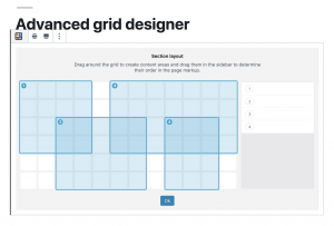
It’s called Grids, and it’s a free download on the WordPress plugins repository.
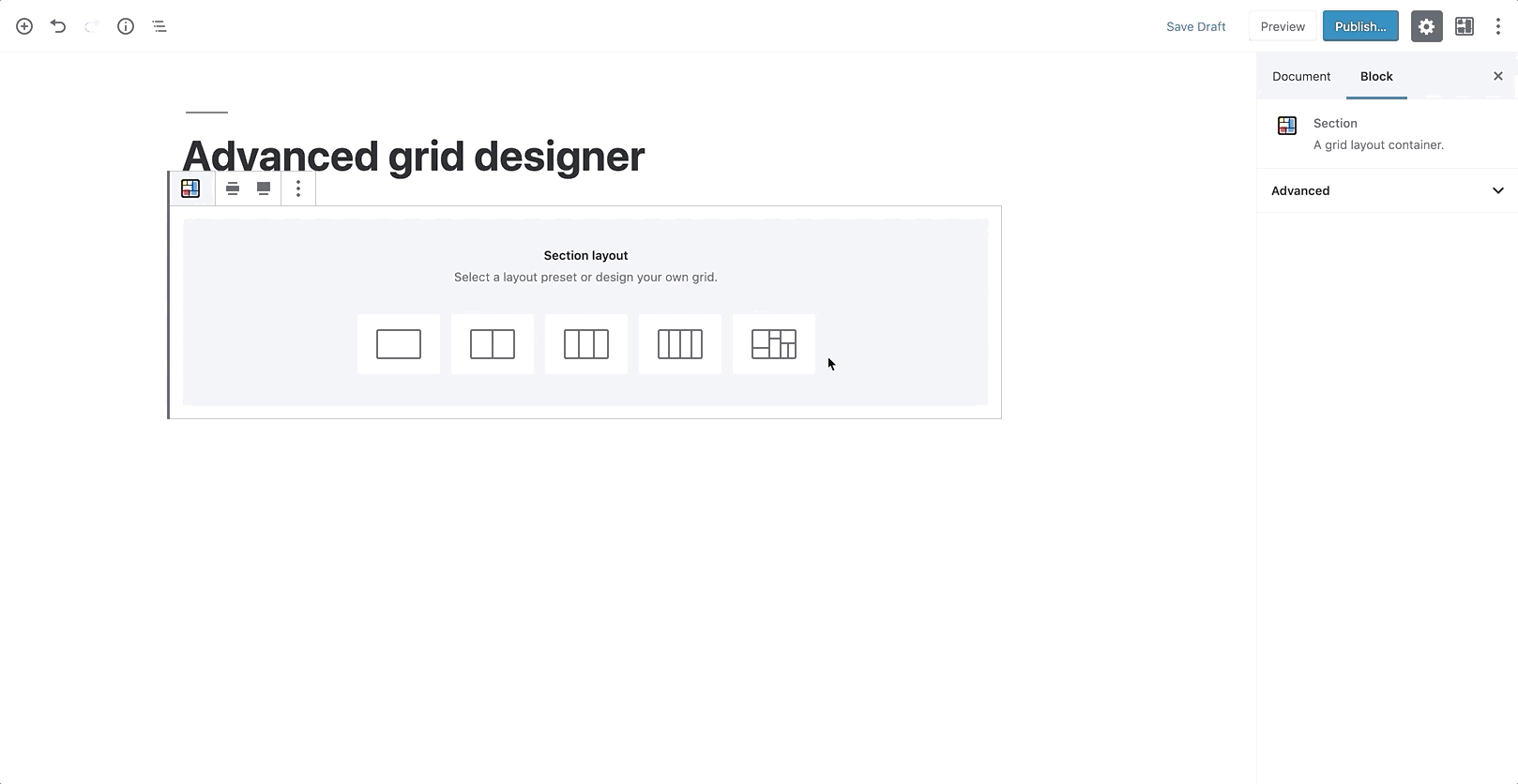
Grids only takes care of the layout structure. It puts a 12×6 grid at your disposal (called Section), over which you can drag and draw the elements (Areas) that are going to be contained in that Section.
The system allows you to manually specify dimensions, backgrounds, responsive behavior, all using visual controls in the Block Editor, but by design, it doesn’t provide any content block. Sure, one could see this approach as a weak point, but we think it’s actually Grids’ biggest strength because it enables the plugin to integrate with the myriad content blocks that other developers all around the world are creating. More so, in a way Grids helps bringing those blocks, and WordPress as a platform, in touch with CSS Grid itself.
Yet, even if the plugin doesn’t strictly produce content, it’s inevitable to put it in the same phrase with successful page builders, in fact comparing its functionality to that offered by those. If you care about concepts like separation of form and content, page weight, ease of maintenance, Grids offers a cleaner solution to the problem of creating visually appealing layouts in WordPress.
The generated markup is minimal. In its most basic form, a Section (that is, the element with the display: grid property) is only composed by its own element — of course, an internal wrapper (that couldn’t be avoided and that’s used for spacing purposes), and then one element per Area belonging to the Section. This is a huge step forward in terms of avoiding using unnecessary markup.
This choice also directly determines what happens in the eventuality that you disable Grids in your install.
??
??If you don’t re-save your page again, what’s left of Grids on the front end is actually exclusively the content you put inside the content Areas. Not any extra markup elements, not any weird-looking shortcode.
??
??On the back-end side of things, the Block Editor has a system in place that warns you if you’re editing a page that is supposed to use a particular block type, but that block type isn’t currently available: in that case, you could easily turn Grids back on temporarily, move your content in another place, and then get rid of the Section altogether.
CSS generated to create the grid is also dynamically added to the page, as an inline style in the portion of the document. We haven’t been exactly fans of styles written in the page directly, because ideally we’d like to delegate all of the styling to files that we could put under version control, yet this is a case where we found that approach to be very convenient.
Another viable option would have been to identify all the possible combinations of column/row starting/ending points, and programmatically map those with classes that could then be used to actually position elements within the grid. On a 12×6 grid, that would have lead to having a grand total of 36 class selectors, looking like this:
What if we decide to offer more control over how a grid is composed and, say, give users access to options that determine how many columns or rows form the grid structure?
We’d have to manually map the classes that we don’t yet have in the stylesheet (and release an update to the plugin just for that), or, again, generate them inline, and then add those classes to the grid elements.
While perfectly fine, this approach kind of goes against the idea of having a leaner, more scannable markup, so we’ve decided not to follow this route, and pay the price of having style dynamically put in the head of the document, knowing that it could be easily cached.
Because of the experimental nature of the plugin, the backend UI that’s being used to actually compose the grid is created with CSS Grid, and a set of CSS variables through which we control the properties of content Areas. Using variables has immensely sped up our work behind the grid creator prototype — had we chosen a different path there, things wouldn’t just be much longer in terms of development times, but also more complex and less clear to maintain down the road.
Feedback wanted!
To further foster the adoption of CSS Grid, we need tools that automate the process of creating layouts with it.
While we have been seeing great examples of this technology out in the wild, it would be short-sighted to assume that every website that is published today has a team of front-end devs behind it, that can take care of the issue.
We need tools that produce good markup, that don’t hinder the maintenance of the website stylesheets, and, most importantly in the WordPress world, that can be easily integrated with the existing themes that people love to use.
We think Grids is a step forward in that direction, as it’s a tool that is built upon two standards — the Block Editor API, and CSS Grid — and, as such, suffers less risk of reinventing the proverbial wheel.
While we’ve been recording general interest in the plugin at the recent WordCamp Europe in Berlin – with Matt Mullenweg himself displaying a brief demo of the plugin during his keynote — we know that it still needs a lot of feedback that can only be obtained with real-life scenarios. So, if you want to take Grids for a spin, please use it, test it and, why not, suggest new features.
The point of the element (behind a flag in Chrome Canary) is that you can preload another whole page (like ), but then have APIs to animate it to the current page. So “Single Page App”-like functionality (SPA), but natively. I think that’s pretty cool. I’m a fan of JavaScript frameworks in general, when they are providing value by helping do things that are otherwise difficult, like fancy state management, efficient re-rendering, and component composition. But if the framework is being reached for just for SPA qualities, that’s unfortunate. The web platform is at its best when it seems what people are doing are in step with native, standardized solutions.
But it’s not the web platform at its best when things are done inaccessibly. Steve Faulkner wrote “Short note on the portal element” where he points out seven issues with the portal element as it exists now. Here’s a demo of it with some of those issues addressed. I guess it’s somewhat of an implementation issue if a lot can be fixed from the outside, but I imagine much of it cannot (e.g. back button behavior, whether the loaded pages becomes part of the accessibility tree, etc.).
(This is a sponsored article.) If you think about it, software teams are a lot like sports teams. While each team member works towards the same exact goal, the role they play and the actions they take are vastly different from one another.
Which is why it’s crucial to have a seamless way of moving the ball from one team member to another.
Unfortunately, the handoff that takes place within software teams isn’t naturally as smooth as what you see on the sports field. And one of the primary reasons for this is the different systems and approaches used to build products.
Designers create pixel-perfect UIs in Sketch, only to have to translate them into a language that developers can use when they build apps in the Visual Studio Code IDE. Without a seamless way to move product designs through the pipeline, these inefficiencies lead to expensive reworks and debugging after an app has been shuttled from designer to developer.
Needless to say, a solution to the Sketch-to-IDE handoff problem has been a long time coming. It’s not that software teams don’t know how to collaborate or communicate well with one another. It’s just that their disparate systems and strategies make the transition from one team to another clunky, time-consuming and error-ridden.
Today, we’re going to look at why this happens and how your agency can fix the problem with two plugins and a prototyping cloud platform from Indigo.Design.
Where Does the Designer-Developer Handoff Go Wrong?
First, what we should really ask is:
Why is the designer-developer handoff such a problem?
Nick Babich recently wrote about how designers go to great lengths to create digital solutions that are perfectly measured and consistently crafted. But design systems don’t fluently translate to development systems.
The more the designer does to an interface, the more they have to actually communicate to a developer. So, it’s not enough to hand over a Sketch design file and leave the developer to run with it. Designers have to provide design specs that explain how all the moving pieces need to be laid out, spaced, styled, colored, engaged with and so on.
It’s been the only way to ensure that an app ends up pixel-perfect in the end. Even then, it still requires a lot of implementation on the part of the developer once they’re inside their IDE.
As you can imagine, this whole process takes a designer a lot of time to do. But without design specs, developers end up having to play a risky guessing game.
Not only that, developers aren’t typically in the habit of coding with HTML and CSS, which is tedious work and only represents the UI. There’s a lot more code behind the scenes that makes a web app work and not all developers are adept at or interested in learning to write the UI markup. When they’re forced into this position, the steep learning curve adds more time to projects and the resulting reworks and debugging sends costs spiraling out of control.
Is it the designer who has to redline everything so the developer knows how to turn the design into reality?
Or:
Is it the developer who has to look at a design, manually measure everything on the screen and hope they get all the specifications right just by eyeballing it?
No one wins in either scenario. And you’re going to eat away at your profit margins in the process.
There may be some agencies who believe that forcing designers and developers to work in the same platform is the best solution. That way, there’s no need to do all of this translation or interpretation during the handoff from Sketch to Visual Studio Code. But that often results in stifled creativity on the part of the designer or a hampered ability to build effective software solutions on the part of the developer.
So, what’s the answer?
Improve The Designer-Developer Handoff With Indigo.Design
It’s not like Indigo.Design is the first platform to try to solve handoff issues for software teams. InVision and Zeplin have both offered up their own solutions.
Each of these platforms have made visual specifications more accessible for developers while consequently improving the efficiency of designer-developer teams. Specifically:
Designers don’t need to mark up the UI anymore as the platforms handle the redlines.
Developers can manually extract the design specs without the designers’ help.
That said, with platforms like InVision and Zeplin, developers still have to inspect each element and manually code it based on the extracted specs. These platforms also have yet to create a seamless bridge between Sketch and Visual Studio Code.
So, if designers and developers want to work as efficiently as possible with one another, Indigo.Design has developed an answer to their problem:
Step 1: Design in Sketch
There’s really only one thing about this phase that has to change for the designer. The app, pages and flow will still be designed as usual within Sketch, using components from the Indigo.Design UI Kit.
An example of what your app might look like in Sketch. (Source: Sketch) (Large preview)
However, there’s no longer any need to compile redlines or specs for the app anymore. Indigo.Design takes care of it for you.
In order to leverage this, your designer has to ditch whatever prototyping system they were using before. With this new streamlined and error-free system, your designer can easily push their designs into the cloud using the Indigo.Design plugin.
This can be accessed under the Plugins menu > Indigo.Design > Publish Prototype:
The Indigo.Design plugin simplifies the publication of prototypes. (Source: Sketch) (Large preview)
There’s no need for the designer to export files and upload into another system for clients to review or developers to work with. They get to stay right where they are to publish the prototype.
All it takes is one link to move clients, developers and others into the Indigo.Design cloud. (Source: Indigo.Design) (Large preview)
It takes only about a minute to complete the process, too. The designer is then given a link to the cloud which they can share with clients and others to review and comment on the prototype.
Step 2: Work in the Indigo.Design Cloud
To get others into the cloud is easy. The link provided will take them into the experience cloud where the design can be reviewed:
The developer can also edit or copy the cleanly written and outputted CSS from this panel, too. (Though they shouldn’t have to, as I’ll explain in the next step.)
See what I mean about saving designers time in generating specs? By simply pushing this design into the Indigo.Design cloud, the specs are automatically generated.
Step 3: Build in Visual Studio Code
Now, let’s say your design is good enough to go into development. The moving of an Indigo.Design prototype to Visual Studio Code is just as easy as the move from Sketch was.
Retrieve the original cloud link provided by the Indigo.Design plugin in Sketch. If you don’t have it anymore, that’s fine. You can retrieve it from the libraries screen in Indigo.Design:
All the developer has to do now is install the Indigo.Design Code Generator extension. This is what enables Visual Studio Code to talk directly to Indigo.Design to retrieve the prototype.
Once the extension is set up, the developer will do the following:
The developer has the option to generate code for all components of the app or to go component-by-component, checking only the ones they need. This is especially helpful if an app is in progress and the developer only needs to import new components into VSC.
By clicking “Generate Code Assets”, the selected components will be added into Angular as readable and semantic HTML and CSS.
The developer now has less to worry about in terms of rebuilding styles or configuring other specs. Instead, they can spend their time building business functionality and really refining the product.
A Note About This Process
It’s important to point out that this Sketch – cloud – Visual Studio Code workflow doesn’t just work with the first iteration of a design. Developers can build while designers work through feedback with clients or usability studies with users — something Indigo.Design has accounted for.
So, let’s say the designer moved a login form UI through Indigo.Design and the developer generated the code to get things moving.
While working on the form, the developer implemented some authentication code in the TypeScript file.
In the meantime, though, the designer received a message from the client, letting them know that a new Universal Login with Google needed to be implemented. Which means the UX has to change.
When the update is ready and the prototype sync’ed to Indigo.Design, the designer messages the developer to let them know about the changes. So, the developer launches the Visual Studio Code Generator once more. However, when regenerating the login screen, they select “Do Not Override” on the TypeScript file. This way, they can preserve the code they wrote while simultaneously importing the new HTML and CSS.
The developer can then make any necessary adjustments based on the updated design.
Wrap-Up
Indigo.Design has effectively created an efficient and bug-free handoff for designers working in Sketch and developers working in Visual Studio Code.
Designers don’t waste time designing in one platform and prototyping in another, drawing up design specs or dealing with file exports. Developers don’t waste time trying to re-create the design intent from a static file.
As Jason Beres, the Senior VP of Product Development for Indigo.Design, said:
With Indigo.Design code generation, all of these bugs are 100% avoided. Not only is the spirit of the design maintained, but pixel-perfect HTML and CSS is created so the developer isn’t in the unfortunate position of having to manually match the design.
And by working out the technical kinks in the designer-developer workflows and handoff, your agency will greatly reduce the cost of reworks and debugging. You’ll also boost profits by providing your software team with a more efficient and quicker way to get apps through the process and in pixel-perfect condition.
For most designers – freelance or in-house – generating new business can be a dreaded part of the job. But it necessary to maintain and sustain growth and find new clients. When it comes to finding design work, is there a best way to find jobs? Do you pitch for new business or rely on other methods to find work?
Reasons to Pitch for New Business
There are so many places that freelance designers can pitch for new business, including job boards, and content or design networks, or marketplaces. Some designers may pitch on social media as well.
But is it worth your time to post in these places to generate business?
For some designers, the answer is, “Yes.”
Pitching requires you to think about the type of work and clients you want to take on. This can be a valuable exercise that helps you grow your business strategically and with the type of work you want to do. If you plan to pitch, create specific pitches that respond directly to postings, avoiding generic “I can do any type of design” pitches.
For freelancers with limited time, this can be an ideal situation
Pitching works for designers that want to know exactly where they stand with projects and don’t want to deal with the management of them. Most pitches you submit in response to a job board or marketplace post will detail a specific design need, timeline, and payment for that work. You know everything up front and don’t have to negotiate terms or deal with scope creep. For freelancers with limited time, this can be an ideal situation.
Pitching can help you find an “in” with new clients and turn into long-term work. There are plenty of designers that have found good projects through Behance, Dribbble, and Upwork.
Pitching might be the only way for a new designer to build a strong portfolio. Depending on the stage of your career, this type of work can help generate clients, relationships, and projects that can lead to more work later.
Whether responding to ads and sending pitches is the right choices depends on you and the stage you are at in your career. It’s not for everyone, but for some designers, pitching can be totally worthwhile, and work better than cold calling or trying to generate new business in other ways.
Reasons Not to Pitch
Some designers hate pitching and find that the time spent looking for new business doesn’t generate enough income to support itself. That’s the top reason not to pitch. If you aren’t bringing in work with pitches, it could actually be costing you money. Analyze pitches sent, responses received, and clients you are actually working with. How much time do you spend on pitching versus revenue generated from actual work from pitching?
If the math doesn’t work out to a sustainable hourly rate, pitching might not be the best option for you. It can be a lot of work, without a large return.
Are you charging less or doing work that you’d never put in your portfolio?
When it comes to responding and pitching for projects, there’s almost always a “middle” company or organization that gets a cut of the payment for the job. If you can generate new business own your own, why pay that fee?
Sometimes pitching can feel spammy or doesn’t help you build more business. Are you cutting your worth to respond to a pitch? Are you charging less or doing work that you’d never put in your portfolio? If the answer to either question is yes, then pitching is probably not for you.
Other Ways to Generate New Design Business
Building a reputation as a designer and taking new clients from word-of-mouth recommendations and referrals is the top way most designers seem to want to generate new business.
But you have to have a fairly established client base and good network for this model to be sustainable. For a lot of designers, this often means that seeking outside work starts with responding to pitch requests while building more of a network and portfolio and then moving to other (more profitable) methods of generating new business.
So how do you generate design business?
There’s a funnel for getting design work for freelancers. At the big end of the funnel is work that’s mostly unsolicited and projects are often granted via pitch (such as marketplaces or job boards). These jobs don’t typically include long-term contracts or big fees. At the small end of the funnel is referrals and repeat client work. These jobs come from relationship building, often pay more and result in longer-term business for more experienced designers.
And then there’s everything in the middle:
Cold pitches: Soliciting work from clients via cold call, email, or with a pitch letter;
Events: Using speaking engagements or conferences to network and make connections that result in design work;
Advertising: Using paid advertising, a website, or email/mail to connect with potential clients that might need design services;
Social media: Generating business through social media channels by showcasing work or expertise or offering services;
Networking and feeders: Connecting with businesses or design agencies that can subcontract overflow work to you.
The reality is that almost every type of connection requires some type of pitch. The colder the pitch (or less connected you are to the potential client) the more work it will probably take to land the job.
Conclusion
So, we are back to the question at hand: Are pitches worthwhile?
Depending on your career stage, the answer is yes. For early career, or new freelance designers, pitching through marketplaces or job boards can help you grow a business on your own or provide just a little extra income from a side hustle.
For designers that are more established and already have a strong network, cold pitching isn’t the go-to option. In the end, most of us have responded to pitches at some point and either loved the simplicity of pitch and respond work or hated the lower income ratio often associated with these jobs.
Personally, pitching was a great way to establish my position in the field. And with years of experience to show now, work comes via referral. So yes, pitches can be worthwhile. They were a building block in my career and I expect many others share a similar experience.
Everybody loves a beautiful wallpaper to freshen up their desktops and home screens, right? So to cater for new and unique artworks on a regular basis, we embarked on our monthly wallpapers adventure nine years ago, and since then, artists and designers from all across the globe have accepted the challenge and submitted their designs to it. It wasn’t any different this time around, of course.
This post features wallpapers created for August 2019. Each of them comes in versions with and without a calendar and can be downloaded for free. A big thank-you to everyone who got their creative juices flowing and submitted their designs!
At the end of this month’s collection, you’ll also find some “oldies but goodies” that we rediscovered way down in our wallpapers archives and that are just too good to gather dust. So, which one is your favorite this month?
Please note that:
All images can be clicked on and lead to the preview of the wallpaper,
We respect and carefully consider the ideas and motivation behind each and every artist’s work. This is why we give all artists the full freedom to explore their creativity and express emotions and experience through their works. This is also why the themes of the wallpapers weren’t anyhow influenced by us but rather designed from scratch by the artists themselves.
Submit your wallpaper
We are always looking for creative designers and artists to be featured in our wallpapers posts. So if you have an idea for a September wallpaper, please don’t hesitate to submit your design. We’d love to see what you’ll come up with. Join in! ?
Colorful Summer
“‘Always keep mint on your windowsill in August, to ensure that the buzzing flies will stay outside where they belong. Don’t think summer is over, even when roses droop and turn brown and the stars shift position in the sky. Never presume August is a safe or reliable time of the year.’ (Alice Hoffman)” — Designed by Lívi from Hungary.
“Headed towards Smoky Mountain Bigfoot Conference this summer? Oh, they say it’s gonna be a big one! Get yourself out there well-prepared, armed with patience and ready to have loads of fun with fellow Bigfoot researchers. Looking forward to those campsite nights under the starry sky, with electrifying energy of expectations filling up the air? Lucky you!” — Designed by Pop Art Studio from Serbia.
“Friends are forever! No matter what, when, where you are, they are with you. A day spent with friends is always a day well spent.” — Designed by Sweans Technologies from London.
“Summer is beach and swimming pool, but it means countryside, too. We enjoy those summer afternoons with our friend ‘El pollo Pepe’. Happy summer!” — Designed by Veronica Valenzuela from Spain.
“Life is like a beach, it is full of waves (read: ups and downs). But we got to learn to enjoy it the best we can!” — Designed by Emily van Hemert from the Netherlands.
“I was checking out a manga which centers around karuta, a game using cards with verses from a set of 100 Japanese Poems. One poem in the manga (which is not among those 100, ironically) caught my interest and since August instills some kind of autumn feel in it, I thought it suited this poem really well. By the way, I did this in HTML and CSS.” — Designed by Nguyen Tuong Van from Singapore.
So many beautiful, unique, and inspiring wallpapers have emerged as a part of our wallpapers challenge in the past years. Deep in our archives we rediscovered some of these almost forgotten treasures. Here’s a small selection of August favorites. (Please note that these designs don’t come with a calendar.)
Purple Haze
“Meet Lucy: she lives in California, loves summer and sunbathing at the beach. This is our Jimi Hendrix Experience tribute. Have a lovely summer!” — Designed by PopArt Web Design from Serbia.
“The warm, clear summer nights make me notice the stars more — that’s what inspired this space-themed design!” — Designed by James Mitchell from the United Kingdom.
“Melon Day (second Sunday in August) is an annual national holiday in Turkmenistan devoted to festivities to celebrate the country’s muskmelon. Another reason for me to create this wallpaper is that melons are just awesome!” — Designed by Melissa Bogemans from Belgium.
“Every experience is a building block on your own life journey, so try to make the most of where you are in life and get the most out of each day.” — Designed by Tazi Design from Australia.
“August is very notable for me. It is the month of two great events: World Elephant Day and the birthday of my son (both are on August 12th — what a coincidence!). So I want to share my double joy with you! Remember, elephants are great animals (in all meanings), but they still need your care.” — Designed by Anna K. from Minsk, Belarus.
“I imagine that I am lying on the beach on a warm summer night looking up at the sky, just thinking and letting my imagination take me away.” — Designed by Maggie Green from the United States.
“I was inspired by the aesthetics of topography and chose to go with a camping theme for the month of August.” — Designed by Nicola Sznajder from Vancouver, B.C., Canada.
“For this piece, I was inspired by what the end of summer meant to me as a child. I remember running around barefoot in the warm grass and catching fireflies late into the night. I wanted this to be a little reminder to everyone of the simpler times.” — Designed by Rosemary Ivosevich from Philadelphia, PA.
“August is the month that brings to mind the passage of summer season and the arrival of autumn. The entire landscape around us gets a new look, and each of us remains nostalgic due to the passage of summer.” — Designed by Tattoo Temptation from the United Kingdom.
“In the summer, I always see a lot of buzzy animals, including bees. And because of the relaxing nature of summer, I thought ‘Let it bee!’” — Designed by Pieter Van der Elst from Belgium.
“I have created and recreated this image in my head many times over and finally decided to create an actual copy. The ‘arrows’ have been big lately as my life has shot off into the design field. And the colors, well, they’re just awesome.” — Designed by Tatyana Voronin from the United States.
I got this question the other day. My first thought is: weird question! Specificity is about selectors, and at-rules are not selectors, so… irrelevant?
To prove that, we can use the same selector inside and outside of an at-rule and see if it seems to affect specificity.
body {
  background: red;
}
@media (min-width: 1px) {
  body {
    background: black;
  }
}
The background is black. But… is that because the media query increases the specificity? Let’s switch them around.
@media (min-width: 1px) {
  body {
    background: black;
  }
}
body {
  background: red;
}
The background is red, so nope. The red background wins here just because it is later in the stylesheet. The media query does not affect specificity.
If it feels like selectors are increasing specificity and overriding other styles with the same selector, it’s likely just because it comes later in the stylesheet.
Still, the @keyframes in the original question got me thinking. Keyframes, of course, can influence styles. Not specificity, but it can feel like specificity if the styles end up overridden.
@keyframes winner {
  100% { background: green; }
}
body {
  background: red !important;
  animation: winner forwards;
}
You’d think the background would be red, especially with the !important rule there. (By the way, !important doesn’t affect specificity; it’s a per-rule thing.) It is red in Firefox, but it’s green in Chrome. So that’s a funky thing to watch out for. (It’s been a bug since at least 2014 according to Estelle Weyl.)
Without any media queries, that will set up a grid container that has a flexible number of columns. The columns will stretch a little, until there is enough room for another one, and then a new column is added, and in reverse.
The only weakness here is that first value in minmax() (the 10rem value above). If the container is narrower than whatever that minimum is, elements in that single column will overflow. Evan Minto shows us the solution with min():
In this post, we’ll be using an ecommerce store demo I built and deployed to Netlify to show how we can make dynamic routes for incoming data. It’s a fairly common use-case: you get data from an API, and you either don’t know exactly what that data might be, there’s a lot of it, or it might change. Luckily for us, Nuxt makes the process of creating dynamic routing very seamless.
In the last post, we showed how to set up stripe payments with Netlify Functions, which allow us to create serverless lambda functions with ease. We’ll use this same application to show another Nuxt-specific functionality as well.
In this case, we’ve got some dummy data for the store that I created in mockaroo and am storing in the static folder. Typically you’ll use fetch or axios and an action in the Vuex store to gather that data. Either way, we store the data with Vuex in store/index.js, along with the UI state, and an empty array for the cart.
import data from '~/static/storedata.json'

export const state = () => ({
 cartUIStatus: 'idle',
 storedata: data,
 cart: []
})
It’s important to mention that in Nuxt, all we have to do to set up routing in the application is create a .vue file in the pages directory. So we have an index.vue page for our homepage, a cart.vue page for our cart, and so on. Nuxt automagically generates all the routing for these pages for us.
In order to create dynamic routing, we will make a directory to house those pages. In this case, I made a directory called /products, since that’s what the routes will be, a view of each individual product details.
In that directory, I’ll create a page with an underscore, and the unique indicator I want to use per page to create the routes. If we look at the data I have in my cart, it looks like this:
[
 {
   "id": "9d436e98-1dc9-4f21-9587-76d4c0255e33",
   "color": "Goldenrod",
   "description": "Mauris enim leo, rhoncus sed, vestibulum sit amet, cursus id, turpis. Integer aliquet, massa id lobortis convallis, tortor risus dapibus augue, vel accumsan tellus nisi eu orci. Mauris lacinia sapien quis libero.",
   "gender": "Male",
   "name": "Desi Ada",
   "review": "productize virtual markets",
   "starrating": 3,
   "price": 50.40,
   "img": "1.jpg"
 },
  …
]
You can see that the ID for each entry is unique, so that’s a good candidate for something to use, we’ll call the page:
_id.vue
Now, we can store the id of the particular page in our data by using the route params:
data() {
 return {
   id: this.$route.params.id,
  }
},
For the entry from above, our data if we looked in devtools would be:
id: "9d436e98-1dc9-4f21-9587-76d4c0255e33"
We can now use this to retrieve all of the other information for this entry from the store. I’ll use mapState:
And we’re filtering the storedata to find the entry with our unique ID!
Let the Nuxt config know
If we were building an app using yarn build, we’d be done, but we’re using Nuxt to create a static site. When we use Nuxt to create a static site, we’ll use the yarn generate command. We have to let Nuxt know about the dynamic files with the generate command in nuxt.config.js.
This command will expect a function that will return a promise that resolves in an array that will look like this:
To create this, at the top of the file we’ll bring in the data from the static directory, and create the function:
import data from './static/storedata.json'
let dynamicRoutes = () => {
 return new Promise(resolve => {
   resolve(data.map(el => `product/${el.id}`))
 })
}
We’ll then call the function within our config:
generate: {
  routes: dynamicRoutes
},
If you’re gathering your data from an API with axios instead (which is more common), it would look more like this:
import axios from 'axios'
let dynamicRoutes = () => {
 return axios.get('https://your-api-here/products').then(res => {
   return res.data.map(product => `/product/${product.id}`)
 })
}
And with that, we’re completely done with the dynamic routing! If you shut down and restart the server, you’ll see the dynamic routes per product in action!
For the last bit of this post, we’ll keep going, showing how the rest of the page was made and how we’re adding items to our cart, since that might be something you want to learn, too.
Populate the page
Now we can populate the page with whatever information we want to show, with whatever formatting we would like, as we have access to it all with the product computed property:
In our case, we’ll also want to add items to the cart that’s in the store. We’ll add the ability to add and remove items (while not letting the decrease count dip below zero
In our methods on that component, we’ll add the item plus a new field, the quantity, to an array that we’ll pass as the payload to mutation in the store.
In the Vuex store, we’ll check if the item already exists. If it does, we’ll just increase the quantity. If not, we’ll add the whole item with quantity to the cart array.
addToCart: (state, payload) => {
 let itemfound = false
 state.cart.forEach(el => {
   if (el.id === payload.id) {
     el.quantity += payload.quantity
     itemfound = true
   }
 })
 if (!itemfound) state.cart.push(payload)
}
We can now use a getter in the store to calculate the total, which is what we’ll eventually pass to our Stripe serverless function (the other post picks up from here). We’ll use a reduce for this as reduce is very good at retrieving one value from many. (I wrote up more details on how reduce works here).
cartTotal: state => {
 if (!state.cart.length) return 0
 return state.cart.reduce((ac, next) => ac + next.quantity * next.price, 0)
}
And there you have it! We’ve set up individual product pages, and Nuxt generates all of our individual routes for us at build time. You’d be Nuxt not to try it yourself. ?
One of the most impactful things we can do to improve page performance and resilience is to load CSS in a way that does not delay page rendering. That’s because by default, browsers will load external CSS synchronously—halting all page rendering while the CSS is downloaded and parsed—both of which incur potential delays.
Don’t just up and do this to all your stylesheets though, otherwise, you’ll get a pretty nasty “Flash of Unstyled Content” (FOUC) as the page loads. You need to pair the technique with a way to ship critical CSS. Do that though, and like Scott’s opening sentence said, it’s quite impactful.
Interesting side story… on our Pen Editor page over at CodePen, we had a FOUC problem:
This has done this for (years?) on CodePen in @firefox.
We have a totally normal at the top of the page that is supposed to be render-blocking, yes?
What makes it weird is that we load our CSS in tags in the completely normally, which should block-rendering and prevent FOUC. But there is some hard-to-reproduce bug at work. Fortunately we found a weird solution, so now we have an empty tag in the that somehow solves it.


