Blissful Thoughts And Embracing Change (September 2019 Wallpapers Edition)

Blissful Thoughts And Embracing Change (September 2019 Wallpapers Edition)
Cosima Mielke2019-08-31T09:00:00+02:002019-09-01T08:06:32+00:00
Lush green slowly turning into yellows, reds, and browns in the Northern hemisphere; nature awakening from its slumber in the Southern part of the world: September is a time of change. A chance to leave old habits behind and embrace the beginning of something new. And, well, sometimes a small change of routines is already enough to spark fresh inspiration and, who knows, maybe even great ideas.
With that in mind, we embarked on our monthly wallpapers challenge more than nine years ago, and since then, artists and designers from all across the globe have accepted the challenge and submitted their designs to it to cater for a bit of variety on the screens we look at so often. Of course, it wasn’t any different this time around.
This post features their wallpapers for September 2019. All of them come in versions with and without a calendar, so it’s up to you to decide if you want to have the month at a glance or keep things simple. As a bonus goodie, we also collected some timeless favorites from past years’ editions at the end of this post. A big thank-you to all the artists who have submitted their wallpapers and are still diligently continuing to do so. Happy September!
Please note that:
- All images can be clicked on and lead to the preview of the wallpaper,
- We respect and carefully consider the ideas and motivation behind each and every artist’s work. This is why we give all artists the full freedom to explore their creativity and express emotions and experience through their works. This is also why the themes of the wallpapers weren’t anyhow influenced by us but rather designed from scratch by the artists themselves.
Submit your wallpaper
We are always looking for creative designers and artists to be featured in our wallpapers posts. So if you have an idea for an October wallpaper, please don’t hesitate to submit your design. We’d love to see what you’ll come up with. Join in! ?
Stay Or Leave?
Designed by Ricardo Gimenes from Sweden.
- preview
- with calendar: 320×480, 640×480, 800×480, 800×600, 1024×768, 1024×1024, 1152×864, 1280×720, 1280×800, 1280×960, 1280×1024, 1366×768, 1400×1050, 1440×900, 1600×1200, 1680×1050, 1680×1200, 1920×1080, 1920×1200, 1920×1440, 2560×1440
- without calendar: 320×480, 640×480, 800×480, 800×600, 1024×768, 1024×1024, 1152×864, 1280×720, 1280×800, 1280×960, 1280×1024, 1366×768, 1400×1050, 1440×900, 1600×1200, 1680×1050, 1680×1200, 1920×1080, 1920×1200, 1920×1440, 2560×1440
Bear Time
Designed by Bojana Stojanovic from Serbia.
- preview
- with calendar: 320×480, 640×480, 800×480, 800×600, 1024×768, 1024×1024, 1152×864, 1280×720, 1280×800, 1280×960, 1280×1080, 1366×768, 1400×1050, 1440×990, 1600×1200, 1680×1050, 1680×1200, 1920×1080, 1920×1200, 1920×1440, 2560×1440
- without calendar: 320×480, 640×480, 800×480, 800×600, 1024×768, 1024×1024, 1152×864, 1280×720, 1280×800, 1280×960, 1280×1080, 1366×768, 1400×1050, 1440×990, 1600×1200, 1680×1050, 1680×1200, 1920×1080, 1920×1200, 1920×1440, 2560×1440
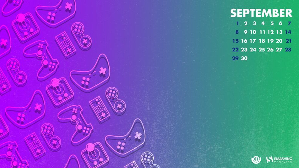
National Video Games Day Delight
“September 12th brings us National Video Games Day. US-based video game players love this day and celebrate with huge gaming tournaments. What was once a 2D experience in the home is now a global phenomenon with players playing against each other across statelines and national borders via the internet. National Video Games Day gives gamers the perfect chance to celeberate and socialize! So grab your controller, join online and let the games begin!” — Designed by Ever Increasing Circles from the United Kingdom.
- preview
- with calendar: 320×480, 640×480, 800×480, 800×600, 1024×768, 1024×1024, 1152×864, 1280×720, 1280×800, 1280×960, 1280×1024, 1366×768, 1400×1050, 1440×900, 1600×1200, 1680×1050, 1680×1200, 1920×1080, 1920×1200, 1920×1440, 2560×1440
- without calendar: 320×480, 640×480, 800×480, 800×600, 1024×768, 1024×1024, 1152×864, 1280×720, 1280×800, 1280×960, 1280×1024, 1366×768, 1400×1050, 1440×900, 1600×1200, 1680×1050, 1680×1200, 1920×1080, 1920×1200, 1920×1440, 2560×1440
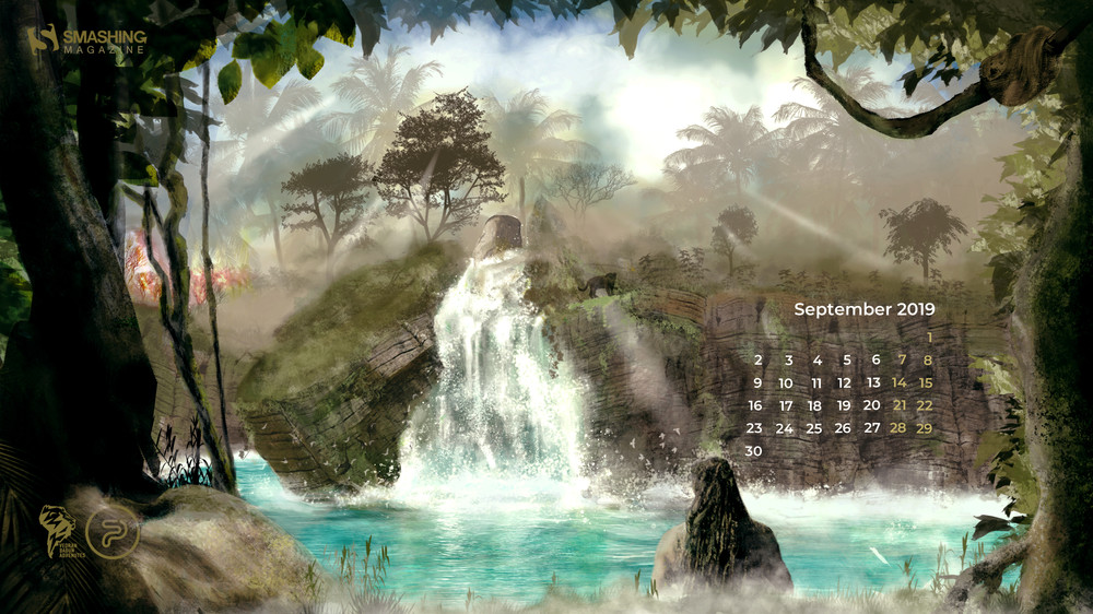
Finding Jaguar
“Nature and our planet have given us life, enabled us to enjoy the most wonderful place known to us in the universe. People have given themselves the right to master something they do not fully understand. We dedicate this September calendar to a true nature lover, Vedran Badjun from Dalmatia, Croatia, who inspires us to love our planet, live in harmony with it and appreciate all that it has to offer. Amazon, Siberia and every tree or animal on the planet are treasures we lose every day. Let’s change that!” — Designed by PopArt Studio from Serbia.
- preview
- with calendar: 640×480, 800×480, 800×600, 1024×768, 1024×1024, 1152×864, 1280×720, 1280×800, 1280×960, 1280×1024, 1366×768, 1400×1050, 1440×900, 1600×1200, 1680×1050, 1680×1200, 1920×1080, 1920×1200, 1920×1440, 2560×1440
- without calendar: 640×480, 800×480, 800×600, 1024×768, 1024×1024, 1152×864, 1280×720, 1280×800, 1280×960, 1280×1024, 1366×768, 1400×1050, 1440×900, 1600×1200, 1680×1050, 1680×1200, 1920×1080, 1920×1200, 1920×1440, 2560×1440
Celebrate Like A Hispanic
“September marks the start of the Hispanic Heritage Month, a multicultural tradition we should all be proud of.” — Designed by Yaiza Narganez Gomez from Belgium.
- preview
- with calendar: 1280×720, 1920×1080, 2560×1440
- without calendar: 1280×720, 1920×1080, 2560×1440
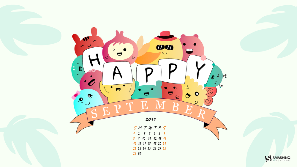
Cheerful September
“Wanted to create something colorful and happening for this month.” — Designed by Ciara from India.
- preview
- with calendar: 800×600, 1280×720, 1280×1024, 1366×768, 1400×1050, 1680×1200, 1920×1080, 2560×1440
- without calendar: 800×600, 1280×720, 1280×1024, 1366×768, 1400×1050, 1680×1200, 1920×1080, 2560×1440
Cozy Times
“As the days are getting shorter and colder, fall is here again. Enjoy these cozy times!” — Designed by Melissa Bogemans from Belgium.
- preview
- with calendar: 320×480, 640×480, 800×480, 800×600, 1024×768, 1024×1024, 1152×864, 1280×720, 1280×800, 1280×960, 1280×1024, 1400×1050, 1440×900, 1600×1200, 1680×1050, 1680×1200, 1920×1080, 1920×1200, 1920×1440, 2560×1440
- without calendar: 320×480, 640×480, 800×480, 800×600, 1024×768, 1024×1024, 1152×864, 1280×720, 1280×800, 1280×960, 1280×1024, 1400×1050, 1440×900, 1600×1200, 1680×1050, 1680×1200, 1920×1080, 1920×1200, 1920×1440, 2560×1440
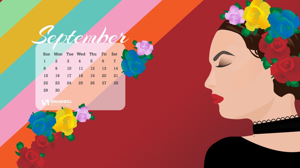
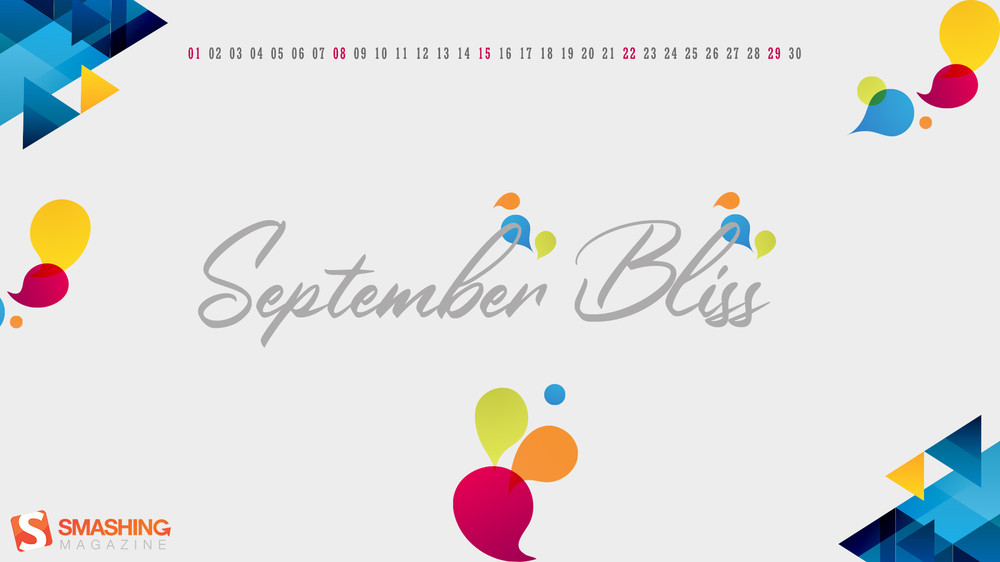
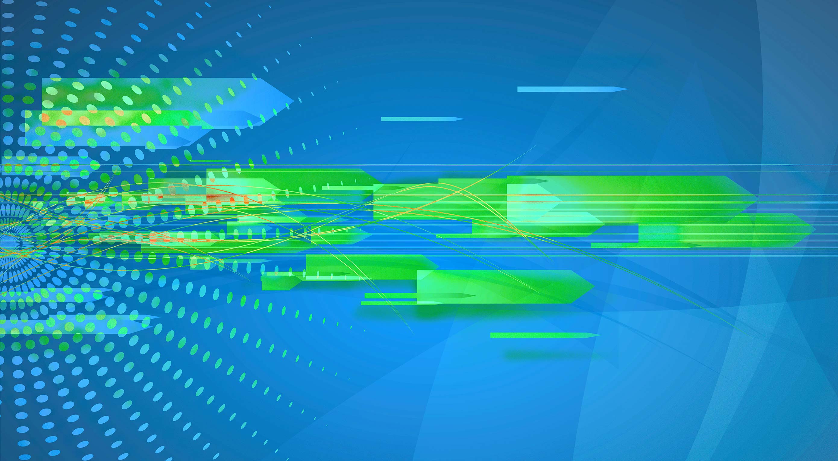
Blissful Thoughts
Designed by Thamil G from Chennai, India.
- preview
- with calendar: 1366×768, 1440×900, 1920×1080
- without calendar: 1366×768, 1440×900, 1920×1080
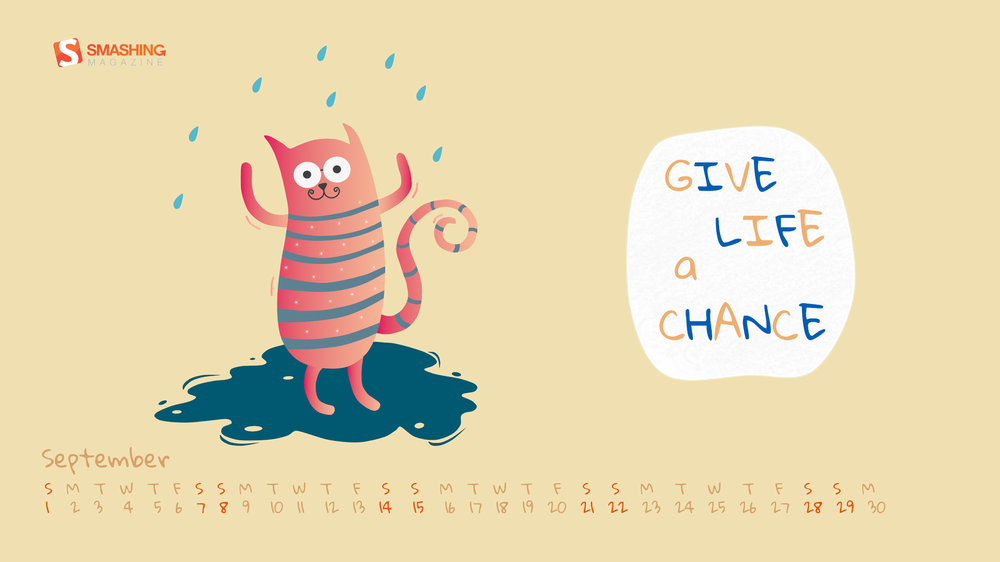
Give Life A Chance
“Life is all about taking chances. God is going to give you all the opportunities in life, it’s on you to take the chance and make a successful life out of it.” — Designed by Pragya from India.
- preview
- with calendar: 800×600, 1280×720, 1280×1024, 1366×768, 1400×1050, 1680×1200, 1920×1080, 2560×1440
- without calendar: 800×600, 1280×720, 1280×1024, 1366×768, 1400×1050, 1680×1200, 1920×1080, 2560×1440
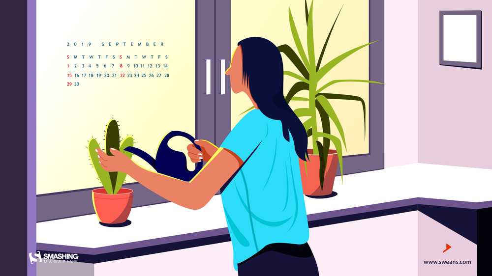
Even The Cactus Needs A Little Moist
“Even the toughest of hearts need a tiny bit of gentleness and kindness just like the cactus that needs to be nourished with a little bit of water and sunlight to stay bright and blooming in the bumpy journey of life.” — Designed by Sweans Technologies from London.
- preview
- with calendar: 320×480, 640×480, 800×480, 800×600, 1024×768, 1024×1024, 1152×864, 1280×720, 1280×800, 1280×960, 1280×1024, 1366×768, 1400×1050, 1440×900, 1600×1200, 1680×1200, 1920×1080, 1920×1200, 2560×1440
- without calendar: 320×480, 640×480, 800×480, 800×600, 1024×768, 1024×1024, 1152×864, 1280×720, 1280×800, 1280×960, 1280×1024, 1366×768, 1400×1050, 1440×900, 1600×1200, 1680×1200, 1920×1080, 1920×1200, 2560×1440
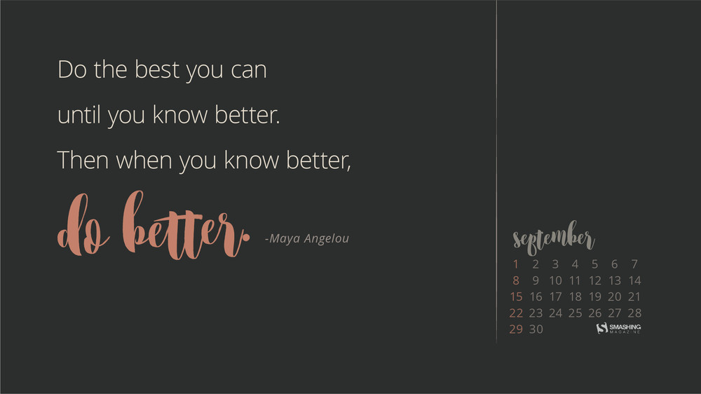
Do Better
“Character is what you do when no one else is watching. A friend recently posted the 2nd half of this quote on their Instagram and it’s been my mantra lately.” — Designed by Marie Newell from Missouri, USA.
- preview
- with calendar: 320×480, 640×480, 800×480, 800×600, 1024×768, 1024×1024, 1280×720, 1280×800, 1280×960, 1280×1024, 1366×768, 1440×900, 1440×1050, 1600×1200, 1680×1050, 1680×1200, 1920×1080, 1920×1200, 1920×1440, 2560×1440
- without calendar: 320×480, 640×480, 800×480, 800×600, 1024×768, 1024×1024, 1280×720, 1280×800, 1280×960, 1280×1024, 1366×768, 1440×900, 1440×1050, 1600×1200, 1680×1050, 1680×1200, 1920×1080, 1920×1200, 1920×1440, 2560×1440
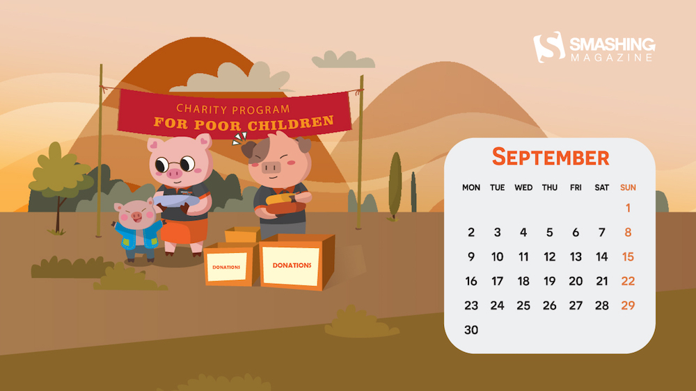
For Poor Children
“We created this wallpaper, wanted to show what we wanted and done!” — Designed by V?n ??c Phúc from Vietnam.
- preview
- with calendar: 320×480, 640×480, 1024×768, 1024×1024, 1152×864, 1280×720, 1280×800, 1280×1024, 1366×768, 1400×1050, 1440×900, 1600×1200, 1680×1050, 1680×1200, 1920×1200, 1920×1440
- without calendar: 320×480, 640×480, 1024×768, 1024×1024, 1152×864, 1280×720, 1280×800, 1280×1024, 1366×768, 1400×1050, 1440×900, 1600×1200, 1680×1050, 1680×1200, 1920×1200, 1920×1440
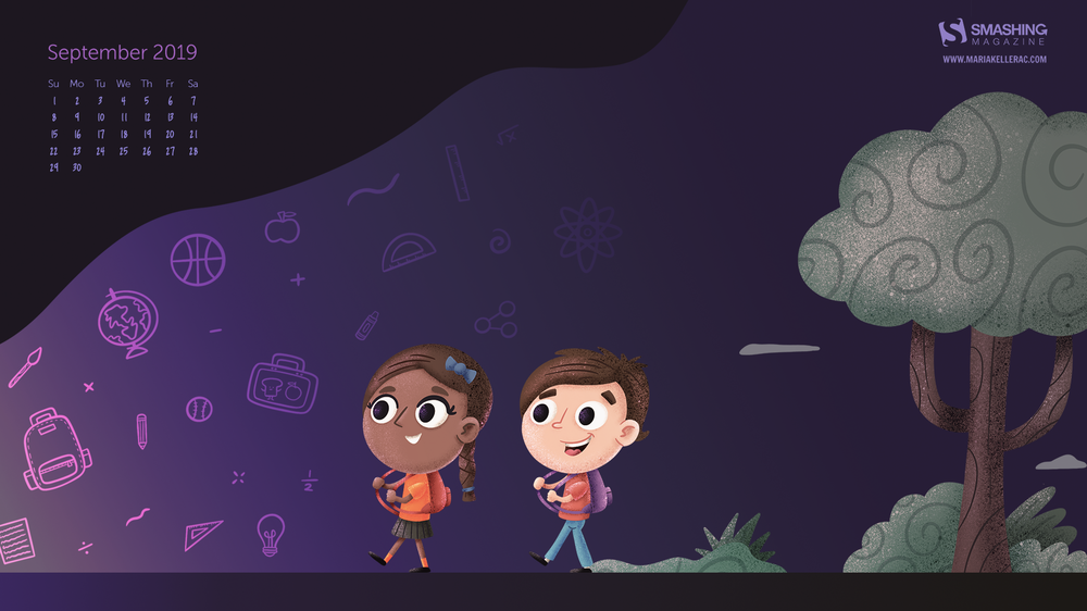
The Mythical Land Of School
“Going back to school is always a thrill no matter how big or small you are, facing new knowledge and challenges is one of the most satisfying feelings a human can encounter in life.” — Designed by Maria Keller from Mexico.
- preview
- with calendar: 320×480, 640×480, 640×1136, 750×1334, 800×480, 800×600, 1024×768, 1024×1024, 1152×864, 1242×2208, 1280×720, 1280×800, 1280×960, 1280×1024, 1366×768, 1400×1050, 1440×900, 1600×1200, 1680×1050, 1680×1200, 1920×1080
- without calendar: 320×480, 640×480, 640×1136, 750×1334, 800×480, 800×600, 1024×768, 1024×1024, 1152×864, 1242×2208, 1280×720, 1280×800, 1280×960, 1280×1024, 1366×768, 1400×1050, 1440×900, 1600×1200, 1680×1050, 1680×1200, 1920×1080
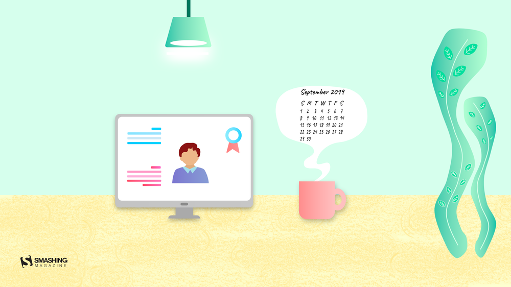
Online Learning
“Online learning is the most popular way learning nowadays and, thus, I created a view which represents that.” — Designed by Ritu from India.
- preview
- with calendar: 800×600, 1280×720, 1280×1024, 1366×768, 1400×1050, 1680×1200, 1920×1080, 2560×1440
- without calendar: 800×600, 1280×720, 1280×1024, 1366×768, 1400×1050, 1680×1200, 1920×1080, 2560×1440
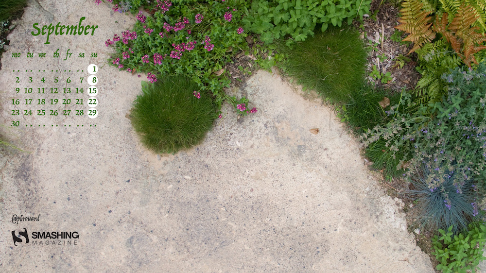
Put Some Green Everywhere
“I took this photo in Chaumont France, at the garden festival. For example, plants and concrete are in good association in that corner. That’s why I think we should put more plants in the cities and everywhere.” — Designed by Philippe Brouard from France.
- preview
- with calendar: 320×480, 1024×768, 1280×800, 1366×768, 1440×900, 1600×1200, 1920×1080, 1920×1200, 2560×1440, 2560×1600, 2880×1800
- without calendar: 320×480, 1024×768, 1280×800, 1366×768, 1440×900, 1600×1200, 1920×1080, 1920×1200, 2560×1440, 2560×1600, 2880×1800
Oldies But Goodies
Some things are too good to be forgotten. That’s why we dug out some September favorites from our wallpapers archives. Please note that these designs don’t come with a calendar. Enjoy!
Cacti Everywhere
“Seasons come and go, but our brave cactuses still stand. Summer is almost over, and autumn is coming, but the beloved plants don’t care.” — Designed by Lívia Lénárt from Hungary.

- preview
- without calendar: 320×480, 800×480, 1024×768, 1024×1024, 1280×1024, 1400×1050, 1920×1080, 1920×1200, 1920×1440, 2560×1440
No More Inflatable Flamingos!
“Summer is officially over and we will no longer need our inflatable flamingos. Now, we’ll need umbrellas. And some flamingos will need an umbrella too!” — Designed by Marina Bošnjak from Croatia.

- preview
- without calendar: 320×480, 640×480, 800×480, 800×600, 1024×768, 1024×1024, 1152×864, 1280×720, 1280×800, 1280×960, 1280×1024, 1366×768, 1400×1050, 1440×900, 1600×1200, 1680×1050, 1680×1200, 1920×1080, 1920×1200, 1920×1440, 2560×1440
Funny Cats
“Cats are beautiful animals. They’re quiet, clean and warm. They’re funny and can become an endless source of love and entertainment. Here for the cats!” — Designed by UrbanUI from India.

- preview
- without calendar: 360×640, 1024×768, 1280×720, 1280×800, 1280×960, 1280×1024, 1366×768, 1400×1050, 1440×900, 1680×1200, 1920×1080
Talk Like A Pirate Day
“This calendar was inspired by International Talk Like a Pirate Day (September 19) — one of the many obscure and quirky days we celebrate in New Orleans. Our fair, colorfully corrupt city has entertained its share of outlaws over the years, but none as infamous as the pirate Jean Lafitte, a Frenchman who terrorized sailors and ships in the Gulf of Mexico and distributed his booty from a warehouse in New Orleans in the early 1800s. This calendar is a playful tribute to all of the misfits, outcasts and swashbucklers who call New Orleans home.” — Designed by Sonnie Sulak from New Orleans, LA.

- preview
- without calendar: 640×480, 800×480, 800×600, 1024×768, 1280×720, 1280×800, 1280×960, 1400×1050, 1440×900, 1600×1200, 1680×1050, 1680×1200, 1920×1080, 1920×1200, 1920×1440, 2560×1440
Geometric Autumn
“I designed this wallpaper to remind everyone that autumn is here and they are still reading the best design website, Smashing Magazine” — Designed by Advanced Web Ranking from Romania.

- preview
- without calendar: 800×600, 1024×768, 1280×800, 1280×1024, 1440×900, 1440×1050, 1600×1200, 1680×1200, 1920×1200, 1920×1440, 2560×1440
Summer Ending
“As summer comes to an end, all the creatures pull back to their hiding places, searching for warmth within themselves and dreaming of neverending adventures under the tinted sky of closing dog days.” — Designed by Ana Masnikosa from Belgrade, Serbia.

- preview
- without calendar: 320×480, 640×480, 800×480, 800×600, 1024×768, 1024×1024, 1152×864, 1280×720, 1280×800, 1280×960, 1280×1024, 1400×1050, 1440×900, 1600×1200, 1680×1050, 1680×1200, 1920×1080, 1920×1200, 1920×1440, 2560×1440
Flower Soul
“The earth has music for those who listen. Take a break and relax and while you drive out the stress, catch a glimpse of the beautiful nature around you. Can you hear the rhythm of the breeze blowing, the flowers singing, and the butterflies fluttering to cheer you up? We dedicate flowers which symbolize happiness and love to one and all.” — Designed by Krishnankutty from India.

- preview
- without calendar: 320×480, 640×480, 800×480, 800×600, 1024×768, 1024×1024, 1152×864, 1280×720, 1280×960, 1280×1024, 1366×768, 1400×1050, 1440×900, 1600×1200, 1680×1050, 1680×1200, 1920×1080, 1920×1200, 1920×1440, 2560×1440
Penguin Family
“Penguins are sociable, independent and able to survive harsh winters. They work as a team to care for their offspring and I love that!” — Designed by Glynnis Owen from Australia.

- preview
- without calendar: 320×480, 640×480, 800×600, 1024×768, 1152×864, 1280×720, 1280×960, 1600×1200, 1920×1080, 1920×1440, 2560×1440
Shades Of Summer
“You can never have too many sunglasses” — Designed by Marina Eyl from Pennsylvania, USA.

Be The Wind Of Change
“Be the wind of change. Nature inspired us in creating this wallpaper as well as the Scorpion’s song “Wind of change” we dedicate to all creatives worldwide.” — Designed by Design19 from Romania.

- preview
- without calendar: 320×480, 640×480, 800×480, 800×600, 1024×768, 1024×1024, 1152×864, 1280×720, 1280×800, 1280×960, 1280×1024, 1400×1050, 1440×900, 1600×1200, 1680×1050, 1680×1200, 1920×1080, 1920×1200, 1920×1440, 2560×1440, 3360×1050, 3360×1200, 3840×1080, 3840×1200, 3840×1440, 5120×1440
Laughing In Flowers
“A colorful wallpaper to brighten up your day.” — Designed by Shavaughn Haack from South Africa.

Colors Of September
“I love September. Its colors and smells” — Designed by Juliagav from Ukraine.

- preview
- without calendar: 320×480, 1024×768, 1024×1024, 1280×800, 1280×1024, 1440×900, 1680×1050, 1920×1080, 2560×1440
Tsukimi
“The moon will become the roundest in mid-autumn and Japanese will eat Dango (sweet rice dumpling) while admiring the moon.” — Designed by Evangeline Neo from Japan.

Red Beetle
Designed by Oxana Kostromina from Russia/Germany.

- preview
- without calendar: 320×480, 1024×768, 1024×1024, 1280×800, 1280×1024, 1440×900, 1600×1200, 1680×1050, 1920×1080, 1920×1200, 2560×1440
It’s September But I Can Still Ride The Waves
“Summer seems to be over… but the weather is still warm and we definitely can enjoy the sea for a little longer. So… let’s go and ride the waves! Are you coming?” — Designed by WebOlution from Greece.

- preview
- without calendar: 320×480, 640×480, 800×480, 800×600, 1024×768, 1024×1024, 1152×864, 1280×720, 1280×800, 1280×960, 1280×1024, 1400×1050, 1440×900, 1600×1200, 1680×1050, 1680×1200, 1920×1080, 1920×1200, 1920×1440, 2560×1440
Join In Next Month!
Thank you to all designers for their participation. Join in next month!


