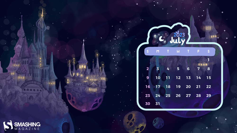
Off To New Adventures (July 2023 Wallpapers Edition)

Often, it’s the little things that inspire us and that we treasure most. The sky shining in the most beautiful colors at the end of a seemingly endless summer day, riding your bike through a light rain shower on a hot afternoon — or maybe it’s a scoop of your favorite ice cream that refuels your batteries? No matter what big and small adventures July will have in store for you this year, our new collection of wallpapers is bound to cater for some inspiration along the way.
More than twelve years ago, we started this monthly wallpapers series to bring you a variety of beautiful, unique, and inspiring wallpapers every month. It’s a community effort made possible by artists and designers from around the globe who challenge their creative skills to cater for some good vibes on your screens. And, well, it wasn’t any different this time around.
In this post, you’ll find their wallpaper designs for July 2023. All of them come in versions with and without a calendar and can be downloaded for free. To make the month even more colorful, we also compiled a selection of July favorites from our wallpapers archives at the end of this post. A huge thank-you to everyone who submitted their artwork — this post wouldn’t exist without you!
- You can click on every image to see a larger preview,
- We respect and carefully consider the ideas and motivation behind each and every artist’s work. This is why we give all artists the full freedom to explore their creativity and express emotions and experience through their works. This is also why the themes of the wallpapers weren’t anyhow influenced by us but rather designed from scratch by the artists themselves.
-
Submit a wallpaper!
Did you know that you could get featured in our next wallpapers post, too? We are always looking for creative talent.
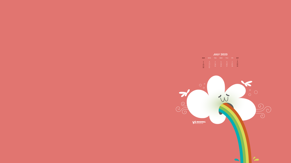
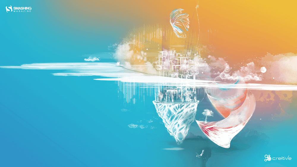
Under The Enchanting Moonlight
“Two friends sat under the enchanting moonlight, enjoying the serene ambiance as they savoured their cups of tea. It was a rare and precious connection that transcended the ordinary, kindled by the magic of the moonlight. Eventually, as the night began to wane, they reluctantly stood, their empty cups in hand. They carried with them the memories and the tranquility of the moonlit tea session, knowing that they would return to this special place to create new memories in the future.” — Designed by Bhabna Basak from India.
- preview
- with calendar: 1440×900, 1600×1200, 1680×1050, 1680×1200, 1920×1080, 1920×1200, 1920×1440, 2560×1440
- without calendar: 1440×900, 1600×1200, 1680×1050, 1680×1200, 1920×1080, 1920×1200, 1920×1440, 2560×1440
DJ Little Bird
Designed by Ricardo Gimenes from Sweden.
- preview
- with calendar: 640×480, 800×480, 800×600, 1024×768, 1024×1024, 1152×864, 1280×720, 1280×800, 1280×960, 1280×1024, 1366×768, 1400×1050, 1440×900, 1600×1200, 1680×1050, 1680×1200, 1920×1080, 1920×1200, 1920×1440, 2560×1440, 3840×2160
- without calendar: 640×480, 800×480, 800×600, 1024×768, 1024×1024, 1152×864, 1280×720, 1280×800, 1280×960, 1280×1024, 1366×768, 1400×1050, 1440×900, 1600×1200, 1680×1050, 1680×1200, 1920×1080, 1920×1200, 1920×1440, 2560×1440, 3840×2160
In Space
Designed by Lieke Dol from the Netherlands.
- preview
- with calendar: 1280×800, 1280×960, 1280×1024, 1400×1050, 1440×900, 1600×1200, 1680×1050, 1680×1200, 1920×1080, 1920×1200, 1920×1440, 2560×1440
- without calendar: 1280×800, 1280×960, 1280×1024, 1400×1050, 1440×900, 1600×1200, 1680×1050, 1680×1200, 1920×1080, 1920×1200, 1920×1440, 2560×1440
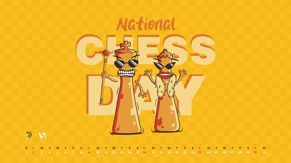
Unleash Your Inner Grandmaster
“Hey there, chess champs and rook-ies! Today, we’re rolling out the red carpet for the grandest celebration in the chess universe. It’s World Chess Day, where we celebrate the brain-bending battles, knightly maneuvers, and epic pawn sacrifices that keep us coming back for more! Step into the realm of kings and queens, where the fate of nations is decided over a checkered battlefield. Chess, the ultimate game of mental gymnastics, proves that you don’t need biceps of steel to flex your strategic muscles!” — Designed by PopArt Studio from Serbia.
- preview
- with calendar: 320×480, 640×480, 800×480, 800×600, 1024×768, 1024×1024, 1152×864, 1280×720, 1280×800, 1280×960, 1280×1024, 1400×1050, 1440×900, 1600×1200, 1680×1050, 1680×1200, 1920×1080, 1920×1200, 1920×1440, 2560×1440
- without calendar: 320×480, 640×480, 800×480, 800×600, 1024×768, 1024×1024, 1152×864, 1280×720, 1280×800, 1280×960, 1280×1024, 1400×1050, 1440×900, 1600×1200, 1680×1050, 1680×1200, 1920×1080, 1920×1200, 1920×1440, 2560×1440
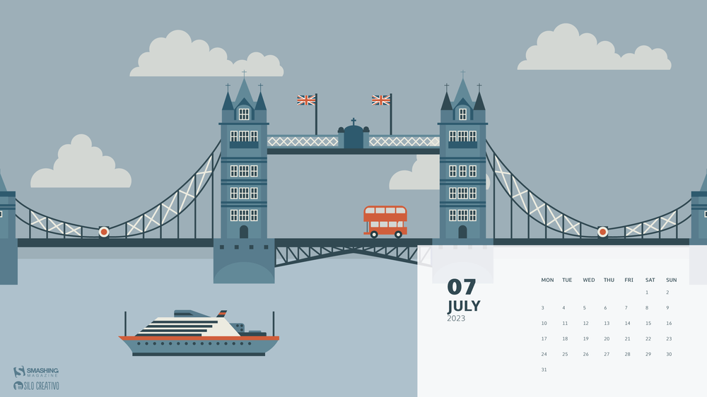
Cross The Bridge
“On this trip around the world, we return to Europe, specifically to London. We walked through its streets and decided to cross the bridge to enjoy both sides of the city. We may take one of its famous red buses or take a walk along the Thames. In any case, we have a whole month to become true Londoners.” — Designed by Veronica Valenzuela Jimenez from Spain.
- preview
- with calendar: 640×480, 800×480, 1024×768, 1280×720, 1280×800, 1440×900, 1600×1200, 1920×1080, 1920×1440, 2560×1440
- without calendar: 640×480, 800×480, 1024×768, 1280×720, 1280×800, 1440×900, 1600×1200, 1920×1080, 1920×1440, 2560×1440
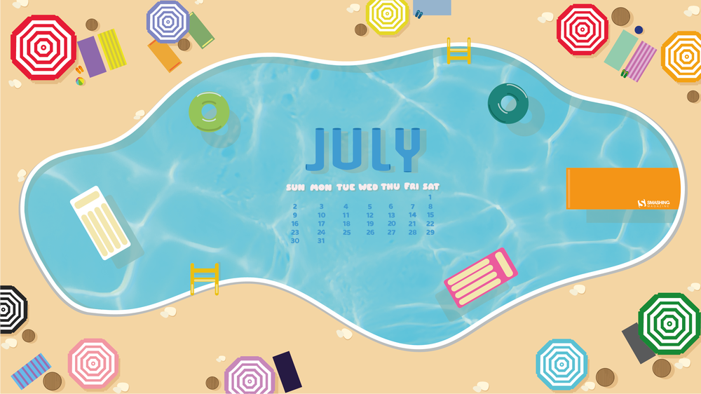
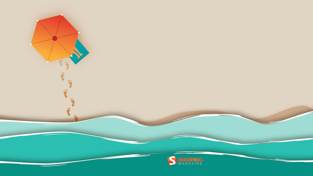
Swim Swim
Designed by Rebecca Curiel.
- preview
- with calendar: 1024×1024, 1400×1050, 1440×900, 1680×1050, 1680×1200, 1920×1080, 1920×1200, 1920×1440, 2560×1440
- without calendar: 1024×1024, 1400×1050, 1440×900, 1680×1050, 1680×1200, 1920×1080, 1920×1200, 1920×1440, 2560×1440
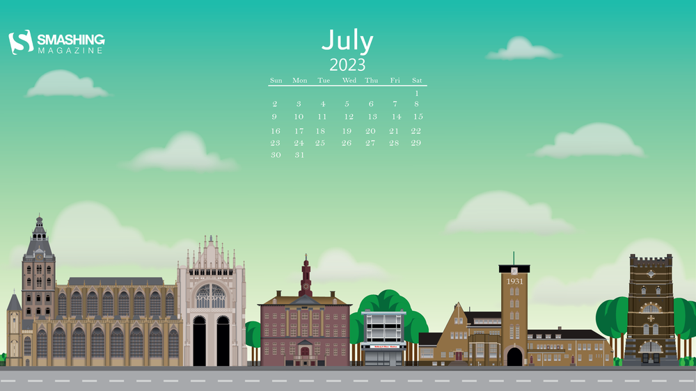
Flat Design ’s-Hertogenbosch
“I admire artwork that is made using simple shapes and colors in Illustrator, also known as flat design. The amazing things you can make with these simple shapes are just mind-blowing. The buildings in the artwork come from my hometown ’s-Hertogenbosch in the Netherlands. I am most proud of the great cathedral on the left. The number of hours I’ve put into it is not normal.” — Designed by Mitch van Trigt from the Netherlands.
- preview
- with calendar: 320×480, 640×480, 800×480, 800×600, 1024×768, 1024×1024, 1152×864, 1280×720, 1280×800, 1280×960, 1280×1024, 1400×1050, 1440×900, 1600×1200, 1680×1050, 1680×1200, 1920×1080, 1920×1200, 1920×1440, 2560×1440
- without calendar: 320×480, 640×480, 800×480, 800×600, 1024×768, 1024×1024, 1152×864, 1280×720, 1280×800, 1280×960, 1280×1024, 1400×1050, 1440×900, 1600×1200, 1680×1050, 1680×1200, 1920×1080, 1920×1200, 1920×1440, 2560×1440
Motion Sickness
Designed by Ricardo Gimenes from Sweden.
- preview
- with calendar: 640×480, 800×480, 800×600, 1024×768, 1024×1024, 1152×864, 1280×720, 1280×800, 1280×960, 1280×1024, 1366×768, 1400×1050, 1440×900, 1600×1200, 1680×1050, 1680×1200, 1920×1080, 1920×1200, 1920×1440, 2560×1440, 3840×2160
- without calendar: 640×480, 800×480, 800×600, 1024×768, 1024×1024, 1152×864, 1280×720, 1280×800, 1280×960, 1280×1024, 1366×768, 1400×1050, 1440×900, 1600×1200, 1680×1050, 1680×1200, 1920×1080, 1920×1200, 1920×1440, 2560×1440, 3840×2160
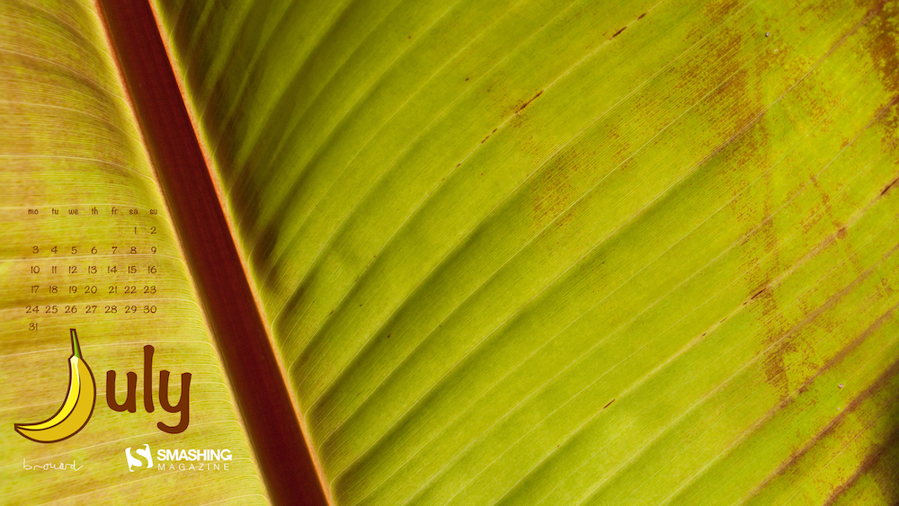
Underneath The Banana Tree
“July is the time to relax. What about having a rest underneath a… banana tree, lala la la? You know this song? Yes it’s about a mango tree, but never mind.” — Designed by Philippe Brouard from France.
- preview
- with calendar: 1024×768, 1366×768, 1600×1200, 1920×1080, 1920×1200, 2560×1440, 2560×1600, 2880×1800
- without calendar: 1024×768, 1366×768, 1600×1200, 1920×1080, 1920×1200, 2560×1440, 2560×1600, 2880×1800
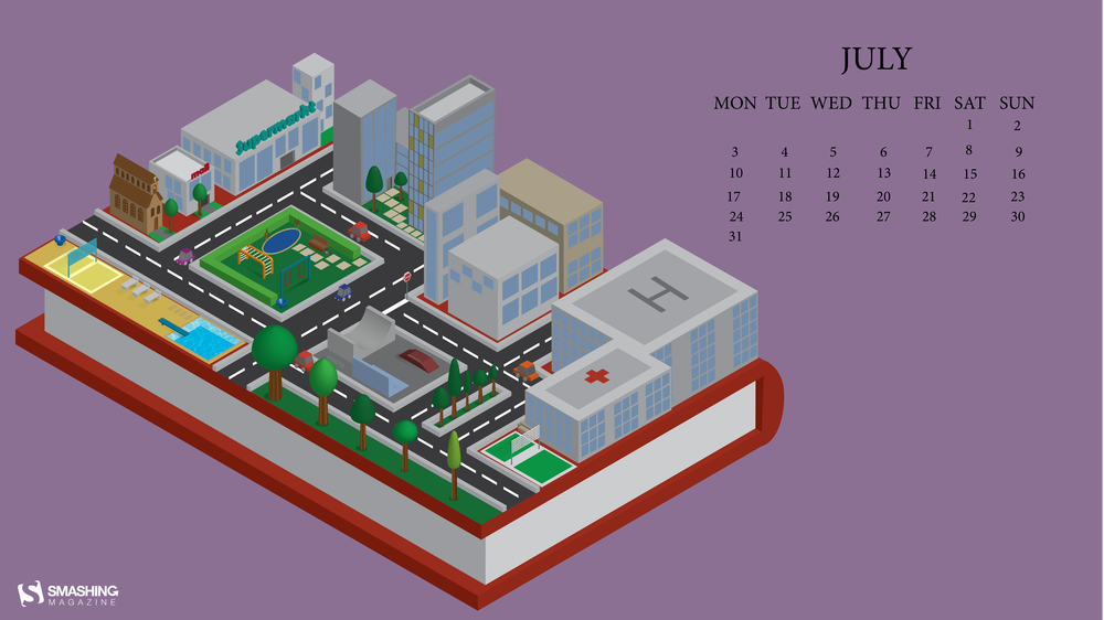
Book Imagination
“Everyone’s imagination when reading books is different. One person thinks of a village and another of a city. That’s the beauty of reading.” — Designed by Britt van Falier from the Netherlands.
- preview
- with calendar: 320×480, 640×480, 800×480, 800×600, 1024×768, 1024×1024, 1152×864, 1280×720, 1280×800, 1280×960, 1280×1024, 1400×1050, 1440×900, 1600×1200, 1680×1050, 1680×1200, 1920×1080, 1920×1200, 1920×1440, 2560×1440
- without calendar: 320×480, 640×480, 800×480, 800×600, 1024×768, 1024×1024, 1152×864, 1280×720, 1280×800, 1280×960, 1280×1024, 1400×1050, 1440×900, 1600×1200, 1680×1050, 1680×1200, 1920×1080, 1920×1200, 1920×1440, 2560×1440
Oldies But Goodies
Our wallpapers archives are full of timeless treasures that are just too good to be forgotten. So here’s a small selection of favorites from past July editions. Please note that these designs don’t come with a calendar.
Melting July
“Welcome to the sweltering July — the month when it’s so hot that even the fruits are edgy. Our ice-creamy, vibrantly-colored monthly calendar is melting as the temperature rises, so make sure to download it as quickly as possible!” — Designed by PopArt Studio from Serbia.

- preview
- without calendar: 320×480, 640×480, 800×480, 800×600, 1024×768, 1024×1024, 1152×864, 1280×720, 1280×800, 1280×960, 1280×1024, 1366×768, 1440×900, 1440×1050, 1600×1200, 1680×1050, 1680×1200, 1920×1080, 1920×1200, 1920×1440, 2560×1440
Hotdog
Designed by Ricardo Gimenes from Sweden.

- preview
- without calendar: 640×480, 800×480, 800×600, 1024×768, 1024×1024, 1152×864, 1280×720, 1280×800, 1280×960, 1280×1024, 1366×768, 1400×1050, 1440×900, 1600×1200, 1680×1050, 1680×1200, 1920×1080, 1920×1200, 1920×1440, 2560×1440, 3840×2160
Meeting Mary Poppins
“This month, we travel to London with Mary Poppins to discover the city. We will have great adventures!” — Designed by Veronica Valenzuela from Spain.

- preview
- without calendar: 640×480, 800×480, 1024×768, 1280×720, 1280×800, 1440×900, 1600×1200, 1920×1080, 1920×1440, 2560×1440
Birdie July
Designed by Lívi Lénárt from Hungary.

- preview
- without calendar: 800×600, 1024×1024, 1152×864, 1280×960, 1280×1024, 1600×1200, 1920×1080, 2560×1440
Summer Season
“I’m an avid runner, and I have some beautiful natural views surrounding my city. The Smoky Mountains are a bit further east, so I took some liberties, but Tennessee’s nature is nothing short of beautiful and inspiring.” — Designed by Cam Elliott from Memphis, TN.
- preview
- without calendar: 320×480, 640×480, 800×480, 800×600, 1024×768, 1024×1024, 1152×864, 1280×720, 1280×800, 1280×960, 1280×1024, 1366×768, 1400×1050, 1440×900, 1600×1200, 1680×1050, 1680×1200, 1920×1080, 1920×1200, 1920×1440, 2560×1440, 3840×2160
The Ancient Device
Designed by Ricardo Gimenes from Sweden.

- preview
- without calendar: 640×480, 800×480, 800×600, 1024×768, 1024×1024, 1152×864, 1280×720, 1280×800, 1280×960, 1280×1024, 1366×768, 1400×1050, 1440×900, 1600×1200, 1680×1050, 1680×1200, 1920×1080, 1920×1200, 1920×1440, 2560×1440, 3840×2160
Summer Cannonball
“Summer is coming in the northern hemisphere and what better way to enjoy it than with watermelons and cannonballs.” — Designed by Maria Keller from Mexico.

- preview
- without calendar: 320×480, 640×480, 640×1136, 750×1334, 800×480, 800×600, 1024×768, 1024×1024, 1152×864, 1242×2208, 1280×720, 1280×800, 1280×960, 1280×1024, 1366×768, 1400×1050, 1440×900, 1600×1200, 1680×1050, 1680×1200, 1920×1080, 1920×1200, 1920×1440, 2560×1440, 2880×1800
Eternal Summer
“And once you let your imagination go, you find yourself surrounded by eternal summer, unexplored worlds, and all-pervading warmth, where there are no rules of physics and colors tint the sky under your feet.” — Designed by Ana Masnikosa from Belgrade, Serbia.
- preview
- without calendar: 320×480, 640×480, 800×480, 800×600, 1024×768, 1024×1024, 1152×864, 1280×720, 1280×800, 1280×960, 1280×1024, 1400×1050, 1440×900, 1600×1200, 1680×1050, 1680×1200, 1920×1080, 1920×1200, 1920×1440, 2560×1440
A Flamboyance Of Flamingos
“July in South Africa is dreary and wintery so we give all the southern hemisphere dwellers a bit of color for those gray days. And for the northern hemisphere dwellers a bit of pop for their summer!” — Designed by Wonderland Collective from South Africa.

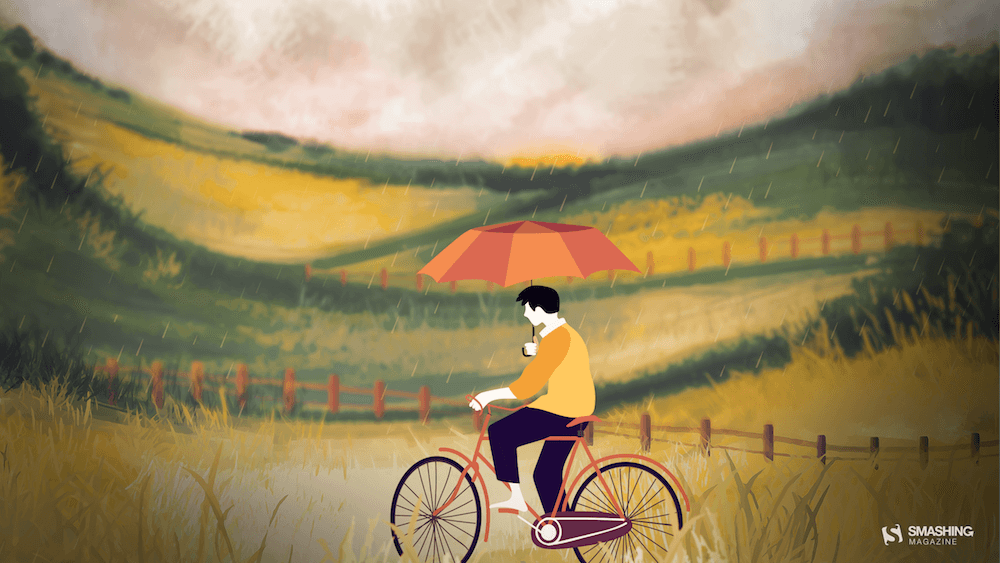
Riding In The Drizzle
“Rain has come, showering the existence with new seeds of life. Everywhere life is blooming, as if they were asleep and the falling music of raindrops have awakened them. Feel the drops of rain. Feel this beautiful mystery of life. Listen to its music, melt into it.” — Designed by DMS Software from India.
- preview
- without calendar: 320×480, 640×480, 800×480, 800×600, 1024×768, 1024×1024, 1152×864, 1280×720, 1280×800, 1280×960, 1280×1024, 1366×768, 1400×1050, 1440×900, 1600×1200, 1680×1050, 1680×1200, 1920×1080, 1920×1200, 1920×1440, 2560×1440
Less Busy Work, More Fun!
Designed by ActiveCollab from the United States.

- preview
- without calendar: 1080×1920, 1400×1050, 1440×900, 1600×1200, 1920×1080, 1920×1200, 1920×1440, 2560×1440, 3840×2160
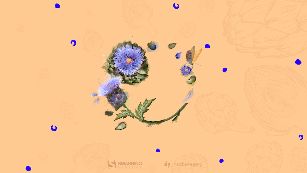
Taste Like Summer
“In times of clean eating and the world of superfoods there is one vegetable missing. An old, forgotten one. A flower actually. Rare and special. Once it had a royal reputation (I cheated a bit with the blue). The artichocke — this is my superhero in the garden! I am a food lover — you too? Enjoy it — dip it!” — Designed by Alexandra Tamgnoué from Germany.
- preview
- without calendar: 320×480, 640×480, 800×600, 1024×768, 1152×864, 1280×720, 1280×800, 1280×960, 1280×1024, 1440×900, 1440×1050, 1600×1200, 1680×1050, 1680×1200, 1920×1080, 1920×1200, 1920×1440, 2560×1440
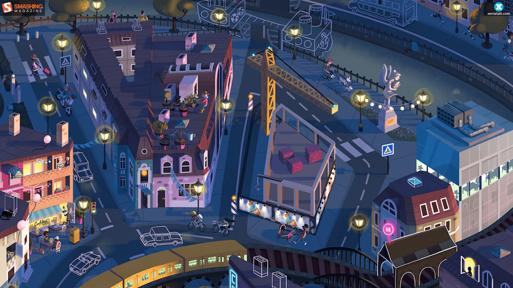
Day Turns To Night
Designed by Xenia Latii from Germany.
- preview
- without calendar: 320×480, 640×480, 800×480, 800×600, 1024×768, 1152×864, 1280×720, 1280×800, 1280×960, 1280×1024, 1366×768, 1400×1050, 1440×900, 1600×1200, 1680×1050, 1680×1200, 1920×1080, 1920×1200, 1920×1440, 2560×1440
Heated Mountains
“Warm summer weather inspired the color palette.” — Designed by Marijana Pivac from Croatia.

- preview
- without calendar: 320×480, 640×480, 800×480, 800×600, 1024×768, 1024×1024, 1152×864, 1280×720, 1280×800, 1280×960, 1280×1024, 1366×768, 1400×1050, 1440×900, 1600×1200, 1680×1050, 1680×1200, 1920×1080, 1920×1200, 1920×1440, 2560×1440
Tropical Lilies
“I enjoy creating tropical designs. They fuel my wanderlust and passion for the exotic, instantaneously transporting me to a tropical destination.” — Designed by Tamsin Raslan from the United States.
- preview
- without calendar: 320×480, 640×480, 800×480, 800×600, 1024×768, 1024×1024, 1152×864, 1280×720, 1280×800, 1280×960, 1280×1024, 1440×900, 1440×1050, 1600×1200, 1680×1050, 1680×1200, 1920×1080, 1920×1200, 1920×1440, 2560×1440
Sweet Summer
“In summer everything inspires me.” — Designed by Maria Karapaunova from Bulgaria.

- preview
- without calendar: 320×480, 640×480, 800×480, 800×600, 1024×768, 1024×1024, 1152×864, 1280×720, 1280×800, 1280×960, 1280×1024, 1366×768, 1440×900, 1440×1050, 1600×1200, 1680×1050, 1680×1200, 1920×1080, 1920×1200, 1920×1440, 2560×1440
Summermoon
Designed by Erik Neumann from Germany.
- preview
- without calendar: 1280×720, 1280×800, 1280×960, 1400×1050, 1440×900, 1600×1200, 1680×1050, 1680×1200, 1920×1080, 1920×1200, 1920×1440, 2560×1440, 2560×1600
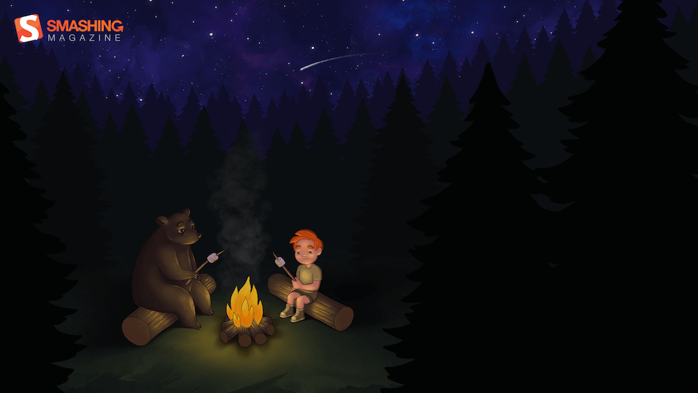
Fire Camp
“What’s better than a starry summer night with an (unexpected) friend around a fire camp with some marshmallows? Happy July!” — Designed by Etienne Mansard from the UK.
- preview
- without calendar: 320×480, 640×480, 800×480, 800×600, 1024×768, 1024×1024, 1152×864, 1280×720, 1280×800, 1280×960, 1280×1024, 1366×768, 1440×900, 1440×1050, 1600×1200, 1680×1050, 1680×1200, 1920×1080, 1920×1200, 1920×1440, 2048×1536, 2560×1440
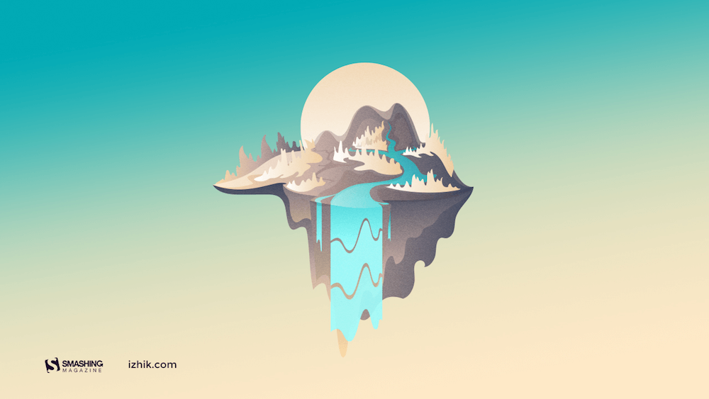
Island River
“Make sure you have a refreshing source of ideas, plans and hopes this July. Especially if you are to escape from urban life for a while.” — Designed by Igor Izhik from Canada.
- preview
- without calendar: 1024×768, 1024×1024, 1152×864, 1280×720, 1280×800, 1280×960, 1280×1024, 1400×1050, 1440×900, 1600×1200, 1680×1050, 1680×1200, 1920×1080, 1920×1200, 1920×1440, 2560×1440
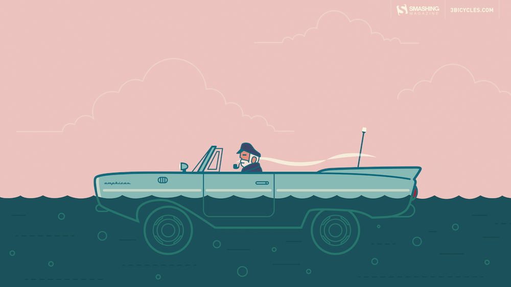
Captain Amphicar
“My son and I are obsessed with the Amphicar right now, so why not have a little fun with it?” — Designed by 3 Bicycles Creative from the United States.
- preview
- without calendar: 1280×720, 1280×800, 1280×960, 1280×1024, 1400×1050, 1440×900, 1600×1200, 1680×1050, 1680×1200, 1920×1080, 1920×1200, 1920×1440, 2560×1440
It’s Getting Hot
Designed by Ricardo Gimenes from Sweden.

- preview
- without calendar: 320×480, 640×480, 800×480, 800×600, 1024×768, 1024×1024, 1152×864, 1280×720, 1280×800, 1280×960, 1280×1024, 1366×768, 1400×1050, 1440×900, 1600×1200, 1680×1050, 1680×1200, 1920×1080, 1920×1200, 1920×1440, 2560×1440
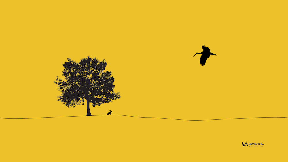
Alentejo Plain
“Based in the Alentejo region, in the south of Portugal, where there are large plains used for growing wheat. It thus represents the extensions of the fields of cultivation and their simplicity. Contrast of the plain with the few trees in the fields. Storks that at this time of year predominate in this region, being part of the Alentejo landscape and mentioned in the singing of Alentejo.” — Designed by José Guerra from Portugal.
An Intrusion Of Cockroaches
“Ever watched Joe’s Apartment when you were a kid? Well, that movie left a soft spot in my heart for the little critters. Don’t get me wrong: I won’t invite them over for dinner, but I won’t grab my flip flop and bring the wrath upon them when I see one running in the house. So there you have it… three roaches… bringing the smack down on that pesky human… ZZZZZZZAP!!” — Designed by Wonderland Collective from South Africa.

Heat Wave
Designed by Ricardo Gimenes from Sweden.

- preview
- without calendar: 320×480, 640×480, 800×480, 800×600, 1024×768, 1024×1024, 1152×864, 1280×720, 1280×800, 1280×960, 1280×1024, 1366×768, 1400×1050, 1440×900, 1600×1200, 1680×1050, 1680×1200, 1920×1080, 1920×1200, 1920×1440, 2560×1440
My July
Designed by Cátia Pereira from Portugal.
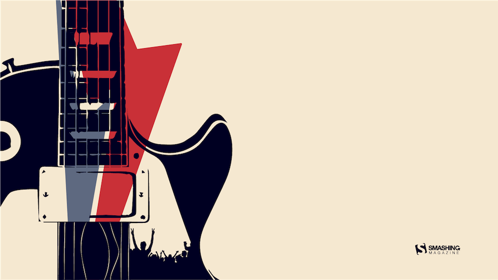
July Rocks!
Designed by Joana Moreira from Portugal.
Frogs In The Night
“July is coming and the nights are warmer. Frogs look at the moon while they talk about their day.” — Designed by Veronica Valenzuela from Spain.