Does CSS Grid Replace Flexbox?

No. Well. Mostly No.
Grid is much newer than Flexbox and has a bit less browser support. That’s why it makes perfect sense if people are wondering if CSS grid is here to replace Flexbox.
To put a point on it:
- Grid can do things Flexbox can’t do.
- Flexbox can do things Grid can’t do.
- They can work together: a grid item can be a flexbox container. A flex item can be a grid container.
Even though Grid is pretty new, we have lots of articles about it, including a getting started article, an article about a basic layout done multiple ways, and a complete guide.
If you hadn’t heard the trumpets blaring, March 2017 was the banner month for Grid. It was released, completely unprefixed and ready-to-go, in Chrome, Opera, Firefox, and Safari. Even Edge supports it, albiet an older version of the spec, which you can get some support for by using Autoprefixer.
So.
Does Grid replace Flexbox?
It seems a little complicated at first. Especially if you’re just starting to get a grip on the weird, alien syntax of Flexbox. Now there is a whole other syntax to learn? Sheesh.
Here’s some things Grid is specifically better at than Flexbox:
- Making whole page layouts. It’s better for that even just considering layout performance reasons.
- Making literal grids. Like X columns with Y gap between them homegrown framework stuff.
grid-gapis wonderful, as gutters are the main pain point of grid systems. - Requiring less media query intervention with really powerful functionality like auto layout,
minmax(),repeat(), andauto-fill. Here’s a neat idea.
And another huge one: Grid can position elements in 2 dimensions. Both columns and rows. That’s a first. Rachel Andrew once made that very clear:
Flexbox is essentially for laying out items in a single dimension – in a row OR a column. Grid is for layout of items in two dimensions – rows AND columns.
Let’s see some demos.
Say we’re building a horizontal navigation component — that’s the perfect use case for Flexbox because it sets content in only one direction. In Chris’ demo below you can mess around with those properties and see just how powerful Flexbox is:
See the Pen Bar Navigation with Flexbox and SVG icons by Chris Coyier (@chriscoyier) on CodePen.
But there are some instances where those flexbox properties, such as justify-content or align-items, should be used in conjunction with Grid properties. Take this demo for instance:
See the Pen Flexbox and Grid – First demo by Robin Rendle (@robinrendle) on CodePen.
First we’ve made a .wrapper that is set to display: flex;. That way we can set a max-width on our .grid and use justify-content: center; to place it in the middle of the viewport. Then we can make our grid with the right number of columns:
.wrapper {
  display: flex;
  justify-content: center;
}

.grid {
  display: grid;
  max-width: 800px;
  grid-template-columns: 1fr 2fr;
}
That’s just the first step.
Now let’s make that .ad take up the whole row of our grid. Well, we can do that by specifically targeting our
.ad {
  grid-column-start: 1;
  grid-column-end: 3;
}
What we’re saying with the code above is “start this div on the first column and end on the very last column.” That should look something like this:
See the Pen Flexbox and Grid by Robin Rendle (@robinrendle) on CodePen.
Further, let’s say that we always wanted our ad block to be twice the size of our first row – we can totally do that! We just need to use the grid-template-rows property:
.grid {
  display: grid;
  max-width: 800px;
  grid-template-columns: 1fr 2fr;
  grid-template-rows: 1fr 2fr 1fr;
}
That’s the equivalent of saying: “there are three rows in our grid. Always make sure that the second row is twice the size of the first and third.” In other words, we’re creating relationships between rows and other rows whilst also defining the number of columns in our grid!
See the Pen Flexbox and Grid by Robin Rendle (@robinrendle) on CodePen.
With CSS Grid we can set relationships horizontally (with grid-template-columns) and vertically (with grid-template-rows) but at the same time. Flexbox, on the other hand, is stuck doing either vertical or horizontal layouts (with flex-direction) – but that doesn’t mean we should ditch it.
Potentially Confusing: a “2D” Layout with Flexbox
What can get a little confusing is that it’s not impossible to make multi-dimensional layouts in just Flexbox. For example:
See the Pen A “Grid” with Flexbox by Chris Coyier (@chriscoyier) on CodePen.
There are certainly rows and columns there, even a final element that spans multiple columns. It’s easy to build and flexible. It’s done through allowing flex-wrap on the container, having the children’s flex-basis be 1/3 of the width of the container, and allowing flex-grow to stretch children if need by. (The flex property is shorthand for flex-grow, flex-shrink, and flex-basis.)
It’s not wrong, it’s just one way of doing something like this, and you could probably make an argument for it being less intuitive and adaptable.
Potentially Confusing: a “1D” Layout with Grid
Grid can do 2D layout, meaning defining both grid-template-rows and grid-template-columns, but it doesn’t have to use both. Here’s a demo of using it just to lay boxes in a horizontal row:
See the Pen Easy Columns with Grid by Chris Coyier (@chriscoyier) on CodePen.
This isn’t wrong either. In fact, you could easily make the argument that this is easier to understand and more succinctly expressed than doing it with flexbox. For example, no layout properties are needed on the child elements at all. But you could also argue that purely 1D layout like this is more powerful in Flexbox, because Flexbox allows us to move those elements around easier (e.g. move them all to one side or another, change their order, space them out evenly, etc).
About That Nesting
One more time to lock it in!
This is good to remember: grid items can be flex parents.
See the Pen Easy Columns with Grid by Chris Coyier (@chriscoyier) on CodePen.
And, flex items can be grid parents:

See the Pen Easy Columns with Grid by Chris Coyier (@chriscoyier) on CodePen.
Does CSS Grid Replace Flexbox? is a post from CSS-Tricks
15 Brilliant Website Design Examples To Inspire You. 7 Steps To Awesomeness

Creating a brilliant website design can be a daunting task sometimes. Not just because of all the steps involved in this process, but also because of all things you should take into consideration and the direction your website design should take on.
And a good website, which accommodates effectively plenty of content with an excellent user experience is often a tricky balancing act to pull off. Should you attempt to present the user the whole information in a clean, organized manner, or you should reveal it bit-by-bit, to create an engaging trip that tugs the visitor on the road to the enlightenment?
If you get it wrong, and you will overwhelm your visitors, they’ll leave your website without retaining anything from what they’ve just read. And maybe they will not come back again, as long as their experience on your website was not exactly what they expected.
But if you get it right, you’ll gain a new audience, who not only understand your message, but they will come back again and again, and even bring few friends with them.
If there is one thing true about the website design, it’s that it is always evolving. The design is dynamic, and it must adjust to accommodate the form and the function. And because of its ever-changing nature, it can be a challenge not only to keep up with the newest design trends but also to follow few principles that should live in every website design.
- Color – the site’s color should always match your brand’s color scheme and have consistency through the site. Colors evoke emotions for your website visitors and sustain your brand messages. Therefore you should take it into consideration when choosing the colors for your website. Also, you keep in mind that the colors on your website should be easy to read and pleasant to the eyes.
- White Space – by using the white space for your website design, you will allow the content and the visitors’ eyes room to breathe
- Font – the site’s font doesn’t necessary match your logo but it should fit in your brand. Aside from this, making sure that the font is legible, is one of the most important things. You can vary and mix different fonts through the site, to increase the visual intrigue and add visual appeal, but make sure they complement each other well. Also, keeping the body font consistent across the whole site is essential.
- Simplicity – the simpler, the better. Keeping your website design simple allows that “clean” look your visitors are looking for.
- Consistency – keep the design consistent. The website colors, fonts, button styles, heading and subheading sizes and styles, image styles and sizes and backgrounds are among the pieces to keep your site consistent.
- Usability – make the functionality the key of your website. An appealing visual website shouldn’t sacrifice the ease of usage for a better visual. Creating user-friendly websites with easy to understand navigation and page layout is what determines how your visitors will interact with your website.
- Visual hierarchy – the relative importance of different content areas and elements can be visually implied in many ways, ranging from the typography (headlines, sub-headings, body text, quotes, etc.) to image size, style, and saturation, placement, etc.
We gathered 15 website designs for your inspiration. Some of them are new, some of them you’ve seen before. In all of them, you’ll see some of the best practices mentioned before. These sites are, in my humble opinion, well-designed for their clearness, usability, aesthetics and user experience and for sure, they will give you inspiration for the next project you’ll be working on.
-
Bienville Capital Management

http://www.bienvillecapital.com
This is a very simple responsive design that transitions to mobile perfectly. They kept the information concise and focused, taking into consideration that you don’t need walls of text for attracting and engaging your visitors. Give them the most important information first. In the same time, the navigation menu is very friendly, letting you drive easily through the website.
-
Brooklyn Soap Company

One of my favorites in the list. The website design is clean and bold, using the white space very well and allowing the visitor’s eyes to rest. The company makes quality products and they don’t need to astonish with a lot of sparkly or complicated graphics and animation to get your interest. Both the website and soaps have an undeniable classy feel, underlined by the black and white color scheme.
-
Emblem

This website is entirely funky and funny. The visitor’s curiosity is caused by bright, vivid and sparkly colors, lots of eye-catching imagery, icons, and fonts you wouldn’t usually find in a law company’s website. In the same time, they offer a great user experience, especially with the services section. And guess what? It’s responsive!
-
Auger

I like this mostly flat website, which is responsive and looks good on any device. The solid bold and contrasting colors, combined with vector images and the photos from this website seamlessly melt between devices.
-
Falve

This site is a carousel of color-rich full pages images, combined with a lot of white space and clean serif font. The general design is clean, bold and simple, and the overall feeling modern and undoubtedly classy. A site where you are welcomed from the homepage and which implores you to stay.
-
Brave People

Check out this website, and you will be rewarded with a brave experience! Simple, clean and bold design, color-rich photography are complemented nicely by the simplicity of the typography. The last, but not the least, the videos from this site tell you the story of this fast-growing digital creative agency in a way you can’t resist!
-
GC Watches

Take a look on this website, and you’ll convince yourself (if it was still necessary) that timeless designs always stand out! Clear copy next to bold and vivid images, in a white and black color scheme, pass the test of the time and become more valuable over the time. Besides, the website is responsive, and its usability gives a great user experience to the visitors.

Feed presents us an interesting concept, with a stunning execution that challenges our understanding of what could be possible on the internet. Using the contrast in the best way possible and blending creatively animation and video, the site provides the users a very engaging experience. A totally atypical site, which contains several unique usability elements, including a navigation that doubles as a scroll progress bar.
-
ETQ

ETQ takes a minimalistic approach to e-commerce with their clear and bold website, with big and compelling visuals for their products. Simple, flat, mixing the powerful and endless elegance of the white and black visuals with a color-based background, the imagery is accompanied by strong and simple typography that helps users to focus on what they want to see: shoes.
-
World of Swiss

Swiss Airlines built a thrilling website that tells their story and describes how it’s like to fly with them in a powerful and engaging way, by captivating their visitors from the first glance. The strong visuals and animation introduce the users to the different sections of the site, which are packed in an unusual sales and marketing pitch.
-
IWC Schaffhausen

A timeless classic elegance, perfect for this premium brand. That’s what IWC Schaffhausen’s website offers to their visitors through a refreshingly clean and unexpected design for a watch manufacturer. A simple, clear and bold design, determined by the strong contrast between the neutral colors of the background and the rich-colors photography.
-
Jack Daniels

Once you pass the age verification, the Jack Daniels’ website offers you an incredible experience and tells a great story! A stunning design, rich in colors and contrasts. Once you open the “Our History” page, you are transposed in a world full of history and passion. And you experience the same feelings while you are greeted with a carousel featuring different varieties of whiskey.
-
Juliana Bicycles

http://www.julianabicycles.com/
If you prefer a photography-infused web design, you should take your inspiration from this site! It is a good inspiration for people who are both goods in photography and web design, as the photos are exquisite and manifest the magnificence in the simplest way possible. Also, like many other websites, this is a responsive one, which makes it good also for tablets and smart phones.
-
JOHO’s Bean

This website tells the story of a coffee bean’s journey in a compelling, emotional and engaging way. Storytelling, incredible imagery, animation, interactivity, visual design and sound engineering (which you find out from the very first moment you came up on the home page). These all come together and offer the users a unique experience.
-
Ogilvy One Worldwide

The simplicity of this website is amazing, the main focus being on the content and how it could be delivered in the simplest yet prettiest way. The flat design and the minimalistic approach present the content in a readable and logical way, while the very easy navigation makes it better. All these ensure that the content is properly delivered and understood by the user. The site is also responsive, and this makes it even more beautiful and friendly.
Bonus: Here are 8 names every graphic designer should know.
Read More at 15 Brilliant Website Design Examples To Inspire You. 7 Steps To Awesomeness
About Property Ordering
Web Development Reading List #176: Safari 10.1, Prompt()-Deprecation, And Professional Pride

|
|
What a busy week! To stay on top of things, let’s review what happened in the web development world the last few days — from browser vendors pushing new updates and building new JavaScript guidelines and security standards to why we as web professionals need to review our professional pride. How can we properly revoke certificates in browsers, for example? And how can we build accessibility into a style guide? Let’s take a look.
Safari 10.1 was announced a while ago already, and this week it finally came to Macs and iOS devices around the world. The new Safari version ships CSS Grid Layouts, fetch(), IndexedDB2.0, Custom Elements, Form Validation, Media Capture, and much more.
The post Web Development Reading List #176: Safari 10.1, Prompt()-Deprecation, And Professional Pride appeared first on Smashing Magazine.
Google Unveils New Home for Open Source

On the back of Google’s successful open-source projects such as Kubernetes and TensorFlow, it’s no surprise to hear that the Mountain View, California-based company is taking another step into open source.
This time, it’s launching an all-new website dedicated to showcasing all of Google’s open-source projects in one handy URL. Google’s Open Source site is based on the philosophy that everyone benefits from open source, and developers now have another repository to access if they want to collaborate on the creation of new technology.
The projects’ code will still exist on Google’s own self-hosted git service as well as GitHub, yet this new site is going to operate as a central directory for them. Though showing off Google’s projects is the main point of the new site, it’s not its only purpose. Google says it’s also going to use it as a way to give developers a behind-the-scenes look at how the company operates its open-source projects.
According to the announcement on Google’s official Open Source Blog, the company’s open-source protocols are based on many years of experience and lessons its teams have learned along the way. However, the company cautions that developers shouldn’t read their documents as a definitive “how-to” guide, seeing as how there are multiple ways to do open source.
Conceding that its way may not be the way for everyone, the company nonetheless is letting outsiders have a look at its open-source approaches.

The new site currently features 2000 projects, and this list is by no means complete and will continue to grow.
Together with this new site going live comes word that Google is making public a collection of its documents concerning how it handles open source internally. The subjects in the documents cover a range of topics, everything from the particulars of Google’s release processes for its new projects and how to go about submitting patches to other projects, to the company’s policies on dealing with third-party open-source projects that it uses internally.
Google has a long history with utilizing open source for innovation. Think of this site as a way of Google returning the favor to the open-source community. Site visitors can expect to see released code that pushes the industry forward, gives insights into best practices, or is just fun to see.

Google’s already had success with its recent open-source projects. The aforementioned Kubernetes and TensorFlow have grown to where they each have big ecosystems around them, so these new documents are definitely worth a glance, from a developer’s standpoint. If nothing else, checking out the new open-source site will be helpful for other companies that are thinking of releasing their internal code as open source.
| How to Create Brilliant 3D Explainer Videos Course – only $19! |
 |
Colormind Creates Color Palettes Using Artificial Intelligence

It surely is not the first application case that comes to mind when you think about it. Nonetheless, the automatic creation of color palettes via “Deep Learning” definitely makes sense.
Colormind: AI-Experiment With Practical Use
Jack Qiao from Vancouver, Canada neither calls himself a designer, nor an engineer, even though he works in both areas. Jack doesn’t like to be tied down, and always tries to work on things that he is interested in. In the developer community, he already gained some popularity with his JavaScript tool SVGnest.
His most recent project Colormind.io deals with the question how you could use artificial intelligence for the creation of harmonious color palettes. Jack’s primary thought was that in the end, even quite experienced designers tend to create color palettes based on personal taste for the most part. He looked for a more scientific method to reduce the human factor a bit more and to produce more objectifiable results.
Thus, he used the technique of “deep learning” which is basically always meant when talking about AI. If you are interested in a newer, more differentiated definition, you should read my article at t3n (German), which goes more into detail explaining the differences.
“Deep learning” is a method of machine learning that’s very similar to the human brain’s way of working. Using neuronal webs, the engine allows itself to recognize structures, evaluating this recognition, and continuously improving itself in multiple iterations. This way, it improves its results on its own, constantly learning.
For the application case of generating color palettes, Jack fed his AI palettes from Adobe Color, as well as best practices from Dribbble. The achieved results still require human judgment, but they are a mostly objectified basis for further work.
Colormind: How to Generate Color Palettes With the AI-Tool
The creation of harmonious color palettes becomes easy using Colormind. On the project’s landing page, you see a broad color palette directly below the main navigation. Colormind always starts with a suggestion. Generate a new one by clicking the “Generate” button on the bottom left of the palette.
However, this approach will only be modestly expedient. It’s better to choose a starting color, using the button with the sliders below the first palette field. A color picker opens, which can either be used to visually select a color value or by entering the desired color’s hex value.
After the color selection, this color will be displayed in the first palette field. If it’s a color that has to be in your palette, in any case, fix it permanently with a click on the lock symbol. Now, click on “generate” again, and Colormind adjusts the other color values to your initial selection.
The color’s position in the palette makes a difference. If you want the selected color to be a part of, but not the starting point of your palette, use the arrow icons below each field to move it to a different position simply, and generate a new palette.
Colormind is also able to create color palettes from images. To do so, just upload your image via the button “upload,” and click “generate.” Here is where Colormind works flexibly. If you click on “generate” multiple times, your results will vary to an extent. No matter what the generator makes sure that all results work well as a palette.
If you are highly interested in the functionalities behind Jack’s AI usage, you should read both of his blog posts, which explain the algorithm itself, as well as the approach when it comes to images.
Blooming Colors And A Bit Of Magic: Wallpapers To Get Your Ideas Springing (April 2017 Edition)
|
|
Time is running! The first quarter of the year lies already behind us and a new season is in full swing. But no matter if April means blooming colors and embracing the warmer weather in your part of the world or getting cozy for autumn, our new batch of desktop wallpapers is bound to cater for some fresh inspiration regardless of that.
We’ve been on this mission to bring you unique wallpaper calendars each month anew for eight years already, and we are very thankful to all the designers and artists who keep it running by diligently contributing their artworks to it. This post features their works for April 2017. All wallpapers come in versions with and without a calendar and can be downloaded for free. Now could there be a better occasion for a little inspiration kick?
The post Blooming Colors And A Bit Of Magic: Wallpapers To Get Your Ideas Springing (April 2017 Edition) appeared first on Smashing Magazine.
Book Release: SVG Animations

Our own Sarah Drasner has published a book! You can grab it from the O’Reilly website or Amazon.
If you need a little convincing, I figured I would post the foreword I wrote for the book here, then you can continue reading over on the O’Reilly site.
Foreword
Have you ever learned a new word, then had the opportunity to use that word in the perfect situation come up a number of times that week? That’s what it feels like when you start learning SVG. To layer on the metaphors, it’s like discovering your toolbox has been missing a tool all this time.
As a designer and developer, now that I’ve dug into SVG, I can tell you I work with it almost every single day. Not necessarily because I’m jamming SVG into projects because I can, but because it’s so often the right tool for the job. After you read this book and SVG becomes your tool too, I think you too will find yourself reaching for it regularly. It will pop to mind when you’re working, just like that satisfying moment when a new word you’ve learned comes in useful.
Perhaps you’ll think of SVG when you need to replace a logo with one that will display crisply on screens of any pixel density. Perhaps you’ll think of SVG when you need an icon system, a chart or graph, or a vector background pattern. Now that you’re holding this book in your hands, you’ll almost certainly think of SVG when you think of animation.
SVG is uniquely qualified for animation. It’s the single most powerful tool there is for animation on the web. Partly that’s because SVG is made of numbers. SVG essentially draws with geometry. And on the web, numbers are easy and intuitive to manipulate and animate. Perhaps you know that you can “fade out” an element—a rudimentary animation—by animating opacity from 1 to 0. So too you could animate the radius of a circle, the coordinates of a rectangle, or a point along a path.
Another reason SVG animation is so compelling is how many ways there are to do it. There are a variety of native technologies to choose from, and libraries built on top of those to help. How do you know what to choose? It requires some knowledge and consideration. Fortunately, you’ve made the perfect purchase.
Sarah is the ultimate tour guide for all of this. She’s not just an experienced technical writer, but an accomplished vector artist and front-end developer as well. She has been bringing her own SVG art to life through animation for years and years. She knows the tools. She knows the landscape. She knows how to get to the meat of what is important about all this and explain it.
I’m not gasconading for Sarah without reason. I’ve worked with Sarah and ingurgitated her knowledge on SVG animation much to my benediction. If you’re thinking “I’m a front-end developer already, and have gotten by just fine without this,” remember that you don’t reach for what you don’t know. Read on, and become an SVG opsimath.
Read Chapter One Buy at the O’Reilly Shop Buy on Amazon
Book Release: SVG Animations is a post from CSS-Tricks
Color Theory for Web Designers – How to Choose the Right Color Scheme for Your Website

You have decided to create a website. One of the first questions that you will face sounds like “What colors should I choose to make it professional and at the same time visually appealing?” This is not surprising because color is the first things that attract your visitors’ attention, that’s why a color scheme is considered to be the foremost thing every designer should know.
Color affects not only the appearance of a website, but also its effectiveness. It means that an average time spent on site, a number of returned visitors, and even conversion depend on the choice of the color scheme. Moreover, taking into account visualization of modern technologies, color plays one of the main roles on the Internet. And you shouldn’t forget this rule when you start your own website.
However, some of us can hardly pick up a t-shirt that matches the color of the jeans, so it’s not always entirely clear how to choose the right color scheme for your website. But don’t give up, because the theory of color comes to the rescue. Having studied its basics, you will be able to create beautiful and effective color combinations. All experienced web designers rely on the theory, which means that you can do that too! Let’s talk about its main principles, and you will see that everything is much easier than it seems.
Your Working Tool
A color wheel is a basic element of the color theory. We think you all saw him, but if not, here you are:
Color circle is your main working tool, clearly demonstrating how colors are created and combined. They are divided into three basic ones – red, blue and yellow, that can be used to create additional colors like green, orange, and purple.
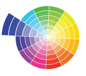
However, circle does not always consist of six sectors, they can include twelve or more variations. In this case, six colors are added as a result of primary and secondary colors mixing. Those are yellow-green, green-blue, blue-violet, violet-red, red-orange and orange-yellow. There are circles that contain 24 sectors with even more additional hues.
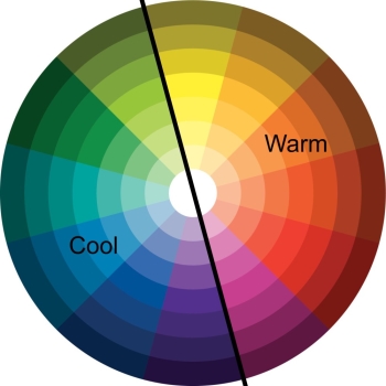
Warm and Cool Colors
All color wheels can be divided into two halves. One of them includes warm colors like yellow, orange and red (most shades of brown also belong to the warm color palette). Cool colors are: blue, green, purple and all shades of gray. And here goes the question “Which colors are better – warm or cool?” The answer is obvious – there is no “better” color. Your choice should depend on the effect you are going to achieve and on associations with a particular feeling or idea. Warm colors are considered to be cheerful, friendly and stimulating; cold colors are in most cases calming and relaxing.
As a result, the choice of color depends on your corporate style, needs, and an atmosphere you want to create. If you like experimenting, and you probably do :), you can mix warm and cool colors, the main thing here is to know how to do that right, and in the next part, we will show that to you.
Color Mixing Basics
There are several working color schemes based on the position of colors in the circle. Let’s start with the simplest one, and then move on to more complicated schemes:
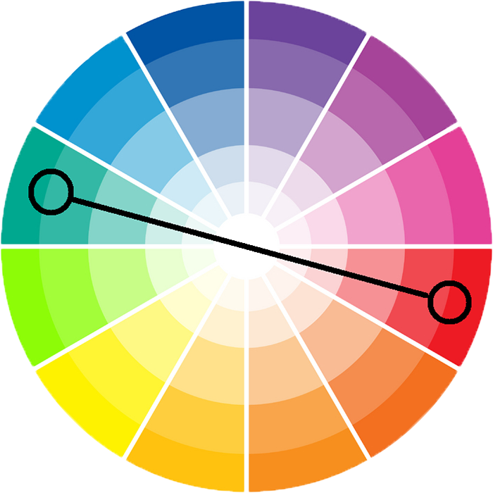
Complementary color scheme
According to this scheme, you can combine two contrasting colors located opposite to each other. For example, you can use red and green, or yellow and purple. For a more elegant combination, it is recommended to add neutral additional shades – beige, light brown, light gray, black or white. Those can be the background colors, for instance.
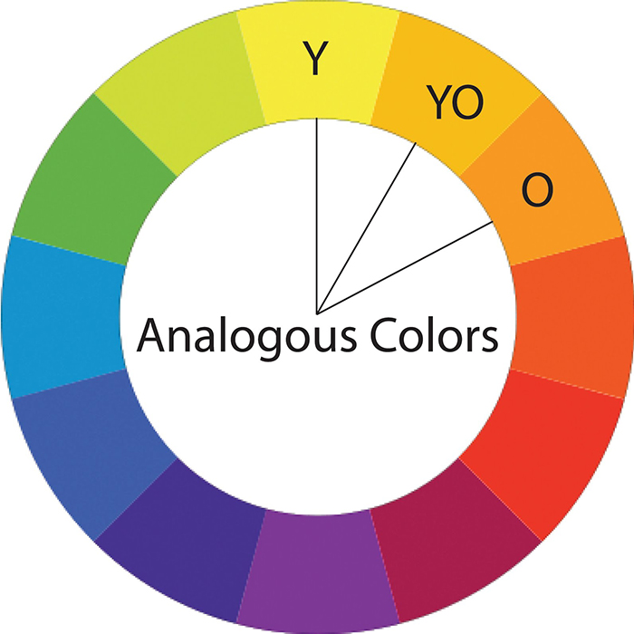
Analogous color scheme
According to this scheme, three colors located next to each other are used. Examples: orange, yellow-orange and yellow, or purple, blue-violet and blue. All these colors will be well combined with each other because of their close neighborhood in the color circle.
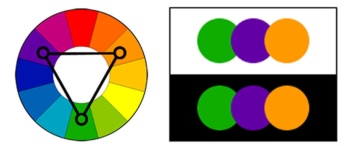
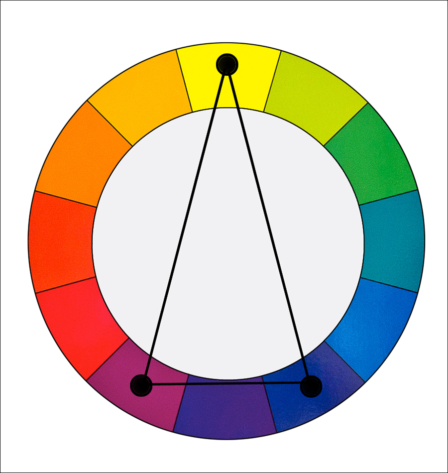
Color triad
Speaking about this scheme it will be necessary to remind you some basic geometric rules. Do not be afraid, there is nothing complicated: you take any three colors equidistant from each other. If you connect them using lines, you will get an equilateral triangle. Possible combinations are: yellow-green, orange-red and violet-blue; yellow-orange, red-violet and blue-green. This is a very rich, contrasting scheme, so you will need to find a balance and choose one color as the main one, and make the other two additional.
Split-complementary color scheme
In this scheme, you select a color as the main one and combine it with the other two, that are standing close to its complementary color on the color wheel. If you connect the selected colors with lines, you will get an isosceles triangle. Possible options are: red, yellow-green and blue-green, or purple, yellow-orange and yellow-green. This is a rather contrasting scheme, that has less tension than a complementary one.
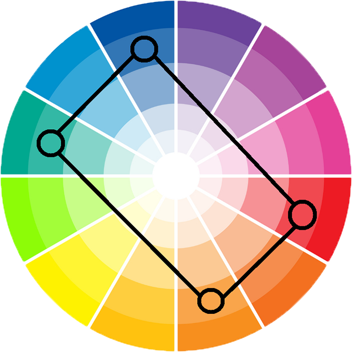
Rectangle color scheme
Here you need to choose two pairs of complementary colors. If you connect them with lines, you will get a rectangle. Example: yellow-orange, yellow green, blue-violet and red-violet. This scheme is a perfect option for unusual combinations and creative websites. Though, if you are afraid of creating a color chaos on your website you can choose one color as the basic, and use the other three to make accents.
Monochromatic color scheme
It is clear from the name that this scheme combines shades of the same color. You can both mix dark and light shades, and choose either dark or light variations.
From Theory to Practice
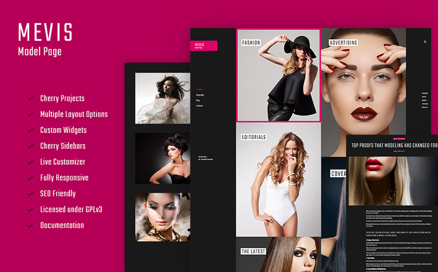
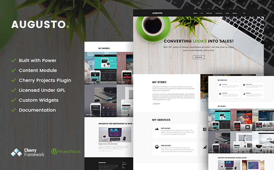
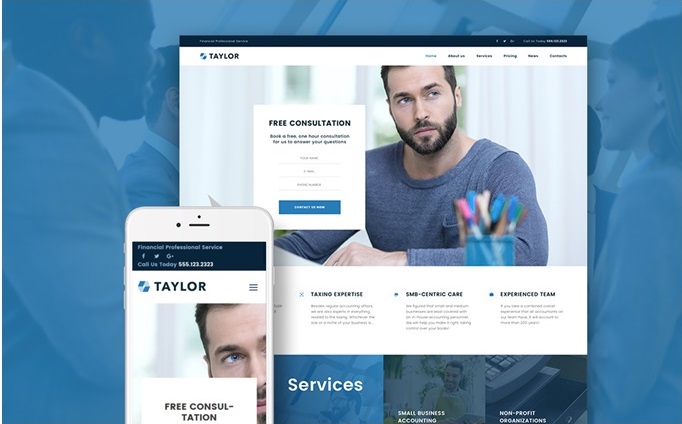
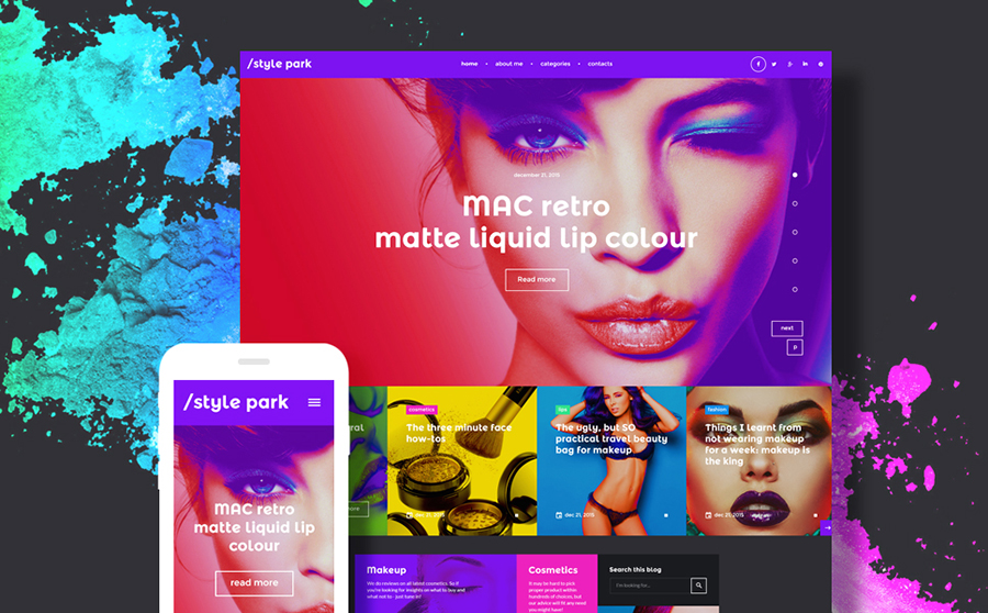
Congrats! Now you know the main color schemes and understand their pros and cons. Let’s see how to use this knowledge in practice. Here are some premium WordPress themes with different color schemes created by TemplateMonster. I think they can be good examples and a source of inspiration. If you have carefully read through the theory and are ready to show your knowledge – guess which color schemes were used in each of the websites and comment below.
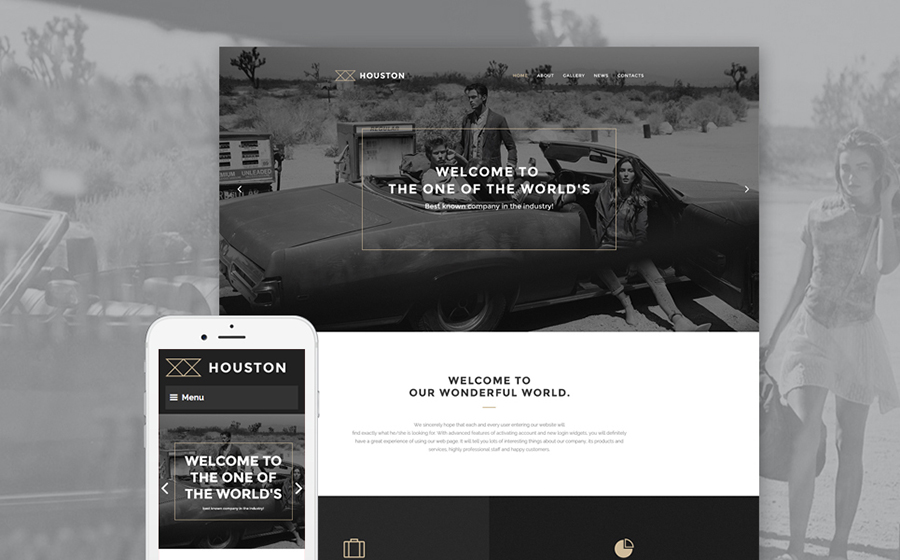
Houston Business WordPress Template
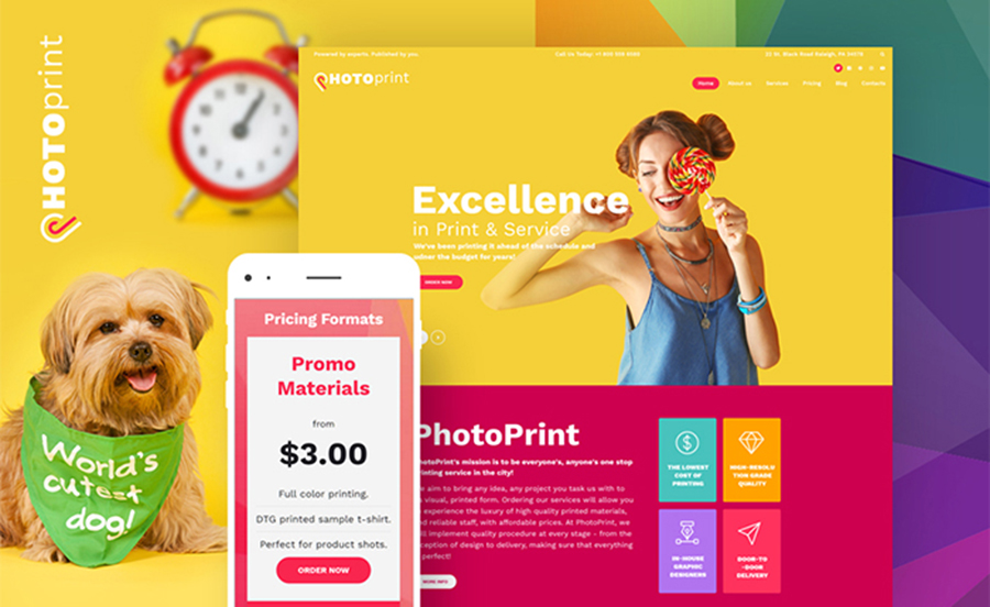
Bright Print Shop WordPress Design
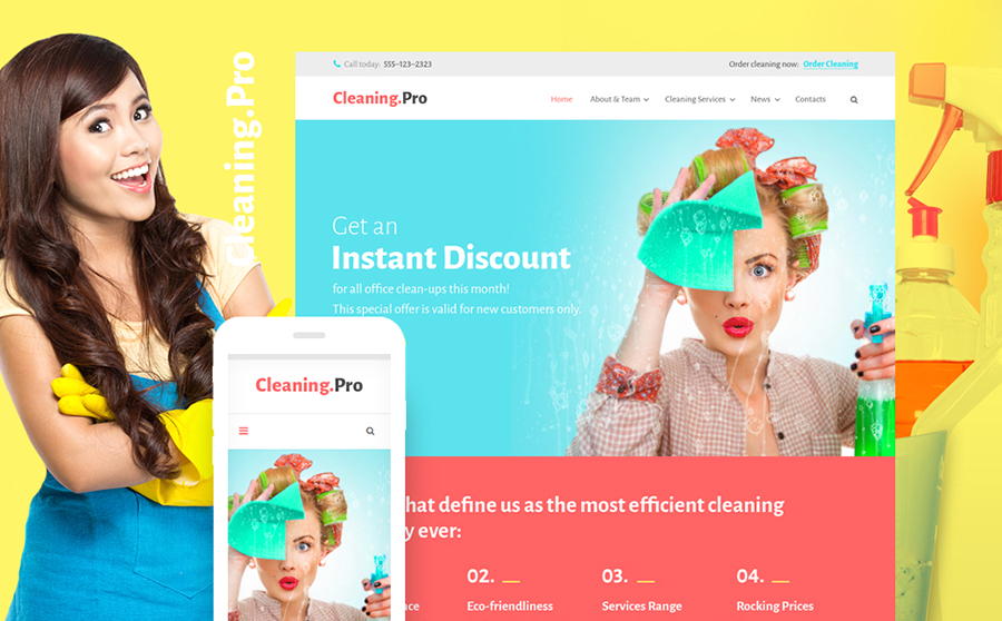
Fast Cleaning Service WordPress Theme
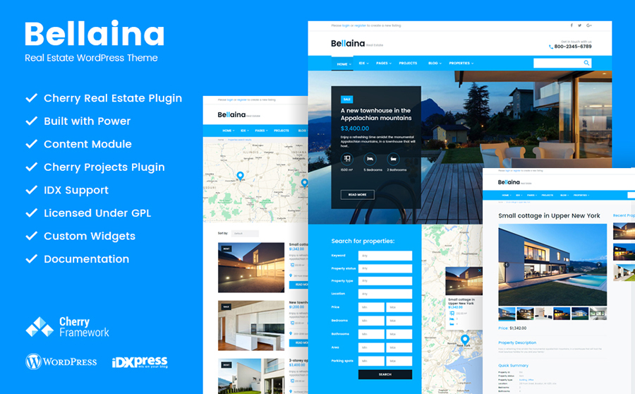
Bellaina – Realtor Services WordPress Template
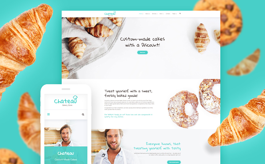
Sweet Cakes and Bakery WordPress Theme
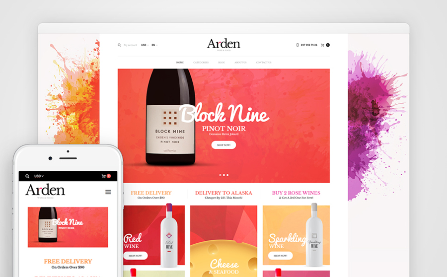
Wine Store WooCommerce Theme
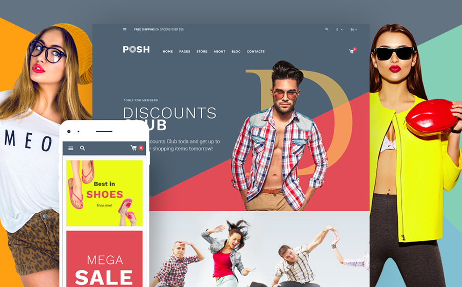
Fashionable Apparel WooCommerce Website
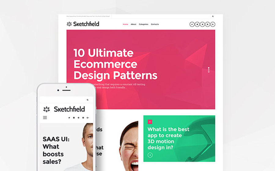
Sketchfield – Web Design WordPress Site
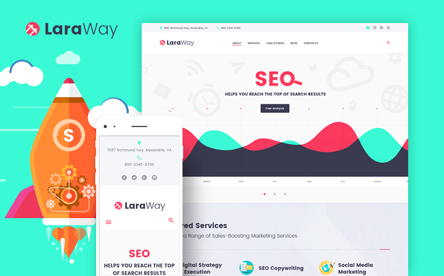
SEO Agency WordPress Theme
Elegant Photography WP Design
WordPress Theme for Professional Designer
Reliable Financial Company WordPress Theme
Bright and Fashionable WordPress Template
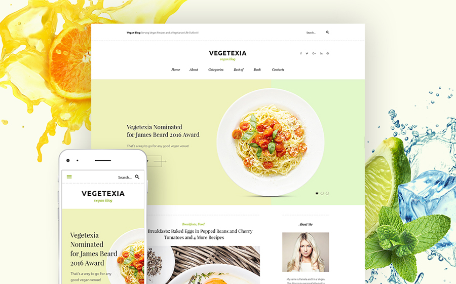
Vegetarian Restaurant WordPress Theme
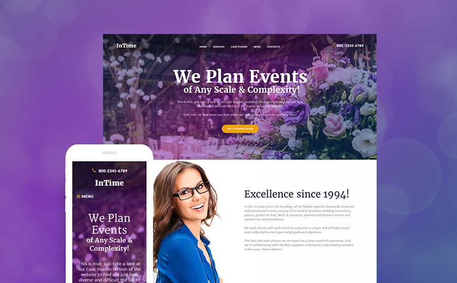
Best Event Planner WordPress Design
Read More at Color Theory for Web Designers – How to Choose the Right Color Scheme for Your Website
Filling Up Your Tank, Or How To Justify User Research Sample Size And Data
|
|
Jen is presenting her research report to a client, who runs an e-commerce website. She conducted interviews with 12 potential users. Her goal was to understand the conditions under which users choose to shop online versus in store.
The client asks Jen why they should trust her research when she has spoken to only 12 people. Jen explains her process to the client. She shares how she determined the sample size and collected and analyzed her data through the lens of data saturation. The client feels comfortable with the explanation. She asks Jen to continue the presentation.
The post Filling Up Your Tank, Or How To Justify User Research Sample Size And Data appeared first on Smashing Magazine.
