The feature of keeping information up-to-date over a longer period of time makes brochures an important and useful tool in marketing campaigns. There are plenty of websites that provide you with brochure templates. We’ll mention some in this blog post. But at times, you might feel like designing one from scratch. For this very reason, we provided you with some simple brochure design guidelines.
We all know that brochures tell only one story at a time. This is the rule. In a brochure, you only focus on one thing, a single subject. Therefore, the information contained in a brochure is unitary, circumscribed to a particular theme. The design of the brochure, the presentation of the theme, the quality of the information, and the expectations of the target audience are directly responsible for the success or failure of a brochure-based advertising program. Once we understand the importance of a good brochure design, we can actually take the first steps into designing one.
Know your audience
Whether you design a brochure for yourself or for a client, you need to make sure that you know as much about your target audience as possible. Usually, this is the less visible or cared for aspect of a booklet: the audience to which it is addressed. An in-depth study of your audience increases the effectiveness of the message promoted through brochures. You need to take into account the age, the ethnicity, demographics, and the gender of your audience. Once you have figured all that out, you can effectively take the first steps into the physical design of the brochure.
Distribute the information correctly
Brochures limit us regarding the amount of content they can display. Advertising brochures should be based on a layout that draws the attention in a convenient way. You can do this by separating the text blocks through descriptive headlines. But in order to avoid any misunderstandings with your client, make sure you talk to him/her before you decided how much space is necessary for the content, and how much for the images. You don’t want whoever is reading the brochure to be overloaded with information in the first couple of sentences. Distribute all the information equally so the viewer stays interested.
Make them attractive, use colors
An advertising brochure has to go beyond its black-and-white version, which is typical of textbooks, small-scale cards, etc.. A reaction is guaranteed on those reading the booklet if you use colors, chosen in such a way that they resonate with the theme. Use polychromy for a bigger psychological impact. Beyond the point, colors make anything look better. We are a designer, after all, so use your imagination.
Images speak louder than text
Images draw attention involuntarily and are infinitely easier than any text. The use of thematic and aesthetic images is necessary to capture the interest of the reader. Incorporate large images that fill the page tastefully in the brochure layout. Get your hands on any corporate brochure and you will see that the photos seem to go beyond the edges of the pages. Adding images gives more depth to the content on the page. It takes the reader beyond the letters laid out in front of them and gives them a different form of visual stimulation.
Get your content right
The content, the information in the brochure must be legible, clear and grammatically correct. The easiest way of doing that is by keeping it simple. You don’t need heavy words, nor neverending sentences. Also, use only one font. Since you’re only using one font, try alternating the sizes according to the importance of the text. Give your viewers something new to read, without overcomplicating things.
Keep in mind that size matters
If you have a large budget, then go for a larger brochure size. Keep in mind, however, you want to keep things aesthetically pleasing, so don’t go too crazy with the size. A larger format allows a better use of the white space. Use white space with the intention of guiding the page from one block of information to another. White space balances the active areas in the brochure design with visual rest areas. The customer’s attention is a rare and valuable resource, so manage it with great design and a comfortable layout.
Ease your work
As mentioned at the beginning, there are websites that provide designers with quick downloads for brochure templates. As genuine as a custom brochure can be, we also understand that time is a valuable resource. If you ever find yourself in a pinch and need a quick brochure template, here are a few places you can find them:
Whether you are a beginner designer or an experienced one, we hope that you found these tips helpful. Here is a short summary of them that you can print out and always take into account when designing a brochure:
learn who all you can about your audience;
let your pages breath, don’t overload them with content;
use colors;
add relevant images that speak the same message as your text;
make sure your text is correct in every aspect;
find the right size for your brochure;
ease your work by using already created brochure templates;
have fun!
If you liked our blog post, please share it with your friends so they can benefit from these amazing tips. We would also love to know what are your favorite techniques when creating a brochure. Share your tips with us in the comment section below.
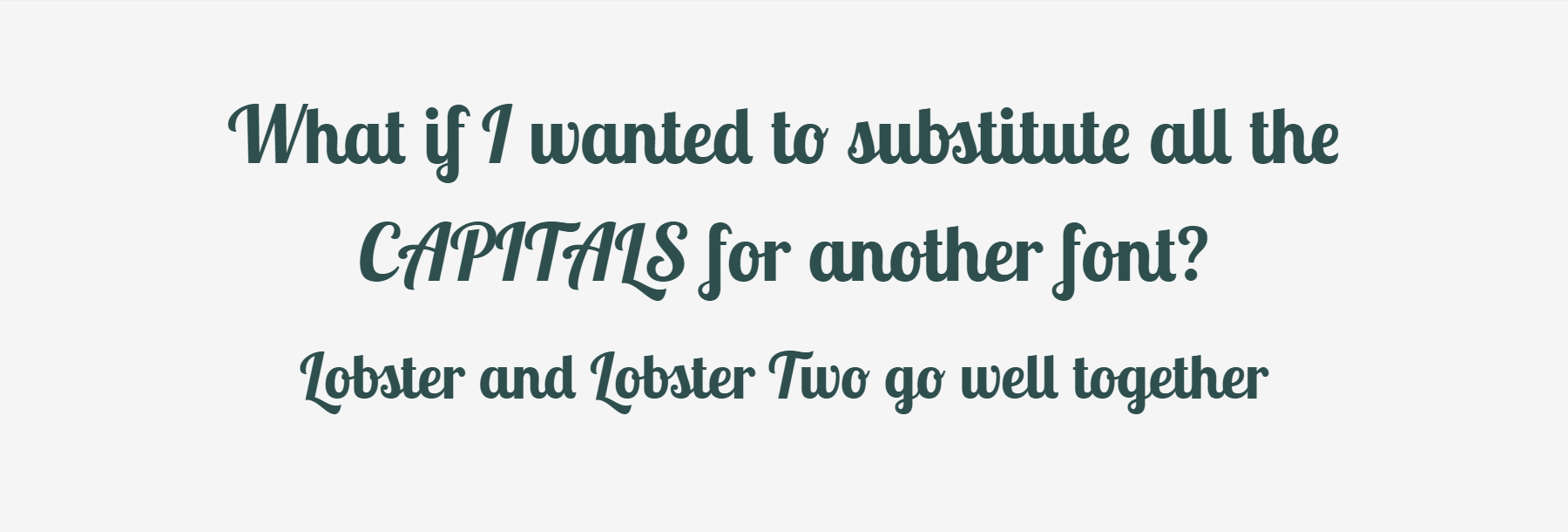
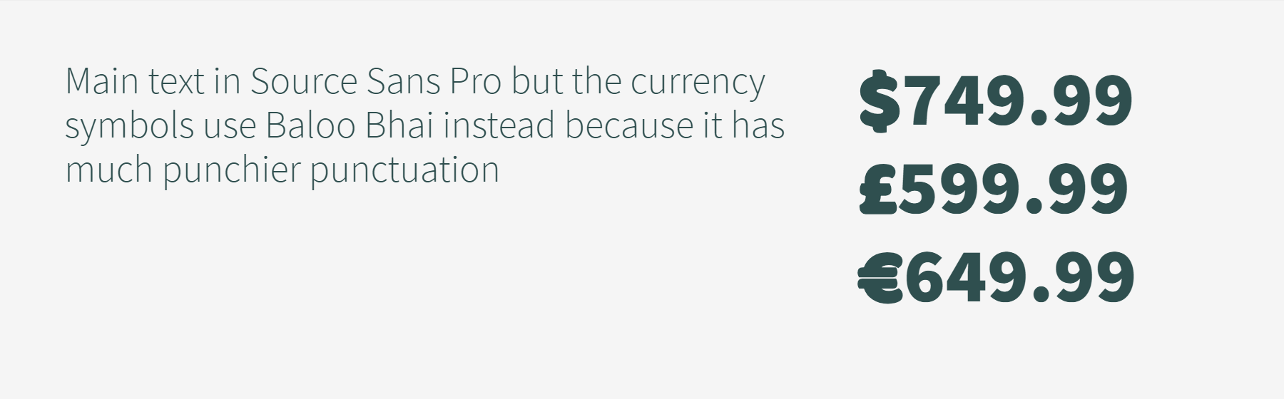
You’re putting the finishing touches on your new million-dollar-idea — your copy is perfect, your color scheme is dazzling, and you’ve found a glorious font pairing (who knew Baskerville and Raleway looked so great together? You did.) but there’s one problem: Raleway’s pesky lowercase numbers make your shopping cart look confusing and overwhelm the user.
This is a fairly mundane problem, but an issue that can make beautiful typefaces unusable if numbers are an important part of your site; a store or an analytics dashboard for example. And this isn’t just an issue with lowercase numerals. Non-monospaced numerals can be equally distracting when glancing at a list of numbers.
We’re going to look at a few techniques to combat this problem, but first we need to find a font whose numerals we can use instead of our main body font. There’s no cut-and-dry way of finding your font twin. The most important characteristics to search for are the weight and width so that you can match it to that of your original font. If you intend to use numerals at multiple weights, try looking at fonts that have a wide range of weights to up your chances at matching your original. You may end up needing a different numeral font for each weight or mismatching the weights of the font pairs, but that’s fine because there are in fact no font police.
Here are a few Google Font pairings that match well enough to not be noticeable at small sizes:
Your total comes to $<span class="numeral">15</span>.<span class="numeral">99</span>
This is not a good solution. Having to add to the markup is bad, and loading both fonts in their entirety is not great, but if you don’t have a lot of content and want a simple solution, then there’s no shame in it.
What we’d prefer to find is a CSS-only solution that isolates the numerals of the number font and loads them instead of (or before the main font) without having to change theHTML. Read on.
How font-family works
The following methods rely on creating a @font-face declaration which only refers to our preferred subset of numerals, and references them in the font stack as normal:
body {
  font-family: 'Custom Numeral Font', 'Main Font', sans-serif;
}
By ordering the subsetted font first in your font-family declaration, the browser will default to it and will fallback to the subsequent fonts for glyphs that are not available in the first. This is a really important distinction — the browser is not only checking that the declared font is available (locally or imported via @font-face), but it is also checking that its character map contains the requested character and will pass onto the next font if it doesn’t, on a character-by-character basis. By the way, the spec for the font-matching algorithm is a surprisingly interesting read.
It’s important to note that the browser will prioritize the font family over the font weight and style, so if you subset the numerals for only a normal weight and then have a number inside a bold-style element, the browser will choose to show the normal-weight character from the numeral font rather than the bold-weight character of the main font. Basically, if you’re doing this, make sure you do it for all the font weights you’ll show numbers in.
Method 1: Font Squirrel custom subsetting
If you self-host your font files instead of serving them from a hosted service like Adobe Fonts or Google Fonts, then you can use the expert configuration of Font Squirrel’s Webfont Generator to create files that only contain the numeral subset. Read the font’s license agreement to make sure this type of manipulation is okay before proceeding.
Setting the Character Type for the replacement font to Numbers in the Font Squirrel interface.
Once you have the subsetted font files, you can use them as you normally would. Check out this article for more information about @font-face and file type browser support.
If you’re being performance-conscious, you can also subset your main font to remove its numeral glyphs and shave off a few extra bytes.
Method 2: @font-face unicode-range subsetting
The unicode-range property of @font-face is mostly used to declare the character set the font files contain in order to help the browser decide whether or not to download the files; a big potential performance boost for multi-language sites that use non-Latin alphabets. The flip-side is that unicode-range also restricts the @font-face declaration to the specified range, meaning that we can only use it to make certain portions of the font files available for use in the browser.
This is worse for performance than the previous method as the browser still has to download the whole font file to use the numerals, but preferable if the license agreement disallows manipulation of the files.
Sadly, we can’t use this method to subset fonts already loaded by an external service, but it can be used on local fonts:
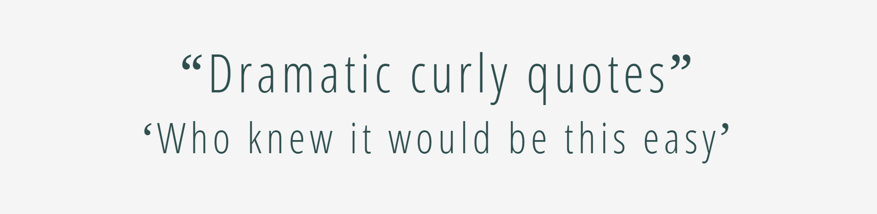
This is a neat way of tweaking particular characters of your main font, perhaps subsetting for just an ampersand or preferred curly quotes (in which case you’d have to give up the “Times Numeral Roman” pun), with no performance loss as the local font will just be ignored if it doesn’t exist. You can check common system font availability here. And you can become Queen of the Type Nerds by making a site that can only be appreciated properly if you have all its subsetted fonts downloaded locally, premium esoteric.
Support for unicode-range is pretty good, but note that the subset font will be used for all text if it’s not supported, so maybe don’t make it Papyrus. Or if you really want to use Papyrus, you can be sneaky and add another web-safe font first so that unsupported browsers will default to it instead of Papyrus:
@font-face {
  font-family: 'Backup Font';
  src: local('Arial');
  unicode-range: U+60; /* backtick because I can't think of a more innocuous character */
}

@font-face {
  font-family: 'Papyrus Ampersand';
  src: local('Papyrus');
  unicode-range: U+26; /* & */
}

body {
  font-family: 'Backup Font', 'Papyrus Ampersand', 'Main Font', sans-serif;
}
Method 3: Google Fonts text subsetting
The Google Fonts API comes with a few handy extra options to aid optimization by specifying only particular font weights, styles and alphabets (the subset parameter takes a list of alphabets like greek,cyrillic and not a unicode range, sadly), but there’s also a little-known “beta” parameter called text which is ostensibly for use in titles and logos but works equally well for our purpose:
The text parameter can take any UTF-8 characters, but make sure to URL encode them if they’re not alphanumeric. The only possible issue with this method is that we’re not creating a custom name with @font-face, so if the user already has the subset font on their system, it will use that font in its entirety.
I haven’t been able to find any other hosted font services that offer this level of granularity for subsetting but do comment below if you come across one.
Friends, I come with a warning…not to alarm, but to assist. Grab your crucifix, gather your silver bullets, prime your chainsaw, because I’m about to shine a light on nightmare clients that will chill the heart of the most experienced web professional.
Nightmare clients everywhere, await the unsuspecting designer. They’ll suck the time from your day, relentlessly pursue you, and trap you in a project that you’ll never escape.
My friends, forewarned is forearmed. This collection of fearsome fiends is easy to tackle…if you know their weaknesses. So pay attention, because what I’m about to share, may just save your life (or at least your weekend).
The Nosferatu Client
The Nosferatu client creeps into your home at night, sucking the life from you to feed his own self-importance. Whether it’s a late-night call, weekend texts, or meetings booked for 7am, the Nosferatu client wants to own you, and every second of your life.
The key to defeating the Nosferatu client is setting boundaries and sticking to them.
The Nosferatu’s chief weapon is flattery. You are invaluable to him. Your quick-thinking is keeping the project on track. The work you’re doing is award-winning quality. It is all designed to make it impossible for you to say, “No.”
The Nosferatu client is always looking for ways into your life. If he discovers that you’re working the weekend, he’ll expect you to be available every weekend. Don’t open the door to him.
How to Defeat a Nosferatu Client
The key to defeating the Nosferatu client is setting boundaries and sticking to them.
Let your clients know that you work regular office hours, even if you really work until midnight every night.
Never invite the Nosferatu client into your spare time, once he’s invited in, he’ll never leave.
Never call, post on Slack, email, text, upload files, or make any other sign that you are working after hours. If you finish a deliverable 30 minutes after your official close-of-business, then upload it the following morning.
Never invite the Nosferatu client into your spare time, once he’s invited in, he’ll never leave.
The Mephistopheles Client
Like the devil of Faustian folklore, the Mephistopheles client has a great deal for you. A deal too good to turn down. The opportunity of a lifetime. Never mind the small print, just sign here…
Lots of clients will offer you a terrible deal. It’s easy to turn down solicitation that only offers “exposure”; the Mephistopheles client traps you with a deal that on the surface looks enticing, but has a hidden sting in the tail.
Your terms are a litmus test; if a client wants to modify them, or work under different terms, then look closely at exactly what you’re agreeing to.
Is the client offering you a higher than expected rate of pay? Is the client offering you unlimited creativity? Is the client overly eager to sign you up? Any deal that looks too good to be true, probably is.
It could be that the client has sneaked a clause into the contract that gives him unlimited revisions. It may be that he’s sneaked in a clause that specifies payment on acceptance instead of payment on completion—yes, that has happened to me, and no, the acceptance never materialized.
How to Defeat a Mephistopheles Client
Have a comprehensive terms of service, and attach it to every single quote you send out. Make it clear that these are the terms under which the quote is issued.
Write your terms in plain-English (you probably don’t need a lawyer to draft them). The terms aren’t to cover you legally, or for use in court, they’re to establish ground rules and promote a healthy working relationship.
Your terms are a litmus test; if a client wants to modify them, or work under different terms, then look closely at exactly what you’re agreeing to.
The Zombie Client
The Zombie client is perhaps the most common of nightmare clients, there are millions of them.
The typical Zombie client is slow: sign-off takes weeks, not days; content arrives in months, not weeks.
Be warned…working with one Zombie client will attract more.
The Zombie client knows who his target demographic is. It’s people just like him. He’s certain there are thousands of them, and he intends to use you as bait.
What is worse, the Zombie client is aimless. He doesn’t have a defined goal, and is rarely able to supply a brief. Stray too close to a Zombie and he’ll make you aimless too.
How to Defeat the Zombie Client
The Zombie client is relatively harmless, if kept at arm’s length, but you do need some form of barrier to keep him at bay. The web professional equivalent of electrified fencing is a well-honed project plan.
The Zombie needs to be herded, and actually enjoys being given direction.
Despite his slow speed, and aimless wandering, it is almost impossible to rid yourself of a Zombie client. Years after you think he’s vanquished, the Zombie client will reappear, more often than not asking if you have a copy of his logo on file. Keep an archive of important files like this so you can send it to him and escape; the faster you respond the less likely the Zombie client is to catch up to you.
Be warned, the Zombie client knows countless other Zombie clients, and working with one Zombie client will attract more.
The Wolfman
The Wolfman client often appears to be a regular, even good client. The Wolfman client often doesn’t know he’s a Wolfman. But beware, for the Wolfman is ever-changeable.
Changes define the Wolfman client. One day he’s signed-off on a deliverable, the next day he’s revisiting the project brief.
When the Wolfman client changes his mind he’s like a dog with a bone. The fickleness of his decisions is matched only by his certainty that this one final change will bring the whole project together.
The Wolfman client spends much of his working life confused. The Wolfman will wake, the day after a meeting, unable to recall what was agreed (and wondering where all these chicken feathers came from).
How to Defeat the Wolfman Client
The Wolfman client isn’t a monster, simply a victim of his own nature. But that doesn’t mean you should allow him to make a victim out of you too.
The Wolfman will wake, the day after a meeting, unable to recall what was agreed…
When dealing with a Wolfman client, get all decisions in writing. If a decision is made in a meeting, or on a call, write it down while your memory is still fresh and post it to your project management system (or at the very least pop it in an email). Keep a paper trail.
The Wolfman client is often unaware of his own nature. If you spot one, then try to get off a fixed project fee and onto an hourly rate as quickly as possible; getting bitten by the Wolfman’s changeable nature is a lot less painful when you’re getting paid for every revision.
Fin
Clients often feel like nightmares, because we don’t understand them. The Wolfman doesn’t want to be changeable, he doubts his decisions. Mephistopheles often doesn’t want to trap you, he’s worried about being trapped himself. The Nosferatu client will respect your boundaries, provided you let him know what they are. The Zombie client will hang around, but is relatively harmless unless you let him slow you down.
When we take the time to establish good working relationships, by managing expectations, setting boundaries, and keeping our work process transparent, nightmare clients have a lot less bite.
So the next time you find yourself confronting one of these fearsome fiends, remember this advice dear friends, and you’ll escape unscathed.
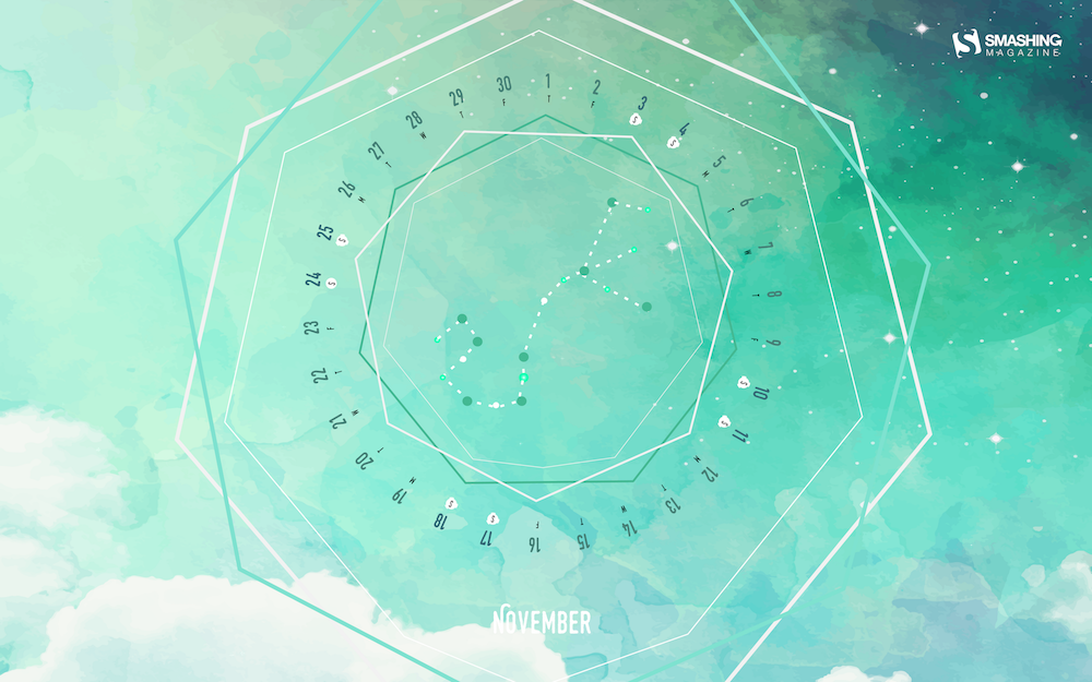
How about some colorful inspiration for those gray and misty November days? We might have something for you. Just like every month since more than nine years already, artists and designers from across the globe once again tickled their creativity and designed unique wallpapers that are bound to breathe some fresh life into your desktop.
The wallpapers all come in versions with and without a calendar for November 2018 and can be downloaded for free. As a little bonus goodie, we added a selection of favorites from past November editions to this post. Because, well, some things are too good to be forgotten somewhere down in the archives, right? Enjoy!
All images can be clicked on and lead to the preview of the wallpaper,
You can feature your work in our magazine by taking part in our Desktop Wallpaper Calendar series. We are regularly looking for creative designers and artists to be featured on Smashing Magazine. Are you one of them?
Outer Space
“This November, we are inspired by the nature around us and the universe above us, so we created an out of this world calendar. Now, let us all stop for a second and contemplate on preserving our forests, let us send birds of passage off to warmer places, and let us think to ourselves — if not on Earth, could we find a home somewhere else in outer space?” — Designed by PopArt Studio from Serbia.
“Foliage is the most mystical process of nature to ever occur. Leaves bursting and falling in shades of red, orange, yellow and making the landscape look magical.” — Designed by ATop Digital from India.
“Diwali is all about celebrating the victory of good over evil and light over darkness. The hearts of the vast majority are as dark as the night of the new moon. The house is lit with lamps, but the heart is full of the darkness of ignorance. Wake up from the slumber of ignorance. Realize the constant and eternal light of the Soul which neither rises nor sets through meditation and make this festive month even brighter and more vibrant.” — Designed by Intranet Software from India.
“I already had an old sketch that I wanted to try to convert to a digital illustration. The colors of the drawing were inspired by nature that at this time of the year has both the warm of fallen leaves as it has the cold greens of the leaves that make it through winter.” — Designed by Ana Matos from Portugal.
“Monsoon is all about the chill, the tranquillity that whizzes around, a light drizzle that splashes off our faces, the musty aroma of the earth and more than anything – a sense of liberation. The designer here has depicted the soul of monsoon, one that you would want to heartily soak in.” — Designed by Nafis Mohamed from London.
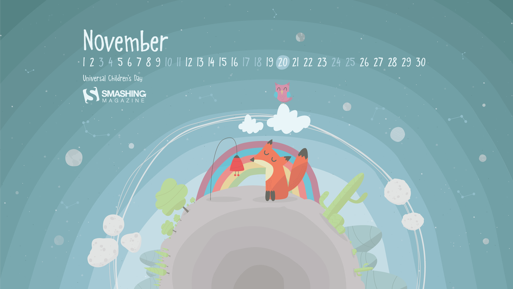
“Universal Children’s Day, 20 November. It feels like a dream world, it invites you to let your imagination flow, see the details, and find the child inside you.” — Designed by Luis Costa from Portugal.
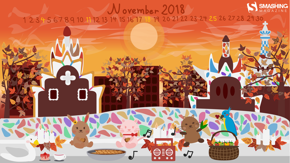
“It is believed that childhood is the happiest time cause this period of life cannot be matched with any other phases of life. During this month of November, let’s continue celebrating Children’s Day no matter how old you are, by sharing wishes to your children and childhood friends.” — Designed by Taxi Software from India.
“This month’s wallpaper is dedicated to the magical place of Barcelona that has filled my soul with renewed purpose and hope. I wanted to recreate the enchanting Parc Güell where I’m celebrating Thanksgiving with the people I’ve met that have given me so much in so little time.” — Designed by Priscilla Li from the United States.
“I have a maple tree in my yard that sometimes turns these colors in the fall – red on the outer leaves, then yellow, and the inner leaves still green.” — Designed by Hannah Joy Patterson from South Carolina, USA.
Below you’ll find some November goodies from past years. Please note that these wallpapers don’t come with a calendar.
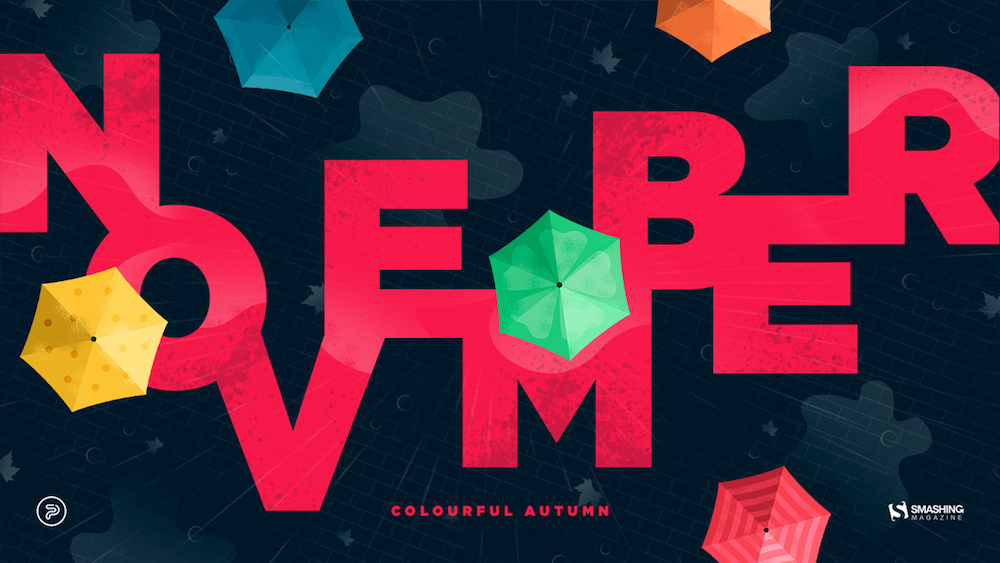
Colorful Autumn
“Autumn can be dreary, especially in November, when rain starts pouring every day. We wanted to summon better days, so that’s how this colourful November calendar was created. Open your umbrella and let’s roll!” — Designed by PopArt Studio from Serbia.
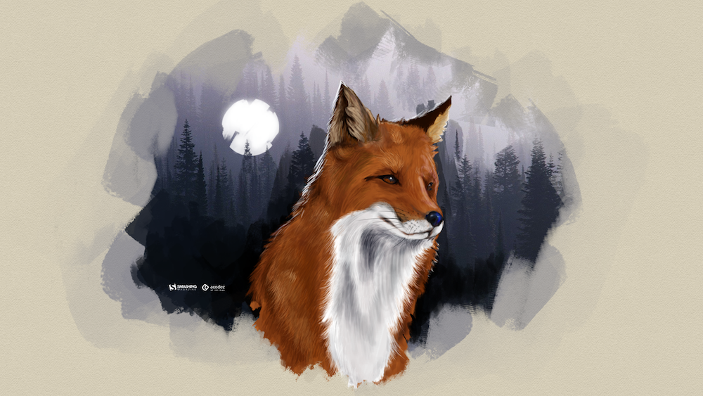
“The smell of winter is lingering in the air. The time to be home! Winter reminds us of good food, of the warmth, the touch of a friendly hand, and a talk beside the fire. Keep calm and let us welcome winter.” — Designed by Acodez IT Solutions from India.
“It is autumn! It is raining and thus… it is mushroom season! It is the perfect moment to go to the forest and get the best mushrooms to do the best recipe.” — Designed by Verónica Valenzuela from Spain.
“I love the changing seasons — especially the autumn colors and festivals here around this time of year!” — Designed by Rachel Litzinger from the United States.
“Those chill November nights when you see mountain tops covered with the first snow sparkling in the moonlight.” — Designed by Jovana Djokic from Serbia.
“I often read messages at Smashing Magazine from the people in the southern hemisphere ‘it’s spring, not autumn!’ so I’d liked to design a wallpaper for the northern and the southern hemispheres. Here it is, northerners and southerns, hope you like it!” — Designed by Agnes Swart from the Netherlands.
“The design of trees has always fascinated me. Each one has it’s own unique entanglement of branches. With or without leaves they are always intriguing. Take some time to enjoy the trees around you — and the one on this wallpaper if you’d like!” — Designed by Rachel Litzinger from Chiang Rai, Thailand.
Please note that we respect and carefully consider the ideas and motivation behind each and every artist’s work. This is why we give all artists the full freedom to explore their creativity and express emotions and experience throughout their works. This is also why the themes of the wallpapers weren’t anyhow influenced by us, but rather designed from scratch by the artists themselves.
Thank you to all designers for their participation. Join in next month!
I think Facundo Corradini is right here in calling out our tweet. If you’re italicizing text because it should be styled that way (e.g. using italics to display a person’s internal thought dialog, as illustrated in our example), then that’s an and not an , because is for stress emphasis — as in, a word you would emphasize with your voice, if spoken, to affect meaning.
Plus, I’m always down for long-form articles about the nuances of a handful of HTML elements!
I came clean about my long-running and ongoing battle with chronic depression last year in a blog post on my personal site. But don’t worry, things no worse than they were then and this post is about something else. This post is about designing empathetic user experiences.
It’s the latter I’d like to focus on here. In fact, Lucas Chae did such a fantastic job on that post that you should stop reading this right now and head over there. Seriously, if you only have time to read one post today, that’s the one.
Lucas goes to great lengths to show how UX can prevent suicide using Google search as a case study. I don’t disagree with any of his ideas. I love them. But anything has room for improvement or at least refinement, and I have a few ideas I’d like to toss in the ring. Again, not because the ideas are bad or screaming to be fixed, but because I have a personal connection to this topic and am interested in seeing great ideas like this move forward.
Let’s briefly rehash the context
I really hope you took up my suggestion to pop over to Lucas’s post, but if you didn’t the main gist of it goes:
Roughly 500,000 people submit suicide-related searches on Google every month.
Google returns some helpful information pinned to the top of the results, but it feels like a requirement more than a helpful interaction.
Lucas mocked up a proposed experience that replaces the existing pinned result with UI that feels more conversational and relatable.
There’s a lot more nuance to it, but that’s roughly what we’re looking at. My four suggestions are merely standing on the shoulders of what’s proposed there.
Gut check
At this point, you might be asking how much responsibility Google has in preventing suicide and whether it really needs to invest more into this than it already does. I like the way Lucas phrases it in his proposal:
“We are only a search engine, and cannot give you answers to your hardest questions. But we can help you get there.”
That is a good line to draw. And, yes, Google is technically already doing that to some extent, but this is an opportunity to provide recommendations that are as relevant as the search results that are Google’s bread and butter.
It’s also worth couching this entire diatribe with a note that there are zero expectations and absolutely no responsibility for Google to do anything proposed in this post. This is merely demonstrating the impact that UX design can have on a real-world problem using Google as the vehicle to drive these points home. We really could have done this with Bing, Yahoo, DuckDuckGo or any similar product.
Suggestion 1: Reach the user earlier
Lucas’s work zeroes in on what Google delivers after the search query has been made. Thinking about this as a user flow, we’re looking at something like this:
Step
Description
Expected Outcome
Emotions
1
User is contemplating suicide, reaches for phone, computer
Able to start up a device and fire up a browser to navigate to Google
Hopeless
Sad
Lonely
2
Enters “How to kill myself” into the search field
Possibly some related search suggestions, but ultimately a means to submit the search.
Probably not much different than the previous step, but maybe some pensiveness over what search term will produce the best results.
3
Submits search
A page refresh with relevant links
Anxious
Scared
The majority of Lucas’s work is driven by Step 3 (and beyond). I think we can narrow the gap of time between contemplation and search submission by zooming in on Step 2.
Have you ever typed a partial query into Google? The auto-suggestions are often extremely useful (at least to me) but they can be pretty hilarious as well. Take, for example:
I’m not sure why that was the first thing that came to mind as an example but, hey, it’s still nuts that those are actual examples of user submissions and have made the list of predicted suggestions. I mean, of course, Russell Crowe is alive… right?
(Does some more searching.)
Right!
Funny (or not funny) enough, Google does not provide those suggestions for suicide-related searches. Or, more accurately, it weeds out suicide-related results and provides others until it simple can’t suggest anything:
? LOL, did you catch “how to kill mysql process” in there?
I understand why Google would want to exclude suicidal terms from their suggestions. Why plant ideas in people’s heads if that is not what the user is actually looking for? Seems like something to avoid.
But what if it’s an opportunity rather than an obstacle? If we have a chance to interact with someone even a few seconds earlier in the process, then it’s possible we’re talking about saving some lives.
I would suggest embracing the prediction engine and even beefing it up to take sensitive searches head on. For example, what if we took Lucas’s initial idea of interacting with the user right from here instead of waiting for a submitted search and its results?
Suggestion 2: Amp up the personalization
Let’s all agree that Google knows way too much about people in general. I know, I know. Some people love it and see it as a potential force for good while others are wary of the impact a digital footprint can have IRL. I read The Circle, too.
Either way, Google likely knows a thing or two about the user, even if they are not logged in. But, assuming that the user is logged and has at least a partial profile (both of which I think are safe assumptions given Google’s ubiquitous nature, prevalent reliance on it for oAuth, and that the user turned to it instead, say, Bing), then we can make a personal appeal to that user instead of generalized content.
For example, we can make use of avatars, names, locations, search history, etc. And, yes, the likelihood of Google having all of this among many, many (MANY!) other bits of data are extremely good — nay, great!
If we are going to utilize the predictive search feature, then we can put Google’s treasure trove of user data into play to grab the user’s attention and extend an invitation to engage before the search has even happened. That said, while I’m suggesting that we “amp” up the personalization, let’s agree that any attempt to be too smart can also lead to poor user experiences and, at worst, even more personal pain.
So, while we have a treasure trove of data, keeping the scope to a personalized greeting or introduction will suffice.
Suggestion 3: Leverage Google’s technical arsenal
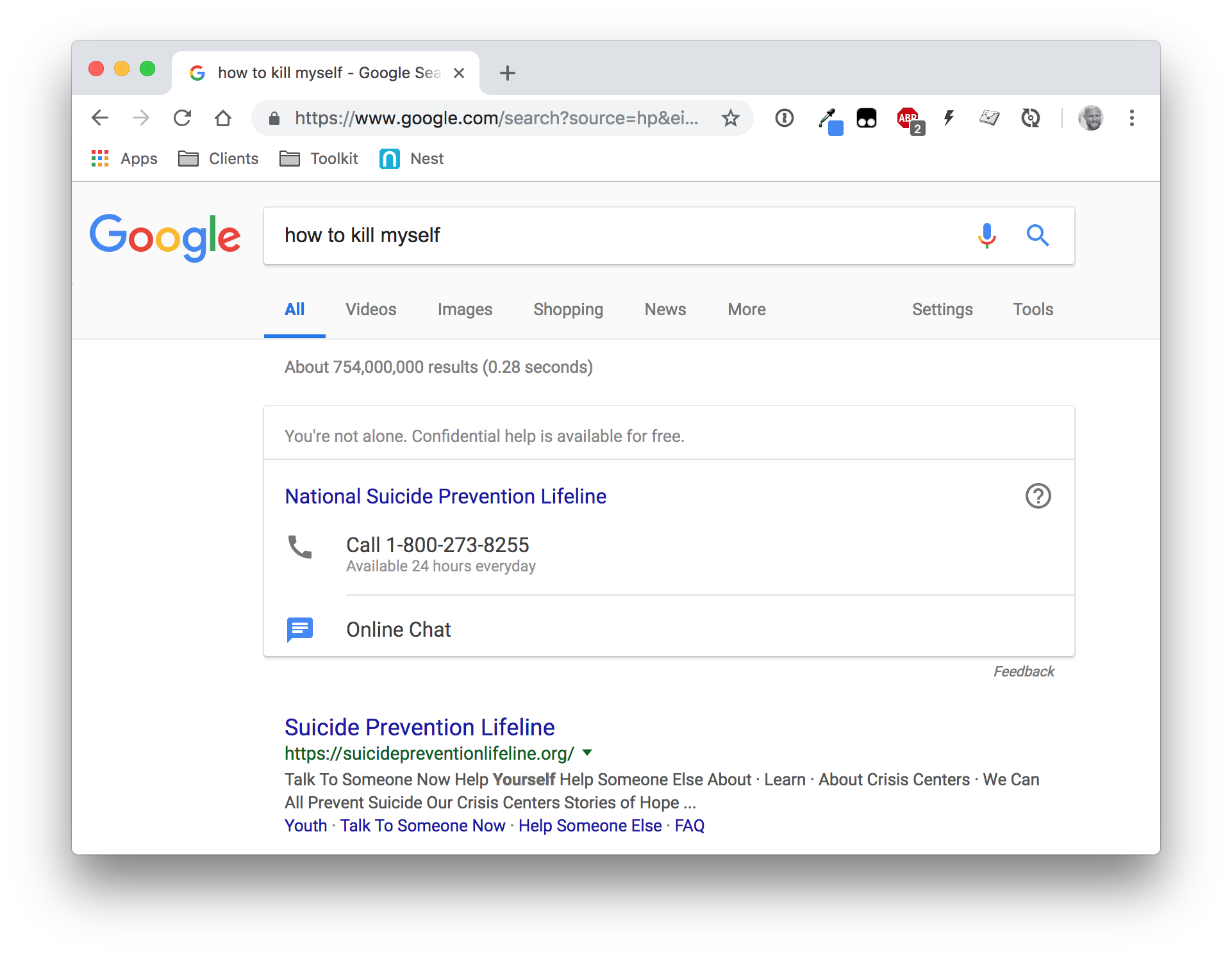
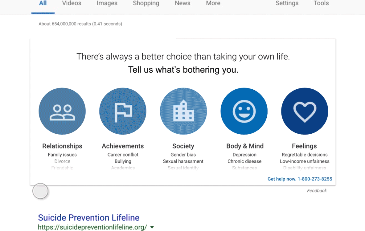
The biggest criticism of Google’s existing experience is that it feels like a requirement. I wholeheartedly agree with Lucas here. Just look.
And, yes, that is now in my search history.
What that uninviting and impersonal approach has going for it is that it provides the user with two clear paths to get help: phone and online chat. Google has developed products that make calls and power video chats, so there’s no reason why we can’t take these already great innovations and put them to use in this new context.
The proposed design from Lucas maintains a call link in the UI, but it seems buried beneath the core interaction and totally removes online chat. If Google has the technical means to apply one-on-one interactions that narrow geographical distances between help and help, and has influence to partner with suicide prevention groups and mental health professionals, then by all means! Those are things I would absolutely work into the UI.
Suggestion 4: Go further to maintain the Google brand
Lucas makes a stellar point that any improvement to the UX should be mindful of Google’s own brand and positioning:
This is a redesign, not a new service that I am launching. One principle I value the most when redesigning an existing interface is respecting the original design principles. Design is never just about making it look pretty. Design is a manifestation of a company’s philosophy and core-values based on years of research and testing.
Amen!
Lucas absolutely nails the grid system, color palette, iconography and baseline card component that come straight from the Material Design guidelines. Still, I think there is room to be even more faithful to Google’s design DNA.
There is a specific point Lucas deviates from the card component guidelines — once the user has made a selection in UI that allows them to categorize feelings.
The animation and general interaction is slick. However, it does feel off-brand… at least to me. We’ll get to my mockups in a bit, but I wanted to make sure any new UI took the card component as far as it could go, always using established Google components. For example, I took the UI Lucas created for feeling categories and “dumbed” it down to literal card patterns as they’re described in the docs.
OK, onto the mockups…
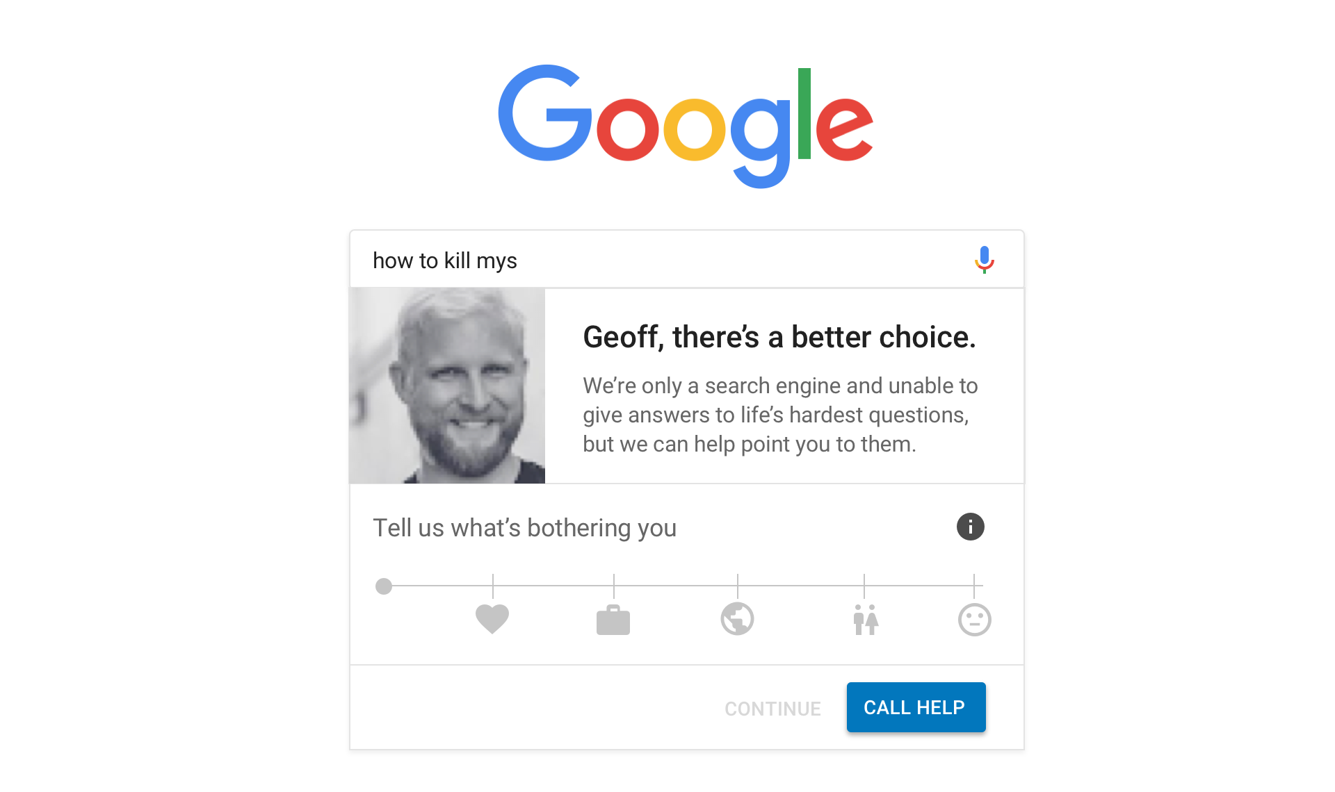
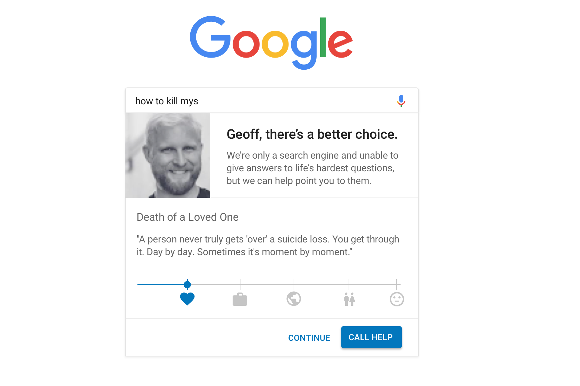
Looking past my lack of design chops, here’s where I landed with everything we’ve covered so far.
Predictive search interface
The user has landed on google.com and is in the process of typing, “how to kill myself.” Rather than disabling predictive suggestions like the current functionality does, we tackle the tough query head on and engage the user, making a personalized plea and making an offer to point the user to positive answers.
Notice that the “Continue” text link is in a disabled state. That’s to add a little friction in the flow to encourage the user to engage with the slider. Of course, we’re also creating a clear path to “Call Help” if the user does indeed need to talk with someone and bail on this UI.
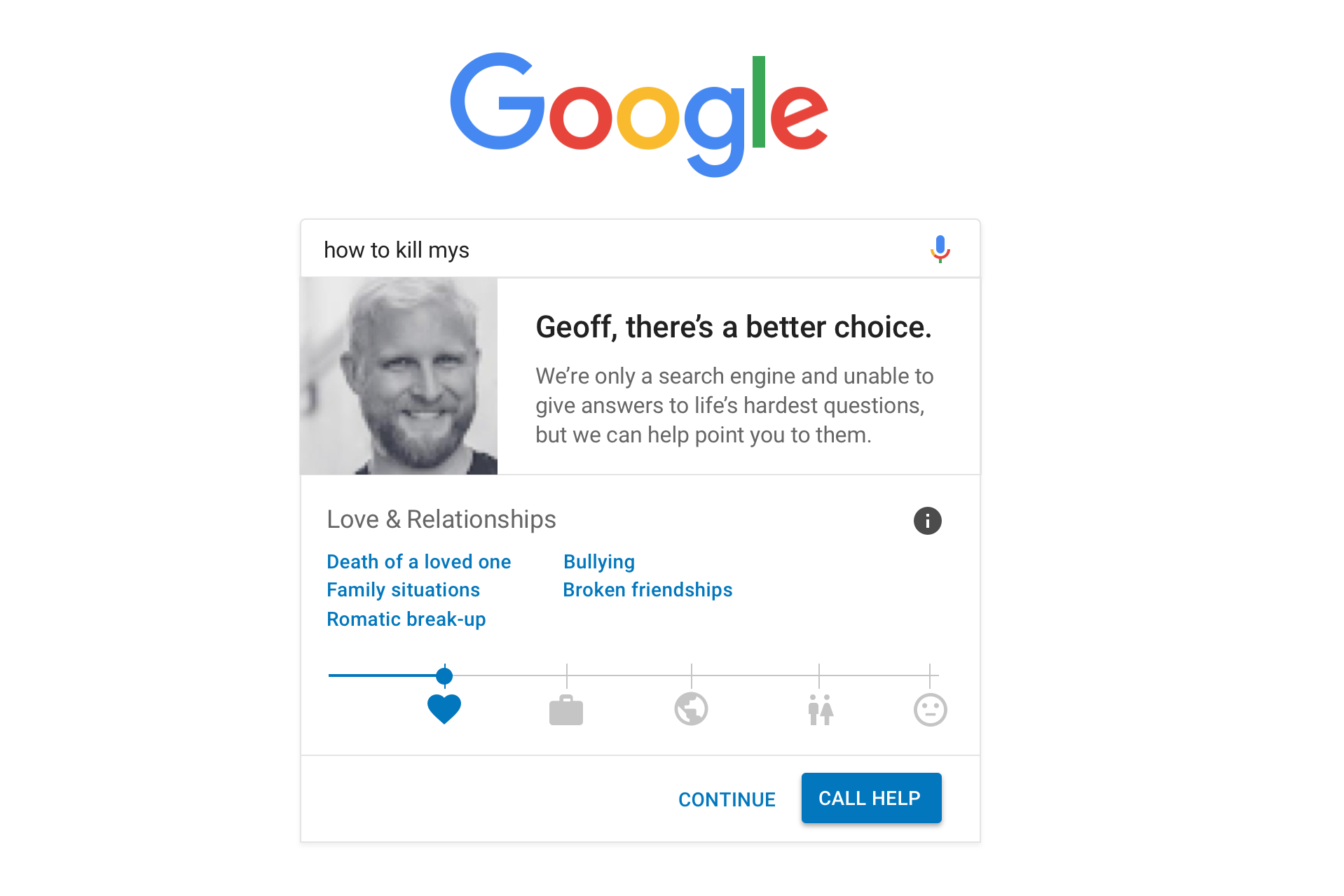
Interacting with the user
What’s the slider? Well, it’s more or less an interpretation of the UI Lucas created that allows the user to provide more detail for the pain they’re suffering:
I find that my proposed pattern is more in line with Google’s Material Design guidelines, specifically with sliders.
The slider is a nice way for users to make a selection across a wide variety of options in a small space. In this case, we’re allowing the user to slide between the same categories Lucas defined in his research and introducing sub-categories from there as text links.
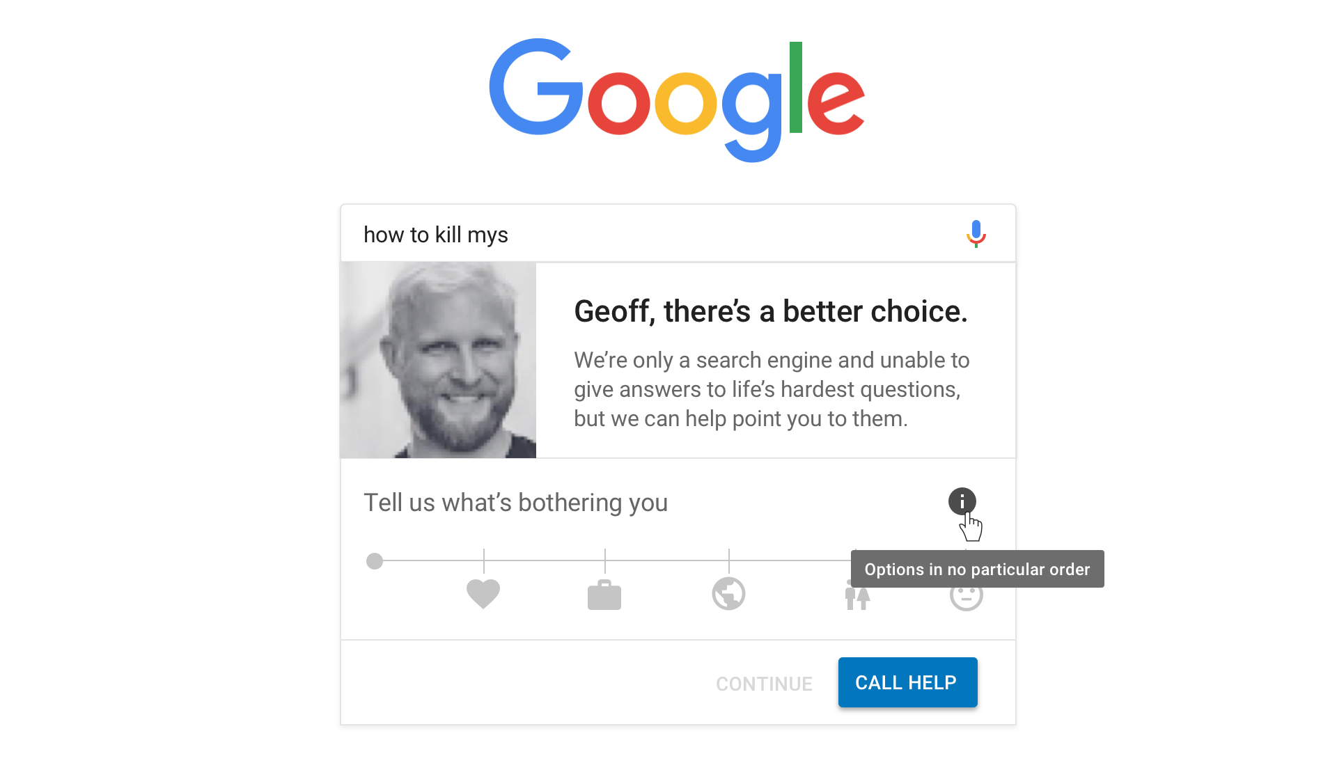
One thing we want to make sure of is that the intent of the options in the slider are not misinterpreted. For example, is “Love & Relationships” first because it’s the most important? It’d be a shame if that’s the way it came across. One idea (among others, I’m sure) is to float a little information icon in there that displays a tooltip on hover explaining that the options are in no particular order.
I think the outcome here, again, is a nice way to get the same level of detail that Lucas mocked up into a smaller space while gaining valuable feedback from the user that helps us learn the context of their feelings.
The first step to help
Once the user has made a selection in the slider and clicked on a sub-category, we can provide the same encouraging, inspiring content Lucas proposed, perhaps pulled from real articles on the subject.
Note that we technically changed the state of the “Continue” text link from disabled to active in the last screen. We can use the context the user has provided so far to allow them to proceed with a much safer and productive search query based on the category/sub-category that is selected.
Additional guidance
Will the UX so far prevent a suicide? Maybe. I hope! But there’s a chance it won’t.
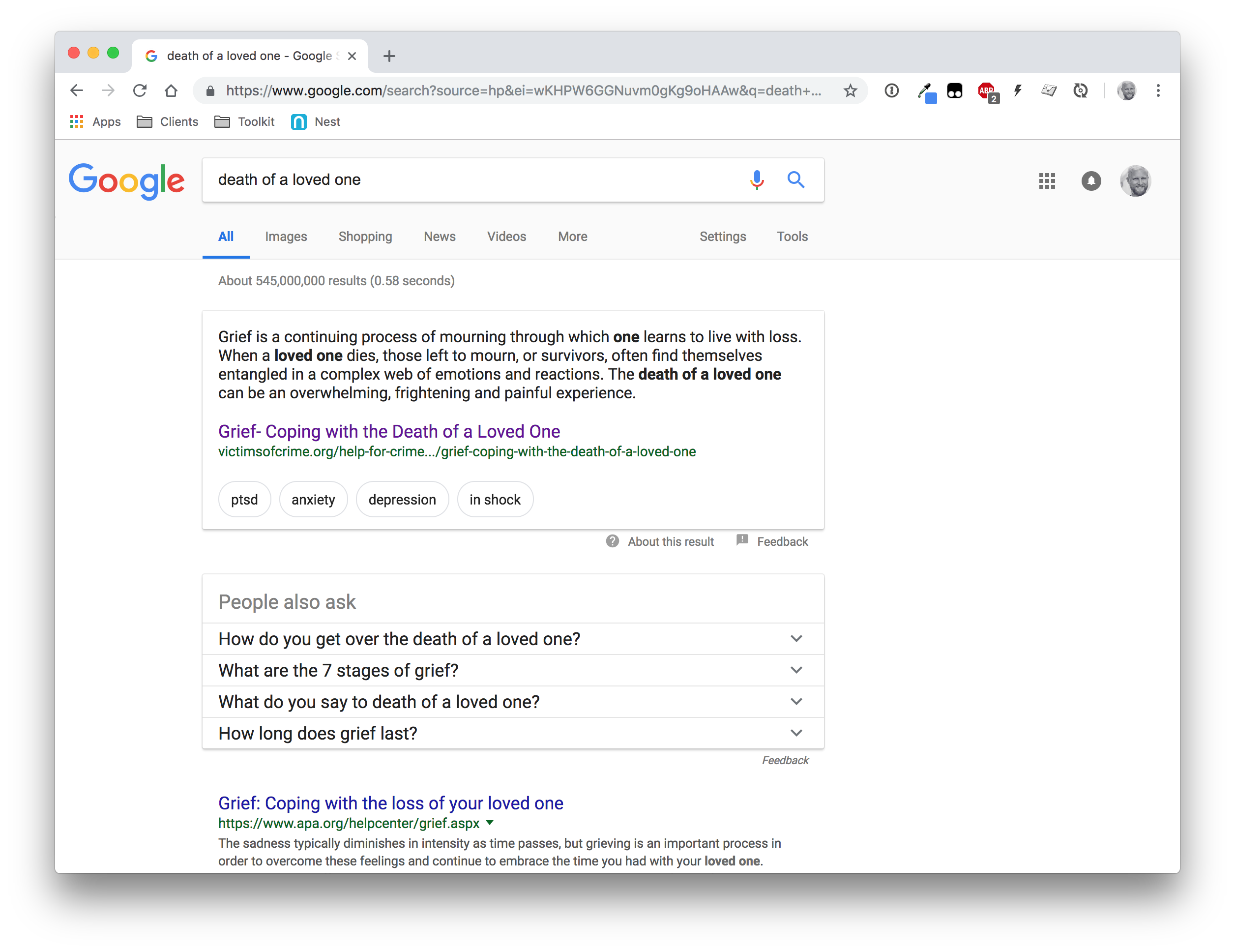
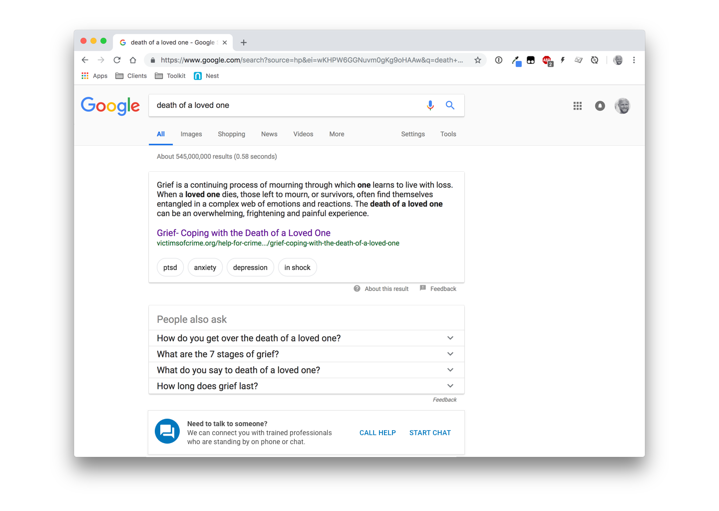
But, hey, we now have better context for the user’s feelings and can provide a relevant path to suggest answers. So, if the user has chosen the category “Love & Relationships” and selected the “Death of a loved one” sub-category, then we can send the user to search results for that subject rather than “How to kill myself” — which would inevitably lead to a more destructive set of search results than something on love and relationships.
Google already does a pretty darn good job of this…
Seriously, say what you want about the lack of design flare, but having a featured result up top that the user can personally relate to, additional search suggestions, and the organic results at the end makes for a pretty compelling experience. A much better place to send the user!
The only change I would suggest is to maintain the ability to make a call to or initiate a chat with a trained professional. It’s doesn’t need to scream for attention in the UI, but be available. Material Design’s banner component seems pretty relevant here, though I can see push back on that as far as the literal use case.
Are we making progress?
I give the greatest hat tip of all hat tips to Lucas Chae for broaching such a hard topic. Not only does he do a bang-up job to solve a real-world problem, but brings awareness to it. Obviously, it’s something I’m able to relate to on a deep personal level and it’s encouraging to see others both empathizing with it and pushing forward ideas to deal with it.
Thank you for that, Lucas.
I hope that by putting my own ideas on the table that we can keep this conversation moving. And that means getting even more ideas on the table and seeing where we can take this bad boy as a community.
So, do you have feedback on anything you’ve seen so far? Maybe ideas of your own you’d like to mock up and share? Please do! The web community is a great one and we can accomplish amazing things together. ?
Note: My sincere thanks to Chris, Andy Bell and Eric Bailey for providing thoughtful, insightful and thorough feedback on earlier drafts of this post.
I know, your pulse doesn’t start racing with excitement.
Forms get a bad rep.
Love or hate them, from registration to collecting payments, forms are here to stay. Forms equal input, they mean collecting data from anyone who interacts with your business.
A form is successful when it engages rather than frustrates your user, and if it provides you with the data you need.
A form consists of different parts. And building a form that does what it needs to do relies on rules, principles, logic — and a bit of play.
Here are some ways to structure online forms that actually convert.
Deceptive simplicity
Forms look simple. A few fields, a bit of text, a couple of buttons. Is there really much more to it than that?
Well, yes.
A successful form feels simple for the user. But behind the apparent simplicity lies a spectrum of decision-making, tweaking, careful wording and thoughtful strategy.
All these are necessary to create a form that garners the useful data you need. Without them, forms won’t yield what you need.
Like a Lego construction, a good form relies on architecture. That means strong foundations, the right kind of structure and attention to detail.
There are five essential rules to keep in mind when you build a form.
1. Start with questions, bottom up
As in a Lego game, the organization of your form needs to be informed by questions. It’s questions that build a form from the ground up.
That makes listing questions a good place to start.
I always encourage our users to start by writing down all the questions that come to mind when thinking about what a form needs to achieve.
Make them proper questions, with a question mark at the end. Give yourself time to do this. You may want to ask colleagues to join you and add their questions.
2. Remove any questions you don’t need
Removing the unnecessary questions is essential because you need the cooperation of your users — the people who will be taking the time to fill out the form.
What are the chances of these people having a long time to spare on something they don’t see the point of? None.
So don’t offend your users by wasting their time. Cut with an eye for what you really need to know. Then rephrase each of these questions as succinctly as possible, without losing an inch of clarity.
Every time your user gets confused, doesn’t understand a question or doesn’t know what’s expected of them, the risk of them giving up increases dramatically.
Every additional question will affect a form’s conversion rate, and a user’s likelihood to complete it. If you don’t need it, don’t ask for it.
3. Organize questions into groups
Once you have trimmed and streamlined your list of questions, divide them into groups and subgroups where necessary.
Organizing questions in groups will help create logic and flow, which will support your user in progressing through the form. It will also make questions more digestible, and lower the overall cognitive load.
Some other affordances of grouping questions:
A large form can be divided into multiple sections.
Grouped questions can be skipped by setting a single Skip logic condition
A set of questions can be repeated for every unit, such as members of a household
A set of questions can be displayed together on the same screen during data entry
You can mark the ‘theme’ of each group (i.e. what holds the questions together) with a short, informative header at the top of each section (e.g. contact details — personal details — work experience). This lets the user quickly scan the form to see what type of information they will need to provide.
All this will lead to groups of succinct, thought-through, clear questions. Some of these groups will be bigger, some small. You may have some orphan questions. All good.
4. Sequence your questions skilfully
Even if you have more than one question per page, your user will have to answer them one at the time.
Every section in the form should nudge users to the next one. That means you need to order groups, and questions within groups, in a sequence that is logical and makes sense.
So ‘Who are you?’ will come before ‘ Where do you live?’ which will, in turn, come before ‘What’s your work experience?’
On a payment form, you would start by taking details, follow with shipping information, and finish by asking for payment. If you asked users to pay first, they would be far less likely to do so.
Sometimes, questions will need to be asked in a specific sequence because they don’t make sense out of context.
As a general rule of thumb, try and stagger questions from easy to hard. This helps users move through questions more quickly and motivates them to continue.
Remember to be ruthless when it comes to eliminating unnecessary questions. You can always ask optional questions after a form is completed — chances of getting a higher response rate this way is always likely to be better.
For example, questions like “How did you first hear about us?” or “Would you like additional information about our services?” feel less invasive when presented as an optional follow-up question.
Each of your questions is half of a whole. The other half is provided by your users. You can see the way you build your form as the blueprint for a conversation, or a dance.
The key thing to keep in mind is that there’s someone else you need to engage with, and who needs to engage with you. That’s what’s going to drive your decisions on how to order the questions on your form.
5. Create movement in your form
Your next, and final, rule follows from this: there needs to be movement in your form.
Each bit needs to prepare your user for the next one. In essence, it needs to become a story that you co-write with your users.
The way you construct and order your form needs to have some kind of narration woven within it — and that narration will be an important part of what makes your reader hanging.
Who is going to be your conversant who will co-create the form with you? That’s the question to keep in mind as you build the form. Forms are not just about mindless data — they are about people with minds.
Key components of a form
A form has one overarching goal — to get the recipient to completion. Part of guiding them down this path is explaining
what type of form they are filling out and
what they can accomplish by filling it.
Realistically, few people will take the time to read a detailed description of a form’s purpose, so you need to capture it concisely. That’s why the title is so important.
Make your form title is absorbing, informative and apt. Don’t waste words; get to the point. You want your reader to remember the purpose of the form as they continue to fill it out.
A good form doesn’t start abruptly: it will have a welcome page. It won’t end abruptly either: it will finish with an expression of thanks. Make sure you don’t skip these two parts.
Some forms require more effort than others. For instance, some will ask the user to check external bits of paperwork (e.g. passports). Some will take a substantial amount of time to complete.
Don’t spring this upon your user halfway — this will annoy and demotivate them. In the case of a more elaborate or more demanding form, give a brief, upfront description of what they can expect right at the start.
Some more technical stuff
Types of Input Fields
Selecting the right divider
Choosing the right type of divider for your form is essential. Depending on a form’s length, this could be very minimal.
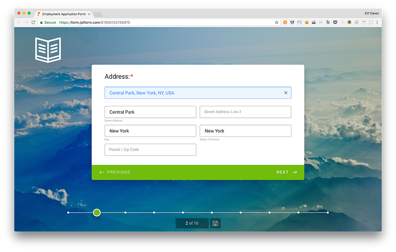
Our new product, JotForm Cards, presents each question separately. But in the case of traditional forms, placing dividers in (to visually break sections up) reduces overwhelm.
Communicating distinctions between groups don’t require much visual difference. In fact, too much contrast can distract people and stop them from being able to scan the form. The focus should always be on a form’s content rather than its presentation.
As information design expert Edward Tufte points out:
“Information consists of differences that make a difference.”
Basically, any visual element that isn’t actively signifying something makes it worse.
Multi-page or single page?
Is it better to group each topic on a single page or divide them across a series of pages? How many pages should there be? The answer is… it depends.
Some types of forms work better with multiple sections on one page and others work better with various pages, depending on length and content, and the users’ mental model.
When distinct topics are short enough to fit into a few sections, a single page will probably work best. When each section begins to run long, multiple pages may be required to break up the conversation.
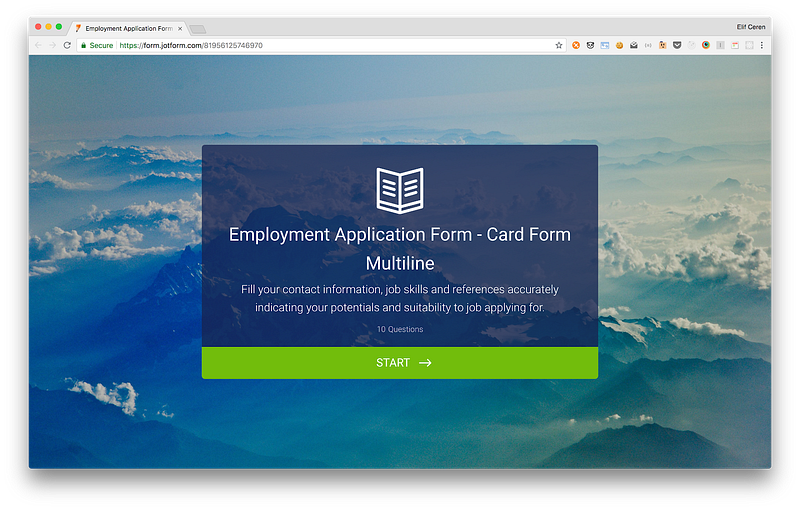
When we released Card Forms, the JotForm Data Team conducted research about conversion rate (Form View/ Successful submission rate) of our new cards. The study showed that even in short forms (up to 7–8 fields), asking questions in a single page provided a better conversion rate.
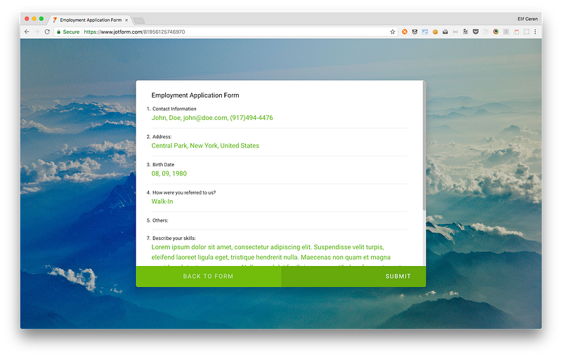
Because of this set-up, we also added a summary page and a progress bar. This displays how many questions there are remaining and how many have been completed, motivating users and encouraging them to finish the form with the endowed progress effect.
Distinguish between primary and secondary actions
Grouping questions also have the advantage of distinguishing between primary and secondary actions. Primary and secondary actions let users complete forms without any issues.
A primary example encourages you to complete the form. A secondary action takes you back when necessary. The most common example of primary and secondary actions is moving forward or backward.
But there are also use cases for secondary actions such as Save for later, preview, export and reset.
Advantages of using input groups and flexible inputs
Finally, there is the question of flexible input vs. form validation.
Form validation = required field, for example, someone’s name.
These should always be visible. However, when an input is flexible, it can be useful to offer the option of collapsing the field to minimize overwhelm.
Carefully consider the right input field for the type of answer you’re looking for. Could it be yes or no? A predefined selection?
Whenever possible, give affordances to help people answer questions quickly. Having predefined answers or yes/no questions will also help you collect and analyze data more easily.
You can always add an ‘other’ section if necessary.
Equally, remember to indicate which fields are optional and which aren’t. The (*) symbol is well-understood to mean ‘required’.
Associate required or optional indicators with input labels to demonstrate which questions need to be answered. The (*) symbol is well-understood to mean ‘required’.
Final thoughts
Yes, forms exist to gather data — but they do so through a collaborative process between you and your users. Skillful form building is not a mechanical process: it involves reflecting on what you are trying to achieve, and what’s the best way to achieve it.
That means, amongst other things, thinking about which data type will be most useful to answer the questions at hand. Focused forms are most likely to yield actionable results.
Building an effective form is a creative process, but forms are no place to get fancy. Keep it as simple, short and focused as possible. Good luck.
When undertaking any sort of performance optimisation work, one of the very first things we learn is that before you can improve performance you must first measure it. Without being able to measure the speed at which something is working, we can’t tell if the changes being made are improving the performance, having no effect, or even making things worse.
Many of us will be familiar with working on a performance problem at some level. That might be something as simple as trying to figure out why JavaScript on your page isn’t kicking in soon enough, or why images are taking too long to appear on bad hotel wifi. The answer to these sorts of questions is often found in a very familiar place: your browser’s developer tools.
Over the years developer tools have been improved to help us troubleshoot these sorts of performance issues in the front end of our applications. Browsers now even have performance audits built right in. This can help track down front end issues, but these audits can show up another source of slowness that we can’t fix in the browser. That issue is slow server response times.
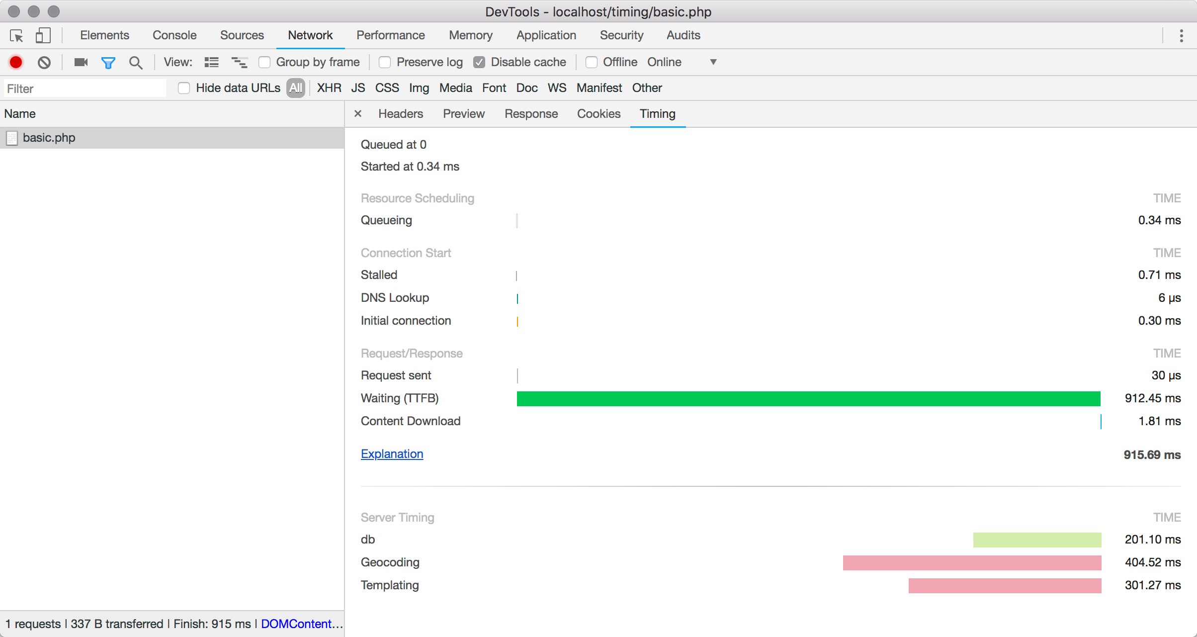
Time to First Byte
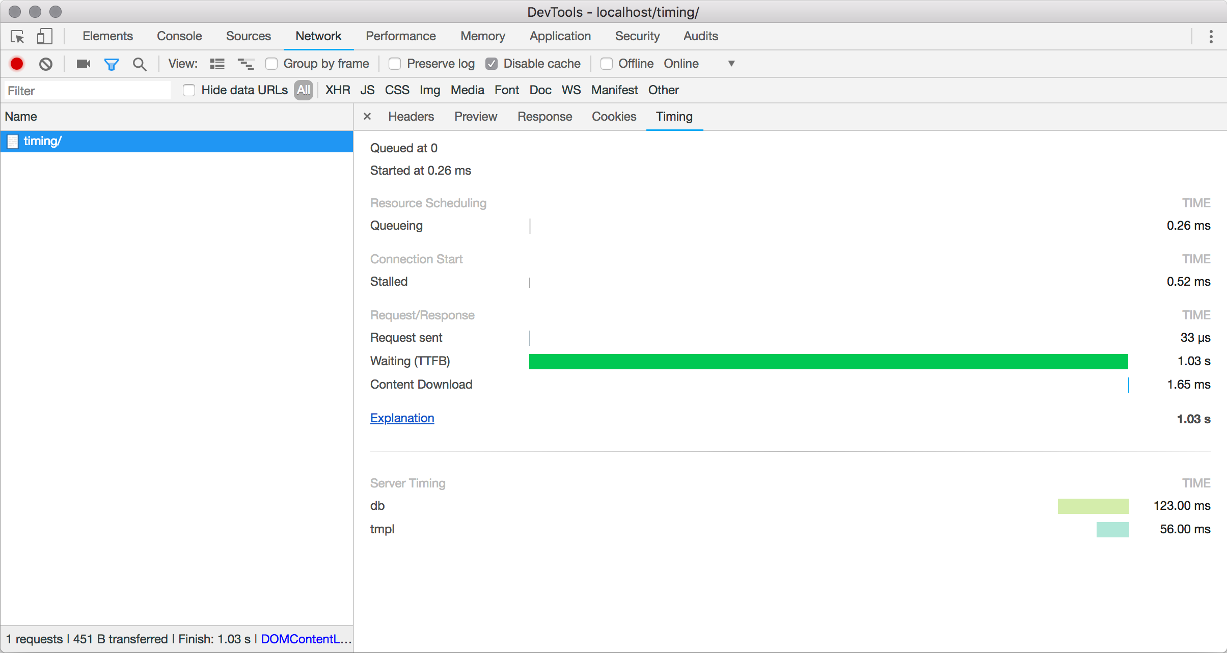
There’s very little browser optimisations can do to improve a page that is simply slow to build on the server. That cost is incurred between the browser making the request for the file and receiving the response. Studying your network waterfall chart in developer tools will show this delay up under the category of “Waiting (TTFB)”. This is how long the browser waits between making the request and receiving the response.
In performance terms this is know as Time to First Byte – the amount of time it takes before the server starts sending something the browser can begin to work with. Encompassed in that wait time is everything the server needs to do to build the page. For a typical site, that might involve routing the request to the correct part of the application, authenticating the request, making multiple calls to backend systems such as databases and so on. It could involve running content through templating systems, making API calls out to third party services, and maybe even things like sending emails or resizing images. Any work that the server does to complete a request is squashed into that TTFB wait that the user experiences in their browser.
Inspecting a document request shows the time the browser spends waiting for the response from the server.
So how do we reduce that time and start delivering the page more quickly to the user? Well, that’s a big question, and the answer depends on your application. That is the work of performance optimisation itself. What we need to do first is measure the performance so that the benefit of any changes can be judged.
The Server Timing Header
The job of Server Timing is not to help you actually time activity on your server. You’ll need to do the timing yourself using whatever toolset your backend platform makes available to you. Rather, the purpose of Server Timing is to specify how those measurements can be communicated to the browser.
The way this is done is very simple, transparent to the user, and has minimal impact on your page weight. The information is sent as a simple set of HTTP response headers.
Server-Timing: db;dur=123, tmpl;dur=56
This example communicates two different timing points named db and tmpl. These aren’t part of the spec – these are names that we’ve picked, in this case to represent some database and template timings respectively.
The dur property is stating the number of milliseconds the operation took to complete. If we look at the request in the Network section of Developer Tools, we can see that the timings have been added to the chart.
A new Server Timing section appears, showing the timings set with the Server-Timing HTTP header.
The Server-Timing header can take multiple metrics separated by commas:
Server-Timing: metric, metric, metric
Each metric can specify three possible properties
A short name for the metric (such as db in our example)
A duration in milliseconds (expressed as dur=123)
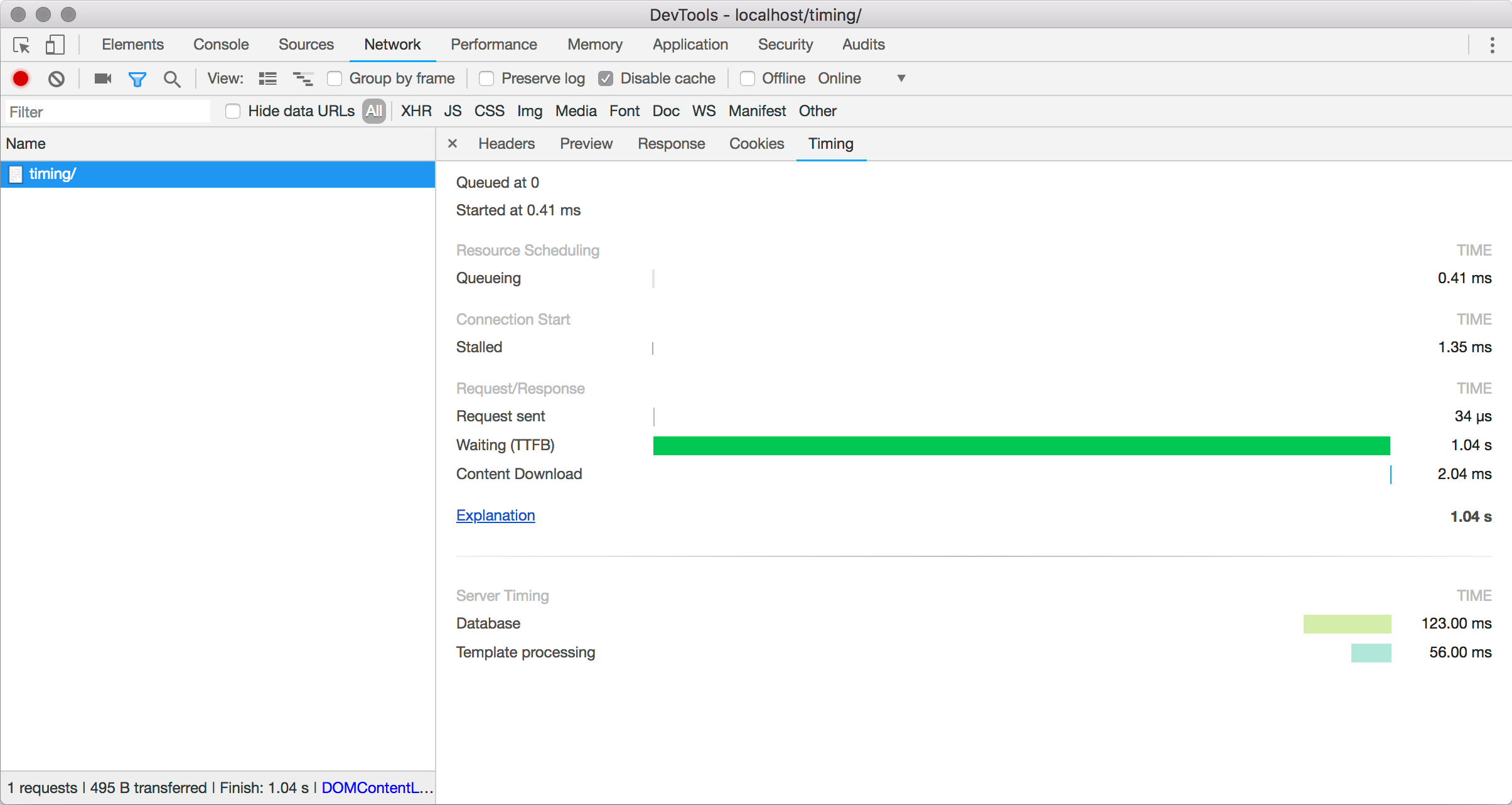
A description (expressed as desc="My Description")
Each property is separated with a semicolon as the delimiter. We could add descriptions to our example like so:
The names are replaced with descriptions when provided.
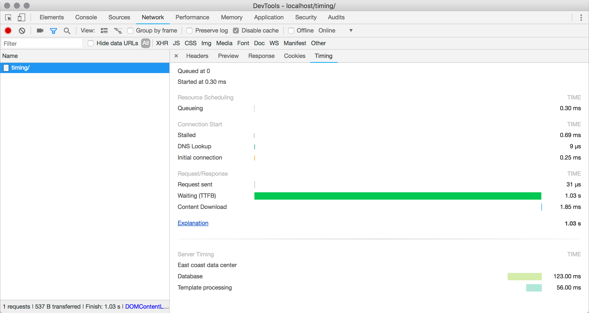
The only property that is required is name. Both dur and desc are optional, and can be used optionally where required. For example, if you needed to debug a timing problem that was happening on one server or data center and not another, it might be useful to add that information into the response without an associated timing.
Server-Timing: datacenter;desc="East coast data center", db;dur=123;desc="Database", tmpl;dur=56;desc="Template processing”
This would then show up along with the timings.
The “East coast data center” value is shown, even though it has no timings.
One thing you might notice is that the timing bars don’t show up in a waterfall pattern. This is simply because Server Timing doesn’t attempt to communicate the sequence of timings, just the raw metrics themselves.
Implementing Server Timing
The exact implementation within your own application is going to depend on your specific circumstance, but the principles are the same. The steps are always going to be:
Time some operations
Collect together the timing results
Output the HTTP header
In pseudocode, the generation of response might look like this:
The basics of implementing something along those lines should be straightforward in any language. A very simple PHP implementation could use the microtime() function for timing operations, and might look something along the lines of the following.
class Timers
{
    private $timers = [];

    public function startTimer($name, $description = null)
    {
        $this->timers[$name] = [
            'start' => microtime(true),
            'desc' => $description,
        ];
    }

    public function endTimer($name)
    {
        $this->timers[$name]['end'] = microtime(true);
    }

    public function getTimers()
    {
        $metrics = [];

        if (count($this->timers)) {
            foreach($this->timers as $name => $timer) {
                $timeTaken = ($timer['end'] - $timer['start']) * 1000;
                $output = sprintf('%s;dur=%f', $name, $timeTaken);

                if ($timer['desc'] != null) {
                    $output .= sprintf(';desc="%s"', addslashes($timer['desc']));
                }
                $metrics[] = $output;
            }
        }

        return implode($metrics, ', ');
    }
}
A test script would use it as below, here using the usleep() function to artificially create a delay in the running of the script to simulate a process that takes time to complete.
The Server Timings set in the example show up in the Timings panel with the delays configured in our test script.
Existing Implementations
Considering how handy Server Timing is, there are relatively few implementations that I could find. The server-timing NPM package offers a convenient way to use Server Timing from Node projects.
If you use a middleware based PHP framework tuupola/server-timing-middleware provides a handy option too. I’ve been using that in production on Notist for a few months, and I always leave a few basic timings enabled if you’d like to see an example in the wild.
For browser support, the best I’ve seen is in Chrome DevTools, and that’s what I’ve used for the screenshots in this article.
Considerations
Server Timing itself adds very minimal overhead to the HTTP response sent back over the wire. The header is very minimal and is generally safe to be sending without worrying about targeting to only internal users. Even so, it’s worth keeping names and descriptions short so that you’re not adding unnecessary overhead.
More of a concern is the extra work you might be doing on the server to time your page or application. Adding extra timing and logging can itself have an impact on performance, so it’s worth implementing a way to turn this on and off when required.
Using a Server Timing header is a great way to make sure all timing information from both the front-end and the back-end of your application are accessible in one location. Provided your application isn’t too complex, it can be easy to implement and you can be up and running within a very short amount of time.
If you’d like to read more about Server Timing, you might try the following:
We’ve been covering performance quite a bit — not just recently, but throughout the course of the year. Now, Harry Roberts weighs in by identifying three types of ways performance can be tested.
Of particular note is the first type of testing:
The first kind of testing a team should carry out is Proactive testing: this is very intentional and deliberate, and is an active attempt to identify performance issues.
This takes the form of developers assessing the performance impact of every piece of work they do as they’re doing it. The idea here is that we spot the problem before it becomes problematic. Prevention, after all, is cheaper than the cure. Capturing performance issues at this stage is much more preferable to spotting them after they’ve gone live.
I think about this type of performance all the time when I’m working on a team, although I’ve never had a name for it.
I guess what I’m always thinking about is how can we introduce front-end engineers into the design process as early as possible? I’ve found that the final product is much more performant in when front-end engineers and designers brainstorm solutions together. Perhaps collaborating on a performance checklist is a good place to start?
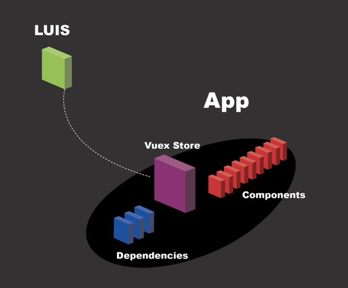
In this tutorial, we’ll pair Vue.js, three.js and LUIS (Cognitive Services) to create a voice-controlled web visualization.
But first, a little context
Why would we need to use voice recognition? What problem might something like this solve?
A while ago I was getting on a bus in Chicago. The bus driver didn’t see me and closed the door on my wrist. As he started to go, I heard a popping sound in my wrist and he did eventually stop as the other passengers started yelling, but not before he ripped a few tendons in my arm.
I was supposed to take time off work but, typical for museum employees at that time, I was on contract and had no real health insurance. I didn’t make much to begin with so taking time off just wasn’t an option for me. I worked through the pain. And, eventually, the health of my wrist started deteriorating. It became really painful to even brush my teeth. Voice-to-text wasn’t the ubiquitous technology that it is today, and the best tool then available was Dragon. It worked OK, but was pretty frustrating to learn and I still had to use my hands quite frequently because it would often error out. That was 10 years ago, so I’m sure that particular tech has improved significantly since then. My wrist has also improved significantly in that time.
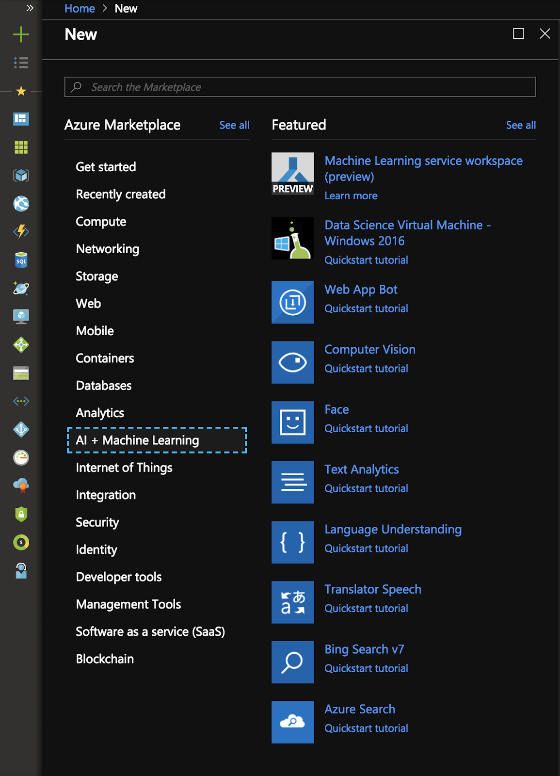
The whole experience left me with a keen interest in voice-controlled technologies. What can we do if we can control the behaviors of the web in our favor, just by speaking? For an experiment, I decided to use LUIS, which is a machine learning-based service to build natural language through the use of custom models that can continuously improve. We can use this for apps, bots, and IoT devices. This way, we can create a visualization that responds to any voice — and it can improve itself by learning along the way.
After picking New ? AI/Machine Learning, we’ll select “Language Understanding” (or LUIS).
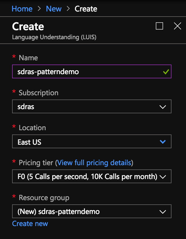
Then we’ll pick out our name and resource group.
We’ll collect our keys from the next screen and then head over to the LUIS dashboard
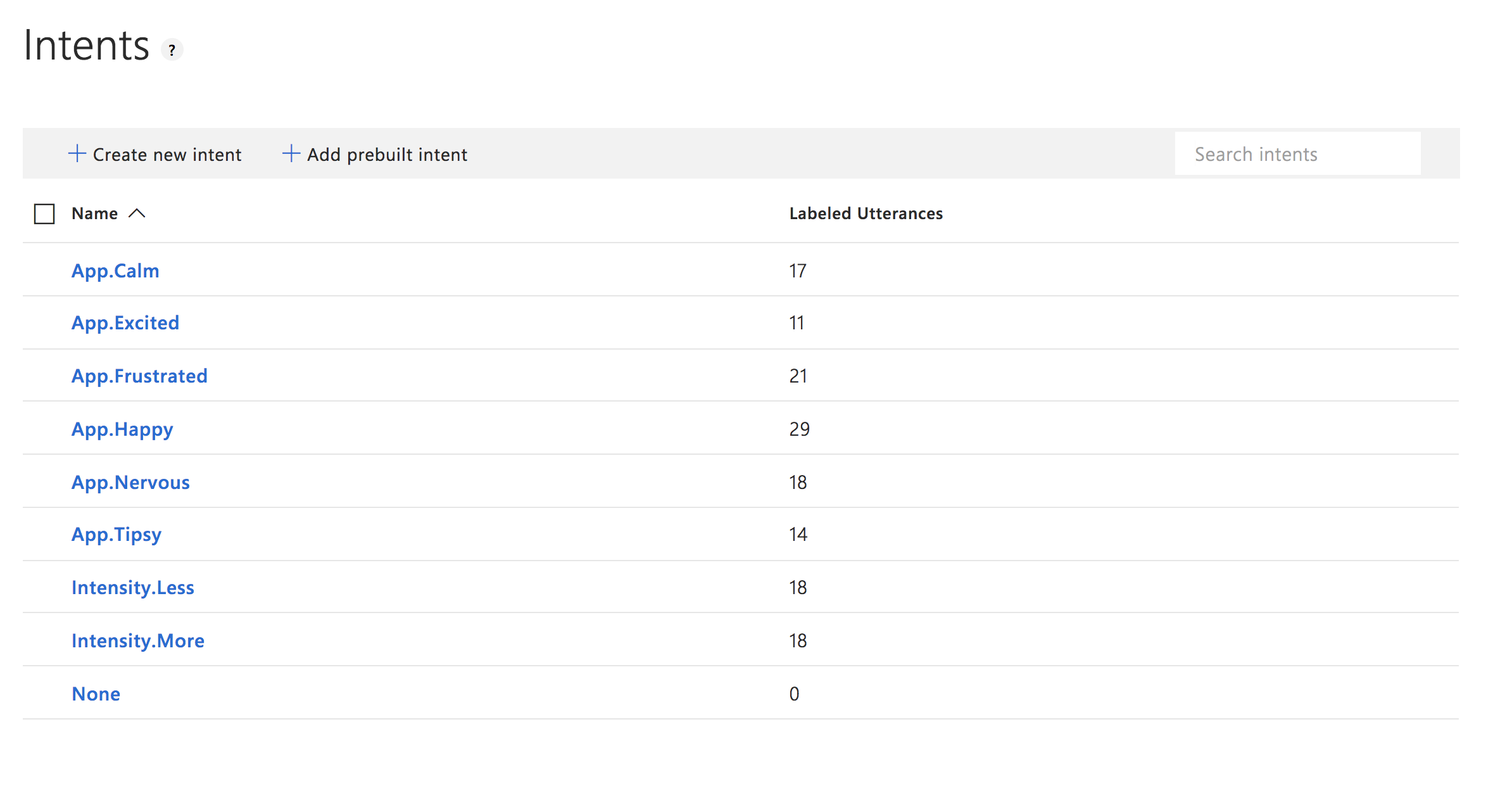
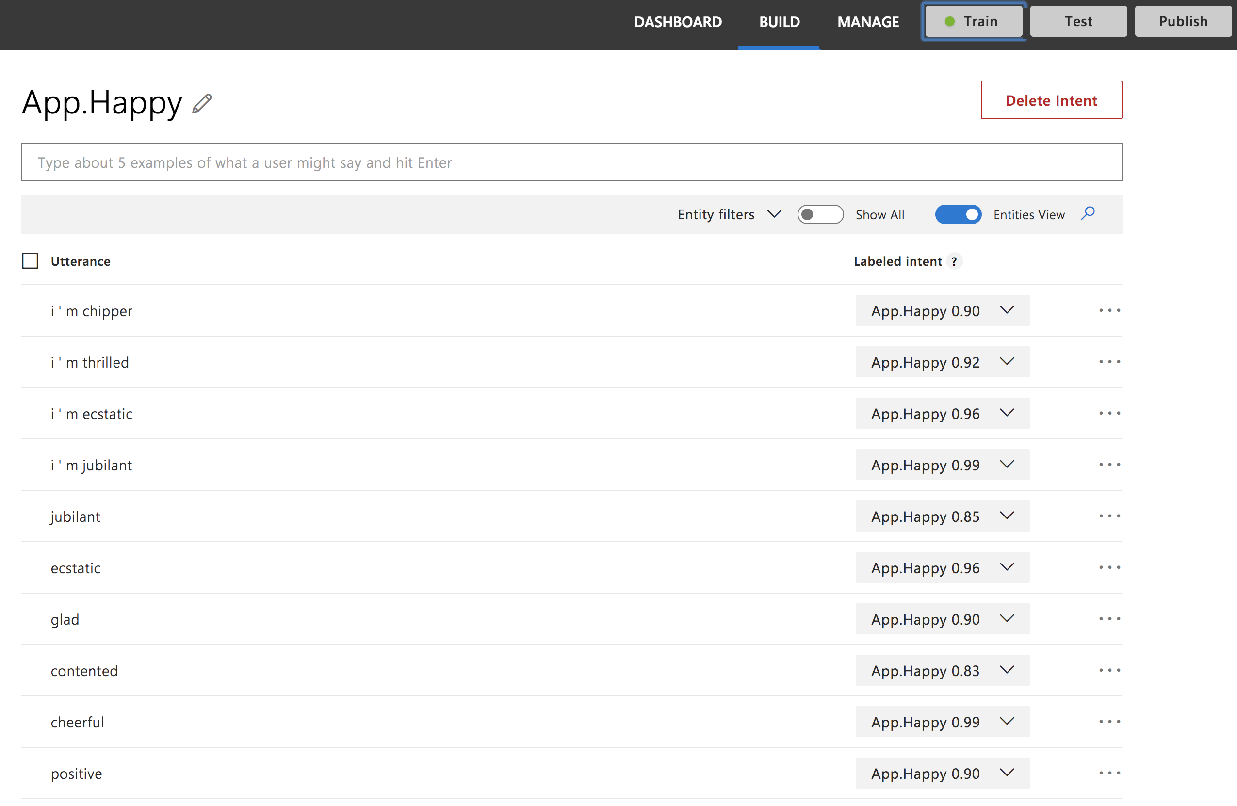
It’s actually really fun to train these machines! We’ll set up a new application and create some intents, which are outcomes we want to trigger based on a given condition. Here’s the sample from this demo:
You may notice that we have a naming schema here. We do this so that it’s easier to categorize the intents. We’re going to first figure out the emotion and then listen for the intensity, so the initial intents are prefixed with either App (these are used primarily in the App.vue component) or Intensity.
If we dive into each particular intent, we see how the model is trained. We have some similar phrases that mean roughly the same thing:
You can see we have a lot of synonyms for training, but we also have the “Train” button up top for when we’re ready to start training the model. We click that button, get a success notification, and then we’re ready to publish. ?
Setting up Vue
We’ll create a pretty standard Vue.js application via the Vue CLI. First, we run:
vue create three-vue-pattern
# then select Manually...

Vue CLI v3.0.0

? Please pick a preset:
  default (babel, eslint)
❯ Manually select features

# Then select the PWA feature and the other ones with the spacebar
? Please pick a preset: Manually select features
? Check the features needed for your project:
  ◉ Babel
  ◯ TypeScript
  ◯ Progressive Web App (PWA) Support
  ◯ Router
  ◉ Vuex
  ◉ CSS Pre-processors
  ◉ Linter / Formatter
  ◯ Unit Testing
  ◯ E2E Testing

? Pick a linter / formatter config:
  ESLint with error prevention only
  ESLint + Airbnb config
❯ ESLint + Standard config
  ESLint + Prettier

? Pick additional lint features: (Press <space> to select, a to toggle all, i to invert selection)
❯ ◉ Lint on save
  ◯ Lint and fix on commit

Successfully created project three-vue-pattern.
Get started with the following commands:

$ cd three-vue-pattern
$ yarn serve
This will spin up a server for us and provide a typical Vue welcome screen. We’ll also add some dependencies to our application: three.js, sine-waves, and axios. three.js will help us create the WebGL visualization. sine-waves gives us a nice canvas abstraction for the loader. axios will allow us a really nice HTTP client so we can make calls to LUIS for analysis.
yarn add three sine-waves axios
Setting up our Vuex store
Now that we have a working model, let’s go get it with axios and bring it into our Vuex store. Then we can disseminate the information to all of the different components.
intent and intensity will store the App, intensity, and intents, respectively. The score will store our confidence (which is a score from 0 to 100 measuring how well the model thinks it can rank the input).
For uiState, we have three different states:
idle – waiting for the user input
listening – hearing the user input
fetching – getting user data from the API
Both zoom and counter are what we’ll use to update the data visualization.
Now, in actions, we’ll set the uiState (in a mutation) to fetching, and we’ll make a call to the API with axios using the generated keys we received when setting up LUIS.
Then, once we’ve done that, we can get the top-ranked scoring intent and store it in our state.
We also need to create some mutations we can use to change the state. We’ll use these in our actions. In the upcoming Vue 3.0, this will be streamlined because mutations will be removed.
This is all pretty straightforward. We’re passing in the state so that we can update it for each occurrence — with the exception of Intensity, which will increment the counter up and down, accordingly. We’re going to use that counter in the next section to update the visualization.
In this action, we’ll commit the mutations we just went over or log an error if something goes wrong.
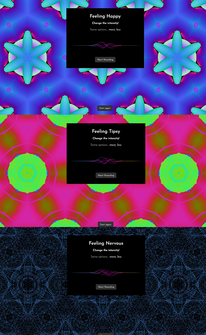
The way that the logic works, the user will do the initial recording to say how they’re feeling. They’ll hit a button to kick it all off. The visualization will appear and, at that point, the app will continuously listen for the user to say less or more to control the returned visualization. Let’s set up the rest of the app.
Setting up the app
In App.vue, we’ll show two different components for the middle of the page depending on whether or not we’ve already specified our mood.
Both of these will show information for the viewer as well as a SineWaves component while the UI is in a listening state.
The base of the application is where the visualization will be displayed. It will show with different props depending on the mood. Here are two examples:
I wanted to work with kaleidoscope-like imagery for the visualization and, after some searching, found this repo. The way it works is that a shape turns in space and this will break the image apart and show pieces of it like a kaleidoscope. Now, that might sound awesome because (yay!) the work is done, right?
Unfortunately not.
There were a number of major changes that needed to be done to make this work, and it actually ended up being a massive undertaking, even if the final visual expression appears similar to the original.
Due to the fact that we would need to tear down the visualization if we decided to change it, I had to convert the existing code to use bufferArrays, which are more performant for this purpose.
The original code was one large chunk, so I broke up some of the functions into smaller methods on the component to make it easier to read and maintain.
Because we want to update things on the fly, I had to store some of the items as data in the component, and eventually as props that it would receive from the parent. I also included some nice defaults (excited is what all of the defaults look like).
We use the counter from the Vuex state to update the distance of the camera’s placement relative to the object so that we can see less or more of it and thus it becomes more and less complex.
In order to change up the way that it looks according to the configurations, we’ll create some props:
createShapes() {
 this.bufferCamera.position.z = this.shapeZoom

 if (this.torusKnot !== null) {
   this.torusKnot.material.dispose()
   this.torusKnot.geometry.dispose()
   this.bufferScene.remove(this.torusKnot)
 }

 var shape = new THREE.TorusKnotGeometry(
     this.tConfig.a,
     this.tConfig.b,
     this.tConfig.c,
     this.tConfig.d
   ),
   material
 ...
 this.torusKnot = new THREE.Mesh(shape, material)
 this.torusKnot.material.needsUpdate = true

 this.bufferScene.add(this.torusKnot)
},
As we mentioned before, this is now split out into its own method. We’ll also create another method that kicks off the animation, which will also restart whenever it updates. The animation makes use of requestAnimationFrame:
We’ll create a computed property called shapeZoom that will return the zoom from the store. If you recall, this will be updated as the user’s voice changes the intensity.
In data, we’re also storing some things we’ll need for instantiating the three.js scene — most notably making sure that the camera is exactly centered.
There’s more to this demo, if you’d like to explore the repo or set it up yourself with your own parameters. The init method does what you think it might: it initializes the whole visualization. I’ve commented a lot of the key parts if you’re peeping at the source code. There’s also another method that updates the geometry that’s called — you uessed it — updateGeometry. You may notice a lot of vars in there as well. That’s because it’s common to reuse variables in this kind of visualization. We kick everything off by calling this.init() in the mounted() lifecycle hook.
It’s pretty fun to see how far you can get creating things for the web that don’t necessarily need any hand movement to control. It opens up a lot of opportunities!


