The Internet has made life and shopping convenient.
A little… too convenient, perhaps.
Yet at the same time, it has given modern-day con artists a versatile tool for ripping off the unsuspecting and unwary. Today’s internet scammers, just like the charlatans and snake oil salesmen of yesteryear, are after one thing: your money. New research from Bromiumreveals that cyber crime in 2018 is projected to yield criminals more than $1.5 trillion.
During the holiday season, the number of fraudulent websites will increase. Cyber criminals are unscrupulous, but they’re also creative. They excel at making fraudulent websites look like the real thing.
If you plan to shop online (who doesn’t?), pay close attention to the following and you can start detecting a fake website in about five seconds.
1. Poor Grammar and Spelling
Major retailers like Amazon, Walmart, Home Depot, and Best Buy spend millions of dollars annually on marketing. This includes spending money on experienced copywriters. Spelling, punctuation, and grammar are checked and rechecked by editors before it goes live.
Typically, cyber criminals do not have the time, resources, or mastery of the English language to avoid these errors. If a website has odd phrasing, questionable punctuation, or incorrect spelling throughout its copy, alarm bells should be going off in your head. Chances are that the site is fraudulent.
2. If the Deal Is Too Good to Be True…
Black Friday and Cyber Monday are some of the best days to get deep discounts on the products you have wanted all year. Retailers offload goods from the current year to make way for the next year’s models.
But they are still in the business of making money. If you visit a site and see the latest iPad Pro on sale at a 95% discount, know that you have a 99% chance of never seeing the thing after you pay for it..
3. Look at the Website’s Connection Type
A website with the “HTTPS” tag is more secure and trustworthy. A site that has the “HTTP” tag is not. It’s that simple. With the former, a site has gone through security certification that the majority of illegitimate sites ignore. There are a few things to keep in mind:
Sites with “HTTPS” connections can still be unreliable. Use the connection type in conjunction with other forms of verification to determine if the site is trustworthy or not.
Verify that the payment page is a “HTTPS” page.
Click the padlock on the upper left corner of the URL to verify the details of the site, such as the encryption used.
4. Check the Domain Name
A favorite tool of scammers is to create website addresses that are close but not exactly the same as large brands or companies. They hope that you will not notice that yahoo.com has been replaced by yah00.com or that Amazon.com has been replaced by Amaz0n.net.
They are betting that you’re going to skim over the address bar and the domain name. This is one of the reasons why it’s important to double check your address bar if you are redirected to a commerce site from another page.
5. How Old Is the Domain?
Amazon was founded on July 5, 1994 in Seattle, Washington. Its website Amazon.com was founded on October 31, 1994. This information is easily available using the Whois Lookup domain tracker https://whois.domaintools.com. Any site founded in 2018 claiming to be Amazon.com is fraudulent. The same is true with other websites.
Cyber criminals hope that their victims either do not know how to or simply will not research the age of the last-minute fraudulent sites they put together around holiday time. They hope that their real-looking websites will be enough to trick people into handing over their personal information.
When you look up a website and see how long it has been in business, you get a good overall sense for its veracity.
6. Run a Virus Scan
A website that has more pop-ups than legitimate content should be viewed suspiciously. While the mere presence of ads on the site shouldn’t be taken as positive proof of fraudulent intentions, this could be an indication that viruses, malware, or phishing attempts lie in wait.
Make sure you’ve had a recent virus scan and don’t be shy about running another one just for kicks. It’s easier to stop malware at the gate than try to root it out after it’s in your system.
7. Only Use Secure Payment Options
Legitimate e-commerce websites should offer standard payment options, including major credit cards and PayPal. If you are being asked to purchase your new iPad using a money order, a wire transfer, or some other form of unsecured and non-refundable payment, run away. This is true even if the rest of the site looks legitimate.
Look for approval by the Better Business Bureau (BBB) or similar organizations. While hackers often think to include a shoddy replica sticker proclaiming their safety, rarely do they bother to link it back to the actual issuer. Hover your cursor over the sticker and see where it leads.
8. Take Basic Steps To Secure Your Computer
Even cyber security professionals find themselves inadvertently visiting fraudulent and potentially dangerous websites, so it’s reasonable to expect that the same thing will happen to you. However, there are some basic measures you can take to secure your computer and its contents.
For example, keep up with system and software security updates. Updates can seem like an annoyance, but they are designed to cover security holes that cyber criminals have found. This includes keeping your OS and all other software that runs on your computer up-to-date.
Choose a strong, no-logging VPN service to keep your data private when surfing the web. Through data encryption, It prevents cyber criminals from learning information such as your location and internet usage habits. It allows you to safely navigate the web anonymously.
Keep your firewalls enabled. They serve as a barrier between your computer network and the Internet. They protect your computer by stopping threats from entering the system and preventing threats from spreading between your devices.
Adjust your browser settings. This allows a high level of privacy while you browse and will prevent websites from tracking your movements by blocking cookies. Many safety options are disabled by default. You may be unwittingly exposing yourself more than you think each time you browse.
The Bottom Line
Online shopping is an awesome experience as it allows you to search for what you want from the privacy and comfort of your home. Millions of online transactions are made yearly with no issue.
Don’t be afraid of shopping online, and don’t be afraid of fake websites. Simply empower yourself by knowing what to look for and use common sense. If it doesn’t feel right, run away.
By doing these things, you will be able to take control of your online experience.
I feel the same this year as I have in the past. Web standards, as an overall idea, has entirely taken hold and won the day. That’s worth celebrating, as the web would be kind of a joke without them. So now, our job is to uphold them. We need to cry foul when we see a browser go rogue and ship an API outside the standards process. That version of competition is what could lead the web back to a dark place where we’re creating browser-specific versions. That becomes painful, we stop doing it, and slowly, the web loses.
For the past couple of weeks, I’ve been building our UI Kit at Gusto, where I work, and this is a Figma document that contains all of our design patterns and components so that designers on our team can hop in, go shopping for a component that they need, and then get back to working on the problem that they’re trying to solve.
There’s a couple things that I’ve learned since I started. First, building a UI Kit is immensely delicate work and takes a really long time (although it happens to be very satisfying all the while). But, most importantly, embedding Figma components within other components is sort of magic.
Here’s why.
First, it’s important to note that I’ve tried to break down our components into the smallest, littlest chunks. So, for example, our Breadcrumbs, Tabs, and Progress Bar components are all separate from one another and I’ve dumped them all into a Symbols page.
Here’s an example of how I’ve started to build our form elements:
From what I can tell, this is how a lot of UI Kits are designed — there’s a welcome page that introduces what this document is and how to use it; there’s a symbols page that the design systems folks will maintain that has everything from buttons to forms inside it as symbols or components; and then there’s typically another page that has examples of these symbols that represent the final application.
Shopify’s design system, Polaris, does also this with their Sketch file, but so do a lot of examples I’ve seen from other big design teams:
But anyway, going back to my design in Figma — notice below that a forward slash (/) is used in the name of ProgressBar/Two and ProgressBar/Three components.
Well, that’s Figma’s naming convention for identifying Instances. What this means is that when a designer drags in the ProgressBar component from the UI Kit, they can switch between different options, like this:
That’s nifty! But once I broke up our UI into these tiny components, I started to wonder how I might combine these pieces together to make things even easier for our design team. I soon realized that in our app we have navigation items like breadcrumbs or progress bars but they always have a title associated with them. Once I figured that out, I started a series of new components called Header/Default, Header/Breadcrumbs, Header/ProgressBar, etc., which have all these components embedded within them.
So, now when a designer drags in the Header component into their mockups, they can do the following:
We’re switching between the different Header instances there and that doesn’t look like much, yet. But! Since we’re nesting components within our Header component, designers can jump down into the subcomponents, like ProgressBar and update that, too:
How neat is that? And again, this doesn’t look particularly useful just yet but nesting components within larger components means that you can start to use them in clever ways.
Where this gets interesting is here: at Gusto, we have two different UIs for our types of customers. We have admins that run payroll and then their employees that can access their account to see how much they’ve been paid. There’s different navigation and options for both, so I created two components for them: Frame/Admin and Frame/Employee.
These two components have the sidebar and navigation items but are then placed into a separate component called Layout/Default where we’ve placed our Header component. But since these components are instances and nested together, we can begin to click-clack bits of the UI together to get the precise interface that we want.
Now, whenever designers need to switch between different UIs, they can use these nested components and instances to toggle between them super fast. I’ve only just started experimenting with this but the idea is that by using these nested components you give folks a way to toggle between the different variants inside them whilst also providing a nice API for larger layouts.
If you’re using instances in Figma, Sketch, or another design tool — let me know! I’m constantly on the lookout for improving things here, but I think this is certainly a good start.
With DropInBlog, you can embed a blog into your site in only three minutes. A quick JavaScript/HTML widget, or a full-featured JSON API, is all it takes.
A headless blog you can take anywhere
Ever been working on your existing static site or anything that wasn’t built with WordPress, wanted to integrate a blog, but then couldn’t find a clean solution?
Now you can quickly integrate a full featured blog into any existing site. Actually, any existing page. Drop it right into your existing template. It’s so easy you can be up and running in just a few minutes. Check out this live example:
You’ll feel at home with the simple admin panel. Effortlessly create posts, categories, and authors. Tweak the blog output settings and enable features like share buttons, Disqus or Facebook comments with a couple of clicks.
You can embed your blog on a site in about three quick minutes. From there, you have a ton of control to customize and even put a variety of widgets to use, like Author List, Recent Post List, Category List… and more!
Check out this short video to see how quickly you can get up and running:
There are a few integration options ranging from the drop-dead simple JavaScript method to the super flexible JSON API. You get to choose what works best for you.
It’s far too easy to look back and imagine that everything was better then than it is now. God knows I miss being a skinny teenager, but I don’t want the acne back. The hormones can just shove right off, too.
Even so, there are things I miss about being younger, and frankly a bit naïve.
Lately, there has been conversation about the nature of the Internet, and many people seem to feel much as I do about my teenage years: that is to say, they miss the relative innocence. Though once reviled, dancing baby .GIFs and elements seem like high art compared to the click-bait, the passionate-yet-incomprehensible comment wars, and the desperate attempts of corporations to look “hip”. We’d be hard-pressed to look around and say, “Yes, this really is better.”
We even miss Tom, and his kind of desperate-feeling attempt to be everybody’s friend
We miss the utopianism of the early Internet pioneers. We miss the creativity of people just learning HTML, from the days of the first pages, to the days of the customized MySpace page. We even miss Tom, and his kind of desperate-feeling attempt to be everybody’s friend; because at least he was trying to be friends, not tell you how your every opinion was wrong.
And so here we are, in a new world of our own making, and we wish we’d made it differently. Some people blame corporations, and their focus on profit over community. Others more or less blame the blog format, and the press of people who all want to be a little bit famous. There are more than a few who blame social media.
None of these people are entirely wrong, of course. We could have done better. We can do better. We can make a friendlier Internet that promotes creativity. What we cannot do is go back.
“You can’t go home again.” For those unfamiliar, it’s an old saying based on the idea that once you leave a place, you can never truly return to what once was. Even if the place you left has stayed the same, you will have changed. The you that comes back is not the you that left.
We can do better. We can make a friendlier Internet that promotes creativity.
We can’t go back to the old Internet because we have changed. Like Adam and Eve in the proverbial garden, we now have knowledge of both the good the Internet can do, and the evil. Businesses have seen how much money can be made. The near-monopolies of the Internet have no reason to give up their advantages.
Elsewhere, communities have seen how, when there are not enough rules, or when the rules are not enforced, the loudest and most violent voices will oppress the rest. We have also seen that with too many rules, and inflexible enforcement, the bureaucrats will become the oppressors.
Knowing what we know now, we cannot go back to the wild west days of the Internet, because it’s unlikely that most of us could ever embrace that sort of potential without the fear born of our experience. Whatever the Web becomes next, I hope it has the better qualities of the Internet of the past, but it will not, perhaps cannot, be the same.
Okay, that’s quite enough mourning of our collective innocence. There are things we can reasonably do to help improve the state of the Internet, and after all that, I’d like to include a few I thought of.
Get Political
Now I don’t mean that you should tweet at your ideological opponents more, and I’m not going to tell you who to vote for. What I am going to say is that most politicians in most governments are sorely ignorant what what the Internet truly is, and how it works. Watching Mark Zuckerberg getting questioned was one of the more painful things a nerd could ever watch. Don’t even get me started on the mess that was/is the EU’s attempt to redefine copyright law. Articles 11 and 13 are nightmarish concepts.
Watching Mark Zuckerberg getting questioned was one of the more painful things a nerd could ever watch
If we’re going to bring back some of the fun to the Internet, we need to make sure our politicians are better educated about it. I’m not an expert on political activism; but perhaps we could all stand to reach out to our local politicians more, and not just when they’re about to take away half of our online rights through ignorance.
Make Alternatives More Attractive
For example: many video creators are feeling stifled under YouTube’s arcane and sometimes arbitrary sets of rules, and many a creator has lost their source of revenue overnight. You see, YouTube has become so massive that many video creators wouldn’t even think of putting their content elsewhere, which makes the platform even bigger. That centralization gives YouTube massive power over millions of creators, and their algorithms more or less define what many would-be artists create.
So on top of controlling smaller creators’ revenue, one website is having an out-sized impact on entire cultures. That is antithetical to the spirit of the Internet as it was intended to be. Some smart cookies have decided to try to alleviate this problem, and other crises caused by corporate near-monopolies, by creating decentralized versions of YouTube, decentralized social networks, and even decentralized versions of the Internet itself.
Alternatives to massive sites need more tangible, immediate benefits
These alternatives face one major problem (besides plain old logistics): attracting a user base in the first place. This is normal for any business breaking into a crowded market, but many of these projects advertise themselves by saying things like, “We’re not corporate and evil like Google.” The problem is that this is not something the average user cares about. We already give away our information freely, so privacy isn’t going to sell it either. Alternatives to massive sites need more tangible, immediate benefits.
Support Efforts That Lower the Web’s Creative Entry Requirements
We, as people who love the Internet, need to each make our own efforts to improve it. But we should also remember that there are plenty of people out there already doing what they can, and they need some love.
One of my favorite examples is that of NeoCities, which we’ve previously discussed here on WDD. Basically, it’s a place where anyone can create a basic HTML/CSS site about anything they like, for free, in the spirit of the old GeoCities sites. The idea is to encourage more people to try making sites for themselves with the lowest possible barrier to entry.
Projects like these need ongoing support, and frankly deserve free advertising. So that’s why NeoCities is getting a link.
Be Kind, and Forgive
If the Web is going to change (again), people will have to change (again). And as people change, we’ll need to be ready to forgive. We’ve all made mistakes in the past, from simply saying rude things online, to building tools that might have had a part in making the Internet a less friendly place. What’s worse is that the Internet has a better memory than we do.
as people change, we’ll need to be ready to forgive
If we’re going to make massive, sweeping changes to make the Internet more fun, and weird, and friendly, we need to be fun, weird, and friendly. More importantly, we’ll need to be kinder. We may find ourselves needing to be kind even to those who took part in making the Internet the unfriendly place it is now. People can and do grow and change, and if we’re going to make a better world, we can’t hold their past mistakes against them (so long as those mistakes are truly in the past).
Ultimately, the people on the Internet are the Internet, and we can’t go home again. We can build a new home, though.
What are you looking forward to in December? Spending time with family and friends during the holidays, watching the birds gather in your snowy backyard, or celebrating “Bathtub Party Day” maybe? These are just some of the things that inspired artists and designers to create their desktop wallpapers this month.
All wallpapers in this post come in versions with and without a calendar for December 2018 and can be downloaded for free — as it has been our monthly tradition since more than nine years already. To cater for an extra bit of December joy, we also collected some wallpaper favorites from past years at the end of the post. Happy December and happy holidays!
All images can be clicked on and lead to the preview of the wallpaper,
You can feature your work in our magazine by taking part in our Desktop Wallpaper Calendar series. We are regularly looking for creative designers and artists to be featured on Smashing Magazine. Are you one of them?
Christmas Wreath
“Everyone is in the mood for Christmas when December starts. Therefore I made this Christmas wreath inspired wallpaper. Enjoy December and Merry Christmas to all!” — Designed by Melissa Bogemans from Belgium.
“During Christmas season, in the cold, colorless days of winter, Cardinal birds are seen as symbols of faith and warmth! In the part of America I live in, there is snowfall every December. While the snow is falling, I can see gorgeous Cardinals flying in and out of my patio. The intriguing color palette of the bright red of the Cardinals, the white of the flurries and the brown/black of dry twigs and fallen leaves on the snow-laden ground, fascinates me a lot, and inspired me to create this quaint and sweet, hand-illustrated surface pattern design as I wait for the December 2018 snowfall in my town!” — Designed by Gyaneshwari Dave from the United States.
“December is all about coziness and warmth. Days are getting darker, shorter and colder. So a nice cup of hot cocoa just warms me up.” — Designed by Hazuki Sato from Belgium.
“You know that warm feeling when you get to spend cold winter days in a snug, homey, relaxed atmosphere? Oh, yes, we love it too! It is the sentiment we set our hearts on for the holiday season, and this sweet snowy tenderness is for all of us who adore watching the snowfall from our windows. Isn’t it romantic?” — Designed by PopArt Studio from Serbia.
“The tiny flakes of snow have just begun to shower and we know it’s the start of the merry hour! Someone is all set to cram his sleigh with boxes of love as kids wait for their dear Santa to show up! Rightly said, ’tis the season of snow, surprise and lots and lots of fun! Merry Christmas!” — Designed by Sweans Technologies from London.
“December 5th is also known as Bathtub Party Day, which is why I wanted to visualize what celebrating this day could look like.” — Designed by Jonas Vanhamme from Belgium.
“Everything that reminds me of the cold days of December. I’ve tried to put everything in one illustration, the snow, hot coffee, mountains, snowman. Also my illustration is blue, it’s a cold color, so this give the illustration more of a winter effect.” — Designed by Dennis van den Heuvel from Belgium.
“‘Christmas waves a magic wand over this world, and behold, everything is softer and more beautiful.’ (Norman Vincent Peale)” — Designed by Suman Sil from India.
“Of all the months of the year, there is not a month so welcome to the young or so full of happy associations as this last month of the year. A month of giving, celebrations, and holidays. Christmas month is here. Make this last month of the year special for you and the ones around you.” — Designed by Procurement Software from India.
“Have you ever noticed how people have characteristic (or weird) poses playing instruments? It was my inspiration for drawing very simple and funny stick-figure musicians. Over the years I have drawn everything from violinists to pipa players (Chinese instrument) and from electric guitarists to tubaists. I never get bored of drawing new instrumentalists, ensembles or, in this case, a Christmas band. I wish you a very happy December with lots of music!” — Designed by Franke Margrete from The Netherlands.
“December is that time of the year where snows starts to fall. It’s from this moment that we can go skiing and snowboarding again. It’s the best time of the year.” — Designed by Jasper Bogaert from Belgium.
“December is when winter begins, so I decided to go for some nice, cold, pastel colors and a wintery scenario. The ram is a family-related symbol and it’s cute, so I named it Meeeh.” — Designed by Ana Matos from Portugal.
“December always reminds me of snow and being with other people. That’s why I created two snowflakes Snow & Flake who are best buddies and love being with each other during winter time.” — Designed by Ian De Lantsheer from Belgium.
“Christmas is the most wonderful time of the year! Once we’ve had our fill of turkey and welcomed the holiday season, we’re constantly encouraged to get into the spirit of the festive season.” — Designed by Mobile App Development from India.
“My parents are divorced so I don’t really like the holidays because it feels like I always have to choose between my mum and dad.” — Designed by Micheline Van Looveren from Belgium.
“December automatically brings to mind the Christmas spirit, the smell of delicious food, and the joy of opening beautiful presents. A couple of years ago I volunteered in a homeless shelter for a while. I even spent New Years’ Eve at the shelter. And ever since, Christmas also reminds me that a lot of others are much less fortunate than me…” — Designed by Kim Haesen from Belgium.
“‘Christmas gives us the opportunity to pause and reflect on the important things around us.’ (David Cameron)” — Designed by Pinki Ghosh Dastidar from India.
“December 15 is International Tea Day, so I thought to design a cup of tea, which also represents the cold weather during the winter.” — Designed by Hannah De Wachter from Belgium.
“I wanted to emphasize people who do not have enough money to celebrate Christmas like everyone else in the world.” — Designed by Angelique Buijzen from Belgium.
“‘We must go beyond textbooks, go out into the bypaths and untrodden depths of the wilderness and travel and explore and tell the world the glories of our journey.’ (John Hope Franklin)” — Designed by Dipanjan Karmakar from India.
Ready for a trip back in time? Here’s a collection of December goodies from past years that are too good to be forgotten. Please note that these wallpapers don’t come with a calendar.
“Since we often yearn for a peaceful and quiet place to work, we have found inspiration in the famous house on the River Drina in Bajina Bašta, Serbia. Wouldn’t it be great being in nature, away from the civilization, swaying in the wind and listening to the waves of the river smashing your house, having no neighbors to bother you? Not sure about the Internet, though…” — Designed by PopArt Studio from Serbia.
“There’s no more special time for a fire than in the winter. Cozy blankets, warm beverages, and good company can make all the difference when the sun goes down. We’re all looking forward to generating some hygge this winter, so snuggle up and make some memories.” — Designed by The Hannon Group from Washington D.C.
“Joy to the world, all the boys and girls now, joy to the fishes in the deep blue sea, joy to you and me.” — Designed by Morgan Newnham from Boulder, Colorado.
“‘Winter is the time for comfort, for good food and warmth, for the touch of a friendly hand and for a talk beside the fire: it is the time for home.’ (Edith Sitwell) — Designed by Dipanjan Karmakar from India.
“As a Belgian, December reminds me of snow, cosiness, winter, lights and so on. However, in the Southern Hemisphere it is summer at this time. With my illustration I wanted to show the different perspectives on December. I wish you all a Merry Christmas and Happy New Year!” — Designed by Jo Smets from Belgium.
“There’s nothing better than a tall glass of Golden Eggnog while sitting by the Christmas tree. Let’s celebrate the only time of year this nectar of the gods graces our lips.” — Designed by Jonathan Shears from Connecticut, USA.
“Santa’s tired of winter (and the North Pole) and is flying to the South part of the globe to relax a little bit. He deserves a little vacation, don’t you think?” — Designed by Ricardo Gimenes from Sweden.
“My brother-in-law has been on a design buzzword kick where he calls everything minimal, to the point where he wishes people, “Have a minimal day!” I made this graphic as a poster for him.” — Designed by Danny Gugger from Madison, Wisconsin, USA.
Please note that we respect and carefully consider the ideas and motivation behind each and every artist’s work. This is why we give all artists the full freedom to explore their creativity and express emotions and experience throughout their works. This is also why the themes of the wallpapers weren’t anyhow influenced by us, but rather designed from scratch by the artists themselves.
Thank you to all designers for their participation. Join in next month!
This is such an interesting conversation thread that keeps popping up year after year. The idea is that there could (and perhaps should) be in-browser tooling that helps web designers do their job. This tooling already exists to some degree. Let’s check in on perspectives from a wide array of people and companies who have shared thoughts on this topic.
Ahmad Shadeed wrote for us last year about how DevTools can be useful to designers in a number of ways, like changing state, content, colors, variables, etc.:
Editing things visually like that will give [designers] more control over some design details, they can tweak things in the browser and show the result to the developer to be implemented.
In a post titled, “A DevTools for Designers”, A.J. Kandy wrote that, just because you’re a designer, it doesn’t mean you don’t know how to code — but you might not be production-level and might be faster elsewhere:
I can edit front-end markup; I’m just way faster at drawing rectangles and arranging them into user interfaces. I’m technical, but not a coder.
It sparked a lot of responses and thoughts back when we originally shared the post:
It’s one thing to augment the existing DevTools to be better for designers. Firefox has done great work in that area with stuff like their animation tooling, flexbox and grid inspectors. At the same time, it’s also nice to see entirely fresh takes on how we can approach it! For example, Google dropped VisBug, an extension with designers squarely in mind. The video is only 30 seconds:
There have been a lot of opinions about browser extensions that allow design editing over the years. Check out options like Stylebot (Chrome store link).
There is another visual design browser plugin called Visual Inspector:
Don’t forget this classic trick:
My favourite trick to do in devTools is probably `document.designMode = “on”`. Turn it on and start editing text on any element on a website. Super cool! https://t.co/bdV9yONayTpic.twitter.com/rkC0ZsTCcD
Browser dev tools were traditionally useful for debugging JavaScript and inspecting network requests. More recently, we’ve seen browsers add graphical interfaces for manipulating CSS. Most browsers offer a color picker and eyedropper tool for selecting colors. In Chrome, this tool will helpfully display a color-contrast ratio. Chrome also offers a GUI for adding or tweaking text-shadow and box-shadow.
Perhaps design tooling will lead us in this direction in a big way?
?isual ? evelopment ? nvironments
??Just like most code-based developers use IDEs to develop software today, we’re going to start seeing multiple new VDEs emerge that enable a primarily-visual way of designing and shipping software.
… it’s possible to use Chrome DevTools to investigate competitors, see what’s not working with add-ons, change your viewport, understand page load timings and edit the web; all of which can help digital marketers, product managers or anyone working with a website to do their job more efficiently. It’s a tool which I use every day and I hope that you will too!
Hard to look at all that and not see this is where tooling is headed.
You know the concept of lazy loading images. It prevents the browser from loading images until those images are in (or nearly in) the browser’s viewport.
There are a plethora of JavaScript-based lazy loading solutions. GitHub has over 3,400 different lazy load repos, and those are just the ones with “lazy load” in a searchable string! Most of them rely on the same trick: Instead of putting an image’s URL in the src attribute, you put it in data-src — which is the same pattern for responsive images:
JavaScript watches the user scroll down the page
When the use encounters an image, JavaScript moves the data-src value into src where it belongs
The browser requests the image and it loads into view
The result is the browser loading fewer images up front so that the page loads faster. Additionally, if the user never scrolls far enough to see an image, that image is never loaded. That equals faster page loads and less data the user needs to spend.
“This is amazing!” you may be thinking. And, you’re right… it is amazing!
That said, it does indeed introduce a noticeable problem: images not containing the src attribute (including when it’s empty or invalid) have no height. This means that they’re not the right size in the page layout until they’re lazy-loaded.
When a user scrolls and images are lazy-loaded, those img elements go from a height of 0 pixels to whatever they need to be. This causes reflow, where the content below or around the image gets pushed to make room for the freshly loaded image. Reflow is a problem because it’s a user-blocking operation. It slows down the browser by forcing it to recalculate the layout of any elements that are affected by that image’s shape. The CSS scroll-behavior property may help here at some point, but its support needs to improve before it’s a viable option.
Lazy loading doesn’t guarantee that the image will fully load before it enters the viewport. The result is a perceived janky experience, even if it’s a big performance win.
There are other issues with lazy loading images that are worth mentioning but are outside the scope of this post. For example, if JavaScript fails to run at all, then no images will load on the page. That’s a common concern for any JavaScript-based solution but this article only concerned with solving the problems introduced by reflow.
If we could force pre-loaded images to maintain their normal width and height (i.e. their aspect ratio), we could prevent reflow problems while still lazy loading them. This is something I recently had to solve building a progressive web app at DockYard where I work.
For future reference, there’s an HTML attribute called intrinsicsize that’s designed to preserve the aspect ratio, but right now, that’s just experimental in Chrome.
Here’s how we did it.
Maintaining aspect ratio
There are many ways to go about the way we can maintain aspect ratios. Chris once rounded up an exhaustive list of options, but here’s what we’re looking at for image-specific options.
The image itself
The image src provides a natural aspect ratio. Even when an image is resized responsively, its natural dimensions still apply. Here’s a pretty common bit of responsive image CSS:
img {
  max-width: 100%;
  height: auto;
}
That CSS is telling images not to exceed the width of the element that contains them, but to scale the height properly so that there’s no “stretching” or “squishing” as the image is resized. Even if the image has inline height and width attributes, this CSS will keep them behaving nicely on small viewports.
However, that “natural aspect ratio” behavior breaks down if there’s no src yet. Browsers don’t care about data-src and don’t do anything with it, so it’s not really a viable solution for lazy loading reflow; but it is important to help understand the “normal” way images are laid out once they’ve loaded.
A pseudo-element
Many developers — including myself — have been frustrated trying to use pseudo-elements (e.g. ::before and ::after) to add decorations to img elements. Browsers don’t render an image’s pseudo-elements because img is a replaced element, meaning its layout is controlled by an external resource.
However, there is an exception to that rule: If an image’s src attribute is invalid, browsers will render its pseudo-elements. So, if we store the src for an image in data-src and the src is empty, then we can use a pseudo-element to set an aspect ratio:
That’ll set a 16:9 aspect ratio on ::before for any element with a data-src attribute. As soon as the data-src becomes the src, the browser stops rendering ::before and the image’s natural aspect ratio takes over.
There are a couple drawbacks to this solution, however. First, it relies on CSS and HTML working together. Your stylesheet needs to have a declaration for each image aspect ratio you need to support. It would be much better if the template could insert an image without needing CSS edits.
Second, it doesn’t work in Safari 12 and below, or Edge, at the time of writing. That’s a pretty big traffic swatch to send poor layouts. To be fair, maintaining the aspect ratio is a bit of a progressive enhancement — there’s nothing “broken” about the final rendered page. Still, it’s much more ideal to solve the reflow problem and for images to render as expected.
Data URI (Base64) PNGs
Another way we attempted to preserve the aspect ratio was to inline data URI for the src. as PNG. Using png-pixel.com will help with the lift of all that base64-encoding with any dimensions and colors. This can go straight into the image’s src attribute in the HTML:
<img src="data:image/png;base64,iVBORw0KGgoAAAANSUhEUgAAAAMAAAACCAQAAAA3fa6RAAAADklEQVR42mNkAANGCAUAACMAA2w/AMgAAAAASUVORK5CYII=" data-src="//picsum.photos/900/600" alt="Lazy loading test image" />
The inline PNG there has a 3:2 aspect ratio (the same aspect ratio as the final image). When src is replaced with the data-src value, the image will maintain its aspect ratio exactly like we want!
And, yes, this approach also comes with some drawbacks. Although the browser support is much better, it’s complicated to maintain. We need to generate a base64 string for each new image size, then make that object of strings available to whatever templating tool that’s being used. It’s also not the most efficient way to represent this data.
I kept exploring and found a smaller way.
Combine SVG with base64
After exploring the inline PNG option, I wondered if SVG might be a smaller format for inline images and here’s what I found: An SVG with a viewBox declaration is a placeholder image with an easily editable native aspect ratio.
First, I tried base64-encoding an SVG. Here’s an example of what that looked like in my HTML:
<img src="data:image/svg+xml;base64,PHN2ZyB4bWxucz0naHR0cDovL3d3dy53My5vcmcvMjAwMC9zdmcnIHZpZXdCb3g9JzAgMCAzIDInPjwvc3ZnPg==" data-src="//picsum.photos/900/600" alt="Lazy loading test image">
On small, simple aspect ratios, this is roughly equivalent in size to the base64 PNGs. A 1:1 ratio would be 114 bytes with base64 PNG and 106 bytes with base64 SVG. A 2:3 ratio is 118 bytes with base64 PNG and 106 bytes with base64 SVG.
However, using base64 SVG for larger, more complex ratios stay small, which is a real winner in file size. A 16:9 ratio is 122 bytes in base64 PNG and 110 bytes in base64 SVG. A 923:742 ratio is 3,100 bytes in base64 PNG but only 114b in base64 SVG! (That’s not a common aspect ratio, but I needed to test with custom dimensions with my client’s use case.)
Here’s a table to see those comparisons more clearly:
Aspect Ratio
base64 PNG
base64 SVG
1:1
114 bytes
106 bytes
2:3
118 bytes
106 bytes
16:9
122 bytes
110 bytes
923:742
3,100 bytes
114 bytes
The differences are negligible with simple ratios, but you can see how extremely well SVG scales as ratios become complex.
We’ve got much better browser support now. This technique is supported by all the big players, including Chrome, Firefox, Safari, Opera, IE11, and Edge, but also has great support in mobile browsers, including Safari iOS, Chrome for Android, and Samsung for Android (from 4.4 up).
Yes, we do, but stick with me as we improve this approach even more! I remembered Chris suggesting that we should not use base64 encoding with SVG inlined in CSS background-images and thought that advice might apply here, too.
This is just a tad smaller than base64 SVG. The 1:1 is 106 bytes in base64 and 92 bytes when URL-encoding. 16:9 outputs 110 bytes in base64 and 97 bytes when URL-encoded.
If you’re interested in more data size by file and encoding format, this demo compares different byte sizes between all of these techniques.
However, the real benefits that make the URL-encoded SVG a clear winner are that its format is human-readable, easily template-able, and infinitely customizable!
You don’t need to create a CSS block or generate a base64 string to get a perfect placeholder for images where the dimensions are unknown! For example, here’s a little React component that uses this technique:
I’m happy to report that browser support hasn’t changed with this improvement — we’ve still got the full support as base64 SVG!
Conclusion
We’ve explored several techniques to prevent content reflow by preserving the aspect ratio of a lazy-loaded image before the swap happens. The best technique I was able to find is inlined and optimized URL-encoded SVG with image dimensions defined in the viewBox attribute. That can be scripted with a function like this:
This is the guide I wish I had the last couple of years when running projects with headless Content Management Systems (CMSs). I’ve been a developer, a user-experience and technology consultant, a project manager, information architect, and an author. The different hats have made me realize that even if we’ve had so-called “headless” CMSs for a while now, there’s still a way to go about thinking how to use them best.
We are now at a place where many of us rely on JavaScript frameworks for frontend work, using design systems made of components and compositions, rather than just implementing flat page layouts. There’s a lot of traction towards the JAMstacks and isomorphic/universal apps that run both on the server and the client. The final piece of the puzzle then is how we manage all the content.
Traditional CMSs are adding APIs to serve content through network requests and the JSON format. In addition, “headless” CMSs have emerged to exclusively serve content through APIs. My argument in this article though, is that we should spend less time talking about “headless”, and more about “structured content”. Because that is the essential quality of these systems. There are lots of implications for our craft implied by these systems, and we still have a way to go in terms of figuring out the good patterns of how we should deal with these technologies.
Coming to technology consulting from a background in humanities, I have learned a lot about how to organize and work with web projects that take a content-centric approach — both with the newer API-based as well as the traditional CMSs. I have come to appreciate how getting started early with actual live content from a CMS; doing so in a cross-disciplinary setting has not only made it possible to uncover complexities at an earlier stage but also lends agency to everyone involved, and gives opportunities to reflect on the challenges and possibilities of technology and design in its broadest sense.
Headless WordPress
Everyone knows that if a website is slow, users will abandon it. Let’s take a closer look at the basics of creating a decoupled WordPress. Read article ?
In this article, I’ll suggest some overarching strategies, with some concrete, real-world examples on how to think about working with structured content. At the time of writing, I have just started working for a SaaS company that provides such a content management service, for hosting content delivered over APIs. I will make references to it, both because of my past experience with it in projects I was involved in as a consultant, but also because I think it aptly illustrates the points I want to make. So consider this a disclaimer of sorts.
That being said, I have been thinking about writing this article for a couple of years, and I have strived to make it applicable to whatever platform you choose to go with. So without further ado, let’s jump twenty years back in time in order to understand a bit more where we are today.
First Moves With Web Standards
In the early 2000s, the Web Standards movement inspired a field to change their ways of working. From a “layout-first” approach, they directed our attention towards how content on a page should be marked up semantically using HTML: A website’s menu isn’t a
, it’s a ; A heading is not a , it’s an . It was a significant step towards thinking about the different roles content web plays in order to help users find, identify and take it in.
The Web Standards movement introduced the argument that semantic markup improved accessibility, which also improved its ranking in the Google search results. It also marked a shift in how we thought about web content. Your website wasn’t longer the only place your content was represented. You also had to think about how your web pages were presented in other visual contexts, like in search results or screen readers. This was later fueled by social media and embedded previews of shared links. The mindset shifted from how the content should look, to what it should mean. This also happens to be the key to working with structured content.
With the adoption of pocket-size devices connected to the Internet, the web suddenly got a serious contender in apps. The competition, however, was mostly for the eyeballs of the end user. Many organizations still needed to distribute information about their products and services in both their apps and their different web presences. Concurrently, the web matured, and JavaScript and AJAX made it easier to connect different sources of content through APIs. Today, we have GraphQL and tooling that make content fetching and state management simpler. And so the bits of the technological puzzle begin to fall into place.
“Create Once, Publish Everywhere”
Though it’s mostly described as a “technological shift”, the embedding of content in JSON payloads (traveling along HTTP tubes) has an outsized impact of how we think about digital content and surrounding workflows. In some ways, it already has. Almost ten years ago, National Public Radio’s (NPR) Daniel Jacobson guest blogged at programmableweb.com about their approach, summed up in in the acronym COPE which stands for “Create Once, Publish Everywhere”. In the article, he introduces a content management system providing content to multiple digital interfaces through an API — not through an HTML rendering machine — as most CMSs at the time (and arguably now) did.
Illustration of NPR’s COPE system. Published originally on programmableweb.com (Oct 13, 2009) (Large preview)
NPR’s COPE “data management layer” is what would become the notion of “a headless CMS”. In the early days of COPE, it was achieved by structuring the content in XML. Today, JSON has become the dominant data format for transferring data over APIs, including internet of things devices, and other systems outside the web. If you want to exchange content with chatbots, voice interfaces, and even software for visual prototyping, you very often talk HTTP with a JSON accent.
“Uncoining” The Term “Headless CMS”
According to Google Trends, searches for “headless CMS” gained in popularity as late as 2015, i.e. six years after NPR’s COPE article. The term “headless” (at least in relation to digital technology and not late 18th-century French aristocracy), has been used a good while longer to talk about systems that run without a graphical user interface.
Note: One could argue that a command line interface is indeed “graphical” such as software on servers or testing environments (but let’s save that for another article).
I’m of two minds calling these new CMSs “headless”. We could as well call them “polycephalic” — that which has many heads. They are the Hydras and Cerbeuses of CMSs. “Headless” is also defining these systems by the capability they lack (i.e., a template engine for rendering web pages), instead of defining them by their true strength: making it possible to structure content without the constraints of the web. That being said, as of today, many of the solutions in this category could also be called “Nearly Headless Nick”. Because the editing interface is still tightly coupled to the system. Their “headlessness“ arises from their lack of a templating engine, that is, the machinery producing markup from content.
Note: I would almost definitely use a CMS called “Mimsy-Porpington” (known from the Harry Potter universe) though.
Instead, they make content available through an API, hence giving you more flexibility for how, what, and where you want to display and use this content. This makes them perfect companions to popular JavaScript frontend frameworks such as React, Angular, and Vue. And despite the claim of being able to deliver content to “websites, apps, and devices”, most of them are still limited by how web content works. This is most noticeable in the way most handle rich text — storing it either as HTML or Markdown.
Traditional CMSs have also started adding somewhat generic APIs in addition to their template rendering systems and call this “decoupled” as a way to distinguish themselves from their fresh competitors. “All this, and APIs, too!”* is the claim. Some of these CMSs are also pretty agnostic when it comes to the content modeling. For example, Craft CMS, makes almost no assumptions about your content model when you first install it. WordPress is also moving towards using APIs for content delivery. I suspect the gap between the old players in the CMS field and the new will get narrower as we go along.
Nonetheless, putting content management behind APIs (instead of an HTML renderer) is an important step to more sophisticated ways of working in an age where an organization’s text, images, videos, and media are digitized and exposed to internal and external users and customers. It’s time though, to move away from defining their lacking frontend rendering capabilities, to what they really can do for us: give us a way to work with structured content. So, should we be calling them “Structured Content Management Systems”? As in, “No Bob, this isn’t your usual CMS. This is a SCMS, trust me, it’s going to be a thing.”
It’s Not About The Heads, It’s About Structured Content
The most radical change that the Structured Content Management Systems (SCMS) imposes is a move away from arranging content according to a page hierarchy to where you are free to structure content for whatever purpose you see fit. Avoiding duplicate content is a clear advantage because it increases reliability and decreases administrative burden (you don’t have to cope with duplicated content across multiple channels). In other words: Create Once, Publish Everywhere. If you just have to update your product description once — in one system — and it updates wherever your product is exposed to the user, that’s clearly an advantage.
While SCMS vendors frequently use “your website and an app” to justify thinking differently on page structure, you don’t have to cross the river to draw benefits from a structured content structure. With the popularity of JavaScript frameworks, it’s more and more common to build websites as a composition of individual components, that can be “filled” with different content depending on state and context. You may have a product card that appears in many different contexts throughout your web application. We’re seeing that modern web development moves away from setting documents and pages to composing components according to a mixture of user input, algorithms, and customization.
These trends for how design systems are made, and how we are encouraged to work in teams through processes of testing, learning, and iteration, makes the field of content management ripe for some new ways of thinking. Some patterns have emerged, but we still have many ways to go. Therefore, based on my experience from working in teams and projects that have put content front and center, and as now part of a team that builds a service for it (and I urge you to be aware of any bias here), I want to put forth some strategies that I believe can be helpful and create points for further discussion.
1. Approach Content In Multi-Disciplinary Teams
I believe that it is a thing of the past that a graphic designer can hand over stale, pixel-perfect pages to a frontend developer whose responsibility was to “implement” the design. We now make design systems consisting of smaller components, laid out in compositions that come with multiple possible states out of the box. More often than not, these components have to be resilient to user-generated input, which means that the sooner you introduce live content into the process, the better. A frontend developer’s responsibility isn’t to reproduce the vision of a graphic designer’s; it’s to maneuver a complex field of how browsers render HTML, CSS, and JavaScript, making sure that the user interfaces are responsive, accessible and performant.
When working as a technology consultant at Netlife (a consultancy specialized in user experience), I saw great steps being made towards collaboration between developers, designers, and user researchers. Even though our content editors were always involved in the project from the get-go, their contributions didn’t enter design workflow mainly because of technical friction.
The bottleneck was often a legacy CMS we couldn’t touch, or that it took time to build the content structure because it was dependent on the design layout. This often resulted in work being doubled: We made an HTML prototype, often based on content parsed from Markdown-files, which had to be re-implemented in the CMS-stack when the user testing was done, and everyone was pixel-perfect happy. This was often an expensive process as limitations in the CMS were discovered late in the process. It also creates pressure on all parts to “get it right the first time” and left less space for the kind of experimentation you would want in a design project.
Multi-Disciplinary Work Requires Nimble Systems
Moving to a SCMS in which it took minutes to code up a content model (where fields and API were ready instantly) turned our process upside down — and for the better. I remember sitting with the content editor of the new u4.no in the project’s first days. Talking through how they worked and would like to work with their content. Rather quickly, we translated our conclusions into simple JavaScript-objects that were instantly transformed to an editing environment in the browser. Figuring out helpful titles and descriptions for the titles. We talked about how they wanted text-snippets they could reuse across different pages and contexts, which they in-house called “nuggets”, which we then created then and there.
Allowing for this kind of exploration early in the project development — a content editor and a developer talking together while the interface was being made in front of us — felt powerful. Knowing that we could continue designing the frontend in React while she and her colleagues began working with the content. And not worrying about painting ourselves into a corner, like we often did with CMSs in which the structure was tightly coupled with how you had to code up the frontend part of it.
Example from u4.no’s custom editor environment in Sanity with its style guide is carefully and contextually integrated with the fields. (Large preview)
A Content System Should Allow For Experimentation And Iteration
Creative redesign projects aside, a system for structured content should also allow you to continue improving, testing and iterate your content as part of your whole design system. UX designers should be able to quickly prototype with real content using tools like Sketch or Framer X. You should be able to augment content management with quantitative measurements, be it readability scales or how the content performs where it’s used.
Note: I used the term “UX designers” above despite having the opinion that we all should — in some way — relate to the process of making good user experiences. We’re all UX designers in our different strands of design.
Example of quantitative readability analysis in a rich text editor. (Large preview)
Working with structured content requires a bit of getting used to if you’re used to just WYSIWYG-ing content directly on your web page layout. Yet, it lends itself to a conversation that is more in line with how the digital design field is moving. Structured content lets a team of designers, developers, content editors, user researchers, and project managers collectively think about how a system should work to support users’ needs and strategic goals. This also requires you to think differently about how content structures, which takes us to the next strategy.
2. You Might Not Need A Pecking Order
One of the most notable changes for many is that systems for structured content are geared towards collections and lists of documents and not folder-like hierarchies that reflect website navigation structures. These structures stop making sense as soon as some of the content is to be used in other contexts — be it chatbots, print media or other websites. Traditional CMSs have tried to mitigate this by allowing for reusable content blocks, but they still need to be placed on page layouts and cumbersome to reason with through APIs.
Folder-based content management in Episerver. This screenshot isn’t old by the way. Published on episerver.com.(Large preview)
Each Page To Its Own
As laid out in The Core Model, when one of your main referrers is either Google or sharing on social media, you should consider every page a landing page. And if you look at the distribution of page views, you will notice that some of your pages are way more popular than others. Unless you are a news website, those tend not to be the news, but those that let the user achieve whatever they hoped to achieve on your website. They are where business is actually happening.
Your digital content should be in service of the intersection of your own strategic goals and individual goals of your users. When the digital agency Bengler (sanity.io‘s predecessor) made the new website for oma.eu, they didn’t structure the content after an elaborate hierarchy of pages. They made content types that reflected the organizational everyday reality, i.e. after projects, persons, and publications. In fact, the OMA-website is almost completely flat in terms of a content hierarchy, and the front page is generated from a mix of algorithmic and editorial rules.
How sanity.io structures their content (Large preview)
So, how to go about it? I believe a mix of thinking about your content as a reflection of how your organization’s mental model and what it needs to be to be useful for whatever your users need it for.
Here’s a basic example: When building a page of employees, you should probably start with a content type called person. A person can have a name, contact info, an image, different organizational roles, and a short biography. A person document can be reused in contact lists, article author bylines, chat support interfaces, and building access badges. Perhaps you already have an in-house system that knows who these people are and that comes with an API? Great, then synchronize with that.
Don’t Get Lost In An Ontological Rabbit Hole
It’s useful to return to Google’s way of indexing web pages and how they’re trying to index the world’s information. That’s why they are expending time and effort on linked data (RDFa, microformat, JSON-LD). If you annotate your web pages with JSON-LD elements, you will appear more prominently in search results. It’s also relevant when your information should be spoken by voice assistants and displayed in an assistant UI. If your content is already structured and easily available in an API, it will be relatively easy for you to implement it in these microformats.
I’m not sure I would recommend going all in on the ontologies of schema.org and various linked data resources though, at least not for editor purposes. You can quickly get lost in a rabbit hole of trying to make perfect platonic structures where it all fits.
Newsflash: It never will, because the world is a messy place, and because people think about stuff differently.
It’s more important to structure your content in a system that makes intuitive sense and lends itself to be adapted as needs change. This is why it’s important to start with content modelling early on in the design and development process — you need to learn about how it needs to be used.
Abstract From Reality, Not From CMS Conventions
It can be tempting to just follow whatever conventions your CMS comes with. Remember how WordPress will give you “Posts” and “Pages”, and suddenly everything needs to be fitted into those boxes? A WYSIWYG rich text field is flexible in that it allows you to put in whatever, but the content will not be structured and easily adaptable — it’s only flexible once. But you need some place to begin your mapping of a content model. My suggestion is to begin with talking to people, i.e. the authors and readers.
How do people talk about the content internally? What do people call different things? You could run a free-listing exercise, a method used by ethnographers to map folk-taxonomies. For example, you could ask:
“Name the different types of content in our organization.”
Or, on a more specific level:
“Can you name the different types of reports we have in this organization?”
The point with this survey is to tease out the internalized taxonomies people carry, and not their opinions or feelings about things (something that often tends to derail design processes). You don’t have to ask particularly many before having a pretty exhaustive list you can work from. You’ll probably find that parts of your list come from conventions in your current CMS (that’s good to know if you are to do some remodelling). Now you should talk with your editor and try to pin down what they need the content to do.
Some questions you can ask could be the following:
Do you need to use this content in more than one place? Where?
What are the different relationships between the content types?
Where do we need the content to be displayed today, and tomorrow?
In which ways do we need content to be sorted? Can the ordering be done algorithmically, by the user, or does it have to be manually?
Are there systems or databases in other systems that we can synchronize with in order to prevent duplication?
Where do we want the canonical content to live? Should the SCMS be the source for it, or just augment existing content, e.g. marketing copy for products living in a product management system?
This doesn’t mean that you have to throw the traditional information architecture out with the now lukewarm bathwater. It still makes sense to have articles as a content type, if articles are a part of your organization’s content reality. But perhaps you don’t really need the abstract convention of categories, because how these articles have references to the type of services or products in them. And this relation allows for querying these articles in circumstances where it makes sense, without requiring someone to have “article category management” as part of their job description.
The article is also what makes it hard to decouple content completely from the presentation layer. We are so used to thinking about the layout and styling of the article, but in an age where you are expected to host your own content on your own domain, and then syndicate it to platforms such as medium.com, you already have given up control over visual presentation. This takes us to the next strategy.
3. Presentation Contexts Are Also Content Types
Be Redesign Ready
You want to be able to adapt and quickly change the navigation structure of your website as well, without having to either rebuild your whole content architecture or fight against a stringent folder-like interface. You also want to be able to have some content hierarchy, because it sometimes makes sense, and sometimes it gets deeper than two levels, where most interfaces in the department of API-first CMSs fail to deliver much help.
Interface for arranging content in a hierarchy (called “Structure”) in Craft CMS. Content defined by their place in one hierarchy may make sense in some cases, but it’s a legacy from menu navigation that stops making sense when the content is reused across channels or placed by software like targeting algorithms. Published on craftcms.com (Large preview)
Interestingly, content management systems for chatbots tend to use similar hierarchical structures for arranging intent trees and dialog flows. This goes to say that content hierarchies play different roles in different channels, but often they provide ways of navigating through content. A way to approach this is to make types for navigation, where you can arrange content by references, and either build routes for web pages, menus, or paths for conversational interfaces.
Relationship Advice
References (or relationships) is what makes a system for structured content possible, and it’s really the core of everything we’re dealing with when it comes to content on the web (it’s the reason it’s metaphorically called the web in the first place). To be able to make references between bits of content is a very powerful thing, but it can also be costly in terms of how the backends are able to write and retrieve such data. So you may have to think differently if you have multitudes of documents since scale seldom comes for free.
It’s also worth considering that you don’t always need an explicit reference to join data; most often it can be done by criteria that has to do with the content, e.g. “give me all persons and all buildings within this geolocation”. The building and persons don’t need to have an explicit reference to each other, as long as it’s implied in a location field on both content types.
Example of a simple routing type for sanity.io. Notice that we have a “page” type, too. (Large preview)
The page type is just a series of web page specific compositions where it’s possible to reuse other content types. (Large preview)
References between presentation types and other content types is useful when you can’t leave it to an algorithm in the presentation layer to join data. It may seem a bit cumbersome to explicitly draw these presentation types and make compositions of referred content, but it’s a solution to a problem you’ll often meet with SCMSs: It’s hard to know where content is being used. By including navigation types, you’ll explicitly tie content to presentation, but not just one. This makes it possible to reason to work with navigational structures independently of the content they lead to.
For example, in the screenshots we have tied Google Experiments to the routes type, allowing for adding multiple pages composed by references to content, which means that we can run A/B-tests with next to no content duplication. Since we also get a warning if we try to delete content that is referenced by other documents, this way of structuring will keep us from deleting something we shouldn’t.
Relationships across content types is a double-edged sword. It increases sustainability and is key to avoid duplication. On the other hand, you can easily cut yourself because you make dependencies between content, which (if not made transparent) can lead to unintended changes across the channels where your data is displayed. It would, for example, be bad if we could remove a “page” used by a “route” without warning.
This leads us to the next strategy, which (granted!) is partly beyond the power of the normal user as of today since it has to do with how different systems are architected. Still, it’s worth thinking about.
4. Don’t Put Rich Text In A Corner
Rich Text Is More Than HTML
I can understand why HTML is given such prevalence in digital content, but know it also comes from something; it’s a subset of SGML, a generalized way of structuring machine-readable documents. As Claire L. Evans points out in the wonderful book “Broad Band: The Untold Story of the Women who made the Internet” (2018), there was already a vibrant community of people thinking about linked documents when HTML was introduced. Tim Berners-Lee’s proposal was a lot simpler than many of the other systems at the time, but that’s probably why it caught on and made the — as of now — open, free web possible.
Almost everyone does it though, even the new kids on the block: I went through all the vendors on headlesscms.org and browsed through the documentation, and also signed up for those who didn’t mention it. With two exceptions, they all stored rich text either as HTML or Markdown. That’s fine if all you do is use Jekyll to render a website, or if you enjoy using dangerouslySetInnerHTML in React. But what if you want to reuse your content in interfaces that aren’t on the web? Or if you want more control and functionality in your rich text editor? Or just want it to be easier to render your rich text in one of the popular frontend frameworks, and have your components take care of different parts of your rich text content? Well, you’ll either have to find a smart way to parse that markdown or HTML into what you need, or, more conveniently, just have it stored more sensically in the first place.
For example, what if you want to output your rich text to a voice interface? We know that voice assistants are increasing in popularity. The most popular platforms for these assistants have the capabilities to get the text for spoken content through APIs. Then you want to take advantage of something like Speech Synthesis Markup Language. A system for portable text takes a more agnostic approach to rich text, which lets you adapt the same content for different kinds of interfaces.
Example of a rich text editor with speech synthesis capabilities. Compatible with, but not restricted to SSML).
Portable text is also useful when you’re primarily doing content for the web. What if you want to have the possibility to nest and augment your text with data structures, such as a rich text footnote, or an inline editorial comment? Or an alternative phrase or wording for A/B-testing cases? Markdown and HTML quickly fall short, and you’ll have to rely on adding something like special shortcode tags, just like WordPress has solved it. With portable text, you have an agnostic representation of content structures, without having to marry a certain implementation. Your content ends up being more sustainable and flexible for new redesigns and implementations.
There are also other advantages to portable text, especially if you want to be able to edit content collaboratively and in real time (as you do in Google Docs); you need to store rich text in another structure than HTML. If you do, you’ll also be able to take advantage of microservices and bots, such as spaCy, in order to annotate and augment your content without locking the document.
As for now, portable text isn’t widely adopted, but we’re seeing movements towards it. The specification isn’t very complex and can be explored at portabletext.org.
5. Make Sure Your SCMS Is In Service For Your Editors, And Not The Other Way Around
Digital content isn’t just used for your organization’s online web page leaflets anymore. For most of us, it encapsulates and defines how your organization is understood by the world, both from those within it and those outside: From product copy, micro texts to blog posts, chatbot responses, and strategy documents. We are millions of people that have to log into some CMS every day and navigate interfaces that were imagined twenty years ago with the assumptions of people who have never made much effort to user test or challenge their interfaces. Countless hours have been wasted away trying to fit a modern frontend experience into a page layout machine. Fortunately, this is soon a thing of the past.
As a technology consultant, I had to read through pages of technical specification whenever someone thought it was time to acquire a new CMS for themselves. There were demands from which server architecture it should run on (Windows servers, of course) to their ability to render “carousels” and “being able to edit web pages in place”, despite also requesting a “modular redesign”. When editors had been allowed to contribute to these specifications, they were also often dated to the what the editors had begotten used to. They seemed not aware that they could demand better user experiences, because enterprise software has to be big, lumpy and boring.
This is partly the fault of us making these systems. We tend to communicate technology features and specifications, and less what the everyday situation working with these systems look like. Sure, for a frontend designer, something supporting GraphQL is shorthand for how conveniently she is able to work against the backend, but on a higher level, it’s about the systems ability to accommodate for emerging workflows, where a content model could survive visual redesigns and design systems should be resilient to changes of its content.
Questions To Ask Of Your (S)CMS
If we are to embrace design processes, we can’t know prior to solving the problem whether the user tasks are best solved by making carousels (newsflash: most probably not), or whether A/B-testing makes sense for your case, even though it sounds cool.
Instead, ask questions like this:
Is it possible, and how exactly will multi-disciplinary teams work with this system?
How easy is it to change and migrate the content model?
How does it deal with file and image assets?
Has the editorial interface been user tested?
To what extent can the system be configured and customized to special workflows and needs of the editorial team?
How easy is it to export the content in a moveable format?
How does the system accommodate for collaboration?
Can content models be version controlled?
How easy is it to integrate the system with a larger ecosystem of flowing information?
The goal of these questions is to explore to what degree a content management system allows for a cross-disciplinary team to work effortlessly together, without too many bottle-necks or long deployment cycles. They also push the focus to be more about the content should be doing, and less about how things should look in a given context. Leave that for the design processes, where user testing probably will challenge assumptions one may have when looking into getting a new content system.
There are, of course, many factors in addition to this that probably have to be taken into consideration. The easiest thing to assess is the fiscal cost of software licenses and API-related costs if you are on a hosted service. The invisible cost (in time and attention spent by the team working with the system), is harder to estimate. From my experience, many of the SCMSs in combination with one of the popular frontend frameworks can significantly cut development time and allow for an agile (there’s my coin for the swear jar) design process. With the caveat that your team is prepared to solve some of the problems that come out of the box with traditional CMSs.
Towards Structured Content
The ways we work with digital content has changed dramatically since the World Wide Web made working with interconnected documents mainstream. Organizations, businesses, and corporations have amassed gigabytes of this content, which now is stuck in rigid page hierarchies, HTML markup, and clunky user interfaces.
Using a Structured Content Management System can be a great way to free your content from a paradigm that begins to feel its age. But it isn’t a trivial exercise, and success comes from being able to work multi-disciplinary and put your content model to the test. You need to get rid of some conventions you have grown used to by dealing with CMSs designed to output hierarchical websites. That means that you need to think differently about ordering content, make presentations types in order to make it easier to orchestrate content across multiple channels and to consider how you structure rich text so that it can be used outside of HTML contexts.
This article deals with some of the high-level concerns working with SCMSs. There are, of course, loads of exciting challenges when you start working with this in your team. You have to rethink stuff we’ve taken for granted for many years, but that’s probably a good thing. Because we are forced to evaluate our content, not only from its place on a digital page but from its role in a larger system that works for whatever goals your organization and your users may have.
I believe that we can achieve content models that are more meaningful and easier to sustain in the long run, and that means saving time and expenses. It means more flexibility in terms of inventing new outputs and services, and less tie in with software vendors. Because a well-made Structured Content Management System will make it easy for you to take your content and go elsewhere. And that makes for some interesting competition. Hopefully, all in favor of the users.
Most people think of art as a colorful canvas hung on a wall. The Oxford Dictionary defines art as “The expression or application of human creative skill and imagination, typically in a visual form such as painting or sculpture, producing works to be appreciated primarily for their beauty or emotional power.” The cool folks at Meow Wolf decided to put their creative skills to the test in order to create a fascinating world of interactive art.
Established back in 2008, Meow Wolf is currently located in Santa Fe, New Mexico. The crew consists of over 200 artists from a variety of disciplines. These people include sculptors, painters, architects, videographers, photographers, music and audio engineers, writers, and more.
So, what exactly is all the fuss about? There are plenty of design agencies and art studios out there. What makes these guys any different? Well…
The crew at Meow Wolf creates interactive art that is both immersive and revolutionary. Their first permanent piece (as shown above) launched back in March of 2016. With the support of Game of Thrones creator George R.R. Martin, The House of Eternal Run showcases a multidimensional house where guests can explore and discover hidden passages, portals to new worlds, climbable structures, and much more.
The Due Return was an exhibit based on a fairytale ship that was settled on an alien landscape. The outside of the vessel bore marks of the ships previous voyages. Originally, the ship was used to transport various technologies. The inside of the ship provided rich detail into the lives of the ships passengers, and its integration with the technologies that it once carried. Talk about interactive art!
Meow Wolf’s House of Eternal Return
It was truly something to admire. One for the shear detail that was put into everything about it, and two for the pure imagination that went into thinking of something like this and bringing it to life.
Glitteropolis opened up back in November of 2011. It featured small, village-like structures, obelisks, and glyphs covered in… you guessed it, glitter. Glitteropolis was designed by 35 artists and built by 9 of them. This particular exhibit showcased vastly wild sights and sounds that were sure to make you want more.
So now, you can pick your mouth up off the floor, but it might fall right back down. Let’s talk about how interactive their website is. When you first get to meowwolf.com, you’ll notice that everything moves. It’s not just a normal hyperlink to another part of the website. It moves and changes shape and makes you feel like you’re looking at art right on the front page. It gathers the viewer’s attention and lights up the screen with a waterfall of colors.
If you’re interested in visiting some of these amazing interactive art exhibits, visit their website. Do set some extra time aside to navigate the website, though. Not because it’s hard to navigate, but because you’ll be there, staring at the artwork for hours. The nonprofit art collective plans on expanding their campuses all across the United States’ west coast. Soon, you’ll not only be able to visit them in New Mexico, but Las Vegas and Denver as well.

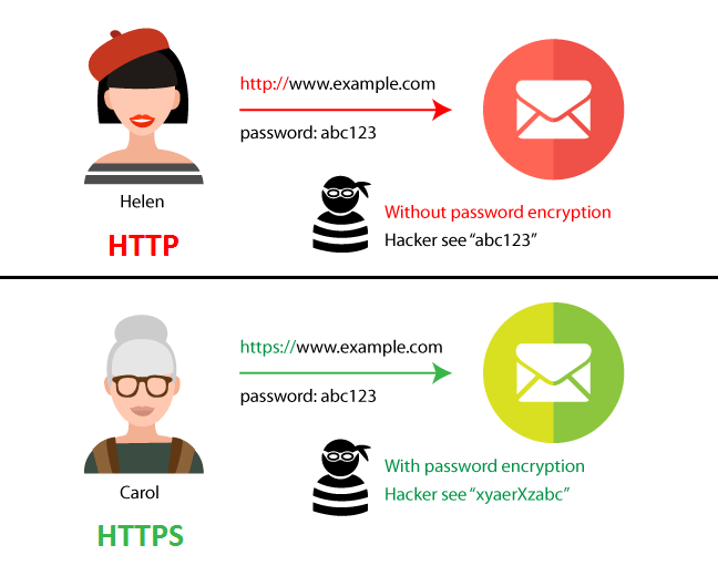
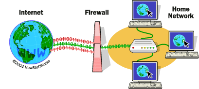
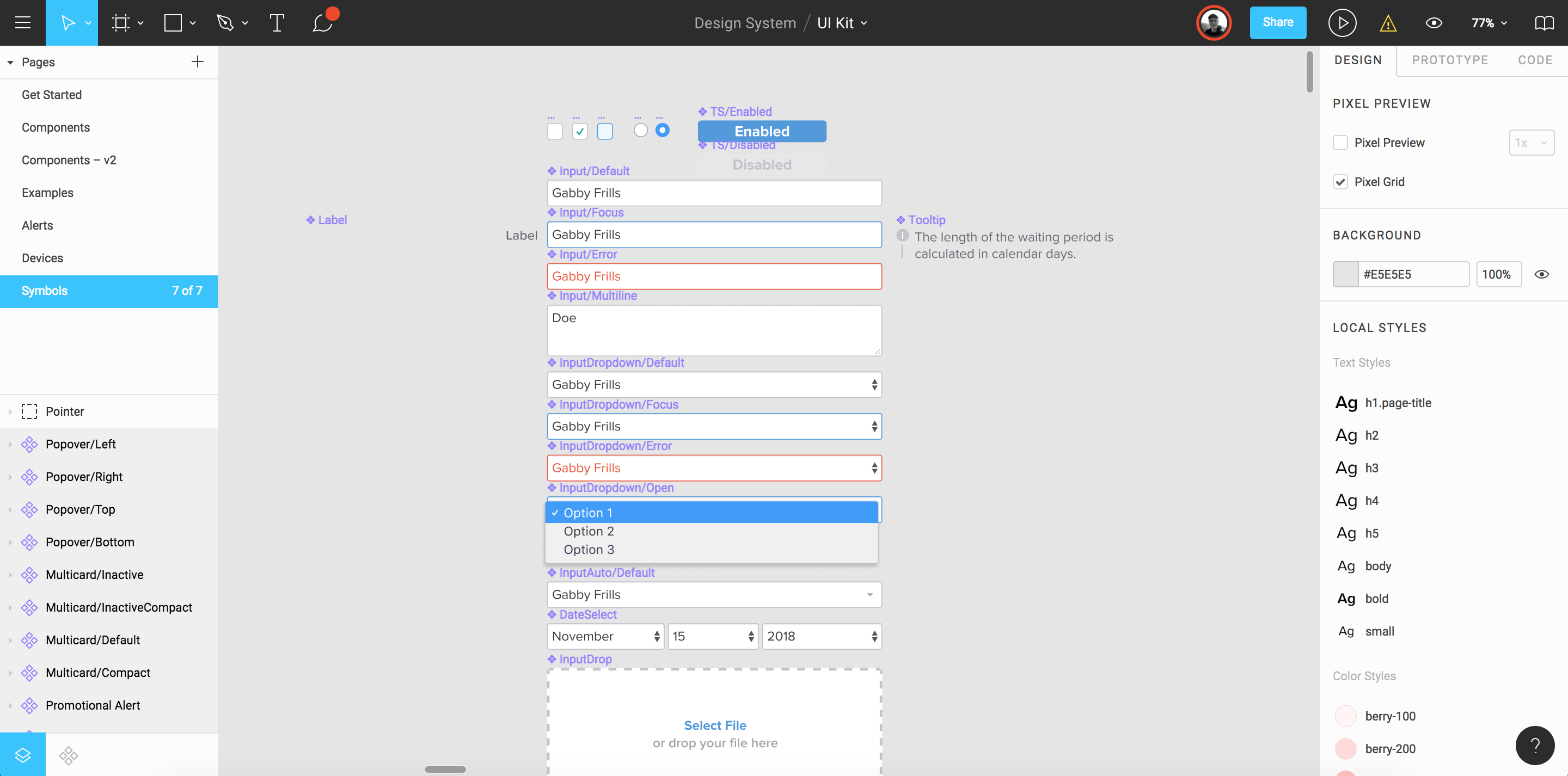
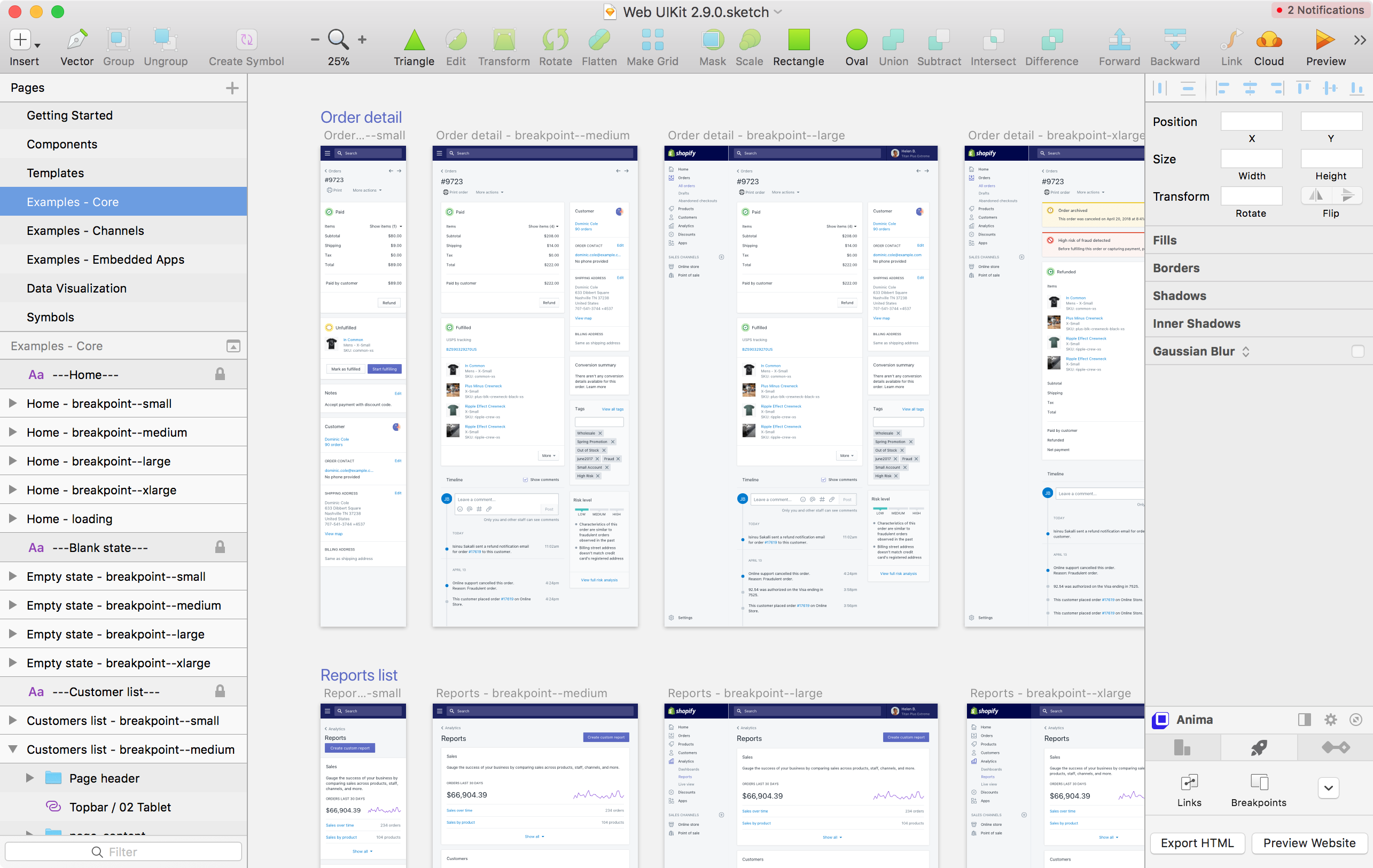
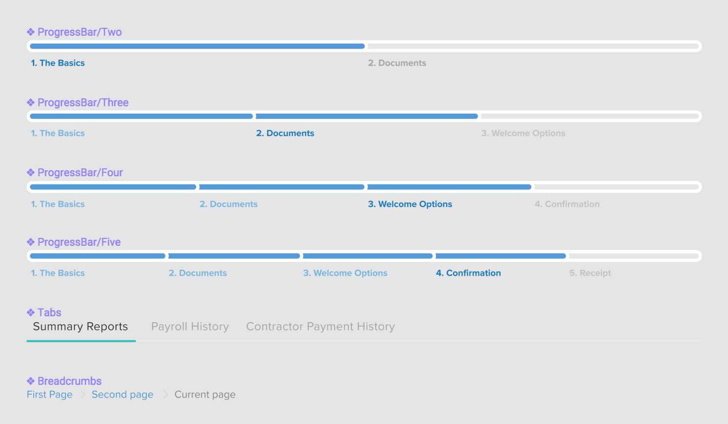
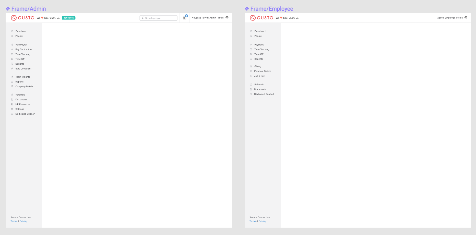

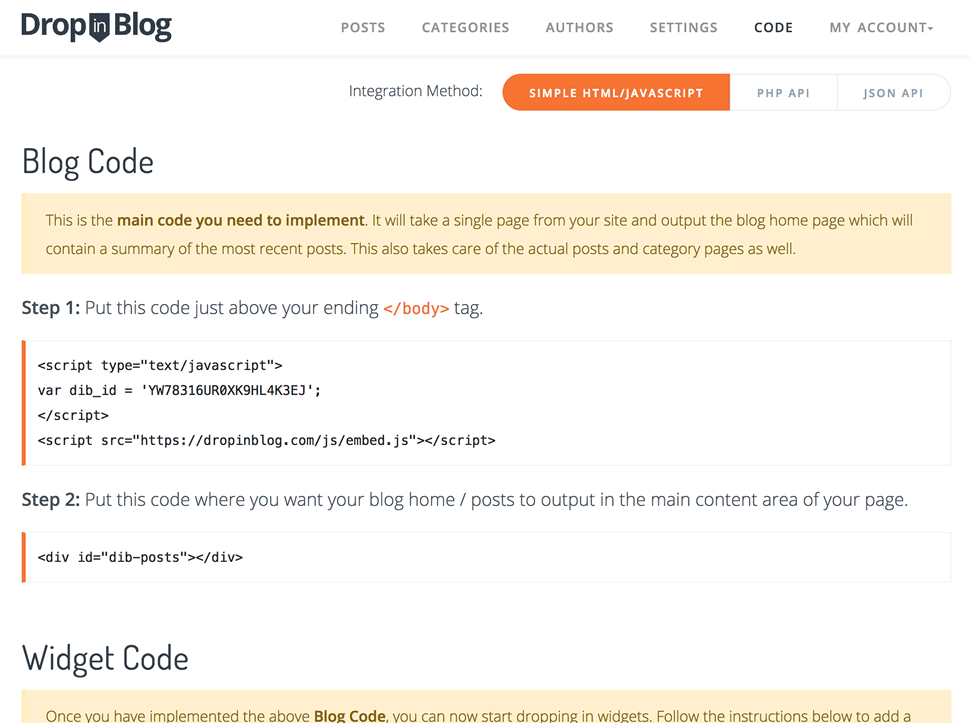

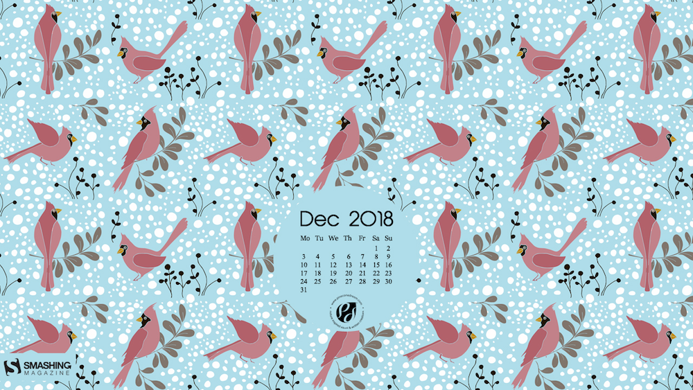

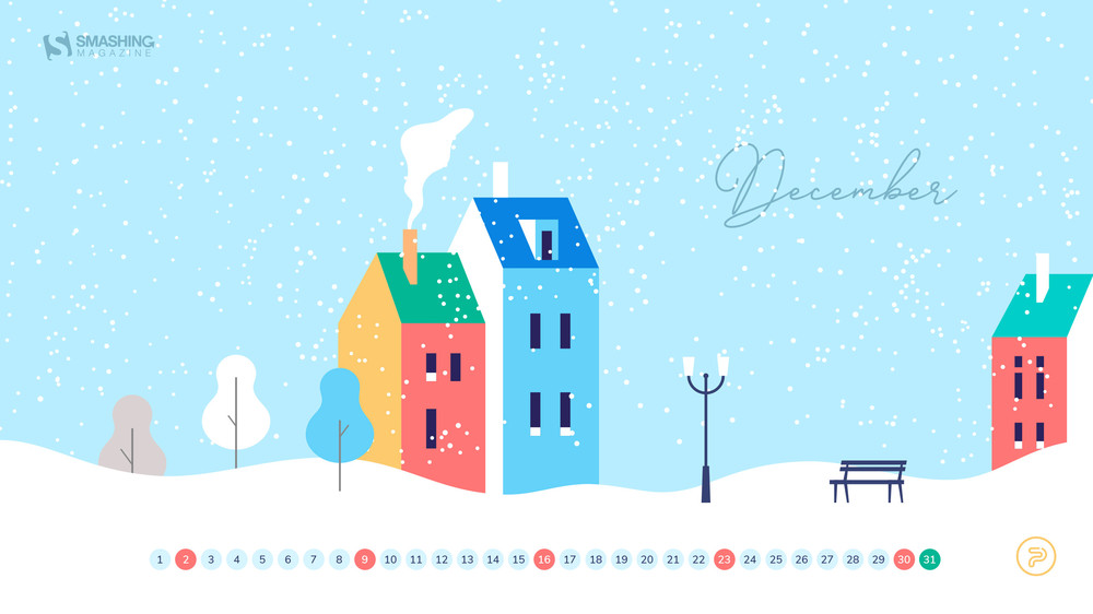


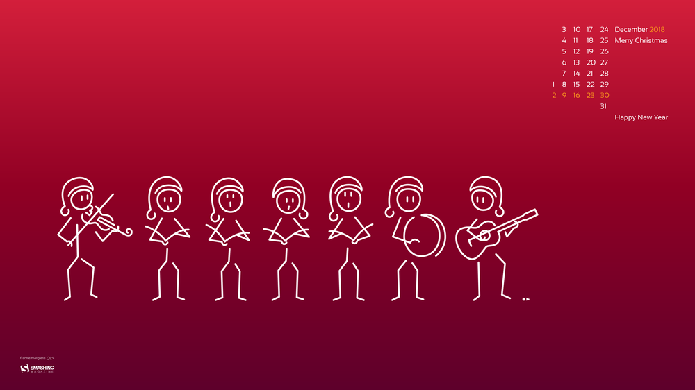

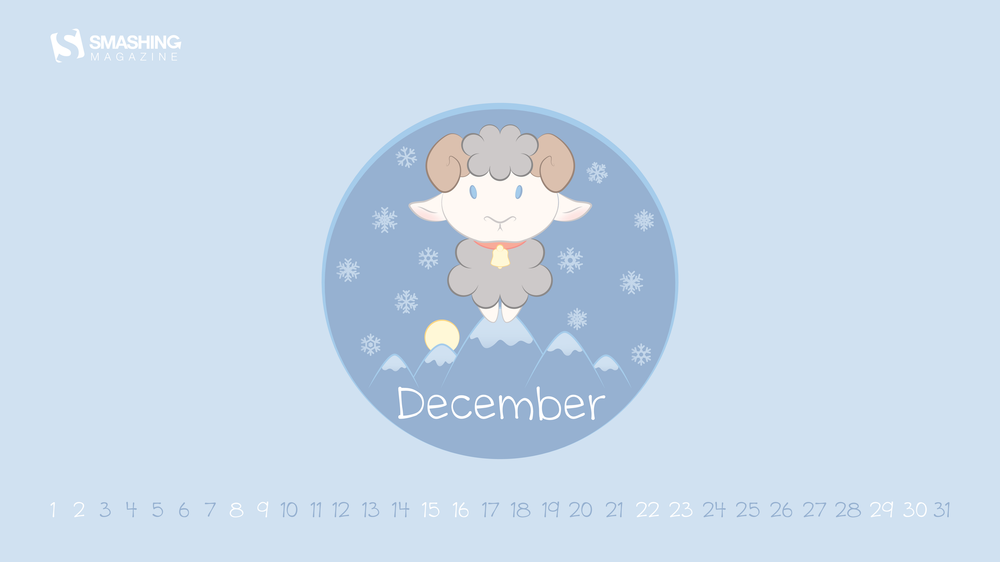
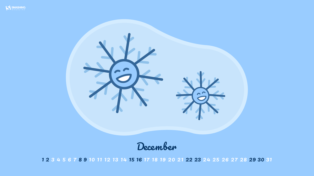


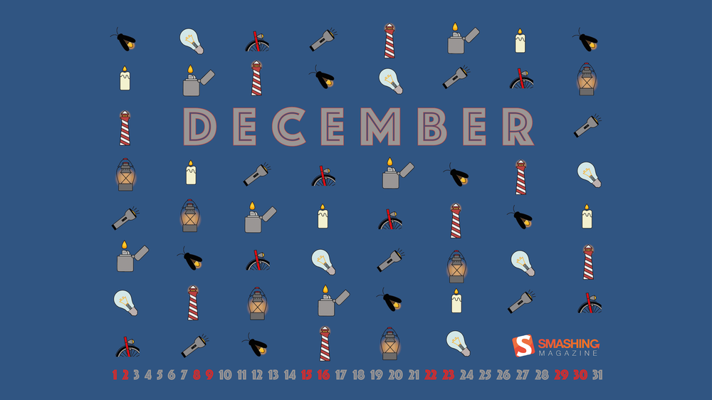
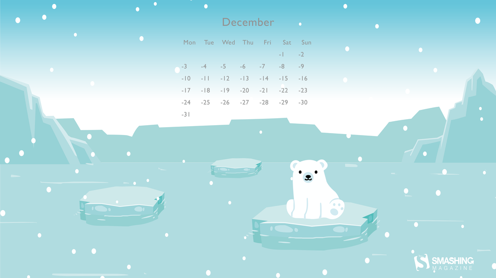
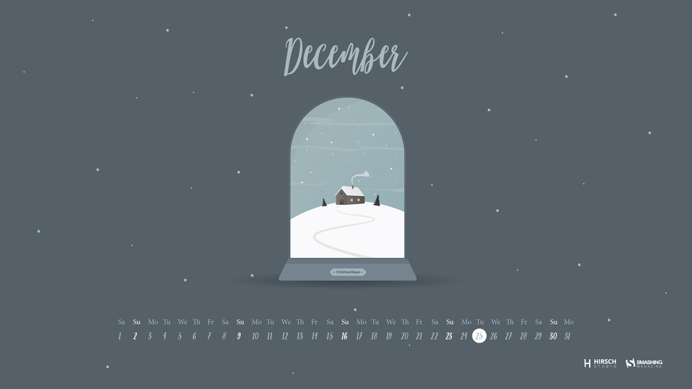


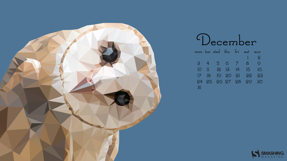

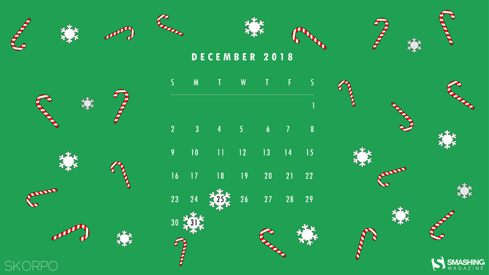

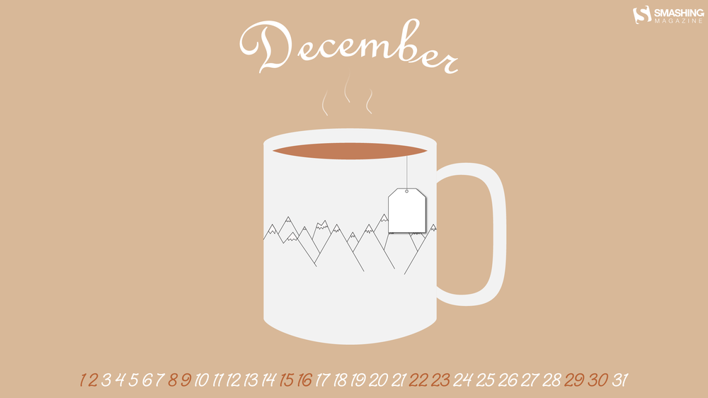


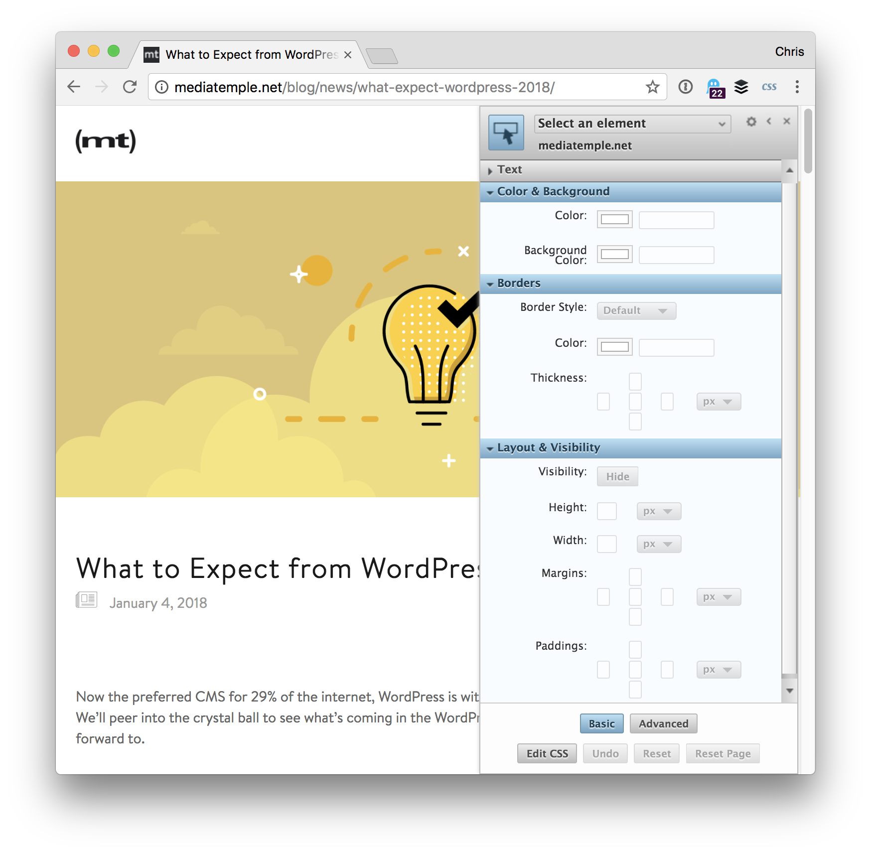
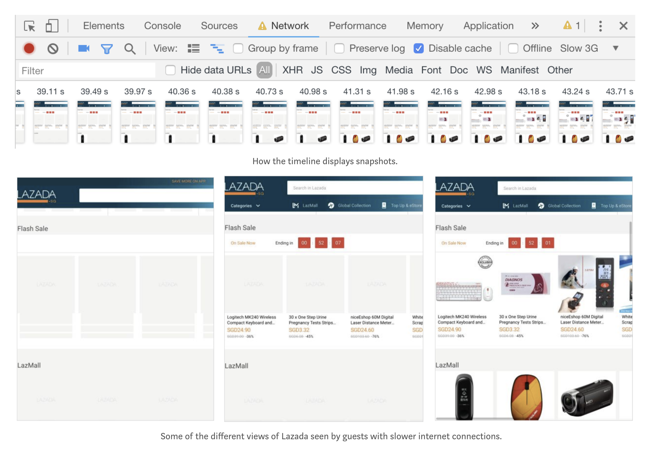


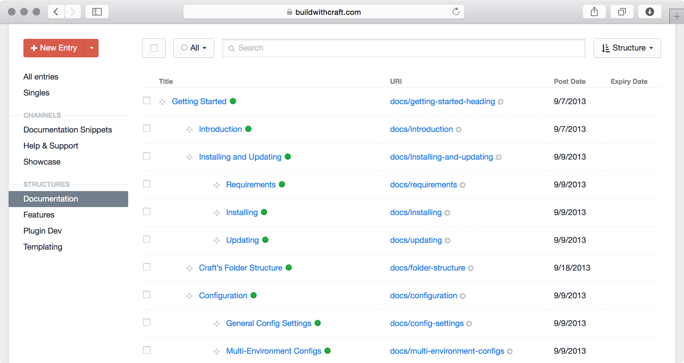

