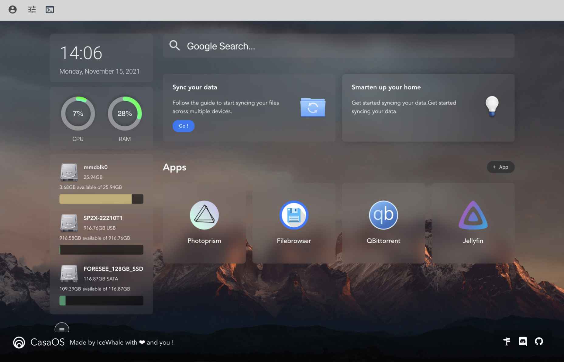
I was playing this game on Apple Arcade the other day called wurdweb. It’s a fun little game! Little touches like the little shape dudes that walk around the screen (but otherwise don’t do anything) give it a lot of character. I kinda want little shape dudes that walk around on websites. But another UI choice caught my eye, the way that transitions between screens have these diagonal lines that grow and fill the screen, like window blinds closing, kinda.
Here’s a quick screencast showing how those wipes work:
I wanted to have a crack at building this.
The first thing that went through my mind is repeating-linear-gradient and how that can be used to build stripes. So say we set up like this:
We can use transparent as a color though. Meaning if we covered the screen with stripes like these, we could see through where that color is. Say like this:
CodePen Embed Fallback
In that gradient definition, we use 10px as the “start” and 20px as the “end” of the gradient before it repeats. Part of the trick here is keeping that 20px “end” the same and animating the “start” number up to it. When we do that, it actually covers the screen in a solid color. The problem is… how do you animate it? You can’t do this:
What we need to do is animate that “start” pixel value number alone. We can use a custom property, but it’s a little tricky because without declaring them, custom properties are just strings, and not animatable lengths. So we’d have to do it like this.
We’ve got to use @property here to do this, which I really like but, sadly, has limited browser support. It does work though! I’ve got all that set up, including a quick prefers-reduced-motion media query. I’m using a smidge of JavaScript to change the background halfway through the animation (while the screen is covered) so you can see how it might be used for a screen transition. Again, note that this is only working in Chromium-based browsers at the moment:
CodePen Embed Fallback
Notice I’ve used CSS custom properties for other things as well, like the angle and size of the stripes and the speed of the animation. They are both very trivial to change! I’ve chucked in knobs so you can adjust things to your liking. Knobs? Yeah, they are cool:
Like and subscribe
This whole thing started as a tweet. In this case, I’m glad I did as Temani Afif chimed in with a way to do it with masks as well, meaning pretty solid support across all browsers:
CodePen Embed Fallback
I don’t think animating background color stops or a mask position is particularly performant, but since we’re talking “screen wipes” here, one could imagine that the page isn’t likely to be interacted with anymore until the page transition is over, so maybe that’s not the world’s biggest deal.
The “Reflog” is one of Git’s lesser-known features—but one that can be extremely helpful. Some people refer to it as a “safety net,” while I like to think of it as Git’s “diary.” That’s because Git uses it to keep a journal about every movement of the HEAD pointer (i.e. every time you commit, merge, rebase, cherry-pick, reset, etc.). Git logs your actions in the Reflog which makes it a valuable logbook and a good starting point when something went wrong.
In this last part of our “Advanced Git” series, I’ll explain the differences between git log and git reflog, and I’ll show you how to use the Reflog to recover deleted commits as well as deleted branches.
In previous articles, I’ve recommended you use the git log command to inspect previous events and look at your commit history, and that’s exactly what it does. It shows the current HEAD and its ancestors, i.e. its parent, the next parent in line, etc. The log goes all the way back in the commit history by recursively printing every commit’s parent. It’s part of the repository which means it gets replicated after you push, fetch, or pull.
git reflog, on the other hand, is a private and workspace-related recording. It doesn’t go through the list of ancestors. Instead, it shows an ordered list of all commits which HEAD has pointed to in the past. That’s why you can think of it as some kind of “undo history” like you might see in word processors, text editors, etc.
This local recording technically isn’t part of the repository and it’s stored separately from the commits. The Reflog is a file in .git/logs/refs/heads/ and it tracks the local commits for every branch. Git’s diary usually gets cleaned up after 90 days (that’s the default setting), but you can easily adjust the expiration date of the Reflog. To change the number of days to 180, simply type the following command:
$ git config gc.reflogExpire 180.days.ago
The repository’s configuration file (.git/config) now includes the variable reflogExpire with the value 180.days.ago
Alternatively, you can decide that your Reflog should never expire:
$ git config gc.reflogExpire never
Tip: Remember that Git makes a distinction between the repository’s configuration file (.git/config), the global per-user configuration ($HOME/.gitconfig), and the system-wide settings (/etc/gitconfig). To adjust the Reflog’s expiration date for the user or the system, add the --system or --global parameter to the commands shown above.
Enough theoretical background—let me show you how to work with git reflog to correct mistakes.
Recovering deleted commits
Imagine the following scenario: After looking at your commit history, you decide to get rid of the last two commits. You courageously perform a git reset, the two commits disappear from the commit history… and a while later, you notice that this was a mistake. You’ve just lost valuable changes and start to panic!
Do you really have to start from scratch again? You don’t. In other words: keep calm and use git reflog!
So, let’s mess things up and make this mistake in real life. The next image shows our original commit history in Tower, a graphical Git client:
We want to get rid of two commits and make the “Change headlines for about and imprint” commit (ID: 2b504bee) our last revision on the master branch. All we need to do is copy the hash ID to the clipboard and then use git reset on the command line and enter that hash:
$ git reset --hard 2b504bee
Voilà. The commits have disappeared. Now, let’s assume this was a mistake and take a look at the Reflog to recover the lost data. Type git reflog to view the journal in your terminal:
You’ll notice that all entries are ordered chronologically. That means: the most recent—the newest—commits are at the top. And, if you look closely, you will notice the fatal git reset action from a few minutes ago right at the top.
The journal seems to work—that’s good news. So, let’s use it to undo that last action and restore the state before the reset command. Copy the hash ID (which is e5b19e4 in this specific example) to the clipboard, like before. You could use git reset again, which is totally valid. But in this case, I’m going to create a new branch based on the old state:
$ git branch happy-ending e5b19e4
Let’s take a look at our graphical Git client again:
As you can see, the new branch, happy-ending, has been created and it includes the commits we deleted earlier—awesome, nothing is lost!
Let’s look at another example and use the Reflog to recover an entire branch.
Recovering deleted branches
The next example resembles our first scenario: we’re going to delete something—this time, it’s an entire branch that has to go. Maybe your customer or your team leader has told you to get rid of a feature branch, maybe it was your own idea to clean up. To make things worse, a commit (C3 in the picture) is not included in any of the other branches, so you’re definitely going to lose data:
Let’s actually do this and then recover the branch later:
Before you can delete the branch feature/login, you need to step away from it. (As you can see in the screenshot, it’s the current HEAD branch, and you can’t delete the HEAD branch in Git.) So, we’re going to switch branches (to master) and then we’re going to delete feature/login:
Okay… now let’s say our customer or team lead had a change of heart. The feature/login branch (including its commits) is wanted after all. What should we do?
Let’s take a look at Git’s diary:
$ git reflog
776f8ca (HEAD -> master) HEAD@{0}: checkout: moving from feature/login to master
b1c249b (feature/login) HEAD@{1}: checkout: moving from master to feature/login
[...]
Turns out we’re lucky again. The last entry shows our switch from feature/login to master. Let’s try to return to the state right before that and copy the hash ID b1c249b to the clipboard. Next, we’re going to create a branch called feature/login based on the desired state:
$ git branch feature/login b1c249b
$ git branch -vv
  feature/login b1c249b Change Imprint page title
* master        776f8ca Change about title and delete error page
Great—the branch is back from the dead and also includes that valuable commit we thought we had lost:
If you’re using Git in a desktop GUI like Tower, you can simply press CMD+Z to undo your last action, just like a text editor or word processor when you make a typo.
Keep calm and keep track
Git’s Reflog can be a real lifesaver! As you can see, it’s quite easy to bring lost commits or even entire branches out from the grave. What you need to do is find the correct hash ID in the Reflog—the rest is a piece of cake.
If you want to dive deeper into advanced Git tools, feel free to check out my (free!) “Advanced Git Kit”: it’s a collection of short videos about topics like branching strategies, Interactive Rebase, Reflog, Submodules and much more.
This was the last part in our series on “Advanced Git” here at CSS-Tricks. I hope you enjoyed the articles. Happy hacking!
Cloudinary (the media hosting and optimization service) has a brand new version (v3) of its WordPress plugin that has really nailed it. First, a high-level look at the biggest things this plugin does:
It takes over your media handling. Images and video are served by Cloudinary instead of your own server, which is good for a whole host of reasons. But don’t worry, your assets are also on your own server, so there is no lock-in.
It serves your images and video as performantly as possible. Everything is optimized, served in the best format, and use techniques like responsive images and lazy loading, all while providing a good loading experience. All together, those things are massive for performance.
It provides and image gallery block with lots of functionality.
Setting it up is as easy as copy and pasting from your Cloudinary account.
So, yes, you need a Cloudinary account. You can check out the programmable media plans here. There is a free tier that will likely work for many sites and paid plans that will cover sites that have heavy media needs, of which you’ll likely find the pricing amicable. Once you have your account, you pop the connection string (from your dashboard) into this quick onboarding wizard and you’re basically done. The default settings are good.
You could do literally nothing else and the plugin will work its magic, but it’s fun to look through all the settings.
Here are the general settings:
Those two (default) settings are important. Auto sync is nice in that all your images (even your entire existing media library) is synced up to Cloudinary and stays in sync. This is necessary to host your images (and do fancy optional stuff like “transforms”) but you could otherwise think of it as a backup. When you use “Cloudinary and WordPress” as the Storage setting, it means that media will be uploaded to your own server and Cloudinary. That’s what I would highly recommend, but if you’re in a situation where, say, you have very limited or no storage on your WordPress host, you could have the images go straight to Cloudinary (only).
In the Image settings, you can see two of Cloudinary’s most powerful weapons: f_auto and q_auto, standing for “auto image formatting” and “auto quality compression.” Those are defaults I’d highly recommend leaving alone. It means that any browser on any device gets the best possible format of the image, and Cloudinary adjusts the quality as appropriate for that image. Cloudinary has very good tech for doing this, so let it do it.
The “doing images right” checklist is a thing.
Remember, we blogged it just recently. Host them on a CDN. Optimze them. Serve them in the best possible format for the requesting browser. Use responsive images. Lazy load them. None of those things are trivial, and that’s just a partial list. The good news is: this plugin does all that stuff for you, does it well, and does it without you having to think too much about it.
I like seeing the output. This is where the rubber meets the road. From this I can see that responsive images are implemented correctly and lots of different sizes are available. I can see the the image sources are pointing at the Cloudinary CDN. I can see lazy loading is implemented and working. I can see the width and height attributes are there as they should be to ensure space is reserved for the images during loading. This is everything.
It goes the extra mile by hosting the images the used by the theme as well.
Heck, it replaces CSS background-images in your theme’s stylesheet with Cloudinary-hosted versions. That’s… amazing. There must be some real clever WordPress filter stuff going on.
The Gallery Block is just gravy.
I like seeing this in there:
Why? It shows that this plugin is part of modern WordPress. Block editor WordPress. The block itself is simple, but useful. It shows images in a variety of useful layouts with a “lightbox”-like effect (wow, it’s been a long time since I’ve typed the word lightbox). Hey, sometimes you just need a dang image gallery and you might as well use one that is well done.
Who am I to say?
Just a lowly blogger, I suppose. But I can tell you I’ve been watching this evolve for quite a while. A ways back, I had implemented a hand-rolled Cloudinary integration here on CSS-Tricks because I wanted all this stuff. I ultimately had to give up on it as it was more technical debt than I could maintain.
The previous versions of the WordPress plugin were better, but it’s not until now, v3, where this integration is truly nailed.
Shortly after that time I tore down my custom integration, I blogged “Workflow Considerations for Using an Image Management Service” and outlined what I thought the (rather high) bar would be for integrating a third-party image host. It was a lot to ask, and I wasn’t really sure if anyone would find the incentive and motivation to do it all. Well, Cloudinary has done it here. This is as perfect a media management plugin as I could imagine.
Apple Music has this “Spatial Audio” feature where the direction of the music in your headphones is based on the location of the device. It’s tough to explain just how neat it is. But that’s not what I’m here to talk about.
I opened up the Apple Music app and saw a featured playlist of hit songs that support Spatial Audio. The cover for it is this brightly-colored pink container that holds a bunch of boxes stacked one on top of another. The boxes animate in one at a time, fading in at the center of the container, then fading out as it scales to the size of the container. Like an infinite loop.
Cool! I knew I had to re-create it in CSS. So I did.
CodePen Embed Fallback
Here’s how it works…
The markup
I started with the HTML. There’s obviously a container we need to define, plus however many boxes we want to animate. I went with an even 10 boxes in the container.
That’s literally it for HTML. We are free to jump right into the CSS!
Styling the container
Nothing too fancy here. I measured approximate dimensions based on what I saw in Apple Music, which happened to be 315px × 385px. then I took a screenshot of the cover and dropped it into my image editing app to get the lightest possible color, which is around the outside edges of the container. My color picker landed on #eb5bec.
As I was doing this, I knew I would probably want this to be a grid container to align the boxes and any other elements in the center. I also figured that the boxes themselves would start from the center of the container and stack on top of one another, meaning there will be some absolute positioning. That also means the container ought to have relative positioning to reign them in.
If the boxes in the container are growing outward, then there’s a chance that they could expand beyond the container. Better hide any possible overflow.
We have 10 .box elements in the markup and we want them stacked on top of one another. I started with some absolute positioning, then sized them at 100px square. Then I did the same thing with my image editing app to find the darkest color value of a box, which was #471e45.
Cool, cool. We’re unable to see all the boxes as they’re stacked on top of one another, but we’re making progress!
CodePen Embed Fallback
Creating the animation
Ready to write some @keyframes? We’re gonna make this super simple, going from 0 to 100% without any steps in between. We don’t even need those percentages!
@keyframes grow {
  from {
    /* do stuff */
  }
  to {
    /* do stuff */
  }
}
Specifically, we want two things to happen from start to finish:
The boxes go from our starting opacity value of 0.5 to 0 (fully transparent).
The boxes scale up to the edges of the container.
@keyframes grow {
  from {
    opacity: 0.5;
    transform: scale(0);
  }
  to {
    opacity: 0;
    transform: scale(3.85);
  }
}
How’d I land on scaling the boxes up by 3.85? Our boxes are 100px square and the container is 385px tall. A value of 3.85 gets the boxes up to 385px as they fade completely out which makes for a nice linear animation when we get there.
Speaking of which…
Applying the animation
It’s pretty easy to call the animation on our boxes. Just gotta make sure it moves in a liner timing function on an infinite basis so it’s like the Energizer Bunny and keeps going and going and going and going and…
.box {
  animation: grow 10s linear infinite; /* 10s = 10 boxes */
  /* etc. */
}
This gives us the animation we want. But! The boxes are all moving at the same time, so all we see is one giant box growing.
CodePen Embed Fallback
We’ve gotta stagger those little fellers. No loops in vanilla CSS, unfortunately, so we have to delay each box individually. We can start by setting a custom property for the delay, set it to one second, then redefine the custom property on each instance.
.box {
  --delay: 1s;

  animation-delay: var(--delay);
  /* same as before */
}
.box:nth-child(2) {
  --delay: 2s;
}
.box:nth-child(3) {
  --delay: 3s;
}
.box:nth-child(4) {
  --delay: 4s;
}
.box:nth-child(5) {
  --delay: 5s;
}
/* five more times... */
Huzzah!
CodePen Embed Fallback
Keep on rockin’
That’s it! We just recreated the same sort of effect used by Apple Music. There are a few finishing touches we could plop in there, like the content and whatnot. Here’s my final version again:
The average favicon network request takes 130ms, at least from our speedy cloud instance.
Fast, but not that fast, particularly for a file that nearly every website in the world has. All the more reason to get it right and ensure only one is downloaded (ideally SVG).
I would have guessed most favicons are ICO, but no:
The vast majority of the favicons offered up by websites are PNG. 71.6% of images are PNG.
And lol:
21.1% of /favicon.ico files are secretly PNGs
One of the reasons that file extensions, to browsers, are rather meaningless. It’s all about that content-type.
Also, they question the accuracy of the method, but the dominant color in the analysis so far is purple. I hope it ends up true as it kinda makes sense. Unless you’re offering different favicons for dark mode, using white or black seems too dangerous these days.
The year might be coming to an end, but plenty of design trends are still beginning to emerge. It’ll be interesting to see how many of these website design elements remain popular into the new year. From vintage elements to circles to happier feelings, there’s a lot to play with here.
Here’s what’s trending in design this month…
Old-School Print Inspired
Vintage design elements seem to circle back in new iterations at a pretty frequent pace. This time website designers are finding inspiration from old-school print design.
These projects mimic the look of old newspapers and magazines with styles that look like news or advertising content. One of the most exciting takeaways might be color, with beige backgrounds that almost seem like aged paper.
Note the font choices, scale, and imagery as well. All of these things have an old-school feel that’s modern enough to help encourage interaction.
Each of these designs keeps visitors engaged with trendy effects that pair with the vintage aesthetic so that while there’s an old-school look, the overall design is modern and fresh.
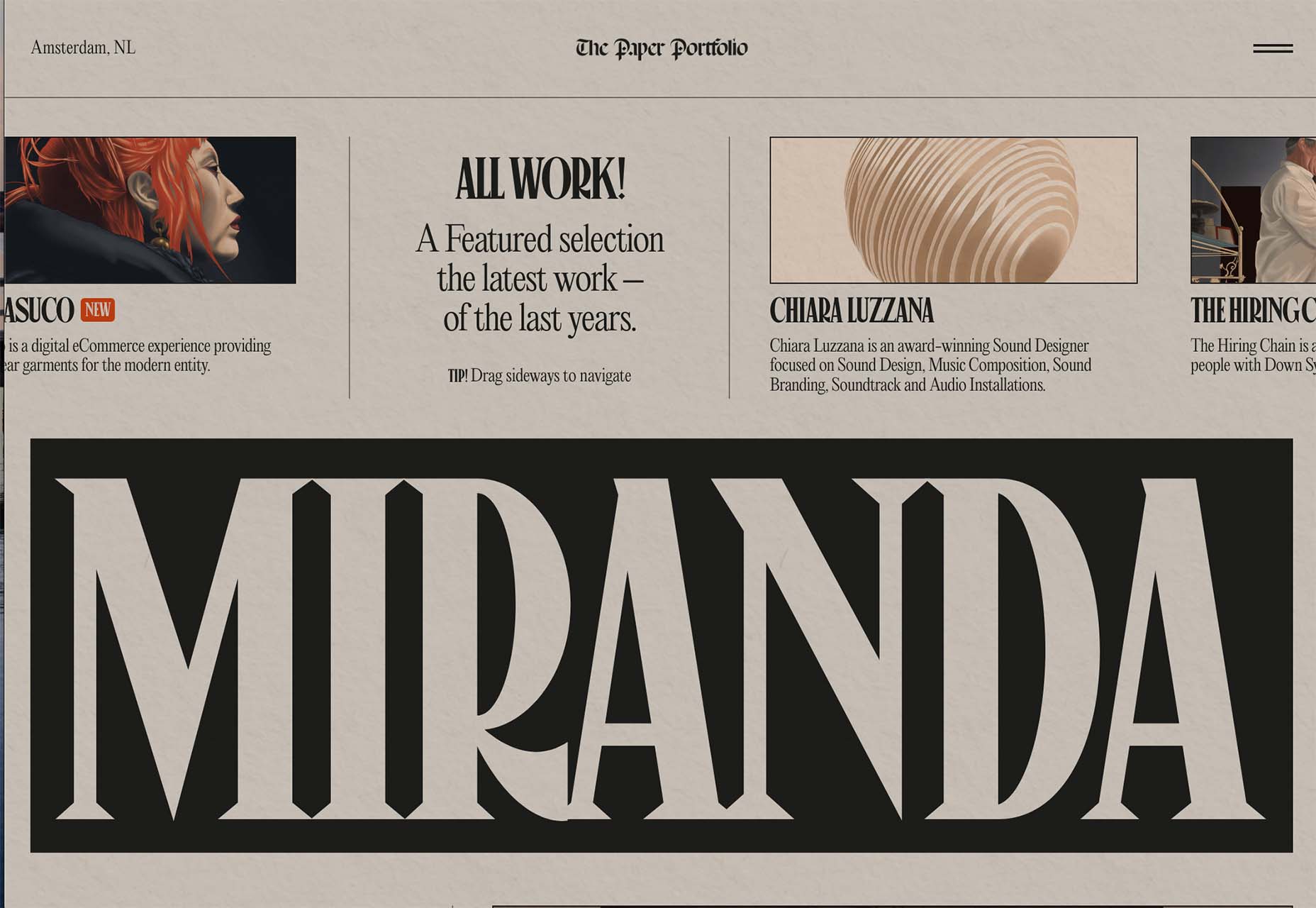
The portfolio of Niccolo Miranda feels like a “WAR” day on the front page of a major newspaper, but with modern touches – computer illustrations, animated images, and button-style icons.
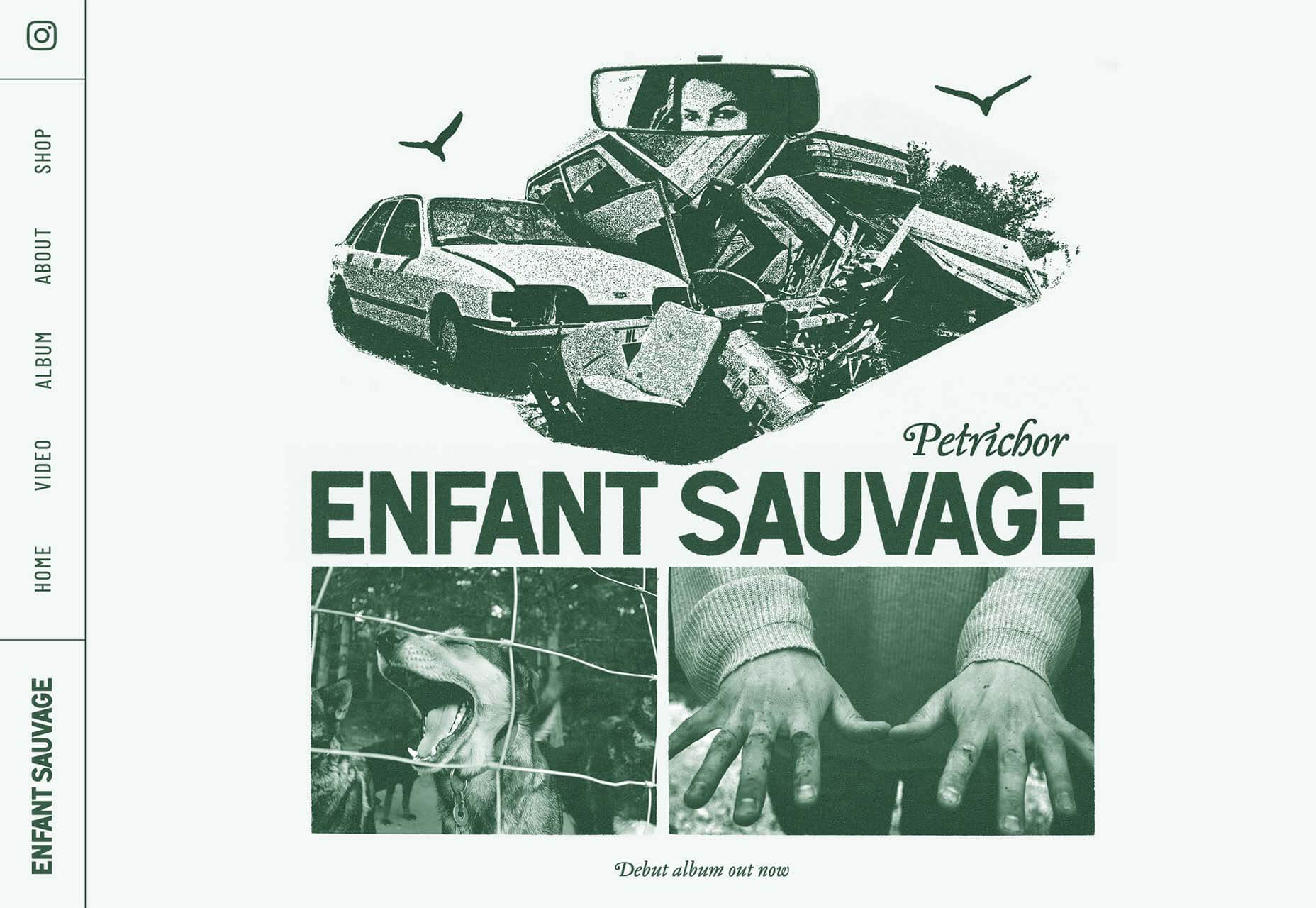
Enfant Sauvage Music takes on the feel of an old-style newspaper or magazine ad with a single color design and grainy imagery. An oversized funky pointer on hover and side navigation keeps the design interesting.
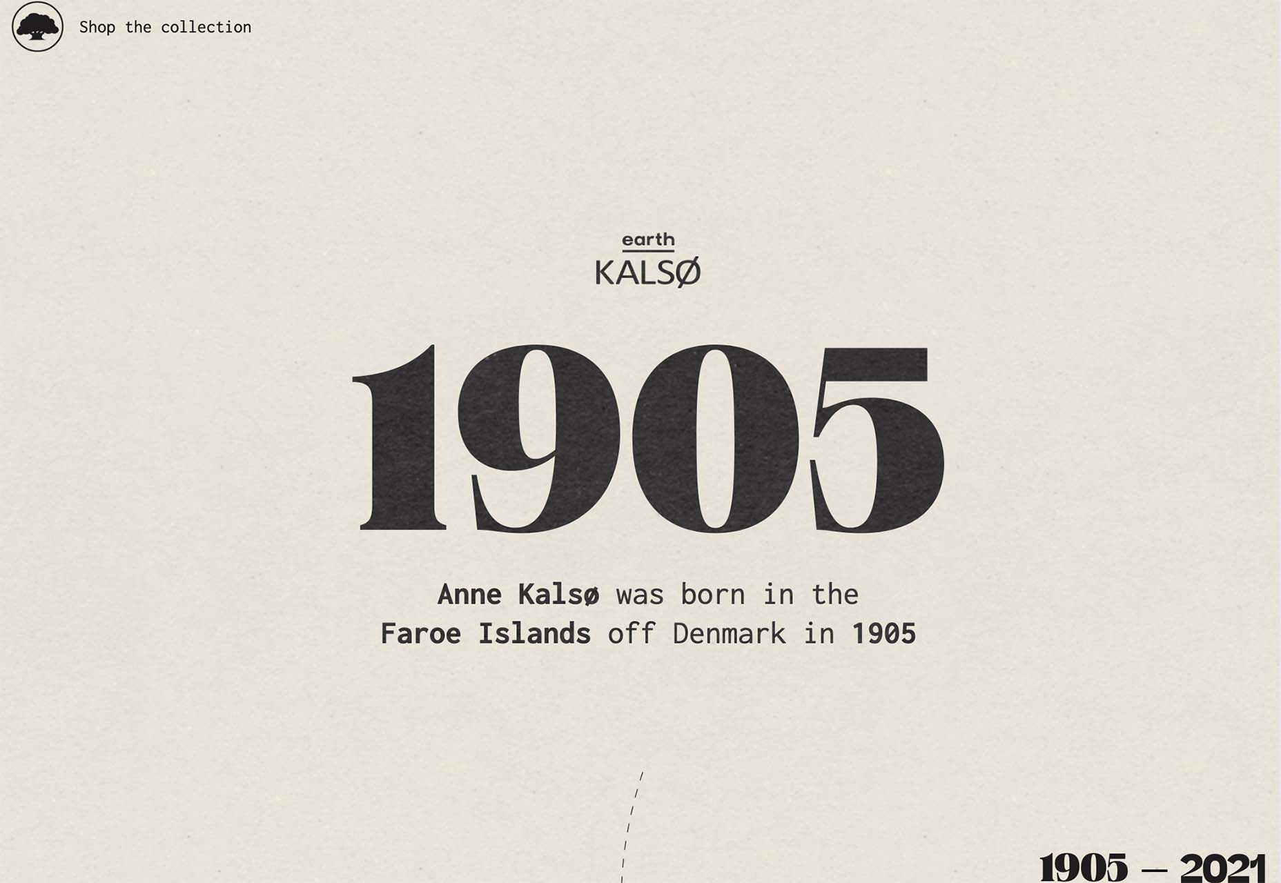
Kalso uses a giant timeline with typography and effects that mimic the era on the screen. Animation and motion keep the design with the times and on-trend.
Center-Screen Circles
Circles seem to be a website design trend that just never goes out of style – it only evolves.
The newest iteration includes center-screen circles. And you can use them in all kinds of different ways. The nice thing about a circle is the shape is innately harmonious and can pull a design together and make everything feel together and unified.
They can be an excellent container for text or other elements or serve as a button.
Circles work with almost any overall design pattern, in any color, and with virtually any type of image or video. The shape is practically perfect! (That’s why it’s a trend that never really gets old.)
Each of these examples uses a center-screen circle in a slightly different way.
Aflote uses a center circle as part of its overall branding effort and to help draw the eye from the split-screen images to the center arrow, encouraging users to scroll to the next bit of content. Color helps here, and the circle is a container for brand and some other content with a nice layer on top of the images.
One Ocean Science uses one of the oldest circles we know – the globe – as a dominant art element that rotates in the center of the screen. The layer on top – the exact text in multiple languages – gets extra attention thanks to the center placement. The design also uses a top left corner circle for branding and a bottom right corner circle as a CTA, helping create a visual flow through the design from top to center to bottom to click.
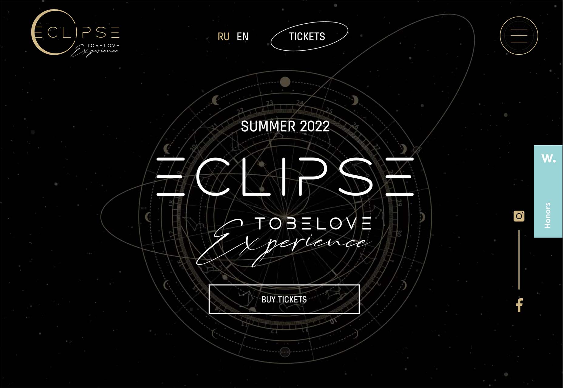
To Be Love uses a fantastic animated set of concentric circles to pull together the name of the event and draw interest to the CTAs. The circle is just the right size in a sea of black sky to draw the eye to the content in the middle of the screen.
Lighter, Happier Designs
After a couple of years of pandemic life and a world that’s just been a little less than cheery, website designers include lighter, happier elements to projects. This might just be the design trend we all need right now.
This effect can be designed in several ways, including color, imagery, animation, scale, and even typography. It’s hard to pinpoint what makes a design lighter and happier until you see it, but when you do, you’ll know it. (It might just be that little grin at the corner of your mouth when you see it.)
Meanpug uses fun, animated illustrations as a load screen with a full-text homepage (you’ll have to click through to see it). Between color and animation, you can’t help but feel good looking at the design. What might be most interesting is that the website is for a marketing agency that works with law firms. (Probably not what you expected at all.)
Happy smiling faces are hard not to feel good about. Even the devil emoji seems somewhat joyful. Add in big, bold typography and the yellow smiley, and the world just feels a little less dark.
Oatly uses lots of small elements in a cartoon-style aesthetic that is light and interesting. In addition to fun fonts and animation, all of the words on the website also contribute to a feeling of ease and happiness. It’s a solid strategy for sales; make people feel good about what they are thinking of buying to help propel them toward a purchase.
Conclusion
One of the most exciting things that we’ve seen with design trends in the past year is how world events – from the pandemic to isolation to working remotely – have impacted design projects as a whole.
We’ve seen fewer faces, more illustrations and typography, and an overall shift in feeling to some of the lighter, happier design elements featured here. Cheers to 2022!
When going to any site, the user does not start by reading the content, he evaluates it visually by means of scanning.
To create a positive first impression, consider every little thing that can affect it. All of the most visible elements should create the correct impression of the entire company/store. To do this, you should start by researching the best fonts for websites and by looking at the overall design quality of your site.
The design must be fully built to influence the subconscious interest levels of a potential user as well as the conscious ones in order to fully get their attention and ignite their curiosity to continue browsing your site. Today we’re going to take a look at the subtle details that can go a long way in organic design.
No. 1. Detailed design
It is necessary to use the best fonts for websites, colors, shapes, buttons, and other little things. All of them should be thought out, form an overall beautiful visualization, and reflect the corporate identity corresponding to the company/store. These small details affect the perception of users, if they are not chosen correctly, you will mislead people. It should be intuitively clear what and how the site is arranged, otherwise it will be closed when the first impression is formed.
different size of the text depending on its importance;
using the minimum number of colors for an organic look;
highlighting the most important elements on the site;
smoothness of all menu transitions.
Use each of them or choose the most suitable for the site. Aesthetic convenience gives the impression that the product/service itself is just as beautiful. An attractive website builds more credibility and improves the user experience.
No. 2. Errors
Even a great website design can be ruined by one small mistake. Check the site for faults before and periodically after implementation. If users notice them in front of you, they will leave and are unlikely to return.
The most common misprints in the text, problems with loading media files, and the appearance of dead links.
No. 3. Adaptability
Today, each user uses several devices to access the Internet. Therefore, your site should be adapted to each of them. For example, if you made a design only for a PC, then you will lose some of the clients who use mobile devices to access the Internet.
All information should be displayed correctly on the page. Remember that some users use mobile devices to visit the site in order to search for contact information or check the value of goods. Adapt the design so that this information is in plain sight. In addition, it is better to make larger interactive elements for mobile gadgets, this will simplify the interaction process for users because of the small buttons, they constantly have to zoom in and spend a lot of effort.
No. 4. Simplify page scanning
The design of the site should be light and easy to read; on the first page, you should not add walls from the text. After a positive first impression, the user will go exploring further. For a comfortable experience, build the right hierarchy so that the person can find what they are looking for without difficulty. Cyclic visualization should consist of logical links interconnected.
The structure of the rest of the site should also be simple. If the volume of text is large, it should be divided into headings and subheadings, have listed, and be divided into paragraphs with additional spaces. User-friendliness is paramount for browsing the entire product. The effectiveness of communication with the client is the goal of the design, so all content and elements should nudge the client to make a deal/purchase.
No. 5. Integrity
A website is like a shopping mall, which is filled with signs, has a holistic structure, and is adapted to the different flow of people. Evaluate what the user will see first and where they want to go. If the site will sell a service, there should be elements of insight that will redirect the person to a page with prices, details, and ways of making a purchase.
Don’t make your website travel a difficult quest – it is repulsive and leads to a negative experience. It is better when the design is filled with a minimum number of clicks, then the client will be effective and quickly decide to make a deal / purchase.
No. 6. Start over
Step into the shoes of the users and imagine how you see an ideal site, what it should contain and how to present the product/service. This will help to build a picture of “what and where to place”. Add whatever seems convenient and go back to the beginning of the analysis several times until you get the perfect picture.
No. 7. Navigation
The user needs to open all the roads and offer to go along them. Clear navigation with fast transitions and easy-to-use positioning of all elements creates a balance of convenience and passion. Any action should not be burdened, even if it is “unsubscribe” or “return of goods”. Do not give users multiple moves and difficult steps to get what they want, otherwise, it will provoke them to leave the site forever.
All interactive buttons must show that they are clickable and vice versa, if a word or button is highlighted, but does not lead to a transition when clicked, this confuses the user.
Conclusion
Be a perfectionist and think over the site to the smallest detail, because each of them affects the quality of the user experience. Remember that the latter initially evaluate the site only visually, so implement a holistic and aesthetic appearance in the design that reflects the values ??of the company / store.
Make a balanced user interface adapted to different devices and thoroughly check the site for errors before implementation and throughout the entire work. The user should immediately see how convenient and useful the site is, then he will continue to interact with it and is unlikely to say goodbye.
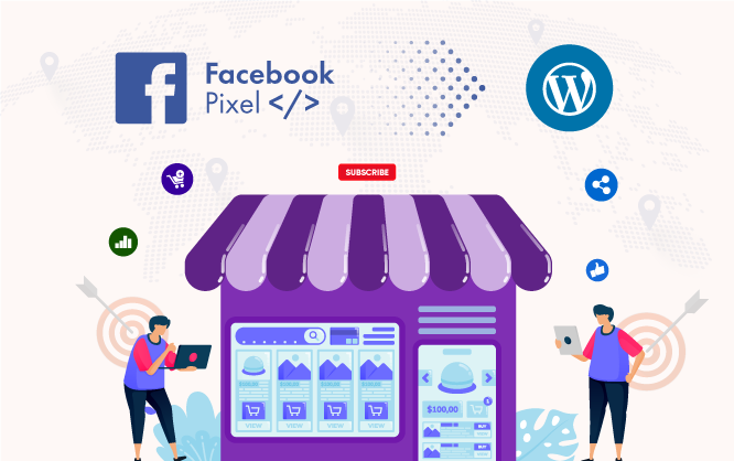
Facebook has become one of the greatest ways to bring your products to your customers. It allows you to display products through a Facebook business page.
Therefore, you can promote your products via Facebook ads or posts on a business page. The advertising, remarketing, and retargeting capabilities of Facebook are incredible.
While running a WordPress-based online store, Facebook advertising capabilities will bring you the best output according to your budget. Hence, you need to learn how to install Facebook Pixel on your WordPress website. That is because it’s crucial for online businesses to reach the right audience with the right product.
In this article, we will guide you through the processes of installing Facebook Pixel on your WordPress site. This step-by-step guide will assist you in running your online business smoothly via Facebook pixel.
What Is The Facebook Pixel?
On Facebook, you will find various advertising tools with unique features to help you grow your business. Facebook pixel is one of those tools where you need to invest some time to understand and utilize it. Therefore, you need a clear understanding of Facebook Pixel before using it on your WordPress site.
The Facebook Pixel is basically a piece of JavaScript code that leaves cookies on your website to monitor user activities. As a result, you can reconnect with your online store visitors later and offer them ads based on their activities. You can also measure the efficiency and productivity of your Facebook Ads via Facebook Pixel.
Facebook Pixel allows you the options to understand the behaviors of your site visitors while they are using their Facebook account. Therefore, installing the Facebook pixel is a must if you are running an online store or promoting via Facebook Ads.
By using Facebook pixel on your WordPress site, you can:
Target every type of customer that visits your store
Analyze conversion by tracking user behaviors accurately
Enhance the efficiency of your Facebook Ads by optimizing it
Promote your products to the right audience at the right moment
Target and retarget your current and previous website visitors
Let’s say you are not willing to promote products via Facebook Ads; still, it is essential to insert Facebook Pixel on your site. Why? By pixeling your visitors, you will get an idea about the product preference of your site visitors. As a result, you can advertise to those visitors and set up an ad campaign accordingly.
How does Facebook Pixel Work
The Facebook Pixel and Google analytics both work almost in a similar way. How?
Let’s pretend someone clicked on your ad, was taken to your online shop, and bought your product. As a result, the Facebook Pixel will be triggered, and you will get a report of your customer’s activity that just occurred. Additionally, you will get a specific report on your customer’s actions on your Facebook Ads (clicks, shares, buying via ads), thanks to the Facebook Pixel.
In the future, you can easily target all your customers again, utilizing a custom audience. Moreover, the Pixel feature isn’t just assisting you in targeting those who completed the purchase process. It also allows you to target shoppers who only clicked your ads, showed some interest, added products to the cart, and left without purchasing.
According to Facebook, the pixel is a piece of JavaScript code that enables you to monitor website visitor behavior. It works by loading a tiny library of functions that you can call whenever a site visitor performs any activity (referred to as an event) that you wish to monitor (called a conversion). Tracked conversions data are displayed in the Facebook Ads Manager that is required to analyze the success of your website’s conversion funnels, establish custom audiences for ad targeting, and monitor the impact of your ads.
All the customer activities on your site are called “events.” There are 17 standard Facebook events that usually take place on a website. Standard events can be utilized to track conversions & optimize them and increase the audience. The standard events for the Facebook pixel are listed below:
Website action
Description
Add payment info
When a customer add payment information on a checkout process or click a button to save their billing info
Add to cart
Adds a product in a shopping cart or clicks the add to cart button
Add to wishlist
Adds a product on a wishlist or clicking the add to wishlist button
Complete registration
When a user completes a registration form on your website
Contact
When someone contacts your business via a website
Customize product
When Someone selects a specific color or category of your products
Donate
When someone donates on your website for a specific cause
Find location
When someone searches for the location of your business
Initiate checkout
When a shopper initiates the checkout process
Lead
When a user signs up for a trial service or submits a form
Purchase
When a customer completes the purchase process on your website
Schedule
When a user schedules an appointment to visit your service location or business
Search
When a user searches for something on your site
Start trial
When someone starts the trial version of your service
Submit application
If someone submits an application to get a product, service, or program on your website
Subscribe
When someone subscribes to a product or service on your site
View content
When someone views content on any page of your website
You can customize the standard events by adding a few extra lines of code that are called parameters. Therefore you can add more factors such as – The worth of a conversion event, event, content type, and long-term value that was predicted. As a result, you will be able to track pixels for a specific scenario. For example, finding out the specific category that was viewed by your customers through the tracking pixel.
The Process of Installing Facebook Pixel on WordPress website
Now that you’ve learned what is Facebook pixel is and how it works, it is time to get to the main point. Let’s hop into the process of installing Facebook Pixel on your WordPress website following the easiest process.
There are two different methods of adding Facebook Pixel on your WordPress website:
Manual Installation with code – This option is handy, and you can add the code manually. But to get the code, you have to get into the Facebook ads manager and collect it.
With a third-party integration or plugin – There are several plugins on WordPress such as Official Facebook Pixel, Insert Headers, and Footers, Pixel Caffeine plugin, CTX Feed Pro, etc.
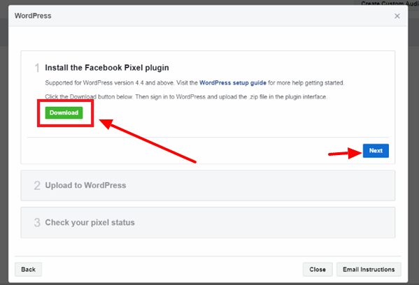
Installing Pixel with the official Facebook Pixel plug-in
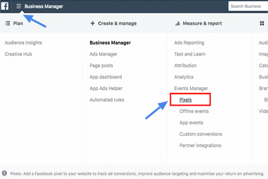
Step 1: Heading to the Pixel on Business Manager
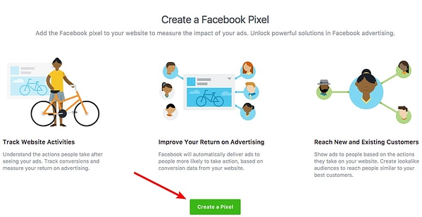
First of all, sign in to your Facebook account and then head over to the Facebook Business Manager. Sign in and then click the hamburger icon on the upper left corner of the page beside the heading “Business Manager.” A menu will open up where you need to select Events Manager > Pixel.
Step 2: Selecting the Pixel Setup Method
After clicking on Pixel, a page will appear with the heading “Create a Facebook Pixel.” On this page, you have to click the button – Create a Pixel.
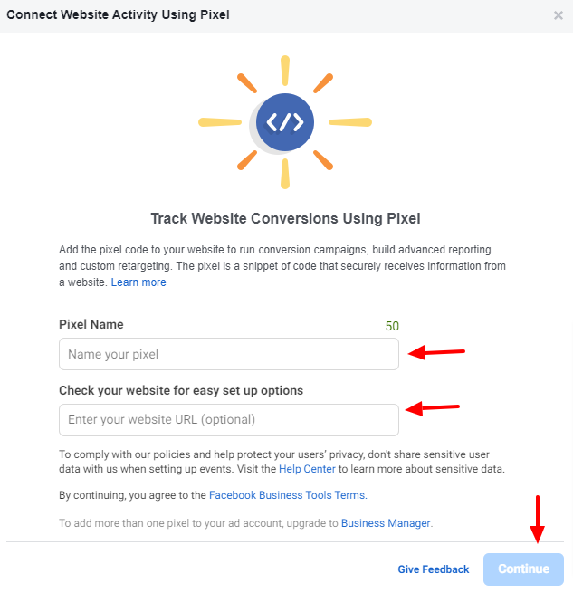
Now you can enter your preferred name for the Pixel and provide your website URL (Option). If required, you can change the name of the pixel later. After providing the information, click Continue to proceed further.
At this point, a pop-up box will appear, including a message “Download Your Pixel Key” after getting a message about the progress.
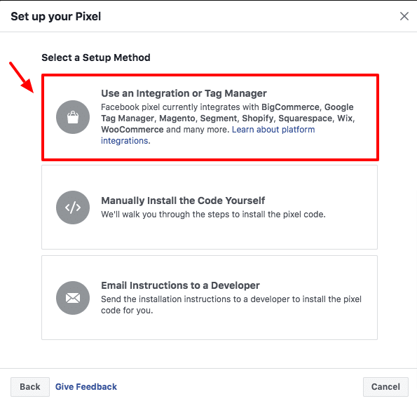
From the pop-up box, select the Use an Integration or Tag Manager between three options.
By Clicking the first option, “Use an Integration or Tag Manager,” you will be presented with another pop-up window that will offer your different website solutions such as WordPress, Wix, Shopify, BigCommerce, and more. As you are going to set up Pixel for your WordPress website, select WordPress from the window.
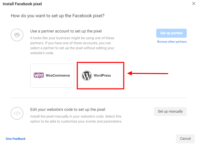
Step 3: Facebook Pixel plugin Setup Method
In this step, you have to download the Facebook Pixel plugin in order to install Facebook Pixel on your WordPress website. After selecting WordPress on your previous step, you will be given an option to install the Facebook Pixel plugin via a pop-up window. Click the Download button to download the Facebook Pixel Plugin.
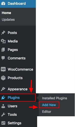
After downloading the Facebook Pixel plugin, you have to upload it and activate it through the WordPress dashboard. Therefore, you have to sign in to your WordPress website and then head to Plugin > Add New section by clicking those.
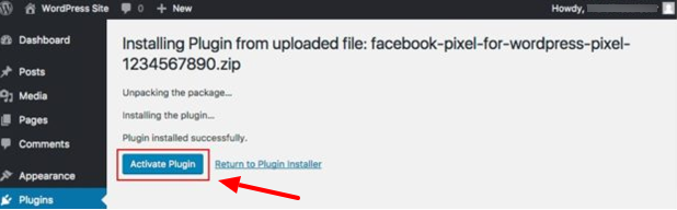
Now, click the “Choose File” button and upload the plugin by selecting it from your download directory. After selecting the downloaded plugin, click the “Install Now” button. When the installation process is finished, click “Activate Plugin” to finalize the setup process.
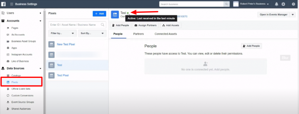
Within thirty minutes, head back to the Ads Manager. Click the Breadcrumb on the top left corner of your screen and head to Data Source> Pixel. Now you can see pixels that you’ve created. Just beside (right side) your pixel name when the dot becomes green from red indicates that your pixel is successfully activated.
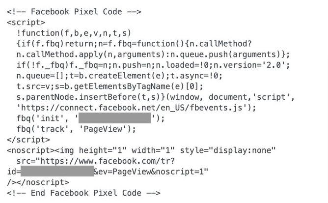
Installing Facebook Pixel on your WordPress Website Manually
In case if you don’t want to install Facebook Pixel via a plugin, you can complete the whole process manually. The process is not as complex as it sounds. You can follow the process stated below:
Create the Facebook Pixel if you haven’t created one already.
In your WordPress site’s section, paste the tracking code from the Facebook pixel.
Step 1: Creating New Pixel and Collecting the Code
Let’s start this process by heading to the Pixel tab on Facebook Ads Manager. If your Facebook Pixel is not ready, we recommend you to follow the previously stated Step 1 and step two at the beginning. Consequently, you have to select the manual installation process and for that, firstly click the “Create a Pixel” button.
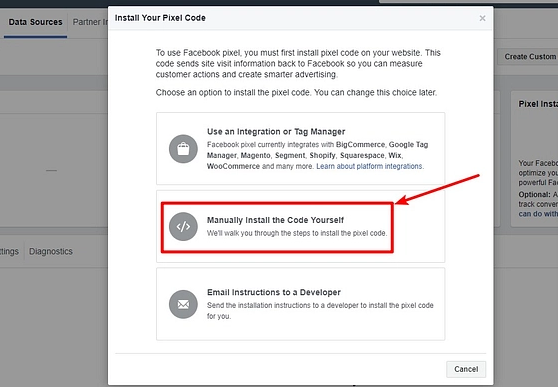
Now on the pop-up window, select the “Manually Install the Code” between three options.
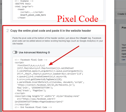
Right after selecting the manual installation option, you will be presented with the Facebook pixel tracking code. This is the piece of code that you need to use on your WordPress website. Therefore, keep this code copied on your system.
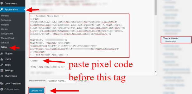
Sign in to your WordPress dashboard to manually insert the pixel code in your WordPress website. Now, go to Appearance > Editor, where you will get the theme’s header.php file. You can search out the tag easily from the header file.
Before the tag, paste the Facebook pixel code and update the file. You have successfully added the pixel to your WordPress site.
Some WordPress themes will allow you to install scripts to run in the header or footer section. Moreover, there are plugins such as Insert Headers and Footers, CTX Feed, Pixel Caffeine that you can utilize to install Facebook Pixel on your site. These plugins will allow installing the pixel on your site easily. That is because you don’t have to paste the code into the header section manually.
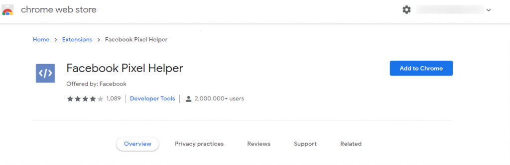
Testing if Facebook Pixel is Working on Your WordPress Site
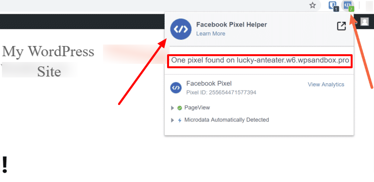
When you are done adding pixels to your WordPress site, make sure it’s working properly. Hence, you need to install the Facebook Pixel Helper Chrome extension.
After installing and activating the Facebook Pixel Helper plugin, head back to your WordPress site via Chrome Browser. When you click on the extension, you should see something like this:
And there you have it! Now you can track customer conversion, take a remarketing approach, and make decisions by creating custom audiences. That’s all there is to do when it comes to adding Facebook Pixel to WordPress.
Conclusion
You have successfully learned the process of installing Facebook pixel on your WordPress site. So, Facebook Pixel is not as hard as it sounds, right? Now, you can set the roadmap for your business with precise targeting and retargeting opportunities. Additionally, you can optimize your ads according to your pixel data and get outstanding results.
However, we recommend online business owners integrate Facebook pixel on their WordPress site right away. We hope this article helped you understand the importance of Facebook Pixel and guided you thoroughly.
Every day design fans submit incredible industry stories to our sister-site, Webdesigner News. Our colleagues sift through it, selecting the very best stories from the design, UX, tech, and development worlds and posting them live on the site.
The best way to keep up with the most important stories for web professionals is to subscribe to Webdesigner News or check out the site regularly. However, in case you missed a day this week, here’s a handy compilation of the top curated stories from the last seven days. Enjoy!
I love little touches that make a website feel like more than just a static document. What if web content wouldn’t just “appear” when a page loaded, but instead popped, slid, faded, or spun into place? It might be a stretch to say that movements like this are always useful, though in some cases they can draw attention to certain elements, reinforce which elements are distinct from one another, or even indicate a changed state. So, they’re not totally useless, either.
So, I put together a set of CSS utilities for animating elements as they enter into view. And, yes, this pure CSS. It not only has a nice variety of animations and variations, but supports staggering those animations as well, almost like a way of creating scenes.
You know, stuff like this:
Which is really just a fancier version of this:
CodePen Embed Fallback
We’ll go over the foundation I used to create the animations first, then get into the little flourishes I added, how to stagger animations, then how to apply them to HTML elements before we also take a look at how to do all of this while respecting a user’s reduced motion preferences.
The basics
The core idea involves adding a simple CSS@keyframes animation that’s applied to anything we want to animate on page load. Let’s make it so that an element fades in, going from opacity: 0 to opacity: 1 in a half second:
Notice, too, that there’s an animation-delay of a half second in there, allowing the rest of the site a little time to load first. The animation-fill-mode: backwards is there to make sure that our initial animation state is active on page load. Without this, our animated element pops into view before we want it to.
CodePen Embed Fallback
If we’re lazy, we can call it a day and just go with this. But, CSS-Tricks readers aren’t lazy, of course, so let’s look at how we can make this sort of thing even better with a system.
Fancier animations
It’s much more fun to have a variety of animations to work with than just one or two. We don’t even need to create a bunch of new @keyframes to make more animations. It’s simple enough to create new classes where all we change is which frames the animation uses while keeping all the timing the same.
There’s nearly an infinite number of CSS animations out there. (See animate.style for a huge collection.) CSS filters, like blur(), brightness() and saturate() and of course CSS transforms can also be used to create even more variations.
But for now, let’s start with a new animation class that uses a CSS transform to make an element “pop” into place.
I threw in a little cubic-bezier() timing curve, courtesy of Lea Verou’s indispensable cubic-bezier.com for a springy bounce.
CodePen Embed Fallback
Adding delays
We can do better! For example, we can animate elements so that they enter at different times. This creates a stagger that makes for complex-looking motion without a complex amount of code.
This animation on three page elements using a CSS filter, CSS transform, and staggered by about a tenth of a second each, feels really nice:
CodePen Embed Fallback
All we did there was create a new class for each element that spaces when the elements start animating, using animation-delay values that are just a tenth of a second apart.
So far, we’ve looked at a base animation as well as a slightly fancier one that we were able to make even fancier with staggered animation delays that are contained in new classes. We also saw how we can respect user motion preferences at the same time.
Even though there are live demos that show off the concepts, we haven’t actually walked though how to apply our work to HTML. And what’s cool is that we can use this on just about any element, whether its a div, span, article, header, section, table, form… you get the idea.
Here’s what we’re going to do. We want to use our animation system on three HTML elements where each element gets three classes. We could hard-code all the animation code to the element itself, but splitting it up gives us a little animation system we can reuse.
.animate: This is the base class that contains our core animation declaration and timing.
The animation type: We’ll use our “pop” animation from before, but we could use the one that fades in as well. This class is technically optional but is a good way to apply distinct movements.
.delay-: As we saw earlier, we can create distinct classes that are used to stagger when the animation starts on each element, making for a neat effect. This class is also optional.
So our animated elements might now look like:
<h2 class="animate pop">One!</h2>
<h2 class="animate pop delay-1">Two!</h2>
<h2 class="animate pop delay-2">Three!</h2>
Let’s count them in!
CodePen Embed Fallback
Conclusion
Check that out: we went from a seemingly basic set of @keyframes and turned it into a full-fledged system for applying interesting animations for elements entering into view.
This is ridiculously fun, of course. But the big takeaway for me is how the examples we looked at form a complete system that can be used to create a baseline, different types of animations, staggered delays, and an approach for respecting user motion preferences. These, to me, are all the ingredients for a flexible system that easy to use, while giving us a lot with a little and without a bunch of extra cruft.
What we covered could indeed be a full animation library. But, of course, I did’t stop there and have my entire CSS file of animations in all its glory for you. There are several more types of animations in there, including 15 classes of different delays that can be used for staggering things. I’ve been using these on my own projects, but it’s still an early draft and I love feedback on it—so please enjoy and let me know what you think in the comments!