Archive

Archive for December, 2015

The best of what’s new for designers, 2015

December 31st, 2015 No comments
Cactus

Every month we bring you the best new apps, frameworks, design and mobile resources, business resources, and more. Here we are at the end of 2015, and we’ve compiled a roundup of the best of what we’ve featured this year, a total of more than 70 resources, carefully curated to make sure it’s the best of the best!

Almost everything on the list this year is free, with a few low-cost, high-value apps and tools also included. They’re sure to be useful to designers and developers, from beginners to experts.

Check back each month in 2016 and beyond, for more resources!
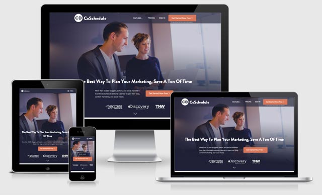
Cactus

Cactus is a fast, free static website generator for Mac. Just pick a page template (portfolio, blog, or single page) to get started, and then focus on editing with live preview anywhere.

Evil Icons

Evil Icons is a set of open source SVG icons, plus loading spinners, that are clean and simple. They come with code to support Rails, Sinatra, Node.js, Gulp, and Grunt.

evil icons

UI Tiles

UI Tiles is a system for building site maps and visual flowcharts for web projects, with 72 screens included. It has an elegant and light design, and it’s easy to use and customize to your needs.

UI Tiles

Skeleton

Skeleton is a simple, responsive boilerplate that’s super lightweight at roughly 400 lines. It’s quick to get started, with no installation or compiling necessary.

Skeleton

Material Palette

Material Palette is a Material Design palette generator that’s super easy to use. Just pick two colors and you’ll get a downloadable 8-color palette.

Material Palette

AndroidLibs

AndroidLibs is a collection of libraries for Android app development. Libraries are sorted by category, or you can search to find what you need.
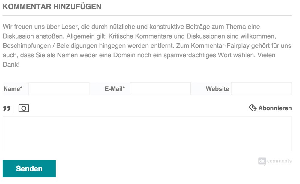
AndroidLibs

Isso

Isso is a commenting server that’s similar to Disqus. Comments can be written in Markdown, and you can import comments from Disqus and WordPress, hassle-free.

Isso

Campfires.io

Campfires.io is a collection of interviews with your favorite designers. They share insights, tips, and behind-the-scenes stories for you to learn from.

Campfires.io

Underdog

Looking for a job at a leading startup? Underdog lets you quickly apply to leading startups in New York, San Francisco, and those who work remotely in just 60 seconds.

Underdog

AppVirality

AppVirality is a growth hacking toolkit for mobile apps. Just enter your App Play Store URL to get started.

AppVirality

Agile Domain Search

Agile Domain Search is a powerful domain name search engine that actually looks good. Just enter a word and it will bring you back a whole list of possible domain names including that word.

Agile Domain Search

Transformicons

Transformicons is a set of transforming, animated icons. There are menu icons, grid icons, add/remove icons, loaders, and more.

Transformicons

Specfox

Specfox makes it easy to create website specifications. You can upload screens, add notes, and generate PDFs that you can share with your dev team.

Specfox

Practice

Practice lets front-end devs practice their skills by getting creative inspiration or random suggestions. You can receive a random challenge, turn a Dribbble shot into code, or solve a random Github issue.

Practice

NativeScript

NativeScript lets you use JavaScript to build truly native apps. You can build apps for iOS, Android, and Windows from a single code base.

NativeScript

Cuckuu

Cuckuu lets you turn your schedule and alarms into a social game. You can use words, pictures, and videos to make your cuckuus more appealing, and you get points when you shut off a cuckuu faster.

Cuckuu

Women Who Startup

The Women Who Startup Podcast celebrates, connects, and empowers women founders, women who code, women entrepreneurs, and women in tech. It’s co-hosted by Lizelle van Vuuren, the Founder and CEO of Effectively and Women Who Startup, and G. Krista Morgan, Co-founder and CEO of P2Binvestor.

The Women Who Startup Podcast

Stripe Connect

Stripe Connect is a new offering from Stripe for marketplaces and platforms who need to get their users paid. If offers multi-party payments, full control, and it’s completely scalable up to billions of dollars per year in payments.

Stripe Connect

Brick by Brick

Brick by Brick is a free guide for building communities. It includes information on audience, seeding, engagement, email, promotion, moderation, recycling, value, and voice.

Brick by Brick

#Launch

#Launch is a community of like-minded makers, designers, developers, and entrepreneurs that was founded in 2006 and re-launched this year. It started out as a secret community of 20 members that spawned 5 Y-Combinator founders, a Thiel Fellow, and dozens of startups, but now you can join.

#Launch

Funnel

Funnel lets you easily create contact forms, track deals, send proposals, track customers, and more. It even works with Gmail.

Funnel

Trianglify Generator

The Trianglify Generator lets you create a custom images based on triangles and color gradients. You can adjust the width and height of the final image, as well as adjust the variance in triangle shapes, the cell size, and the color palette.

Trianglify Generator

Beagle

Beagle is a tool for creating better proposals that lets you import content to base your proposals on existing ones. It also has tools for collaboration, and lets you send directly to your client with a custom cover letter.

Beagle

Ways We Work

Ways We Work interviews a variety of founders and creatives on how they work. It includes questions about the tools they use, how they stay on top of email, and more.

Ways We Work

Visual Studio Code

Visual Studio Code is a free app for building and debugging modern web and cloud applications. It works on Linux, Mac OSX, and Windows.

Visual Studio Code

AppLandr

AppLandr makes it easy to create beautiful landing pages for iOS and Android apps. It puts the focus on marketing, saves you hours of time, and they offer 24/7 support.

AppLandr

Invoice.to

Invoice.to is an incredibly quick and easy way to set up up and send an invoice. You can connect with with Stripe for easy payments, and then either send or print your invoice.

Invoice.to

Custom vs. Template

This questionnaire helps you decide whether to create a Custom vs. Template website design. Just check off your requirements and it’ll tell you which option fits best.

Custom vs. Template

Makerbook

Makerbook is a curated directory of some of the best free resources for designers and other creatives. It has categories for photography, mockups, fonts, textures, video, audio, and more.

Makerbook

Great Email Copy

Great Email Copy is a Tumblr blog that collects awesome emails from around the web. You can filter by type of tag, and it even points out why each email was included.

Great Email Copy

DeployBot

DeployBot is a simple app for deploying code anywhere. You can trigger deployments automatically or manually.

DeployBot

IconStore

IconStore offers free icon packs from world class designers. There are dozens of sets available.

IconStore

Teachery

Teachery lets you create and sell beautiful online courses quickly and easily, with no design or development skills required. Just sign up, create a course, add lessons, style it, create an order page, and you’re ready to start selling!

Teachery

Foundry

Foundry is a collection of vector assets for designing mobile apps and other interactive designs. It includes a variety of images, from browser chrome to everyday objects, any or all of which can be downloaded.

Foundry

Webdesigner News

Webdesigner News is a news aggregator that lets you see the latest news in the design world, as well as check out the most voted, most shared, and most clicked. You can even sign up for an account to save your favorites.

Webdesigner News

Lrn

Lrn lets you learn to code at your convenience on your smartphone. It includes fun interactive mini-quizzes that teach you.

Lrn

Prototyp

Prototyp makes it quick and easy to create interactive prototypes. It’s built on Framer.js.

Prototyp

BlackStock

BlackStock offers up free and affordable stock images that aren’t white-centric. They offer images for both web and print projects, and all the images are royalty-free.

BlackStock

The Working Lunch

The Working Lunch is a daily collection of helpful content for starting and growing a business, aimed at reading or watching on your lunch break.

The Working Lunch

NoDesk

NoDesk features a curated collection of resources for the digital nomad. If your work is location independent, NoDesk is sure to have some useful tools for you.

NoDesk

Rucksack

Rucksack is a collection of CSS features like responsive typography and property aliases that’s built on PostCSS. It’s modular and lightning fast.

Rucksack

Frontify Style Guide

Frontify Style Guide lets you create free style guides for your projects quickly and easily. You can include logos, images, color palettes, typography, and much more.

Frontify Style Guide

Bonsai

Bonsai offers free, bulletproof contracts. It includes simple e-signing and integrated escrow, too.

Bonsai

Color Hunt

Color Hunt serves up beautiful color palettes every day. You can also see popular palettes, or suggest your own.

Color Hunt

GMass

GMass is a mass email system for Gmail. You can create instant recipient lists, track opens, and personalize based on names and email addresses, among other features.

GMass

The Freelancer Podcast

The Freelancer Podcast is a short, weekly podcast for designers, developers, and writers. It’s hosted by Paul Jarvis of Creative Class.

The Freelancer Podcast

Webflow

Webflow is the world’s first visual CMS for building custom, dynamic websites. You can easily structure your content, create custom designs, edit right on the page, and more.

Webflow

Vectr

Vectr is a free design app for print and web. You can download the desktop version, or use it right in your browser.

Vectr

Primer

Primer is a free app that teaches you marketing lessons from Google. They add new topics every week, and they use a learn-by-doing approach.

Primer

Growth Hacking Experiments Template

This Growth Hacking Experiments Template lets you try out growth hacking strategies that have been refined across more than 1200 startups. It breaks down everything into a step-by-step process for trying these growth hacks on your own projects.

Growth Hacking Experiments Template

Workmanship Manual

The Workmanship Manual gives guidelines for writing front-end code that’s reliable and easy to maintain. It includes guidelines for HTML, CSS, and more.

Workmanship Manual

Blend

Blend lets you choose from standard color palettes (Flat UI, Material Design, etc.) to create a CSS gradient. It’s easy to use and you can quickly grab the code for your projects.

Blend

WP Email Delivery

WP Email Delivery is managed email delivery for WordPress. It works with any plugin that sends through WP-mail.

WP Email Delivery

Fundamental UI Design

Fundamental UI Design is a free weekly email course that teaches key UI design topics.

Fundamental UI Design

Landing.Jobs

Landing.Jobs helps you find a great tech job by showing curated offers, rather than just a list of random job openings.

Landing.Jobs

Seeby

Seeby is a startup marketing assistant. It helps with finding leads, tweeting relevant content, proofreading emails, and tons of other marketing tasks startups can have trouble managing.

Seeby

Azendoo

Azendoo is a Subject Calendar that lets you organize, visualize, and manage your team’s tasks. It integrates with a variety of apps, including Salesforce, HubSpot, MailChimp, GitHub, and many others.

Azendoo

BatchedInbox

BatchedInbox lets you schedule when your emails are delivered in Gmail. It lets you save time by scheduling emails around your workflow, and end distractions from emails coming in at random intervals.

BatchedInbox

Avalanche

Avalanche is a super clean, Sass-based CSS grid system. It’s powerful and responsive, with real-world breakpoints and a flexible, easy naming convention.

Avalanche

Flexbox Froggy

Flexbox Froggy is an awesome, fun way to learn about CSS’s Flexbox properties. There are 24 lessons in all, with increasing difficulty in each one.

Flexbox Froggy

Besom

Besom is a hand-painted all-caps font that comes with basic punctuation, perfect for display use.

Besom

Moon

Moon is a simple, rounded typeface that comes in two weights: light and bold. It’s free for personal use, with paid commercial licenses available.

Moon

White Pine

White Pine is a slab serif font with a hand drawn feel.

White Pine

Hamster

Hamster is a free cursive typeface inspired by traditional sign painting and brush lettering.

Hamster

Didactic

Didactic is a practical serif typeface with a full character set and unique style.

Didactic

Royals

Royals combines a classic shape with edgy details to create an uppercase display font in two styles, both with italics.

Royals

Palitoon

Palitoon is a display brush typeface that’s perfect for youth-oriented projects.

Palitoon

Stellar

Stellar is a sans serif typeface for personal use that comes in four weights.

Stellar

Madyson

Madyson is a sans serif typeface inspired by architecture. It’s free for personal use.

Madyson

Ansley Display

Ansley Display is a free slab serif typeface with a retro look. It’s designed for headlines and large type.

Ansley Display

Cormorant

Cormorant is a serif typeface that’s inspired by the Garamond typeface. Cormorant is meant for use at large sizes, where Garamond appears clunky and inelegant.

Cormorant

Logoista Bold

Logoista Bold is a font in progress. It has a hand-drawn, comic book-style look.

Logoista Bold

Mighty Deals 2015 Year End Bundle – $466 Worth of Resources – only $24!

Source

Categories: Designing, Others Tags:

Desktop Wallpaper Calendars: January 2016

December 31st, 2015 No comments

The new year is an occasion to start things fresh, to rethink current practices and habits. So why not start small? Clean up your desktop and give it an inspiring new background. We might have something for you: desktop wallpapers created by artists and designers from across the globe as a part of our monthly desktop wallpapers challenge.

Desktop Wallpaper Calendars: January 2016

This post features their artwork for January 2016. Each wallpaper is available with and without a calendar and can be downloaded for free. Thanks to everyone who contributed their designs! And a happy 2016 to all!

The post Desktop Wallpaper Calendars: January 2016 appeared first on Smashing Magazine.

Categories: Others Tags:

Eight Tips to Start Your Own Web Design Agency

December 30th, 2015 No comments

You’ve always wanted to be your own boss? When working as a web designer or developer, having an own agency or working as a freelancer can be very tempting. But it’s not an easy challenge, as you need to have a lot of abilities to be successful in the tough market. The accounting needs to be taken care of, and marketing needs to be done to help you become famous and get commissions. You’ll also need a sufficient seed capital so that you can not only start, but also survive droughts. That’s why we’ll give you a bunch of useful tips from practice in this article.

1 – Adjust Your Way of Thinking

Adjust Your Way of Thinking

Being your own boss is very tempting, but this is exactly what makes it difficult. A staff web designer will spend the majority of his working time actually designing. Other people work on gaining new commissions, doing the accounting and setting new goals and strategies for the business. When you are your own boss and work for yourself only, you will need to work on new tasks. Even when you earn enough money to afford employees, you’ll still need to do more tasks not directly related to the core of the design business.

The more successful a business becomes, the less you will deal with your actual matter, read web design. You’ll turn into a full-time manager. But at least, you’ll still be your own boss and working as this boss is also rather exciting.

2 – Find the Right Niche For Your Business

Find the Right Niche For Your Business

The most important decision is, what group of clients you want to target with your web design. As you probably know, there is the total schlock, serving the “I can’t spend anything” sector. But there are also the individual, more expensive and lovingly designed websites for those customers that are willing to pay for it. Businesses gain public reputation rather quickly, either being known as a cheap supplier or as the creator of high-quality results. This should reflect your portfolio.

Of course, it is completely okay to offer an additional, less expensive product. But the majority of your work should reflect the area you want yourself to be in.

3 – Know What You’re Offering

Know What You're Offering

Web design is a relatively well-covered area, a nearly filled market. That’s why it’s important to ask yourself what makes you different from thousands of other web design companies nourishing from the same market. Here, the challenge is to find the right niche, meaning the area that is not overcrowded by a lot of other market participants. Maybe you’ll focus on lawyers and their individual needs? Or you offer your service to doctors. Of course, you can try to cover the local market. Quality can also be a characteristic to make you stand out. But to do that, you’ll need to be able to provide first-class and high-quality work. When you’re a career changer in web design, it can be a good idea to focus on a niche that you used to work in before.

Try to stand out from other agencies by offering added value. This could include many things; among them things that you don’t instantly recognize as added value, but might be crucial to the customer. An example: Always keep your promises and be as fast as possible. When you assure your customer a cost estimate until 6 pm on the same day, keep your word and deliver it in time. Set reasonable times for project tasks and add a little more time to that so you never need to say sorry for delayed delivery. Your word is everything in today’s economy. So always keep your promises.

Create a network of partners that can do additional work. That allows you to offer bigger commissions or complete solutions.

A branding with a proper name and an appealing corporate identity should also be given. The name of your agency will ideally stick in one’s mind very quickly. Your logo should have a very high recall value.

4 – Calculate the Financial Pressure Properly

Calculate the Financial Pressure Properly

This is the most important thing when going freelance. As an employee, you’ll get paid on a specified date every month and don’t need to worry about that. As a freelancer, this is entirely different. Can you afford independence? To answer this question, you should thoroughly build up a sheet and throw those numbers in. Will you have customers with commissions already when starting your independent work? That’s an important factor.

Otherwise, start-up costs will need to be calculated. You’ll also need to calculate the regular running costs as well as reserves for tough times in a commission drought. Also, make realistic estimates on how many new customers you can gain and how much you will earn from them. Set these estimates rather low. Optimism is nice, but pessimism is required when it comes to money.

Calculate exactly when you’ll meet breakeven, meaning the point at which you earn enough money to cover your costs. When you just started working, you should know beforehand that it can take a long time until you’ll make profit. That’s why you need to know when breakeven, all costs covered, is reached. Starting from there you calculate when you are able to start living from your work.

Also, think about whether you want to charge a fixed price or an hourly wage for your work. In both cases, you will need to calculate a realistic hourly fee. You’ll need to be very honest and include a time cushion when calculating with fixed price offers.

5 – Become the Perfect Communicator

Become the Perfect Communicator

When you’re a brilliant web designer, that doesn’t mean you’re brilliant businessman and able to lead a design agency. That takes a lot more skill than just creating good websites. I’ve already talked about the financial aspect. Now, I’ll talk about one of the most remarkable abilities of an entrepreneur: communication.

You need to learn to be a fantastic communicator. Creative people often hide in their agencies and only work on their core tasks with passion. But in the economy, there are other things that count. Almost every business-related problem can be solved through simple communication. Will your project be delayed? Get your telephone and talk about it with your customer. Do You need new commissions? Get your telephone, call potential clients and sell your services. Everything goes as planned? Inform your client. Maybe you already have first results. Your customer will be more than pleased to receive a link from you.

You are more of an introvert and have problems with cold calls or delivering sales presentations? I can understand that well. I feel the same way. But you can practice these critical skills. The more often you deal with it, the easier it will be for you. Consider the following: the more often you do those things you don’t like, the more money you’ll probably earn.

6 – Get Help and Build New Partnerships

Get Help and Build New Partnerships

When you’re not among the lucky ones that have a lot of money on their bank account, you probably won’t be able to afford employees from the beginning. This is no problem, as you should look out for other people with skills that complement yours anyway. Start partnerships with these people. Of course, you could also outsource subtasks by searching for proper persons on order portals. Then distribute these subtasks to these companies and freelancers.

Everyone has started small once, and it’s not a problem to admit that you can’t do everything. Especially when starting a freelance business, this feels overwhelming. Don’t let it bring you down. In the beginning, searching for people with complementing abilities to form partnerships has the highest priority. Then, you accept bigger projects and just outsource the tasks you can’t do. Once your business starts growing, employ workers for just these areas.

7 – Always Continue to Work on Your Projects

Always Continue to Work on Your Projects

It’s very tempting to let some projects slide during the start-up phase of a business. Of course, taking care of your own blog for your small agency consumes a lot of time. You might be tempted to spend that time better. But that’s exactly what you shouldn’t do. The company’s blog is a valuable tool for branding and the generation of commissions. Never underestimate the power of personal projects. Your brand popularity will thank you later.

Just note what you spend your time with on work days for a week. You’ll often find time bandits that you need to optimize. Freelancers also only have 24 hours a day. This time needs to be used the best way possible. Remove the time eaters and replace them with work on your own projects. Always keep your web design knowledge up to date and write about it. This helps with growing popularity and convincing potential clients.

8 – Start as a Side Job or Jump in at the Deep End?

Start as a Side Job or Jump in at the Deep End?

Once you’ve considered and worked through all aspects I shared with you in this article; you’re prepared for independence. But not everyone dares to make the jump at the deep end of full-time freelancing. The question about money and the amount of customers, which you had from the beginning, remains.

When you’re lucky to have many customers “threatening” you with commissions, you can instantly go full-time freelance. Then the amount of invested money in the start-up phase is relatively small. When enough capital is available, you can also make the jump. However, when money and clients are limited, you should aim for a side business. A freelance business next to a full-time job put you under a lot of pressure, however. You shouldn’t take that lightly. But if you are well organized, you can deal with this double burden.

This has the advantage that you don’t need to make the jump into the economy’s shark tank and allows you to slowly create your place in the web design industry.

Conclusion

Being self-employed as your own boss has many advantages. But to enjoy that, you need to know that it won’t be easy. You’ll need to work more and work harder and thus; you’ll have less free time. Especially the beginning will be tough as you’ll struggle. But when you realize that freelance work is your thing, every offer of a full-time job won’t matter anymore. You’ll never ever want to return to carpet land.

(dpe)

Categories: Others Tags:

Web designers, digital signage needs you!

December 30th, 2015 No comments

Digital signage is the term for the displays you see in coffee shops, gyms, hospitals, schools, banks, and pretty much any other business or organization with a physical presence. Digital signage has a wide variety of uses such as providing information, generating sales, recognizing donors, etc. It used to be limited to large businesses because of the high costs of installing, managing, and creating content; but in the past 5 years or so, the industry has seen an influx of low-cost media players (the computers that power the displays) and content management systems (the software that puts the content on the displays).

You can now purchase a Raspberry Pi 2, use a free content management system, and an existing TV; and have a digital signage system for as little as $45. With the barrier to entry being continually lowered, it’s no longer just large businesses who are using digital signage. Mom-and-Pop shops are setting it up as well at an increasing rate.

Digital signage is…forecasted to grow to be a 20 billion dollar industry by 2020

There is a major hole in digital signage right now. The cost is down, it’s accessible, and it’s easy to use. But the content… let’s just say: it leaves a lot to be desired. Many businesses have content management systems that have drag-and-drop signage builders, but they’re not great. However, most of them also have the ability to either “schedule” web pages, or build them with HTML.

Digital signage is a big industry in its own little world. It’s forecasted to grow to be a 20 billion dollar industry by 2020, yet it seems like no one has heard of it. It is estimated that there will be 22 million active screens worldwide this year. All of those screens need content, and the proprietary platforms of the past are not doing a great job.

The good news is that if you’re a web designer, digital signage needs you.

Many web designers entered the field because they wanted to try something new. More than likely, you wanted to create interesting and engaging online experiences. Digital signage has opened a new challenge for you. You have the skills and ability now to create stunning digital signage experiences.

Building content for digital signage

Responsive web design and consistent user experience are some buzzwords that have been around for a while now. We already design for everything from phones to large HD desktops; why not expand to large format displays as well? A user should experience the same great web content and branding as they move from their computer, to their phone, and into a physical location.

Digital signage is unique though; and just popping a website on a display is not a very effective way of building a great experience. Digital signage content is dynamic. In many cases it needs to change based on location, time, season, etc. Building separate HTML pages that you can schedule depending on those variables is the easiest way of doing it.

For example, think of a restaurant chain with three locations, in three time zones, each with three displays. Two of the displays in each store are menu boards, and the other one shows a greeting message. When the restaurant closes, the displays show employee communications, such as calendars, company events, and important announcements. The menu boards need three different HTML pages for breakfast, lunch and dinner, and the greeting screens all need content. The employee communications will also need their own content designed and built. Lastly, each store will need individualized content.

This content could be passive, meaning it slides through on its own, or you can create interactive content using touch screens. Incorporating social media campaigns, can also be a good way to engage viewers with passive content. And interactive content can be a very interesting way of creating cool digital signage experiences.

How do you get started?

To begin bringing your web design skills into the world of digital signage, start by signing up for a digital signage platform, to familiarize yourself with the software that sends HTML content to display screens. There are open source platforms, paid platforms, free platforms, and proprietary ones. Many of them allow you to use all the knowledge of web design that you already have and start building.

if you’re a web designer, digital signage needs you

There are a few ways to start building; it depends on what platform you chose. Here are a few different ways: You can build using widgets, or apps, which are the building blocks of sign content. There are widgets and apps for Twitter, financial data, news, weather and more. Another way is to use your editor of choice to build the content. When you’re done building it, publish it to a Github page or website, and then schedule that link in the platform to appear on your display. Lastly, you can build a page in your editor, and then move your HTML directly into the platform, if it allows for that.

Who do you sell to?

If you have any existing clients with brick and mortar locations, they are prime candidates for your display design services. If not, you can add digital signage as a service that you can provide to new clients. Picking a niche can also be a helpful way to grow clients: for example, be the expert on creating signage for restaurants, or dentists, or any other specific profession or industry.

The great thing about digital signage is that content needs to be updated regularly, which generates recurring revenue. With some platforms, you can easily train your clients to schedule and manage their own presentations. Alternatively, you can provide content updates as an additional service.

Conclusion

The digital signage industry is growing rapidly. Gone are the days of proprietary, expensive software. HTML5 has knocked down the door, so you can now create, manage, and display amazing sign content from the web. This is an amazing opportunity for web designers to expand their offering and differentiate themselves.

Featured image, digital signage image via Eugenio Marongiu / Shutterstock.

The Delightful Font Bundle: 5 Creative Typefaces – only $12!

Source

Categories: Designing, Others Tags:

Revisiting Firefox’s DevTools

December 30th, 2015 No comments

If you do any kind of development for the web, then you know how important tools are, and you like finding tools that make your life easier. Developing and testing new browser features, however, takes time. Between the time a useful tool first appears in an experimental nightly build and the time it’s available for everyone to use in Firefox, a while has passed.

Revisiting Firefox's DevTools

That’s one of the reasons Mozilla released Firefox Developer Edition in November 2014 as the recommended Firefox browser for developers. It gets new feature updates more quickly so that you can use the latest tools.

The post Revisiting Firefox’s DevTools appeared first on Smashing Magazine.

Categories: Others Tags:

Design Principles To Evaluate Your Product

December 29th, 2015 No comments

A company proves that it has a strong creative process by developing successful products repeatedly. We see this in companies like Apple, BMW and Google. Founders such as Steve Jobs formed a corporate culture with an intense focus on creativity and design. This culture highlights two core elements in the creative process: the ideas and the team.

Product design preview

The creative process can be described in one sentence: Ideas begin with a small team of creative people at the heart of the company who communicate easily with each other.

The post Design Principles To Evaluate Your Product appeared first on Smashing Magazine.

Categories: Others Tags:

Should I use a video as a background?

December 29th, 2015 No comments

A reader writes in:

I’ve seen done beautifully, but I’m having a hard time finding any articles on best practices. I try to steer clients away from wanting video background even though it’s hard to argue against it because it does look stunning when done right.

“Look at my competitor’s website, they have a video!! You can do it!!”, they say.

The problem I run into is when a client actually sends me a video they want to use, it’s either crappy/low quality or the file size is way too big and would never load in time before the user leaves the site and never looks back.

It’s time for a THOUGHT DUMP!

Is it “just a trend”?

I don’t think “video” is a trend, but “cover the entire screen with video and set white text on top of it as the homepage” probably is a trend. Not that there is anything wrong with that. Another way to think of a trend is in fashion and people don’t tend to be as negative about being in fashion.

This particular trend is at least few years old now though. Posts like 60 Beautiful Examples of Websites With Full-Blown Video Backgrounds are over 3 years old (as far as I can tell).

People do tend to roll their eyes at old fashion.

Sometimes trends are benign to results

There is research that the seemingly superfluous trend of parallax scrolling doesn’t negatively impact “usability, enjoyment, satisfaction, and visual appeal” but increases fun.

A surprise to me, at least.

Does it fit with the brand? And your plan and vision for the site?

Remember, they hired you.

There is that classic analogy where you wouldn’t tell a plumber how to install a faucet. You hired them to do it because they are the expert. In this case, this company hired you to design a website because you are the expert. That holds true up until you think “well, you do tell the plumber which faucet you want installed.”

Still, if they hand you a video that doesn’t seem to work with the rest of the site, that’s not good.

Video is just a medium, it’s not exempt from needing to adhere to the brand. Does it fit the color palette? Does it have the same voice and tone? Does it feel like it belongs?

Video is only going to get more and more normal

How it is used will evolve as well. The people in Harry Potter weren’t surprised that the pictures in the newspapers moved, it was their normal.

The quality better be pretty darn high

Not because of the size, but because of the expectations. If you’re going to force me to see this video, it better be kinda awesome. It better help me understand your thing in a quicker and more meaningful way.

Is autoplay the only way?

People have aversion to autoplay. I don’t have a study to point you to, other than I’ve seen countless people squirm and grumble when they see it.

No sound

Autoplay isn’t nearly as bad when there is no sound, and to be fair, the trend is for these videos not to have sound. Although, for me at least, when I see a video start to play automatically, it triggers uh oh shut it down muscle memory.

Performance

This is the elephant in the room.

Even small videos are huge resources. Especially when you’re talking going full screen by default. Especially when the quality needs to be high or it will make the site embarrassingly trashy.

Do you have a plan to not completely destroy performance? There are lots of studies showing that bad performance is bad bad bad.

Perhaps you can only load the video after the rest of the page is loaded? Mustard cut it? Show a nice poster image? Perhaps there is a way to do like…

<video
  src="#defer-loading"
  poster="nice-default.jpg
  autoplay
/>

Are there more tricks you can look into? Inlining it? Extreme compression? Streaming? Limiting colors / black and white? Overlaying static stuff (e.g. dots/lines) to hide lower quality in an interesting way? Blur?

Budgeting

Do you have a performance budget, such that the video can trigger sacrifices elsewhere, evening page weight out a bit? Seems like a fair approach. And a common one, as the trend seems to point to very simple pages with simple calls to action to take you elsewhere.

Do you need a service?

In my experience, using a video hosting service like YouTube or Vimeo solves a boatload of pain points, like bandwidth fees and cross-browser interoperability.

Can you design the player such that it works for the design? Or do you need more full control?

Are you going to measure success?

If a video background is a sea change in the site’s design, wouldn’t it be a good idea to set up some metrics to ensure the change is a positive one? And have a plan if it isn’t?

Need the code to make it full screen?

Color me a little skeptical of things like jQuery plugins.

CSS is what you need to position the video in the background and size it.

Dudley Storey has approached it this way:

video.fullscreen { 
  position: fixed;
  top: 50%;
  left: 50%;
  min-width: 100%;
  min-height: 100%;
  width: auto;
  height: auto;
  z-index: -100;
  transform: translate(-50%, -50%);
}

And his demo even has some bonus features like pausing:

See the Pen Fullscreen HTML5 Page Background Video by Dudley Storey (@dudleystorey) on CodePen.

His blog post on the subject covers a few other important things too, like how to hide the video on small screens (if you want to) and dealing with IE 8.


Should I use a video as a background? is a post from CSS-Tricks

Categories: Designing, Others Tags:

How to Create Websites That Meet Visitor Expectations

December 29th, 2015 No comments
CoShedule

Creating good websites starts with a certain consistency. This consistency is essential for the cognitive burden of a website’s visitor. When your design is consistent, using the website feels smooth and logic. However, when it is inconsistent, the user needs to put in unnecessary effort. This is what you need to avoid when you want to create websites that meet the expectations of your visitors.

Consequence, in the sense of consistency, doesn’t mean to do the same thing over and over. In some areas, more needs to be invested into building consistency while other areas are easier to create. It’s also really boring to always do the same thing and to deliver boring, uniform designs. The key to success is the equilibrium between consistency and chaos.

MightyText Website

In this article, we will explain in detail, what consistency in web design means, why it is important to achieve, and what it means to bring it in line with user expectations.

Why Consistency in Web Design is Important

Good design for interactions is based on the system’s learnability. Put simple: When a user interface works well, it becomes predictable. This means that the user understands how to use certain features intuitively, without any guidance. And this sums up what the following article is all about.

A safe and predictable UI leads to smooth operation of the final product – a good consistency. In contrast, when a user interface is inconsistent, it hinders the process, provokes frustration and causes a bad user experience. The user will not visit the website again.

Of course, consistency is not restricted to the site you created. The user will spend most of his time surfing other websites. That way he will gain experience in dealing with a website. Regarding your site, this experience will then either be positive or negative, depending on how much effort you put into the user guidance and operability. Basically, consistency means that everything fits together perfectly and works homogeneously.

The Principle of Minimum Surprise

When you’re not sure on how to design the surface of your website, follow the principle of minimum surprise. Of course, small surprises, like the ones on MailChimp are alright. However, your core features shouldn’t differ from the standard too much. The design rule should be adhered to. Videos shouldn’t be confused with images; buttons should be easily identifiable, labelled with a clear message, and so on. Always check your design from the point of view of a user.

When you’re still not sure what consistent design means, read the iOS Human Interface Guidelines. That should help. These guidelines can also be applied to websites.

Consistency in Web Design

Consistency regarding web design can be divided into two areas, internal and external consistency. External consistency means comparisons with other products and surfaces while internal consistency focuses on the project’s surface in itself. Let’s take a closer look at some of the best practices for surface design.

External Consistency

External consistency includes the comparability with similar products. Your website gets compared to multiple other websites every day. To summarise, you can say that external consistency means meeting user expectations. To create a design that does that, you need to look at your design and the work of other designers from the perspective of the user. When you are able to operate a website perfectly, you can apply the achieved external consistency to your own design.

A clear user guidance. The user instantly knows his ways around

The current knowledge of your website’s visitors depends on some external factors. However, in most cases, the expectations of the users will be appropriate, allowing you to react to them. In the end, the design is based on how much your users know already. This is not a new concept, but it has become the standard and can be found on almost every website or mobile application.

For example, there’s a slider for the presentation of images, an envelope symbol for the email address, the logo of the website that leads back to the landing page when clicked. All of these are returning UI patterns that the visitors expect.

Using returning surface patterns

Using so-called UI patterns or surface patterns prevents many problems regarding user friendliness. Many users already know these patterns from other solutions, learned them from visiting other websites or by using programs like Word or other everyday programs. Designers don’t need to reinvent the wheel. The free E-book »Web UI Design Patterns 2014” covers most of the conventional patterns. You can get good ideas from there.

Examples for UI Patterns

Microsoft Word

Die Word Oberfläche
Microsoft Word for OS X

Probably all of us have used Microsoft Word or use it still. Its type of menu options has etched itself into the minds of users that often use text editors. Thus, it feels natural to find them in other applications. Even at this moment, writing this article, I have this type of user guidance in front of me because the WordPress TinyMCE editor uses the same design elements.

Icon Fonts

Font Awesome Icons
Font Awesome

The icon font »Font Awesome” is a superb example of a functional UI pattern. It offers many icons that a lot of people can immediately recognize and relate to. As these icons can also be edited in size easily, icon fonts are the first choice when creating a good user experience. As you can see, external consistency can have many faces, but the recall value is always very high and thus creates a good user experience.

Recognisable, Clear, Structured and Intuitive

The most important things in web design can be summarised in one headline. That doesn’t mean that your websites should always look the same. It only means that the essential elements are always exactly where the visitor of your website searches for them. A navigation belongs at the top area of a site. Here it will be visible and able to catch the eye instantly. The search feature – when offered – also needs to be easily distinguishable. The logo has to be clickable and has to lead back to the homepage.

A website shouldn’t be overloaded. Less means more here! Clear structures are necessary. Call-to-action buttons need to catch the eye instantly and need to be labelled appropriately so that the user knows what he’s expected to do. Intuitive means that everything can be found where you look for it first. You know this. You are a consumer of websites as well. So check your design from that point of view.

Dr. Web
Everything in the Right Spot: Our Beloved Sister Dr. Web

These Things Should Be Avoided

Expectations of visitors are not always preferences. Sometimes they are mere habits. Let’s take a standard comment form as an example. We all know that a star next to the input field means that this information is necessary. If no information is entered, you can not continue.

Ein Standard-Kommentarformular

In many sign up forms, the necessary fields outweigh the optional ones. Wouldn’t it be easier to mark the optional fields with a star? Avis has tried just that a couple of years ago.

Avis Formular

However, the only way of understanding this new labelling is to read the text above the form. Never underestimate the laziness of your users. Back then, the visitors of Avis have filled in the form like they were used to and were angry and confused about what the purpose of this new kind of user guidance was. This new design forced the users to read forms again. This has nothing to do with user friendliness. Avis quickly noticed the mistake and reoffers a standard form today.

Das neue Avis-Formular

All required input fields can instantly be recognised, as the stars tell the user what to do. It doesn’t matter if the stars are black or red; the user knows the meaning. Alternatively, the optional fields can also be labelled with the word “optional”. However, that forces the user to read the form. The cognitive burden on the user increases – even if just for a few milliseconds -. This can not be the goal, as intuitive controls make the user feel comfortable. He will gladly visit the website you created again.

Conclusion

Of course, we can only teach the basics in this article. But paying attention to the basics can already lead to a well-designed website that meets the user expectations sufficiently. Always remember that a user on a website doesn’t want to think. He expects intuitive user guidance that instantly tells him what to do. A visitor expects a clear structure and a design that is not overloaded. Less is more. Always try to view your work through the eyes of a visitor.

Related Links

(dpe)

Categories: Others Tags:

5 easy ways to get fired from a design job

December 29th, 2015 No comments

Plenty of web designers are consummate professionals who strive to do the best for their clients and provide excellent service. These are designers who rightly have pride in their work and love what they do. Then, unfortunately, you also have the other side of the equation: designers who don’t care about making their clients happy, and therefore don’t provide good service. These are designers whose standards are poor.

Worse yet, from the client’s perspective, you can’t really weed out who’s who until you’ve hired your designer and have worked with him or her for a period of time. Sadly, by then, if it’s a designer with low standards, it’s already too late.

1) Delay your first draft

To make your client begin to doubt whether he should have chosen you as his designer, start to really take your sweet time with your mockups as you set off the development process in earnest. If you’d really like to sugar coat it, keep giving your client excessively optimistic estimates about getting the project done in just a matter of weeks.

Go from ensuring your client that you’re highly excited to get the site design or redesign project underway, to taking several weeks before you email him your first mockups of the new design iteration. Then, to add insult to injury, drag your feet just a little bit longer when your client asks (and know that he’ll always ask) you for some tweaks and minor changes to the initial mockup you sent over.

2) Re-prioritise your schedule

Now that you’ve planted the seeds of doubt in your client’s head, you’re well on your way to getting fired.

If the project you were contracted for should last through holidays like Christmas, be sure to neglect the project for the entirety of the holidays. After all, your priorities during festive seasons should be on things like recreation and hanging out with your friends or family. Never mind the fact that your client already paid you a hefty retainer…which you’re already using.

Then, perhaps because you’ve experienced a small pang of guilt, finally send your client an update email raising his hopes that maybe, just maybe, you’ll be able to get the project done by the holiday’s end. Of course, to stay consistent with your plan to drive off your client in anger, make sure that you break this promise, too, as it was only ever false hope anyway!

3) Make the site live with blatant errors

When my old designer finally had a “finished” version of my old site ready to go live, approximately four months after the project began, he presented me with a site that had obvious problems that he apparently didn’t notice. That’s because he couldn’t have cared less. If he would’ve given his final creation at least the once-over, he would’ve noticed glaring issues like:

  • broken links;
  • images with uneven borders;
  • lack of responsive design.

Plus, my email at my then-new URL wasn’t working at all, even though we agreed that it was part of his job to set it up.

By now, your client will understand completely that you were the wrong designer with whom to go. You’ve delayed the project numerous times; gone way beyond the earlier estimates of how long the project’s duration would take; been unresponsive in communication; and, to top it all off, presented your client with a sub-par work that needs significant corrections.

Hold on, though. If you think that’s the worst that designers can do, think again. There’s still one final action that you can take to absolutely ensure that your client will be completely upset with you and never return (not to mention, probably give negative recommendations about you).

4) Refuse to correct the problems

By now, you’ve very likely angered your client, and he’s likely not to come back to you for anything. To put the final nail in the coffin of your professional relationship with your client, simply never reply to his emails or text messages asking you to fix the glaring problems with the finished site. It doesn’t matter if the contract you and your client signed, as well as follow-up emails, expressly stated that you’d handle minor revisions. Just go for broke at this point!

5) Overpromise, then under-deliver

Needless to say, after my old designer finally did what he was supposed to do, and got paid for it beforehand, too, he wasn’t going to work with me anymore. I cut contact with him right after that and began looking for a new web designer/developer in 2014. Thankfully, I did find a highly talented and extremely professional designer in late 2014. My current site design is his great work. He’ll also maintain my site through the years, as well as handle any necessary site updates to respond to SEO concerns going forward.

Looking back on this nightmarish experience that really tested my patience on so many levels, I can say that my old designer’s problem was overpromising to put my mind at ease and hook me in—and then completely under-delivering on so many occasions. To put it into perspective, my old designer took about four months for a redesign while my new designer took a couple of weeks. The difference between the two is work ethic (or lack thereof) and pride in one’s work (or lack thereof).

In conclusion, just follow all the steps my old designer took if you want to provoke your clients and drive them away for good. I’m sure that, after you do that to enough clients, you won’t have a viable design business for long.

Featured image, fired image via Shutterstock.

Learn 3D Modelling with The Blender Creator Course – only $19!

Source

Categories: Designing, Others Tags:

Value-based billing: Escaping the trap of trading hours for dollars

December 29th, 2015 No comments
Value-Based-Billing-FreshBooks

In the Billing Like a Boss series, you’ve learned about how to work through the uncomfortable money talk with clients and the basics of an invoice for web designers. We’ve also shared some easy ways to get your invoices paid lightning fast. In this post, we’ll share with you the problems with hourly-based billing and how to take your business to the next level with value-based billing.

The problem with hourly-based billing

“So what’s your hourly rate?”

It’s a simple but loaded question every potential client will ask you at some point. Giving a single rate can reduce the immense value you provide down to a single number. In the complex world of web development and design this can ignite unappreciative attitudes in clients that don’t understand the nuances of your efforts.

But – perhaps more importantly – it a logistical nightmare for you.

Let’s say you landed a project that enlists various aspects of your talents. Each responsibility requires a different amount of specialized knowledge (or lack thereof). For example, tasks like site architecture design need more effort and senior-level experience than database entry. In the world of hourly-based billing, you would price out and track each task at different rates. However, projects containing more than 3 tasks quickly becomes an administrative burden.

If you run an agency with staff, charging different rates creates politics as to everyone’s “worth” and can feel degrading for some.

Also, when the conversation focuses on your hourly rate, clients start to fixate on “how fast” and “when it’ll be done” vs. focusing on the value they can get from your services. They’ll want to spend as little time as possible with you while obsessing about the clock.

Shifting the mindset: Value-based billing

Value-based billing flips the conversation toward the value your services deliver. It’s important to remember that the value is determined by the client, not you. If they don’t think you’re worth the money, they won’t pay it.

That’s why educating clients is so important. It’s your job to provide informative, high-quality information on what benefits your services will bring their business. From there, value can be established and accepted.

The overarching value you provide is only one part of the equation. You must also convince your clients that this new form of billing is preferable. In order to accomplish that, you’ll need to change their mindset.

Let’s look at how a web designer could look at their services from a value-based billing perspective:

Say your client needs a website redesign. Your initial conversation reveals that this new design has the potential to increase their yearly profit by $100,000.

Now, the $2,500 you’d charge based on an hourly rate seems pretty miniscule in comparison. Looking at it in these terms, you could feel confident charging $10,000 or even $20,000, as this is still just a fraction of what your client will recover.

Clients will also be better able to justify that type of investment when it’s viewed from this angle. It’s all about the way you look at it. And once you get your client looking at it the right way, great things can happen.

Suddenly, they’re not as worried about how to reduce costs (i.e. your hourly rate), they’re looking for new and innovate ways to increase overall profit.

So how do you implement value-based billing? Here are 3 steps:

1. Get down to the numbers

Since value-based billing is all about what value you can bring to your client, you’ll need to spend more time researching with them upfront. Don’t be afraid to break down the numbers. Establish clear, attainable goals that can be achieve through your services.

A few examples include:

  • What increase in sales is your client trying to reach with a new web design?
  • What % lift in leads for their sales team?
  • What is the % lift in conversion rate?

In many cases, your client may not be able to articulate the goals in a measurable way, so you’ll need to work with them to help. This will not only demonstrate that you’re a talented web designer, but focused meeting business goals and not a pretty website that doesn’t convert. Bringing value before you ever even draft a wireframe is a powerful sales technique.

Aim to charge between 10% – 20% of the value you’ll provide for your services.

2. Give pricing options

People love having options – though not too many options. Because of this, it’s important to lay out a few different choices for various levels of value.

This is where a value-based system really shines.

With hourly pricing, you’re limited to the hours in a day and your varying efficiency levels. However, invoicing based on value means that you’re delivering a result – regardless of how long it takes. And that’s much more powerful than just exchanging your time for a paycheck.

Some strong option categories include:

  • Ad-Hoc Jobs: Task A costs $XX each time a client orders it.
  • Maintenance Plans: You deliver ABCD for $XXXX per month/quarter/year.
  • Tiered Service Levels: Clients get A for $X, AB for $XX or ABC for $XXX.

Depending on the client’s needs, you may want to offer several options for various categories. Once you know the general value, put together 2-3 package choices that will fit their needs. Spend some time developing your pricing strategy so you’ll be prepared with the right option for your client.

3. Find the “right” customer

Ultimately, using this system successfully relies on your ability to track the right clients. You can’t convince people of value when they aren’t willing to shift their mindset, or simply want the cheapest route to their goal.

The right clients form a bond with you that’s hard to break.

With a good working relationship built on trust, these customers will appreciate the value you’re providing – even if the results aren’t always what they wanted.

And, don’t forget, people spend time with other like-minded individuals. That means if you’re able to win the heart of your client, they likely know another ideal client that could use the powerful value of your services.

Are you ready for the change?

Shifting your invoicing process to this system is a great idea for many service-based entrepreneurs, freelancers and business owners. Take some time to evaluate the above points and decide if you’d like to dive a bit deeper.

Want to learn more about value-based billing? Download our FREE e-book Breaking the Time Barrier: How to Unlock Your True Earning Potential. The e-book outlines more about the problems of hourly billing and more importantly, shows the power of value-based billing for freelancers.

Read More at Value-based billing: Escaping the trap of trading hours for dollars

Categories: Designing, Others Tags: